Richard Tuttle. I Don’t Know. The Weave of Textile Language, at the Whitechapel Gallery, London.

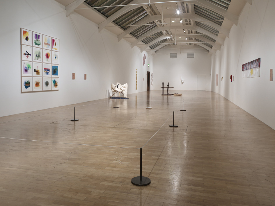
Richard Tuttle, I Don’t Know. The Weave of Textile Language, installation view 2014. Photo credit Stephen White
It’s easy to take for granted the shape-shifting and transitory ‘almost there’ quality of Tuttle’s work and forget the length of his career to boot. It is too easy to have caught a glimpse of 3 or 4 of his pieces over the years and think that you know his work. I caught such a glimpse last year in a large collection of American art. I was impressed by the subtlety and focus to his colour play, hard won, it seemed, from the frailty and ubiquity of the throw-away materials he manipulates or strings together somehow. No matter how fragile, or how far they wavered from the painterly rectangle, the works still held the wall and seemed to hold their own too against the more robust conglomerations of good ol’ American trash that the likes of Rauschenberg, Kienholz or Brecht could throw at me from the same show.
Richard Tuttle, I Don’t Know. The Weave of Textile Language installation view 2014. Photo credit Stephen White
But these initial and casual introductions to his work as seen as parts of larger group exhibitions did not prepare me for the low-key ambiance that this Whitechapel survey show had in store. Here, Tuttle shows assemblages from a 50 year career that explore and question the foundational rectangle of painting and the spatial parameters of sculpture via his obsession with what he calls ‘the weave of textile language’.
I had admired what I considered Tuttle’s real visual lightness of touch. It’s comprised of an acute sensitivity to the potential in colour, texture and weight of the most mundane materials. It’s a sensibility that manifests itself in the most suggestive shapes and a peculiar and refined taste for balance (and its disturbance) stretched to the limit, all achieved by the greatest economy of means. This current show runs with a different emphasis though…
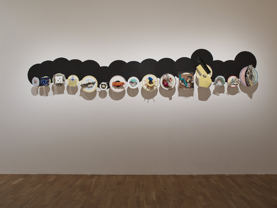
Richard Tuttle, I Don’t Know. The Weave of Textile Language installation view 2014. Photo credit Stephen White. Work shown: ‘Clutter’, 2008-12.
“Just as a series of single threads are woven to form textile, words are interlaced to form sentences and meaning”
This is a cosy correlation between language and the visual properties of textile and cloth. As much as I enjoyed the curatorial thesis, I think it closed down rather than opened up different ways into the work. Why? Because I believe his best work is the least literary and most abstract. The danger here is to overplay Tuttle’s taste for word play and language games which run the risk of turning the works into easy-to-digest absurdities, a sort of neo-dada-lite. From this perspective, Systems VI, 2011, was more like a theatrical curiosity, almost parodying the machinery of the textile industries from the late 19th to early 20th century. Plonked centrally in the ground floor space, It lacked any sensitivity to site, or weight or other clear sculptural concerns. My attention was drawn to the ambiguous play of contrasting materials suspended under an internal light source like a half-built birds nest. On another level, the whole look of the sculpture resembled some kind of revolving clockwork stage; or, with its four corner posts, a makeshift bandstand, the circular base punctuated by wooden beams and irreverent red orbs.
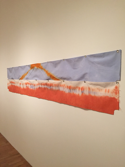
‘Walking on Air, C10’, 2009. Cotton with Rit dyes, grommets, thread. ©Richard Tuttle
All in all, the ground floor hang felt particularly subdued and, ironically, full of very conventional if ill at ease rectangles, a lot of which were wall texts. Are these texts half-baked truisms or revelatory insights by the artist? At their best they did shed a little light onto the philosophical predilection for finding the miraculous in the everyday. But on more than one occasion they felt visually awkward and, as poetry goes, heavy handed. Wherever one looked they seemed to be cutting up and budging in on the fragile countenance of the works they were there to support. The whole left side of the ground floor space felt cramped in this respect. It was difficult to focus on the tiny combinations of minute flotsam clumped on the end of the makeshift stems of the group Section VII Extension pieces, 2007, or focus on some of the delicate thin washes of paint on spun plastic (Space-is-Concrete series). Spotlights high above focused in on very small areas of wall space and left the overall atmosphere somewhat murky and even more theatrical.
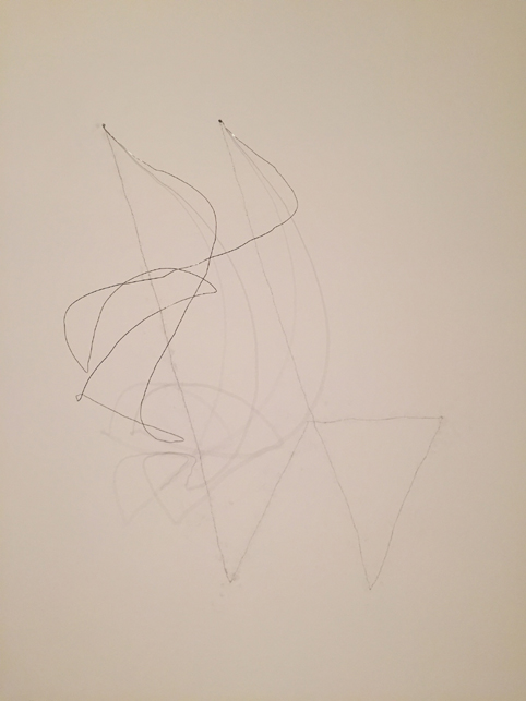
‘Wire Piece’, 1971- 72. Made on site. ©Richard Tuttle
By contrast the right wall felt strangely empty. Here, the Wire Pieces are the sum of pencil lines drawn directly on the wall, combined with tethered wires and the shadows cast by them from the heavy spots. This low-fi choreography of 3 forms of line ignites a flash point between the conceptual and the material. But it’s that gratifying irrational ‘ping’ of the coiling wires released from various tethers that sets the whole thing off.
For all the frailty and danger of whimsy, Tuttle’s ‘touch’ comes from a tough quotidian take on minimalism. This approach, I believe, is explored with more clarity in the last of the upper galleries. Here, the space feels much lighter, and finishes the show with some earlier pieces from the late sixties. Tuttle asks us to focus our senses and scrutinise the vertical warp and horizontal weft of the weave that forms the textured surface on which the painter has worked for centuries – the canvas itself. This warp and weft forms the usually tightly-knit grid of the canvas that holds the paint in and on its surface. The grid in another context had at this time (late sixties) become a central and rather more portentous concern of high-end minimalist art. Pieces like Purple Octagonal, 1967, or Ladder Piece open up the hard faux-industrial edges of minimalism to the ability of textile and cloth to express a very human vulnerability and scale. These works feel thrown around the space, close to the ceiling and low to the floor. They escape the rather inward looking and framed doodlings or the more fussy and theatrical contraptions of later works selected.
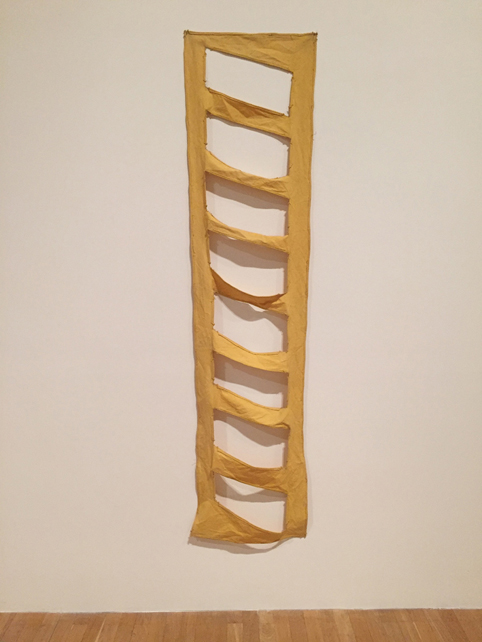
‘Ladder Piece’, 1967, dyed and cut canvas. ©Richard Tuttle
‘Slacker Art’, ‘Crapstraction’ and other manifestations of what might be called the provisional trend in painting/sculpture have been well and truly played to death in the last 10 years. Tuttle’s influence here is easy to see. But his best work has less to do with frustrating audience expectations, some notion of failure or theatrical nihilism, and more to do with exploring the inner logic of a work’s necessary development through the expressive potential of the most unexpected materials and use of colour and space. At his best he finds, in the given histories and conventions of painting and sculpture, a springboard into unfamiliar, poetic and psychologically charged territory. I think this survey show suffers for being just one part of a three-pronged project (a book and a massive a Turbine Hall piece at Tate being the other two). I was left wanting a more comprehensive and challenging retrospective of Tuttle’s work in this country. And I guess that can’t be a bad feeling to have!
John Bunker, October 2014
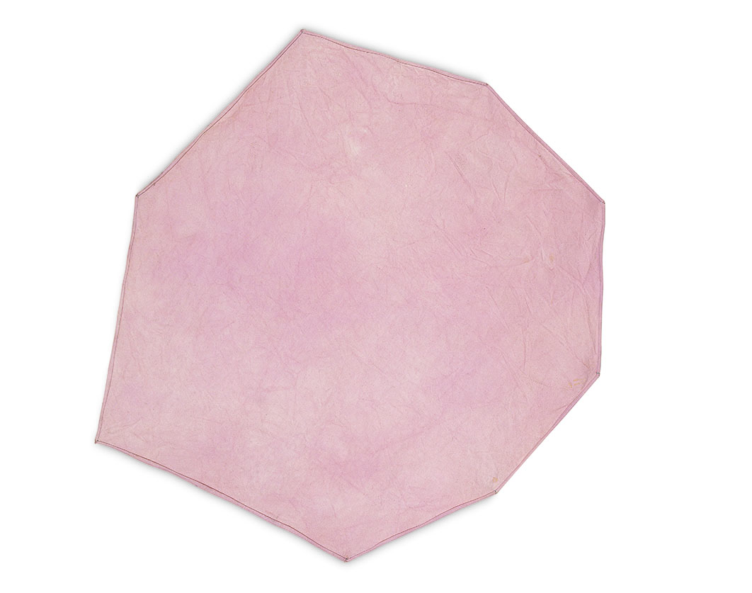
‘Purple Octagonal’, 1967, dyed and cut canvas ©Richard Tuttle
Richard Tuttle: I Don’t Know. The Weave of Textile Language is at the Whitechapel Gallery until 14 December 2014 and Tate Modern Turbine Hall until 6 April 2015. All photos ©Richard Tuttle, Courtesy Stuart Shave Gallery/Modern Art, London, and Pace Gallery, New York
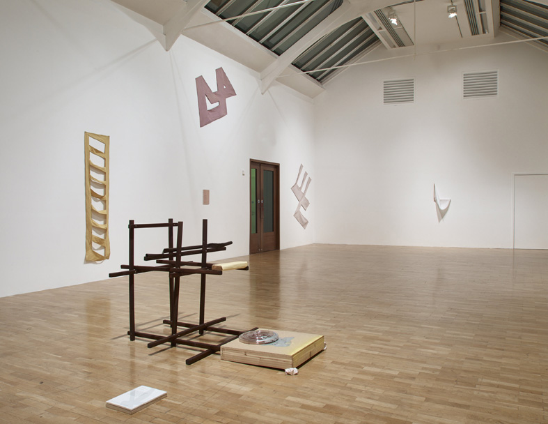
Richard Tuttle, I Don’t Know. The Weave of Textile Language installation view 2014. Photo credit Stephen White
‘Section VII, Extension O’, 2007, ©Richard Tuttle
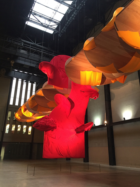
‘I Don’t Know. The Weave of Textile Language’, at Tate Modern, 2014

“Fascinated by how text and textile share the same linguistic root ‘but not the same stem’, Richard Tuttle has explored the relationship between them.”
This does not convince me at all as a curatorial context for a 50-year survey of Tuttle’s work, and I think that John’s review has been very forgiving in its lack of critique of this as a foundation for Tuttle’s significant presence in London at present. The beauty of Tuttle’s work is often in its modesty of form and subtle engagement of materials in space. There are many great pieces of work in ‘I Don’t Know. The Weave of Textile Language‘ but too often the work is overshadowed by its uncomfortable arrangement in the gallery and its persistent accompaniment by Tuttle’s poetic writing. Such a literal illustration of the relationship between text and textile provides an inadequate articulation of what Tuttle sees as the significance of textiles, which he has said have been central to cultural expression for millennia, yet continue to be overlooked by the arts establishment. If this is a genuine subject for exploration and further thought then the exhibition at Whitechapel doesn’t venture far enough beyond Tuttle’s use of obvious word play into more interrogatory grounds. In addition to what John has noted about Tuttle’s text panels being an overbearing physical intervention into the display of the works, I also found them to be an interruption to the material reading of the work, encouraging a rather bilious reaction to the trite alignment of visual art to written language. Such insensitive curation is at danger of making ‘I Don’t Know. The Weave of Textile Language‘ less about the work and more about what Tuttle and/or The Whitechapel say about it, which limits our reading of it to something very prescriptive and mundane.
The pieces of Tuttle’s work that I enjoy most are those that challenge traditional ideas of monumentalism: exhibiting an economy of material, gesture and scale. Like John, I found the construction of ‘Systems VI‘ (2011) to be an uncomfortable fit in the first gallery, distracting from the modest delicacy of texture and form of pieces such as ‘Section VII, Extension O‘ (2007) and ‘Fiction Fish I, 7‘ (1992). Both of these encourage a more rigorous questioning of space and material value than the large central focal point, which, like ‘Present‘ (2004) shown in the first and most awkward upstairs gallery, is lit by artificial light. Such ‘theatrical contraptions’, to use John’s well chosen term, feel overcooked and unnecessarily contrived when seen in proximity to the restraint of Tuttle’s more temperate pieces such as ‘Purple Octagonal‘ (1967) and ‘Ladder Piece‘ (1967). These early works, often considered as a radical soft rendering of minimalism’s hard-edged geometry, were placed at the end of the final room of the exhibition. It was refreshing to see them integrated with Tuttle’s later work and not presented chronologically or as iconic art historical referents as Tate recently did with Malevich’s ‘Black Square‘. However, ‘Untitled (Cloth Piece)‘ (1967) and ‘Pale Blue Canvas‘ (1967) undoubtedly suffer from being hung either side of an illuminated fire escape sign above the exit to the exhibition. There is a very awkward use of space throughout the entire show but this is by far the strangest.
I agree with John, that there is still a need for ‘a more comprehensive and challenging retrospective’ of Tuttle’s work, and I would look forward to seeing that hugely. It feels like ‘I Don’t Know. The Weave of Textile Language‘ mostly contains all the work needed to produce a great show yet it is all somehow presented in the wrong way: too weirdly spaced, too swamped by interpretive text, and altogether too understated. Curiously Tuttle’s installation in the Tate’s Turbine Hall suffers from the opposite problem of being too big for its own good and lacking a meaningful dialogue with material and form. Maybe we should focus on the ‘I Don’t Know’ part of the exhibition title instead of placing the emphasis on the language of textiles, as Tuttle’s successful relationship with this is well established and leaves us with few questions – but how we should be allowed to see the work feels at this point less well defined and is perhaps a subject for wider discussion in terms of contextualising abstract art in linguistic, cultural or social terms.
LikeLike
I haven’t seen the Whitechapel show yet, but I thought the Turbine piece was too small rather than too big (although maybe this is just the same problem looked at from different directions). Given his central concerns Tuttle seems like a knowingly perverse choice by the Tate, but one that turns out to have the problems that would have been guessed at in advance. I also wonder what the Whitechapel show will look like against the David Hammons currently up at White Cube. I’ll try and see both over the weekend.
LikeLike
I live in New York. I haven’t seen the shows or the book John writes about. But, as I say, I live in New York, the center of the universe: I’m happy to comment, with resounding authority, on any and everything.
First the title of the Whitechapel show: “I Don’t Know. The Weave of Textile Language”. I agree with Charley Peters: I like the first half, don’t like the second half. Bruce Gagnier made an extraordinary sculpture he called “I Don’t Know” back in 2010. Click to image 13 here: http://www.loribooksteinfineart.com/artist_artwork.php?pageNum_exhibit=12&totalRows_exhibit=26&id=6. Maybe it’s not silly to connect the delicacy with which Gagnier’s sculpture was painted with Tuttle’s sensibility. Connect the two, you’re left with some questions: Is there not more to the Gagnier sculpture than the delicacy with which it was painted? Is there more to a Tuttle than Tuttle’s delicate sensibility? Is there more “abstraction” in the Gagnier—more in the Tuttles? What the hell is “abstraction” anyway? Just one of Robin Greenwood’s fantasies?
John at least touches on this question when he says Tuttle’s best work is “the least literary and the most abstract.” And John really does go on to explore this question—maybe not explicitly/directly, but very effectively (as I hope other writers at Abcrit will). His praise for Purple Octagonal and Ladder Piece is especially suggestive.
I just read Maika Pollack’s (Pollack is the GREAT American art critic who writes for the NY Observer) take on the not unTuttle-esque “ZERO: Countdown to Tomorrow, 1950s-60s” show at the Guggenheim Museum in NYC. (http://observer.com/2014/11/the-mid-century-motorized-madness-of-zero-countdown-to-tomorrow-at-the-guggenheim/) Pollack: “Never figurative, the works are spiky, silly, perceptual takes on the new materials and modern experiences that greeted these young artists in 1960.” Not a definition of “abstraction,” but something to think about.
About the second half of the title and the literary dimension of Tuttle’s work I don’t really have anything to say. I did just discover May Swenson though, a GREAT American poet. Here are a couple of stanzas from an early poem of hers, “Any Object”:
any Object before the Eye
Can fill the space can occupy
the supple frame of eternity
my Hand before me such
tangents reaches into Much
root and twig extremes can touch
LikeLike
This show was always going to give me problems, finding the positives… in fact, finding anything that I would call ‘abstract’. Most of the 3-D stuff is as abstract as a washing machine, though not as useful.
I thought the least-bad things were the minimal, stretcherless, shaped and stained canvasses from the sixties, which had some vestige of visual form. I found a lot of the show rubbishy, lame and boring, a bit like conceptual art, but without the ideas. As with the Turbine Hall piece at Tate Modern, Tuttle’s work exudes such an aura of indifference (though, of course, this is arch, which makes it doubly annoying) that it makes me, in turn, unresponsive. If he can’t make an effort, why should I? One thing I know for sure; John Bunker makes far better work than Richard Tuttle.
The recent tendencies of ‘Provisional Painting’, ‘DIY’ and ‘Crapstraction’ etc., attempt, like Tuttle, to circumvent qualitative criticism by a twin strategy of firstly positioning themselves somewhere in the cracks between disciplines – in Tuttle’s case, between painting, sculpture and poetry – where it won’t attract unfortunate comparisons with works that utilise the full expressive capabilities of those individual domains; and secondly, by the related business of finding and demonstrating literal ‘truths’ about the mechanics of painting (you can’t really do this any longer with sculpture) in a demonstration of its quiddity. There is a whole raft of work that boringly deconstructs painting in similar ways to Tuttle. He seems to have got involved in such an over-conceptualised version of that deconstruction process that he early on loses his marginal Minimalist sensibilities (probably his original saving grace) and now drifts senselessly about in what he must suppose is the territory of sculpture (but isn’t), simply because he is messing about with the 3-D stuff from which paintings are literally made.
I come back over and again to a principle of comparison – are Tuttle’s canvasses (let’s take the illustrated example of ‘Walking on Air, C10′, 2009) better or worse than: a) the colour-field paintings of (say) Helen Frankenthaler; or b) a random selection of tie-dye textiles? I know many will say this is not the point. It is absolutely the point. Tuttle comes off worse in both of those comparisons (provided it is a visual comparison), and I am a fan of neither Frankenthaler nor tie-dye. To extract any shred of meaning from Tuttle’s work, you are compelled to view it in a wholly contextualised manner; i.e. embedded in a rather nauseating art-world back-story. Any such shallow quality and content is almost entirely extrinsic to the work. There is just so little of any value to look at. So too with the 3-D stuff; it’s all very poor, and any other conclusion would be wholly subjective.
In the NY Times of April 2009, when Tuttle’s ‘Walking on Air’ series was first shown, Ken Johnson wrote: ‘As you draw closer, the optical, painterly aspect gives way to the tactile, sculptural dimension. You notice the grommets, the nails, wrinkles and creases in the fine cloth, machine stitched lines of colored thread and, in a few cases, added pieces of rope… Tie-dyed textures and blurry white lines nostalgically evoke hippie consciousness, and the sensuously philosophical marriage of the material and the immaterial is at once austere and sweetly seductive.’
This is a good example of that rank subjectivity. An evocation of tie-dye hippiedom is not a ‘painterly aspect’; grommets and creases are not in the least part a ‘sculptural dimension’. Have we learnt nothing since the sixties, when this sort of work and its concomitant weak-minded critique originated? In Tuttle’s case, it appears not, because archly pretending to make crappy bits of next-to-nothing is still making crappy bits of next-to-nothing. It will still be crappy bits of next-to-nothing in another fifty years time, regardless of the whims and caprices of the artworld.
LikeLiked by 1 person
not a fan then. but why so angry?
LikeLike
Katrin: Why so angry? Good question. At least a question a lot of people ask. I don’t think a good answer is that Robin’s not really “angry:” he’s “passionate:” he’s “honest.” There is something wrong with Robin: he doesn’t live in New York: he hasn’t been trained by Jerry Saltz and Roberta Smith to be nice, to be careful, to skip the hard parts. I live in New York: Roberta and Jerry have ruined me: I’m a terrible, prissy writer: I fuss over every word. Now your use of the word “fan” is beginning to bother me, but I’ll let it go. . .
LikeLike
Jock, my use of “fan” was with tongue in cheek so best not to overthink. Regarding your point: I see you are being self effacing and also paying Robin a slightly backhanded compliment… I can’t quite keep up with these subtleties but as Tuttle is an artist whose work I enjoy immensely I do want to respond to an implication that seems to be made that one must be caught up in the artworld, believe the hype, dazzled by a back-story etc.to think highly of it. I first saw Tuttle’s work when I picked up that large white catalogue in 2005 and it spoke to me straight away. Since then I have seen a couple of shows, the odd piece at art fair etc and was moved, amused, intrigued, puzzled, stimulated, delighted, excited…. Unfailingly his art has affected and engaged me, often in a profound and certainly in a lasting way. I have heard him speak a couple of times. I have not read about him or otherwise tried to theorise or contextualise what he does – that would seem non-sensical. Yes, the work is very personal and subjective. But this seems right to me. I feel that the more specific and individual the work is to the artist, the more clearly it communicates to others, if they are open to that. There is plenty more to say about this but I shan’t go into more detail – I can’t quite match the intellectual stamina so often displayed on AbCrit. Suffice to say that I value Tuttle’s work highly in a similar way I value Rilke’s poetry for example. And I have “studied” neither – they have simply succeeded to work on and deeply affect me.
LikeLiked by 1 person
Wow! Katrin, you write VERY beautifully! I kind of imagine Rilke wrote the way you do. I don’t know much/any German, but I have a ridiculously big number of translations of Rilke’s work on my bookshelves. I STUDY things—frantically, hopelessly: all the wrong ways. I remember telling a friend that Rilke must be THE flakiest guy ever to have lived. My friend agreed with me. He was an English guy—really a brilliant English guy: Andrew Forge. As soon as he nodded in agreement, I knew I was “wrong”—that I would never be able to dismiss Rilke.
Let me clear up a couple of things.
First, I want to be open and outright in complimenting Robin on his comments, on his setting up of Abcrit, of Abstract Critical—on the many, many great things he’s done to help/encourage people to talk about, to think about, simply to look at art in “good” ways. I’m sure Robin and I will disagree about a thousand things. I’m sure we’ll misunderstand each other, etc., etc.—but I’m very, very grateful for all he’s done, for all he’s continuing to do.
Second, I don’t mean to imply/suggest that because you enjoy Richard Tuttle’s work immensely you have been duped by the Art World. There are many things about the Art World that I object to—that I really object to! But the Art World (does such a place really exist?) is where I live—and where I live very happily. I think it’s wonderful that you enjoy Tuttle’s work—though I might say maybe Tuttle has been duped by the Art World.
I went to college thinking Rembrandt and Michelangelo were real artists; Picasso, a suspicious character; Andy Warhol, not even worth thinking about. When I came out of college, Andy Warhol was my hero. I stumbled on Frank Stella in college—much the way it sounds you stumbled on Tuttle. It was the 1960 something William Rubin Stella catalogue in my case. It was a wonderful, “eye-opening” experience, but it didn’t last—BUT then I discovered Robert Ryman! Again, real joy—but it too didn’t last. Even when I was crazy about Warhol, I’d begun reading a book about Brancusi by Sidney Geist. The Brancusi book was fun, but it was fun not because it made things simple/clear: it messed everything up. I think it was 1977 when I first knocked on the door of the NY Studio School: Sidney taught there: in a way I’ve been a very bad (but very happy) student there ever since.
“I feel that the more specific and individual the work is to the artist, the more clearly it communicates to others, if they are open to that.” I don’t have any argument against that. Keep “chewing on” it. Keep “chewing on” Tuttle. Don’t worry about your “intellectual stamina.” And know that there’s an old man in New York smiling as you chew—smiling a very annoying smile. . .
LikeLike
Here is a blog that makes an interesting contribution to the understanding of his work.
http://artdealmagazine.blogspot.com/2006/01/richard-tuttle.html
LikeLike
Like I say – artworld back-story; with a bit of personal anecdote for good measure. So what’s new?
LikeLike
What Parks wrote is a rather private back and forth of whether there is meaning and lack of meaning in Tuttle’s work.In the end I don’t know what side he comes down on.I guess he blames himself for not getting it but in so doing hints that there may be nothing to get.
LikeLike
He added to this post recently with more qualifications
http://artdealmagazine.blogspot.com/2014/11/richard-tuttle-another-pass.html
LikeLiked by 1 person
Richard Tuttle is no more an artist than Jack vettriano. Tuttle and his work are a laxitive for the intellectual constipated?
LikeLike
it is evident that much deep thought and rigorous critical analysis has gone into this comment and we should all take a moment to carefully consider and then loudly applaud the invaluable contribution that has been made to our discussion here. Thank you for showing us the light Mr Stephen Grant Art – I salute you.
LikeLike
Thanks John for your review, I am looking forward to visiting, though it will be a week or two before I can get there. I am particularly keen to see Systems VI, and the question I am rehearsing in advance is “in what way(s) is the work a system?” the general definition of the term, borrowed from Ludwig von Bertalanffy, being “a set of elements standing in interrelations”. From your brief description and the installation photo here I half expect to find simply a sum of elements, a “heap”. The other half of my expectation is that I will be proved wrong, and I sincerely hope that the latter will turn out to be my experience.
LikeLike
From a NY Times review today of a terrific Chris Martin show (in NYC) (review by the GREAT Martha Schwendener):
In a 2005 essay built around the conceit of a conversation between Buddhism and Painting, Mr. Martin admiringly described Richard Tuttle’s work: “One does not imagine him actually making the paintings,” he wrote. “Rather he steps aside and allows them to pass through to us.” Clearly, this is the plane on which Mr. Martin is operating, and he wants us to join him there.
Link to the complete Times review: http://www.nytimes.com/2014/11/07/arts/design/chris-martin.html?ref=arts&_r=0
Link to the Chris Martin essay: http://www.brooklynrail.org/2005/04/art/buddhism-landscape-and-the-absolute-trut
LikeLike
Are you all on drugs in NY?
Here is Chris Martin’s interview with Tuttle: http://www.brooklynrail.org/2005/01/art/richard-tuttle
LikeLike
No drugs in my studio. Don’t know about the offices of the Brooklyn Rail. Notice: the interview is kind of “documentary”/non-fiction/”realistic”/”figurative”–the “essay” is more like fiction, maybe even a little “abstract”/”philosophical”–and you have to admit Chris’s paintings are abstract, and pretty terrific. . .
LikeLike
I have to admit no such thing. Since I haven’t seen any Martins, other than in reproduction, I can only say they appear to be neither terrific nor abstract. I see lots of glitter and bits of photos (?) in them. But this is off-topic; let’s put an end to Chris Martin for the moment.
I’m with Charley on the bilious writing; but I need to ask her which she thinks are the ‘great pieces of work’ in the Whitechapel show? You see, I don’t quite agree that poor curation could so easily put paid to ‘great’ works.
LikeLike
For me, the works that are ‘great’ in the context of the exhibition’s curatorial concerns are those where textile, or the use of it as a material, is an active or challenging component in the work. For example, the soft edged geometry of ‘Purple Octagonal’, ‘Ladder Piece’ and ‘Untitled (Cloth Piece)’ as a point of departure from what John describes as ‘the hard faux-industrial edges of minimalism’. Where the use of textile in the work becomes less critical, then for me it starts to wander dangerously close to the realm of handicrafts, using techniques such as tie-dye and machine stitched embroidery for what often appears to be mostly decorative purposes. I was going to say that Tuttle’s ‘Wire Pieces’ at least start to cover some interesting ground in terms of the material being of drawing, but I’m going to sit on that thought for a little longer after reading this about them, ‘to install the work, Tuttle enters a meditative state in order to recall the length and width of the line necessary to create a given piece’. I’m sorry to say that where I might otherwise attribute a measure of objectivity and interrogation to the work, when I read anything Tuttle has said about it I am repelled by the amount of inconsequential hot air he employs to validate his practice. Returning to the metaphor of ‘language’ as used to conceptualise Tuttle’s relationship with textile, the ‘great’ work ‘says’ something about textile and/or its ability to challenge – to quote John again – the ‘painterly rectangle’. Where the work falls short of this its language is one of convenience and short cuts – as charmless and irritating as SMS shorthand.
LikeLike
Fair enough, Robin: maybe the Martins are “figurative”–maybe they’re junk. You’re right to notice the glitter and bits of photographs. Also note: they’re rectangles: significant–at least maybe not “off-topic”–in the context of the Tuttle show. I wonder, are they “complete” paintings? Can one stand alone? Do I need to see a whole show to be impressed? Does it not help to think about Tuttle?
But you’re right: enough about Chris Martin: I look forward to hearing more from Charley–and others–about the Whitechapel show.
LikeLike
‘Mr. Martin admiringly described Richard Tuttle’s work: “One does not imagine him actually making the paintings,” he wrote. “Rather he steps aside and allows them to pass through to us.”’
Like a nasty dose of gastroenteritis? This may be a slight diversion from the matter in hand but I am finding all the reading material about Tuttle quite hard to stomach. It’s like enduring his Whitechapel text panel ‘poetry’ all over again and that was bad enough the first time round.
LikeLike
Again I “agree” with you. I think I read the Tuttle texts years ago. Couldn’t get through them today. BUT I got a kick out of the Chris Martin show (I’ve only seen one of the two)–and Martha’s suggestion to look at/think about Tuttle “through” Martin is a good idea I think. Here’s a link to the Anton Kern website: pictures worth a thousand words: http://www.antonkerngallery.com/exhibit/chris-martin/#/installation-view–578
LikeLike
And don’t get me started on this:
‘I think that men’s art is read from left to right and women’s art is read from right to left.’
LikeLike
Is this a Tuttle quote?
LikeLike
Yes, it’s in Chris Martin’s interview with Tuttle that Robin posted. I don’t really know what he means so if anyone can explain it to my right to left brain then please do so.
LikeLike
Crapstraction can work if it’s done beautifully. There is form to be found everywhere and anywhere. And sometimes it depends how you look at it – literally speaking. You know the first assemblage ‘altar’ piece against the wall on the second floor with the drapes, blue/purple I think? I could hardly look at it: so ugly. But then I looked back from the far side of the room and I saw the ‘whole’ and it worked. The paper plate piece ‘Clutter’ is great too and full of intriguing tactile curiosity reminiscent of primary school art displays: each relief is like a different child’s pretend food concoction. I liked ‘The Present’ too. Unlike Charley I thought this was a funny clever little alien piece with indispensable elements, and the coloured spotlight theatricality was touching. Even the poem/description was bearable. ‘The Right Side of Summer’ is a good title and the pink spirals uplifted this one from its quotidian rough plywoodness. Although they nearly ruined it by placing a brown plastic poem next to it? – such visual clumsiness! ‘In 23’ was quite sunny and upbeat too.The only pieces I liked or at least remember downstairs were Space-is-Concrete 6, 25 and 5, flag-like experiments with plastic sacking and acrylic (?) paint dashed off – let’s see what happens…. On the other hand, and I am trying not to be dissentient because everyone I speak to loves this show, a. the poems seemed a bit childish, got in the way both physically and mentally and were brown! b. the wire/string/drawings are dependent on roughly stippled emulsioned walls or a messy floor – do we want to look at that? c. we are encouraged to get close up and detail can be unprepossessing and bitty. It is what it is. (I will probably change my mind tomorrow)
LikeLike
I like the contrast between the everyone you speak to loving the show, and the decidedly mixed reception he is getting here!
LikeLike
Changed your mind yet Katrina? I’m baffled and amused to the point of being mesmerised by your comment.
‘Clutter’ is ‘great’ – really? ‘…reminiscent of primary school art displays: each relief is like a different child’s pretend food concoction.’ Sounds like a total put-down, but to you its a recommendation. Well, at least you do try to defend individual pieces of work, unlike a lot of the generalisations and contextualisations we have already here, so good luck to you. But you must live on a different planet.
Try comparing ‘Clutter’ with https://twitter.com/thebunkers4/status/528500700943486976/photo/1
LikeLike
Baffled, amused, mesmerised: signs we three (Robin, Katrina, Jock) live on the same planet!
Tuttle’s “Clutter” is simply (maybe delightfully, maybe annoyingly) idiotic. The Bunker piece Robin gives us a link to is Boy Scout work: full of virtue, but you have to know “the language” to understand what it means—and “the language” is from Mars.
LikeLike
Just seen the show. I think Tuttle is best at a small scale and in the gap between painting and relief – on the evidence of this show and a root around on-line. I would need to see a much better show (which much better work before I could say I was a ‘fan’, but I liked the wire, pencil line and shadow pieces & the flag-like thing Katrinna liked enough; whilst the fabric pieces which hung on eye-lits were intriguing, as were the early canvas pieces. There was a lot of dross – the sculptures particularly irritating. As were the poems, and the drawings were pretty mixed at best. The sculptures and the poems might be evidence of a lack of confidence – he seems best when making something out of almost nothing (a nonchalant tight-rope performance) and perhaps the tendency for the sculptures to simply pile up pointlessly, and the poems to cover up this almost-nothing with MEANING are reached for when this nonchalance is available, or isn’t functioning properly.
I don’t think context has anything to do with the best Tuttles, or the worst. Particularly not in the sense of evoking a particular place. It all – good and bad – seems pretty hermetic to me, to do with touch, the potential of materials, and in this sense pretty modernist. I really don’t have any idea what people in 100 years will think of these – or any of the other pieces of contemporary art we happen to have seen and like, though I can see why even the best stuff grates. The term post-minimalist seems misplaced. The best bit of Tuttle is an assemblage-artist or collagist in a way that is relatable to the history of collage. I don’t think I rate him over say Schwitters or Motherwell, but in a way he makes the former look fussy and over-complicated, and the latter look portentous. He says: why go through all that difficulty? Relax, let the material breathe!
LikeLike
Sam: I’m amused by your talk about the gap between painting and relief. I, of course, am used to thinking about relief filling a “gap” between painting and sculpture. Is it really useful to think about a gap between painting and relief? Or is it not just kind of whimsical—maybe Tuttle-esque—to introduce this new bit of “geography”? (Or are you joking about Robin’s comment above about “cracks” between disciplines?)
Later you talk about Robin “barking up the wrong tree” when he “looks at influences”/makes a connection between Tuttle and Duchamp. I think Robin’s observation is very sharp—that he’s on solid ground looking at influences. I think it’s a mistake to think you can escape old-fashioned art history/”geography”—either by pretending it’s not there, or by creating something new. (No doubt I’m simply misunderstanding your comment: you make some very sharp, old-fashioned art historical observations about Schwitters and Motherwell and Tuttle yourself.)
But I’m most surprised by how interested I am in your comment on Katrina’s comment about the reception of the show. Katrina “loves” the show. She says “everybody” does. You point out that there are some “doubters” here at Abcrit. I think the nature of Tuttle’s appeal is significant.
Here I’m afraid I must bring in the Chris Martin show in NYC—and risk bringing Robin’s Wrath down upon my head. I think Martin’s paintings are terrific “comments” on Tuttle’s work (not, of course, on the Whitechapel show specifically—but it’s important to remember that the show is just part of old-fashioned art history). Martin’s paintings are ingratiating. I think Robin was able to pick up on this just from JPEGs: Robin seemed repelled by the glitter. Martin’s writing is intelligent, insightful—but it never gets beyond being just charming. I think Martin’s paintings are ingratiating without ever being charming—that that’s one of the most remarkable things about them. I hope I’m not just playing with words here. I think Jeff Koons is a very/hopelessly ingratiating artist: his work (most of it anyway) is whole-heartedly/”literally” ingratiating: it’s sickening as a result: there’s nothing to “balance” the ingratiating-ness: in Martin’s work there’s a kind of emptiness/maybe a “formal” “incompleteness” (there are the bits of photographs that Robin noticed too) that gives some bite to the “ingratiating-ness”.
Thanks to you, Sam, and Katrina I’m thinking about Tuttle in the context of Martin and Koons: it helps—helps me anyway. Am I simply embedding Tuttle in “a rather nauseating art-world back-story” (to shift awkwardly to Robin’s opening comment)? I see the aura of indifference in Tuttle’s work Robin sees. Maybe it’s arch as Robin says. Maybe it’s about circumventing qualitative criticism. But it’s more complicated than that. It’s also about a kind of freedom, about a kind of engagement with the “real” world, whatever “world” might be outside the art world, outside Abcrit, outside art schools. I’m a kind of a part-time art teacher. I know or at least see lots of young people who are kind of nuts about art, but who are just not at all interested in art school. That’s “interesting” to me. It’s a bit distressing—but maybe it’s more distressing that I kind of “understand” how the young people feel. In a way I can’t imagine how what I have to teach might be of any “use” to a young person. (At the same time I kick and punch students regularly just to make sure I’m useful.) There’s a mix of freedom and fear in Tuttle’s work. I see the same kind of thing in a lot of young people, a lot of old people too.
LikeLike
Like Sam, I’d like to know what exactly Katrina’s colleagues are getting from Tuttle’s work, especially as it is laid out in this show (Katrin bravely goes some way with this). I ask only to cast a different light on Robin’s contention that Tuttle’s work fails not only by the way it is hung. In this respect the notion of influences might be an interesting way to approach his work. Both the influences on him and his influence on others. I say all this because on reading back on my review, I get a strong sense of searching for something that I thought I knew to be in the work, but was finding so difficult to re-find in this show.
Maybe it has something to do with his long career and his point of artistic ‘coming of age’ in the minimalist ferment. He must have seen the usurping of ‘painting’- namely Clem’s ‘post Painterly Abstraction’- as it actually happened. He would then be part of the ‘eccentric abstraction’ backlash (Eva Hess comes to mind here also) against the high minded and reified wing of minimalism itself.
A rather good and recent article on Matisse’s influence immediately comes to mind here, in which Tuttle and Kelly are mentioned to interesting effect. Any thoughts? http://hyperallergic.com/157796/matisses-garden-of-problems-the-cut-outs-at-moma/
LikeLike
The Hyperallergenic article is indeed very good. This is one of the quotes about Tuttle:
“In both Tuttle and Kelly this frontality, this direct engagement with the individual beholder that remained of such importance to Matisse has been discarded. Tuttle’s work is performative: every element is present in a non-relational way. Composition is not his concern, only presentness.”
Quite so – his work is non-relational. It is very much about literal presentation, albeit it inverted in intent so as to (pretend to) be non-confrontational and low-key. In this, he is more directly influenced by Duchamp than Matisse.
LikeLike
Robin, I’d like to take a different quote from the same article……”But both of these artists [Joe Fyfe is talking about Ellsworth Kelly as well as Tuttle here] are post-utopians, problematizing the unity of these pretty patches of cut color [Matisse’s cut-outs]. Tuttle realized an art of sequences, fragments, openness and contradiction, utilizing the lessons of Matisse when it suited him, almost like an apprentice chef with his own ideas.”
Although this paragraph does not contradict your reading of Tuttle, I feel it places a slightly different emphasis on this debate. Is it possible to have a more nuanced approach to Duchamp’s influence on those who have continued to make painting/ sculpture/ objects since the 60s?
Fyfe goes on to mention “As Harold Bloom observed, the artist must misread the great work that preceded him in order to move on. Bloom called this a “correction.”
The term that is most prescient here is ‘post- utopian’. This immediately brings to mind Raoul De Keyser too. The emphasis seems to be on fragility, ambiguity, a knack for forming suggestive shapes, catching almost recognisable forms at their point of dissolution. I’m not sure this is as ‘arch’ as Robin would like to think- and is it really Duchampian- especially when one thinks of the more nihilist strand of the big D’s influence that is so easily read in Warhol and Koons? De Keyser’s and Tuttle’s certainly is a decidedly Un-monumental approach to art making though; a way of breaking open something like the grand scientific notion of ‘Perception’ with a set of very personal, humble materials, tools and/or obsessions. (Good art has probably always done this- back to Matisse again). De Keyser’s influence has been all over painting in London for too long- with a proliferation of diddy canvases, washy, ghostly abstractions and haunted figuration. Tuttle seems jaunty in comparison, but does he appeal in a similar way? “Joy, as Peter Schjeldahl observed, was Matisse’s sole idiom.” (Fyfe again). Maybe with Tuttle and De Keyser the idiom is doubt….. If so how do we relate to this? How do we move on from this?
LikeLike
You know John, I don’t really take too much exception to any of that (except the crap about Matisse and ‘joy’), and I’m certainly not against renewal, ‘correction’ and an ‘art of sequences, fragments, openness and contradiction’. I suppose I am just against art that goes no further than looking like the remnants of a kiddies’ lunch-break.
And Tuttle and co. didn’t invent doubt, contradiction, etc.. Go see the Constable, it’s all there, all that shit, but its all reconciled and… yes, made into unambiguous and magnificent art.
How do we move on? By talking about specific works, rather than artists’ auras and cultural contexts. What do you think of ‘Clutter’, as someone who works in collage/assemblage?
LikeLike
How do we move on?
By talking about specific works: works by Constable, Van der Weyden, Tuttle: yes. By watching out for generalizations, contextualizations—but not by being afraid of them. Is “abstract art” not a generalization? Is Brancaster not a cultural context?
John talks about Tuttle’s “idiom” being doubt. I think it’s fear (though I’m not sure “idiom” is the right word for it). (Tuttle doesn’t really doubt. He doesn’t really think in a way—for a length of time—that might involve doubt. Lately he does seem confused, but again that’s not doubt.) I think Tuttle’s best pieces are the ones John points to in the opening review—Purple Octagonal, Ladder Piece (I also think his noting the “human scale” in these pieces is very sharp: are they “abstract” or “figurative”?)—and in many ways they’re about being afraid to move on, to take another step. I think Katrin’s connecting Tuttle to Rilke is more “important” (of course Rilke makes Tuttle look silly: Rilke also makes “talking about” fear look/sound silly—and, of course, that doesn’t mean either Tuttle or “talking about” fear is really silly)—back to Katrin: her connecting Tuttle to Rilke is more “important” than Joe Fyfe’s (wonderfully intelligent/sophisticated) connecting Matisse to provisional art and whatnot. It can seem silly to talk about joy, fear, human vulnerability, etc.—inadequate, nothing but “crap” as Robin says—but unless art is connected to these things all you’re left with is collage/assemblage, painting, and shoptalk.
LikeLike
I think looking at influences is barking up the wrong tree. I don’t think whatever it is you were looking for in Tuttle can really be put down to a kind of art historical lineage. At least I hope not. I think you should drop that idea. What was the the visual thing you wanted, or what feeling were you looking for, and in what way did you not find it?
LikeLike
Briefly, just to say that this was meant to be aimed at John’s comments on post-painterly vs eccentric abstraction, not at Robin….
LikeLike
I visited this show and could not engage with any work there. It’s quixotic nature becoming tiresome pretty quickly. I did not see any “acute sensitivity to colour” either. Delicacy has been mentioned too but delicacy must be underpinned by strength otherwise it just looks wishy-washy. I tried to think of a delicate work of art and Utamaro sprung to mind. His prints are amazingly delicate yet there is a heat that has taken place somewhere in their creative process which gives his work the steel of a Samurai’s sword. It’s that fire that was missing here. Artists usually develop this in their more formative years, late adolescence and the onset of adult maturity and better ones continue to stoke this fire throughout their lives. This work felt made by someone has had a smattering of a liberal arts education which is not enough. A more robust critique that focussed on the visual pay off would have helped him. The wire / shadow pieces never got past early student project level. I think the less said about the clumsy central assemblage the better. I was intrigued to see framed works and it was here that it completely ran aground – rectangles have a way of finding you out. I found nothing on show to get my teeth into, and felt irritated at sensing a forlorn hippy-dippy subject matter vaguely pawing at the metaphorical window: John writes” It was difficult to focus on the tiny combinations of minute flotsam clumped on the end of the makeshift stems” …I agree so I didn’t try. The wall texts read like spoof Galton and Simpson lines from Hancock’s Half Hour. I am sure there must be better examples of his work to get a high profile show like this but from reproductions I am yet to be convinced.
LikeLike
Personally, I’ve always thought Tuttle was about humility, the quiet mind, the consideration of the immediate and the present, that his works were koan-like in their ability to be at once simple, irrational, deeply confounding and profoundly moving. I think I am seeing the exploration of sensibility as antidote to more grandiose art forms of his era when I see his work. Tuttle perhaps looks to engender a less egoic experience in his practise and is offering this to the viewer. The wire pieces for instance beginning with a controlled pencil line, move to relinquishing control of the line somewhat to the spring in the wire and eventually ceding power entirely to the conditions of light to provide final lines by shadow. An interesting metaphor for creativity and its manifestation as pure experience outside of the confines of personal goal and the ensuing possible aesthetic/spiritual/phenomenological implications of this. I like it and enjoy it. I saw Hello, The Roses in Munich a couple of years ago and I went with it, it was witty, absorbing and surprising. The quality of surprise eventually gave way to a relaxed and contemplative observation that was quite lovely in its feeling tone as I recall. More work from Tuttle coming to Hauser and Wirth in November to Bruton I noticed there Friday.
LikeLike
Jason, I can follow you part way on the road you take to being profoundly moved by Tuttle’s work. I see the simplicity, the irrationality—but Tuttle gets self-conscious before he’s able to “move” me: I hear a kind of panicky giggling in the work. I’m not put off by this—at least not wholly put off by it: it has some bite: it’s clear, “awake” (in contrast to, say, Brice Marden’s dull, “sleepy,” maybe grandiose (to take a word from your comment) Orientalism). The giggling is “loudest”/”clearest” in the wire pieces I’ve seen. Maybe there’s giggling going on in “Walking on Air, C10.” (There’s another painting from this series out at MoMA in New York now.) It’s almost a Japanese landscape painting. It kind of asks to be described as humble, quiet-minded, as being about the immediate/the present. At the same time there are all kinds of things that “giggle.” They say, no, I’m not a Japanese landscape painting, I’m not humble, etc.—the space, the color, the grommets, etc. Compare the Tuttle to work by Morris Graves or Mark Tobey: Tuttle’s self-conscious; the other guys aren’t: the other guys have something to say. What about comparing Japanese landscape painting with abstract art? Two big, fat generalizations. Is one more remote than the other? One more abstract? Probably a waste of time. We should all be drawing the figure! Especially Robin and John. REAL Boy Scouts draw the figure!
LikeLike
Thanks Jock. Possibly Tuttle works in series to break free from a potential self-conscious aspect in his practise. I saw the, “Walking on Air” series at Stuart Shave in 2010 and was struck by some colour dissonance initially and then my eye settled in. They have a landscape feel from their horizontal nature and some colour but they don’t have the space of landscape for me, this I find interesting as it becomes the spur to look more deeply at the other conditions of their being. Am I to accept this ironing mark as expression, incident, allusion? I don’t know…After a while the habit of association breaks down and a different quality of perceptual relationship emerges….or not. If one is not in a receptive condition or the context is not supporting the work Tuttle’s delicacy can be easily undermined. The octagon piece in tate modern is a subtle play with luminosity and the use of the least amount of material possible to create a statement, when the place is quiet, other times it can be lost and overwhelmed. I think Tuttle questions the discarded materials of his era for expressive and poetic possibility very well, if his work seems self-conscious at times it might be a residue of the material used, it being the off-product from an increasingly narcissistic and gaudy period. I think I find his work more personal than self-conscious, but sometimes the titles and wordplay can seem clever.
LikeLike
As it has evolved, this discussion seems to have come up against what might be called the ‘Ed Sheeran’ problem.
Ed Sheeran clearly has a following. A large number of people like or love him. However others, me for instance, find it impossible to understand why on earth anyone thinks he’s any good, and listening to his music, or watching him perform, does not throw any light on the matter. This is the problem.
Yet Sheeran isn’t an obvious product of music industry promoters. He seems to have emerged through being ‘discovered’ by fans, rather than hyped or manufactured. This, along with his philanthropic gestures, should recommend him to those who are cynical about show biz.
He is hard to criticise. He is so ‘non-threatening, anything negative you might have to say about him is going to seem like bullying.
The non-threatening work of Richard Tuttle presents a similar problem. He displays his weakness, gaining kudos as a result, and his admirers read it as exquisite delicacy, which should evoke a sympathetic response in the viewer, provided they are sensitive enough. So, like the princess and the pea, it is a kind of test that the viewer will fail if their approach to the art is too coarse or sceptical.
In life, as a general rule you should be kind to people, but surely in art criticism W.C. Fields’ dictum ‘Never give a sucker an even break’ should be the one to follow.
LikeLiked by 2 people
In relation to bullying, Tuttle would have to be seen as passive-aggressive since he is in partnership with a lot of power-players in the art world right now and is being very aggressively pushed in the UK currently. Tuttle has always been promoted and always art world establishment. I think there are many questions a viewer is being tested with when looking at Tuttle and not just those of sensibility and aesthetic distance. Tuttle’s work does question the nature of architecture and the spaces for viewing art, more as a continuation of Ellsworth Kelly than the conceptual and performance artists of his period. This is very much from within establishment parameters. He also sees himself as continuing a line from the abstract expressionist Agnes Martin. Both Tuttle and Martin have similar philosophical concerns which are well publicised, fine in itself, but does this become molded into an art world persona and legend or is it genuinely present and available in the work? With Tuttle it can be, but the context of display needs to be rarefied to support it, it seems to conjecture intimacy, Tate Modern is not intimate for example. Even the most sensitive and open viewer is going to fail to view Tuttle with sympathy as his work is placed in progressively more mainstream venues as is currently the case. So, Tuttle works best for me in exclusive galleries where you get to see them quietly and alone, unless you are being intimidated by the staff. For inexpensively produced work it’s at its best in extremely expensive and elitist art space, it likes to be rested on that velvet cushion. Another Tuttle paradox? Parody? Dada? A result of him growing up an artist as an insider in the nascent art world of sixties New York? Whatever view you prefer, but it is hard to get a successful view of Tuttle without something getting in your way. Go and see Rothko at Tate Modern, the tragedy there is less in the paintings these days and more in the scrum you become part of when viewing them. I find it difficult to see art world big hitters lately and be open to the work whilst filtering out the distracting environment. Last time I was in the National people were taking photos with red flash reflectors appearing in paintings everywhere. It is a denigrated viewing environment that one finds oneself in so often these days, I think Tuttle suffers this more quickly than most. Perhaps his work comes from an age of the small and intimate art world that no longer exists in that form. Perhaps his show at Hauser and Wirth in Somerset will be a kinder context to the viewer. I persevere with Tuttle and believe we will be hearing more from him next year with the Agnes Martin retrospective at Tate, much of which is owned by his current dealer.
LikeLiked by 1 person
An interesting discussion. I haven’t seen the show yet, but I began to ‘get’ Tuttle’s work after spending some time exploring different approaches within my own work. This involved questioning the assumptions and parameters in my painting – I tried working very small as opposed to quite big, using a range of everyday materials, the discarded, the insignificant, working playfully with a sideways glance as opposed to seeking the grand statement, allowing impermanence and fragility, entertaining compositions that were ‘off’, testing ‘unity’ through forays into the fragmented and the unreconciled. I’m not sure it’s possible (or how possible) it is to appreciate Tuttle without having experienced something akin to that process. True, such work may not stand up as ‘masterpieces’ in a hundred year’s time, or even now, but I’m not sure they seek to do that. Clearly his work is about the act itself – less (or more) than that – it is about being present – being, and I like what was said about standing aside to allow the materials to speak or something to take place through the artist (something like that). This is about intimacy, integrity – allowing the small voice to be heard – like David standing up to Goliath. There’s a sensibility, and yes a spirituality at work here, that will be completely missed by a course or crude appraissal, no matter how direct or clever the language. I agree with much of what you say Katrin. Objectivity, truth, quality, speaks through the subject, the individual, but only when we are quiet enough, free enough of ego to hear it. I think perhaps Tuttle’s work is less about the object we see, as beautiful (or otherwise) as they might be – but about a ‘way of living’ or ‘relating’ (which must of course be the case in Rilke’s poetry). Of course I’m talking more generally about his work, and not about particular contexts, placements etc. I agree that his work is probably best seen in an intimate situation with as little curatorial interference as possible. It will be interesting to see his work in in relation to the Agnes Martin show, but also Diebenkorn at the RA in spring. There is I think an undeniable quality that comes through the integrity of these artists that one simply doesn’t come across very often in much of the work going on at the moment.
LikeLike
I live in Devon and am not about to spend two days ,£200 ,bitter disappointment to see some bent wire in the Whitechapel when I can find much more on my local beach.Funnily enough even detritus comes with curatorial issues these days.I saw reference to ,immigration ,climate change ,boat people ,ferry disaster,saw loads of surrealism,even racism in the barbie dolls covered in tar.But I love John Bunker who is so serious ,thoughtfull and liberal,altho I sense a bit ageist. I did venture up to hear a good 45 minutes of Mel Gooding dissing his own past in a tyraid against isms.This was at his book launch at the Grad gallery where there were some terrific Suprematist collages,made in 1917 when art meant something about changing society.Thats the trouble with Art ,its slippery.At the Richard Serra show at Gagosian there was plenty of completely redundant macho posturing ,except..I was moved by the torqued arc you walked thro ,like walking under a waterfall in a Japanese painting.But then Im totally lost as the most wonderfull show I can remember was in New York.It was was a retrospective of Morris Louis,by John Elderfield at MOMA in the 90 s which was totally ignored by the Art World.The veils reminded me of waterfalls.Should probably emigrate to Cambodia.Good to see Ab Crit up and running.
LikeLiked by 2 people
The first part of the title of the show brings to mind another title,’What’s the point of it’ by Martin Creed, earlier at the Hayward. I have not seen Tuttle’s show but looked up a lot of pieces online ( tend to sympathise with Patrick regarding disappointment and financial cost travelling from the West Country). He seems to have kept up an experimental approach to work and has created some eccentric pieces. I rather like the paper pulp objects but not sure what I really feel about his work or what it means, in fact ‘I Don’t Know’ .
LikeLike
Caveat, I’ve not seen this show but videoed several of his 90’s NYC Soho openings then seeming far more relevant. Tuttle’s finely tuned inventive art seems for me eventually defeated by his sense of sublime & delicate composition — his relational exactitude — very classy, but seemingly arbitrary, safe — do they any longer still really zing in this rougher tumbling world he’s again matching himself against? The huge installation with cloth seems overly symmetrical.
LikeLike
That’s an interesting take, Bill. You are saying that Tuttle is old hat? Too refined?
“Relational exactitude” is not something I would have put him down for, if I thought he had any of it. I don’t see his work as either relational or exact, I see it as literal and casual.
LikeLike
I’ve always avoided commenting on Tuttle’s body of work. On one hand I am drawn to the narrative mythology of American Minimalism of the likes of Kelly, Martin and Turrell. I would include Tuttle in this — a vision and presentation that borders on the religious. On the other hand, in Tuttle’s case I’m not sure I would have come to that conclusion without the rhetoric that has sprung up around the work.
For the most part Tuttle’s work seems fey, anemic and too off hand to really grab me.
I will note that I’ve not seen the show that is the subject of this review but have seen much of the work over here over the years.
LikeLike
Paul’s comments on the religious and minimalism are definitely aspects I found in this show without having read the backstory – and as Jason points out these are works that very quickly present the viewer with a whole series of obstacles – none of which seem easy or particularly valuable to resolve.
What I like best were some of the understated small-scale pieces where a delicate line combined with unfamiliar juxtapositions of materials and colour. I can see how this appeals to John and there is a certain quality of gentleness in the approach that is welcome. Against the macho industrialism of minimalism proper there is something of the lacy tablecloth and tea cosy about it all. Something of a mythical folksy grandmother I never had.
Where it is at its worst for me, however, is in what it shares with minimalism. In this respect it seems of note that so many have complained about the display. For indeed the display is massively central to the work. Many of the works rely so wholly upon their environment for that kind of forcibly intense looking, that I desperately wanted them to just be some eccentricities a mad uncle had made so I could view them without hostility or expectations of profundity. There in my (once more hypothetical) uncle’s garage, away from the sanctifying walls of the gallery, I feel about 5 or 6 of the works would stand the test (Section VII Extension M, Distance 2009, Right side of summer…)
The presence of the (limp, theoretical) poetry and the functionless three-dimensional shrines to aesthetic searching which stand redundantly yet pretentiously across the floor, however, as well as the scale of the ‘three-part exhibition’, pushes the whole far away from the eccentric family garage and into an art world frenzy that is banal and slightly repulsive. The heightened ‘visual sensitivity’ the works demand in order to push close to some form of meaning cuts to the core of the art world’s penchant for hermetic mystique and asocial conceptions of profundity. Many of the works feel like crutches to a shared ritual experience of gallery going without transporting that experience any further than the walls and spot-lighting of the space.
If sections of the multiple plate nursery piece seemed balanced and interesting the whole was facile and unnecessary (totally unrelational and arbitrary). As for those ropes on the floor and wall – just extreme self-indulgence: surrealism without the saving grace of a worldly encounter.
The lighting on ‘The Present’ seemed to point most to the tension in Tuttle’s work. At his best he is a delicate and understated eccentric with some sensitivity to materials. But at his much more frequent worst he is pretentious, self-indulgent and totally reliant upon the sanctified uncritical spaces of the contemporary art world. We start peering for meaning with hypersensitive visual acceptance….and the security cameras capture our self-perpetuating ritualised idiocy.
LikeLiked by 1 person
This is probably way of the mark so apologies in advance.I have just learnt of the death of my close friend Roger Ackling .He was an unlikely ally at Wimbledon Art School ,where we challenged academic orthodoxy together .I saw a show of his at Annely Judas,which consisted of burnt wood held together by rubber bands.It was the most gentle ,witty and lyrical experience .Qualities I dont often look for in Abstract Art,where Im involved with the maximal rather than minimal. Despite this I positively enjoy works by the artists John Carter and Trevor Sutton,who I also met at Wimbledon.The proof is always in the experience of the work which must transmit signals of invention,investigation and ultimeatly a certain sort of joy in the making,reflection of love .
LikeLike
Sounds like you’re converting to the incense and beads brigade, Patrick. I’m sure Tuttle can provide you with loads of joy, love, peace and understanding, so perhaps you should blow your £200 on a trip to Whitechapel after all – you might like it. Or does it depend upon you having known the artist in your youth?
To be serious, just what are you saying – that Ackling was similar but better than Tuttle?
LikeLike
John Carter’s work is rational to it’s core. It’s got a wonderful clarity and seems more ebullient than Tuttle’s and is extremely crafted too, all the increments of touch and thought seem so present, I find it very warming. I’d like to see more of Carter’s work, there’s some in Southampton, if anyone could advise me, I’d be grateful to know where. I saw the RA show last year. On the subject of crafted I’d love to see Martin Puryear in the UK. Anyway, thinking on all this Tuttle business has suddenly made me remember Hodgkin & involuntarily say, “wow”.
LikeLike
Sorry ,that post was interrupted in mid stream and came across a bit cheesy at the end.My point is that it is possible to enjoy much Art that is outside the tradition you choose to work in.Acklings Juda show brightened an otherwise dull day with wit ,play and a certain tenderness ,which is an unusual quality in Art.Qualities which I dont always associate with the Matisse/Hoffmann tradition in English Abstract Painting to which I feel I belong .Therefore I understand Alan Gouks bravado as part of that tradition.Recently I had to research Victor Pasmore ,s influence on both Turner and Abstraction,but could easily have dismissed him if it hadnt been for the late paintings made in his Maltese farmhouse,which were first class and ground breaking.Similarly my memory of the Whitechapel is indelibly etched by my experiences of wonderfull shows there[Juan Gris ,Hoyland and Pollock ]and abysmal experience of David Mach sculptures.His work ,altho technically proficient ,was completely lacking in anything I desire from the artistic [aethetic ]experience.This is an attempt to fine tune and differentiate between experience of Art ,which is never without some personal context.
LikeLike
Robin says I always like to get the last word in,so Ill go for it . .I wont be going to see Tuttle,which I am only engaging with out of affection for John Bunker.I cant say Roger Ackling is better,as I havent seen this show,but I suspect that is the case,at least to my eye..His work and life is being celebrated at Annely Juda gallery from 18th Dec.The two minimal artists I mentioned Carter and Sutton ,altho very different from each other and Ackling ,but have a thoroughness in common which is not in the least provisional.Their care ,poise and absolute positions as artists have an exactitude I d class as typically English in the best sense.The love of making I mentioned earlier is far from craft ,yet there is an irreducible quality of nothing awkward or extraneous in their ouvre.They are crafted with extreme care.The casual throw away attributes of Tuttle leave me cold ,the only interesting preoccupation is questioning the rectangle ,which nobody should take for granted.Ellsworth Kelly is a terrific artist,whose architectural interest is really exciting,but palpable and defined. .As Sam Cornish and John have questioned my love of classical Modernism as old hat ,I challenge them to bring up any new artist or shows that would make me jump ship.This aint it.Robin has got close with a new definition for Abstract Art which is genuinely new.There is nothing in this article or at the Whitechapel to make me reevaluate my practise.I have long known having supporters amongst curators etc.is the key to art /world success.This has nothing to do with individual pictorial success or true artistic development.
LikeLike
More recollections from Addison an artist who wrote for Artsmagazine.He knew him well. http://artdealmagazine.blogspot.com/2015/01/art-and-beauty-at-bottom-of-things.html
LikeLike