Pat Passlof: Paintings from the 1950’s at the Elizabeth Harris Gallery, New York.
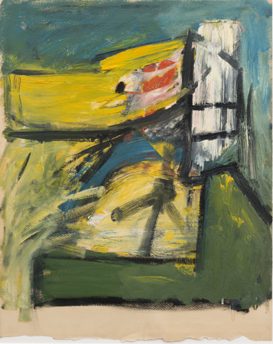
untitled, c.1950’s, oil on paper, 25 x 20 inches
The current exhibition at Elizabeth Harris Gallery in New York City presents abstract oil paintings by Pat Passlof from the early 1950’s through the end of the decade. At the time this work was made, Passlof was only in her twenties. Born in Brunswick Georgia in 1928, she sought out and studied with Willem de Kooning at the famous Black Mountain College. Soon after, she took his advice and moved to New York City, embarking upon a painter’s life. In Manhattan, Passlof continued to receive private painting instruction from de Kooning and became close with the painters that populated the 10th Street artists’ community in the early 50’s. Through de Kooning, Passlof met the painter, Milton Resnick, whom she later married. Resnick no doubt introduced the young Passlof to the painting philosophy of Hans Hofmann, whose ideas, collected in The Search for the Real (not published until 1967) influenced a whole generation of painters. The New York art scene of the early 50’s was a hot bed of contention, influence, and personality. And it seems the young Passlof was for a time caught up in the wave, producing strong and ambitious, if derivative, work.

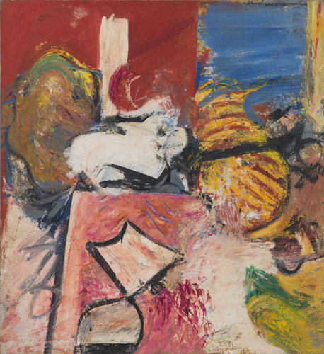
‘Crown’, 1959, oil on linen, 38 x 30 inches
In works such as Crown (1959), Untitled (ca. 1950’s), and Ionian (1956), Hofmann’s tendency to begin with a studio view or still life is promptly detected. In Ionian, the ready pictorial convention of an interior room that opens to an expansive outdoor view is abstracted to the point that portions of the picture plane begin to function non-objectively.
‘Ionian’, 1956, oil on linen, 35 x 32 inches
While the upper right corner seems to recede into a blue expanse, this reading is quickly subverted by a form, flattened by pattern, that seems to enter the room space from a distance but upends the traditional perspective by immediately bringing any such reading to a halt as it is cross cut by a thick, black line. This line induces an abrupt, sharp change in the reading of the space by yanking the yellow and red striped form into the interior space and smashing it flat. De Kooning often created similar speed bumps when he used collaged elements to disrupt any comfortable spatial reading. A tabletop form juts upward from the bottom of this medium-sized canvas into the center of the picture plane. This gives the viewer something concrete to hold onto before the left side begins to dissolve into a field of dappled, frenetic brush strokes that seem at once to merge with and hover above the tabletop. The harsh, alizarin strokes dissolve on the right into one of two truly non-objective portions contained in the work. The thick, white smear, in the lower right joins with scumbled and stained corners whose dirty greens and yellows anchor the composition’s corner one moment and seem to slide under its ghostly neighbor the next. The second non-objective element locks into the tabletop’s far edge at the bottom right of the upper left quadrant of the work. This palpable, white form is bordered and given weight by thick black outlines. The shape itself, the paint application, and the black, white and gray color scheme would feel right at home in one of de Kooning’s black and white paintings from the late 40’s. All of these elements; interior and exterior, natural and plastic, pattern and uninterrupted expanse, all work together to disrupt a common reading of space or to blend that reading with plastic concerns to jolt the viewer from a state of complacency and sureness.
‘Sutbury 2’, 1957, oil on linen, 28 x 34 inches
Other paintings shove the viewer harder and further into the waters of abstraction. Sutbury 2 (1957) is a beautiful wreck of a painting. But even the scribbled and muddy grays that border the work on two sides before barreling into the center contain enough subtly to delineate form and mark off space creating enough surface and vacuum in what would otherwise be a mess. On parts of the surface paint is scraped away so the under painting becomes a form. While in others shape and mass are delineated when a topcoat is painted over a surface carefully so that the under painting then becomes a form and an integral part of the composition. Quickly applied strokes add to the urgency of the work, as does the artist’s signature hastily scrawled across the bottom. These last elements borrow heavily from de Kooning, while the palette combines color combinations often found in the formidable abstractions of Alfred Leslie and Grace Hartigan.

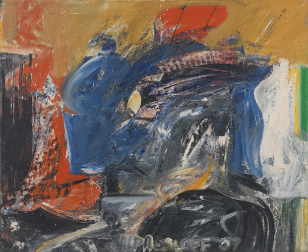
‘Panoras’, 1954, oil on linen, 44 x 37 inches
Panoras (1954) also recalls Hartigan with its clearly outlined forms and its palette of saturated primary and secondary colors. But by the time the viewer is confronted with Promenade for a Bachelor (1958), at an imposing 68 x 68 inches, we find Passlof’s palette softening and her thin staccato brushstrokes burring together. Now in place of quasi-surreal and solid abstracted forms we find an all-over compositional approach, reminiscent of Resnick’s, beginning to take over and threatening to smother the lines and boxlike forms that only a couple of years before were taking center stage. This work is particularly interesting because it quickly paves the way for 1959’s Lookout and Stove. These works act as a bridge to Passlof’s later work and remnants of Stove in particular can be detected in mature, later pieces like the intensely monochromatic Untitled from 2011.

‘Promenade for a Bachelor’, 1958, oil on linen, 68 x 68 inches

‘Lookout’, 1959, oil on linen, 69 x 69 inches

‘Stove’, 1959, oil on linen, 77 x 69 inches
In both early and late paintings mentioned, larger expanses of quickly applied color overtake the entire picture plane. All references to a traditional reading of space are blotted out by what can often appear as a pig-headed gauze that is more rational, clean and directed, as well as more satisfyingly Passlof’s own. Gone are de Kooning’s scrawling and scraping, Hartigan’s clunky stained-glass-like forms, and Resnick’s primordial soup.

untitled, 2011, oil on linen, 60 x 48 inches
In all, Painting’s from the 1950’s leaves the viewer with an incredible understanding of a painter’s development. To see early works by this very young, but directed, artist gives a clear sense of just how focused and intense Passlof was in pursuit of her goal to become a painter in her own right. We can follow her path as she first sought out de Kooning for instruction, then relocated to New York City to continue her studies, and continued to paint doggedly for a decade and more. During that time Passlof consumed and digested her influences. Learned to filter them through her own personality and refined her painting aesthetic until she came into her own as a painter. Just as it should be.
Pat Passlof: Paintings from the 1950’s is at the Elizabeth Harris Gallery, New York from October 16 to December 20, 2014. All images courtesy of Elizabeth Harris Gallery.

installation at Elizabeth Harris Gallery
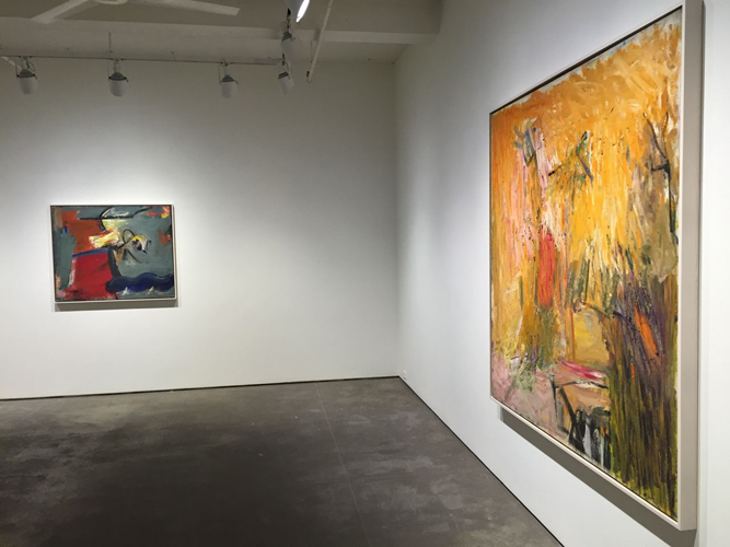
installation at Elizabeth Harris Gallery
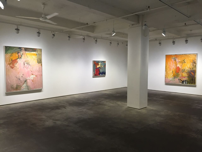
installation at Elizabeth Harris Gallery

installation at Elizabeth Harris Gallery

Thanks for posting. Great overview.
LikeLiked by 1 person
As a New Yorker who’s been able to see the show at Elizabeth Harris, I want to endorse heartily everything Paul says—everything except the last sentence/incomplete sentence: “Just as it should be.” I don’t see the show as a neat and tidy package up simply to be praised.
The Passlof show shares “center stage” in New York with a big Chris Ofili show up at the New Museum now and a big Robert Gober show at MoMA. The big museum shows are getting “all” the attention. Is it fair simply to blame Jerry Saltz for this? (That’s my favorite solution.) Might it not be wiser to ask some questions about the Passlof show? Is the set of “influences”/”precursors”/”models” presented by the show—and by Paul—not kind of narrow? What about content in Passlof’s work? What is it? Is it not somehow “restricted”?
Mark Strand, a terrific American poet, died Saturday. Paul has a nice memorial entry up on his blog: http://structureandimagery.blogspot.com/. Strand’s Collected Poems was just published in the States. Here’s a link to a great interview/conversation between Wallace Shawn and Strand: http://www.theparisreview.org/interviews/1070/the-art-of-poetry-no-77-mark-strand.
Shawn begins the interview talking about poetry in the way many people talk about abstract art. “I started reading that thing that that guy wrote about you. But it upset me, because he kept talking about the themes of your writing, and I didn’t get it. I don’t think I really get the concept of “themes.””
Later on Strand says, “So a poet describes that point of contact: the self, the edge of the self, and the edge of the world. That shadow land between self and reality.” Might it not be useful to think about Passlof’s painting in the context of Strand’s poetry? Maybe there are other contexts which might allow us to see more in Passlof’s painting.
LikeLiked by 1 person
I am not familiar with this artist’s work, it looks very interesting and she seems to have a seductive use of paint. The gallery images point to a well curated layout, would this exhibition be touring the UK I wonder? Passlof ‘s later paintings seem to have roots in nature ( one of Ben Wiedel-Kaufmann’s categories in his excellent essay on abstract art) and there seems to be a glow and light quality that I imagine would draw the viewer in.
LikeLiked by 1 person
The focus of the show could be seen as narrow although I don’t really view it that way. Her influences etc. as presented were the most exciting painters working in the most exciting scene at the time. Content in her work cannot be measured by content in work by artists like Ofili and Gober. They are products of a different world.
LikeLike
Careful, Paul: you’re beginning to talk about Pat Passlof as if she were a Proper Lady who came from a Proper family and who went to the Proper schools. (Maybe that’s what Robin’s suggesting too.) She went to Black Mountain and then quit after a few months—and then kind of spent 10 years “studying” on her own. No quick MFA for her! I think her “influences”/whatever were undeniably narrow, but her engagement with these “influences” was whole-hearted, very intense, very deep. She came out of her “apprenticeship” not just with a voice of her own, but an ability to speak to the World, the Whole Big Wide World. I’m not sure what you’re saying when you talk about “measuring” content. I am sure Passlof’s paintings live in the same world Robert Gober’s work does, the same world Chris Ofili’s work does. Gober and Ofili are youngsters. Maybe there’s a sense in which their work “contains”—as every artist somehow (consciously or not) responds to everything that’s been made before—Passlof’s. Having just said that, I’m thinking: both Ofili and Passloff use bright colors: funny how Passlof’s color “contains” Ofili’s (and more). . .
One more thing about the World: it “contains” all kinds of things: good painting, not so good painting, abstract painting, not-abstract painting (wait: maybe there’s no such thing!), poetry, music, etc. Good painting is definitely better than not so good painting. I don’t want Robin ever to stop making the demands he keeps making about painting and spatiality. But good and bad/”measuring” (in your sense of the word (maybe), Paul)—those aren’t the only ways of looking at a painting. You can look at “Promenade for a Bachelor” through Mark Strand’s poetry, and get a big kick out of the painting and the poetry. I bet other people can come up with lots other ways of connecting with Passlof’s painting.
LikeLiked by 1 person
“you’re beginning to talk about Pat Passlof as if she were a Proper Lady who came from a Proper family and who went to the Proper schools.”
Not at all. What I’m saying when I write that she came from a “different world” (maybe I should have said” time”) is that I’m always wary when we view another generation’s work through the filter of our own time. Sure, there is value in that at times. But that would have been a different review. To compare her “content” to that of two artists that passed through Conceptualism, Minimalism, and many other ism’s doesn’t seem relevant to these early paintings or the way she thought about them. And if she’s comes up lacking in that comparison then it’s unfair. Apples and Oranges (is this an incomplete sentence?) Back then content was largely the gesture, modernist formal concerns, and grand or personal themes. You can’t judge the validity of that next to the myriad social, political concerns in Ofili’s and Gober’s work. That’s what I mean by viewing her too much through our lens.
“You can look at “Promenade for a Bachelor” through Mark Strand’s poetry, and get a big kick out of the painting and the poetry. I bet other people can come up with lots other ways of connecting with Passlof’s painting.”
Of courseyou can. There are as many ways of connecting with an artist’s work as there are people viewing it. But as I said, that would be a different article and not my initial response to this show.
BTW, Passlof did receive a Bachelor’s degree from Cranbrook Academy in MI.
LikeLiked by 1 person
A great article about a very important era of American painting.I was a student of Hartigans in Baltimore in the 70s and very much taken by the real painters,such as Resnick,Passloff ,Ruth Miller,Dugmore.Unfortuneatly much of the work now looks a little like the Aurbach/Kossoff/Freud school in the UK,overworked,overpaid and uninspiring.It lacks a crucial clarity of intention ,however worthy the floundering looks in the photos.I have a very clear notion of the reason for my works being ,even if I cant always acheive it .Content is a red-herring .The aim of Abstract Painting is to state ,clearly and unequivically ,the condition of being alive in the noughties ,with all its complexities.Difficulty ,complexity,confusion are my breakfast but by the end of the day ,I have to turn that into a blast of consciousness that is overwhelmingly positive.Im sure Passloff felt the same way and I would be straight round to see this show if I was still in New York.
LikeLiked by 1 person
“Content is a red herring.”
Not according to Robin Greenwood: “[C]ontent is, less narrowly, the sum total of everything that the work ‘does’ or ‘says’, plastically, spatially, physically and visually. In abstract art (if not in figurative art too), the content denotes what you get out of the whole thing, what you might see and feel at the time, and/or take away from the experience; what it ‘means’, if you like. This is necessarily vague, because real content in visual art is not easily verbalised or written about.”
When you talk about a “crucial clarity of intention,” Patrick, I think you’re talking about content. The late/’58/’59 paintings in the show are wonderfully “clear”—maybe, as Robin suggests in his comment just now, the “clearest”/best work she ever made.
Great that you bring in Auerbach, Kossoff, Freud, and Grace Hartigan, and Ruth Miller. I can’t go along with what you say about them, but it’s a start. Next we need to talk about specific paintings. . .
LikeLike
Great definition.
LikeLike
Though, I think content can be a red herring in the sense that (according to this definition) it’s so subjective.
LikeLike
Excellent review.
Your reference to Hofmann, De Kooning and the New York school give us an excellent insight and understanding of Pat Passlof’s work and her influnces, the ideas Artist were sharing and the times.
LikeLiked by 1 person
“A note to Patrick Jones, and others, on ‘red-herring”
Always intrigued by “neither fish nor fowl nor good red-herring”, a phrase that comes back to me when confronted by those cross-over creations;- Rauschenberg’s goat, for example, that appears through an auto-tyre as “part” of an art-work. Progenitor, is it not, of much recent studio practice that has been recently exhibited and talked about and promoted on the old Abstract Critical and other sites ?
So I was pleased to see red-herring advertised as “HERE”, in a fish-monger’s window, on a recent visit to Great Yarmouth. Never having previously had the good fortune to sample these, I stepped in and duly purchased a pair. They are, I was informed, doubly smoked, are largely for the export market, mainly for Africa, where the extra curing ensures they keep good for a long duration without necessity for refrigeration.
For my own part, I have to report, I found them to be somewhat dry, over-powering even, and tasting mostly of smoke.
LikeLike
These paintings, though I’ve never seen any by Passlof in the flesh, look in reproduction both attractive and familiar. I guess a lot of that is down to the influences from which they derive. I wonder if she knew of Alan Davie, because the earliest ones remind me a lot of his semi-figurative work from the fifties. I don’t dislike them, but I don’t think they rank anything like as highly as Davie’s best work, which is more original and inventive (http://abstractcritical.com/article/alan-davie-space-and-spontaneity/ ). She would appear to have been dragged along a little through all her changes of style by the stronger personalities she came across, but she does appear to have had a genuinely visual talent. I feel I’m damning her with faint praise, because though I’d like to be more supportive and positive about the apparent authenticity of her painting, I can’t muster huge enthusiasm.
Her more recent work, of sketchily-painted grids and webs, which I have looked at also only on the internet, I find a disappointment after the partial promise of the earlier stuff. Wobbly grids in restricted colours are pretty ubiquitous in abstract painting. And whilst I applaud the sense of her wanting to make her painting more abstract, and lose the semi-figuration that is part of the Hofmann/de Kooning ‘package’ she starts from, it comes back to the ever-present dilemma in abstract painting: deep and dramatic space is (often) ambiguously figurative; shallow space and surface is (often) flat and disappointing. This dilemma shouldn’t entirely preclude making good art – it may lead through resolution to something really exciting – but it does make for difficulty in really pushing genuinely abstract painting towards spatiality. Passlof appears to have accepted a little too easily and passively the limited tropes and methodologies common to a lot of modernist painting. She seems to have ended up making ‘painterly’ patterns – though my lack of knowledge and direct experience of her work might mean I am doing her a serious injustice. The best of the work in this show looks to be ‘Promenade for a Bachelor’, which looks like it may be opening out the whole thing.
P.S. to Patrick: trying to paint the condition of being alive in the ‘noughties’ is obviously where you are going wrong. We’re in the ‘teenies’ now.
P.P.S. to Patrick: if content is a red herring, I’m kippered.
LikeLiked by 1 person
I should know better than to mention fish on this site where articles and comments can often smell a bit .I felt bad after I posted mine because Im dissing another artists work ,who has more than enough pedigree ,talent and authenticity.Im just personally not interested in the rescuing sludge,yellow ochre that seems endlessly deep etc.[alan davie review abstract critical].I think Matisse asked us to paint with more clarity and invention.Even Hoffmann built his own Celestial Jerusalem out of coloured blocks.Its a problem of Abstract Expressionism and expressionism in general. Pollock and Louis addressed this by not touching the surface with a 6 inch brush at all .Ill stick with Greenberg on this not Rosenberg who supported De Kooning.Thank you for the heads up over the date Robin .Ive realised for a while now that Im back in my teens.No cod sympathy
LikeLiked by 2 people
Nice piece, Paul.
Having just seen a show of Jack Tworkov’s drawings, a larger show of Resnick’s work, and now these images of Passlof’s work, I’ve come to the conclusion that, yes, deKooning was a profound influence on his contemporaries. But I have also concluded that deKooning, now elevated to God-like-status, has been given too much credit for approaches that were practiced by a lot of artists simultaneously.
Unfortunately as a result of deKooning’s apotheosis, its become difficult to look at works like Passlof’s without seeing/thinking of it as simply being derivative. If it is indeed derivative, we need to acknowledge that abstraction, unlike forms of representation has a kind of “style” problem inherent to it.
LikeLiked by 1 person
Nice to see you on Abcrit, Alan. I’m intrigued by your post – can you elaborate? What is the ‘style’ problem, and how is it different to figurative art?
LikeLike
Robin,
Not terribly long ago I saw a late career retrospective of an elderly Chicago artist who basically spent his whole life imitating the work of other abstract painters. I liked his show, but mainly because his work reminded me of similar paintings by other better artists. There was a bit of deKooning, a bit of Miro and even some Mitchell and Motherwell all thrown into the mix. I find that this easy “style-spotting” happens a lot with abstraction, but less so with figurative or representational art.
While “problem” may not be the best term for it, it’s indicative of a real phenomenon that seems to plague particular forms of improvisatory abstraction. Why is it so hard to be influenced by an artist such as deKooning without appearing to merely imitate him?
In representational or figurative works, style arises as a byproduct of technique; it’s the unique spin an individual artist puts on commonly understood processes. I can teach two students to compose and execute a portrait in exactly the same manner, and given enough time and investment on their part, natural variations in the application of the technique will, in a few years, yield style. In representational painting technique is useful because often the objective is credible spatial relationships and depictions of commonly experienced objects. Technique makes that possible.
In abstraction, technique isn’t necessary to the degree it is in representation, and more often than not, it’s a hindrance. Style on the other hand, is abstraction’s life-blood. The ability to recognize a Pollock or a Rothko at 30 paces is a large part of the works’ (and the artists’) prestige. Pollock and Rothko’s style arises not out of individual variations in the application of a shared technique, but rather as the result of a series of “accidental” occurrences unique to their situation. Their style becomes autographic, it’s style in absence of technique. Or perhaps more accurately, style and technique fuse and thus become indistinguishable.
So abstract artists that come after (Passlof or Resnick for example) are influenced by deKooning’s style, not his technique. Because the visual problems they’re trying to solve are not common to one another, the results look derivative because all they are is a kind of homeless style. Style as a result of technique developed to arrive at a style. With a lot of time and struggle, the good ones like Resnick and Passlof will eventually work through it and arrive at a style all their own, but many others never will.
That’s not to say that this doesn’t happen in representational work as well. It does, and I’ve seen enough bad Caravaggio knock offs to prove it. But the fundamental problems of representation (depicting space and objects in a credible way) preclude paintings based solely on the imitation of style. That massive Caravaggio knock-off at the Art Institute of Chicago may in part be an imitation of someone else’s style, but dramatic application of chiaroscuro without the technique underlying it, wont add up to credible painting, except maybe by accident.
Conversely, one might plausibly arrive at a good or even great improvisatory abstraction in the absence of any technique because the goal is simply a series of stylistic markers arranged in a visually pleasing way.
Of course this is a simplification but the difference is real. I apologize for this long reply, but I was trying to do the idea some justice.
LikeLiked by 2 people
Hi Alan,
Maybe. And I understand what you are saying about de Kooning. But the fact remains that Passlof did seek out his instruction and was taking private lessons from him at the time. In light of this I think one can safely say these are derivative of de Kooning.
And I’m not sue I know anyone who was painting like de Kooning in the 50’s that he didn’t influence. That doesn’t mean you are wrong though- just that I’m not aware.
Of course much earlier he was under the influence of Graham, Gorky, Picasso, Miro, etc. So no one is immune.
And you must not forget that when these paintings were made Pasloff was very young. Most of us have made our share of derivative work at that age. I didn’t intend to use the term as a slight but as an illustration of her development.
BTW was the Resnick show you mention the one at Cheim and Read a while back?
LikeLike
You’re absolutely right, and I don’t think it reads as a slight on Passlof in anyway. I’m in my 30s and I hope to be free of making really derivative work by the time I’m 50. By the time I’m 60, I hope to be making some real art. Commitment to abstract painting demands long and repeated trips to the sauna! (see my lengthy comment in reply to Robin)
The Resnick show I was speaking of is actually still up here in Chicago through the end of the month at Mana Contemporary. I did see a pretty impressive Resnick show at Cheim and Read maybe in late 2011? It was right around the time of the big deKooning retro. It was late 70s work, the gray slabs, I was frightened by them at first, something I always take as a good sign.
Looking forward to more of your writing.
LikeLiked by 1 person
I think the conversation is taking a vital turn in highlighting the process of being engaged with painting ( or sculpture ) . It might even take more of a lifetime, than reaching 60, to start producing work that is not influenced by another, and real . To make very credible paintings while under the influence and move on to a personal vision seems to be something Passlof has done successfully. I suppose the pitfall with developing a style in abstract art, if it really works and becomes lucrative, is that one can get stuck in it ( I know this is obvious , but it often happens, even with good artists). The thing is, choosing artists to follow is an important part of the process.
LikeLiked by 1 person
HI Noela- You’re right. I think “walking in your own landscape”, as de Kooning described it, takes a lifetime. I’ve been painting nearly everyday for the last 22 years. I just turned 49 last week and still feel I have a very long way to go. So to me 60 seems a bit optimistic.
I think to key to moving forward and developing is not worrying too much about a “career” or sales. Painting has to be separate from making money. This isn’t something that academia stresses.
LikeLike
A couple of things I’d like to unpack a little. First, this rather insightful passage from Alan Pocaro:
“In representational painting, technique is useful because often the objective is credible spatial relationships and depictions of commonly experienced objects. Technique makes that possible… In abstraction, technique isn’t necessary to the degree it is in representation, and more often than not, it’s a hindrance. Style on the other hand, is abstraction’s life-blood.”
Just ignoring for a moment the rather interesting but populist and academic notions that representational painting is dependent upon technique and abstract painting dependent upon style – and I’m sure Alan is not suggesting they are wholly dependent – I want to ask straight away why “credible spatial relationships” (though obviously not “depictions of… objects”) is not an objective of abstract painting? If abstract painting is to be spatial, doesn’t it absolutely have to have “credible” spatiality? Or is abstract space in painting different? Is it in-credible or ambiguous? Or is abstract painting not really spatial?
As I’ve argued before, I cannot get my head around “abstract” space. In painting of any sort, space seems to me to be a representation of something we know of as a real three-dimensional experience; or it’s a kind of two-dimensional, lateral “spacey-ness” on the picture-plane; or it’s a metaphor. That may be my bias as a sculptor, because in abstract sculpture, you make real spatiality (albeit under the sway of different kinds of illusions, mostly physical). I’d like to hear other opinions about this, particularly from painters who use colour spatially.
In response to Paul’s earlier comment about content:
The assessment of content is, for sure, subjective. But, perhaps paradoxically, subjectivity and the evaluation of deeply-held feelings about our responses to art are not only the only true things we have to go on, but they are central to forming a more objective appraisal of real and actual achievement. The trick that solves this paradox is to keep ones opinions open to “updating”. Tastes might go in and out of fashion, and contexts might change, for sure; but the art is what it is, and the artist has put into it what he/she has put into it. Whether we can get a feel for what is really going on is another matter, but that is the intention; to form a more objective opinion about what the art is actually doing, the answer to which, with art of any seriousness, will undoubtedly be manifold and complex. But that should not be confused with the idea that all opinions are equally valid, and that therefore all interpretations of art are inevitably subjective and inviolable in the last resort.
Accepting that our responses to the content of art are initially subjective does not preclude having objectivity as an aim; nor does it mean pandering to everyone and anyone’s most puerile interpretations, including our own; hence we need to test those feelings for authenticity in the spotlight of some sort of public domain. So here, in our meagre fashion, we are…
The fact that we are talking about abstract art only sharpens the requirement to distinguish between content and subject matter, since we don’t have the latter. In my (subjective?) opinion, you can and should be able to compare Passlof with Gober or Ofili or anyone – Rembrandt too – provided you are comparing content and not context. All visual art benefits from being put in the same boat – provided it is not a contest, but a means towards better understanding.
LikeLiked by 1 person
Thanks to Paul for drawing attention to this artist whose work is new to me. I also felt a Davie vibe in the colour – mainly that scribbly black infused look. These are more modest in size and ambition though. I can see the derivative angle when compared with De Kooning too but I am not too fussed by that and happy to enjoy them for what they are. They have a sparkiness about them in spite of being entrenched in easel scales . Sometimes those dragged muddy brushstrokes – which is a signature style of a lot of paintings from this period – can look a bit laboured. I quite liked “Lookout” which has a freshness (albeit on screen) about it. As to Robin’s point about abstract colour space… Try comparing a Matisse and a Derain of the exact same scene and in the Matisse, the colours have a deeper synthesis and through their interaction create a summative luminous surface. Your eye can travel in, around and through Matisse’s spaces if you look to do so but you can also float above them and at no point feel you are going to fall. The colour holds you. This is what abstract colour at its best should aspire to. It’s a huge mountain to climb as Paul and Noela’s admirable Hokusai style comments affirm. Abstract painting has to invent from scratch. Formats are a sort of chair-lift. They help to get us up the ascent but with hindsight they feel lacking somewhat due to the mechanical intervention. Time to get our boots on perhaps….
LikeLiked by 2 people
There is some excellent stuff here,thanks to Pauls insightfull review,so Ill tread carefully.To be honest I am not in the least concerned with Space as an obsession in Painting .I accept the shallow depth interplay available within my own Abstract painting lanquage.I am much more concerned with colour choices, as Emyr rightly flagged up in relation to Matisse. However ,more than anything,Im obsessed with wholeness,in the same sense that Pollock addressed with his all-over method.I dont think Painting has changed much since the 50s when Passloff painted ,or since Cezanne.Its what we individually do with it that is paramount.
LikeLiked by 1 person
” Learned to filter them through her own personality and refined her painting aesthetic until she came into her own as a painter. Just as it should be.” Absolutely!!
Thank you for a wonderful review on the work of a great painter..Pat Passlof. I am in awe of the beauty in her painted imagery and…like Grace Hartigan….her determination to define and create her own aesthetic voice.
LikeLiked by 1 person
Thank you Paul for your review. There’s a strand here that I find interesting, and it is taken up in some of the comments, namely how abstraction might be learned through a process similar to an apprenticeship. Arshile Gorky comes to mind for me as an artist that may have followed this as a strategy, his early paintings being ‘derivative’ for the purpose of learning, His method, (and from your description, perhaps Passlof’s also), seems to have involved imaginatively stepping into an exemplar’s shoes, and ‘becoming them’ in order to learn their approach and, dare I say, technique? An academic version would perhaps be the practice of transcribing the work of an admired artist, an outside-in strategy. The method I am imagining, is inside-out, the learner attempting to identify at a psychological level with the artist, to ‘think his/her thoughts’, and then to paint from this state.
LikeLike
Many thanks for this excellent piece Paul. It is refreshing and nourishing to read some wonderfully descriptive writing on paintings that I am unfamiliar with and can only see here in reproduction.
These early Passlof works instantly called to mind a tweet exchange between Robin and I concerning Matisse’s Goldfish and Palette, 1914 (MoMA, © 2014 Succession H. Matisse / Artists Rights Society (ARS), New York)
Robin responds to the image…..
RG. “A great painting. I wonder how many imitations it’s spawned. But you can’t do it again, and it’s part of the end of figuration.”
JB. “But what became of ‘proper’ abstract ‘all over’ painting though, or colour as be all end all? Dead end?”
I go on in ernest Boy Scout fashion….
” Is it ‘figurative’ to want more varied shapes, contrasting visual rhythms & surfaces in contemporary abstraction?”
This chat goes on with more interesting rejoinders from others too……
But maybe this exchange lays bare my difficulty with abstract painting that seems to solely be about ‘colour’. What I get from a painter like Gary Wragg, for instance, is as much to do with drawing and structure (and structure’s undoing) as it is with colour per se. there is some kind of exciting irritant duality in the interpenetrations of colour and shape- something to do with contrasts in rhythm and pace (de Kooning?). Is it the impulse to draw- to draw in, on, under or through the paint that keeps Wragg’s work shifting in unpredictable ways? Is this the same kind of excitement and immediacy I’m getting from these Pat Passlof’s paintings?
Greenberg tried to put down de Kooning’s (and other’s) influence as a harbinger of “homeless representation”. This term does suggest some negative connotations; a sort of an ‘impure’ kind of painting with essentially ‘no where to go’, an art that is lost to itself …. And indeed, it’s interesting how other comments here pick up on the muddy aspects of these early Passlof works. Personally, I like their toughness, for me Passlof’s painterly ‘homelessness’ is a searching, probing and questioning one. I also like the idea of ‘dropping out’ from Greenberg’s deterministic, historically driven striving toward some notion of ‘pure’ painting- with it’s ultimate flatness and ultimate colour etc etc.
Robin is of course right to suggest we can’t go back to the end of figuration but nor should we pay lip service to that totalising myth that colour is the only thing left to abstract painting. I get uncomfortable when the rhetoric around colour seems to become all ‘churchy’ as though we’re talking in hushed tones about stained glass windows in the West’s great houses of worship………
It has been fascinating seeing how artists wrestle with their ancestry and visual family ties in the Brancaster crits. Many of these issues are being sensitively worked through by the participating artists. I see it as a double challenge; to, all at once, question the hegemony of abstract painting’s ‘post painterly’ inheritance and, at the same time, move on from the empty rhetoric and theatricality of much gesturally driven painting- and do all this in original and surprising ways…… It will be very interesting to read the Brancaster crits coming up on the painters Patrick Jones and Nick Moore in all these respects………..
LikeLiked by 1 person
I agree with you about colour, John; it doesn’t seem enough by itself, you have to make it do something in the service of content – but what? Colour wasn’t enough in itself for Matisse, but then he had figurative subject matter, and the spatiality of the ‘Goldfish’ painting you refer to relies a great deal on its figurative architecture and how we read that space, and how that three-dimensional space is resolved by Matisse in two-dimensions. Take out the ‘figurative’ and you take out the tension and the resolution and replace them with ambiguity.
I don’t agree about the drawing; I don’t think that is an alternative to unstructured colour. I think too much of that is to the detriment of Passlof, de Kooning, Wragg, Bunker… but that’s another argument.
To Patrick and Emyr I would say: If you are so into colour that you are interested only in making a ‘summative luminous surface’, and you also want to shed both figurative references and ‘abstract’ formats, how are you going to ‘invent from scratch’? How are you going to abandon configuration without abandoning spatiality? A ‘surface’ is not the least bit interesting as painting, is it? Well, even if it was, it’s been done to death, surely.
There was an interesting distinction made by Patrick about Hilde Skilton’s painting on Brancaster – he distinguished between a spatial painting and one that had luminosity. He favours the latter, and it sounds like Emyr does too. Is this where it’s at with abstract painting?
LikeLike
I apologise for brief posts at the moment . l felt it was a shame you couldnt post images on abstract critical and now abcrit.If you could I would post the Morris Louis veil show thats just finished at the Mnuchin gallery in New York.I havent read the reviews yet but the images speak volumes to me.Unfortuneatly beauty is in the eye of the beholder and respectfull as I am of Robin and John,I suspect the beauty of the images will put them both off.There is a hidden, hair shirt agenda here,where difficulty is associated with profundity..Great Art should be gob-smackingly beautifull.Everything else is trying and failing.As Pollock says in the biography by Ed Harris,you dont ask a rose what it means.You simply fall over at the aroma. Link http//www.Mnuchingallery/morrislouisveils -images plus 6 reviews
LikeLiked by 1 person
reading with interest
LikeLike
Each time colour decisions are made, I would try to avoid taste and aim for luminosity, by that I mean the result of how they interact – or at least the ambition I have when deciding upon the colour. By surface I simply mean that the whole thing needs to be active and end up working together. I am not suggesting a miasmic soup. Each colour can have a different facture to it and that’s of interest to me.. Furthermore I don’t think dealing with colour means you can’t build space into the work. Space will happen through the colour, but it is surprising. When you try to control it, it tends to lead to tonality – a sort of predictable and predicted space. Colour can ‘breathe’ or it can look turgid and there’s a whole range of degrees in between. You can set up systems and so forth and find ways to describe them, but I think its simpler: either the colour adds up to something greater than its parts or it doesn’t.
LikeLiked by 1 person
Reblogged this on patternsthatconnect and commented:
Lots going on over at ABCRIT. Paul Behnke writes on Pat Passlof.
LikeLiked by 2 people
Thanks Andy!
LikeLike
I saw the show today and was surprised at how beautiful the surfaces were. Informed by de Kooning certainly but for a young painter to possess such subtlety was impressive. It’s a large show and even the over flow works in the back room consistently sustain the quality. I wasn’t expecting this in a show of early works.
I suspect that the prime motivation for these paintings is painting itself; they really deliver the brushwork and that’s not something that carries in the images above.
It’s a shame that Passlof is not considered more highly. I wonder what other painters are out there to discover from this period. I would like to see more from Passlof, Mary Abbott, and Shirley Goldfarb to start; there must be more.
LikeLiked by 1 person
I remember posting a comment on the old Abcrit site about Larry Poons and his ideas about light in a painting creating something new and surprising every time one experienced it. The trick of light does create spatiality , but surely the gift of working in an abstract format is that no rules should apply, and spatiality need not always be relevant ? Or is spatiality something that makes a painting successful?
LikeLike
I enjoyed the article and the images of Pat Passlof’s work and the ensuing discussion.
We have to break down subjects (art as colour, shape, texture, structure, etc etc) to understand them better and yet I think we have to keep both the parts and the whole (I’m thinking here of the individual object in front of us) in mind as we go, which is pretty tricky, and we will be forgetful at times.
So we shouldn’t get stuck in polarities – as if we had to choose between the ‘hair shirt’ creation of art as continuous struggle and angst versus a natural self expressive profundity that produces beauty. One polarity that’s worth breaking is between critical reflection and questioning and expressive (spontaneous?) uncertain action – as artists we need both and the problem is what when – what’s appropriate?
Ultimately we have the slightly separate question of critical judgment. And again we have to have both thought and feeling, don’t we? It’s not enough just to have an intellectual reasoned justification of what we experience? Neither is it enough to have an emotional reaction with no connected thought and justification. Both extremes will fall short in the end.
The very best of paintings, for me, have a chaotic everything bar the kitchen sink involved in an overall fantastic structure. Packed with variety, rejecting overall simplicity and repetition, that have me emotionally and intellectually gob smacked as to their achievement.
They also repay a long term relationship with new intellectual and emotional discoveries that relate to their complexity (just responding to their beauty alone won’t last; see human relationships as a parallel).
And, I hesitate to say, I tend to feel and think that good complex paintings are, in some way, connected to the troublesome ideas of progression and originality (if not authenticity).
I should also say that I take all of this with a healthy pinch of salt.
I think I would enjoy the Passlof show but it doesn’t look the best of 50’s painting (a very strong era).
We’re nearly in 2015: where to now?
LikeLiked by 1 person
Wise and considered words, as ever, from Mr. Pollard. I do like this: ‘They also repay a long term relationship with new intellectual and emotional discoveries that relate to their complexity’ Oh yes.
So if it’s all about beauty, Patrick, and beauty is in the eye of the beholder, then that’s ‘end of story’. We can pack up this pointless discussion. But, as John P. might suggest, a mixture of ‘truth’ and beauty is a better long term bet and a far more complex set of issues to boot, not all of which are subjective, and many of which are worth airing.
I would make two brief points about the ‘beauty’ thing. Much as I find it impossible not to like certain Morris Louis paintings (though the ‘Veils’ are the least of them), they were ‘then’, and this is ‘now’. You cannot revisit them any more than you can revisit the beautiful aesthetics of the Matisse ‘Goldfish’. Abstract painting has to re-complexify at the moment, and this has nothing to do with adopting a ‘hair-shirt’ approach, or a work ethic, or a wish to return to the sludge of fifties British art. It’s to do with finding new ways to be lucid and clear that don’t involve cliché and banality. I would suggest that engaging with ‘spatiality’ over and above any considerations of beautiful surfaces is one way to do that, but that is only a suggestion that I’m punting out at the moment, because I don’t know the answer. Maybe ‘luminosity’ is a better bet…
But if it’s all about beauty, Patrick (a stance that provides you with some very odd bedfellows – you and Dan Coombs are in the ‘beauty above all else’ camp http://abstractcritical.com/note/all-overness-polke-and-richter/ ), where does something like the sculpture of Mark Skilton fit in to that scheme? He has made over the past couple of years some of the best abstract art around, but I don’t think it would be quite right to call it ‘beautiful’ – not in the aesthetic sense you mean. It’s as natural and unforced as a Morris Louis (i.e. it has no intellectual pretentions) but is exciting in a much more genuinely involving way, packing as it does bags and bags of sculptural content.
So where now?
LikeLike
John Pollard: “We’re nearly in 2015: where to now?”
Robin Greenwood: “So where now?”
What about looking back as a way forward?
The Passlof show is kind of about finding a way forward by immersing oneself in the past (though a very recent past for Passlof). Last night at MoMA John Elderfield talked about Matisse’s cut-outs as the product of a retrospective look at his (Matisse’s) whole career. Elderfield remembered arguing with his old friend and thesis advisor, John Golding, about whether or not Matisse used cut paper while painting The Moroccans. Then, of course, there’s the Renaissance: a look back at Ancient Greece and Rome.
At MoMA yesterday I also walked through a show of contemporary painting that has the word “now” in its title: Forever Now. So much concern today about “now”! Roberta Smith’s review of the show just went up at the Times website. She makes the point that it’s a show of paintings in “the digital era.” She says a lot of nice, smart things. She’s not an idiot. I am an idiot. I want to push the “digital era” point, and say that the show is all about information (superficial nonsense), and not at all about knowledge (real understanding). Walking through the MoMA show, I just wanted to go up to the Met—though I must say I’d like to see the Mark Skilton sculpture Robin talks about. . .
LikeLike
Every work of art is original (new existing object), every work of art is not original (all genres/styles have been done).
I should reiterate that “everything bar the kitchen sink” complex painting will obviously not guarantee a good painting or sculpture and that there will continue to be good work which is less complex and more derivative.
And I resist being overly committed to any ‘one’ way.
The complex variety argument relates to the future becoming of abstraction, perhaps a kind of synthesis of historical parts. And in keeping with some existential philosophers, future authentic becoming and choice will involve freely appropriating the past (hence some looking back as a way forward Jock) while being pulled anxiously towards an ambitious future.
LikeLike
Do you think you have a commitment issue, John? I can recommend a good existential therapist.
LikeLike
I like to keep my options open………..
LikeLike
Robin,Of course Beauty isnt all ,but neither should it be dismissed,as its a remarkable allusive quality,impossible to ascribe without discussing taste.Several points about this post.Firstly from the photos Paul included,Id take the installation shots as evidence of a show really worth seeing .But then the artists original works Id take in in reverse order,the first my favourite,then losing velocity.We have several mentions of age in relation to progress and Id say to them ,if you want to be great and doing important Art,you better be doing it now .Im well past 60 and Ill tell you it gets harder,not some alysium field.This is to do with raising the bar to supposed accomplishment .Its wonderfull to have this site to discuss what we intuit while working .All I do know is that the result will come from WITHIN THE WORK.This puts enormous pressure on judgments made in the studio .We dont get to be great artists thro social networking,nor in the pretentious museum discussion,nor in going to openings with famous dealers/curators.I saw an artist promoted today as the 10th highest in terms of revenue?The only thing that matters is that we make clear choices over the direction and execution of our Painting and Sculpture within our unique cultural /physical/emotional constraints.The rest is for the birds[no fish today]
LikeLike
Reblogged this on jetude.
LikeLike
Very nicely put,Emyr,particularly about the surprise element in applying colour.This was mentioned by Fred Pollock as ” seeing what would happen if”during the Chronicles,,with his reds,oranges and mint greens overlaid.Which is why a simple format ,like Albers Homage to the square is so effective.Anything more complex can be completely unseated by what colour does,spatially and effectively [emotionally],when butted together.All the theory in the world wont predict what happens visually.Turquoise,honey,violets,burgundy etc.radiate their own light. Colours leap ,jump and generally misbehave,forming their own space.Everything else ,like facture,edge ,surface ,opacity effect the whole .Tone on the grey scale is the most important ,if you want to avoid holes in the surface,depleting the tension so necessary to a good Abstract picture.Much as I love Cezannes card players,Im not interested in carving space in the quarryman fashion.Id rather float like a butterfly and sting like a bee,using the general mayhem.As you say the proof is in the pudding ..,.It would be interesting to have Pauls take on this, as he is an exciting colour painter as well a very good reviewer.
LikeLike
Hi Patrick, I do like the way you said ‘colours leap, jump and generally misbehave , forming their own space’, I would add ‘light’. Colour well handled surely enriches the viewing of a piece of art.
LikeLike
Thanks Noella,95% of what I post is junk as I have to compete with my 3 year old daughters sabotage and the families Xfactor at full volume.Lots of questions for the New Year such as why Michael Fried uses the word Figuration to describe Morris Louise/’s formats.This is such a great site for discussion of things Abstract.Thank you for your participation in the Brancaster debates and some lovely images on your site.My session in Bristol is up in January and Ive learnt a great deal transcribing the response to my paintings.Merry Xmas and New Year to you and All the commentators.
LikeLike
Apologies on joining the party so late but here is some thoughts I have had:
Firstly, thank you Paul for an erudite piece of writing. As for others, the work is new to me, and your lucid descriptions and the photographs as such all I have to go on. Perhaps this is why the conversation seemed to broaden out so fast into a number of more general directions. I wonder if these two strands could be combined somewhat in an analysis of the work. For example, is there something that fundamentally shifts – moving beyond art world allegiance – between the Hofmann interior, the DeKooning speedbumps and the (could we mention Sam Francis or Joan Mitchell?) veiled spaces. Does the movement represent a shift in more than just which horse Passlof backs and something more fundamental in the ‘content’ of the work itself? Can this be related into a wider history of (abstract?) art (between cubist drawing or Greenwood space and Matissean /or HughesWilliamsian colour for example?), and more crucially (for me) – how might we view these shifts and relations within the broader social field. A retreat to the ethereal, from John’s and Greenberg’s ‘Homeless figuration’? A bold advance into a Rosenberg sublime from a Hofmann interior?
I’m sorry I am posing this in loose questions but the reproductions seem an inadequate base on which to pin an argument and the work is in some senses quite removed from my current thinking.
I also like the discussion of space that was emerging. Robin, is not something of the space we are looking at here (at least in the transitional earlier works) not characterised by its ability to be – not ambiguous but indeterminate – to jump between readings. To be both present and absent – two-dimensional and multiply allusive – and could this be seen as a central quality of the ‘abstract space’ you are striving towards a definition of?
Regarding style, objectivity etc. I was struck by a parallel in some writing by Francis Klingender (a mid-century art historian and proponent of realism over and above abstraction) in some of the terms and attitudes being used:
“It is therefore necessary to amplify the previous definition of the function of form in art –the complete expression of the artist’s aim- by stating: to paint, model, write, compose, act, film, etc., beautifully means so to express the particular that it attains general significance. Art is thus a striking and at the same time peculiarly revealing illustration of the key conception of dialectics, the unity of opposites. For in art the particular becomes the general, the general reveals itself in the particular, and it is the unity of the particular and the general, expressed in the unity of content and form, which makes art an inexhaustible source of significant experience….
Style in art, like system in philosophy or hypothesis in science, is historically conditioned, transitory and relative, but if we use the term in the wider sense of a period style (e.g. Greek, Gothic, etc)., there is not a single style in the history of art which has not produced some concrete advances towards the absolute. It is the task of scientific criticism to discover these concrete achievements of permanent significance within their relative and transitory shell…
…the test of relative and absolute truth must never be applied exclusively to the content of a given work of art. It follows from the essential quality of the artistic image as a unity of content and form, that the truth embodied in its content can only have aesthetic significance if it is expressed in a form which strikes the imagination, instead of appealing merely to the intellect. A work of art which carries its message straight to the feelings and emotions of men by virtue of its vivid, concrete imagery, has greater value than one which lacks this vital power, even though the intellectual content of the former work may be less profound, less comprehensive and more encumbered with illusions”
For all the possible dating of the interest in ‘absolute truths’ it seemed to hold some relation to the conversation – and indeed, if we begin to open up Robin’s definition of space, could not this quality of indeterminacy and multiplicity be linked to the fusion of the particular to a more generalised experience..
LikeLike