
Helen Frankenthaler, ‘For E.M.’, 1981, 71″x115″, acrylic on canvas.
Many years ago I was in a dinner party in California given by my cousin. She is an actor and producer and the company she invited was charming and witty and the conversation easy and friendly. I enjoyed it, and it exuded a slightly glamorous atmosphere too, being in a villa overlooking the Pacific Ocean. One comment though has stuck with me to this day: It was when I was asked “Where are you from?” I answered without thinking, “Wales.” One highly impressed person leaned over to me and in almost hushed tones said: “Wow, that is the spiritual centre of the universe.” Now, I am a proud Welshman and I am always pleased if another nationality knows that Wales exists, let alone passes any kind of familiar comment about it, yet this comment was something I did not see coming at all. I smiled and nodded and thought about this statement… we clearly had very different experiences and ideas of Wales. I assumed he pictured a group of Druids, solemnly striding around a circle of stones, in touch with the forces of nature and the general turning of the universe; whereas I suddenly thought of my home town on a Friday night, when a fellow I was in school with burst into one of the pubs and offloaded two blasts of his shotgun into the ceiling. I won’t name names for legal reasons, though I doubt if he is reading this (and that is a sentence with one word too many). You could say his action was the result of a completely different kind of spirituality.
Artists tend to love Art. We go to galleries, exhibitions and openings. When we are not making Art, we are looking at it or talking about it. We look for it online, we participate in forums, symposia and generally surround and busy ourselves with as much of it as we can. It is our visual food. Yet can our love of Art sometimes be our undoing? Clement Greenberg once said: “The superior artist knows how to be influenced.” The question raised is: influenced by whom and – more importantly – in what way?
There are numerous collections of the “World’s Great Artists” in print and although there are sometimes highly debatable inclusions or questionable omissions in these compendia, we tend to have the usual suspects in there: Titian, Tintoretto, Goya, Rembrandt, Velasquez and so on. (What is also notable is contemporary artists would tend to have very different reasons for a particular artist’s inclusion, as compared to the actual writer’s motivation themselves.) The consensus can be at odds with the reasoning.
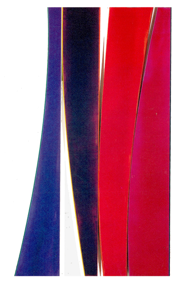
I recently reviewed the enjoyable Turner and Frankenthaler exhibition at Turner Contemporary, Margate for abstractcritical. In that show, there was a stand-out Frankenthaler called “For EM” (an adumbration of a still-life by Eduard Manet of a fish). Frankenthaler often did this – visually quoting the work of a great artist from the past, almost certainly one of the standard inclusions in the hall-of-fame tomes I just mentioned. On another occasion, she titled a painting “A Hint from Bassano”, Bassano’s “The Miraculous Draught of Fishes” being the painting she took the hint from. “Mountains and Sea”, her most seminal work, deserves to be interrogated for its link to Mantegna’s “Agony in the Garden.”
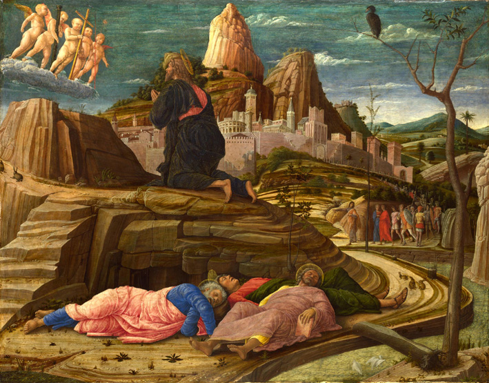
Andrea Mantegna, ‘The Agony in the Garden’, c. 1458, 63x80cm, tempera on wood.
Mantegna constructed a tightly woven undulating space with the rich rock strata pulsing through the picture, leading our eyes into the distant hills. The counterpoint is a right-to-left diagonal that crescendos steadily up to a group of angels wedged ever-so-slightly uncomfortably in the top left corner of the picture. The colouring, as in so many Renaissance paintings, sees rich primaries set off against the warmth of earths. A blazing band of a pink city adds the twist, cooling these earth tones and adding a luminous element that gets us from the red to the blue seen in the robes of the figures that people the space. The interesting thing about this work is just how synthetic it is – a highly implausible landscape and a dramatic distortion of scale. It still has the element of surprise about it.

Helen Frankenthaler, ‘Mountains and Sea’, 1952, 220x298cm, acrylic on canvas.
In contrast to the tautness of the Mantegna, Frankenthaler (in “Mountains and Sea”) washes and swooshes her pigments in a languid-looking way, leaving roughly half the painting with untouched or barely touched colour. Against this ground we see those familiar wristy looping marks, with pink, blue and pale green dominant; the earth remains, but is now relegated to a single ochre wedge just off-centre, with the canvas hue acting as the key colour. We can clearly see the configuration of ‘mountains’, a general business centre stage and an oblique diagonal movement, all a la Mantegna. Frankenthaler, though, opts to send a blue (sea reference) out to the right hand side. This is a clever device as it anchors the whole painting and brings the space up to the picture plane. This painting has passed into Art folklore. It was colourfield painting’s “Moses” moment. The Promised Land was in sight, and it was Morris Louis and Kenneth Noland who entered. From this point on, being a colourist meant neutralising the layout, eschewing the gestures of Frankenthaler, which by comparison are much more related to the abstract expressionists. The ambition now became to give colour a freer rein through cool detachment. New acrylics were developed and the rest is, as they say, history. Suddenly Pollock’s fluency and mural sizes could be achieved and colour opened up. Stains were in.
Noland went on to produce a truly remarkable body of work, characterised by series after series of neutrally formatted paintings. He was always a painter who employed shape, and his use of cropping was intrinsic to his shaping. Circles became stripes with bands of colour finding their limits and edges. These developed into “The Surfboards”, irregular shaped canvases which, simply speaking, had more edges, more possibilities for these limits and more eccentric configurations. Then at the start of the nineties he produced a series called “The Flares”. Seldom seen works, they have all the hallmarks of great Nolands – clarity of colour, generous proportions, an inherent classicism and a satisfying materiality.
Kenneth Noland, ‘Carpintaria Flare’, 1990, 242x141cm, acrylic on canvas mounted on wood with Plexiglass.
Materiality is a crucial issue. In the sixties Sam Golden, working for Boccour, had helped create ‘Magna’, the mineral spirit acrylic. So again, during the eighties, did Golden – with Sam now out of retirement – manufacture a breakthrough product – a whole new range of gels. Physicality was back and with a vengeance. Gone were the now tired looking canvas stain factures and in their place came new surfaces, from delicate glazed skins to ravine-like troughs formed by heavy gelled ridges. Oil paint could not compete with this. The Flares were cool, considered and ultimately Apollonian. They took shaping to new extremes, each part being a different section of colour, joined to its neighbour with linear strips of Plexiglas, which speak to the floods of colour as accent, ever changing their feel as they often switch edging from one panel to another during their arc.
Noland described these shaped works thus: “They are made with hollow core doors as supports, which gives them human scale. They become slabs, chunks, pieces of colour that I put together for pictorial works.” “The Flares” have a wide array of surfaces, from gloss to matte and varying degrees therein. Colour is asked questions: How much? What kind? What shape? What relationship, one to another? Formats are found rather than imposed. Everything seems up for grabs, yet all is reined in by the colour control and surface specificity. They make Ellsworth Kelly’s work look by comparison somewhat overblown and preconceived, in a limiting way. “The Flares” are in my opinion some of Noland’s greatest achievements. I vividly remember a stunning show of them that I saw in California in the early nineties (dinner party time).

Henri Matisse, ‘The Piano Lesson’, 1916, 245x213cm, oil on canvas.
One of these works is called “Homage to Matisse”, a three-panelled work with an understated simplicity. At once we can see the Matisse that is being paid homage to: the fantastic “Piano Lesson”, 1916. Matisse was flirting with cubism during this period and flattened up his works with iconographic severity. This was a work which greatly affected Pollock, with its confrontational flatness. Looking at the Noland, we can see how the green-grey-black relationship has been lifted out of the Matisse; the rose is now transposed to an edge, which acts to light and lift the side of the heavier grey; a blue edges the black and cools it accordingly; the green melts in and out of a fat ochre; these colours react with the blue and again through their infusion at the centre of the painting recall the warmth of Matisse’s grey. Each work shares a powerful diagonal structure. Noland literally cuts his through the painting and it plays against the bellied arc to its left, subtly creating a new “ghost” section. “Homage to Matisse” is cooler and more pinky in temperature than the original Piano Lesson – a subtle change of key, by one of the most significant colour composers in recent memory.
Kenneth Noland, ‘Homage to Matisse’, 1991, 242x82cm, acrylic on canvas mounted on wood with Plexiglass.
Noland has openly discussed the importance of taste, “but the right kind of taste”, and a work such as this comes directly out of a refined, well-educated taste. We can take for granted that his mastery of materials and his colour sense is of the highest order, but compared with others of this period it somehow strikes a more troubled chord. Making these kind of overtly quotational works narrows our experience of colour and seeks to literally choreograph our reaction to it. We can acknowledge context and enjoy the colour, but it doesn’t lead anywhere as exciting as it could, especially given the relative unpredictability of format in these works. Others of this series have magical colour chords with a rewarding volumetric tactility; they have an unfettered freshness about them by comparison.
Around the same time as Noland was exploring curved multi-panel paintings, his friendly rival Jules Olitski was making some remarkable heavy gelled and sprayed works which became known as the “Mitt” paintings. These were baroque in nature, souped-up lizard-skinned swirls of paint. The zigzagged scribble swishes of gel fizzled in and out of corners or up through the heart of paintings. A black coloured top-layer spray checks everything back into a fictive uncertain illusory space which, allied with new nacreous and interference pigments, has the added quality of opulence. Colour is subsumed into powerful gesture. Olitski was a master tonal painter who had a rich sense of colour rather than an out and out colourist, such as Noland. If Noland was Apollonian, then Olitski was Dionysian by comparison. These works were only possible as a result of Golden’s new acrylic paints. (We can find technological precedents such as the paint tube’s usefulness to the Impressionists and Golden as a company deserves an essay for their influence in much advanced abstract painting made since the 1960s)

Jules Olitski, ‘House of Shem’, 1990, 112x119cm, acrylic on canvas.
It seemed surface could do no more. As a point of interest, it was these ultra non-flat works that so convinced Greenberg of Olitski’s stature as the “greatest painter alive.” “Greenbergian flatness” is a red herring; he just reacted to the times and what was in front of his eyes.
Where does one go after these? Back to colour, as it proved. With hindsight, it seemed quite a logical step to see large orbs and dollops of hand-splattered colour left in larger unsprayed and unchecked areas arrive as works after these “Mitt” paintings. It was as if he had come full circle to return to the early flat irregular discs in colour fields, which were first made in the sixties. The disc-like configurations are now revealed through his hallmark – intense materiality.

Tintoretto, ‘Susanna and the Elders’, 1555, 147x194cm, oil on canvas.
Olitski was a keen student of Old Master works. Rembrandt and Tintoretto are often referred to, a series of monoprints worked out of Tintoretto’s El Paradiso and called “The Paradise” being an overt case in point. There is frequently a numinous reference to his work too. The painting I wish to look at is an off-beat reference to Tintoretto’s extraordinary “Susannah and the Elders.” Olitski titled his: “With Love and Disregard: Susy and the Elders.”
Jules Olitski, ‘With Love and Disregard – Susy and the Elders’, 2002, 102x122cm, acrylic on canvas.
This painting has a centrifugal weighting unlike the Tintoretto, who splits his picture space into zones. In the Olitski, there is a switch from yellow to a startling white in the top right, akin to the surprise of seeing the flesh of Susannah, which is cooled with a white, draped cloth. Both paintings compel you to look inwards, deep into the picture. Tintoretto, through the diagonals of water’s edge and top of hedge, and the perspective of the mirror that Susannah gazes into, reinforces this pull. It leads us to the second lasciviously-lurking figure. The closer figure’s circular bald pate creeps around the bottom left hand of the hedge, orb-like. It forms a rounded apex to a cone-like projection that culminates in the curve of Susannah’s body. In this work there are numerous details of delight: the “thieving” magpie, the roses on the hedge, the sparkling leaves cascading down the side of the hedge’s trunk. Figuration has so many possibilities for this kind of rich detail – all worked in here through a logical reasoning. They may be symbolic or allegorical, yet whatever their function the visual construction of the work takes precedence. They must work on the picture’s terms, first and foremost.
So what do we make of Olitski’s slyly laconic reference? Are we to see this as art to compete with an Old Master work? Is this modernist bravado? Has he reached a point when he feels he has the all-round game approach to visually accommodate such a reference? In short, has he got inside the Tintoretto and disembodied it, understood its order and logic? This was something he humbly discussed failing to do with Rembrandt’s “The Polish Rider.” Olitski: “I was going to get inside that painting. I was going to take it apart, open it up like you might an unusual sounding clock to see what made it tick the way it did.” If this was the intent again, it’s a heck of an attempt, that’s for sure. These works pack a punch when you see them in the flesh. Yet the speed within the work and that centralised pull undermine the ambition. Tintoretto was also a tonal painter, yet he gets a lot out of a little. The pared down colour, the chess like placement of incident, the steadiness of it all, pins us back and we are ultimately “out boxed”. You can’t pin this painting down. The Olitski by comparison is more of a beautiful hit, a sugar rush. Those galaxies of colour which so often swim around in their liquidity, merging and cracking, like tectonic plates on a sea of lava, have such a literal physicality that any more functionality is almost beyond them. Technically, blowers were used to physically agitate the paint and produce unexpected fissures and fractal-like forms. It’s ambitious stuff, and there’s a lot to marvel at, but that title does invite another choreographed comparison.
I want to believe that abstract painting can be as great as figuration, but this is a battle that must be fought on abstract art’s terms and not figuration’s. Paying homage feels like a white flag has already been raised, with content being delivered through context rather than visual functionality. Could we surmise then that making these homages is part of paying ones dues in some way to the great art of the past, to be seen to be part of its continuum; to ultimately be accepted on the same kind of revered terms; or will this work eventually become just another page in a book gathering dust on a shelf?
Can figuration really teach abstract art? Artists have always worked from those that inspired them in previous generations. For example, Picasso was famed for his re-workings of Velasquez, Cranach, Manet and others, yet he stayed in the realm of figuration. Once you cross the Rubicon, you must not turn back. We need to find better ways to challenge figurative painting. Compared to figuration, abstract painting is a relative pup, a toddler finding its feet, and as such is want to fall on its face from time to time. I am optimistic for its future though. Yet for it to truly move forward, I can’t help feeling that we have to stop trying to hang on to figuration, even in oblique ways. The relationship between what we see and what we make is a complex and fascinating one. I have avoided discussing sculpture in this article in spite of initially intending to, mainly because I realised it would need a complete article on its own, though my sentiments would remain unchanged. As abstract artists we need to tear out our own piece of the universe to wrap ourselves in. We need to get out of the gravitational orbit of figuration. As an art form, it has produced a cornerstone for all civilizations. Is it now too containing, though? Does it box us in? Maybe a couple of shots through the ceiling will allow us to see space anew. The possibilities are out there, but I don’t think walking around those ancient stones is enough anymore…

Emyr, this is a wonderful essay. Clear and brilliantly straightforward. Thanks. Sandi Slone
LikeLike
Maybe “Homaging” is going to be the new Art buzz word of 2015
Being involved in ABSTRACT art for 40 years I only recently understood that there are some Abstract artists who “do” and some who “don’t” ” Homage” that is.
It would be impossible to dispute the inspirational relevance of the origins of the “Homage” coming from sound academic excellence and a figurative tradition.
Those who “don’t,”in my experience, will inevitably be challenged by their perceived inflated egotistical self reliance by those who “do” but mostly by themselves.Exciting but precarious.
Invention is a key to Abstraction.
Is it possible to achieve a true Abstract art today whilst “Homaging “?
LikeLike
Congratulations to Emyr on a terrific and pertinent article,which I will respond to at length later.It starts off like an express train with a fascinating possible discussion about identity.Altho Im not familiar with Nolands flare paintings,I saw a couple of shows in New York of the spread iredescent gel variety and was deeply unimpressed.They were almost a catalogue of Golden special effects and seem totally meaningless ,except as self -parody.Similarly Olitskis thick paintings in my mind got better the more he moved into Poons territory of the heat cracked gel.I still think Poons painted some of the most original works of this bunch,mainly monochrome like “Railroad Horse” of the mid 80s.To address the Homage idea,I feel it is a weak link if taken too literally ,particularly when moving from a figurative source to an Abstract conclusion.The Frankenthaler ,altho brilliant, is really an assay in Manets colour/tonality.I I have found Abstract Painting extremely testing and difficult because I beleive it demands individual synthesis and resolution ,without props.Imagination.improvisation and experiment is the key.
LikeLike
So at first glance I would think that figuration is important to Absract Art because it seems to show Abstraction how to create narrative catharsis. The thing about the Mantegna painting is that its diagonals and curious scaling are very much there to create *drama*, and I think that’s something valuable for Abstacrt Art to learn and understand, something that keeps abstaction from being a cold, useless placement of obscure forms. What I think figuration understands is how to make the most of the fact that painting is a set of relationships, how to turn formal and visual relationships–through representation, reference, cultural imagery–into a piece that’s not only just eye-catching or interesting, but engaging and meaningful in a fruitful way. Meaninguful in a way that *matters*.
What I’m asking myself is what tools abstract art has to do this. With line, color, form, shape, “space” and placement, it’s arguable that Abstract Art can tap into even deeper, and more primal emotional ranges. Perhaps “getting there” (I get a bit uneasy about the language about “moving forward,” I’m not sure that the ‘dialectic’ of art moves so linearly or progressively), requires some better understanding of what kind of meaning abstract art can, or should be tapping into. If it isn’t communicating ideas through figurative cultural imagery, what is abstract art supposed to be doing? What “social bases” is abstraction keen to touch? And do they matter? I think this would be the point I would link The Social Bases article on the previous abstract critical website, which really helped me through these ideas.
Great piece Emyr! I learned a lot reading this history.
LikeLike
I’d take issue with the ‘red herring’ concerning Greenberg. I think it’s more of a qualified guess as to how he simply “…..just reacted to the times and what was in front of his eyes” and how much he was laying down the law to those practitioners that he championed. It’s interesting that the 3 artists Emyr talks brilliantly about were at different times close to him. I only say this because ‘Modernist Painting’ is itself a brilliant attempt to place abstract painting in a much broader tradition within the history of art. I think Clem wanted to bring painting back into line as a ‘serious’ endeavour as many artists embraced the kitsch and the exploded visuality of the postwar commercialisation of every day life that he had set himself so clearly against.. I wonder if the 3 artists mentioned here were responding to Greenberg’s idea of history (or a general anxiety about it) by gravitating as they did at different times to great paintings of the past?
Having said all that, we come back to these opposing notions of continuity and rupture in Modern art and how individuals and groups wrestle with the past and the future at different points in history. Painting and sculpture as we know them become the precious residue of these interactions. I think it would be bloody minded to believe that there is nothing to be learned from the serious study of them. But what form that study takes for the individual artist is another matter. And what has been learnt from visual traditions that have little to do with the those of the West? A vital yet continually undervalued component of the Modernist syntax?
Modernity seems to be, all at once, a celebration of individuality and originality and a mourning for the loss of some kind of over- arching tradition or philosophy in which you can immerse or lose yourself -almost….and judge others by accordingly. Likewise, abstract art seems to be, all at once, the harbinger of a questing visual intensity and by turns hopelessly tangled up in its own tiny history of forms- or it’s anxiety at its own lack of history, even. To ride this anxiety out, and to keep this tension working positively might be part of the task.
I can’t help but also think of an old art dealer describing a special moment of realisation about abstract art while sitting in a NY apartment with a TV showing a baseball game sometime in the 60s. He described how the TV camera looked down upon the immaculate pitch. From this particular perspective, it took the shape of a perfect chevron, beautifully cut into by different tones of contrasting dirt and grass- and all flattened out on the black and white screen. Beside him sat a very talented artist flicking through pulp detective novels looking for titles for new paintings. Now that’s the kind of history lesson I like!
LikeLike
I agree with Williams that “flatness” is a red herring in discussions of Greenberg. Greenberg was trying to enrich the theory of the medium in its essence by elaborating on that famous statement by Maurice Denis: “Remember that a picture, before being a battle horse, a nude woman , or some anecdote, is essentially a flat surface covered with colors assembled in a certain order.” For Greenberg flatness was a dialectical concept. The surface is flat, but the very first mark on it establishes some degree of spatial illusion and thereby sets up a tension, which the artist needs to resolve To Greenberg, then, flatness is the locus for an essential property of paintings, and it is not a desideratum. If it were, how could he admire the thick paintings of Olitski as he did? Greenberg often complained that his descriptive commentary was often misinterpreted as prescriptive, and that error cannot be corrected too often.
LikeLiked by 1 person
I like what you say here, Ken, particularly about the misinterpretation of Greenberg. He is a writer I much admire, without really caring too much for some of the artists whom he favoured. And I agree with the suggestion that a large part of the job of painting is to resolve its spatial illusions with its two-dimensionality. What I’m much less sure about, as I have written elsewhere, is whether in abstract painting there is enough real spatial content in the first instance to set up any kind of meaningful tension to such a resolution. At the moment it seems deeply problematic for anyone to actually say clearly what ‘real spatial content’ in abstract painting is comprised of. Is it about ‘warping’ the flat surface?
I think, in any case, that one needs to distinguish spatiality in painting from facture. The thick paintings of Olitski do not appear to me to be necessarily spatial because of their thickness of paint, if indeed they are significantly spatial at all. The examples of his work shown here seem to me (in reproduction, though I have seen similar) neither spatial nor two-dimensionally resolved – losing out on both counts.
LikeLike
“At the moment it seems deeply problematic for anyone to actually say clearly what ‘real spatial content’ in abstract painting is comprised of.” Allow me!
Earlier Robin wrote about “a tensioned reconciliation” in sculpture between “the illusions of physicality with its literal objecthood.” I like that. Paired with sculpture’s “literal objecthood” “illusions of physicality” loses its “Shakespearean”/obscure/big-number-of-syllables tone. I can read what Robin wrote as another way of talking about the tension between illusions of depth and the picture plane in painting. (I don’t know whether or not the picture plane should be described as “literal.” I like to think of it as something different from the actual/“literal” surface of a drawing/painting.) NOW I’m sure—I’m CERTAIN—you ALL can FINALLY see that there’s no difference between abstract and figurative sculpture—or painting—that, really, there’s no difference between sculpture and painting. Now you ALL can see The Light. Yes? No?
EVERYBODY at the New York Studio School understands this. And EVERYBODY at the Studio School hates color. (EVERYBODY except the dean, Graham Nickson, a great colorist, a colorist whose color is full of content.) Color is so unreliable, so un-pin-down-able, so dangerous. You can’t talk about it intelligently. You end up talking about “warping” flat surfaces. But everybody at the Studio School loves drawing. And maybe drawing is the key to talking/thinking about ““real spatial content” in abstract painting.” I certainly think drawing is a more useful context for talking/thinking about “real spatial content” than abstraction is.
Not that it’s easy to talk about drawing (but at the Studio School EVERYBODY does): take Titian’s Bacchanal of the Andrians: maybe Bacchus’s boat, off in the distance, is where your eye ends up. The drawing allows your eye to travel through the painting—to take a poetic trip—all the way to the boat, “the focal point:” maybe that’s the “real spatial content” of Titian’s painting. Maybe the boat’s more than just a boat too: maybe it’s just a place deep in space, an unnamable presence—maybe it’s also deep inside ourselves. And isn’t there something similar, another “focal point,” in de Kooning’s Excavation? Maybe just a little to the left of center? No “focal points,” no poetry, no depth in paintings by Noland/Olitski.
LikeLike
I should add no “real spatial content” in paintings by Noland/Olitski. Nice colors though.
LikeLike
As a marker of that anxiety John ,I remember hating the idea that you could overlay a Mondrian and get the shadow of a Vermeer.The idea that you can haul quality from the past into the present through a skilfull use of the diagonal is rubbish we dont need.To me its a sign of intellectual laziness to do Abstract versions of older art.Despite enormous reservoirs of his own talent Caro ,I beleive, came unstuck with his descent from the cross. I was struck by how much Greenberg and Formalism lost power collectively in the 80s,individual artist like Poons being the exception.
LikeLiked by 1 person
One of the interesting issues this essay raises is why the abstract ‘homages’ are all so much simpler than the figurative works they appropriate. Why is abstract art so rigidly associated with a more-or-less geometric simplification? Why couldn’t it be the case that to make a real homage to the Tintoretto would be in fact a more complex task than even the original?
When I was about 17 and at my first art school, one of the tutors gave everyone a transcription project, and I was allocated “The Portinari Altarpiece”, 1475, by Hugo van der Goes. It’s a pretty good painting, though I didn’t see it (in the Uffizi) until quite a few years later. The thing was, even then I thought of myself as an abstract artist, and I had absolutely no idea what I could possibly make that would relate in any way to the complexity of the van der Goes. To turn it into a series of simplified geometric boxes (which is what my ‘thing’ was at the time) seemed a superficial affront to his art and an irrelevance to mine. I abandoned the project in some despair.
In the late seventies/early eighties Anthony Smart set a sculpture project at St.Martin’s to ‘remake’ an Etruscan lion in the British Museum. It was taken up by both students and other members of staff, including Tony himself. The idea was to get inside of the structure of the thing, and by remaking it, try to understand its figurative physicality as a way of enriching and broadening the physicality of abstract sculpture. Interestingly, the more successful works ended up in some ways more complex than the original (this project led inexorably to ‘Sculpture from the Body’).
I loathe the whole idea of abstract artists mimicking the vague geometry of figurative art (or alternatively going through the ridiculous pretence of quoting its subject matter). These works by Frankenthaler, Noland and Olitski look very poor. I don’t care how seminal ‘Mountains and Sea’ is supposed to be, it’s a weak painting, and it led to yet more of the same (semi-abstract-landscape-yuck). In every instance given by Emyr here, the figurative art is, hands down, incomparably better than its abstract parody. I take issue, Emyr, with your geometric analysis of Tintoretto’s ‘Susanna’, for the same reasons I’ve criticised Bridget Riley in the past for deconstructing Titian and Veronese into the very meanest of geometric parts. I see no ‘cone’; I see three amazingly different figures in stunningly-manipulated three-dimensional spaces, along with all sorts of unbelievably great detail and complexity, ranging from the spatial to the psychological, altogether a most fantastically inventive achievement. You yourself, Emyr, eloquently list its many attributes, then draw meaningless lines over it. It’s probably amongst the best twenty-five paintings ever made, and it owes nothing to that kind of ‘abstracted’ geometry. The Olitski, even without making the embarrassing comparison, is a lumpen, blobby monstrosity, with a particularly stupid blue border.
‘Can figuration really teach abstract art?’ Absolutely, but not by this method. When it’s great, like Tintoretto, it teaches us to be ourselves, to abandon all theories and clichés, all formats and geometries, to go hell-for-leather for as much lively and ambitious content as we can lay claim to, to wring out every last drop of articulation out of the things we make, and sod the bloody consequences for ‘refined, well-educated taste’ and all other false notions about art (this is, after all, exactly what the fantastic Tintoretto did). We need to think harder about what ‘abstract’ means, because it damn-well doesn’t mean tastefully ‘abstracting’ something figurative. Nor does it mean imposing geometry onto stuff. It necessitates inventing something new and brilliant, from scratch. You could even say that by this definition, the Tintoretto is the more abstract, because it’s a far, far greater invention in every aspect than the Olitski.
The complex and timeless constructions of painters like Tintoretto are at a level of achievement that we can happily admire and aspire to; walking around and being moved and stirred by those ‘ancient stones’ is fine, provided you don’t start to parrot them. I don’t think that is where the problem for abstract painting lies; it seems more to do with the drag of some very dodgy modernist baggage, combined with what appear to be limitations to the spatial abilities of abstract painting – so far. Even Matisse’s very ‘abstracted’ ‘Piano Lesson’ has (figurative) space in abundance, compared to the Noland. As for the Olitski ‘Mitt’ painting, that is one of the lowest points in any compendium of art history you might care to devise.
LikeLiked by 2 people
I deliberately wrote this short note before reading Robin’s:
I enjoyed reading this, especially the personal interpretations of the paintings preferably in isolation to the whole piece – although we all read paintings a bit differently. I totally agree that even the idea of an ‘abstract/ed’ homage to a specific figurative painting from history is annoying and a strange digression from the matter in hand. Surely we are homaging the whole of the history of painting/art all the time: it really helps to know/think about it. I want to know why things were painted, how they were painted. I want to be able to analyse form, composition, arrangement, design, volume, space, colour…all that and more. And I get to learn more every time I look carefully at good painting and think about it and read about it. But I am not rushing off to spend time looking at Rembrandt in order to go back to the studio and do a dark painting about light. Well maybe I will! But it is not going to be directly about/of a Rembrandt painting – it’s not going to be called A Woman Bathing in a Stream. But I will think about Rembrandt in my studio. I will think about repetition, mirror images, tone, facture, emergence, temporality, engagement, perception…all that and more. And when I go and look at a Piero della Fancesca I will look at the architecture both in the space and of the painting and try and find a connection between the two aspects. I will try and learn/think about its colour arrangements and relationships as well as its geometry and overall topology … and more. But I’m not painting religious paintings for a start and if I did try and use some of the actual elements from a particular painting – say the colour (Noland) or motifs (Frankenthaler) then that would completely wreck ‘my’ whole evolving methodology. The paintings are from something else (and everything around me) so why would I name it Discovery and Proof of the True Cross? That would be obscure, pompous and crazy, however much I had gained from the analysis. Not sure what the word ‘influence’ means anymore with regard to the visual – that and the word ‘intuition’ should be banned for a while. Surely, with time looking, listening to people, writing and reading books, crucial to the whole process, you just want to try and work out why a painting is good so that you can in turn do a good painting? Sam, do you remember what you said about ‘painting about painting’? Mmm – why not? Better than painting about ‘a’ painting…
(and then ‘transcriptions’ – that’s something else… I quite enjoyed my college charcoal attempt at the Battle of San Romano and also couldn’t see the point at the time – but that’s another essay…)
LikeLike
Katrina, thank you, this is very relevant. Would be great to see you at our Obscure Secure final event / discussion at Studio 1.1. on March 1st from 3 to 5pm with Stephanie Moran. http://www.obscuresecureproject.wordpress.com
LikeLike
Since I have joined Twitter recently, and follow a few artists and galleries, I have many images floating in on my iPad. I have a feeling the work by the ‘homagers’ here could quite possibly pass by without grabbing my attention enough to follow them up, if I had not read the title and name first. I really enjoyed reading this essay though , the way Emyr describes the artworks etc. is hugely entertaining, and highlighting a method of working which doesn’t especially produce great results can still be illuminating.
LikeLike
While I agree with the basic premise of Robin’s criticism, I’m afraid it leave us in something of an insoluble paradox. Wouldn’t an abstract space replete with figure-ground relationships as rich and complex as those of the Tintoretto be, in effect, a figurative, representational space?
I’m not sure that comparisons between the ‘laws’ that govern naturalistic representation and those which comprise abstraction are worth making. As I’ve said in previous comments, at their core, these are quite different approaches to image making, with different aims and objectives, despite superficial similarity.
LikeLike
…just remind me of those ‘laws’ again…
LikeLike
Tintoretto is operating under a series of restrictions that govern the way his painting must function -Olitski is not. First and foremost, as a naturalistic representation, Tintoretto must establish and then populate a credible space that operates within the basic parameters of physics. Up must be recognizable as up, down as down, front as front, back as back, etc. In short, we have to have gravity an atmosphere and X,Y and Z coordinates.
Tintoretto’s figures are bound by a series of conditions as well. As a painter he can take some license with their depiction, but because we all know what people are supposed to look like, he can’t place Susana’s comely foot on top of her shoulder, nor can he place her nose on her chin. But even if Susana’s nose in the right place, if he makes it three times its correct size, the audience will see there’s a problem, and the credibility of Tinotretto’s vision will be compromised.
On the other hand, the parameters that define Olitski’s (admittedly horrible) work are not beholden to the barometer of our lived experience as physical beings on the third rock from the sun. Olitski needs only to assert an individual stylistic vision that accounts for the accepted principles and elements of design for his work to be deemed credible. Things like up, down, left, right, correct and incorrect, all limiting conditions that help make Tintoretto’s work so thrilling, just don’t apply. So a comparison between the two is, at best, only superficially valid.
LikeLike
I agree with Alan Pocaro and also Anne Smart’s point about ‘Invention being key to Abstraction’. It gives the painter/sculptor a personal focus on work which is really the only way to achieve something approaching originality.
LikeLike
True gravity (Without a need for any obvious narrative) & a… ‘Heaviness’ made to last with us.. No? – (!)
It’s R. Greenwood’s picky little … ‘Academic’ | Name checking trip up’s..
That stop ‘us’ from truly passionate commenting.
*Liked it.
Paddy
LikeLike
The thing is, I suppose, if a painting really works does it matter how it was influenced or whether it was an homage? If the painters singled out in this essay had made more impressive pieces would one be so bothered?
LikeLiked by 1 person
Initially I agreed with Robin about his appraisal,but now smell more herrings.The entire notion that Abstraction has to live up to the National Gallery aesthetic is unnecessary.I would disagree that Abstraction is in its infancy.The history of Modernism is over a century old now..From Cezanne to Picasso/Matisse to Pollock there is such a wealth of material to draw from.I would personally love to see more original cubism,particularly Henri Laurens ,a favourite.I particularly relish Oslitski/s sense of glorified play with giant machines to churn the liquid paint .Which brings me back to the fact that Abstraction is a lanquage which has to be learnt before expression is possible .Expression,not expressionism.Colour for me is the thing that still surprises, so its alive.Quiet anger is usefull with a large proportion of the population in food poverty.There is still plenty to say,finding the syntax makes studio time invaluable.Abstraction is the modern means of talking about our increasingly complex lives.There is no link with figuration which is the art of the past and has nothing more to say.
LikeLike
What the hell is a ‘National Gallery aesthetic’, Patrick? I was there today, looking at the Mantegna. So inventive, Noela! So unnaturalistic, Alan, flouting all the laws of physics. And, despite that, so much more ‘credible’ than the limp Star-trek fantasy of the Olitski. Your criteria for deeming abstract painting ‘credible’ are absurd. How can the Olitski be both ‘horrible’ and ‘credible’ at the same time?
LikeLike
Sorry Robin, but I’m not going to let you off that easily. There is nothing in the Mantenga that fundamentally contradicts physical, lived experience. The spatial and structural distortions are just that, minor distortions that can be stylistically accounted for. Even the floating putti (which, as depictions of supernatural beings are not subject to the limitations of man) seem oddly affected by the very terrestrial force of gravity.
As far as my criterion for abstraction goes, its your right to disagree, but the fact remains that a ‘credible’ or ‘resolved’ non-objective painting such as Olitski’s needs only a well organized series of stylistic markers deployed across the surface in a harmonious way to function effectively. That has no bearing whatsoever on its quality. Quality or goodness is dynamic relationship among a number of various and often disparate factors and owing to its constantly shifting nature no fixed criterion for evaluating a painting for quality can ever be objectively established.
I recognize the Mantegna is a credible or resolved naturalistic painting, but for my money its only a better than average representation of the genre. I’ll take the Vivarini “Virgin and Child” in the same room over it any day.
LikeLike
Needless to say, Alan, I don’t agree with any of that, nor really understand it. So a painting can be functionaly harmonious, resolved and effective, but still be horrid crap? Weird.
LikeLike
It’s very hard to be convinced of the “wealth of material” in abstract art when so many pieces of writing and discussion cite and center the same twenty people. I went to a small gallery with a friend of mine, and joked to her that wriitng a piece on abstract art necessitates making a reference to Matisse. She thought it was funny, but I’m still disheartened at how much of a truth it still is in some spaces. So determining the “age” of abstract art is like a contradtiction. I’d say 100 years as a form still qualitfies as quite new but it feels very aged and brittle when the obsession with the same institutional canon remains in assessing the form. A very Old and White canon, I should add. Which is a shame, because, just like you say, Color is still and always has been extremely powerful. It surprises and it challenges. Play matters too.
I think this is related somewhat to the idea that Anne Smart put out that abstraction must always strive to be “inventive.” As someone who writes about technology and digital art, I think I see first hand that the strive towards inventiveness doesn’t do much more than make art insular and diminish its relevance to the world around it. I guess that’s why I like the Olitski so much, as well as Noland’s Homage. It isn’t insular. It seems to actually want to communicate to people, and it isn’t concerned with petty quarrels. It challenges (at least to me) but it engages sincerely, and it makes the act of engaging pleasurable and rewarding. Seeing Robin call the blue border “stupid,” I think, shows that Olitski was probably successful in what it seems he wanted to accomplish with it.
Is Abstract Art just a technology? Something that only exists to re-invent itself? If so, then it’s hard to argue that it would really matter beyond its own endlessly self-referential technological context. I’d say the strive towards inventiveness creates the exact situation where painters like Olitski and Noland feel the need to go to figuration in order to create anything that feels relevant and interesting beyond their own discursive bounds, beyond the dialectic of invention.
LikeLiked by 1 person
Within this forum you are talking to the converted, or those open to such conversion. Regarding abstract painting, you say; ‘I am optimistic for its future though.’ However the questions raised make me feel there is also considerable insecurity as an abstract painter. But that could simply be you playing devil’s advocate.
I am a painter, moving down the abstraction road later in life (and not a wordsmith). Abstract painting I have explored, but decided I do not want to create abstract paintings, especially those devoid of inspiration from a tangible source. However, many do read my paintings as abstract. That is my decision, based upon me as a person; and the freedom of choice and expression, afforded us living where we do. It does not stop me appreciating abstract painting from which I continually learn from. That is why I read the essays on ABCRIT and previously Abstract Critical.
Your concerns regarding figurative art and homage raises one question: For an abstract artist, where should inspiration come from? Being individuals and unique, the answer from every artist, abstract or figurative; should be different for each. There is no, one way, or right way of painting. That is why painting is such a rich medium. I am aware of abstract artists who use science or mathematics; physical and visible sources; subconscious feelings; or from their own paintings to generate progressions. No one source has more importance that the others.
Why would artists create a Homage? They tend not to copy literally, but show how differently they paint to the original, or how far painting has progressed. There is an admiration for the original, but there may also be an egotistical assumption; that they are able to paint the same image better. I do not feel Picasso was a better painter than any he paid homage to. In my opinion, Picasso was not a great painter, he was an ideas man, creating images that showed something new. Homages were ideal. I believe his homages were conceited attempts in showing how painting had moved on, simply to elevate his status. (cynical moi?) Others take a different approach to Homage, rather than a specific painting, it is the artist and their location that inspires. Annie Leibovitz is quoted as saying: ‘I went to Yosemite as an homage to Ansel Adams. I could never be Ansel Adams, but to know that’s there for us – there’s so much for us in this country.’ I appreciate qualities in the work of John Constable. I too, could never be John Constable. Late last year, I spent a few days sketching in Flatford where ‘The Hay Wain’ and other important works were painted. Using concentrated watercolours, I focused on the abstract relationships painted from the same locations. They did not gain approval from the regular Constable tourists, as many only appreciate the accuracy of Constable’s paintings, without understanding just how radical he was as an artist. Josef Albers painted a series: ‘Homage to the Square’. For him, the admiration was a geometric shape. Surely by removing all links to homage, many artists would be deprived of a starting point. As with all stimulus, some roads lead to a better place than others do. Homage is a starting point; but where you go with it is the important element. For too many it is an easy option. When I moved from England to live in Wales, fortunately my road did not take me to Merthyr ‘Shotgun’ Tydfil, but West Wales where Druids do solemnly stride around a circle of stones. No they don’t. Never mind California, most of the English do not recognise Wales existing this far west.
I believe it is a positive trait for abstract painters to consider all artists; abstract or figurative; but to also extend and consider musicians, dancers, singers etc. As children, when we have an interest in art, the route is through figuration; not abstract. Would we understand the concept of abstract at that age? Within the learning process, we use conscious questioning and vision; it takes time to view anything emotionally, certainly abstract art. We also need to understand the language of abstract painting. I do not know any abstract artist, without a grounding in figuration, before moving down the abstraction road, thereby arriving at abstract. Like it or not, figuration within art; is part of our subconscious. I now appreciate abstract art and artists, but reached that point from figuration. To understand abstract art, there needs to be an understanding of art in general; and to be emotionally ready. Before I gained that knowledge and understanding, I confess to rejecting abstract painting. All artists, including the old masters, have qualities an abstract artist could learn from consciously, or subconsciously. It is such a rich source, why would anyone want to cut all links; and suggest every other abstract artist should do the same. There seems frustration and resentment. ‘I want to believe that abstract painting can be as great as figuration.‘ What you are suggesting for abstract painting, is a total separation from figurative painting. Figurative painting can educate abstract painters. Abstract painting can educate figurative painters. Most would not know the paintings of Robert Bateman. He is an American wildlife artist, figurative to the point of illustration and not a ‘real’ painter. Bateman takes compositional inspiration from the abstracts of Robert Motherwell. Through his books, Bateman introduces the uninitiated to abstract art. Working together, the differences between abstract and figuration can be demonstrated in a clearer way. A snobbery exists in art and certainly in painting. There seems a reluctant acceptance that figuration is superior, which you want to redress, if not overturn. Abstract painters do not hold the higher ground within painting as a whole; neither does figuration.
From the early 1900s, different artists or movements reached their zenith, only to be superseded by other artists or movements. The majority retained their conviction even though they were out of fashion. There is on the Internet a video of abstract artist John McLean called ‘Stolen Moments’. Wanting to be an abstract painter, he realised Scotland was clinging on to British Impressionism, so moved to London. In the video, McLean suggests: ‘Art has always had many mansions at any one time, there are lots of ways of going about it.’ We have many art forms: There cannot be one elite area of painting. In allowing room for all, it can seem an uphill struggle for abstract and figurative painting. Over the last fifteen years, art has been accessed and experienced very differently to any other decade, or century. Art is being offered to the masses in diverse ways. Painting has difficulty competing with other medias. Over those years, the same question continued to be asked; is painting dead? The answer has to be no; and it never will die. In recent years there has been a resurgence in painting; both abstract and figurative. Understanding and appreciating an abstract painting takes time; and at present too few are prepared to commit that time. Media panders to the public, both newspapers and television. The public, generally does not understand abstract art and many think it is something anyone can achieve, they only understand and appreciate realism. Abstract is difficult to explain. Artists like McLean state clearly that their paintings are abstract. Some artists, whose paintings appear abstract, consider themselves to be representational. The boundary between abstract and figuration, is impossible to draw as there is not actually a division, just a blurred area. The skill required to create a great realist painting and the skill required to create a great abstract painting are of the same level; though elements are also very different.
For those, who feel they can only move forward, by removing all contact with figuration, do so! If others wish to join the march, do so! But respect others and accept, not all artists want the same. As artists, we are all unique. Regarding your statement: ‘Once you cross the Rubicon, you must not turn back.’ There have been great artists who did turn back, that decision has to be their choice; it cannot be a decree handed down. You say: ‘As abstract artists we need to tear out our own piece of the universe to wrap ourselves in. We need to get out of the gravitational orbit of figuration. As an art form, it has produced a cornerstone for all civilizations. Is it now too containing, though? Does it box us in?’ Tear out a piece of the universe by all means, but I fail to grasp why you need to wrap yourself in it, like a cocoon for protection. Stand on the piece of universe to reach beyond. All of painting is in the same orbit. If anything boxes in abstract painting, it is the attitude of abstract painters. It is all in the mind.
Well, those are my thoughts.
LikeLike
a hierarchy of skill exists .. figurative painters can also make abstracts, but not always the other way around
LikeLike
Surely it’s a matter of dealing with what’s in front of you? All the conditions which lead up to the painting have to end when the painting is begun; they are just places to start. The job at hand is to make a painting. All other issues are secondary and not the concern of the painter.
There are always external relationships, there will always be idiosyncratic belief systems and mythologies but these are the red herrings. We need to move away from that.
It’s fine to reference other work figurative or otherwise but in the end it’s often just a catchy title and a grasp at an associated lift. In thend? It either works or it doesn’t .
These are thoughts I’ve had while reading a few pieces recently and this, by the way, is one of the better ones.
Thank you.
LikeLike
I tried to deal with this issue in a review of a book on Jean Helion by Deborah Rosenthal called “Double Rhythm”, the way certain abstract painters are haunted later in life by the complexity of figurative work of the past.For Helion he wanted the immediacy of life after his reduced life in a labor camp in WW11.For Stella it was Caravaggio that saved him from the dead end of flatness.Al Held pursued the same in his late work. Here is the link: http://martinmugar.blogspot.com/2014/10/double-rhythm-writings-about.html
LikeLike
Your article brings us interestingly to the tragic site that is abstraction, a site full of sorrow,although it is touted as one of liberation.I think this putting back together after taking the visual world apart is a fool’s errand.It can’t be done although the initial attempts made by Cezanne and Monet to take things apart may hold some clues as to how it may be done. The flattening out was too seductive to now several generations of artist and was a trap that Stella is still trying unsuccessfully to escape.
LikeLike
ABCRIT has started well!
An interesting essay by Emyr which raises relevant and useful areas for the (again) useful forum discussion that has followed.
First the colour issue is important here – identifying very closely with one’s work being all about the colour runs the risk of other aspects of the work being ignored. Haven’t we all done this? Overly pre-occupied and stuck on a certain idea, or goal (particular colour ‘scheme’, particular area of the work, type of form, tone, texture, pattern, etc. etc.) we let the rest of the work down. I’m not suggesting that if you only just remember every aspect to a work, including its overall configuration, it will be good (it won’t be sufficient) but it may help us (or one) move forwards and avoid clichés.
That is, if we are interested in a complex visual abstraction. Robin’s idea of aiming for more complexity as homage to Tinteretto makes sense here. In fact it may be abstraction’s strength (and hope) – while individual ‘areas/objects’ in an abstract painting may have some limitations over representational objects (how to create an abstract ‘part’ that does not tip the painting into figuration), abstraction has the advantages of not being limited by subjects and a certain type of visual space.
The validity of the question of how one would translate a figurative masterpiece, let’s say Mantegna’s ‘The Agony in the Garden’, into an abstract work, and what the result would be is actually quite a useful one if we are abstract painters trying to create a visually complex abstract painting (no problem if we are not).
The crux of the matter is how the recognizable subjects – people/clothes, paths, cities, mountains, sky, trees, birds, etc etc, – help you with your understanding of the visual image, more importantly the formal and abstract qualities of the image. There is no easy way of translating this to abstraction: how can we lose the subject matter without losing its formal qualities? Everything would change. Yet, it feels right to aspire to a complexity of integrated construction achieved by the Tintoretto and Mantegna.
Finally, it would be more useful in my mind to compare some complex abstraction with these two painters.
Emyr, I’m curious about your selections here and think your own work from the last two Brancaster’s is more ambitious and interesting than your choices here.
LikeLiked by 1 person
One of the things (perhaps the only thing?) I agree with Alan Pocaro about is that my surmises about spatial shortcomings in abstract painting do leave it in something of, to quote Alan, ‘an insoluble paradox’. It seems to me that the idea that painting got flatter and flatter in the course of modernism is a kind of self-fulfilling prophesy. It will, if painters want it to – by taking the easy way out.
Cezanne and Matisse did not flatten painting. They are as three-dimensional as any previous great figurative painters. What they both did, in my opinion, is take forward, to new intensities, the reconciliation of three-dimensional space into the two-dimensions of painting. Again, in my opinion, all great painters have done that to some extent (and Constable was very important in that progression).
The ‘tension’ in the figurative depiction of space in Matisse’s ‘Piano Lesson’ is a case in point. Without that, the Noland falls, quite literally and in every sense, flat. How does abstract painting find that tension again? I don’t care how good your colour is, flat is ‘flat’.
I can see how sculpture can and will make (and already is making) a tensioned reconciliation – in its case, of the illusions of physicality with its literal objecthood. That’s really exciting. I would have liked to know how Emyr would have gone on to talk about sculpture, but maybe that’s another debate…
LikeLiked by 1 person
The idea that abstract art (by which I mean art that starts without subject matter) can offer what the very best of figurative art does is open-ended, optimistic and ambitious but there seems to be a wide range of opinion about the role that figurative art might play in informing this ambition. I like the conviction and extremity of Patrick Jones’ statement that ‘there is no link with figuration which is the art of the past and has nothing more to say’. To some extent I also agree in that I don’t think there is either a direct or an indirect way in which figuration can be transformed/translated convincingly into the abstract. Looking for example at some features of the Mantegna, what is the abstract artist to do with the wonderful depiction of dead weight in those sleeping figures or the poised assurance of the large bodied bird perched so delicately on the flimsiest of branches, not to mention the audacity of those cheeky cherubs surfing precariously into the action on cloud nine. Simply marvellous.
.The very best of figuration still has a powerful voice of visual complexity and richness of both detail and imagination even though its subject matter and symbolism might not have the same resonance in the 21st Century. But singing the same songs lacks ambition so abstract art will have to voice its own complexities in a completely different way. Does that really mean though that nothing can be learnt from the achievements of figuration, that abstract art can turn its back completely and take nothing forward from the figurative past? That is perhaps a question that each individual will have to ask themselves set against the context of whatever is driving their work. In a general sense though the least that can be said is that the best figurative art offers the opportunity to assess and get a feel for the levels of complexity that it is possible to achieve through the inventive organisation and characterisation of different elements.
Thanks Emyr for a very enjoyable and informative essay that has, dare I say, triggered a forthright exchange of varying views and shades of opinion in the best tradition of Abcrit’s mother site.
LikeLike
Thanks Emyr for a wonderfully insightful essay. I don’t know whether I want to believe that abstract painting can be as great as figuration, I just cannot help believing that it already is just as great. Similarly, I may want to believe great things about the grand masters of the past but I just cannot. I recently attended a carol service, and found that I could only sing the carols if I reinterpreted them. I didn’t believe in the content the songs were referring to, just as I cannot believe in the content of the paintings referenced here as being done homage to. What if rather than doing homage the abstract artists were reinterpreting or re-assimilating them, at a time when modernism was the dominant force? We are more apologetic about abstraction today, we tend not to believe in it any more than in figuration, so both may appear equally in need of re-assimilation. Personally, I would much rather look at a Noland or a Riley than any of the great masters, even those of the early modern period, including Manet, Picasso and Matisse. In fact it is only through the art of the present that I learn to appreciate the art of the past. I particularly enjoy looking at Indian Miniatures, but I feel sure that it is largely because I look at them through abstraction spectacles!
LikeLiked by 2 people
Reblogged this on patternsthatconnect and commented:
Is a reblog a type of homage?
LikeLike
I know Robert Bateman’s work well ( though I thought he was a Canadian?). It’s beautifully painted; wonderful animals in spectacular settings. What’s not to like? However, this is all about appearances, the paint is a servant. It’s not about being realistic, it’s about being believable. Art is limited if it is regarded only in terms of imagery, even a space making abstract painting can be relegated to that approach conceptually. If you can foresee it, don’t trust it.
I am not imposing any geometric readings of the Tintoretto, just proposing how Olistki approached it and how it relates schematically with his work. It’s a wonderfully rich and complex painting that needs no props or articifical viewfinders to ‘see’ it.
I am flattered by John Pollard’s remarks also, but I – respectfully- disagree…lots to do yet. I think the (non homage) Noland and Olitski are excellent paintings. I have sought their work out since I was a student and eventually was lucky enough to meet both (working with Noland too). Looking at art and talking to them was part of my education with hindsight. I also enjoyed spending a whole afternoon with Clement Greenberg once discussing their work and every other artist I was keen on too. He had about 7 or 8 examples of Noland and Olitski in his apartment. I found him to be open, generous and completely without any “angle”. I am simply writing out of experience, no guesses. There are important qualities for me in their work that help me as a painter. I do not feel a compulsion to share those either…all I can say is look again. Screens anaesthetise us. That Noland is 8ft high: the sheer visceral experience of seeing that colour put together so wonderfully and inventively has stayed with me. The colour is not flat either. So what if it was? As a student , I remember standing next to a painting tutor – the sadly late- Peter Kalkhoff, in the Uffizi. We were looking at Titian’s Venus of Urbino and he said in his wonderful German accent “look it’s so “flet”. I stood again at that painting on a holiday a couple of years ago having dragged two of my kids there and couldn’t help but be deeply moved by the memory. Painting must move on and new concerns will be explored though. I believe passionately in connecting with the best art I can find and see, from every era, every place, every culture. The museums in the UK are free!! It’s our bloody right to see great art! If we don’t know our past, we can’t make our future. Can abstract art become something new? I do not know, and I accept it’s a provocative issue. My feeling is that no one time can claim to be better than any other. Last week I took students to the V&A and saw the Constables for the second time- amazing! I also saw Rodin’s John the Baptist, which is hypnotic. Respect the great art, yes, pander to it.. No. Henry Miller once said “the great artist is he who conquers the romantic in himself”. If you can’t connect with art or anything else on an abstract level, then how can you call yourself an abstract artist?
LikeLike
Continually I am brought back to what complexity and variety means in practice and in the ‘value’ of a painting (or indeed a sculpture).
I think that a difference between the way we see abstraction, Emyr, lies in this notion along with how we see (not just literally) ‘colour’.
Therefore, one of my issues with your chosen work is its simplicity (and one could say emptiness (of visual meaning and interest) and perhaps repetitiveness (of form, shape, colour even).
I’m not suggesting you can’t make some good work with simplicity and repetition but I would question how satisfying and ambitious that is (let alone the problem with trying to move forwards with abstraction, to ‘progress’).
Now some would say that you can get a positive visual ‘hit’ with simplicity (and maybe even a complexity in simplicity?), and I wouldn’t disagree with experiencing a ‘hit’ in this way. But just how long would you look at Noland’s ‘Homage to Matisse’ before it couldn’t say anything more to you, before it became part of the decor of its environment?
Contrast a good complex painting (say a Larry Poons large complex paining circa 2007, which I know you also admire) and isn’t there a huge world of difference. If it works it will ‘stand out’ and almost demands your engagement.
Both emotionally and intellectually this kind of painting is one you can have a relationship with, or more accurately, an interesting rewarding, life enriching (and ongoing) relationship. But the Noland?
Anyhow, I think this conversation about complexity and variety and other important terms which you would also have to discuss – ‘spatiality’, ‘colour’, ‘depth’, ‘configuration’, etc – is one that I hope we continue to have.
We will never be able to see the world through another’s eyes but in this ongoing debate it is useful to try.
So how would you compare a complex Poons with this Noland? How are they both working?
LikeLike
Here’s a few quotes from Poons:
“Look, you’re in competition with every great painting that’s ever existed. If an abstract painting has less going for it that a great Rembrandt, it’s not a good painting. Abstract painting has to stand up to any kind of painting. It has no separate category… You’re always in competition with the big guys not the Joneses. Right?… The best painting of our time that I’ve seen has been abstract. It has the most power, the most excitement, what ever you want to call it – the most art. Let’s just use the damn word art. Meaning I feel closest to Rembrandt when I look at a great Noland, or a great Olitski, or a great Pollock. I feel closest to the art feeling that I get from a Rembrandt when I see those paintings….Because painting ultimately only represents painting. …..I think Pollock had the feeling that he wanted to do everything, which is what the best abstract painters have always had. I mean , if they ended up with just four stripes of solid colour going across the canvas, that was everything: I’m talking about a great Noland. There is never a Minimalist feeling to a Noland painting. Even though all the means seem to be, superficially at least . all Minimalist, the result is never Minimalist. It’s Maximized. It’s Maximalism – like Rembrandt.”
I do not think that being busy or having complicated processes necessarily adds up to complexity. You can get pretty complex with a pencil and paper if you wish. As a colourist, Noland’s work is essentially “lateral”. He uses side by side colour for the most part – not exclusively, but in the main. We can move on from that or sideways or wherever, I don’t know, but I acknowledge how great some of that colour was. There are important lessons there for me at least. This painting is a sharp counterpoint to the hog hair brush brigade. I see a lot of hit and hope painting, it often ends up in a sludge. Artists keep on chucking stuff in there, and eventually all that’s left is a tasteful – and thankful – decision at the end to stop. Well, that’s never spoken to me. Poons is a different kettle of fish; he chucks stuff in there, but he works on keeps things fresh, until there’s a “click” and bingo the thing pops into being and it looks right. It’s just another way of doing it. Furthermore, I don’t agree at all that simple colour does not equal complexity (like Poons states). The non homage Noland has a remarkable colour control: the way those colours relate to one another; the way they sink in and out of under painted colour; the zips of plexi that add a wonderful scale change and act in surprising ways; moving from one panel sometimes to another, affecting dramatically these large areas. It’s restrained, yet tightly focused, condensed and intense – almost haiku-like. Also the surface is very subtle, it has a sumptuous quality that has been technically earned over a long time. Those surfaces breathe – that is hard to pull off – believe me!
LikeLiked by 1 person
There are a few red herrings that are rarely addressed in the abstraction v figuration debate. Each of the disciplines ( figurative/abstracted/non-figurative) require different muscles to be exercised so to speak. The difference is where the various stages of thoughts and actions happen during the making process. I think it fair to say most artists have a varied skill set and I personally like to see that breadth; to see how one may affect another.
The red herring hidden in this idea of skill and the, often misunderstood, difficulty inherent in the non-figurative applies more often to audiences and figurative painters who sometimes miss the point. It’s how the mode of thoughts and actions stack up or to put it another way where the ‘art’, as Poons puts it, happens that further differentiates. To paint is the primary action in any great painting, to act in any great work……..which is not a very popular idea these days.
LikeLike
“But just how long would you look at Noland’s ‘Homage to Matisse’ before it couldn’t say anything more to you, before it became part of the decor of its environment?”
I am interested in that thought John, and I think it is a useful challenge, perhaps one of your personal criteria for value shows up here, I am not sure I share it but I am trying it on. I noticed at a gallery viewing recently with my twin brother that he was employing the same criterion, the paintings he said were good were the ones that he thought he would still find interesting after very prolonged viewing. As for the Noland in discussion I get the impression (I haven’t yet seen it for real) that I would be able to keep on coming back to that and it continue to “say more to me” for a very long time. I am trying to find a quote from Sean Scully saying (from memory, so I may have slightly wrong): “what fascinates goes the distance”. If the work continues to fascinate I want to keep looking. And I propose that it is a type of looking that has a different quality to the kind of looking that is pertinent to figurative painting. Personally, I can easily bore of magnificent figurative paintings but less likely to get bored looking at a Noland or a Riley (or some Olitskis etc), and I think its a different thing I am doing when I am looking at them than when I am looking at a picture of something. My engagement has a different quality. I might even venture to say that it is more trance-like but that idea might lead to some very unhelpful places.
Anyway, I also note that if I listen to a really excellent piece of music on repeat I tire of it shamefully quickly, even Mozart!
LikeLike
Thanks for posting that Poons quote Emyr, it really puts things into perspective. Getting a recurring hit from a minimalist painting can have just as much currency as a slow burn from something more complicated.
LikeLike
Emyr, I think that we would have to look at the Noland together, for half an hour and talk about what we were seeing. Then we may have some more clarity (but maybe no more agreement). This is what is so good about the Brancaster Chronicles – how a work can shift and change in front of our eyes over time because we are spending that time, reflectively and in dialogue, with others.
“I do not think that being busy or having complicated processes necessarily adds up to complexity.” Agreed.
“This [Noland’s] painting is a sharp counterpoint to the hog hair brush brigade. I see a lot of hit and hope painting, it often ends up in a sludge. Artists keep on chucking stuff in there, and eventually all that’s left is a tasteful – and thankful – decision at the end to stop.”
I won’t enter in to the possibility of a good complex ‘sludge’ painting for now. And there is nothing wrong with a brush. But your right: this is where judgment comes in and I’m still very surprised that my favourite painters judge some of their output to be ‘good enough’ to put out there, when they can paint such great paintings (is there anything objective we can say about this? Well, we can try, although it sometimes sounds a little insulting).
Judgment is crucial to “hit and hope painting”. When does expressive spontaneity become hit and hope? Is it a matter of degree and how much of your painting time is just hitting and hoping? I have some time for hit and hoping as ‘part’ of the method – it can create interesting and unusual areas/forms that can be related to and prevents a painting becoming slick and empty. But you need the judgement. And what does that mean? How do we become better judges of visual quality? (the answer lies somewhere in the word ‘visual’).
So I like your thoughts on Poons:
” Poons is a different kettle of fish; he chucks stuff in there, but he works on keeps things fresh, until there’s a “click” and bingo the thing pops into being and it looks right. It’s just another way of doing it.
This is what I mean by the judgment – you have to recognise the ‘click’ and ‘pop’!
Developing one’s visual capacity is therefore crucial to this, I think. And this is where ambition and effort come in, and an ongoing questioning.
Although it seems a little strange to label one painter a ‘colourist’ and one not I think that I am less focused on colour that you Emyr, and this is maybe where some of our differences lie. Or perhaps, more accurately, I am interested in colour in a different way. Perhaps I am arguing for renewing that old fashion word ‘composition’ back into our language; a word Patrick Heron described as old fashioned back in the mid 20th century. Another term maybe ‘configuration’.
I can get an impressive colour hit in a part of a painitng but for me that doesn’t add up to a good painting – it all has to work, together, in a stimulating way.
I particularly like variety and complexity in an all over painting with no ‘dead’ areas. Of course it is personal taste, but it seems to me to be relevant for moving forwards with abstraction. I tend to think ‘less’ has been done, so for me there’s more in more! (Apologies for clumsy sentence).
Andy, I used to have major problems with the old ‘masters’. Now I can appreciate them and look at them in a way that seems to ignore their subject matter, history, etc, and see them as brilliant complex works of form and colour in stimulating configurations. This is why I think they are very relevant for abstract art in terms of moving forwards.
LikeLiked by 1 person
Speaking from long experience, sometimes there is no ‘click’ or ‘pop’, just a long slow grinding noise as conflicting thoughts abrade each other…
LikeLike
Id agree with Robin about the pop or lack of it.I recomend investigation of Hyperallergics Weekend article on the Abstract Painter Bram Van Der Velde,a long term favourite of mine.He was championed by Samuel Beckett and practised removing the ego from the painting activety.His investigation of failure in a market driven scene like today makes a great deal of sense artistically .
LikeLike