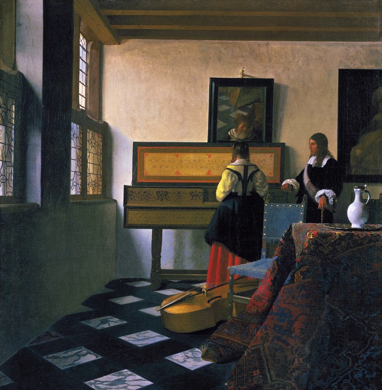
Johannes Vermeer, The Music Lesson, 1662-65, oil on canvas
In her fascinating essay Color, Facture, Art and Design[i] Iona Singh argues that, in a world saturated with industrially produced synthetic colours: dyes made from coal tar, a by-product of oil production, we are losing touch with any meaningful connection with the materiality and facture of colour and our sensory perception. ‘Use of these strong, lightfast and inexpensive synthetic colors are at the expense of nuance, tincture and the plenitude of natural formation.’ She suggests that the ubiquity of coal tar colours in the built environment has contributed to the alienation of the senses and our estrangement of colour on an aesthetic level – colour is divorced from structure and does not appeal to the body in any real material sense anymore: relationships are lost and thereby the ‘sensual ground of related cognitive processes’. I would add to this the finite range of back lit colours that we are faced with on a daily basis on the computer or the TV – every colour starkly saturated and smoothed out: unmixed and de-materialised.
In the preceding essay Vermeer, Materialism and the Transcendental in Art Singh critiques the mystical or spiritual emphasis in promotional material surrounding the Vermeer and the Delft School exhibition at the National Gallery in 2001. Words and phrases like the ‘imprint of the soul’, ‘something of a miracle’, ‘mesmerizing’ and ‘magic’ abound. All the artists, except Turner, (who a century later learnt about materials largely through his own experimentation) that she discusses in her essays spent at least seven years in a guild system studying methods and techniques; learning how to make and utilise grounds and varnishes, not to mention the production of different kinds of paint using a whole range of natural pigments and binders. ‘These materials were manipulated to serve their meticulous aims to create a distinctive affect, effect, feel and texture. […][to] reflect the evolution of the “intimate senses” as an evolved sphere of perception manifested in the ability to respond with discernment to a wide range of textures, shapes and colors.’ One example Singh gives is Vermeer’s particular use of a thick, lead white based grey ground which provides ‘gravity’, ‘dynamism’ and an underlying, unifying element to a relatively small painting. It seems that it is this very method that contributes to the luminosity of the overall painting and is somehow evident behind the over painted colour. As Singh further points out, in Holland at the time there was a great interest in the visual perception of colour and colour production in line with huge scientific advancements in optics as well as the dye industry; Vermeer’s paintings are a product of a particular historical economic and social context. However, she draws the conclusion that recent art history has favoured the idea that ‘style is seen as art of a unique personality and not a skilled and manual job of work developed to have a material affectivity’ and that the ‘sensual element of construction’ or the idea of a ‘visual and sensory syntax’ has always been omitted from [contemporary] art theory’.
The following contributions were gratefully received in the spirit of communal exchange. And although none have attended a Dutch ‘guild’ school, I think it is evident that a great deal of serious ‘labour’ and ‘research’ is going on with regard to the creation of colour relationships and colour materiality, whether through systematisation, organisation or experimentation, and the artistic results are testament to this.
EMMA BIGGS
‘The initial colour I select for the paintings I do with Matthew Collings is generally quite random, but everything after relates with purpose and intention to that first choice. Colour is often seen as a means of differentiating one thing from another, even by a critical body that is highly sophisticated in the way it analyses meaning or reads signs, or is capable of challenging how work fits into the art machine. Colour seems an old fashioned preoccupation, freighted either with Greenbergian ideas about judgment and hierarchy, or in need of resuscitation from its associations either with primitivism or femininity. Add to that the deskilling of the art workforce, and outsourcing of technique to artisans, and you have an art world with very little interest in something that pertains so inescapably to the visual. I think, by focusing on an area that has become, for this community, an unseen or a conscious absence (it is deliberately overlooked, in other words) I’d like to shift the focus to the materiality of colour, to show that to lose a comprehension of those material properties is to lose something important. If we artists were potters, or car makers, or coal miners, we would fight about the loss of skills, but the art machine demands a perpetually novel product to feed profit, and when we lose an understanding of a craft element of our work, we lose knowledge and we deskill, with consequences that we see in those industries. The art world is money rich because of the crazy novelties it trades in. Artists themselves though, without skills, become ever more replaceable.
Colour is not organised in any predetermined way in our triangle paintings, but there is a system of tonal opposition that plays over the whole thing. The colour choices and the eventual overall colour arrangement are each matters of judgment, and the aim is to create a variety of resonances and hold them successfully in a tense, shifting and mutable grid.
I don’t think the monochrome has anything to do with colour, as I think colour is a matter of relationships, not a matter of hue alone. Where monochromes are sophisticatedly inflected by facture, or tone, those are the issues, not ones of colour.’
TOM BENSON
‘[…] But the paradox here is: because of the way that it’s made; the application of paint, the movement of the hand and the brush, and the softness of the surface (unlike the surface of an industrially made product), the striations of the brush marks both catch the light and hold the shadows, so what it’s possible to see from time to time is darkness within the white – a patchiness within the white. […] I’ve made a few white paintings over the years and they are some of the most extreme and the most demanding of works, because you’re given a degree of freedom and a sort of a blankness and a challenge to make sense, to make connections, or even to relinquish some of the behaviours that you might have in terms of any kind of reading.
And the painting, because of its non-illusionistic nature (it doesn’t propose a space within itself – it’s a part of the space that a viewer exists in), appears and disappears in that space – it takes on the qualities of that environment. And the difference between one white painting and another is partly underscored by the subtlety of the surface. They’re all distinct, but how easy it is to tell one from the other isn’t straightforward.
The white painting enters into or makes a space, metaphorically speaking, within the room, for a dialogue with the viewer and what else might be going on: not between them and that piece of work and how they’re reading it but with what else might be preoccupying their thoughts and their life and their concerns. And sometimes it’s a restful painting and sometimes it’s a challenge to noise, so it’s an extreme painting: that’s how I think of it.[ii]’
ANDREW BICK
‘I have a book published in Basel in 2009 documenting colour systems from 1611 – 2007; in Goethe’s Theory of Colours (1810), he divides his optical and chromatic experiments between subjective and objective; David Batchelor’s Chromophobia (2000) proposes that “colour is bound up in the fate of western culture”… Analysing, categorising and systematising colour has been with us for a long time, as has the transition of such theorisations between rational and intuitive positions.
I approach painting through using grid and gesture, as an un-spontaneous process of adjustment and correction, as a site where the contradictory elements of improvisation and measurement can be further interrogated through uses of colour. This colour is found by chance in the environment around us as well as lodged in references to art historical precedent. Everything is observed, organised and strategised, but with hindsight the organisation and strategy seems to frequently elide into something I find hard to categorise. The only thing I can be sure of is that colour is both authentic and artificial at the same time; its ambiguous place in systematic art (for example) is therefore what makes the best of that art come alive. Based on the same reasoning, I can only address monochrome ambivalently, which is how I see it approached by artists like Kupka (his abstract narrative Four Stories of White and Black), or in late Ad Reinhardt paintings.’
SIMON CALLERY
‘Colour is one of the physical elements that make a painting. It is no more or no less important than the canvas or linen, the wooden stretcher or the metal fixtures that give a painting its form and hold it in its place. I mix quantities of dry pigment in hot rabbit skin glue size and soak it into washed and softened canvas. I am after a compelling and tangible physical coloured surface that will register with the body as much as with the eye. Some pigments have tiny, fine particles and are ideal for this way of working. The particles are absorbed into the weave of the textile and are caught and held by the tangle of cotton fibres. Other pigments have large and heavy particles, which do not penetrate and simply fall off the canvas overnight. All the Mars pigments and Caput Mortuum do this – they are all iron oxides – and can be collected up with a magnet. Chromium Oxide, Cadmium Red Deep and Lamp Black are all good and work well. The green paintings refer to landscape obliquely without depicting it, the matt black paintings suck in the light and the reds catch the eye and demand immediate attention. Working with more than one colour is a question of finding the balance point between the two allowing the work to be perceived as a unified whole rather than splitting into its constituent colored parts. Working to find the balance between green and red encouraged me to develop paintings with significant physical depth and exposed internal parts as well as the conventional flat planar surfaces. The monochrome is a perfect solution to many of the painter’s dilemmas but like many solutions thrives within a specific context. A moment arrives when the noise of the outside world disturbs the stillness of the monochrome painter’s world and it must be let in.’
SELMA PARLOUR
‘In my paintings, colour is for itself (rather than to flesh-out volumes). My colour is flat, unblended, artificial, contained, isolated, transparent and infinite. As part of my invented vocabulary for painting, I enclose shapes with thin bands of colour to separate and organise the viewer’s experience of colour and illusionistic space. Colour as such is difficult to quantify perhaps because it exists without semantic explanation and because it is impossible to detach it from governing conditions, such as light or surface. Within the virtual world of a painting, I sometimes use reminiscent (or ‘local’) colour for descriptive purposes (for example, an area of grey might represent the concrete floor of a white cube gallery space); however, for the most part, colour selection is unfixed, with each colour informing and influencing the next. I am attentive to colour relations and the spatial push-pull of comparable colour. I am not really interested in the monochrome in terms of colour, for me, it holds more potential in its relationship to the architecture of its surroundings.’
SIMON BILL
‘Colour vision evolved as an extra way of discriminating between substances and conditions of objects. It allows us to ‘colour code’ or label things. And, as it’s a code, it doesn’t matter what colour is assigned to which substance or state of an object, so long as it’s consistent and can differentiate one from another. Anything could be any colour. In fact all we are detecting with our three types of cone photoreceptor cells is the wavelength of electromagnetic radiation a given surface does not absorb. The wavelengths from surfaces are objectively measurable, but the colour is a subjective marker.’
JUAN BOLIVAR
‘Colours are experiential phenomena of the mind, so a cat encountering a bowl of oranges will experience these differently to us. ‘Pigmentation’ alters these phenomena: water for example can ‘appear’ blue, whereas blood is crimson through the iron in red blood cells.
For most artists, colour is the bound pigment we call paint,[iii] and the way paint (colour) has been utilised by other artists. So when artists discuss colour, we implicitly mean paint – or painters’ use of paint – rather than the colour of a rainbow or the blood in our veins.
I used to mix colours in large bucket containers. The paint consistency resembled pancake-mix and it was a monochrome key starting point for abstract compositions. Today, I match colours found in art books and artists’ postcards: Malevich, Mondrian and Albers to name a few. I mix colours in plastic ‘take-away’ containers, wishing I was more methodical and labeled each sample as I went along. More often than not I forget to do this, inevitably having to start the process again.’
KATE TERRY
‘My grandmother had a penchant for wearing the brightest, most clashing colours at once: fuchsia, scarlet, lilac, and green; she stood out amongst the dark and neutral shades more commonly favoured by the elderly. She approved of my teenage pink, then turquoise, hair. Similarly, I am drawn to the brightest hues; I select colour rather than mix it. Choosing household paints and materials in their ‘pure’ artificial form; traffic red paint, fluorescent yellow reflective tape, teal thread, and bright orange Perspex. I am interested in notions of good taste and class when it comes to colour: Martha Stewart’s jadeite green, Easyjet orange, Farrow & Ball heritage colours of ‘Arsenic’ and ‘Charlotte’s Locks’, cheap blue fabric, and Juicy Couture pink. When I did an image search for ‘colour and class’ all the images were of cars: black, navy, grey, blue, with the occasional red. Even our cars are boring these days. Rather than monochrome, it’s the collision of colour that’s exciting to me, where a pale Germolene pink rubs up against an acidic canary yellow. Colour in succession and in relation, in its purest artificial form.
Ruskin: ‘While form is absolute… colour is wholly relative. Every hue throughout your work is altered by every touch that you add in other places… In all the best arrangements of colour, the delight occasioned by their mode of succession is entirely inexplicable. Nor can it be reasoned about. We like it, just as like an air in music, but cannot reason any refractory person into liking it if they do not. And yet there’s distinctly a right and a wrong in it, and a good taste and a bad taste respecting it, as also in music.’[iv]
KIERA BENNETT
‘My paintings could be seen as being purely concerned with abstract line and colour but they always start as a thought or observation, which I make tangible through drawing, line drawing. Once I start painting it does become about balance, form, line, colour, surface, rhythm, light, direction, dynamics, harmony, contrast, marks, space etc. All painting is pretty much about painting. No one ever thought: I’ll paint that vase of flowers, without really thinking about another painting of a vase of flowers. I say that because I guess that’s where a lot of my colour comes from, from looking at other paintings…if I used a certain black and pink I may be thinking about Guston for example. Or a grey and blue in Demoiselles d’Avignon or Giotto etc. Of course I may see colours next to each other in the ‘real’ world and this may trigger the next painting. Colour can also come from design but not in a ‘Pop’ way. Colour combinations like black, orange, yellow and green but also muted earthy colours come from looking at art deco designs. I have overused a green stolen from Matisse and Braque, it’s a sort of default. I instinctively return to it over again, I haven’t worked out why I rely on it so much yet. I fight that a lot. Some colour combinations obviously have special dynamics. I try colours out to varying degrees of success and am conscious that I don’t want to over-use certain ones, which seems odd given that I remake over and over certain motifs or structures. So I do my best to challenge this, bouncing between intuitive then counter intuitive colour choice, the ‘counter’ to try to avoid habitual colour tendencies. Things won’t evolve unless a spanner is put in the works, something difficult, unknown.’
CATERINA LEWIS
‘Colour is the first thing a person negotiates when looking at a painting and is probably the most important decision I make when painting. I usually come to a painting with quite a clear idea about the feeling I want it to have and it is through decisions about colour that my process begins and this must be true for most painters.
The thought I have found most exciting is that colour has content and meaning beyond my intentions and understanding. This problematizes questions and decisions when painting and creates unforeseeable complexities. The idea that I might make something that I don’t fully understand is exciting and compels me to paint.’
CLEM CROSBY
‘Colour, more specifically the use of coloured pigment, is something I aspire to in my painting but never feel entirely satisfied with. For example I may ‘see’ a particularly subtle dark orange in my mind’s eye only to recognise, once I’ve mixed the oil paint, a somewhat underwhelming burnt orange or terracotta. So over the years I’ve learned not to rely on colour as the main ingredient in my painting, rather I hope for the best and look toward gesture and line, and the medium itself.
I work under an even and flat fluorescent light, no doubt this has had a bearing on the end result and choice of which colours do work best, so part of what the viewer may experience is a painting with an amplified sense of its self. This is also due to the fact that I’m painting directly onto a shiny black Formica surface. The black of the Formica gives the colour an ideal base on which to reveal its self.
I began as a monochrome artist because it gave me ample opportunity to cleanse my palette, and time to decide what I wanted to paint next. After several years I concluded that the monochrome is rather authoritarian and didactic and I wanted to deal again with composition and try and find a different intensity, so I returned to drawing. Drawing with paint. As I’m painting directly onto a flat black surface it could be argued that I’m starting from the monochrome and working backwards towards the drawing.’
KAREN DAVID
‘I choose colours purposefully to tap into a certain stylistic aesthetic; like a 70s tie-dye t-shirt, the colours of a sunset from an Athena poster or the pastels from Memphis Group furniture. I have also custom-made wall paint to match the colour chart of Annie Besant and CW Leadbeater starting with the colour `Love for Humanity` which is a dusky pink shade. They believed colours have specific emotional effects, such as `Pure Intelligent Feeling` which is a golden brown or `High Spirituality` which is a warm blue. Every now and then I will return to monochrome, and just use carbon black in my paintings. This allows me to focus on the materiality of paint. I suppose this activity can be seen as purist, but I like to think of it as a cleansing, a colour detox if you like.’
MALI MORRIS
‘…Colour in painting brings with it the possibility of constructing luminosity, – not an illusionistic depiction of illumination and shade, but an actual source of particular light. Light makes space apparent, and space in painting is always on the move, as the eye moves through it, even though the painting itself is still.’
DAN COOMBS
‘Colour for me is spatial and structural, and in the absence of perspective or foreground and background it creates the pictorial space in my paintings. This is because colours occupy different spatial planes when juxtaposed. There is the Matissean idea that colour creates light, so rather than depicting light within the picture, light is generated by being reflected off the actual surface of the painting. Another of Matisse’s ideas is that two separate colours can mix together optically to create a third indefinable colour.
The only colour that is a constant in my work is black. I wondered whether I relied on black too much, but then I re-watched David Lynch’s film ‘Blue Velvet’. The intense colours in that film are structured around the film’s deep blacks. For example Kyle MacLachlan’s hair is a deep matt black throughout. Black makes the other colours resonate, but also tinges everything with subliminal gothicism.’
DAVID RHODES
‘The etymological origins of the English word black are – Old English blaec, (dark), Proto-Germanic, blakaz, (burned), more remotely, Greek, phlegein (to burn, scorch) and Latin, flagrare (to blaze, glow, burn). Interestingly, the same root of blaec produced Old English, blac (bright, shining, glittering, pale). In fact, by the time of Medieval English it is ambiguous as to whether blac/blak means black/dark or pale/colorless. This paradoxical quality in the use of the word black persists in the way black is regarded in painting through to the 21st century.
A painting made almost contemporaneously with Kazimir Malevich’s non-referential Black Square of 1915, is Henri Matisse’s French Window at Collioure, 1914. The black rectangle of Henri Matisse’s painting was seen as signifying the “black future” by poet Louis Aragon: But it could just as easily be a zone of latent potential, or as El Lissitzky said “a stopping place on the road of becoming.” ‘
[i] Color, Facture, Art & Design: Artistic Technique and the Precisions of Human Perception by Iona Singh, Zero Books, 2012
[ii] Notes on a White Painting by Tom Benson from an interview with David Connearn, 2014
[iii] Offered by manufacturers since 1840
[iv] John Ruskin, ‘The Elements of Drawing’, London 1857, Letter III, Section 153 and footnote to Section 240. Quoted in Bridget Riley’s interview, ‘Perception and the Use of Colour’, with E. H. Gombrich.

Kazimir Malevich, Black and White, Suprematist Composition, 1915, oil on canvas
Questions that were asked:
1.Assuming you don’t rely totally on intuition how do you arrive at colour choice? (intuition: origin: late Middle English denoting spiritual insight or immediate spiritual communication)
2. What is the purpose of colour in art/your art?
3. Do you organise colour in some way?
4.Can you say something about (the idea of) the monochrome?

WHEW!
LikeLike
For me, there are lots of intriguing positions and insights in the various artist’s quotes . But I would like to take issue with a couple of quotes in Katrina’s thoughtful introduction. I’m with Picasso on this- you should be able to make art out of anything. I don’t care if “…..the ubiquity of coal tar colours in the built environment has contributed to the alienation of the senses and our estrangement of colour on an aesthetic level…..” The more ‘estrangement’ (in a Brechtian sense) on an aesthetic level- the better, I say. Time to wake up and smell that alienating diesel. ‘Coal tar’ and all fossil fuel derivatives have a very real energy- they have a life force all of their own- straight from the sun- compressed into vital intoxicating energy boiled up over millions of years. They ripened in perfect time to become the fuels that fired the maniacal machines of modernity. They now hold fast the colours that light up our post-industrial consumer cultures. Love it or loathe it- who, as an artist, would not be interested in that? Like it or not fragments of plastic have become as ubiquitous as the pebbles and shale that coat the coastlines of the world.
Also, I’m reminded of that Hoyland quote about likening acrylic paint’s arrival as a new painting medium to the impact that the electric guitar had on music. Bob Dylan got the ‘Folkies’ all upset for playing one! Trouble is the Folkies, along with an icy blast of a new puritanism and austerity, are back with a vengeance. Surely ‘colour’ can come from anywhere bringing with it it’s own peculiar qualities, whether totally synthetic or wholly ‘organic’? Thick or thin, inert or toxic- on the back of a McFlurry cup or floating about in high class ‘Golden’ Gels. It’s what the artist does with them that counts. (Skill).
“Use of these strong, lightfast and inexpensive synthetic colors are at the expense of nuance, tincture and the plenitude of natural formation.”
I find this language a tad sanctimonious. I blame William Morris! “Inexpensive”, eh? I say, PLUG IN AND TURN IT UP!
Sent from my iPad
LikeLiked by 1 person
Sorry but you seem to totally have the wrong end of the stick. I suppose that’s what comes of not actually reading Singh’s original book first.
LikeLike
I suppose you are probably right.
LikeLike
Are people becoming desensitised to the subtleties of art making? Facture has always been a crucial issue for me; how it affects colour. I can appreciate the comments and the sentiment of the article’s main thrust. I just wonder though that painting and sculpture are part of a much bigger pond now. Film for one thing is such a significant cultural phenomenon, and imagery in general is such a dominant communicator. Add to that a whole myriad of spectacles that rely on computerised effects.
Frank Stella put it nicely: “It’s displays with the tinge of art rather than the touch.” Rather than lament a perceived loss of sensitivity though, it might be interesting to ponder if one was ever truly there to any great extent. How many people were really ‘really’ interested and tuned into the more advanced art? There could have been a lot of hangers on as there was nothing else to hang on to…now there is. Painting and sculpture can mine their own rich seams and not try to skim off other forms. A good question is always can something be achieved better in another medium? Also as humans we adapt and change. Our experience of colour and our use of it will also follow these changes. The use of materials now is very different to Vermeer’s day granted (no lead for one thing, which is to be grateful for. ) I am pretty sure artists then would have preferred a wider range of – safe- colours and also the ability to store them readily if they had the choice.
Building a skyscraper is inconceivable without using computers as part of the design process. Flight simulators train our pilots. Digital imagery assists major surgery. Nano technology is a sleeping giant starting to waken. Art is just another human endeavour. Must we all only use organic pigments? Why stop there? Shouldn’t we weave our own canvas, forge our steel, mine our stone? How we use our resources is more of an issue than imposing any hierarchies. The impetus to be creative is mysterious rather than quantifiable….unless you work for Apple maybe.
LikeLiked by 2 people
Granted things change and the production of art changes with it. I think it is the role of artists to negotiate this. For me the article does not rule out these changes. I have read the whole of the book by Iona Singh and there is equal weight and analysis placed on Yves Klein and his more modern practice of production and immersion in materials, and in which he was equally engaged and radical, as lets say, Vermeer. I think the methodology described in the article could be pushed forward with regard to the great technological revolutions of the modern era, with one premise: the sensitivity and the sensibility of human senses can never be regarded in a brutalised fashion (or it’s not fulfiling its job description), whether we’re talking about art or art history or philosophy etc… and some kind of extreme engagement with the materials is going to be necessary, in order to do this and to avoid being pulled back into the rational, logical, narrative, logocentric, which although important in their own way should not encroach or subsume somatic sensuality, feeling which is ultimately sensitivity, care, love and well being.
LikeLike