‘Ocean Park #43’, 1971
Richard Diebenkorn at the Royal Academy, London, 14 March – 7 June, 2015
If I’ve read one 5-star review of the RA’s Diebenkorn show by now, I’ve read at least ten, most of them little more than P.R. exercises repeating the same blandishments to the gallery-going public, to recognise and acknowledge a masterly evocation of the lambent light and open spaces of his native Californian west coast. Spoiler alert: this will not be another piece of positive flannel. OK, Diebenkorn was by all accounts a fine fellow and a much-respected artist, and his reputation has grown considerably over the past two decades as he has entered the collective art-school consciousness of recent generations as the straight-up kind of painter’s painter in an age of conceptual art. More and more young abstract and semi-abstract painters have become familiar with the three phases of his work, and it now chimes in with something that has recently happened in abstract painting, whereby it has become the acceptable, non-scary version of modern art in general; safe to feature in sofa catalogues, a safe occupation for the younger amateur painter, decidedly unthreatening; in fact, not too radically abstract. And Diebenkorn is a kind of flagship painter for the confident employment and enjoyment of these ubiquitous modern aesthetic tropes. He now, reputedly, has clout and charisma, where he once seemed a peripheral and minor contributor. He undoubtedly had a degree of talent, and his paintings have the sniff of sincerity and ‘authenticity’; they look superficially like the ‘real deal’. But, as some clever wag pointed out recently, authenticity is a content-free zone. If you think Diebenkorn’s art has anything to do with, say, a continuation of Matisse’s lifelong core project, you’re wrong; if you think Diebenkorn is anything of a colourist, you’re wrong; and if you think Diebenkorn is exciting, you are living a very sheltered life. He raises the mediocre to fantastic levels of significance. More on all this later.
So how’s the show? It’s OK; decently hung, clearly staked out into the three phases in three rooms, so it’s a shoe-in. And on entry, I thought for a minute the opposite of all the above – I thought he had something exciting going on. This mistaken belief was really down to one painting, Berkeley No.57, 1955, which is in the first room, and is the best painting in the show. It’s a difficult work, complex, demanding, having something of a wrestling-match with itself over exactly what it wants to do, perhaps not entirely resolved; and for those reasons and others, rather engaging. There are coloured forms in movement, rolling, turning against one another, receding and advancing, competing with and contradicting Diebenkorn’s predisposition towards drawing. Here, in this one work, that tendency is temporarily suppressed in favour of a more open, painterly-structured spatiality. Unfortunately, Diebenkorn insists upon drawing controlling the organisation of almost all of the other paintings in the show, the application of paint being relegated often to filling in between the lines.

‘Berkeley #57’, 1955
Berkeley No.57. comes at the end of his first phase of abstract work, and surpasses all previous paintings. So what’s going on here? Why, I wondered, when he had just got to a really challenging place with his work, just got to something with a bit more muscle to it than the frankly rather commonplace works that precede it; why, then, does he stop what he’s doing and start on some out-of-the-way figurative thing? Now, I must admit that the only figurative works I’ve seen by Diebenkorn are the ones at this show (having contrived to miss the Whitechapel exhibition some 25 years ago), and I was genuinely looking forward to the prospect. Some of you will know that I have often expressed doubts about the potential of abstract painting and its ability to ever compete with the very best of figurative painting from the past. You might also know that I see no benefit from any kind of return to figuration in painting at the moment. It is in the light of this contradiction in my own mind that I do actually have some empathy with Diebenkorn’s dilemma and his switch away from abstraction for a decade. But, and this is a big ‘but’, I was thrown off sympathising thus by two things: firstly, that Diebenkorn changed tack just when things were getting interesting/challenging in terms of how three-dimensional space in his abstract painting might be tackled anew; and secondly, that the figurative paintings on show here seem to offer no furtherance to, or deliverance from, those issues. Berkeley No.57. is more spatial than any of the figurative paintings, so why not hang in there? In the light of that question, the reasons for the switch begin to look suspect. The figurative paintings are, like most of the abstract work that preceded Berkeley No.57., relentlessly flat, unspatial. They are also, I think, somewhat anecdotal. They tell a story, and they do it with lots of the sort of stuff painters hanker after nowadays – facture, washy brushmarks, pentimenti, painterly quiddity, etc., all wrapped up in a bold and semi-abstract style. What’s not to like? Well, the story they tell is not spatial, it’s illustrative; it’s pre-occupied by two-dimensional compositional decisions. To say that they are spatially ambiguous would in fact be beside the point. They are, like the Ocean Park series yet to come (and how!), based upon drawn shapes, filled in with colour, borderline ‘graphic’. They would look the part as magazine illustrations to a story (this is close to why I call them ‘anecdotal’), where the clumsiness would be acceptably clever, stylistically.

‘Interior with View of Buildings’, 1962
We know Diebenkorn felt himself influenced by Matisse, and just about every review repeats the truism; but I see no link. I happened to have seen a handful of really great Matisses over the past year or so; one or two have come up in Christie’s and Sotheby’s in London recently. In a good Matisse the space has something of a plastic nature all of its own, a fully-felt three-dimensional reality resolved in two, but heightened by that resolution, not compromised. The space is the thing, newly created; a new veracity – and incidentally, not just by means of great colour, but by the nature of Matisse’s painterly architectures too. Whereas in Diebenkorn, the space, far from evincing some Californian plenitude, is squeezed and crushed by the jostling tightly together of over-engineered shape-upon-shape. It’s not so much that Diebenkorn wants to go down the literal route of making painting a ‘thing’; but he seems to want the painted shapes themselves to be ‘things’, and to stay two-dimensional, and stay nailed upon the flat surface of the painting, interlocked in a tightly controlled design. Some will see this as a good thing, but there is no great truth to painting in this for me. And also for me, that is a false reading of Matisse.

Henri Matisse, ‘Interior at Nice, Woman Seated with a Book’, 1919
Diebenkorn has stated, perhaps overstated, a desire for ‘just-so’ wholeness and balance. There is more than one way in which you can have too much of that. You can have too much at the outset, if, for example, you think that you have a formula by which you will inevitably end up answering your own question – in the case of the Ocean Park series, answering it 145 times. Or you can have too much at the end, when the work puts itself forward as an exercise in content-free aesthetics. Some will say, and have said, these are works of limpid beauty, whole and self-contained, in need of no crude and rough thing such as ‘content’. Well, maybe; but that way lies a lifeless conventionality, an imposed and academic completeness; a concept, a conceit. In order to maintain his precious balance, Diebenkorn will water down his colour to pastel shades, then pick up hues in smaller, more intense highlights, and then even these get watered down; and all within the bounds of orthogonal divisions, echo upon echo, rectangle echoing rectangle, all repeating the shape of the canvas; all feasible, all do-able, no problem; no content. This is, in fact, just another manifestation of minimalism.
And this shallow aesthetic is currently running through a great deal of contemporary abstract painting, becoming more and more widespread. There are lots of abstract painters around at the moment who love this stuff, and who are milking it, and bit by bit, unambitiously hollowing out abstract painting until it is borderline meaningless. Paint as paint, canvas as canvas; do a little ‘free’ design, suggest a bit of this or that, mute the colours, don’t frighten the neighbours. Hint at a ‘subject’ just a little; paint ‘cages’ of triangles; suggest that it could be a bit ‘landscapey’; show lots of layers, wipe some of them off; change your mind; fiddle about; whatever…
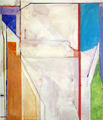
I digress… The best of the Ocean Park series in this show is No.43, because up the right-hand side are strong, active colour-forms that start to make something spatial happen in relation to the modulated off-white open centre of the work… Oh god, something’s happening! Can’t have that, let’s balance it all off with some more uprights up the other side, and let’s make those beige. Well, if Diebenkorn’s your master, it’s the bland leading the bland.

I remember visiting the Philips Collection in Washington, DC, back in 1991. Leland Bell—a terrific, American, “FIGURATIVE” painter: http://en.wikipedia.org/wiki/Leland_Bell—was taking a bunch of NY Studio School students through the galleries. He stopped in front of Matisse’s Interior with Egyptian Curtain. Leland said some nice things about it. They were really kind of ecstatic/rapturous things. Then he began apologizing for what he was about to say about Diebenkorn. Leland said Diebenkorn was a nice guy, etc.—but Diebenkorn didn’t understand a thing about Matisse, Diebenkorn was an academic, etc.
Leland died not long after the Washington visit. Not long after his death Roberta Smith pronounced Leland a failure. (Writers can never be forgiven: what they say is written down: http://www.nytimes.com/1993/10/15/arts/art-in-review-249493.html.) At about the same time Michael Kimmelman was going nuts about an easy-does-it Roy Lichtenstein retrospective at the Guggenheim Museum.
Leland’s comments about Diebenkorn kind of shocked me—and they cracked open my eyes a bit. I’ve been very lucky. I’ve been able to ask stupid questions of friends of Leland’s—other other oddball, demanding, Studio School teachers/“failures.” I’ve had my eyes opened a little bit more over the years. I’m very curious about how young people are going to respond to Robin’s comments here. . .
LikeLike
They are hard to swallow, but not unrecieved. The “unfolding” of a painting (or painter) seems like a personal thing. From a relatively young painters point of view, the author appears to have had the opportunity to see many significant works over an extended period of time, whthe most of us young painters are still accumulating those experiences and forming those opinions. This of course is daunting due to the seemingly limitless access to images, information, and opinion… how to catalog this?
I guess the thing is, as we move through our own practice our perception changes; we see new things and lose appreciation for the things we used to love. Although I am nothing of a gestural or painterly painter, I have always admired Diebenkorn (maybe too much) for how taught the work feels, and how unpretentious he seems.
The thing I feel though is that Diebenkorn admired Matisse but didnt try to make Matisse’s work; he made his own work in his own time. I, and I think most of my peers, acknowledge now that the avant garde, the abstract, the purely non-objective carries no real charge in The present and comes off as plainly aesthetic, but I believe Diebenkorns inquiry was genuine and thats all you can ask of a painter.
For the young generation we are in a different time (a timeless time apparently) but are the same painters as previous generations dealing with the same questions: how to make paintings, how to see paintings, why make paintings, which paintings to make, what to make paintings about, how to talk about paintings….. on and on. Its nice to have an oppositional argument even if as a point of resistance. The thing that benefits youth though, is the vision to see that the RA hung the show, the public wants to see the show, and we are talking about the show, but Diebenkorn was just a guy who wanted to make paintings, and found a way he could do that. He never tried to tell us it was something it wasn’t, we did that.
LikeLiked by 2 people
Thanks Robin for this rather sobering piece,
I’ve recently been noticing a similarity between Diebenkorn and Guston, and how they are both so revered by young abstract painters and art students. I include myself in this bracket of painters who have perhaps come close to worshipping these two Americans, one from the east coast, the other from the west, who both shifted between the abstract and the figurative.
There is something “cool” about liking Guston and Diebenkorn. Maybe it is because they were not so wholeheartedly endorsed in their own respective lifetimes. It is certainly more cool than saying you like Pollock, although I’m not such a huge fan of his anyway.
I think their work is easily digestible, and that’s not easy for me to say, particularly in Guston’s case. In defence of both painters, they at least spent a life time struggling to find a way that worked for them, whilst looking at complex painters like Piero della Francesca, Rembrandt and Matisse. The results Diebenkorn and Guston arrived at are unfortunately quite easy to imitate (minimal rectangles or cartoonish forms), and perhaps this is part of the appeal for younger painters. We look at them and go, “I could do that”, when we’d be far better served looking at the painters they revered.
LikeLike
I wrote this on the Henri art Mag blog where Robin,Jock and I have been talking about space.http://henrimag.com/blog1/?p=7056#comments
Bravo Robin.In total agreement with your article.I also agree with your take on Tuttle of which I can’t recall the details but I think it is related.I was once in a small gallery show of Tuttle’s in the 90’s with a friend who had befriended him back in the 80’s before he had a reputation.He met him at a show at Brown U that was opening next to a show of Alex Katz.No one was at the Tuttle show and everyone was at the Katz show.Things change.I started to vituperate over the pretentiousness of Tuttle’s work and was told to calm down by my friend. It is only recently that I can accept my intuition about Tuttle’s work and understand how it applies to Diebenkorn. The decision about colors and their placement has to push back against something and that something pushes back and creates the space.The X factor.Otherwise it is just a technical exercise or in the case of Tuttle inert objects. Both Diebenkorn and Tuttle are flaccid in that sense.There was a time when he was the one to emulate.That time is long past.Like Cezanne, Matisse still unfolds and surprises.
LikeLiked by 1 person
Great Stuff..We should be able to glean from this expose of Robins ideas what it is about bunching colours together,making them spacial,which feeds the human soul.I think Ive experienced it recently with the Cezannes in the Courtauld.Can you wax lyrically once again about the satisfying feast to both eye and mind that Matisse compared to a relax at the end of a day in an armchair.I was a bit worried for a moment about the struggle and difficulty being a pre-requisite but think we are beyond that now.John Bunker got worried about the churchifying around my appreciation of Matisse/s Celestial Jerusalem and those tinted rose windows,where on a mediterranean afternoon ,it was possible to be transported to spirituality..Isnt Hoffmann the epotheosis of this rolling thunder approach ,altho I personally find his surfaces in say the Berkely pictures,dull and dry.Do you have any contemporary examples of painters who are acheiving this synthesis?A terrific spur to seeing the show.and reassessing Diebenkorn.
LikeLike
I certainly appreciate Robin’s almost knee-jerk contrarian views on art, but I think this is a case where he criticizes an apple for not tasting like an orange.
Why did Diebenkorn turn to figurative painting “just when things were getting interesting” ?
Possibly because reconnecting with David Park (a thoroughly under-appreciated painter if there ever was one) caused him to question his commitment to intuitive gestural abstraction at a time when everyone and their brother were banging-out 3rd rate deKooning knock-offs -which is precisely what “Berkeley #57″ looks like. Diebenkorn was willing to forge his faith in the fires of doubt, and became a better artist for it.
Are all of his paintings masterworks? Certainly not, but neither are all of the paintings by your much vaunted Matisse; who made at least as many horrible paintings as he did exemplary ones.
Diebenkorn may not have been a particularly innovative artist, but he zeroed in on the possibilities opened up by Matisse’s “cubist phase” of 1913-1917 and brought those formal configurations to a high level of perfection. In that sense he is akin to Mozart, a prolific classicist par excellence, but not highly original in his own right. Diebenkorn’s best works are possessed of a stillness that is both subtle and sophisticated, qualities I think Robin has a hard time detecting, let alone appreciating.
LikeLiked by 6 people
Absolutely.
LikeLike
For me the content Robin is space, and light – that is simply not to your taste. Of course you homed in on Berkeley No.57 because it is similar to the kind of work you often put forward in your discussions as the best of abstract painting, i.e. meaty, gestural, multi-coloured, ‘complex’ and so on – not my cup of tea. I used to be into the early Alan Davie’s but for me, there wasn’t much mileage in continuing to do that once the point about spontaneity and gesture had been made. If Diebenkorn had not advanced his work through the Ocean Park paintings I don’t think I would have regarded him as a particularly exceptional painter. In that series he found a counter-balance to all that painterly stuff through the constraints of the rectilinear grid which enabled him to ‘measure’ his moves so to speak. It brought a kind of classicism (as Agnes Martin speaks of it) to his work – or to put it another way, cool thought was brought into a relationship with the visceral. That happened in some of Motherwell’s work too, and Sutherland – and even Davie in a different way.
I have sympathy with what you say about a lot of present day abstraction: ‘Paint as paint, canvas as canvas; do a little ‘free’ design, suggest a bit of this or that, mute the colours, don’t frighten the neighbours. Hint at a ‘subject’ just a little; paint ‘cages’ of triangles; suggest that it could be a bit ‘landscapey’; show lots of layers, wipe some of them off; change your mind; fiddle about; whatever…’. I go out to see painting and want to be blown away by something, but that very rarely happens – even by the Amy Sillman show which I thought might. I’m not going to try to qualify what it is about those Ocean Park paintings, but the fact is they have a very profound effect on me. All you can do is trust the highest level of discernment you can muster. It’s more of a feeling. One has to trust something. I rarely see that quality in a lot of abstract painting going around at the moment (you see it in Stephen Buckeridge’s recent paintings though). I would say a lot of that stuff comes from others like Terry Frost and a lot of those Cornish painters where you see the quick, the tasteful, the economical, the ‘found’, which has enabled anyone and everyone to ‘make art’ today. Most don’t really know about Diebenkorn.
I think Suit’s comments make sense: ‘I believe Diebenkorns inquiry was genuine and thats all you can ask of a painter’, ‘Diebenkorn was just a guy who wanted to make paintings, and found a way he could do that. He never tried to tell us it was something it wasn’t, we did that’.
Of course there’s all the hype and the commerce. One can ignore all that. I can’t stand the way the monographs often make these guys out to be more than human – Gods even. I think Diebenkorn was a pretty ordinary bloke by all accounts – he just tried the best he could in a very honest workman-like way, and pushed himself beyond his limits, which is to my mind pretty extraordinary, and an example to all of us.
LikeLike
“The Archives of American Art” have a long and excellent interview with Diebenkorn which gives a pretty clear picture of his process, successes, doubts and resolve as a painter. He is admired and deserves to be for the work he created.
http://www.aaa.si.edu/collections/interviews/oral-history-interview-richard-diebenkorn-11813
LikeLike
Thank you Robin for your thought-provoking and eloquent article.
Although I trained in London in the Sixties, I now live in Australia. What most interests me about the middle & late periods of Diebenkorn is their particular luminosity and spatial emptiness. Those are qualities very specific to California (and also this amazing continent) and they image a fundamentally different sensibility from their European origins. Given the dominance of American West Coast culture throughout our modern world, it could be argued that that is exactly why Diebenkorn appeals so much to us at this time.
LikeLike
A couple of things I want to pick up on so far – Alan Pocaro’s suggestion that ‘Berkeley #57’ is a banged-out ‘3rd rate de Kooning knock-off’ (no knee-jerks there then, Alan). Well, you might be right, and I’m no huge fan of de Kooning, and (despite what Ashley thinks) I don’t particularly champion ‘meaty, gestural, multi-coloured’ paintings by him or anyone else. I rather dislike art that rushes about all over the place, aimlessly. But in the context of this show, I would maintain that it is the best painting, even if I concede that it is not a really good one. My reasons are quite simple: I think it has some active spatial content and liveliness; whereas pretty much everything else is rather lifeless, flat and dull.
OK, so maybe I don’t appreciate subtle and sophisticated ‘stillness’ in abstract painting, and I’ll tell you why: because in abstract painting, ‘less’ is most definitely not ‘more’, and usually ends up as ‘a lot less’. In (some) architecture (say, Mies), the old dictum of ‘less is more’ may have some truth, because architecture operates as a context for human habitation and culture, so the human activity can bring alive the minimal design. In abstract painting, there is no such input; minimalism in art has no way past its own overwhelming banality.
Here is an interesting comparison: Diebenkorn’s Ocean Park #43′ (at the top of the page); and Cezanne’s ‘View of L’Estaque and the Chateau d’If’. http://www.wikiart.org/en/paul-cezanne/view-of-l-estaque-and-chateaux-d-if-1885
Analysts of the two-dimensional composition of the Cezanne might see a similar structure to (and some kind of justification for) that of the Diebenkorn – the off-symmetry of the framing verticals, the open space through the middle, the odd diagonal (not to mention the subtle sophisticated stillness…). And interestingly, Cezanne paints the sea in a similar way to how Diebenkorn approaches his ‘shapes’ – ‘filling in’ between and up to the trees. This makes the sea stand up at the back of the painting. At the back, though, not on the picture plane; and that notwithstanding, when I saw this work recently, in a room with lots of other ‘Impressionist and Modern’ works, it sang out as the most spatial painting in the room, by far. It was a complete repudiation of the idea that Cezanne flattened painting. The Cezanne is not a piece of minimalistic design; it is a living, breathing, complex spatial invention. The verticals are not reduced to lines; they are trees of some particular complexity in themselves, comprised of a considerable variety of forms, spatially weighted, felt in three-dimensions, slowly built into magnificent relation with all the other elements of the work.
It seems to me that in comparison the Diebenkorn has lost all particularity and power. The lust after an aesthetic wholeness has overtaken itself in the rush to simplify. In my opinion, abstract painting, simply because it is abstract, has to work much, much harder than this if it is to begin to compete for quality with the specific things that trees, buildings, the sea, etc. do in the Cezanne. But there is no going back on that, only forwards, taking on board the shortfall and the difficulty.
That’s why I think the way forward is through a greater complexity and intensity of activity, and why I distrust the invocation of some kooky spiritual calm.
LikeLiked by 1 person
You make some valid and interesting points. I left the show slightly confused at the term abstract though which has become like the word engineer in this country; used too readily and mistakenly. Your use of Cezanne is slightly oblique maybe ; what about comparing Diebenkorn’s “Interior with buildings” which you have chosen to show and Matisse’s “Interior with Goldfish” 1914.

It is a sobering reminder just how massive the task of taking Matisse on is and on his terms too. Diebenkorn has a deft and pleasing sense of colour and there’s an explicit acknowldegment that structure is all important but maybe a doubt about how to achieve it, and imposed structures will blunt colour. He was a very good painter with a decent feel for colour and there is a sense of his work dovetailing with much current abstraction in its vernacular and in fact it is “abstraction” rather than “abstract.” Even though he is being championed for his colour, I am not convinced that is the reason for his popularity. Colour is something this country is suspicious of still I feel. It’s not enough in its self and must have a readable justification for being used- in this case the colour refers to a place.
I think that the criticism about a lack of spatiality is more about a concern for shortcomings you perceive now rather than one that illuminates his work then. He is deliberately echoing the rectangle and what you term the designed areas are his attempt to organise colour pictorially rather than – overtly- spatially. He is dealing with recessive spaces granted, but trying to find a way of unifying them in some kind of coherent – non gestural – system. We can conclude now that we need to address this in more radical ways. Constable talks about how important studying the great masters is but it is not as important as working from nature. The challenge to an abstract artist is in that statement I feel ; the problem is the definition of nature. The link between what we see and what we make is elusive to pin down. When it is seen readily it will be accepted. If one has to work at it, be prepared to expect plenty of cold shoulders.
In fact I am not entirely convinced we really do abstract in this country either – if we do it’s usuallly reluctantly and it almost always gets celebrated when figuration is either in the backgound or part of the curation – witness Richter for example. It is good that a show like this is being put on but what about going a step further with a Jack Bush show in this country? Look at the ingredients : influenced by Matisse, rooted in nature, yet with a greater degree of synthesis and an even better sense of colour.It’s a winner! Cue some early figurative work to sugar the pill maybe…
LikeLike
I’m inclined to agree with your statement that “less is more” is more often than not, a lot less. But I wonder if comparing the Cezanne to the Diebenkorn is productive or fair.
In terms of space, clearly the Cezanne has a far stronger sense of depth and volumetric form, but spatial complexity is the dynamic result of a host of other formal values (color, line, and shape-plains that create alternating figure-ground relationships) beyond mere depth.
At any rate, I’ll stipulate that the major draw back of the “Ocean Park” series is that they’re mostly just too damn big. Diebenkorn does not vary touch and incident enough to sustain a surface so large. I’ve always felt they would feel much more potent at 1/3 the size or smaller. I recently saw a works on paper show in January and felt that at easel scale, they were much better that his larger works.
LikeLiked by 1 person
I in my youth was a fan of Diebenkorn. But on closer inspection over the years my uneasiness with his work has increased. I haven’t seen the RA show yet but from the printed image I can understand why you have singled out Berkeley No.57. After only having experienced his work in print I will not forget my disappointment on encountering some of his Ocean Park paintings for the first time. They did not deliver what the scaled down images on the printed page promised and bland was exactly what I felt. I also wondered at his sudden switch to the figurative and was surprised at the Matisse link mentioned. No comparison, except for an iron balustrade or two.
Although perhaps they were more interesting (only just) to look at than the Ocean Park paintings. Perhaps he lost his nerve after Berkeley No.57 he didn’t have the courage to continue and so instead of being a directional piece it just became a dead end. I wonder what really happened to him? I wonder if anyone said anything to him at the time?
LikeLike
Seems to me I remember reading Diebenkorn said the abstract work had gotten too easy for him. He wanted something more difficult and that is why he began painting figuratively. I actually think it’s great that he went back and forth.
LikeLike
Alan,
I think we nearly agree. It strikes me that once upon a time (this is very old-fashioned!) many a painter would have been ashamed to have huge areas of the canvas doing next to nothing. The minimalist sensibility seems to have de-sensitised everyone to the natural abhorrence of a vacuum. There were actually three little Diebenkorns in the RA show, done on cigar-box tops, but I thought they were a bit silly, and just as boring. I think the answer is to paint big, but to try out lots of things and fill the canvas with a variety of stuff. That in itself answers to nothing, but I think it might generally be a better prospect out of which to work.
The business of thinking about the ‘wholeness’ of painting is, I suspect, the last thing that the artist ought to be doing. I’m not saying don’t do it, I’m saying do it at the end of gathering lots of stuff that will fully activate the work, from micro-level, accumulating organically into bigger sets of relatedness. The end result, the ‘content’ of the work, should be a discovery, not an imposition. If you are ‘composing’ the whole thing right from the off, dividing up the canvas with lines that set out the design of the whole (even if you tweak them about, like Diebenkorn), it can end up being about a pre-determined and rather redundant aesthetic. This is also true of contemporary abstract paintings that are simplistic. As I’ve argued elsewhere, ‘Provisional Painting’ and ‘Crapstraction’, etc. never get beyond a rather academic first base. To misquote Alan Gouk, you have to at some point with abstract art set sail on the choppy seas of the unconscious, and trust yourself to navigate a few storms and sea-monsters. Better that, than to tootle about in a dinghy, safe inside the harbour wall.
However, it’s important to stress that the aim of starting from a less pre-determined, more open and free beginning with more going on is not to end up with complication for its own sake (like, say, the obfuscation of Albert Oehlen), but to achieve a deeper coherence by the acts of problem-solving and decision-making from a rich and complex outset. So the issue of ‘wholeness’ is deferred, but not absent.
LikeLike
I like all this talk of forging faith in the fires of doubt, setting sail into choppy seas, storms and sea-monsters. This visually evocative and exciting language led me to re-read Edward Lear’s’ ‘The Jumblies’, you know, the one about those’ lads’ with green heads and blue hands who sailed to sea in a sieve and didn’t give a fig. It seems to me that what Robin is saying is that abstract art needs to travel adventurously towards the unknown rather than seeking to continually confirm and refine that which is either consciously or subconsciously known. I am not certain that that view is right but,like the Jumblies, I have faith in it, .
LikeLike
Robin is an idealist. He’s obviously looked at a lot of art, thought about it a lot, discussed it a lot. He’s ambitious. I generally agree with this ambition although my taste, at least in this case, is a little wider.
I enjoyed this show. Ok there are lots of paintings that don’t work, but I was able to engage for some time with 10 or so (this included work from each phase). Diebenkorn had a studied, technical, and thoughtful approach to his work; it’s generally not sloppy and throwaway and neither does it rely on a philosophy of nothingness/ lack of content for its value. But it is generally lightweight. It’s not profound on a visual, personal, human or philosophical level; but then the vast majority of painting isn’t either. And I did quite enjoy an element of its calm, considered, refinement.
I do see an element of complexity in some of Diebenkorn’s paintings, and the lightly broken surfaces of fairy flat areas work ok for me when they make sense with what else is going on in the painting. But yes, I think Diebenkorn is too safe, probably overreacting to all that meaty, but often empty, gesture of dynamic ‘existential’ abstraction going on on the east coast (I’m using existential’ in the misleading way that many artists do; physically expressive/spontaneous).
I agree that Berkeley #57 is the best painting here, by a country mile. Living with any of the others would probably get a little boring after a while. Even the floaty disconnected drawing doesn’t interfere with the whole structure of the work and I’m not sure that it’s not properly resolved (its impressive to do a complex painting like this which has some fairly uniform flattish areas that aren’t ‘dead’). It’s a very good painting.
Diebenkorn may well have made his decision to drop abstraction because of external influences that he might have been better to ignore, There would have been some influence from near artist neighbours and friends who were working figuratively, and he may have been turned off abstraction by his problems with the ‘New York School’. He may have got scared of all that freedom that abstraction can confront us with. Who knows?
Robin says “if Diebenkorn’s your master, it’s the bland leading the bland.” But this doesn’t mean that Diebenkorn cannot influence you, and not just visually but in a lesson about how we come to make decisions about the kind of work we want to make. The reasons he stopped making abstract paintings might just be a lesson to us all.
Diebenkorn seems to be yet another painter (Davie and de Kooning being two notable others) who painted some interesting ‘abstract’ paintings in the middle/late 50’s, some full of content, variety, energy and a togetherness overall. And then something happened.
Just when abstraction started to match the complexity and variety of the content in the best figurative painting abstract artists turned away, seemingly needing to embrace something new, leading to all sorts of varieties of minimalism (“hollowing out?”). Losing sight of the importance of what was happening visually in front of them led to various ideas (philosophical, spiritual, political) which were needed to shore up the lack of visual content and meaning (it’s still happening). Visual art is visual!
To make sense of this (if indeed it is important to) we have to understand personal, artistic and cultural issues.
Any ideas on this subject people?
One more related point. In terms of complexity and variety one important question that looking at Diebenkorn raises is; can you have a complex, varietal, ambitious, engaging painting that is not energetic and vibrant (as those wanting this kind of complexity tend to both paint and support bright, contrasty, colourful work that has energy and movement) .
So, examples of ‘calm’, complex, varietal abstraction anyone? And if not why not?
LikeLike
‘Calm, complex, varietal abstraction anyone?’ Quite an interesting question. There’s quite an interesting connection between Diebenkorn and Frank Nitsche http://koenigandclinton.com/wp-content/uploads/2013/09/FNitsche_KOK-03-2005_2005_300-650×635.jpg.


The latter is a bit like the former in a car crash – kind of distopian. I was gobsmacked when I first came across one of his pieces in the flesh several years ago – just what I like to see in a painting – process, a hard won image, ‘measured gesture’, space. He does seem to have produced such paintings with typical German workmanship and efficiency. The colour work in the spaces are quite flat but this is contrasted by the incredibly dynamic structures. They remind me of a piece I did some years ago where I had been painting with Diebenkorn-like rectilinear structure but wanted to try pushing it out of the comfort zone. I remember I’d been watching the Formula 1 Grand Prix a lot on the box and found the twisting and turning of the track, the spins and bumps, changing camera angles etc. really exciting. This was the result:
I’ve mentioned Stephen Buckeridge – take a look at this:
Seems to me to have a lot of spatiality, dynamics and layering, but the result is quite composed and measured – resolved if you like. I know Stephen tries to push beyond provisionality he sees in a lot of work around at the moment. Again, it’s the kind of painting i like to see and am engaged by. Having said that I don’t need complexity for the sake of it. It’s clear from this discussion that people are into different things, and no amount of debate is going to change tastes and temperaments it seems. Personally, I am mystified that anyone should find the Ocean Park paintings bland or boring – they are anything but flat (compare them to any truly ‘flat’ or hard edged painting like an Ellsworth Kelly), and I find them totally captivating. It isn’t just the work – it’s the man and the integrity of his pursuit. Same with Stephen. Some of the comments made in this discussion seem to me to be embarrassingly facile to say the least. But isn’t it interesting that we are so patently different and yet we look for undeniable principles that we might call ‘objective’?.
LikeLiked by 1 person
Very interesting contribution, Ashley, and thank you. Mind you, anyone who finds watching Formula 1 on telly ‘really exciting’ is going to find Diebenkorn even more so. Have you tried the central reservation of the M25?
To be serious, the three examples you show all look like some kind of semi-abstract surrealism to me… but I’m interested to get some other opinions about them, so for once I’m going to shut up. Do they answer to John P’s criteria?
LikeLiked by 1 person
Thanks for taking the time to post this Ashley, You are right about the struggle for some kind of ‘objectivity’. I do get tired of having to reply to the common “it’s subjective, just your opinion” charge. Of course it’s my opinion, how could it be anyone else’s? Unless I might not be truly thinking for myself. I think artists will tend to progress when they are open to questions and criticism while at the same time being their most important critic.
The paintings you post are not really what I was thinking of (this doesn’t relate to a judgment on quality) as the palette is limited and the clear figure ground contrast doesn’t make the painting very ‘complex’ in my view (others, I’m sure, would see complexity in its subtlety). I guess on your painting I would like the entire area to be working like the bottom central strong configuration. However, I am also only going from online photos, obviously limiting.
I tend to like the idea of progress when possible and the youth of abstraction leaves a little space still for increasing complexity and variety within an abstract work (Hoyland’s we can’t go back to Rothko quote continues to resonate with me). Most other abstract styles have been done and generally they no longer ‘look’ very adventurous or engaging to me. Of course the whole complexity thing won’t guarantee a good painting and you can get good painting of other styles but when a lot of complexity works in an integrated whole you get an awful lot of visual ‘stuff’ to engage with. Much as you get with the great figurative works.
I think that the different meanings people give to the same terms heightens the problems with communication about a work of art. And people also have widely differing agendas.
About the Ocean park paintings you said “I find them totally captivating. It isn’t just the work – it’s the man and the integrity of his pursuit”. This is interesting: how can a person’s character effect the quality of the painting as you look at it?
You can see a good painting and that might imply a certain quality of character but there is a real danger that you start to let your view of the person effect how you judge the work – something we all have to be wary off. If we really like someone perhaps we are more likely to like their work. This also works the other way round and I have wrestled with liking someone’s work who I didn’t really like personally. It’s a good test of valuing the work on its own terms!
On a calm, subtle, complex abstract painting with variety I have just remembered Anne Smart’s painting ‘Broiderie Landings’ from last year’s Brancaster event. I hesitated to mention it as the photo of it online doesn’t do it any justice whatsoever, which is a shame, as it is a great achievement.
LikeLike
Diebenkorn is something to get over.There is a lot there and I am glad his work is being praised but he stops short of being challenging and inspirational.When I used to teach he was a good person to point out as a student moved from figuration to abstraction, but beyond that I feel he has no use.
LikeLike
Its great to have a chance to dissect Robins ideas,even without having seen the show.I particularly enjoyed the reference to Cezannes L’Estaque seascapes,which surely must be some of the most glorious pictures ever painted.Interesting that both Braque and Picasso chose this location of what look like abandoned brick factories ,to kick start Cubism.In terms of volume it seems important to remember that Cezanne wrote to Zola the his little sensations [of pure colour] were the opposite to chiarascuro,or modelling from light to dark,which were the habit of the salon .Its important not to go back on his enormous acheivement and realise a term like the picture plane is very much open to personal interpretation.
LikeLike
When considering the Ocean Park series, they were products of their time and need to be paced in context. At the time architecture, surface pattern, fashion and many other areas were changing. Buildings were being constructed using hollowed out spaces combined with geometric shapes. Fashion too experienced an uprising. The minimalist designs used geometric shapes and areas of colour. Living in California, Diebenkorn would have been aware of such trends. For some, the 1950s and Abstract Expressionism was dead. Between his Abstract Expressionist work and the Ocean Park series, Diebenkorn seems to have been in a state of limbo; as he toured around and painted still-lives etc. These were new times where many artists, designers and creatives searched for ways to express themselves within this global revolution (Op Art, Pop Art, Minimalism, Photorealist etc). Diebenkorn finally chose geometric paintings, creating coloured harmonies with open spaces and tight geometric areas. I can see how such paintings fit within that society. They complemented the large new houses where they would be hung and the lifestyle of those residents, who would be able to afford his paintings. There seems no intent, to push the boundaries of modern abstract painting; which I accept is not the aim of every abstract artist. Throughout, Diebenkorn had made a living from teaching and for two summers he worked alongside Rothko, but Diebenkorn does not appear to have the drive that would set the abstract art world alight. There is a video where Diebenkorn talks about the struggle within paintings, which seems more about surface rather than any direction. Commercially, the Ocean Park series are easy images to create prints from, that still adorn many square rooms, homes or office blocks. They do not challenge the viewer, while at the same time suggest the owner knows something about modern, abstract art. Perhaps that is part of the issue. ‘Berkeley #57′ has a multi-faceted intensity, so much consideration has been given to its construction. As for the Ocean Park series, in my opinion they are lightweights in comparison. Was it ever Diebenkorn’s intention for such paintings to be admired by staunch abstract painters at the time; or some fifty years later? I admire his conviction and it would seem he was committed in painting the Ocean Park series. The question I often ask, is would I want one on my wall; and the answer has to be no. We now look at these paintings from the twenty-first century; and a very different society. If the Ocean Park series ever were ‘of their time’, I do not feel they have aged as well as many contemporary images that challenged the 1960s.
LikeLike
Poor Keith.I dont read this column when Im painting ,to keep the blood pressure down.Id rather own a Diebenkorn than a Porshe,and Id hang it by the window,looking out at the sea.Id stare at it morning noon and night to discover its secrets.I dont think anyone who doesnt do it realises how deep you have to dig into yourself to produce anything of value.Its shattering ,exhausting work of the most important kind.The dedication required can destroy relationships and severely diminish the self,through financial constraints,and groping alone in the dark,without a guide or markers.All so the well-dressed ,well heeled cognisenti can wonder around deciding they dont like it .Read Albert Irvins obituary in the Guardian to realise how poorly real painters of value are under-appreciated in this ignorant country ,who choose to prefer peter blake and hockney.Despite the Tate Modern ,John Hoylands essay in his Hayward Annual stands today.
LikeLike
Dearest Patrick,
I do so think that you shouldn’t write comments after three pints of Waitrose special offer Shiraz. You know very well your oleaginous obsequiousness goes off-scale, and your spelling.
Albert Irvin was an extremely successful abstract painter who sold like hot cakes to the “well-dressed ,well heeled [sic] cognisenti”; he was, like Diebenkorn, lauded beyond understanding; and do please put a space after the comma, not before.
LikeLike
A few things – maybe a little fragmented as there are a number of threads going on in my head in response to several comments that have been made. First of all John (Pollard) – I feel slightly foolish having put up images of mine and Steve’s work given that it appears you had something in mind all along. Looking at your work and then at Anne Smart’s again I realised that “Oh it’s more of the Poussin/Brancaster mob – now I see!”, which is OK but it seems that there’s a bit of a hidden – or not so hidden – agenda, and most of that stuff doesn’t do it for me at all – I think painting and sculpture has moved on in so many different and more interesting ways, and while it can still leave one wanting something more, or different, all of that diverse exploration has to be a good thing. So maybe one should simply accept that it’s a case of apples and oranges, horses for courses – you lot are playing football, whereas maybe I enjoy cricket. Seems silly to discuss a football match through talking about cricket – although we could of course discuss the nature of ‘games’. And you don’t try to play cricket on a football pitch – you just need to move off and find your own space.
Visiting Tate Modern the other day there were a number of curated displays. You might think that the ‘Structure and Clarity’ display (Kelly, Mangold et al) was my bag – well it just seemed vaguely interesting on a historical level but a lot of it left me quite cold because the human process was so hidden – you just saw the result. the biomorphic pieces by Brancusi and Hepworth though were much more alive, but it was a small Henry Moore bronze that I would have taken home as the human process was so implicit and concentrated.
The ‘Making Traces’ and ‘Energy and Process’ displays were closer to what I needed just now – evidence of the hand and heart at work – not just the head. Avis Newman’s large drawing on canvas was stunning. But it occurred to me when looking at hers. Joan Mitchell’s and others (such as Rebecca Horn) that what you saw was evidence of the process or the performance, a trace – the act was the real thing. Looking at these pieces in isolation from what one knows of the artist, their pursuit, their oeuvre and to scrutinise them to see if they ‘work’ would seem to be to take them out of context. Is it really appropriate to look at Cy Twombly’s ‘Bacchus’ paintings and ask if they work, aside from the fact that they are maybe simply his final affirmation of life? I couldn’t fail to be reminded of the incredible ambition and daring of many of these artists.
Coming back to Diebenkorn, one can ask where the Ocean Park paintings position themselves in relation to these displays at the Tate. The Berkeley paintings were all emotion, gesture, process – uncontainable, uncontrollable. He saw that. The figurative paintings were a way out and a transition – they are kind of unattractive, awkward, many of them, like many of Cezanne’s were, but they provided a transition to the Ocean Parks. Of course they are of there time, how can anyone not be? Look at the way painters and musicians of the past were constrained by having to please their patrons, but they have satify those requirements while at the same time operating on another level and aiming for the timeless. Cezanne served painting in the way he could, in his time – you bet your life he would understand Diebenkorn if he could see them – “lucky bugger” he would say “well done!”.
The Ocean Park paintings have something of the quality to be found in the ‘Structure and Clarity’ display – the flatness, the structural etc, but only in part. They also have something of the expressive, human quality to be found in ‘Energy and Process’, but again only in part. He isn’t affiliated to any of these camps. He set himself to fuse the two together, and nothing in the Tate displays does that.
He stated that he was particularly interested in “the interweaving of emotions, and the wonderful fabric that can result if one of them isn’t squawking”. He also affirmed that, “Part of painting is physical. Another part is intellectual. The most highly praised aspect is intuitive, when it is operative….there should be a balance”. “I seem to have to do it elaborately wrong and with many conceits first. Then maybe I can attack my pomposity and arrive at something straight and simple.” That’s for you Patrick.
Peter Lanyon was driving at a similar idea when he said, “…it is necessary to go beyond the immediate gesture. As soon as this is done the artist enters a human condition. To transcend this is to achieve an act of commitment and choice and eventually an arrival of consciousness” and also Graham Sutherland, “I don’t always understand what I am doing – or what I am likely to do. You might say that at this stage I am hemmed in and compressed – even thwarted. My mind is receptive – but vacant….Gradually an idea emerges: there is the knowledge that, almost in spite of myself – something significant has arrived” Leaving the harbour Robin?
I’m with Patrick on this one (though I won’t compete with his passion!). Before his post went up, in response to Martin, I said to my wife “Well I would swap everything I own for one of his Ocean Park paintings” – well I doubt whether I would or could, but you get my point. Forget the interiors they sit nice in, forget the money, forget the hype, just look at the work. If they’re not your thing maybe just respect that they were his thing. Some of us get what he was doing. I’ll stick my neck out and say that in my (informed) opinion, what he was doing was of an incredibly high level – not subjectively, objectively. If you don’t get that you just need to do your homework, and maybe keep quiet until you do?
I’ll say one thing more. I did read that Brancaster Chronicle Discussion No.10 again and I have to say there’s something very intriguing about Anne’s paintings. I’d love to see them in the flesh – maybe it’s the light – as if you are looking down through light filled air and haze to the interwoven fabric of the terrain below. I enjoy them in a similar way to some of Bonnard’s paintings. But I do have a question about them and paintings of this kind, which is that they seem to represent a natural process – they have a similar myriad of complexities to the natural environment that surround us, and even of the body itself, like an analogue. In the Ocean Parks Diebenkorn handles complexity in every brushstroke (they are not flat or hard edged) but his structure and composition reconciles individual nuances and parts to the whole thing. It’s as if he’s having a high level dialogue with complexity, which is both philosophical and practical.
I strongly recommend reading the Ian McKeever article on the RA website. Here’s my previous article on Diebenkorn at the Corcoran for those that may not realise it’s there: http://abstractcritical.com/article/richard-diebenkorn-a-door-opened/index.html
I’d love to hear from more people that get Diebenkorn, to give a more balanced discussion….as I gently retreat!
LikeLike
No need to feel foolish about posting your work Ashley. I have an agenda, like you, like anyone else, but I hope it is both open to possibility and change, while at the same time trying to understand and clarify what I (and others) value and why.
The Brancaster ‘Mob’ are a pretty diverse ‘mob’ of individuals. The critiques are often pretty tough and there are lots of disagreements – so not a great deal of unthought through back slapping which I’ve found impressive and refreshing.
The main strength of the Brancaster’s is probably the focus on the ‘visual’, as it is hard to get away with appealing to some part of the ‘process’, artist’s psychology, authenticity, politics, whatever. The value of the work stands and falls on its own visual qualities. This, I would argue, is the best route to improvement, that is if the “visual” in your visual art is the primary goal.
I quite enjoyed the Diebenkorn show. Most of the critic’s reviews have been posiitve. I think it’s good to get a critically negative review.
LikeLike
Thanks for this very illuminating post Ashley, you have put Diebenkorn’s work into perspective for me and I very much look forward to seeing the exhibition later (probably when AbCrit has moved onto another topic). There seems to be a strong silent presence to his work which I hope will come through when viewed in the flesh.
LikeLike
Like comparing football and cricket, apples and oranges? No, more like evaluating the merits of Bayern Munich against those of West Ham.
I think there may be legitimate reasons for circumspection when comparing abstract and figurative painting, though I’m still minded to think the benefits outweigh the anomalies; but I can see no reason why all abstract painting cannot be profitably compared and contrasted. As far as I am concerned, it’s all in one big pot, and you stir it around, privately and publicly (like this) and see what comes to the top…
You can actually even compare football and cricket, if you are minded, though that is much more a matter of taste and preference – subjective if you will. Some people subjectively like Formula 1, apparently, though god knows why. And we might say “there is no comparison” between Bayern Munich and West Ham, or the coaching of Pep Guardiola and Sam Allardyce, but what we mean is that there IS a comparison, but not an equality. Surely it is just that discussion, that discourse, about whether “tiki-taka” or “the long-ball game” is more interesting/successful/progressive for football that gives life to the whole business, in the light of results. Therein lies art’s problem – the results, and how to judge them. In football, the goals count, the result is clear, even when we say “such-and-such” a team didn’t deserve to win. It may be more complex in art, but the comparisons are still the thing that gives it life and dynamism as an advancing human activity.
It’s important to say, continuing our analogy, that even the lowliest park game of soccer on a Sunday morning can be good to watch and exciting – or it can be boring. So too, Real Madrid v. Barcelona can be fantastic or a crap stalemate. That doesn’t stop us saying, if we are objective, and even if we don’t support them, that Messi and Ronaldo are two great players playing for two great teams, and they are, at the moment, better than anyone else. With apologies to readers who hate football (I’ve nearly finished with the analogy), it seems to me, Ashley, that you (and maybe Patrick in his reverie, and maybe Andy Parkinson in his trance-like state from a previous post) want nothing less than to do away with the whole idea of goals, and sit navel-gazing in the centre-circle.
Then again, you want it both ways, because you believe Diebenkorn worked at “an incredibly high level”; that’s a comparative term; you think he is better than most, so who or what are you comparing him with? Only other Diebenkorn-look-alike-painters?
So, is there an agenda here? Sure – to make better abstract painting and sculpture. Are we promoting one way of doing that? I don’t think so, otherwise you, Ashley, would not have a voice here, and your voice in this debate is very welcome, despite the weird suggestion that John Pollard and Anne Smart (and everyone in Brancaster? Nick Moore? Alex Harley?) are pushing some kind of similar and out-of-date style.
But you can’t claim it’s not a comparative – and even a competitive – business. Competitive? Oh yes! Without competitiveness, we don’t get better. Think how the competitiveness of Lewis Hamilton drives up the quality and excitement of Formula 1 (!). Well, objectively, I think you and Patrick are wrong about Diebenkorn, because I think you are reading into it lots of things that the man didn’t put into the work. You are, I think, under the spell of smoke-and-mirrors modernist reductionism (that “strong silent presence”), and in abstract painting we maybe don’t yet have quite enough work of a fully articulate and outgoing nature to show that approach up for what it is. This is where a comparison with figurative painting would come into its own. Put a good Titian or Poussin in with the RA show and watch it all fall down. Why would we do that? To learn; to get better.
LikeLike
??!?!…we won’t want to be making sporting analogies again then will we?! Robin’s got all bases covered! Tee hee (whoops, there we go again). Mind you snooker world championship’s coming up soon isn’t it? Where’s the white going?!
Sent from my HTC
LikeLike
Can’t comment on this exhibition yet but maybe Diebenkorn is more mood music than the full orchestra of a Poussin or Titian, and on some occasions that can hit the mark.
LikeLike
Having seen the Diebenkorn show twice, I have been struck by the polarities that his work appears to both present and challenge. I am certainly not a devotee and probably fall somewhere in the middle, I am however interested in seeing any work that might move me in some way. While it is interesting to read the sporting analogies – being a life long West Ham supporter – I am always wary of making comparisons or being competitive with a team like Barcelona – in fact my love of the Hammers in some way stems from the fact that they can never be like Barcelona. And in that sense neither can Diebenkorn be like Titian or Poussin but I can be moved by all three, albeit in different ways. I see nothing wrong with striving to make better paintings and frequently the older I get, the further back I have to look, Piero Della Francesca being a particular source.
There were two paintings that moved me at the Diebenkorn exhibition – one being Berkeley #57 1955, the other being Ocean Park 130 1985. My initial response toward OP was its light and beauty, dare I say sublimity, the beauty measured for me by the surface and its organised components, the sublimity a quiet wonderment. As I focused upon the layeredness of the surface skin and as my eye probed, I became aware of a number of conflicting elements within the painted surface – a separateness, a stratification, a temporal sequence, a simultaneity and in effect a presentness across the whole surface. An abstractness that existed both within and on the painted surface – I hesitate to use the work abstractness Robin, having read and enjoyed your essay ‘What’s abstract about art’ my understanding or miss-understanding may differ from yours. I suppose what I am trying to say albeit crudely is within this painting there is something strangely beautiful going on. It is more than a detachment from the physical. It is the way the space shifts toward picture surface – a balance between the outward and the inward spread of the surface and the tension that exists between the two. OP 130 was calm, full of light, the forms and the surface shifting weightlessly – (I was reminded of Monet’s Rouen Cathedral series), at times the surface appeared more reflected, distilled, mirror-like, pushing, pausing, a breathing skin. The space appeared to be both shallow and deep seemingly infinite. For example the relationship between the salmon orange rectangle (bottom third) and the silvery blue horizontal above appears initially to be solid (toward the left) and in front of the orange, but this appears to change, become lighter and more fleeting as one looks toward the right. This shift between solidity and translucency is fleeting transient/ subtle, both floating in front and behind.
Berkeley #57 1955 was certainly a shift/development from the other paintings in the first room – I noted the turbulence that was evident upon the painted surface – the evidence of a struggle, pressed and visceral – fecund? Effort and action evidently exposed! Yet there is light within the painting, which emanates from the top left and right middle – a light that emphasises the central section – the surface of Berkeley #57 appears to exist as a synthesis of many actions – a live space? the painting is probably unresolved, but still active. Berkeley is clearly a landscape and I am reminded of Ian Mckeever who stated that ‘the more paint one puts on a painting which breaks the surface up, the less depth the painting has and reverts to becoming something material. Perhaps Diebenkorn feared his work becoming fractured – it took a while but a number of the Ocean Park series and for me particularly OP 130 1985 certainly have an ‘inner space and light’ . This move away from tactility – was a brave move and certainly ambitious and one I would consider risky. I certainly wasn’t drawn to the figurative work in room 2, which for me heavily overpainted, crude even? largely unresolved and suggested an artist who was struggling for a way to escape Matisse. Although even within these paintings I felt that there are areas that pointed to the future (a lighter touch). Even a team like West Ham can occasionally produce football as sublime as Barcelona – sadly infrequently!
LikeLiked by 2 people
If only abstract painters could find space as easily as Messi and Ronaldo do.
LikeLiked by 1 person
Not sure it will help with the painterly spatial knicker-twist since it invokes the third dimension. However, the La Liga metaphor has got legs. Ex -Real Sociedad goal keeper E. Chillida was on to something re; sculpture/football “you must have a very good connection, in both professions with time and space, you realise that the field of football is a two dimensional space, but this two dimensional space becomes, in goal, three dimensional. This is the space for the goalkeeper and this is the place where the ball is more active, always. Everything happens there.”
Although, he was apparently not half bad as a goalie I don’t fancy his chances against the aformentioned!
Is it not the case that this flatness/illusion problem has necessarily driven so many artists logically off the wall onto the floor into three dimensions? A problem in a sense now artificial, since the dichotomy is bound up with the motor of the American avant-garde being a spiralling reduction of means, hence the often seen contemporary phenomena of a kind of zombie minimalism – we are now all fully aware of our means, but instead of employing and enjoying the full constellation the sign of art in the market is still largely stuck with reductivism.
LikeLiked by 1 person
To return to Richard Diebenkorn see https://www.youtube.com/watch?r=JTcgrjTVG-O for a sympathetic talk by his daughter ,with slides of early developing Paintings.Skip the museum intro and go straight to Grechen Diebenkorn Grant..I will see the show on the 8th and respond with a drop goal[rugby analogy]!
LikeLike
Saw the show at last and it was an agreed highpoint with myself and my students ,despite stiff competition from Gillian Ayres and Sonja Delauney .Altho the three large Ocean Parks grouped along the big wall ,were aenemic,the fouth was a tantalising colour version[no 70?]with its blue centre panels and areas of purer colour toward the top.Ive seen some better Ocean Parks in America,with curved elements.However Robin is broadly right that a sort of academic drawing dogs the show,and is really whats left in those big abstracts .To take that into full colour and edgieness was a tall order for an artist at the end of his career.Look at Ayres development from the early Pollock pictures to her most recent or indeed Delauneys last two rooms of tragic Abstraction to compare the difficulty of any notion of linear development.
LikeLike
Diebenkorn’s problem was that he was just too f******g tasteful.
His paintings are delightful- attractive sense of colour, senstive ‘touch’, nice bit of palimpsest for lyrical ambiguity, abstractish- ‘artistic’, subtle, sort of serious yet approachable, and nothing awkward or silly or difficult.
Whatever Mattise taught him, it wasn’t tastefulness.
LikeLike
Do you really think those are the criteria he used when painting John?? Of course not. You would know that if you really looked at the paintings and the man. In a world full of superficiality, ego and cynicism he provides, for me at least, and for many others, one of those oases of truth and sincerity. Painting for him certainly wasn’t the comfortable armchair it was for Matisse. Of course it’s a rather silly preoccupation – to be concerned with balance, space, light and so on – old hat, socially or politically irrelevant. It’s amazing the way human beings extract so much meaning from such strange pursuits – putting a golf ball into a hole, excuting the perfect paradiddle, walking a tightrope, yet all these things, pursued to the limits will reveal an understanding not only of the world around us, but who we are. As Peter Brook the theatre director said, in any art form, at its best, human beings seek quality, whether in its creation or in responding to the creation of another. But for that we need to get past the rubbish we are full of most of the time. We need to find a place in ourselves that is quieter, more open, and truer to who we really are. In this sense Diebenkorn was was relentless in seeking integrity in his work.
LikeLike
WWHHAATT!! Are you saying, Ashley old boy, that Diebenkorn was in some way a less complacent painter than Matisse? No way.
And you are back on that old ‘integrity’ thing again. Diebenkorn the man no doubt had it by the bucketful, but it doesn’t make him a good painter.
LikeLike
What a strange thing to say, Ashley; no, of course I don’t think that Diebenkorn “used the criteria” of stifling tastefulness when making a painting, any more than I think Beuys used the criteria of pomposity. It’s the result of his personality, his sensibility, his talents and his methods.
The pursuit of “balance, space, light and so on” is not unique to him- the opposite, obviously. The interest is in how such things are pursued, how much is risked and how revalatory is the ‘find’- I am, like Robin, dumbfounded by your inferrence that Matisse found these things more easily and comfortably than Diebenkorn.
You may love The Dieb’s paintings, that’s fine, but they are a very pleasant footnote to the achievements of Matisse.
LikeLiked by 1 person
Well I’m not setting myself up as an authority on the subject, but without being over guarded – being playful even, yes! He could be repetitive, comfortable and sometimes very decorative. I’ve implied it before – I think… well I was going to say that I think D. was a great painter, but that’s not quite right – he was very humble and honest IN HIS PAINTING (not just as a man). He simply tried to be as straight as possible and you simply don’t see that level of engagement and judgement often. It singles him out in my opinion. He was onto something really important in the Ocean Parks and I think it goes beyond subjective taste. It’s like Bach – some things approach an objective quality (though my dad once said “he goes on a bit doesn’t he?”). I’m pretty hard to please. After a lifetime trying to find a ‘measure’ that can sort out the wheat from the chaff, I would say that nothing has touched me more, in any sphere of life, than those paintings and I’m bemused that you don’t get it. I’d also be saddened if your response was typical of the reception to his work in this country. I suspect that isn’t the case, though there hasn’t been much enthusiasm in these quarters. Thank goodness for Ian McKeever’s words of wisdom.
LikeLike
Oh my gosh. I can’t believe the number of words on this page about painting. Isn’t anyone painting? Or is everyone just writing about painting. You either love it or you don’t. You either get it or you don’t. You love Diebenkorn, you hate Richter. You love Scully, you hate Krasner. And that’s just Wednesday. On an alternate Thursday Richter is god and Diebenkorn is crap. But it’s always, always about painting. Not words. As Agnes Martin said “paint with your back to the world.” Diebenkorn was doing the work, that’s all he was doing. That’s all any of us should be doing.
LikeLike
Oh my gosh, only two years late. If you don’t like words, what are you doing writing a comment? Not contributing anything, that’s for sure. Go paint like Monet!
LikeLike