
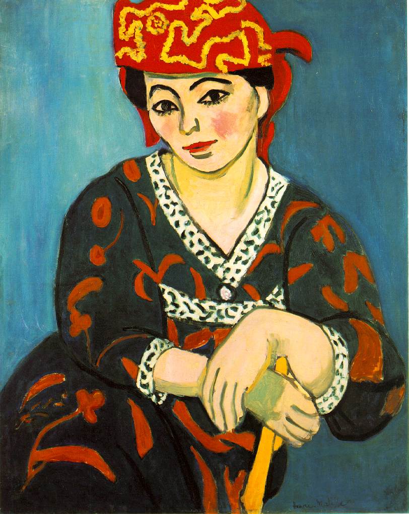
Henri Matisse, “Baroness Gourgaud”, 1924, Musee National D’Art Moderne, Paris.
Matisse’s oeuvre can be divided into numerous periods, (and not just for curatorial convenience), too many to list here, but each stylistically distinct from the previous (though not so obviously as with Picasso), and with a different set of priorities both formal and expressive, much more so than might appear to the casual observer.
I choose to write about this particular picture, The Baroness Gourgaud, almost certainly a commissioned portrait from the wealthy Baron, partly because it is one of Matisse’s finest portraits, utterly different in character from the great Madame Matisse in Rouge Madras 1907, (Barnes Foundation), or Auguste Pellerin, 1916, or Woman in a Turban, (Laurette) 1917, (Cone Collection, Baltimore), but also because it reveals many of the devices he had learned from Persian and Indian miniatures, by which Matisse ordered his spaces in the more relaxed setting afforded by the early Nice years, after the intensity of his engagement with Picasso’s and Braque’s cubism, to which the Pellerin portrait attests, during the first world war, the so-called “Radical Years”. But Matisse was always “radical” in ways which escaped most commentators then and now, who tend to downgrade the Nice years for reasons which amount to no more than Puritanism and philistinism. Renoir’s sensuality accrues similar opprobrium, quite unjustly.
John Golding writes: ”But basically for him [Matisse] the decorative came to mean an allegiance to the totality of the painted surface and to the overall spiritual and emotional aura that radiated from it… Matisse is one of the very few Western artists who have been able to invest pattern, normally associated with flatness, with spatial properties”. (Matisse and Picasso, Tate Modern 2002). [Braque in the 1930’s is another]. And Matisse himself said: “Persian miniatures… through their accessories… suggest larger spaces, a more truly plastic space. That helped me to go beyond the painting of intimacy”. (Dominique Fourcade ed. Matisse – Ecrits et propos sur l’art. Paris 1972 page 203). The intimacy would return with paintings like that of The Baroness, however.
Henri Matisse, “Madame Matisse in Rouge Madras”, 1907, Barnes Foundation.

Henri Matisse, “Auguste Pellerin”, 1916, Musée National d’Art Moderne, Paris.

Henti Matisse, “Woman in a Turban”, 1917, Baltimore Museum of Art.
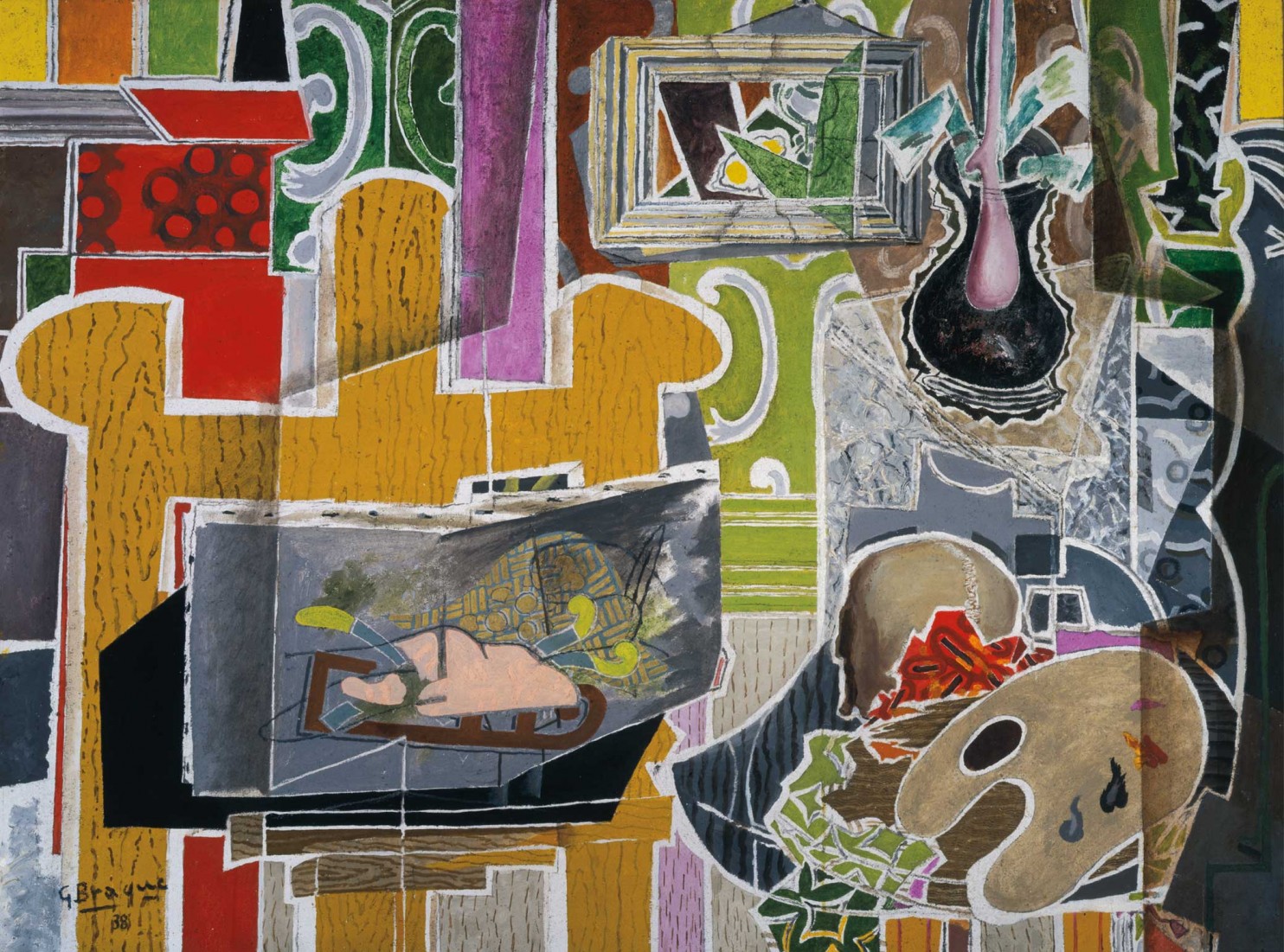
George Braque, “Studio with Black Vase”, 1938, The Kreeger Museum, Washington
Matisse had demonstrated (well nigh programmatically) his gains from a study of Islamic art chiefly in his still lives and studio interiors – Still Life with Aubergines 1911, (Grenoble), Pink Studio,1911, (Pushkin Museum, Moscow), and The Painter’s Family 1911, (The Hermitage, Leningrad); or Moorish Screen 1922, (Philadelphia). But by 1924 this preoccupation with patterned surfaces which indicate various distances from the plane of the picture by gradually reducing the size and boldness of the inflected strokes which register these patterns, had begun to be combined with more “Western” norms of plasticity, perspectivally receding planes, bold diagonal lines which tip the planes inward, yet not really, table-tops raking from emphatically delineated foreground to ambiguous “depth”, The Black Table 1919,(p.c. Switzerland), and a greater emphasis on the textural feel of different substances, fabrics etc.

Henri Matisse, “The Black Table”, 1919, private collection.
The Baroness Gourgaud 1924, (Musee d’Art Moderne, Paris) is a consummate example of this fusion, manifesting Matisse’s “touch” at its most delicate and sensuous, a “condensation of sensation”, a symphony of blue-tinted light, a well nigh miraculous evocation of a moment in subjective time, bearing little or no relation to the way we actually see the space of rooms and personages in quotidian experience, and a mood which exudes the kind of emotion which poetry aspires to, but which only a great painting such as this can embody.
It is almost futile to try to describe how this is done, dependent as it is on the complete absorption of the artist’s feeling in face of his model, and the direct transmission of this feeling through the quietistic submission to the hard-won achievement of the by now unconscious gift of a mastering of impulse, when “the respectful craft obeys, because it knows the language so well” (Cezanne, according to Emile Bernard). But we are here talking about the formal devices employed, as a stepping stone to an understanding of how the painting “works”. Needless to say, these same devices could be, and have been, employed by lesser artists to numbing effect, nullifying the quality of the original, or trying to.
Henri Matisse, “Baroness Gourgaud”, 1924, Musee National D’Art Moderne, Paris.
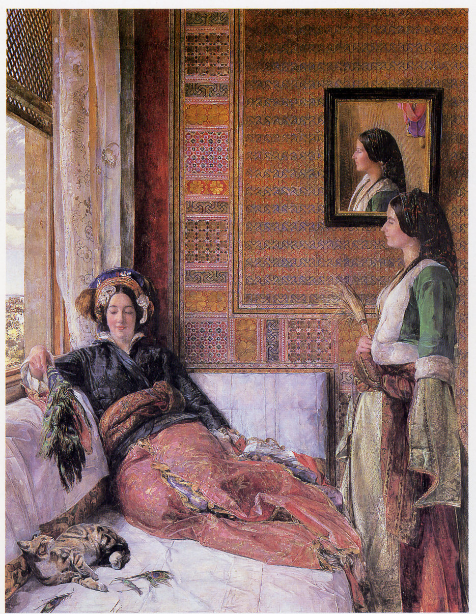
Our habits of perception tend to situate the subject of the picture, the Baroness, in shallow depth within the fictive space of the picture, although on closer inspection her face, looking straight at us, is as forward as anything else in view, and as we concentrate on it, the rest of the picture falls away. This suggestion of depth is reinforced by a foregrounded figure, with her back to us, whose extended arm, shaded cylindrically (as is her neck) moves “into” the picture from the yellow flattish but very slightly modelled shape of her shoulder ,which marks the most salient plane, the right hand bottom corner of the picture.
The cylindrically foreshortened forearm of this prominent figure reduces in perspective to meet a black wristband (or watchstrap) abruptly turning at the wrist to a fingerless hand, laying on top of one of a number of books, opened and subtly shaded in blue-greys, which rests on an ovoidal table-top covered with a cloth patterned with roses, delicately touched in with Matisse’s characteristically semi-transparent dabs and commas of fluid oil paint. The roughly ‘L’-shaped arm movement is mirrored in recession by the right arm and hand of the Baroness, who is wearing a blue and black blouse with semi-transparent sleeves, rendered with more of the delicate dabs and commas that decorate the table-top. Thus far, if we follow that route designated by the echoing arms, we are some way into the space or spaces of the picture, except that when we meet the gaze of the Baroness, she seems present in a way that negates the logic of this subtle perspective.
“Behind” her right shoulder, we see a mirror reflection of her back, the dabbings of the blouse smaller, reduced in scale (as in the Persian miniatures), the back of her chair and a slightly modelled brown ovoid, smaller and less coiffed than logic would expect, indicating the back of her head, although where the supposed mirror begins or ends is not at all clear unless the reflection of a pale blue window, further “behind” this reflected head is thought to indicate a window situated behind our heads as observers (as in Manet’s Bar).
The cursory, almost flat treatment of the black head or hat of the yellow-clad foreground figure, the largest blob in the picture, and the brown blob of hair in the mirror, act as recessional foils on opposite sides of the picture, against which the Baroness’s features loom out from her dark brown tiara of primly cropped hair. Her features are beautifully modelled in cream and grey shading, with a darker grey centre parting to her forehead, echoing Matisse’s discoveries in The Green Line, 1905, accentuating the fine sharpness of the ridge of her nose and the repressed sensuality of her nostrils and lips. And her darkly lined eyes miraculously indicate a deeply melancholy personality, miraculous because this effect is achieved with a few simple but dramatic arched black lines, the pupil of each eye no more than a black dot.
Immediately to the opposite side of her face from the blob in the mirror, almost at her eye-level, sits a vase of flowers, (more dabs), very much reduced in scale, indicating “further away”, resting on the edge of a table which thus appears to be “in another room” further within the fictive spaces, with a red floor cross-hatched in brown, which does and does not recede to the back wall of this room, and a view through a curve-topped window to the sea beyond with a sail indicating “boat”; and the balustrade of this window reduced in scale accordingly, and less strongly saturated in colour to enhance the supposition of further away.
However, these scalar reductions apart, if we read across the top areas of the picture laterally from left to right, the vertical strokes which indicate mirror(?), doorway, furniture, far wall, window, interior doorway, screen shaded in black, and the sequence of colours which register them, are virtually all on one continuous plane closely identified with the canvas surface itself. It is only the inward curving of the top of the screen, and the perspectival angle at its base, echoed at the corner where the red floor meets the back wall of the inner room, that leads us to see a perspectival recession in these background areas of the picture. It is the larger scale of the yellow clad foreground figure with her dominant black hair (or hat?) and her columnar neck and thrusting inward arm which clinches the sense of a spatial depth receding to the inner window and beyond. Our visual habits are thus confirmed, when so much else in the picture conspires to deny them.
One returns to the almost imperceptible delicacy of the shading of the Baroness’s hands, the deceptively childlike simplicity of the dabbing in of the pearl necklace around her neck, the modelling of her features, the expression of the eyes, the vase of flowers, the subtle transitions from the near-flat yellow shoulder of the first lady to the shading of her upper arm, “flat and not flat”, the paler shading of her elbow as it meets illumination reflecting from the table-top etc., etc. (qualities admired by Milton Avery for one).
It is this inimitable “touch” of Matisse that is so often highlighted by connoisseurs, and rightly so. Compare it to, say, Bonnard’s “inspired timidity” (P. Heron), or Renoir’s, which influences these Nice years. Without it there would be no Matisse, and no great painting, even when all other aspects of the style are taken into account. Not that it remained unchanged throughout his development. But these early Nice years conspired to produce pictures which in their quiet plenitude, richly ornamented detail, and sheer subtlety and brilliance of colour orchestration, rival, and no doubt are intended to rival, some of the masters of painting in this mode: Vermeer’s late small portraits, Girl with a Red Hat 1666-67,(Washington Nat. Gall.), Delacroix’s Femmes D’Alger crossed with Ingres’ Madame Marcotte de Sainte-Marie, 1826 (Louvre), Corot’s Jewish/Algerian Woman,1870 (p.c.) or something of Renoir’s nacreous glazes in La Loge, (Courtauld), Madame Heriot,1882, Odalisque,1870, and Madame Clementine Stora in Algerian Dress.

Vermeer, “Girl with a Red Hat”, 1665-66, National Gallery of Art, Washington.

Ingres, “Portrait of Madame Marcotte de Sainte-Marie”, 1826
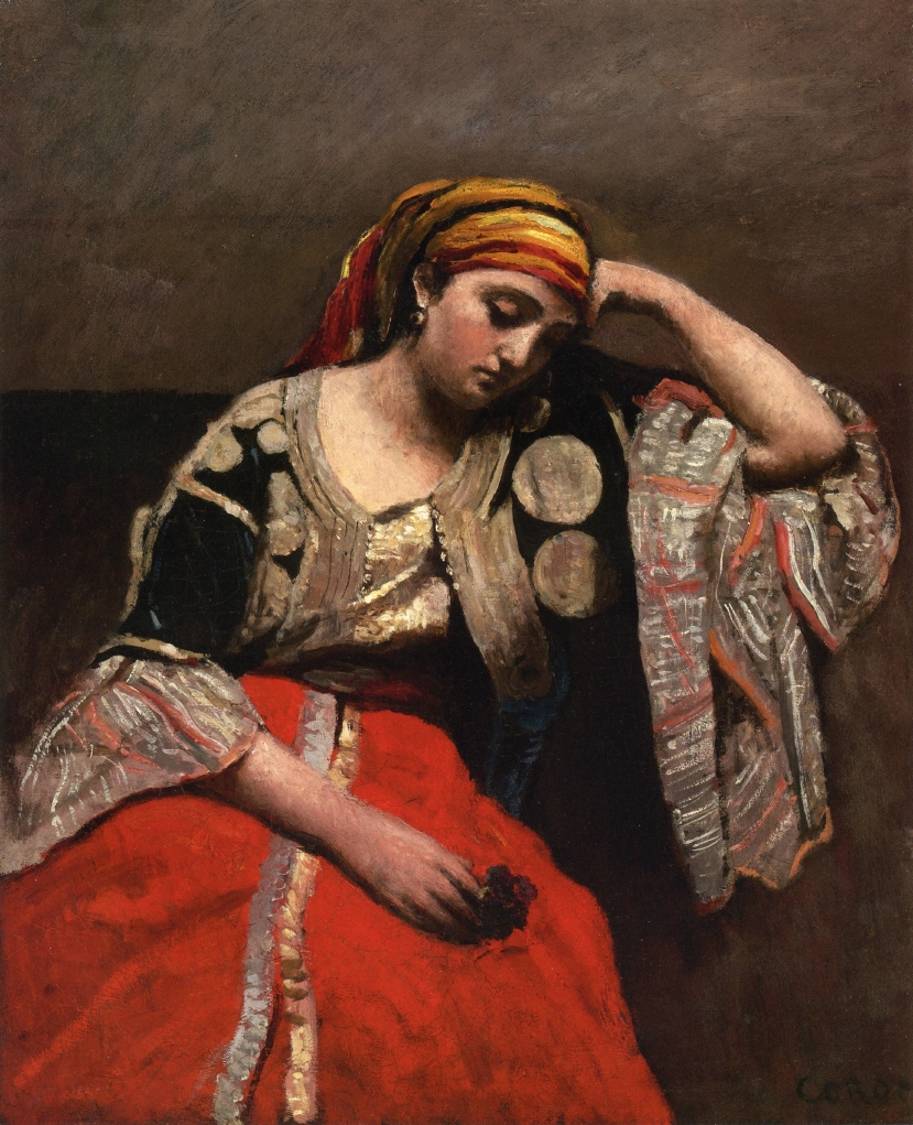
Camille Corot, “Jewish-Algerian Woman”, 1870.
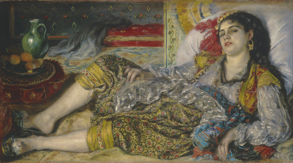
Pierre-Auguste Renoir, “Odalisque”, 1870, National Gallery of Art, Washington.
[Compare Renoir’s Sailor Boy (Robert Nunes) and Girl with a Parasol (Alice Nunes) 1883 with Matisse’s Boy with Butterfly Net, and Girl with Parasol and Shawl, and Rose in Ear].
Matisse’s long standing rivalry with Renoir is often oblique or covert, but in the Nice years becomes more obvious. It influenced both his Moroccan period and his Odalisques of the 1930’s. The range of Matisse’s powers of assimilation from his predominantly French forebears, synthesising apparently opposing streams of influence, from both Delacroix and Ingres for instance, is a constant source of surprise as new affinities emerge. Nor was he the first to fall under the spell of Orientalist themes, which preceded even Delacroix’s visits to Morocco and Algeria in 1832-34.
John Frederick Lewis, “Hhareem Life, Constantinople “,1857.
In particular the remarkable English painter and watercolourist John Frederick Lewis anticipated the spatial organisation of interiors by incorporating devices from Islamic, Persian and Indian miniatures as early as the 1850’s, of whom John Sweetman writes: ”This psychological separation of figures by background horizontals and verticals parallel to the picture plane has notable counterparts in Persian painting… in the end Lewis avoids pastiche and marries his jewel-like dabs of colour to European methods of space-presentation”. And: “…returning from Egypt in 1850. But by then, with ten years study of Egyptian light and the two-dimensional expanses of Islamic screens and tile-work behind him, he was committed to the experiment of opening closely meditated classical compositions to the invasion of that light and pattern… Space is seen in terms of adjoining sectors rather than as a continuum defined by perspective… to set these patterns against the corporeality of figures and render both as a totally integrated surface.” And: “he castigated Millais in the street for ‘unseemly loading’ of his canvas with paint”. (The Orientalist Obsession – Pages 134-139.)

John Frederick Lewis, “Life in the Harem”, 1858.
I mention all this just to indicate that the more one enters into a pursuit of any pictorial or poetic theme, the more resonances with its past are revealed. It becomes harder and harder to identify its originating impulse in an eternal regress to the earliest of recorded pictorial time. There truly is “nothing new under the sun”, although in the foreshortened vision of the up-to-date it may be difficult to recognise this.
Conversely there are connotations in the “scented languor” of the Odalisque theme that clearly belong to the 19th century, and Matisse, by adopting it, is rescuing it from a by then corrupted and decadent recent history of Salon kitsch (but that’s a story for another day).

Henri Matisse, “Madame Matisse, Woman with a Hat”, 1905, San Francisco Museum of Modern Art
How far Matisse had come since the perfervid nervous agitation of the height of his “fauvism”! In Madame Matisse, Woman with a Hat of 1906 he had risked disintegration of the whole image in pursuit of an intense frisson of light-creating oppositions (as he had learnt it from divisionist practices); a troubled and in many ways incoherent picture, a hybrid, marking the coming together of incompatible styles of representation, but at the birthpoint of a major discovery. It, and the “Radical Years” of cubist assimilation which followed, test conventions of “realist” representation, and the representation of spatial depth to the limits. Their relationship to observable reality as commonly and lazily understood is thus fractious and confrontational.
The result is a discordant three-tiered (at least) series of disjunctions. Madame Matisse does not “wear” the hat. It is perched on top of her features like a gigantic paper mache construct seen front on, and tipped up to meet the picture plane, while her head, seen from an oblique angle, is colouristically modelled as described, with an abrupt transition at the flat neck to the contraposto of her chest, which is obscured by a reflecting bib designed to light up her face. Meanwhile her foregrounded right arm and shapelessly wooden hand jut out awkwardly.
Interest in the division of tones originally came from outside painting, from the budding science of optics and of the phenomenology of perception. Matisse realised that it was not an objective science to be applied systematically by all and sundry, or even by gifted painters. It needed to be sensed intuitively in the Crocean manner, by an active attention of the spirit, and that the anti-naturalistic effect of the side-by-side placing of complementary colours was so marked, that it required a conceptual element taking it far from a humble recording of observable fact.
Just as in Picasso’s proto-cubist drawings, indeed in all drawing, cubist or otherwise, there is a conceptual element – you have to think it before you can draw it (as in jazz, what you can’t sing you can’t play) – so in Matisse’s fauvism there is a search for a Cezannian form-creating purpose for the pulses of light generated by these oppositions of pure, though often not so pure, colour, and one which would spread to involve the entire painted image, not dissipate itself in isolated nervously agitated incidents, (a lesson lost on some of the other fauves).
Thus by the time of The Moroccans 1916, Matisse has combined the rendering of light-bathed figures and objects with a larger pictorial schema (following his wrestling with cubism) which overcame the centripetal bias, the tendency to centralise which a preoccupation with volumetric depiction had compelled on the analytical phase of cubism.
In contrast, the Baroness’s portrait seemingly embodies a more relaxed relationship to the dilemmas of pictorial architecture, and to the everyday gaze with which we intake our domestic surroundings. But this is only seeming, since the lessons of these radical years are all there, inbuilt, implicit; they have attained the level of the semi-involuntary, though not merely of habit. Matisse reconfigures his rooms in accordance with innovations in pictorial priority as before. In Woman with a Hat, 1906, the colour oppositions are in a certain sense “arbitrary”, but there is a supererogatory logic at work; light generated by colour contrast is made to turn corners in the service of the double function of the placing of the volume of the head in space, whilst adjusting it to the plane of the picture. The planes of the face, neck, and shoulders are not delineated as material bodily surfaces, flesh-coloured, as in the Baroness’s portrait, but as opportunities to reflect light, almost as if the features of Madame Matisse exist independently of their fleshly protuberances, as merely prismatic effusions, to be captured by a concatenation of light-creating nodes of colour. This is an anti-naturalism put in the service of a higher form of naturalistic depiction. I do not think for an instant that Matisse was fully conscious of what he was doing – that is the magic of it. He was in trance-like thrall to the compelling dislogic of the demands of his art at this point in its evolution.
To place Woman with a Hat 1906 side-by-side with the Baroness Gourgaud 1924 would be to witness extraordinary gains, and precious few losses in the enfolding grandeur of Matisse’s art. And these gains, in rendering the space and its ambient atmosphere (subjectively held together in consciousness) in which a human subject, a living person is present to us, are coupled with an emotional depth conveyed by intangible though evident means, centred on the Baroness’s facial expression, but resonating to involve the whole of the spaces depicted.
What we are presented with, in the end, is the painter’s feeling, a unique moment of identification with the full tragic presence of another person’s life, which we are customarily too impatient or too callous to notice: a quality all too rare amongst even the most celebrated of painters. This is Golding’s (or Benjamin’s) “aura”. And it is there despite the efforts of cynics to deny or undermine it.
ALAN GOUK December 3rd 2015.
Footnote: See Orientalism by P.A. Renoir 1841-1919 and his Algerian Quest. Barbara Wells Sarudy July 23 2014 It’s About Time.
See also The Orientalist Obsession by John Sweetman , Cambridge University Press 1988.

I have certainly enjoyed reading this article – and it prompts me to think of a humanised conception of ‘pictorial space’ that is realised by Matisse studying the evidence/subject matter before him (on behalf of us all), perceptively and plastically (from what is seen to what is rendered). The image is humanised by being psychological: Hence – “Our habits of perception tend to situate the subject of the picture, the Baroness, in shallow depth within the fictive space of the picture, although on closer inspection her face, looking straight at us, is as forward as anything else in view, and as we concentrate on it, the rest of the picture falls away.”
Does the Baroness’ portrait appear a little too large because, as we focus like Matisse the observer, we too bring her image closer? (Rather like a child drawing the eyes too big?)
LikeLike
Nice essay, very interesting-looking painting; but it’s a little bit rotten (I refrain from ‘tiresome’) to find Baroness Gouk banging on about the subtleties of a three-dimensions-resolved-in-two spatial painting from ninety years ago in a manner not a million miles from those I used to describe Durer’s Paumgartner Altarpiece which brought down such opprobrium from the man himself.
It is, actually, a very good Matisse, by the looks of the reproduction (I don’t recall ever seeing it). It is indeed very spatial, though I’m not sure it is absolutely resolved (that foreground figure is rather clunky, no?). But it’s interesting that Alan’s text, once it floats past the “symphony of blue-tinted light” thing and gets down to the nitty-gritty, has so little mention of what the reciprocal influence of colour explicitly does in the description of how Matisse achieves this particular space-form. What use then for abstract painters who only make space through colour, I wonder (as a mere sculptor and occasional bad painter)?
I remain unconvinced by “the sequence of colours… virtually all on one continuous plane closely identified with the canvas surface itself”. Only seeing the original would say for sure, but I can’t imagine that there is a flatness to it that so undermines the spatiality. I’d go the other way, and say that there might be almost too much spatial tension in that passage, as we search for the edges of mirror/room etc. It’s certainly exciting.
“It is only [only!] the inward curving of the top of the screen, and the perspectival angle at its base, echoed at the corner where the red floor meets the back wall of the inner room, that leads us to see a perspectival recession in these background areas of the picture. It is the larger scale of the yellow clad foreground figure with her dominant black hair (or hat?) and her columnar neck and thrusting inward arm which clinches the sense of a spatial depth receding to the inner window and beyond.” Yes, the spatiality is clinched by the structures.
LikeLike
For what it’s worth, I thought it was a fake Matisse when I first saw the image here. The figure in the bottom r/h corner did not ring true.
LikeLike
Just as a point of fact, I did not say anything negative, or indeed anything at all, about Robin’s account of Durer’s painting.
LikeLike
As another point of fact, I haven’t said you did. But you did say: “…the types of spatial organisation found in Netherlandish and Pre-Renaissance painting, while they may stimulate the imagination of a sculptor, are antithetical to the aims of abstraction in painting…”
Presumable the type of spatial organisation in the Matisse is more conducive to your kind of abstract painting, and so I would like to know more about what the difference amounts to. Since it doesn’t appear to be wholly reliant on colour, is it then in this identification “with the canvas surface itself” that you see in the Matisse? Just asking.
LikeLike
My purpose, in so far as I had one, was not to show how the subtle catalogue of illusionistic devices Matisse uses to give an illusion of spatial depth could be of benefit to abstract painters. On the contrary it was to suggest once again that there is a borderline between figuration and abstraction which cannot be crossed with impunity. In a letter to Robin last year, I wrote:– “To the representational painter, the world consists of a sequence of light-reflecting convex and concave surfaces, or flat planes inflected at various angles toward and away from the eye.
But add to this phenomenon of perception what happens when pigments of varying degrees of transparency, opacity, and degrees of saturation, the optical weight of primaries, tertiaries etc. are applied to a surface. There is no way of predicting what will happen when one area of colour is applied next to another —no systematic formula will guarantee control of the spatial implication thereof.
Cezanne was able to adopt a systematic approach by grading his colour patches from, say, bluish to greenish, or vice versa, strongly to weakly saturated, along a logical path around the spectrum, returning on itself at the point of maximum contrast, red against green, or blue. And this system is implicit;it lies behind the push and pull dynamic in Hofmann, but in the freer world opened up by abstraction, free that is of volumetric depiction, colour takes on a more unpredictable , unsystematic and surprising role.
By flooding the canvas with semi-transparent grainy washes, often of a murky indeterminate tertiary mix, which both assert the surface, but are ambiguous spatially, and then placing more strongly saturated planes on top, some of which sink in, while others jump forward, but only relatively, (see Darby Bannard’s account of Ave Maria in Hofmann’s Rectangles) Hofmann is able to induce a box-like illusion of space in depth, but not one that is fully under conscious control. You can never tell what will happen until the colour is applied, how it will react to its neighbours.
But Hofmann rarely stops there. Usually more and more colours are added, yellows bridging in both directions, through orange to red, and through blues to violet until the surface closes up into a dense wall. Then a spatial element is introduced in classic fashion by reducing the size of some blocks, which may recede, or may be firmly planted “on top” of others, causing a tension between actual size ( which would or should imply recession through diminution in scale ) and visual impact , all of this relative to other placings, and other colour sequences in the picture. It is all a relative interchange in co-dependence. (See especially Magnum Opus, or Goliath, and the fantastic Equinox 1958).
To the academically minded this constitutes a system, but it is full of surprises for an imaginative painter. To try to force this freedom back into the role of trying to fashion volumes or “forms” in space, or moving into the depth of the picture, runs against the whole spirit of adventure in colour which modern painting opened up.”……. Elsewhere I have related that it was just these qualities in Hofmann that Patrick Heron objected to, but that is another matter. I the n went on to say how I felt my painting differed from both Heron and Hofmann, but that too is straying from the main issue that concerns Robin. I hope that clarifies!.
“One of Hofmann’s greatest pictures –Pre-Dawn 1960. (Now in Canberra) has a richly modelled greenish, bronzing brassish “ground”, on which or in which smaller yellow blocks or chocks act as punctuation marks, sometimes fractionally “behind”, sometimes floating “in front” of the Reds and blues. But turn the picture on its side and the whole reciprocal pressure of the blocks on one another changes. And the blues never recede –they are emphatically just BLUE against red or orange.”
LikeLiked by 1 person
On crossing the line between figuration and abstraction:- …. In both Hofmann and Heron there is a continuum. Hofmann did not fully commit to abstraction until around 1950-51 , when he was 70 years old, but even then he continually reminds us that it is a continuum, a matter of emphasis, with his most painterly works, like Summer Nights Bliss, In the wake of the Hurricane, Lava, and Fiat Lux (-1960 I think — I don’t have my books with me). The large square Monet’s in the second to last room in the R.A.’s current show are within a hairs breadth of hofmannesque abstraction.
The crucial transition occurs in Rothko in 1947-8, with the first Multiforms, when he leaves surrealist drawing and allows his colour to create the space directly, and Heron follows him in this in 1956. Clifford Still had anticipated this move with his swathes of palette knifed surfaces. As Bannard said in Touch and Scale in Abstract Expressionism, Still’s rich surfaces cast further into the future than the “opennesses of post painterly abstraction, surface being the first property of the art, (paraphrasing).
Nicholas De Stael transitions in the opposite direction, from abstraction to figuration, and one can see what an unhappy compromise that is in his football match influenced pictures, and in his nudes. He then became fully figurative, although his last picture, Le Concert transcends the distinction, and still resonates. He then jumped from his studio window.
In a British context, Scott, Lanyon, Hilton, Hodgkin,are all compromised by their irresolution , sitting on the fence regarding abstraction, and hence unable to create a fully convincing, “clear, demarcated, out there, resistant to the eye, of equal intensity” (Adrian Stokes) kind of picture. Don’t go there, would be my advice.
LikeLiked by 1 person
I am quite delighted to read Alans writing for Ab Crit,,which is incredibly knowledgeable, serious ,but not stuffy,and above all descriptive of the act of enjoying a Painting.I have thought his written word excellent in thought and application,and very little compares with his discussions of Heron and Colour.While I was reading this the impossible spaces of Cezannes work in the Courtauld came to mind.We are very lucky to have his contribution.However,I am still struggling with Painting after 50 years of activety and ,much as I appreciate the comparisons made here between Matisse and Hoffmann /Rothko,still find it most testing to try and get the sticky stuff out of the pot and onto the canvas with anything approaching the grandeur mentioned here. I have to remind myself that most good painting is shocking and can look very bald and lop-sided when first painted,and that those discussed above were once wet,awaiting judgement,in a corner of a studio I would agree with Renoir,most Painting has way to much physical stuff loaded onto the canvas,it being primarily a spiritual act
LikeLike
Alan, I always enjoy your comments, but I do think that you are confoundingly contradictory. You are one minute claiming an unbridgeable chasm between figurative and abstract painting, and the next saying it is all a continuum. Have sympathy on us lesser intellects who can’t keep up!
Here is a link to Hofmann’s “Pre-Dawn”: http://nga.gov.au/Exhibition/ABSTRACTEXPRESS/Default.cfm?IRN=102786&BioArtistIRN=16603&MnuID=3&GalID=2&ViewID=2
I’d be interested to get other views on this painting that Alan thinks is so great. I also wonder if he has seen the actual painting. Like any other work, Hofmann can look very different in the flesh. I can’t say it’s one of my favourite Hofmann’s, judging from reproduction. It also looks rather figurative to me, with that green background and high horizon line, and has a rather clumsy symmetry. What Alan says about turning it around confirms to me there is a kind of figurative “gravity” thing happening (is that figurative?), something I think happens a great deal in abstract painting. (It’s especially true in early Hoyland. Try turning one of his green or red paintings from the sixties upside down.)
LikeLike
On the „gravity“ thing, I find that you have to make the bottom of an abstract picture recede slightly compared to the top in order to counteract the eye´s natural „pulling out“ of the bottom as imagined foreground. That way you get a more even pressure from top to bottom. Hofmann seems to being doing the opposite in this painting, which adds to the landscape feel.
LikeLike
Robin,
Your articles on Early Gillian Ayres and What Paint does (in Abstractcritical)’ show that you understand the difference very well. It’s about freeing the expressive power of paint-flow, shape, value (saturation and transparency etc) from the task of volumetric or any other depiction, allowing them to make their own spaces directly , of equal intensity, clear, demarcated, out there resistant to the eye. But as always there are no absolutes; Pre-Dawn pushes the weightiness of the blocks almost to the point of representing the front-on end of a mass, but not quite.
De Stael, who some claim influenced Hofmann in the early fifties, is travelling in the opposite direction from Hofmann. De Stael is a genuine, an “authentic” painter, but he is not really a colourist, no matter how bright his colour patches become. His paintings look best in black and white reproduction, where their robust and carefully attuned surfaces come across, but they are tonally organised, close-toned, and his most successful pictures —such as The Orchestra 1952 (centre George Pompidou) are near monochromatic, in a subtle range of greys. Even here though, we are looking at a view of something, as if on a stage, not at something creating its own spaces independently.
His lightest tones suggest surfaces that are illuminated by sunlight or a source of light from outside the picture; the colours do not light one another up as in Fauvist lineage, nor do they glow from within. And when, as in the Reclining Nude 1954, the one with elbows raised up, De Stael tips his planes into depth, they also tip into shade, and are tonally adjusted accordingly. Perhaps I may write on De Stael at greater length sometime, since some of his letters and statements reveal an acutely perceptive vision, and an original mind.
LikeLike
By odd chance today I picked up (in a second hand bookshop) the catalogue for the 1955 de Stael memorial exhibition at the Whitechapel. All the photographic illustrations are in black and white.
LikeLike
“To try to force this freedom [of abstraction] back into the role of trying to fashion volumes or “forms” in space, or moving into the depth of the picture, runs against the whole spirit of adventure in colour which modern painting opened up.”
I do agree very much with this, and I would insist that I have not advocated any such “return”; but I also think the “spirit of adventure” in abstract art often needs a good shake-up, and sometimes (even in Hofmann) that might entail having to sail close to the wind regarding things looking in some manner figurative, messy, or even rather monstrous. I suppose my point is that the flattening and simplification of painting that you sometimes extol is, in the hands of so many exponents of abstract painting, an excuse for something very much against that spirit of adventure. The novelty of flatness and simplification wears thin very quickly.
And of course I’m unconvinced still that the whole of that adventure in abstract painting is bound up so exclusively with the reciprocal influence of colour. Or maybe it is that I think that some kind of “pure” colour painting is just not a sufficiently rigorous discipline… For example, I’m not a fan of late Monet, as seen in the current “Garden” exhibition at the RA.
LikeLike
I thought this made an interesting comparison with the Matisse (just to annoy Alan): http://www.metmuseum.org/collection/the-collection-online/search/436984?=&imgno=0&tabname=online-resources , though I should stress again that I have seen neither for real.
This Quentin Metsys “Adoration of the Magi”, 1526, in the Met, N.Y. has an intensity in all aspects – spatial from front to back and in the strong three-dimensional articulation of the foreground so completely bound together with the powerful psychological focus between the main players; the sheer visual delight in the variety of form and space and detail in all parts of the picture – which I think, for me, makes it not only far, far superior to the Hofmann, but also surpasses the Matisse. It certainly interests and excites me far more than either, and I think I could go on looking at it for a lot longer. Where now, modernism?
LikeLike
…by which I mean, what are the “freedoms” of abstraction so often cited? Are they really freedoms for the work itself, bringing greater scope and power and the ability to do the most extraordinary things (which I think, as an example, the Metsys does); or are they mere freedoms for the artist’s own indulgence? Is the Hofmann really “freer” than the Metsys? It seems very much more constrained to me. Are the achievements of Rothko really “freer” than Matisse? Etc…
LikeLike
Perhaps the freedom of abstraction is for the viewer? (I know they don’t carry much weight around here!). A particular type of freedom which involves submitting to the limitations another has imposed…..
LikeLike
I find it hard to reconcile these comments with your general calls for abstraction as the necessary condition of important or relevant painting now.
How is abstraction going to accommodate your “powerful psychological focus between the main players”, for example?
LikeLike
Can’t you read? The colour is free from the burden of volumetric or any other kind of representation or depiction. The total contradiction of your “position” is that you want absolute abstraction for sculpture, but all the paintings you point to are figurative, so,that once again values deriving from painting are being urged as a stimulus to sculpture, just as Caro did, and you are trying to get as far away from Caro as you can. At least I am consistent. I say that planarity is of the essence of painting, which cannot be escaped by diffuse handling such as you employ in your recent painting. Whereas sculpture exists in three dimensions, not literal three-Dimensionality, but plastically realised three-Dimensionality, which is a very different matter. And admiring these old paintings is not going to help one bit with that.
If you want to know the full story of the continuum and borderline in ABSTRACT painting, reprint my article from Fuse magazine in1988, on Hofmann at the Tate, curated by Hoyland.
LikeLike
Paradox 2 , You advocate a sculpture that starts from nothing, has no past and no precedent, and is abstracter than anything that has gone before, and yet you spend all your spare time looking at paintings, figurative paintings form 600 years ago. Where’s the sense in that? . Every epoch has its own “arbitrary” limitations, its own areas of focus and concern. And as Matisse said, the artist is not free to do anything he likes. He can only do what the pressure of the historical moment will allow. The problem is that today’s visibility, its historical moment is utterly devoid of concern for the sorts of issues that engaged painters of the 20th century, and Robin is just one of many who are wilfully turning their back on the very things that gave modern painting its backbone, the disciplines that made the major figures, like Still, Hofmann, Pollock, Heron, Frost, Nicholson etc., the greatest painters of their time. As I’ve already said, Robin is totally out of sympathy with, or understanding of, the whole current of modern painting from around 1900 onwards.. There is a word for this kind of myopia, but I will refrain from using it. Try placing up an image of the Metsys and the Hofmann side by side, and compare the strength of colour. The best painting of the future will develop out of the painters I have just listed, indeed it is already doing so, whatever Robin may think.
LikeLike
Ridiculous rubbish. Comparing the Metsys and the Hofmann was exactly what I was doing, and it’s the Hofmann that looks burdened. It’s a poor show if you think that the relative value of a painting is all down to it’s colour saturation. That puts a whole new perspective on art history, especially if we now have to follow on from the distinctly ‘iffy’ linage of Heron, Frost, Nicholson. Oh dear.
Why don’t you list Stella? He’s got lots of bright colours and flatness – sorry, planarity.
LikeLike
I should have said that modern painting, not quite the same as modernism, really begins with Monet’s response to Manet’s Dejeuner sur L’Herbe. His own version, cut in two, one half in the Musee D’Orsay, where he begins to introduce a new sense of the vividness of natural light, which became the lodestar for every progressive painter subsequently, and especially for Matisse, whose devotion to the luminosity of objects and sitters as he saw them with his own colour sensitive eyes is what still gives his pictures a shock value even today. (by comparison Cubist pictures are dingy brown things).
It’s a bit like saying that music is all downhill after Bach. In a certain sense it’s true, of course, but what are we to do about it after all the mutations that have taken place since. The back to Bach movement of the anti-modernist right produced nothing but cod-Bachian pastiche, as Schoenberg unkindly said of Stravinsky. Antediluvian recidivism has been a tendency throughout the last century. Why painters like Lucian Freud and Frank Auerbach are reactionary is because they haven’t even seen the lesson of Monet and Matisse. Their colour is drab, monochromatic, does not create light. On the other hand the likes of Stella, Bridget Riley and many others, as you well know, can use as much pastel brightness and fluorescent paint as they like without ever creating a harmony, or a true colour relationship. How do I define a true colour relationship. You can only point at it. And I am pointing at Monet of the 1870’s and Matisse of the 1910’s.
LikeLike
And why has no-one pointed out how complex and multi-layered that Braque Interior with Black Vase is ?, Braque who himself was obsessed with space, plastic space, tactile space? Is it because he is also a master of complex flat patterning, reconciling the two ?
“Braque was for De Stael the master of modern art, he represented ‘la vraie pienture” and his friendship gave De Stael much needed spiritual support , helping to shape his vision and confirm his sense of the “metier” of painting. Braque’s overriding preoccupation with space, visual space,tactile space, manual space, was clearly an important influence on De Stael’s painting.” Jean Bauret. 1945.
LikeLike
If this wasn’t by Matisse it would be quite easy to be irritated by several things: Why doesn’t the tilt of the head in the mirror echo the angle of the figure in front? Why is the Baroness’ reflected hairstyle simplified into a banal oval? What on earth is the role of the woman in the right foreground and why is she so weakly rendered? It turns out that this is Henriette Darricarrere, his model and, weirdly, her inclusion was a condition Matisse set for accepting the portrait commission. He liked the graceful way her head connected with her neck, something he noticed when he first saw her, but you wouldn’t guess that from the painting.
Fulfilling the self-imposed condition meant that Matisse gave himself compositional problems that he couldn’t overcome. To accommodate the interloper, the Baroness sits too high up in the rectangle with too little distance between her and the top edge. Matisse tries to expand the gap by putting in all those verticals, then complicates the spaces, (interior, reflection, window view,) to make up for the claustrophobic compression. He has more difficulties in the bottom quarter. Convention demands that this should contain a depiction of the Baroness’ skirt and legs but instead there’s a table, needed to divide her plausibly from Henriette. He can’t decide how to integrate the right hand side of the table top with the rest of the painting and camouflages the junction by placing Henriette in the way. But it’s a portrait, so he attempts to restore the primacy of the sitter. Hence the over-sculpted, German expressionist face which stares out both at us, and Baron Gourgaud, who would have presumably paid for the picture quite happily, because it’s a Matisse.
LikeLiked by 1 person
Playing devil’s advocate does’nt suit you, David. Your “reading” of the painting is obtuse to say the least, and just plain wrong. If you compare the Baroness with the two related interiors without the portrait, the one with the phonograph and the one with the birdcage, (details to follow) , you’ll find variations on the devices I described in the above article. Are the paintings better for the absence of the figures? I don’t think so, though they are also masterpieces.
LikeLike
Interieur, fleurs et perruches 1924 Cone Coll. Baltimore, and Interieur au phonograph 1924. If possible, please put up the image of the latter.
LikeLike
At least we are back to discussing the painting and the original article. I am not going to rise to Robin’s provocation with his idee fixe about “flatness”. I think anyone reading the article and the exchange of comments will recognise that I do not extoll “flatness” at all. But for anyone interested, my early article, Principle, Appearance, Style, Studio International, June 1974, discusses the issue of surface and depth in Matisse, Still, Hofmann, Noland etc. in considerable detail, and it seems I am really just repeating myself all these years later.
LikeLike
The one thing I’ll give you David, is that the shading of the columnar neck of the foreground lady, and the line defining her cheek, are slight blemishes, but it is precisely because he is trying to give Robin his receding depth that these blemishes occur. But depicting a figure from behind and at an angle is a very difficult proposition, I would imagine, especially in the context of the decoratively unified picture.
LikeLike
I’m pleased, of course, that Matisse did it just for me; but you need to think that through, Alan. You’ve taken a large part of your essay to describe the important values of this painting’s spatiality. So even Matisse finds what is essential about painting difficult to resolve. You, at a stroke, want to do away with all that for abstract painting.
Even should we agree that light and colour are crucial, the question remains: how are you to embody those values in abstract painting? You can’t just have those things in some kind of pure formlessness – so, as you’re not painting gardens, interiors with figures or whatever, what’s it going to be: stripes, rectangles, flat planes, geometry, symmetry… or something more adventurous?
I think I know who has the “idée fixe”!
LikeLike
Got worried for a moment there, with the ‘Devil’s Advocate’ remark. But I’m fairly sure I’m right about the limitations of the Baroness’ portrait. Comparing it to the two other Matisse paintings mentioned clinches it. They are fully articulated in terms of planar organisation, which is defined strongly enough to support and counterpoint the excess of ornamentation. In ‘Interior with a phonograph’ Matisse has been typically clever in having the same pattern on two walls, one about 80º and the other about 45º to the picture plane. The foreshortened version on the left seems particularly effective and spatially productive. In both paintings, the tied back Persian rug dramatises the view through to the rest of the apartment.
Everything fits, with each plane joined to the next, and the objects arranged within the architecture. But these two paintings belong to the interior/still-life genre where structure dominates composition. With the double figure portrait, composition dominates structure. The architecture seems less relevant and the pose and positioning of the two women, which are compositional issues, becomes crucial. Compare the Henriette’s angled elbow and arm (composition) with the angled table-top in the birdcage picture (structure). They involve different forces, I think.
LikeLike
Robin, you have the advantage over ABCRIT readers in that you know what my paintings look like from the 1970s to the present, and you also have seen photos of my recent work. So you know that they , or most of them, do not contain stripes, rectangles, flat planes geometry or symmetry. So do me the honour of putting up an image of The Bawd of Boddin, 1991-7, Scarce Merveille du Jour, 1997, and one of my recent Gouaches/acrylics, so that people can judge for themselves. And when I say that the planarity of painting cannot be escaped by diffuse handling, which is almost word for word what I said in 1974, I am including Monet’s Day Lilies, 1914-17, now in the R.A. , and Hofmann’s Fiat Lux. Hofmann goes all the way from The Window 1950, a cubistic still life with plunging diagonal planes overlapping in space, a figurative picture, to Beatae Memoriae, 1960?, with a few ultra bright saturated planes, so that we don’t have to! If you really want sculptural illusionism, you have to tone your colours down to gradations of blue/grey/black/white — as Picasso does in the blue version of his Women of Algiers, 13.2.1955., which gives the picture great visual/spatial impact, but it is not ABSTRACT, and as De Stael does in his Nudes. Strongly saturated colour contrasts inevitably “flatten” the picture, but only relatively
LikeLike
P.S. You’ll find the same “blue tinted light” in Poussin’s Landscape with Buildings in The Prado. It is that kind of gradation of colour, (I should have added brown) , that creates space in figurative painting.
LikeLike
In answer to John Holland’s interesting question: it is my contention, though perhaps unproven and somewhat un-thought-out as yet (I’m working on it), that those elements of human interaction and drama which were once the province of figurative art (particularly figurative painting) which seemed far beyond the scope of ‘mere’ abstraction, but which are no longer truly at the behest of the figurative artist either, who can only now debase or at best make commonplace all the human content of visual art, are progressively the prerogative of the abstract artist, and can and will be addressed in and through abstract content.
And if abstract content cannot be tied to human content in this way, then it’s a waste of time.
LikeLike
Needless to say, you won’t get very far down that road with coloured stripes, no matter how saturated.
LikeLike
I think John Holland is absolutely right here Robin. As I see it the most important aspect of the Metsys ‘Adoration of the Magi’ is that powerful psychological focus between the main players (this is I think even more pronounced in the St John Altarpiece) and without it, the painting, despite all its other attributes would be almost meaningless. Abstract art simply cannot work towards this type of intensity, with it uppermost in the artist’s thoughts or indeed hope to pin it on somehow after the fact as it were. At the centre of the history of western art is the human presence that has largely been realised through the figure itself. If abstract art has given artists anything in the way of freedom it has surely shown that there can be other ways other considerations that don’t require human content (or obscurely ascribed human presence other than that of the viewer) either at the heart of content or lurking in the wings. I would cite Pollock’s dripped/splashed paintings as examples of great visual power and intensity that, at least as far as I can tell, don’t need, even if it were possible, to be tied to human content in order to justify or improve them in any way.
LikeLike
Congratulations, — once again you have managed to divert attention awy from the human content, and the emotional content of the Matisse picture, ( which Matisse was at some level responsible for, without consciously putting it there), in favour of a purely speculative art theoretical conundrum.
There is a human content that does not require the presence of human actors depicted, virgins, babies, old men, etc. And it is present in the best abstract painting. As Rothko said ” a painting expands and quickens in the vision of a sensitive observer,
. It dies by the same token.” You’ve just killed this one.
LikeLike
In this painting there are several ovals at different attitudes plus rounded sections – even in the brushstrokes as much as the motif. These ‘curve against straight’ devices became more explicit in the forthcoming years as his confidence and experience grew. (Utamaro is dazzling at using these same devices) . Matisse was always headed somewhere in his painting; edges became tangents to these circles. The zig-zag across the horizontal meets the concertina verticals. How floor meets wall and the exterior through the window was a preoccupation. As a figurative painter he would always have to deal with structures. After the move to Nice, most of his time is spent indoors which means angles, planes and edges; no wonder human figures are introduced – it must get boring juxtaposing patterns after while (the window could be read as a symbolic clinging to his fauvist al fresco days). Angles -and elbows – create structural spaces yet he builds these ultimately through colour decisions. It’s all colour really…
If that right side head was bigger (as one would think) then the line of hot ochre that is the central frame of (what looks like) the mirrored cupboard would be shorter above it – which would cut the picture in two by lining up wth the left sided chair’s top. Also that notch of colour by the neck would be lost and the whole side would be a very different – heavier, ponderous even. If we focus on a face (even one that has the expression of a bulldog licking piss off a nettle) then our field of vision is going to become incidental.
Matisse is trying to deal with how we see as much as what we see. Yet this is a commissioned portrait and the face here is the pictorial climax. If it’s going in then it goes in in no uncertain terms. It’s always a give and take with Matisse though; he’s looking , recording, synthesising: “I don’t paint a woman, I paint a picture”. Matisse uses ovals to punctuate the verticals – there’s a soft ghost-like oval on the table top and the distant skirting board is also rounded off. The spine of the reflection is part of a series of deliberate hinged diagonals that gently saws throughout the picture from top left to bottom right. The eyes are echoed cleverly in the mirrored cupboard’s bruised tones. (or is it a screen?). Matisse is using primaries cooled by a blued grey with a warmed version in the reflection. It full of awkward but resolved passages. Matisse’s ultimate skill is “holding the rectangle”.
A subtext to this debate might also be how “detail” is created in a painting. For Matisse it is often through touch. Flatness and planarity can be bandied about but these are cumbersome terms. This is a fantastic painting – really extraordinary. It takes guts to put something together like this. I was immediately reminded of Cézanne’s portrait of Gustav Geffroy, which has a similar zig-zag device in the “foreground” – compare these two with Degas’s version of the same fellow and the colour is so strident in Matisse and Cézanne – crystalline and piercing. Matisse spends the 20s loading up his paintings with contrast upon contrast. The thirties see drawing leading the way and this puts a spine of steel into his work. From then on , he empties his paintings out (having earned the right to do so – modernist paintings often jump on these emptier spaces and codify things into neat formats – which are approaches that clearly bug our editor). We ultimately get to the Vence interiors. (which I wrote about in Closeness on abstract critical).
I thoroughly enjoy Robin’s unveiling of Northern European masterpieces, which he uses as a jabbing stick. The latest is phenomenal (well done!). It has a ‘pebbles in a box’ tonal polish – something to admire both in terms of spatial composition and detail. How detail is created can happen in lots of different (and equally exciting) ways though. Metsys never travelled over 20miles per hour, left the earth for the skies, flicked a switched to illuminate his studio and so on. We can’t just reach for umber to soften our tones. Different times, different … spaces.
LikeLike
Thank you Emyr. That is all very well said, and shows that there are many ways of “reading” a painting, as long as the gaze is uncluttered. Here’s a subject for some budding P.H.D. Student — the use of mirrors in Matisse’s Interiors. Some of these pictures, Interior with phonograph 1924 for example, (Please reproduce it) look as if the entire painted image/surface is a reflection in a mirror. In others the introduction of a mirror reflection complicates and makes more ambiguous the spatial illusions, subverts the rationality of perspectives if the mirror is slightly tilted away from vertical, and renders the image more “optical”. And so on.
LikeLike
Returning to Robin´s and Terry´s comments above:
Psychological content that can be expressed figuratively as facial expression, posture etc. is (at least theoretically) already amenable to language. Devoted faces are in the public domain so there can be some kind of rational behaviour that counts as understanding the words “a devoted face” (and via grammatical extrapolation “devotion”), which, following Wittgenstein, is the necessary and sufficient condition for meaningful, non-poetic language.
Figuration on its own, because it portrays the publicly visible world, and though it may at times find itself a few steps ahead of language in subtlety and complexity, thus cannot ultimately transcend language.
Abstract art (and of course the abstractness that may be contained in figurative art) is only itself and therefore has no necessary connection to language. It is a symptom of being rather than a portrayal of being.
Or so: Wittgenstein´s beetle is forever hidden to others inside its box. Figuration portrays the box. Making abstract art is more like shaking the box to convey some further impression of what might be inside.
LikeLike
The descriptions here of the Baroness portrait are extremely thorough, detailed and considered and have revealed differing views and ways of looking at the work, even amongst the contributors that broadly agree on its quality and status as a painting. I just wonder whether it is possible to reach a view of its merit as a portrait that can be separated from the other elements depicted also the structure and colour that characterise it as a whole painting. Asking the question a different way, is it a great painting that happens to contain a portrait as an important pictorial element or is it a masterpiece of portraiture. Or is it indeed neither of these things as I think is David Sweet’s leaning (apologies if that is not correct). There is certainly a feel of melancholy about the Baroness (whose status Emyr describes as the pictorial climax appears rather crudely emphasised by her disproportionately large head) that is tangibly dominant. Is that (mood) enough to make it a great portrait? For me it doesn’t possess the depth of powerful feeling and engagement for example that a Rembrandt self-portrait generates in the viewer. I accept of course that that might not be an appropriate ie. like for like comparison but rather a matter of personal preference. I would like to have seen the Mme Gourgaud’s expression on receipt of the work.
LikeLike
Here’s a few examples of Matisse using mirrors to extend the spatial tensions of his painting, one of the earliest being the great “Carmelina” of 1903, http://www.mfa.org/collections/object/carmelina-32429 where Matisse himself makes an appearance in the mirror, as in the “Interior with Phonograph” http://www.henrimatisse.org/interior-with-phonograph.jsp that Alan mentions. Then there is the extraordinary and complex “Interior with Eggplant” 1911, http://www.the-athenaeum.org/art//full.php?ID=64999 where the different openings of the mirror, the doorway and the window are played off against each other. Not least there is the very different approach of “Anemones with Black Mirror” 1919 http://bofransson.tumblr.com/post/66302933414/anemones-with-a-black-mirror-henri-matisse which was in the fabulous but now dispersed Reader’s Digest Collection. Space as infinite blackness… are all these spatial variations lost to abstract art?
B.T.W. Alan, it’s no use berating me with the words of Mark Rothko, whose contribution to painting, despite the glory of colour in his early work (you see, I’m not immune), remains in the negative. His (and your?) kind of subjective metaphysical “content” is down to the interpretation of the viewer, and as ever, is unaccountable. My “content” is at least in the hands of the artist.
LikeLike
Thank You, Robin. I am afraid I don’t know how to put an image up yet! Although the colour in The Aubergines picture and the Anemones too is greatly heightened over the originals, the former is still one of his most important paintings, which Braque saw in progress when there were coloured papers attached, and influenced him to “invent” papier colle soon afterwards. It is as near as damn it an abstract picture, if one or two telltale signs were removed, so there’s continuum for you.
I wrote about the Anemone picture in 1986 in Artscribe International No.57.
There is a remarkable painting by the High Baroque painter Pietro Da Cortona, ( setting aside the astonishing ceiling of the Palazzo Barberini, in Romeo) , The Rape of the Sabine Women 1627-29, now in the Pinacoteca Capitolina, Rome, which at first glance looks very like a Veronese, but obviously would’nt in the flesh, due to just these imponderables of character as expressed in “touch” that I maintain are so crucial. Then there’s his Stoning of St. Stephen, in the Hermitage, which has all the depiction of action in depth you could wish for, and yet does not have the missing ingredient of greatness that would transform it from merely being “interesting.” Why is Rembrandt’s The Blinding of Samson a truly great picture, even with its lateral spread, while the Cortona is not.?
And Cortona, who is influenced by the sculptor Bernini, also influenced Poussin, your favourite painter. Those were the days when pictorial and sculptural values cross-fertilised one another, so perhaps you are onto something after all. I only wish you could try to understand why the leading painters of the 20th century felt impelled, sometimes reluctantly, to take the steps they did, and what it was they wanted to reject to get there. Look at the Aubergines picture– it’s about colour and light, brighter than in the old brown painting of the past.
LikeLike
“the old brown paintings of the past”! I’ll say no more about that.
And yes, maybe I am on to something, and I do understand why the leading painters of the 20th century [and sculptors, don’t forget the BLOODY SCULPTORS!!!] felt impelled… to take the steps they did,”, because I took not a few of those steps myself, before I gave it all up for love of the old brown stuff. Pass the gravy.
LikeLike
Re: Matisse/mirrors, here’s an even earlier one, “The Yellow flowers” 1902 http://www.museothyssen.org/en/thyssen/zoom_obra/1133
You know, I’m not so sure that it is right to say that the “Eggplant” (or “Aubergine”) Matisse is nearly an abstract painting. For me it would lose so much if you couldn’t read the spaces. And therein lies a part of our disagreement, perhaps.
LikeLike
Must end this on a positive, this my last comment. Yes, that little 1902 picture is a beauty, showing once again Matisse’s complete honesty of vision and means.
I said almost an abstract. The reflection in the tilted mirror in the aubergines picture is logically completely at odds with any rational spatial reading — that’s the genius of it . We look “into” that reflected space, as if into another room. That apart, the only cues for depth apart from those created by the reciprocal influence of the colour itself, are the edges of the tablecloth and the shadowed interior of the fireplace. Remove those, and the rest is “almost” an abstract picture, with the blue patterning on the dark “wall” and “floor” making everything float and sing in unison. The end.
LikeLiked by 1 person
Correction. The mirror is not tilted. It is made to look so by the green plane leaning in. The image in the mirror is upright, but bears little relationship to what “should” appear. The gold frame of the mirror also overlaps the patterned screen, but does not reflect it correctly. Then look at the Braque interior with Black Vase. Is that not an aubergine inside the transparent vase? I’d like to hear someone try to analyse the spaces in that Braque. It would run to pages.
I refer you also to my first article on Abstract Critical, –Letter from New York, in 2012?. Which discusses all these issues in greater depth, and much more. Over and Out.
LikeLike
Just got back from the Met. Had to check on the Metsys painting. It’s an actual (terrific) painting! I had thought it might be just a photo-shopped fantasy of Robin’s: it’s such a perfect painting to put beside the Alan’s Matisse. The yellow/orange sleeves, the blue dress/robe, the hard-working architecture, the crowd of flowers and books spilling out at the bottom of the Matisse/the budding crowd (intellectuals all) advancing in the Metsys—and, most striking, the heads—the Baroness’s and the middle king’s—that are too damn big.
(There’s a political party in New York City—maybe it’s a state party: maybe it’s no longer around: I’m not sure—anyway it is/was called “The Rent’s Too Damn High.”)
There are at least two people in New York—two guys who haven’t seen the painting “live”—whose first response to the reproduction of Baroness Gourgaud was the same as Geoff’s: the Matisse is a fake. Or maybe Matisse’s original head was painted over by Matisse—or even by somebody else—at the request of the Baroness (or the Baron) to make the Baroness look more “important.” Or maybe Matisse just lost touch with his plastic consciousness for “psychological” reasons: the social/financial pressures of a commission, simple fascination or simple impatience with another human being.
It is always a GREAT, GREAT JOY to read Alan. Really everything at Abcrit and Brancaster is marvelous—especially marvelous given the dismally impoverished etc., etc. Maybe the best thing about the Abcrit writing and the great exchanges that take place in the comments sections is their openness/their “casualness.” The writers aren’t art historians/corporate lawyers making air-tight cases for this or that. The writing/thinking is, of course, considered/thought-through/years and years of experience are behind much of it, and not a little passion—but it can be full of holes too. Thing is: you can learn a lot wrestling with the “holes.” I’ve been happily wrestling with the holes in Alan’s analysis of Baroness Gourgaud ever since his piece went up.
Essentially I agree with David Sweet—though I can’t say I follow all David’s thinking. The two interiors Alan brought in to refute David are better (much better) paintings: you can move around in them. In the “portrait” you get stuck on that head, that head that’s way too big. And, of course, this is not just a trivial, “plastic” mistake (bad proportions). As Robin usefully never tires of reminding us form and content are inseparable. The “spiritual” content of the painting is as confused, as forced as the organization of the rectangle.
Alan and Robin seem to be two guys who’ve been labeled Formalists or Greenbergians. They’re not happy about being put in those boxes—and with their writing they’re trying to be explicit about how they’re NOT Formalists, NOT Greenbergians: they’re both engaging with figurative paintings: Alan’s picking up on human content in paintings (even when it’s not there); Robin’s thinking about something he calls “abstract content.” They’re doing all kinds of other (great) things with their writing obviously. I’m oversimplifying things here ridiculously.
Maybe all our problems/misunderstandings stem from the word “abstract.” Sometimes it means not figurative, not representational—sometimes, not literal. Sometimes it means plastic. Sometimes it just means color—sometimes it means modern painting, historically inevitable modern painting.
Rather than thinking about the word “abstract” though, I’d like to suggest we think about Alan’s “antediluvian recidivists.” Yves Bonnefoy sees two “camps” in 20th century art: the modern painters (and sculptors), and the “antediluvian recidivists.” I think Bonnefoy has some great insights into 20th century art. Here are the opening paragraphs of his little book on Giacometti:
“Most artists express the ideas that dominate their age. But there are some we can only understand if we accept that their work embodies a spirit, or simply an existence, that their age has forgotten or repressed. In such cases, we need to broaden the field of critical categories, although this does not necessarily mean going back to outmoded aspects of creativity or study. No, this forgotten spirit is often one that society would like to address, even if most of the time it does not know how. Artists whose aspirations seem irrelevant to the present may actually answer the deepest wishes of the time. In the end, they prove to be the boldest of all the moderns.
“This was the case with Alberto Giacometti. This was his destiny. He answered his artistic calling at a moment in Western history when all the important painters, sculptors and musicians had reached a remarkable degree of unanimity concerning the principles of a new kind of art, an art that reflected, questioned and tested a great event in modern thought: the discovery that the signs that constitute our speech, and that determine what we are, relate to one another in ways that are to some extent beyond our grasp.
“The realization that such an activity is going on precisely in that place where we thought consciousness was in complete control opened up a vast field for artistic experiment. Works of art, particularly paintings, were produced so the signifying elements were allowed to agree amongst themselves, to decide amongst themselves, rather than be subordinated to the imitation of outside objects or to the artist’s conscious design. I need only mention the Fauves, the Cubists, or Delaunay or Matisse, to make it clear to what extent this poetics of the sign had acquired the force of law in 1913, on the eve of the first of the great wars, when Giacometti made his first drawings.”
Before I go I must say that Metsys painting really is something. I don’t think it’s great, great: that middle king’s head is wrong, a little off—but nowhere near as “off” and the head of the Baroness. I feel way more “connected” to the Metsys—today: I wouldn’t have said that 40 years ago. I think the Metsys is fit to be compared with the work of the great Raymond Mason, the greatest English sculptor of the 20th century. (Viewers ALL agree he’s the greatest, right, Sam?) Mason made reliefs—often crowd scenes. He made horrendous blunders, but his work can be as hearty, as wonderfully clumsy as Hofmann’s. A plastic consciousness is behind Mason’s work. A plastic consciousness drives Fernand Leger’s work too. Leger is more abstract, but not more free.
I’d fault Lucian Freud for bad drawing: there are holes in his modeling, and other problems—but not for not being a color painter—and, of course, his drawing isn’t that bad: want bad drawing, come to my studio. I’d fault Frank Auerbach for trying to be a color painter—but what a noble “mistake”! It seems to me that the lesson of Monet and Matisse—the lesson of light—has more to do with the completeness of an illusion than the brightness/drabness of colors. Six months from now I might have something to say about Pietro da Cortona. But the big question is about the future. Will it come out of Heron, Frost, Nicholson? Will it come out of De Stael? Or will it come out of the New York Studio School?
Just one more thing. A dance critic friend just returned from Zurich. (A new Ratmansky ballet just premiered there.) He saw Kokoschka’s portrait of Adele Astaire while he was there. I don’t think he really liked it, but he told friends about it—and about how unhappy both Adele and Fred Astaire were about the painting. I love the painting (though I haven’t seen it “live”). Adele’s head (in the painting) is way too big, but forget about the (unforgettable) head: what’s left might be a painting (or at least the beginning of a painting) by Alan Gouk! (http://www.wikiart.org/en/oskar-kokoschka/not_detected_235829)
LikeLike
I,d like to reply to this bucket of cold water, but it would take far too long. I’ve said enough already. All I will say is that I saw this painting in Paris in the 1980’s, and felt right away that it was one of his best pictures, and finding it again on a calendar reminded me of my first impression. Who are you to say that the head is too big? Comparing with the phonograph picture just confirms that however difficult to pull off, the Baroness is a greater, perhaps more challenging picture, though not as great as the Interior with Aubergines. I think you are all either blind, or resistant to something special about the Baroness picture. What? I don’t know. Out again, Paddy O’Scotland.
LikeLike
Who am I? I’m a NY Studio School student. The Studio School is the home of the Plastic Consciousness–and is or at least was a temple to Cezanne AND Giacometti. Maybe I am resistant to something special about the Baroness picture. Maybe you, Alan, have been seduced by something special about it. You MIGHT want to give some more time to those “antediluvian recidivists” though–Giacometti, Balthus, Morandi: they had eyes for proportions (among other things). I’m happily continuing to think about Matisse thanks to your great writing.
LikeLike
Oh ! What the hell. Here we go again with the Greenberg thing. You’ld think that no-one has ever written perceptively about painting before Greenberg came along. Wolfflin, Berenson, Roger Fry, who in all likelihood is responsible for that Metsys being at the Met. since he was advisor there and in Philadelphia , where a great Gerard David is housed, until some shicanary with Pierpoint Morgan led to him retiring -can’t remember the details- Fry, whose little book on Matisse in the 1920s became a little bible for greenberg as reflected in his Influences of Matisse, some 40 years later — and so on. Bannard and Fried are both more accurate than Greenberg and disagree on many things latterly, Lawrence Gowing, John Golding, quoted in my article, –Sydney Friedberg? Fry was a great enthusiast for Flemish painting, and an expert in the field, and so on……. Not that I’m denigrating Greenberg’ achievement, on the contrary dipping into his collected writings is a constant surprise —almost at random, try The State of American Writing 1948 –Book 2 page 254. “It must be obvious to anyone that the volume and social weight of middlebrow culture, borne along as it has been by the great recent increase of the American middle class, have multiplied tenfold in the past three decades. This culture poses a more serious threat to the genuine article than the old-time pulp, dime-novel, Tin Pan Alley, Schund variety ever has or will. Unlike the latter, which has its social limits clearly marked out for it, middlebrow culture attacks distinctions as such and insinuates itself everywhere, devaluating the precious, infecting the healthy, corrupting the honest, and stultifying the wise. Insidious ness is of its essence, and in recent years its avenues of penetration have become infinitely more difficult to detect and block. In this matter it is necessary for each of us to suspect, and correct himself.” —Stand up Melvyn Bragg, Alan Yentob, Waldemar Januczek (yuk!) , even Simon Schama, — you will no doubt have your American equivalents, always have!
LikeLike
What the hell indeed. If anyone doubts the idea that “abstract content” has a potential kinship (and more) with “human content”, look at Calder @Tate (the sculptures from the thirties, not the mobiles). Little seeds are sown here – though maybe for abstract sculpture more than painting, who knows? – for an intimate, personal, intense, expressive, physical, spatial, human abstract art.
LikeLike
My doubts about “abstract content” have to do with whether or not what I think of as “abstract content” has anything to do with what you, Robin, think of as “abstract content.” I think there’s “abstract content” in ancient Egyptian sculpture: it has something to do with eternity—in ancient Greek sculpture: it has something to do with reason/harmony/balance (the classical stuff anyway). There’s “abstract content” in Calder, as you say. It has something to do with being modern—maybe being American. There’s “abstract content” in your work, Robin—and in the work of the other “Brancaster” sculptors. It’s hard to say what the content is because the work is so close to us—but it’s fun to think about, fun (for me especially) to compare the “Brancaster” work with the work of English sculptors who moved to the States (William Tucker, Garth Evans, Lee Tribe): many differences, many similarities—but very hard to find the words.
I don’t really like the phrase “abstact content” because it seems to tie content to abstract art. (I kind of don’t even really like the phrase “abstract art.”) But I can accept “abstract content” because I think content gets into art mostly through abstract “doorways”/“forces”—through things like balance, movement, proportion.
I don’t have any doubts about “abstract content” being “human.”
Am I even close, Robin?
LikeLike
Not even remotely close. What you appear to be trying to relate to is something akin to an “abstract sublime” or somesuch nonsense. You are basically talking about subject matter (as usual).
LikeLike
Yes you are Jock, very well said!
LikeLike
I must apologise for an error . the Stoning of St.Stephen I was referring to is also by Rembrandt, not by Cortona, who did paint the same subject. The comparison therefore is between two Rembrandt’s, one with considerable depiction of space in depth, the other, the Samson, more lateral. Does the depth make it a better picture? I think not. And the dramatic force is much greater in the Samson picture , is it not?.
However, take a look at the Palazzo Barberini ceiling by Cortona!
LikeLike