
John Bunker, ‘Old Roan’, 2015, 70cmx85cm, mixed media shaped collage.
Tribe: New & recent collages by John Bunker was at Westminster Reference Library, 35 St Martin’s Street, London; now closed.
John Hoyland: Power Stations At Newport Street Gallery, Newport Street, London until 3rd April 2016.
[This is the third article on Abcrit with views on the Hoyland show – see also #19 and #26. for other opinions and more illustrations]
Size Matters
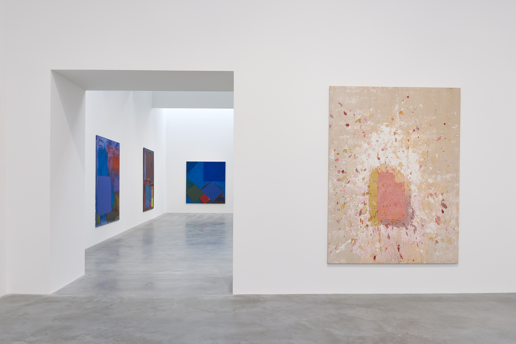
Choosing to visit two exhibitions on the same day should always be considered with care, for one might critically overshadow the other. If you are fortunate the two will complement, or resonate with one another in some way. So, having spent the morning looking at the predominantly cinematic John Hoyland canvases in the inaugural ‘Power Stations’ exhibition at Damien Hirst’s Newport Street Gallery (NSG), an afternoon session viewing John Bunker’s comparatively small collages at the Westminster Reference Library was a suitable combination and, by good chance, seen in the right order.
After the impressive, no-expense-spared, attraction of the curatorially upmarket Newport Street location (just a 15 minute walk from Tate Britain), the unassuming public library, almost surreptitiously skulking down a side street, but only a stone’s throw from the National Gallery and the National Portrait Gallery, provided a haven of quiet consideration amongst the all-pervading commercial enterprises of central London. This scholarly location encouraged silent contemplation.
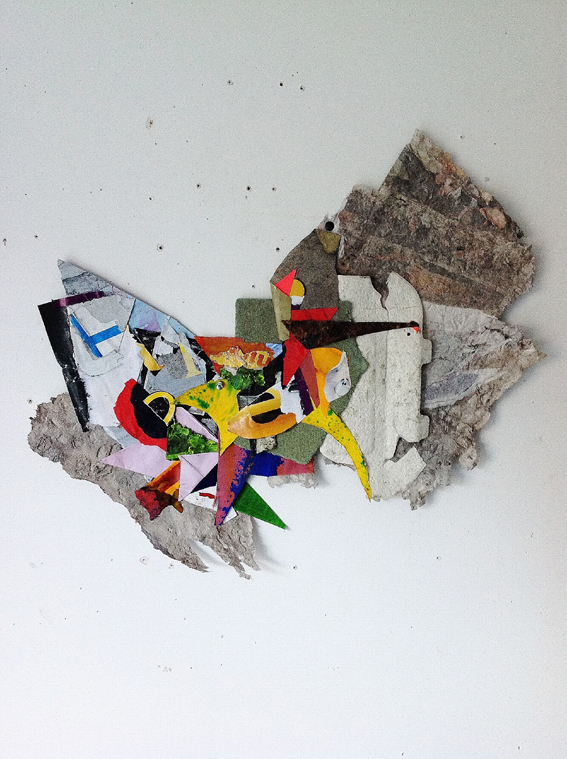
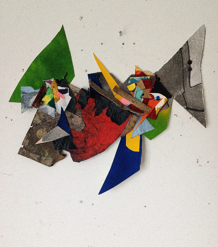
In a small but adequate space, eight of Bunker’s recent collages were arranged in linear fashion, encouraging the viewer to step up to each one to inspect the various elements. Something like double-portrait sized and displayed at head height, all but one of the collages were nailed to the wall – the odd one out was framed and a little superfluous. These islands of matter floating, though fixed, presented unassuming stuff from the urban world and, by association with the process of collage, the studio floor.
The collages were intimate, despite the attention of the spotlights, and fell silent in appropriate surroundings; whereas the high ceilinged, well-lit chambers, of Damian’s gaff in Newport Street created an uplifting sense of awe that could have elicited cries of “wow” from visitors. Not that a comparison between Hoyland’s paintings and Bunker’s collages is crucially relevant, or even fair, but the range of sizes and the visual impact of imagery in these works, posed questions of audience experience of the exhibition as spectacle – which can create a fulfilling encounter, large or small as the show might be.
Certainly, the aptly titled ‘Power Stations’ display would have impacted on the viewer for the sheer physical size of many of the canvases. And also, with an emphasis on visually explicit colour subject matter, and a celebratory exposition of the act of painting, the compelling experience of offering examples of a range of tour-de-force performances from the studio (a Rachmaninoff piano concerto perhaps – though with Hoyland there’s a New York city jazz twist) may not be too fanciful. It depends on the viewer’s preferences for painting, and music, I dare say.
John Hoyland installation, Gallery 5 into 6 – ® Victor Mara Ltd, Photo by Prudence Cuming Associates
Temperamentally, Hoyland was always an ‘action’ painter of sorts, at times not unrelated in fervour to Jackson Pollock; but in nature (I want to say organically, but not sound naff) more European, like one of his esteemed seniors, Hans Hofmann. The show also provided a pointer to the hard-to-imagine optimism of the 1960s which young and middling generations of artists today might find disconcerting. A sub-theme might also reference the changed cultural and media specific, fine art contexts from which the work was produced as the show is experienced now, in 2016.
On the subject of size, it should be noted that the dimensions of 28.10.65 (1965) by Hoyland (approximately 2.3X4.6m / HxW) is a little more than 10 metres square: translated into floor space this would provide a small studio in London right now – where prices are making both studio and gallery rental challenging. Is this comparison arbitrary? Not in the sense that available spaces, and materials, have always partly affected the possibilities and limits of what artists produce and, if London is to remain a centre of the international art community, there could be trouble ahead. Apparently, John Bunker’s studio in east London is twice the size of a Big Hoyland painting – a sobering thought.
But I digress.
Power Stations
Hoyland’s works, in Hirst’s 1964-1982 collection presented at the NSG, represented three distinct phases from the very early, post-figuration years of Hoyland’s career. Power Stations confirms Hoyland’s boundary-pushing attitude to embracing change and development in the history of modernist/abstract painting on a very personal level. Hoyland’s painterly, ‘expressionistically’ inclined, version of colour/shape abstraction steered clear of the sometimes aloof, emotionally reserved, minimalist aesthetic embraced by, say, Frank Stella, Ellsworth Kelly or Kenneth Noland. The inherent, expressive, visual, physically challenging characteristics, “dependent upon the act of looking”, to quote Andrew Lambirth of The Spectator, placed Hoyland in the European wing of abstraction, despite his career-enhancing links to the New York avant garde.
But Hoyland was never obliged to be non-European. He indisputably straddles both a European and a North American, transatlantic, fusion of interests in developing the scope and subject of painting. The ‘classic’ Hoyland’s of the mid to late ‘60s present a commitment to colour-shape monumentalism, although this super-sized intimacy, generally constructed from a few rectangular shapes, or colour-fields, of greys, reds, oranges, blues and greens, could be imagined as the achievements of a Giorgio Morandi on LSD, taking colour on a trip and expanding canvas sizes to almost literal, mind-blowing proportions.
Hoyland was truly ‘out there’, unafraid to push his engagement with the visual and psychological experience of colour. He was untainted by any additional figurative referencing – despite possible representationalist readings of doorways, skyscrapers, monoliths, perspectival planes, cosmic portals or other associations generated by the viewer (not the paintings). Attempting to define abstract imagery for anything other than what we are actually experiencing in front of our eyes is understandable – but worth avoiding.
In spite of needing to stand well back to view these paintings: e.g. 12.6.66 [1966] is approximately 2.6×3.6 metres; 28.6.67 (1967) is 3 metres in height and 9.11.68 [1968] is over 3.6metres wide – to fit the whole of these compositions into your field of vision, you also have the contrary option to get up close to experience the colour, the shapes, and the very physical, almost haptic, presence of visual space. (A quality echoed later at the Bunker exhibition.) But this is not a didactic quality of the works – it’s more of an invitation to experience something quite straightforward, and raw. Indeed, to coin a phrase from Stella, “what you see is what you see”.
Coincidentally, the American art critic Barry Schwabsky references Morandi’s still life paintings in relation to the “pale tones of earth and flesh” (in the ‘Out of The Trap’ essay in the ‘Power Stations’ catalogue) from Hoyland’s next series on display (from 1970/71). These may have been the more challenging paintings to take on board if, as is generally the case, strongly hued colours are often expected in non-figurative painting (a misnomer, of course). In the nine canvases displayed, the pastel and tertiary mixes of colour, enlivened by controlled, expressionistic splashes might be interpreted as manifestations of an exceptionally brave move away from the colour palette that Hoyland typically used in the preceding stage of his career. Perhaps being away, albeit intermittently, from New York and London at his Market Lavington Wiltshire retreat influenced his decision to add so much white? In this chalk downland landscape, not far from Neolithic Stonehenge and the Avebury stone circle, it is conceivable that Hoyland unconsciously absorbed a naturalistic palette mediated by the external environment. A heresy to some back on the East Coast, where the sublime was to be found on the canvas, and not in nature anymore.

John Hoyland, 28.2.71, ® The John Hoyland Estate, Photo Prudence Cuming Associates
By some oblique association, I was reminded of Tuscan architectural colours in Hoyland’s canvases from this intermezzo period: namely, the chalky, coloured stucco walls in representations of those stage-like props of interiors and exteriors in 13th and 14th century Italian painting. Duccio’s ‘Maestà Predella’ panels in the NG are a prime example. In such works there is an aura of simplicity in constructing layers, segments or passages of visual space on a two-dimensional surface, which is not quite yet subjugated by the doctrine of clever perspectival systems and sophisticated illusionism. But I digress, again.
At some point an artist will simply experience a need for change. Was there a struggle with personal doubt in the loneliness of the studio? Or was Hoyland extending his boundaries, vigorously challenging where his painting could go next? There is always a sense of optimism in his work, despite the risk of being denounced as being reactionary, or nature-inspired, about what was developing from a body of work, still unfettered by figurative imagery. Whatever the circumstances, Hoyland’s paint application loosens up. He becomes more gestural and splashy, but retains a strong flavour of his own developing visual language in which there would always be a Hoylandesque characteristic present, who or whatever was influencing him.
In the third and final stage of the show (1978 to 1982) Hirst presents eleven of Hoyland’s canvases that are now identified with a named title, in addition to the dating system he had been using for many years. ‘Longspeak 18.4.79’ [1979], still quite large at a little over 2.4×2.1 metres, like other works from the 1970s and ‘80s, appears to connect with Patrick Heron’s ever-developing achievements for abstraction in painting, as much as Hofmann’s example clearly reveals itself for both of these painters.
Replete with more pronounced diagonal content than before, Hoyland’s project now emphasizes flatness and abstract pictorial space even more expertly. Interestingly, Bunker, who is actively interested in Hoyland as, for example, he has commented at length about the ‘Power Stations’ show and his contribution to British abstract painting for ABCRIT, is critical of this period of Hoyland’s output, characterising it as a “burn out”, and is distracted by his “old Marxist teachers”. My advice here would be, trust your own eyes, and not someone else’s theories or political agenda.
Though admittedly, in the wider context, both political and cultural (let’s blame the Conceptualists, the Punks, Reaganites, Thatcherites, Critical Theorists, the Higher Education system, the new wave of curators espousing the ‘new media’ of film and video, the Arts Council with their new-fangled ‘inclusive’ policies, ‘bureaucratisation’, futuristic agendas, other publically funded organisations anywhere and everywhere, the zeitgeist, Uncle Tom Cobley…) art is never produced in a vacuum. But Hoyland did go on to make loads more vital work that is not represented in Hirst’s collection as it ends as the dominion of the YBA’s was on the horizon. But I digress into territory beyond the scope of this article.
Tribe
John Bunker is a guest speaker at the Chelsea College of Arts (UAL) symposium – Colour, Emotion, Non-Figuration: John Hoyland Revisited (March 2016), where “The day will explore Hoyland’s art and times, while opening his painting up to new perspectives and the peculiar pressures of the ‘expanded field’ in which art now operates.”
This expanded field for many painters has taken them into sculpture, often with an installation vibe. If this ‘pressure’ still persists in questioning the relevance of painting today then, indeed, Hoyland might be a standard bearer for the ongoing interest in painting. Before Hoyland died in 2011 the ‘new media’ had started its transformation (more of a segue) into the digital realm, and subsequently, towards the post-Internet era that appropriates and references the phenomenon of the digital for the sake of modernity.
But that pesky painting and a ‘back to materials’ approach are not so unfashionable after all. For many young (ish), would-be-painters, it’s a form of ‘painterly-objecthood’ that the likes of Lydia Gifford, Helen Marten, Laura Owens; or Fiona Rae, Katharina Grosse and Pia Fries, (the latter, painters that appear to see paint as overtly medium-specific), espouse in their work. And that’s just the girl-band. There you go lad, digressing again.
John Bunker, “Invriko”, 2015, 52x60cm, mixed media shaped collage.
An aspect I found refreshing in this small exposé of Bunker’s collages in the Westminster Reference Library was in the materiality of the contents. Like all of those words and pictures reproduced in the books and periodicals (pre-Internet formats) under the same roof, you have to deal with the real. The collages, consisting of purposely fragmentary, torn and cut materials, we have all seen somewhere before in another form. Most especially if we are painters or collagists, these materials come back to confront us with a sense of redemption. The bits and pieces that litter our studio spaces, congeal in the Brownfield car park, or blow around in the alleyway, are materials with nine lives.
Bunker’s collages are disarmingly straight talking, pick ‘n’ mix patchworks of materials that have had other uses – maybe even as failed paintings, collages or out of date posters from advertising hoardings. Maybe as stuff ready-made for or from the bin or skip. Out of the discarded – and way beyond a corny aesthetic, school project, ‘up-cycling’ exercise, you can nail it to your wall without recourse to a designer trash Habitat readymade frame.
Additionally, looking like an arrow or a devil’s tail in one composition, the odd acrylic painted paper segment interjects like signs in the metropolis outside might do. In the glass, metal, brick, asphalt and concrete jungle the colourful neon, stencilled or hand painted sign sometimes offers surprising visual delights.
John Bunker, “King Lud” 2016. 46cmX52cm, mixed media shaped collage.
That we live, work, and play in a collage – a competing assemblage of forms, structures, colours, textures, fragments, attention grabbing commercial visual dross, graffiti, pealing paint, sounds and actions – combining old and new materials in transitory environments – might be a matter of opinion, perspective, or reveal a Dystopian state of mind. But Bunker’s collages have a vitality and freshness about them that I found surprisingly uplifting, because out of the abject sprouts an optimistic reconfiguration. Bunker re-presents real surfaces, colours and shapes that we may otherwise have overlooked. It’s all very Wabi-sabi – but not in a precious, pseudo-spiritual kind of way.
For these collages (except Widows Son, 2015, which is framed) there is no physical ground or support. We see skins of paper and other fibres; two-dimensional objects that are image and object combined. There is no actual, physical, subjectile (to loosely reference Antonin Artaud), for there is nothing under the surface. This feature suggests sculpture – though not overtly in an extended field context. But the artworks are surely subject and object (to very loosely reference Jacques Derrida) and situate the work in the historic direction, of Kurt Schwitters and Dada, Arte Povera and the NeoConcretists, as much as from the tradition of abstract art. For undoubtedly there are abstract tropes too: colour shapes, suggested geometry, gesture and the performative – offering visual-spatial readings, formality and expression, clarity and mystification.

John Bunker, “Geist”, 2015. 55cmX50cm, mixed media shaped collage.
So, are they wall-mounted sculptures? Does it matter? (Bunker also produces larger pieces that are better termed constructions – and perhaps owe something to Rauschenberg). I also wondered if these were collages produced by a painter – and admonished myself immediately with the retort that they do not need to be. Collage, like drawing, does not, is not, and cannot be subservient to painting. The language, like the medium, is similar, only different.
Rather like Hoyland, Bunker’s project is not programmatic. There is plenty of healthy individualism on display without any pretentious, self-expressive indulgence. Both exhibitions demonstrated a conviction to explore the endless realm of the visual in the concrete. Abstract or otherwise.

Not sure if this is a fair comment, but I think the collages look like studies for a painting, thought experiments, spatial/visual experimentation as a forum for working ideas out and then after, the resultant painting. If you’re like me, then you’re probably beaten into the ground, to the extent that the experimentation is the work, the final work, perhaps work for someone else to then take up the reigns, rather like a concept artist for a computer games or movies company and that these pictures were the architectonic blueprints for whatever mysterious worlds might be conjured up, as a result.
LikeLike
I see your point, but I think this might be because there is a history of studies for paintings (a process I was taught at art school in the 1970s) and/or because this work of John Bunker’s is currently being seen on-line. When I saw ‘the real thing’ (as it were) in the show I was left in no doubt that the collages were complete in themselves. This does not mean that the collages could not be treated as studies for paintings of course.
LikeLike
I’m working on a similar groove, like details of motorcycle engines, some form of engineering of aesthetics.
LikeLike
I haven´t seen John Bunker´s work in the flesh, but I would be interested to hear if and how the aims and methods for these irregular works differ from those involved in the making of more conventional square and oblong formats. For me, the Fugue collages (http://johnbunkerart.tumblr.com/Fugues2014 ) have an immediate and exciting spatiality, even as jpegs, which these irregular pieces lack. Within the virtual frame of a photo they appear as figures unconnected to their ground. Is it not a problem for this kind of work that along with the fascinating positive shapes, one cannot avoid simultaneously constructing interesting (and therefore distracting) negative shapes that are not integrated into the whole?
LikeLiked by 1 person
I think that’s a good point, Richard. I have my own views on it, which are slightly conflicted, in as much as I think these really strong pieces constitute some of John’s best work to date, and yet sometimes I’m distracted and a bit disappointed by the overall “shape-image” of some of them, particularly the ones (not so much the ones shown here) that become very “pointy” and symmetrical (they look a bit like butterflies or something similar: http://johnbunkerart.tumblr.com/image/137363573338 ). I think it boils down to the idea that the content of the work is really original and exciting and very abstract, but the “image” is sometimes a bit familiar; and that the content is in fact felt to be – paradoxically – constrained by the “shape”, perhaps even more than it might be by the rectangle…?
I’d be very interested, like you, to hear from John B. (or others) what his thoughts are on the difference between working with and without the rectangle. Seems to me quite a good issue to open out…
LikeLike
I don’t mind the images in John’s work at all. I think this is partly because I don’t think the need to have a more abstract language is what John is driving at (either in his work or how he speaks about it). A more vivid language, a more dynamic, exciting, varied and inventive one, but not a more abstract one. Indeed I could see it his language increasing these qualities while becoming less abstract. Not that I think it should do this, though it might be interesting – I am not sure what this would mean in practice (though I think the integration of found imagery is a positive thing).
I like a lot of John’s rectangle pieces – perhaps precisely because I enjoy what Richard sees as their exciting spatiality. But at the same time I think he may do well out of trying to ramp up the discontinuity of his shaped pieces. Perhaps to have more distractions and less wholes.
LikeLike
If one is about representing the Aesthetic Object, which I think the Bunker work intuits, then a problem might arise if the work is rectangular because of the cliches of composition and the notion that the art work is the object and not a thing representing an object.
There’s always the temptation to make a work ‘just so’, when if one is lucky, one can retire from the Promethean battle and be satisfied with the picture looking OK and be happy in the world of OK.
The collages are very concrete and object-like, to start off with so there’s the added buzz of object representing object and from apparent randomness, sieving out order from chaos. A key part of that echos Richard’s comments that the areas surrounding the piece are just as important, as dynamic parts of any potential integration.
LikeLike
Just like to add, I think some think the Aesthetic Object is abstract, I think it’s figurative, no matter any attempt to deny it via art such as Minimalist abstraction.
LikeLike
If there is one medium which demonstrates the continuum and dividing point between representation and abstraction, it is in collage. We are faced with the paradoxical situation of Robin, the anti-modernist, praising work which replays the early experiments in relief-construction of Picasso’s works of 1914-15, Mandolin and Clarinet 1914 (Musee Picasso) or Violin and Bottle on a Table 1915 (Musee Picasso) with typically English artsy-crafty tweeness (shades of Omega Workshops).
What Robin seems to be saying is that if these collages of Bunker’s were translated into sculpture, as they easily could be (and are crying out for), since they are planar, low-relief constructions in paper (with colour playing an ancillary, I.e. a non-plastic role) , they would look “familiar” , and so they would, but without the perceptual ambiguities and the representational allusions which redeem the Picasso originals. And that they employ non-art, low life materials and referents is just another respect in which they repeat synthetic cubism.
LikeLike
There is error in just about everything you say there, Alan, but the two big glaring pieces of nonsense are that:
1.) these works are anything like, or even remotely related to, Picasso’s relief constructions; they are not, and in fact are categorically different even from more recent 2D collage work such as Motherwell’s.
2.) that they could be “easily” translated into sculpture. The hell they could – they are totally pictorial – and you who know a great deal about abstract sculpture should know far better than to make such a ridiculous proposition. Just how would you “translate” them…? And you have the nerve to suggest that it is MY proposition. Huh!
I don’t suppose for one minute you went to see the actual work, since you have an inbuilt hatred of collage, but even from looking at reproductions you should not come up with such baloney.
LikeLike
The appeal of the collages at present seems to lie on their clusters of overlapping facet-planes, the volumetric implication of which, if rendered into sculpture would need to be clarified into “things”, “forms”, “volumes” to be coherent, and “things” inevitably carry representational connotations, and yes, they would be “familiar”.
LikeLike
“Abstract content” , if it means anything at all, must refer to the relationship between things, rather than the things themselves, — what Fried problematically called their “syntax” , or what I call the reciprocal pressure of one thing on another, such as the way Cezanne’s bodies ” lean into” the treetrunks in the Barnes Foundation Bathers. And it requires clarity, coherence if it is to occur at all. Roger Fry explained all this well in his book on Cezanne, but later became more circumspect in his reading of abstraction into figurative paintings.
LikeLike
Perhaps the one thing we agree about is that the colour is playing an ancillary role to something else, i.e. the colour relationships are not the central content of the work. But they certainly are involved in the relational movements that develop (hey, you’re getting the hang of this “abstract content” thing!). I like John’s colour (and all the textural stuff), it’s one of his big talents, and for me it’s in it’s rightful place as a contributor to what is plastic and spatial about them, rather than the be-all and end-all of the work.
LikeLike
Alright I withdraw “easily”. John Foster’s Step Flashing 1977, in Sam’s Stockwell book, and Tony Smart’s Windjammer 1974, also illustrated there show the kinds of things that would be involved, but also how much clearer the reciprocal pressures would have to be to achieve clarity in three dimensions. I did not try to compare with Picasso’s 2D collage paintings because they involve so much more illusionistic role-playing than Bunker does. However I regret to say that I have broken my own rule and entered into a discussion of a Brancaster artist. I won’t be doing it again. ( However I have seen the previous Bunker show at the same venue, and others at the Social Bases of Abstract art show in Ramsgate, so am not disqualified on that ground.)
LikeLike
Just a couple of questions Alan, while you bend your “rules”. Do you see Picasso’s constructions and synthetic cubism as a necessary but over estimated hiatus in the history of art? Did it do more for sculpture than painting? Following on from that, do you see medium specificity as a central/vital concern- a defining principle that sets painting apart from other hybrid or “low-life” forms? I have heard it eloquently argued that here in the “expanded field” painting is now ‘free’ to explore its own true capacities while the rest of the world is seduced by our lust for the next big thing like new technologies etc. How do you see it?
LikeLike
Hi John —After I’ve stopped laughing — sorry, but low life was not intended as it may sound . Question 1 , not necessary outside of Picasso’s febrile imagination, although collage seems to me to require at the very least the shaped canvas, and probably relief construction for its fulfilment. And certainly over-rated.
Question 2 , — almost entirely a negative influence on sculpture, as all my writing on sculpture attests. It is a barrier to true three-Dimensionality, as Robin, as much as any one is aware.
Question 3. Yes, medium specific , in the current jargon, is the very least that one would expect of painting. My trouble with collage, if you will pardon the impertinence, is that it seems to me to inhabit the in-between world , a half way house between painting and relief sculpture, without the extra element of definition of form that would be required for full legibility. That may just be a roundabout way of saying that the disciplines of painting are being avoided. Is this doctrinaire? Probably. But what can I do? I’ m a painter.
All the best, Alan.
LikeLike
P.S. I am delighted that we are finally able to be in dialogue on such issues, because differences of opinion on questions of art should be no barrier to friendships, and need not be taken personally. If they were, Robin and I would have fallen out long ago. And I see that you are taking them in the same spirit.
LikeLike
Yes indeed. Many thanks.
LikeLike
Another of the implications of your first question is whether there is a kind of teleological historical progressivism in art (the pressure of the historical moment alluded to by Matisse) — and which Greenberg is often accused of —(early on, yes, later denied).
All I can say is that you cannot go back, however much you may admire aspects of the art of the past. You can assimilate, but only in order to move on. Not to adapt to “the technological flux” , which, as I’ve said before, has produced nothing that was not exceeded in the 15th century, by Mangegna and Giovanni Bellini and co., but to build on the strongest pictorial achievements of the recent past, which have been obscured and trashed by the post-modern eclecticism. Easy to say, not so easy in practice. Good luck with it!
LikeLiked by 1 person
Just to clarify —Windjammer and Step Flashing are two sculptures that I like very much, and I don’t think they are in the least pictorial in inspiration or in fact. And I would have included them and discussed them in my Steel Sculpture articles, had I known about them at the time. Their only relation to the Bunker collages in the recent show is that the 3D world envisioned by the collages, if extrapolated, would tend in that direction. Also I agree with Robin that these new collages are the most interesting so far, but I also agree with Sam that they are somewhat inhibited in the range of elements employed, and their concern to remain within the abstraction fold.
LikeLike
To be more specific, every facet plane, or truncated triangle, implies the surface of a volume inflected towards the eye at a certain angle — and when it is brought into relation with another such plane, their join connotes either the inner or outer edge of a box-like volume advancing or receding in perspective, or in isometric projection, when tipped up towards the viewer.
A cluster of overlapping planes tends to be grouped by the eye/mind into larger wholes, or rather the eye/mind tries to form such wholes but is frustrated by the contradictory implication of the various planes. This happens in painting on a flat surface too, as it did in Braque and Picasso’s analytical cubist phase, or would do if it wasn’t resolved (see Picasso’s Violin at a Cafe 1913), but the added dimension of papers of differing thicknesses and textures, some large in area, some small, and where the overlap of planes is “real” rather than illusioned, means that the larger tend to be read as “background” within which the smaller are housed.
A sculptural projection implied by all this would be complex though not impossible, but it would require greater clarity as to just what spatial role the planes were playing in relation to one another, whether the implied volumes were open or closed, partial or complete, and how they connected to one another.
I guess that Picasso’s relief constructions were prompted by the need to sort out problems that had arisen in his trompe l’oeil paintings of 1913, which play on the textures of the “real” and illusionistic, or certainly complementary to the paintings.(Braque did not feel the need to take this step).
All these manoeuvres were carried out within the orbit of “figurative” painting. Can they also operate within the ostensibly “abstract”? Or do we tend to see these non-rectangular collages of Bunker’s as mini-creatures, or mini-sculptures?
LikeLike
Actually, on closer inspection, the triangulated pieces function more as directional spikes pointing downwards, upwards or inwards, than as plane surfaces. And the large areas form a kind of shelf to hold the clusters together. Invriko for instance — a cluster a bit like a starfish or crab-like form is housed within a shelf. I’m warming to them!
LikeLike
When John Bunker’s work is contained within a rectangle it is easier to look at in the sense that one can visually travel round the image as well as take it all in, in one go. There is a stabilising effect which helps the process of looking and understanding what is going on. The free form pieces have an added sense of drama and rhythmic movement which is exciting but can also make it harder to pin down and focus on all the elements within. Perhaps there is a sense of the pieces being ‘mini creatures’ but maybe it’s a matter of getting used to viewing work in a different format. I think John’s understanding of colour attached to shape makes for some original and very engaging work.
LikeLike
Another thing that should be factored in is the influence on Tatlin of his visit to Picasso’s studio in 1913 which led to his corner reliefs of 1915 . Bunker’s Old Roan echoes these reliefs at some distance even though his step into actual space is minimal as yet. And this visit to Picasso is the missing link which led to Naum Gabo’s realist manifesto some years later. So Picasso’s reliefs have been historically very influential, with implications for sculpture which Picasso himself could never have envisaged.
LikeLike
P.S. A distance of one hundred years to be precise. The black lettering at the base of the floating rectangle in Old Roan is perhaps a sly reference to the political ambitions of Tatlin and the Russian constructivists.
When I suggested that we should develop out of the strongest elements of the recent past, ignoring the ironists and post modernists, it was not just my own “convictions of taste” that I was promoting. There are other lines that can be drawn, and they include overlooked or sidelined moments of the past. It is up to each of us to discover our own convictions.
LikeLike
Ah, the sound of gears crunching as they go into reverse without any double-declutching… must be Spring, the daffs are out and Alan’s being nice to people (and collage), and telling us it’s OK to just go out and do our own thing. Not sure, but I think nasty and rude was more real, and definitely more fun.
In “Old Roan”, I absolutely love what’s happening in the centre and left as the movement jerks around in a most unexpected way, then starts to head off out of itself on a mini-journey before JUST turning back at the last minute to hold itself together. I think the big stuff on the right is a foil for that movement, but it doesn’t really need it. It’s a safety net, a surrogate background, a compositional element that turns out to be doing nothing much in itself. I want more of what happens on the centre/left. Why stop there? It’s not enough, it could go on to build and build…
LikeLike
And please note that what I mean by “movement” is NOT to do with line or arabesque… but it’s a big part of what I do mean by “abstract content”. It’s “doing” something, but it’s entirely its own thing that it’s doing, and no metaphors, associations or “images” are involved, distracting or otherwise.
LikeLiked by 1 person
Here’s a funny thing – if you start thinking along the lines of what has “abstract content” and what has not, Hoyland (and a hundred more “abstract” artists) starts to look a bit dubious. The big pink one illustrated here, 28.2.71, for example, is doing next to nothing, and what’s more, starts to look like a (pretty) picture of something, a “depiction”, something figurative-ish (I do remember quite strongly thinking this at the exhibition). My detractors will say that this just proves my conjectures about abstract content are bollocks. I’m going to say that it proves “abstract” has come a long way, but still has lots of new territory to move into, lots of places to go, new things to do, if you just start thinking a little bit differently. This is a really interesting conjunction of work, is it not, if you dare to actually compare them? Not sure Geoff has gone far enough with his analysis.
LikeLiked by 1 person
Hoyland’s 28.2.71 leaves me a bit cold. I wonder if part of this Wiltshire period was a sort of pause? Though an active one. Everything is happening around the coffee cake slab.
Which reminds me that I find figurative associations problematic. (e.g. butterflies and islands in JB’s collages). I find analysis, when put into words, often falls into the trap of description – which the abstract artwork hardly needs. Imagine describing that coffee cake? I would rather eat it. On the other hand (figuratively speaking – ha ha) interpretation might be the productive aspect of analysis? What is the (expanded) field of interpretation? How much ‘context’ is necessary to appreciate an artwork? Is there such a thing as a ‘pure’ way of experiencing an abstract image? Is Clive Bell’s ‘Significant Form’ still valid?
LikeLiked by 1 person
But in the essay you were reminded of Duccio’s ‘Maestà Predella’ panels by this work. I think that’s one of our biggest problems as abstract artists – that everylittlething can remind us of something, and often of other art. It’s all so vague, this associational stuff. Is that a good enough reason to think is has value? It certainly doesn’t add up to real content for me.
LikeLiked by 1 person
And I’ll stick my neck out and say that Clive Bell (and Roger Fry et al) just don’t matter any more, because they couldn’t possibly imagine where abstract art will/can go.
LikeLike
Of course it is not known for certain what Tatlin actually saw in Picasso’s studio in 1913, or whether Picasso had begun to think in terms of actual relief, but if as is likely it was paintings like Violin at a Cafe 1913 , it does demonstrate how relatively “easily” their spatial implications could be translated, or if you prefer, realised in relief. They remain however mini-flying machines — free-standing sculpture is another matter. But they do presage much that did happen in 20th century sculpture, for good or ill, via Gabo and Gonzalez.
Robin says “build, build, build”, but don’t even think of coming off the flat surface. Keep it pictorial, keep it pinned to the wall, keep those shelves and “butterfly” wings pictorial. And yet everything he says about them tells that he sees them with the eyes of a sculptor.
As to the comments about cake painting, why take the weakest and use it as a yardstick to tarnish the best, indeed why take Hoyland at all as an exemplar of what abstract painting is capable of? And once again we are spiralling off into art theory industry speak.
LikeLike
There is a photograph (it can be viewed here- http://www.moma.org/interactives/exhibitions/2011/picassoguitars//picassos-studio/index.php )
taken in late 1912 of Picasso’s studio which shows his cardboard guitar on a wall amidst some drawings. Whether Tatlin saw it on his visit to the studio in 1913 is anybody’s guess but by the time of his visit Picasso had already ventured into relief.
With regard to the influence that works such as the Guitar had on the development of modern sculpture I’m not persuaded that it can be characterised so simply as being almost entirely negative (I don’t know if that is exactly Robin’s view as well). In a strict linguistic sense that statement doesn’t suggest a negative view of those Picasso reliefs per se, rather their subsequent influence, but, at least to me, it implies that they somehow acted as a barrier to the progression of free-standing sculpture..Surely modern abstract spatial sculpture was only made possible by those radical reliefs even though they were the products of an essentially pictorial maker.
I do understand the pictorial argument in relation to their subsequent influence on sculpture but let’s not forget just how positively influential their physical radicalness became. It is for example almost inconceivable that any sculptors working today in a constructive manner .could be working in the WAY that they do if it hadn’t been for those early Picasso adventures in space.
LikeLike
And please don’t conflate Clive Bell with Roger Fry and say that they are over. Especially when you have learned so much from Fry at least. They are very different animals. Re-reading Fry both the early and the later might help you with your quest for “abstract content”, though you hear much less of it in his later writings, and he was less eager to demonstrate its presence in the figurative paintings he admired.
LikeLiked by 1 person
How can one paint something if one doesn’t know what it is? That’s what abstraction is, it’s the Jodrell Bank of image-making, it’s a strategy of denial of the subject until the subject reveals itself via the strategy.
LikeLike
Re-read Bell last night (well, started). The terminology/language is a bit weird. Feel like I need to don my tweed jacket and wear a woven tie. Just wondering – who are the (post) modern day Bell’s and Fry’s worth reading? (Harman?)
LikeLike
Robin, — would it make any difference to the actual work if you were to discover “abstract content” in it? And in your own work, surely it is up to other people to decide whether it has abstract or any other kind of content, not for you to go on making claims for it, or boasting about it? You seem to be worried they may not find it unless you tell them it’s there and that YOU’VE PUT IT THERE.
I’ve never known anyone before so insistently to make such claims for their work (as if no-one had ever done it before). As far as painting goes, at least, where’s the evidence?
LikeLike
I was talking about John B. Where am I making claims for myself, insistently?
LikeLike
Before you answer that , Richard Taruskin has some interesting things to say on the subject.
“The transfer of vivid illustrative effects, even onomatopoeias, into “abstract” musical forms shows that those forms, at least as handled by Bach, we’re not abstract at all, but fraught with a maximum of emotional baggage. What is most remarkable is the way Bach consistently contrives to let the illustrative idea that bears the “affective” significance serve simultaneously as the motive from which the musical stuff is spun out.
Structure and signification, “form” and “content” are thus indissolubly wedded, made virtually synonymous. …… that was what Bach, building on a century of musical changes, would achieve within an outwardly old-fashioned, even backward-looking career. (Vol.2 page 254).
LikeLiked by 1 person
I love Bach, he’s very abstract, and the more fraught with emotional baggage the better.
LikeLike
Please put up an image of Tatlin’s Corner counter-relief 1915 ( not the hammock one, but the one attached by wires to the corner screens, of which Robert Hughes writes “Tatlin …… Regarded the still life … As a genre tainted by bourgeois conventions. Still life, after all, was the chief image of private property in Western art. To make ‘socialist’ art, one must stop depicting ownable things: in short, go abstract. (Tatlin would have considered today’s art market nothing less than an atrocity). (The Shock of the New, P.89).
LikeLike
LikeLike
You can see an image of John Foster’s Step Flashing on this site about his work (for which I wrote the text). http://johnfoster-sculptor.org/#seventies
LikeLike
Personally, I can’t see a strong connection or development from Tatlin’s piece or Foster’s piece to what John B. is doing. I can’t see them as an influence.
LikeLike
Robin is trying to pretend that none of this matters, that none of the ideas and influences that got him to the point that he is now at matter, that the great white hope of the “new” abstract content has no precedent, comes from nowhere but from himself and Brancaster (and that no-one ever thought of it before. ) Why?
Painting and sculpture are on utterly divergent paths, closed off to one another. Painting is about intoxication, perturbation of spirit, superabundance, going too far, going with the flow, “mindless virtuosity running amok ” — yes indeed. Take a look at La Lutte D’Amour in the Delacroix show. I haven’t seen it yet. This Is something sculptors cannot understand and will never understand.
Robin is rare among sculptors in that in his finer moments he does understand this, — and paradoxically is more likely to achieve the required intoxication in his sculpture — much more difficult in sculpture perhaps, but why in any case does sculpture always have to be so darned difficult? Just saying. I’m off to watch the Rugby! Who do I want to win? You decide.
LikeLike
So you are not going to apologise for saying incorrectly that I’m bigging up my own work when I have been praising others. You must be all out of U-turns, I guess.
LikeLike
The real reason this work will stay as collage, is because its status as a work of art is that of ‘facilitator’ and not of ‘the manifestation of the vision’. To actually manifest the vision that such works facilitate is too hard, it’s asking that the artist be superhuman and overcome all impediments to advanced cognition i.e. one can’t grock all the forms that a shape might represent, because of the extremes of the perspective involved in any much resolution. Only Augmented Reality computer technology can offer the possibility and even then, it’s remote.
LikeLike
Well you did say you preferred me “nasty and rude” . I think anyone reading the chain of comments on the Matisse, Goya , Bunker and Hoyland pieces will have discerned an insistent denigration of “your kind of abstract painting”, and of the prospects for abstract painting in general : eg. — ” What are the ‘freedoms’ of abstraction so often cited? Are they really freedoms for the work itself …….. Or are they mere freedoms for the artist’s own indulgence.” “You’ve taken a large part of your essay to describe the important values of this painting’s spatiality. So even Matisse found what is essential about painting difficult to resolve. You, at a stroke, want to do away with all that for abstract painting.” —- “Little seeds are sown here -though maybe for abstract sculpture more than painting, who knows? –for an intimate, personal, intense, expressive, physical, spatial, human abstract art. ….. Those elements of human interaction and drama which were once the province of figurative art … Which seemed far beyond the scope of ‘mere’ abstraction ….. Are progressively the prerogative of the abstract artist, and CAN AND WILL BE addressed in and through abstract content.” By whom? Is the obvious question raised by all that, with the clear implication of , — not by “your kind of abstraction”. What is odd about all this is that the association of my paintings and my values in painting with the out of date and superseded is of recent origin in Robin’s writing. I am at a loss to know what has sparked it.
There are many more of such implications going back into the Abstractcritical archive which the observant will have picked up on, but enough already. Paranoid? You decide.
LikeLike
I stand by all those quotes, but they hardly amount to “boasting”; more like just trying to envisage an optimistic and abundant future for abstract art now, which on the whole I see as in decline from the period of your American heroes of the fifties, who I happen to think are overrated anyway when compared with what the best of figurative art has to offer. I also think that the historical approach you use in justifying everything has its limitations, and that seeing everything as justified by a modernist context is unhelpful.
So where is my boasting? The last time I mentioned my own work in a comment was on Brancaster Chronicle No.27, where I discussed how and why I think my own work was compromised. Of course, I hope I can work through that and get better, but my optimism is hardly blameworthy.
Putting your calumny aside, I think our own little spat will be rather boring for other readers, so why don’t we stick to the work. You could try and be a little more consistent, because it’s very hard to have a reasoned argument with someone who is all over the place. For example (and there are many), one minute sculpture can be “easily” translated from 2D collage, the next minute “painting and sculpture are on utterly divergent paths”, never to cross paths again.
I think you have not made the case for historic precedent in John B.’s work, certainly not with Picasso, or Tatlin or even John Foster (which John B. would not have known). Where is the precedent for the sort of integrated movement I have described in parts of “Old Roan”, which I’m suggesting is, in and of itself and without external reference, the content of the work. I suggest that this is a new-ish kind of thing in abstract art, that is not so bound by the aesthetic conventions and image-consciousness that most abstract art has had to date (although, of course, you can make links between just about anything if you wish to – six degrees of separation and all that – but they don’t necessarily mean much). It is not like quite a lot of John B.’s other work, and it is not like, for example, other collage such as Schwitters or Motherwell.
If you don’t see this content, well, fine. Despite our disagreement on this, you remain one of the best abstract painters around, in my estimation, though we still won’t agree, I fear, on what is your best work. And if you’re happy with the status quo, that’s fine too. But don’t keep having a go at me just because I’m trying to eke out what I see as the promising beginnings of something new which apparently don’t include or interest you. You stick with your Lady Bate Dudley of 1787 and your “mindless virtuosity running amok ” — yes indeed.
Really!!!? You really are in favour of mindless virtuosity? Bloody hell, I hate it.
LikeLike
That was a joke, Robin, the mindless virtuosity thing. But I agree we have left the context of abcrit, and entered the world of social media, a pitfall that it is all too easy to fall into.
I was not saying that John’s new collages were influenced by Picasso, Tatlin, or Foster, if you re-read. I was saying that if their implications were followed through with more clarity, this is the sort of territory they would be entering, whether he is aware of the precedent or not. I happen to think that he is well aware of the Tatlin resonances , and their political context , but that is for him to say.
To put it crudely, you can get away with murder in painting, and in the in-between world of collage, which a move into relief or 3D would force one to face up to and clarify.
LikeLiked by 1 person
We nearly agree! Not relief, but yes a move into sculpture would find out a lot of things/people.
LikeLike
This is my last comment on these issues. Here’s another line that can be drawn — from Tatlin to the Bauhaus, Gropius, Moholy-Nagy, Marcel Breuer, Mies, De Stijl, Rietveldt, Van Doesberg, Mondrian, Corb — the so-called International Style of the inter-war years, it’s revolutionary utopian idealism (such a far cry from today) , and it’s watered down echoes in British art and architecture of the 1950s, — Brutalism, The Smithsons, Peterloo and Victor Pasmore’s conversion to abstraction and social art experimentation, Alloway, This is Tomorrow, new London Situation, which John B references in his essay on Robyn Denny, and which I guess he has a hankering to revivify.
Can’t you see that by declaring a tabula rasa, forgetting the whole history of modernism and starting from “nothing” , is the only way that you can declare these little collages to be doing something “new” . This may seem like a heavy load to be putting onto them, but this is the reality that every artist faces in the period of late, late modernism. It takes boldness to break out of it, which is what I encourage John B to do. Over and out.
LikeLike
Your last comment – I wonder.
I don’t understand; you again try to contextualise these “little collages” (cheeky) out of existence, then tell John and everyone they should “boldly break out of it”. Do we or don’t we need to talk all day about your linear histories? I suspect many would happily do so (maybe even John), but not me. Maybe that’s why you dislike the Brancaster discussions, because we don’t go in for reinforcing of such academic heirarchies. They might be interesting, but so what; they are mostly a hinderance to getting on.
As for Terry’s comment: it may well be literally true (though maybe not) that we wouldn’t be making abstract steel sculpture at all now had Picasso not done the guitar thing, but you could say ten million things had to happen before we could do what we now do, and that’s just one of them – and I still don’t see a direct influence on John’s present work, and I certainly don’t have any feeling for it in what I do. The connection is too tenuous to be worth going into, unless you are an art historian.
Since nobody seems to be backing me up in what I see in this work that is new, I’m over and out too.
LikeLike
Robin, you could indeed say that ten million things had to happen before we could do what we do now and that’s (Picasso’s ‘guitar thing’) just one of them, you might even believe that to be correct and I have no wish to persuade you or anyone else to take a different view but what you are suggesting is that the making of those Guitar reliefs ranks no higher amongst the millions of other anonymous random events that could have led to where we are in terms of the constructive way that sculpture is made by many artists today. It might now seem a tenuous connection for you but as long as three dimensionality continues to be pursued in a constructive, spatial way then it will, in my view, remain potent. No doubt Picasso, Braque and cubism has problems for artists, painters sculptors , collagists etc even 100 years on but problems are ok. Good art doesn’t provide solutions just better questions. .
LikeLike
The value I perceive in JB’s construction/collages is in showing evidence of a contemporary (new/fresh) approach to image making – consciously with real stuff – without repetition or overt reference to, say, Kurt Schwitters or Peter Blake (heaven forbid). There is bound to be some historical lineage that has an echo back in time (I am guilty of this in my writing). In fact I was tempted to reference Rauschenberg’s ‘Jammers’ that were displayed at the Gagosian Gallery in Britannia Street, London in 2013 as examples of utilising material from ‘the world’ to re-confure and present in a fine art context in relation to John’s collages.
The collages at WRL (and from other recent shows of JB’s) have a certain ‘edge’ about them that plays on the viewer’s conscious/unconscious expectations that might be asking if these collages are operating in the arena of painting OR sculpture – but is not one or the other. This dilemma might get under your skin.
The pertinent historical link here might indeed be Picasso, as well as Rauschenberg, as both consciously, synthetically, manipulated materials to work as images as a balanced dialectic.
I am also impressed by JB’s refusal to be flash, shocking or gimmicky with his collages. This reflects his character – which is clearly one of honest commitment.
Whatever. It ends up as a purely visual encounter before associations are made.
See: http://www.gagosian.com/exhibitions/robert-rauschenberg–february-16-2013/exhibition-images
LikeLike
The word that strikes me here is “doing”. Which seems an odd demand to make of a painting, and one which lends itself to all sort of literalisms. It could be quite convincingly argued that none of the images here – made by either John – are doing anything. They are stilled collections of material and shape, that create the illusions of space, movement, coherence through – manipulating, responding to – our familiarity with the world, and with pictorial conventions. To mangle slightly – its not that you do, it’s the way that you do it!
“Doing” seems to imply that ‘abstract content’ is about movement, getting the parts to look as if they are going on a ‘mini-journey’ – doesn’t this seem quite figurative!? And quite a limited way of looking at art! Why can’t things and space be stilled? It also seems to blind Robin to much of John B’s work. The right hand element in Old Roan is not inert as implied but has to impress itself as shape, and there is an action of sorts in this; a sort of motion which tenses against the parts on the right hand side. Sure, the work uses two different registers – and there is as Geoff notes a tension – a productive one – between painting and sculpture (between image and building, perhaps?) in John B’s work. But to want to jettison part of this is to impose demands foreign to the work on it (the denial John uses line seems to be very much part of the same problem of prejudiced seeing). John B is exciting because of the way he skims across these tensions – to wish them away is bizarre.
John B’s work is clearly not just about abstract content (whatever that means today). It is full of associations. He wants to communicate something about the world, as he sees it, as it is now (though without restricting himself to representing it directly). Perhaps this non-formal drive allows him to avoid getting bogged down in tunnel vision ideas that his collages should operate in this way or that way. It’s probably worth admitting that I could see myself fighting a reverse battle against a too active reading of direct figurative content into John’s collages!
Without getting too involved in the spat, I find Alan’s insistence on historical precedent overbearing, and Robin’s insistence that he is free from these precedents – from modernism itself! – at best misguided….
LikeLike
You appear to be sat on the fence, and tying yourself in knots… a precarious position.
How can a work that is, by your own admission, creating space and movement be “stilled”?
Then how come the most “stilled” part of “Old Roan” is, to quote you: “not inert as implied but has to impress itself as shape, and there is an action of sorts in this; a sort of motion which tenses against the parts on the right hand side”. Sound a bit like it’s “doing” something to me. So we agree, but for my own part, all I have said is that this part of the work doesn’t do quite enough to justify it staying. That’s just an opinion, but maybe you are right, maybe it is doing enough. Would you agree that it could come out if it wasn’t doing anything? You see how untenable your argument is.
As for the platitude: “He wants to communicate something about the world, as he sees it,”, well, go on then, what has he communicated to you about the world via all these associations etc., over and above the space and movement? Let’s hear all about it…
LikeLike
Of course it can be stilled! Not only can they be stilled, they are. They don’t actually move do they? I prefer to risk tying myself in knots that to satisfy myself with sticking my head in the sand. I was drawing attention to the fact that your ‘doing’ as presented here – opposed to composition – is very partial, and very limited. And that to suggest John to build and not to make images would be to restrict his art.
I think John’s collages are full of the clutter of the city, not just its debris, as in the literal bits and pieces, but also its visual overload, its signs, flashing lights, and screens, the different registers we have to negotiate in the urban environment. Their abstract structures seem to be a way to gather up all these experiences, without becoming bogged down in them, to celebrate them, without being restricted by them. Of course this is a difficult thing to articulate, but I think it is very much present in John’s art.
LikeLike
Stillness???
“Old Roan” is full of movement! There’s a dancer in there. With two right feet. One’s blue—the other’s wearing an orange shoe. The airplane way over on the left is flying toward New York City, pictured in the big, grey, irregular pentagon over on the right—the pentagon the dancer is holding down with her blue heel. “ac” stands for “Air Canada.” The “b” hiding behind the orange shoe stands for “Baryshnikov”—not Bunker. Just because.
I want to report that I find this Abcrit whatever-it-is, start to over and out, SO exciting! Also want to report: I was able to get hold of a copy of Artscribe No. 57 through Abebooks. Cost $25, but it was worth it! Alan’s words about Braque and Matisse, priceless! In case a publisher happens to be reading this: I understand (from Gouk’s GREAT Principle, Appearance, Style) that there are what seem to be very important “articles” of Alan’s that have not yet been published: this makes NO SENSE to me. I find Alan’s “insistence on historical precedent” absolutely marvelous—and not at all insistent. Robin, of course, is insane—but NOT misguided: he’s following The Light. . .
LikeLike
No Jock it’s a chicken wearing red stilettos pecking at a coal scuttle….
I’m not sure whether the right hand section is needed but it does make a difference to the left. At times they look like two very distinct halves only to come together intermittently, depending on where and how you are looking. Perhaps less of the right and some more of the left might be an improvement? Tricky.
I do like the way the bits of material in John’s best work disappear at times and become simply the content of the structure/work; the fact that they often have some volume makes this all the more impressive (given Alan’s words on how sections of material connect).
The beauty of some of the pieces is interesting given the material.
I like the way you admire both Alan and Robin’s take on the relevant merits and limits to history.
‘Appropriate the past in a free and creative way, being pulled towards the future, rather than pushed from the past’ still sounds good to me. Plenty of tension between things to aspire to while embracing uncertainty and freedom.
LikeLiked by 2 people
Sam’s support of a half-arsed compromise on abstract art is exactly what is holding John B. back in his own thinking. And Sam’s answer to what else is communicated is vague, conventional, ambiguous, MOR, and in John’s case, verging on the irresponsible.
Sam hasn’t explained why he has to use words about what the work is “doing” to describe it, but I can’t. All he says is it’s “stilled” because it’s not literally moving. Oh boy, really? Big point.
By the way, it is totally untrue of Sam to say that I have denied that John uses line. Of course he does, a lot; too much for my liking. What I said was that the movement I liked in “Old Roan” was not dependent upon it, or on a linear “arabesque” depiction of movement – and all the better for that.
LikeLike
Actually I can’t be bothered with all this. It always – and I include myself in this – descends too quickly into pointless point scoring, with the same positions repeated over and over again
LikeLike
It can SEEM to be pointless point-scoring, but it doesn’t seem that way to me. There’s always something new that comes up, some little corner of something that I missed. I’ve been listening to Bruce Gagnier and Garth Evans “fight” in Studio School crits for years. It’s always “fun”—just because they’re honest, direct. Years ago Al Held and Bill Bailey “faught” this way at Yale. It can seem to be a “boys will be boys” thing. Maybe “positions” get “repeated”—but those “positions” are complicated—full of “details” Robin might say—wonderful “details” . . .
LikeLiked by 1 person
What the hell again. Exasperated by all this, I’ve been staring and staring at Old Roan in an attempt to understand what all the fuss is about.
More convinced than ever that these little(literally) collages are much more interesting than the rectangular ones, precisely because they imply so much more space than they occupy, and in that sense remain pictorial, at least Old Roan does.Sticking with it, therefore, here is my detailed analysis, for what it is worth.
Starting with the red cut-out piece at the bottom, which points downwards forming a kind of datum from which the somewhat isometric shelf in grey and yellow takes off at a roughly 30 degree angle —the yellow triangle is hinged or slopes downward from the grey shelf creating a further slope over which the dirtied white strip with pointed end is laid, and around the end of which the dark brown L shape with broken leg folded back around the pointed end, then slopes back up and over and above the grey shelf –all these “movements” are both literal and optical (being as its collage) .
The black oval of the centre of the letter B, tucked in behind the red shape, forms a secondary base from which the planar rectangles (it’s all planar really) jump up and out, above the brown L ,with the two crossed over brown pieces forming an X shape, jumping still higher, backed up by a beige wedge patterned (as in Picasso) to suggest “wall”, or wallpaper. — and behind that, literally and optically, the blue striped rectangle, with red tip pointing down leads back, or tries to, down to the main plane on which the little metal,object floats, covering a black square (painted?) , and echoing across to the dark brown broken L “below” it, (though literally on the same plane.)
The join between grey shelf and yellow slope is punctuated by three card nail files at different angles to it and each other —and the right half of the piece forms an upright wall or pile-up of surfaces at right angle to the shelf, with the cut yellow triangle at the back waving to the blue striped piece across an imagined space.
The flying two-part wedge on the extreme right, which in my view is essential, converts what otherwise would be a little miniature object into something spatially more complex and ambiguous, perhaps not wholly successfully, but opening the whole thing out. The status of the work, whether pictorial, low-relief pictorial, with implications for sculptural relief? ? Abstract content? Definitions are limiting. I agree with Sam on that. I personally would not be happy with something pinned to the wall. And I don’t fancy that kind of complexity, which it has taken so many words for me to describe, for painting as I conceive it. But only time will tell on that. I certainly don’t want to put a damper on it. See , I have been warming to them.
LikeLiked by 1 person
Excellent! I think there will be any number of ways to read out this work, which suggests that it has a lot going for it, but that is a good one, and helpful, and I’m glad you agree that it is pictorial. I see it as having no connection to sculpture at all, despite it’s spatiality. As for that right hand side, I do think, as you suggest, that it is a little ambiguous or disconnected. I stick with my original opinion about it – that something more active would work better.
I see no need to put a limit on the complexity (at the moment), because we just don’t know how far that can go. I do feel John could really push the boat out and see just how much he can load a single work with before it breaks down, by getting away from a focussed centre and getting away from a simple image. What’s to lose, except stillness, flatness, things we know already, etc.?
LikeLike
Ah, that old complexity thing again. Wresting it round to try to make out that you’ve been right all along. “They want to be right where others are wrong” (George Braque’s aphorisms) . Aren’t you going to apologise for jumping down Sam’s throat in that unseemly manner?
LikeLike
No. Sam has left the building, never to return.
LikeLike
I’m not going to take sides as I’d become part of the problem! Time to move on: new posting, new subject, new angle, new????????? Getting tired of the personal baggage which can interfere with your/our insights being heard and benefitted from: I am assuming you all want your opinions heard properly?
LikeLike
I do think “irresponsible” (of Sam) was particularly unfair, especially when it is you, Robin, who are trying to coax John B. Into the mould of your own obsessions. Complexity IN ITSELF has no value unless accompanied by a large conception.
So I’ll be equally “irresponsible” and suggest that John takes a look at Picasso’s amazing Women at their Toilette (Cartoon for a Tapestry) 1938 Musee Picasso, Paris, 299cm x 448cm. As with Matisse’s Still Life Interior with Aubergines 1912 , a little tweaking would remove the figurative elements (signs for features ) which Picasso cannot help including, and reveal the spatial architecture, which is not quite the same as abstract content since it is not particularly abstract. (I’m beginning to wonder if there is really any hard and fast borderline between representation and abstraction, heresy of heresies). No, there is, but it’s hard to define in words.
So here is one collage I definitely like, along with Matisse’s Sorrows of the King. However, nothing I said in my little analysis contradicts my earlier gut reaction. They are still a bit artsy-crafty, still a bit twee, and could still be bolder. Time to move on indeed. Positively my last comment. Over and out.
LikeLike
No advice from me John Bunker just a couple of thoughts. My preference is for the works that are not ‘contained’ within a rectangle which, delightful though they are to look at in the sense of their being resolved within their boundaries, are, in my view, rather too tasteful for being so. There is definitely a more anarchic feel (at least that’s what I’m getting from the images) to the shaped collages. They don’t have that ‘complete’ feel that for example that the Fugues have, rather they carry the spirit of the individual fragments from which they are made through to the finished works which (and I hope this makes sense) themselves retain that sense of being fragments (and perhaps slightly visually discordant?-it’s difficult to say not having actually seen them).
I can’t see any barrier to your applying (as opposed to translating) what you do in the collages (ie make things out of diverse fragments) to free-standing objects but ‘sculptural ‘ considerations could be too inhibiting so you might have to navigate your own route of expression through space with your heap of stuff.
LikeLiked by 1 person
I think that Terry hits the nail on the head. More nails in walls please.
LikeLike
Thank-you for that Geoff, I’ve really enjoyed your piece and it has certainly generated an energetic discussion.
LikeLike
ps What I meant by sculptural considerations is making free-standing works that conform to established (or indeed emerging) principles of making sculpture.
LikeLike
In parenthesis, I forgot to thank Jock for his flattering comments on my book and writings, not to mention the paintings.He has broken the omertà that surrounds them in England, Robin excepted. Jock’s comment is virtually the only response I’ve had, outside of Abstractcritical. Maybe I should emigrate, yet again, maybe not. I still cherish the rejection slip I received from Peter Fuller of Modern Painters for my article on Rodin, and the one from Karen Wright of the same publication for one on Patrick Heron’s Tate retrospective, in which she said she’d have been more inclined to publish it if it had been a hatchet job. That’s England for you!
LikeLike
Probably not a good idea to emigrate, Alan. I expect New York is not much different from England. Money/ignorance rules everywhere. Whenever I approach the Authorities over here with my enthusiasms, I’m met with a deafening silence.
But please keep “talking,” keep writing, keep painting. There are young people out there we’ll never know about who are “listening.”
Last night I listened to a conversation between Mark Morris, an American dancer/choreographer, and Surupa Sen, an Indian dancer/choreographer. They mostly talked about a place called Nrityagram, a village in India where Surupa lives with a bunch of people who essentially do nothing but dance: all day, all week, all year. Dance is life for these people. It comes out of music, out of literature, out of sculpture, architecture, etc.—as it always has. There are still small pockets of culture/sanity scattered all over the world. Every couple of years Morris visits Nrityagram for a couple of weeks. He cooks for everybody in the little village.
LikeLike
R.I.P. Johan Cruyff, total footballer. This from David Winner in the Guardian:
“Cruyff and Michels together re-imagined the game as a highly skilled, swirling spatial contest…”
“Cruyff was argumentative, arrogant, dominating and brilliant. He prized creativity over negativity, beauty, originality and attack over boring defending.”
“There were problems along the way. With his belief in the ‘conflict model’ – the idea that you got the best out of people by provoking fights and thereby raising levels of excitement and adrenaline – Cruyff made enemies almost as easily as he generated delight.”
As Cruyff himself said, “Every disadvantage has its advantage.”
With apologies for those uninterested in football. No apologies to those uninterested in pushing abstract art towards its own “totality”. Ha ha! Happy Hols.
LikeLiked by 1 person
Well said Robin. Cruyff was a bit of hero of mine and with the absence of England from the World cups in the 70’s the Dutch football team made up for that – such a shame they didn’t win in either 74 or 78.
I’m sure there are some more Cruyff/Art/Abstraction analogies out there and hope that Mr Williams will provide one soon.
I still occasionally risk life and limb attempting a successful ‘Cruyff turn’.
I would say that even though a single minded slightly arrogant judgemental conflict approach to art will have its drawbacks it is probably how things often do move forwards.
Mentioning no names of course.
LikeLiked by 1 person
More interesting comments on John Bunker’s new work here from Harry Hay and Alan Gouk: https://brancasterchronicles.wordpress.com/2016/04/25/brancaster-chronicle-no-32-john-bunker-collages/comment-page-1/#comment-242
LikeLike