
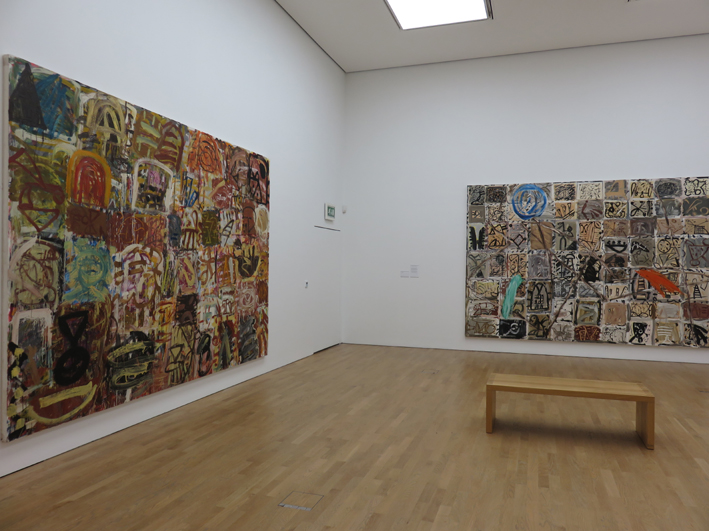
Basil Beattie installation at MIMA, L to R: “Without End”, 2005; “Never Before”, 2001; “Hinterland”, 1995
Basil Beattie – When Now Becomes Then: Three Decades, at MIMA until 12th June 2016.
“Only the paradox comes anywhere near to comprehending the fullness of life. Non-ambiguity and non-contradiction are one sided and thus unsuitable to express the incomprehensible.” CG Jung
This years exhibition highlights for me so far have been two substantial shows of big paintings; John Hoyland at Newport Street and Basil Beattie at MIMA, both a refreshing contrast to the multitude of ‘contemporary’ domestic abstraction often artfully and sometimes even subtly restrained in grids of one sort or another with no personal ‘signature’ in the facture. Impersonal and emotionally cool, they are what Roger Hilton would have called “tidy”. Not so here. In these two shows it was so refreshing and invigorating to see progressions of series and witness the leap from identity to existence in such a strong way, especially in Beattie’s ‘retrospective’. And refreshing to hear him say that having a show like this is a way of ‘learning about what I am doing’. It is not a grand finished statement but a work in progress, a getting to know your own working process in a more objective way.
Beattie sees painting as a journey, full of doubt and uncertainty, but he also likes to use such words as ‘vividness’ and ‘intensity’ to describe the satisfactory outcomes. He ‘discovers things’ after he finishes a painting, doesn’t ‘know much about it before or during…’ He says in the film Corridors of Uncertainty that he ‘finds things that have meaning in a painting which I cannot necessarily or easily accommodate through speculating about them but they seem to impose themselves on the memory…’ Working in series is one way of making sense of this, allowing the images to shift and change until they are ‘worked out’ enough to move onto a new series. Some elements are stubborn and have a propensity to return later and be explored anew among different permutations and painterly adventures. The show at MIMA demonstrates this admirably, stretching from the eighties through samples of various series such as the Witness paintings, Brooklyn series and Janus series to a room full of what I will call dreampaintings made between 2012-15. The sequence of the exhibition is roughly chronological, arranged in four rooms covering examples from approximately 10yrs in each.

“Witness VII”, oil on canvas, 1994, 213x183mm
The first room in the exhibition is rooted in the 90s with two paintings from the Witness series, and two of the Brooklyn Series; they flank a tower of drawings that stretch up the whole double-storey height of the wall opposite the entrance. It is a breathtaking introduction to Beattie’s work, where we are presented with an encyclopaedia of marks that was to fuel the next thirty years of painting, all individual drawings in black and white originally shown together, floor to ceiling, on three walls of the Eagle Gallery in 1991.

“Witness III”, 1990, detail
Both the paintings in this first room, Witness III, 1990, and VII, 1994, embody the tactile sensuousness and improvisational attack typical of those in this series. They are thickly layered, with the characteristic stepped and stacked rectangles confidently drawn over the incrusted surface beneath, dominating the canvas. The paintings are large, 7ft x 6ft, but the sense of scale is monumental and in the later painting the stacking of the rectangles has collapsed from the more upright grid-like arrangement of the earlier one. As with all the series that Beattie undertook, there are variations on a theme, some more subtle than others, but each one shows a further exploration and inventiveness as the series progresses. The initial form is used as a way of exploring energy and translating this into the painting; the structure is there to be broken, bent and distorted, the series is disrupted, just as our lives are, and the facture is sometimes brutal and raw, multi-layered, rough cast and dripping.
In Witness III the built-up layers of the paint are there for us to see at the outside edges of the flowing white brush marks which have been dirtied by the wet black paint beneath… each of these strokes which delineate the grid or rectangles is different; the paint loading is not the same in any single one. They all work differently as they fade or break up over the scabrous surface beneath. So much to see and experience in just one painting. Witness VII is even more complex in its facture and even more engaging. The use of a limited palette also adds to the power of the paintings, locking us in the subtle variations that can be pulled out of so little.
“Hide and Seek”, oil on canvas, 1999, 213x183mm
The two paintings from the Brooklyn Series, made in a year spent in the USA in 1999, are markedly different in their presentation; they are the same size canvases as the previous series but the feeling is very different. The sparseness of Hide and Seek contrasts strongly with When First is Last… the former being predominantly black with thin white drawings, with no two the same, though they spring from the similar basic shape stretched in different ways, stacked in three uneven columns, and play with our perception of possible three dimensionality. Faint white brushmarks in the middle lower rectangle might suggest an arched tunnel echoing the more formal drawing on the right of it and it is this ambiguity that Beattie enjoys playing with; spaces move back and forth – is it a ‘this’, is it a ‘that’? – and this is very present in the other Brooklyn painting, When First Was Last… where we are presented with a complete contrast to the other.

“First Last, Last First”, oil and wax on canvas,1999, 213x198mm
The whole canvas is full. It is full of colour, though only five – grey, white, Indian red, black and buff. It has enormous scale and is split into two unequal halves; the thin column on the left containing more of the same drawn shapes as the former painting and the rest of the canvas filled with what appears to be a ‘classical’ architectural structure built out of wide continuous brushstrokes, vertical and horizontal, that seem to give perspective to it, topped by a triangular pediment. But on continued looking, as usual with Beattie, things are not what they seem. The structure is cranky, the post and beam system wouldn’t hold up. Elements do not meet, they are out of sync. What we actually have is a series of wide, bold, assured almost dry brushstrokes that have etched lines into the wet background – though some of them have dripped down to animate the buff area below. They are of uniform width, do not overlap or give a sense of receding. The triangle on top is a flattened version of the drawings on the left. This playfulness echoes the area I talked about above in Hide and Seek. Is it an actual space or not… contradiction and ambiguity, a fluidity of means and meaning, are at the heart of Beattie’s paintings.
“Smallness Stirs”, 1987; “Legend”, 1986
The second room is a marked contrast to the first. Here works from the eighties present an earlier lexicon of marks and forms that are gridded out in two of the three densely-worked paintings from the seminal show at the Curwen gallery in 1987, Legend and Smallness Stirs. This group of paintings were tailor-made to fit that gallery, creating an intense space that one stepped down into; it might have felt like entering an Egyptian tomb with wall paintings covering every inch of the surface, though this immersive experience would have been more restless, more like an animated frieze wherein the hieroglyphs are jumping around. Beattie has described this configuration as giving us the experience of walking into his head ‘which has overflowed with imagery when the usual gatekeeper has gone for a coffee break’.
In the room at MIMA these two big, teeming paintings have room to breathe and are accompanied by two smaller ones, Full House made in 1984, and the larger Zenith from 1986. The former reminded me of the kind of exuberant mark making of Gillian Ayres paintings at around the same time, but hers with brighter colour. Full House with its different strokes and daubs anticipates the larger two in the room, while in Zenith the grid has gone and the forms are freer to move about in the rectangle of the painting, as in the larger one aptly called Smallness Stirs. The paintings have an immediate sensory impact, they play with density, complexity, space and texture; they are the seeds of the rest of his work which bloom into variegated and wild specimens, some complex and some with a mesmerising clarity.
‘The meaning can only come from a direct confrontation with the surface, with the object itself, and when I am making a painting often I might have what you might call some of the main ingredients but it remains there, it doesn’t speak….it is only through trial and error often, that the process of finding out how the images should be presented brings the painting to the point of vividness, a certain degree of intensity.’ Beattie in the film Corridors of Uncertainty, 2007.

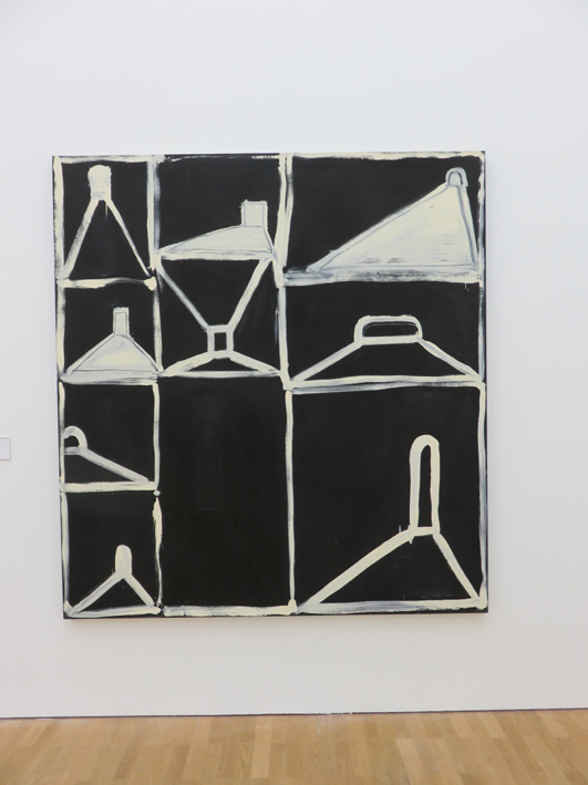
“Beyond the Last Thought”, 2010; “In Sight”, 2010; “Two of a Kind”, 1995
In the third room are paintings from 1995 to 2010, which demonstrate the variety but also the consistency of the work, including two of the ‘step’ paintings and two of the Janus series from the prolific period between 2006 and 2010. This room is striking in that three of the paintings have large areas of clean canvas and two have thick, seemingly monochrome grounds which cover two thirds of the surface and have painted elements placed in them. They are both from 1995 and double the length of the related ones in the first room. Two of a Kind has the elements of the Witness series in lose splashy white paint on a blue/black surface which has been overpainted on red (which is still visible in places), while the other, Hinterland, on the opposite wall, is unlike any other painting in the show and has a resonance with earlier more experimental paintings the were made alongside the Witness series in the early nineties. They all appear to be one offs playing with space and relationships of suggested forms with titles such as Imagine If and Two States, all enlivened by the quality of the paint surface, its tactility and varied application but mostly without the usual recognisable elements.
Hinterland is very specific in its facture, with black paint unevenly dry-brushed vertically onto the unprimed canvas; this has then been painted over in a rich, thick earth red, again painted from top to bottom leaving an off-centre strip which has then been partially painted out with a horizontal band at the top. On the left side of the painting a semicircular area has been painted with concentric strokes obscuring part of the original vertical blackened panel. A hinterland is an area that lies inland from a centre of influence, somewhere that is off centre, on the edge, eccentric, perhaps unexplored, aptly summing up Beattie’s painting practice. This apparently minimal painting on first sight presents a powerful visual dynamic through the quality of the mark making and the contrast of the paint surfaces; as Beattie says in the film, Corridors of Uncertainty: ‘The work is very dependant on process which deals with a lot of sensuous ideas about paint, about the substance of paint, the thickness and thinness – in a lot of the canvasses there is an absence of paint – the weave of the canvas untouched by paint is as important as the painted areas themselves. I feel about the absence of paint as if I could breathe through these areas because the paint fills and clogs the weave and blocks out the sight of the canvas and I feel it almost blocks out the air – it’s a skin, a thickness.’
The addition of wax to the oil paint adds greater depth and body to the material, gives it an extra sensuousness and viscosity that oil doesn’t have on its own, and this is exploited to varying degrees throughout the different series and helps to facilitate the possibility of an emotional response.
He talks about the paintings having to hover somehow, having to be potent: ‘I think potency has to do with making the work very general in the symbolic sense but very specific in the painting sense…’ from Conversation with Sarah Wedderburn, 2001, in Basil Beattie, Large Works 1986 – 2009.
But also he states that: ‘The process enriches and deepens the understanding of what I am doing. I want the formal moves to be charged with a psychological and emotional element; but I don’t want to be too specific about it, I don’t want it to be something that has a fixed meaning. But I also don’t want to make a formal structure that relates to nothing else.’ From the film Corridors of Uncertainty.

“All Ends Up”, oil and wax on canvas, 2004, 275x244mm
All Ends Up, 2004, contains elements from both the ‘steps’ series and the Brooklyn series, a hybrid of dripping stacked blocks beneath an upside down configuration of the Witness grids. Here the white covering the umber background was scraped away to form variations of the drawings found in Hide and Seek.
Without End, 2005, a diptych, is a one-off and could be Beattie’s nod to geometric abstraction or pop art; it is one of the largest paintings and is about 60 percent raw canvas, but is bisected diagonally by a yellow and blue stripe and sketched-in shapes in a way that prefigures the Janus series. Again we have dramatic contrast, this time between the yellow and blue stripe, the loose mark making and the bare canvas.

“In Sight”, oil and wax on canvas, 2010, 213x198mm
The formal structures of Beyond the Last Thought and Beyond Sight, both from the Janus series, 2010, also in this room, define the paintings with stacked truncated ellipses in threes, each containing variations of colour and motif. One stack has vigorously painted, atmospheric interiors while the other one appears flat in comparison; both are beyond us, but also present an experience of immediacy; we are there in front of them being drawn into a silent conversation about looking back, and trying to make out the future. Janus was the Roman God of two faces, and was guardian of the doorway. He faced both past and present and presided over the turning of the year. Rear windows and rear view mirrors have been sited as inspirations for these paintings but it is once again the paint surface and mark-making that draw us in.

“In Sight”, detail
Entering the last room is a somewhat jarring experience as we leap out of familiar territory into something radically different. It contains five paintings of various sizes, two triptychs and a diptych and three of his standard size canvases (7ft x 6ft). Here are intense colours and a feeling that something has given; the previous scaffolding has collapsed. Earlier I referred to these as dreampaintings to try and give a sense of their otherness in relation to what had gone before, and I am reminded of something Gaudier Brzeska said; ‘Art does not lie in the dream, but of the marriage of the dream with the material’ and this feels very resonant here. The actual material leads us into the material of the imagination.
We are met by the immediacy and vigour of Far From Somewhere 2014, as if frantic scribblings try and recall things from a dream – it has the accepted colours of black/brown and Indian red but intruded upon by intense areas of white which are interrupted with pink and red areas and a blue circle bringing to mind Legend where the dense grid was disrupted by a blue circle, orange flame, a whitened green flash and a brown zig-zag graffiti line that ricocheted around the whole painting. Roughly drawn motifs from the earlier Hide and Seek or All Ends Up and three blocks of rich, deep red each unequally divided into three by yellow lines that have reappeared from the late nineties to re-assert themselves twenty years later in a more haphazard way.

“That Irresistible Climb II”, 2012; “Far From Somewhere”, 2014; “Ladder”, 2015
This and In the Ascendancy 2015, feel completely out of kilter with the rest of Beattie’s work in the show and are quite jarring in comparison; however they do recall the ones shown at the Jerwood in 2013, most of which were from that year, though Ascent and That Irresistible Climb II from 2012 were also there. These dismantled his existing structures and motifs and threw them together seemingly randomly, perhaps to surprise himself out of the tropes of ziggurats and tunnels etc. that had become too comfortable and ordered.
Looking at Beattie’s creative burst from 2012-15, one can see a gradual breaking apart of the former structures through the triptychs of 2012, still replete with ladders and stepped units but disrupted and less tangible, less structural to the point that one might not trust their strength; in Ascent the left hand stair appears to lay on a soft violet mass and above it is a ladder and platform that reappears in In the Ascendancy on the opposite wall. Irresistible Climb II is a diptych of three ascending structures, each different, on a lively background of white gestures worked into black. In the middle panel is an off-set vertical stack of rectangles in red and mauve stretching from top to bottom; on the left is a suggested ladder form leading to… what, a vigorously painted patch of ambiguity? …on the right panel is a stack of ascending blocks also ending in an irregular patch of white… the irresistible climb to what? The journey continues in the aforementioned paintings from 2013 shown at the Jerwood, which threw everything up in the air with the disordering of former motifs and the introduction of much higher colours, leaving behind surface coherence and welcoming a more unconscious, spontaneously-driven attack, with colours including bright red and pink, and disrupted or corrupted forms from previous series more urgently and randomly worked.
They recall the areas of broad brushed calligraphic urgency in Two of a Kind and Smallness Stirs harking back to a kind of dense automatic writing, the overwritten, scored over, scraped out ecriture resonant of earlier European painters such as Vedova and Schumacher, as well as the vigorous paint marks of DeKooning. Beattie has talked about thinly painted or raw canvas being spaces to breathe; he also talks about noise and silence in relation to the contrast between the frantic marks (often inside the ziggurats, blocks or steps and rear windows) and the raw canvas or thinly painted areas.
Looking at these most recent paintings from the last three years, I am tempted to lay a parallel with Picassos so-called ‘late paintings’ which pushed all the boundaries of his previous work (if he ever had any) and those around him, and were dismissed as senile ramblings by critics of the time. Yet they proved to be some of his most potent work. This is obviously a time of reassessment for Beattie, he seems to have thrown down the gauntlet to himself and is working without inhibition, and in complete spontaneity, shaking up the previous order and seeing what happens.

“Broken Promises”, oil and wax on canvas, 2015, 213x198mm
However, the last two paintings from 2015 settle back into a familiar colour scheme of black, red/brown and grey in a nod perhaps to one of his favourite Ab Ex painters, Rothko; in one, simply entitled Ladder, we find a ‘soft’ ladder and in the other, Broken Promises, there appears a cranked disjointed stairway, the lower part of which is black, pierced to show the white and grey underpainting, while the upper part is made of Indian red and grey with white and bright red beneath. Things have fallen apart, melted – uncertainty and doubt appears to have replaced the bravura confidence of the preceding decades. But not so; this is a letting go and is as vital as any of the other paintings. Beattie has turned our expectations back on us and tripped us up.
Noticeably, Ladder is the most literal painting of the exhibition and opens up the question of abstraction; in previous paintings, the steps are stacked rectangles; the drawn variations of grids and possible spaces of the Witness series are ambiguous, as are the ‘windows’ in the Janus series – these are common ways that painters have explored the tensions between the literal and illusion, by using repeated variations of motifs improvised in series;
‘Can I make a painting about human experience without having to depict appearances… can I reveal the splendours and agonies of life through space, colour, light shape, line, confrontation, rhythm and inflections in the paint?’ writes Bert Irvin in the exhibition catalogue Freeing the Spirit, 1988. A number of Irvin’s recurring motifs can be traced to architectural sources such as arched windows, quatrefoils, chevrons and grids (e.g. Clapham) which are used to convey the experience of place rather than a representation of a particular building or street. So too Robin Denny’s rectilinear paintings from the 60s and 70s (e.g. Gully Foyle and the Two Way1 and 2) play with reality and imagination in the illusion of doors and steps; both are considered abstract painters. I will leave the last word to Beattie who states:
‘My paintings are abstract to me, but I feel I can put almost anything in. I put in things that have references to psychological and emotional concerns that are important to me, but I’m trying to paint them in a way that is not illustrative… I withdraw from describing it to myself in a precise way because I want it to remain ambiguous. Perhaps an image – a door or whatever – may invite thoughts of escape; but the sheer physicality of the means (of painting) prevents there being an escape from the language of painting. I deliberately construct these contradictions.’ From a conversation with John McEwen, New Paintings, Todd Gallery, 1998.
All photographs taken in the exhibition by Nick Moore, with the kind permission of MIMA.

This is great writing, (about great painting indeed)! What comes over most to me is Beattie’s ambition, or rather that the paintings are ambitious, taking on big “existential” themes like meaning and its ambiguity. I like your rich descriptions of the paintings and rooms. I can imagine being there and seeing the exhibition for myself. What I think is great is your echoing of Beattie’s commitment to ambitious “content”. I find your opening comment about the domesticity of much contemporary abstraction personally challenging (some of the work I favour might look decidedly domestic compared with a Basil Beattie) and I am interested in your comments about scale. The confidence communicated in the bigness of Beattie’s works surely goes against that “uncertainty” you mention. But maybe that adds to the sense of their being contradictory or paradoxical, “wrong and strong” perhaps?
LikeLike
I’m not going to make it up the Beattie, although I had planned to, but it would perhaps be interesting to compare to the late Dubuffet exhibition just opened at Timothy Taylor.
LikeLike
I would just like to say how thorough and perceptive Nick Moore has been with this guided tour of Basils show.Its a very valuable journey and the only proper review Ive read of a show Ive been unable to see,so I am gratefull to Nick and Ab-Crit for this.I would certainly agree with the assertion that this show at MIMA confirms Beattie as Englands most fascinating of Painters.I was particularly struck by Hinterland at Tony Stokes space and would love to own it, so I could live with its association.Terrific!
LikeLike
For what its worth,and without pretending to be any sort of expert,I recognise that Basil,like John Hoyland in the Newport Street show,have something going for them in terms of profundity of purpose ,which most contemporary art lacks.Basils discourse with ambiguity is highly infectious and to the degree with which he has abandoned colour and optimism for a dogged ,determined drawing could be very usefull to artists involved with a way forward for Abstraction.Both he and John were trained at the Royal Academy schools and were senior citizens before hitting this stride in their work,but its the purposefull nature of their researches which is so striking.
LikeLike
Completely disagree, Patrick. Beattie is certainly not an abstract artist now, and when he was, back in the seventies, he was pretty much in thrall to Hoyland. No problem with that, perhaps, but what he is doing now, with all due respect to Nick, has no bearing at all on abstract painting. How is a staircase abstract? How is a pictograph of a ladder abstract? Even when slathered with paint?
And surely Hoyland’s best work was not late in life, when it also became far less abstract, a far more literal “presentation” of splashes, spatters and stripes..
LikeLike