
Hans Hofmann, “In Sober Ecstasy”, 1965
“In Sober Ecstasy”… I was, I was.
Not drunk, but pretty high. But not until the very last room of the show, having been bored and annoyed, as usual, by the uninteresting posturings of Still, Rothko and especially Newman; and somewhat underwhelmed by David Anfam’s selection of de Kooning and Pollock. Finally, here was a so-called Abstract Expressionist painting, “In Sombre Ecstasy” by (to quote Matt Dennis from his comment on the Motherwell post) “the criminally under-represented” Hans Hofmann (1965, from the Audrey and David Mirvish collection, Toronto) that was not only properly abstract, but also truly expressive. I think this is a really good painting, possible a great one. I think it might hold its own against a decent Cezanne or Matisse; I’d love to see it in the company of a good Tintoretto or Constable. I’d love to see it in good company, full stop.
I’ve seen it before, at the Hofmann show that Hoyland put together at Tate in 1988. I don’t recall being quite so taken with it then, but there was a lot to digest in that show – the whole oeuvre of Hofmann’s later works, and it was all new to me.
It’s the best Hofmann that I can now recall seeing, which must also make it one of the best abstract paintings I’ve seen. In my opinion it is a very integrated work, including the big rectangles, my frequent stumbling blocks (pun intended) with Hofmann, especially when they take over most or all of the painting. In this instance they are much more fully integrated with all of the other content – the powerful but unspecified movements which course both diagonally across, and back and forth through depth. The other general factor in this particular painting’s favour, compared with much other abstract painting, including far too many Hofmanns, is its completeness; it has been carried right through to a resolution, rather than left off at an early stage in a half-painted, half-bare-canvas state. Hofmanns are on the whole all the better for being fully worked up, and this one certainly is.
Unlike much of the painting in this show, this Hofmann has something of the quality of resolved tensions of duality between two and three-dimensions which is a frequent contributor to the successful spatial content of many great figurative paintings, but not often achieved in abstract work. The space is fluid and coherent, the colour is resonant (someone called the colour “faecal”, but I love all those varied orange and reddish-browns), and you can move without impediment right across and through the whole work. It’s a great deal more than just “push and pull”. It has variety and scale, works from far or near, and I can’t really fault it, though its orthogonal set-up and echoing yellows may possibly in the end count against it just a little. But compare it with any of the brutish Clyfford Stills, which are so singularly and monolithically tensionless (apart from the one – the best one, but can’t remember the title – that has a meandering diagonal line on a dark background, which does at least start to have a physical sense of unease in its “tipping” quality), to see how fluid, varied and limber the Hofmann is. It would probably be no good to try NOW to imitate it or follow too closely in its footsteps; it’s too much of a culmination of Hofmann’s long-fought-for style to enable imitation to succeed. But my high opinion of it ignores the context of Hofmann’s career or any other context, and I judge it as a one-off. Try that approach out on most of the other work in this show and see how little of it stands up when separated from the bolstering effect of the artist’s repetitive signature style. Imagine being stuck on a desert island with a single Barnett Newman… the boredom of it!
[The picture (above) of this painting is from the RA merchandising website, and not a good reproduction, but all I could find. It is reasonably well reproduced in books and catalogues. It’s in the catalogue for this show and in the RA magazine, where Mali Morris writes about it; also in the Tate catalogue from 1988; and there is a rather good reproduction in the German catalogue from a few years back, “Hans Hofmann: Magnum Opus”.]
Other works in this show worth a proper look are Joan Mitchell’s “Mandres”, 1961-2; Jack Tworkov’s “Transverse”, 1957-8; and de Kooning’s big “Composition”, 1955 (from the Guggenheim). Though I would have liked to have seen more by these artists, none of these particular examples hold up for long under serious consideration, for various reasons; the Mitchell is initially exciting, but in the end too gratuitously gestural, to the extent that the point of the painting is lost in the recklessness of the rather savage (and tonal) processes (maybe that is the point of the painting, in which case it’s not for me). It’s also become, like many of her works, too much of an isolated image in the middle of a bare canvas ground. She’s a bit formulaic, and those strident, slashing gestures are a little clichéd – too unvaried and too literal.
The Tworkov is a brave and more subtle attempt to invigorate the content by getting physically stuck in, but it ends up vague and sketchy. And the de Kooning doesn’t bear looking at for too long before the drawing in paint becomes intrusive and destructive of the very space it tries to construct; plus the colour is not really at all sensitive or interactive in the way it is in the Hofmann.
Pity then, that Anfam has hung the best painting in the show by a mile (the Hofmann, I mean) in a constricted corner of the last room, whilst giving his favourite, the unimaginative Still, a whole room with acres of wall-space. Why is Hofmann so frequently marginalised, when he is undoubtedly the best of all these painters?
I thought in general the selection and the curation was poor. Regarding the latter, for example, you can’t hang a couple of big, minimal Rothkos within eighteen inches of one another and expect the Rothko fan club (not me)to be able to look at either one in isolation. And the Hofmann is imposed upon by a gigantic Mitchell, too close by on the adjacent wall. If you can get beyond this imposition, it does demonstrate just how brilliantly Hofmann had transcended the literalness of Mitchell’s sloppy and supposedly “expressive” brushwork. His painting had integrated all of that into real abstract content, which pretty much completely fills the canvas. Mitchell doesn’t have half enough content in the first place to sustain a picture this big, so a great deal of it is left blank. Blank is blank is blank, and there’s a lot of it about in abstract art.
As a general criticism of the show, I would have liked to have seen a much broader range of names, instead of such a focus on the big boys (and poor examples of token girls). I’d like to have seen more from the fringe players and people who contributed but didn’t become iconic. I’d like to have seen more stuff that I’ve never seen before. The first room is decidedly underwhelming in its introductory assembly of early works. There are surely better early examples.
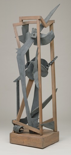
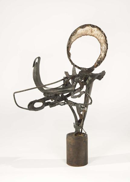
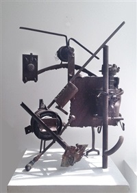
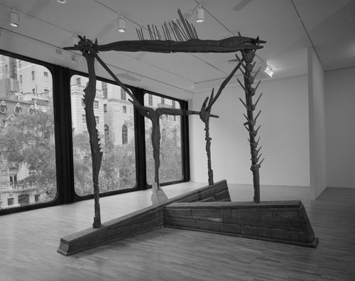
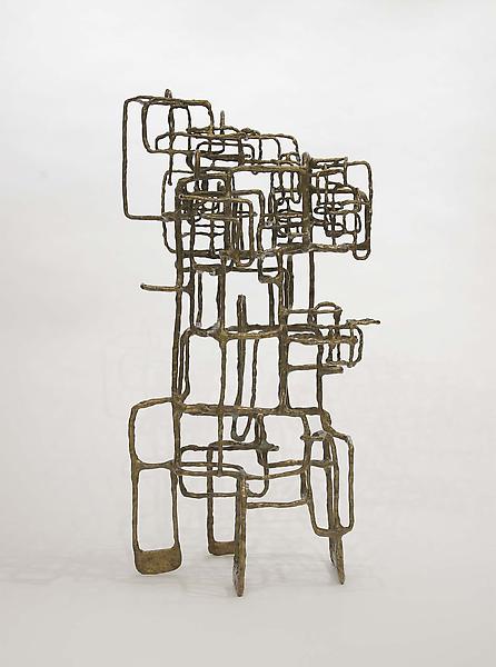
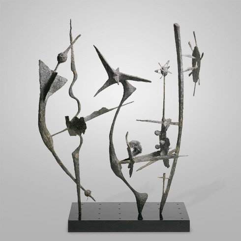
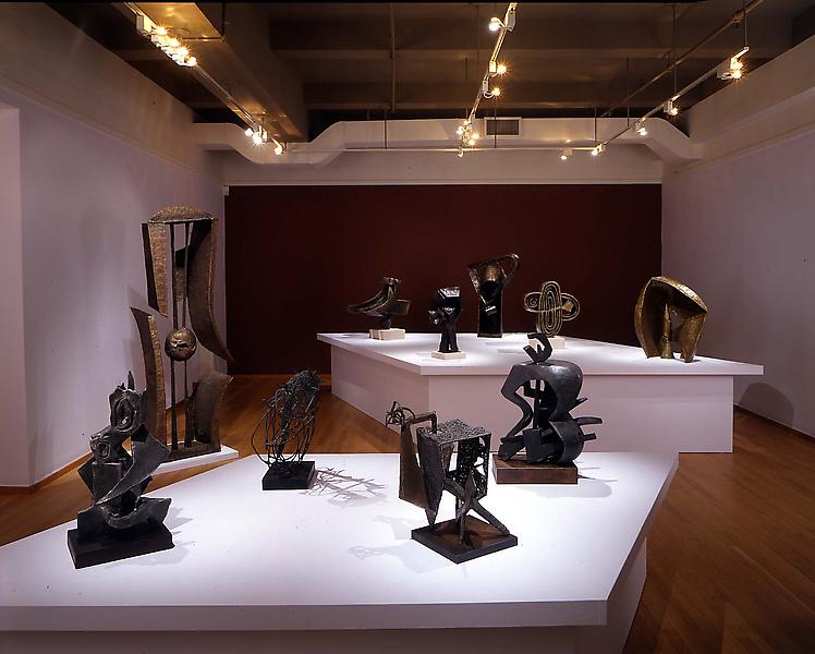
The narrow predictability of Anfam’s narrative is particularly telling in his selection of the sculpture, where (ignoring Newman’s idiotic verticals and the boring black Nevelson wardrobe – pity Caro couldn’t ignore this idea of presenting stuff in boxes!) we get only Smith, Smith and yet more Smith. I would love to have seen some other American sculptors from this period, ones that we NEVER see. How about Seymour Lipton, Richard Stankiewicz, Ibram Lassaw, Theodore Roszak, Herbert Ferber or even Frederick Kiesler, most of whom are declared, or considered to be, Ab-Ex sculptors? It could have been a really interesting show had we got lots of different stuff we’ve never seen here, instead of so many familiar Smiths.
I can see why people, and particularly painters, like the Smiths, because being flat and 2-dimensional makes it completely undemanding as sculpture; you can get it all at once, like a painting; one view of it suffices, job done, and no hard work necessary. Plus, the earlier works here have all the trickery and beauty of Smith’s seductive metalworking techniques, clear and simple pleasures that are to be found in how they are made as objects, carefully and cleverly, by Smith the craftsman – that’s something that anyone can appreciate, without having to wrestle with issues of three-dimensionality or spatiality. Smith was very proficient with manipulating, shaping and joining metal, particularly early on. He does rather nifty little things like including delightful little 3-D “vignettes” in amongst all the flatness, as in “The Letter”. They serve to show that he could have made the whole work much more three-dimensional, had he wanted. On the whole, he didn’t want, and I suspect he was encouraged by certain critics to stay in the world of 2-D.That was maybe Smith’s route out of the tweeness and model-making aspects of some of the early work. Flatness may have been seen by Smith and others as a radical and modernist move away from conventional 3-D “organic” modelling etc., but the work ends up overwhelmingly and persistently disappointing because of the flatness, culminating in the really dreadful late stainless steel work. I think all the work in the courtyard, and most inside, is poor. “Blackburn” and “Star Cage” are probably the best of them indoors, as they do at least attempt to pull themselves about a bit spatially, and so manage to get out of the “picture plane”. Crazy idea, to have a picture plane in sculpture. It makes some of them into objects that are not really sculpture at all – pictographic “openwork screens” perhaps? The fact that you see through them does NOT make them spatial!
My guess is that a lot of the flatness is down to Smith making things laid out flat on the floor (as he is shown doing in some photos), tack-welding them together and then standing them up – perhaps then adding a few more 3-D flourishes (though sometimes not even this). But this methodology does not make sense in the world of real sculpture, and its relative ease of working has proved a poor example to many sculptors, notably including Caro, who I’m sure took Smith’s example as the green light to make lots of equally flat, or frontal, or pictorial works. Smith’s oeuvre, because of its superficial attractions, set a bad precedent for abstract sculpture, which persists even now, the flatness being seen by some as positively liberating for sculpture. That’s the opposite of the truth; it’s a very restrictive practice, and his work is a precedent that ought to be rejected as deeply flawed. We could have really benefitted from this show if a much broader range of early abstract sculpture had been included, of a kind that did not follow the Gonzalez/Smith/Caro flat/frontal/pictorial linear historical narrative that is so relentlessly pushed by most commentators on abstract sculpture, and is so unthinkingly repeated here.
It would have been good to see examples of work by some of those sculptors I have listed above (all of whom you can Google, with a few examples below), work that at the very least shows fewer signs in reproduction of compromising its three-dimensionality. Whether in the end any of it would stand up to a real sculptural critique better than the Smiths do is hard to say, but we could at least have had some enjoyment seeing something different and making our own minds up, rather than being fed the usual dumb presumptions about Smith’s supremacy. He so plainly has severe shortcomings as a sculptor.
Seymour Lipton
Theodore Roszak
Richard Stankiewicz
Frederick Kiesler
Ibram Lassaw
Herbert Ferber
Seymour Lipton
Some Quotes from the reviews:
Mark Hudson, The Telegraph, 21st Sept. 2016
“When British artists saw the first London exhibitions of American abstract painters such as Jackson Pollock and Mark Rothko in the late Fifties, they were astonished by the improvisatory freedom of their works, in which paint appeared to have been hurled on to the canvas without any preconceived ideas, and by the sheer size of the paintings. To artists raised in austerity Britain, the idea that you could do a painting 20ft-wide was a revelation.”
“Rothko gets the central rotunda for six of his sonorous, saturated-colour field paintings, while Barnett Newman is perhaps even better served with his sculpture Here I (to Marcia), a towering strip of bronze, standing in front of three of his majestically sombre blue paintings, as though it’s been torn out of the painting to become something tangible and actual. At the end of the show, a large room is devoted to the San Francisco painter Clyfford Still, who may yet emerge as the surprise hero of the exhibition.”
Laura Cumming, The Observer, 25th Sept. 2016
“Rothko, along with his colleagues Adolph Gottlieb and Barnett Newman, is responsible for the abiding utterance of abstract expressionism. “The subject is crucial, and only that subject matter is valid which is tragic and timeless.” This subject matter – painted big and painted simple, or so they claimed – was as much about the human condition as any figurative self-portrait. That some of their colleagues might be more interested in landscape, colour or – God forbid – naked women, is only one of the innumerable ways in which this statement fails to unite conceivably the most disparate of all art revolutions. And so it is with this show.”
“This is the advanced art of America in the 1940 and 50s – unbound, free of illusion, definition, the constraints of the canvas, the bonds of earth, even, if you listen to the esoteric utterances of Newman or Rothko. Rothko can take care of himself, and indeed gets a quasi-chapel of his own in the RA rotunda. But Newman is persistently hampered. His art asks you to look at paintings in new ways, literally in the case of a soaring monument such as Ulysses, rearing high on the wall above you with its oceanic colours and its fine, bright zip dividing light from darkness, or land from sea. Any sense of infinity is compromised by the paintings crowding around it. And there is Reinhardt on the opposite wall, his geometric abstracts nearly subliminal in their subtlety of tone, their surfaces so delicate and pensive. Art isn’t a contest; Reinhardt should not knock Newman off the wall.”
“…any selection that includes a severe wooden construction by Louise Nevelson, parked like a bookcase against the wall, and one of Guston’s late, great cartoon-like tragicomedies is not just tendentious but counterintuitive, stretching in too many directions. Some might argue that it is good to see this wider period context, and many more of the lesser works too. But I can’t agree: I would have preferred the pure rush of exhilaration that comes with the greatest abstract expressionism.”
Matthew Collings, Evening Standard, 20th Sept. 2016
“Oh dear, this is a ropey show. It ought to bust the five-star limit — the artists in it are so high achieving. But it’s a mess. The catalogue has nothing to say. If it did it would answer basic questions. Abstract Expressionism is a known entity and has been for nearly 80 years. For many of us the knowing is from a distance. We have fundamental curiosity but we don’t want to make fools of ourselves. So we don’t ask those questions out loud. What is an abstract? What is expressionism?
Pollock’s drips, de Kooning’s gestures, Kline’s starker larger gestures, Newman’s straight lines, Rothko’s glowing fuzzy-edged banks of coloured rectangles, Still’s jagged contours and rich impacted palette-knifed surfaces, Guston’s murky clouds: why did the artists require a logo-like abstract style so each of them could be identified, and why did they paint like they had all the paint in the world and canvas was being given away by the hundreds of yards? Why large-scale, why splashes? “
“A room devoted to de Kooning is very strong. The delicious hit of a wholly abstract red and white painting from 1950, entitled Composition, is repeated at the same high level in other works by de Kooning in the same space. They all do much the same thing as Composition — an explosive approach to a format that’s basically a geometric grid — but manage to have completely different moods. His Fifties Woman series, like joke sex totems, are funny and silly, his Forties pure abstracts are subtly marvellous; his Sixties high-colour huge brushstroke abstracts are giddy.
After the de Kooning high point, where the show threatens to gel into something impressive, it sadly resumes its bumpy up and down motion. Rooms of Rothkos, Stills and Klines are effective, with only a few duds. There are beautiful sculptures by David Smith, none of which are shown with any dignity, and seem scattered about the exhibition like pot plants. A room of paintings by Barnett Newman, the philosophical thinker who reduced Abstract Expressionism’s expansive looseness to large areas of flatness and single narrow divisions, which can be exhilarating when displayed with an eye, pulls itself apart because of inappropriate matching, as if whoever arranged it disliked him.
A last room is devoted to Late Work, which should be a straightforward category. However, there’s no particular sense to the mix. A painting by Hans Hofmann is in the same sensual style he’d been doing for decades. Two splendid de Koonings aren’t late: he was still working 15 years on, and by then did have a distinctive late style. “
Adrian Searle, The Guardian, and 21st Sept 2016
“I wanted to be blown away, and to reconnect with a kind of painting that once had me in its thrall, and whose traces and impulses continue to be felt into the 21st century. I wanted to see it in some new and instructive way, but I didn’t.”
“From Gorky’s querulous biomorphs to one of Rothko’s very late grey and black images of emptiness and closure, I struggled. Overloaded, frequently puzzling and erratic, this is an exhibition whose pleasures – and there are many – come at a price. For all its key works, and also because of them, it often flattens out signal achievements, with deadening juxtapositions and clunky sightlines. While the biggest names get rooms to themselves, others fight it out in thematic displays that deaden individual works and achievements.”
“Abstract expressionism came with a lot of critical as well as artistic bullshit, much of which Ad Reinhardt gleefully lampooned in his coruscating cartoons and statements. Reinhardt, whose paintings were close-toned and emphatically mute and inexpressive, was a sort of antidote to much of Ab Ex’s tub-thumping. He should have had a room of his own. One constant throughout the exhibition is the presence of sculptor David Smith, as if his sculptures give it spine and continuity. Smith is everywhere. Many of his smaller sculptures are essentially pictorial, and need silhouetting. Their curves and angles snag on the paintings beyond.”
“With passing acknowledgements to Hans Hoffman (two works), a tally of the show gives us 15 Rothkos, 18 De Koonings, 13 works by David Smith and 12 paintings by Clyfford Still, who also gets a room to himself. Pollock said of Still that he “makes the rest of us look academic”. Still certainly made everyone else look like pygmies, with his oversized, riven scarps of claggy, craggy paint, with their fiddly, jagged interlocking fissures. We have probably never seen so many together as here, as the Clyfford Still Museum rarely lends works from its fastness in Denver, Colorado, where Anfam is senior consulting curator. Having so many Still paintings together may be a coup, but they cancel one another out.”

Predictably perhaps ,I completely disagree with Robins usual carping criticism,just as I do with Adrian Searle and others bored musings.What is the matter with their jaded eyes ? Is it so long since theyve seen a decent Painting that they have forgotten how to get excited? I expected exactly the not 3 dimensional enough criticism of David Smith,who had other qualities going for him in spades,notably real excitement and invention in each work,which somehow spoke of his personality and wit.However its the Jackson Pollock Paintings ,notably the smaller very physical “Phosphoresence”but also the absolutely knock-out Blue Poles,which stole the show and left me so excited about getting back to the studio .I had regarded the work as a late failure of desperation,and was completely unprepared for its extraordinary 3 dimensionality from a distance.The R.A.s huge rooms allowed unrestricted viewing of many of his master works,close to , far away or at angles which seemed important to their reading.Paradoxically it was the 3D quality of Clifford Stills Red and Grey Painting,on its own in a corner ,which completely usurped the biggest wall of his work.I found the Hoffmann disappointing with its over -size dead rectangles superimposed on top of a good picture.This was Real Art and we/ve forgotten whats its like,having been served soft ego trips for so long.
LikeLike
How weird is that? You like three-dimensionality in painting, but don’t need it in sculpture. Some bloody paradox, indeed! And did you not notice that in fact I did get rather excited – about the Hofmann? Even by your standards, Patrick, this is a bizarre comment.
LikeLike
Im not interested in scoring points.I enjoyed the deepest pictures.This extraordinary exhibition has so much to look at that is good,its slightly confusing to try to pull out the Best Pictures.I thought the Gorky”Water of the Flowery Mill”was a beautifull and moving painting.I thought Jack Tworkov had a cracking grey Painting with watery veils,two pillars on either side.De Kooning had at least two extraordinary late works,Rothko a pale lemon picture with strange pale colour and a knock-out Blue and Red hidden in the gloom.I thought the Klines were not the Best I ve seen and have seen better at a show in Tapies space in Barcelona.I really missed more of Adolph Gottlieb who was poorly represented,as was Frankenthaler.But that left room for a Second Generation into Colour Field show ,including Jack Bush,which I can imagine but may never see.I thought there was a great deal more to investigate than the one Hoffman and found the Pollock work ,all of it, ,stunning and extraordinary in its acheivement.I found the same quality of invention in the David Smith sculpture,but feel spaciality/3 dimensionality are completely different in Painting and Sculpture in its literalness over an imaginative visionary quality the best Abstract Painting can hold .There seemed very little shallow spaciality of interest in the Paintings.I thought the Best Paintings dissolved the picture plane in a way that allowed total immersion in the fantasy offered.I repeat Blue Poles is a staggering picture that hangs someway off the surface into our imaginative space.This causes the room to go quiet and total immersion in the experience.Altho of course we are so grown-up,analytical and critical But if we cant reach the child in us with the excitement in it ,we are jaded and I found much of the critical comment bizarre,as though people have forgotten how to look and engage.
LikeLiked by 1 person
This is just to add to the chorus of annoyance at the lack of representation Hofmann suffers from. In America, I saw only one Hofmann, his “Flight” from 1952, at LACMA. Admittedly my timing was not good. There was recently a Hofmann solo show at Ameringer-McEnery-Yohe in New York, and there is currently a large Hofmann exhibition at BAMPFA where he is truly valued. Oh, but I did also see this, at the Getty…
http://www.getty.edu/art/collection/objects/130518/hans-hoffmann-a-hare-in-the-forest-german-about-1585/
If I could remove the extra “f” from the name, I’d use it to grade the efforts of lazy curators who only seem to want to give the public what they already know, dooming the more experimental works, and probably for that reason lesser known, to always remain marginalised and shrouded in obscurity.
I can think of several reasons why a wider audience have not been made familiar with Hofmann, but I think Greenberg puts it quite well when he writes that, “His omission from the “New American Painting” show that The Museum of Modern Art sent to Europe (1958 – 59) is a case in point (an omission which did more to distort the picture than did the number of highly questionable inclusions). A good share of the blame rests with the public of advanced art, which has its own kind of laziness and obtuseness, and usually asks that a “difficult” artist confine himself to a single readily identifiable manner before it will take trouble with him… But Hofmann himself is also to blame in some part-and actually, the more excellence I find in his art the more I incline to shift the blame toward him. The variety of manners and even of styles in which he works would conspire to deprive even the most sympathetic public of a clear idea of his achievement. At the same time, such a diversity of manners makes one suspect an undue absorption in problems and challenges for their own sake.”
Unfortunately I think there is a suggestion from Greenberg here, that he too thinks that Hofmann ought to have done more to “iconicise” himself. But then he concludes this piece with “The consecration of one’s reputation may be a cause as well as an effect of decline. Hofmann has one of the profoundest instincts for self-preservation I have ever become aware of, and I am inclined to think that, subliminally, he prefers, and needs, to delay his canonization. It is mostly, as I said at the beginning, his own doing. Though his name does not exactly go uncelebrated, though museums and collectors acquire his work, and though he does not refuse the honors that come his way or adopt attitudes of intransigence, he manages to keep at a distance the corrupting odor of incense.”
LikeLiked by 1 person
Reactions to the Abstract Expressionist exhibition have been patchy to say the least. What I think is being missed is the historical dimension. The ambition of these painters was to take on the history of painting, exemplified by the achievements of European practitioners. They wanted to make connections between the divergent stylistic elements and philosophical postures associated with the identifiable ‘isms’ of the twentieth century.
Their trans-Atlantic reading of European art history was highly productive and enriching, not least in its positive promotion of abstraction as a significant pictorial strategy. They are also important of course in the context of American art history. But here a problem arises: What followed, in terms of mainstream abstraction, was Stella, Noland and Olitski. What you think of Abstract Expressionism depends on what you think of those three.
In his 1965 catalogue essay for the exhibition ‘Three American Painters’, Michael Fried commends the work of this trio for developing the post-cubist space of Pollock. This he contrasts with the cubist tendency exemplified by de Kooning, who he saw as continuing the painterly tradition of Rubens and Rembrandt. So Stella, Noland and Olitski’s radical starting point was a critical view of that organic, tension creating/controlling way of building up a fleshy field of energised gestures. They were on the side of Pollock, but also Still and Newman.
Fried suggests that looking at Pollock, Newman and Still involves a different, and new, visual process. When looking at de Kooning, and perhaps Hofmann, we are on familiar spatial territory. Even though the figures may have turned into coloured blocks, or blips of pigment, we know our way around. With Newman, there isn’t an ‘around’.
Experiencing Newman involves a kind of optical conditioning. His work is like an apparatus through which the work of others can be revealed more accurately, more justly. It helps us to see Mondrian better, not as black scaffolding against a white sky, but as a structure of ‘side by side’ elements, with equal rights to a place on the painting’s surface. It also helps us appreciate what I’ve called the ‘new pictorial economy’, initiated by Matisse in French Window at Collioure, (1916) finally exhibited in 1966, the year after the ‘Three American Painters’ exhibition. This economy underwrites Louis’s bare canvas, Noland’s chevrons and Stella’s irregular polygons, as well as Agnes Martin’s grids, and without Newman’s contribution to the history of pictorial space, these works would be unintelligible.
However, there are plenty of people who don’t rate Newman or the high modernism of Louis, Stella, Noland, etc, preferring a pictorial economy that is hyperactive and gestural. It’s easy to see the attraction of continuing the tradition of Rubens, Rembrandt and de Kooning, though I think the methodology seems clapped out, and is unlikely to provide the next step forward in terms of abstraction. What’s more, an insistence on working that way means that any innovation within the tradition of Newman, Stella and Noland is likely to be dismissed out of hand for being too simplistic, or devoid of content.
We live in peculiar times and despair seems a reasonable reaction to the advent of the new Dark Age we are all expecting. Maybe the current evaluation of abstract painting, its failure to remain convincing to a contemporary audience, is reflected in the downbeat reception of the RA’s non-blockbuster exhibition. But just when you thought it was all over, just as the last surviving radio operator on HMS Abstraction taps out the mayday message to any craft in the vicinity, stating the doomed ship’s final position, the news comes through that last night, in New York, the capital of Ab Ex, Christie’s sold a 90’s Gerhard Richter non-figurative painting for 22 million dollars.
LikeLiked by 2 people
Tim Marlow gives us five minutes of his time here:
https://www.royalacademy.org.uk/article/video-abstract-expressionists-in-60-seconds?utm_source=Adestra&utm_medium=email&utm_term=&utm_content=Abstract%20Expressionism&utm_campaign=FR%20Weekly%2001.12.2016%20%28B%29&emailcode=
Meanwhile, Tim Scott is still having computer difficulties and has sent this for me to post:
Having had the misfortune of not bring able to see the RA AbEx show, I shall not enter the debate on the paintings and would rather keep out of the Alan / Robin diatribes.
However, I WOULD like to make a few comments on Smith and his role for sculptors today
Pace Robin, I think we must recall that sculptors working in the fifties and sixties were not thinking in terms of the (recent) categorisations of ‘spatiality, ‘physicality’or ‘plasticity’ (at any rate as understood now). ‘Flatness’ was not looked upon as some strange non-sculptural norm or idiom; in fact reaction against Smith’s mannerisms was much more to his tendency to a ‘monolithic’ or ‘totemic’ format than ‘flatness’. Reaction to ‘flatness’ occurred far more to Caro’s interpretations of it (pictorialism).
I too, remarked on ‘The Letter’ when I saw it at a Smith show at the Guggenheim (1972 I think), and it is indeed ‘flat’ .But it is full, as Robin noticed, of little inflections of three dimensionality which give the lie to Smith being unaware of the necessity for sculptural three dimensionality to surmount it (flatness).
I would say that Smith’s .’two dimensionality’ came primarily from his ‘drawing’ subject matter, (though I agree with Robin that working on the floor had a lot to do with it too). One must remember that Smith was not an ‘abstract’ sculptor, but consistently worked from subject matter (as did Picasso and Gonzalez). Caro’s abstraction was far more responsible for subsequent questioning in abstract sculpture making.
As for other American sculptors Robin mentions, I have actually seen some of their work and it certainly did not affect me in the way that Smith’s did. Turning to Alan’s comments and the emotional use of the word ‘tensility’ in sculpture, I would like to remind everyone that ‘tensility’ is a FORCE, not a characteristic; and that force can be implied in many ways and not just in steel.
Tim Scott
LikeLike
I’ve been lucky enough to get to the AbEx show six times now and Robin’s ode to ‘In Sober Ecstasy’ has made me reconsider what I take for granted in my understanding about the term Abstract Expressionism. The whole top half of ISE hinges on a run of white that’s smeared into the top left edge intimating some kind of very high horizon line. And this sets a precedent for fuzzy indefinite or simple repeated acidic greens and muddy passages of soupy browns and reds lapping up against each of the other edges. As a hazy set of anchoring devises, these deep reds and browny fussy daubs plod like semi submerged stepping stones from the bottom corners up through the middle of the painting. All these rhythmic undercurrents are tinctured or punctured with highlights of harsh blues and whites that erupt as flourishes- all salted with odd strings of bright yellows and reds- that feel like an attempt to prise open or almost flip over the lumpen hard edged rectangles that listlessly float like sodden cardboard packaging in a leaf laden park fountain that’s been turned off for the winter. For all their leaden materiality though, they set a falling diagonal bass rhythm from top right to bottom left that then heads back up again. The high keyed feathery highlights and stringy tracer fire seems to wing it’s way from bottom right up to top left. Very clever(!), as some how, a deeper sense of space can be sensed, just…..
‘In Sober Ecstasy’? Of course, it might suit some who have that Northern European Puritan streak or a penchant for their abstraction to be based in some notion of ‘nature’. In this respect it sits quite nicely with the Mitchell that so obviously plays with intimations of nature, landscape and light. I find these imitative qualities of this Hofmann difficult. At his worst, unassimilated styles are turned by Hofmann into a sort of abc of modernist signage- all topped off with a big murky daub of nature-based mysticism. One gets a inkling of this stylistic stammering in the very first room. You only have to compare Pollock’s ‘Male and Female’ of 1942-3 with Hofmann’s ‘Idolatress 1’ 1944 (close by) to clearly see Hofmann’s awkward politeness in the face of the audacious synthesising power at work in the Pollock. Pollock’s synthesis is of Cubism with Surrealism. It is leaving Impressionism and Post Impressionism far behind where they belonged- in the previous century. Considering this thought, it made me realise that Matisse gets really interesting when he has to deal with Picasso and the gauntlet laid down by Cubism. The Fauvist reliance on colour at the expense of practically everything else, apart from the whiff of mysticism and exoticism, was no longer enough to sustain him or us. Cubism was never some sort of pseudo science for simply representing notions of a multi-dimensional reality in 2 dimensions- it was a visceral grasping at a full bodied, sensual apprehension of the world that could be articulated in no other way or with such visual vehemence than on the picture plane, thus giving the reality of that picture plane such rich new possibilities. Cubism could be a riveting combination of complex visual sign making and sign breaking, a dynamic interweaving of extreme brutality and visual sophistication- as channeled through Picasso. This is when painting became alive again to the realities of the 20th century. These qualities are what the best of the AbExers tried to ride- as well as the power of size and scale that sets out to overwhelm and engulf the viewer physically as well as visually. They mixed all this with the most engaging aspects of the Surrealist experiments with materiality (what Motherwell would call ‘plastic automatism’ rather than ‘psychic automatism’). They realised it gave them access to a realm where inner and outer realities could collide and fuse in new and dynamic ways.
When I look at the AbEx show from this perspective, Hofmann seems to be existing in an anterior reality to his younger peers (sometimes ex-pupils). And maybe that’s because his synthesis is of Fauvism with Cubism (with an intensity that is not necessarily retrogressive). It seems to me that I’ve been brought up on a Cubist/Surrealist syntax and I can see why so many Abcritters are so sceptical of the AbExers in general and understand why, by the 70s, certain British painters looked to Hofmann as an alternative and re-energising influence. I think there might of been a feeling that Newman and Rothko had opened the door to minimal and conceptual concerns that were coming to dominate discourse and that the post painterlys had become ever ‘thinner’ and slicker. In a way Hofmann keeps the Matisseian and European strain of painting alive while thugs like myself are beguiled by the size, the violence and crass materiality that hinged on the post 20s Picassoesque ripping apart of Cubist grammar, as explored by early 40s Pollock, de Kooning and in Motherwell’s early collages. That said’ it’s 2016. What has remained important about this art and what has fallen away?
LikeLiked by 1 person
“And so, as the white smeared top left-hand edge of time begins its assault on the fuzzy horizon-line of artistic destiny, and the twin buttocks of soupy brown anchoring devices are sucked into the semi-submerged stepping stones of leaden materiality, like sodden cardboard packaging listlessly floating in the leaf-laden park fountain of eternity, we take our leave of the Puritan penchant for the murky daubs of naturalistic abstraction…”
John, I shall be putting forward your first paragraph for next year’s “Bad Sex Award”. No wait, let’s start our own, the “Abcrit Prattling Paragraph of the Year” (APPY). But I doubt there is another painting in the show you could plumb so deeply, or write about so seductively. Try saying that much about a Barnett Newman.
If you prefer Pollock’s “Male and Female” over the Hofmann, I have no problem, and Pollock is a big artist who in the forties was hard to beat. Certainly Hofmann doesn’t match him in that decade. I prefer the more inventive “Guardians of the Secret”, 1943, to “Male and Female”, which I don’t think is a particularly well integrated painting (though I need to look again). And when Pollock moves into his drip phase, his quality is very patchy (the three long horizontal paintings in the show are particularly poor). I think he tends to lose grip on his content as technique and process take over somewhat, and he seems to recognise that too, and revert to those weird black and white figurations. Meanwhile, Hofmann ploughs on through the fifties and sixties with the bit between his teeth, trying to resolve HIS relationship to figurative space. I don’t think he does, but he makes great painting trying. He remains, I agree, in a kind of naturalistic, semi-abstract world, though it’s often a kind of closed-off, rectilinear world – all those disporting rectangles are like nothing so much as the arrangement of boards on easels ranged around one of Hofmann’s own art classes.
And Hofmann is very patchy too. But in the end, context falls away. “In Sober Ecstasy” remains for me the best thing to look at in the show. It looks by straight-forward comparison pretty abstract in this company, by making most other things in the show look rather literal. And “literal” is perhaps a more helpful antonym to “abstract” than “figurative”.
LikeLiked by 1 person
Of course, I’d be deeply humbled and honoured to receive such a prestigious award. But can I make it clear, that in these difficult times of societal unrest and austerity, I would feel impelled to share the prize amongst the other shortlisted candidates. #thetragicemptynessofnow
LikeLiked by 2 people
Truly awesome sentence by John Bunker. Sounds like it could have been written by the great Cormac McCarthy in Blood Meridian:
“A legion of horribles, hundreds in number, half naked or clad in costumes attic or biblical or wardrobed out of a fevered dream with the skins of animals and silk finery and pieces of uniform still tracked with the blood of prior owners, coats of slain dragoons, frogged and braided cavalry jackets, one in a stovepipe hat and one with an umbrella and one in white stockings and a bloodstained weddingveil and some in headgear of cranefeathers or rawhide helmets that bore the horns of bull or buffalo and one in a pigeontailed coat worn backwards and otherwise naked and one in the armor of a spanish conquistador, the breastplate and pauldrons deeply dented with old blows of mace or saber done in another country by men whose very bones were dust and many with their braids spliced up with the hair of other beasts until they trailed upon the ground and their horses’ ears and tails worked with bits of brightly colored cloth and one whose horse’s whole head was painted crimson red and all the horsemen’s faces gaudy and grotesque with daubings like a company of mounted clowns, death hilarious, all howling in a barbarous tongue and riding down upon them like a horde from a hell more horrible yet than the brimstone land of Christian reckoning, screeching and yammering and clothed in smoke like those vaporous beings in regions beyond right knowing where the eye wanders and the lip jerks and drools.”
LikeLiked by 1 person
I had no idea this debate was still going on. My favourite bad sex quote from Bunker is … ” like sodden cardboard packaging in a leaf laden park fountain that’s been turned off for the winter” … For its singular inappropriateness to the painting in question. This kind of free association is what gives art writing such a bad name. There are parks like this, usually in suburban London, rather than sunny California, or even New York, but the entire colour mood of In Sober Ecstasy speaks of a very different experience. At least my “liquorice or Lebanese hashish” is an attempt at synaesthesia, trying to respond to what the painting gives, rather than trying to be clever about it.
The analytical cubists suppressed colour in order to concentrate on ” form”, and in doing so set the template for “radical ” “progressive” art, inadvertently continuing the slander that Impressionism ( and Fauvism) is “work without intelligence”. Meanwhile Monet was carrying on regardless to produce some of the greatest colour painting ever, colour that has never been equalled or surpassed throughout the whole of Post painterly colour field abstraction and beyond. So far away from the pressures of the historical moment that they still can’t be accommodated within the ideology of the historical avant garde.
Colour carries the sensuosity gene, and the sensuality gene. The A.E.s are puritans to a man, except for Rothko when he is good. That’s why the idealogues have such difficulty with him, and why he has to be side-lined. And Matisse is something else again.
LikeLiked by 1 person
Correction — that’s why Hofmann has to be side-lined.
LikeLike
Weren’t you singing the praises of purity recently?
And are you now saying that no abstract painting is as good as Monet’s last iterations of figurative painting?
And, to be clear, are you saying Hofmann has to be sidelined by the idealogues because of his colour?
Just asking…
LikeLike
It seems to me that Rothko has been anything but side-lined. On the contrary, he is celebrated and over-praised as the singular, dark, tormented, genius alcoholic genius searching for a God worthy of his faith, similar to the distorted image of Jackson Pollock in the public mind. I think it is not so much Hoffman’s use of color that explains his marginal status as the difficulty of his art. I also don’t understand the idea that AEs were “puritan”, which suggests restraint and repression and respect for formal constraints.
LikeLike
I did not mean Rothko. He was obviously not sidelined. Apologies for the slip. By Puritan I mean distrust of hedonistic feeling, indeed the suppression of it by force if necessary, and a feeling that only the dark man-forged manacles are portentous enough to embody high seriousness in our time, hence the preponderous of an unsensuous unsparkling and foreboding black in so many of these pictures, coupled with a dead white, except in Gorky ( see my review).
LikeLike
P.S. Of course De Kooning grew out of it, but his colour is never entirely convincing, and with all those wannabe Rubensian flesh tones, certainly far from abstract.
LikeLiked by 2 people
To answer Robin — I am saying that no abstract painting has yet succeeded in creating a picture with colour as aristocratic, richly orchestrated, and tangible, or “present” as Monet, early and late. And the efforts of American critics to claim these qualities for the likes of Still, Louis , Olitski, or Poons, for that matter, are bleating in the wind. How they would like them to be true ! But they’re not. Every time one sees a Nympheas in close proximity to one of the above, this is confirmed. And as for Pollock’s One or Autumn Rhythm, much though I admire them, it is just their Puritan distrust of the sensuous that holds them back. They are effectively very large distended drawings, rather than the fully sensuous experience of the greatest painting. Patrick Heron said that the Nympheas’ we’re really not abstract, but a distended figurative idea. I wouldn’t quite go that far, but he is more right than those who claim them for abstraction, and cite Lavender Mist as their offspring. Again I say that with so many of the great paintings of the 20th century, they are borderline. (My upcoming talk at Hampstead School of Art may clarify or expand on that. It’s already pretty much written).
LikeLiked by 1 person
So much is this the case that would be colourists have had to come at colour from a different direction, and that is where Hofmann, with his synthesising powers, has come to hold such interest for those of us who reacted against post-painterly and colour field abstraction, and against acres of unpainted cotton duck, staining, the continuity of the canvas weave, masking taped edges, rollered bland surfaces, mechanical squeeze-geed application, water tension breakered soaked in colour, etc. etc…..
LikeLiked by 1 person
On my first visit to the Abstract Expressionism show I was enamoured with the De Koonings. (See https://fineartruminations.com/2016/10/17/ab-ex-at-the-ra/) – But when I returned a few weeks later, I scribbled the following comments into my notebook:
*DeK: ‘Untitled (Woman in Forest)’ c.1963-4. A little unusual in that the woman in question is placed on the r/h side. The paint slides across the canvas – at right angles to the predominantly vertical gestures on the left hand side. Is the flesh tint merely gratuitous? Flimsy linear slashes of reds and green.
* ‘Villa Borghese’ 1960
* ‘Untitled’ 1961
had both impressed me immensely on my 1st visit. They start to disappoint. Most especially ‘Villa’. The colour is cheap-chalky (like the nasty poster paints from Junior School days). All is gesture. The brownish green in bottom l/h corner reads more as sludge – and is thankfully interrupted by the overpainting of a white triangular interjection.
‘Untitled’ still retains some of the power that engaged me originally (and it looks great in reproduction too). The pink ‘sky’ in the top fifth reads as colour. The intruding yellow is forcefully present but the later admixture of blue (from below) fails to make a satisfactory green.
Another gratuitous mark.
Then a repetition of this wet into wet trickery appears as a significantly large/approximate square in the bottom left.
Colour feels like it ‘fills in’.
There’s too much white infiltrating…
Before leaving the RA, I bumped into Sam Cornish and blurted out something about DeKooning making gratuitous marks and that I would be writing about it as a follow up to my first review. He looked rather shocked – so I chickened out.
LikeLike
Intimidating, aren’t they, those big, bullying art historians.
LikeLiked by 1 person
Haha! I don’t remember feeling shocked. I was in the middle of more than four hour visit though, so maybe I was just generally stunned. The show got better and better for me. I think it confirmed their importance, but also made them seem fallible. De Kooning was a highlight.
LikeLiked by 1 person
I am still a member of the DeKooning Appreciation Society. But was he a better drawer than a colourist?
LikeLike