
Frank Avray Wilson installation at Whitford Fine Art
“Anyone involved with the search for the Abstract would know that it was not a stunt. It was far too demanding, and powerful, for that.” Frank Avray Wilson, ‘Thinking About Painting’ 1990
This exhibition covers the work of Frank Avray Wilson from 1948 to 1962 and includes examples of his early experiments with formlessness, such as ‘Tropical Sea’ c1948, followed by tussles with cubism and geometry as in ‘Harbour’ 1952, and ‘Configuration’ 1953-7, before developing his ‘dream-like crystalline’ approach for which he became known, which makes up the main body of the show.
Born in Mauritius, Avray Wilson studied Biology at Cambridge University between 1932-5 and it was while involved in this scientific research in 1935, making a painting of a cell structure from under a microscope, that he had his ‘eureka’ moment;
“I drew some of the cells, colouring them with fast running watercolours, overrunning with Chinese ink. The result astounded me. Instead of dead replicas, the forms were bursting with life, looking more living than the cells when alive. From that day my attitude to painting changed… how could a drawing be experienced as more living than life? FAW, 1990.
In his writing “Reminiscences” from 1913, Kandinsky talks about the insubstantiality of the atom and the melting of reality: “one of the main obstacles [on the path to abstraction] was swept away by a scientific event. This was the further division of the atom. The disintegration of the atom was, to my mind, analogous to the entire world. Suddenly the thickest walls collapsed. Everything became insecure… I wouldn’t have been surprised if a stone had melted in mid-air before my eyes and grown invisible.”
Before this it was thought that the world was made of solid things, and the basic building blocks, atoms, were thought to be solid too. Following on from Einstein’s theories of particles and relativity in 1905, the unsettling discovery in 1911, made by Rutherford, was that the atom consisted of mainly empty space… then in the 1950s atomic scientist Oppenheimer declared: ‘The world that is revealed to our senses is only a world of appearances. The world of realty is hidden under the surface of things and this real world can be reached both by the mystic and the scientist, [and I would add, the abstract artist] each in his own way: the mystic by introspection and the denial of his senses and the scientist by mathematics and inductive reasoning [and the artist through intuition and experience].’
In the late forties, the world was being shaped anew, and populations were having to come to terms with the obscene destruction of two World Wars; artists had to work out where they stood and how they could proceed in this wasteland. Many turned to abstraction as a way of trying to make sense of an indeterminate world that had disintegrated on many levels.
It is no coincidence that a common resonance seen to be running through lyrical/informal/expressionist abstract painting in Europe from the ’30s to the ’50s is an intuitive vision of the microcosmic or atomic structure of the world; not just illustrated, but imbued with energy and a bursting vitality, in opposition to the more mathematical approach of geometric abstraction.

“Conjugation”, 1953, oil on canvas, 40x104cm
It was on his travels after the War in 1946 in Paris, that Avary Wilson became exposed to Tachism, or Abstraction Lyrique, the European precursor to Abstract Expressionism. Then, back in London in the 1950s, having decided to devote himself to painting, he became a member of the progressive Free Painters Group, with the like-minded Tachist painter Denis Bowen in 1953. Throughout the 1950’s, Avray Wilson regularly returned to Paris, where he exhibited, and met leading figures such as Hans Hartung, Alfred Manessier, Georges Mathieu and Jean Paul Riopelle. With Bowen, Avray Wilson founded the legendary New Vision Centre Gallery in London in 1956, which promoted lyrical and expressive forms of Abstraction, along with hard-edge geometric. Together they participated in the landmark ‘Metavisual, Tachiste, Abstract’ exhibition at the Redfern Gallery, London, in 1957, which included Lanyon, Wynter, Hilton, Gear and Heath, Davie, Denny, Ayres and Blow all of whom would go on to develop their own paths in response to their experience of the world, both internal and external.
The first thing one is aware of walking into a room full of Avray Wilson’s paintings is the vibrant colour; vibrant in that it appears to be alive and pulsing, even glowing, bringing to mind stained glass or a kaleidoscope. This implies light coming through the paintings, as if they are back lit; but this effect is due to the intensity of the colours used, mostly primaries, and that they are thickly laid on with a knife; but it also has much to do with the strategic use of black. In a lot of the paintings there is a substantial black content, not only in patches or clumps, but as a lining to the other colours. He uses the black to outline and separate the colours, thus enhancing their intensity in the way that the Expressionists did, and as he had practiced in the figurative paintings he had done in 1948; he learned from looking at Rouault and the German Expressionists; “The uses of paint learnt in this figurative expressive phase of the 40’s, rough, impulsive thick and defiantly un-painterly, served me well later.” FAW 1990

“Talisman”, 1954, oil on canvas, 90x68cm
At the door of the Gallery we are greeted by the glowing warmth of ‘Thrusting Reds’ 1959, a red and black piece with the intensity of glowing coals; the thickly laid paint radiates out from the off-centre core, edged either side by arcs and a horizontal thrust on the left. Next to this is the smaller and earlier ‘Talisman’, 1954, with its rotational energy breaking the thick black structure, seeming to spin on a yellow and white patch that is quite central; the thickly painted white areas to the edges of the canvas are dirtied by black and an L shaped area of this mix breaks into the centrality of the painting on the left. A diagonal flash of yellow in the top left area also breaks the black substratum to open out the structure and is reflected at the bottom centre by three bands of multicoloured paint in varying densities. The rotational movement is achieved by wide, long strokes of deep red that cut over the dense black structure. (Compared to it, the later ‘Nucleus’ 1957, on the opposite wall, is of the same size but much more static and makes me think of a furnace with its glowing, central red.)

“Reactive”, 1959, oil on canvas, 198x152cm
The centrepiece of this wall is the large canvas ‘Reactive’ 1959, a shattered tessellation of yellow and blue which merge to form areas of green in the middle and to the top right corner. It appears to be turning and throwing off particles and bending the vertical blue on the left in the process, as bars of colour – yellow, blues and greens – are thrown off, away from the centre.
“Myth Form”, 1958, oil on canvas, 152x122cm
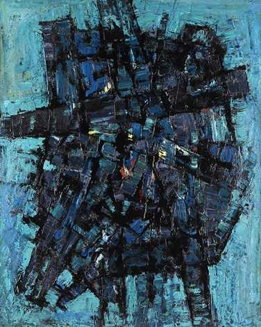
On the end wall is the almost monochrome blue ‘Myth Form’, 1958, which slowly releases other fragments of colour as we look at it. The dark blue and black network of strokes is peppered with small marks of yellow and red in the central area, making it seem to glow. There is a curved lattice which swings down to the bottom left corner from the tipped horizontal, giving the painting a sense of structural movement, as opposed to the liveliness of the generous, buttery paint application. Spaces are pierced through to the turquoise background (for that is what it is, for all its lively application of paint) and it appears more static than the previous two pieces mentioned, with movement being potential, and with the general mass being central.
The downstairs gallery holds a similar, smaller monochrome painting in green, ‘Meeting’ 1960; again it is centrally massed but more animated, with a vertical emphasis and bowed elements spreading up and out from the centre. The area to the edge of the canvas, as with the previous piece, is roughly painted in a tone lighter than the mass, though here there are darker patches that reconnect it, anchor it, especially down the left hand side, so that there does not appear to be so much of a ‘background’ on which it is floating. This gives a sense of space rather than detachment. Slightly below the centre of the painting is a flash of red paint echoed by two duller ones just above it and to the right. This gives the piece a glowing core that is common in Avary Wilson’s work (as in ‘Myth Form’ above); there are five paintings that have this feature, but they are all subsumed into the general energy of the paintings and do not make them static.
“Meeting”, 1960, oil on canvas, 101x66cm
‘I studied biology hoping that it would provide me with an explanation of the wonder of life. But the claim that life was no more than a molecular mechanism, led me to join the ranks of ‘vitalist’ biologists, who recognised that life, like beauty, was a quality, not a thing.’ FAW 1990
Avary Wilson’s love of colour and nature was rooted in the intense “breath taking beauty” of the semi-tropical environment of Mauritius which he had soaked up as a child. As a scientist who was interested in the microscopic structure of life, and, like his fellow travellers in abstraction, Davie and Wynter, Avray Wilson had also studied Jung, “as the only psychologist who touched into the transcendental component in art and life”. All three also had a common interest in Zen in their quest to get to the reality beneath appearances, and in what was seen as a bid for authenticity, something from deep within that enlivened their work.
It was the vital fusion of energy and structure through colour that was to occupy Avery Wilson over the next ten years, ploughing an idiosyncratic field amongst his peers who were also working with energised colour and form – Wynter’s mescaline-infused, reverberant, jewel-like paintings from the mid-fifties such as ‘High Country’ or ‘Carnival’, both from 1956; Gear’s explosive ‘Pastoral’, 1952, or the vertical ‘Landscape Structure’ from 1954; Riopelle’s Mosaiques series begun in 1953, monumental canvases made with heavily loaded strokes of the palette knife to build a complex patchwork of shattered colour.
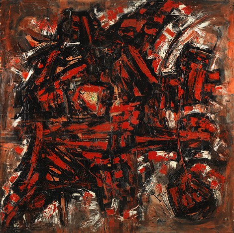
“Energy” c.1959, oil on canvas, 183x183cm
The centrepiece of the downstairs gallery is a large square canvas, ‘Energy’ 1958, predominantly bars of red amongst black, but with some strokes of orange and flashes of white towards the edges. It is the painting in the show with the least coherent structure, breaking away from the centralised, almost symmetrical approach of most of the others. At first it appears to be chaotic, in the sense that the application of paint is more ad-hock and broken up, with multi directional strokes and scattered energy. After some looking it starts to cohere into a six pointed shape, set off to the left with a circle lower right, and a familiar rectangular matrix to the upper right, both to the side of the main area (just to say that confronting this painting in the flesh, it takes some time for the eye to see what is quite clear in the reproduced image, where the structure is immediately apparent – underlining the argument for seeing the originals rather than judging an image). In the centre of the main structure is a small area of paint completely different to that of the rest of the canvas; it is a triangle of thick strokes of red within which is an area of orange and white on which are small drips or spatters of red and green, a completely different application than on any other painting of his I have seen. Once noticed it holds the eye and restricts the free movement around the rest of the painting and for me was an anomaly and a distraction.

“Oracle”, 1956, oil on board, 122x91cm
There are two enigmas in this show; in the downstairs gallery, in a corner, is ‘Oracle’ 1956, a relatively subdued painting colourwise, in pink, violet, olive green and white, with a vertical emphasis and the expected black edging and bars. There are crackles of red that enliven the painting and add another complexity to the multi-layered work. In amongst the other brightly coloured explosive paintings, this holds its own and for me is one of the most interesting in the show because it is less structured and also because of the subtleties in the facture, the way the colours are pushed around into each other and the dark areas are more subtle. The enigma is that it appears to have been hung upside down; in the catalogue and on the website it is shown the other way up (see above image) so if you turn your computer upside down (sorry, my photograph of it in-situ had flare from the bright lighting on the shiny oil paint) you will see what I saw in the gallery. Strangely, it seems to work both ways up. Unlike a lot of the others it is not signed, therefore there appears to be no definitive top or bottom… the ‘which way up’ question is familiar to a lot of us painters, I think, and for me boils down to gut feeling, which then hopefully pans out when later analysing the painting with some objectivity. (As Motherwell said, ‘Knowledge never solves a painting, it depends on feeling.’)
The other enigma was upstairs and concerns ‘Exultation’, c.1960, a painting on board, consisting of four panels that fit together, and were obviously originally painted together. In the gallery the painting is separated into its four component parts by a dark frame around each piece, effectively destroying the whole… in the catalogue the painting is shown with its quarters separated by thin white space (which is less intrusive) and on the website we get the whole piece in all its glory. (See image below and the other one of it in situ next to ‘Nucleus’, 1957) In its completeness it is the largest painting in the show and would be a tour de force, and is one of the few not contained by the edge of the ‘canvas’; the energy seems to spread out, and there is a feeling that it could do so indefinitely. Again it is the small details that bring it alive; the flashes and streaks of yellow amongst the red, and against the blue; the haphazard stacks of blue and red bars with curves thrown into the mix. Though ‘Energy’ appeared to be the most chaotic or rather disordered at first sight, this painting has the true chaos of a creative matrix which has some underlying order not immediately visible.

“Exaltation”, c.1960, oil on board, four panels, 122x92cm each

“Nucleus” and “Exaltation” installation shot
In the show there are ten other paintings in vertical formats, some of them extreme, i.e. the height being more than three times the width, and one horizontal one, ‘Conjugation’ from 1953 (image above). There are too many to go into in this piece, but they vary from the very centralised blocky structures of ‘Integrant’, 1953, to the very fluid ‘Vertical in Blues’, 1960. All have the same generous and sensual application of paint that is characteristic of Avary Wilson’s work. As with all complex paintings, these repay the time one puts into them, letting the complexities come to light and the subtleties enrich them… viewing them with what Ehrenzweig called ‘a passive watchfulness’.
‘In aspiring to a vitalistic painting, biology had taught me the key importance of form in the expression of vitality. At profound molecular levels, vitally involved forms could be expressed in complex geometries, indicating that the visible ‘organic’ forms of life had a profound geometric basis.’ FAW 1990
But this geometric basis has to be searched out over time, for it is a ‘soft geometry’ that unfolds as you look and wait. As he put it in the first of his many books, “the artist is a necessary manipulator of resisting matter… he does not ‘see’ the imageries within his inner experience, but must ‘feel’ his way into matter…” FAW ‘Art into Life’, 1958.
Frank Avray Wilson was at Whitford Fine Art, London until 25th November 2016.

This is a very interesting article about a very interesting painter. And a welcome break from Pissarro, for here at least we are talking about a painter who could loosely be said to be “genuinely trying to paint an abstract picture”, with all the unresolved questions that that brings unanswered. I haven’t seen the exhibition, so am unable to make much comment on the work, though Wilson is an artist I have been interested in and from very early on.
However my longing for direct comparison tells me that what is missing here is the chance to compare these paintings with what Hans Hofmann was doing in the early fifties (Wilson was probably unaware, but they are both part of a “vitalist” trend in European painting post-war) — Hofmann’s Scotch and Burgundy 1951, Spiral Nebulae 1951, and Liebesbaum 1954. And of course the major figure of European painting of the 40s and 50s was De Stael. I’d guess that Wilson was well aware of him, and Oracle in this show would seem to suggest a direct influence. It is not only the palette knifed period in De Stael, but also his earlier near monochromatic cubistic vertical pictures that are akin, but I don’t have my De Stael catalogues with me, so can’t be more specific. What an interesting show that would make!
I am reminded of a comment made by Alan Bowness at the time of the American A.E. show at the Tate in 1956, which coincided with a retrospective of De Stael at the Whitechapel following his suicide in 1955. The contrast between the two shows, Bowness said, brought this chapter in British art to a close, and marked a decisive shift towards the Americans. Untrue, as it happens, as I have detailed in articles about Heron, but it does reflect the usual fickle curatorial and critical attitudes, and it does raise the question of what happened to Avray Wilson, and his reputation after 1960 ? And the fate of tachism in general. The New Vision Centre struggled on into the mid-sixties, but fashion did for it in the end.
LikeLike
And when I say cubistic, what I mean is paintings that really want to be sculptures, but if they were, would have to be a lot clearer in articulation. The chief exception would appear to be Exultation. What a pity it is framed in four parts like that.
LikeLike
What is “backlit”, if it is, is an armature made up of vigorous and rhythmic thrusts of the arm making clusters of palette-knifed bars, almost physical in their creation of the illusion of relief. The implication of some kind of event in science ” behind appearances” is metaphoric, since painting is concerned with appearances and on a flat surface such events can only be suggested diagramatically and mimetically. This is not to say that the paintings are “figurative” in either sense of that word. Their motifs have taken on a life of their own as plastic constructs, but tend to rely too much on the suggestion of an explosive burst of energy carried by literal hand-movements of the artist, perhaps. But a very timely intervention!
LikeLike
This is a well-written paean to Avray Wilson by Nick, and I appreciate his enthusiasm for the artist, though I cannot share it. Nor can I let such an uncritical appraisal go without comment (this is Abcrit!). And it’s interesting to read Alan’s admission (for a second time of late) that abstract painting does indeed have “unresolved issues” (mainly spatial?). Well, whatever, let’s not start another world war.
Like Alan, I didn’t see the show, but I’ve seen a lot of Avray Wilsons over the years; unlike Alan, he’s a painter I’ve never had much joy out of. I find his work rather monotonous and rudimentary, so it’s something of a culture shock thinking about this work after Pissarro’s “Côte des Bœufs”. We’ve gone from one of the subtlest and richest of voices in the history of painting to someone that speaks in monosyllables. Avray Wilson has indeed got unresolved issues, but chooses not to address them, and pretty much exemplifies the rather gross characteristics of much abstract painting from the period, when it was de rigueur to find some niche encompassing only partial content at the expense of plenitude, real discovery and innovation. By these means Avray Wilson established his signature style, to the exclusion of by far the greater part of the potential of painting, and perhaps a lot of his own.
And I don’t think “genuinely trying to paint an abstract picture” is an excuse for this lack, or for anything else, unless we are contextualising madly. Nor can we do much more than give a passing nod of acknowledgement to Avray Wilson’s awkward place in the history of art, unless we abandon altogether the idea that, for artists of any age, such a history acts as an argosy of aspirational comparisons.
Which leads me on to David Sweet’s interesting comment on the Ms. Knee feed (and indeed, his previously overlooked comment on my Ab-Ex essay), where the achievements of “Cézanne, Constable and even[!] Pissarro” are sidelined, after brief praise, as “lost to us”. What, forever David? Apparently not to Emyr, and me neither. Whilst I agree that Cubism did him no favours, I don’t think they (the Cubists) or we (abstract artists) have yet matched up much to Cézanne’s massive vision for painting. Until such time as abstract painting gets completely over its fads for repetitive simplification and starts to get a measure of his achievements, turn for turn (and that of Constable and Pissarro likewise), embodied in its own accomplishments, then we won’t get near to matching him. And I don’t agree that he is lost to us just because we might work in a very different way. Direct influence doesn’t mean much really. It’s often detrimental. You could make a good historical case for the style and facture of Avray Wilson’s work being linked directly to the influence of Cézanne and his followers, but there is no comparison of value to be made from that link, and we cannot blame Cézanne for it either. There are a great many things in modern art we cannot blame Cézanne for (lack of ambition is one). That doesn’t mean we should lose sight of him. He remains, along with Constable, Pissarro and others, deeply important to the future of painting.
Straight lines? Sure, we need them, and everything else too. In David’s theory of modern painting, there’s a naturalistic, broken up, painterly space that is essentially figurative and “past it”, like in Cezanne/Hofmann; and then there is a brave, new, flat, straight-lined “kind of optical conditioning”, a “new pictorial economy”, like in Newman/Stella/Noland etc… Well, it’ll take a lot of “conditioning” to convince me that this isn’t just a great big dumbing down of painting, where less is less, and where simplistic stripes signify a “big” subject matter and little else. Less to look at, that’s all it is.
And here we are again, with Avray Wilson; the relentless consolidation of his narrow oeuvre would be almost laudable if it wasn’t so stultifying. I can’t look at a single painting for more than a few seconds without feeling frustration – why so few colours, why such a repetitive facture, why is every part of the painting the same, why is there such a graphic “figure” on a background every time? Hofmann, despite all his “unresolved problems”, is a giant by comparison, with a much more open-minded sense of experimentation, balanced by plenty of solidly-focussed achievement, but without too many periods of the self-conscious stylisation that overwhelms Avray Wilson’s talents. And when such stylisations do occur in Hofmann, they don’t last too long.
Sorry Nick, not for me.
LikeLike
Cézanne remains, along with Constable, Pissarro and others, deeply important to the future of sculpture too, which reinforces my point that being inspired by ambitious achievement and the manner in which it is accomplished is more important than direct influence, which often manifests itself as a downgraded mannerism.
Avray Wilson’s paintings have no real relationship to sculpture, and nothing to offer sculptors. I’m not convinced they have anything much to offer painters either.
LikeLike
Whilst I agree that David Sweet’s comment is very silly (as usual) , and says as much about his inadequacies as a painter as it does about the superficiality of his grasp of art history, I can’t help but wonder why Robin’s response to it is conflated with gibes at mine on Wilson instead of on Ellen Knee, where it belongs. I did not say that Hofmann had unresolved problems. I said that there were unresolved questions about where “abstraction” begins and ends, which is a very different matter. Once again the animus is peeping out. And Robin is seemingly unable to name a single abstract painter, other than Hofmann, that he likes, and unable to see that just going on raving about Constable and Cezanne does not come anywhere near answering these questions for abstraction. They will only be answered on canvas of course, and what Sweet is hinting at is that a welter of complex detail without a sense of pictorial architecture will not hack it. There is also the question of naturalistic light and colour, which creeps into painting by default if it it is not addressed, for or against, in a conscious way by the artist, another fault-line for abstraction.
LikeLike
“…unresolved questions about where “abstraction” begins and ends…” would certainly apply to Hofmann. And since answering such questions will only happen on canvas (that’s what I said!) I’ll carry on carrying on on Constable, thanks.
As for other abstract painters I like – well, there a guy called Gouk (and a few others too).
LikeLike
In 1968 Dick Fosbury won Olympic gold for the high jump with a clearance of just over 7’4”. His methodology was unconventional. After a diagonal run up to the bar he took off, led with his arm and head, turned his body in mid-flight, lifted up his feet, and landed on his back. That’s what I would call a paradigm shift, or a radical revision of the physical economy of the high jump.
Ten years later, Vladimir Yashenko, who was a straddle jumper, set a new world record of 7’8”. But that was the highest point reached using that technique. After 1968 most jumpers adopted the ‘Fosbury Flop’ and in 1993 Javier Sotomayor of Cuba, using that method, cleared slightly more than 8’, a record that stands today.
Now Yashenko was clearly a great high jumper, but practitioners would have recognised that imitating his approach would not be a good investment of their time and effort and switched to the new economy. That’s where the event is at the moment.
If there was a website called ‘HighJumpCritical’ some contributors may argue that the future of the high jump lay in a revival of the great tradition of straddle jumping. Others may reply that Fosbury’s paradigm shift has to be recognised and taken seriously, that straddle jumping has exhausted its potential, and the supporters of the technique Yashenko perfected should get over it.
LikeLiked by 1 person
Yes, David I get your humorous point about paradigm shifts but it is rather meaningless to compare making abstract art with a niche section of sport.
LikeLiked by 1 person
Maybe that’s why sculptors are having difficulty in getting above four foot six.
LikeLiked by 1 person
The latest iteration of my sculpture “Yellow Rattle” (as yet unphotographed) has, with ease, reached 5’10”. Perhaps I should rename it “Paradigm Shift”. It’s certainly no longer a dodo.
What David doesn’t realise is that he and his fellow exponents of the “new pictorial economy” have conveniently lowered the bar. In fact, they are not so much high-jumpers as limbo-dancers, seeing who can go lowest, simplest and dumbest. The ambition of those who want to make complex spatial painting and sculpture remains uninfluenced by such goings-on.
LikeLike
Here’s some nice uninflected painting: http://hyperallergic.com/341557/agnes-martins-contemporary-sublime/?utm_source=sumome&utm_medium=twitter&utm_campaign=sumome_share
The big con of the “abstract sublime”, otherwise known as “boring design”.
LikeLike
” The ambition of those who want to make complex spatial painting and sculpture remains uninfluenced by such goings-on. ” I admire the single mindedness of those on this site who hold dear this project for their art. But, surely, it’s not a matter of the complexity or the simplicity of the art, but of the quality of the relationships created.
David Sweet recent comments raise serious issues for abstract artists that cannot be dismissed as lightly or as rudely as they have been.
LikeLike
Isn´t that a bit like saying that all modern literature should be carrying on in the manner of Finnegan´s Wake, or that Tolstoy, Dostoevsky, Kafka etc. were all hopelessly backward-looking since they came after Tristram Shandy?
LikeLike
Just as a point of order. I did not suggest that Yellow Rattle was like the dodo skeleton. I sent the photo to you privately as a joke, given the history of work from the body etc. Then you chose to put it up in the context of comments about Yellow Rattle, thus hoisting yourself with your own petard, and giving others the opportunity to see a similarity that I for one did not suggest was there. But having done so, it was possible to make points about clarity of articulation etc., … And so offended were you by this that you took the image down, thus making a nonsense of the sequence. Just saying.
LikeLike
With ease? I thought you were against modernist ease. Boom Boom.
LikeLike
Irony is obviously wasted on you. Basil Brush more your thing.
BTW, now we’re done with semantics, when are you and Tim starting the proper debate on sculpture? Kathy’s review?
LikeLike
I am deeply surprise by some of the comments. My only wish is for all the writers of the above texts to have actually viewed the exhibition in person. The paintings were among his best, never been on show before and they would have convinced even the most skeptical critic.
LikeLike
Indeed. Having now seen some of the paintings, after the show has closed, I have to withdraw the word “cubistic” altogether. The pictures are not only better than they look on screen, or the best of them are, but much more painterly. Reactive and Myth Form have a colour/light unity about them, not so much back-lit as glowing inwardly. And Reactive has a great painterly sweep about it, much richer and deeper in colour than it appears on screen, and a painterly abandon in its “drawing” that I for one envy. There were other exciting paintings not shown in Nick’s article, but Talisman also transcends the superficial look of the rather stark contrast of a dark armature on a white ground to meld into a burnished unity of surface and image, that is all painting.
LikeLike