
Henri Matisse, Interior, Flowers and Parakeets, 1924, Baltimore Museum of Art: The Cone Collection. Succession H. Matisse / Artists Rights Society (ARS)
On Art News Phyllis Tuchman reviews The Matisse/Diebenkorn show in Baltimore:
Striking Up a Conversation: The Baltimore Museum of Art Unites Matisse and Diebenkorn in a Glorious Exhibition.
Tuchman writes:
“Astonishingly, Diebenkorn’s paintings in Baltimore are never overshadowed, as you might expect, by Matisse’s masterpieces. The American who twice lived outside San Francisco—in Berkeley (1953–66) and Healdsburg, California (1988–93)—as well as on the western outskirts of Los Angeles (1966–88) doesn’t just hold his own: he actually upstages Matisse.”
That indeed is astonishing…
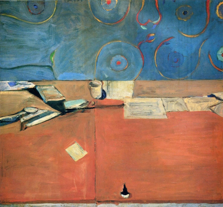
Richard Diebenkorn, “Large Still Life”, 1966
On Hyperallergenic, Barry Nemett takes a more prosaic approach:
“Matisse and Diebenkorn grew up in different cultures with different histories, architecture, customs, landscape, and cuisine. Twizzlers here, eclairs there. George Washington and Mount Rushmore here, Cézanne and Mount St. Victoire there. But connections abound between the artists. Within their individual compositions, both fought to reconcile seeming conflicts like tradition and innovation; drawing and painting; representation and abstraction; depth and flatness; vigor and poise; order and muddle; grandeur and humility.”
Henri Matisse, “French Window at Collioure”, 1914
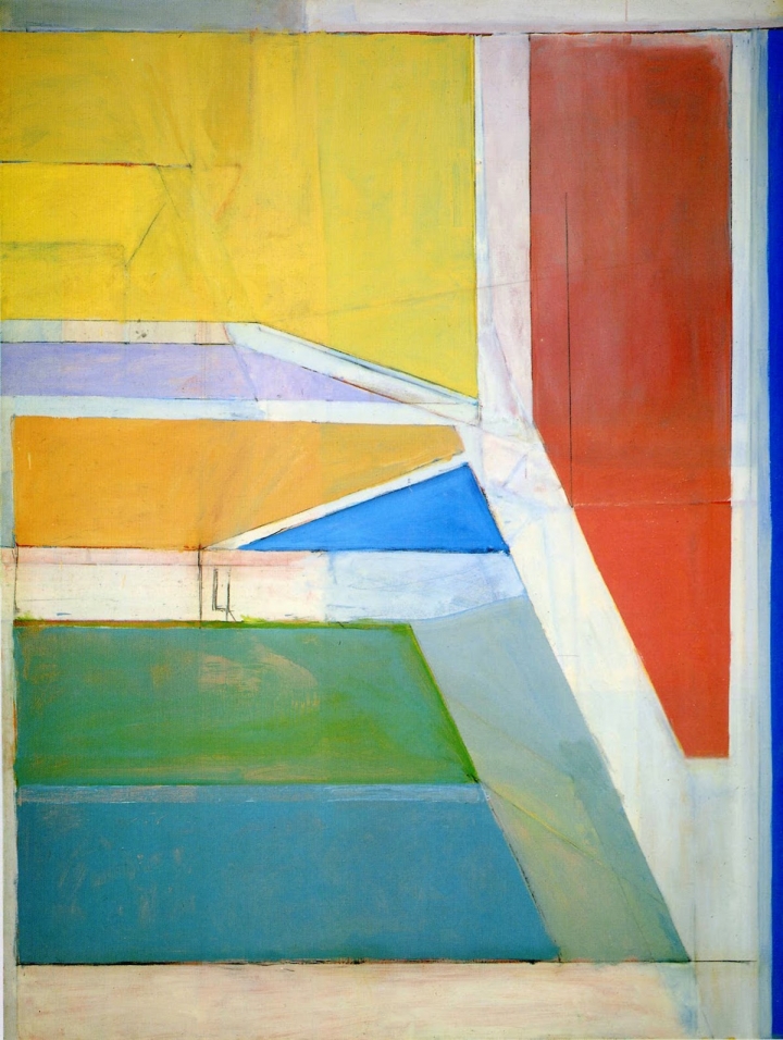
Richard Diebenkorn, Ocean Park Series no.27, 1970
………………………………………………………………………………………………….
Also on Hyperallergenic, the prolific writer John Yau writes of some close and personal observations on Rothko at Pace Gallery, N.Y:
“ Rust browns, red browns, blue blacks, and dark plum reds — these are some of the crepuscular colors Rothko used. Some of his rectangles, edged with an aura, seem almost never to come into focus, while others feel almost crisp. Looking at “Untitled (Dark Gray on Maroon)” (1963), which is in the collection of the National Gallery of Art in Washington DC, I feel as if I am losing the ability to distinguish, to see the three rectangles hovering inside the painting’s rectangle, which is over 11 feet high by six feet wide. Each one is different enough from the others that I find myself registering the increments separating evanescence and density. The edges of the middle, squarish shape are darker than the interior. At times the maroon ground seems to have bled through the skin of the darker color that Rothko has laid over it. There is something disconcerting about the experience, even as you are flooded with an odd tranquility.”
………………………………………………………………………………………………….
Diana Copperwhite, “Depend on the Morning Sun”, 2016
Again on Hyperallergenic – Stephen Maine writes on the new work of “semi-abstract” painter Diana Copperwhite at Gallery Thomas Jaeckel , N.Y. Maine frequently likens her work to Howard Hodgkin and discusses the ins and outs of paintings that look at first like abstract art, but reveal themselves as obscurely figurative.
“So is Copperwhite’s work Ab Ex redux? No, but not because it isn’t truly abstract — why, de Kooning himself almost never quit the figure entirely. If a key strategy of historical Abstract Expressionism was to trim the lag time between impulse and response — the belief being that doing so would allow form to emerge from the subconscious, unmediated by culture, the “literary,” or the artist’s internal editors — then Copperwhite’s calculatedly eye-grabbing tricks with the brush are in quite the opposite spirit. (And anyway, you can’t go home again.) Rather, Copperwhite approaches “action painting” as an inherited language, to which she contributes some striking dialect of her own.”
So you can be “truly abstract” without quitting the figure entirely…?
………………………………………………………………………………………………….
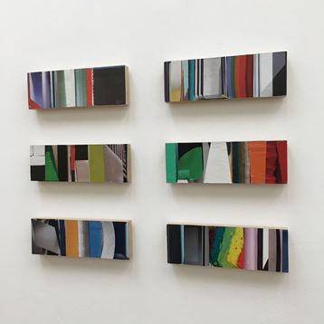
Laurence Noga, 6 works including “So Orange Filtered Violet”, 2016
Closer to home, a review by Fiona Grady on the Saturation Point website http://www.saturationpoint.org.uk/Imperfect_Reverse_review.html of Imperfect Reverse at Camberwell Space Projects, Wilson Road, London, which took place from 18 October – 18 November 2016 and continued at Ruskin Gallery, Cambridge, until 21 January, 2017.
“Despite the reductive nature of these works, the real world does creep in. Laurence Noga’s collages, at first glance, are a sequence of coloured segments, but on closer inspection the viewer sees the details of the magazines from which they are made. The work suddenly becomes more figurative; the panoramic layout becomes spatial and indicative of interior situations. Ian Monroe’s Glyph Glyph is part painting, part sculpture; it follows a non-linear logic, referencing the complexities of technology and constructed reality. Tim Ellis also re-interprets collage by crumpling, folding and reshaping military posters, thereby re-formatting and contextualising the artefacts to distort their meaning. This approach is investigated further by Simon Callery, whose painting Punctured chromium oxide flat painting documents an excavation in North Wales; instead of reconstructing the site he presents an alternative form of mapping.”
The question is, do we want more or less of the real world in abstract art?
Lastly, some recent tweets we noticed:
Carl Kandutsch @CarlKandutsch continues to tweet modernism, Caro especially:
https://pbs.twimg.com/media/C2u7_0IUUAAX3Yl.jpg
Double Tent 1993
https://pbs.twimg.com/media/C2rHPZtVIAAmaFP.jpg
Barcelona Crown
A couple of new works by John Bunker @thebunkers4
https://pbs.twimg.com/media/C2yBBomXEAAN9h-.jpg
Tzila, 2017-01-22
https://pbs.twimg.com/media/C2kJmqzXcAE76be.jpg
Djinn, 2017
And Stephen Buckeridge tweeted his studio floor, which got more likes than… well, I won’t say
https://pbs.twimg.com/media/C2x41eiXcAAohNb.jpg
Martin Mugar thought it looked a bit like a Rauschenberg. Looks like the real world…

a propos my comment on Buckeridge I would add that the goal of Rauschenberg was to break down the barriers of art and the real world. Buckeridge stumbled into that realm. As for Diebenkorn upstaging Matisse I can only rely on my memories of both.(Matisse 2012 at the MET) The totally abstract Diebenkorn’s always seemed flaccid and inevitable overworked abstractions of what he saw whereas a good Matisse seems like a discovery of a new space in what is an extraordinary visual event.
LikeLiked by 1 person
Couldn’t agree more, Martin. I look at this photo and find myself in my imagination making a run for the Matisse.
LikeLike
Like Perl’s use of speculative in regards to Matisse.
LikeLike
I wouldn’t agree with flaccid but overworked does fit. He very often was calculating and had Matisse looking over his shoulder. The sort of enforced brutal finish is contrived.
But, to be fair, Diebenkorn is great. Hard to move out of a Matisse orbit. The pull is intense. The ‘modest’ still life pictures that his son has several of are fantastic and have none of this pretentiousness.
LikeLike
A very interesting discussion. I just saw the DIebenkorn / Matisse exhibit today at SFMOMA with some friends and have to admit I was the only one in our group who felt somewhat disappointed in the pairing. As a long time fan of Diebenkorn I felt that in each gallery the Matisse paintings were more riveting and involving. Only in the final gallery, the one with the Ocean Park paintings, did I feel that Diebenkorn ‘stood his ground’ so to speak…and maybe would have held it if “View of Notre Dame (1914)” wasn’t in the same room.
Nonetheless, the show was fun. I could certainly see the Matisse influence. And de Kooning, It makes me wonder how a show pairing Diebenkorn and de Kooning would hold up.
LikeLike
Here’s a paragraph from Jed Perl’s terrific review of the Matisse/Diebenkorn show in Baltimore (http://www.nybooks.com/articles/2017/01/19/cool-sublime-idealistic-richard-diebenkorn/):
“It seems clear that Diebenkorn, in working on his Ocean Park paintings, was forever in Matisse’s debt for the black lines that the Frenchman inscribed on a thin wash of blue in his View of Notre Dame. Elderfield would say that Diebenkorn took the implicit abstraction of Matisse’s enigmatic View of Notre Dame—a painting Matisse never exhibited—and imagined a new kind of abstraction. But what is easygoing, free-spirited, and speculative in Matisse’s work becomes all too insistent and determinative in Diebenkorn’s Ocean Park paintings. Diebenkorn has a way of hammering at a subject that may be both his greatest strength and his greatest weakness. With the Ocean Park abstractions, he’s hammering ever so softly, but hammering nonetheless.”
The paragraph doesn’t really answer Robin’s question about wanting more or less of the real world in abstract art, but it’s a suggestive paragraph: maybe there’s a useful way at least to think about Robin’s question in there.
Here’s another “suggestive” paragraph (you need a NYRB subscription to get to Jed’s review):
“In an essay in the catalog of “Matisse/Diebenkorn,” John Elderfield, who over the years has organized landmark exhibitions devoted to both Matisse and Diebenkorn at the Museum of Modern Art, argues that “their most important practical commonality may be a quality of alertness, a mixture of judgment and vigilance, about what happens in the process of making a painting.” Taken at face value, that sounds like a fairly modest claim. But the more time I spent with the paintings and drawings at the Baltimore Museum of Art, the more Matisse and Diebenkorn struck me as being alert in entirely different ways. What it comes down to is that Matisse’s attention is omnivorous while Diebenkorn’s is narrower, perhaps cooler.”
LikeLiked by 1 person
“Omniverous vs narrower, perhaps cooler” says Elderfield. Please say what you really mean a bit more emphatically Mr Elderfield. Those were very polite words which do a disservice to the subject of their comparison and to Matisse. Much credit to Diebenkorn but Matisse’s shadow engulfs him, as it does to most everyone.
LikeLike
Freeway and Aquaduct
Cityscape I
LikeLike
I find the real world creeping into abstract art sometimes very disconcerting, seeing the figures emerge in Diana Copperwhite’s painting, illustrated above, takes away a lot of the impact (to my mind) and fixes the content in a disappointing way. I felt the same when looking at some of De Kooning’s Women paintings ( the less obviously figurative), I really enjoyed some wonderful passages of brushwork then would become aware of a pair of eyes staring out which I found difficult to integrate into the work. The real world is bound to come into an abstract painting in the sense that we are part of the world and subconsciously things will appear, but isn’t the point of abstract work to enjoy the challenge of expressing something other and new, however difficult? Semi abstract painting has a different set of problems and is just as difficult to pull off successfully.
LikeLiked by 1 person
It seems to me that the point of abstraction in modernist painting and sculpture is the same as the point of representation in pre-modernist art – namely, to establish a connection between artist (and viewer) and reality. Otherwise, why would we be interested in abstraction as a way of making art? If so, what is “disconcerting” is not so much the appearance of (represented) eyes in de Kooning’s Women paintings (as if they constitute the intrusion of a foreign element) but the fact that at the time they were painted, what we crave from art, which is reality, could only be given in a painting by abandoning the appearance of things as an integral whole. Instead of a picture of a woman, we have only some fragments indistinctly emerging out of and then disappearing back into a painted surface. I believe it is the implied UGLINESS of the woman in the de Kooning that is disconcerting.
LikeLike
I don’t really understand what you mean by this, and I am as wary of anyone stating “the point” of abstraction (and/or figuration) as I am of anyone thinking they know what the “essence” of sculpture is. Artists’ intentions, and viewers’ desires, are manifold, and mostly unknowable. In fact, one of the enduring qualities of art seems to me to be it’s ability to create a totally believable world of its own – whether abstract or figurative. How that relates to the so-called “real world” is anyone’s guess. For me, it’s a great big chunk of it.
LikeLike
Just to be clear, I have never claimed (expressly or otherwise) to know the “essence of sculpture”. My observation about the “point” of abstraction is that it is a mode of visual art, and as far as I know it’s axiomatic that all serious art, like any other mode of serious communication, is about reality, the relationship of humans to the world.
LikeLike
I’m with you Carl.
LikeLike
A bit off-topic but maybe not out of place in a Knee posting – I´ve just been to a lecture from Prof. Marie-Elisabeth Faymonville, who is an expert on hypnosis and hypnotic states.
Hypnosis is a state of mind similar to sleep but with a high level of conscious activity, akin to lucid dreaming. Like sleep, it cannot be forced on anyone and nor can it be entered into as a deliberate act. Just as a darkened room, silence, lying down etc. can encourage sleep, hypnosis can be encouraged by absorption and by a rhythmic stimulus. That is the principle behind the swinging watch-chain. The hypnotist can help someone to achieve a hypnotic state in the same way that parents can help their children to sleep by reading to them. It has nothing at all to do with willpower etc. and self-hypnosis is a faculty that everyone has to varying degrees and which can be learnt.
The interesting and valuable thing about the hypnotic state is that, although there is a high level of conscious activity, the critical and analytical faculties are severely reduced. This is what lies behind the suggestibility and vulnerability of people in hypnosis (and is the reason why hypnosis should be regulated against abuse). The positive side is the associated liberation of thought patterns, enabling a self-induced loosening or reconfiguration of ingrained attitudes, theories, ways of seeing the world etc.
It occurs to me that there is a connection to visual art here. The viewer is absorbed in the work and (in most or all successful artworks) there is an optical movement – push/pull, surface/depth, object/illusion – that can form the basis of a rhythmic stimulus. Such an artwork could then be (among other things) an aid to self-hypnosis, encouraging freedom and flexibility of thought and perception. That might also help to explain the extreme emotional reactions reported by some viewers of Rothko´s (optically very active) Seagram Murals for instance.
LikeLike
Regarding Rothko, I remember the thrill when I saw one of his paintings for the first time. However, the initial excitement has tended to dissipate over time, in part because Rothko was content to basically repeat the same format varying only the colors until the end. I am sure that he had good reasons for that but the fact of repetition indicates that he was unable to resolve the problem that the format was intended to address and that the problem was essentially a private and personal problem. The result is a kind of religiosity that bothers me (not unlike the religiosity of John Coltrane’s music – not to steer the conversation in unwelcome directions) because it tends toward literalism. Not the literalism of ordinary objects but that of taking one’s feelings at face value, which means, wearing them on one’s sleeve so to speak. For that reason, Rothko’s paintings do not strike me as abstract in the way that, say, Louis’s do. In Louis’s work, it is not so much particular feelings that are expressed as much as the capacity to express feelings at all by means of paint.
LikeLiked by 1 person
Carl,
Little confused here given your earlier post that it is axiomatic for humans to communicate their relation to the world that Rothko’s wearing of his feelings on his sleeve would be a bad thing.
Rothko was expressing feelings which you consider less legitimate than Louis’s “capacity to express feelings”?
Confused in Lodi with the Memphis blues.
LikeLike
Billy: Rothko’s paintings look to me like metaphors for a feeling or state of mind that exists apart from his activities as a painter. That would explain why he stuck with the same format for so long; the visual metaphor worked for him, within limits (until it didn’t). I have the same feeling looking at a lot of Barnett Newman’s stuff. By contrast, when I look at a painting by Morris Louis I sense that he was only able to discover or form the feelings he needed to convey in and by the act of painting pictures. As a result, a painting by Louis does not induce me to look or think beyond what I see; it doesn’t make me want to understand Louis’ mood or state of mind or specific intention; I feel that EVERYTHING he had to say is there facing me in the painting. Which means that it is not a metaphor or a symbol or a totem or a religious icon; it is not one thing standing for another. I have the same feeling about all great sculptors and painters. I apologize for the vagueness of this.
LikeLiked by 1 person
Thank you for taking the time to explain that.
LikeLike
Its possibly this is not relevant to Matisse and Diebenkorn. I was a student in Baltimore and admired the pink nude often in the museum there.I just watched a television tribute to Francis Bacon ,who I was introduced to in the Colony club ,and do not feel as an Absract Painter in the same world at all.My friend Maggie Hambling makes great claim for the activety of painting the Human Form.I dont live,or paint int the same universe as Freud,Bacon ,Kitaj,Kossof or Auerbach,or Hockney for that matter..I dont have the same feeling for fame and riches as Bacon,Hirst and Saatchi.Ive seen it and been in it and despise it.A failed painting device .like the space frame in so many of Bacons pictures,is so much less than the black lines across blue in Matissses Notre Dame.
LikeLike
What are the black lines in the Notre Dame Matisse doing? Looks to me like one of Matisse’s least successfull works, despite being better than Bacon etc.
These two Matisse’s might be worth a discussion, 1902 and 1911:
LikeLike
I wouldnt attempt a description of Matisse without being in front of one,the second one,which I think Ive seen in MOMA,NY. A stunning painting.Bacon saw shock in Picasso,and figured out how to use it to get rich,by smudging faces.Matisse seems much more about constructing the whole painting from the back forward,through colour,drawing,and continued invention.Matisse is speculative,architectonic,not just in the relation of shapes,but even in the expressive brushwork .There is more tension in a Morandi than in a Bacon.Which leaves me with the feeling that English painting is a con ,built on ignorance.Very few,like John Golding,certainly not Sylvester ,knew the difference.So much money,so many reputations built on bluster and fooling the masses.
LikeLike
The reason I flagged up those two Matisses is that I’ve just recently seen them both in the Fondation Louis Vuitton Shchukin exhibition in Paris and their dramatic differences made me think a good deal. The way the earlier work is constructed (“Path in the Bois de Boulogne” of 1902, of which this is a terrible reproduction, but the best on the internet) is closely linked to Matisse’s admiration for Cezanne, with strongly delineated and heavily painted discrete areas that have been separated from other areas in their proximity, or alternatively merged with them, to make forms that are strongly independent of their figurative source – like for example the central mid-grey area, which might roughly correspond to the foliage of one or more trees, and which though ambiguous in terms of figuration, achieves a plastic and spatial certainty within the painting, alongside other similarly emphasised areas. This adds up in my eyes to something very powerfully inventive and coherent, as those forms all lock in together. It reminds me very much of the Cezanne in the Picasso Museum in Paris,
where spaces between solids become solids in their own right in a very strongly plastic, physical and three-dimensional resolution of space (and tipping you into the picture, over a threshold, often seen in Cezanne). I’m also reminded by this Matisse of the decade up to 1910 of the work of Kandinsky, when he took liberties with colour and space to create new realities from figurative sources, but before he sought to make supposedly more fully abstract work – to his detriment, in my opinion.
Kandinsky, “Painting with Houses”, 1909:
What separates all these works from so much second rate “abstraction” from figurative sources is, in my opinion, a very strong take on resolving three-dimensions in two, and an avoidance of any kind of “graphic” two-dimensionality and “design”. I don’t think the values in these paintings are in any way sculptural, but nor are they flattening painting, as Cezanne and Matisse are so often cited as doing.
Turning to the other Matisse, “The Pink Studio” of 1911, we are in a very different world, a very different kind of painting space, simultaneously both more and less figurative. But the big change is in the thickness and density of the paint and the degree to which it is worked on and over, particularly in relation to the under-drawing, which remains mostly visible under and around the thinly applied oil. This painting and others like it, particularly “The Red Studio” of the same year, are held in the greatest esteem by many abstract painters, and do seem to foretell of many modes of working in the fully abstract painting of later decades, particularly in America, of a kind where elements are thinly and casually arranged across the picture plane. Paradoxically, the figurative entities in this later picture remain discrete in outline, and their spatial separation on the canvas is emphasised more than their actual spatial separation in space. Possibly any spatiality the painting possesses is more dependent upon the figurative reading of the objects depicted than in the earlier work (?).
I liked this painting a lot, until I got close to it, then its strength seemed to dissipate and drain away. There is no detail in it, holding its own. I liked the earlier work more, and liked it more still when I got up close.
LikeLike
This is all a bit fanciful and no, I’ve not seen the original, but I’ve been trying to imagine why Matisse should want to paint such a weird picture as the “Pink Studio” and it seems to me that there’s a kind of playfulness at work.
He seems to have set himself the task of portraying a space which is hidden from view, namely the space BEHIND the screen placed so incongruously in the middle of the picture.
The screen is set more than halfway back in the studio by the perspective implied in the diagonal rug. Matisse then uses various devices to prise apart studio wall and screen.
On the left hand side he dispenses with any further use of perspective, instead stacking up a host of overlapping objects to push back the wall.
On the right hand side one can almost imagine him challenging himself to create the same effect using different methods. The screen is kept from receding by the coffee table at its side. Behind it the very cool, pale turquoise (in the standing sculpture and the picture next to it) pushes back the wall. In the case of the picture this is so effective that it would go right through and create a hole if it wasn’t rescued by some hastily constructed shelves and the painters’ palette tucked behind the top left corner of its frame.
The task of separating screen and wall seems a bit harder on this side of the painting. Matisse adds a perspectival helping hand at the bottom of the framed picture half-hidden on the extreme right. The vertical lines on the wall directly behind the screen on this side are narrower than elsewhere, also helping to make it more distant. The strange construction of the statue’s left leg is perhaps evidence of a struggle to achieve the same distance between screen and wall here as on the left hand side.
Finally, the screen is pushed forward and separated from the window directly behind it by the strange aerial-like pole, that seeks the same optical depth as the only other dark object, the seated sculpture on its left.
Having achieved this space behind the screen, Matisse shows it off by guiding the viewer’s way around. Entry point is on the rug at the bottom. From here the eye follows the ockers and browns (the only warm colours in the painting) in an upward sweep to the standing figure in Luxus I or II, whose gaze goes down into the hidden space. The trail of ocker and brown is picked up on the other side by the palette and a batten leaning against the wall, before tightening into a spiral through the coffee table and on to the stool in front of the screen. And here at the end of the journey is a tiny, insignificant jug, as if to say “it’s not about the THINGS in this painting”.
Playfulness? Another little amusement would seem to be that it is only the depicted artworks that are modeled sculpturally – everything “real” is silhouetted in synthetic cubist manner.
It’s hard not to prefer this painting to the landscape, although the latter has the virtue of being properly a painting, with edges found rather than drawn.
Impossible to say without spending time with both originals, but maybe the sophistication and artfulness of the “Pink Studio” might pall after a while?
I wrote this before seeing yours Robin. Interesting to hear that the landscape comes off best in original.
LikeLike
Then again, “The Pink Studio” is testament to Matisse’s abilities, even with such thin paint and without revision, to feel his way around the space in a manner that is more convincing than anything Diebenkorn seems able to achieve. Despite (or because of) his numerous refinements of individual paintings, such as the ones Carl posted, Diebenkorn still seems to me to be designing his way out of compositional problems and into a sort of graphic fixity.
LikeLike
A few more Diebenkorns
LikeLike
The Rothko essay was good: very ‘eyes first’ and no mention of Death. His reiteration of the vertical stack structure makes Rothko seem unadventurous or self-limiting, like Albers with his squares within squares. But his choice of format is, I think, more authoritative, and based on an analysis of European painting of the early 20th century.
Like the other Abstract Expressionists, he had, from a distance, to make sense of a foreign painting culture that was contradictory and diverse. Rather than taking sides, he, and they, tried to find a way of combining the best bits of stylistic material and organisational principles to make something new, but powered by the achievements of their European co-practitioners, who they admired.
They showed that Miro, with his surrealist overtones, could be combined with Matisse, with his tendency to flatten. Symbols and planes, which are associated with two different ways of organising pictorial space, could be used in the same painting.
Rothko’s rectangles belong to a planar tradition, started by Manet, in which perspectival tensions between the canvas surface and internal pictorial events are reduced to near zero. But the gaps between the rectangles come from the rules governing the deployment of symbols. The gaps are like that between this paragraph and the one above, or between ‘this’ and ‘paragraph’ in this sentence.
If symbols aren’t separated they become confusing and incomprehensible. The gaps in Rothko create an order that confers meaning to the structure but also recasts the relationship between the rectangles raising expectations about ‘content’. We associate symbols with content because of cultural history. That’s why lots of people talk about Rothko in religious terms. Without the gaps he would be interpreted as a colour field painter; with them he is taken very seriously indeed.
{If the justified margin command had survived the transfer from my laptop to this platform I could have made this point even more impressively.}
LikeLike
“But the gaps between the rectangles come from the rules governing the deployment of symbols. The gaps are like that between this paragraph and the one above, or between ‘this’ and ‘paragraph’ in this sentence.”
How are the gaps “like” that between two paragraphs or two words in a sentence? What is the gap between two words like?
“We associate symbols with content because of cultural history. That’s why lots of people talk about Rothko in religious terms. Without the gaps he would be interpreted as a colour field painter; with them he is taken very seriously indeed.”
We associate symbols with content because that’s what symbols are – one thing used in place of another. When one thing is used in place of another, you have reference, i.e., content.
But that’s not why I talk about Rothko in religious terms. I refer to religion because religion has to do with ritual and ritual has to do with repetition and oneness – doing the same thing again and again, as a person with OCD washes his/her hands 60 times per day or Muslims pray in the direction of Mecca. Rothko’s mature work is all about repetition and oneness.
The last clause – “with [the gaps], he is taken very seriously indeed.” Presumably, then, he would not be taken seriously without the gaps – he would be interpreted as a colour field painter, and they aren’t taken seriously – right? Who takes Rothko so seriously – more seriously, for example, than color field painters? Obsession, depression, ritual and devotion can be taken as the conventional signs of a certain kind of seriousness, but that kind of seriousness (e.g., lack of fun, adventure, humor, experimentation) need not be confused with artistic achievement.
LikeLike
” We associate symbols with content because that’s what symbols are – one thing used in place of another. ” Dear Carl Kandutsch please dont confuse signs with symbols even though in our western culture the two terms have become synonymous. A sign is one thing used in place of another. A symbol is what it represents. The experience of which is virtually lost to our modern materialist minds,
LikeLike
If a symbol is what it represents, why do we use the word “symbol” at all? Why not just talk about thing it represents? How does a symbol “represent” something if it is not one thing (doing the representing) standing for another thing (being represented)? If the two terms have become synonymous, why is it confusing to use them interchangeably?
LikeLike
Your questions and the thinking behind them kind of prove the point about the loss of symbol in our time. Interestingly, symbolic survival seems to be surfacing via the abstract art being discussed on this site. The atonement of form and content. I’m convinced Robin Greenwood is a religious artist !
LikeLike
To go back to Robin’s earlier comments on the two Matisse paintings, I was reminded of one of Richard’s comments way back on the thread of my Guston/Matisse essay. Richard wrote,
“Maybe this is a bit off topic, but I’m not sure how helpful Matisse can be for abstract painting as it seems to me that the space in his pictures is almost always created or at least structured by a combination of essentially figurative means, namely perspective and the overlapping of recognisable things.
You can see the two clearly working together in “L’Atelier Rouge” 1911.
Without the figurative interpretation of the central area of “La Conversation” 1911 as a window or picture with a man’s arm in front of the lower right hand corner it jumps out way in front of the blue wall. The light blue flowers in “La Fauteuil Rocaille” 1946 are only saved by figuration from sinking below the area of red wall behind. The coussin bleu in “Nu au Coussin Bleu” 1924 becomes a hole without some kind of figurative interpretation.”
It did get me thinking, because one of my criticisms of Guston was that the works are for the most part flat, and rely heavily on the imagery, whether it is figurative or a black blob, in order to set up any kind of distance between things. The space isn’t really built into or wrought out of the light or the handling of the paint. It’s just implied by plonking some ‘things’ in there. Matisse is no plonker, but it got me wondering if any of these criticisms were also applicable to him. If they are, it is in a completely different way.
I watched Alan’s recent talk at the Hampstead School of Art today, and his discussion of Matisse’s Moroccans, Still Life With Aubergines and the Piano Lesson was very much concerned with this issue. Sadly it cuts out during his discussion of The Moroccans and left me wanting more. To what degree do these incredible Matisses require legible figurative things to inform us of the space being presented? Alan talks about the little perspectival diagonals in the Piano Lesson, or the railing on what might be the balcony. Also the association of the colour green with the garden. Does the space remain plastic without these elements and associations, if I take plastic to mean something along the lines of visual and physical cohesion regardless of the subject depicted? None of this could stop me from adoring these paintings, it’s just something to consider if you want to make abstract painting that isn’t like Kenneth Noland’s “Homage to Matisse” 1991. As Richard said, is it ‘helpful’ for abstract painting? Perhaps, if abstract painting could unearth space and content as curious as the mirror in Aubergines, or as visually astute and humorous as the melons posing as Muslims at prayer or vice-versa in the Moroccans, though this seems quite impossible. Or has abstract painting achieved such a feat already but in a different currency, and we articulate this value in different ways, because these things don’t have such clear and intended figurative associations.
I don’t think that Diebenkorn can provoke the same level of curiosity about the role of imagery, spatially or otherwise, because for some reason his paintings often look more flat when he puts a figure in it, and so you wonder why it is there at all. It seems rather meaningless.
LikeLiked by 2 people
“Or has abstract painting achieved such a feat already but in a different currency, and we articulate this value in different ways, because these things don’t have such clear and intended figurative associations.”
I think this is a very interesting question to which I have no answer, just the following thoughts…
Deep space in abstract painting always seems to have (and possibly arise from) figurative associations unless it crudely destroys the surface (Howard Hodgkins’ “framed” paintings), or is uncommunicatively atmospheric (and therefore possibly also figurative – sky, deep water, fog).
Maybe our spatial perception acts on a principle of maximum economy – deep space is only seen where it is absolutely necessary in order to make sense of the optical phenomena in conjunction with what we already know about the world (the physical size of things etc.) In an abstract painting it is hard to see where this absolute necessity might come from. The spatial effect of two adjoining colours both present on an intact surface would then be limited by this principle of economy to a shallow push and pull.
Can a meaningful wedge be driven between the ideas of plasticity and spatiality and could one “different currency” (see above) be plasticity? More plasticity wouldn’t necessarily imply deeper spatiality. A pronounced plasticity would be happy in shallow space. To me “plasticity” also has overtones of immanence that “spatiality” doesn’t have. The colours in a highly plastic painting could come back (optically) to the surface just as strongly as they recede, so the painting can seem to be advancing into the viewer’s space rather than just opening up a box of space in the wall. Abstract painting would have a huge advantage over figurative painting in this respect, since it has fewer problems with ingrained habits of figurative interpretation stopping the eye from bringing colour up to the surface.
LikeLiked by 1 person
I think the potential for abstract painting to return serve with the colour could be an advantage over figurative art, if it wasn’t so comparatively limited in regard to how it travels back into the picture. It’s apparent that we get very strong sensations from this phenomenon in painting, and that these sensations are not equal either, meaning that there is huge sophistication involved in arranging colour to elicit such a response, and that it takes a good eye, depth of feeling and hard work to pull it off. In the wrong hands, it will just sag. And to be honest, I don’t think I’ve really seen (in the flesh) enough painting of serious ambition that attempts this, so my views have some limitations, based on experience.
So does the sensation of strong optical pressure from the colour match the intensity of sensation experienced when perceiving deep and coherent space? Is it possible to make the kind of painting you might be imagining, Richard, one that comes forward as strong as figurative painting can recede? This would be a kind of illusionistic “push”, and not a literal one, as in Stella. It’s intriguing, but I’m trying to imagine such a thing, and keep seeing myself looking at a painting while wearing 3D glasses.
On what might be a related note, John Pollard posted a short youtube video about Tintoretto on twitter the other day. It was about “The Miracle of St Mark Freeing the Slave” http://www.wga.hu/html_m/t/tintoret/3a/1mark.html , a painting that I’ve been fascinated by in reproduction for the last few years. Towards the end of the video, the speakers make a point of demonstrating how the structure is underpinned by strong recurring colours, namely these deep reds and orangey golds that burst forth yet also hold and ensconce the procession of characters, and by the looks of it, are somewhat undermining the insistence of the recessional perspective that the group of figures construct. The strong colours are part of this receding form, but they also break free from it (and I know this is different to what you alluded to, Richard, which would be a kind of painting where the colour re-asserts itself across the whole surface).
I’m not saying we should try using strong colour to hide spatial figurative devices in abstract painting. Also it would be a disservice to refer to anything in the Tintoretto as a ‘device’. Devices are for cheap semi-abstract paintings like Howard Hodgkins’. I’ll just say that the Tintoretto is both highly considered in it’s structure and design, yet tremendously free in paint application and spatial possibility via the inventiveness of forms like those terrific foreshortened bodies, one at the bottom facing up, the other at the top and upside down (remarkable). There’s so much going on in there, too much for him to have predetermined despite the strength of his design.
I might have gone off track a bit, but the problem I sometimes have with discussion about colour in abstract painting and what it can do spatially, is that the word ‘theory’ is always lurking, no matter how many times we acknowledge the fact that no-one knows what two colours will do when placed side by side. There seems to be an implication that if the colours are wrong, just change them until they ‘work’ (I’m aware that the reality is more complex than this). The fixedness of the format (in some cases) will support this solution by not diverting our attention from the colour relationship. The spirit of the Tintoretto bespeaks a freedom of activity, using a whole range of means to alter, invent, change course and uncover things that could not have been found if one had to strictly adhere to a figurative design or an ‘abstract’ format (contradiction in terms?). Maybe this freedom is the unrealised advantage of abstract art, but in all likelihood we were probably more free when to be figurative was not a sin, because space itself was not compromised. Tintoretto could move wherever he wanted to go.
LikeLiked by 2 people
I see what you mean about the 3D glasses!
But I can imagine perceiving the reassertion of the surface not as a kind of mirage hovering in front of the canvas (some op-art does this and it is only annoying), but as a reinforced presence. Joan Mitchell springs to mind. I don’t suppose you got to see the RA exhibition, but I thought that “Mandres”, the smaller of her two works exhibited there (in spite of its characteristic lack of resolution) had a presence that was hardly equalled in the rest of the show. I think this had a lot to do with the fact that, when focussed upon, every patch of colour was totally there at the surface and even the “background” white came forward in a lot of places, where it overlapped the “figure”.
But there we are by figuration again…
Some of Hofmann’s (“In the Wake of the Hurricane “) and de Kooning’s (all I’ve ever seen from 1977) paintings have this quality in spades too.
LikeLike
http://brooklynrail.org/2017/02/art/CHRISTOPHER-LE-BRUN-with-Barbara-Rose
That Barbara Rose again, interviewing Christopher Le Brun. The conversation has its moments, but there’s a horse in there somewhere…
LikeLike
Didn’t see the RA show, Richard. The closest I got was a catalogue kindly lent to me. I did find “Mandres” very striking in the book’s reproduction, despite my finding Mitchell’s work quite unresolved and repetitive. But where there was activity in Mandres, I liked the look of it. Like you say, present and direct, not veiled and submerged.
But maybe submerged could be ok at times too, if it’s not being reverted to as a format or a device for making the painting seem to exist on a plane back a length from the surface.
Sorry about the 3D glasses remark by the way. Couldn’t resist.
LikeLike
For me an abstract painting can make use of its non figurative, i.e. recognizable pespectival, depth and space. I verge on calling this ambiguous space (I know Robin doesn’t like that word) as it is not straightforwardly recognizable. You can do this more or less simply, push and pulling with clearly defined simple colour areas, perhaps in repetition and pattern, or you can break it up.
As my bias is towards work that you can enter into an ongoing rich relationship (I hesitate to make an analogy with good human relationships, but I just have). This being the case work where explicit areas in a painting belong to more than one larger area fascinate me, where they play multiple roles. Of course complex diversity can become chaotic unstructured clutter when it doesn’t work (that should go without saying but I end up repeating this!).
And clearly although Tintoretto is a figurative painter he breaks up ‘normal’ perspectival space (through structure, through colour, both?) which seems to serve the painting’s value (I hesitate to call this its ‘abstract qualities’ but the term helps me).
Perhaps many great painters do this (breaking rules of recognizable space – Matisse comes to mind).
LikeLike
A while ago I had a conversation with a friend who had just visited the Prado, and so El Greco came up. Before too long, my mind drifted off towards Tintoretto, and I started to think about why El Greco didn’t do as much for me as he used to. I think it’s because El Greco, wonderful as he may be, obsesses over the unique forms he creates, running them into each other across the surface of the painting. Tintoretto on the other hand obsesses over space, and in some ways, despite his own uniqueness of form, seems to succeed in making the forms disappear, giving themselves up to the “air” of the world he was creating. Greco’s world is a flatter, more stylised one (obviously). He is Picasso to Tintoretto’s Matisse perhaps.
LikeLike
Picasso had different interests to Matisse which partly explains the overall structure of his paintings but I do like some of his work where there is less of a simple figure ground separation and his colour/shapes vibrate and weave throughout the work in a more interesting fashion.
LikeLike
The exchange between Richard and Harry above sets a new benchmark for intelligent exchange of comments – and civility – on Abcrit. Tops.
With regards to Tintoretto, who keeps cropping up in the conversation at the moment, he is without a Renaissance equal in his unique uses of spatiality, and hardly ever does he let compositional devices and mannerisms get in the way of imaginatively opening out the picture-space three-dimensionally, whenever and however he sees his chance to do so. It is for this reason that I personally value his work as a peerless example of relentless spatial ambition. A greater part of the real content of Tintoretto’s best painting involves exercising the most imaginative and spatially-projected interpretation of each theme or subject matter that he can possibly invent, often returning to the same space-theme again to crank it up another notch. Such focus acts to the exclusion of more conventional and two-dimensional Renaissance notions of compositional completeness (and also, I have to admit, acts sometimes to the detriment of surface, and all that is sensuous about paint and painting. That’s also the case, I noted today at the Dulwich Picture Gallery, with much of Poussin’s output). A study-in-depth of Tintoretto’s art will reinforce the idea that great art must be driven by content rather than superficial form. As Harry puts it: “The spirit of the Tintoretto bespeaks a freedom of activity, using a whole range of means to alter, invent, change course and uncover things that could not have been found if one had to strictly adhere to a figurative design or an ‘abstract’ format”. The problem now, as is evident on this site, is what is meant by content when it refers to what goes on in abstract art; and how are we to develop it for ourselves? Tintoretto’s ambition will still inspire even when his specific content fails to be relevant.
And now I find myself wondering whether Matisse has any greater relevance than that?
LikeLiked by 1 person
“Bravo Robin
“Great brave and true words strung together magically on a great subject….subjects. I wonder if he has seen the Tintoretto “Descent into Hell” in Venice ?”
–from an email from my friend, Bruce Gagnier.
LikeLike