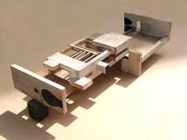
Victor Pasmore, “Model for the Apollo Pavillion”, Peterlee, 1967
Victor Pasmore: Towards a New Reality is at Pallant House Gallery, Chichester, until 11 June 2017 (and previously shown at the Djangoly Gallery, Nottingham Lakeside Arts).
http://pallant.org.uk/exhibitions/current-exhibitions/main-galleries/victor-pasmore/victor-pasmore
In 1861, the 80m tall spire and tower of Chichester Cathedral calamitously collapsed under its own weight from a structural failure of the piers, depositing as it did 6,000 tons of rubble into the nave below (6,000 tons! The Eiffel Tower, well over three times the height, weighs in at only 7,300 tons. You get a lot more height for your heft with steel – but I digress). You would think, to read the account of Victor Pasmore’s controversial conversion in 1948/9 from lyrical landscapist and Euston Road “Objective Realist” to abstract painter, collager and relief-builder, that the scale of disaster for the reactionary English art establishment who had thus far supported him was equally cataclysmic. Pasmore, prior to his apostasy, seems to have been the apple of many a well-connected eye, leading a rather charmed existence: working alongside William Coldstream and Claude Rogers to set up the Euston Road School in 1937; being supported and patronised by the then director of the National Gallery, Kenneth Clark from 1935 up to 1948. Then, having gone abstract, gaining the support and encouragement of Ben Nicholson; showing regularly at the Redfern Gallery, through all phases of work, until taken up by Marlborough in 1960; and being appointed Master of Painting at King’s College, Durham/Newcastle , in 1954, where he taught alongside Lawrence Gowing. Throughout his life, he seems to have been well in with everyone that mattered.
In retrospect, the transition from figurative to abstract looks rather harmless and parochial. In this exemplary show at Pallant House Gallery, excellently and unobtrusively curated by Anne Goodchild of the Djangoly Gallery, Nottingham, Pasmore’s evolution is set out chronologically (I love chronology! How different from the Vanessa Bell show now at Dulwich, which destroys all semblance of developmental logic by its intrusive theming), from his first talented efforts as a gifted young painter, taking us coherently through all his wildly different phases, up until the late sixties and his excellent design for the Apollo Pavilion in Peterlee, 1967, which is where the show ends. After which, Pasmore retreated to his house in Malta for thirty or so years, producing the ubiquitous and rather repetitive biomorphic paintings and prints that you now see all over galleries and art fairs. He died in Malta in 1998, aged 90.
So, what to make of this man who is described by Anne Goodchild in her catalogue essay as possibly “the patron saint of the committed Sunday painter”? Not a very flattering description, to say the least, but I think I know what she means. The exhibition moves very fast between the phases of his work, and as I walked around I jotted down the most visible and, to me, obvious of his influences, as follows: Cézanne; Vuillard; Degas; Manet; Corot; Matthew Smith; Morandi; de Staël; Klee; Schwitters; Seurat; Bruegel; Turner; Whistler; Mondrian; Gottlieb; van Gogh; Rodchenko/Tatlin constructivism; Nicholson; Le Corbusier; Miro; Arp. Bonnard and Kandinsky are also cited, but I couldn’t see them.
I repeat, these are just the obvious ones that I could point to. I have never been to Pallant House Gallery before; I have never been to Chichester before; and I’ve never known an artist to have such a long list of clear and present influences. Was the man really such a dilettante?

“The Gardens of Hammersmith No.2”, c.1949, oil on canvas, ©Tate London
There is quite a lot to enjoy in the early figurative works between the mid-1930s and 40s, when Pasmore was deeply involved with, first of all, studying and continuing late Parisian Impressionism and Post-Impressionism; and then creating his own perhaps less successful brand of homespun “Objective Realism”. The figurative work becomes more wistful and supposedly lyrical as the forties progress, culminating in the “Hammersmith” paintings of semi-abstracted atmospheric river and outdoor scenes, such as The Gardens of Hammersmith No.2, made at about the same time as his first forays into abstract painting and collage. The London exhibition of work by Paul Klee in 1945 seems to have had a big impact, with Pasmore’s first 1948/9 abstract works of small coloured triangles and squares looking very similar to Klee’s painting from two decades before. Pasmore’s stock as a collectible artist crashed about this time, though the Redfern stuck with him.
“Triangular Motif”, c.1949, oil on paper on canvas, Ferens Art Gallery, Hull; ©Estate of Victor Pasmore.
If there is one aspect of Pasmore that I can relate to, it’s his struggle to work out what constitutes being properly “abstract”. In 1947/8, according to his own account, he goes from being an artist who “abstracts”… to an “abstract artist”. It’s a distinction I’ve made a few times (but which hasn’t stuck) and Pasmore was an early proponent of it (it didn’t stick for him either):
“…pure form refers to no other object. It is a reality, logical and sufficient in itself”
“…the transition from visual abstraction to visual development, and from visual representation to visual autonomy, is not a continuous one. A point is reached when one ends and the other begins.”
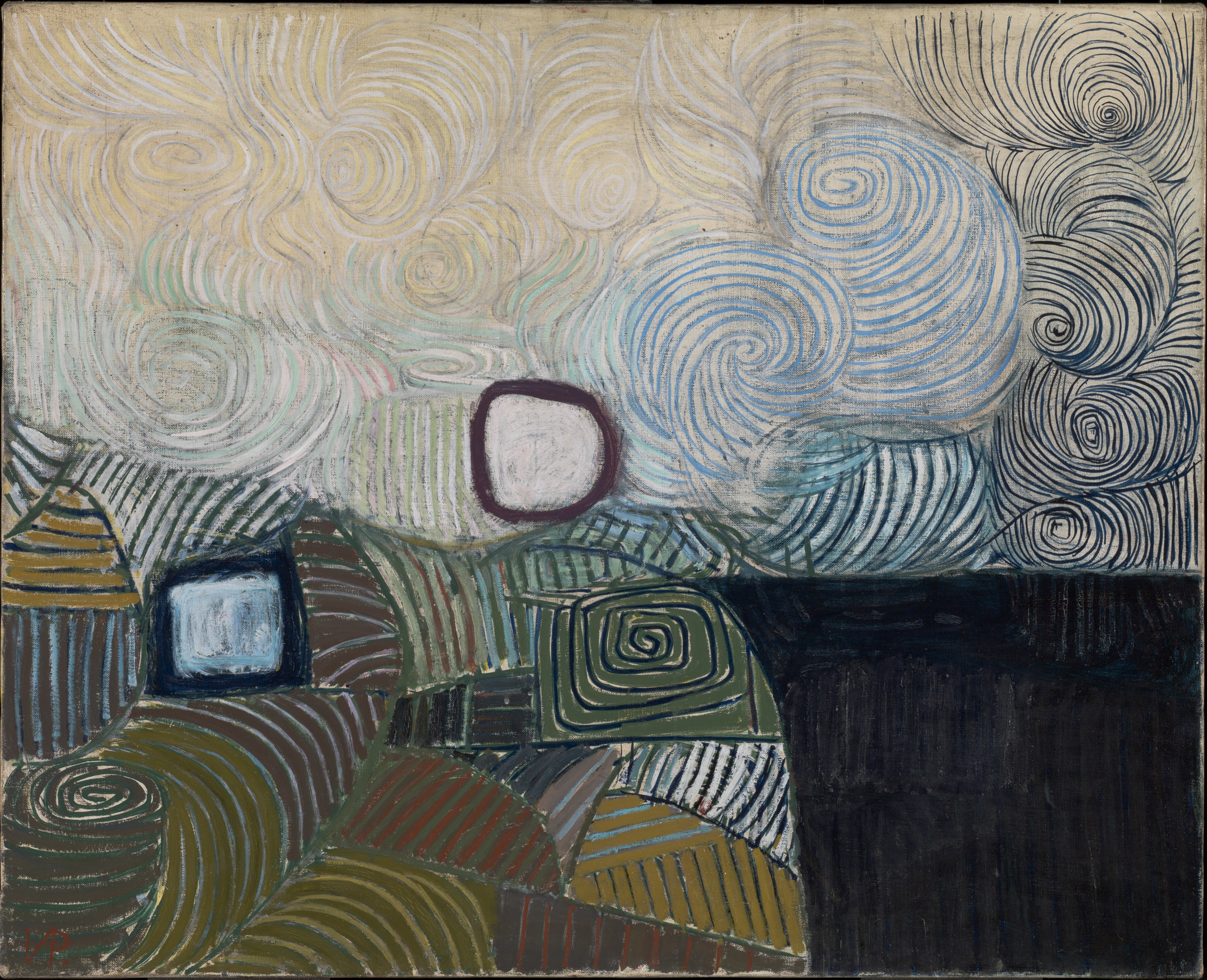
“Spiral Motif in Green, Violet, Blue and Gold; the Coast of the Inland Sea”, 1950, oil on canvas, ©Tate London
A couple of years on from his change to “abstract”, Pasmore was still getting flak from most critics, but In 1949 Patrick Heron praised his Redfern show of that year as a “…vital communication; air, light, space…”, pointing out “[t]he exquisite colour… the intricate, thoughtful balance of design… the extremely sensitive touch.”
And again, in 1950, Heron came to his support, describing Spiral Motif in Green, Violet, Blue and Gold now in Tate as a masterpiece of strong colour, the spiral motifs of which “…invent and define space without committing the painter to any subject-matter whatsoever.” I’m not so sure about the strong colour; Pasmore is essentially a tonal painter. That sensibility was to transfer directly into the whites, blacks, greys and browns of his later relief works.
Despite Heron’s encouragement, Pasmore had a somewhat fractious relationship to the artists of St. Ives, where a slightly different brand of abstraction was taking place. He argued for the distinction between pure abstract art, for which he strove, and the more relaxed positions of Nicholson, Hepworth and Lanyon, who embraced more easily the path of abstracting from figure and landscape. The gap between them now looks less clear-cut, since they were united in wanting a particular degree of distinctively simplified modernism; but Pasmore fought his corner:
“…there has grown an emanation of painting which has broken entirely with the visual tradition and has now nothing to do with the process of abstraction which visual painting involves. It is to this emanation that the term “abstract” correctly applies and it is towards this that I have attempted to lean. What I have done, therefore, is not the result of a process of abstraction in front of nature, but a method of construction emanating from within.”
He continued, rather more ambiguously:
“I have tried to compose as music is composed, with formal elements which, in themselves, have no descriptive qualities at all. The spiral movement which can be discerned throughout nature, in many different forms, is reduced to its single common denomination – the simple spiral.”
Critic Robert Melville muddied the water still further:
“These pictures, composed entirely of spirals, evoke the seas and the heavens, restless movement and a vast stillness, the mortal coil and a profoundly stirring sense of the ascent of the human spirit.”
By the beginning of the fifties, Pasmore had worked out for himself the contradictions of this position, wanting to leave behind the metaphors and the metaphysics, and find a more down-to earth approach to “real” abstract art, rooted in modern materials and techniques. He looked for a solution in the abandonment of painting in favour of constructed reliefs:
“Today… abstract art enters a phase of construction… It is this transformation…which places the artists at the beginning, and not the end, of an era of subjective art… In this new phase of art, the object is invested in the material with which the artist works…”
So began this new phase: a decade and a half or so of constructions:
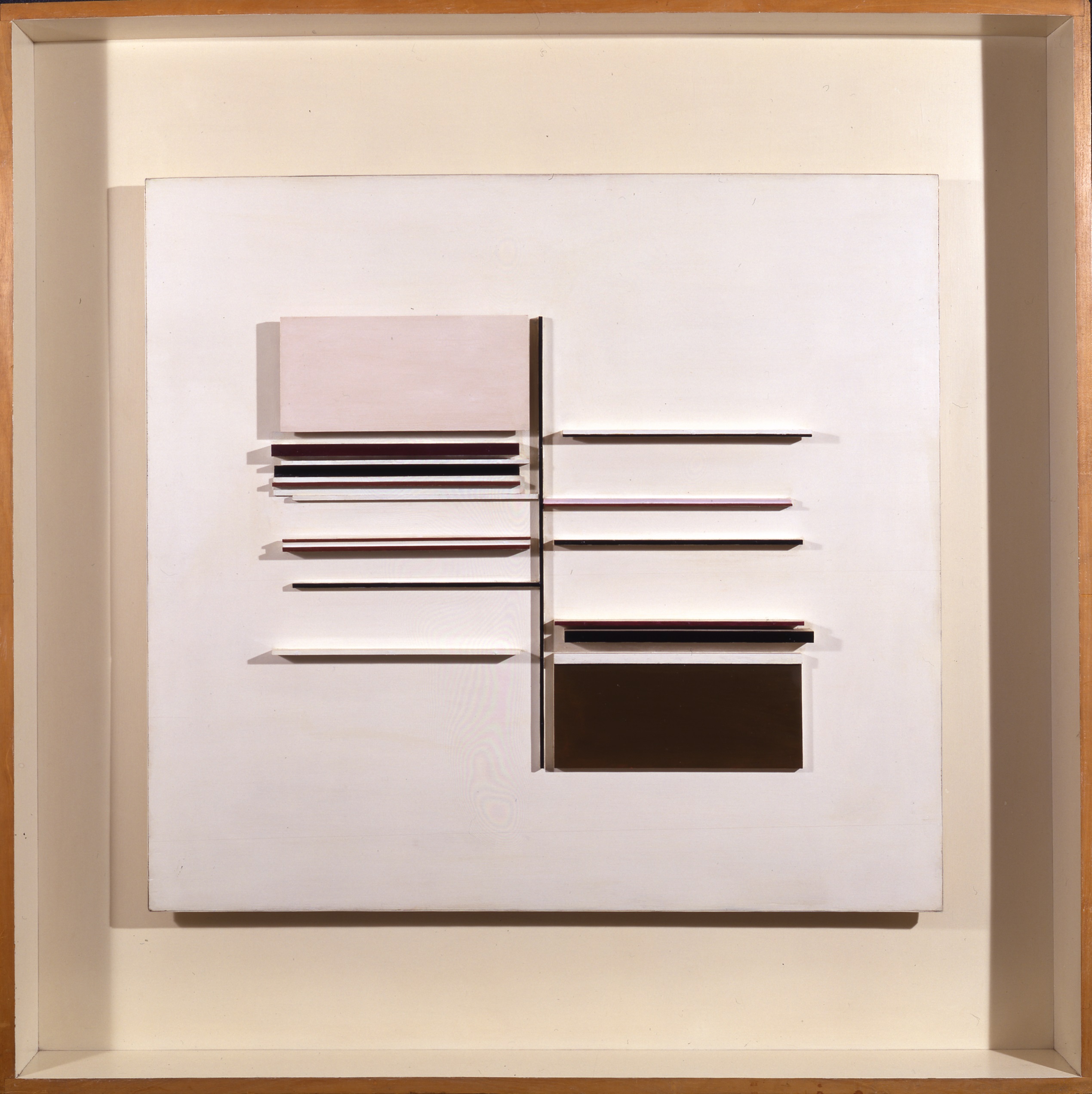
“Abstract in White, Black Brown and Lilac”, 1957, relief construction, painted wood, British Council Collection, ©Estate of Victor Pasmore
A new association too began in the early fifties with the group of British constructivists centred around Kenneth Martin and the younger Anthony Hill. The Pallant House Gallery is currently showing, as a complement to the Pasmore exhibition in an adjacent room, the Catherine Petitgas Collection of British Constructivism. This small exhibition contains work by Norman Dilworth, John Ernest, Jeffrey Steel, Peter Lowe, Gillian Wise, Hill, both Kenneth and Mary Martin, and indeed, a late-ish relief from Pasmore himself, “Abstract in Natural Wood, with Black and White” of 1965-66. I don’t personally care at all for this kind of deadpan systems art (though Gillian Wise in more recent times continues still to produce quirky but intelligent work with a very individual colour sense), but the conjunction does serve to illustrate how intuitive and visual Pasmore was by comparison – not at all slave to the mathematics or any set of systematic rules. But then, these small-time mathematical doodles of the British constructivists don’t set the bar nearly high enough to make the comparison particularly important.
And the problem with Pasmore is for me flagged up by that earlier Heron comment: “…the intricate, thoughtful balance of design…”. Because, as with a lot of what I think of as “primitive” abstract painting and sculpture, such as that produced by the constructivists and systems artists and many others besides, Pasmore’s art from this period is very difficult to separate out from design. Pasmore undoubtedly had a very refined aesthetic sense, a “good eye” for the correctly positioned shape, line and dot; a natural talent for the compositional nuance. The relief works are entirely of a piece with applied design from the sixties, and even engage with the same materials – plastics, natural wood, aluminium etc. Some of the reliefs look inseparable from a utilitarian kitchen aesthetic. And of course, with his architectural involvement at Peterlee and his various mural commissions in factory and office foyers, Pasmore himself directly and willingly conflated his art and design.
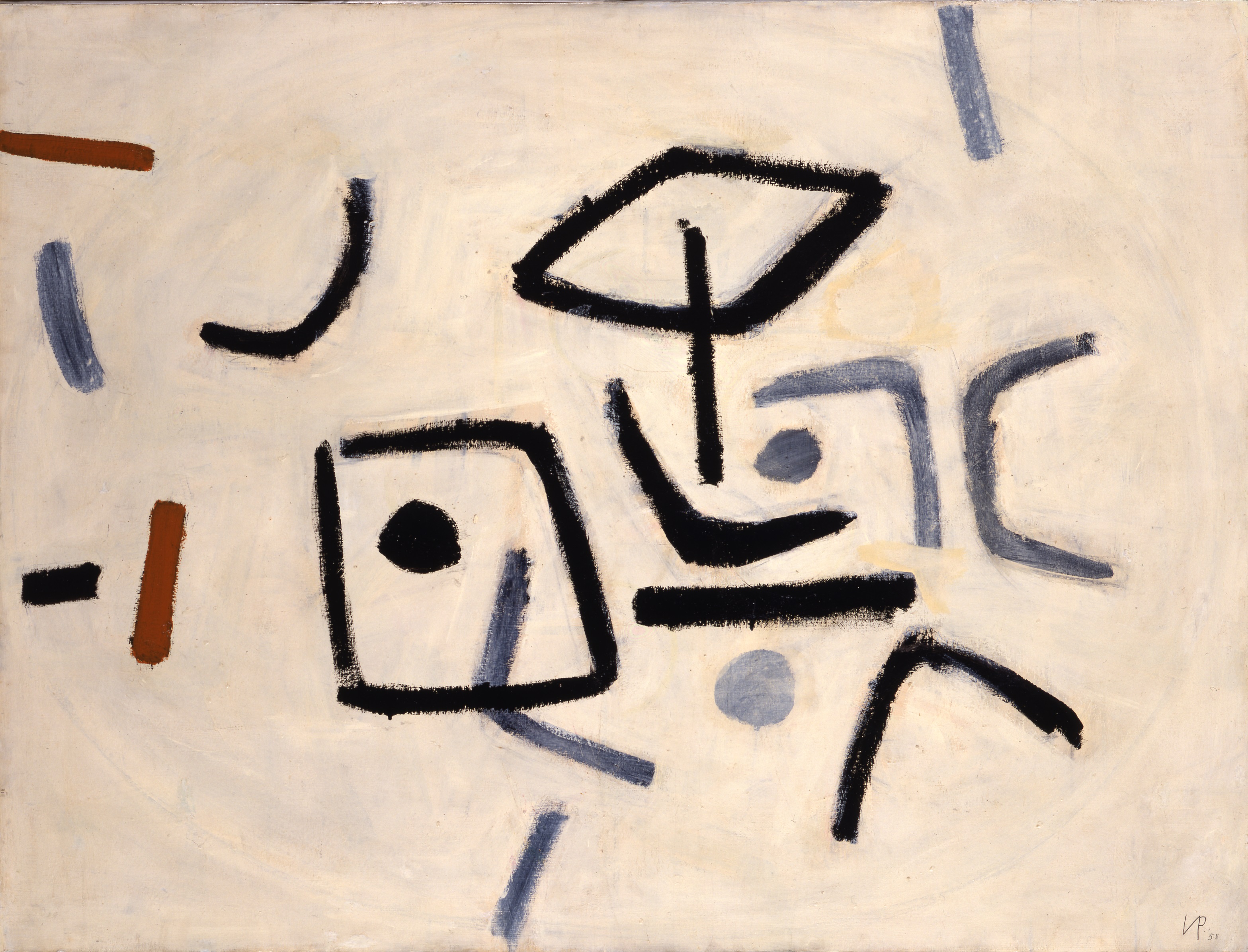
“Abstract in Black, White and Ochre”, 1958, oil on board, British Council Collection, ©Estate of Victor Pasmore
And what of the Americans? In 1956, the Tate showed Modern Art in the United States: A Selection from the Collections of The Museum of Modern Art, New York; and Meyer Schapiro came to Britain to give a talk at Tate, entitled ‘The Younger American Painters of Today’, which was broadcast on BBC Radio and published in The Listener Magazine. It’s hardly likely Pasmore missed out on that. And it was followed by The New American Painting, also at Tate, in 1959.
Pasmore made a few paintings, such as Abstract in Black, White and Ochre, 1958, that looked like there was some influence from the Ab-Exes, but I don’t think he fully engaged. Or else he was deliberately resistant. Others were less so, more willing to soak up the lessons of the Americans on scale, colour, ambition, as well as some of the Pop Art influences coming through too. And so along came a new wave of younger British abstract artists – Robyn Denny and Richard Smith, Caro and then in 1965, the New Generation. That’s where I came in. By the time I got to art school in 1966, Pasmore was old hat, not to be considered worth a look, beyond the pale, though I can see now that he had strongly influenced the people who were then teaching me. The Pasmore aesthetic, and that of Moore and Nicholson, was the presiding modality of the preceding generation to mine, and as such, something to rebel against. I’d hardly started life-drawing classes, taught by a “Euston Road” style realist, before I was up and running with large scale hard-edge shaped canvases and coloured plywood boxes, à la Richard Smith and Bill Tucker.
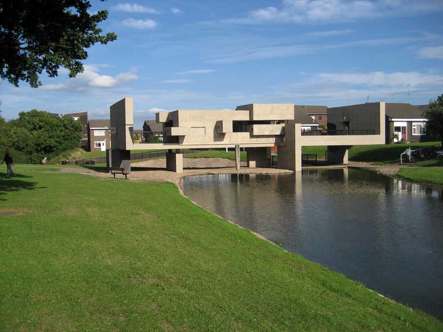
“The Apollo Pavillion”, Peterlee
So Pasmore’s crowning glory, the Peterlee Apollo Pavilion of 1967, passed me by completely. There’s a lovely model of it in this show (first illustration at the top) which looks like it was improvised from bits of wood and stuff lying around the studio, made on the hoof, so to speak, and really not “designed” at all.
Perhaps it’s odd, then, that Pasmore never attempted sculpture. The nearest he seems to have got was his 1957 collaboration with Richard Hamilton on the rather uninspiring installation “an Exhibit”, made from suspended Perspex sheets, which was reprised for the Royal Academy’s Modern British Sculpture show in 2011. But right from the off, his paintings show an interest in spatiality and volume, starting with the Cézanne-esque Bradman Still Life of 1929, which emphasises rounded three-dimensionality over planar flatness; and continuing right through to his late reliefs, which appear to want to disown the picture-plane altogether. In the end, there seems to be something of a compromise between two- and three-dimensions in Pasmore’s work, which never becomes fully resolved or worked through. Nor, taken as a whole, does it ever become truly expansive, or sufficiently challenging or ambitious enough to put him near to being on a par with the French and English masters he revered.
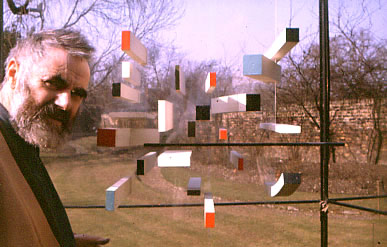
Pasmore with relief, c. 1965
Postscript
The Grade 1 listed Queen Anne town house that forms the original part of Pallant House Gallery was enlarged in 2006 by the addition of a modern extension (with a somewhat uncharacteristically garish frontage) by the architect Colin St. John Wilson (notable for the British Library and various buildings in and around Cambridge), who then donated his art collection from his former home in Grantchester Road, Cambridge (one of his best buildings) of mainly sixties British painting and sculpture, adding to the permanent collection which consists of other small collections and donations, mostly modern.
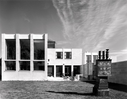
Colin St. John Wilson’s Grantchester Road house, Cambridge, with a Paolozzi in the back garden.
I cannot in all honesty wholeheartedly recommend the Pallant House permanent collection, though the “reserves” appeared more interesting. There were also a handful of other small exhibitions on at the same time as the Pasmore, including the execrable Sidney Nolan, forerunner in “scrotty” painting techniques of the equally spiteful Anselm Kiefer, I’ve since realised (I’ll back up that claim another time!). But Pallant House Gallery is well worth a visit, and if you are interested by Pasmore, it’s a good chance to see how his career pans out.

Excellent article, Robin. Knowing that you were going to write it, I googled Basic Design and Pasmore, and discovered this little gem of unconscious revelation from George Vasey in Apollo Magazine, November 2014.
” One can perhaps see the legacy of Basic Design as the first stages in the continued professionalism of Art schools in the 1980’s and 90’s when artists started to become engaged in ‘research’ within their ‘practice’. Basic Design’s emphasis and formal experperimentation feels very removed from my own experience of art school (I studied on the BA Fine Art course at Newcastle University, graduating in 2004).
Ulimately, art education in this country since the 1960’s has shifted from creativity to criticality. Students are now expected to be literate in economic, social and political discourse and the influence of critical theory has become pervasive”.
Every word sends a shiver of horrible memory down the spine. It seems that Basic Design was the first response of artists to the recommendations of the Coldstream Report, which sought to align the “experience” of art students with a University style requirement, but it was swallowed up in much worse to come. I remember Patrick Heron telling me that he and Henry Moore went to see Margaret Thatcher, then Education minister, to tell her that the applicants with A levels were the first ones to be rejected in their day, but to no avail. She wasn’t having any of it. But the left were no better. And now the critical studies component has swallowed up everything.
However I was not able to find any visual evidence of what Basic Design amounted to in pictorial terms. It was about education in a general sense, and the beginning of the end for courses concentrated on painting or sculpture in their own right. Pasmore’s ambiguity on that front is symptomatic of a vacillating mind.
LikeLiked by 1 person
So Pasmore, in spite of his abortive pursuit of pure abstraction, joined the ranks of the British semi abstract painters, Lanyon, Hilton, Scott , Hodgkin, and others, who cannot commit to a full hearted abstraction, but in their irresolution on the question offer succour to all those who hold on to that naturalistic spatial illusion, or hints of such, that keeps their work linked to the old English traditions of poeticised landscape reference. In the case of Hodgkin, even further, a suggested peep show into the depiction of private erotic epiphanies, unspecified and unverifiable. Painting and the resolution of an image happens in real time. Adjustments are made to solve the spatial implication of what one has made in the present moment, and are not vehicles for the depiction of memories of emotional situations in the past. That is an entirely bogus claim that may appeal to the literary minded, but has no basis in the reality of painting.so, whatever may be said about the Abstract Expressionists, at least they had the guts to go all out for an abstraction which leaves naturalistic suggestions behind, and uninhibitedly embraces the full potential of painting to create space out of its ” fulgent or fuliginous flatness”. Comparing Motherwell’s black paintings for instance with Pasmore’s black silhouettes, shows up the cramped and timid nature of the latter’s sensibility.
LikeLiked by 1 person
It does, and the pompous portentous pretentiousness of the former, fuliginous or not. Motherwell didn’t leave the metaphor and metaphysics behind. And even the best alliteration doesn’t excuse flatness, on the part of either. I think that’s a nil-nil draw.
LikeLiked by 1 person
I don’t know about this abstract-not business. It always struck me that Paul Tonkin was under the sea, even though I’m pretty sure he’s never been in a diving-bell. Geoff Rigden was surely on the moon, though why he got there nobody knows. Fred Pollock was caught in the whin with his lovely yellows and bright northern reds and greens. And Alan Gouk is most often in a North-easterly storm when the haar hasn’t got him. As for myself I’m abstract, certainly, though often horizontal you’d be hard put to identify a tree.
LikeLike
Nowadays it would be called an installation:

LikeLike
Since Pete Hoida has entered the fray, I’d ask him to supply images of Antibes 1994 and Uiskhe (spelling), the sorts of painting of his I wrote about in 1994. Whenever people see horizontality they inevitably try to read landscape into it. Steps need to be taken to dissuade them. In these more recent Hoidas I see no landscape as such, but I do see weather, lowering skies, brooding imminent darkness etc. But not in these 1994 pictures. They knock spots off the quartet named in my second comment.
LikeLike
What sort of “steps” are you going to take? Goose steps?
Could I politely suggest the possibility of the painter taking responsibility in the first place and making paintings without lots of horizontals in…? No? Too simple?
As for the seeing all sorts of stuff in all sorts of stuff all over the place, I quote the great poet Stevie Wonder:
“They’ve been spending most their lives
Living in a pastime paradise”
LikeLike
Antibes: https://pbs.twimg.com/media/C6z6YXAXAAA8JQl.jpg
Uisghe: https://pbs.twimg.com/media/C6z72ynXUAAAmNS.jpg
LikeLike
Antibes, courtesy of Almeida restaurant, 86 x 295 cm, 1995
Uisghe, 121 x 288 cm, 2004
LikeLike
What I meant was steps within the painting itself, and these two Hoidas have done that in no uncertain measure. The virtue of horizontality is that it allows the spatial organisation of the painting to expand into the viewer’s vision directly , “clear, demarcated, out there, resistant to the eye”, without encouraging them to “see in” , look for illusionistic recession that isn’t there. Colour makes space directly in reciprocal,influence. That is all.
LikeLike
“So Pasmore, in spite of his abortive pursuit of pure abstraction, joined the ranks of the British semi abstract painters, Lanyon, Hilton, Scott , Hodgkin, and others, who cannot commit to a full hearted abstraction, but in their irresolution on the question offer succour to all those who hold on to that naturalistic spatial illusion, or hints of such, that keeps their work linked to the old English traditions of poeticised landscape reference”
Actually, it strikes me that Lanyon, Hilton, Scott and Hodgkin have very little naturalistic spatial illusion between the lot of them; they are mostly pretty flat – graphic, even – and rely for the most part on drawing for their figurative references etc.
But in any case, you are now resolutely in the “all-out abstract” camp, are you Alan? (excepting perhaps when you see “weather, lowering skies, brooding imminent darkness… “?)
But then, isn’t your irresolution regarding abstract sculpture and your requirement for a kind of “naturalistic” structure, tying it to the traditions of the gravity-defying figure and the “essences” of figurines in polished metal, an exact equivalent to those naturalistic spatial recessions of semi-abstract painting?
LikeLike
I once told Patrick Heron I liked his stripe paintings.
LikeLike
I have no “requirements” for abstract sculpture at all. I only respond to what I see and try to clarify what is going on. The rest of your comment is plain tosh. It seems to me there are too many requirements for abstract sculpture floating around, but I am only an observer looking for the “qualitative character as made apprehendable by its form”.
LikeLike
It’s weird that what began as a brilliant article on Pasmore and a couple of innocuous comments by me has degenerated into this irrational abuse, “goose steps” and all. What is going on?
What is good about Hoida’s Antibes 1994 and Uiskhe, is that they generate a sense of natural light through colour juxtapositions without undermining the independent created unity of the whole image, quite a rare achievement in itself. They neither abstract from landscape nor move towards a depiction of landscape. I was suggesting that the ones Mel Gooding is talking about are less successful in that regard, partly because of the flashes of light against the darks.
I personally find the purely or wholly abstract constructions of Pasmore a crashing bore, and they are certainly not in any way relevant to sculpture. But this is not to say that others might have more success. The proof of the pudding… as they say.
The problems for an abstract sculpture are of any entirely different order. Any fair minded and objective reader of my Katherine Gili article and the hundred and more comments on it will gather that the issues are far from simple, and that I am not an absolutist on this or anything else. Painting and sculpture remain related to the natural world and ” the laws of physics” whether you like it or not, and are not dependent on “the figure” or the body for their organisation.
LikeLike
Nothing’s “going on”, and there is no irrational abuse, just a light-hearted jibe at your comment: “Steps need to be taken to dissuade them”, which despite your explanation sounded somewhat dictatorial. The reason I keep nagging away at you is because you make interesting but sweeping statements which are often contradictory. So what, you’ll say. But the topic of what the relationship of abstract painting and sculpture is to nature and the laws of physics is, as you suggest, far from simple – but really interesting and important (to me). I think it’s worth chipping away at it. It’s why I write articles about artists I don’t wholly endorse, because they open up these issues. And I mean no disrespect to anyone (including Gili) when I suggest that there are real problems with an approach that is semi-figurative. Sometimes you seem to agree, sometimes you don’t. Sometimes trying to pin you down is really frustrating.So what, you’ll say.
I agree with you that what you call the “wholly abstract” constructions of Pasmore are sterile, and lead nowhere, but perhaps unlike you (though I’m not sure!) I would insist that this is NOT at all because they are wholly abstract, but just the opposite – because they are not abstract enough; too simplistic, too designed, and flirting with a kind of well-mannered and tasteful literalism (for me, the real opposite of abstract). They certainly don’t open up any insights into the nature of three-dimensionality – and yet at times that seems to be exactly what they might have been intended to do. They are, as I suggest in the article, not at all “expansive, or sufficiently challenging or ambitious” to make any real headway in new abstract territory, either for Pasmore himself (what came after in Malta was surely a retreat) or for us now.
LikeLike
Following on, something else that I’ve said before, but which also hasn’t “stuck”: when I talk about “more abstract” I don’t mean a “purer”, more desiccated formalism, but the opposite: a fuller, richer experience, and “more of it”. That’s why I think complexity is an important part of the mix, and why one might need to look to get it into the work early in order to sustain it through to synthesis.
Pete’s “Antibes” looks to me to be, as Alan suggests, a better painting than the “horizontals” shown on the film with Mel Gooding, and what Alan says about the colour and light may well be a factor. But for me it is also better because it has more complex things going on that relate to one another in more particular ways, rather than just the side-by-side horizontal bands in the more recent paintings. Plus, there appears to be more spatial layering and “halo-ing” around the slabs and blocks of colour. Altogether “more”, though it still is a rather orthogonally organised picture, which may perhaps be a way out of structuring a painting in a more complex, more specific (more abstract?) way. Just saying.
LikeLike
“Following on, something else that I’ve said before, but which also hasn’t “stuck”: when I talk about “more abstract” I don’t mean a “purer”, more desiccated formalism, but the opposite: a fuller, richer experience, and “more of it”. That’s why I think complexity is an important part of the mix, and why one might need to look to get it into the work early in order to sustain it through to synthesis.”
This is an example of what Wittgenstein meant when he wrote about language “going on holiday” or “idling”.
“Such a reform for particular practical purposes, an improvement in our terminology designed to prevent misunderstandings in practice, is perfectly possible. But these are not the cases we have to do with. The confusions which occupy us arise when language is like an engine idling, not when it is doing work.”
Philosophical Investigations, 132
LikeLike
Robin may disagree, but I see him an artist seeking words for a new kind of art that he envisions, rather than a philosopher defining abstraction or an art historian constructing a narrative. His language is therefore more poetic/inspirational than descriptive/analytical. Should his efforts bear fruit, then the art and the language to describe it will develop together. If he were using language that was already completely bound into a “way of life” / “language game” with “particular practical purposes” (thus satisfying Wittgenstein´s account of non-idle, understandable language) then he would be describing an art that is already academic.
LikeLiked by 1 person
Richard – I have great respect for Robin as an artist and in his critical insights even when I disagree with them or (more likely) don’t understand what he’s saying. I do not mean to demean anyone with my comments.
LikeLiked by 1 person
https://twitter.com/abstractsculp/status/842320929187336192
Re: Caro’s “Cool Deck”. As someone who seems particular about the use of language, Carl, perhaps you could enlighten us as to why you think this is such a strong example of achieved abstraction, what exactly it is abstracted from, and why you think it is even a sculpture. I don’t know much about Wittgenstein’s “idling”, but I’d say the language you apply to Caro and other high modernists hit the buffers a while back and is going nowhere. If your opinion of this sculpture is more than just a matter of your “good taste”, you need to explain why this work specifically is so great, in order that we can get somewhere with your ideas. Because to me it looks like a throwaway piece by Caro, one of his worst, with very little happening (no content!) and next-to-no three-dimensionality – an eminently reasonable pre-condition for calling something a sculpture, whether good or bad.
LikeLike
During the early 1970s Caro was preoccupied with the nature of the ground in making sculptures. This preoccupation was based on prior discoveries in his Bennington sculptures and in the early table pieces. In particular, his ambition was to render the ground abstract – meaning, the ground wouled not be seen as the literal ground on which it is placed, but rather as part of the sculpture. This would mean that the ground is experienced not as the foundation from which everything rises but as the lowest level that itself does not require support and for that reason cannot be supported by anything else.
One way to render the ground abstract was to make sculptures that do not rise against the force of gravity but rather submit to it, and this is revealed in the sculpture’s horizontality, its extending and reaching laterally at ground level. Some of these works (e.g., Cocaine and Blow) have the look of accident, as if a structure collapsed, but closer examination shows that Caro is in fact rendering gravity itself as an abstract force, a vertical, downward force that conflicts with the solidity of the horizontal ground. Cool Deck expresses the encounter of these two abstract forces but it does so in ways that are entirely illusive rather than literal. It is as if abstract forces that are inherently at odds or in tension with each other are made present to the eye. Cool Deck provides yet another way to experience the fact of having a body, which means taking up space and being of a certain density weight and always being located in one particular place rather than any other place.
LikeLike
Hmm… yes…
First of all, thanks to Richard for philosophically jumping to my defence. However, I think what I am perhaps clumsily attempting to say is really very prosaic, rather than poetic. “Put more in” – what could be simpler? It does not guarantee good or bad, but at least something will be happening. Better than nothing.
Which brings us to “Cool Deck”. It is, in my opinion, a complete modern(ist) vanity to think that this work is some kind of masterpiece. I say vanity, because it can only be a reflection (or projection) of ourselves to see in it anything beyond what it actually is – a minimal, content-free and unconsidered work with hardly any intrinsic value. That’s why, presumably, Carl cannot say anything specific about the work, but only talk about his (highly intellectualised) bodily responses to some general idea of gravity. This “experience-through-the-body” thing is a cliché of modernist, minimalist, and Post-modernist justification. What, specifically, makes this Caro better than others (or indeed my scrap pile, when it is spread out across the floor; or a Carl Andre floor piece) at making one aware of these supposedly profound and existential things?
The idea that gravity and the floor are abstract forces in conflict, which the Caro somehow makes you ultra-aware of, is surely far more of a concocted concept than my modest proposal about content.
Move along. Nothing to see here.
LikeLike
I did not say that Cool Deck is a masterpiece or better than other Caros, so that line of attack goes nowhere. However, it’s still much superior to just about all contemporary sculpture I’ve seen. My remarks about gravity are clearly to be read in relation to the remarks about grounding, which you ignore. Cool Deck is the result of the encounter of gravity and grounding considered as abstract rather than literal forces (like your scrap heap and Andre’s floor pieces), and we feel this because of the specific arrangement and texture of its elements, which manage to be entirely illusive despite being entirely non-representational (e.g. the way in which the rods and angled polished sheets support and don’t support each other while also spreading laterally, rising at extreme oblique angles from various horizontal planes). Cool Deck is successful as sculpture because in it forces that experienced literally are always in conflict are here manifested in a resolved tension that IS the work.
References to the fact of having a body may or may not be clichéd in my writing but they are certainly not clichéd in Caro’s sculpture, which does not require minimalist or post-modernist justifications. The fact is that it is this fact and no other that makes space (or “spatiality” as you like to say) a value in sculpture; a sculptor is not a physicist and things are seen as occupying or closing off or opening up space in relation to the fact that we exist as embodied rather than purely spiritual beings – we therefore require a ground on which to stand and we are subject to gravity, which in turn implies that each of us finds him or herself located at a particular place at any given moment of our lives, one place and not another place, a fact that we tend to ignore despite its significance – which is brought home for me at any rate in the experience of sculptures like Caro’s, in comparison with which most contemporary sculpture looks a bit academic. In this context the real absurdity of your repeated assertion that Caro’s work in general is “not three dimensional” is really driven home.
Whether any of this is said to be “in the sculpture” or “in my mind” seems to miss the point not only of Cool Deck but of art generally, the human significance of which is to nullify the distinction itself.
LikeLike
How very Post-modern, indeed. We don’t need to worry any more about what we actually do in our work, because anyone can read into it anything they like, there being no distinction between what the artist does and its interpretation by another mind. We may as well do anything, really. And who is to say you or anyone else is wrong in their interpretation?
For example: you can read something that comprises of a few pre-cut sheets of stainless steel and other bits, casually arranged on the floor in a very mildly aesthetic but rather dull arrangement (not a million miles in its mannerisms from a Pasmore relief turned horizontal), that was probably the result of half an hour’s work by Caro before his assistants welded it up, an arrangement that in fact in no way contains anything looking like a downward gravitational force, or indeed any other force, but instead has a lateral-shifting look about it, with crude linear vectors coming off sideways like shit off the proverbial stainless steel shovel, and with no attempt whatsoever to start, contain or end these slight gestures or make them significant to each other, or active as anything beyond lines, or interrelational, or spatial, or physical, or three-dimensional – you can interpret that scant broth as a profound statement about yourself and your place in the world. I’d say you would be better off hugging a tree. It’s absolutely the very same pseudo-metaphysical claptrap that is disseminated about standing in front of the most boring of Barnett Newman stripes. And this kind of subjective interpretation continues to be used to justify a lot of the very worst of Post-modern Crapstraction. It’s all about you the viewer and how you relate to it…
“…as strong an example of achieved abstraction in sculpture as one is likely to find” is as close as damn it to calling it a masterpiece, and certainly implies it’s one of Caro’s best, and better than most other peoples abstract sculpture. And I’m saying you are wrong. And I’m saying you do damage to abstract art by perpetuating this myth. How can we fight the real battle against conceptual art when you are saying that in terms of abstract sculpture this is virtually unsurpassed? This Caro (and many like it) are on the cusp of being conceptual art themselves, so little do they contribute real content to any kind of progression in abstract sculpture.
LikeLike