
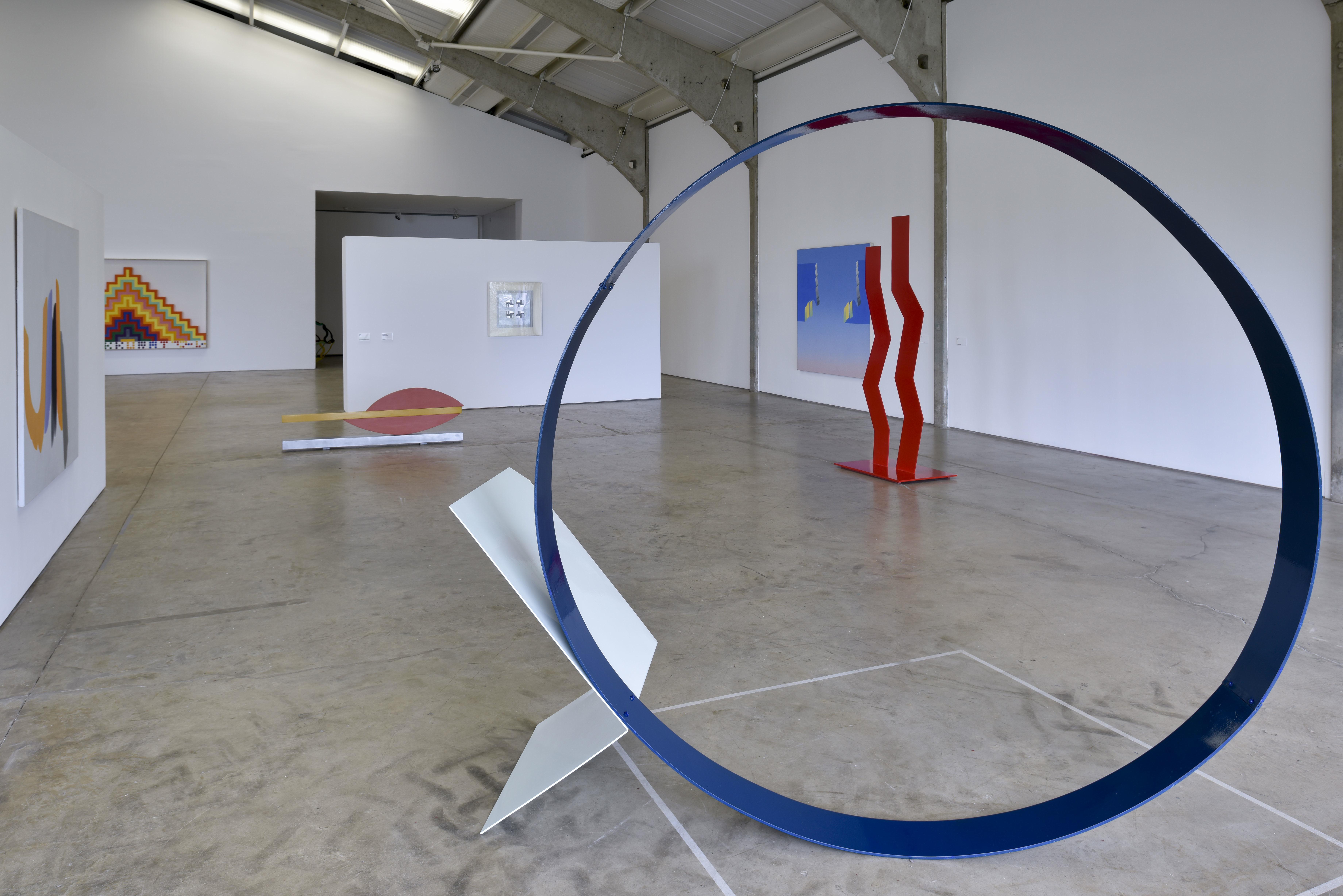
Kaleidoscope: Colour and Sequence in 1960s British Art, installation view at Longside Gallery, Yorkshire Sculpture Park © artists and estates. Photo: Jonty Wilde. Left to right: William Tucker; Anthony Caro; Robyn Denny; Richard Smith
KALEIDOSCOPE: Colour and Sequence in 1960’s Art. http://www.artscouncilcollection.org.uk/exhibition/kaleidoscope
Longside Gallery, Yorkshire Sculpture Park. 1 April – 18 June 2017
Djanogly Gallery, The University of Nottingham. 15 July – 24 September 2017
Mead Gallery, University of Warwick. 5 October – 9 December
Walker Art Gallery, Liverpool. 24 February – 3 June 2018
I’ve never liked Sgt. Pepper’s Lonely Hearts Club Band. The 1967 album seemed a betrayal of what the Beatles stood for, namely the authentic voice of the North of England, and signalled their transformation into a crypto-postmodernist bunch of dandified dilletanti. (Ringo excepted, obviously) I wasn’t crazy about the cover either, influenced by Peter Blake’s obsession with Victoriana, though the insert poster of the Fab Four in day-glo military uniforms was at least strong on colour.
Colour in the sixties was rationed, and experienced against the background of colourlessness. Now colour has triumphed. It’s everywhere, creating a totalised and vibrant chromatic context of what Goethe called ‘motley’. But in this exhibition, curated by Natalie Rudd and Sam Cornish, colour’s place, though central, is insecure and colourlessness comes back into the reckoning.

Kaleidoscope: Colour and Sequence in 1960s British Art, installation view at Longside Gallery, Yorkshire Sculpture Park © artists and estates. Photo: Jonty Wilde. Right: Bridget Riley
Robyn Denny’s Over Reach, 1965-66, seems an exercise in colourlessness. It is built from large planes, which might be expected in a colour field painting, but it contains virtually no colour sensations. The wan, blue-grey area, which forms a deep border on three sides of the central rectangle, is peculiarly inert. Here the oil paint is thin but opaque with a finish that recalls the dead qualities of gouache, especially when too much white is used. The middle area contains the angular structures that Denny relied on for graphic interest but neither of its subdued hues has any chromatic power or tonal excitement.
On the other hand, Movement in Squares (1961) by Briget Riley, which is actually colourless, creates something like the percussive visual effect of strong colour through tonal contrast alone. The black and white interact as complementaries, setting up the retina-engaging conditions that became synonymous with Op art, an oddly unsatisfactory side-branch of abstraction. But, looked at as an easel painting, the kinetic effect of the rhythmic variations, that from a distance give the illusion of concavity, is lessened. The flatness of the grid is reasserted and a constructivist interpretation of the work becomes more plausible, avoiding the nausea of the optical illusion

Kaleidoscope: Colour and Sequence in 1960s British Art, installation view at Longside Gallery, Yorkshire Sculpture Park © artists and estates. Photo: Jonty Wilde. Left: Philip King
Colour is usually regarded as belonging to the pictorial domain but in the period covered by this exhibition polychrome sculpture seemed a radical and liberating departure from the limited palette of stones, metal, and its alloys. Its arrival coincided with a preference for hollowness and a corresponding interest in surfaces, which had to be arranged to contain that hollowness. In pieces like Philip King’s Point X (1965) and Thebes (1963) by William Tucker, the colour has an ordinary, household relationship to the structure underneath, as in painted furniture. Viewed in pictorial terms, it doesn’t seem that advanced, but of course it would have looked innovative at the time in the context of sculpture’s traditional drabness.
As history shows, sculpture’s colourlessness reasserted itself fairly soon and remains a sign of seriousness of purpose even in practitioners like Hirst and Emin. (What colour are sharks, sheep, beds?) Even Caro, the art form’s greatest exponent of colour, turned away from it to favour the unfinished, readymade appearance of sculpture’s raw materials, old and new. But here he is represented by a successful example of his chromophile output, Slow Movement from 1965. This simple piece is not an ordinary combination of paint on steel. The enamel finish fuses blueness with the supporting metal rather than coating its surface like a skin. The colour replaces the steel, an effect that is very different from the fresh from the shipyard look of Double Red (1966) by William Turnbull.

Kaleidoscope: Colour and Sequence in 1960s British Art, installation view at Longside Gallery, Yorkshire Sculpture Park © artists and estates. Photo: Jonty Wilde. Left to right: Bridget Riley; Tim Scott
In phenomenological terms this sets Caro’s deployment of integral colour in the centre of the formal concerns of the work, as original material rather than afterthought. The depth of the blue gives it an autonomy, so it appears directly shaped, but the intensity of its hue also affects the play of light and shade within the construction. The poised, vertical blade stands like a gnomon, but it casts no shadow, nor does one side of it appear lighter than the other. It shows that Fried and Greenberg were right about Caro, on the importance of ‘syntax’, avoiding the ‘structural logic of ordinary things’ and his work’s emphasis on ‘abstractness’, and ‘radical unlikeness to nature’.
The colour in most of the paintings does not match the intensity of Caro’s blue. This may be because it hasn’t lasted so well, or that colour in English paintings has always under-performed. John Hoyland’s 15.5.64 (1964) may have looked better just after it was painted. Wine red and green should generate enough interaction to maintain a high level of optical vibrancy even if the two rows of lozenge shapes were somewhat unadventurously placed, and their credibility as fully ‘abstract’ elements somewhat compromised. The paint was scrubbed on parsimoniously, leaving the ground showing through. It may be that luminosity has been reduced as the canvas underneath has darkened with age, killing the visual impact of the red, and without that the shapes seem to wilt under the attention that should have gone to the colour.

Kaleidoscope: Colour and Sequence in 1960s British Art, installation view at Longside Gallery, Yorkshire Sculpture Park © artists and estates. Photo: Jonty Wilde. Right: Jeremy Moon
Luminosity has suffered a little in Richard Smith’s Trio (1963). The brightness of the yellows and orange is less than it needs to be in order to create a shimmering atmosphere out of which the image, mirage-like, can emerge. It has a slightly grimy appearance, as though the original drawing was in charcoal that has dirtied the pigment. As with the Hoyland, the shapes, particularly the three blue and white ‘fans’, appear compromised or derivative, but given that there isn’t enough going on in the rest of the painting, they are obviously necessary.
By far the strongest painting in the exhibition is Cape Red (1965) by Jeremy Moon. Moon was probably the best painter of that generation, making work that was clear-cut and avoided the iffyness and approximations that many of his contemporaries indulged in. He was influenced by American art, as were the others, but he was the only one that seems to have worked out the pertinence of shape in the development of pictorial abstraction. Choosing a square and flipping it 45 degrees, excludes the lingering suggestions of landscape or still-life that Smith and Hoyland cling to. The half circles, pushed into the corners by a suggestion of centrifugal force, pinch the dominant red area, twisting its profile out of true, making it more formally active. Because the colour does not rely on the luminosity of the ground, it doesn’t show its age and the particularity of the red, decided, mixed and adjusted fifty years ago, still looks the right choice.
Kaleidoscope: Colour and Sequence in 1960s British Art, installation view at Longside Gallery, Yorkshire Sculpture Park © artists and estates. Photo: Jonty Wilde. Foreground: David Annesley
But I realise I’ve missed the main point of the exhibition. It’s actually a show about the sixties, specifically sixties London. It tells the story of a time when thirty-something artists worked in their studios and were visited by a guy in a suit, with a chequebook and fountain pen. It illustrates the Arts Council’s policy of supporting a wide range of contemporary work, including Pop, represented by Joe Tilson, the Euro constructivism of Anthony Hill and Mary Martin, and whatever the artistic category occupied by Barry Flanagan may have been, so in that respect the exhibition is art historically accurate.
Having been an art student for most of the sixties all the exhibits have an element of familiarity and it would be interesting to see what those to whom the stuff is unfamiliar make of it. Apart from Caro and Riley this may feel like a show of minor art. At the time, British fashion, popular music, design, literature and style in general had an international impact, but the visual arts were less impressive. What mattered most, especially for those interested in the possibilities of abstraction, were the major figures of American art, showing both in the galleries and, in colour, in the art magazines, compared to which many items in Kaleidoscope look rather weak in identity and aesthetic purpose: Then, as well as now?

Judging from the activity at the Royal CourtLiverpool’s Twitter account, the Mark Morris Dance Group’s new Pepperland with music based on Sgt Pepper’s Lonely Hearts Club Band seems to have been a hit. Not sure that has much to do with anything, but Pepperland will be performed tonight and tomorrow night. . .
LikeLike
Morris dancing on LSD would be more interesting. This sounds a bit like the rehash of sixties modernist tropes that goes on in a lot of abstract painting at the moment, which is nowhere near as good as the original, which in itself was not up to all that much anyway…
And if “Cape Red” is the best painting in this show, I can empathise with David’s slight sense of disappointment. The sheer detatchment of all of the work is palpable even in photograph.
“Nothing is real. And nothing to get hung about…”
LikeLiked by 1 person
Whose is the anodized-bronzish, cuboid thing in the fifth photo?
LikeLike
Bernard Schottlander
LikeLike
A few disconnected remarks on the review:
First, it is unfortunate that so many of the works in the exhibition have not been mentioned directly, particularly when they are dismissed so completely. The mix of sweeping historical statement and personal preference is uncomfortable at best.
It is unlikely the Hoyland has faded since it was made, as it was in Hoyland’s studio for much of this time. It has been recently cleaned, and to my eye looks great. Of course it is difficult to convince someone else of its richness of colour, although I think in general colour is more than a matter of ‘percussive visual effect’.
The review approaches the sculpture – whether approved of or not – in purely pictorial terms. Despite the closeness of sculpture to painting in much of the work this is obviously inadequate. Are the King and Tucker the same because of their paint application?
I don’t know how the paint was applied in Slow Movement, but I think its gloss finish is more important than the notion of ‘fusing’. What is clearly more important than the hue, or the manner of its application is the openness, presence and structural complexity that Caro is able to coax out of such simple elements.
It is very strange to be so interested in how colour and matter interact without mentioning Scott’s Quinquereme, which uses sheets of semi-translucent acrylic so that the colour is the material. The sculpture actively integrates the play of reflections contained in the acrylic into the overall structure of the work. This seems to me the most radical (out-there, unprecedented, rather than remorselessly logical) work in the exhibition.
It is correct to observe that the exhibition is partly a history of the Arts Council collection, and also that American art was important (although the sculptors had Caro as their dominate example). But, whatever one’s personal opinions, it is not historically correct to say British visual art at this time did not have an international impact. There were touring exhibitions of this work in the United States, major exhibitions in Germany, France, Spain and Italy. Commercial galleries showed this work, particularly in the US, Germany and Italy. A major American collector of Colour-Field painting recently said to me that ‘the British were ahead of us in sculpture in the sixties’, a view which echoes the contemporary opinion of Clement Greenberg.
‘Apart from Caro and Riley this may feel like a show of minor art’. – do you mean you think it is minor; if not I don’t quite understand how you can second guess someone less familiar with it. Perhaps you mean Riley and Caro would seem major because they are well known? Otherwise how is Moon minor when it is ‘by far the strongest painting in the exhibition’?
LikeLike
WTF.
I mention nine of the exhibits; which is quite enough.
I didn’t say the Hoyland had perhaps faded but the canvas may have darkened over 50 years, reducing the effect of an initially luminous ground on the overpainting.
I was concentrating on colour (and ‘colourlessness’) in the sculpture, maybe because the show had ‘colour’ in the title. Tucker and King were similar in their use of colour, as distinct from Caro. I didn’t think much to the Scott.
I didn’t write that sixties British visual art had no international impact, simply that its affect was less impressive than other cultural products like music or hairdressing. My view of its status at that time was based on my actual experiences of visual culture at the RCA in sixties London.
The concluding remarks speculated on how the work may look to someone with a different age/background from me. I would be interested in how it seems to them, what they thought about it. One thing’s for sure, If I ever get to read a review by someone in that category, I promise not to complain that they have given me their ‘personal opinion’.
LikeLike
I take the point about the number of artists and the Hoyland. And of course you are free not to be interested in the Scott. I should have probably phrased my remarks about colour less confrontationally, although I still think that the review does not take into account the subject is coloured sculpture.
But your last paragraph is ambiguous in the way it shifts between historical overview, personal experience and speculation as to what someone of a different generation may think. I’m not complaining about personal opinion per se. It would have been interesting to read directly about your time at the RCA. What bothers me is the way in which personal opinion / experience leaks out and assumes other guises, which then build into a dismissal of a whole generation of artists. Without your subsequent comment it is difficult to read this sentence – ‘At the time, British fashion, popular music, design, literature and style in general had an international impact, but the visual arts were less impressive’ – as having much to do with what you personally thought at the time. As I’ve already said, regardless of how you experienced it, British visual art of the 60s did have an international impact. And why might only the Riley and the Caro escape being labeled minor by a subsequent generation?
LikeLike
Sam, re. the Caro: I would have expected you to enthuse about its clarity and simplicity of image, so I’m surprised to see you write of its “structural complexity”. Care to expand?
LikeLike
Quite a lot of images of the show here, including the Hoyland: https://greatacre.wordpress.com/2017/04/10/kaleidoscope-colour-and-sequence-in-1960s-british-art/
LikeLike
Well said, Sam. As someone who was also around in 1964-67 as exhibition officer at the British Council both to the 1966 Venice Biennale exhibit and the touring New Generation Sculptors to Berne, under the auspices of Harald Szeemann, to Düsseldorf andAmsterdam, in 1967, I can attest to the great interest being taken internationally in the mostly St.Martins sculptors, but also David Hall and Derrick Woodham from the RCA. Perhaps it is Prof. Sweets schooling at the RCA that has so skewed his judgement. And there was also the inclusion of several of these British sculptors in the Primary Structures exhibition in America. The Brits came back from that experience more convinced than ever that the Americans didn’t have sculpture to reckon with, apart from Smith, (David, that is.). All the Americans had to offer was the optical minimalist stuff rightly criticised by Michael Fried in his own terms, and it is also true that Greenberg admired the St. Martins sculptors, saying that we had Sculpture over here, i.e. a sculptural lineage.
To ignore the best sculpture in the show, the Tim Scott, and to heap praise on a minimal Caro while also ignoring the David Annesley, at least as interesting a work, shows just how prejudiced Sweets take is, and how flaky his world view.
LikeLike
It would have been good to include work by Woodham and Hall. As well as Garth Evans (and probably a few others). I don’t really want to make this a St Martin’s versus the RCA / the World argument.
I think the Caro is a really good one btw. Not minimal in its effect. The complexity comes from the illusions generated and how these change as the work is circled. Despite its visibility it appears to change as it is moved around, without losing the sense of it as a coherent structure – i.e it does not flick from one possibility to another. It has a lot of space around it in the show, but I felt could have commanded a much bigger area without compromising itself.
LikeLike
I think you are right, Sam, to switch from describing the Caro as “structurally complex” to saying that it is complex in its “effect” (which is a very different matter), though I still don’t agree. I recall going to see this work with you a few years back in Farnham. I was struck by its “weediness” more than anything, partly due to its minimalism (with a small “m”), and partly due to its illusions and “effects” being pictorial rather than three-dimensional, based upon the shapes of receding planes. I don’t really see what else it has going for it.
I also think that the Tim Scott is one of his weakest works, with its uninteresting repetition of designed geometry/symmetry.
That said, this show from photographs looks to me to be really well curated, and I’m sure it is pleasing to a great many people. I suspect the “effect” of the show as a whole achieves more than any of the works individually, being not even particularly good examples from this period of the better-known artists. I wrote about this tendency in 2013 here – http://www.abstractcritical.com/article/william-scott-garth-evans-haroon-mirza-john-constable/index.html – on the Garth Evans show at the very same Longside Gallery:
“…the show as a whole, so beautifully curated by Deacon, was interesting and varied, almost vivid, but the discrete pieces, for all their rigour and thoughtfulness, were a little too minimal to be individually forthcoming. This seems to me an ongoing dilemma of modernist art.”
I don’t really see it as a dilemma any more. Abstract art has evolved to the point where individual works can be worlds unto themselves.
LikeLike
We’re not going to agree on either the Scott or the Caro….
LikeLike
For sure. The question is whether it’s worth discussing further. I’d be very interested to know what Tim thinks…
LikeLike
What Tim thinks is this :
All art is of its time and is conditioned by its time. What we are making today will probably, in fifty years time, look ‘passe, jaded and weak. There will no doubt be a review of a show of twenty teens art that says as much, or worse.
Sam, with the very limited resources of the Arts Council collection has attempted to put together an honest show of what sculpture and painting (in Britain) looked like then. There are no Cezannes or Monets, but at least it is absolutely clear to the viewer, from Sam’s excellent arrangement, what there is and what there isn’t – (according to personal view).
Of course a much better show (qualitatively and comprehensively) could have been put together, according to one’s choice; (what would Bryan Robertson have done in Sam’s place?) but at the very least it serves as a signpost, (especially for sculpture), to directions that one could or should persue, or not, now.
LikeLike
Thanks Tim. Are you saying then that this work does indeed look passé? Or are you saying it’s OK provided its seen within it’s historical context? That’s a slipperly slope.
Is it not our responsibility to at least try to do better than make work that will in fifty year’s time look jaded and weak? How we do that is a pressing question, is it not? And we have to press! The exhibition, good though the curation is, will pass. The work remains, to be seen again. Is it any good?
Anyway, I don’t agree that all art is of it’s time. Good art transcends the context of its making.
LikeLike
I am saying that this work does indeed look “of its time”; I was taking the general tone of the essay and subsequent comments to be negative, hence my wording..
I can only cite my own work as proof that one ‘moves on’; of course, – hopefully – in order to do better.and not flap about with big sheets of plastic for ever, and of course that is one’s pressing responsibility. as an artist
“Good art transcends the context of its making”, yes, but cannot be other than what the artists of that time can see it as being.
LikeLike
Yes, absolutely, Tim, which is why we must press so hard to see it being more and more, to open up the potential, to free up abstract sculpture from where it started. There is no disrespect intended, but move on we must.
(P.S. I always thought the “Bird in Arras” series better because they seemed fluently spatial.)
LikeLike
I’d say that Quinquereme, far from looking passé, looks startlingly fresh and original even now, especially now, — open, expansive and daringly extravagant, “designed geometry/symmetry” or not, so far is it from the “requirements” of the self apointed custodians of the “new”, who by contrast lurch from one clogged and knotted rubi cube to another. Open out, centrifugally, take up space with confidence, command it, with the optimism they were able to muster in the 60s.
LikeLike
Well hooray, and well done! That at least is unequivocal. Can I assume I’m one of the clogged-up lurchers?
The only question now is how to combine flapping about with big bat-wing sheets of plastic whilst simultaneously making semi-organic, small-scale, bronze-like essences of sculpture.
You could have made you point about ‘Quinquereme’ without slagging-off the self-appointed, non-Gouk-anointed lurchers. Why don’t you paint like Jeremy Moon? Elegant, optimistic, pleasantly and spatially centrifugal…?
LikeLike
What David thinks is this;
I made a 120 mile round trip to see this bloody show, at Sam’s request, and I agreed to review it. I followed the usual critical procedure; look at the stuff, say something about it. What struck me was the insecurity of the colour; about a third of the exhibits were either black and white, or pretty near colourless. I’d worked out an idea about colourlessness a few years back, and it seemed relevant to the exhibition. Please see ‘Colour and Colourlessness: the chromatic discourse of Impressionism’ published in 2011, if you’re at all interested. That was my framing concept.
Having written the review, I get told off by the person who asked me to do it! My error, it turned out, was that I suggested the international influence of sixties British art was less than other cultural exports of the period. To disprove this assertion, evidence of its importance has to be compared with the impact of hairdressing styles or pop songs. Surely most cultural historians think their effect was greater and more significant than that of British abstraction. Then the redoubtable Mr. Gouk weighs in with his usual charm and elegant turn of phrase, a man, it’s rumoured, who dislikes Caro so much, he sets his alarm clock an hour early every morning so he can dislike him just that little bit more.
The problem is that there is no predictor of good art. Whenever you curate a show the trick is to get the best things you can, then make up something to stand as a theme. If you start with a theme or brief, which you have to in order to write a funding application, you risk choosing exhibits that comply but aren’t very good. Then it can look like an exhibition of minor art to some people.
LikeLike
David I didn’t intend that to be a telling off: more of an argument, or a rebuttal,even if an ungrateful one – thank you for the review! I still disagree about minor / majorness and about impact (maybe I feel major / minorness is slightly beside the point, or inevitability freighted with particular positions, already well worn narratives – as I said in an interview on Studio International I wanted to look at the scene beyond Caro, where there are many good / very good / great sculptors who are I think are worth returning to. This work would readily stand up against contemporary and now canonised approaches to sculpture e.g. minimalism, arte povera, post-minimalism – I think it has suffered from an institutional neglect in this country).
After what was perhaps my over-senstivieness – mainly on behalf of the artists – has settled down a little, your main point about the uncertain place of colour is astute, although I think King, Tucker etc do not use it in a pictorial sense (nor does their sculpture function like painted furniture, except in its unshowy application). You hit on a discrepancy between the underlying thinking of the show and its title. The idea was proposed and the exhibition selected based upon the themes of symmetry and sequence, after I noticed that they appeared in the work of Scott, King, Bolus etc, in a way that was distinct from Caro. Colour followed these other qualities. It was – in my thinking – pretty much unavoidable in a show based around 60s sculpture, but it was felt that it should be included in the title so that this very prevalent aspect of the period could be signalled to people less familiar with it.
You might not want to continue this, but who were – in your personal experience / opinion! – the major sculptors of the 60s?
LikeLike
Im sorry to have missed Sams show.My daughter takes priority at 5 and I wasnt invited.I find professor Sweets comments about the 60s on a par with Peter Blakes claims, offensive nonsense .This wasnt the most important Art going on in Britain.I was 12 in 1960 and traumatised by watching Selma Alabama on black and white TV in Devon.At 15,Fortuneatly I wasnt accepted by St Martins ,but went instead to Exeter,Cheltenham and then Birmingham ,before Baltimore in 73.By the age of 17 ,I had been taught by Patrick Heron ,Terry Frost,John Epstein [,a student of Bomberg,]Harry Thubron ,Tom Hudson at the Barry summer school.Ken Smith on Lorca and Melville.John Lyle held a Surrealist festival in Sidmouth with ELT Mesens.Fortuneatly I went to Cheltenham where Art forum covered shows by Stella and Poons,which caught my eye.At Birmingham I realised two Johns ruled British Painting ,Walker and Hoyland .Through Trevor Jones I walked thro Walkers Acton studio ,where I saw the biggest Painting I had seen at that point,nearly 30 feet ,with two David Smith lozenges on the baseline,squeezing coloured gel through a screen to enhance the surface.Mick Bennet and Dave Tabourn were making 20 footers with tons of Spectrum Paint.Sean Scully won both South and North Young Contemporaries.I met artists profoundly affected by Terry Setchs colour teaching in Cardiff,Barry Cook and John Mitchell in Stourbridge and Coventry.That was without Alan Davie ,who I only heard about in relation to Jazz and Painting.In the Stonehouse pub,Nick Waite,a student of Leavis,made sure we took nothing for granted,turning most Abstractionists toward SocialismJimi Hendrix lived in Notting Hill,Van Morrison was on TOTP,and Dylans All along the watchtower,performed by Hendrix,says it all. I havent mentioned the women,Gillian Ayres,Prunella Clough ,Jenny Durrant who I was seeing for the first time,let alone meeting John Mclean at an Elderfield talk on Noland at Chelsea,or Olitski in the Carolinas with Derek Southall,John Goldings books on Cubism. Brian Robertson.You guys lead sheltered lives.Maybe the truth will out one day.This may be an extreme of name dropping ,but the effect of the ideas,the paintings,the music ,the discussions, was electric and devastating.By 73 I was only 22 and had experienced a tsunami of cultural shift,from the stultifying 50s for which I am eternally gratefull
LikeLike
Prof.Sweet. — I don’t know who the rumourmongers are, but as with so much of today’s fake news, they are entirely mistaken. I would refer you firstly to Part 1 of Steel Sculpture over on Abstractcritical for my considered views on Caro’s sculpture. Then to my tribute in the little pamphlet produced by Central St. Martins at the symposium following Caro’s death. Sam can supply you with a copy.
I have recently been involved in a series of interviews for the British Library on my relationship, amongst other things, with Caro and Heron, being in the unique position of having been close friends with both of them. I have been amazed myself as to the complexity of the feelings I have had for Caro’s over more than forty years, and it is entirely presumptuous and ignorant of you to add to whatever “rumours” you think are out there. And even worse to imply such motives to lie behind my response to his work. Disgraceful.
LikeLike
I’m pleased to be corrected on this point and of course unreservedly apologise for implying otherwise.
LikeLike
Once again the chronology of the comments is upset, giving the impression that Robin’s belated and somewhat mealy-mouthed preference for the Bird in Arras sculptures, after declaring Quinquereme to be one of his weakest, came before my defence of the latter. Tim’s sculptural career has been marked by a succession of spectacular works at intervals, and of course he has “moved on” time and again, exerting a considerable influence on younger sculptors in the process. It serves no useful purpose to be using today’s blinkered priorities as a stick with which to chastise the past . Talk about kicking away the ladder!
LikeLike
Admit it. Back in the 1960s you used to envy Scott his Quinquereme. And the work of the Brancastrians now is a wilful negation of all the qualities that made Q, Early One Morning and Bird in Arras III and IV so exciting at the time. The time for negation has surely passed.
LikeLike
No I never liked the Q series, always liked the Bird in Arras series. Thought they were terrific at the time. Be interested to see them again. Why is that mealy-mouthed? I presume there are a lot of things in this show you dislike, so I don’t know what you are getting on your high horse about. And your blanket denigration of “Brancastrians” is very ill-considered, really not worthy of you.
LikeLike
I know you like to remind us all from time to time, Alan, of your seminal role in the development of abstract sculpture at St. Martin’s and after, and I wouldn’t want to attempt to diminish your contribution by one iota. But other people have done stuff too in support of people like Tim; perhaps you have forgotten the massive effort Graham Burke and I made, under the auspices of Poussin Gallery, in supporting Tim and all phases of his work, showing early stuff (in 2008), more recent (in 2006, 2007) and very new (in 2011), not to mention the absolutely Herculean effort of restoring, transporting and showing at Roche Court, Wiltshire and Jesus College Cambridge one of Tim’s most important, and certainly biggest, early works, “Cathedral”, which until we got our hands on it, was rotting away in a barn. And we did it for no reward whatsoever, as it turned out, but for the love of it.
And even if I had done none of that, and never lifted a finger to support Tim’s work, never given up my own time, my own effort, my own money – at a time, incidentally, when no other gallery would so much as look his way – even if I had done none of that, I would still absolutely defend my right to discuss critically his and anyone else’s work from the past, in any manner I choose, whether connected to my own history or not. Everything and anything is forever up for grabs, to be looked at again and again, and re-assessed for both good and bad. I have no interest in an art history written in stone, even on the tablets that Moses Gouk might from time to time bring down from the mountain.
If you don’t like it, bog off from my website, ‘cos that’s primarily what it’s for. It’s called Abcrit.
LikeLike
Just to reinforce that, if I need to – I’d go a little bit further than David and say all of the work in this show is second-rate, though I’m sure Sam did the best job he could, and I’ve already praised the curation. Having seen the photographs, I pretty much lost the urge to go and see the show. I thought there was nothing to learn from it. Had there been a “Bird in Arras” and a better Caro I might have thought differently and gone.
I think I’m pretty open about learning from the past, but your council to: “Open out, centrifugally, take up space with confidence, command it, with the optimism they were able to muster in the 60s” is meaningless. “Quinquereme” is not spatial, even though it expands laterally (and literally). We (and I include Tim) are beginning to learn much more about the relationship between three-dimensionality, physicality and spatiality in a very real sense in the new sculpture you now seem sometimes to detest. Don’t be too eager to knock it.
LikeLike
Robin, I don\t have to repeat the huge amount of thanks I have had and still have for your support of my work. You are of course perfectly free, at the same time, to voice your opinions, be they critical or otherwise. So let’s stick to what Abcrit is for and keep the intelligent comments keeping on coming.
Incidentally, ‘no other gallery’ is still not looking my way !
you
LikeLiked by 1 person
Cheers, Tim.
One further thing. I was and to an extent still am a big fan of John Hoyland’s early work, and had there been a better one than this one, which I don’t like, that would have been another factor to weight up in deciding whether to see the show or not. At times in the late sixties and seventies he was perhaps the best abstract painter around. (And still that doesn’t mean I can’t be critical.)
LikeLike
I’m going to have one more say:
I just have the sneakiest of suspicions that Sam’s choice of work in this show is actually deliberately aimed at a particular kind of work that I don’t have a great deal of regard for (no, I don’t mean he did it deliberately to annoy me). There certainly looks to me to be quite a few pieces here that I would dismiss outright as “crap” without a second look. I think having a very clear outline/image and simple shapes appeals to Sam, regardless of content, whereas I on the whole lack interest in that kind of work. There was of course plenty of it in the sixties. There you go.
LikeLike
I think people might have already picked up on this aspect of your “taste”
LikeLike
It is not an aspect of my taste. When I was young and being taught by the likes of Caro, Scott and, er…Gouk, I liked some of this stuff too, and was quite happy to go along with simplistic ideas, and made quite a few of my own. The sixties seems to still have a hold on many, David included (though make no mistake, I like this essay by David, despite our disagreements), and, it turns out, on Alan too.
The point is, putting taste aside as being an unreliable guide, how do we move abstract sculpture on, how do we make it evolve into something more substantial than these flimsy examples? How do we deal with issues of three-dimensional viability etc. And it’s proven (though you flat-earthers will deny it) that we cannot have evolution without complexity. But that’s another essay.
LikeLike
“Proof”, “evolution”, “complexity” – Each of these words is taken from and applies to the history of science.
LikeLike
I think you’d have trouble proving that, even if you evolved your argument into something complex
LikeLike
But Robin, you are confusing cause and effect.
At the risk of being labelled an unscientific flat earther, surely all arts – painting, sculpture, architecture, music, poetry etc. have frequently used the minimum of ,means to produce the most complex of effects and emotions.. Literal complexity does not necessarily produce the equivalent in result, though of course it can. The choice of complexity of means or otherwise depends on the intensity of the aims in the first place aand indeed the skill with which they are realised.
LikeLike
The art (and philosophy, for related reasons) that moves me most strongly does so by virtue of its clarity, which is to say, its simplicity. This does not imply that it (in the case of visual art) looks simple or was easy to make, etc., or the opposite. However, complexity is not per se an artistic value in my view.
LikeLike
The extremes of difference and distance between the 60s and now cannot be reduced to questions of taste. That is just to evade the issue. It is a question of the kinds of impulse and feeling intent that lie behind the work and generate it. I’d say it is expansiveness as opposed to contraction,( and on a practical level obviously, the acceptance of the structural potential in modern industrial materials). “Openness”, “extension”, and later “weightlessness” were the watchwords, and these of course had strong pictorial connotations,as we all know by now.
One of abcrit’s critical failures was in shirking an exhaustive analysis of the Stockwell sculptures shown in Greenwich in 2015, and Sam’s book on Stockwell. ( the cursory treatment Robin gave it at the time was wholly inadequate). If it had been discussed more fully, the internal critique and self examination by the Stockwell sculptors and others including Tim Scott that has led over the years to a resetting of priorities away from those of the 60s, including the renegades like Roland Brener, -all this painful process of trial and error learning would be seen to underlie the current preoccupations of the Brancastrians, the correct context in which their work should be viewed.(I am speaking only of the sculptors). But of course since Art was decreed to “start from scratch” with Brancaster, none of this was to be made available to your readers. I repeat, it is not a question of taste, either in the preferences being voiced for and against the work in this show, or in the wished for alternatives. It cuts much deeper than that.
And it should not be such a difficult stretch of the imagination to recognise why these sculptures were so celebrated in their time, and what it was about that time that made it a joyous experience to live through, if only for a few years.
LikeLike
To answer both Carl and Tim – I have never said, and never will, that complexity provides any guarantee of value. (Nor does simplicity.) It seems to the best of my guesses at the moment to be a necessary condition in which new and real sculptural values can prosper.
Alan, that’s really depressingly crap of you to say that about the Stockwell review. Sam wrote the excellent book, I recommended it. If you wanted more on Abcrit, you should have done it yourself.
And whilst we seem at least to agree it can NOT come down to a matter of taste, your first paragraph is surely self-defeating. Whereto, if we shed the pictorialism? Point us to some new sculpture that you do like.
LikeLike
Come on Alan, show us some good new “expansive” sculpture… I’m waiting. Put up or shut up, I believe is the expression.
LikeLike
Carl – I would agree that clarity is important in art and that complexity in itself is no guarantee of quality. However, the clarity that comes with simplicity can easily be gratuitous, whereas a clarity wrought from a degree of complexity seems to me to be potentially more interesting and more of an achievement. I don’t think that other artforms go as far as the visual arts in the fetishisation of simplicity. I may be presuming, but from your previous comments, it would seem that you approve more or less strongly of Wittgenstein, Shakespeare and Miles Davis. To my mind, all of these weave a complex web in order to arrive at what are arguably simple but profound truths that cannot be reached by any direct and simple route. Don’t you think that painting und sculpture could do the same?
LikeLiked by 1 person
Just to note that figurative painting undoubtedly already has done the same. So the question is, why couldn’t abstract art?
LikeLike
Richard: I agree that sometimes clarity is only achieved by complex means, although I think that very often complexity is used to cover up the fact that an artist or writer or musician has nothing to say. To see the truth of this, compare a passage from Philosophical Investigations (an
often obscure book that is obsessed with clarity) with a passage from any currently fashionable philosophical writing. My comment merely objects to the idea that complexity is an artistic value.
LikeLike
So we all agree about that.
Still waiting, Alan…
LikeLike
As they say on the terraces: “It’s all gone quiet over there”.
I’ve been wondering where this idea that Brancaster represents some kind of “Ground Zero” has come from, and can only conclude that it is from our main critic, the man himself. I don’t recall ever making such a claim, only that some of the Brancaster artists are attempting to push and pull abstract art into some much needed new territory. Nothing wrong with that. It would be nice to be able to talk about other stuff happening elsewhere without returning all the time to BC (it’s often, as in this case, Alan who brings up the topic, in the form of abuse). I’m actually on record as saying (perhaps to the annoyance of others in Brancaster) that our achievements to date are rather modest.
Our direction of travel is good though, on the whole. Let’s wait and see what wonderful “expansive” alternatives Alan can come up with. I believe I’ve been here before with Sam; waiting to hear of viable alternative paths through the maze of crap that is the short history of abstract sculpture. Ho-hum.
Still waiting…
LikeLike
My comment about the absence of debate around Sam’s book was not directed solely at you, Robin. None of the regular writers on abcrit took it up. And as I recall, you were the only Brancastrian present at the opening evening of that show. Looking at the book now, I am amazed that no-one else thought it merited discussion. There is so much still there that could be developed, and should not be confined to history. Sculptures like David Evison’s Irawaddy 1971, (with wood and steel, would you believe), Tony Smart’s Windjammer 1974, and his Untitled 1979, (well worth another look), compare Tamarind X 1977 with Tim Scott’s Bird in Arras VII, John Foster’s Step Flashing 1977 and Full Face 1978, Smart’s Stirrup 1978 (the one exhibited), Peter Hide’s Pomeroy 1975 and High and Over 1976, Gili’s Splay 1974 and Rise 1979 (exhibited), and one could go back even further, even to include Hide’s Arch 1971. If time’s arrow were reversed, a la Martin Amis, it would surely become apparent just how expansive the past of these sculptors had been, and how contracted their sphere of interest now has become, despite the cries of freedom in all dimensions. (There are of course exceptions). Maybe this is a necessary corrective, but let’s not pretend that this is not what has happened, and that there is not a narrowing logic at work. Just look into your own history for examples of expansiveness. I cannot provide you with examples. I was just suggesting a possible way forward, since it is obvious that no one else is remotely concerned with sculpture as we understand it.
As to “starting from scratch” — please— read back through the earliest Brancaster comments. Why would I, of all people, come up with such an idea, so absurd have I found it from day one. It dates back to the origins of the Brancaster Chronicles as first proposed to me by Tony Smart, and echoed in many a response to the work since. That’s what the row over the publication of Steel Sculpture I and II was all about. All attempts of mine to point out the lineage of how you all got to be where you now are , have been met with derision and denial.
And it is not me who keeps bringing in Brancaster to comments on the abcrit site. You do a pretty good job of that yourselves. Modesty? What modesty?
LikeLike
PS. “Narrowing logic” is going too far. I withdraw it. That was a spill over from a dialogue with Tony Smart. Sorry. As Cuillin Bantock wrote on Geoff Rigden, quoting Stravinsky, I think — where there are no constraints there is no tension. You can’t have everything at once, no total freedom.
LikeLike
“Expansiveness” in sculpture, or the idea of it, is all very well if you can sustain it, if you can make it really viable in three-dimensions, plastically, spatially. I have no wish to make Tim a whipping boy here, but I have recently come across a picture of “Song for Chile II”, a sculpture that you have more than once championed as embodying the very best of these open, expansive, ambitious qualities that you say we are denying. I think you called it the last great large abstract sculpture by anyone. This photo seems to me to show that such qualities are REALLY difficult to achieve in 3-D.
Image deleted – see below
The fact that it looks a bit of a shambles is not aimed at being a criticism of Tim, this is a criticism of your unrealistic notions of what sculpture should be doing. You should back off a bit and give us some room. You have also recently been very wrong about my sculpture from last year, which you have admitted privately, but not yet in public retracted. Whatever.
Freedom, we seem to agree, is won bit by bit in sculpture. It evolves – no apologies for the word – rather than jumps into existence from nowhere, with big sheets of plastic or steel or what-have-you. We probably agree about a lot of this. Just because I criticised Tim’s ‘Q’ sculpture, you jumped in with a sarky comment about BC. Well, let’s get over it.
LikeLike
Wouldn’t you know it! I tweeted this pic so I could link to it here to make my point, and it’s gone and got quite a few “likes” on Twitter. I’m ashamed of myself, really.
LikeLike
Is that really Song for Chile II.? or is it No I. ? In any case I wouldn’t cite Song II as an example of expansiveness as it emerged in the 1960s. Whatever – expansiveness is a state of mind, related to breadth of conception, which in turn is related to spatial openness, or an acceptance of space as the element in which we live and move . Remember your praise of Matisse’s Memories of Oceania. Better than Hofmann you said and more spatial. That is what has been lost along the way in pursuit of complexity for complexity’s sake. It seems so obvious as hardly to be worth stating. I should have included your One Flag Day as worth another look too.
I deeply appreciate your positive response to my recent paintings, and Emyr’s perceptive take on them, and believe me I’d love to be able to be equally enthusiastic about yours and his. It was wrong of me to cast aspersions on the latest ones without seeing them in the flesh.(I was actually referring to my take on the recent show of Brancaster at the Heritage gallery in Greenwich, where a certain incipient house-style amongst the sculptors seems to be spreading to some of the painters too, (and collage). John Bunker’s collages have clear links to your sculptures, like it or not, though I had been ridiculed for saying that if they were “translated” into sculpture they would have to be a lot clearer. And John Pollard is diligently following your every word, with what result? A semi-figurative “homeless representation” reminiscent of much painting in the 1950s in Europe, –group Cobra – choppy brushwork a la Frans Hals, guaranteed to suggest figurative “content”. I could go on, but in a hole, I’ll stop digging.
Whatever I say, you will go on stubbornly putting in your complex “content”, and I will go on trying to like it more than I do. You are right. It’s time I butted out altogether and let you get on with it.
LikeLike
I am sorry to disappoint everyone, but the photo of my’Song for Chile’ has been taken with ir placed upside down, a not uncommon problem when dealing with ignoramuses dealing with abstract art.
I have no idea where this picture came from, but no doubt it was taken when attempts were being made to set it up after removal from another site. It also looks as if a piece of it has been broken off (at the end sticking in the ground) and been welded back in the wrong place.I will report it to Francisco Gazitua in Chile to find out about it if at all possible.
In the mean time would Abcriters (and others) please refer to the earlier photos where it was at least set the right way up.
LikeLike
Blimey. Sorry about that Tim. I’ll delete it if you like.
LikeLike
Perhaps Tim in the brave new world of abstract sculpture that is aiming to give a fully three dimensional experience notions such as a work being the right or wrong way up might have no relevance. Given the somewhat edgy nature of some of the exchanges in this discussion I would point out that my comment is in no way intended as a criticism of your piece. I hope that you will be able to get it restored to its original form.
LikeLike
There might be some truth in that Terry, but I’ve deleted it anyway.
LikeLike
I think when painters and sculptors discuss and respect each other’s work there can be times when there are visual crossovers, the Kaleidoscope exhibition certainly seems to have, what Alan Gouk suggests Brancaster Chronicles has, a ‘house-style’ . What I can remember of the 60’s is that it was an expansive, open minded , less intensely stressed time, which is perhaps reflected in the simple forms of the work in this exhibition. The times have changed and tension and complexity are more appropriate now I suppose. Simplistic way of looking at it maybe, but it feels right to work into things more rather than just stick with an easy formula.
LikeLike
Alan.
You have no idea of my motives and reasons for what I do. I never “follow” anyone but happy to take inspiration and advice, if it makes sense to me, from anyone and from anywhere, even from individuals whose character is questionable. This is freedom and authenticity.
I have been very wary of becoming part of a group (i.e. Brancaster Chronicles) but as a group I think that Brancaster respects individuality. In fact within Brancaster there are many different views and perspectives. Perhaps we don’t acknowledge these enough.
I have benefitted quite a lot from your paintings and writings. Although we have different aims and ambitions I will continue to try and get what I can from your work, despite your occasional personal insults.
Apologies to David and Sam for a post that is not focused on their input, but felt it was time to respond directly to Alan.
Hope we can move on.
LikeLiked by 2 people
A small group of sculptors 30 odd years ago decided to have a crack at what seemed to them to be the gaping hole in abstract sculpture. That is some sort of three dimensionality that was neither literal or under the influence of any object etc etc. Thus far, Alan, that accepts how we got here. Hardly news to anyone.
To my mind that in itself is accepting the “lineage” and better than that in time honoured process trying to do something about it and move sculpture on. No one would argue with that unless they had something more precise to say about the initial aims and where they are today. Which may or may not be somewhere.Wherever that “somewhere” is it is in those pieces of sculpture now being made to tackle this.
And if a few of the thousands of words expended on this site had come from real critique of actual pieces this site could have played more of a role in that than perhaps it has as I am sure is Robin’s intention.
But as luck would have it.
Starting this Saturday morning in Bermondsey begins the First of the Fifth Annual Exhibition that is the 2017 BRANCASTER CHRONICLES of new Abstract Painting and Sculpture.
Here is another opportunity..we are all really excited.
LikeLike
Yes, the fifth year of brilliant Brancaster.
But personally speaking, Abcrit has played a big part in my thinking too. For better or worse! Not all of those thousands of words have been wasted on me. Direct critique is good, but so is a bit of theory. I’ve found the arguments we’ve had here, particularly about sculpture, have directly helped to me to think things through better because of having to put them down in black and white, against some stiff opposition. It’s good to see if things stand up in daylight. I hope one or two other people have found that too. In fact, I know that is the case, but I’m the first to admit that Abcrit is not everyone’s cup of tea.
Then again, not everyone can or will do Brancaster, but are still interested in abstract stuff. And let’s not forget that quite a few of the people who participate in Brancaster now came to it via Abcrit or abstractcritical.
LikeLike
Of course, the proof of the pudding is in the eating. See you Saturday.
LikeLike
Don’t you think Robin by taking my comment too personally you have deflected away from a most important issue for sculpture now ? The issue of a two dimensional lineage which Alan Gouk seems unable to live without !
LikeLike
I never take things too personally. But unfortunately I’m not sure what you mean. You’re not being ironic, are you?
LikeLike
No honestly Robin..I felt you had over personalised things…..and that upsets me…because whatever its about its not that…so hope thats cleared things up ..Really looking forward to seeing Richard Ward’s paintings for the first time and your new sculptures on Saturday.
LikeLike
Thanks Terry; but I must disagree with you. In my experience there is ALWAYS a right way up because (in sculpture at any rate) the spatial and physical tensions that (ought) to be in the work (should) be sufficiently strong to carry any doubt about HOW they work. I have often (in the course of making) changed the position of pieces in progress, but in the end it either carries its certainty physically, or it doesn’t.
LikeLike
Red faces all round then.
LikeLike
Have to laugh, as the only non-sculptor, obsessed with two dimensionality, to notice that there was something amiss with that photo.
LikeLike
What does “freedom” in sculpture mean? Perhaps the most important kind of freedom for me is that gifted to the viewer to travel unhindered around the sculpture in any way of their choosing, in a kind of mutual give and take with the work. This is a good reason why a certain amount of structural indeterminacy is preferable to a configuration “set in stone”, beholden always to one-dimensional, literal or metaphorical ideas about objecthood or figurative organisations of form.
The artists of the sixties may have had a different kind of freedom, the liberty to repeat simple forms across twenty foot of floorspace; or indeed, to do just any old thing and call it sculpture. This view might be superficially attractive, just because an outward variety of object-types prevails. But we are not after objects. It’s the ability within the work to give the viewer choices to turn this way or that, do this or that, look here or there, pulled around by diversity and change WITHIN the content of the work, that’s what really counts. You might nostalgically flick through a book of the sixties or seventies now, or visit for half an hour a show like this, and think it was all super-exciting, but the feeling dissipates quickly as soon as you realise what exactly is going on – i.e. very little. Freedom for the viewer is being able to invest time and effort into looking at whole and complex sculptural encounters that give back in-depth multi-faceted real experiences, not a few quickly discovered banal ambiguities.
In the sixties, the choices in sculpture were actually far more limited than now. The content was usually regular, geometric and standardised; right-angles, rectangles, geometry and repetition. This show sets out to celebrate that, and for my money demonstrates very well the huge limitations of the work of this period. Since then, bit by bit, we have built into sculpture more and more possibilities, more and more freedom of movement, more and more potential for differential changes from one part to another, more and more comprehensive three-dimensionality, as the work evolves towards new values only to be found in abstract sculpture and nowhere else.
Freedom in sculpture is “the capacity to achieve what is of value in a range of circumstances”, to appropriate Nicholas Maxwell’s philosophical definition. That sets taste aside and leaves open the question of what it is that has value; and that is as it should be.
LikeLike
Freedom in sculpture has to have something to do with not being trapped by words/ideas/ideologies too. Robin’s wonderful description of walking around a “free” sculpture of 2017 works almost perfectly for the little Matisse “Seated Nude” now at the Luxembourg Dayan Gallery in NYC. Almost: the Matisse is a “figure”—it’s not “abstract.” (Though it’s full of “structural indeterminacy”!) The Matisse is also “old”/“historical.” How do those words affect our freedom to see the Matisse for what it is? How will those words affect the coming Brancaster Chronicles?
Will the Brancaster Chronicles have the freedom Mark Morris brought to his recent engagement with Sgt. Pepper’s Lonely Hearts Club Band? David Sweet’s freedom not to like Sgt. Pepper’s Lonely Hearts Club Band? The freedom of Tim’s “Quinquereme”? Alan Gouk’s freedom? Sam’s freedom? Patrick’s? I haven’t seen Mark’s new dance, but I’m willing to bet it’s a lot more exciting than Nicholas Maxwell’s definition of freedom! Anyway, I’m very much looking forward to the Brancaster Chronicles too.
LikeLike
Glad you think it’s “wonderful”; so why then muddy up the water by smearing my attempt at clarity across various unrelated wordplays?
On another note, hurray for John Pollard, who doesn’t say much on this site, but when he does it’s usually rather good. Why Alan should choose this moment to vent his particular brand of slightly deranged connoisseurship upon John, I’ve no idea. Best kept for those evenings in with the lovely Estelle.
LikeLike
Regarding John Pollards response….A very polite, open and accurate reaction to an unnecessary outpouring …Alan.since when was it ok to be personally insulting to a fellow artist ?
Anne and Tony Smart
LikeLiked by 1 person
Want some more “personally insulting” “connoisseurship” ? Better not. Holy ground!
LikeLike
BTW. what’s personally insulting about listening to what Robin has to say about painting and acting on it. I thought that was the whole point of Brancaster, and not only Robin of course. ?.
LikeLike
A final word on expansiveness. Take a look at Stephenie Bergman’s Untitled (circa 1973) shown at the Stephen Lawrence Gallery for the Stockwell book launch, and reproduced in Corrina Lotz’s review of that show — 60s expansiveness surviving into the seventies in collage. How different from today’s collegiate! Peter Hide bought one of these, and it may have influenced his High and Over 1975?. The Matisse influence from Memories of Oceania lives on.
LikeLike
For those of you who have no idea what he’s on about: http://www.aworldtowin.net/reviews/StockwellDepot.html
LikeLike
I unfortunately missed the show but from the photographs it is very clear that Sam Cornish is a fine curator!
LikeLiked by 1 person
If I could express my opinion too, I would like to congratulate Sam for this great exhibition, as well as for the Sculpture Depot (I recently purchased a catalog and I read it with great interest).
I do not understand why David Sweet had the idea to write about the lack of color in the context of an exhibition entitled Kaleidoscope. This is basically offensive to the curator. All the more so because the attached photos clearly deny this thesis. But maybe for linguistic reasons I did not understand the complexity of the text …
Text seems to me to be simply cruel.
Perhaps this is because the critic is relying too strongly on his subjective sensations in the reception. Too strong faith in phenomenology, not enough hermeneutics? … but I did not want to criticize, there was a lot of criticism here … although it was really hard to read, in the end I suppose that You are all friends? Or not?
This discussion … the arguments “ad rem” are so easily are turned into arguments “ad personam”…
As far as color and sculpture are concerned, I want to draw attention to the thing that was overlooked. The author of the text writes with great care about the cooperation of color and material in the sculpture of A. Caro
(…”In phenomenological terms this sets Caro’s deployment of integral color in the center of the formal concerns of the work, as the original material rather than afterthought.”…)
and at the same time fails to notice that in Tim Scott’s sculpture the integrity of color and material is at a much higher level. In principle, Scott unifies color and material. Matter is the color here. This is not a painted sculpture. I think it should be noted.
The Quinquereme photos shown here are excellent and show a lot more quality that this work has.
I really like this sculpture (because of many aspects , eg. because of its translucence).
In addition to other British works, this sculpture was, in my opinion, a very intelligent response to Americans proposals.
LikeLike
To quote Mrs May, ‘Enough is enough”
To quote Popeye the Sailor, ‘That’s all I can stands ‘cos I can’t stands no more’.
To quote Ronnie Corbett, ‘It’s goodbye from me’.
LikeLike
Not wishing to add to the critical onslaught, David, but that’s a misquote of Ronnie Corbett:
“…it’s “Goodnight” from me.”
LikeLike
But I hope Swexit doesn’t mean Swexit.
LikeLike
David Sweet,
pretty sensitive skin for someone who write such sharp judgments. Very common.
I have hoped that my comment is worth the normal reaction but I understand that for You it was one comment too much.
I apologize to You
LikeLike
To misquote Ronnie Corbett even more comprehensively;
“It’s definitely ‘Goodbye’ from me.”
LikeLike