
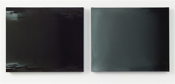
“the painting undressed” 2011, diptych, oil on linen, 18 x 40 inches (all images courtesy of Regina Rex Gallery)
Nancy Haynes: This Painting Oil on Linen was at the Regina Rex Gallery, New York, 7 April – 14 May 2017
http://reginarex.org/exhibition.asp?exid=576
These Paintings Oil on Linen
I don’t think I’d go quite so far as to describe Haynes’ practice as “a form of prayer,” but I can see why Ken Johnston would say that.[1] She has always made paintings that are impressive because of the way they’re painted, but in her newest work she has realized more intensely the kind of depth and movement she has worked with for a long time. The surface is more delicate, its relation—more exactly, its active non-relationship—to its support more subtle.
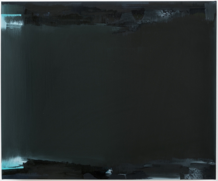
Each of the paintings in this group is made of a generally horizontal movement, which takes place in several stages but proceeds in all cases from lighter on the left to darker on the right. At the top and bottom things happen that qualify this movement, altering the way we see space and movement by changing the color and the surface. Where most of the painting is made of layers of thin paint applied with a foam rubber brush, Haynes uses a tiny watercolor brush to make the marks or surface interruptions at the top and bottom. Nothing moves quickly but some affects seem to emerge, or appear, suddenly.
In 1988 I said in connection with one of her paintings that dark spaces seem closer to one than light ones and that therefore it was (is) very hard to judge the relative space between the dark and the not so dark, because it’s a relationship between degrees of envelopment. [2] There is no distance of straightforwardly describable sort, it would be like saying which part of the sky was closer to one than another. It starts at your eye—where the outside most obviously enters your inside—and goes on from there. We look into it, and Haynes talked about “disappearing into the painting” when we met to talk about these new paintings. What disappears into it? The viewer I think, oneself. Its interiority takes you over not when you’re not looking but when you are.

“night reading” 2015, oil on linen, 21.5 x 26 inches
The painting I was discussing in my 1988 essay was matte and porous. Being matte establishes a continuity between the inside of the work and the world, because there is no sheen of any sort to suggest the very outside of an inside—or the extreme limit of the outside, where the viewer and the wall are. Being made of oil paint, the new paintings act and are in consequence encountered quite differently. Almost the first thing you experience is the glow that comes with the material, but I say ‘almost’ because it seems just as likely that what you first get grabbed by is the presence of movement. It may be important to say here that the visual is founded in the involuntary, in phenomenal affect rather than recognition. Which is to say that vision is made of what you can’t help but see rather than what you know something is meant to represent. Saying you can’t see depth or movement in painting—because you aren’t a slave to illusion, but rather a good materialist, or slave to literalism—is like saying you can’t see that because of refraction a twig half submerged looks as if it is bent. It is an attitude common among artists and others who hate painting, especially those who teach. But actually you can’t help but see these things, despite them being not really there. Seeing movement is a consequence of not being able to see the painted surface as anything but a depth, at least some of the time—nothing can move without a space to move in, to move on a surface you have to be in the space in front of it, there is no within flatness. This is what painters paint with, or at least where they begin.[3] As Cézanne made clear by saying that no one has to impose depth on a painting, the gessoed white ground is already deep, they certainly don’t begin with flatness. Matisse was addicted to the arabesque because one cannot see it as other than a movement—two ‘s’ shapes juxtaposed cannot be seen as still. They aren’t signs stuck on a surface awaiting interpretation.
Haynes uses good quality paint applied in a manner sparing but not stingy. The pigment is dense, density being what distinguishes good paint from rubbish, and therefore it can be got to be dark like night pretty quickly. When we met to discuss the works Haynes talked about them beginning with a light which is then edited, a luminosity established and then modulated. She also talked about her paintings involving slowing down, making one look slowly, a way of experiencing movement to be sure. She tends to use colors which have blue in them, expansive and at the same time recessive therefore: ivory black, i.e., a bluish-black with distance built into it (blue recedes while black absorbs, the one intensifying the other,) rather than mars or lamp black therefore. Other colors we talked about which are used in these paintings were cobalt teal and cobalt green, both bluish rather than yellowish greens.
I like Guisseppe Longo’s definition of biology as physics plus chemistry plus life, and I think that in a non-literal (but in that not metaphorical) way it is a good description of how when looking at painting’s surface we see paint as a physical material (dense stuff) but one animated rather than inert. When inert a painting’s surface is either a fashion statement or technical failure.
Seeing these new works brought to mind two memories having to do with the importance of the surface’s immediately visible tactility. I remembered Karl Zerbe telling me in the sixties that he thought the surface of a painting was its most important property. Zerbe, a refugee from Hitler who had been Ellsworth Kelly’s and Brice Marden’s teacher, was an encaustic painter and one might reasonably suspect that his feelings about the primacy of the surface had something to do with that, but my other memory was of Elizabeth Murray visiting my studio for the first time sometime in 1974 and asking me whether I sanded the canvas as I went along. My remembering these two different artists emphasizing how paintings work visually at least in large part because of what they are physically was I think brought about by the way paint is used in these paintings. They may be the most exciting she has made, and if so one reason will be because of how they’re painted, not necessarily because of their being painted with oil on linen but because of her realization of the potential of what oil on linen may be made to do.
It is germane that oil paint contains a glow, the closest thing to electronically technological surfaces like film screens or, even more, video, that the pre-electronic had with the exception of glass, and it’s because it holds light. Writing about her work in 1998 I talked about how she had already produced paintings in the eighties of which it was possible to say that the surface was not continuous with or visually dependent on the painting’s support, but by the nineties this had become more obvious, and the medium of which this discontinuity might remind one is different.[4] Haynes’ dark paintings are the ones in which she makes the most out of the internal luminosity which is a property of oil paint both conventionally and literally. Dried oil paint is pigment suspended in an oxidized oil that having become transparent emphasizes the color and its location within or as part of the surface that contains it. This is what is worked with and presented with great effect in the newest paintings, with a new element of greater variety (and therefore complexity) in the movement(s) that characterize the work. And because it’s oil paint (on linen,) these paintings are neither matte nor porous. They glow like video, and while the press release describes them as possessing a luminosity that “hovers on the surface like the emanating glow from a computer screen,” I’ll say that I don’t think it hovers on the surface, I think it is in the surface. That’s why light (appears to) emanate from it like the glowing of a computer when it’s turned on but there’s nothing on the screen. The difference is that the computer’s light really is within the screen, while oil paint’s glowing surface depends on an external source, but it is the similarity that concerns us here. A comparison that was not available to any artists who were working before a certain date, now it’s unavoidable.
“reaching back”, 2016, oil on linen, 21.5 x 26 inches
Underscoring the possible comparison with a computer screen, and how the possibility of that comparison influencing one’s reception of the work, Haynes’ has given this group titles which are all written in lower case. What was once a modernist device or gesture (for example, e. e. cummings) which had specific meaning of one or another sort is now the way one writes things into a computer most of the time when searching for anything. reaching back (2016) may, for me, be the most complicated painting in the group, because it makes the most of the impossibility of describing precisely what one is looking at, the reason for that being that the work causes one to see parts in a way that frustrates one’s seeing it as a whole because of one finding oneself concentrating on details. Bringing oneself back to thinking of the whole introduces another difficulty. This painting, like the others in the group but more explicitly, doesn’t really, or at least only, present one with a unified space so much as a group of spaces that coexist in the same place. Places frequently if not always combine spaces of different kinds, think of any city, and in paintings as in cities what characterizes a particular space has to do with where it is in relation to the center and the periphery. As in cities it is also true in paintings that spaces are defined through and by what kind of movement they produce or facilitate. Density, both perceived and actual, also has something to do with it. Space in painting involves movement in and out as well as across, and moving from (or through) one space to the other. In landscape paintings one moves in and out of shadow, from fast moving brightness to slow moving tenebrousness. However, in nonrepresentational paintings such movements don’t depend on a sense of a consistent ground that runs through both but rather something more like the opposite, a ground only determined by its color and tone and therefore not the same one in each place, no stable common reference or assumption on which to rely. This is how Haynes’ new paintings live in the ungrounded space we associate with video and computer screens. Everything they do is something the computer can’t, but it’s made possible by the example of a space filled with action—no one experiences a screen with electricity in running through it as without movement—and without a ground or source of light, it is light and inseparable from it. Like a video screen they can’t be seen in terms of a picture plane—where would it be? The work depends on being imprecise in its precision, which is that of the surface as a physical experience which becomes (or presents itself as) a depth because of its glow, displacing the tactile with it’s opposite: the ungraspable by definition, indeterminate distance. As noted, because it’s a painting, neither literal thingness nor unavoidable depth (or space) that isn’t really there replaces or gives way to the other. As also suggested it is in my view thinking about what the surface is made to perform, and by all means what it may be about. I’ll seek to touch on the latter before getting to the implications of the former. Both—pace Johnson—may be seen to have something to do with prayer, or at least sincerity.
“Black milk of daybreak we drink it at evening we drink it at midday and morning we drink it at night… ,” 2016, oil on canvas, diptych, 21.5 x 53 inches
John Yau has written a useful review of these paintings in which he talks about one of them (one of two diptychs in the group) that has for a title the beginning of a poem by Paul Celan (presumably why it’s the only one of the paintings with a title that begins with a capital letter.)[5] The poem is about the Holocaust, and Yau compares favorably Haynes’ “refusal to replace the emptiness at the core of the Holocaust with something graspable,” with Anselm Kieffer’s eagerness to do more or less exactly that. Yau describes the painting and the paint and speculates, I think quite reasonably, that Haynes wanted to know if paint could become the “black milk of daybreak” that Celan has in the poem, “and, equally important, if she and the viewer could ‘drink’ it in.”[6] He concludes by reminding us that paint is poisonous and “what she lives on.”[7]
I’ll take what Yau talks about and generalize it. Haynes works with darkness, which has automatically somber if not negative connotations. Her choice of the Celan poem points at least to the connotations of darkness, and while the poem is about the dawn I’ve talked about her paintings in terms of the night, which I think is reasonable given the colors she uses. Regarding the Holocaust Himmler did of course say, when asked where all the Jews were going to go when expelled from the reich, that they would disappear into the night and fog (nacht und nebel.) Black can go to gloomy, whether it is of either of two kinds: the one that conceals something and the one that has nothing to conceal. Darkness that isn’t concealing anything is the incarnation of invisibility because it’s what can’t be seen when there’s nothing to see, made into a tangible experience. Darkness which does conceal something, for example the countryside at night, can be quite scary. Haynes invokes, or uses, both. There is nothing behind the color, which is the color of landscape at night.
Her use of Celan’s poem as the title for a dark painting may ask for comparison of some sort with Frank Stella’s use of the title of a Nazi marching song for one of his black paintings. Noting that Stella’s painting is contemporaneous with other uses of paradox of a politically difficult sort such as Godard’s right-wing hero who quotes Lenin in Le Petit Soldat, made around the same time, one might also draw some conclusion from Stella’s great work being one of negation of an elaborate sort, including of traditional aspects of oil painting such as its surface. Haynes, on the other hand, after making paintings for years out of all sorts of things, now makes paintings which are affirmations rather than negations of the medium and the way it works. In both, what you see is the paint. One conclusion a necessarily sensitive comparison might make inevitable is that how terror may be used by art will depend on the general state of intellectual life. What works now might have seemed implausible then, even corny; what worked then might seem puerile now, mechanically subversive or provocative. Yesterday we could only find a way to be sincere by pointing to dialectical contradiction. That could not be the way to do it today, because we did it yesterday. How interesting that we used not to be able to use oil paint, now not using it seems almost suspect, parasitic on what is now a cliché.
Matisse came up earlier, and he is also relevant to the sincerity issue, also in response to the Nazis. Todd Cronan has written about how, when Matisse’s daughter was briefly detained by the Gestapo, he sought to console her when she got home but was faced with the problem of how to act sincerely when all the ways we have of being sincere were already the province of actors. How to do authentically what has become conventionalized? As Cronan shows he had the same questions and concerns about how to paint.[8]

“this painting”, 2015, oil on linen, 21.5 x 26 inches
this painting (2016) is made of darkness that doesn’t cover anything up, and lightest where there are less layers of paint, so that one sees the dark as a development but, since the painting is not one color, one doesn’t necessarily see the lightest bit as the starting point. Better to say one sees no starting point while seeing the overall painting as development, through adjustment. One is just not able to say quite where what’s developed began. Some or most decisions are irreversible, so there is something at stake that one can’t but notice. As with Asian painting, there is no way that a mistake can be covered up with white and the color and or surface redeveloped from the start. this painting might be the painting in the group where it’s easiest to see how it developed, but why might be another kind of question, because while the left to right emphasis might be programmatic, beyond that initial decision the work’s development is intuitive. This brings us into an area where it is not possible not to be sincere, in the same way that one can’t be insincere about breathing. Brian Massumi has written about both intuition and instinct in a book about politics that is relevant here.[9] Citing experiments on birds he shows that we now know that, counter-intuitively, instinct has a place in it for experiment and novelty: faced with a new shape baby birds become more excited and interested by fake beaks that are less rather than more like real ones; and even more surprisingly mother birds welcome cuckoo’s eggs rather than reject them, despite them clearly not being theirs. They welcome a change. Instinct is clearly not conscious, it leads to action for which there is no time to reason, and intuition is likewise pre-conscious. Instinct doubtlessly, and intuition certainly are what one hears when a jazz musician improvises. Action that makes sense but is not in any way reducible to or interpretive as the discursive. The ancient jazz joke about Caucasians dancing—“Watch whitey tell his feet when to move” is I think apposite here. One likewise sees—feels, is moved by—intuition (and no doubt instinct too) when looking at one of Haynes’ paintings. Like breathing and jazz the work is about the ongoing but as action in the present, not as a link in a teleology.
Some years ago T.J. Clark wrote an essay not about an art historical subject but about the left and its (our) need to give up gearing thinking to what is ahead, and deal instead with how to act now.[10] I think (especially abstract or nonrepresentational) painters should take the same advice for related reasons. This is especially so given the current state of things in the art world, but that is only to say that what would be bad anyway has become worse than it might have. Even if that were so, art which parrots an idea is putting itself in a position where it can’t do anything to the idea it parrots, which is what a lot of art has come to nowadays. Art which wants to cut across history has to come close to not caring about it; otherwise it can’t change it or critique it but only repeat it, as pastiche or otherwise altered memory. Haynes, as informed historically as any other painter, nonetheless seems to work without any particular goal for painting other than hers, and to an end or ends that need not change our definition of the medium while, as noted, making paintings that everyone including presumably the artist can’t help but compare with contemporary technology.
Jazz musicians have a list of standards, great tunes on which they improvise, hearing (playing) them as they haven’t been interpreted before.[11] Abstract or nonrepresentational painters have standards not in the sense of great works so much as of formats. The square, the quadrant, the painting divided into two or three, the diptych, the horizontal format called landscape in French and unavoidably reminiscent of one in any language, these are the general formats abstract painters have to work with. Most of the paintings here are landscape-like formats, and as noted they present the colors of night landscapes and play with the space that comes with that. They’re performances rather than arguments, and in that quite unlike too much of what one sees nowadays. You have to actually see them, rather than just know to what they are meant to refer and why.
They have much more to do with staring at than looking for, in the terms I’ve discussed elsewhere with regard to Uta Barth’s work.[12] You can look at a space searching for a particular thing, or you can stare at it and see what emerges. There is nothing to look for here but a lot to look at. Dark colors literally slow down the heart. At the same time they cause anxiety unless you stop trying to find something. Video screens have been mentioned but I’d also bring up the tiny paintings of Peder Balk (1804-1887,) whose work I only saw for the first time a couple of years ago when the National Gallery in London did a show. Small paintings of the foggiest and coldest and roughest part of northernmost Norway—thinking of it causes shivering—which are like Haynes’ paintings in being little rectangles filled with—embodying—force. Art may always aspire to what other mediums can do—in painting’s case, therefore, to music and/or to the photographic, for examples—and also always to the invisible. Forces and movements that one may contemplate, or otherwise be open to, that are visibly there, not traces of actions but actions still in motion, depths that won’t give you time to let you tell your mind when not to be moved in and around. When it comes to controlling how you see them you haven’t got a prayer.
[1] Ken Johnston, New York Times (Friday March 6th, 2009.)
[2] Jeremy Gilbert-Rolfe, Beyond Piety: Critical Essays on the Visual Arts, 1986-1993 Chapter 6 “Nonrepresentation in 1988: Meaning Production Beyond the Scope of the Pious” pp. 63-70.
[3] For more on this see my “Marginalized but not Demystified,” https://abcrit.wordpress.com/2016/01/01/24-jeremy-gilbert-rolfe-writes-on-marginalized-but-not-demystified/,) or footnote one in the essay I wrote for a show I curated, “Outside” at MIM gallery in L.A., http://mim.gallery/exhibition/outside-curated-by-jeremy-gilbert-rolfe/#
[4] Jeremy Gilbert-Rolfe, “Endspace: From a real to an absolute,” Nancy Haynes (Zurich: Fondation Lechot, 1998) p. 6 et passim.
[5] John Yau “Nancy Haynes Invites us to Look Closely” Hyperallergic (May 2017). Yau’s review may be compared with Peter Geimar’s extreme act of public monotony on the same topic of the Holocaust’s unrepresentability in Luc Tuyman’s Gaskamer (Gas chamber) 1986 (Peter Geimar, “Painting and Atrocity: The Tuyman’s Strategy,” in Isabelle Graw, Daniel Birnbaum, Nikolaus Hirsch (eds) Thinking through Painting/ Reflexivity and Agency beyond the Canvas” (Berlin: Sternberg Press, 2012) pp. 15-37. The significant difference is that by the time Yau brings in the poem he has, briefly but quite adequately, discussed what the painting looks like. He doesn’t make the case that the painting is good because of what it is not before he has suggested what’s good about what it actually or visibly is. The question (of the unrepresentable) comes up after he has told us what’s presented. In contrast to Geimar who wants one to believe that what you see when you see the painting is abstraction as a sign of the unrepresentable. There’s no discussion of why its being painted the way it is results from its subject. It could have been anything to judge from his discussion.
[6] Yau
[7] (So do we all if we’re painters, while photography is now computerized, no more poison baths in the dark are required to make those images.)
[8] Todd Cronan Against Affective Formalism: Matisse, Bergson, Modernism (Minneapolis: University of Minnesota Press, 2013) p.179 et passim. For my review of this book, see Jeremy Gilbert-Rolfe “Actually, Images Have Meanings of Their Own” Los Angeles Review of Books (October 4th 2014) lareviewofbooks.org/article/actually-images-meanings/
[9] Brian Massumi What Animals Teach Us About Politics (Durham and London: Duke University Press, 2014) pp. 31-33 et passim.
[10] T. J. Clark, “For a Left with no Future”, New Left Review 74 (March-April 2012)
Prudence Peiffer, in a short review of a Rothko show in Artforum (March 2017, p. 264,) makes several useful points about darkness and the apperception of movement and also includes the intriguing fact (assuming it’s documented) that Rothko shared with Reinhardt a “fixation with … thwarting progression in an artistic oeuvre.” Dark paintings would seem to be well suited to artists who seek ongoing presence rather than narratives about development.
[11] Here for example is a list of what Benny Lackner of the Benny Lackner Trio thinks are the top jazz standards: There will never be another you; April in Paris; Round midnight; All of you; Giant steps; Donna Lee; Cherokee.
It may be coincidence that is not wholly irrelevant that Haynes worked for a while in the Metropolitan Museum of Art’s musical instruments department. Her pocket paintings (1974) were inspired by pocket violins she saw there, as noted in the 1998 catalog mentioned above.
[12] Jeremy Gilbert Rolfe, “Focus” Uta Barth (London: Phaidon Press, 2004) p. 100.

Thank you- a terrific bit of writing (aside from Massumi’s highly dubious interpretations of bird behaviour). Shame the illustrations are, inevitably, not much use.
LikeLike
This is indeed an amazing bit of writing. What’s dubious is whether any illustrations of this work, no matter how high res. – or indeed the actual work itself – would merit such detailed analysis and interpretation. It’s obviously unfair to judged only from reproduction, but they look really unambitious and redundant. As I’ve said before, the more vague and ambiguous this kind of minimal art is, the more one can read into it all sorts of allusive and contextualised meaning, without fear of contradiction by the work or any other commentator. The artist has not done anything like enough, for me, to make something both really good to look at and challenging to think and/or write about. You can indeed “stare at it and see what emerges”, but despite Jeremy’s insights it would seem to me a little dopey to spend much of one’s time doing so.
LikeLike
I don’t know how to reply to comments such as this, it seems all opinion and no argument. Obviously I’d not have spent time writing about Haynes’ work if I didn’t think it merited it.
LikeLike
Thanks for the thanks. I don’t know how to respond to the description of Massumi’s interpretations of bird behaviour. They aren’t Massumi’s, he quotes published scientific research. He may be said to interpret that I suppose, but the research is what it is.
LikeLike
If the writing is amazing (in a good way), then it is self-evident that the work that occasioned the writing merits such detailed analysis and interpretation.
LikeLike
Perhaps it’s amazing in a bad way, then. Perhaps it just adds to the obfuscation of art. Then again, I don’t actually follow your logic, Carl, even though it’s supposed to be self-evident.
LikeLike
I agree, this is an excellent essay, and troll-proof, as evidenced by the small number of comments it has attracted. It’s based on fastidious observation of work that is hardly photogenic and unfamiliar to most visitors to this site, but I think what it says is open to a wider application. It emphasises the importance of treating the available phenomena seriously when approaching abstract painting, addressed to an ‘involuntary’ ‘vision…made of what you can’t help but see rather than what you know something is meant to represent’.
The intertwined themes of abstraction, technology and darkness go a long way towards enlarging an appreciation of Haynes’ painting. When the views of the other writers are added one gets an impression that her work has found an enviable critical audience, sensitive, informed and alert. It’s good to know such things happen somewhere in the culture, if not always round here.
‘Staring at’ rather the ‘looking for’ seems the right behaviour when confronting both darkness and abstraction. The problem is I haven’t seen Haynes’ work, but I think Jeremy Gilbert-Rolfe’s insights concerning it can be extended to cover other examples that might be more familiar. The central darkness of Matisse’s French Window at Collioure 1914 for instance, Stella’s ‘black’ paintings, Ad Reinhardt’s ‘black’ paintings, and Agnes Martin’s grids, seem ideal candidates. I’d like to include Whistler’s Nocturns of the 1870s, which I think have a physical resemblance to Haynes, and for good measure, the work of Robert Holyhead. (I’m listing these examples simply because I have commented on them in contributions to this website.)
Associating Haynes with the series of Nocturns introduces a nostalgic, even romantic idea of the surface, alluding to the nineteenth century, which somewhat complicates her works’ relationship to the states of pictoriality generated by screen technology in the twenty-first. Going just on the photographs, it makes sense to talk about the ‘glow’ of computer images, and recall the particular light produced by the electronic field of video, and the viewer’s experience in front of the cathode ray tube. What’s striking however is that the ‘space’ involved in those technologies now feels almost as obsolescent as that found in Whistler’s account of evening scenes in London or Paris.
The possibilities of that obsolete space seem richer than the pictoriality of current platforms. Laptop and HDTV screens are markedly less radiant and liquid, bereft of the kind of light bearing characteristics of painting or the cathode ray picture. They are closer to the phenomenology of the illuminated manuscript, full of colour, detail and information, inked into a dry layer of parchment or paper. Or they bring to mind the look of tattoos, stained onto a one-cell thick sheet of epidermis. I think this comparatively impoverished phenomenology is restricted in an important way, namely it limits the visual entities that are allowed to appear or ‘emerge’ when we stare.
Haynes’ work is clearly ‘abstract’, and participates in a relatively minimal pictorial economy that is often seen as one of abstraction’s disadvantages compared to figuration. In figuration there is always something to look for. But in her work, and that of other abstract painters I’ve mentioned, the issue of whether there is anything already in such paintings, as opposed to what we might ‘read’ into them, is often raised.
The idea of ‘involuntary vision’, takes care of the problem of ‘reading into’, and echoes Stella’s notorious but phenomenologically accurate remark that in front of these works ‘What you see is what you see’. Of course, in the case of abstract painting, there has to be ‘something’, something ‘you can’t help but see rather than what you know something is meant to represent’. If there isn’t something, then there’s nothing.
I intend these remarks to add to the points made by Jeremy Gilbert-Rolfe. Though his essay is not in need of such additional commentary, I’m offering it as a respectful response to an interesting piece of writing.
LikeLiked by 1 person
“Associating Haynes with the series of Nocturns introduces a nostalgic, even romantic idea of the surface, alluding to the nineteenth century, which somewhat complicates her works’ relationship to the states of pictoriality generated by screen technology in the twenty-first.”
Although it is difficult to tell from reproductions, for me the link to Peder Balke (another artist I had not heard of before) appears just as important as the link to the screen. Haynes idea of surface seems very unmodernist. I mean in the sense that the paintings reproduced above tend – as far I can make out – to dissolve their materiality into their illusions; rather than attempting to keep paint as paint whilst imbuing it with a sense of space and surface tension.(Paintings such as by Jacob Kassey they superficially resemble don’t do either, and are simply aimed at making something which looks like a painting).
I don’t think it is necessary to frame this as nostalgic or an historical allusion, rather it seems to take up a bit of the technology of painting that most abstract painting had thrown out. I think it is plausible to say that at least some of the assertion of abstraction (or self-sufficiency) in modernist painting comes from stressing paint’s materiality, so suggesting that illusions of space or light (or other allusions to the wider world) are in fact inherent properties of the material.
Haynes seems to offer us pictures of space, rather than paint made spatial.
LikeLike
I think Haynes’ work is maybe the opposite of Jacob Kassey’s, and certainly they are not pictures of space but rather paint acting spatially, as I think I describe it as doing.
LikeLike
I intended to contrast both Haynes and my fictional / composite Modernist painter with Kassey, but perhaps that wasn’t very clear. I agree Haynes and Kassey seem opposites.
My final statement was meant to have a question-mark at the end. Even if Haynes does make paint spatial this seems to be done in a way that is very different from how it is understood within the modernism most frequently discussed here. Perhaps I could suggest a sliding scale, rather than an either or between paint made spatial and pictures of space? I’d be interested to see these for myself, although I suppose little chance of turning up in London anytime soon.
LikeLike
Sam you say “Associating Haynes with the series of Nocturns introduces a nostalgic, even romantic idea of the surface, alluding to the nineteenth century, which somewhat complicates her works’ relationship to the states of pictoriality generated by screen technology in the twenty-first.”
I feel the idea of surface is the only thing that painting is clinging onto in the 21st century. I sense anxiety in painting, every criticism you care to read will concern surface and physicality. It is as though painting has nothing else to offer so both aspects have almost become a fetish. The Artist toiling away in their studio making handmade objects with surface and physicality. I think this is the reaction to the onslaught of digital media that confronts us daily. Unfavorable comparisons are made regarding computer screens as opposed to seeing a handmade object in person.
This seems disingenuouss in a sense as most people viewing the works he is discussing will probably only do so on a computer screen.
I think the future of painting will be digital. Painting will dematerialize into the digital medium. I have no concerns about the death of painting. In fact the digital medium will offer many benefits to painting and many new avenues to explore.
LikeLike
I appreciate the reading and agree with the further comparisons suggested. I think the question of what is read into a work and what is already there is quite complicated whether the work’s figurative or abstract because in the first one is of course bound to look for unintended meaning, while in the second one is at least on guard against responding in a way to which one has been programmed. I have referred elsewhere to what Schopenhauer has to say about listening to music. He says one can’t possibly say what a piece of music is about, in the sense that one may say that about a novel, but that after listening to it one feels that all the questions that were on one’s mind have been answered. I’d note that if black is like a minor key, it’s only in western culture that minor keys are heard as sad. There are then limits of one sort or another to the perceived meaning of the most universal of vague sensations.
LikeLike