
Installation, Simon Gardam at Fort Delta, Melbourne, Australia
Field, an exhibition of new paintings by Simon Gardam, is showing from August 3rd – September 2nd at Fort Delta, Melbourne, Australia
http://www.fortdelta.com.au/fort-delta-events-and-exhibitions/2016/06/17/simon-gardam-201/
This is Simon Gardam’s second solo exhibition at Fort Delta in little over a year, and in such a small space of time his work has undergone some significant transformations. The addition to Gardam’s repertoire of stitching paintings together is but one reason for this, and certainly not the most important when it comes to determining just how these paintings go about engaging us in a way that is very different to the last few years. I think the most consequential factor for bringing about this shift lies in the colour and how it sits on the surface. Gardam’s colour is brighter now than it has been in recent years and that has a lot to do with the immediacy of its application. Traces of older methods are still evident as well, able to co-exist with these newer developments, all in all contributing to a diverse selection of works, with physical and spatial differences occurring across all the paintings in this current exhibition, Field.
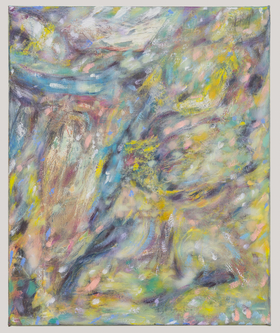
“Temple Master”, 2017, oil and pastel on canvas, 56 x 46 cm
It would be naïve to assume that the distinct properties present in each work occur in isolation from one painting to the next as they are made. In actual fact, these paintings are all moments, the best samples taken from a wide output, offering different sets of concerns and resolutions that best represent particular periods of time. The best moments are probably those that capture the most tension between the desire to consolidate certain developments whilst also needing to push things on into some new and unfamiliar territory. All works are transitory, but with the benefit of hindsight, some are more transitory than others. Temple Master is probably the work in the show that most retains elements of older works by Gardam in terms of its colour and atmosphere, whilst simultaneously pre-empting how paint will be applied to canvas in the works that follow. It is probably the oldest work in the show, and so possibly the most literally transitional, but in my opinion is not the strongest piece here. It is probably let down in the end by a rather frosted over palette, with too many repetitions of colours, particularly the recurring dabs of dulled pink, an abundant warm yellow being one of few colours not obligated to emerge from the otherwise murkier colour base. The repetition of colour casts too much emphasis on how the thing was made, as we see the procession of marks as they were laid down. This piece also has some more distinguishable forms than most of the other works in the show, which generally have a more interwoven approach to colour. These dark, linear shapes take prominence, one curving in horizontally from the top left, the others more centrally placed and slightly symmetrical, rising diagonally and meeting at the top to form a sort of inverted ‘V’. They still manage to sink back in space due to a combination of their blurriness and the application of thicker dabs of paint over the top. They are by no means distinct from the rest of the painting and are actually integral to it, but they are noticeable, almost like focal points, carving up the painting in too linear a fashion, which explains why Gardam has tried to mute their influence. The muting by no means comes across as contrived. I rather think it speaks of a kind of intuition for abstract painting, of not giving too much precedence to one aspect at the expense of another. But in this case, I think it falls a bit short, and lacks some of the crackle and spark of the other works.
In some ways, the linear forms create compartments within the work, and within each of these segments there is a different directional pull. The left-hand side surges upward quite insistently, whereas the middle right has a horizontal movement. I think there is a criss-crossing of forces throughout the painting, but for some reason it is resistant to letting you completely travel from one movement into another. It’s like the momentums meet with some wall or object, and that might be the skinny blue lines, but I also wonder if it is down to the colour, and that if it had more dynamism, more contrasts, more colour clashes and less of a muddiness, if that might create more of a tension between parts, forcing us to consider relationships more, and making the viewer more of an active participant. When things are more ‘unified’, tonally in this instance, we may allow more structural, linear things to dictate terms.
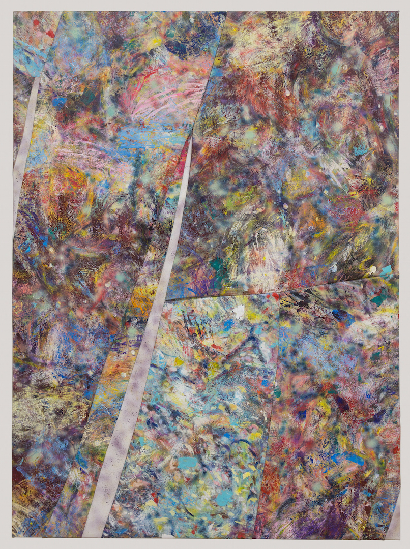
“Prelude”, 2017, oil and pastel on canvas, 152 x 112 cm
It is somewhat odd that my eye should struggle more with Temple Master than it does with Prelude, despite the latter having far more visual obstacles to overcome due to its obvious juxtapositions and evidently diverse methodologies. For some reason, I feel more capable of integrating a number of the different compartments of the painting even though they have literally been stitched together. The long white strip, subtly dusted with paint, which runs up from the bottom, does not feel abrupt, although my initial reaction was not one of total endorsement. I should specify that whilst I don’t find it abrupt as I make the transition across it from one densely painted field to another, I do find its ending abrupt at the bottom of the canvas. The straight horizontal that it is met by feels too easy, or too hampered by the physical constraints of the stretcher frame, constraints that are otherwise being ignored by the action of cutting paintings up and reassembling them with others. My initial doubts about this painting and how it resolves these combinations was not to do with any such contradiction brought about by the method, but was probably more down to the awkwardness of the work as a whole, rather than any individual bit. The exception would be the triangle in the bottom right corner, which unsettles the balance of the painting in such a way as to make it unstable, almost toppling out of itself and onto the floor. My gut feeling tells me that it could do without this, and that this is potentially distracting from more rewarding relationships throughout the work. But nevertheless, there it remains, and it is fascinating to see something so small doing something so consequential in a rather large painting.
With more than a degree of caution, this work tempts me into using one of art’s most maligned and misused words, originality. These paintings are not bolts from the blue, they combine a number of ‘known’ approaches, in this case abstract painting with a density in the mark making, along with more open and sprayed surfaces, and of course, stitching. But this particular combination of supposedly familiar things has produced something quite unusual that is difficult to place alongside anything else I have previously seen. Whilst there are numerous examples of abstract paintings being collaged, reassembled or stitched together, this is usually done with paintings that don’t have that much information in the first place. More time spent would usually quell the temptation to start cutting the whole thing up. Prelude is unusual for that reason if nothing else, but I would hope to be able to put the obvious aside for a moment, and get down to what is really going on here. Beyond the simple fact of the way it is put together, how else does this painting reveal itself to us?
It is interesting that in Prelude, the interstices between different patches of painting, for the most part do not interrupt the flow of the viewing. The exceptions to this are the two large pieces toward the bottom right, which seem cut off from the rest of the painting, and I mean visually here, not literally. This could be because they are rather rectangular, destined to echo the frame and create their own pictures or worlds, within but separate from the rest of the painting. This does not detract from the activity going on within these segments, which I really enjoy. But it is just one of the potential risks of this methodology, that the patches will not really cohere, and remain disparate, even though the paint-work itself is evidently from the same hand. Perhaps a less geometric border would help in this instance, because further up I have far less trouble at jumping across different patches and accepting their relationship, even with the thin white tusk thrusting up the middle. I think it is good that Gardam has not continued to paint across the stitching in any attempt to make the joined elements fit together more, though that could be something to consider in the future, with a more complex array of shapes perhaps. I think that as exciting as the stitching is in this work, and the possibilities it throws into the mix, it is at the moment in a primitive stage, and I think we can expect to see it cultivated and enhanced in time. But for now, it remains a bold and unusual move.

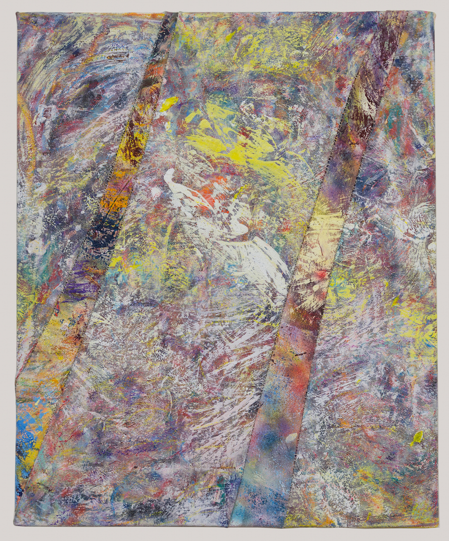
“LWO”, 2017, oil and pastel on canvas, 56 x 46 cm
Another problem posed by the stitching is the question of whether or not some of the paintings actually need it. If I were less convinced, less excited about the actual paintwork, then perhaps I wouldn’t ask this question, because these sorts of solutions to paintings often pop up when there is so little there to begin with. With collage, or assemblage, or painting that incorporates ‘foreign elements’, or in this case, an additional method, there is a temptation within the viewer, often allowed for by the artist, to grab hold of that “outside element” and treat it as the content. Sometimes this is a welcome distraction. A literal thing to grab hold of as you slip down the muddied rock face towards the terrifying pit of having to think about content. With this in mind, I will turn my attention to LWO, because I find the middle segment of the painting so fascinating in and of itself, that I wonder to what extent it needs the blurry strips either side of it. For starters, the colours, though finely interwoven, are bright and maintain their own resonance, untarnished by the rest of the palette. They resist each other more, and give off a sense of layering, whilst still attesting to a vigour in application. The whites do act as highlights, but are very dazzling, and move in and out of transparent washes or smears, sometimes sinking in behind, sometimes sitting confidently on top, but always ready to lead you to another part of the painting. It isn’t all flicks and sparks either. There are more deliberate forms within there as well, but unlike Temple Master, the shapes they create are less linear and less removed, far more incorporated into the visual drama. I do worry a bit about the use of white, and if its effect is too dominant, but despite this, I like what I see.
So why the strips? Why attach two bits of canvas, painted (barely) by the haze of an air brush, to a painting that seems to be working so well on its own? Why risk creating such an optical nightmare that threatens to negate all the visual enjoyment to be got from the middle segment of the painting alone? Well, for starters, I do not think there is an optical effect present in LWO, and I say that with a degree of confidence, having seen what can happen when this juxtaposition malfunctions, as it has in Cortex. In Cortex, the optical illusion that takes place, between the airbrushed segment on the left and the central area to its right, is mammoth to the point that it is extremely difficult to draw yourself away from this negative effect. I think that optics are negative and non-visual because they continue to distract and cancel out the properties of other elements, even when you are not directly looking at the area that is causing the confusion. An example of this is evident in Mondrian, where grey dots appear at all the intersections of the black lines, except for the one you are focusing on. In Cortex (appropriately hung in a room to itself), the central patchwork piece projects out dramatically further in space than the sprayed piece to its left, and the eye cannot escape this, because the blurred greys appear to actually move whilst you are not focussing on them, so you are always brought back to that vertical division on the left. The top and bottom strips do not suffer from this so much, perhaps because they are closer in colour to the central piece. But they do suffer as a result of the optic effect, because whatever value they might bring to the painting is diminished by it.
“Cortex”, 2017, oil on canvas, 152 x 112 cm
To go back to LWO, I really admire the fact that in spite of this rather negative effect occurring in Cortex, Gardam has pushed on with the project, and somehow managed to pull it off in a way that does not result in one part of the painting feeling like it is floating acres in front of the other, or that the blurred areas are literally moving when you are not looking at them. That effect does not occur here, and I can only think that it is due to a combination of his reducing the scale of the blurred strips in relation to the rest of the work, and the colour of this particular painting, perhaps even the white that I was so unsure of. Also, it is worth wondering to what extent my positive reaction to the complex paint work is being enhanced by the presence of those flanking strips.
Whereas LWO is almost guaranteed to have an impact because of the hugely contrasting aesthetics, Come on Let’s Go generates its impact in no less intriguing fashion, similarly with some stitched additions, yet with an altogether different outcome on the space and our physical relationship to it. In Come on Let’s Go, there is a sense of wanting to penetrate in, but always being thrust back out again. I think this has something to do with the way the vertical strip on the left-hand side recedes in a slightly perspectival way, whilst the one on the right does less so. This creates a kind of swing, so as one strip takes you further into the field, the other one simultaneously draws you out. Yet this feeling of going in and coming out again is not just a two-step process. It doesn’t end when you come back out, because the eye immediately delves in again, even into the detail within the strips, which I suggested were generating that backward push. There is something slightly disorienting about this, like standing atop of a sky scraper where all the floors are made of glass. I think this feeling of vertigo is due to the fact that whilst the strips from a distance seem to sit in front of the paintings they are attached to, on closer inspection it is possible to look through them, travelling deeper into them at times than through the ‘background space’ they appear to sit before.
“Come on Let’s Go”, 2017, oil and pastel on canvas, 56 x 46 cm
How is this achieved? The left-hand strip has some much darker paint that is set off by some orange around it, so that helps. These strips are for my guess cut from a larger painting, the mark making being relatively bigger, as if magnified by a lens, but also out of focus, more blurred than the viscous web like intricacies of the larger fields they play against. In a sense, you can gaze into them more, maybe even drift, whereas the activity elsewhere produces a more active engagement, because it’s physicality is more present. I think it is also worth mentioning that this rather unique space, for better or for worse, is probably only made possible by the fact that there is so much detail in all the combined surfaces. Were the strips simply painted in only one colour, they would certainly sit atop in a spatial sense, but it would not allow for this confusion of depth, the sense of vertigo that I find compelling in this particular painting. In this painting, you lose your sense of being upright and looking ahead at a ninety-degree angle to the floor. Here, the floor is gone and you are gazing downward.
One of the most exciting aspects of this show is that each painting, or more specifically, the experience of each painting, is unique. Over the last few years, Gardam’s work has sometimes been strengthened by the combined impact of the paintings collectively, having tended towards a more austere outcome, built up with fluid glazes of oil, often sending somewhat brooding centralised images back behind the plane and its hazy atmosphere, generating a kind of mystique or enigmatic quality. Sometimes, any suggestion of a ‘form’ would be dispersed entirely, favouring a more all-over solution. Common to all these outcomes was their physical unity, melded together by their built up oily skins, set permanently as if behind glass. With hindsight, this rather easy notion of unity and wholeness has been well and truly challenged by Gardam in this new batch of paintings. In most of these works, we are witnessing a much freer range of movement, combining all or many of the aspects of the visual vocabulary he has steadily developed over the last several years. Now, where there is paint submerged behind an atmosphere, be it glassy or frosted, you may also find, within that same picture, paint that breaks through to the surface into full unabashed colour, positively asserting its physical texture and presence, yet still able to relate to what is around it, giving us a more diverse and constantly shifting space.
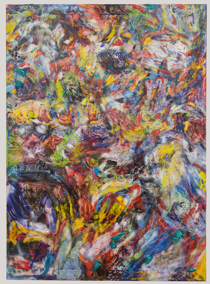
“National Acrobat”, 2017, oil and pastel on canvas, 168 x 122 cm
I think National Acrobat is very successful at combining this submerged, glassed over depth with a more tactile surface, attempting to reconcile these peaks and valleys with a palette that is more vibrant than usual. It is also worth mentioning that this is one of the larger works in the show, so it is attempting to do quite a lot at a human scale. In some way, I wonder whether it struggles to meet this size, because there is a fair amount of repetition in the use of colour, relying heavily on red, sometimes slightly tinted to a pink, which tends to float at times, a bit like confetti. However, the possible over-abundance of yellow is actually very important for dragging these reds back into the structure. The colour that seems to be causing the most trouble is the phthalo green, which mostly appears in little dabs, and is probably at its most problematic toward the bottom of the picture, where the opening out of the space throws the greens into prominence. It might be that the cooler tone of this green is finding itself at odds with a palette that is mostly gearing towards warmth, with many of the blues even leaning to becoming violets. Also, the green dabs have been applied much flatter than the other colours, which catch on the surfaces left by earlier layers, all intermingling and diminishing any sense of backdrop. The green aside, it has all started to meld together, without being locked in by a consistent skin. I think this painting demonstrates Gardam’s feeling for abstract painting, showing an understanding that you cannot rely on a pre-existing figurative space to lodge a form into, but that you have to conjure up this space yourself through rich, complex and unexpected relationships of surface and colour. The cohesion is exciting, because it threatens to grind and jar.
One of the most important parts of this painting is one that initially bothered me, because of its potentially figurative role and awkward positioning. The black and purple cave like opening above the bottom left corner seems jarring and out of kilter with much of the scale of mark making throughout the painting (although things do seem to get bigger towards the bottom), and it creates a somewhat annoying horizontal that cuts abruptly into the flow of the thing. But I actually think this chasm provides a crucial change of pace. Without it, this painting would be too much of an instant, despite the evident layering. It shows a willingness to intervene, rather than just follow some sort of rhythmic pattern through to its conclusion, not that any of this painting resembles a pattern. I’m suggesting that a change of direction within the painting can allow for greater longevity in the viewing experience, because the work can no longer wash over you in a few moments.
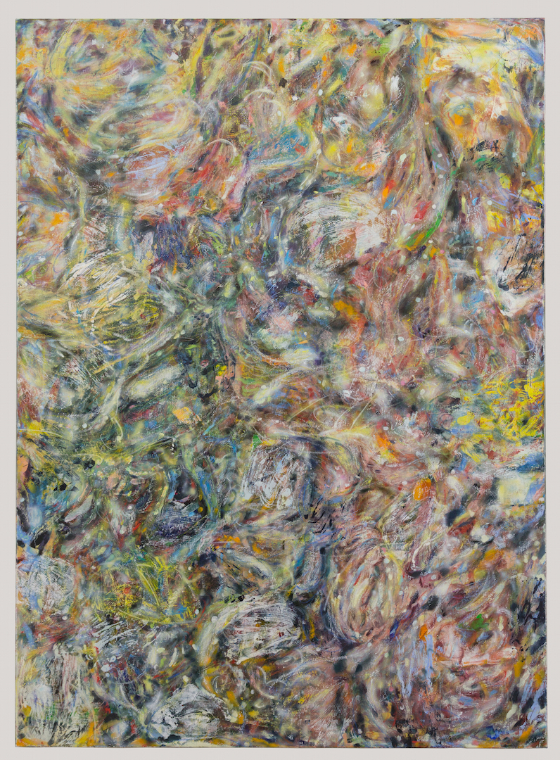
“Pamela’s Letter”, 2017, oil and pastel on canvas, 168 x 122 cm
Whilst the palette in National Acrobat could be described as primary and explosive, the impression given by Pamela’s Letter is dusty, maybe even granular. Facing off as they are, hung on opposing walls at Fort Delta, these two works provide an interesting contrast. They might appear at first to have the most in common. They are both large, measuring at 168 x 122cm. They are both dense with information and neither of them contain stitched elements. Perhaps they are two of the more conventional works in the show. But in my opinion they are quite difficult, not least because of the fact that the conclusions you might draw from one, will simply not stand for the other. The main reason for this difference is the colour structure. National Acrobat is bolder, maybe even more rudimentary and explicit. The colour in Pamela’s Letter on very close inspection remains quite bright, but is far more interrupted and becomes more muted, establishing a more even film from a distance. The endless variations of colour and tone create a continuous movement in Pamela’s Letter, but one that remains relatively composed due to the combined tone of the painting. The energy is constant but not hyperactive. Again, colours repeat, and the white is an easy suspect, perhaps playing the biggest role in both generating and stabilising the energy of the work, being permitted to travel all across the canvas. There is some compartmentalising of colour too. The middle to right-hand side has an upward surge that is predominantly pink. Its opposing area is largely made up of a tonal range of greens. The top of the painting is generally speaking, quite orange. Yet none of these colours ever break loose as they do in National Acrobat. In some ways, they seem checked by remnants of an aesthetic principle Gardam brought to earlier works, pushing the activity back behind the plane. In this case, it may be the blurriness of the airbrushed marks, helped along by the whites, breaking down these colour barriers beneath a wispy atmosphere. I wasn’t sure about these white rings at first. In fact, I am still unsure about them. Perhaps they seem too easy, too seductive, and too swirly even. But they are also quite complex. Their scale shifts all the time. Sometimes they seem dripped, sometimes sprayed, sometimes more thickly brushed and scumbled over a richly built up surface. Many of the more curling examples have been drawn on with pastel. They move in and out of the colour, squeezing the space, binding it all together within an endless white wire. Perhaps my suspicions have something to do with an apparent lack of differentiation across the painting, and the relative ease with which all the elements meld together. Perhaps I want more of the daring interventions on display in National Acrobat. But this evenness in Pamela’s letter really only exists from a distance. Up close there is a wealth of information with tremendous variety, with so much of it bubbling up at the surface. Just how it achieves its unity remains difficult to understand.
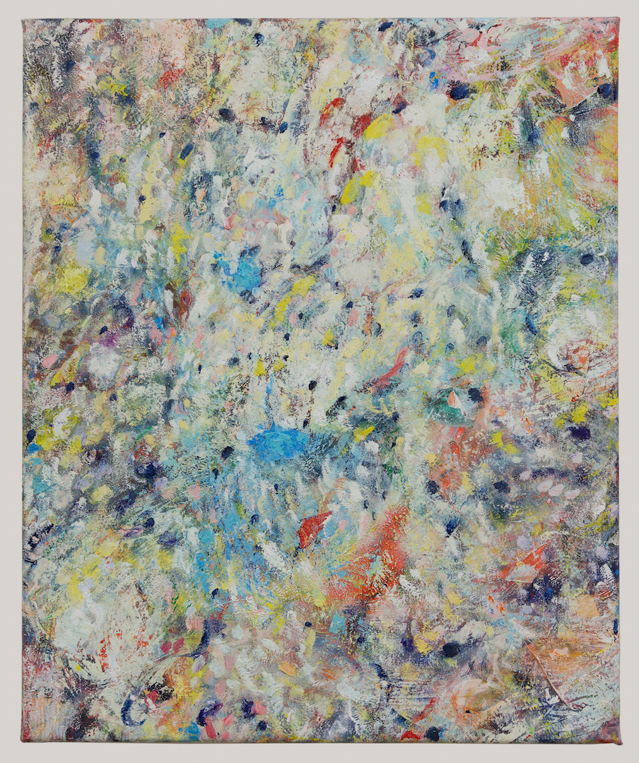
“Fluff”, 2017, oil and pastel on canvas, 56 x 46 cm
So, to come all this way and end up with Fluff. It is one of the smaller works, a touch heavier in paint application than the other seven, and maybe my favourite painting in the show. Most of the paint activity exists at the eye’s first point of contact, with very little submersion occurring. There is a slight dotted sort of approach to its making, the surface punctured here and there by deep blacks. The darting yellow allows for an opportunity to trace certain developments a bit too generally, but it is not really that much of a problem because the bright blue is so alluring, and the reds and salmons so punchy but sparing. White again plays an important role from a distance, but up close it seems no more apparent than any of the other colours. The surface is one of the highly satisfying aspects of this work. The top right hand corner has a lovely kind of corrugation, allowing these streaks of turquoise to drag over beds of orange and red. The bottom right corner appears scarred, like some surgical incision was etched in, almost like a signature, but acting more like a sling that launches you back into the action going on above it. On the other side, a rather elegant curling hook swings down to the bottom edge, chiming with another, more boot shaped anchor to its left. If you choose to follow this piece of infrastructure and the dark trails it leaves, you will see that they start to inform us of a kind of bulge above the bottom left corner. This part of the painting is probably the most spatially close, though it is not made explicitly so. From it you can move inward and upward to that striking patch of blue, which is also being rushed at from the opposing corner by a surge of brushstrokes coming at it like a receding tide. From there I find the directional forces less insistent, and I can follow my whim a bit more in the top half of the painting. But in that bottom portion there is quite a lot of drama being played out. Here we are presented with a space that is difficult to pinpoint, because it doesn’t rely on atmospheric submersion or any sort of optical device to start throwing things around in a dramatic way. Instead, it sets up a range of activities across the surface, with just enough variation in them to create a series of contrasts capable of pulling things about. Its appeal is subtle but not slow or deceptive. I liked it from the start. To think we were promised fluff!
The crucial thing to note about this exhibition is that the experience offered by each painting is different. This diversity is due to a range of factors, whether it be how the painting was literally assembled, or the influence of colour on structure, or the effect of touch upon colour. But all these things ultimately answer to Gardam’s own resolution to make a painting that is not the same as the one before it, warranting a review that treats each painting, hopefully, with something resembling the attention it was given during its making.

A very good review Harry, you have described the works really well and enhanced the experience of viewing them on screen.
I am drawn to the last three images illustrated, especially ‘National Acrobat’ , there seems to be a lot of expressive movement and rich complexity going on.
I find the collage pieces rather interrupt and confuse the visual experience, the shapes seem to distract the eye, maybe because they are so linear, and so different from the quality of the surface.
LikeLike
Thanks Noela. I like the final three works the most too. Though I am intrigued by “Come on Let’s Go”. Of the collaged works it is the most sensitive, with each strip having much more of a relation to what is around it. The penetrative spatial swinging it musters is very much a part of the content I feel, and made all the more possible by the linearity of the strips. I agree with you that the others probably suffer from the rather linear arrangements. The white tusk that runs up the middle of “Prelude” insistently launches you to the top of the painting, neglecting what is below. I have a sneaking suspicion that ‘Prelude’ would work better if turned ninety degrees to the right. If the tusk came in from the left, we would be forced to consider the adjacent areas as we read across it.
The collaging is still a recent development for Simon, and if he wants to continue with it, I would expect it to only become more involved. By that I mean less linear, less rudimentary and more integral, so that we don’t even consider how the painting might be without it. As I say in the review, it is in a primitive stage, which I think is a good thing, because it means there is something of promise.
LikeLike
Hi Harry,
As you say, there are interesting experiments going on here.
My favourite (along with Fluff) would be LWO and from what I can see, I agree with your remarks about it. I´d just like to add that for me (and very subjectively) the strips on each side give the whole painting an upwardly billowing, el Greco-like feeling. Take them away and it´s earthier, more de Kooning. The rather heavy-handed blue shape at the top looks to be better integrated when the strips are held away.
So are the strips a part of the painting or a setting for the painting? Their influence seems to be very one-way – there´s not much sense of the central area “doing” anything for the strips.
LikeLike
As you have said Harry, the collages are a recent foray for this artist and there can be many possibilities for development. I remember John Pollard (Parnham Mill Exhibition) using a similar process which worked really well and sustained an integrated balance of shape, colour and texture.
LikeLike
I didn’t know that John has tried a similar process, Noela. As I said, it is relatively unusual to see it in painting that is already rather visually dense, at least as far as I’m aware.
LikeLike
Actually they weren’t stitched come to think of it. John might clarify if he is following this thread.
LikeLike
Hello Richard,
You’re absolutely right about the blue shape. Without the strips in your vision it becomes far more prominent, and yes a bit more like a sort of ‘abstracted’ centralised shape in a de Kooning, being consumed in a flurry of strokes. So the blurry strips do indeed seem to be working hard for the middle segment and it is worth wondering what they get in return. That probably drives somewhere close to the root of what it is that bothers me about LWO. It is a problem if it is no more than a framing device for enhancing the main area of concern, as I’m sure you’d understand, having recently seen and written about Howard Hodgkins. I’m not yet certain whether that is what has happened in LWO. It is as far as I’m aware, stitched together off the stretcher, so neither surface is actually a base for the other, though perhaps one is more of a base in a visual sense.
LikeLike
Yes, it’s a matter of whether the strips eventually become an annoyance. I think they probably do, more so than the strips in “Come on Let’s go”. Here they look to be a way of getting small marks to work together in larger areas. I imagine you could do something similar with lines enclosing parts of the painting. A bit crude and sudden, like Hodgkin’s frames, but interesting nonetheless.
LikeLike
From the pics it would seem to me that the stitched and patched works end up on the whole more conventional than the single canvasses, in terms of their spaces and content, which seems very compromised by such abrupt compositional devices.
Anne Smart did some paintings in the early 2000’s which were patched together from different workings, had holes cut in, and generally reorganised by cutting up. They seem to me to be more radical in how they dealt with this kind of literal construction and its integration into a proper pictorial whole:
http://www.poussin-gallery.com/site.php?artist=16&group=21
LikeLike
Anne´s painting looks great, but I can´t see any patches in it. She seems to have been using patching as a means to an end rather than as a visible element in an intended or accepted result.
Maybe Sarah´s quilts are relevant here. Her smaller, more regular patches achieve a pictorial whole without spatial disjunctions without disappearing from view.
LikeLike
If you increase the human content in an Abstract painting you may begin to undermine its Abstract content.
In so much as Simon has the liberty to put his canvasses together in any way he wishes the more human content , reconfiguring, sawing, cutting, pasting, scratching etc etc ,be it using materials foreign to mainstream painting or pieces of cloth to make a quilt should in the end be of no consequence.
Let’s face it…it was as difficult for dribbled and splashed paint back then as it is today for Simon.
All of that activity has to become the door to ABSTRACT.
LikeLike
I suppose then that if the aim is to integrate these transitions of different surfaces to a stage where they are almost indivisible from each other, then there is no point in combining them in the first place. Unless as Anne says, all these steps are necessary endeavours towards reaching something more abstract. If it means cutting something up, revealing something of its materiality, covering it up again and so on until you reach something unfamiliar, then that potentially is an abstract process where anything is possible, because you don’t know where you are headed. I think in Simon’s stitched work, there is quite clear evidence of the decision making process, and it reveals I think something of an aim, which would be to see how close you can get to creating an abrupt transition whilst maintaining a sense of cohesion (in some of them, particularly Prelude and Come on Let’s Go). Whether or not you want an aim to be evident in an abstract painting is debatable. This is why I think the last three paintings I write about are all the more interesting for being the more baffling. They are less deterministic but probably more sure of themselves.
LikeLike
There’s a bit of a theme developing here that ties in a little with the comments on Mark’s latest Brancaster discussion. If you set out to baffle of confound or obscure the true nature or content of the work, then I think there will be an unhappy result, because that will be visibly evident – as I think it is here, to some extent. But if you are cutting and pasting and stitching, whatever, in order to experimentally disclose the content of the work by a process of open discovery, and indeed disclose content that is in some way untried or previously undiscovered, and you are doing those things with a will to get past known ideas and cliches in the art, then that will have more potential. It still won’t mean a definite result, but it might give you the chance of an original result – if you can resolve and integrate all of that experimental stuff into something that feels like it has its own sense of purpose. But it’s important to distinguish between the development of a sense of intentionality in the work and one’s own clumsy and over-deterministic intentions.
LikeLiked by 1 person
I think that the material and process need to disappear in a successful work so the more you put together disparate elements the harder this will be. But that doesn’t mean we shouldn’t try, I’m all for experimentation.
P.s Noela: I can’t sew, even in a gestural abstract way.
LikeLiked by 1 person
For those who might be interested, part 1 of a conversation I’ve been transcribing between Simon and myself has just been published here: http://www.samizdatonline.ro/harry-hay-conversation-simon-gardam-fort-delta-melbourne-australia/
Part 2 to follow…
LikeLike
Thank you for the link, Harry, and look forward to part two. I’d be interested to know where Simon’s work goes next, so it would be good to keep us posted.
LikeLike
You’re welcome, Robin. I’ll post again when part 2 is published. Simon and I have a show together in Canberra in about a month’s time. I’m also excited to see what he comes up with for that.
LikeLike
Who’s going to review that one?
LikeLiked by 1 person
I’d be very happy to consider an Abcrit sponsored all expenses paid review trip to the land under?
LikeLiked by 1 person
Thank you John. Please submit your CV of previous review articles for Abcrit…
LikeLike
Blast!!
LikeLike
There is an interesting and linked discussion on the work of Anne Smart over on Brancaster:
LikeLike