
Gillian Ayres, Cardiff installation shot from Gallery 2, l to r: “The Bee Loud Glade”, “Aeolus”, “Anthony and Cleopatra”, “Calypso”, “Ace”
Gillian Ayres at the National Museum, Cardiff, 8th April – 3rd September, 2017.
https://museum.wales/cardiff/whatson/9457/Gillian-Ayres/
‘I suppose I am always trying to find something. I’m always looking for it. This has gone on since I was fourteen – and now I’m eighty five.’
A life lived backwards – for this review I will try an experiment and follow the more complex journey of the exhibition as it proceeds from the eighties back to the fifties, rather than the apparently more logical way of chronology from early to late…
The overarching sense of this exhibition is of a celebration of a painter whose work is vibrant, energetic and ambitious, but perhaps, above all, someone who has lived in painting. Ayres’s rich colour and attack, especially in the vibrant later works, bring a sense of play and uplift to these spaces – a feast for the senses in all respects, with the faded smell of oil, the sticky, tactile surfaces, and enough colour to last a lifetime. It was a bonus to have seating in the galleries (though I found the bean bags challenging – not so good for getting up again!) as it encouraged us to stop and sit, and open up to the work. When given some time to engage emotionally with the paintings (and physically because of the material and the scale), the experience can lift us into ourselves in a visceral way. In the first two rooms I would suggest that you can almost hear the swish, slick and smear of the paint as it is literally handled onto the canvas like an extreme version of finger painting – for this is what it is, a primary engagement with material, the canvas sometimes so heavily loaded that it sags under the weight.
The exhibition embodies forty years of a life in painting, with more than half the works being lent from private collections, and so rarely seen in public. It starts with the two rooms of paintings from the 80s, then meanders through a room with a selection from the 60s and 70s, and ends with what many think is the high-point of Ayres’s output, that of the 50s. The basis of the exhibition is a celebration of her connection with Wales, hence the emphasis on the first two galleries, work made while living in an old rectory in the Llyn Peninsular and as an external examiner at Cardiff Art School, before moving down to the Devon/Cornwall border in 1987. Proceeding through the galleries made an interesting journey backwards through time, enabling different connections to be made and it was breathtaking to be presented with a whole room (and it has to be said in the most beautiful space) of the 50s paintings as the climax to the show.
‘I got unhappy with teaching in art schools and just resigned one day, lost my London mortgage and cut to Wales. I thought I’d paint like hell. I just didn’t worry’.
Our journey begins with the most recent paintings shown, and it is in these from the early 80s that Ayres hits her stride again, having left teaching, abandoned acrylics, moved to North Wales, and thrown herself back into to an engagement with oil, colour and substantial texture on an ambitious scale. The chromatic intensity that soaked the interior of Ayres’s studio was echoed outside it by not only a profligate garden, but the presence of guinea fowl and peacocks. In these rooms we are surrounded by a selection of the idiosyncratic, recognisable flow of high key painting that hasn’t stopped since.

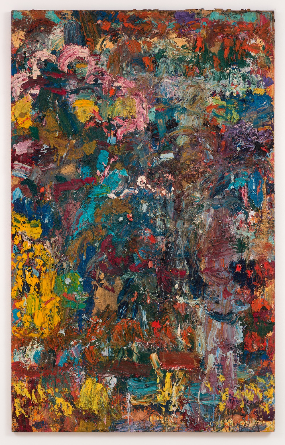
Gallery 2, l to r, “A Belt of Straw and Ivy Leaves”, “Cinnibar”, “Sea Sea The Shepherd’s Queen”, “Ding Dong Merrily on High”
In the first room are a variety of canvas formats; Ayres’s first tondo, ‘Ah Mine Heart’, 1981 was painted impulsively on an antique tabletop! – it is a format (said to be variously inspired by Florentine Renaissance paintings, Picasso plates, and Medieval Rose windows) which Ayres pursued over the next two decades. There is an upright lozenge, ‘Ace’, 1984, by the door. ‘A Belt of Straw and Ivy Leaves’, 1983, is three meters high and less than half that in width, containing a stack of overlapping arching gestures interrupted by fingered straight lines on the diagonal. ‘Dance of the Ludi Magni’, 1984, is a long, thin format nearly of three and a half meters with an unusually symmetrical construction centred on a large yellow area. Opposite this is the largest painting in the room, Anthony and Cleopatra, 1982, at nearly three meters square, was the first painting made in Wales, giving vent to the new release of energy. In this the paint much less amorphous, more vibrant and contains larger, longer marks than the those that preceded it, such as Sabrina (see below). A small painting on hessian, ‘Galetea’, 1981-2, just over a metre square, completes the line-up of this room. Even as we enter this first gallery our gaze is drawn through to the far wall of the second, on which is ‘The Fairest of Stars’, 1984, with its red edges and golden, luminous centre glowing in the distance.
The second room is dominated by four large paintings paired up on either side, each with a highly individual character; three are over three meters square. On the right are ‘Aeolus’, 1987, a large square with a green ‘border’ which seems to have an internal glow to it and a particular clarity when compared to earlier paintings of similar size such as ‘Anthony and Cleopatra’ and ‘Sea Sea the Sheppard Queen’.
‘Aeolus’ is underpinned by white inflected yellow in the upper centre which balances a large area of finger-applied white curves to the right side; over and around these are a range of different coloured marks, from zigzags, lines, dots and circles to fan shapes; some are applied wet-in-wet to slur the colours, others are cleanly laid on top of dryer paint, built up in layers. The lower centre is dominated by a fan of red and black, struck through with a later addition of a vivid blue vertical which is then echoed as a curve at top right. Next to this are amorphous red shapes dotted with black, echoed in the centre of the painting by radial red lines on a black circle – and so we start to be drawn around the painting, encountering the internal logic in what at first appears to be a frenzied chaos.
Next to Aeolus is ‘The Bee Loud Glade’ also 1987, which is unlike anything else from this period of the show. It seems to prefigure the paintings that emerged around 2006 onwards, having a dark background with clearly defined, separate coloured shapes, rather than the overlapped, interweaved, layered approach more common in the other paintings from the 80s. The two vertical bands on the left hand side of the painting, one predominantly orange and black, the other also with yellow and white, are a unique characteristic of this painting too, taking up at least a third of the canvas.

Gallery 2, l to r, “Farest of Stars”, “The Bee Loud Glade”, “Aeolus”
‘Sea Sea the Shepherd’s Queen’, predominantly blue, appears to be three paintings stacked on one another, on the skew, outlined in red; one of these ‘edges’ breaks down into a zigzag before it reaches the top of the canvas. There is a characteristic frieze of alternate rectangles along the bottom of the canvas grounding the painting.
Next to it, ‘Ding Dong Merrily on High’ is dominated by black and white and is framed by straight lines on three sides with snaking verticals on the left enclosing turquoise horizontals and semicircles. Along the lower border, yellow and black zig-zags and to the right a yellow quadrant with black spots, give the eye some anchor amongst the constantly moving rhythm of the painting.
These are not one-hit paintings and the benches provided were a welcome chance to sit, soak them up, and let the internal logic of these complex works slowly reveal themselves over time, though I found this last one was particularly hard work. I visited the exhibition twice, both times spending three hours in the galleries and will probably go back again before it finishes, the experience was so rich.
‘I do actually think that the hands and fingers are very sensitive instruments for painting. I don’t mean that I just apply great handfuls of paint, though I may do that. And then I may use a brush; in some parts of the painting the touch may be very fine.’
From these two rooms of intense colour with smeared, combed and thickly layered paint (‘Cinnibar’, 1989, sags at the bottom under the weight of the paint), going upstairs we enter what seems to be a period of uncertainty and desire for something different from the more spacious paintings of the early sixties. Ayres had held her own in the Situations exhibition in 1960 with Cumuli, Trace and Muster, amongst contemporaries predominantly working in colourfield and hard edged geometry; oil and Ripolin now give way to experiments in the new-found acrylic and a number of different approaches are tried in the onslaught of encroaching Pop art influences.
In gallery 3, on one of the returns by the door, can be seen an example of patterned hard edges and muted colours as in Shiraz 1964, the only one shown here of a series seemingly based on leaf and flower shapes that could have been stencilled, which lasted till 1969. There followed experiments with clusters of blots, perhaps a nod back to her earlier, denser Tachiste work, as in the extensive Untitled (purples) 1971, on the right hand wall. It is a monumental work over seven metres long and nearly three metres high which had to be stretched in the gallery, again the only example here of the series. These ran alongside a number of vertically poured works represented here by ‘Weddell’ from 1973/4, and including Untitled (Cerise), 1972, nearly two metres high and five and a half metres long, which was shown at the Alan Cristea Gallery earlier this year.

Gallery 3 installation
At this time, between 1966-78 Ayres was teaching at St Martins; then was Head of Painting 1978-81 at Winchester, during which time she was back grappling with oil paint and producing the dense, impastoed paintings such as ‘Sabrina’ 1978, which prefigure the exuberance of the eighties, (an outpouring possibly stimulated by seeing a retrospective of Hofmann’s work in Washington in 1976 on a visit to the States with Frank Stella).
“Sabrina”, oil on canvas, 245 x 153cm, 1978, © & courtesy Gillian Ayres & Alan Cristea
“Brood”, oil and ripolin on canvas, 214 x 315cm, 1962, © & courtesy Gillian Ayres & Alan Cristea
On the opposite (left hand) wall and the returns either side of the doorway to room 4 are three of the dense paintings from the late fifties; ‘Distillation’, oil and Ripolin on canvas, and ‘Untitled’, oil and Ripolin on board, both from 1957 and ‘Sun Up’ from 1960 which heads a line of sparse and lyrical landscape format works, with thinned applications of paint filling circles and oblongs. Those such as ‘Break-off’, 1961, ‘Brood’, 1962 (still with oil and Ripolin), are among a run of paintings that features a new openness where the space between the elements is important, in contrast to the previous dense Tachiste approach seen in the work from the Hampstead Mural and the above paintings from 1957. It is interesting too, to note that there is a change of support to the more flexible canvas in these paintings, perhaps leading to a softer approach after the previous attacks on the more resistant board. ‘Lure’ 1963 demonstrates a more controlled approach with staining as well as brushwork and a filling of the canvas, with the space now made of colour rather than large areas of ‘blank’ canvas.

Untitled, oil and ripolin on board, 305 x 160cm, 1957 © & courtesy Gillian Ayres & Alan Cristea Gallery
In the last room we are amongst the early phase of development in the artist’s process, the fluid beginnings of the Hampstead Mural and the poured paintings of the late fifties, in both horizontal and vertical formats. Entering this room from the uncertainty of the previous one is an emotional and physical shock… here is an entirely coherent, strong and visceral presentation of painting from somebody right at the beginning of their journey. The progression from the dense, sensual attack of the Hampstead Mural, (which has more resonance with European painting, Davie and Denny, than with Pollock), to the long liquid paintings that followed, was realised between 1957 and 1959; by any standards it is an immense achievement. With these, Ayres could hold her own among contemporary works by Frankenthaler and Mitchell.

Gallery 4, l to r,”Hampstead Mural paintings”, “Cumuli”
As mentioned earlier, ‘Cumuli’ and ‘Muster’, both shown in this room, were included in the Situations exhibition in 1960; the addition of the latter painting amongst the group in this room is interesting in that it has more affinity with those of the previous one, but then as we start back through the exhibition in a chronological way, it serves as a reminder of what was to come.
‘I just like painting. I wouldn’t know what to do without it. I don’t find it odd to spend ones whole life painting…..there’s that whole ridiculous other side of the jubilation you get from art; the nutty aspect of an entire life devoted to painting. But I don’t think I could live without art, literally.’

Gallery 4, l to r, “Muster”, “Cwm Bran”, “Unstil Centre” and “Cwm”
Installation images courtesy of National Museum Cardiff.
Images of paintings © & courtesy of Gillian Ayres and Alan Cristea Gallery.
(for more discussion of the 50s paintings at the Jerwood, Hastings, see Robin Greenwood’s article on abstractcritical from 2012: https://abstractcritical.com/article/gillian-ayres-paintings-from-the-50s/index.html)

Can’t disagree with – “…Ayres could hold her own among contemporary works by Frankenthaler and Mitchell.”
The man/woman recognition debate can get tiresome, but would Ayres be even more highly esteemed as a male artist?
LikeLike
The career trajectory of Gillian Ayres is something of a parable of our times in abstract art: full of excitement and real promise in the early fifties Tachiste series; outstanding original achievement and sophisticated simplicity in the late fifties; a strong and colourful style development in the early sixties; degeneration into pattern and banality in the late sixties (how few artists survived the sixties unscathed – not a question, a statement!); a strong, American-influenced, materialistic literalism in the late seventies, morphing into a valiant assault on churning abstract mark-making in depth, that lasted almost exactly until 1980… and then… nowhere to go in abstract art. Just nowhere, nothing. Back, by degree and degree, into a rather bad kind of figurative illustration. This ends up in the late eighties and beyond as a kind of “kitchen-sink” abstraction – chuck everything at it; the baby, the bathwater, the washing-up, the garden, the landscape, the universe; there’s even a late, late phase that we are into now, a kind of flat, “Matissean” design-painting, a sort of reprise of the late sixties patterning in nicer, brighter colours. This is all from an intelligent and spirited painter whose heart seemed in exactly the right place, but whose head just couldn’t work out where to go with it all. She did better than most, and there are some really great paintings from both the late fifties (I still rate “Muster”, though in the light of recent thinking about abstract painting it looks kind of stark and graphic) and the late seventies. “Sabrina”, shown here, is not the best of these, but it is good, even as it has the seeds of Ayres’ figurative reversal just beginning to peek through in the way the colour/forms are starting to be regimented into figurative ensembles, corralled by a kind of pseudo-drawing into something a little too eagerly over-composed, a little too familiar. But then you have to sympathise – what more could she do, on her own, in the desert of serious art criticism and discussion that prevailed (and still does), and with abstract art “all washed up”. She did only what many others did – Hoyland, Beattie, Irvin, et al; she copped out, the definition of which is: “A failure to fulfil a commitment or responsibility or to face a difficulty squarely.” The responsibility was to abstract art, to not give it up for disguised figuration, a stylised success based upon a personally indulgent outpouring of vastly overblown work. Going big and figurative is the easy way out, and those other three did it too, eventually, but it’s not the right way forward.
This is VERY hard on her, I know, but from the nineties onward she’s done some poor work that really helps to fuck up the perception of what abstract painting can be. So now that she’s made her supposedly abstract painting kind of “accessible” and full of heavy-handed imagery, you get clever sods like Andrew Marr sounding off about how she’s “England’s answer to Jackson Pollock”. Bollocks.
LikeLiked by 1 person
Who didn’t ‘cop out’? We need a contribution from Mr Gouk here.
LikeLike
Gouk were only a wee lad back then…
LikeLiked by 1 person
This is an unduly harsh, even vicious piece by Robin. “nowhere to go in abstract art. Just nowhere, nothing”. ….”Back by degree and degree, to a rather bad kind of figurative illustration”…..”pseudo drawing”. It’s not pseudo drawing by the way, it’s just plain drawing.
What Robin doesn’t say is that 1980 /1981 is exactly the time that Gillian Ayres began talking up her identification with the complex content of the Venetians, Titian, Tintoretto, and also with Rubens, and began compartmentalising her compositions into balcony, scaffolding, curtains framing a kind of stage set, though she had the good sense not to essay plunging diagonal lines into the “depth” of the picture.(look at the amazing Abduction of Helen in the Prado of Tintoretto for an example of what NOT to do in abstract painting.The loading of her canvases with all this allegedly “figurative” content is precisely what happens when you start trying to emulate these masters. I’ve given a list of fellow travellers in the past — John Walker, Hugh O’Donnell, Hughie O’Donohue, Sean Scully (how execrable are his recent efforts at the RA.) etc etc. Robin has been urging Tintoretto on his painter colleagues for years. He may not like the outcome in Ayres’ case, and seems to be blind to the effects of it closer to home, but this is the virtually inevitable consequence of trying to emulate the way spatial depth is created on the cusp of mannerism shading into the baroque. There is little or no spatial depth in the Ayres pictures of the late 70s and the 80’s precisely because of all this heavily underlined muscular drawing around a welter of “shapes” crowding and jostling for attention across the entire surface. The only way that Ayres’ profligate spangling of dolly mixtures could be deemed “too familiar” is with reference perhaps to the earlier flouting of canons of tastefulness that Alan Davie revelled in a decade earlier, but that is stretching a point, and not what Robin had in mind at all.
Robin also has the advantage of having read Part 2 of my Key Paintings essay, so he knows what I have to say about Ayres, who despite all these reservations remains one of our best painters, especially with her densely encrusted works of the late 70s, such as Ultima Thule, Bellona, Coelus (Atkinson Art Gallery) and yes, Sabrina.
And regarding the patronising “wee lad” comment —- I first exhibited with Gillian at the Hayward Gallery in 1972 (and with John Golding). The show was selected by Norbert Lyndon, and the exhibition officer was none other than Nick Serota at the very outset of his career as an official. My development has criss-crossed and overlapped with hers ever since, but without her high profile, amongst the hardy few who have kept abstract painting going, making all the hard yards which enable today’s practitioners to take the form seriously. Robin may think that abstract painting has “nowhere to go,” or is “all washed up”, (I presume he means had and was ) , but one thing is sure, that if it does go somewhere it won’t be where he thinks it should, nor as a result of what he advocates for it. Stick to sculpture would be my recommendation.
LikeLiked by 1 person
Are you exhorting us to look at “the amazing Abduction of Helen” by Tintoretto, or saying we should avoid looking at it?
You are as usual willfully misinterpreting many of my comments, even as you agree with some of them; but especially and repeatedly you misconstrue my enthusiasm for Tintoretto, of which this particular one is a great example, which any painter might learn from (though not emulate) even now. Not you, of course, because you are in a lineage straight from Matisse.
And your own comment is a bag of contradiction. Are you for or against spatial depth? Who knows. Not you, perhaps. Won’t you even admit it is a problem in abstract painting? No – sail on! Be yourself! But that’s what Ayres does, and it’s not enough. You need more than yourself.
LikeLike
No more of those cancerous growths please!
Does anyone part with good money for that crap?
LikeLike
By the way, the “wee lad” was thirty three in 1972.
To be clear, abstract painting NEVER had nowhere to go, and never was all washed up. And it never is. You sound like Waldemar Janufczak (spelling?). What happened was that in 1980 John Hoyland curated a Hayward Annual which proposed to be a broad survey of the sort of painting he approved.(I was of course excluded because I had written some rude things about his work some years before). But almost all the other Stockwell painters were included.
The show was panned by the critics, like Peter Fuller and Matthew Collings. I recall one notable phrase from Collings — “a terminal nosegay”, but I think he singled out Gillian for praise.
It was a watershed moment, especially for me, since I was able to see more objectively from the outside where things had gone wrong. There were too many grand manner gestural flourishes, scrapings and sweepings, dragging paint around, and I had been doing it too.
Hoyland began saying ” I want the independent life of shapes, without them being endlessly restricted by concern for the unity of the picture plane” (paraphrasing). Shapes became the watchword for Ayres too.
Simultaneously there came the appalling New Spirit in Painting at the R.A. , curated of course by Norman Rosenthal, Nick Serota, and a Greek gentleman whose name I have forgotten. Here was a resurgence of all the ghastly expressionist ugliness that had been so effectively suppressed during the ascendancy of Post Painterly Abstraction, now rearing its head again, and touted as “new” by a consortium of German banks.
And in the same way that the St.Ives generation had been unsettled by the tide of fashion for P.P.A., and obliged in spite of themselves to respond, so Hoyland and Ayres, being very ambitious and hungry not to be left behind, became more gestural too, heaving great “shapes” around with muscular gestures, splashing down big drawn calligraphic marks and the like, their art becoming coarsened in the process. (They would no doubt deny such an influence, but it is not a coincidence).
Thirdly, there was the relentless diatribe of negation from many critics and curators that painting , not just abstract painting, was dead, finished, over, in favour of multi-media, video, photography, installation and post modern so-called “conceptual art”, and it is against this background that all of us who have sustained our love of the art throughout have had to persist undeterred. ….. to be continued.
LikeLike
Funny how you were an objective observer, whereas Ayres & Hoyland were greedy for fame!
LikeLike
At around the same time, in 1981, there was big show of The Art of Venice , also at the R.A., in which the star attraction was Titian’s The Flaying of Marsyas. There was a furore of enthusiasm for this picture amongst the Artscribe painters, Gary Wragg, Bill Henderson, Bruce Russell, mostly teaching at St. Martins, but chiefly Gillian Ayres, and it was then that Gillian began to praise the richness of the Venetians that she would like to emulate. Nothing wrong with that you might say, but I didn’t buy it then, and I don’t buy it now. You might also say that because the effects weren’t good for Ayres, it doesn’t follow that they would always be so, but there are just too many bad examples to hold out much hope.
Something has happened in painting since the impressionists or before, that means only an “utter directness” (P.Heron), “the humble transcription,in terms of paint, of sensation itself”, the fauve simplification, “clear, demarcated, out there, resistant to the eye”, I repeat for the umpteenth time, will answer the needs of our time.
You can’t draw your way to space in depth without creating a figurative, fictive illusion of depth, I also repeat again for the umpteenth time. Space in painting now is created by the reciprocal pressure of colour acting on colour. Yes indeed, “there is a whole continent left to explore in the direction of colour, and in no other direction” P.H.
LikeLiked by 1 person
Sounds a wee bit like going nowhere to me, for Ayres anyway; she is after all the topic, even though all topics lead eventually to you.
Interesting that you should bring up this particular Tintoretto, because it has in its favour something that Tintoretto attempts many times, which is the extreme dramatisation of changes of scale. Alongside that very adventurous configuration is the remarkable range of different paint-handling. I would have thought that both spatial attributes were still “viable” concerns for abstract painting?
I take issue with your implication that modernist painting has somehow superseded the Venetians in all aspects of painting, and therefore the latter can and should be dismissed. And if Ayres did succumb to “identification with the complex content of the Venetians”, she certainly didn’t take it on in all aspects. In fact, Ayres’ paint-handling after 1980 is heavy-handed and repetitive. “Brushwork is spatial”, said Heron, but not here, where its mundanity is unceasing – as it often is in Heron, though you wouldn’t admit it. Despite all the “drawing into space”, the later Ayres resist all real spatiality and flatten very disappontingly (perhaps we agree on this?).
LikeLiked by 1 person
One of the more interesting works in Harry’s review of Simon Gardam’s show is possibly “National Acrobat”, where the scale of the activity varies a lot – though in this case all the larger-scale stuff is rather conventionally down the bottom of the picture.
LikeLike
I really can’t see how the change in scales in the Acrobat painting are in anyway similar to the Tintoretto. Isn’t Monet in the background here, as he seems increasingly to be amongst the Brancaster painters?
LikeLike
I haven’t said it was similar to the Tintoretto. I was pointing to a close-at-hand instance of abstract painting with a change of scale in it.
As for your little dig at Monet and Brancaster, why don’t you take that up with the Brancaster painters on the Brancaster site?
LikeLike
I think it’s worth saying that the move towards very small transitions (which I think was raised already implicitly in the comment about recent thinking in abstract painting making Ayres look graphic) is a move away from the possibility of the architecture which Tintoretto presents.
LikeLike
Whilst I take the general thrust of Robin’s first comment I take issue with some of his reasoning, a quality much respected by himself.
I too take issue with use of imagery that gradually takes a hold on Gillian Ayres in, for example the great fungi that appear in the painting ‘The Bee Loud Glade”. It is not the fact that the painting is not abstract that I dislike, it is that these over-sized toadstools “do” nothing, they merely depict. We could wallow in the slatherings of paint, but to what higher effect? Abstraction is a mere side-issue; under the brush of Philip Guston the cartoon does more than tell a tale. He has a quality of colour and touch that takes your attention beyond the narrative, important as that in itself may be. Incidentally, Guston learned to paint from his long years as a not-so-great abstractionist.
If we consider Robin’s praise of the heroes of the eighties last-stand of great abstraction, can he not conceive that they also depict as a seismograph or illustration of the psyche of the artist – no less a depiction and in many instances no less hysterical in manner than Gillian Ayres.
I am afraid that the use of Bert Irvin as an object lesson is rather unfortunate. He may claim real-world inspiration, however his noughts and crosses formats merely purvey candy-floss colour given dashes of fluorescence in his pattern making. Again, it is the quality of the stuff, neither intention nor design, on which he falls. What begs the question for the chosen people is quite why the hoola-hoops, licks, scavengings, whorls and dabs are any better a vehicle for painting than the despised cooker-hobs, rectangles, wind-screen wiper jobs or so-called stripes (which demand the longer stroke).
Touch, facture, speed or slowness of gesture and application have, as far as I am concerned, to take equal part in estimation of value. To neglect quality of colour or even the “nap” on the painting surface is to fail as a critic.
To slip in the dogma is no longer very amusing; the creation of a good painting doesn’t demand that the kitchen-sink, the mountain or the abyss be denied. He may think, evidently, that he detects the whiff of the great goat cheese in the sky coming off the old billy himself, but not yet.
LikeLike
It reminds me of the time Andre Emmerich came to Stockwell Depot. Looking at one of my oil paintings in 1976 he said — “that’s oil painting. If you’re going to do that you gotta compete with Teeschian.” He was so used to the soft immaculateness of stained acrylic into cotton duck that he couldn’t see beyond it. That’s the sort of thing we had to contend with. Well we did contend with it, and without falling back on “teeschian”.
LikeLike
I have never said or even implied that Modernist painting has superseded all aspects of Venetian painting. That would be too foolish even for me! What I said was that Cezanne and Matisse , in spite of themselves, are a development against or away from the Venetians and the Baroque. And I don’t think that any style of painting “supersedes” any other, or any style of sculpture either, for that matter. There is too much talk of superseding going on. What the best painting does is to add a link in the chain, as Cezanne said.
Would someone please engineer a virtual wall with The Moroccans, Davie’s Patrick’s Delight, and Ayres’ Aeolus side by side, to scale, and then one with that Tintoretto in place of the Ayres, or the Davie.
LikeLike
LikeLike
Thank you Emyr, for what I’m not sure. God, what a mess.
Sam says: “I think it’s worth saying that the move towards very small transitions (which I think was raised already implicitly in the comment about recent thinking in abstract painting making Ayres look graphic) is a move away from the possibility of the architecture which Tintoretto presents.”
This is certainly a point worth considering. Looking as hard as possible at the pics of “Aeolus”, it seems to me that Ayres attempts to reproduce the big architectural/spatial moves of figurative masterpieces like the Tintoretto are doomed to fail for all the reasons Alan cites (and with which I agree, even though he can’t accept my agreement), to do with, mainly, a false drawing of shapes resulting in unbelievable and incoherent transitions across the picture surface, and the corresponding spatial failure.
And so, therefore, rather than chuck out altogether the ambition for “big” spatiality (which, despite his dubious and dated protestations about space in painting now being “created by the reciprocal pressure of colour acting on colour”, Alan effectively does by bringing everything to the surface WITHOUT the tension of three-dimensions – and how can you use colour so purely anyway without making “shapes”), some painters are attempting to build from scratch, bit by bit (in a manner that ought to be applauded as being true to the spirit of Cezanne), a new way of making an abstract painting which maintains its reality as an activity whilst mining its spatial potential. This they try to do without the impositions of shapes or formats etc. There is no better way forward, so you should go easy with the implied criticism, because it’s a tough task in its early days, being done by people who are determined not to cop out.
Unless, of course, you can offer a better way?
LikeLike
And if it looks a bit like Monet, you’re not looking hard enough.
LikeLike
Re: Emyr’s gallery: bagsy the Tintoretto
LikeLike
…and the Davie is better than the Matisse.
LikeLike
Blasphemy!
LikeLike
Ayres’ creative trajectory mirror’s that of numerous other painters from the mid-century. I’m thinking specifically of someone like Milton Resnick (a painter I hold in high esteem) who returns to figuration at the end of his career. None the less, I do think Robin’s analysis has more than a kernel of truth to it. The “abstract project” if there can be such a thing, is pretty well out of gas and floundering by 1980. Ayres, Olitski, Poons and their ilk on both side of the Atlantic flee the smoldering wreckage of Post-Painterly Abstraction in the late 70s for the relative safety and reduced aesthetic pressure of just “slapping the paint on”.
Is that a cop out? I’m not sure. Resnick said “you always come around to what you hate” and I don’t think there’s some Hegelian logic at work behind the scenes demanding that abstraction must inevitably “progress”. The key problem underscoring Robin’s frequent criticisms is that despite his demands, pictorial space simply cannot be abstract. As Alan G says “You can’t draw your way to space in depth without creating a figurative, fictive illusion of depth” and I would add the word “paint” as well.
I think the trouble with Ayres’ 1980s work isn’t the reintroduction of figurative structures representing a formal or creative retreat. If anything, the problem is the mindless application of color. In works like “Cinnibar” or “Sea Sea The Shepherd’s Queen”, Ayres’ turns the saturation up to 11 and the canvases look like a clown convention after a mob hit. She’s far from the only guilty party, as this confusion of saturation with light and space is a perennial problem for painters made especially acute after the appearance high chroma pigments in the 20th century.
As to Emyr’s gallery, kudos to you sir for your computer wizardry. Gillian, channeling the arabesque movement of the Tintoretto holds her own, while Matisse is gasping for air.
LikeLike
Thank you Emyr. You are indeed a wizard. Funny how entrenched positions confirm what they already think even when offered the chance to revise. Me too perhaps, heaven forefend.
Of course the final piece of the jigsaw puzzle was the series of The Artist’s Eye exhibitions at the National Gallery, launched with the somewhat preposterous pairing of Anthony Caro’s Orangerie with Antonella de Messina, Titian, Giovanni Bellini, Rembrandt, Courbet, Manet and Cezanne. Wide open to exploitation by all the usual suspects — Hodgkin became a trustee of the N.G. (How did that come about, I wonder?), Bridget Riley began to talk up her affinity with Seurat, and it all descended into the farce of Encounters at the N.G. , with people doing the old first year art school trick of transcriptions from the old masters. That was never the intention to begin with, but that’s a story for another day. Hodgkin did a massively overblown copy of Seurat’s The Grande Jatte, Lucian Freud did crude copies of Chardin, and even Cy Twombly piled in with some vast drippings “referencing” Claude Monet. Steer clear of all of this would be my advice, and if you are going to pay homage, do it very obliquely, or you’ll end up with egg on your face.
LikeLike
P.S. The Davie may be “better” than the Matisse, but it could never have been painted without it. Can’t you see that. That is a true encounter.
LikeLike
And has Davie “superseded” Tintoretto? Of course not — it’s just from another world.
LikeLiked by 1 person
Interesting to speculate why the Davie comes out of this encounter so well. I would do so by referring to some remarks of Clement Greenberg in his essay on Paul Klee made about Picasso. — ” a lordly talent — a native largeness and power that are rare — Picasso asks you to construct more than invent, to build large, substantial edifices — not like Klee, to send up demountable tracery and momentary mists. Picasso asks you to be more aware of your surroundings. This does not mean that Picasso is more “intellectual” or even more deliberate than Klee; in fact, he works faster and less meditatively. The difference is that he sees the picture as a wall, while Klee sees it as a page; and when painting a wall you have to have a more conscious sense of the surroundings and of their relation to the picture. Architecture imposes itself then, and with that the monumental and the public”.
And why is the Davie titled Patrick’s Delight? Because there was a momentary kinship with Heron at the time it was painted, Heron having written enthusiastically about Davie, and liked this particular painting for obvious reasons when he saw it in progress. ” Clear, demarcated, out there, resistant to the eye”. But abstract? You decide!
LikeLike
Matisse, Picasso, and it seems Davie, at least in this picture, wind in a thread that leads them all the way back to the Minoans, and at their best, their art , as I’ve said elsewhere, would have been fully understood by the Minoans in a way that Rembrandt, for instance, would not. That’s the Modernist project, like it or not, stemming from Gauguin’s ” primitivism” to Picasso at Gosol, Matisse in Morocco, Klee in Tunisia…….
LikeLike
…Gouk in Montrose, no doubt, to finish your sentence. Funny how the “modernist project” seems to be for painters.
No, the Davie is not abstract, at least not in terms of our recent understanding of what the potential of “abstract” is, which for painting may well be more than Alan P surmises at the moment, and for sculpture is already proving exceptional. How that might link to the sacred modernist project is anyone’s guess. Frankly, I couldn’t give a damn.
LikeLike
“Aeolus” comes off badly in the virtual exhibition because it is a catastrophe of a painting, unstructured, unresolved and with a surface destroyed by random streaks of colour, without the slightest attempt at integration.
A fairer comparison would be with something like “Spica” from 1989, which also has the scaffolding but as part of a more integrated surface that still allows for an illusion of depth.
Stick this on the wall and I think it holds its own against “Patrick´s Delight”.
LikeLike
LikeLike
The moves of Ayres in the 80s, and perhaps Heron’s late garden paintings?, were preceded, perhaps influenced by Gary Wragg’s paintings in second half of 70s.
See Promenade 1978, for eg.

LikeLike
or Morning Night, 1978 https://abstractcritical.com/wp-content/uploads/2014/04/Morning-Night.jpg
LikeLike
That should put the proverbial cat amongst the pigeons…
LikeLike
I doubt very much that Heron knew anything about what Gary Wragg was doing in the seventies, or had ever seen a Wragg. He was rather too self centred and autodictatic to notice what younger painters were up to. No, Heron’s Garden Paintings mark a return to the sort of Braque influenced drawing he had developed in his family interiors , Christmas Eve, and the like, in the late 1940’s, which themselves were influenced by the big Ivon Hitchens mural in Cecil Sharpe House, in Islington/Highgate. Combined with a reprise of his own earlier Garden paintings of 1955/56. This was sparked by some comments that I had made towards the end of my second article on Heron in the 1950’s, in Artscribe No 35 , in 1982. If you’re going to be art historically smart, better to get it right. What pictures did Gary Wragg show in Happy Hoyland’s Hayward Annual, where Ayres might have seen them ? I don’t think he was in that show. He came later, in the Artscribe Hayward, in 1982? curated by? James Faure -Walker? Sam, you have the advantage of being able to check such details out!
And on the Ayres comparisons, I prefer Aeolus to Spica.
LikeLike
And on the Matisse /Davie encounter — I have studied both of these pictures at close hand, and know that the fine tuning and integration of the darks and lights, shadows and shafts of light, which Pocaro denies, and the emphatically declared surface, with many pentimenti (quite uncharacteristic of Matisse for most of his oeuvre) not at all the watery brittle that Pocaro thinks he sees, gives The Moroccans the edge over the bold but cursory stabbing in of the Davie, much as I admire it too. None of this comes across on the screen of course.
But I wouldn’t choose the Moroccans as an example of Matisse’s colouristic gifts. That lies almost everywhere else in his work. Try Statuette and Vases on an Oriental Carpet 1908, Pushkin Museum, or Fruit and Bronze, also Pushkin Museum, where the Gauguin influence is paramount over the Cezannian.
LikeLike
I see Sam is trying to talk up the influence of Gary Wragg in drawing-based abstract paintings that might or might not have influenced the worst phases of both Ayres and Heron. Perhaps you should be careful what you wish for?
I think I dislike “Spica” at least as much as “Aeolus”, judging by the 2cm reproductions on my computer screen!
LikeLike
…and the Tintoretto just keeps on giving.
My money is on abstract painting developing more meaningful detail, out of which will come a new “architecture” not constrained by the horizontal planar recession of figurative space, and not having to rely on dumb compositional drawing.
LikeLike
I’m not “talking it up”, nor being “art historically smart”. I thought it was an interesting possibility, showing an early move away from the dominance of the stressed picture plane. It undeniably preceded Ayres & Heron in this, whatever you think of them.
For what’s it worth, Wragg was in the Hayward Annual in 1979 (where Morning Night and a number of related pictures were shown) & in 1982. He showed in the RA summer exhibition in 1978 & 1980, on one of these occasions I think he had a very large picture similar to those I posted. He and Heron both exhibited in British Painting 1952-77 at the RA in 1977, where Wragg showed another related painting. He was very frequently reproduced in Artscribe at this time.
Of course I’m surprised to learn that it was in fact some comments by Alan that sparked it all.
LikeLike
Hang on, Robin, the phrase “meaningful detail” implies the presence of some kind of figurative content. Detail of what specifically? Abstractness? I fail to see how one might reveal the “details” of something that does not exist.
Could Davie have gotten to “Patrick´s Delight” without Matisse? Unlikely, but not impossible. A sincere interest in Persian miniatures and Japanese woodblock prints would get him about 1/2 of the way there, though.
And there is definitely one artist on our wall who understands how to create rhythm, space and unify design using light and shadow, I’ll let you guess who that is.
LikeLike
I find Robin’s take on all this, and the vehemence of his ,and not only his , attack on Ayres including the drawing in Wragg’s paintings, incomprehensible. I’d have thought that with all he has been saying in the past he would be in favour of all that complexity, dramatic changes in scale and the like. It seems that when faced with the consequences of his own advocacy he is forced to “retreat” to a species of connoisseurship not far from that of the despised “Greenberg”. Having overpraised the likes of Muster in the past, he has to come down hard on any sign of a falling off or “retreat” into figuration. Is he seriously saying that the Brancastrian painters are being more adventurous, inventive, ” a new way of making abstract painting which maintains its reality as an activity whilst mining its spatial potential” than Ayres, Davie, Wragg and Heron? Do without “shapes”, drawing, the reciprocal pressure of colour acting on colour, the influence of any painter from the past (except Cezanne , Constable and Tintoretto) all of whom used shapes, drawing, the reciprocal pressure etc…. And what are you left with? The former are all condemned as figurative, and yet everything he urges leads inevitably to figuration of some sort. How figurative is Wragg’s Promenade in fact? How figurative is Heron’s Purple Garden Painting, title aside? And when the merest hint of figuration amongst the Brancastrians, or the obvious link with painters of the past, Monet included, is pointed out, there is a blanket denial, and a glitch in proceedings while everyone resets the terms of their response to ignore it.
And on Sam’s chronology on Wragg, I defer to your research on this, except that there is nothing in Heron’s Garden paintings that can’t be traced back to the earlier Herons I mentioned. His solipsism and vanity were such that he would have been more likely to turn the influence around, although a case can certainly be made, I agree.
LikeLike
Sorry — solipsism is quite unfair. No painter of his generation spent so much of his time supporting causes that were of no benefit to himself, and probably did him more harm than good.
LikeLike
That’s right – he sussed Thatcher out as a total (cultural) cretin.
LikeLike
Hang on indeed, Alan P! Presumably you think that all abstract art is meaningless in order for it to be abstract? Detail in an abstract painting would of course gain meaning from its relations with everything else in the work – well, amazing (!), and just like it does in a good figurative painting, in fact. Only it would be abstract. What’s the problem? Well, the problem is precisely that most detail in abstract painting is literal, accidental and incidental (if there is any), the result of a gross indifference, forgotten in the quest for “the big picture”, the grand expansive statement, keeping in step with the majestic modernist project.
I was very tempted to use the term “solipsism” myself, and it wasn’t about Heron.
LikeLike
“Presumably you think that all abstract art is meaningless in order for it to be abstract?”
Of course I don’t and you and I both know that is a gross simplification of my position. As the product of a human mind and as a series of accumulated “meant” decisions, even the most non-objective abstraction is very meaningful indeed.
I think its commonly understood that detail is more than a just a minute portion related to something larger, detail also descriptive of something. The fine sprays of enamel in a painting like Pollock’s “Lavender Mist” aren’t details per se, they don’t describe anything other than their own actuality. And while these marks are anything but accidental, it is accurate to refer to them as “incident”. They cannot be anything else. And if these incidents do take on a descriptive function beyond the nebulous all-over space they collectively suggest, it will be of something (a shape, a column, a shadow, etc) and then we’re right back into illusory figure-ground relationships.
I think it’s no wonder why you’ve singled out Ayres’ “Sabrina” in your initial comment. It’s one of the few works that seem to fit through the narrow window your proscriptions for abstract painting leave open.
When will AbCrit sponsor a debate night at a local bar? Im happy to travel to the UK and standing invitation to anyone who would like to meet up for beer and argument in Chicago.
LikeLiked by 1 person
Well, we’re waiting for your first essay for Abcrit, then you can pop over and defend the indefensible in person.
What I meant by detail was strongly linked to my previous comment on changes of scale. But it has to be more than just scaling down of some drawing; it would need to be linked to how exactly the spatiality of the painting is formed, from the inside, out, or from the bottom, up, as it were. The thing that troubles me most about the later Ayres, and other so-called abstract paintings like this, is the imposition, from the beginning, of big, drawn compositional elements that then need to be “filled in”. In Ayres case, she tends to do this with “expressive” brushwork, but expressive of what, god only knows. It seems to me the whole business is something of an artistic conceit.
LikeLike
Funny how when Robin’s misguided project is comprehensively called out, he resorts to ad hominem sarcasm , for there is little doubt his solipsism jibe is directed at me. How come then that for most of my life as a writer I have been championing the work of my painter friends (as Heron did)and supporting ,and trying to explain the thinking of , the very band of renegade sculptors (soi disant) he is part of, — why? Because no one else will. Has this done me any good? And have I been thanked for it? Maybe just a little, and grudgingly, and not for quite a while.
I don’t think any of the painters involved in the Brancaster Chronicles would have the gall to make the claims he is making for their work.
Yes, the Tintoretto keeps on giving — it keeps on giving figuration.
Correction : the Seurat mentioned was of course The Seine at Asnieres, not La Grande Jatte, which is in Chicago. Perhaps A.P. would give us the rundown on that one, since he has actually seen it, whereas I doubt that he has seen the Davies, Ayres’s, or Herons he makes so free with.
LikeLike
I make no claims for Brancaster painters, other than that their projects are real. Here’s one below who speaks for himself.
LikeLike
Far from ignoring Sam’s Monet comment, I’ve had it doing laps around my brain since I read it two days ago. Whilst I don’t agree with the suggestion that Monet looms in the background of Brancaster, I certainly think it could be worth unpacking why indeed he may. However, I understand the lack of response, because there is nothing to say really until it is elaborated on.
The point of Brancaster as I see it, is to find a way of articulating the experience of perceived visual meaning in a work, without simply deferring or referring to another artist’s work. Why? Because to do so is largely unproductive. What does it achieve? When dealing with people who are hugely uninformed, you have to deal with these sorts of questions all the time. I copped one just the other day. Someone who was shown my work on a phone asked me, “Are you inspired by Jackson Pollock?” What can I say to that? Without further elaboration, the Monet remark is not too dissimilar. Although because I know Sam is well informed, I do take it seriously, and I know that he could say more if he wanted to. I’m simply defending the lack of response from the tiny handful of painters this was most likely directed at. Of the twelve artists who have contributed pictorial work to the Brancaster discussions, I can think of only two or three that a correlation with Monet could possibly apply to. And even then, why… because of small transitions of colour?
I’m not denying an interest in Monet, but I don’t think Brancaster needs to be about paying our dues. Doing so achieves zilch in such a context, if not outside of it as well. And as for the farfetched suggestion that Brancaster artists don’t give a shit about anyone’s work but their own, Tintoretto’s and Cezanne’s, well it’s just absurd. It is simply the case that a public forum for trying to help someone else discover content in their own work, is not the place to start heaving around all of one’s own personal interests, which may have no relevance to the work in question. That’s what art school is for.
I also think Sam’s other point about small transitions of colour possibly being a step away from Tintoretto’s strong architectures is an interesting one. I’m not necessarily disputing it. It is highly probable that such a close attention to detail can ignore the bigger picture, but that isn’t how I feel. I’ve come to realise that my primary concern is the impression I get from the whole structure at a distance, and the secondary concern is how things might change or contribute to that as that distance changes. Also, to simply introduce some big line or block some huge area out for the sake of clarity or architecture can just be disingenuous. You paint yourself into a mess and you try to paint yourself out, with each structural element impacting another, demanding alterations. Do these things not add up to some sort of architecture?
P.S. Not sure if any of this relates to Gillian Ayres so apologies to Nick Moore.
LikeLiked by 1 person
Hi Harry,
It was probably unfair to say all Brancaster Painting, but I suppose I was thinking of yours and Anne’s, which together to me at least seem to most embody the general adoption of small transitions in Brancaster, and – and this is nothing to do with how successful I think individual artists are – the sense I have of a situation which is closing in on itself. I would have to admit that I have only seen your pictures on-screen.
I’m not suggesting that you or Anne or anyone else spend their time looking at or thinking about Monet, but I think his fluid, shifting colour-space and flecks of – natural seeming – light, and of being close to and immersed in the image, are in the background. In that – and this is inevitability simplistic – Monet’s paintings have set the terms under which this aspect of abstract painting functions, an inheritance which was first raised well over a half-century ago.
I think it stretches the usefulness of a word such as architecture (particularly used in relation to Cezanne or Tintoretto) to evoke it here.
As you say, not much to do with Ayres, so sorry Nick.
Sam
LikeLike
“Isn’t Monet in the background here, as he seems increasingly to be amongst the Brancaster painters?”
No.
Talking of “stretching the usefulness”, you now admit the comparison with Monet only vaguely might apply to two of the ELEVEN painters on Brancaster, so why make the comment? Please explain.
And please note that Monet was figurative. This is important! More helpfull would be to talk about the differences, not only with Monet, but between Harry and Anne. How about it?
LikeLike
P.S. there is a website devoted to this, called Brancaster Chronicles. Please feel free to use it to help us get along.
LikeLike
Hi Sam,
Thanks for expanding on this. I actually find this quite helpful to think about. I would hope that some sort of awareness of this association would be an impetus to not fall into making work like Monet’s. I can understand the history, but am I obliged to accept that this is the framework through which to understand my own work forevermore? It doesn’t mean ignorance or some kind of conceited attempt to paint oneself as original. I only wonder to what extent we miss out on the unique activity of someone’s work today if we only approach it through the lens provided by another artist from 100+ years ago. I’ve seen quite a lot of Monet over the last two years and my thoughts on him are always shifting, though very rarely in relation to how I myself would go about it. The fact of me or Anne or anyone today making paintings out of small transitions of colour feels (though admittedly it isn’t) incidental. Monet looms in so much as Picasso looms over any abstract art that employs elements of geometry or linearity. To insist we acknowledge this is merely to state the obvious.
The key question I suppose is whether the use of a natural seeming light that you are detecting is actually a legitimate way of making an abstract painting? Furthermore, does its presence make the work retro or even conservative? That I think is an interesting question, but my hope would be to push on with the approach despite that risk and see where it can go from here, rather than chuck the baby out with the bathwater.
None of this talk of architecture was intended to sound at all like mine had anything to do with Tintoretto’s. I wouldn’t dream of it. I’ve been fortunate enough to see The Abduction of Helen twice in the last couple of years. It came to Melbourne in 2015 and I saw it again at the Prado this year. He makes me look like some kind of meandering outsider lunatic. My point was merely to say that in this type of abstract painting there can still be architecture of a sort, and a strong one at that. It may not be there yet but we’ll work on it 🙂
Also I wouldn’t worry about Brancaster closing in on itself. I feel very much that it has begun to open out.
Thanks for writing back, Sam.
LikeLike
Might this (positively) apply to Ayres’ work? – “You paint yourself into a mess and you try to paint yourself out, with each structural element impacting another, demanding alterations.”
LikeLiked by 1 person
Just noticed that Ayres’ the Bee Loud Glade is from 1987. Compare it to Heron’s Big Purple Garden Painting 1983/84, shown at the Barbican in 1985, with a catalogue introduction by yours truly. Those toadstool shapes, or mushroom shapes as Hoida describes them – – in my essay , describing the colour and light in these “garden” pictures I use the simile – “like new morning mushrooms breaking through the grassroots at dawn (from memory).
If Sam is so surprised that I might have had something to do with the sudden taking up of “drawing” again by Heron in 1982/83, after a hiatus following his wife’s death, he should read the Artscribe Heron article No 2. In 1982, where I say something about D.H.Lawrence planting lettuces in the garden just below Eagles Nest during the First World War, andd that Heron should get back in touch with the earth, with his feet back on the ground like he used to — (again paraphrasing cos I don’t have the magazine here).
LikeLike
I think the Minoans would have had some difficulty with the Tintoretto too, since you have to learn to project an imaginative space into pictures, and learn to see such. It isn’t “given in perception”, and modern painting since Cezanne is concerned with what is given in perception, as intuitively revealed to each individual “temperament” . That’s what the struggle in Cezanne was all about. There are no longer any grand strategies to bring this about, no hierarchy of depths, massive in the foreground, diminishing in scale and weakening in colour as one imagines a recession to a fictive depth. Everyone has to discover for themselves what qualifies as spatial experience (through colour). If this is what the Brancastrian painters are trying for, I applaud it, but don’t claim that they have invented it, or have a unique purchase on it.
LikeLike
But I did not mean to suggest that the Heron shapes were figurative. All shapes have figurative associations, but all depends on their usage and context.
LikeLike
Well, are they or aren’t they figurative?
LikeLike
Perhaps a ‘colour-shape’ in an abstract painting context can be associatively figurative? I am reminded of that (Melvin Bragg?) interview with Heron after he had been flying over Eagle’s Nest for a TV documentary and he commented that the surrounding landscape features connected, visually, with his paintings. Heron had not consciously referenced the garden or the landscape directly. There’s a better word for this (which escapes me at the moment), whereby our surrounding environment seeps into us. Strange, but true?
LikeLike
Dear Mr Gouk
Why such vehement disregard and unprovoked attacks on the way some choose to move forward with Abstract painting……it seems a massive disapproval of my own and other peoples work and if you were honest surely this is all about ABSTRACT ART that is SCULPTURE and PAINTING ?
As a student got massive inspiration from a guy called Alan [ I think you may know him ? ] His paintings were weird and wonderful, huge and free, full of heavy paint and colour and he talked of Hofmann whilst wearing paint encrusted boots.I say this in response to your comment about you not having been thanked enough. So thank you. Really!!!!!! But how much thanks have we had from you for the contributions we might have made for your vision and understanding of Art. Lets hear it for US for once or has it all been one way?
What has happened?
Is it all too much?
It is not too much for me.
And as for not having the balls to come out and agree with the stuff Robin may write about what I and all of the other Brancaster painters are up to!!!
What the Brancaster Chronicles does is try to make honest response to the work at the time on the day with may be a little follow through .It tries to fill a role which has been neglected for a long time…..Is it not true that you have a vision of painting which myself and others may disagree with.? I don’t think it is up to us as artists to justify our position just because it does not fit your profile for your ” style” of painting
My ambitions for Abstract painting are embarrassingly huge and one of them as it happens is NOT to paint like you.
Best wishes.
Anne
Thanks to Nick and Gillian Ayres.
LikeLike
I visited this exhibition and thought it was well worth the trip to Cardiff ! Gillian Ayres has such exuberance and attack, maybe her later works do not stand up to rigorous intellectual criticism but as Nick Moore has pointed out, from her quotes, painting is her life force and the strength of that shines through. Painting like hell and not worrying does seem to sum up the way she works.
Great figurative works have the added potency of illustrating a powerful narrative and /or an infinite variety of urban or pastoral views which give them more to hook onto. It’s so much harder to create abstract work that has any real merit. The Tintoretto is absolutely amazing but it is ‘designed’, composed and crafted , isn’t abstract art all about discovery and building on what is revealed and expressing the character of the artist? Character in the sense that the work reflects the individuality of the painter or sculptor.
LikeLike
This is a quote from Emyr’s essay on abstractcritical, “Closeness”, regarding space in abstract painting:
“Depth has replaced space too. Depth is a product of imagery, screens and illustrations. Space as felt by moving sight is a prize greater than staged or even accidental illusions of depth. The repoussoir devices and atmospheres of landscape often flavour even the better abstract art and the flip side of shallow-space overallness tends to undermine potentially more inventive, unpredictable spatial qualities. Cubist painting, as I mentioned in that thread, was dogged by a centralised pictorial weighting, often struggled with the corners and ended up merely filling space with awkward – literal – planes of colour rather than describing or discovering it as a palpable entity. Cubist space has cast a long shadow over abstract artists who have been happy to work in its shade. There is something here that makes me consider that synthesis can turn into artifice when discovery is not present, and cubism ultimately presented artificially “composed” rather than “discovered” spaces.”
https://abstractcritical.com/article/closeness/index.html
“…more inventive, unpredictable spatial qualities” sounds good to me. Nothing to do with drawing into space or trying to mimic figurative art.
LikeLike
To Anne ….. please, — the last thing I would want is for people to paint “in my style” if I have one. I’m told I have no consistency, and the only one who keeps trying to impose the notion of “format” onto my diverse approach is Robin. If I hear the word format one more time I’ll squeam and squeam.
The first thing I say to students at my classes on Gouache at HSOA is “I don’t want you to copy me.” I am well aware that you don’t want to paint like me, but don’t throw out the baby with the bath water.
As to “vehement disregard and unprovoked attacks” — I have tried to avoid saying anything about the painters in Brancaster, unless some egregious claim is being made by Robin. But Robin keeps dragging them in to discussions on abcrit. All I said was that I am pretty sure all the painters do not think that what they are doing is “better” than Ayres, Heron, and the others on Emyr’s virtual wall, or has “superseded” Davie and co. I’d have thought that, Abstraction or not, they’d be happy if their paintings stood up in that company. That at least is the way I look at it. Can you do better than Ayres, Davie, Heron, Wragg etc. (Leave me out of it). That is the question.
On the Abstraction question, when trying to describe shapes in painting, words have to be used to identify them in some way. When I talked about the pale light of dawn , and mushrooms, in trying to describe the light in relation to Heron’s Big Purple Garden Painting, I did not expect to be taken literally. If “shapes” of any kind are to be ruled out, the options for painting are narrowed, which is why I still would say that there is courage in Ayres’ use of them, even though she is profligate with them. And the same with “drawing” in Wragg’s work of the late 70’s. I personally don’t want to do that sort of thing, and they passed me by completely at the time, but Hats off to him for trying. Are they abstract? Which is better, to be on the cusp of Abstraction with a rich “content” to use Robin’s word for stuff, or to be “abstract” by leaving out almost everything that makes painting exciting. Very early on I realised that if you are to paint with any freedom, spontaneity and vitality, you have to take the censorship off, and just paint without worrying about definitions, purist notions or the like. Connections to the real world are bound to arise, quite naturally. The task is to control them, and submit them to a higher purpose, i.e. “The creation of an independent object, a work of plastic art, ” P.Heron. That’s all you need to worry about. Ayres did achieve that in her paintings of 1978/81. Let the legislators decide how abstract it is. Do you think Cezanne cared two hoots what others thought of his work, or how they tried to categorise it. Categories are for civil servants and aestheticians. Just 🎨 paint.
LikeLike
“Just paint”! Where have I heard that before? Ah, yes, Sharon Butler, the apologist for Provisional Painting.
I want to repeat – I make no claims for the artists on Brancaster other than the reality of their approach to abstract art and their lack of pretention. Nor do I speak for them in any capacity. My opinions are my own, and most of the artists on Brancaster disagree with quite a lot of what I say. That’s the way it is and should be. And we have half a dozen of them speaking for themselves here, all with different views to me.
I think you will find that I never mention Brancaster on Abcrit unless you mount a derogatory attack, which is, let’s face it, rather frequent. And suddenly now you’re all supportive of the list of famous artists you have previously slagged off in private, simply in order to have another go at me, you naughty boy! Except Hoyland, of course. Hah-hah! Why is that, Alan?
Well, I’m not going to respond any further, other than to say I absolutely reserve the right to express my opinions on this website. Criticise them, criticise me, by all means, and see if I care, but don’t have a go at Brancaster through me when you haven’t any longer got the bottle to comment on the Brancaster site itself with your true opinions, as privately expressed to me over recent months – which might shock a few people who now think you are so very benevolent and broadminded.
And so, here we are, talking about Alan Gouk again and not Gillian Ayres. Funny how that always happens. And of course, we all know who Part 2 of “Key Paintings of the 20th Century” is going to end up with, don’t we. Unless, that is, you’ve taken my advice, which seems hardly likely.
LikeLike
Here’s an article on abstractcritical on Gary Wragg: https://abstractcritical.com/article/constant-within-the-change-gary-wragg/index.html
I made quite long and complimentary comments on this. Strangely, Alan was silent.
LikeLike
Alan….
There you go again….Coming down from on high asking me the BIG question…..”Do you think Cezanne cared two hoots what others thought of his work,or how they tried to categorise it ” who knows ?…do you know.?..I am not worried ……..and I do not think it is in your remit to tell me to just paint.
Could I remind you of what caused this spat in the first place. Your aloof sniping at my painting and others in the Chronicles without any description of their work to prove that you actually see what you are looking at.
Robin “dragging ” us Brancaster painters out into discussions so that you just have to put us back in our place ..I don’t think so !!!!!
and to the question about wether I can do better than Ayres ,Davie etc etc,,,,who knows….all I know is that in the world I live in and the people I talk to about Abstract art ,who is the best is not the issue. The issue is getting to grips with what they are doing.That is what matters most .
My answer to how good a painter I am would depend on when you asked. Sometimes I am amazing mostly I am not.
Maybe you do not see that the last three lines of your comment are a massive put down? Using Cezanne to hammer down your point and put me in my place.
Not that I am bothered ….it just a shame because it makes you look so arrogant.
Put simply it seems to me you struggle with the idea that there may be a group of painters out there for whom you have little regard and your protestations against their achievements are more descriptive than analytical. Incidentally I stress that these painters are in no way working together on some sort of project to be turned into a manifest but as Emyr said in the introduction to our last group show in Greenwich ..We “have a commonality” …yes we do!!!!!
I close with the thought that you could have got involved with the Brancaster Chronicles but objected as someone who did not want to ‘ air their dirty linen in public ‘ and hey ho that is what you spend most of your time doing..
I can only wonder …Why ?
Surely we all want the same thing…lets move on..
Anne.
LikeLiked by 1 person
We visited the Gary Wragg show (2015) after seeing Alan’s first Hampstead exhibition earlier that afternoon with my daughter Ellen…. her comment “he makes Alan look like a genius”. Hope this cheers you up Alan; if not I’ll be posting you a ten-bob note in an envelope.
LikeLike
Hello Sam
Thank you for your continued interest in my painting
I like the word ‘ shifting ‘ which could for me make the word architecture inappropriate in a description of my paintings.
In fact my hope would be that the whole painting became more of an immersion. A whole space, an entire experience, from close up to further away, always different and opening out into all directions.
Getting mobility into all of these directions across the canvas, for me, would be restricted with an inclusion of any thing too solid and too referencing of the real world
If i were I to turn to art history I would not choose Monet but rather Cezanne ‘s watercolours or the oil “The Gardener Vallier” in the Tate. I would use how I FEEL when I look at them.
The way he seems to handle his paint across the whole surface area never wavering although the fluidity changes. The scale pulses and in the end the touch and its diversity almost denies that they are paintings of apples and seated figures,jugs and tablecloths.
So for me it is Cezanne himself who can “stretch the usefulness of a word such as architecture” He has already achieved that in figurative painting.
The tantalising thing for me about Abstract painting is daring to confront the empty canvas head on …no haystacks or apples or gardeners.
This leads to a different ‘ purpose” behind everything.
The space, the colour, the movement, etc etc can all be re thought in terms of a unity and no longer be propped up by a behind the scenes figuration.
Anne
LikeLike
This has now become absolutely silly. If you read over the comments from the top you will see that I was provoked into a response, as usual, by a comment of Geoff Hands, followed by the “wee lad” comment of Robin’s . And the first reference to the work of the Brancaster painters was by Robin, as usual, on August 20th.
Why have I not mentioned Hoyland? I quoted him on the issue of introducing shapes,right at the beginning, but other than that he doesn’t appear because no one else has brought him in. I really don’t know what you are implying?
I’m afraid that Anne’s version of what I said to her is just too bizarre to take on. “Coming down from on high”–? Do,you really think so? Says more about you than it does about me, I’m afraid. It would seem that any advice, however innocently offered and in good faith, is going to be misconstrued. You know which paintings of yours I think are you at your strongest and best, but that only propels you in an opposite direction, so the less I say the better.
Of course it is foolish to generalise about a group of painters. My remarks about Brancaster have been about the tendency to converge, especially marked amongst the sculptors, but affecting the painters too. If you are not feeding off the wider world, the good bits of it that is, you will tend to feed off one another. (There are exceptions of course).
Since Robin has been so ungallant as to hint at the contents of private communications with him, I can say that there is nothing in them, or almost nothing , that I wouldn’t say directly to the painters involved, and in some cases have already said directly, at the Heritage Gallery opening for instance. I asked Robin to forward the bulk of my comment on Noela’s Chronicle to her, but he declined. I wrote directly to Richard Ward about his Chronicle. So Robin is simply being scurrilous. My relationship with Robin is of a different order to the others, which is why I can say things to him that are personal, even “personally insulting”, but honest and well intended in a way that I would not to anyone else. But to disrespect this confidentiality is not on.
What a lot of this bile surfacing is about , it seems, is that Robin is trying to preempt what he knows I have to say in Part 2 of The Key Paintings of the 20th Century, and to get his responses in ahead of the game. Does that mean it’s all about me?….. “talking about Alan Gouk again and not Gillian Ayres”… Read again from the top — almost everything I’ve said is directly about Ayres and the context of her work, and so have most contributors. Who brought the ad hominem jibes in ? Who brought comparisons with “some painters who are attempting to build from scratch……who are determined not to cop out”. I sometimes wonder if Robin ever reads his own stuff back , or just ploughs on with the next promotional puff , denigrating the efforts of everyone who came before he saw the light.
But enough is enough. There is too much pent up resentment behind this latest turn of the screw. I’m out.
LikeLike
Alan, if I have ‘provoked’ you it’s because I totally respect what you have to say. So, I apologise if I was out of order.
LikeLike
I’m, going to repeat where I came in on this:
“This is all from an intelligent and spirited painter whose heart seemed in exactly the right place, but whose head just couldn’t work out where to go with it all. She did better than most, and there are some really great paintings from both the late fifties… and the late seventies.”
I stand by that assessment. I think it is very telling that such a good painter struggled (in my opinion) so badly at times – telling from the point of view of the support and general level of criticism and discussion about abstract art throughout those periods. Alan’s exhortation to “just paint” is inadequate in so many ways, because abstract painting doesn’t just work itself out like that, particularly in present circumstances, and Ayres and the other successful artists I mentioned are the evidence. In the face of the problems and issues of both abstract painting and sculpture, the competitive ego that every artist must possess needs balancing with humility and Emyr’s “commonality”. In fact, working through those issues, and needing the help of other people doing the same, is just the new normal, a state of affairs that, like as not, will continue unabated. Abstract art is a really big thing with a long way to go.
LikeLiked by 1 person
Can’t quarrel with that. Donna Nobis Pacem.
LikeLiked by 1 person
Yo! And apologies because we were both wrong – Sam mentioned Brancaster first.
Incidentally, it would surely be a good topic for an art historian (mentioning no names) to look into why so many abstract artists gave up on being abstract. The one we haven’t mentioned – the big one – was Davie… if, that is, he ever was really abstract. One might also finger Caro to some extent.
LikeLike
Here’s another former great white hope of British abstract painting gone native in expressive figurationland:
https://hyperallergic.com/396276/john-walker-from-seal-point-center-for-maine-contemporary-art-2017/?utm_medium=email&utm_campaign=Saving%20the%20Art%20and%20Home%20of%20Mary%20Nohl%20Whose%20Neighbors%20Called%20Her%20a%20Witch%20weekly&utm_content=Saving%20the%20Art%20and%20Home%20of%20Mary%20Nohl%20Whose%20Neighbors%20Called%20Her%20a%20Witch%20weekly+CID_c007a3e500d6f7a7d107843258911986&utm_source=HyperallergicNewsletter
LikeLike
That would be really interesting, there are a lot going the opposite direction, figurative-abstract, or abstraction, so it would be good to see how an abstract painter or sculptor handles realism.
LikeLike
Chris Crossman must own an investment property at Seal Point. “It’s not just an idyllic retreat. It’s a place – his place…”
LikeLike
Another shovel of shit on the steaming pile that is the populist critique of abstract painting:
https://www.spectator.co.uk/2017/08/the-abstract-paintings-all-went-in-the-bin-gary-hume-interviewed/
It’s why we need to move on. This half-way house stuff is bollocks.
LikeLiked by 1 person
Thanks Nick for this. I really enjoyed the earlier room too; for me, from 57-63, right up there with any of her contemporaries.
LikeLike