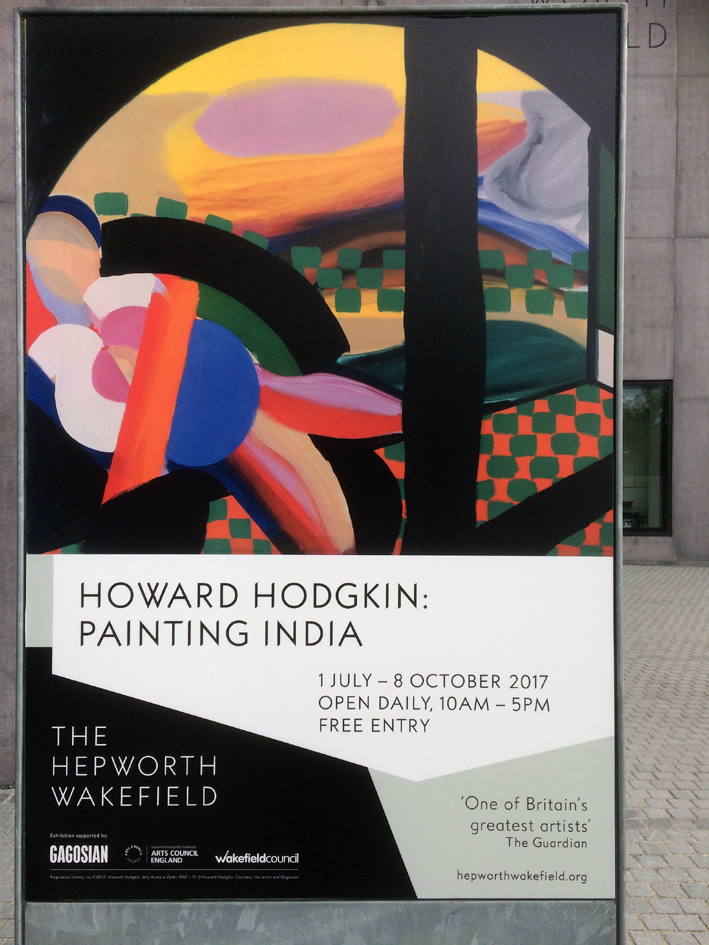
Poster for Howard Hodgkin: Painting India
Howard Hodgkin: Painting India is at the Hepworth, Wakefield, 1 July – 8 October 2017
http://www.hepworthwakefield.org/howard-hodgkin-painting-india/
We shall be rewarded, albeit poignantly, with no less than three exhibitions of Howard Hodgkin’s work in 2017. The NPG show, ‘Absent Friends’, has been and gone; ‘Painting India’ is currently on view in Wakefield; and the Victoria Art Gallery in Bath opens in mid-October with a display of works on paper, including prints.
For Hodgkin, Fate’s proverbial bus of arrival of events certainly came along this year. The first event, sadly, was the ultimate departure as we all mourned the artist’s death in March. Significant media coverage provided a fitting range of positive reviews of his career and of his achievements as a painter of emotions, with imagery often dominated by the impact of colour, permeating all commentary. The sometimes acerbic, but on this occasion generous Jonathan Jones in the Guardian proclaimed Hodgkin as “the finest colourist in painting since Mark Rothko”.
Utter nonsense, of course, but the attraction of Hodgkinesque colour usage has some credence, as combined with notions of colour as something powerful in and of itself there is an indefinable emotive appeal. Characterised by expressionistic painting gestures, the oil medium is applied in a way that becomes visually seductive and affective – though what those emotions are for the observer cannot replicate whatever they were for Hodgkin. Is ‘emotive’ the correct term to use here? ‘Emotional appeal’ sounds like a cop-out term for inadequate communicative terminology, but I am struggling to define and defend these clichéd words in relation to Hodgkin’s work. Best look at the paintings.
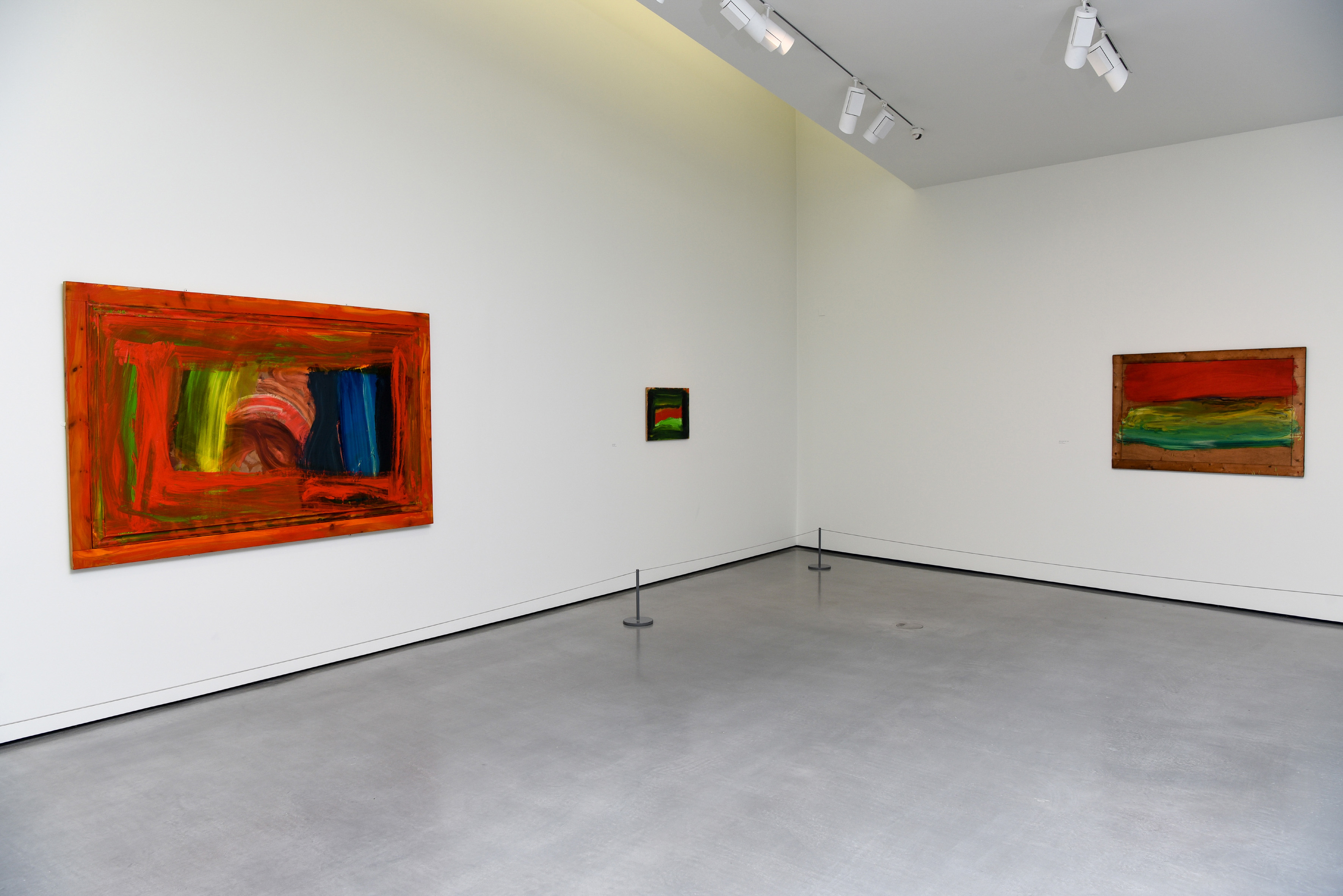
At The Hepworth Wakefield a selection of paintings from a period of 50 years of almost annual visits to India by Hodgkin are on display. Walking up the stairs to the main galleries a hand-knotted Persian yarn wall hanging (appropriately entitled, ‘Rug’) is displayed, but this medium does not prepare the visitor for how oil paint can deliver colour – so physically and so embedded in the materiality of paint.
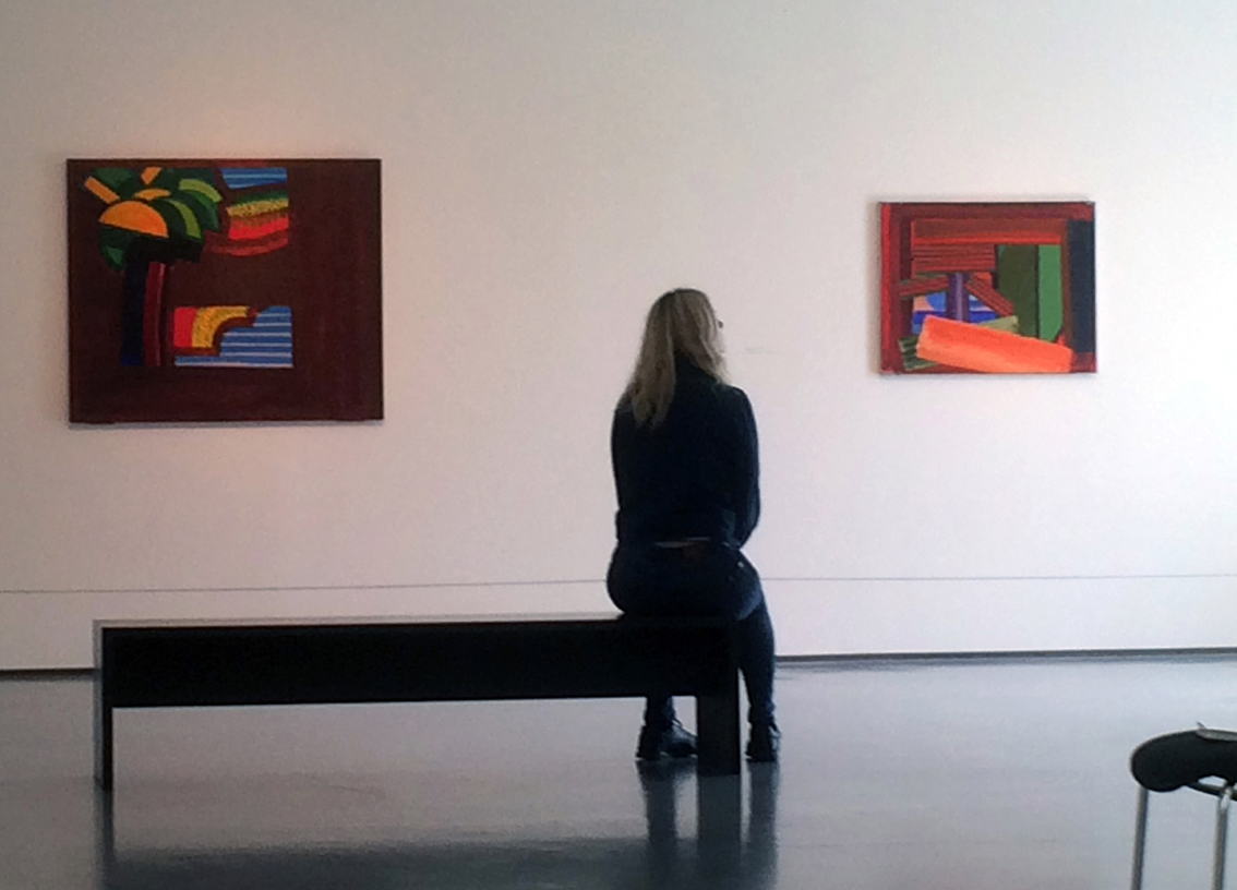
Installation view
An entrance space/vestibule, containing three Indian miniatures from Hodgkin’s personal collection, a short video of the artist in conversation, a gouache design for a mural for the British Council HQ in New Delhi is not entirely successfully (it seems inadequate and piecemeal, leaving me wanting much more – or less – of such material). There is also a display cabinet containing a few photographs, a typed Bruce Chatwin article, a magazine and two of Hodgkin’s notebooks. Given a bigger venue it would be interesting to read more of this material in a space (or book) of its own – but it’s the paintings that bring us here.
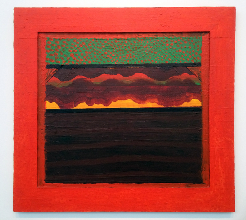
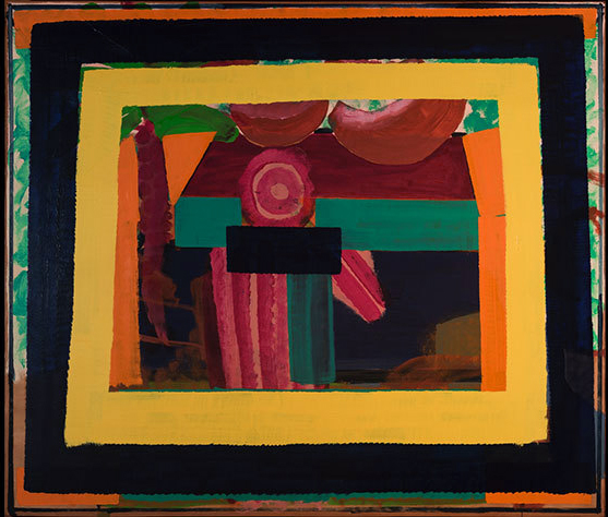
“Bombay Sunset”, 1972-3
The 37 works (including a triptych) displayed in five rooms are displayed with ample space between them, as Hodgkin typically insisted upon, and some readers may recall the Whitechapel show of 1985 (two paintings – ‘In A Hot Country’ [1979-82] and ‘Bombay Sunset’ [1972-73] reappear here). The exhibition is a very comfortable size, neither too large nor too small, and a quick recce around the five main rooms to get an overall feel for the show is easily managed.
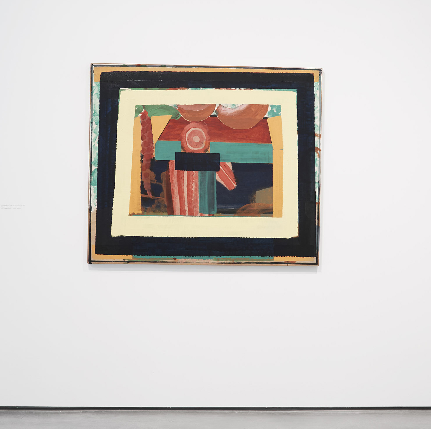
“The House of Bhupen Khakhar”, 1975-6
In fact, over two visits in three days this was my modus operandi in looking at and taking in the exhibition. The sequential trawl from picture to picture in the arranged order (more or less chronological) was briefly attempted, but whether it was the ample space to roam about in or the influence of the architecture I am not sure. Perhaps it was the inherent nature of the works, where one could pop in and out of paintings as if visiting a marketplace before the crowds arrived. On one such foray, ‘The House of Bhupen Khakhar’ [1975-6] in Room 2 was almost avoided, but I was drawn in nevertheless. Viewing distance is crucial. From 3 metres I almost dismiss it. Initially, this painting felt piecemeal and dismembered – and I wrote “speculative’ in my notebook. Then, close-up – 1.5m away seemed about right – it fused together. The disparate shapes locked in. Habitually attempting to read the painting figuratively, a tabletop viewed from above came to mind. (Measuring about 1.2 x 1.45m this made some sense.) Then I thought of a still-life arrangement as the various shapes cluttered up the pictorial space. Around this patchwork of colour-shapes the dominating framework of a dark blue and a lemon yellow band established the framed, window-like image onto the gallery wall. The figurative ‘reading’ started to diminish.
“The House of Bhupen Khakhar”, 1975-6
Then, like a kind of anchor point, a blue, brick-shaped, rectangle in the centre of the painting floats forward, pushing three green rectangles aside. Above and behind the blue shape are several thinly applied red areas on a yellow/orange ground. There are six vertical, straight and wavy edged brush marks, plus two diagonals to the right and two concentric rings. This geometric reading momentarily moves towards the abstract, until the perspectival, receding plane of a slightly darker red area above, imposed on a flat orange plane, suggested a tabletop within the painting. On this implied domestic surface sit two brown/pink segmented melon-shaped forms – although they appear to float away from the actual surface of the wood support until the lemon-yellow frame pins them down. Looking at this painting in the catalogue later on, the reds I noticed first crudely represent a figure at the table. The blue ‘brick’ might be the back of a chair – or just a blue rectangle. The same blue on either side of this figure now reads as shadow under the supposed table. Two of the three green rectangles that I sensed as displaced by the central arrangement of reds now read as the table edge. The strong green takes on a double-identity as the inherent power of the colour-shape also denies a figurative reading and becomes detached from identification. Hence the importance of the term ‘speculative’ – which may well describe this middle-period of Hodgkin’s work. (A photograph in the catalogue shows that the table of my imagination might be the raised floor in Khakhar’s studio and the green rectangle a supporting column in this space.)
Installation picture By Darren O’Brien/Guzelian
Was Hodgkin a figurative or an abstract painter? It hardly seems to matter – as no one could deny the balanced portrayal of the figuratively visible world or the abstract, formal qualities of, say, Matisse. Hodgkin’s painting project shifts from figuration towards abstraction (with Cubist and Hofmannesque traits?) over many years. No doubt, the debate between conceptions, and perceptions, of representation and abstraction (in non-figurative painting) will continue long into the future – and Hodgkin’s example might be central to this discussion. Add the artist’s denial of abstract intent and there may never be any resolution. But these are discussions around the paintings and are parallel to the original works (though not secondary – or we had better just shut-up).

“Autumn in Bombay”, 2010-14.
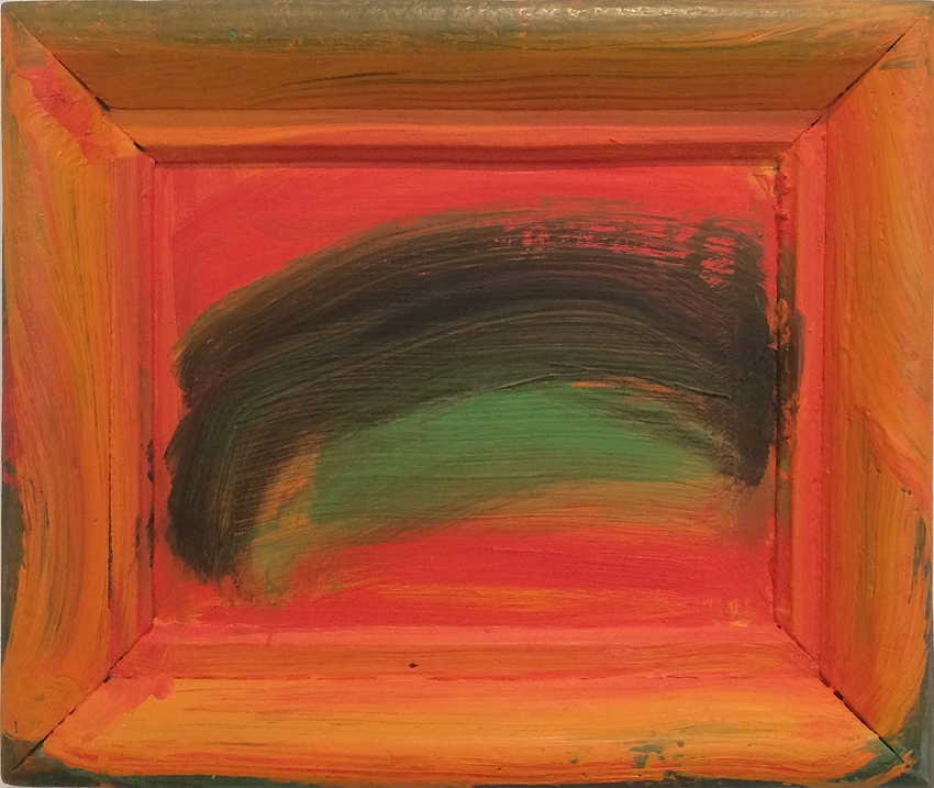
To buck the trend in Hodgkin appreciation, it might be an idea to forget the paintings’ titles and the artist’s references to ‘memories’ so that the images are seen more clearly for what they are as paintings. A healthily broad view of abstract art generally predominates on Abcrit and so any doubts about reporting on the ‘Painting India’ show in Wakefield had already been assuaged by reading Richard Ward’s review of Hodgkin’s exhibition at the NPG earlier this year. Ward quickly pointed out Hodgkin’s skill in using colour and moved, appropriately, on to space and framing. In viewing, ‘Painting India’ I had this same sense of spatial concerns dictating attention in the work – despite expecting a veritable colour-fest. Not that the colour was unimportant – the sophisticated and skilful fusion of colour, shape and positioning is (arguably) incontestable. (There is crudity at times, such as when HH gets carried away with too much red – see ‘Indian Summer’ [2010-14].)
“Small Indian Sky”, 1990
Colour is important but not absolute in Hodgkin’s work. The visual impact after the colour has hooked you in seems to be materially based on brush marks aligned with the push and pull of implied spatial constructs. The shapes of colour, typically translucent or solid over dried backgrounds, or formed of intermixing pigments as one wet area is brushed into another, are drawn by the use of broad, quickly executed brushstrokes – and I’m not so sure that this corresponds with Patrick Heron’s demand for brushwork that is spatial in a context of abstraction that does not allow any allusion to an external source. For this emphasis on the drawn/painted-shape see for example, ‘Small Indian Sky’ [1990]. The two greens at the centre of the rectangle contrast (typically) with the surrounding red/orange framing devise. In reproduction the larger, darker, swathe of green looks almost incidental, despite being centred and proportionately large within the composition. Yet, in the flesh every part was integrated and in the gallery-viewing situation the experience told me that that this is a beautiful painting: it’s perfect in its imperfections. Which is just so corny and clichéd – but that’s my reaction. I shouldn’t care about the title either – and if Hodgkin was recalling a sunset over a green vista; or a dark cloud set against the dawn sky I still don’t care. But I may have to because it’s someone’s memory of a place and an event – and like all of you abstract painters (and sculptors) who might be reading this – you will have witnessed similar views and the ‘real world’ of perception could worm its way into your own work, however surreptitiously.

“Indian Veg”, 2013-14, picture By Darren O’Brien/Guzelian
Or was the greater occasion getting to me? The added ingredient for visitors to this, and the aforementioned exhibitions from this year, will be one of a sense of mourning. Which is really bad timing. The experience of looking is, undoubtedly, affected by previous knowledge, and physical and emotional contexts – or some little bit of information. Think of John Berger’s example in ‘Ways of Seeing’ when a b/w reproduction of Van Gogh’s ‘Wheatfield with Crows’ is repeated on the following page with the declaration that this was his last painting before committing suicide. The emotional hit is undeniable and presents a lesson in warning of often-unavoidable contingencies and preconceptions that the viewer (or a text) brings to the experience of looking at a work of art (though this was not Berger’s only point – as observers we do not necessarily ‘see’ what the painter wanted us to perceive).
Emotion can cloud vision – but in the right context does not distort. Curatorially straightforward, but effective nonetheless, was the display of wall mounted information in the final room which included this verse from the Stevie Smith poem, ‘Mr Over’:
“Mr Over is dead
He died fighting and true
And on his tombstone they wrote
Over to you”
There’s another emotional hit.

“Over To You”, 2015-17
Looking again at the painting, ‘Over To You’ [2015-17], one of Hodgkin’s final works, it’s difficult not to be affected. Superficially, the composition consists of little more than a smear of red on green. The red is pink in some areas; then I notice white paint underneath the red brush mark – more of a wipe in fact as by this stage Hodgkin was painting from a wheelchair and used long handled brushes. The white does not appear to mix, wet into wet, with the green background and so was not executed in one fervent session as it might appear. Getting a little more technical now, close observation reveals another coloured ground beneath the green. By the end of a long career, Hodgkin’s work is deceptively simple in appearance. But this process is calm and measured; the wood panels are worked on all in good time and thought about carefully – not knocked out in a hurry. Even the simplest paintings need time to ponder for the observer – most probably over a lifetime.

“Over To You”, 2015-17
Looking up Stevie Smith on the Poetry Foundation website, the poet David Smith is quoted:
“…not only does she belong to no ‘school’ – whether real or invented as they usually are – but her work is so completely different from anyone else’s that it is all but impossible to discuss her poems in relation to those of her contemporaries.”
The same might be said of Howard Hodgkin.

“Heat”, 2003
“Tea with Mrs Parikh (second version)”, 1974-77
“Summer Rain”, 2012-13
“Now”, 2015-16

“Mrs Sheth on the Terrace”, 1970-72

Installation of “Indian Veg”, 2013-14

Wall text

I wonder, can we have a conversation about Hodgkin on Abcrit? Richard’s essay in May on the “Portraits” got no comments. Here is a second chance.
He seems to divide opinion. Geoff obviously thinks highly of him. I don’t like his work on the whole, except for a few of the obviously figurative early ones, but it’s hard to say exactly why. I see him as a painter of tasteful high-end wall-objects with lots of nice colours, but the work doesn’t open up to me. I think a lot of them are very banal. A painted frame on a frame around a few deft swathes of colour is not my idea of visual excitement. But I don’t think, ignoring what he says, that the ends results are very different from the end results of a lot of people who call themselves abstract painters.
And then there is the colour. He may be a great colourist according to some (many!), but that just proves to me that colour is not enough. Yet still I don’t quite understand my own resistance to the work, and I’d like to.
Over to the painters…
LikeLike
I’m not so sure that he is a great colourist. If he was then he wouldn’t rely so heavily on other devices to consolidate the visual impact of his work. What would these be without the frames, or the linear frames he paints in the absence of a literal one? A nice complimentary or two, often red and green, or the black lines in “Mrs Sheth on the Terrace” that prevent the colours from actually testing themselves against each other. It is possible that a lack of ambition in the colour accounts for the frames, and the frames make up for the lack of excitement offered by the colour.
This is going to sound like an illegitimate criticism for this day and age, but is the problem with Hodgkin the fact that it all looks so easy? I can see all the steps and feel that I could make one in my sleep. I would not say that of just any painter whose work benefits from the deployment of only a few elements. I would not say it of Rothko or Newman. Hodgkin, and indeed a lot of contemporary abstraction, has a very quaint, hand made and accessible look that I think is very easy to replicate. That doesn’t automatically exclude it from the possibility of looking good, and many Hodgkin paintings probably do, but it does mean that they are likely to unravel rather quickly.
LikeLiked by 1 person
I agree with the Harry’s “looks too easy”, and would explain it in terms of conventions either ignored or dealt with in an undemanding way.
Hodgkin’s framing device removes the formal pressure on surface, space and edges in his paintings. This leaves very few critical (and therefore meaningful/non arbitrary) decisions to be made apart from those concerning colour harmony.
I think this is why the colour “speaks” to us, but rather superficially – sorely missing any other dimensions which would add complexity and nuance.
“Over to you” is a case in point.
This small fragment of Stevie Smith’s poem is constrained (at the least) by rhythm, rhyming, grammar, concision, the conventional senses of the words used and coherent narrative. No part of it is inessential or arbitrary.
Even without the rest of the poem it conveys a wry religiosity combined with an amused but well-wishing respect for the deceased – the picture of a whole community and Mr Over’s place in it.
And this has nothing to do with the specificity of language – belief, doubt, respect, amusement are nowhere mentioned but all come across.
It is hard to find this complexity and power of evocation in any of Hodgkin’s work.
Hodgkin´s own overriding constraint/convention is that the painting should reflect his own feelings connected with a very specific situation.
There are philosophical problems with any talk of the correct recall of subjective experience, but leaving these aside, Hodgkin´s approach excludes discovery because he is looking for something which for him is already fixed.
This doesn´t have to be a bad thing, but the artist who discovers a rightness/significance/import emerging in their own work does so as an observer and is thus in the same situation as other observers of the work. It seems to me that this “being a stranger” to one´s own work increases the chances of making something that can also have rightness/significance/import for someone else.
LikeLike
I would like to join in with this conversation after a few more comments. More HH images here: https://howard-hodgkin.com/gallery/paintings
LikeLike
Hodgkin began as an old-fashioned semi-figurative maker of cabinet pictures in the school of Omega Workshops, (and essentially this is where he remains), turning the borderline Abstraction of Matisse in The Moroccans and Interior with Aubergines into coyly self-conscious mannerist arcs with blank circles for faces and eyes. He borrowed many devices from these two pictures.
Realising how out of step all this was with the fashions of the 60’s, he tilted the style in the direction of pop-art, with gaudy neo-geo colours, and as a result was included in such shows as London-The New Scene, a British Council collaboration with Minneapolis. But embarrassed by being thought part of a scene, whilst wanting to have it both ways,he claimed to be Sui genesis, neither pop-figurative nor abstract.
The pop artists all made sly ironic references to the geometry of abstract art, parodying the work of those committed to “serious” Abstraction, and Hodgkin did likewise. Gradually he began to imitate and appropriate more of the sorts of brush strokes and formal arrangements used by abstractionists, (as Francis Bacon had done before him), but equivocated, turning them to figurative ends, encouraging viewers to “see in” (Richard Wollheim) to some ill defined interior. Hence the framing devices which, like the surround to a TV screen, encourage a view into some event within. This is precisely what Abstraction does not encourage.
Of course the literati love all this, because it gives scope for them to “imagine” a peep show into hints of some lubricious life-style, which Hodgkin was only too happy to play up, with talk of “bodily fluids” and the like.
Take Mrs Sheth on the Terrace as paradigmatic: An interior view is proposed at the outset by the framing device. The black swathe at left recedes like a tarmacced road into fictive depth, while the blue shape next to it twists the space upwards. The Orange/yellow/red banding overlaps the road and is enclosed by black lines which draw it up to the surface — similarly the shaded pale green area recedes in a way that contradicts the black road, but is pulled up short by the black lines enclosing it.
Then moving in from the right edge is an orange triangular plane bounded by black lines receding in yet another direction, it’s implied movement curtailed as the black line knocks against the top of the panel, and the gap between these planes implied by the green and orange is fudged over with a brown arc. Finally, or firstly, an orange/brown “stick”, shaded in 3D breaks into the image, throwing everything else behind it.
This sort of fudged melange of directions is characteristic of many of the ostensibly simpler and more “abstract” pictures. And the worst of it is that Hodgkin is aware of these deficiencies, and plays upon the viewer’s longing for the reassuring presence of a naturalistically illustrated space.
Let’s face it — it is true that Hodgkin is no abstractionist. He sits painfully on the fence — a half way house indeed, and one that is painful for an abstractionist to behold.
LikeLiked by 1 person
Over to you, Geoff.
LikeLiked by 1 person
Can’t really say much after Alan Gouk’s appraisal (above), he seems to have encapsulated Howard Hodgkin’s working life as a painter.
When I first saw HH’s work I found it compelling mainly because of the rich intense colour and the succulent quality of the application of paint. It had an instant accessibility with its designed, graphic yet gestural passages of blobs and blocks of colour.
I felt that he was trying to express something deep and powerful with a kind of perverse yet effective, up to a point, simplicity.
However, as I have seen more of his painting and print works over the years I am left wanting more visible depth ( i.e. more complex content) and less formulaic mark making. He spent many years on certain pieces, yet it doesn’t seem to show. There is a strange mix of initial excitement followed by a kind of emptiness.
LikeLike
I agree with what Alan says, and the demolition of Mrs. Sheth is useful, albeit an early work.
But is it not true that:
a) The “framing devices” and horizontal “swathes” of paint Hodgkin uses in the later work, regardless of the fact they are not of his own origination, are sometimes indistinguishable from the devices of a thousand abstract painters, based as they are upon the repetition of the stretcher’s rectangle within the work.
b) The evocation of some figurative associations, landscape in particular, is reckoned (though I’m not sure I agree) almost impossible to remove totally from abstract painting. I think I’m right in saying this is Alan’s position.
c) There seems to be a strong-ish consensus that we can only ever read spatiality in painting as figurative. Space is space.
LikeLike
Space is space, sure, but is it necessarily figurative? Is it not just the condition of painting? No matter what one does, we will always read a space into a painting, even a blank one if we are asked to consider it as a work of art. Just as music has to exist in time, so painting has to exist in space. The question is, how sophisticated can that space be? How unexpected? How unfamiliar?
In a Vermeer say, or a de Hooch, the architectures of the depicted interior are so particular that the space of the room is articulated to a point that you could almost breathe the air within it. We recognise the space because the things that define it are familiar to us (though how it is achieved remains wondrous!). Hodgkin reaches a similar kind of familiarity, but of a stripped down, crude and exploitative nature that is accessible but obvious and underwhelming.
The important thing is to not settle for being semi-abstract, and for now at least, judge the merits of the space that emerges based on the particularities of the elements that define it.
LikeLike
I agree space is the condition of painting. Well then, to do with the specificness of the space? Or maybe the fact that the space is imaginatively arrived at and inventively “shaped”? Do these make it more abstract?
It seems to me there is a redundancy in Hodgkin – that the space is not very inventive at all. But that still doesn’t single him out particularly.
LikeLike
Actually, inventively “shaped” space is as much a property of good figurative painting.
LikeLike
I think that the term “space” is used pretty imprecisely in these discussions – for example, in asking whether space is or isn’t “figurative.” Getting back to basics, a painting is “spatial” because it is an object existing in the world; it has dimensions, width, height and at least virtual depth (although it’s usually seen as surface). A person also exists in space because we are embodied; we exist in the space that contains objects, including paintings, that we see, handle, avoid, approach, touch, etc. Traditionally, paintings have tried (and succeeded) in suspending their own objecthood by depicting human space – that is, by creating the aesthetic illusion that we might actually enter the deep space depicted in the painting, approaching the figures or objects depicted. An abstract painting doesn’t purport to create the illusion of human space, and if it does, it’s not really abstract (e.g., Kandinsky’s later work); therefore, it runs the risk of being experienced as a mere object, like a bad figurative painting. A successful abstract painting must still suspend its own objecthood, but without depicting the kind of space that contains (and thus implies) real or imagined objects; therefore, it must create a different kind of illusive space, one that we do not imagine physically entering, but nonetheless experience as real, not necessarily as objects are real but as the world itself is real because it’s there (i.e., here). (For example, Morris Louis’s veil pictures seem to open a space that looms out in front of the picture’s surface, threatening to envelope the viewer, while the unfurleds have something like the opposite effect.)
LikeLike
Carl-
If a space can threaten to envelop me then surely I can imagine physically entering it.
It´s difficult to visualise any kind of deep space that could not imaginitively also contain objects – maybe some sort of dynamic, shifting space, or a shallow plasticity that is already filled by the elements that establish it in the first place (Alan´s “fulgent or fuliginously inscribed flatness”)?
In what sense is a space that could not possibly contain an object still a “space”? Why should we perceive it as “space”?
And is art just about producing some kind of “hereness”/”amness” in the observer?
I think it is at least as plausible that it is an attempt to objectify elements of subjective experience, suggesting or communicating structures that help us come to terms with the chaos of sentience. The latter would still provide arguments for abstraction, but without the pressure of finding ever new effects or unprecedented varieties of something we might want to call space.
LikeLike
How many times do I have to repeat —- colour makes space out of its fulgent or fuliginously inscribed flatness, through the reciprocal pressure of colour acting on colour. Some colours recede momentarily, and then advance again in mutual interdependence, since, and if, they are organised at the surface of the picture. It is this organising at the surface that makes a picture, an abstract picture, a created independent object, a work of plastic art, independent that is from depiction, or the suggestion of depiction. Can colour make space without at the same time representing that space as occupied by objects or bodies.? This is the question posed by Rothko and Heron, and answered in the affirmative. Hodgkin fails on all counts because he is so anxious to hold onto hints of figurative reading for his audience. He should be compared with Patrick Caulfield, not Rothko. –“The finest colourist since Rothko”. ?
When Hodgkin occasionally comes close to Abstraction ( google insists on the capital), it is always in his slightest works, like Heat and Autumn in Bombay, minimal pictures, wafted in with self admiring, self satisfied slicks. Anything more than that is beyond him.
But this does not mean that abstract paintings have NO referential qualities. But they do so obliquely, within the limits of the organisational terms set out above. Colours and colour relationships, in so far as they create light, do refer to phenomena of the natural world, like it or not, not necessarily landscape, and to suppress this fact by trying to create non-referential colour, is to reduce painting’s expressive powers, on the road to an arid Abstraction — Malevich, Ad Reinhardt, Stella’s black paintings — I’d suggest that the word Abstraction be replaced by non- representational sensuous embodiment.
LikeLike
But all of this can only be demonstrated by direct comparison of the contending paintings, and Hodgkin negotiated a position for himself that meant that his work was never compared directly with any abstract painter. So the hard tests were never engaged, the wheedling self regard went on unquestioned, which left the novelists, incompetent critics and curators free rein to rhapsodise on whatever they thought they saw.
LikeLike
I know it’s tiresome to have to explain everything again, but… you have rather skidded over the question of exactly how all this alliterative coloured flatness is to be organised. Not in Richter “colour-charts”, presumably. But if Rothko and his fuzzy rectangles are to be put up as paragons of non-representational sensuous embodiment and the reciprocal pressure of colour acting on colour – well, that to my mind is a very great reduction of painting’s expressive power. Rothko has a bigger ambition than Hodgkin, but that’s not hard, and it’s not enough when the painting content gets pared back and back. Rothko’s art goes nowhere.
I think you have to address the “form” in which this effing colour sensation is delivered. Being abstract doesn’t get you out of that question, so much as dump you deeper in it.
And I don’t understand this, or at least, I think it needs some further explanation: “Colours and colour relationships, in so far as they create light, do refer to phenomena of the natural world”. But there is a great deal of talk about light in abstract painting I don’t get. In fact, Hodgkin seems rather good at this trick, of delivering effects of light through colour.
As a passing thought, I can’t see any light effects, or the creation of light through colour, in John Bunker’s collages, yet they seem to me both spatial and, for the most part, abstract.
LikeLike
I was also thinking that about John’s collages, the only figurative dimension being the occasional likeness to something in the outline of the shaped form, which can easily be addressed. But he is making collage, albeit with painted elements, but is still less bound to the light emitting properties of paint. His method has other drawbacks to overcome, but the light, space, format issue that seems so relevant to the problems in Hodgkin, simply doesn’t factor in for John’s collages. Yet I still think there are lessons provided by John’s collages, for more of a paint on canvas approach to painting.
The light question isn’t actually a drawback either, but one of the things we love about painting, and we don’t want to lose it, for the reasons that Alan cites above, that arid wasteland that is Malevich and Reinhardt. We just don’t want it to be cheap and self satisfied for the sake of having it at all.
I don’t know if I would want the light generated by form to “shape the space” in abstract painting, because that sounds volumetric and figurative. But I like the sound of inventive space. The trick is to begin with colour, form, and the things in your control, and continue to question that which seems too easy or familiar. I think it is impossible to know before the fact what kind of inventive space one would want.
LikeLike
Yes, but maybe putting the sophisticated effects of light and colour in painting to the fore, and not dealing with the organisational content, is putting the cart before the horse? I rather think this is exactly what Hodgkin does. Lots of people love his work because it is not difficult to deal with, they can enjoy the colour without being bothered about serious content (which is replaced by vague allusion) and because its simplistic organisation chimes with being “modern”.
As you know, I’m a great believer in not knowing what you are doing before the fact (!), but in that case great vigilance is required to stem one’s natural lapses into simple banality. Malevich and even Reinhardt to a degree were both colourists before they got into geometric simplifications. In fact, I think very highly indeed of early Malevich.
LikeLike
I’d also question the phrase “light emitting properties of paint”. It doesn’t, does it, but it can replicate that natural effect if used in a certain way. Is that abstract? As I freely admit, I am confused about light in abstract painting.
LikeLike
I agree, and I think it was what I really meant, that the organisational content comes ahead of the effects of light and the space it communicates, “Begin with colour, form and the things in your control”. I certainly wasn’t suggesting that you were advocating any preconceptions of space, Robin. And yes we shouldn’t just go in carefree with all the regular impulses either. I’m just trying to wrap my head around this abstract space thing, which I think is a contradiction in terms, yet one that doesn’t automatically make space “figurative” either (maybe). I come back to my earlier point, that if the space is made up of things we recognise, then we recognise the space. If we don’t recognise the things and their arrangement, then does the space, whilst still presenting as a space, become unfamiliar and not figurative? Much of this hinges upon space being an unescapable condition of painting, rather than a mechanism of depiction.
This makes my brain hurt, I hope it’s worth it.
LikeLike
And yes paint does not actually give off light, but it can certainly appear to. I’ve almost felt the need to squint in front of a Claude Lorrain. Is that abstract, for paint to do that? The obvious answer is no, but these are tough questions that I don’t have the answers to.
LikeLike
If you refer back only a few days to the discussions on Gillian Ayres, you will see that the question of form and “content” are debated at some length, albeit in the context of borderline Abstraction. Don’t you ever join up the dots, or take anything in, or just go on repeating the same prejudices over and over. There are a million and more ways of relating colour and applying paint that call for all the richness that has ever been in painting, without recourse to the repertoire of trompe l’oeil craftsmanship that sustained former centuries, and was gradually rejected by Manet, Monet, Cezanne, Gauguin, Van Gogh and the rest. (brought back in re-jigged and disguised, by the analytical cubists). “The humble transmission, in terms of paint, of sensation itself” — ” The effects of sensations apprehended in their relations” is the way Roger Fry described the difference between a picture that has abstract “form”, and one that is formless. It is the coherence of these relations, the “syntax” of their reciprocal pressure that makes a painting, a convincing abstract painting. A bad abstract painting tries to eliminate the “sensation” term of the equation. Without this contact with visual sensation of the real world, Abstraction becomes arid, cerebral, depressing. How awfully depressing were those Malevichs in the Shchukin Collection in Paris.
LikeLike
More sexy sacred utterences. Surely “the effects of sensations” is exactly what Hodgkin specialises in?
LikeLike
Maybe landscape is a less vicious form of figuration because it is actually quite an abstract and spatial concept in the first place.
A landscape is a kind of space. To call something a landscape says nothing about what it might contain, apart from maybe an infinite, atmospheric element, combined with a finite more shaped and granular element. Think of desert landscapes, woodland landscapes, underwater landscapes, moon landscapes etc.
It also has a strong aesthetic
component. Farmers are more likely to talk about their fields and meadows than about their landscapes.
Could a landscape without objects already be abstract?
LikeLiked by 1 person
Never one to hold back when it came to disparaging the work of abstractionists in private, (Heron in particular), like many of the pop artists, (I well remember Peter Blake evincing distaste for Monet’s colour in the Nympheas, on TV.), Hodgkin’s assertion that “no one liked him”, no rival painter that is, is well founded, since by claiming that his tepid hot-house cameos, (anachronistic Art Deco meets the 1912 R and S Delaunay) were autobiographical, he opened the way for prurient supporters to speculate with prying eyes for suggestions of some private revelation — this the last refuge for someone who fears that his paintings will not stand on their own formal merits.
How could the likes of Robert Hughes, Susan Sontag and many another novelist and literary figure be taken in by this ploy.? Because that is not what they would countenance of a novel or poem in their finer moments. Only when it comes to painting were they prepared to unbutton and give this lapse of taste and judgement free rein, with egregious praise lavished on this minor artist. The discomfort with Abstraction in painting is the only discernible cause, and a hankering for some sentimental epiphany.
LikeLike
I find myself in the strange position of feeling obliged to defend Sir Howard Hodgkin! So, into the lion’s den…
Thankfully, the debate on Abcrit (thus far) has been reflective and thoughtful. Differences of opinion are talked/typed through as if the participants were sat around a table, perhaps after a meal that was agreeable. The wine is not yet finished and emotions are under control. The fulgent glow of the claret, aided and abetted by the atmospheric wall lighting in Robin’s Bar, creates a sensuous ambience. Fortunately no one is smoking…
Some consensus of the characteristic of space being paramount in painting (especially in Abstraction) is agreed upon. We have also recognised this in Hodgkin’s work and there are reasonable misgivings about the professed brilliance (excuse the intended pun) of his use of colour. This element of his paintings can be garish, crude and over simplistic. Did he sweat enough to get there?
The missing guest is Howard: he couldn’t make it tonight. So his work will have to suffice. Or at least our memories of it – though we have some inadequate reproductions. And we have to talk of the work itself, not the man (especially as few, if any, of us knew him). But if the work is authentic, which I believe it is, it must say something of the personality of the ‘author’ (and perhaps the implied connection with literature is not superficial). The middle-career and mature works do strike me as honest because they are liable to slip-up sometimes and the apparent boldness might hide a tentative process that could only be resolved by making those final and painterly decisions with the luxury of time spent dreaming in the studio. Did he really sit there all day and do nothing? There’s a paradox at work here – hardly the Protestant work ethic of the artist working at the coalface.
There is an idiosyncratic element to his work. The subject matter is always personal and self-centred; yet is intended to be shared openly with an audience that will participate somehow. As active observers we are not psychoanalysts, so the characteristics of the paintings are paramount over the personality of the maker. We want something from the works. Triggered by colour, form and material (paint) we can respond with joy or indifference. At Wakefield (and the NPG) I responded with the former. The visual experience was engaging and returning to see ‘Painting India’ a second time reinforced this pleasure in immersing myself in actively looking in the moment so forcefully. The titles are irrelevant (at best secondary) – and of course the memories alluded to are unrelatable to any observer. Despite the media hype over HH, which has become over sentimentalised, seeing the works first-hand provides an opportunity to engage without the distractions of received opinion.
Interestingly, I see the real world afresh after experiencing Hodgkin. Even now, some weeks later, sitting at my computer, the bundle of objects piled up at one end of the table (unopened envelopes, some coins, a sat-nav, an iPhone, a pen and a pencil), plus the speakers, the mouse, the mouse-mat, the keyboard, my hands, the iMac computer screen with its black rectangular – Hodgkinesque – surround, compose into an arrangement that could be found on the wall of a Hodgkin exhibition. The actual visible world is a kind of jumble too. Given time to move around, changing perspective and recalling old spaces seen afresh, or stepping into the same river twice but finding it changing in a constant state of flux might only be apprehended, tentatively, by philosophy (Heraclitus, Descartes…) or Art in its various forms. Perhaps Hodgkin’s literary fan-club recognise that no one art form is predominant in re-inventing lived experiences or in making new forms, stories and scenarios?
A thought: What if Hodgkin’s work were being discussed on FigCrit – the rival internet-forum?
LikeLike
Enigmatic nostalgia – http://www.christies.com/features/Howard-Hodgkin-works-offered-at-Christies-in-October-8528-3.aspx?sc_lang=en&cid=EM_EMLcontent04144A04E_1&cid=DM125603&bid=103830452
LikeLiked by 2 people