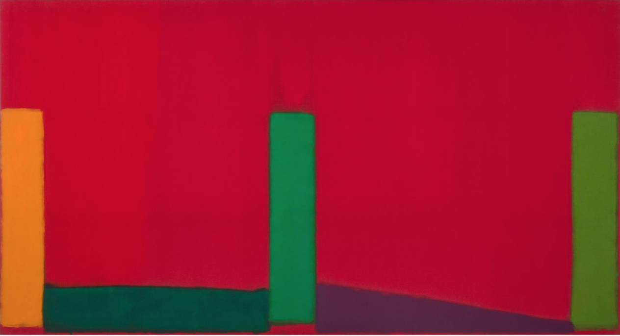
John Hoyland, “7.11.66”, 1966, acrylic on canvas, 213.4 cm x 304.8 cm. © The John Hoyland Estate. All rights reserved, DACS 2017. Photograph by Colin Mills, courtesy of Pace Gallery
John Hoyland Stain Paintings 1964-1966 is at Pace, 32 East 57th Street, New York, NY 10022, September 15 – October 21, 2017
http://www.pacegallery.com/exhibitions/12883/stain-paintings-1964-1966
John Hoyland Stain Paintings 1964-1966 is the first in-depth exhibition of the painter’s work in the United States in 25 years. Hoyland’s work is rarely seen on this side of the Atlantic and this marks only the third time I have been able to see works by the artist “in the flesh”. The first being at Flowers Gallery (NY) in the group exhibition The Independent Eye: Contemporary British Art from the Collection of Samuel and Gabrielle Lurie which featured a small number of works by Hoyland dating from the early 1980s through the early 2000s. The second was the stunning Power Stations mini retrospective in 2015 at Damien Hirst’s Newport Street Gallery in London.
In 1964, at the age of thirty, John Hoyland (1934-2011) was awarded a traveling fellowship by the Peter Stuyvesant Foundation and with it traveled to New York for the first time. There he either met or renewed acquaintances with prominent members of the New York School including Barnett Newman and Helen Frankenthaler as well as the formidable critic Clement Greenberg, and several of the painters he championed as post painterly abstractionists – Kenneth Noland, Paul Feeley and Jules Olitski. These latter three artists had a considerable affect on the works on view here.
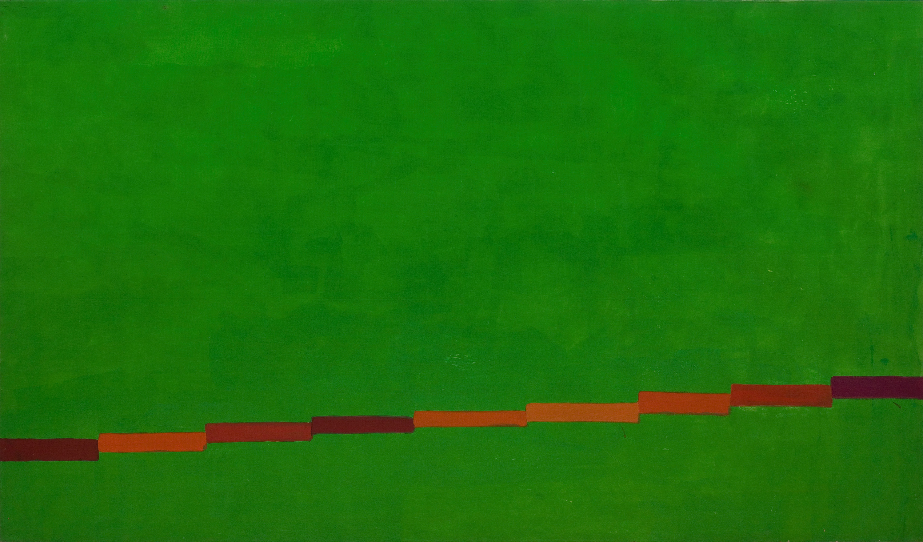
John Hoyland, “11.10.64”, 1966, acrylic on canvas, 198.1 cm x 335.3 cm.
© The John Hoyland Estate. All rights reserved, DACS 2017. Photograph by Colin Mills, courtesy of Pace Gallery
The Abstract Expressionists certainly influenced the scale of works being made in Britain with the arrival, at the Tate, of The New American Painting show in 1959. But by 1964 surely artists were becoming accustomed to seeing and making large scale work. After all by that year Bridget Riley had completed Continuum (1963), a 3-D installation/structure that measured 8.53 m long, 2.1 m high and 3.65 m in diameter. And Patrick Heron, Brett Whiteley, Michael Andrews, Gillian Ayres and Hoyland himself, among many others, were routinely making works in the 203 x 203 cm range.
However, the post painterly group heralded by Greenberg shifted Hoyland’s perspective in a couple of ways. The first was the Greenbergian idea of reduction, both in form and in abolishing the evidence of the artist’s hand. This allowed the focus to become the materials as well as the self- evident nature of the object they formed. In London, Hoyland had already come in contact with a healthy dose of formalist coolness, objecthood and non-referential color having developed friendships and artistic dialogues with sculptors like Anthony Caro and William Tucker.
The second shift was caused by the paint itself. The work that Hoyland encountered in New York was painted using Magna (first used by Noland to stain cotton canvas in his centered compositions of the 1950s) and various water soluble acrylics and gels that made intensity of color, transparencies and gradations easier to achieve in large scale work when applied with sponges and rollers as Noland did and as Hoyland later emulated.
In Hoyland, these new attitudes, energies and exciting material developments combined with an acute and serious sense of feeling for what paint was capable of and an admiration for the solemnity evidenced by the older painters, Mark Rothko and Barnett Newman, to produce the piercing color, painterly happenstance and a studied reason we find in the seven monumental stain paintings on view here.
John Hoyland, “16.8.66”, 1966, acrylic on canvas, 213.4 cm x 304.8 cm.
© The John Hoyland Estate. All rights reserved, DACS 2017. Photograph by Colin Mills, courtesy of Pace Gallery
In 16.8.66 the viewer first notices the vivid red expanse that covers most of the picture plane from the top down. This intense wash is uneven. Perhaps bits of underpainting show through the inconsistent ground helping it to pulsate and to sharply interact with the centered green bar. To the left and right of this focal point, a yellow-orange bar and a tart, yellow-green bar are forced against the edges of the canvas. Their placement takes on a double duty, providing both stability and tension. These stakes anchor the composition and jangle all at once with uneven and shimmering edges that vibrate against the red slivers of paint that barely confine them in their plane. The three bars hover slightly along the bottom border of the canvas connected by a darker forest green rectangle on the left floor and a muddied red-violet wedge on the bottom right side. These connectors also destabilize – particularly as the light green bar on the right balances precariously on the wedge’s thinner point. The colors and their opacity or lack of it are of tremendous importance here. The red-violet, dark green and yellow-orange are a calming tertiary triad while the hot red interacts with the lighter greens causing a jolt. Nothing in this work is sure. Just when the red envelops the smaller forms- seeping into their nooks and suspending them like insects in amber, the next glance sees that they are violently rejected. And they never seem to fit quite as securely into their niches when they are drawn back in.
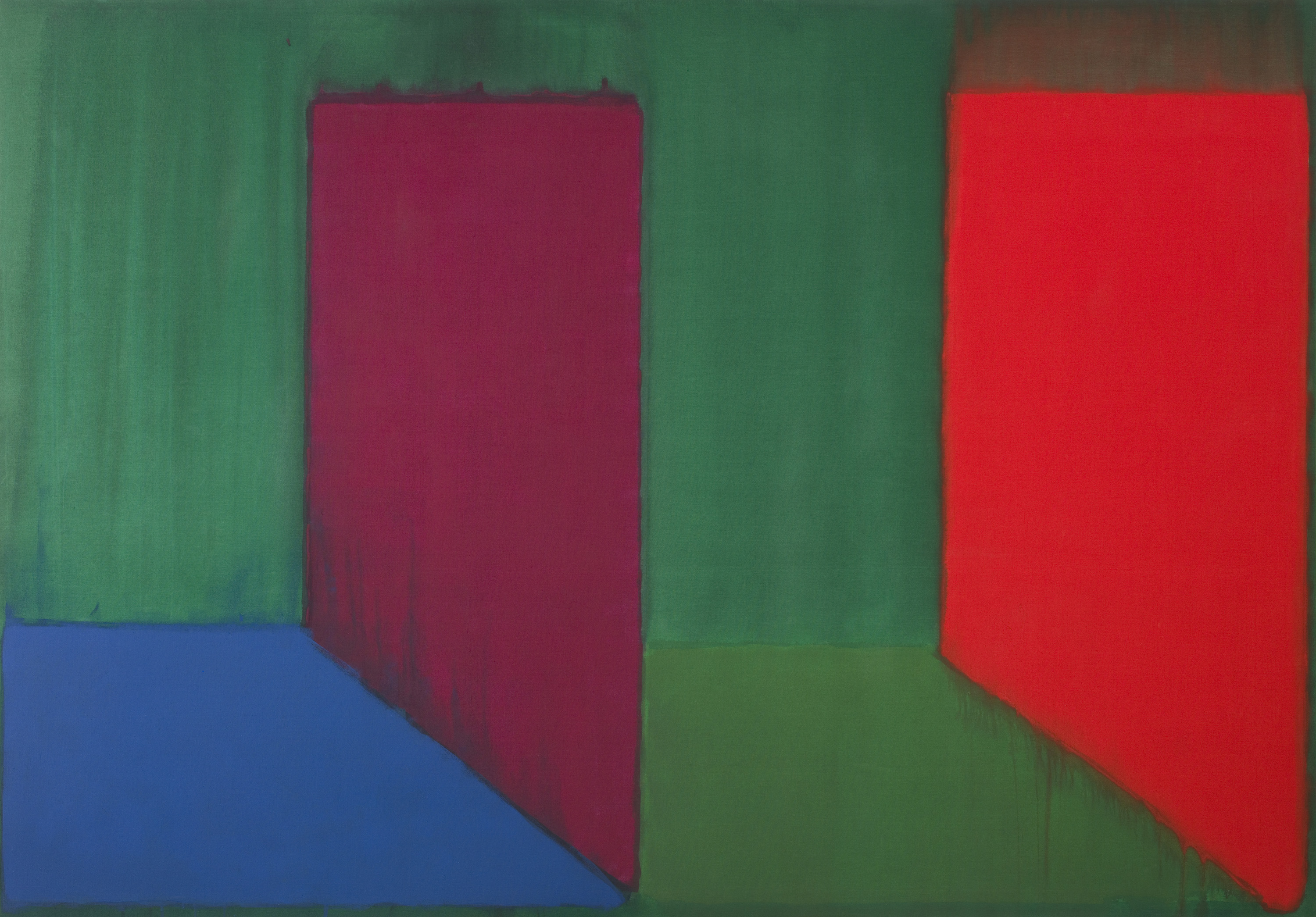
7.11.66 [top picture] offers us a more comforting depiction of three-dimensional space and traditional perspective but even here assumptions prove groundless. This large canvas is divided into equal parts- what can be seen as a cobalt floor, rolled over dark green, supporting a rusty wall form on the left side and a solid grass green base holding up an inverted orange wedge, with a red wash drug over its surface leaving a residual ghost trail along the top, to the right. These forms/scenes sit like a zipper’s teeth between clamping rectangles of a hastily applied green wash that interacts and alters every edge it touches. Our three-dimensional touchstones are flattened, turning natural cubed spaces into mitered, jointed wedges shoved against the painting’s surface.
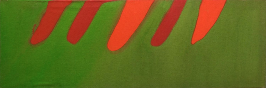
John Hoyland, untitled, c. 1965, 61.43 x 182 cm, acrylic on canvas, © The John Hoyland Estate. All rights reserved, DACS 2017. Photograph by Colin Mills, courtesy of Pace Gallery
The smallest work included in the show seems like a cut away remnant compared to the other monumental and intricately arranged compositions. I have read that Hoyland was familiar with Pollock’s tendency to paint on large pieces of canvas and crop out the best parts for final compositions, but that he mostly eschewed this tactic in favor of Barnett Newman’s cropping is photography dictum. In any event, Untitled, c. 1965 (61.43 x 182 cm) is definitely the odd one out in this group. The composition is simple and has no visual intricacy. Hoyland assigns its forms, more than any other piece in the show, to familiar figure ground roles. Five thin lozenge forms jut down from the long top edge, warm reds, oranges and combinations of the two colors, are set against an evenly stained lime green background.
Even 11.10.64, a large, uncomplicated work completed the previous year, provides depth and visual interest by juxtaposing the opposites: thick/thin, fast/slow, light/dark and by staggering the small bars that run along the bottom of the piece at a slight incline. The way Hoyland is able to hold the viewer’s interest in this larger piece seems to confirm that Untitled as an experimental after thought.
7.65 (304.8 x 214.63 cm) fits neatly onto its allotted wall at the end of a more narrow and rectangular space in the gallery, making it seem like a destination as the viewer approaches. A tight grouping of thin and thick rectangles in solid contrasting colors join to form an L shape down the left side and skim along the canvas’ bottom edge to stop abruptly an inch from the lower right border. Drips and spatters from the lower segments of color cement the relationship to the lower edge and restate its importance to the composition. Several of the trapezoidal links in the bordering frame allude to a linear perspective that leads either to infinity or hits a wall depending on the opacity or transparency of the thinly applied, high key green ground. This is another formidable but simple composition given subtle spark and complexity by adroit, painterly variations.
John Hoyland’s reputation as a painter’s painter and manipulator of abstracted space was made with these works and the thoughtful, cunning and intuitive way that he applied paint and composed forms. The painter’s love of his materials and tools of the trade and his respect for, and belief in, what non objective painting can impart are very much present and felt in these early works of great ambition and restraint.

John Hoyland, “20.4.66”, 1966, acrylic on canvas, 229.5 cm x 304.8 cm.
© The John Hoyland Estate. All rights reserved, DACS 2017. Photograph by Colin Mills, courtesy of Pace Gallery
Some links to further reading:

It would be interesting to hear about the reaction to this Hoyland show from the wider community of contemporary painters in New York – maybe the critics too?
LikeLike
see the further reading links at the bottom of the article….
LikeLiked by 1 person
There has been some great coverage of the show which is great since a lot of painters I talk to over here were unfamiliar with his work. Robin put some links to other reactions under the review.
LikeLike
Have you heard of Patrick Heron across the pond?!
LikeLike
Of course.
LikeLike
I mention him briefly in the review.
LikeLiked by 1 person
I was being provocative (sorry)!
LikeLiked by 1 person
It is interesting though – I think for the most part painters over here aren’t familiar with British painting , particularly abstraction from the 60’s – It’s a great shame.
LikeLike
What is “Barnett Newman’s cropping is photography dictum”?
LikeLike
It refers to the way some of the ab-ex artists used to paint on unstretched canvas then crop a composition from the larger cloth – Newman was being provocative and saw that as cheating a bit I guess –
LikeLike
A technique suitable for photographers in the darkroom not painters.
LikeLike
Paul, you should perhaps explain why cropping is not suitable for painters.
LikeLike
As a bit of an aside on this matter (re: cropping – which might be contentious for some), I am reminded of that procedure by which the painter as viewer will create a viewfinder with their fingers to isolate an area within a composition to decide whether it ‘works’ or not. Or the related way of adjusting ‘looking’ with one eye closed. The subsequent viewers will do this too.
LikeLiked by 1 person
I don’t mean to speak for Paul, but I read this passage as not necessarily endorsing Newman’s position by saying flat-out that cropping is not suitable for painters, but rather reporting the procedural and ideological debates, or maybe options, that were in the air when Hoyland worked.
Here is the passage from Newman I recalled off hand; maybe there are others: “The issue is one of scale, and scale is a felt thing. It is not something you can build or develop by relating parts of a painting or deciding after the fact how much of the painting is the painting.” Selected Writings and Interviews, p 272.
When I first read “deciding after the fact how much of the painting is the painting,” I thought of the scene in the film Painters Painting, when Larry Poons directs an assistant with a tape measure or something to crop a large poured canvas. (The two painters were very friendly I believe.)
It seems that this cropping is one way to circumvent the relational juggling that Frank Stella also found so dispiriting (the relation of parts), but Newman rejected cropping too and insisted that one, or that he at least, had to achieve this sense of totality through composition, not through any pre-given system. The above passage was from 1966.
As he also said about Rauschenberg’s White Paintings: “Emptiness is not that easy. The point is to produce it with paint.” And while the white paintings were painted, they were not composed.
Lygia Clark wrote about a “full-emptiness,” and that (from my screen admittedly) is the marvelous feeling I get from the Hoylands.
LikeLiked by 2 people
Exactly. Thanks, Vic.
LikeLike
“Full-emptiness” sound fascinating. It seems important to you. What does it mean?
LikeLike
I asked Paul the question as it relates to an interesting debate around the importance, or not, of process in any evaluation/judgement of a finished painting.
LikeLike
I evaluate the work mentioned by what is in front of me on the wall compared with the other work in the show. By mentioning the cropping ( and I’m just guessing by what I see) I’m only offering an opinion. I wasn’t there when Hoyland made the painting.
I have no opinion on the use of cropping by a painter- and it’s not really that interesting to me- just providing context for what I Isaw and surmised.
LikeLiked by 1 person
As far as the reception of a painting involves the perception (conscious or unconscious) of decisions made by the artist, cropping removes or at least distorts the context of most of the decisions, rendering them “unreadable” or at least falsifying their reading to a greater or lesser extent. The only clearly visible decision is that of the final cropping – “this, for me, is a painting”.
This isn´t just a matter of process. I think it´s rather likely to affect the felt integrity of what´s there on the wall, and therefore its feeling of rightness / power of conviction.
If Larry Poons was throwing paint in that film scene, then maybe the cropping didn´t obscure any/many foregoing decisions, which would make it less of an issue.
LikeLike
We might not necessarily know for sure that a work was cropped or not. Should we care? is an interesting question.
Why?
I think cropping is an example of how people can put a value on part of an artist’s process on to their judgement of the actual work, which then in a sense can predetermine the quality of the work, gets in the way of judgement: i.e. cropping equals lack of “rightness /power of conviction.”
I stopped using cropping in my work four or five years ago because it didn’t feel ambitous, does in fact feel a bit like cheating, and has a relationship to photography. It doesn’t feel as ‘creative’, in fact feels reductionistic.
That said I think that you could end up with an excellent work that have been cropped, or that has involved cropping as a fundamental part of the process.
Cropping can also help with developing our own eye for what a succesful work can be (see Geoff’s comment).
LikeLiked by 1 person
I don’t think that Tintoretto cropped.
LikeLike
“It seems that this cropping is one way to circumvent the relational juggling that Frank Stella also found so dispiriting (the relation of parts), but Newman rejected cropping too and insisted that one, or that he at least, had to achieve this sense of totality through composition, not through any pre-given system.”
A photograph is necessarily cropped because what we see in a photograph is always, in principle, the world itself in all of its breadth and expanse. You can always ask what lies beyond the edges of a photograph because what is within is continuous with what is without. The physical limits of a photograph are the result of the physical constraints of the camera, which pre-determine the extent of the view it will accept. The limits of that view reflect or replicate the limits of the eye itself considered as a bodily organ – unlike some spiders (for example), we cannot have a 360-degree view from any particular bodily position. In this sense, cropping is built into the medium of photography.
The question of what lies beyond the frame of a painting makes no sense because the world of a painting is not continuous with the world beyond its edges; the frame is the limit of the world in a painting. I think that the intuition behind Newman’s remark about cropping was a sense that the discontinuity between painting and world was about to erode, and once that happened, the art of painting would end. But painting did not end; instead, it figured out how to acknowledge the fact that paintings have shapes (rather than frames), and when that happened, the issue of cropping came to the forefront. (Noland’s chevrons and stripes feel cropped because the painted vectors virtually extend beyond the edges of the picture.) A container gives shape to what it contains, for example liquid in a teacup. And vice versa, content can confer artistic significance on what contains it – what Fried describes in “Shape as Form.”
LikeLike
I can’t remember exactly when I first met Hoyland, but it was certainly before his one man show at the Whitechapel. He was already friendly with Brian Robertson by then. At the opening and at his request I introduced him to Lilian Somerville, Director of the British Council Fine Arts Dept. Shortly after he was selected for the Paris Biennale in 1965, by a sub committee headed by Norbert Lynton and Jaschia Reinhardt. He had already been inviting me down to his Kingston studio to see his paintings. My wife and I went to dinner there on several occasions. He was obviously pumping me for information about the workings of the Council, and other art world gossip, but recognising that I was a painter too, he was very friendly.
So far as I am aware he painted on the stretcher, not off, and most of the painting was carried out with rectangular floor mops on long handles and rollers, onto cotton duck, using water tension breaker ( like Frankenthaler) to enable penetration of the colour into the fabric, which accounts for the haloes of bleeding around the “blocks” of colour.
When Kenneth Noland saw these 60s Hoylands he said to him — “You’re Smart to go low” — since the effect is of blocks that have settled towards the bottom of a liquid container, or as if coloured lozenges have sunk to the bottom of a beaker of acid, and are being slowly eroded at their edges. You can see from the direction of the runs that the paintings have been turned around on the stretcher.
Morris Louis’s veil paintings were a big influence at that time, and the running of paint in curtains without the evident agency of the hand of the artist , a background influence not only on these pictures but on Bert Irvin and Basil Beattie as well , on into the 70’s.
I don’t think Hoyland was aware of Hofmann at this stage, although Hofmann’s painting, The Cliff, had been in the Gulbenkian exhibition at the Tate in 1964, and an early Hoyland too. The Cliff has no “blocks”.
Patrick Heron relates that in 1959? Greenberg had taken him to Hofmann’s studio, being keen to see his reaction. Heron was not impressed. “This little old man heaving these heavy paintings around full of mechanically compounded cubist and fauvist cliches and strident sweet colours” is how he described them. Delia was equally unimpressed. So it is possible that Greenberg also showed Hoyland some Hofmanns in 1964/65. But their effect would not appear until the mid 70s.
Although Hoyland was not a Rowan Gallery artist, these 60s paintings have many resonances with the Rowan Gallery styles of simple, childlike formal arrangements, common to both the painters and sculptors associated with that Gallery, and an oblique nod to pop-art’s confectionary colours. William Tucker’s stacking of children’s toy like blocks, Phillip King’s Tra la la, Garth Evans’ floor reliefs, and Paul Huxley, Jeremy Moon and Patrick Caulfield’s neo-pop abstractions, are part of a common aesthetic at that time.
LikeLiked by 2 people
I like the Noland quote – where / where was that said? The weighting of object-like structures to the bottom of the canvas is one of the central differences between Hoyland and Noland etc (much more than thickness or thinness of paint application). It is part of his connection to the European tradition of de Stael, but also bound up with his involvement in sculpture, Tucker in the earlier sixties, then Caro. I think the Rowan connections you list are relevant but only go so far, and certainly from the mid-sixties he was aiming at a much more resonant, heroic, sublime form of expression (although arguably he never completely abandoned the cool restraint of the sixties).
Greenberg showed Hofmann paintings to Hoyland at Samuel Kootz in 1964. Hoyland lived in New York for protracted periods in the late sixties and early seventies (I don’t have the dates readily to hand) and would surely have seen more Hofmanns during that time. Piri Halasz (see link above) has some interesting remarks about his involvement in the ‘Greenbergian’ scene, which I think she is right that Mel Gooding downplays. The Hofmann influence on Hoyland I would say arrives in the late sixties (round about 1968) when he starts working the contrast between an impasto block and an atmospheric expanse, particularly in his up-right ‘door’ paintings.
Anyway it would have been his birthday today. Happy birthday John!
LikeLiked by 1 person
Thanks for this insight!
LikeLike
Thank you Alan for your excellent insight and first hand knowledge. Can I ask, will you be teaching any painting workshops this year or any time soon?
LikeLike
I remember doing the Canadian, Emma Lake Workshop in 1990 and Kenneth Noland was one of the invited artists. He basically went around cropping everything that hung on a wall. Having said that, it was enlightening to see the results – how things tightened up and became ‘paintings’. This whole procedure being a moot point. Heron was positively averse to the whole endeavour of cropping, and also acrylic for that matter – I think mentioning how it “shunts’ all relationships around and the surfaces look dull. He never used really good acrylic maybe, which came much later. Also he was really wedded to easel painting (even when working on mural scales – they could be realised on more modest sizes equally successfully – and indeed were – especially in his prints. He eventually championed the brush (as a result of having to perform on a BBC film – he recounted this story in talk given on a visit when I was a student) As John P points out – if cropping is “integral’ then it should not be an issue; Poons, Noland and Olitski being high profile exponents of it. All of whose work I rate highly. I don’t think the the link with photography is that important. If you go down that route, why not chasten Vermeer for using a Camera Obscura. Who cares? Working stretched had the school of Paris connotation too – As Noland said, so called advanced artists sort of accepted you had to do “something’ when you reach the edges. As to Newman on scale: yes he would say that – emptying out the painting, means you are eschewing any internal relational issues as such , for – at the time- that again pointed to the traditional checks and balances of easel painting – vis-a-vis “hackneyed” approaches. These stain paintings often “burn” with that red – green combination. 16.8.66 seems more successful – three greens and that yellow do the business – plus that purple looks really “felt” . They don’t feel as radical as a Noland (still clinging to the notion of forcing a painting from the off, rather than the painting being at the end of the road of handling the colour in a highly neutralised way – to really get at it , as was the ambition – for better or worse as an approach it could be argued now) nor are they as satisfying in colour for me -though this will be disputed. I find them Northern European in feel. (I am a Jack Bush fan also and for me, he had a much more complex palette when working with saturated stains). They are a marker of a moment of liberation for painters though – big, ballsy things – and it is always good to see them. How times have changed – everyone is back on the easel now. Enjoyable review Paul!….PS when are you Americans going to start spelling the word “colour” properly ?- or is that a School of Paris thing too 🙂
LikeLiked by 2 people
I haven’t got the text with me, but in an interview in the late seventies, when he looked back to Whitechapel exhibition that contained these paintings, Hoyland said something along these lines: Everyone went on about the colour, but I wasn’t thinking about colour, I was interested in placement.
LikeLiked by 1 person
Thanks for commenting! Happy you enjoyed the review.
LikeLike
The Noland quote was related to me from the horses mouth by Hoyland himself. You can’t get it all from published material!
LikeLike
Of course not. And quite a lot of the published material is just what the horse happens to say to a writer anyway…
LikeLiked by 1 person
And sorry —once again google sees fit to re-edit. It’s Reichardt, not Reinhardt,!
LikeLike
The inevitably inconclusive and problematical relationship between shared American and British influences in Contemporary art (leading to Abstraction in the 1950s/60s) is, perhaps, still unresolved – at least for those of us who are still enthralled by Patrick Heron’s take on the relationship between the New York School and the St.Ives painters.
In today’s Guardian (12 Oct. – in print on p.34), Jonathan Jones responds to the Rebecca Warren exhibition at the expanded Tate St.Ives with references to modernism/abstraction in the St.Ives School.
“The airy paintings of Peter Lanyon and the organically orotund casts and carvings of Barbara Hepworth have never looked better than they do in the reborn Tate St.Ives. Even for a sceptic like me, who doesn’t believe British abstract art ever rivalled the likes of Mark Rothko or Jackson Pollock, the union of this art with the seascapes is compelling.”
This reminded me of the strong sense of a literal architectural-ness in Hoyland’s paintings in the Pace exhibition. (Or is this merely the tendency for the mind to try to make figurative sense out of non-figurative abstraction?)
Also, who are the British rivals of Rothko and Pollock?
Links:
Guardian – https://www.theguardian.com/artanddesign/2017/oct/11/rebecca-warren-review-tate-st-ives-all-that-heaven-allows
Re: Heron – https://www.theguardian.com/news/1999/mar/22/guardianobituaries.michaelmcnay
LikeLike
“…these 60s paintings have many resonances with the Rowan Gallery styles of simple, childlike formal arrangements, common to both the painters and sculptors associated with that Gallery, and an oblique nod to pop-art’s confectionary colours”
Are you criticizing the “format” thing, Alan? I thought you liked all this stuff, or at least, you have had a bit of a go at me whenever I have had the temerity to criticize work from this period, like Tim Scott’s early work. Actually, I rather like these paintings, to a degree, and I think they are more sophisticated than you make them out to be, and quite inventive. I certainly think Hoyland was better than Noland from any period, and that was borne out by the Pace gallery show in London a while back with the two of them and Caro.
LikeLike
And by the way, nice to see Paul writing for Abcrit again!
LikeLiked by 2 people
Agree, it is good to see Paul’s writing here.
Looking forward to Professor Pocaro’s next piece.
LikeLike
Thanks for the opportunity, Robin.
LikeLike
The blast of red/green, green/red bias of this period rapidly palls. It is bordering on the lurid, and the eye becomes satiated and fatigued quickly. Hoyland has nowhere near the range and subtlety of Noland as a colourist. From the targets, chevrons, horizontals and plaids, and then the shaped canvases, Noland explores the full gamut of colour’s expressive range and its space creating potential. Only when he attempted a more painterly approach, with more obviously different paint applications, and textures, were his limitations exposed.
LikeLike
“The blast of red/green, green/red bias of this period rapidly palls. It is bordering on the lurid, and the eye becomes satiated and fatigued quickly. ”
That’s a great description, very helpful, and no doubt I will borrow that in the future, particularly “the eye becomes satiated and fatigued quickly.”
Although not necessarily about Hoyland’s work.
But I’m no fan.
LikeLike
Will you be writing us a review of Alan’s forthcoming show, John?
LikeLike
Nor is there anywhere near the subtlety of Heron’s colour in the period 1958-62. Heron rightly regarded him as an arriviste and a 60’s fashionista. However he was also suspicious, seeing the American dimension to Hoyland’s “formats”, if you insist on calling them that. This did not prevent them from having a jovial relationship in person.
LikeLike
Amazingly, I agree with you, but that is Heron’s very best period (perhaps ignoring some rather good early figurative stuff), and I’d extend it as far as “Fourteen Discs” of 1963. The rest of the sixties and all the seventies, I prefer Hoyland, whose late seventies work is his very best. After that it’s anyone’s guess who’s worst. Probably Hoyland.
Ah, such connoisseurship! By then Noland is beyond the pale, along with quite a few others.
LikeLike
Review of Alan Gouk or Alan Pocaro?
I’m not qualified to review either: still flailing around in the ‘woodwork’, hopng to emerge at some point……
LikeLike
Fourteen Discs is a painting I rescued from obscurity in a dark corner of Heron’s studio in St. Ives, and flagged up as one of his best in my writings on his work. He began to feature it prominently from then on. Why had he not shown it before? I suspect that Leslie Waddington had discounted it as showing too much the influence of Noland, even though it clearly shows Heron’s desire for a “ recomplication” and asymmetry of design.
1964/65 is the moment at which something began to go wrong for Heron, (in my opinion) but he recovered his form from around 1982 onwards, with the originality of the Garden paintings and the second phase of Garden paintings shown at Camden Art Centre in 1992? Unfortunately almost all of these were destroyed in the disastrous MOMART fire, along with Fourteen Discs and many others. What a calamity for British painting. (Some 20 to 30 of Gillian Ayres 1980s pictures were also lost.)
LikeLike
OK, I’m hooked. Where is the Noland influence in 14 discs, and why would Waddington have disapproved? And, yes, a more complex take on modernism, which goes towards why I like it – though it looks simple enough now.
LikeLike
In the Richard Green Gallery catalogue of Heron’s 2006 show there , The Shape of Colour, Heron is shown in front of Fourteen Discs around the time it was painted, holding a grey catalogue of his 1962 Galerie Leinhardt show, up to the painting, as if he was contemplating adding something. I may be wrong, but it seems as if the painting remained in the St. Ives studio, and was not shown until the 1980’s? It might possibly have been shown in the Whitechapel retrospective in 1972, which unfortunately I did not see, but how can one know?
I am struggling to account for the lack of visibility of this important painting, (for instance it was not selected for the British Council exhibit of Heron at the Sao Paolo Biennale in 1965, for which I was exhibition officer, and Alan Bowness and Herbert Read were selectors) and am just hazarding that it may have been felt that the sharpness of the surrounding of the Discs , even though far from symmetrical, owed something to the prevalence of Noland’s style at that time. Maybe Heron himself felt it, at a time when his militant anti-Americanism was in the ascendant, or maybe Leslie just felt the picture was too punchy to sit with the other Herons of the time?
However I can hear expletives of outrage coming from Valhalla at the suggestion. Heron could be very damning at any suggestion of outside influences or the imputation of rivalry with the Americans.
LikeLike
BTW. Fourteen Discs was painted before any of the Hoylands reproduced above. We would need to see an image of it to indicate why Heron would not have been particularly impressed by the young interloper. But I have been having great difficulty finding an image on the net that does it justice ( for Key Paintings Part 2). Most seem to be taken from catalogues rather than from the painting itself. Perhaps you will have better luck. By all means let us see it.
LikeLike
I have tried and, like you, failed to find a good one.
LikeLike
It is interesting to some extent, I admit. But does Heron help us evaluate Hoyland? They were part of opposing generations, consciously positioned against each other by critics, it is unsurprising Heron would have disapproved.
LikeLike
“But does Heron help us evaluate Hoyland?”
Yes, historically, formally, of course.
LikeLike
Of course you can compare the paintings, but I’m not sure how useful Heron’s opinion is
LikeLike
This is scanned from a book. Not great, and the yellow is a bit greenish.
LikeLike
“The undisputed masterpiece of this period is the pivotal ‘Fourteen Discs: July 20 1963’, which on account if its problematic oddness remained unexhibited for twenty-two years.”
(Mel Gooding; Patrock Heron, 1994).
1985 exhibitions?
I’ll try and photograph the photo in the book although it won’t be a lot better than Robin’s scan.
The difference in scale and ways of delivering a variety of colour in Fourteen Discs seem to make Hoyland’s simple placements look quite basic and clunky.
LikeLike
I do like this a lot and think it might be his best. And yes, I prefer it to these Hoylands. But I prefer these Hoylands to what Heron did afterwards, so precedence is no guide here, not even for Heron himself.
There is something complex and terrific about the space in this painting, seemingly achieved with simple shapes, where the eye is led so brilliantly across and around the work in a kind of endless dance. It suffers not at all from the deadly graphic quality of the seventies.
LikeLike
I am aware this thread responds to the Hoyland exhibition and Paul’s article but as we are mentioning Heron it is probably worth flagging up the Heron retrospective next year at Tate St Ives, May to September.
LikeLiked by 1 person
All aboard the AbCrit Express for the Heron show!
LikeLiked by 1 person
As an aside to this, in the Jazz world there is a whole crop of young musicians coming out of the “woodwork” (I love it), building on the best of the tradition, whether traditionalists or radicals, entirely serious and free from the cynical ironies that taints everything in the visual arts. This is because you can’t do anything in music without mastering at least some of the rudiments of the inherited “language”, all the way from Scarlatti and Bach to Charlie Parker.
Whereas in visual art there are at least four stumbling blocks:
1. The poisonous legacy of Marcel Duchamp, leading to coy commenting on the impossibility of direct unfettered communication, looking over ones shoulder, second guessing audience response. No serious art anticipates the responses of critics, curators or the savvy smart arse half educated cool.
2. The art theory industry, which is the literary theory industry.
3. The “new art history”, which substitutes Socio- political reportage for analysis of the formal innovations that concern painters. (Real painters, that is.) the avant garde has been redefined as anything that supports the agenda of marginalised minority groups, and the activists who would like to see artistic expression reduced to instrumental activity in gender politics and the like.
4. The agendas of the “curatorial consensus”, and the synergy of globalisation with big money forces.
Need I say more. Just saying,!
LikeLike
Hear, hear, Alan!
LikeLike
“1. The poisonous legacy of Marcel Duchamp, leading to coy commenting on the impossibility of direct unfettered communication, looking over ones shoulder, second guessing audience response. No serious art anticipates the responses of critics, curators or the savvy smart arse half educated cool.”
Nothing is more characteristic of serious art than its capacity or willingness to stand on its own and speak for itself; not its gravity or solemnity, but its knowledge of itself and what it is about and its willingness to let us in on the secret if we are up to the task, is what constitutes its seriousness. It accepts the fact of its being finished and standing alone in the world, and this is what commands our attention and repays the effort involved in getting to know it.
A work that insists on anticipating the audience response doesn’t trust in itself; it refuses to accept the fact of being finished and its consequence, which is standing alone and resting on whatever authority it can convey, which is never known in advance. It is nervous, uncertain, neurotic and needy; in this sense, it reflects contemporary reality in lieu of offering a critique. It begs for attention, its self-knowledge is in the form of propositions rather than demonstrations, and refuses to trust the attention it receives, and its right about that if nothing else.
LikeLike
I.e. unable to commit to a positive statement — this is where I stand — this is who I am — this is what I mean. And I don’t care what Rosalind Krauss has to say about it. Or anybody else for that matter!
LikeLiked by 1 person
Indeed and whatever.
I need to say a bit more about 14 discs: When I say “the eye is led so brilliantly across and around the work in a kind of endless dance”, I need to counterbalance that with the thought that there is no overt (or even covert?) rhythm to that dance. I think that makes for the surprise and the invention of the work, to do this dance without the help of a clichéd rhythmic handling.
LikeLike
When Heron hits the ‘hot spot’ there’s no defining this genius in painting. When will Unesco declare Eagle’s Nest a World Heritage Site?
LikeLike
Hopefully never…
LikeLiked by 1 person
Go easy on the “genius” tag.
LikeLiked by 1 person
As in: “extraordinary intellectual power especially as manifested in creative activity” (Merriam-Webster dictionary). On the other hand, it’s all been done before… somewhere…
LikeLike
I really don’t see that 14 Discs is doing anything that Olitski wasn’t already doing in a more single-minded and forceful way. https://www.olitski.com/cleopatraflesh—60
LikeLike
That’s a pity, Carl, because you are missing out on a moment of inspired and unconsciously discovered pictorial invention and an example of a kind of freedom integral to the work itself, rather than to the artist – and apparently even Heron did not recognise it at first. Bravo to Alan if he really did flag it up.
Olitski is by comparison a graphic plodder in 1960, as the work you link to demonstrates, about on a par with Heron’s poorest painting’s. And he really does get worse and worse as his career progresses, taking painting to a place of contrived banality.
LikeLike
To John P. I’m delighted to learn that Mel Gooding, and presumably Patrick, confirm that Fourteen Discs remained at the St. Ives studio all the way from 1963 until I pulled it out from a dark ante-room and immediately recognised its importance. Patrick was not there, being down with a case of shingles in London.
To Carl — if you knew the extent of Heron’s antipathy to the very qualities manifested in those Olitskis, you’ld see how unlikely an influence they could have been. Heron was arranging his surrounded Discs and ovoids like those in F.D. from 1958/59 onwards. Where F.D. differs is in a slightly sharper boundary between the colour shapes, and a more architectonic layout which engages the “ static and architectural at the same time as the fluent and spontaneous”. (Paraphrasing).
LikeLike
“Single minded and forceful”. Olitski had moved from a Fautrier influenced French tachism, with thickly churned brown messiness, and soon moved on to narrow panels of sprayed fields without incident, except for a snail trail streak at one edge, sometimes cropped to “dramatise focus, as in photographic cropping” as I wrote of them at the time.
LikeLike
And “the undisputed masterpiece of this period is Fourteen Discs”.?? When did that happen, and how?, since it was while writing the catalogue article for the Barbican retrospective in 1985 that I first saw it, and I don’t think it was included in that show? It was in the Tate retro. In 1998, and featured in Mel Gooding book in 1994. But when else? Heron was as surprised as anyone else by its sudden elevation to masterpiece status.
LikeLike
When, incidentally was Olitski first shown at Kasmin Gallery, and what paintings were shown.?
LikeLike
To the best of my knowledge the first time Fourteen Discs appeared in public was in Colour in Modern Painting at Stoke City Art Gallery in 1990, which I had curated jointly with Ian Vines. This little episode indicates clearly the ironies of how History comes to be written and by whom.
LikeLike
To Sam. — I remember meeting Hoyland at the opening of Heron’s Barbican retrospective in 1985. He was very nervous and blushing feverishly. Obviously he thought there was point in a comparison with his own work. And he knew who came out on top.
LikeLike
Oh come on!
LikeLiked by 1 person
https://twitter.com/RobinGreenwood1/status/919580667943452672
LikeLike
Obviously we know, so can you spell out the implication?
LikeLike
What, like you do, not?
The implications are that neither of these painters showed any disinterested regard in their later careers for the future of abstract painting (if they ever did, though Hoyland’s seventies homage to Hofmann is of interest in this respect), nor any great inventiveness or originality, and withdrew into their rather similar banal and rather depressingly portentous “Star Trek” configurations and “saucebottle” applications of paint. Neither painter achieves a late synthesis of what they were trying to do in their earlier careers, and I think we have to consider them both with some degree of scepticism as to their ultimate status as artists.
LikeLike
Well, we knew that was coming.
Sorry to go on about Fourteen Discs, but probably the real reason it was held back for so long is that Heron didn’t quite know whether he liked it or not, since it doesn’t quite conform to his stated intentions and values. “ no section of the picture surface should be less of a shape than any other…… I believe in the formal equality of all sections of the painted surface”.
The yellow ochre scribble doesn’t quite sit right, and the blackish billiard ball resting on top of the red rectangle is a bit too real, and as if about to move. But it is just this animation that pulls it all into a gentle push and pull, foreign to his intentions perhaps. It should be compared with Hofmann’s In Sober Ecstasy, to see what it was that repelled Heron about the Hofmann dynamic.
LikeLike
Robin, since no one here has been arguing that either Olitski or Hoyland was a great artist late in his career, what’s the point?
LikeLike
The point is that their respective early work is rather limited, and does not lead us to a later emergence of any greater impressive creativity, but remains the best of their careers.
LikeLike
Actually, more to the point is to not put these guys on high pedestals, but to learn from the bad as well as the good about them, and to move on, and not keep repeating this kind of stuff.
LikeLike