
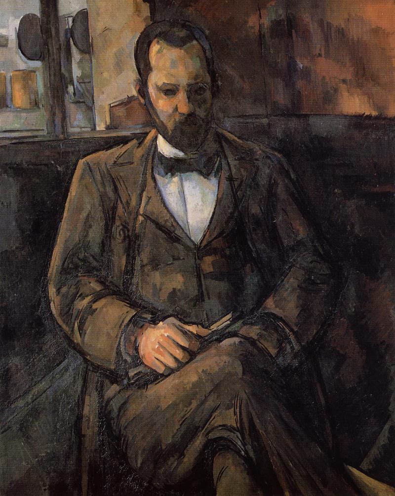
Paul Cézanne, “The Artist’s Father, Reading ‘L’Événement'”, 1866
https://www.npg.org.uk/whatson/cezanne-portraits/exhibition/
Alan Gouk: Some Notes on Three Exhibitions in London. Cezanne, Matisse, Soutine.
The show of Cézanne portraits at the NPG is so overwhelming that I’m obliged to confine my response to just three or four pictures. As with the Rembrandt exhibition at the National Gallery in 2015 one feels that everything that could possibly be said has already been said, and yet nothing has been said that comes near to conveying the qualities of original vision and formal power of these masters, and the formidable (in the French pronunciation) humanity of their affirmation of painting’s capacity to “take the impress of spirit” in the words of Roger Fry. Painting will never be “dead” as long as one can take sustenance from pictures like these.
The resounding “bass vibrato” of the young Cézanne’s temperamental brutalism is struck by the first painting one sees on entry, the large vertical The Artist’s Father 1866. The volumetric relief of this seated man is astonishing, his legs and feet jutting forcefully into the foreground space, swollen like an elephant’s, rendered clumsily in a smoothly succulent and absolute grey, with emphatic shadows that are consistently maintained throughout on the heavy throne-like chair which is modelled with the same fluent clumsiness as the figure of the father, who looks more like a labourer than a banker, his podgy hands clutching L’Événement newspaper, hewn with much scrapings in white/grey/black like a Mosaic tablet. Whether this brutalism was intended as a rebuke to, or an assault on the seamless trompe-l’oeil finesses of Salon favourites, or whether it was the best that Cézanne could manage at this juncture, is no matter, and what it says about his relationship with his father must remain forever prurient speculation. To me if anything it seems to heroicise him. After all it was his father’s largesse that enabled Cézanne to dedicate his life to a sustained concentration on painting that was denied to most of his companions.
The buttery fat palette knifing sculpting the father’s face and hands is echoed in many portraits to follow, of Uncle Dominique and others, which in spite of this limited means, manage an extraordinary salience of volumetric form reduced to the extremes of light and dark (black hat and white gloves placed near the painting to serve as the outer limits of the pendular swing of their tonal language.) The solidity and succulence of paint application in this painting would be subject to transmutation with a thousand nuances over the years, near glazes replacing impasto, in which the watercolours are a crucial accompaniment, re-emerging in the very late portraits with a renewed if symphonic solidity.
But The Artist’s Father has further indices of the inherent tendency of Cézanne’s art, in the dense chocolate brown plane and the sienna wall plane that backs up the chair, with a still-life painting in a style influenced by Monticelli, who was also a palette knifer, hanging behind the head, parallel to the picture plane; in all of which Cezanne seems to want to outdo Manet in “bold impasto” and the emphatic assertion of the planarity of the picture design.
In Paul Alexis Reading a Manuscript to Emile Zola 1869/70 , (how pleased I was to see this picture in the flesh), there is clear confirmation not only of his admiration of Manet’s simplifications in pursuit of “the orchestration of the scheme of the shadows”, but an ambition to outdo him on Manet’s own terms. The enormous value of isolating the portraits from the other strands of Cézanne’s development, the still lifes, landscapes and fantasy bathers pictures, the apprenticeship under Pissarro’s tutelage etc., is that one can see the perseverance with problems of creating a forceful and complete three-dimensional rendering of the human form in close-up relation to the picture plane, rehearsed in The Artist’s Father, but incorporating all that he had learned from these other engagements, and demonstrating a fabulous enrichment of pictorial and technical means along the way.
Paul Cézanne, Portrait of Ambroise Vollard”, 1899
The portrait of Ambriose Vollard 1899, is perhaps the supreme achievement of his later years. The “figure” is now seen much closer up, with the legs cut off by the picture’s lower framing edge. The powerful cursively drawn outlines of the clothed body (which would be envied both by Matisse and Picasso) enclose a fully realised volume of Vollard’s head, but now the modelling of form and surrounding wall surfaces is subject to an enrichment of shading, “brown” being achieved out of a myriad of shades of purplish/grey/ brown, ochre-ish blue violets tinted with madder, of a complexity that only a close up examination of the dense fabric of paint can reveal (reproductions are totally inadequate).
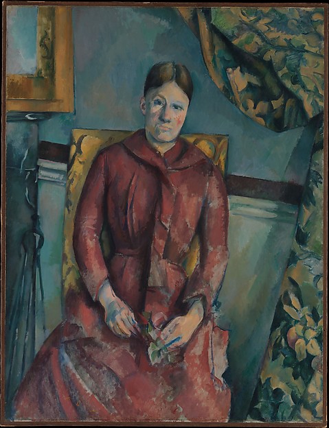
The same applies to the masterly portrait of Gustave Geffroy. No reproduction can give any idea of the myriad of modulations of colour that make up the broad planes of the fireplace and the sitter’s jacket. (Notice the plaster cast figurine cut in half by the left framing edge, and then go to the Matisse exhibition at the R.A.) The effect of all this near glazing of overlapping flurries of brushwork (a hundred shades of grey blue to create one blue plane), is to give illumination to background planes and render them spatial in relation to the salience of the figures, especially marked in Madame Cézanne in a Red Dress, the apogee of the middle period portraits, but far too complex to describe or analyse here.
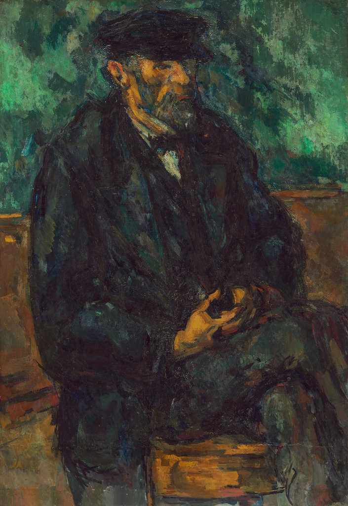
Paul Cézanne, “The Gardener Vallier”, c.1902-6
And then there is the three-quarter view of The Gardner Vallier 1902-06. (Washington N. G.). Here the symphonic ordering of a thousand glazes and shades of succulent blue/black, prussian diluted with viridian, ranging through all the blue greys and olives, set against an equal range of ochres, siennas tinged with madder and touches of vermilion (rarely is there a clear strong patch of flat red or orange. The reds are nearly always muted with touches of sienna). The paradoxical effect of all this overpainting is the dissolving of the form of Vallier’s body while at the same time increasing the sensation of physicality, of physical presence, though the presence is primarily of the sensation of paint. The human features are encrusted to the point where effectively all one sees is the tumescence of paint, “holy paint”, but paint that has gone beyond paint to enter the realm of a molten fusion of the visible, the physical, the mutable and the immutable.
In “Plastic Colour” in Transformations 1926, Roger Fry puts it like this:
“To the older painters , the main point was the harmonising of one local colour with another, but with the seventeenth century, with Rubens in particular, there came in the notion of a single all-pervading dominant note of colour — the colour of the main illumination — and local colour came rather to be suggested than actually stated by means of variations from this dominant in different directions. Where such an all-pervading coloured atmosphere obtains it is surprising what slight deviations from the dominant note will suggest to the imagination brilliant local colours. Thus, in the golden key of some of Rubens’ compositions a touch of grey, made by mixing black and white, will count as a definite blue, or the dullest earth reds will shout like vermilion. By this method of colour orchestration not only do the suggestions of local colour get a new resonance — though they lose something of their meaning as frank oppositions — but the continuity of the colour weft, the absence of sudden breaks, reinforces the spatial and plastic unity of the design, and the recession appropriate for each coloured surface becomes more evidently manifest.
…… ….. Cézanne allowed the Impressionist observations ( of the accidents of coloured illumination, and delight in brilliance and purity of colour) to influence him whenever they assisted the statement of plastic relations, but his central theme was never the effect but the harmonic sequence of planes….. In fact he found certain colour sequences which expressed directly these sequences wherever they approach the critical phase of the contour of a volume, and in his watercolours he often confines himself to a statement of them.
Thus with Cézanne colour has ceased to play any separate role from drawing. It is an integral part of plastic expression. He did not attempt to use it with the same brilliant purity and luminosity as some of the Impressionists, and although as compared with them he re-established the unity of the picture surface, he never practised the opposition of simple masses of local colour.
With Gauguin and Van Gogh a somewhat new situation arose. The interest in the picture surface regarded as decoration increased with the still growing reaction from Impressionism. On the other hand, the taste for pure colour persisted, and was pressed further in the interests of surface unity. It was also exalted by the new interest in orientalist and savage art, and with the acceptance from them of certain chords new to European art. With the earlier Matisse all these tendencies came to a climax. ……….Almost, but not quite, since his instinct led him infallibly to give, even more than the great masters of those schools had done, subtle indications of the planes occupied by each compartment of colour in his spatial construction. None the less, his main direction lay in violent opposition to Cezanne’s.”
Repairing thus to the Matisse exhibition at the R.A. for further clarification (although in fact I had come in the opposite direction) and aware that it is foolish to generalise about painters of such breadth and range as Cézanne and Matisse, and although some of the greatest still life’s of Matisse’s early engagement with both Cézanne and Gauguin, such as Oriental Rugs (Grenoble), Fruit and Bronze, (Pushkin Museum), or Statuette and Jugs on Oriental Carpet, are absent, the first painting in that mode which demands attention is Bronze Figure 1908. (Oslo), (strongly evocative of Matthew Smith in the 1920s.)
Here is that same impressive solidity of paint application, though perhaps not quite so sensuous and absolute as in The Artist’s Father. The touch is a little gentler. Here is the same declaration of the essential planarity of painting, the same boldly outlined form creating contours, (as one paints one draws) in pursuit of form over finesse. Matisse would not have sustained such a long engagement with his efforts in sculpture had he not wished to solve the problem of the integration of a convincing three dimensional illusion of volumetric form in the context of a decorative schema, in which he owed a good deal to Gauguin’s successes and failures in that regard, and in Bronze Figure the firmness of the outlining of his own reclining sculpture is a result of certainty as to its plastic organisation, and an assertion of confidence in his powers.
In Goldfish 1912 (Copenhagen) the dark mauve/ chocolate over pink underpainting which melds together several levels of space is not as multi-layered or multi- hued as Cezanne achieves, but it testifies to the Manet/Cezanne parentage none the less. The cartoonish drawing of the plaster cast figurine would not have satisfied Cézanne, however. It demonstrates a recurring ambivalence in Matisse as to how much sculptural definition is compatible with the over-riding thrust of his art. It is a struggle that persisted right through the Nice years, the Odalisques of the late 1920s and early 30s, the Delectorskaya years, and only resolved itself with the triumph of the freeing of arabesque drawing from the task of volumetric shaping, and the separation of the planes of colour from this independence of drawn contour which he attained in the early 1940s.
There is a good deal of grey shading to black over subliminal charcoal drawing and the general suppression of stark contrasts of colour and tone in the extraordinarily subtle plasticity of the Odalisques. The colour is muted, not as bright as it appears in many reproductions or on the screen, and although there are areas of pure flat vermilion surrounding a decorative pattern of pale blue in Odalisque with Grey Culottes 1926/27 (Orangerie), the overall tonality of this and Two Models Resting 1928, (Philadelphia) tends towards a greyish light.
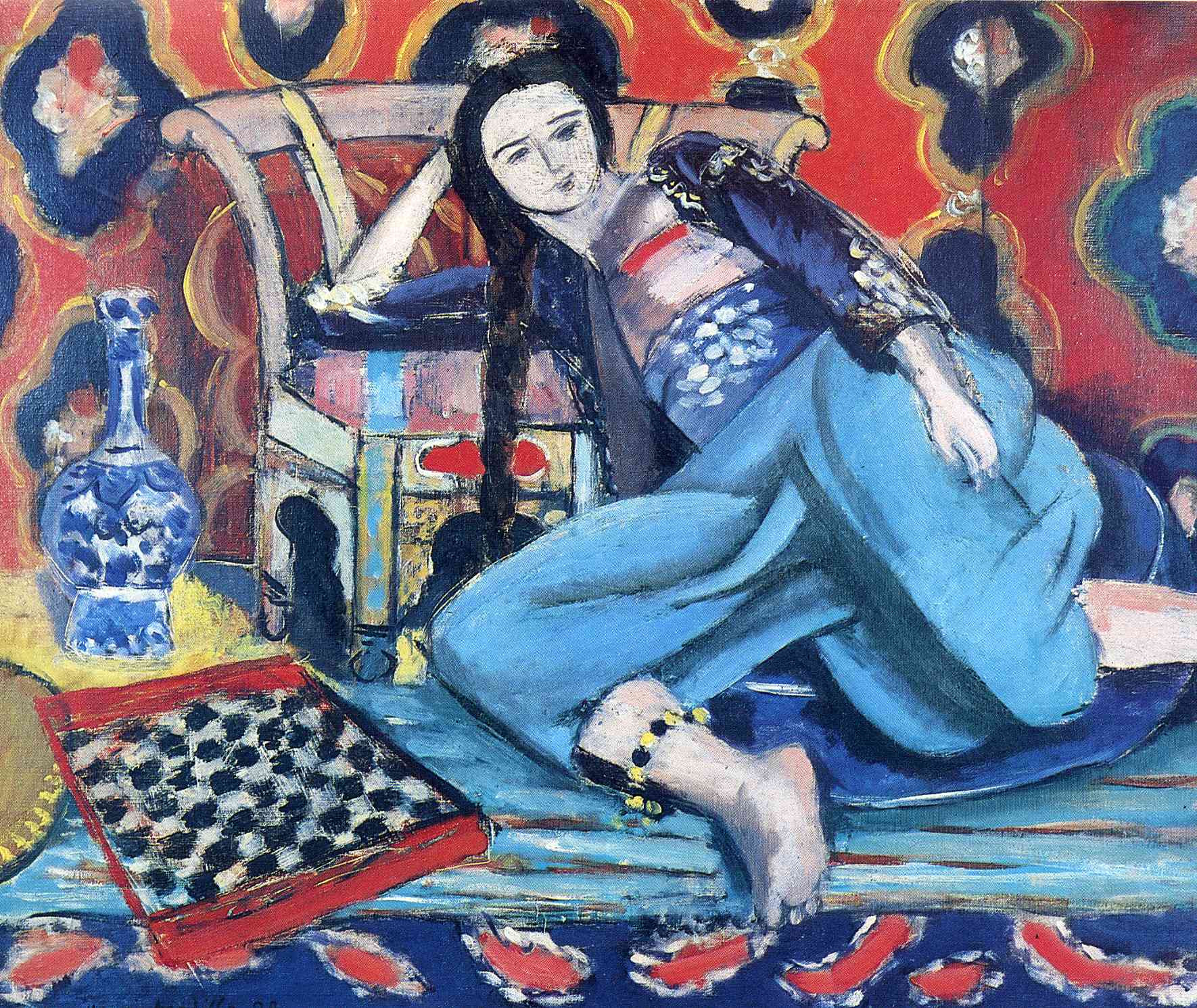
Henri Matisse, “Odalisque with a Turkish Chair”, 1926
Odalisque with a Turkish Chair 1928 (MOMA.Paris) is the most powerfully drawn and heavily worked, hence the most Cezannian of the Odalisques, but the effect of the blurrings of the patterned background is vertiginous; as the figure plunges dramatically inward from the foregrounded floating chessboard, the pattern seems to undulate around her, and the vertical division of the background screen above her left hand further dissolves the apparent “flatness” of the screen, suggesting a mirror reflection rather than a continuous surface.
A very different application of the palette knife from that of Cézanne adorns the wonderful Safrano Roses at the Window 1925. Gone is the slurp and slather, as of thumbprints of slip clay on a modelled form. As Patrick Heron put it, the central mystery of Matisse’s art is that though each patch of palette knifing here is flat in itself, the effect is the creation of a convincing illusion of space and light of an almost measurable depth, the space of the room in which this vase of flowers sits, and of the ambient air surrounding it. Although there is no human presence in the picture, maquillage, the cosmetics of the boudoir exude from the curiously tertiary colour. Those mushroom pinks, the scraped olive greens, the biscuit pale bistres and dull greyed violets together contrive a beautiful poetic mood. One thinks of Wallace Stevens’ Sunday Morning (though the mood there is much darker and conflicted) —-
Complacencies of the peignoir, and the late
Coffee and oranges in a sunny chair,
And the green freedom of a cockatoo
Upon a rug mingle to dissipate
The holy hush of ancient sacrifice
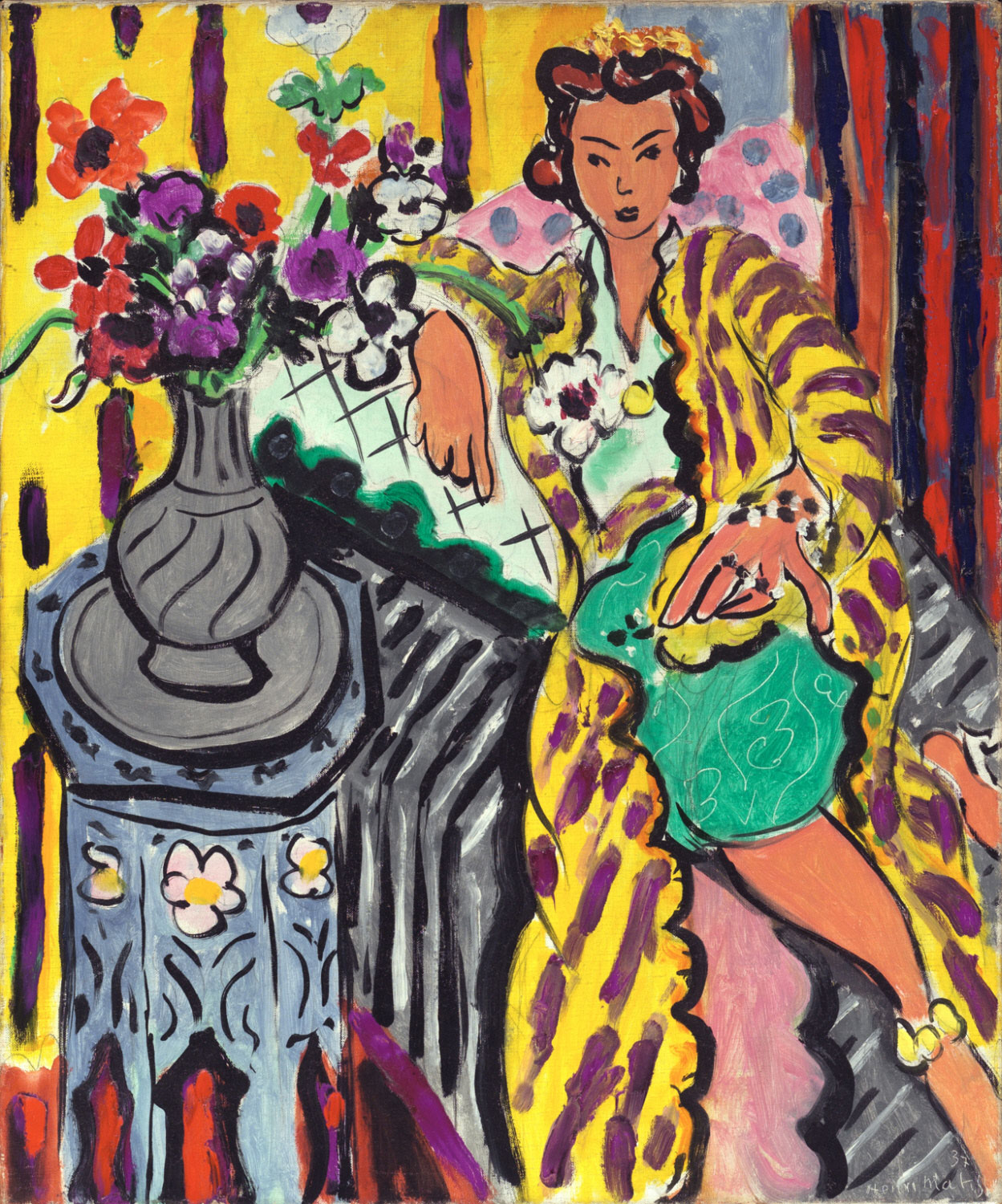
Henri Matisse, “Yellow Odalisque”, 1937
Seated Figure with Violet Stockings 1914 (Pierre Matisse Foundation) is a little picture I’d give anything to possess. The violent black drawing and the incised scratching out suggest a link to his cutting of clay in his sculptures and betoken both exasperation and intense barely suppressed erotic feeling. So too does the marriage of superbly eloquent drawing and passionate spontaneity in the stabbing down of most unusually near-expressionist colour in Yellow Odalisque 1937. The tension with which intense eroticism is allied to mastery in drawing is near to breaking point in this picture, and must have given Matisse a near unbearable agitation, or “perturbation of spirit”. That the picture is such a resounding success would have been adequate compensation.
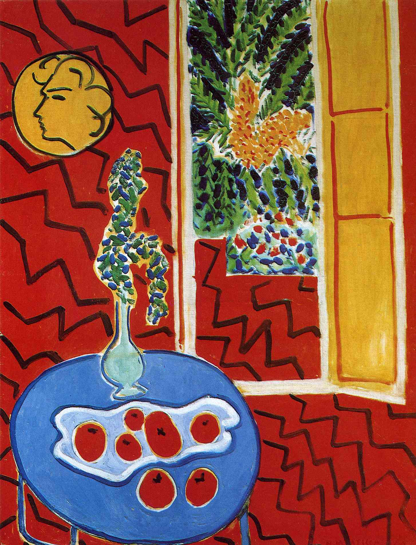
Henri Matisse, “Red Interior, Still Life on a Blue Table”, 1947
Finally, Red Interior, Still Life on a Blue Table, 1947 (Düsseldorf) is of an indescribable (for me) subtlety of colour and space. Patrick Heron has described it at length in Late Matisse 1993, in Painter as Critic, so I will not try to add anything. Cézanne was 67 when he “finished” the Gardner Vallier picture. Matisse was 68 when he painted Yellow Odalisque. What a world away it is. Fry is right to say that “his main direction is in violent opposition to Cézanne’s”. But curious still that it should be through the absolute fusion of drawing with painting that he attained that divergence. Hence “colour ceased to play any separate role from drawing”. There may be a lesson in that, but they need to free one another rather than an entrapment of the one by the other
We have had two great art critics, Roger Fry and Patrick Heron in this country in the past century and possibly three if we include Adrian Stokes (who I haven’t read), but they have collectively made not the slightest dent in the panoply of hallowed betises which besets the English Art-world’s value system. Indeed the colloquy of journalistic hacks, media pundits and curatorial sages have gone out of their way to trash everything that their criticism upheld. Instrumental politicking, agit-prop instead of art, literary expectations and terminology foisted onto painting in the guise of “conceptualism”, theatrical interactive installations, all are pressed on a public hungry for immersion and participation as at a cinematic manipulative catharsis. Post modernism and “conceptual art” are to the 21st century what the arcades and panoramas were to the 19th. And our museums foster this delusion, indeed pander to it.
At a tangent to the demise of all evaluative nous which allows the promotional ferment of the globalisation of art, there still pertains a modicum of the quiet and disinterested scholarship of the likes of Lawrence Gowing, John Golding, Christopher Green, and their American and European counterparts. And it is thanks to the survival of this strain of expertise that we are still able to see exhibitions such as these, free of the Machiavellian agendas of the new museum ethos, which seems hell bent on following the disastrous example of the Metropolitan Museum, New York to degrade its collections and its reputation by appealing to manipulated popular expectations and “laissez-faire aesthetics”. The gap between the connoisseurship of the qualified historians of the old school and today’s curatorial consensus, complicit in the desuetude of all values is starker than ever, and the connoisseurs themselves appear stumped and bereft of insight when it comes to any contemporary art that is touted by the big galleries and the venal collectors who prop them up and exploit them.
“Perturbation of spirit”, and how matter can take the impress of spirit”, allied to colour that has ceased to play any independent role from drawing, though drawing and colour of a very different stamp, is uppermost at the Soutine exhibition at the Courtauld Institute. Agitation more like; — evisceration is a word that is often used of the art of Chaim Soutine. Soutine’s temperament is as strongly realised in paint as anyone’s has been or could be. His temperamental flaying of paint mirrors exactly an exacerbated state of consciousness, which attains a remarkable eloquence of expression, and a subtle if harrowing richness of the paint fabric at its best, which places him as a true painter in a class far above his celebrated followers, Francis Bacon for instance, whose much vaunted painterliness is a modern myth.
Volumetric form is not Soutine’s mission. He stretches and distends the objects and subjects of his vision, viewing them from angles, often from above, that render any quasi-rational conception of space in depth illegitimate. They are spread across the canvas surface as on a bed, and painted cum drawn with a mixture of erotic delectation and traumatised disgust, which in his human subjects conveys more about the psychology of the painter and his peculiar temperamental anxiety in the face of sensuality, than it does about the psychology of the person portrayed. I suppose this is what is meant by expressionism, and if so, Soutine is a master of that school. But he is also a master of painting, of the ability to make paint carry feeling so transparently and so fluently, that almost in spite of oneself one is carried into a world of sensation far from the quotidian or the familiar that we inhabit and expect from art. There is a demi-mondaine allure in this rarefied glimpse into a mode of existence far from the norm which has increased Soutine’s appeal and provoked much excessive myth-making around his life history. He may well not have been as “bohemian” and outre in life as the legend has it. Judging by photographs of his companions and fellow artists he may have been no more bohemian than the young Cezanne, or Picasso at Le Bateau Lavoir, and nearly as “bourgeois” as Matisse, as he pursued a peripatetic life around the grand hotels of Europe. But the power of the painting survives the myth and still resonates today.
It is a vision neither sadistic nor masochistic. It is curiously dispassionate yet affectionate in spite of the distortions and dissolving of features. And it is manifest that the awareness of the great precursors of portraiture, Cezanne and Matisse included, lie behind Soutine’s interpretations. He is aware of them, aware of them technically, of Cezanne’s “brushwork is spatial” modelling of background planes, and Matisse’s arabesque contours, but he puts all this to very different ends. In fashionable parlance one would say that he “subverts” their phenomenological pursuit of truth in perception, and substitutes a subjectivity heavy with doubt and tremulous with uncertainty, “existential” uncertainty, to use another cliche. At the same time this gives his sitters an all too human frailty, affectionately conveyed through his painterly means.
One could rhapsodise at length as others have done on his choice of subjects, dead animals, birds and fish stretched on the rack of his imagination, and their pointed up relation to the symbolism of Still life and death in the French tradition, as if to say here is everything that you didn’t include in the bizarre act of applying paint to a canvas in front of the no doubt rotting corpse of a hapless vertebrate. But death is an overrated artistic trope (as Clement Greenberg pointed out). It’s been done to death you might say. The “obscene sensuality of death” (Pierre Skira) and the obsession with butchered animals, which stemmed apparently from a childhood trauma in which Soutine witnessed a butcher slitting the throat of a goose, are perhaps the most interesting part of his oeuvre, but perhaps unfortunately these do not feature at the Courtauld exhibition which concentrates on the portraits of bell hops and hotel workers.
The good Dr. Barnes did Soutine no favours by investing so heavily in his early work. By thus lifting him out of poverty and setting him on a course of the support and patronage of wealthy collectors, it would appear that the portraits especially are designed to meet a ready market. Many of them are formulaic, though at its best the formula is a good one, consisting of a simple dominant chord, the opposition of red against dark blue and white, or white against dark blue or brown, the figures distended, arms on hips, with pointed shoulders mirrored by legs akimbo; a neck shrunken to nought with a large head perched perilously on top, or disconnected altogether from the neck. The arms too are frequently disconnected from the torso, and yet seen from a distance all this still counts as a body. It all rests on suggestion rather than coherent forming.
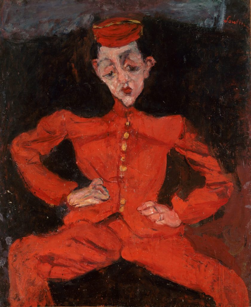
Chaim Soutine, “Bellboy”, c. 1925
Compare Cézanne’s Boy in a Red Waistcoat, 1888-90 with the strongest of the crop, Bellboy c. 1925 ( Pompidou Centre) to see where the formula comes from. Cézanne struggles with the foreshortening of the boy’s right arm, but Soutine doesn’t even essay foreshortening. He allows the silhouette to do all the suggesting of form, and throws the emphasis onto the sonorous dark brown enclosing the figure to create the illusion of presence. In many of the portraits the painting of the facial features is summary and blurred in close up, and yet still conveys an identifiable sitter from afar. Pastry Cook of Cagnes c.1922-23 is probably the best of the white bodied cooks, but again the body is flattened to near silhouette, and the modelling is mere suggestion. The painting relies on the conflict between the starched confining effect of the uniform and the sense that the young cook is trapped within a dress foreign to his character and his natural habitat, like a child dressed up against his will to suit the social aspiration of his parents.
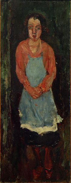
Chaim Soutine, “Cook with a Blue Apron”, c.1925
Soutine’s painterliness is at its most confident and expansive in the backgrounds, which are sometimes painted with a bold and richly harmonised depth of colour more surely than the somewhat tentative delineation of facial features. The best of all the paintings on display is the tall vertical panel, Cook with Blue Apron c. 1930, (Kunstmuseum Basel), a female cook, (the reproduction gives no sense of its rich dark colour and confident handling throughout.) The brown/black hair set against a green/ black ground, and the blue /black skirt showing below the apron, followed at the base by deep red stockings and shoes, form a resonant chain of colour chords, and the facial features are more strongly defined than in any of the other pictures.
Soutine is a much more limited artist than Cézanne or Matisse, but there is an undoubtedly sensuous vision and an impulsive fluidity of paint mastery in his strongest works which should not be gainsaid. I expect that he threw all into the first rush of inspiration, the first coup, even if protracted, and was exasperated by the need for revision. And that is hard to pull off consistently.
……………………………………………………………………….
Robin Greenwood on Cézanne and Matisse.
It is well beyond time that major art institutions such as the National Portrait Gallery stop hanging works in spaces inadequate for their number of visitors. For example, it is unacceptable to hang paintings in a corridor when, to look at them properly, one must act as an obstruction to others. It’s bad form all round, and an example of a general thoughtlessness of curation in the museums.

Paul Cézanne,, “Portrait of Antony Valabrègue”, c.1871
And unfortunate it is that one of the most impressive works in Cézanne Portraits at the NPG is right at the beginning, in the first section of a crowded corridor – the smaller and slightly later of the two portraits of Antony Valabrègue, c.1871. In this work, the palette-knifed strong-arm slabs of the earlier Uncle Dominique portraits (c.1866) make way for the more varied and wrist-y application of a loaded paintbrush, though the modelling still seemingly happens without resort to drawing or outline. It’s a convincing portrayal of character, and no doubt some will find a nobility of expression in the physiognomy of the sitter. I’m more than content to find a thrilling extemporaneity, with freestyle painting on the margins of ambiguity and liberty. The latter wins out, in a manner that will subsequently become the hallmark of Cézanne’s best landscapes and still-lives, both in oil and watercolour, wherein the concentration and close-focus will build to an organic wholeness across the entire canvas. Here are the beginnings of Cézanne’s individualistic and monumental contribution to the beautiful fiction of spontaneity, when the exactness of the artist conjures freedoms for the viewer.
In large parts of the rest of the exhibition, it is drawing and ambiguity that are a touch too often to the fore, and the achievement of painterly freedom is checked. Without prejudice to the fact that I hold Cézanne to be the greatest of painters, he seems often to struggle badly with the figure. I wonder if it is something to do with that close-focus, so carefully proceeding in its task of feeling how one patch of paint works spatially with its neighbour(s), a method of organisation that performs so well on apples and landscapes, which have no need of a believable physical articulation, but which can render shoulders out of joint and pelvises severely compromised. Sometimes these things matter, and sometimes they don’t, and there are, of course, numerous great things on offer here. Cézanne being Cézanne, the exhibition is always interesting, gripping even, despite being frequently problematic. The paintings range from the palpably unfinished to the grossly overworked. Few are really portraits at all, and the long-suffering Hortense Fiquet changes countenance at virtually every appearance. What on earth did she actually look like? That, of course, was not Cézanne’s object.
Paul Cézanne, “Madame Cézanne in a Red Dress”, 1888-90
Asymmetry in the sitters is often played to the maximum. There are moments of a sublime nature, where the focus has briefly held, next to passages of reckless ambiguity. Take, for example, the much-anticipated (on my part) Madame Cézanne in a Red Dress, 1888-90 (MET); the asymmetry of the head is lively, the impromptu sketchiness of the hands (which like many instances in this show, foretells of Matisse) does nothing to destroy the solidity of the arms; but the left-hand side of the skirt (her right) is hopelessly ambiguous, spatially unworkable, and awkwardly thrust into the corner of the painting. Such moments make me think that perhaps figurative painting (and the painting of the figure, particularly) had sometimes for Cézanne frustrations the equal of any abstract painter’s.
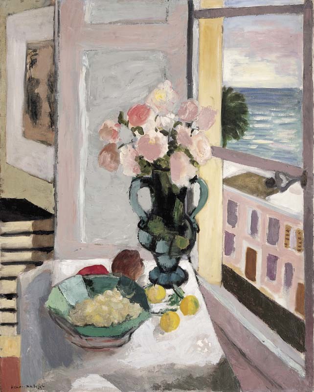
Henri Matisse, “Safrano Roses at the Window”, 1925
The two paintings of roses in a turquoise glass vase, shown in the first room of Matisse in the Studio at the Royal Academy are both a treat. I would have thought they were painted at the same time, but the deceptively simple, more orthogonal Vase of Flowers is dated as 1924, whereas the more complex Safrano Roses at the Window is 1925, though it looks like the same roses in a similar room, from a different viewpoint, a “pairing” of works very common in Matisse. In the latter painting, the build-up of spatial tension and warp is fantastic, as the room bends, the street outside presses, and the table edge and window-sill together pinch, nip and tip the back corner of the upturned table plane, where the vase sits, towards the viewer. I’d say it’s one of Matisse’s greatest paintings, and I’d take it in preference to most of his more feted examples from the “radical” years. Actually, I’m not so sure why I am so drawn to it, but I think it is down to the feel of the space, how it is constructed, which is far from naturalistic or volumetric… the spatiality is very particular and focussed, in a decidedly pictorial way. I’d strongly resist the idea that it is in any way ambiguous, but then nor does it feel locked down. I see this work as a big moment in painting.
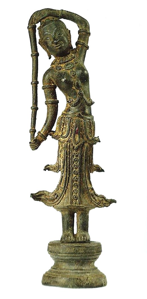
The room of “odalisque” paintings is good too, with Odalisque with a Turkish Chair the best of them (and nothing like its reproduction), though I could happily lose the chessboard. Here, as elsewhere, the link to Cézanne is clear, and in my opinion, not at all to Matisse’s detriment. Overall, there are quite a few Matisses I don’t care much for, but it’s a very engaging exhibition, with some of the “extras” to the paintings – i.e. works from Matisse’s collection – holding their own. I liked the examples of Kuba raffia textiles, and a very honourable mention should go to the little Thai/Cambodian bronze sculpture of a woman holding her long plait of hair down one side, inducing a subtle and supple curve to her back, with her costume flicking out at intervals down her body and legs. Really brilliant.
(After which, I cannot be having Soutine.)
R.G.

Wonderful, NECESSARY writing!
Two small, amusing (to me) things:
Alan writes, “Soutine’s painterliness is at its most confident and expansive in the backgrounds.” Years ago (30, 40, 50???) Jake Berthot, the late American painter, told Bruce Gagnier, another Yank, though Bruce is very much still with us, that he (Bruce) could be a real painter if he’d just wipe out the figures in his paintings and leave the backgrounds.
Robin writes about Cezanne’s frustrations painting figures. For years Cezanne’s The Bather (c. 1885) greeted visitors to MoMA’s painting galleries. For years Cezanne was a god at the New York Studio School. For years Bruce Gagnier taught at the Studio School—and took pleasure in pointing to the MoMA Cezanne and suggesting that Cezanne just couldn’t paint the figure.
I emailed the link to this Abcrit entry to Mr. Gagnier. He’s looking forward to reading it. . .
LikeLike
The point about the foreground skirt in Madame Matisse in a Red Chair is that she is presented as seated in a chair, but Cezanne does not want the knees to project forward with anything like the salience of the legs in The Artists Father, or even the knees of Ambrose Vollard, so he presents her as more or less standing. Yes, the lower section of skirt has left the underlying body behind, with a marked dislocation from the hips, but we are not concerned here with verisimilitude in any case. It’s a case where Greenberg would have said the painting “goes on too long”, as he did of the large Rembrandt self portrait in the Frick, which has a similar long “skirt covering the legs. I am a good deal more tolerant of such things, tending to believe that the artist knows best?
LikeLike
My “pelvises severely compromised” comment had in mind the “Man with a Pipe” painting, where the sitters right leg comes out of the centre of the pelvis. In the case of the “Red Dress”, I’m not so worried about that, so much as the spatial disconnect between the skirt and the rest of the figure, which is exacerbated by that diagonal pull into the corner of the canvas.
LikeLike
Thanks for the illuminating appraisals, and the info around palette knife use.
LikeLike
It has to be said that the Soutine portraits were not what I had hoped to see. I wanted to see the animals, 🦅 and fish. Also the wind torn tormented landscapes.
Just re-read the Heron article From Late Matisse. A must read, brilliant, and the description of the Red Interior could not be bettered, certainly not by me.
LikeLike
Cezanne! Wow!
LikeLike
I think Soutine’s landscapes are really extraordinary.
LikeLike
Say why!
Last time I did the Paul Guillaume Collection at the Orangerie, is was, in this order, a case of absolutely great collection of Cezannes, not so great, but perhaps good, Matisses, “interesting” Picassos, dodgy late Derains, awful Utrillos, and a room of Soutine to make a dash through for the exit, before they soured everything previous. I need converting to Soutine. I will go and see the “Portraits” at the Courtauld (the clue is in the title, Alan), but I’ll have to brace myself. Over to you, Carl.
LikeLike
Louis Finkelstein is pretty good on Soutine. Louis’s prose is not as digestible as Carl’s–but your stomach should be able to handle it. . .
LikeLike
Very brief answer: I am not aware of any painter more committed to and for the most part successful at making the sheer materiality of applied paint a direct and seamless medium for the expression of person feeling, not by way of symbols or signs but as embodiment. The wind that bends the trees in Soutine’s depicted landscapes, and the intensity with which color is applied –
these are not metaphors for inner experience but (so to speak) its literal realization in the world. This doesn’t necessarily make for successful paintings when judged in comparison with historical or contemporary precedents, but it definitely makes his pictures worth looking at, and gives Soutine a kind of heroic artistic character.
LikeLike
Robin — your thoughts on the Matisse sculptures on display? I couldn’t help thinking how much stronger Katherine Gili’s Leonidie is than The Serpentine. But I love the Jeanette heads. For my own take on Matisse as a sculptor, see “The Serf —Matisse as a sculptor 1, Artscribe No 50, and Matisse as a sculptor 2, Artscribe no 52, both 1984.
LikeLike
Not sure I can lay hands on those articles. You were no doubt enthusiastic. I’m much less of a fan of Matisse’s sculpture than you, and I rather dislike the procession of abstraction/distortion in the “Jeanette” heads (as also seen in the “Backs”). Strange as it may seem, the lumpen and inflated three-dimensionality of the forms does not appeal. (I have a similar reaction to much of Lipschitz’s work, where the three-dimensionality is gratuitously inflated, and because it is modelled, has no kind of reality.)
“Leonidie” I’ve always been a fan of, a very spatial figurative sculpture. I think I prefer it to any Matisse and possibly any other Gili.
But first prize for sculpture in this show went to the little Thai bronze.
LikeLike
“The Serf”, of course, is not in this show, and is perhaps amongst the best of Matisse’s sculpture, having the possible advantage of a direct derivation from Rodin. No doubt you said as much, and a lot more, in your Artscribe articles.
LikeLike
They were seriously critical, especially of Aurora, Reclining Nude. The point is the sculptures served his painting. But there is nothing inflated about the Jeanette Heads. He has worked hard to give their “forms” the kind of firmness, as if carved out of wood, one meets in the best African carvings. His taste for these and the Oceanic examples in the show is great. But it was interesting to see a photo in the Cezanne catalogue of Zola in his study where he is surrounded by the same Moroccan and Islamic furnishings that Matisse collected. He was far from alone in such tastes. They had been common currency for near on a century in France by then. It’s the use to which he puts them that is so different. I forgot to mention The Moorish Screen picture, and the amazing wall hanging it is drawn from. The painting is masterly in its use of steep perspective to make the painting seem much bigger than it is, with all the Persian small scale patterning to suggest distance. And it gives off a beautiful light. (See the Jed Perl quote on Orientalism in my Abcrit The Baroness Gourgaud.)
LikeLike
Can we see an image of the Thai sculpture?
LikeLike
I cannot find anything like it. Is it in the catalogue (which I don’t have)?
LikeLike
I think there are a lot of African sculptures far better than the “Jeanette” heads. There were some terrific ones at Frieze Masters.
LikeLike
I’ve not seen the “Red Interior” from the RA exhibition, but there are two of these late interiors (“Large Red Interior” and “Interior with a Black Fern”) hanging in the Matisse/Bonnard exhibition in Frankfurt. I found them disappointing – very graphic, very dependent on figuration for their spatiality and unpleasantly sour in their colouring.
They made a big Impression from a distance, but seemed very thin from close-to. They reminded me of railway posters.
“Odalisque with a Tambourine” is also hanging in Frankfurt and is much richer and more painterly. It’s from the same year as the “Safrano Roses” that Robin discusses in the essay. I think this painterly quality even comes across in the jpeg – just look at the little patch of sky (in the latter work) with its subtle areas of pink, blue and white, minutely adjusted in space amongst themselves and with respect to sea and window frame, yet (and I’m guessing here) all simultaneously there at the surface too.
LikeLike
“Odalisque with a Tamborine” is a great painting, yes, I agree Richard. And I’d like to emphasise again how special I think the “Safrano” is. Part of that specialness is the way it makes the two-dimensional organisation work so hard in setting up the physical/spatial/three-dimensional content. The two aspects are bound together in tension.
Here is the other star of the show – the little Thai bronze:
I have now seen the Soutine Portraits at the Courtauld. I dislike them, and after a short while I took the opportunity to look again at the two absolutely magnificent Pissarros they have – “Quays at Rouen” 1883 and “Boulevard Montmartre, Spring” 1897. In both paintings, the “divisionism” of the period between them, when he came under the influence of pointillism, is replaced by something like its opposite – a kind in indivisibility across the entire canvas that knits everything together in a seamless unity, without in the least lessening the fullness of the plastic space. They possess enough quality to make even Cezanne look a little “workman-like”.
LikeLike
Why the Thai, but not The Serpentine?
LikeLike
And can we have more on the Matisse Bonnard confrontation in Frankfurt.
LikeLike
Let’s have a paired image of the two together. And then a composite of the two plus Leonids, to scale. Please!
LikeLike
What did your last servant die of?
In any case I think putting sculptures together into a virtual gallery might be beyond the talents of even Emyr. You see, sculpture’s more resistant to online chicanery than painting. I bet you didn’t even look at the Thai bronze, so you’ll have to go back, because the photo doesn’t show the best thing about it – not only does it bend sideways under it’s own “tug”, but also, very subtly, backwards.
And of course, I have to add that neither the Thai bronze, nor “The Serpentine”, nor “Leonidie” have anything to do with abstract sculpture. That’s another country.
LikeLike
There’s a challenge Emyr!
LikeLike
To be honest, I’d rather hear Emyr’s views on the painting…
LikeLike
Excellent articles. I have yet to see the Soutine (he has problems with faces – the specific qualities and contours do not mesh well with his painterly approach – things look mannered) The other two shows were outstanding. I agree with Alan about Heron’s analysis of the Dusseldorf painting with its remarkable zig-zags. Some of best descriptive writing on a painting I have ever read. I was pleased to see Alan lead off with Cézanne’s portrait of his father too, as it is quite mesmerising in the flesh. The portrait of Vollard is a counterpoint for me. It has gone into Cézannian folklore with his enormous amount of sessions and that most remarkable “essay” on browns (essay is the wrong word, as it more like War and Peace!) I do not buy his quip about being not too dissatisfied with the shirt front – this is clever self-aggrandisement to ensure the dealer saw him as something above others (“All my contemporaries are arseholes” he once said).
The work is quite hypnotic and astonishing in its strength as are so many of the others on show, but to return to that painting of his father – the (his) right arm is quite dislocated from the body, the handling is almost ponderous and brutal – ham-fisted even when compared to what he eventually produced with that eye-catching handling of paint – his stamina was something else: the way he follows the ‘arc’ of a painting and really drives it to its conclusion. There is nothing quite like it. Pissarro had certain gifts but not those of Cézanne. Pissarro is wonderful at controlling the ‘temperature’ of colour – everything looks locked in to an atmosphere but that can shut out something vital, something wilder – which this portrait has. Alan uses the phrase “a perturbation of spirit”. It is freakish in certain ways and disturbed me a little as I left feeling that even when he harnesses an intense approach with high technical qualities (i.e. – most of his mature work) there is territory left to discover – or in this case territory he left behind. The late Gardener stakes a claim for this sort of painting but I have never fully warmed to that work – the greens are just too over ripe for me set against those blued greys and burning ochres. Matisse was able in his late Vence interiors (works I prize) of handling fine skins of soaked colour – sometimes letting charcoal ‘dirty’ the pigment – the colour is intoxicating, very un-academic, deft and insouciant. He had a rarefied gift for colour and line. I love the sticky certainties in the paint of the odalisques – that 1930s Yellow Odalisque though looks like it was not taken around the block as many times as the others and it jumps all over the place. Sometimes he had so much colour at his disposal he loaded them up to excess – then again as Mae West used to say – “too much of a good thing is…wonderful”
LikeLiked by 2 people
Very interesting observations. Where is Cezanne’s “essay” on browns and on the time he took over Vollard? I’ve never come across it.
LikeLike
And I agree about Soutine’s faces. Those almond shaped fish eyes are also formulaic. Not everyone can have looked like that. De Kooning follows him with the eyes of his Women, and the “moutt (sic) of Marilyn. And dare I mention Bellany? Oh dear. But they’re not quite that bad.
LikeLike
Oh I see, it’s essay as in an attempt, long drawn out. I wouldn’t bother with the Soutine actually. It’s disappointing. No carcasses!
LikeLike
BTW. If you google Hortense Fiquet you can see what she looked like as an older woman. Cezanne has idealised her with porcelain textured smoothness throughout, as if in memory of what she once was. But the portrait in a Red Dress is probably quite like her, and the large portrait from the Musee D’orsay, in blue with a large jug to her left, a formidably strong painting, and not in the least flattering, if it is her, is the nearest he came to realism. It’s only in his self portraits that there is evidence of the psychology of the sitter, or the actor, which slips in and around the intense concentration on self dramatisation.
LikeLike
Speaking of Soutine looking “mannered”, which I agree with, there’s another one coming along shortly – Modigliani. Soutine seems to have taken a single, and perhaps almost unconscious, aspect of Cezanne’s intense observations, the asymmetry of faces, and made a rather dubious career out of its exaggeration. I read that the forthcoming Modigliani held Cezanne in high esteem too, but I hold out no hope of seeing any kind of real understanding from that quarter. In the company of his many followers, including the Cubists, Cezanne remains way above them all, and Matisse is one of the few who seems able to deal with him without trivialising some aspect of him. That in itself is an achievement.
Heron on Late Matisse is truly a riveting piece of writing (perhaps only bettered by the essay on Constable’s drawings which follows it), though I’m not sure, in front of the “Red Interior”, that I can get quite such a specific/manifold experience of the space, back and forth. In fact, the discombobulation of Renaissance perspective in “Safrano Roses” is to me more powerful, tense and exciting/satisfying.
Does any of this apply to abstract painting, where you have none of the figurative clues as to spatiality in the “planes parallel to the picture surface”? In “Red Interior”, Heron talks about how exactly the same colour (and indeed, pattern) works differently on the eye between the inside walls of the room and the outside paving. That is untranslatable to abstract painting, is it not? In an abstract painting, that would be flat repetition. Just saying.
LikeLike
No I don’t think that’s right. The way those two red areas work is the most abstract relationship in the painting, as near as damn it. And Heron’s own paintings take it on into Abstraction. Take Two Vermilions, Orange and Red 1964 for instance. Without standing in front of it, and I think that’s impossible as I’m sure it was one of the pictures destroyed in the MOMART fire, I would not be able to say how it works, but it is a contender. I saw it at Eagles Nest when writing for the Barbican catalogue, and was impressed. And once Heron began to introduce line again, ? Well, I’ll have to look into that further. (You’ll say they became figurative, but I’m not so sure.)
Heron is able to describe Matisse’s surfaces so well because he had emulated them in his best work of the late 50s and early 60s.
My own surfaces are very different, and whatever “space” they may have is less purely pictorial, at least on Heron’s terms. Some of the Ulysses series come close, but that’s not reallyfor me to say how they work, or what kind of space they create.
LikeLike
Or Fourteen Discs itself might fit the bill. I must correct that I said it too had been destroyed. I see that it is listed as in a private collection in the Tate catalogue, so it may have escaped. But who owns it I have no idea.
LikeLike
I think you were right first time – I think it got destroyed, having been put in store.
But you need to explain – how does that relate to Heron’s example of two identical colours being spatially separated? And how in any case is that “the most abstract relationship”, and where does it occur in 14 discs?
LikeLike
In Two Vermilions, Orange and Red, the Red surrounding an Orange top left is the same red as the red disc at the bottom edge, but activates the reds around it quite differently. Which are the Two Vermilions? Hard to tell. It’s a case of lateral shading by means of colour alone, as I mentioned in Notes on Abstractcritical some time back.
In Fourteen Discs it’s two mid greens , the same shade, serving different functions, the large area of green surrounding orange disc on the left, and the same green surrounded by mauve bottom right. But without being in the presence of the two paintings it is only a guess.
Why is such a relationship “almost” abstract in the Matisse? Because the cues which register depth are minimal. The effect is created primarily by the reciprocal influence of the surrounding “window frame”, and almost entirely by the pressure of colour on colour. The brown/ black zigzags carry over both areas almost as if to deny the recession, but it still happens in spite of this. It’s a marvellous game, but as I’ve said before, a game that very few can play.
LikeLike
I think yet again we are at the fault line between us – but let’s try not to fall out over it. What you say about the Heron seems such a marginal and slender kind of content to build abstract painting around, these nuances of colour relations, especially if only a “few” can make anything of them. I see the attraction for abstract painters, particularly of late Matisse planes of colour, but to me it only really works because of figurative prompts of depth and the tension of its depiction in 2-D. That’s assuming that it works at all, which I only partially think is true.
LikeLike
Yes, and that’s why everything you want leads to figuration or “homeless representation”. In spite of protestations to the contrary.
LikeLike
Well, I don’t think I “want” anything other than more options for abstract painting beyond coloured “planes parallel to the picture surface”. There do seem to be some options. You seem to be the one who is happy with semi-figuration.
LikeLike
I saw this Matisse, “Femme Assise, le Dos Tourné vers la Fenêtre Ouverte”, in Marseille a few years ago and thought “Safrano Roses” might be related to it, but no, this is much earlier, 1922. A very striking painting, almost viscerally garish, such that on first glance I could hardly believe was a Matisse. Liked it a lot, in the end.
LikeLike
I’m not certain planar colour regarded as figuratively hinged should necessarily encompass all “open” colour. To use colour and wish to see it with clarity will entail ‘areas’ of hue existing in some form (handling dependent). By contrast, to continually work paint into ever more smaller agitations of hue, facture and incident as a way of wilfully avoiding these notions of a planarity will not be concomitant with being ‘more’ abstract. Furthermore this approach can run the risk of producing a spatially and indeterminately locatable “form”- as can imagery which is suggestive of “other spaces” too. There should be no hierarchy of approach surely. Sculpture can freewheel with bits and pieces , different sizes and ‘histories’ (acquired and/or formed – as can collage, mixed media works etc, so painting should also be able to operate in an equally unrestricted way, which if that means expanses of hue discretely identifiable then I would say, so be it – for me at least. I would always return to giving the colour a chance to do its thing (this is a heck of a lot easier to say than do – I suffer this torment daily) and being in no rush to hijack it to serve ‘pictorial’ ends (see previous caveat) which end up about ‘colouring’ rather than colour. I do not see Matisse in terms of planar colour per se, but see a way of handling paint that opens up wonderfully human qualities – it gets down the cortex in such a grabbingly urgent way. Colour first, painting second (Pissarro by the way – for me – is the other way about). Compare Cézanne’s copy of Pissarro’s Louveciennes painting 1871 with its brilliant path and a tumping grassy bank which you can imagine jumping up and down on then scraping your hobnails over the beaten surface of that path. The little half-tone touches dispersed to aerate throughout , then look at Cézanne’s version with its slightly more abrupt transitions , deeper contrasts (okay its after a painting and not the scene). but, the grassy bank dissolves, the path isn’t quite as deft, yet his eyes are on the paint not the path; he is not rendering but reacting. It’s a fine line here but it’s a line. Many, many artists look at that path, whereas fewer, the paint – a path less travelled and a frosty one at that (pun intended sorry). I can’t properly explain this clearly enough maybe but I know it when I see it. This also holds for Manet (that’s why the unevenness – it’s not about the scene/image- he just ‘had’ to paint. ) I enjoy all sorts of painting but am only compelled to paint in ways that answer to my feelings for colour.
I have to see the colour……time for my walk now matron. Did I mention I was a very good driver?
LikeLiked by 1 person
Very good comment. We seem to agree about a lot of things. “In the paint” was your phrase, I recall, and that’s just where the difference lies. See my comment on the Bunker piece about Tissot/Manet.
LikeLike
T.J.Clark on the Cezanne show: https://www.lrb.co.uk/v40/n02/tj-clark/relentless-intimacy
LikeLike