
Hardpainting at Phoenix Brighton – poster and exterior
H-A-R-D-P-A-I-N-T-I-N-G at Phoenix Brighton, 13 January to 11 February 2018.
https://www.phoenixbrighton.org
Spaces available to show contemporary art in Brighton are limited, but Phoenix Brighton is undergoing a public engagement transformation that will be further re-calibrated with a refurbished gallery space in 2019. The last significant painting shows here were ‘32 Paintings’ (2013) and ‘20 Painters’ (2014) that showcased a broad range of styles and interests from Sussex based artists and were co-curated by Patrick O’Donnell (with Nicholas Pace and June Frickleton, respectively). During the second exhibition a public discussion event took place with Peter Ashton Jones, co-founder of Turps Banana magazine and art historian Peter Seddon. A lingering memory of that evening was of a rather polite assembly of listeners who did not rise to the bait (if that was the intention) of having the range of work on display described as “Home Counties” painting (aka provincial?). Nevertheless, hopes for an ongoing debate about contemporary art (not just painting) were kindled by this initiative, and rightly so, for the gallery space, with or without a forum, is the most appropriate public arena for a meaningful debate to take place.

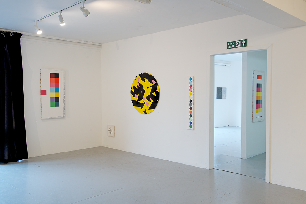

 installation shots courtesy Bernard Mills
Four years on we have H-A-R-D-P-A-I-N-T-I-N-G to revive this delayed conversation, which again involves O’Donnell, with Phoenix Brighton artists Ian Boutell, Phillip Cole and Stig Evans as co-curators. To broaden the range of contributors beyond the Phoenix studios (and Sussex to avoid possible charges of provincialism), several more abstract painters were approached, from whom Johanna Melvin and John Bunker were added to the troupe. Also, to give the exhibition some historical perspective, and a visual example of the thinking behind the show’s title, a work by Tess Jaray from a private collection was also added. This is an original silkscreen entitled, ‘Minuet’ [1967] which she gave permission to include.
The intention for the show as a whole appears to make a continuity argument about a particular kind of abstract art, which the press release has “identified as exploring the possibilities inherent in space, colour, line and edge, and seek(s) to develop a conversation around the language of paint. The exhibition presents a collection of paintings that have been developed through pre-meditated and choreographed processes; in developing the images, the artists favour intention over accident.”
Before seeing the exhibition fully installed (I had visited initially when the hang was in a state of flux to write a preview) I was already forming reservations, but an internal quarrel with the polemic of the exhibition title seemed inappropriate, especially as provocation is a useful tool to stimulate reaction. In a nutshell, I expected something free from improvisation and overt gestural involvement if pre-meditation and intention was to characterise the selection. In anticipation, adjectives for what might transpire that initially sprung to mind were: steady, cool, unhurried, considered, planned, balanced, repetitious, meticulous, sequenced and programmatic.
To give a little enticement to draw an audience, the press release further explained that works on display would be: “Painting that is hard edged, non-figurative and abstract / Painting that endures / Painting that is a complex and esoteric distillation of ideas” – Was a Neo-Geo renaissance on the cards?
Fortunately, the resulting display of work was broad enough, and of sufficient quality, to demonstrate that ‘painting’ (in it’s loosest term, as print and collage was included) could be as personal as it appeared impersonal. Each artist’s work maintained its own internal rhetoric and systematic coherence, and a variety of reactions to the many works was experienced, especially with an opportunity to re-visit the show after the busy (almost frenetic) opening that attracted 180+ visitors.
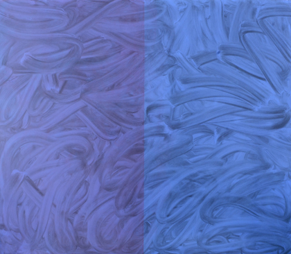
Tess Jaray, “Minuet”, 1967
As mentioned earlier, Tess Jaray RA just had one work on display (and perhaps it was reasonable that the most established ‘name’ was restricted in this way) giving attention to the less well-known names. In Jaray’s image, the geometric, flattened out, perspectival spatiality (a fascinating contradiction) of ‘Minuet’ set a tone of systematic coolness and restraint that was also inherent in the other exhibitors’ works.

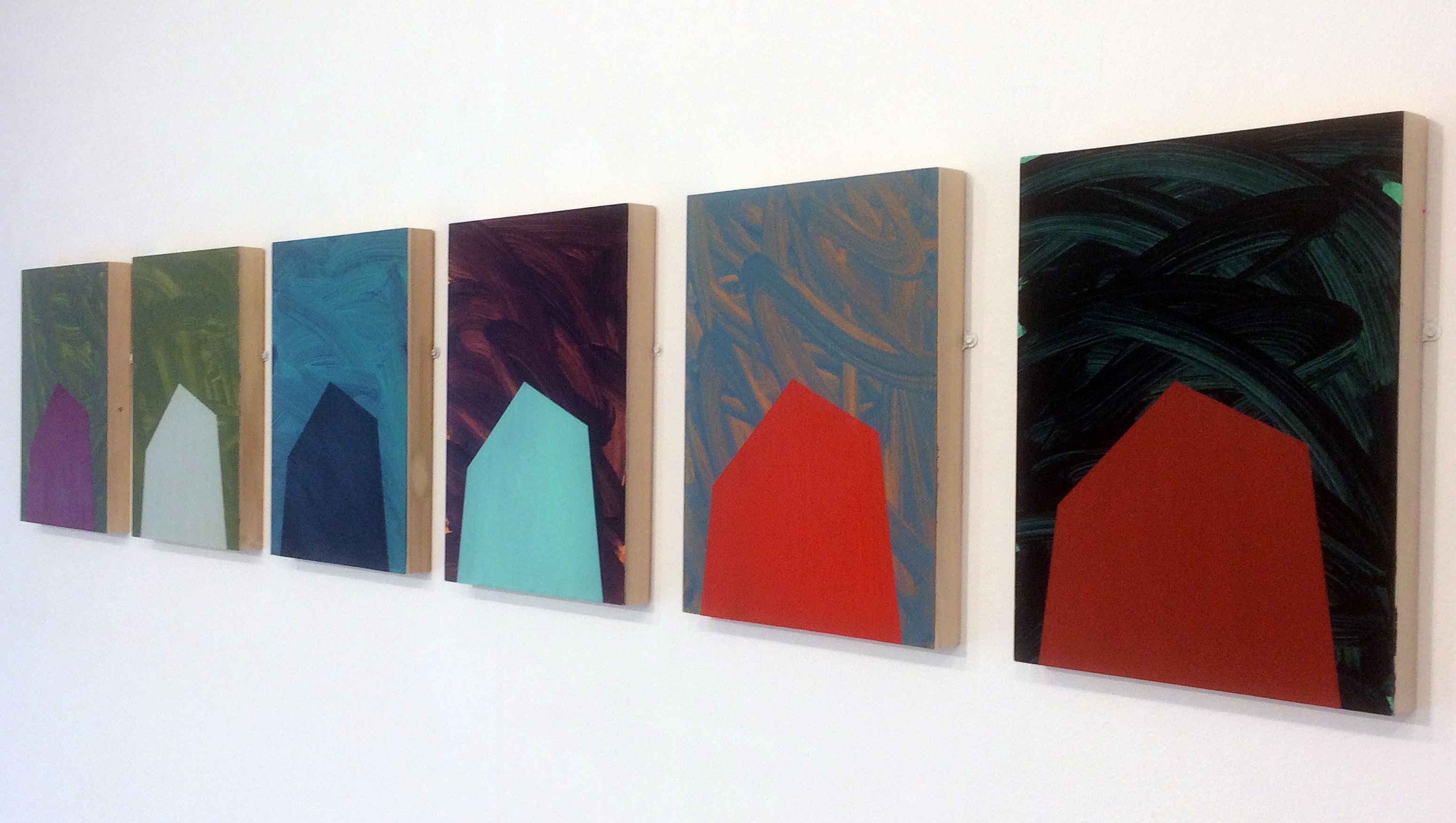
Patrick O’Donnell, “On a Plane”, acrylic and charcoal on board 50cm x 50 cm
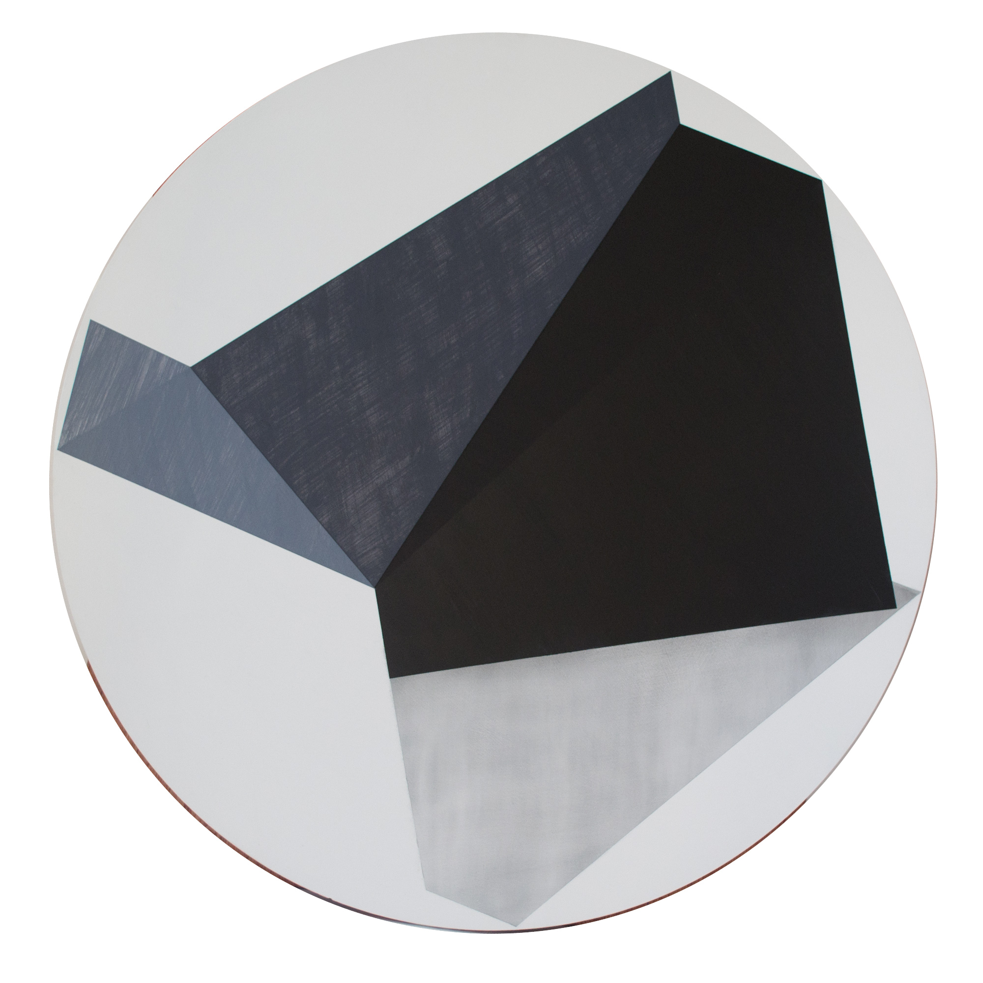
Patrick O’Donnell, “Something to Remember Me By”, acrylic and charcoal on board, 76cm x 76cm

Patrick O’Donnell, “Floor to Ceiling”, 2018
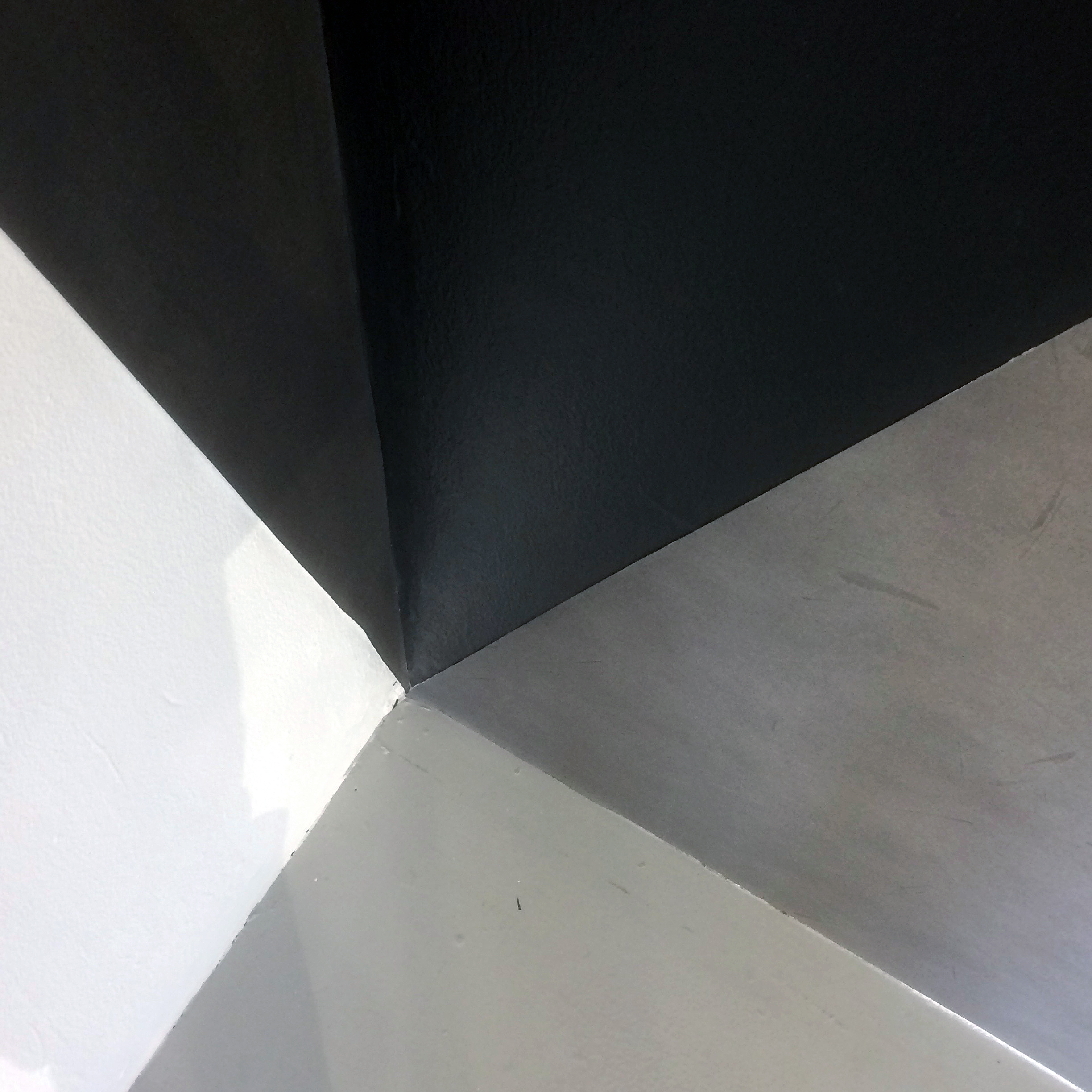
Patrick O’Donnell, “Floor to Ceiling” detail
If we extend the sobriquet of ‘super-cool’ to two of the participants’ work, Patrick O’Donnell and Philip Cole appear to have it in spades. But their work is so very different. O’Donnell’s combined paintings and drawings are calmly uncoloured from black to white, in tones that are perceived in, and extracted from, segmented architectural spaces (and could be based, by implication of extended time invested in looking, on observational drawing more than photography); whilst Cole’s works present (rather than explore) printed colour palettes that will be found tucked behind the glued down forms of mass-consumption packaging.
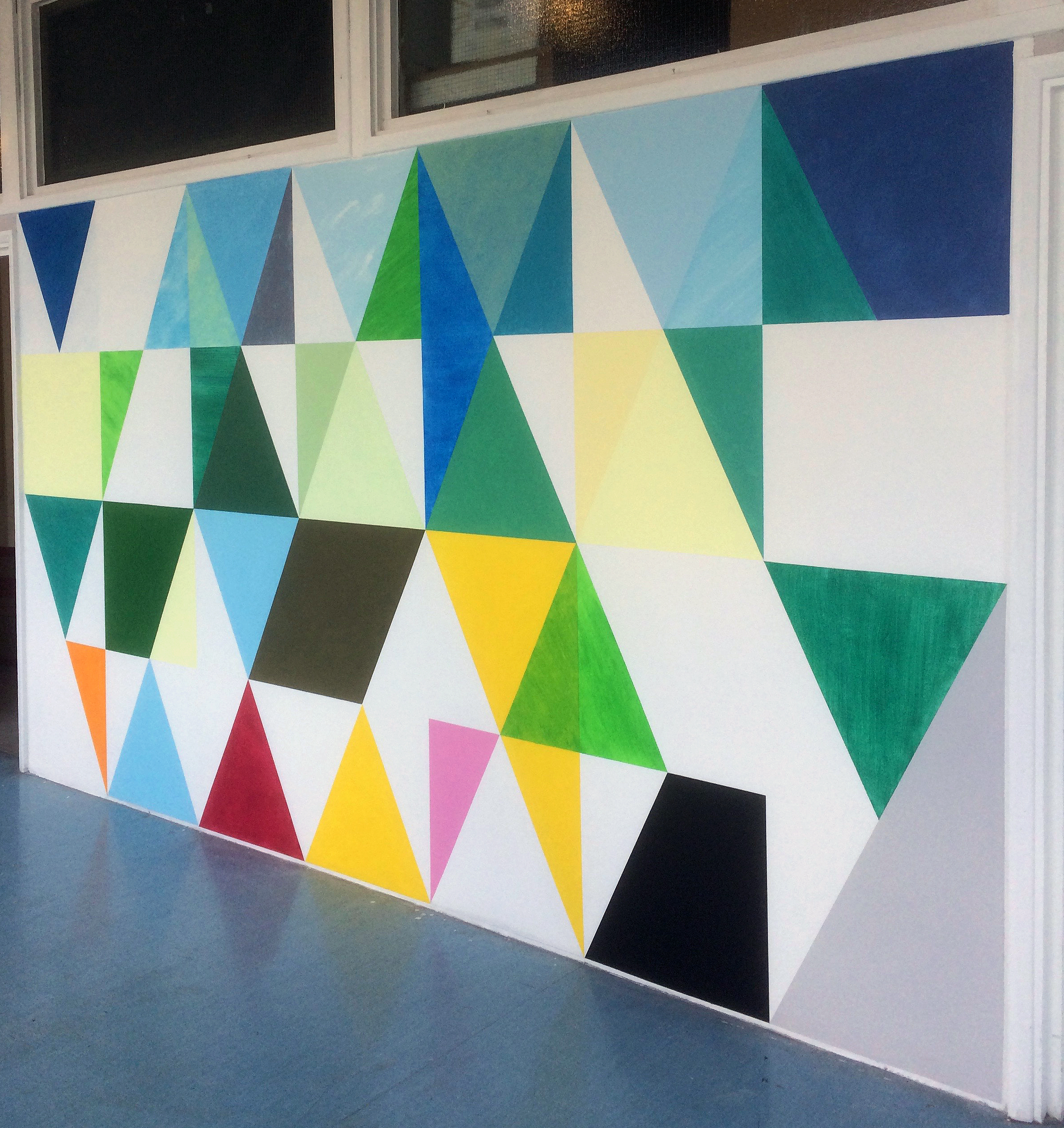
Philip Cole, “Anthropo-scene”, wall painting, 2018
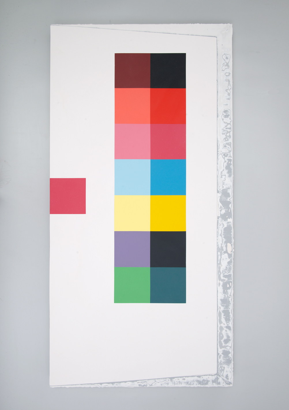
Philip Cole, “Ultra Peripheral Lovely Lolly 2”, 2017
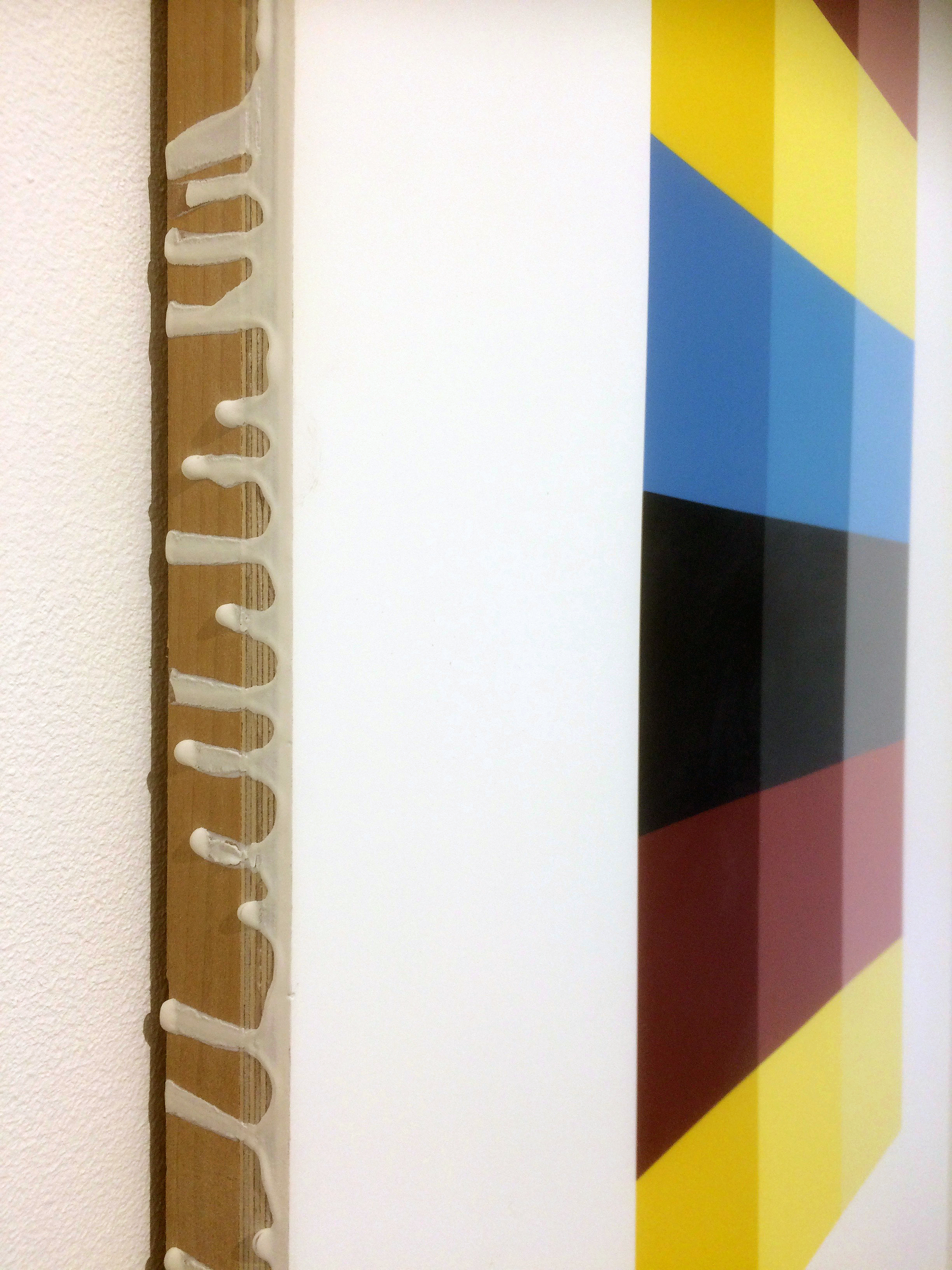
Philip Cole, detail of resin edge and board
Cole’s paintings are typically made from polystyrene resin, which, though wall hung and 2D as imagery, suggests a sculptural association. He also employs an engineered, machine-led process of production to create a non-painterly visual effect – despite leaving drips of resin on the edges of the support board. Although Cole’s imagery appears abstract, the predominant subject matter is derived from the peripheral or overlooked registration marks of commercial printing, such as colour bars and bulls-eye targets. The paintings also have a smooth and highly polished surface that, superficially, may allude to 2D digital production processes that denies the craft aspect of the handmade – but they directly contrast the notion of the machine made with a highly skilled (and labour intensive) hand crafted and hard-edged, geometric and colourful range of imagery – albeit under strict control. What might first appear to be superfluous abstract eye-candy deserved, and demanded, longer looking. For example, by drawing the viewer’s attention to the methodical and contradictory 3D construction of printed colour in his pieces, the pleasurable experience of observing a simple sequence of a variety of CMYK colour mixes in ‘Ultra-Peripheral-Lovely Lolly 2’ [2017], was quietly mesmeric. The building-block squares of colour alluding to an accurate construction of the missing virtual image might allude to a simple yet sophisticated structuralist visual trope: neither symbol or icon, but an invisible indexical sign nonetheless. But in some instances, the esoteric is best experienced for its pure visual pleasure and Cole’s works satisfied either option.
Patrick O’Donnell’s charcoal and acrylic paintings also present a highly refined and controlled production process. But where Cole’s colour palette includes (at least by implication) every primary and secondary subtractive colour mix, O’Donnell’s stark imagery is devoid of colour but full of silent pathos. There is a sense of severe understatement about the flat and planar, but perspectival, folded forms that characterise the essential features of constructed spaces. Oddly, a first impression was of segments of non-organic geometric form taking on the persona of the still life or the anonymous portrait. The sober and dignified, monochromatic images also emanate an emotional kind of piecemeal, but visually resolved, architecture. There is a sense of the mnemonic fragment of the particular about these quasi-domestic monoliths.
This poignant and disturbing element instinctively sensed in the work became more overtly humanised when O’Donnell explained that his visual language and sparse imagery had developed from a visit to the Jewish Museum in Berlin. The Libeskind Building, known as the Holocaust Tower, made a deep impression on him. Subsequently, O’Donnell worked for a year drawing in charcoal, developing his ascetic and sombre, shape-shifting imagery. The most recent works in H-A-R-D-P-A-I-N-T-I-N-G are responses to compositions derived from various corners within his recently deceased father’s house. More concrete than words, the works could augment Gaston Bachelard’s ‘The Poetics of Space’, but with a singular sense of anonymity in the simplicity of forms that evoke universality rather than the personal idiosyncrasies of a private familial space – unless you were the author of the work.

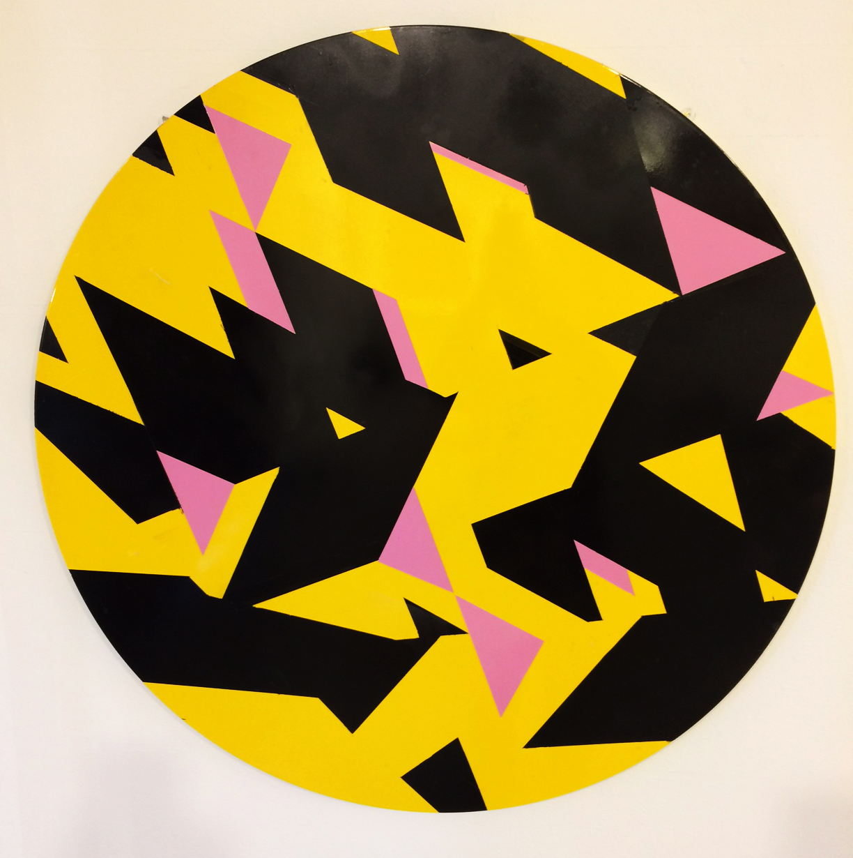
Ian Boutell, “Falling”, spraypaint and acrylic on board, 100cm x 100cm
Ian Boutell, “Never Ending”, spraypaint and acrylic on board, 100cm x 100cm
Also working with imagery with an architectonic feel is Ian Boutell (he trained as an architect at Manchester University). The freedom to develop a more individualised art practice was established more recently, having completed a degree in Fine Art as a mature student. Several works made from Perspex are displayed which form collage reliefs, but it is his two tondos that stand out in this show. ‘Never Ending’ and ‘Falling’ involved spray painting and the use of tape to make loosely geometric but fragmented de-constructivist compositions. The yellow and black stripes might reference hazard-warning tape that is used to cordon off off-limit spaces and initial doubts about this methodology for constructing so-called hard-edge abstraction (recalling early Sean Scully) initially left me feeling indifferent. But having given more time to view the surface of ‘Never Ending’ close up, I was perversely pleased to notice subtle changes in the gloss and semi-gloss black surfaces. Edges of yellow had leaked as some of the paint had penetrated beneath the masking tape during production. Deliberately leaving the technical faults on view, however subtle, gave way to evidence of the handmade process that had undermined refined slickness and a machine-like perfection. These two works also balanced the strictly geometric form of the disc with an inner revolving sense of movement created by Wyndam Lewis-type Vorticist zigzags and restricted choice of flat colour.

Stig Evans, “The Ravished Image (Apocolypse)”
Stig Evans, “The Ravished Image (St John The Baptst)”
The remaining H-A-R-D-P-A-I-N-T-I-N-G co-curator from Phoenix Brighton, Stig Evans, is clearly a perfectionist. He presents minimalistic works that balance painterly mark making with carefully chosen and mixed hues. In these combinations of the geometric with the hand-painted (are the sub-dividing coloured fields behind or in front of the gestural screens?) he also makes reference to paintings from the past. For example, ‘The Ravished Image (Landscape with a Man Killed by a Snake)’ [2017] references Nicholas Poussin’s version in the NG in London. But disappointingly it is placed at what feels like one of the two end points of the show. I make this point as there was a sense of several solo shows having been mixed up to form the mainstream group show. In the largest gallery space (technically there are five adjoining spaces) two of Evans’ paintings, ‘The Ravished Image (Apocalypse)’ was placed next to ‘The Ravished Image (Virgin and Child with Saints)’ [both 2017] and the triptych possibilities of adding the first work might have appealed to an art historian’s sensibilities.

Stig Evans, “Blue Verditer Dulux Trieste”
Evans also displayed many works on paper that juxtaposed traditional colours with modern-day equivalents; for example, ‘Blue Verditer/Dulux Trieste’ [2014] demonstrates similarity and difference, and a potentially nostalgic nod to history. That Evans is also a Paintings Conservator at the Royal Pavilion and Museum in Brighton may come as no surprise.
Johanna Melvin, “Towers” series installation, 2017
Johanna Melvin, “Pink Shed”, 2017
Completing the Magnificent Seven (sorry, I couldn’t resist) are Johanna Melvin and John Bunker. Interestingly, Melvin’s backgrounds (particularly in the series of six ‘Tower’ paintings) echoed the painterly swathes of singular colour in Evan’s largest canvases – or a whitewashed window in an urban setting that could reflect changing ambient colour and light. The foregrounded blocks of solid colour might also be derived from a contemporary range of household colour charts that added to a sense of image construction that explored repetition and diversity.
Despite the implied abstraction, the repeated silhouette reference to the tower blocks placed the imagery in Melvin’s London environment, rather than Brighton (where such architecture is carefully restricted), and a macabre association with Grenfell Tower was unintentional but sadly unavoidable for me. ‘Pink Shed’ [2017], however, had no such association and combined flat, solid colour shapes with thinner more painterly and amorphous patches of colour. Whether the ‘shed’ reference was represented by the floating salmon-pink shape, or the thin frame-like inner border on the right hand side seems irrelevant, and this work joined the dots between O’Donnell’s and Evan’s works to maintain coherency in this group show.

John Bunker, “Ram Raider”, 2014, 280x240cm, mixed media
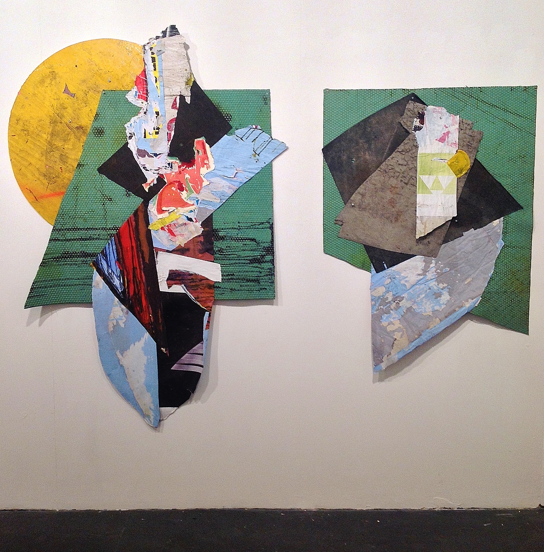
John Bunker, “Wall Flower” and “Just Blood and Shadow”. 2013-14, mixed-media

John Bunker, “Wall Flower” detail

John Bunker, “King Lud”, 2016, 46cmx52cm, mixed media collage
John Bunker’s collage work is well known to Abcrit readers and his employment of risk and spontaneity might have precluded him from this show, but the ‘considered’ and ‘balanced’ placement of found collage material with painted or printed visual content expanded the potential of predetermined rules or recipes for abstraction. The inter-relationships between the melded, shapely parts and the concrete materiality of various mixed media combinations – linked by overlapping or overpainting – makes the work visually persuasive as being in and of the inhabited, social realm where materials and imagery have potential for attaining the aesthetically beautiful or it’s dialectical sparing partner – detritus and wastage.
It was good to see the pairing of companion pieces, ‘Wall Flower + Just Blood and Shadow’ [2013-14] which pull apart the confines of the rectangle and set up a kind of double-portrait of abstract collage. Also, ‘Old Roan’ [2015], from the Tribe exhibition at Westminster Reference Library in 2016, demonstrated how two potentially separate collages could conjoin with just a slight overlap to create a duality that feels resolved. Bunker’s last show (Leave It….) at the Unit 3 Project Space confirmed the independence of his collage from painting as such, but these slightly earlier works (especially ‘Ram Raider’ that was first shown at Fold in 2014) pre-empt the indicative installation element of current progress. In fact the placement of the wall-based assemblage, ‘Ram Raider’, subtly leaving the background of the wall by its placement on the floor, added an indicative installationist dimension to the exhibition that had been explored by O’Donnell’s ‘Floor to Ceiling’ corner construction. This work, which takes the paintings and drawings back into three-dimensional space, activated an otherwise typically dead space. Likewise, a temporary wall painting by Cole (‘Anthropo-scene’) gave strong hints of what might provide a potential follow-up show that could tip over into arenas of so-called expanded painting (for “painting endures” to reference the short manifesto presented by the curators) which evolves without necessarily rejecting its own history.

H_A_R_D_P_A_I_N_T_I_N_G poster
The opening evening of H-A-R-D-P-A-I-N-T-I-N-G brought together a large contingent of the local community for an exhibition of abstract art which augers well for the future. For a cold night in January that is impressive.
LINKS:
A Preview of the exhibition by Geoff Hands was published on fineartruminations before the show opened and has links to the artists’ personal websites :
https://fineartruminations.com/2018/01/10/phoenix-rising/
For the Abcrit review of John Bunker’s exhibition at Unit 3 see: https://abcrit.org/2017/12/08/88-geoff-hands-writes-on-john-bunker-at-unit-3-london/
Phoenix Brighton website: https://www.phoenixbrighton.org

Like you say, Geoff, forming “an internal quarrel with the polemic of the exhibition title seemed inappropriate, especially as provocation is a useful tool to stimulate reaction.” Judging the work itself is always the better option. However, the press release provided above is not so much provocative, but more typical of gallery releases when it comes to abstract art…
“…Exploring the possibilities inherent in space, colour, line and edge, and seek(s) to develop a conversation around the language of paint. The exhibition presents a collection of paintings that have been developed through pre-meditated and choreographed processes; in developing the images, the artists favour intention over accident.” Even with the added ‘definition’ of ‘Hard Painting’, this statement remains pretty mundane and non-committal. Although it is perhaps fitting for some of the work on show, which is not particularly ‘hard edge’. But I find press releases of this kind a real turn-off, and unfortunately they are often a pretty good clue as to what you might expect to see when you get there. Familiar work breeds familiar responses.
Firstly, what serious abstract art, be it hard, soft, loose, whatever, isn’t concerned with “space, colour, line and edge.” All these things occur by default, which says nothing about their quality or inventiveness, nor does “exploring the possibilities”, because when you start, one familiar outcome is just as much a possibility as another familiar outcome.
Secondly, what is the “language of paint”? The press release implies that it already exists, but requires some form of translation. But does “conversation around the language of paint” mean to simply talk about painting, or around painting? The latter sounds pretty strange if not cautious.
Perhaps I’m being petty, but having read many press releases like this one, for abstract work not too dissimilar in its ‘variety of approaches’, often a bit of hardness, with a bit of contrived brushiness, masked off, contrasted with a thin pink line or some nice drips on the edges, you start to wonder to what extent the familiarity and mundanity in the writing and the work are inextricable from each other. Most importantly, abstract painting itself must lift, and hopefully everything else along with it. But we’re probably in a situation where curators and gallerists are looking for work that ‘goes together’ whilst still “exploring a range of possibilities”, and that you can make broader non committal statements about that don’t really mean all that much. Artists probably play up to this to some extent. I think John Bunker probably was an odd choice for this show, because he doesn’t really fit the brief, and at least judging from the install shot of “Ram Raider”, seems to dominate the room. Perhaps that’s good though, some necessary conflict.
LikeLike
Some Interesting comments Harry Hay but you seem to have formed a judgement about the exhibition and the work therein based on your dislike of the written review. You have called it a press release; are you saying that it seems like one or it is one? As an exhibitor and artist/co curator for H_A_R_D_P_A_I_N_T_I_N_G the review seems to me to be by an independent reviewer.
You make a suggestion that the work may be mundane if it is anything like the press release. Surely the best policy would be to visit the exhibition and then you would be able to judge for yourself whether or not the paintings provide a ‘lift’.
What I am certain of, is that there is a broad range of work that is hung in a way that does not seek to separate each artist or type of approach but to mix them up so that conversations might occur. I think that some connections and conflicts are suggested by the ‘hang’ and others have arisen unexpectedly. With this in mind it is clear to see that John Bunkers work does not seem an odd choice at all. What has happened so far at H_A_R_D_P_A_I_N_T_I_N_G is that visitors have been able to make connections and that this has meant an increased public engagement with Phoenix Brighton and with contemporary art.
Perhaps, as Geoff Hands has discussed each exhibitor in turn, this aspect of the exhibition may have been overlooked in the review.
You make two other points; the first, that serious abstract art doesn’t concern itself with space, colour, line and edge but that these things occur by default. I would maintain and I think others might concur, that it does … hence our statement about intention over accident. Perhaps we have a different understanding of what serious abstract art is or we are being too playful.
You also make a comment about the language of paint. I think that you can feel, smell, see and hear it without the need for translation in this exhibition, but this is opinion – hopefully others might add their thoughts in agreement or to the contrary, with no skirting around the issue.
Philip Cole
LikeLike
Hi Philip. I wasn’t criticising Geoff’s review, which I enjoyed. I was criticising the press release that he quoted from, which can be read on the Phoenix Brighton website. I would visit the show if I could. It contains work that I would be very interested to see. It also contains some work that I think looks very familiar, and the press release (not to be confused with Geoff’s review) was also familiar. If I could see the show, I would probably focus less on the press release.
I am still confused about the statement regarding the ‘language of paint’. Being able to feel, smell, see, even hear it is all well and good, but the experiences of the senses do not amount to a language. You say it needs no ‘translation’. I would have thought that meant you’d agree with me then, that language is not really the right word to use.
Sorry if I came across as lazily dismissive towards the work based off the promo, but I do think these things matter to some extent, however small.
Hope you get some more responses, Philip.
LikeLike
Yes. As you imply, the experiences of the senses amount to much more than a language. The word esoteric springs to mind. The response to the experience and the discussion of said encounter in community with others however involves talking about painting and the paintings and this was our intention. This is ‘developing a conversation around the language of paint’. The experiences of the senses can approximate to a language – albeit a non-verbal one.
The experience doesn’t need translating for it to be legitimate but an attempt to translate this language is a thing that some humans like to do.
LikeLike
P.S. I never said that serious abstract art doesn’t concern itself with colour, line, edge etc. I asked “what serious abstract painting doesn’t?”, the implication being that the recital of that well worn trio is not enough to make a distinction between one set of works from another set. That this was too playful didn’t spring to my mind.
LikeLike
Hi Harry
Having re read your original comment I do now see that you were referring to this set of concerns as a given in contemporary abstract art. I do agree that it isn’t enough on which to base any kind of distinction between one set of works and another but it was our opening gambit and as such, designed to give all readers an inkling as to the type of exhibition that they might expect. The press release contained further detail outlining some of our intentions but we aimed to be succinct rather than mundane and non-committal. Grand claims can end in disappointment but a degree of modesty is countercultural and may result in the opposite.
Regards
Philip
LikeLike
I think the relative familiarity of this kind of painting (pre-conceived, predominantly hard-edged, geometric) is due to its narrow focus on perception. Of course, this is a legitimate concern for painting, and one that can produce good art (Mondrian, Albers, Reinhardt). What it tends to lack is any kind of semantic import – not in the linguistic sense of semantics but in the sense that an observer might be moved to exclaim “Yes, exactly!”, though perhaps still unable to put this recognition into words.
The consequence of this focus (and this lack) is that all such works tend to end up demonstrating the same few things, making them rather familiar to any artist or dedicated museum-goer. The bar for any true originality or revolutionary insight is set very high indeed.
This academic tendency, together with the inevitable proximity to design is often countered by the incorporation of incongruous, jarring elements, but it is hard to see what these achieve in a positive sense. I´ve not entirely thought this through but I imagine that the resulting lack of wholeness is probably a further obstacle to semantic import. Our experience of existence at any one moment is a whole thing, a fractured artwork tends at best towards narrative.
LikeLike
It looks like the work in this show is well placed with a sense of unity in its ‘hard edged ness’ and strong confident colour choices. John Bunker’s collages are a fabulous contrast to the neat, graphic, semi minimalist quality of the paintings.
I like Philip Cole’s ‘Anthropo-scene’ wall painting and Ian Boutell’s yellow and black sprayed works, but am wondering if generally, pristine perfection can sometimes look decorative? And does that matter?
LikeLike
Wall piece aside, I found the work quite un-decorative. Reproduced (regenerated?) on screen renders flatness flat. There is some very emotive work in this this show.
LikeLike
Geoff, you are right of course one should always judge work in front of it, but are the emotive qualities evident after reading the words rather than seeing the work? I probably won’t get to see the show so have to trust your responses. Well written piece though.
LikeLiked by 1 person
I´ve just been reading about James Turrell´s new installation at the MONA in Hobart.
Isn´t this (and Olafur Eliasson etc.) a more promising way of providing new perceptual insights/experiences? I don´t think that painting (whatever the acreage) can compete any more in this area of the impersonal exploration/demonstration of visual perception.
I would suggest that painting has to be personal to maintain its relevance. Starting with post-painterly abstraction, there has been a long reaction against the supposed egotistical machismo of abstract expressionism. But can´t there be a painting that is expressive and personal without ego, and without self-detracting irony and whimsy? Grown-up painting?
Since we are all individuals with our own unique experience, sincerity/authenticity is more important to the personal aspects of an artwork than any preconceived originality. And the unconscious, tapped into through meditation, accident, spontaneity or whatever has a greater role to play than in impersonal art. There is no place for the ego in any good art, but for me impersonal painting tips what is left of the baby out with the bathwater.
None of this applies directly to the show reviewed here, which I haven´t seen. They are thoughts prompted by the phenomenon of preconceived, impersonal painting that, with the exception of John Bunker´s collages, looks to be in the DNA of most of the works described.
LikeLike
None of the work in this show is impersonal. The entire history of painting is in the DNA.
LikeLike
Oh go on then, I’ll buy it. What do you mean, and where is it?
LikeLike
Hi all. I’d just like to add that it is a physical show. Not virtual. You’ll see the human hand in all the artworks if you get up close and personal. Best wishes. Patrick
LikeLiked by 1 person
This may just be a disagreement about words, but even from the jpegs, I’d say that most/all of these works have a virtual element, conjuring up illusory space from a literal two dimensional surface.
Without this, they really would be hard to distinguish from decoration.
I think this simultaneous presence of the literal (surface, brushmarks etc.) with the virtual (illusory space) is the special property of painting that ensures its continued relevance.
My point is that it is not enough just to demonstrate this as an optical effect. It is more like a basic requirement for painting, which can then to be used to explore those aspects of human existence made accessible by it.
And when it comes to searching out new or more intensive forms of virtuality, painting has already been left behind by technological advances in other areas, though these too remain a kind of fairground entertainment if they are not used as a form of artistic exploration.
I think the familiarity/academic nature of preconceived art comes from its refusal to engage directly with the individual lived experience of the artist. Its “subject matter” is an effect, a concept, an idea – stuff that is already in the public domain and that benefits from such works only in the form of illustration.
LikeLike
“Lived experience” of the various artists is inherent in all of these works.
What’s the problem with “decoration”? (Although these works are not exclusively decorative at all).
My earlier ‘DNA’ comment points to the fact that ‘contemporary’ paintings (such as those in HARDPAINTING) form part of a continuum from the history of painting – especially (but not only) the 20th century.
LikeLike
Well, there is a problem with decoration. It doesn’t necessarily have anything to do with pattern, or it’s being painted directly onto a wall. But it exists as a problem across all art forms. I see it as basically anything that is not essential, or intrinsic to the work as a whole. It’s when an element seems as if it could be removed without it having any impact on the work and how it achieves its particular character. I’m thinking of certain “found” elements in Rauschenberg, or almost everything that winds up in a Gareth Sansom. In work that is more visually complicated, ‘decorative’ could be synonymous with ‘ornamental’. This can have other unfortunate ramifications, such as the work appearing self-indulgent.
In more minimal work, such as what we see in HARDPAINTING (but not exclusive to HARDPAINTING), the issue of decoration or ornament becomes far more touchy, because in the absence of ‘stuff’ to point the finger at, the microscope falls upon the existence of the work in its entirety. This does not necessarily make minimal work a more risk taking endeavour, just as you cannot assume that minimal work is by nature more essentialist. In the case of HARDPAINTING I would question the drips on the edge of Philip’s work. Given that they are supposedly there intentionally, I wonder at what they are intended to deliver. I think you could also wonder about the colour combos in Johanna Melvin’s “Towers” series. If the colours can just be interchanged, is there anything definitive to be gleaned about this work? Is the composition simply that strong that the colour adopts a secondary role? That sounds like a recipe for decoration to me. Indeed, anything that preferences the realisation of intention over all the other stuff that happens along the way is probably going to wind up as decorative. As Richard has observed, originality cannot be preconceived.
I for one am very excited by the terms Richard laid out for “grown-up” abstract painting, which has been pursued over many years and will continue to be.
LikeLike
Harry, in reply to your question about drips. I cannot give you any assurance that they are an intentional part of the process but they are an unavoidable result of the process of painting layers of polystyrene onto board. Removing or leaving the poured and painted resin drips however required a decision. I have in most cases left them, and so they are an integral part. The wooden frame, also seen from the side view is made from Poplar, It was intentional to have this partly visible as was the decision to exhibit the paintings unframed. The drips may add or detract from the work, they may be a clue to the process used or they may help to obscure it. They may be all these things.
LikeLike
I too am in favour of Richard’s “grown up” painting. If the “lived experience” of these works amounts to drips down the edge, if that is the only real access to something extemporised rather than pre-conceptualised – and even that seems rather arch to me – then our engagement with the intentionality of the work (the work, not the artist) becomes very slender because so little of the work shows an awareness of “wholeness” that goes beyond repetition.
These works (Bunker aside) are by their nature designed, and I think that is a better definition than “decorative”, which by no means needs to be a pejorative description. As for them continuing the DNA of painting’s history, I would suggest that the works owe their perfunctory organisation(s) to the formulations of past minimalist art, and their credibility (such as it is) is sustained through such unoriginality (it’s been done before, so it must be OK to do it again). Geoff works very hard to give this art some significant purchase, but it seems to me mostly contextualising. For example, just how much of Patrick O’Donnell’s history do we need to know to see significance in his illusionistic shadows?
LikeLike
I would put it like this: Decoration isn’t meant to explore or convey anything concerning human experience. It only wants to look good, without import or significance. So yes, as Harry says, all those add-on bits that aren´t a part of the significant whole, together with entire works whose sole motivation is to look good on a wall, convey status, succeed in the market or “look like art”. And no, we cannot know what the intentions behind an artwork were, but the difference will be there in its (admittedly subjective and arguable) power of conviction, just as a flippantly devised, unresearched and untested scientific paper will lack any power of prediction.
For me, this is where artistic integrity comes in. It is the arts` equivalent of scientific discipline. As an artist you constantly have to be asking yourself whether the current work is “finished” only because it looks good or fashionable, or looks like the work of another, admired artist, or is what the gallery asked you for, or whether it has a rightness that reflects some intangible aspect of your existence. Only then might it have the capability to contribute in some way to human awareness, just as science contributes to human effectiveness.
None of which means that art cannot also be “decorative” in the sense of looking good.
LikeLike
I would put it differently – because some of the profoundest art in history is quite reasonably described as decorative. I’m thinking of textiles, carpets, metalwork, indian painting and sculpture, Islamic art, Matisse; even architecture. One of the shortcomings of a lot of modern architecture is in my opinion its inability to integrate good decoration into structure. Really good decoration can indeed “explore or convey” things “concerning human experience”, sometimes better than “fine” art, and often without the big ego trip. So, for me, the work in this show is, if anything, not decorative enough, and way too conceptual.
LikeLike
Also, good though it sounds, integrity on the part of the artist is difficult – often an unknown, like intentions – and no guarantee of anything much. You have to believe your eyes, don’t you?
LikeLike
Yes, OK. I would characterize the examples you give as works that are perhaps intended decoratively but transcend decoration. Roger Fry again – “trying very hard to do something that has nothing to do with what is actually accomplished”.
The integrity thing is vague of course, and only important on the side of the artist. It can’t be seen in the finished work, just as the intentions behind the work can’t be seen. I do think though that it is an issue that arises for every artist with every work, though maybe not exactly in the way I described.
LikeLike
What interesting comments but even more interesting attitudes being expressed. We must be doing something right!
Firstly, you guys, for it has been solely guys so far, you know how to patronise. (Noela not included in this assertion}
It would seem that you believe that you have the only, and possibly the last word, on Abstract painting. How else could we read those comments about the position and colour of some of the elements within a painting. Pink seems to trouble Harry, he also complained about it in John Pollards painting in the Greenwich exhibition #61 where it should have been to the left a bit, not so central. And pthalo green dots in another.
Or the irony of things that you believe (Richard Ward about semantics, the branch of linguistics that is concerned with meaning) but then cannot express in words! Wow! That is hilarious: sadly.
Some words seem to attract derogation; mundane I can understand might come into that obvious category but design and decoration? In Modernism decoration was once labelled a crime but the author of that comment Adolf Loos, regularly ignored his own dictum in his architecture. And whilst stating something authoratively as both Harry and Richard have attempted doesn’t make it true. It becomes simply another opinion debatable until the cows come home.
Brushwork. There is another tome to be written here but not by me. But just a comment about drips on the side of a painting. Phil Cole works with coloured resins on strong horizontal plywood mounts pouring resin over the assembled coloured elements of the painting. The resin flows over the edge quite naturally and unavoidably as an expression of the process. This surface is sanded back to a finish that is free of brushmarks, precise, colourfast and extremely beautiful. The whole is thoroughly authentic and devoid of accident except the side is left as it flowed and formed and hardened. Where does this idea come from that this is familiar, that somehow it does not relate to lived experience? I’ve not seen work like this before and it is Phil’s lived experience every day that he goes to the studio.
Bemoaning the absence of brushwork as impersonal and then advocating a light show produced by a huge Berlin based brand, having previously reviewed a show by admittedly brilliant but long-dead painters called ‘Long Live Painting’ tests my credulity. As Clive Anderson famously said of Jeffrey Archer ‘Is there no beginning to your talent.’
Painting is hard whatever medium or form it takes. Writing about art is hard too but what has surprised me is the level of misunderstanding and assumption. We all need to be better informed and better able to express those complex ideas. As with music the real thing is best. This form of exchange is too slow to have a proper conversation. Instead composed and structured responses move slowly back and forward with each participant playing a role as an expert; in fact the expert. We should all know this and find ways to actually talk about the art. I’m afraid that the way this thread started set the tone.
Finally, may I commend to you a ‘gentle manifesto’ which appears to be about architecture. It is, but it is relevant to art also and was published in 1966 by MOMA New York. ‘Complexity and Contradiction in Architecture’ by Robert Venturi points out the danger of simple, simplistic thinking when the issues to be dealt with are complex and cross-cultural. All you need to read initially is page 16 to see that after modernism we need to think differently.
LikeLike
Sorry Ian, but I do get the feeling that if we had come out and “authoritatively” accepted everything in this show then there would be no problem. At least your show is being talked about. It’s much preferable to indifference.
I accept Philip’s reason for the drips. But I also reserve my right to question them. As Philip says, “The drips may add or detract from the work, they may be a clue to the process used or they may help to obscure it. They may be all these things.”
I’m not looking for lived experience in the drips. I’m wondering what their relation is to the frontal image, and if their presence on a literally three dimensional edge becomes an objectifying factor. At the end of the day it doesn’t really matter all that much and I’m not going to lose sleep over it, but given that Philip indicated he is open to dealing with it in different ways, it may well matter to him.
There’s nothing wrong with making judgements about pinks and greens and how things look and make you feel, as long as you’re also prepared to change your mind as well. That’s art criticism. And if that sounds patronising then I would ask that you don’t patronise me by generalising that I have a problem with the colour pink.
LikeLike
Having worked on a number of occasions with hard edges – probably the most through print and collage, I can appreciate the decision making evident in the work (only seen on screen). I know John B’s work well but I was particularly interested in Ian’s “Falling”. Firstly the colour looks really good – stinging stuff. I can’t tell but does the yellow move from warm to slightly lemon cool from right to left? Anyway the off-white rectangle does a lovely job of cooling that side. The two high key pink, purple rectangles are well chosen, but the clever bit is that extra black rectangle at the base which asserts itself as a floating rectangle a la these other three but also hangs on to the jagged black ‘superstructure’ and becomes part of that – keeping the edgy dialogue in tact betwwen black and yellow (the two strongest contrasting colours tonally as a matter of minor interest); also it not creating a yellow triangle where it almost meets the point of the purple – again evidence of a painter’s brain! I found when making screen prints that when the surface is even the tension moves to the edges and these dialogues between colour and shape provide the electricity. This is an excellent painting. I no longer work with such severe edges but enjoy seeing them when they are done this well.
LikeLiked by 2 people
Thank you for looking at the art and writing about it, Please see my reason for not feeling able to respond as I would have wished, in my short post to Harry this evening
LikeLike
Hello Ian
Let´s not get hung up on the semantics of “semantic”! I was using it in a broader but hopefully still valid sense that includes all kinds of potentially meaningful content, not just words, signs and language.
The point I was trying to make with Turrell and Co. is that whereas in the past painting has been able to provide new or interesting experiences that are demonstrations of perceptual phenomena, or invitations to perceptual self-examination in the viewer (Mondrian´s “Lozenge – Composition with four Yellow Lines” would be a good example), this area of enquiry seems to me to have become repetitive and academic for painting. How many paintings must there be in museums the world over, by a variety of artists, consisting just of two finely balanced areas of colour that see-saw against each other optically? I think that the future for this kind of enquiry probably lies not in painting but elsewhere.
My suggestion is that painting, far from being dead, is still ideally suited for the exploration/communication of personal subjective experience, especially because of its material (surface) vs. immaterial (illusory space) duality. And I think this might be possible without it involving self-glorifying ego or self-deprecating whimsy (including the disturbing whimsy of artists like the Chapman brothers) or irony. Art that has no need to boast or smirk or shock or comment on itself but presents itself as a tentative but sincere and personal contribution to the artistic endeavour, which I consider to be just as significant as the scientific endeavour.
There´s no need for you to agree with any of this. There are plenty of different opinions represented on Ab-Crit, and most of them (including mine) evolve over time. No-one has “the last word” here. I personally think it´s a great place to develop your own way of thinking about art. What´s yours?
LikeLike
And how many more Modernist type paintings must there be in museums the world over, by a variety of artists, consisting just painterly daubs of colour that see-saw against each other optically
LikeLike
This sounds like a jaded view Arthur, but I understand why you might feel that way. The thing is what Richard says about painting being the ‘exploration/communication of personal subjective experience’ , whatever form that takes, is right I think, because it is the only way something slightly different (or maybe even original) can be achieved.
LikeLiked by 1 person
Hi Noela,
I was actually just re –wording part of Richards last reply to make a point about his statement on the repetitiveness of paintings showing demonstrations of perceptual phenomena. (How many paintings must there be in museums the world over, by a variety of artists, consisting just of two finely balanced areas of colour that see-saw against each other optically?) I don’t agree at all with his or my re-worded version. I think all areas of abstraction still (and will) have room for interesting manoeuvre. Thinking that one area is not relevant anymore is actually narrow and jaded. I think he has an issue with what he thinks the type of work is on display at Hardpainting. Which I have not seen either. However I believe that whatever the type of Abstract painting (no matter how objective or purely optical or perceptual) it is, will (and has to) incorporate a ‘personal and objective experience’
LikeLike
This looks familiar:

LikeLiked by 1 person
Sometimes life imitates art?
LikeLike
For me, this logo is, if anything, not decorative enough, and way too conceptual
LikeLike
Sometimes life imitates art.
LikeLiked by 1 person
I think there are at least three relevant dimensions here: pre-conceived vs. explored in the act of painting, geometric vs. free-form, and simplicity vs. complexity, whereby in each case the former is (to my mind) more restricting and impersonal than the latter, mainly because of the nature and to a lesser extent the quantity of the decisions involved.
The works here (John Bunker´s excepted) look to be at or near the impersonal extreme of each of these dimensions.
I don´t think this is just a question of style. Particular media will have particular capabilities and transparencies for the experience they are exploring or trying to convey. To use an extreme example: There is a whole range of different sounding instruments, but personal experience in all its variety, however deeply felt, will find it harder to achieve expression through the bottleneck of a referee´s whistle than through a concert piano. There may well be cases where the whistle is the perfect medium, and far excels the piano, but these will be few and far between, and quickly lead to repetition.
I don´t want to suggest that these are referee´s whistle paintings, but it would be interesting to hear some thoughts as to what the special capabilities and transparencies of “hardpainting” might be.
LikeLike
My suggestion is that painting, far from being dead, is still ideally suited for the exploration/communication of personal subjective experience, especially because of its material (surface) vs. immaterial (illusory space) duality. And I think this might be possible without it involving self-glorifying ego or self-deprecating whimsy (including the disturbing whimsy of artists like the Chapman brothers) or irony. Art that has no need to boast or smirk or shock or comment on itself but presents itself as a tentative but sincere and personal contribution to the artistic endeavour, which I consider to be just as significant as the scientific endeavour.
LikeLike
Yes, but the problem with “…the exploration/communication of personal subjective experience” is in how that relates to abstract painting. I’d be interested to know what you think, Patrick, about what Geoff has said about the backstory to your work. Was that necessary?
LikeLike
Hello Patrick,
I’m not sure how you mean this, but maybe we agree about the aims if not about the ways of getting there. I’d like to add that I missed the bit about your father and would like to apologize if I have trampled on your feelings in my enthusiasm for the argument.
LikeLike
Dear Robin
I’m not sure if you are aware but these words are Richard’s, which I largely agree with, hence reposting, and I would argue that his suggestion applies to the works in H_A_R_D_P_A_I_N_T_I_N_G. Again, this is my argument and others may disagree.
The personal investment I had in the poetics of my father’s space were a catalyst for my current body of work, which has in turn evolved from a previous experience that fed into my practice, ultimately filtered in to works dealing with formal elements – shapes, edges, lustre (or lack of) of each rendered or implied plane, to play with tensile relationships on the surface. How successful these works are again is down to the individual.
Was Geoff’s comment necessary? Well, yes it was to Geoff as he wrote the piece and decided to include the backstory to provide a further context about my current practice. It wouldn’t be my opening gambit but I can’t deny how my personal experience impacts/informs my art practice.
A fond recent memory of the H_A_R_D_P_A_I_N_T_I_N_G exhibition was an hour spent in conversation with Geoff where he elicited this backstory through direct face to face discussion concerning the impetus for my current series of paintings. I would argue, as has been mentioned in earlier comments, that my and all the works in the exhibition derive from our individual personal experience – conceptually, emotionally, spiritually and through the physical hands on evolutionary process of creating and responding to the works. I can say my work on show evolved through their production.
In my painting, as well as writing (though I don’t proclaim to be a writer), I wish to be economical. I don’t wish to justify or feel the need to tell people how to read my work. Maybe you feel I need to?
I don’t (currently) paint blindfolded as I want to be involved in the decision-making process of my artworks – especially the current series as there is (maybe unfortunately) an element of precision that I am pursuing.
Do you and Richard (and Harry) paint blindfolded with your sense of touch somehow diminished?
I ask because the only way I can see true personal expression that you are alluding to, devoid of design and decision-making when, for example, applying 3 horizontal near identical colbalt slabs straight from the tube on to a painting or a large field of emerald green countered with a corner area of alizarin crimson (forgive me if I got the pigments wrong as I am looking at a screen) – would be to not see or feel what I am painting. The colour I’m using , the length of stroke or gesture, the pressure of the brush / tool I am using to apply the paint is predetermined by the brain (and its tacit knowledge) that is in control.
These are of course just my thoughts / opinions and not the law on abstraction. I do reserve the right to change my mind but would like to hold on to my current beliefs for a little while yet.
Best
Patrick
Ps thanks for posting the European architecture photo. It looks like an interesting building. Was there a reason you posted it?
Richard – thank you for the your last comment but don’t worry about my feelings.
LikeLiked by 1 person
“…my and all the works in the exhibition derive from our individual personal experience – conceptually, emotionally, spiritually and through the physical hands on evolutionary process of creating and responding to the works. I can say my work on show evolved through their production.”
Hey, mine too – would you believe it!
A baffling (and disingenuous?) comment. Apart from the prevarication on the meaning/backstory of your work, which painting with the “cobalt slabs” are you talking about, and why would we be blindfolded?
LikeLike
I asked you a few questions Robin
LikeLike
Oh sorry. Er…, do I feel the need for you to explain or justify your work? No, just the opposite, the work should speak for itself, which is why I was asking for your thoughts on Geoff’s “backstory”, which in my opinion has absolutely no bearing on the work at all. If you or Geoff think it does, you should (both or either) explain where and how that backstory manifests itself in what we are looking at?
Do I paint blindfold? No. Why do you ask? (And which is the painting you are talking about?)
The European Architecture graphic is for comparison with Philip Cole’s work, which he apparently had no problem recognising. And of course, neither did you.
LikeLike
Robin, aren’t you contradicting yourself?
LikeLike
Am I? Quite possibly, but I’ve no idea what you are talking about. Do all you minimalists have to write in enigmas? Sorry I got you confused with Philip over the yellow logo thing. I’m senile as well as misanthropic. Ian, do you have any idea what painting Patrick was refering to? He seems to have disappeared.
LikeLike
Patrick
The point I was making in the “three relevant dimensions” comment was that, from jpeg appearances anyway, your kind of hardpainting involves far fewer decisions and that these are less complex and more limited to the purely conceptual than the decisions involved in free-form painting that involves no pre-conception and reacts continually and spontaneously during the painting process (“working in the paint” is Emyr´s phrase I believe). This results in a relative lack of information – many such works can be conveyed by a few colour codes and vectors, which is how Sol LeWitt and other conceptual artists have “painted”.
To my mind, this would appear to make these works much more impersonal and much less able to convey any kind of nuanced or original “personal subjective experience”. You obviously disagree, but it would be interesting to hear your reasoning, as it must surely be something that you have thought about.
LikeLike
My phrase has to be taken in context. I don’t see any hierarchy of approach or think it’s as straightforward or polemical as that. Decision making doesn’t have to be rigid even if the edges are.
LikeLike
Here at Surf City Brighton the boards are waxed but were waiting for some decent art critical waves, there has been some choppy water but nothing much use for serious art surfing; the waves are barely ripples.
So, while we’re waiting for some seriously decent critical waves to develop and hone our skills; a bit of housekeeping to catch up and respond to the recent posts, before attempting to move beyond all those unfounded assertions and illogicality’s to develop a discussion about art, which is strangely missing at present from this site where it is supposed to be its raison d’etre.
Harry; I know a psychotherapist who has chastised me for patronising you, which I did, quite deliberately. She explained that it might be excusable in the young but not acceptable in the old. My feeling about what she has said is that you will grow out of it but that I should have already done so. But my feelings may have misled me, as have yours often.
Re your first sentence. Should not the ‘we’ be I. What group are you representing that gives ‘we’ the ‘’authority’’ to approve, or its unstated obvious opposite, to condemn anything? And how would your approval whether it be from ‘we’ or I (i.e. you) solve any problem for us? Let’s be clear I’m not desperate for yours or anyone’s approval but I would like an intelligent debate if that is possible.
I don’t think that you should take encouragement from Phil changing his mind about the drips. I am sure that he has not. You mistake his gnomic aphorisms for a change of mind whereas he says all of these may or may not exist at the same time. Put simply we are no longer in the either/or times of early modernism but in a more complex era of either/or/also/and.
I won’t use the term postmodern, but we are certainly post- modernity. You haven’t yet looked at Robert Venturi, have you!
No one wants you to lose any sleep, but I must ask the question why if the answers don’t concern you why you expend so much energy so thoughtlessly. Maybe change for you is difficult; just a thought.
Richard; I cannot rise to your challenge to disagree with you. Well not completely!
And before I forget, although we are poor impoverished artists, without Gallery stipends, or rich backers, but also no demands on us to produce easy commercially saleable paintings, we four have clubbed together £50 and are happy to contribute to you visiting us whilst the show is on. Sorry that we didn’t think of this earlier.
Your writing reminds me of Clive Bell in the ‘Aesthetic Hypothesis’ (1914).
‘Significant Form’ leaps without argument or justification from the page as the feature that he identifies as common to all art; in his opinion. Your dualities have the same quality, to my mind, leaping from the screen unfounded, unproven and unprovable. These are your opinions and you cannot use them as if they are incontestable. I have no doubt about the sincerity of your belief of those dualities, but as with Bell they have the whiff of high versus low status about them. A whiff of social or intellectual class superiority, a whiff of we know best. In fact, the whiff of a backward looking Edwardiana. For some reason I’m now imagining a cravat being tied, tweed jacket buttoned, a Havana being stubbed, a Purdey taken from the gun cabinet, cartridge loaded, ready to defend antiquated values. This is now 2018.
Robin, difficult to know where to start; my current impression is that you are a bit like Tim Vines’ one -armed waiter. You can dish it out, but you can’t take it!
You are very fond of demanding responses but not keen on answering, Patrick clearly wrote that the backstory was part of a conversation he had with Geoff and continued that it would not have been his ‘opening gambit’. Take it up with Geoff. Don’t read it, only look at the paintings! Problem solved.
Having met you three or four times I did not have a memory of you being such a misanthrope, which your writing now conveys to me. I’m partial to an acerbic turn of phrase myself but you seem to have raised/lowered this art, and the art that you claim to be passionate about, to a different level. Your recent responses have been bullying and boorish, lacking any subtlety, sensitivity and devoid of humour and insight. I too have a choice; not to read what you write, but I am macabrely fascinated with falls from grace!
Your writing about the Pace Gallery exhibition was an example where I agreed with so much especially the quality of the paintings on show and the plinth for the Anthony Caro sculpture, clearly not one of his finest nor presented properly. But your attack on Caro himself was unpleasant. I remember that he attended one of the openings that you held at Poussin Gallery and I wonder if you ever spoke directly to him in those terms, or did you only choose to do after he was beneath a shroud?
‘’Perhaps we (I mean ‘I’ of course) should just stop being so damnably, self-consciously clever about art. Maybe we (I) should stop thinking about lucidity and simplicity and wholeness and all those kinds of vaguely clever things that we think we all know; and forget about trying to predict how work will impact upon or affect the observer; and admit that we cannot control what sort of context the work will be viewed in. Maybe instead we should just try to work out and focus on what is truly within our compass, and what our ambition is for the content of the work. Maybe we should start to believe more in the abstract content in the first place, that it is a thing of substance, real enough to think that it will be meaningful as the best figurative content, if we put our minds to it, and stop altogether thinking of it a s being controlled by a pathetic vocabulary of rectangles and flatness. How about some extravagant (but not excessive) abstract content, and why not?’
These are your words, I wish that I could have written them.
Instead you now post silly pictures of empty urban spaces with a yellow and black logo. You might just as well post an image of a wasp. At least it would have had a sting.
The forecast is improving. Better critical waves are expected. Surfs up!
LikeLike
Ian, there will be no intelligent debate whilst you continue to make personal attacks on the people whose opinions you don’t agree with. I also regret the way the thread started and I take full responsibility for that. Nevertheless, I was only expressing my disapproval of the press release and suggesting that the work would offer ‘more of the same’, perhaps quite unfairly given that I was never going to attend the exhibition.
Yet I don’t think that any of that and mine, Richard’s or Robins subsequent comments deserve accusations and assumptions about our character as people.
LikeLike
Harry, as Billy Joel sang ‘you started the fire’. and have subsequently made it difficult to develop a reasoned debate,
I really don’t think that I have traduced your character but have challenged robustly and acerbically your views when I have thought that you have been inaccurate and rude,
I have not felt it possible to respond properly to Emyr as I had no desire to lead you to believe that I (we) needed only approval and I had no wish to develop a conversation in the bear-pit that this thread had become. That is why an intelligent debate cannot happen.
Robin does no service to this with his own silly cryptic posts and you all are too deferential to him which allows him to continue. Look back to him rephrasing one of Richards earlier posts and Richards immediate concurrence.
But don’t worry about either Richard or Robin, they can look after themselves perfectly well.
LikeLike
My arse you have robustly and acerbically challenged my views! Some pedantic nonsense about using “I” instead of “we”? Knockout stuff! Or perhaps that I don’t like the colour pink? Do you even re-read what you’ve written? The closest you get to an informative and reasoned argument is in your case for Philip Cole’s work, an argument you yourself undermine with your very postmodern whining that “Just because Harry said something doesn’t make it true”. I suppose the same maxim doesn’t apply to you?
Rather than producing a reasoned counter argument for some of the claims I made, you’ve repeatedly played the man not the ball. Your method in my case is to cast doubt over my claims by characterising me as young, pretentious and arrogant, likely to get led astray by my feelings, and therefore not to be taken too seriously. To top it off, you include some baffling and cryptic suggestion that I also have a problem with change. Where you pulled that from I have no idea, but regardless of whether or not it is founded, it is a seriously unthoughtful statement. I suppose you are on the side of change, no matter how many lives have been ruined, and how much irrevocable damage has been done to the world in the name of it? Change can obviously be a good thing too, but when the word is thrown about so carelessly, it rings of the proclaimer trying to prove to everyone how up to date they think they are.
Everything else you say in your previous response is utter self-congratulatory claptrap. I simply do not believe your reason for not responding to Emyr. You have twisted things to suit your own over dramatised version of the proceedings. One minute you think the “Surf’s up”, next you’re back to saying that there can be no intelligent debate because this is a bear pit!
What’s more, my initial comment was respectfully taken up by Phil and as far as I’m concerned it all ended there. Some fire! My next comment contained some theorising on decoration as it loosely may or may not relate to minimal work. It was quite general, but it did have a specific criticism of some of the work in the show, work which Geoff even seemed to have problems with, but for very different reasons. You did not take me up on that AT ALL!
These were my only contributions before you got involved. You have exaggerated this exchange to the extreme, and I can only think that your views have been formed out of some kind of prejudice. Maybe if you’d bothered to contribute to Abcrit before the topic was YOU, then perhaps you would better understand the capacity for the thread to support multiple strands of discussion, and that you don’t need to silence the dissenters before getting on with the good stuff.
By the way, you were right, I have not read the Venturi piece. There are loads of things I would like to read but haven’t got round to yet. People at Abcrit are very good at suggesting things to read. So when someone I’d never previously heard of starts casting aspersions on my character and then suggests some reading for me, do you really think I’ll be in a hurry to look into it?
Obviously you are going to respond to this with another barrage, inevitably delaying if not killing off any possibility for discussion about the show. I am hoping this comment will be my last. With that in mind, I apologise to the other exhibitors. I don’t think any of this should be seen as a reflection of the exhibition.
LikeLiked by 1 person
Ian,
Thanks for the comment. But, you see, the problem is not solved by looking at the paintings and ignoring the words, and if it was we could all go away happy and there would be no need for Abcrit. But the problem remains because, if I look at the paintings, I see very, very little. Presumably Geoff sees very little either, which is why he has to talk about backstory. Geoff can read a great deal into “very little”. So, it seems, can some of you guys.
The quote of mine which you so kindly reproduce is part of an ongoing plea for abstract art to engage with an abstract content of some substance and complexity, arising from a great effort of the imagination, that might help to take abstract painting and sculpture out of the perpetual complacency that is eminently demonstrated by a number of works in this show. I note that the only person so far to have discussed ANY kind of real visual content in the work is Emyr, talking about your “Falling” and what is happening between the colour-shapes. That’s good to see, even though I don’t agree with it.
But what is being offered here? I won’t try with Patrick any more, I give up trying to see what his work is about. But to take another example, just look at the contextualising happening around Stig Evans’ work. To quote Geoff: “For example, ‘The Ravished Image (Landscape with a Man Killed by a Snake)’ [2017] references Nicholas Poussin’s version in the NG in London.” Nicholas Poussin’s version!!! Of what, for christ’s sake? VERSION OF WHAT? This is no way to talk about art, and don’t go bringing Poussin into it. And it’s not all Geoff’s fault, because the title begs the contextualising. It just begs it, but it has NOTHING to do with Poussin. Poussin is brilliant.
If you agreed with the poor quality of the painting in the Pace Gallery show, as I described it, what are any of you doing that is so very different? Do you think you are better than Hoyland and Noland? Noland is one of Emyr’s heroes. Do you agree with Emyr? Why didn’t you jump on him as soon as he started to talk about your painting so intelligently? Why didn’t you pull it out of him some more? Do you understand what he is saying? Is it meaningful to you? What exactly is it you are trying to do? What are you trying to do that is so very different from graphic design? I don’t see it. Emyr sees it, but I don’t, so tell me.
It is true, and you are not the first to point it out, that I get very rude about Caro; but then I am most definitely trying to do something new and different from what he did, and it pisses me off sometimes to get dragged back to him all the time – just as Caro himself was rude about Moore because he was always getting him thrown in his face. I’m pretty sure Caro knew what I thought of his work. At the end of the day it doesn’t matter. What matters is to move on, do something new, make something truly inventive and original. Stop nuancing all this minimalism.
Back to you…
LikeLike
I will continue this but not for a day or two. Work calls, and it would be nice to hear other opinions than two Alpha males locking horns.
LikeLike
Ian
It’s a bit rich to complain about a lack of critical discussion on art in an ( admittedly entertaining) piece so thoroughly devoid of it.
I’ll have to disappoint you with the tweed jacket and the Purdey but you may be right about the old fashioned – I’ve not read much Clive Bell, but I’ve certainly been influenced by oldies like Konrad Fiedler (who looks the part!) and Susanne Langer.
I know you as little as you know me, but if we’re going to trade characterizations then I’d have to say that your evasive fog of “either/or/also/and” ad hominems reminds me rather vividly of Donald Trump.
LikeLiked by 1 person
Touche!! Sorry but I don’t know how to add the suitable french accent.
I was trying to demonstrate that we (I) at HARD Castle have some imagination but accept that it could not possibly be photographic !
Trump indeed,now that’s a low punch. He’s got more hair, but none that I would want. The ‘evasive fog’ is from Robert Venturi(1966).
Refer to Robin, he knows that I (we) don’t have any original ideas or knowledge but we’re obviously not alone.
I don’t know Fiedler or Langer but I will check them out.
LikeLike
“Bring on the mud”, as Christopher Hitchens said.
LikeLike
See my post to Harry
LikeLike
You did already way back in this thread. Such a pity as it inhibits intelligent discourse.
LikeLiked by 1 person
Read Hitchens – he’s better than Venturi. Have a good lie down and see you later.
LikeLike
Harry, in his rebuttal of Ian, makes an interesting point about change – newness for the sake of it – which contradicts in a way my recent assertion that it is of consequence that what I am doing is something new and different from Caro. I was talking to Sam Cornish the other day about John Hoyland, and I asked him if he liked any of his work after 1980 (I don’t). Yes, he did, and he thought that the ‘Bali’ series (roughly 1995-2002) was Hoyland’s most original period of work.
Having had a good long look at the books on Hoyland, I think Sam is right. No one else has done anything quite like these paintings, before or since. The only precedent I can see is Matisse’s “Jazz” series, which not only have the same kind of graphic and stark colour division, but also the same kind of semi-figuration (the Hoylands are characterised by a loose pictographic figure, usually bottom right, amidst or behind a kind of waterfall of vertical and lurid poured paint. This is not accidental, they ARE figurative, and probably represent this very subject). I pretty much gave up on Matisse’s late stuff at the Tate “Cut-Out” show, having for years been ambivalent (https://abstractcritical.com/article/the-snail-late-matisse-in-context/index.html). I’m sure Emyr will disagree strongly, but the hard-edge graphic thing that is exemplified by “Falling” is a dead end for abstract painting, and all the attributes that Emyr sees in this work ARE graphic tricks of the trade for making geometric shapes on a background take on a “life”. John McLean is the past master at this, to which he brings endless touch and refinement of colour too.
To return to the Hoylands – these are ballsy paintings, and Hoyland seldom did anything half-cock, and yes, they are indeed original, but I dislike them intensely. My reasons I’ll save for another time, the point being that originality does not always make for great art, or even good art. I do think, though, that it is necessary and proper to (perhaps eventually) go out on a limb – your own limb – and make something new and different and original, something that nobody else COULD make, and I admire Hoyland for doing just that. Let history be the judge. I’ve said elsewhere that I have no idea if what I’m doing is better or worse than Caro, but I know it is different and original. It may be crap as art, but it’s my crap. The problem with most of the work in this show begins – though doesn’t end – with its lack of originality, demonstrated by an unhealthy conservativeness of ambition. It’s so well-mannered and minimal, and already knows its place in a long art history of minor cul-de-sacs.
LikeLike
Hi Robin
You mentioned taking a good look at the books on Hoyland. I imagine that the perusal went some way towards reminding you of why you liked or didn’t like them … or at least what your favourite period of his was. I find that when I have seen work that I like or that I think is strong or even ballsy I want to buy the book or catalogue because then I have an image to go back to and look at. It can help to remind me of the experience I felt when looking and I can mull over the work again and again. Because I’m at least a little familiar already it may help me to understand the work better. I sometimes see even more than I saw initially but all the while I’ve experienced the work first of all and the picture is but a poor but helpful substitute.
John Hoyland said ‘Paintings are there to be experienced – they are events’ and I agree with this. When I see something that seems original it is because in my head and heart I know it and feel it – the work seems imbued as it were. I might be perceived as totally wrong – it might even be that the work is similar to something that has gone before (similar but rarely ever identical) but I have to trust my inclinations.
You refer to your own work and question whether or not it is crap. To me it looks interesting, but that is rather a lukewarm term and I would reserve my judgement until I have seen the real event – I hope to do so now that I have looked at your work on line.
I think that much of the work in H_A_R_D_P_A_I_N_T_I_N_G is ambitious, different and original – perhaps Geoff Hands thought this in his positive review?
There’s only three more days before the exhibition closes. It would be great if you were able to see the events in the flesh. If you decide to come please do let Patrick, Ian or Stig know as they would be happy to discuss the works with you. Unfortunately I will be away but I do look forward to seeing your work sometime in the near future.
Philip
LikeLike
Thank you Philip. Unfortunatly I can’t get to your show. Hope to meet up sometime.
LikeLike
I would be interested to know, if its possible to say, in what ways you think the work is ‘ambitious, different and original’, specifically.
LikeLike