
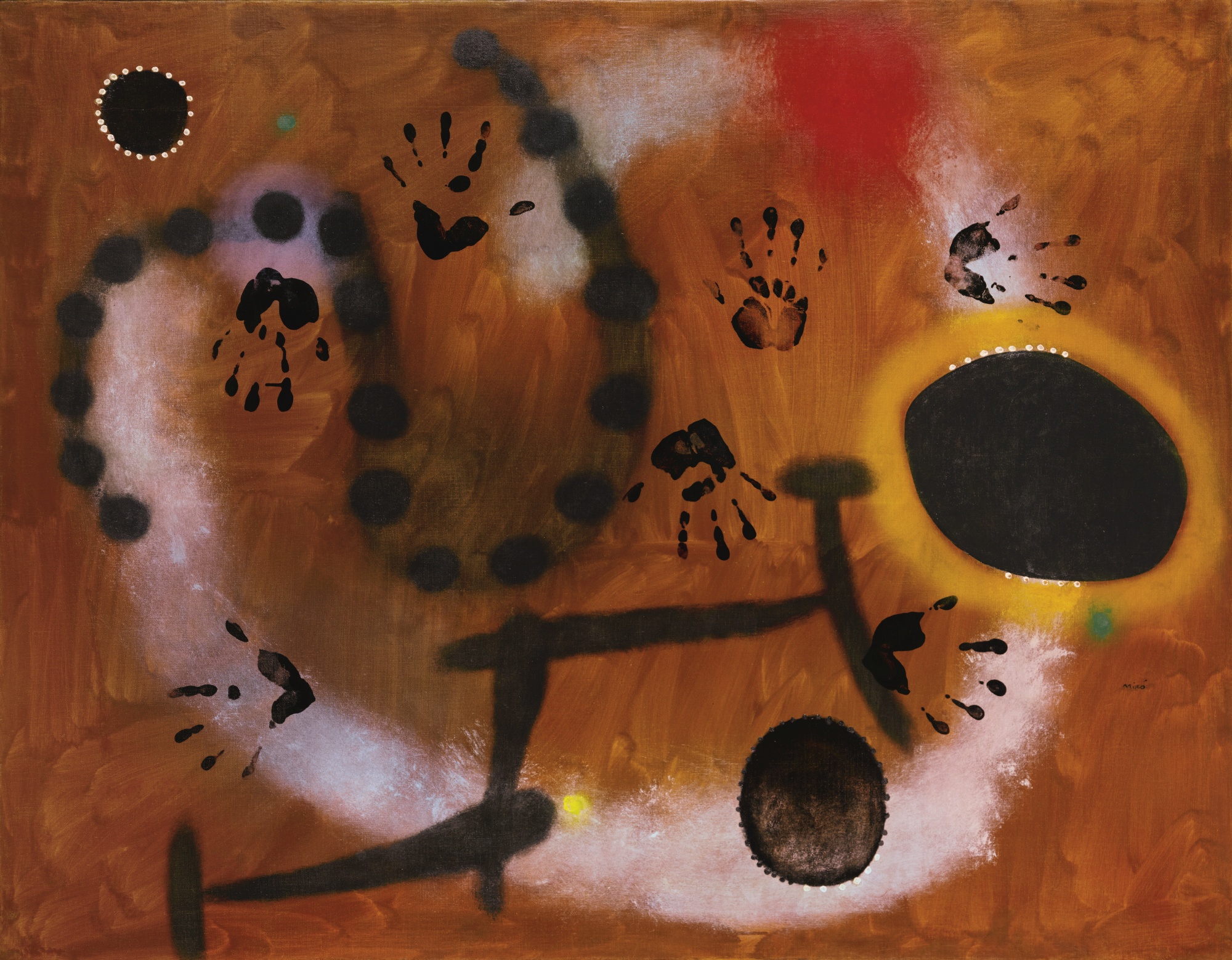
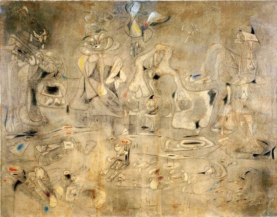
Joan Miro, “Painting”, 1953, Guggenheim NY, © 2018 Successió Miró Artists Rights Society (ARS), New York ADAGP, Paris
“First the Giants, then the pygmies.” Elie Faure
PART 2
Notes Synthetiques ca. 1888 by Paul Gauguin: “Art is an abstraction; derive this abstraction from nature whilst dreaming before it, and think more of the creation which will result than of nature”.
To Schuffeneker Aug. 1888: “Like music it acts on the soul through the intermediary of the senses. Harmonious colours respond to the harmonies of sounds”.
And in Diverse Choses 1898: “ The impressionists… heed only the eye and neglect the mysterious centres of thought”.
The sources of these ideas, which were to prove so fertile for the development of abstract painting, lay in the literature of early German Romanticism, Jean Paul, E T A Hoffmann, the synaesthesic imagery taken up by Baudelaire, Schopenhauer’s views on music as reinterpreted by Wagner, and the cult of Richard Wagner in France, which influenced even the young Cézanne, and the symbolist poets gathered around Mallarme (though some of these pronouncements of Gauguin antecede his friendship with the latter).
Wagner’s music, especially in The Ring, could be described as the triumph of bad literature over music, or the subjugation of music to the literary imagination. The idea that colour, like music, can express the “mysterious centres of thought” appeals to the literary minded, so it is not surprising to find it echoed in Baudelaire and Mallarme. (See the poem Les Phares by Baudelaire). It is for the most part foreign to the French line in painting stemming from Delacroix and finding its culmination in Matisse. Although Matisse echoes the Mallarmean aesthetic “to paint not the thing but the emotion that it arouses in the artist”, in practice his art remains wedded to the full lustre of the sensory world. The transpositions of colour, red for blue, black for azure, are less emotionally driven as arising from his discoveries in Luxe, Calme et Volupte, 1904/05, that degrees of saturation of hue can form the tonal structure, rather than oppositions of dark and light, just as simultaneous contrasts of colour create light rather than oppositions or gradations of warm and cool.
George Seurat and the theorist Charles Henry voiced similar ideas about the expressive role of line and colour in conveying emotion, on the analogy with music, independently of their function in representation. Chromoluminisme as practiced by Seurat and Divisionism as practiced by Paul Signac, endeavour to combine this emotive theory with the science of colour, a hyper-realism, the two sitting uneasily together, and with mixed results, Pissarro being one of the first to express disillusionment with both the pictorial outcome and the intellectual distancing inherent in the approach.

Henri Matisse. “Luxe, Calme et Volupte”, 1904/05
A digression on Robert and Sonia Delaunay:
Robert Delaunay seems to have been given to strident theorising full of abstruse rhetoric about colour and light, making extravagant claims for the revolutionary import of his art. It might be truer to say that Apollinaire was the main culprit, before a rancorous falling out between them. In this they echoed the Modernist proclivity for issuing manifestos – Marinetti and the Futurists, who influenced the hymning of the wonders of technology, Malevich, Wyndham Lewis, Stockhausen, Boulez, Beuys, and many another. (Best to let others do it for you, if you must.)

Frantisek Kupka,” Nocturne”, 1910

Frantisek Kupka, “Disks of Newton (study for ‘Fugue in Two Colours’)”, c.1911

Frantisek Kupka, “Mme Kupka among Verticals”, 1910-1911
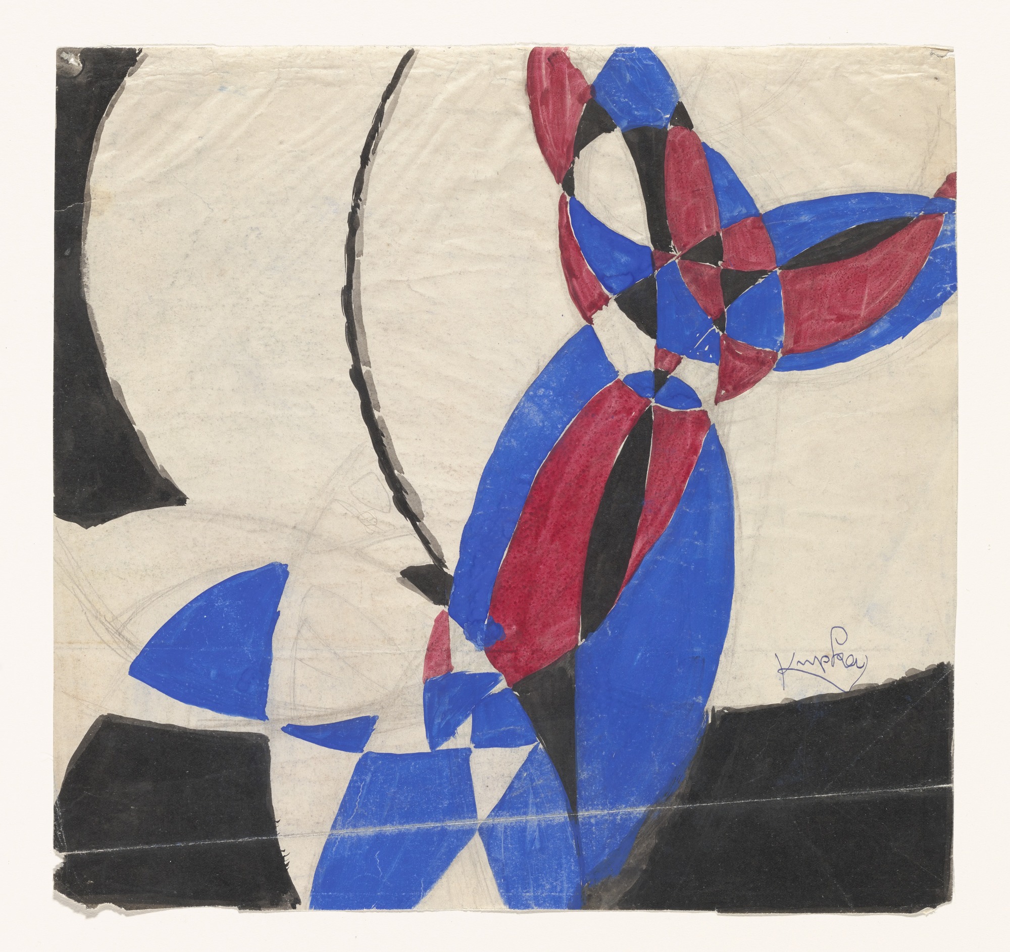
František Kupka, “Amorpha Fugue in Two Colors”, 1912
The first use of the term “pure Abstraction”, akin to music and without a source in nature, is owed to Apollinaire’s proselytising. (It was much in the air as an idea at the time, the 1910s, having been mooted by Frantisek Kupka, a Czech, even before his arrival in Paris.) I suspect that it was Apollinaire’s desire to place himself at the head of yet another revolutionary art movement, as he had done with the Salon cubists, with whom Braque and Picasso never actually exhibited, that led to the rift with Delaunay. The hymning of a vaulting modernity inspired by technology would hit the buffers during the course of the 1st World War, giving rise to the despair and nihilism which spawned Dadaism. Apollinaire received a head wound in battle in 1915, and never recovered, dying of influenza in 1918. Nothing dates a painting more than the worship of technology, since technological change is so rapid that old technology looks merely quaint in time.
The Delaunays seem not to have realised the full potential of their innovations in Abstraction until much later, when their ideas were taken up by others, notably the American Abstract Artists group, founded in the 1930s, and until after Mondrian’s arrival in America, where he began to experiment with colour himself, in Broadway Boogie Woogie, 1942 and Victory Boogie Woogie, 1944. Despite Apollinaire’s advocacy, after 1913-14 Delaunay and Kupka did not pursue the idea of a “pure Abstraction” with rigour, if at all, preferring to explore the expressive potential of simultaneity in colour relationships in a way which drew them back to figuration. A more rigorous engagement with “pure Abstraction” was left to Mondrian, but this involved the suppression of the space-making properties of colour, entrapping primary colour of minimal sensuosity within a prison of black bars, and a commitment to a radical “flatness”. And since colour is the main preoccupation of this Musée imaginaire, Mondrian will be less prominent than other painters who may be have been influenced by him.

Piet Mondrian, “Composition 9”, 1914
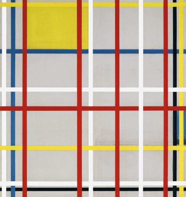
Piet Mondrian, “New York City 3”, 1941
Delaunay’s theorising is an intellectualised gloss on the colour discoveries of Matisse’s fauvism of a decade earlier, which had also grown out of a period of experiment with neo-Impressionism. But compared to the mature fauvism of Matisse, Delaunay’s colour is rather dowdy and unvibrant. Relating colour by simultaneous contrast of opposites does not in itself produce vibrancy. The tones need to be carefully adjusted to one another to dispel op-flicker which bleaches out contrasts (as in op-art). When Matisse said that a square metre of green is greener than a square centimetre of green, he was voicing an implicit criticism of divisionist practices, having absorbed and then rejected the style.

Henri Matisse, “Statuette and Jugs on Oriental Carpet”, 1904-08
Delaunay and his wife Sonia Terk ( it is difficult to separate their contributions to the paintings of the 1910s) attempted to dovetail neo-impressionist colour theory with cubist passage and facetting, leading to a prismatic fragmentation of form over a linear scaffold. It is best to ignore the theorising and just attend to the evidence of the paintings themselves, since the way colour is related in them owes little to the theory.
Coloured pigments do not behave the way spectral light does when fused together. Blue and red light combine to create violet, but blue and red pigments, even when overlaid in transparent layers, do not, but rather produce a murky brownish black. The Delaunays tend to avoid this by placing simultaneous contrasts side-by-side in accordance with classic neo-impressionist principles, or else interspaced with adjacent hues on the spectrum.
Simultaneity, or simultanism, became the watchword, and it has been very influential on later colourists. But it is not the colour contrasts themselves that induce the sensation of movement they sought, so much as the arcs and whorls of curvilinear drawing with which they disposed their colours.
Simultaneity and transparency together influence the Windows and Prismes of 1912-13. The aim was to imitate the effect of light through stained glass, by rendering the paint semi-transparent, but this is a figurative conception. Transparency is all very well, but strongly saturated colour has more visual impact. Matisse does not depict effects of light in his still lifes of 1905-10. There is a close identification of coloured substances in objects or fabrics, surfaces, and the impregnating of the surface of the canvas itself. This was a purely intuitive discovery initially, and it leads to the greater vibrancy of colour and stronger form in these great still lifes. When colour is closely identified with the physical surface on which it is spread, that is the path to Abstraction, even though it was in these figurative paintings that the discovery was made. The task for abstract painting is to rival the formal and colouristically strength of the Matisses.
Of the two Delaunays, Sonia seems to have been the more gifted painter. Robert’s colour is vitiated by an unhappy blend of pseudo-science, mysticism emanating from Apollinaire’s flights of fancy, and naturalistic thinking, and a surfeit of ideas incapable of pictorial realisation. But his obsession with colour as the fount and origin of painting, and his preoccupation with the image of the sun, symmetrical, haloed, brightly pulsing, would lead to a reappraisal of his achievement in the 1940s and 1950s, resonating with the colour experimentation of Josef Albers at Black Mountain College, and through him on the young Kenneth Noland.

Robert Delaunay, “Solar Disc”, 1905-06
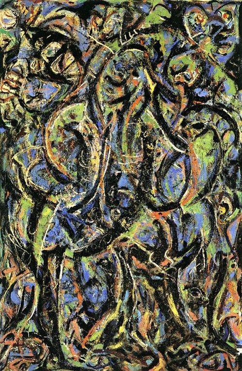
Clement Greenberg , in a throwaway remark, said that one day it will have to be explained how anti-Stalinism became art-for-art’s sake. He might equally well have asked how the anti-art subversive pranks of the Dadaists and Surrealists were transformed to become fertile material for the imaginations of true painters like Arshile Gorky. The most important influences to shape the art of both Gorky and Pollock were Picasso, during the phase of surrealist terribilita, leading to the Guernica studies, and Miro, whose innovations are also influenced by surrealist practices.
Joan Miro, “Painting”, 1953, Guggenheim NY, © 2018 Successió Miró Artists Rights Society (ARS), New York ADAGP, Paris

Joan Miro, “Constellations”, 1940-41
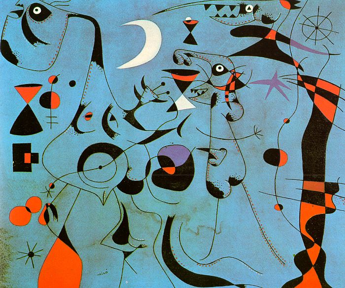
Joan Miro, “Figure at Night Guided by the Phosphorescent Tracks of Snails”, 1940
Joan Miro, “L’Espoir nous revien par la Fuite des Constellations”

Joan Miro, “The Red Sun gnaws the Spider”, 1948

Joan Miro, “The Red Sun”, 1948
However, there is nothing essential in Miro that is not pre-figured in Paul Klee. If one wants to understand the origins and impulses which led to abstraction, one needs to look elsewhere than the relatively extravert orientation to the external world of Matisse, Braque and Picasso. One needs to engage with the visionary imagination, the inner world of German Romanticism as it emerges in the art of Paul Klee. The fact is one can’t really understand the origins of abstraction and it’s motivating impulses without realising that, contrary to the Greenbergian thesis, positivism and materialism are not the key characteristics of modernism. And the strain of modernism that issues from Klee, Kandinsky and Mondrian is opposed to these very tendencies in modern psychology, perhaps because they are the dominant modes of action and perception. Their art is visionary, inward, and a curious blend of spiritualism and science.

Paul Klee, “Red Balloon”, 1922, Guggenheim Museum, NY
Paul Klee, “May Picture”, 1925, Berggruen Klee Collection
Paul Klee, “Static Dynamic Gradation”, 1923, Met, NY
Paul Klee, “Neue Harmonie”, 1936, Guggenheim NY
Paul Klee “Strong Dream”, 1929

Paul Klee, “Insula Dulcamara”, 1921-38
Klee and Miro open up a seam of imagination even further removed from the norms of Western European art than Matisse. Miro takes Klee’s calligraphy and broadens and enlarges the feeling with a greater impulsiveness of attack, and he follows him in experimenting with the expressive range of granular grounds, different media, types of paint quality, from transparent grainy washes to viscous pourings and droplets, opening up for the eye, as never before envisaged, the timbre and texture of paint and surfaces in themselves, with their fictive potential suppressed. (An equivalent of Schoenberg’s Klangfarbe.)
To see how much more abstract Miro is than Picasso, see this installation shot of their two pictures side by side. Clement Greenberg, in perhaps his greatest piece of critical writing, described the difference between Picasso and Klee thus: “ The difference is that he (Picasso) sees the picture as a wall, while Klee sees it as a page”. Miro bridges that gap.

“L’espoir nous revient par la fuite des constellations” by Joan Miro (L) and “Femme assise dans un fauteuil” by Pablo Picasso
Paul Klee is less naturalistic in his thinking than the Delaunays. As early as 1903, at the very outset of his career, he wrote: “For visual art never begins with a poetic mood or idea but with building one of several figures, with harmonising a few colours and tones or with calculating spatial relationships etc. And whether an idea then, belonging to that other extraneous area, joins in or not, is completely irrelevant : It may do, but it doesn’t have to.” And later: “To paint well is simply this: to put the right colour in the right place”. Through the Bauhaus, Kandinsky introduced Klee to the Delaunays in 1912, and their Simultaneous Windows, or Prismes Electriques influenced Klee for an instant before his sojourn in Tunisia. Klee’s colour has greater luminosity even when employing browns and greys far from the contrasts available from the spectral wheel alone. His colour is richer, less naturalistic in implication, and more abstract (with reservations).

Sonia Delauney, Quilt, 1911

Sonia Delaunay, “Le Bal Bullier”, 1912-13

Sonia Delaunay, ” Le Bal Bullier” installation

Sonia Delauney, “Prismes Electiques”, 1913

Sonia Delaunay, “The Black Snake”, 1967
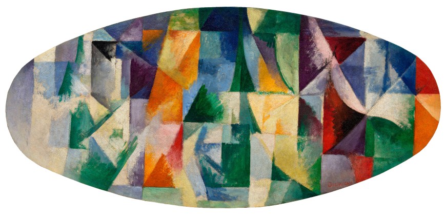
Robert Delaunay, “Windows Open Simultaneously 1st Part, 3rd Motif”, The Solomon R. Guggenheim Foundation Peggy Guggenheim Collection, Venice, 1976
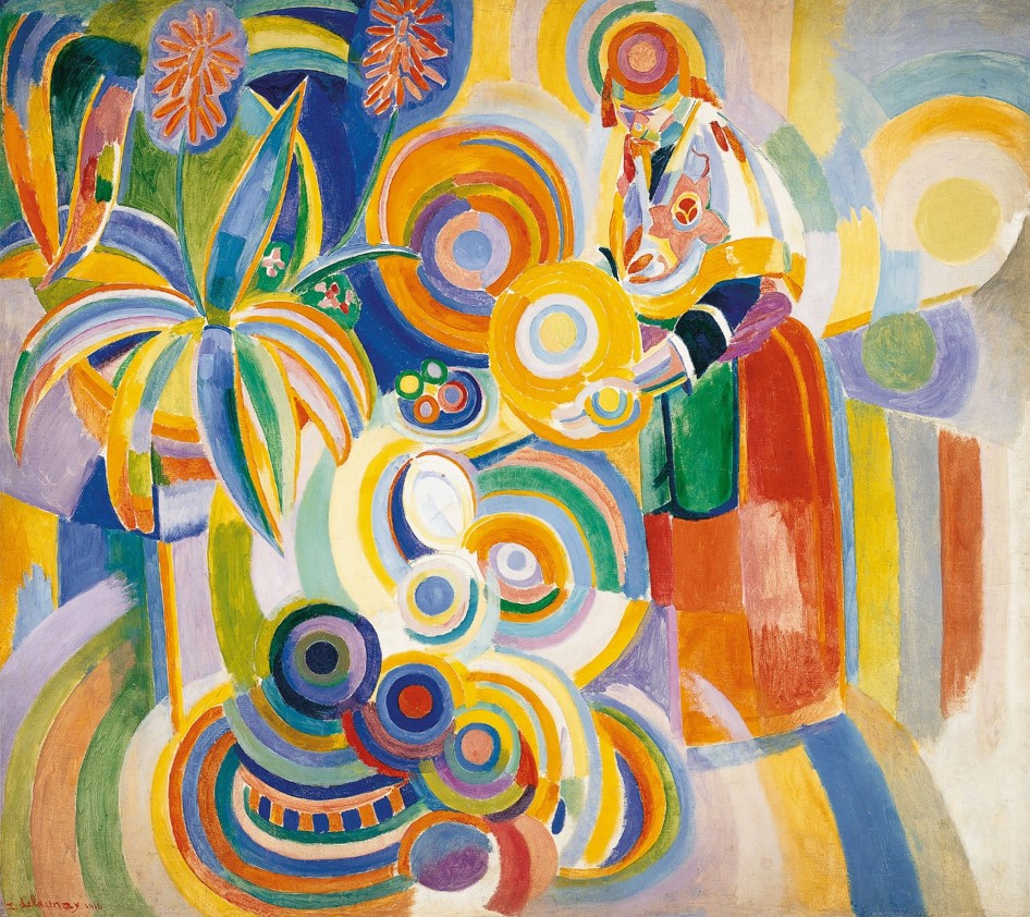
Robert Delaunay, “Portuguese Woman (The Large Portuguese)”, 1916

Robert Delaunay, “Nature Mort Portuguese”, 1915

Robert Delaunay, “Le Jour ni L’heure”, 1914, detail

Robert Delaunay, “Hommage à Blériot”. 1914

Wassily Kandinsky, “Sketch for Composition II”, 1909-10

Wassily Kandinsky, “Deluge Improvisation”, 1913

Arshile Gorky, “The Liver is the Cock’s Comb”, 1944
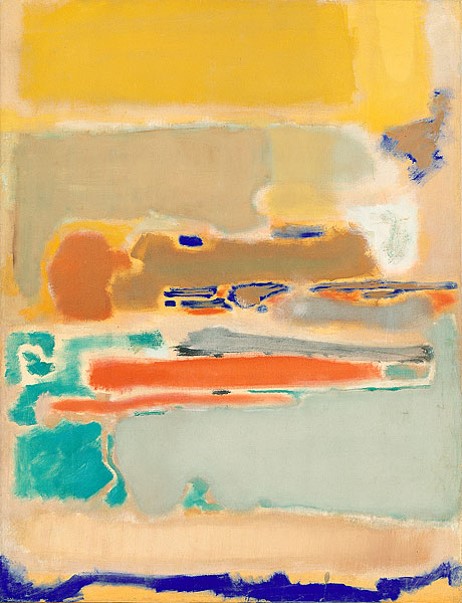
Mark Rothko, “Multiform” 1947-48
The one positive outcome of Marcel Duchamp’s otherwise poisonous legacy was the Love – Machine, diagrams of the human reproductive system at the point of coition seen as a metaphor for creative conception. This image which first appeared in some of Duchamp’s studies for the Large glass was taken up by others, Masson, Matta, and thence in the brilliant drawings of Gorky and in his paintings of the late 1940s, where it is combined with the opening up of the expressive potential of the surface itself we have seen in Miro. The Liver is the Cock’s Comb is his masterpiece. Eros, juissance, fertilisation, pollination, form a continuum, the life force of Gorky’s pictorial imagination, with its corollary, a movement towards the death instinct.
Arshile Gorky, “Summation”, 1947
Although all the main elements of these stylisations can be traced to other artists, including early Kandinsky, (see Sketch for Composition II and Deluge Improvisation 1913), Roberto Matta chiefly (but Matta is a cartoonist compared to Gorky: see The Mirror of Memory , IVAM Valencia.), Gorky is not an illustrator. He does not project an image into fictive space as Matta does. He has learned from Miro that the surface is an expressive force in its own right, as are the varied properties of the medium itself, if used sensitively. And the brilliant suppleness and eloquence of his line drawing is in a different class from the flashy cartoonish art of Matta, (shades of Pixar). Lee Krasner was right to reject his art as insufficiently “plastic” in conception.
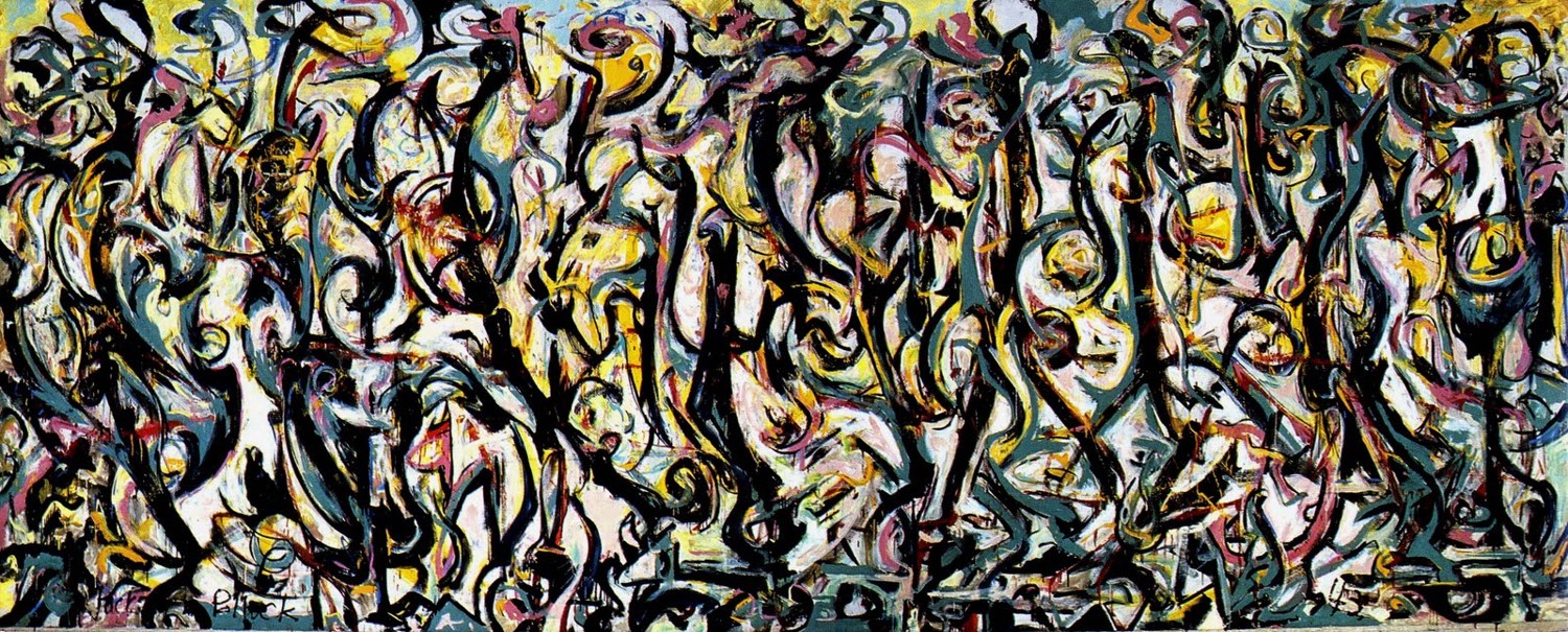
Jackson Pollock, “Mural”, 1943
Jackson Pollock could never be satisfied with the belle peinture and the finesse of Gorky’s appropriations from Miro, nor Miro’s wit and humour. He was obsessed with the violence of expression in Picasso’s studies for Guernica, and The Dream and Lie of Franco, an art that seemed to answer to the violence of the times. Guernica was the most newsworthy public statement in purview. Pollock wanted to make a similar statement with that degree of historical import and currency, but his own obsessional imagery was too personal, too private and conflicted to form the basis of a public statement on such a scale. Although the level of ambition, the competitiveness, is generally a good thing, and raised Pollock above his peers, there is the corollary that bad art attempts to coerce, to twist our arm with its currency and relevance.
Mural, 1943, gave Pollock the opportunity for such a major statement, which had been rehearsed to some extent by collaborating on the murals of Orozco and the W.P.A. projects, but never with this degree of subjectivity. The myth that it was painted in one night of frenzied activity has been discounted by conservationists, who have shown that there is substantial revision carried out over a number of days, as one would expect. Its somewhat coarse and hurried attack is compensated by the breadth and vigour of its imagery.
The importance of this painting not only for Pollock’s development, but for American painting as a whole cannot be overemphasised. It’s daring, the courage to risk all to impulse, on the throw of the dice, and accept the consequences – not in every painting, but to have that potential within you, and the courage to go with it when the occasion demands – largeness of vision, generosity of spirit – this is what I mean – this is where I stand; art need not exhibit struggle, work, laborious integration, it can exult in the freedom to be simple, and to express that freedom in a bold statement. That is what painters since have taken from Pollock’s example, though he struggled to repeat the achievement until the great Lucifer 1947, One 1950 , and Autumn Rhythm 1950, paintings which are the envy of every ambitious painter since.
Of course, just like everything else in life, once realised, it can become a cliche, this freedom, a recipe; but none-the-less it still stands as lodestar of one aspect of great painting, and fired the imagination of many artists in its wake at a particular moment in history.

Pablo Picasso, “Rhythmic Study for Three Women”, 1908
Jackson Pollock, “Gothic”, 1944
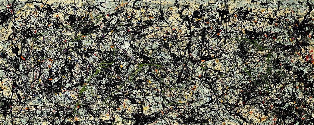
Jackson Pollock, “Lucifer”, 1947

Jackson Pollock, “One”, 1950

Jackson Pollock, “Autumn Rhythm (Number 30)”, 1950

Jackson Pollock, “Ocean Greyness”, 1953
What is originality, and where does it spring from? How does it arise, since it is plain that technical expertise and knowledge of the past will not suffice? It is invariably the result of synthesis, but it doesn’t happen overnight without extensive rehearsal and preparation. And it is possible to be too knowledgeable, and about all the wrong things. The phoney avant-garde took off from a remark of Pollock’s – that “technics is a result of a need” – confusing the idea of technics with new technology, and in America with the tendency to think that artists are “inventors” rather than creators. (Cage, Harry Partch, Conlon Nancarrow etc). “Freedom” is no substitute for rhythmic vitality and compositional originality, using the full resources of the medium. But it cannot be forced or willed into existence. Freedom contained and controlled by a powerful plastic impulse, in other words a sense of form, issuing in abundance, abandon even – that is what reaps the biggest rewards. “Where there is no constraint there is no tension” (Stravinsky).

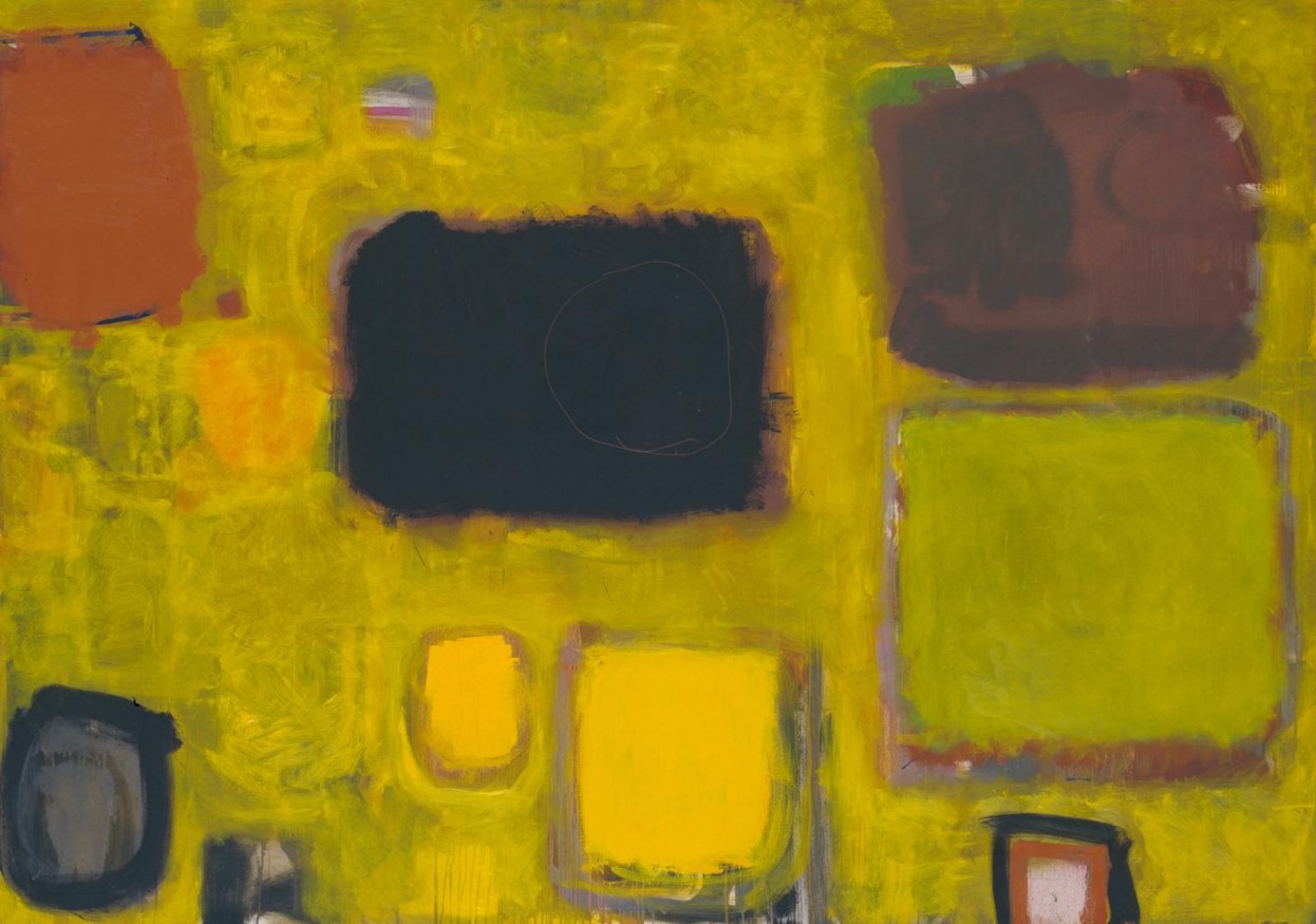
Hans Hofmann, “Sanctum Sanctorum”, 1962

Hans Hofmann, “Pre-dawn”, 1960

Hans Hofmann, “In the Wake of the Hurricane”, 1960

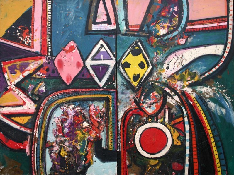
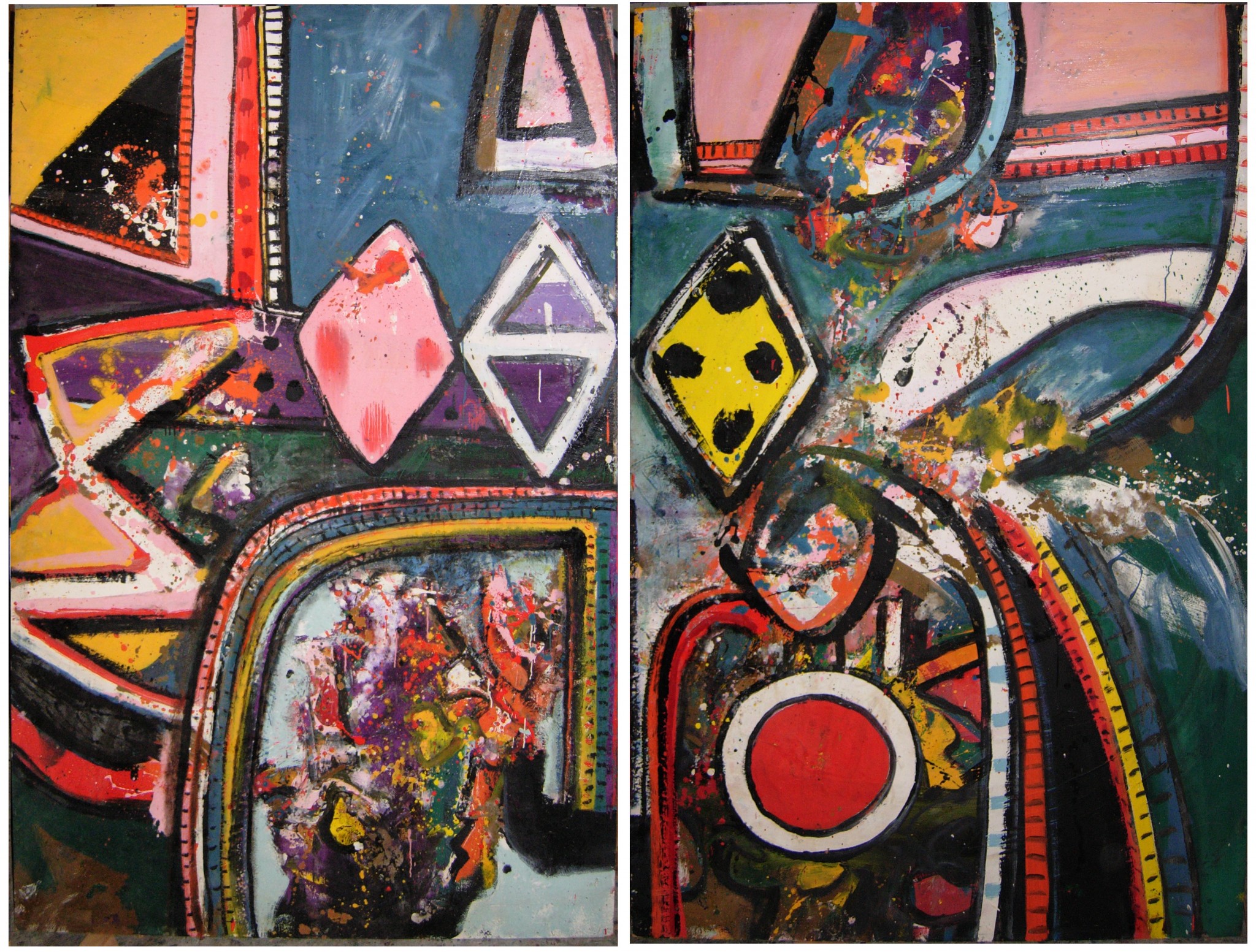
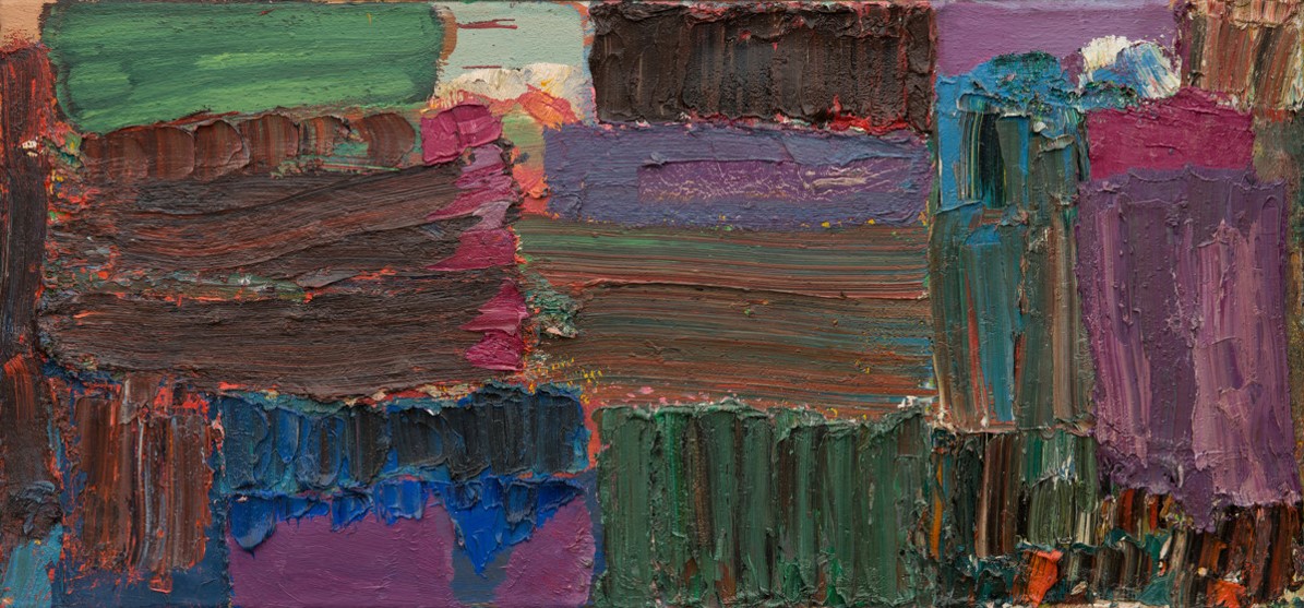
Alan Gouk, “Wichita Lineman”, 2017

Mark Rothko, “Slow Swirl by the Edge of the Sea”, 1944
Mark Rothko, “untitled (Multiform)”, 1948

Mark Rothko, “No.21”, 1949

Mark Rothko, “No. 22”, 1950
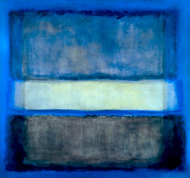
Mark Rothko, “White Band No.27”, 1954
This sequence traces Rothko’s progress from semi-figurative surrealist imagery to abstraction. I have said elsewhere that the influence of Milton Avery can be detected in these pictures, but it is clear also that the sensibility at work has affinity with the “inspired timidity” of Bonnard. It just goes to show how far timidity can take you when it comes to the orchestration of colour. Rothko’s colour is rare, in that acute psychological distress is conveyed through colour contrasts normally associated with hedonism. Pink in the context of red can be searing in the right hands, just as Picasso can place pinks and violets in a context which renders them nightmarish. It is the way Rothko works up his surfaces and edges, with fuzzy nuanced transitions minimising the physicality of surface and paint that creates a fusion of gravitas with delicacy of feeling. Giving a zone of colour an aureole or halo of lighter colour at its perimeter, tends to suggest a numinous dimension to its feeling, as in a Russian icon. This would seem to be the world of feeling in which Rothko lived and moved, in his art at least, however incongruously it sits with his lived environment. And that this is the way he wished his art to be seen is signalled within the paintings as well as by many comments he made about them, before going silent about his intentions in later life. Gottlieb employed similar devices to quite different effect. I set aside T.J.Clark’s attribution of “gaudy” to Rothko’s colour, as simply the usual scurrilous philistine attempt to diminish abstraction’s power to move, by associating it with its opposite.
Patrick Heron’s seminal review of the first showing of the Abstract Expressionists in London in 1956 at the Tate Gallery singles out Rothko for especial praise, while raising doubts about the others, and there is no doubt, despite his protestations to the contrary, that this show marked a decisive shift in his art towards abstraction, and Rothko in particular, though he rapidly turned the influence in the direction of a more European sensibility, less nuanced, a more immediate and direct attack, and an asymmetric compositional style more akin to the early Multiforms , which Heron insists he had not seen. Soon he was able to say –” there is one continent left for painting to explore, in the direction of colour, and in no other direction” (paraphrasing).
But Heron’s painting in the “utter directness” of its fauvism (and on the cusp of abstraction, but with a representational edge) has marked similarities with the fulsome attack of Hofmann in the mid-fifties – Radiant Space, for example.
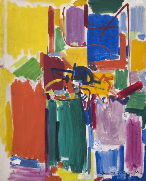
Hans Hofmann, “Radiant Space”, 1955
Hofmann’s art is an actualisation of the Germanic tradition of painterly painting as defined by Heinrich Wolfflin. “An impulse into the depth is answered by an equal echo out of the depth…. Impulse and echo establish two-dimensionality with an added dimension of created breathing depth”. (Hofmann)
The American critic and painter Darby Bannard has coined the designation “the trampoline effect” of the sort of space generated in those Hofmanns which bounce blocks of colour off transparent washes – the brilliant colour play where some blocks sink in, while others project, as seen at the maximum in the great Goliath, and also in In Sober Ecstasy, shown recently at the R.A.

Hans Hofmann, “Goliath”, 1960

Hans Hofmann, “In Sober Ecstasy”, 1965
But I remember talking to Heron after the Hofmann retrospective at the Tate in 1988; these were precisely the qualities that Heron found offensive – the sudden abrupt jumping from “background” to “foreground”, and the sharp edges and corners of the blocks which stuck out like sore thumbs.
Heron favoured a more continuous surface, equally present in all its parts “…of equal intensity, clear, demarcated, out there, resistant to the eye” (Adrian Stokes). He abhorred background, figure-ground painting. The trampoline effect is a speciality of Hofmann, an extreme instance of his “push and pull” dynamic. But there are other, gentler ways of achieving “depth” in abstract painting.
Although the trajectory of his style is from a fauve/cubist hybrid figuration to an expressive Abstraction which exploits the fundamental pictorial elements akin to that of Klee and Miro, Hofmann, with his training as a scientist and his intellectual acuity, is well aware that Abstraction is a relative condition, forever subject to mediation by the visionary imagination of painterly inspiration, and a give-and-take with the sensory world outside painting. A strict or severe abstraction that is subject to prohibitions on the free use of colour as the agent of space, as in the line of descent from Mondrian of the 1930s, and geometric Abstraction in general, will inevitably result in an impoverished art in some direction or another. Hence the wide range of Hofmann’s exploring of painterly means (always subject to the disciplines of the picture plane), and what some regard as the profligacy of his multi-styled approach. But this is precisely why his art has been so influential on a younger group of painters in this country. He closes down nothing, and opens up possibilities for others.
Hofmann is a synthesiser, born a year earlier than Picasso. Through the power of his fauvist colour he transforms the schematic rudiments of geometry in the earlier pioneers of Abstraction, Malevich and Van Doesburg, into something more dynamic and spatially active, at times monumental in its architecture. His paintings have an objective presence which far exceeds his predecessors in that genre.
To the extent that a painting evinces a coherent formal structure, it will tend toward a rhyming correspondence with structures outside painting, more than mere analogy, and much more than metaphor, but always falling short of coaxing the viewer into a naturalistic reading of pictorial space. In the end the painting should “ stand intact as a created independent object,” a work of plastic art. Simultaneity, transparency of colour, and “push and pull”, the reciprocal pressure of saturated hues, employing the full range of contrast of which the means is capable, all of this is in play in Hofmann’s oeuvre.

Hans Hofmann, “Scintillating Space”, 1954

Hans Hofmann, “Song of the Philomel”, 1963

Patrick Heron, “Brown Ground with Soft Red and Green”, 1958-59
Patrick Heron, “Yellow Painting”,1958-59

Patrick Heron, “Grey and Yellow with Circle”, 1958-59
Patrick Heron, “Fourteen Discs”, 1963
The De Stael problem.

Nicolas de Stael, “L’Éclair (Flash of Lighting”, 1946

Nicolas de Stael, “Composition Abstraite”, 1948

Nicolas de Stael, “The Orchestra”, 1953

Nicolas de Stael, “Parc Des Princes Grand Footballeurs”, 1953

Nicolas de Stael, “Nu Couche”, 1954

Nicolas de Stael, “Le Concert”, 1955
The De Stael problem concerns the distribution of dark and light, and the way these are organised to depict the fall of light striking the surface of planes inflected towards and away from the eye; planes stacked so as to induce a sense of volumetric recession, as if a sculpture of a body is bathed in light. In De Stael the light is depicted as striking these surfaces from a source outside the painting, and so his pictures are not truly “abstract”. And this depicted volume of the figure, since it is flattened to adjust to the plane of the picture in broad planes which do not, or almost do not, attempt trompe l’oeil, cannot cohere into a convincing whole. But it is a matter of structural vision and of degree, of emphasis, not an absolute barrier to formal coherence. However it is not often realised that this problem, and this same lack of formal coherence occurs whether the areas of colour are defined by definite edges, i.e. whether their character as planes is explicit or not. Diffuse zones of colour, with ill-defined edges, move towards the same result, especially if they are conceived as representing a kind of natural light striking the surface of the painting, rather than a kind of light that is struck between the colour relationships themselves, as occurs in the mature Matisse, for example. (With reservations.)
It is clear that when De Stael first began to exhibit in New York in 1950(?) he became aware of the large-scale simplifications of the Abstract Expressionists, and especially Rothko, and his own paintings began to undergo a similar simplification and largeness of scale, but this exposure also confirmed him in his rejection of abstraction, and impelled him further along the path of trying to relate his art to the sun-bathed brilliance of light in the south of France, and to the coup d’oeil of direct sensation from sea and sky. This put him at odds with the Ecole de Paris decorative abstraction, and the Tachism of his peers, Manessier, Hartung etc.
Tachism simply means the expressive potential of the stain, the splash, the pouring of paint, and the surface itself raised to a higher degree of visibility, as pioneered by Klee and Miro.

Ben Nicholson, “Festival of Britain Mural’, 1951

Ben Nicholson with “Festival of Britain Mural”

Ben Nicholson, “Feb1960 (ice-off-blue)”, 1960

Ben Nicholson, “The Marble Relief”, Sutton Place, Surrey

Ben Nicholson, “Argolis”, print, 1959
Nicholson is a deeply puzzling and paradoxical artist, at least to me. In many ways his carving conception of space, which he owes in part to Adrian Stokes, is the antithesis of my modelling conception of space in painting. His planar conception is absolutely front on to the picture plane, but in his paintings at least he dislocates, and one has to say subverts his planes’ location relative to one another and to the surface of the panel by subtly overlapping one layer on another, or the illusion of such, and by tilting their edges in an illogical sequence of perspectives allows a counterpoint of lines to contradict, or weave in and out of, the spaces implied by these tilting planes. His line does not cut into depth so much as skate or slide over the fictive spaces afforded. He further complicates things by filling in this jig-saw of interlocking shapes with colour and tone, seemingly, at least to a rational eye, arbitrarily, without any discernible plastic logic.
There is clearly a debt to Braque in this counterpoint of line and plane, but where, in Braque, there seems to lie behind this decorative play an attempt to grasp concrete spatial experience out there in the real world, this grasp on spatial experience is more tenuous in Nicholson, and experienced by the artist at a further remove. Whereas the carving conception of physical contact with the board by way of incisive line takes precedence. Nicholson is in some ways the more abstract, and the more “optical”, but at a price in palpable experience.
The complicated cubist inspired games of 1952 June 4 (table form) Albright Knox Gallery, 1953, Feb. 28th (Vertical Seconds) Tate Gallery , and 1959 August (Argolis) P.C., have a good deal in common with Hofmann’s cubist still lifes of the 1940s, but the push and pull, such as it is, is much more timid and achieved by tonal gradation rather than by colour.
However, August (Argolis) paradoxically seems more coherent as an overall form than De Stael’s Parc Des Prince Grand Footballeurs, – or does it?
But in the spirit of Carl Jung’s philosophy that the integration of the personality requires one to assimilate the suppressed areas of one’s personality, Nicholson continues to exert a certain fascination, at least to me. And without any deliberate attempt to do so, a painting like my Helmsman to Odysseus 2 could be seen as some kind of rapprochement with Nicholson’s art, although it is doubtful if this would have been recognised had I not pointed it out.

Alan Gouk, “Helmsman to Odysseus 2”, 2013
Alan Davie, “Birth of Venus”, 1955, Tate

Alan Davie, “Red Parrot Joy 2” 1960

Alan Davie, “Red Dwarf” 1962
Alan Davie, “Romance for Moon and Stars”, 1964
Alan Davie is the one artist who found a way to develop out of the biomorphic Picassoidal surrealism of the 1940’s Jackson Pollock, with its prioritising of drawing over colour modelling. You cannot draw nothing. You have to draw something, whether it be biomorphic, anatomical or spatial indicators. But as contour drawing became separated from the delineation of volume in the later work of Klee (another influence on Davie) and in late Matisse, it became the invention of signs for things, calligraphic hieroglyphs, alphabets, even letters, taking primitivism further into the pagan prehistoric origins of iconography.
Across the broad spectrum of modernist pursuits, there are the extremes. On the one hand the impetus towards an unvisualisable and unsayable future, epitomised by Schoenberg’s ” I breathe the air of an unknown planet”, and carried to ludicrous extremes by the maniacal phase of the later Stockhausen. On the other, there is the atavistic attempt to revisit the ancient past, to recreate the sound-world of the pagan pre-Christian origins of ancient religion, even as they survive in the earliest liturgical music, of the Orthodox Russian Church, for instance; a ritualised timeless stasis, as attempted by the post-serial Stravinsky.
The abstract expressionists partook of this latter phenomenon in their “Subjects of the Artists” phase, taking primitivism all the way to an imaginary year zero, the first sign alphabet of visual communication, at the furthest possible remove from the Western European tradition of volumetric representation, accommodated to the flatness of the panel, stemming from Giotto, Masaccio, Fra Fillipo Lippi , Mantegna and Giovanni Bellini.
For a moment Pollock had attenuated line almost to the point of its being free of representation, but this was an extreme moment of style, with which he was deeply troubled, as it cut him off from his earlier inspirations, and from which he returned to allow abstract line to morph into figurative signs in the black paintings of 1952.
But Alan Davie chose instead to follow the implications of the 1942/43 Pollock.

Jackson Pollock, “Guardians of the Secret”, 1943

Jackson Pollock, “Male and Female”, 1943

Alan Davie, “Bull God No.5”, 1955
Alan Davie, “Insignias of the Gannet People”, 1958

Alan Davie, “Crazy Gondolier”, 1960

Alan Davie, “Crazy Gondolier”, 1960
Alan Davie, “Romance For Moon and Stars”, 1964
Davie seems to delight in confounding the law-givers of painting and the taste makers. He positively wallows in a profusion of calligraphic signs and modes of representation which defy logic, which should not go together and yet somehow do. No-one is more profligate and libertine with imagery than Davie, perhaps not even late Picasso. Just look at your Persian or Anatolian carpets on your living room floor to see how all embracing are the cultural references and sign worlds that Davie has managed to transform with his mutational writing-drawing. Davie claims to have been influenced by Carl Jung’s Psychology and alchemy. The alchemy fizzes in the paint, and fizzles out when the paint is applied flatly, in his 1970s work and beyond.
Davie’s drawing in Red Parrot Joy No 2 and Insignias of the Gannet People does not cut cursively into depth, or model volumetrically. Instead it maps out broad graffiti-like planes, a kind of simultaneity of shading cum modelling, modelling by overlap, that one can see through, to further planes behind, in echo of Pollock’s all-over dripping, but more muscular/physical. “Brushwork is Spatial”, said Patrick Heron, and even here in calligraphic form, it works to that end.
Heron had made his remark that “there was a continent left to explore, in the direction of colour, and in no other direction” in 1962, following his conversion to abstraction in 1957/58. And he was not alone in being of this persuasion. Following out the implications of Rothko’s simplifications and the dismissal of drawing as an agent of space, a younger group of American painters were following a similar path. Clement Greenberg had essayed a tenuous connection with the staining techniques of Pollock, via the intermediary of Helen Frankenthaler’s Mountains and Sea, leading to Morris Louis’s Veil paintings. But the real progenitor of this out and out colourism was Rothko. So Heron, whatever his protestations to the contrary, was part of a similar chain of influence.
Clement Greenberg remarked that Adolph Gottlieb was pants-presser to the Abstract Expressionists, implying that he tidied up the big painterly gestures of his colleagues in favour of a cleaner, neater image. And he added: if you can’t see Gottlieb, you can’t see the sixties.”
What Kenneth Noland did was to drop one of Gottlieb’s “orbs” down to centre on one of his “splashes”, to create a centralised image, whilst retaining the surrounding areas of unpainted cotton-duck canvas, which has the effect of emphasising the literalness of the painting as object, within which an optical phenomenon is set.
Adolph Gottlieb, “From Midnight to Dawn”, 1956

Adolph Gottlieb, “Counterpoise”, 1958

Adolph Gottlieb, “Splay”, 1958

Martin Friedman of the Minneapolis Museum in front of Adolph Gottlieb’s “Trio”, 1966

Adolph Gottlieb, “Azimuth”

Sonia Delaunay, “No.123-A”, 1938

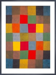
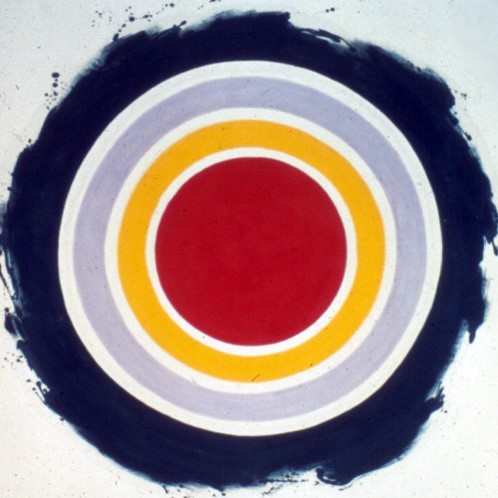
78. Robert Delaunay, “Le Premier Disque”, 1912-13
Kenneth Noland, “Heat”, 1958
Kenneth Noland, “Ex Nihilo”, 1958
Kenneth Noland, “Plum”, 1959

Kenneth Noland, “Cirium”, 1964

Kenneth Noland, “Bend Sinister”, 1964

Kenneth Noland, “Via Blues”, 1967

Kenneth Noland, “Graded Exposure”, 1967

Kenneth Noland, “Little Rouges”, 1968
Kenneth Noland, “Another Line”, 1970
To juxtapose Alan Davie’s Romance for Moon and Stars with Noland’s Bend Sinister is to make the Davie seem very old fashioned, a gulf in the conception of what paintings should give as wide as the Atlantic Ocean itself, and this is precisely what happened to the “middle generation” of painters in England who had come to fruition after the Second World War. Suddenly, and as if from nowhere, there came a radical shift in aesthetic to a cooler, blander and simpler statement of pictorial priority, appearing in the same galleries that had formerly promoted them. Concept was everything, essentially a design concept, and execution carried out using methods that had formerly been the territory of designers and graphic artists, minimising brushwork and individual touch. The St. Ives artists were most affected, to unsettling effect, and many were side-lined in favour of the new aesthetic. Although from another point of view, the Davie may seem a lot richer and more adventurous, this was not the conclusion drawn by the art-world at the time, however.
Noland championed the notion of “making” a painting, rather than painting one, an emphasis on the literal, the canvas, the support, decisions as to where the literal spreading of paint began and ended in the shape of the support; design decisions, in short. This literalism of facture was combined with “opticality”, the suppression of tactility in favour of an optical buzz, pure visual sensation without physical overtones, but differing markedly from Op-art, in that the relationships of colour remained harmonious and did not blur and confuse the eye with flickering effects and hazy mirages.
But as the gamut of design decisions began to be exhausted, Noland reached an impasse in the mid 1970s, and the limitations of his conception began to be exposed as he tried to revivify his earlier successes with gestural “handling” within his signature images, the target, the chevron, and the horizontal banding of narrow masking taped “stripes”.
This kind of heraldic simplicity, the “one shot” instantaneous image, seems to answer to a need in modern psychology, for something final, absolute, “morally decisive and calming”, like a flag, or insignia like that of ribbons on a medal, while at the same time providing a brand image for the artist, a signature style that is his and his alone. And its disavowal of relational complexities, trouble and strife, problems of “resolving”, poses little stress on the capacities of the observer. (There are parallels in contemporary music – Morton Feldman, for example, recently favoured with a six hour long minimalist event at Tate Modern.)
It is worth considering just what is absent from such an approach. We are presented with a stasis, without animation, rhythmic movement, or old-fashioned development, as in musical parlance. However the target format, perhaps Noland’s greatest success, does contain a surprising degree of movement within it as one looks longer. It revolves, like a Catherine wheel, pulses optically,
There is also the thorny question of the claims made for this episode in painting, of the creation of “non-referential” colour, i.e. colour that does not suggest a source in the natural world.
A digression on colour:
To return to “brushwork is spatial” – If the means of application of colour is so impersonal, with all tactility suppressed, with no room for the enlivening effect of the artist’s “touch”, colour becomes so identified with the fabric in which it is soaked (in Post-painterly abstraction), that it becomes just another material surface with no spatial implication, given that “space” in painting is always an illusion.
Working against this literalism is the fact that whatever the “actual” colour, perceived colour is the result of the influence of those colours that lie adjacent to it. In the case of chevrons, the inner colours are sandwiched between neighbours from which they take their colour to the eye, their perceived optical colour. (Just as in music, the sound of any one note or interval is conditioned by its context within the chord in which it is encountered. The same note will sound different when part of a different chord, enharmonically speaking.)
This is as near as one can get to “non-referential” colour – quasi-abstract inter-relational colour. But as oppositions of hue tend to create light between them, there is always the tendency for this “light” to evoke the light falling on the surface of objects in natural sunlight (despite all efforts that may be made to suppress the phenomenon). Paintings in which colour on colour, or colour in colour, is the primary agent of the creation of spatial illusion, however minimally, will simultaneously suggest naturalistic phenomena of colour/light, as we experience it outside of painting, even if it is only fabrics, clothing, flowers, tropical bird plumage, sunsets etc. etc.
Heron engaged in a lengthy and acrimonious argument with Greenberg about the stilted, preconceived design mentality behind the work of the post-painterly faction Greenberg championed, and the focus on symmetry, or near symmetry, which he considered the most boring way to organise a picture, and the lack of discovery through the act of painting which Heron considered essential for true invention in painting. He advocated a ” re-complication” of the picture surface, and the act of painting – “a more considered mode of action, that emphasised the fundamentally static, architectural aspects, at the same time as it involves the fluent and spontaneous” (paraphrasing). “A pre-planned design is always a dead design” (paraphrasing).
To an extent, consensus taste is still albeit unconsciously dominated by the promotional tropes of post-painterly Abstraction, even though the works themselves are denied current agency. There is an inbuilt bias in favour of that smoothly immaculate suppression of the evidence of human agency, the suppression of brushwork that shapes and models surfaces in a spatial way so eloquently described by Patrick Heron in “From Late Matisse” – for fear that it might suggest a figurative space.
For my own part, though I have no theoretical bias against them, when I have encountered Noland’s horizontal bands and shaped canvases in recent years I have been curiously unengaged by them, and when I have studied their surfaces close up, repelled by their fastidious blandness and minuscule textural shifts, masking taped pearlescence perfumed tweaking at the edges. Although intellectually I understand the logic of their empty-centred formats and edge-hugging attempt to activate a pictorial space out of their literal surfaces, I get no excitement at all from their presence.
Similar issues surrounding literalism and spatial illusion through colour are posed by the paintings of Morris Louis and Jules Olitski. Olitski’s remark that he wanted to “hang the weather” does convey the vaporous spatial illusionism he induced by overlaying sprayed colour on colour.

Morris Louis, “Sarabande”, 1959

Jules Olitski, “Twice Disarmed”, 1968

Jules Olitski, “Green Hands”, 1969
Jules Olitski, “Green Princess 8”, 1976

Jules Olitski, “Embraced Orange Yellow”, 2005
The work of all of these painters is characterised by a glamorous immaculateness and a softness deriving from the inescapable prevalence of the feel of staining into exposed cotton duck canvas, which affected even those paintings in which the canvas was fully covered. We had to learn to like it, so at odds is it with the European sense of tactility of surface of the French/Spanish masters. All during the 60s and 1970s we were in thrall to this glamorous reduction, and the absolute finality of image presented by the post-painterlies, and the formidable critical support they received from Greenberg, Michael Fried and others of that circle. But we found that we simply couldn’t paint that way, even if we wanted to, and we did try. But the gulf in pictorial culture was too great. Our hearts were not fully in it, and little by little the spell was broken, and we began to see these painters for what they really were.
Olitski did try to break out of the immaculateness and the cloudy illusions his spray technique created, with a swing to the opposite pole of brute physicality of surface, exposing in the process the lush hyper-romanticism of colour that was always there underneath; but it was too late. His late work is like Gottlieb all over again, but with exaggeratedly physical surfaces, complete with cracking, as in dried up mudflats in a hot summer.
Larry Poons, “Railroad Horse”, 1971
What can I say?
Alan Gouk, “Cloches”, 1970 (black and white photo)
As if to confirm this European antipathy to the stained, immaculately smooth, velvety surface of the cotton duck artists, (which she had flirted with herself during the late 60s,) Gillian Ayres recoiled with a series of heavily orchestrated, tapestry-like, richly adumbrated oil paintings, deeply harmonious in dark and brooding colour, (a rare moment of poise in her far from even work). It took no little nerve and courage to go against prevailing fashion, and to reintroduce a robust layered and scumbled surface in which adjustment and touch played such an important part, qualities that had been all but disallowed by the processes favoured by the post-painterlies.
There has almost always been a conflict in Ayres’s work between painterly fusion of this kind, and decorative pattern. But for a few years from around 1978 to 1982 this conflict was resolved in favour of a kind of all-over unity of sombre rich colour harmony and a fully integrated surface.
However, from the early 80’s onwards, Ayres began to load her canvases with a proliferation of “shapes”, and big gestural drawn arcs and zigzags as if in an attempt to outdo Alan Davie in an assault on taste, and in emulation of her advertised identification with the Venetian masters. Her painting process was, and had been, cumulative, accretional, layered, but the sombre harmony of paintings like Ultima Thule, Bellona and Sabrina became sacrificed to a welter of jostling lozenges, ovoids, spangled with droplets and dolly mixtures, bounded by harsh contours in a compartmentalised space, sewn or tied together by aggressive thrusting of the arm. The delicate balance between surface unity and decorative pattern became once more problematical in her art.
Here “abundance” is taken literally, and to an extreme, akin to the best work of Davie in the early 60s, but without the quality of molten fusion which he attained at his best.
There is a continuity here, running all the way from the homologous ever present surface of late Monet to Jackson Pollock’s all over fractured continuum, to Davie’s “intuitive romantic” plastic physicality, to Ayres’ rich Christmas pudding surfaces, a simultaneity of surface unity that ultimately is owed to the impressionists’ vision.

Gillian Ayres, “Coelus”, 1976-77

Gillian Ayers, “Ultima Thurle”, 1978-80

Gillian Ayers, “Bellona”, 1976-78

Gillian Ayers, “Sabrina”, 1978-79

Gillian Ayers, “Cherry Ripe”, 1982
From here on the story becomes more personal, intertwined with my own developing convictions of taste, rivalries and influences. The 1970s were wilderness years, as my friends and I struggled to discover a way round the influence of the Americans, both the Abstract Expressionists and the post-painterlies. After my first visit to New York in 1972, I tried out some of the ways of painting I had seen first hand there at the studios of Noland, Olitski and Poons, (with Poons especially – he is just two years older than me – I had a phase of mutual influencing when he visited my studio in March 1971). We were continually being pulled back to these influences with every visit Greenberg made to see our work, right through to 1977-78. But in 1980-81 I finally sloughed off the last vestiges of influence from the post-painterly approach in favour of the direct hands on adjustment of colour and surface with a more physical touch, having much in common with Ayres’s work as I see it now in retrospect, though at the time I was scarcely aware of what she was doing, neither of us having much opportunity to show our work in London.

Alan Gouk, “Promegranate Burst”, 1973-74

Alan Gouk, “Sea Horse Tenacity”, 1973-74
Alan Gouk, “In the Wake of the Plough”, 1979
Alan Gouk, “Quercus”, 1981

Alan Gouk, “Paysanne D’Or”, 1981-82
After a period when Heron’s disputational wrangling with the Greenbergian aesthetic seemed to have a deleterious effect on his own painting, he returned to form in 1982-85 with a new impetus of originality with the Garden Paintings, shown in a retrospective grouping at the Barbican Gallery in 1985. He followed this with a sequel of equally original garden paintings in which drawing played an increasingly important part, at the Camden Art Centre in 1994.
Patrick Herom, “Big Purple Garden Painting”, 1983-1984

Patrick Heron, “Big Red Garden Painting”, 1985

Patrick Heron, “Pale Garden Painting”, 1984
Heron In his studio, 1994. Borlase Smart John Wells Trust.

Installation at Camden Arts Centre, “Patrick Heron: Big Paintings”, 1994

Installation at Camden Arts Centre, “Patrick Heron: Big Paintings”, 1994
To be continued as PART 3: “Contemporary Trends.”
Alan Gouk, November 28th 2016.
This essay appears by kind permission of Hampstead School of Art, where it is to be given as a lecture.

You can’t say everything at once, otherwise Part 2 would have been twice as long as it is. When I deliver it as a talk at Hampstead School of Art I intend to ignore the text and just respond to the images, which tell their own story.
Delaunay’s Premier Disc is perhaps the best “target” ever. It has no colour theory, bears no relation to the spectral wheel. It is pure invention in colour of a very high order, and the light that is generated through the juxtapositions and adjustments of colour and tone is as unnaturalistic as the best Klees.
It makes Frank Stella look devoid of any artistic purpose, just pointless decoration.
LikeLike
Smashing !
LikeLike
maybe Alan is going to write all the comments?
anyway here is one from me and its not about the text.
the best thing here for me is the image of Alan’s painting “Wichita Lineman”.2017
If you have a few minutes click on it and get the full monty and try not to think of where it has been squashed into.
It has been painted only last year,
I don’t know but its probably acrylic paint.
It does not matter to me nor how big it is.
In his “A word from the artist” from the HSOA catalogue of his “Mandalay” series last year he says he hopes for a “cavalier boldness of attack”.
This painting has that no doubt. It has a stand up for itself attitude which has no need for add on explanation. To say the paint flows is an understatement . The colour and the fluidity merge together and describe that ineffable quality that paint can have when it is both relaxed and controlled.
It is something to look and learn from if you are an Abstract painter today.
I found it a it disconcerting that Alan puts his painting in direct comparison to Hofmann’s “In the Wake of the Hurricane” 1960…….For what its worth I think “Wichita ..” is better…The greens and oranges are more heavy handed in “…..Hurricane” and the whole thing is more laboured…..I don’t need to see that comparison …maybe Alan’s painting is only a reality because Hofmann painted his first but in isolation I am not bothered about Hofmann .I love the Gouk for what I have said already and for its subtle strength.
The Hofmann relies on a strong format. Whether I call it format or configuration I think “Wichita….” falls down a little because all of its great qualities do “hang ” on a bit to a hidden structure which I keep discovering…and maybe that is not quite Abstract?
But brilliant….
Bring on 2017 and 2018 and on and on and on and on………
LikeLike
In haste: great comment, Anne. A friend here in New York and I were kind of talking about the same thing. We were talking about a distinction between “historical determinism” and “personal determinism.” We give Alan “points” for looking outside of himself for “justification” of his work—but we kind of question that too. We have doubts about the “squashing in” business. (We also give Alan “points” for his erudition, great writing, etc., etc.)
I still just don’t understand what you mean when you, Anne, talk about being “abstract.” I can understand Abstract Art as an historical thing that began at the beginning of the 20th century. I can understand there being an abstract “dimension” to all drawing/painting/sculpture: form, space, etc.
But I just don’t understand what you mean when you talk about hanging on to a hidden structure not being “quite Abstract.” It doesn’t really bother me. There’s plenty I don’t understand. But I’ve been reading this essay by Joseph McElroy: http://www.electronicbookreview.com/thread/technocapitalism/censorious. I think MAYBE it’s “quite Abstract.” There’s kind of no “format/configuration” “hidden” inside/under it.
And, of course, it’s fun/natural to think about abstraction and censorship, “historical determinism” and censorship, etc., etc. What’s “in”—what’s “out”. . .
No mention of de Kooning—or the great Studio Schooler Esteban Vicente—in Alan’s text—and Alan has questions about de Stael’s “light”/value structure. MAYBE that’s what’s “missing” in Wichita Lineman—what makes you feel Alan’s “hanging onto” a kind of artificial/intellectual/not completely integrated/“hidden” structure.
Got to go. But: thanks, Anne—thanks, Alan. . .
LikeLike
I too find “Wichita Lineman” to be a very good painting. May I query your stricture on structure? I suggest that if you dispense with structure you will tend to homogeneity. I would prefer to see you slip up and reveal yourself; only then would we know the person behind the brush and obtain insight into a unique object that may turn out to be painting. I dare even suggest a landscape manifests itself a la Hitchens in “Wichita”, though Alan’s painting is far better than Ivon’s. I for one don’t really care if it can be categorised as “fully abstract”. I might add that musical progress is (as analogy) not always as straight as an arrow; follow Prokofiev after Webern.
LikeLike
My comment above is in reply to Anne.
LikeLike
There is nothing at all wrong with structure, Pete, and the more the better, provided it is discovered and embedded in the content of the work and does not belong elsewhere, i.e. in a landscape or piece of graphic design (it’s ironic that a really good landscape painting does not adhere to a “landscape” format). Structure in an abstract painting is not derived from anything external.
It’s instructive to see just how much of the history of abstract painting is contrived as semi-figurative, or has a crude and clunking format (all those bloody suns!), and when it doesn’t have that it becomes literal – what a poor painter Noland is.
What a great and unexpected comment from Anne, and I’m fascinated to see how Alan responds. As I tried – perhaps rather too subtly – to hint at in his HSOA catalogue introduction, the way that Alan now rather violently but fluidly warps and bends space is adding up to something rather original. I don’t like all his new paintings, but something is afoot in some of his work that is indeed more real and exciting than pretty much any of the other illustrations in this text. Cheeky to say so, but I can’t help but think it is actually Alan’s intellectual link to history that holds him back a little. Maybe getting all this off his chest will be a good thing.
LikeLike
to Pete…
…”only then would we know the person behind the brush and obtain insight into a unique object that may turn out to be a painting”
It is that word “unique” that makes me feel you are answering your own question…follow up with …”it may turn out to be a painting”..well what a wonderful dream !!! and it sounds like you are telling us something you already know about Abstract.To me if it is “unique” it will not carry any associates.
to Jock..
You have made me do what I said what I did not want to do. ..to comment in a comparative way in respect of the Hofmann and the Gouk.
The ‘little’ problem I refer to is present in both of these works.
It is where the paint IS on the canvas. Not the colour of the paint and not what the paint does. Seeing that in them both I sense something external.
The Gouk for me remains terrific.
LikeLike
Reading Alan Gouk’s essays is a pleasure and a real learning experience for me. It helps me to really see the paintings as I haven’t seen them before. If I can make time, I’d like to add some comments on his view of Kenneth Noland’s pictures, and I wish he’d devote more space to Morris Louis.
LikeLike
Noland a poor painter — I don’t think so. The fact that I said I have been unengaged by them in recent years — The fault is no doubt mine. I wouldn’t have reproduced so many if I thought he was not a major painter. I tried to show only paintings I actively like, although one or two have crept in for historic reasons. There are over a hundred, so whilst flattered at the attention, I am puzzled as to why only my picture has been singled out. Even I can see that it is not the most impressive on display.
LikeLike
Well, it’s a matter of opinion, but I don’t see what is so very good about paintings that are identical for every inch along their ten foot length. The last Nolands I looked at were at Pace London a while ago, and I though they were anonymous and unfelt. I did go and see a big Noland show in Tate Liverpool quite a few years back, but that too was disapponting, mostly due to the repetition, but also by the total reliance on somewhat uninspiring and flat colour to do everything. Compared to the Delaunay “Disque”, the Noland targets look perfunctory. But for me even the dazzling Delauney colour, though beautiful and intuitive, is not enough to make a wholly satisfying painting.
As for “Wichita Lineman”, well, I haven’t seen it, and I look forward to doing so, but from reproduction I wouldn’t necessarily have singled it out myself (though I think Anne’s comment is excellent). I would, though, go so far as to say that “Mandalaysian Orchid” from your HSOA show would give anything here a good run for it’s money. (But I did have the advantage over most viewers at that exhibition of seeing it in Isabel’s back garden, where you could get more than two feet away from it, and in daylight too.)
I also think the three big Heron “Garden” paintings look good in this company, whilst what I had always considered his best work – late fifties, early sixties – looks a little predictable now. Hofmann and Pollock are the really big artists in this batch, for me, and the two painters that somehow have to be seriously reckoned with.
LikeLike
I have been imbibing Alan’s analyses of painting ever since he first started them; indeed, I have a whole collection in my library. The ineffable quality of his writing continues to persuade and instruct. He once told me that he had ” the gift of the gab”. Well, what gift, what gab !
Inevitably, on reading his ‘musee imaginaire’, I was led to wonder what the equivalent sculpture ‘musee’ would be like by comparison and whether it too could be taken as a route to the present. One thought struck me, of the comparative amount of dedication to abstraction (even if loaded with figurative and clunking references) in XXth C. painting history.as chosen for this ‘musee’. The ease with which [painters have moved into abstraction compared to the sculptors.
The answer to a question as to why this should be the case, I suggest, lies in the subject matter germaine to painting; not only the figure, but landscape. skyscape, still life, architecture, environment, etc., etc. in short the world; a far greater range than sculpture’s dogged but fundamental representation of the figure, which dominated even the most valiant abstract attempts with few exceptions.
If Impressionism is the fount of modern painting and all that has followed, where is sculpture’s Impressionism ? Certainly not Rosso, far too insignificant. We only have Rodin, and he can hardly be called an Impressionist (despite all the guff about his modelled ‘surfaces), leading to a continuous stream of development as in painting.
Perhaps, right now, sculpture has a better chance of acquiring a truly abstract means of expression in its soul by dint of its previous lack, but will its nature allow ?
LikeLike
Tim
…this resonates a lot for me..fantastic..
Structure is part of Abstract sculpture because it is a reality together with the actuality of the material.
Paint comes out of a tin. It involves brush work and a myriad of decisions to get an Abstract actuality.There can be an uneasy coalition between applying the paint to a surface and making form which sometimes results in a false structure.
That is the fundamental difference for me.
I envy the clarity that sculptors are gaining for themselves today.
LikeLike
What the pioneers of Abstraction feared most was that in leaving representation behind, what would be left would be meaningless decoration, or “merely” formal abstraction ( whatever that means). They did want to express the “mysterious centres of thought”, and though their attempts at a theoretical justification border on the incomprehensible or nonsensical ( to a Logical Positivist), it does not follow that the resultant paintings are meaningless. That would be to think that only what can be coherently articulated in words has meaning.
All visual art involves “Vorstellung” — the representation of an imaginative idea projected into pictorial space (or sculptural space). The subtext of Part 2, which only revealed itself in the course of the writing, and the more I looked at the images, is that hardly any of the painters who have made up this rich panoply would have achieved what they did if their vision had been blighted by a strict view of Abstraction, or if they had tried to define it doctrinally. The exception is probably the austere Mondrian. (I’ll have more to say about him in Part 3). But one can see that in New York City 1941 and the other pictures of 1943-44 Mondrian is moving to a much more exploratory approach to colour, a counterpoint of interlocking grids, a veritable pin-ball machine for the eye as it ricochets from one overlap to another. As in so called absolute music, all manner of kinaesthetic sensations are evoked. Call it Abstraction if you must.
LikeLike
But now that we know for sure that “abstract” is not about “purity” (how I hate that correlation!), and now that we know that, of itself, in the fullness of its visibility, “abstract” can carry independent and free meaning, can we not, now, at last, fearlessly leave all representation behind, along with everything that comes with it. I just don’t think that the alternative to semi-abstraction or semi-figuration lies in austerity, and whilst I think you are right that to date most abstract painting and sculpture has relied upon it, I think we can now do without “Vorstellung”.
Discovery, not representation is the key to “abstract”, as you start to hint at even with late Mondrian, and in sculpture at least, my experience is that “abstract” is rapidly becoming its own discipline, with its own strictures to weigh against the freedoms won, and quite different from what has gone before under the catch-all of “abstraction”. (Which is just one of the reasons why I think new abstract sculpture really is “new”.)
LikeLike
Regarding Alan Gouk’s remarks on Kenneth Noland:
Of course, what I have to say is hopelessly stuck in the past. Not being an artist myself, I don’t have much choice in the matter.
“What Kenneth Noland did was to drop one of Gottlieb’s “orbs” down to centre on one of his “splashes”, to create a centralised image, whilst retaining the surrounding areas of unpainted cotton-duck canvas, which has the effect of emphasising the literalness of the painting as object, within which an optical phenomenon is set.”
1. Dropping one of Gottlieb’s orbs down to the center alters not just the location of the orb but also its function and its significance. (The fact that this alteration is not relative but absolute suggests something about the kind of “influence” one artist has on another in modernism.) One of its functions in Noland’s pictures is that of “centering”, which means it is not so much an image within the space of the picture as a way of establishing a connection between the depicted discs and the support itself – the size and shape of the canvas of which it is the center. Is this accurately described as “emphasizing” the literalness of the painting as object?
“Noland championed the notion of “making” a painting, rather than painting one, an emphasis on the literal, the canvas, the support, decisions as to where the literal spreading of paint began and ended in the shape of the support; design decisions, in short.”
2. Noland “makes” a painting as opposed to “painting it.” What does this mean?
In a subsequent comment, Alan says this: “What the pioneers of Abstraction feared most was that in leaving representation behind, what would be left would be meaningless decoration, or “merely” formal abstraction ( whatever that means).”
All paintings are, after all, objects existing in time and space, and as such may be viewed as meaningless decorations or formal designs. With the abandonment of representation (and therefore of illusion), this brute fact became a threat to the continued viability of the art of painting generally and Noland’s desire to make paintings in particular. If so, then Noland’s decision to center his pictures by means of the disc may be described as finding a way of claiming (without denying) the support’s literal qualities (size and shape) for art. The same may be said of his decision to anchor or hand his colored wedges from the upper corners of the picture. “Claiming” the support’s literal qualities for art (when those qualities could no longer be simply ignored in favor of illusion) was a way of “suspending” (temporarily, so to speak, for as long as the experience endures) the painting’s literalness as an object in the only way it could be suspended – by making the painting “abstract”.
3. You say that Noland championed the “making” – as opposed to the painting of – a painting, and that this meant that his decisions were ultimately “design decisions”. The assumption seems to be that that in order to escape being seen as mere design, or as decoration, the painter’s decisions must be expressed or manifested as movements traditionally associated with painting pictures – for example, movements of the hand and wrist. (I hope I’m not misinterpreting.)
Noland may have felt that movements of the hand and wrist were no longer capable (as far as he was concerned) of making things that mattered as paintings. I think that by the late 1940s, Jackson Pollack felt something similar; his overall paintings of that time also avoid the traditional actions of painting, and they don’t manifest movements of the hand and wrist in anything like a traditional way. But nobody who appreciates his work would say that Pollack’s paintings amounted design or decoration.
To say that a painting by Noland is “made” (as opposed to “painted”) is to say that (1) the concept of style has no clear application to what he was doing, and (2) the way Noland’s pictures were made refers to the technical procedures he used. To refer to “technical procedures” (in lieu of style or manner for example) implies that there is no longer any established (e.g., by convention or tradition) connection between those procedures and the results they produce. Nothing is permitted to come between the idea and its realization.
To say that nothing comes between the idea and its realization may is a way of saying that the artist’s responsibility for making the picture is more important than the manner in which it is made; it has become absolute. What has changed since the early 1960s? Is there now something else than an artist may rely on apart from his or her own conviction, that is, will to make art?
LikeLike
Thank you Carl for returning the discussion to the substance of the article just in time before another hymn to the unparalleled “newness” of Robin’s sculpture, with which all these discussions seem to end. (By the way, I don’t think abstract painting has anything at all to learn from abstract sculpture, or vice versa. I thought we all agreed on that by now.)
On the issue of “making a painting” — these were Noland’s own words for what he was doing — I can only go on my own experience of observing his way of working on a few days at his Bowery studio in 1972. I do think that they were design decisions, but not only design decisions. The end result is a pictorial experience, a spatial experience, but one of a minimal plasticity. I do not think that movements of the wrist have anything to do with it. It is a question of how the colour is spread, how substantial the sensation of space through the physicality of the paint layer, or layers etc.
On my visit. Noland was using industrial type buffing machines to allow the paint to impregnate the surface so totally as to be almost invisible as a separate layer from the duck itself. This was to enable the narrow bands which would go at the edges to also sit IN the surface rather than to have thickness that would cause them to be seen as over the surface. Noland sat atop a pair of step ladders instructing his assistants in the location of the masking tapes that would locate the horizontal bands that would rake across the broad central field. The illustrated Another Line (above) is similar to the paintings he was making then, but Sun Bouquet 1971 is even closer. Needless to say the colour was very close toned and high keyed. And so on ……
In Principle, Appearance, Style, 1974, I wrote ….. “ After the first simple intuition to make paintings which involved horizontal extension plus elision, through more delicate hue variation than he had been accustomed to using, Noland rapidly ran the gamut of variation in band width, hue variation and grouping, picture size, height and width, until arriving at the single centred horizontal broad-band paintings with breaking narrow bands at top and bottom, of 1970. These latter horizontals tend to read as a whole of course, but also as a kind of gentle rising up and across surface and gliding down surface by vertical drifting of the eye across surface; in doing so, slight but crucial illusions of sinking and floating, in depth as well as up and down , occur, at times no more than a ripple, at times with considerable sharpness. I do not see that there is anything to prevent these illusions from becoming more emphatic…….A single colour break would not sufficiently blur the relative location of picture plane and central band, nor induce the delicate spatial shifts, planar tensions and liftings which tease the surface into subtle illusion. Noland ‘s surfaces may be “all colour” but they are not “just colour”. They achieve a number of things spatially also………. etc.
So I think you can see that I have always considered Noland’s pictures to be pictorial, and not just design. But a lot of the stuff about claiming the shape of the support for Art I no longer buy.
When Heron says “brushwork is spatial” he is not talking about wristwork, but that the way paint is applied influences its spatial impact, that touch is an important way in which plastic feeling is transmitted, and evincing a disappointment with these bland cotton duck surfaces that I have come to share. It’s a European thing.
LikeLike
In 1968 I had been doing my own aggressively shaped canvases which projected from 2D to 3D, influenced not by Noland but by Richard Smith … of whom I wrote — “ The final step in the development of what are now amongst the best paintings being made, was the increasing use of three dimensional frontal depth perspective, which allowed the colour to take its place in the surface, which could be shaped and bent in perspective and geometry. This permitted the whole painting as object to lend itself to the propensity in perception to see the total configuration of an object as an immaterial image of form, while precisely locating colour in an unfluctuating relationship within the overall structure of the form. In other words the tendency for for colour areas to fluctuate ambivalently in spatial location in “flat” painting, is counteracted by the further cues of shape. Integrity of the picture plane is not at issue, for the picture plane is itself shaped by three dimensional geometry in controlled perspective. Here space and colour form s single unified entity which does not refer beyond itself”. So you see I do know a bit about the shape of the support etc.
That is where I stood in 1968. I have moved on since then, but seeing one of Richard Smith’s big multiple shaped canvases at Tate Britain recently, I found I still liked it, and liked it more than Noland’s Another Line, on display in the same room, along with a vast, vapid Olitski spray painting, more than 20 feet long, not nearly as good as the ones I’ve illustrated above. In fact not a good painting at all.
LikeLike
The artist sat atop a step-ladder whilst minions run about with industrial buffing machines? Did you manage to keep a straight face for the duration? Was it scripted by Galton and Simpson?
You know, just because it forms a part of your personal history does not make it any the less INSANE.
I’m rather amused to see you still like Richard Smith – again part of your own story – but what about Hoyland, who made some very good paintings in the sixties and seventies? Nothing. And dare I mention Stella’s “Protractor series”?
LikeLike
It seems to me that objecting to work of art on the basis of how it was made is, for better or worse, an exercise in futility.
LikeLike
That’s not what I did. I made fun of the anecdote, but I objected to the paintings because they are boring, as even Alan seems to admit about one or two, without deigning to explain why some are good and some not. Whereas I suppose you, Carl, like them all on principle, because of some moral imperative?
LikeLike
Not really, Robin, I like them because the experience of seeing them (and others produced during that period) in person years ago was strong and lasting enough to affect the way I see paintings to this day. And that was before I had read much art criticism. although I can’t deny that reading the best criticism of the 1960s was also formative for me. The principles involved still seem valid because I have been unable to find others to displace them. (I don’t deny that this may reflect limitations on my part rather than eternal truths. I also don’t deny that quite a few of Noland’s pictures are boring and repetitious; it’s hard to think of any artist whose work does not at some point lose inspiration at some point.)
LikeLike
A good example of the difference between the European aesthetic of “brushwork is spatial” and the wearying effect of staining into cotton duck 🦆 is De Stael’s Le Concert. It too is a very large painting, some 10 feet high by over 20 feet long, painted on primed canvas in oil paint (and all these things do make a difference plastically and spatially) which gives the paint film a certain “lift” and the colour a liveliness, a bite and a fluidity (difficult to describe precisely).
The myth is that De Stael had been to a concert of Webern’s music in Paris, rushed back to the south of France and in a frenzy of inspiration, painted Le Concert and then jumped to his death from his studio window. However there is a photograph of him standing in front of the massive stretcher, which he must have either ordered up before going to Paris, or have had to wait to be made and delivered.
The truth seems to be that he was under intense pressure to produce for a number of dealers (since he was in high demand), and had developed a drug problem to give him the energy to work long hours.
De Stael is a genuine and highly intelligent painter with lots of perceptive things to say about his own and others work.
The role of the colour in Frank Stella’s protractor Paintings , as compared with the Delaunay Premier Disque , is arbitrary, brash and decorative in the pejorative, ie simply an infilling within a design, not a fault that could be attributed to Noland.
On Noland’s Via Blues, also about 20 feet long , — Noland asked David Annesley to send him examples of fabrics for deckchair covers, presumably not available in the US. so that he could see unusual combinations of colour, but he did not simply arbitrarily copy them. I have not seen Via Blues, but it looks to be one of his most challenging paintings. Don’t mention Bridget Riley!
LikeLike
PS. I often look at my paintings in progress from the top of a pair of step ladders too. Nothing wrong with that in itself.
LikeLike
But presumably you dismount to actually paint them – yourself?
Sorry to go off topic again, but yesterday I happened to open a book on Durer at the illustration of an etching, “Hercules”. At every point, in every corner of this work, is evidence of Durer’s engagement of brain, eye and hand. Wherever you look is inventive delight. The “whole” is not an idea about the whole thing, but a “continuity of experience” of the whole thing. There is no reason that I can see why abstract art should not strive to this end.
And as for judging a painting by how it is made, Carl, I would refer you to the endless faddish machinations in thrall to materials and technique, gel application and painting machines etc., etc,. of the Mashomack Triangle Workshops run by some of your favourite artists and critics. All gone by the board now.
LikeLike
…and still no mention of Hoyland…
LikeLike
LikeLike
“All gone by the board now.” Yes, and just look at the crap that has displaced them.
LikeLike
That clunking bipartite Composition is precisely why I wasn’t able to include Hoyland in the survey. I’m afraid that in Hoyland’s case the desire to emulate Hofmann’s strongly saturated colour had a negative effect on his painting overall, though this one is better than most. He gets stuck with a rigid design early on , repeated in painting after painting, and resorts to working it up. There is no give and take, no flexibility, no flow of imagination, and in your words, no “discovery”. Form in painting should be discovered anew with each painting, not clunkingly imposed on it from the start, or near start.
LikeLike
“He gets stuck with a rigid design early on , repeated in painting after painting, and resorts to working it up. There is no give and take, no flexibility, no flow of imagination, and in your words, no “discovery”. Form in painting should be discovered anew with each painting, not clunkingly I posed on it from the start, or near start.”
Those could indeed be my words, but how can you say that about Hoyland and still support Noland? Your partiality is bemusing.
I don’t think Hoyland is a really great painter, but better than Noland and Olitski, on the whole, especially in the sixties and seventies. But obviously he’s not part of your story. He certainly looked the best artist of the three at Pace Gallery “Caro, Hoyland, Noland” show, no question. But we’d better leave this topic alone, I think.
LikeLike
My critique of Hoyland by comparing him unfavourably with Hofmann also dates from P.A.S. in 1974 (studio International), and probably did as much to damage my career as did British Sculpture at the Whitechapel 1and 2 (Artscribe). But what Hoyland demonstrates is that willpower alone cannot turn a clumsy artist into a great colourist, or even a good one.
LikeLike
Imposed, obviously.
LikeLike
Loads here, but for now…
in partial answer to this question:
“He might equally well have asked how the anti-art subversive pranks of the Dadaists and Surrealists were transformed to become fertile material for the imaginations of true painters like Arshile Gorky.”
John Golding says this:
“the Americans – because of their own cultural and geographical situation – found themselves profiting from the intellectually liberating properties of Surrealism in a more down to earth and visceral fashion than European artists of their own generation. It was because of this that, while capitalising on its heritage, the Americans were able to distance themselves from the more esoteric aspects of Surrealism, from its game-playing, from its somewhat incestuous desire to shock not simply the intellectual community at large, but rather themselves and each other. There is a very real sense in which the Surrealists represented the culmination of a European romantic sensibility which spans over a century and a half, while the Americans represent a reappraisal of those sensibilities and their most fundamental tenets”
LikeLike
Thanks Sam. An interesting quote indeed.
LikeLike
I can’t remember Golding mentioning Matisse very much in his account, but I wonder whether you could see the Abstract Expressionists as involved with an abstract art which remained “wedded to the full lustre of the sensory world”
LikeLike
Big subject, but no, not really. See my articles in Abstractcritical on Reappraising Pollock and the earlier Letter From New York 2012.
LikeLike
Except for Hofmann through his fauvism roots. But I don’t really accept “abstract expressionism” as a meaningful category in any case. See also my review of the A E’s at the R .A on abcrit.
LikeLike
Please wait for Part 3, where I will have to say more about Hoyland, although having said that I tried to show only paintings I actively like, there will not be many Hoylands on display. However in terms of accuracy it has to be acknowledged that he spotted the importance of Hofmann’s fiexible vision of the possibilities of Abstraction early on, even though his derivation is all too evident.
LikeLiked by 1 person
In the late sixties – early seventies, I lived with a large Noland (borrowed from Leslie Waddigton) hanging on my living room wall. It was about eight feet square and had a virtually totally blank canvas (cotton duck) all over except for thin bands of colour along all four edges spaced narrowly together and crossing at the corners a la Mondrian. The colours were comparatively muted, or at least gave that effect against the vast acres of bare canvas.they were set against
Far from its ‘minimalism’ being bland and soulless, the painting gave off an austere Vermeerish sort of ethos; it was calm and soothing, and in fact perfectly fitted Matisse’s adage of.enjoyment in a good armchair. It had ‘heart’.
We are back again to the old conundrums; the methods may be ‘idiotic’, but it is what is done with them that counts.
Ann – Yes sculptors START with something that is inevitably, in itself, a structure; it stands up, falls over, bends etc etc. The challenge is of course to subsume the literal givenness if its existing structural qualities into BECOMING structure that is endemic to a sculptural idea that will override literalness in favour of plastic necessity..
LikeLike
Hmm… Did Noland do any Constableish ones?
As for sculpture – I think I once knew what might be meant by “a sculptural idea”, but not any more. I certainly can’t imagine, in advance and wholesale, an abstract sculptural structure; I can only apply my imagination, piecemeal, to its evolution.
Alan: with regards to Sam’s earlier comment about the legacy of Surrealism in America, it occurs to me that – surprisingly – there is no Motherwell in your survey.
LikeLike
Thanks Alan for all these stimulating thoughts. The following reminded me of something I have recently been reading:
“Across the broad spectrum of modernist pursuits, there are the extremes. On the one hand the impetus towards an unvisualisable and unsayable future….
…..On the other, there is the atavistic attempt to revisit the ancient past, to recreate the sound-world of the pagan pre-Christian origins of ancient religion….”
Ernst Cassirer, writing on language and myth, has the following to say: “Language moves in the middle kingdom between the indefinite and the infinite; it transforms the indeterminate into a determinate idea, and then holds it within the sphere of finite determinations. So there are, in the realm of mythic and religious conception, “ineffables” of different order, one which represents the lower limit of verbal expression, the other the upper limit…”
Maybe the extremes of modernism can be more precisely described as addressing these two areas of the ineffable, rather than just looking forwards and backwards in time.
LikeLike
Robin – I think I underlined the word ‘becoming’.I would not dream of suggesting that you can give immaculate birth to it. or ideas.
No. not if Noland was not a ‘Constableish’ sort of artist. Nor was Poussin.
LikeLike
I’m more interested in the f- – – able than the ineffable. Although funnily enough I was a big fan of Ernst Cassirer’s The Philosophy of Symbolic Forms when I was at University. Lol.
LikeLike
Well I think he´s still interesting. I´ve not read much of his work, but he seems to be in a fruitful place that gives the arts a significant and integrated role while avoiding the opposing wastelands of reductionist scientism and post-modern relativism.
LikeLike
I know it’s Philistine of me, but what’s good about Miro? The lead picture, “Painting”, what’s good about that? I think it’s meaningless and indulgent. I know lots of painters who rate Miro very highly, but I don’t get it.
“If one wants to understand the origins and impulses which led to abstraction, one needs to look elsewhere than the relatively extravert orientation to the external world of Matisse, Braque and Picasso. One needs to engage with the visionary imagination, the inner world of German Romanticism as it emerges in the art of Paul Klee. The fact is one can’t really understand the origins of abstraction and it’s motivating impulses without realising that, contrary to the Greenbergian thesis, positivism and materialism are not the key characteristics of modernism.”
If I have to look elsewhere, maybe I don’t want to understand. I can’t say I like either of these extremes of approach. The inner vision of German Romanticism, at least in visual art, which manifests itself in Klee and gets passed on to Miro and Gorky I find mostly rather excruciating. I don’t really like any of the reproductions from those three. I’ve already condemned the Greenbergian materialism of Noland. I’ll say no more on that, except that I remain unpersuaded by the idea of Noland or any other artist providing a kind of arty Vermeerish mood-music. It’s not enough. I keep coming back to the Matisse picture “Statuette and Jugs on Oriental Carpet”, thinking it’s so good and the best thing illustrated, such fantastic colour-forms that lock together in paint, in depth. Organisation, conviction, meaning, strength – Matisse in paintings such as this has it all, and I see no need to look elsewhere for inspiration. “Abstraction” be damned.
LikeLike
Correction. Sorry. Titles. Ayres. Ultima Thule. Olitski. Greek Princess 8.
LikeLike
Worth a look?
LikeLike
wondering what date this was painted Robin ?
LikeLike
1975
LikeLike
Thanks John, yes ’75. There is a very strong argument for saying that de Kooning is a figurative artist, but in this case it looks to me a lot more abstract – and a lot more exciting – than much of the work shown. True, a lot of his work looks slippery in the flesh, but he has his moments.
LikeLike
I don’t consider this painting figurative. That isn’t my first concern when looking at it.
I understand the continued exploration of what abstract space might be and how it differs from figurative space, but I don’t want to loose sight of the common sense view of an abstract painting not having a recognisable ‘external’ subject matter.
I see two main ways that an abstract painting creates a space you might want to call abstract: first is how colour relationships can explicitly work with a more consistent and similar delivery of shapes. In this case the colour does most of the work. In the second way space is broken up, and created, through a diversity of content/areas. I understand this is all a matter of degrees. Both ways can work, for me,
I find it fascinating that Alan has so much confidence in so many ways, about his understanding, judgement, and his own work, and yet fails to see how his best work is so much better than many of his predecessors he rates.
There is something very interesting going on here, and it relates to the controversial idea of progression in art and also how we view hierarchies and power and where one ‘fits’ in.
Do we simply fit in to a historical narrative or can we be pulled towards some kind of newness, dare I say originality? Is the idea of ambition relevant for an abstract artist now? If so what does this mean?
LikeLike
Indeed, I agree, much of Alan’s own work is better than many of the works he cites here, and I can think of quite a bit of more recent abstract painting – not just Alan’s – that I’d rather look at than Miro etc. And much as I love Alan’s writing, I think, to quote Arthur Daley, it’s a bit “previous” to be writing the history of abstract painting as if all was fixed and sorted. I kind of think that it’s early days, at least for “abstract” rather than “abstraction”.
“Do we simply fit in to a historical narrative or can we be pulled towards some kind of newness, dare I say originality?” Great question. The narrative is interesting, but probably gets you nowhere and can send you backwards. But as Alan has pointed out in the past, binning history is a post-modern trope. So probably you need the history and the ambition to break it.
LikeLike
“But as Alan has pointed out in the past, binning history is a post-modern trope. So probably you need the history and the ambition to break it.”
Yes, an awareness of our temporality, the importance of past, present, and future: an existential authenticity.
Although the future is crucial here, given we are always in the state of becoming.
LikeLike
Yes and there is no final solution to what is “abstract”, just a continuum of movement, hopefully forwards, but who knows?
LikeLike
De Kooning got much more abstract when he turned to landscape rather than the human figure for his inspiration. I think his mid seventies paintings are the best by far. This one, from the Looser collection is breathtaking in the flesh:
https://goo.gl/images/HLfpki
“…fantastic colour-forms that lock together in paint, in depth”.
LikeLiked by 1 person
Not only slippery and unable to let go of the flourishes which signal a wish to resurrect a drawn space rather than a colour space, but not really colour painting either. As Heron said way back in 1956, — “ At first I liked this lightweight colour……….I had thought that De Kooning ,for instance, who is so weighty, severe and dramatic as a designer, seen in black and white reproduction, would be at least as drastic as Soutine. But not a bit! His colour is all ladylike, gossamer, pastel tints! Very beautiful, very rich in a muted way. But surprisingly feminine and impressionist, with white in all his charming pinky- green mixtures. …. similarly, Pollock’s Number 1 1948, is as silvery white- grey as a Monet of snow. — but less substantial, and as colour, less plastic.”. The whole article is a miracle of prescience. De Kooning is the acid test of whether you are a colourist or not. Admittedly I agree that his paintings of the 60s and 70s are better in some ways though even more slippery in others. See also my comments in my review of the A.E.s at the RA in 2015?. S
LikeLike
“His colour is all ladylike, gossamer, pastel tints! Very beautiful, very rich in a muted way. But surprisingly feminine and impressionist, with white in all his charming pinky- green mixtures.“ sounds not unlike Heron’s very own “Pale Garden Painting”.
As for the “acid test”, in my own appreciation of painting I probably don’t think like a pure colourist, or want to; and I think there is rather more to painting than just colour, on which point I think I am at odds with Heron (and you?). Compare the Dalauney “Disque” with the Matisse “Statuette…”. They both have great colour (to my eye), but one is a design in which the colour is simply curtailed by shape, and one is a proper painting of variations and modulations of space through both shape and colour working together. I’m not comparing like with like, perhaps, but I see no reason why abstract painting cannot shun the former in favour of the latter.
But actually, I agree with you, that what in the end scuppers de Kooning so often, even – finally – in this particular example, is his quality of “drawn space”, the over-reliance on semi-figurative “clues” to the space, and the fact that his rather limited colour often “fills in” the drawing, frequently doing so rather unimaginatively.
And still, despite and perhaps because of the fact that it addresses these issues, I’d rather have this de Kooning than either the Miro fantasy-doodles or the “literal” drawing of Noland – by which I mean the “format” of stripes or rectangles that follow the shape of the ground, even though I can see that theoretically Noland is a better colourist. It’s notable that Noland tried (in vain, in my opinion) to counter the predictability of this literalness by shaping the canvas – whilst still following the edge. That proved a dead-end. Noland seems in his later years to have nowhere to go with painting, only to revisit rather sadly and detrimentally his former popular successes with circles.
LikeLike
I’d agree that De Kooning is no colour-painter. He seems to use colour fairly arbitrarily with respect to space in his painting. Nevertheless it’s the dramatic spatiality-plus-surface of some of the mid-seventies works that makes them so impressive. I don’t see this as drawn space – the “lines” are often doing something quite at odds to the overall spatial illusion. His main space-making technique seems to be a crude overlapping, which gives him a deep and complex spatiality, but at the severe risk of utterly destroying the integrity of the picture plane. His best paintings are then rescued by the sheer physicality of the paint, which provides the observer with a visual grip on the surface even where the space is deepest. I think that may be why his work reproduces so badly on print and screen. Some paintings (like Untitled VI 1977) look great in the flesh but like nothing at all in reproduction, while others (“Whose Name was Writ in Water” 1975) look like they may be OK in print but have a disappointing, completely unintegrated picture plane when you get to see them live.
LikeLike
I think Imsaid all that at the Blackpool Conference. 🤡🗼🗼
LikeLike
This is a comment I wrote in an entirely different context that is perhaps completely irrelevant to Alan’s superb essay. If so, I apologize for the interruption.
In my opinion, post-WW2 art-making in the USA reached a pinnacle in about 1966 (not only in music) and has been on a long and accelerating decline ever since. Now it’s reached a nadir, but it will be worse tomorrow. It’s not a lack of talent but of inspiration and purpose and direction. This happen to coincide with the rise of television and of rock music, and with the failure of the political left a few years later to achieve anything of lasting importance. It also coincides with the entry into national consciousness of the existence of the Bomb, the very real possibility that the world could be extinguished with the push of a button by unreliable and untrustworthy politicians as depicted in Dr. Strangelove in 1964 (perhaps the greatest single year in 20th century American cultural history). The Beatles and Rolling Stones have a lot to answer for. I believe that the dawning possibility of the world literally ending, initially via nuclear war and now on top of that, environmental catastrophe, has drained the resources of the human imagination because our reality is already fantastic, leaving little room for the imagination. I also believe that the most valid artistic medium in this circumstance is photography, for reasons I hope to articulate in a series of essays I am currently writing.
LikeLike
Oh Carl! No, no, no! Except for the bit about the decline to nadir of American art-making, though I would date it a bit later, say the mid 70s. But your reasons are very wide of the mark. Susan Sontag, for instance, who had helped to create the “new sensibility”, essentially what Perl calls Laissez-faire aesthetics, and a buddy of Andy Warhol, recoiled in her later years, saying that “barbarism” had set in. She cites the culture available at the modern airport as symptomatic of the decline of all values, or she could have said the big city museums of the world, who can no longer distinguish trash from the real thing, and are subject to venal pressures on a scale never seen before, though they were present even in the days of Picasso’s promotional skills.
There is no need to look outside of the art world for a zeitgeist. It has been almost entirely a self inflicted process. But we must not waste time analysing it. Good art, painting and sculpture will go on underground, a bit like the Essenes in 1st century Palestine 🇵🇸, until somebody somewhere stumbles across some old dusty painting in an attic, and rediscovers us. (Only partly joking). But photography has nothing to do with it, and is not in competition with, and has not replaced , anything at all of plastic art.
LikeLike
Hear, hear.
…until somebody somewhere stumbles across some dusty old Brancaster Chronicle film on Ye Olde Vimeo, that is. There is a whole world open to imaginative exploration in proper abstract painting and sculpture, yet to be realised. I am optimistic.
And actually the art galleries, both private and public, Tate et al, are absolutely stuffed at the moment with art photography which does no-one any favours, because, weirdly, it’s mainly conceptual and mostly non-visual, except in a tricksy sort of way, so it takes art absolutely nowhere. To resort to photography in place of painting and sculpture is a complete failure of nerve on the part of the artworld.
LikeLiked by 1 person
Correction. Roman Judaea, not 🇵🇸.
LikeLike
Alan, my remark about photography does not imply that photography is in competition with or has “replaced” plastic art. (It isn’t, because a photograph is a completely different medium that is used in painting for example.) The point is that if it is true that “our reality is already fantastic” – after the entry into consciousness of the very real possibility if not likelihood of world extinction (via nuclear war and/or environmental catastrophe) – then photographs are in the best position to register this fact because the making of a photograph does not involve the imaginative transformation or representation of reality. What you get in a photograph is reality itself, the world complete without us, or, you might say, the world in the wake of human withdrawal from it.
LikeLike
Couldn’t disagree more. The photograph always lies. I’m reminded of the awful book Michael Fried wrote some years ago — “why photography has become so important now” or something like that. I have read it. Complete with quotes from Wittgenstein and Heidegger(of all people) to add weight to its tawdry thesis in an attempt to reinvent himself as a diagnostician for our times. I’m afraid I don’t buy any of it at all. Jeff Wall, Thomas Struth, Wolf 🐺 Tillman’s, Burtynsky etc etc…… none of them have any artistic weight at all , even with their gigantic blown up prints. And the give away is Fried and friend standing in front of Courbet’s The Wave in a German Museum, and Fried says “This is what photography can’t do”. Enough said already.
LikeLiked by 1 person
You forgot Andreas Gursky, whose tediously minimalist picture of a bland riverbank sold for $4.3million. And it’s bloody photoshopped. This is reality?
LikeLike
What I said has nothing to do with Fried’s lousy book, which simply attempts (and fails) to resurrect his analysis of 18th century theatricality in painting by applying it to photographs. That book says nothing at all about the relationship between photographs and the world, which is the content of my comment.
LikeLike
What’s all this about photography ? I thought we were talking about abstract painting.
I personally have always found ‘art’ photography a pictorial dead end for the simple reason that it is visually completely static. You see it the first time, and then the second time nothing has changed in emotional visual reaction; and then the third, and fourth and so on in a declining spiral of interest and expectation. Even a marginally competent work of plastic art has sufficient elements of visual change built into it to make a return to its visual constructions worthwhile and stimulating; in other words, like life, it changes constantly. Photography should stick to what it does best – record in time.
LikeLiked by 1 person
Photography was good in the days of Robert Doisneau, Brassai, Lartigue, Cartier-Bresson, Paul Strand, Edward Weston, Imogen Cunningham, Anselm Adams. …… With technological advancement , and once it began to be pretentiously touted by art theorists, and sought “fine art” status from the museums, still plundering painting and emulating the Salon art of the 19 th Century, it became soulless, inflated —- Barthes’ “’ Punctum” is now entirely absent.
LikeLike
A couple of points have surfaced for me in this thread relating to the ‘abstractness’ of painting, namely the notion of ‘false structure’ mentioned by Anne and ‘drawn space’ referring to de Kooning’s painting illustrated above.
Are there criteria to creating an abstract work that is fully abstract?
It seems to me that drawing in paint could be perfectly abstract as long as it is not relying on figuration and is just purely linear.
LikeLike
Noela, any idea what “purely linear” might look like? An example?
LikeLike
Yes that does sound rather vague I must admit.
Gary Wragg sometimes has a great deal of linear activity in some of his paintings which doesn’t suggest anything figurative yet has a lot of action and looks pretty abstract.
LikeLike
Maybe you should write about it? Maybe even just an illustrated example that you can write about, and say what you are thinking?
You ask: “Are there criteria to creating an abstract work that is fully abstract?” Of course not, who could create those criteria? Not even Alan could do that! There is only discussion, of which you are a part.
LikeLike
Robin, yes I do understand all is up for discussion and when someone has a preference for a particular way a painting works or doesn’t, that is just what it is, a preference. I will try and pick one of Gary Wragg’s paintings in order to illustrate what I mean. I am very interested to see what Alan has to say though because he seemed to suggest there would be something in Part 3 referring to the points I mentioned above.
LikeLike
There’ll be something on that in Part 3, which is pretty much already written, but the picture research, on which it all depends, will take some time. So please wait till then.
LikeLike
Great, looking forward to Part 3.
LikeLike
I was just hanging my Miros and John Hoyland ready for my 70 the birthday bash.I am sorry Robin has missed so much fun in the Miros ,and Alans blindness re. Hoyland .Otherwise a wonderfull article but by no means defineative.Each to his own !Thankfully British Abstract Painting has an amazing array of talent and expression ,which never gets mentioned on Ab Crit ,Ill just list a few artists which don’t get mentioned,all of whom have made extraordinary works ,which I have seen.Prunella Clough,Jennifer Durrant,Fred Pollock,Albert Irvin ,Basil Beattie,John Mclean,Terry Setch,Geoff Rigden,Mali Morris,Gillian Ayres,John Walker,John Golding ,Paul Huxley,Edwin Easidorchik,Gary Wragg,John Epstein,David Bomberg,Roy Oxlade,Trevor Bell,Alfred Wallis,John Hoyland ,Mick Bennet,Mick Moon,Frank Bowling,Tony Whishaw,Roger Hilton,Collete De Morand,Jeff Dellow,Peter Lanyon,Howard Hodgkin,which is not by any means definitive,just the tip .Id like a broader church,Patrick Jones
LikeLike
Well, you know what you can do with that lot, don’t you Patrick. You can write about them! This is a DIY site – don’t criticise the lack, get on with filling it.
Don’t just leave it all to Alan!
LikeLike
“Are there criteria to creating an abstract work that is fully abstract?”
Yes there are. Otherwise, the word “abstract” would not apply to anything in the world. (Criteria are the conditions that make a word or concept meaningful, that is, of something that exists.) The word “fully” is really superfluous here. But the fact that there are criteria doesn’t imply that we know what they are before they are discovered in the experience of a particular work of art.
LikeLike
But even the people on this site cannot agree on what those criteria might be, so where does that leave you in terms of a meaningful concept that we all understand? And who looks at art in order to discover criteria?
We are coming at this from the point of view of the artist, who cannot go about their business thinking they must fulfil certain criteria, but have a desire to get a little further on toward their vision – which may or may not include “abstractness”. As far as I am concerned, “abstract” is forever being redefined by new work, leaving in its wake work that we thought once was pretty abstract but now looks less so.
If you think there are criteria, Carl, you had better have a go at defining them. Just don’t mention “abstract” doors!
LikeLike
I and everyone else who cares about or makes art looks at art (including, possibly, you) to discover criteria – for example, criteria for what counts as good art.
The fact that “abstract” is forever being redefined by new work confirms exactly my point in my comment – namely that the criteria for “abstract” are always to be discovered by and through the experience of works of art. (Without criteria, there would be no distinction between “abstract” and “not abstract”.)
I don’t “think” there are criteria, I know it, and that does not imply an obligation to “define” them because criteria do not do their work by means of definitions (for instance, those found in dictionaries) but by allowing us to distinguish between what counts (e.g., as abstract, as art, as good or bad, what is valuable, etc.) and what doesn’t count (as meeting our criteria). What “counts” is, roughly speaking, what matters to us human beings, what elicits our interest. In realms other than scientific inquiry, what matters is largely a matter of experience, not intellection.
LikeLike
Well, we agree then that its a matter of ongoing discussion.
LikeLike
Please excuse the image, from an image from a book, but I think this painting by Gary Wragg, ‘Menagerie ‘ 1978, (178cm x 500cm) acrylic, pastel, charcoal, rohplex on canvas, is a fine example of a work that incorporates drawing in a very exciting way. The electrically charged scribbles, dashes and zig zags across the picture plane unite the visual field yet allow for varying intensity from one side of the canvas to the other. The drawing doesn’t swamp the colour or interrupt it but works with it. The clearer space on the left hand side feels like a lead into the painting which works for me. I have not seen this particular work but have seen other similar pieces by Wragg where he uses a linear approach.
LikeLike
Posted for Noela, from Gary Wragg ‘Constant within the Change’. Vol.1 ‘Menagerie’ 1978 (178cm x 500cm) acrylic,pastel, charcoal and rohplex on canvas
LikeLike
It’s a coloured drawing. There is a painting of Gary’s from that period that I’d say is better. The Snake and Crane III 1987 (See Gary Wragg Studio). Before you ask, I haven’t mentioned Bert Irvin, Howard Hodgkin (obviously in this context), and I haven’t mentioned them in Part 3 either. I am writing as a committed painter, not as a chronicler of our serendipitous times.
LikeLike
I have seen The Snake and Crane and it probably is a better example but I particularly liked the look of Menagerie.
LikeLike
Sam has previously mooted that he thinks Heron’s Garden Paintings may have been influenced by pictures of Wragg’s like Menagerie. My reply was then that Heron was too vain and too self referential to be influenced in this way by a younger artist, even assuming that he had seen them, (in a Hayward Annual in 1979 I believe.) Everything by way of drawing in the second group of Garden Paintings shown at the Camden Art Centre comes straight from his own Christmas Eve 1951. The foreground chair is even re-quoted in one of them. And Christmas Eve itself is influenced by the Ivon Hitchens mural in Cecil Sharpe House, which Heron must have known, since he wrote on Hitchens.
LikeLike
What is revealing a/out the Hitchens mural, as revealed by the sketches, is that the drawing structure and the colour were developed separately, but when combined in the painting stage became fused, and much more than the sum of its parts. The colour turns the linear into something more plastic, as it does in the Heron too. And in the Wragg? I really don’t know.
LikeLike
Snake and Crane III, not I or II.
LikeLike
Just looking at ‘The Snake and Crane lll’ in the book and it does look amazing, very active with merging colour and line. I saw ‘The Snake and Crane l’ 1987-89 in the Canary Wharf exhibition (I think it was that one) , it has quite an oppressive quality and separate areas feel more solidly defined.
Where is the Hitchens mural?
LikeLike
Cecil Sharp House, in Highbury. There’s a photo of it in the Tate archive .just google it.
LikeLike
Thank you
LikeLike
Carl – Despite your admonitions against dictionary definitions – my Oxford says ” principle, standard a thing is judged by”, and my Webster ” a decision on which a judgement or decision may be based ” – it would seem that a criterion has to be of a predetermined order rather than merely distinguishing what “counts”.
LikeLike
Tim, my use of the word “criteria” (which was brought into the discussion by Noella) follows Wittgenstein’s thoughts on the matter, which is probably the most important concept in his later philosophy. I consider Wittgenstein to be a more productive authority and source than any dictionary. According to LW, there are criteria for anything being what it is (we are able to tell one thing from another), but criteria are not the same as rules that can be known a priori. In other words, criteria are not to be found in dictionaries or in what philosophers sometimes call “universals” or Platonic “ideas”, but rather in how we actually, during the course of our lives, use words in meaningful utterances when communicating with each other. Because there are in principle no limits to the range of meaningful utterances, criteria cannot be the same as rules.
Back to Noella’s question. It is pretty clear that nobody has ever succeeded in providing a list of properties or qualities or characteristics that would define or determine what is “abstract” painting as opposed to non-abstract painting. Likewise, nobody has ever succeeded in providing a list of properties or qualities or characteristics that would define or determine what is a “good” painting as opposed to not-good painting. Nevertheless, it is equally certain that some paintings are abstract and some are not, and some are good and some are not. It follows that our use of the words “abstract” and “good painting” are not governed by rules and discovering the criteria that really do govern their use is not like gathering factual data to support a scientific judgment. If there were such rules, art would be without interest or value, and would not exist because art essentially consists in acts of discovery (whether making or looking).
LikeLike
Whether a thing is abstract or not is according to you, Carl “… merely a trite academic question” anyway. Are our attempts here at “criteria” (or what now appears to be another word for “opinions”), meaningful utterances or not?
I do think that Noela’s original question is interesting (I was trying to get her to give her own opinion, which we now partially have). I agree with Alan about ‘Menagerie’, which is for me problematic and Gary has much better work. The problem with it is that the lines have nothing very much to do with anything else in the painting. That suggests to me that these are not abstract lines at all. I think they are better defined as literal. For something to start to act “abstractly”, it has to be in relation to something else (not relationAL in the optical Friedian way) – and ideally in relation to everything else in the painting (are these criteria? Don’t know).
So these particular lines might be the result of an appealingly energetic application, etc., but they look to me to be rather arbitrary to everything else, and as quite often happens in Gary’s work, on another transparent-ish “layer”. “Snake” III is much more integrated, as are quite a few others from the late eighties.
LikeLike
It seems ( at the risk of making a simplistic checklist) there could be some criteria for abstract painting such as ; non literal, integration of the picture plane, even optical pressure (Richard Ward’s term in a Brancaster discussion), no false structures, no layering, relationality.
But works that don’t necessarily fit can still have resonance and appeal.
LikeLike
Robin wrote: “Whether a thing is abstract or not is according to you, Carl “… merely a trite academic question” anyway.”
This is not true. You have published no less than three essays of mine that demonstrate my serious interest in the meaning and importance of abstraction in painting (Noland) and sculpture (Caro), and how it is achieved in successful works of art. It’s just that I don’t attempt to trivialize the concept or the aesthetic experience by pretending to formulate irrelevant “definitions”.
Criteria are not “opinions” – unless the difference between good art and bad art is the difference between one opinion and another, which it isn’t.
LikeLike
Can we see Snake III and the Cecil Sharp mural, if it’s not too much to ask, for our American readers☃️🐍🐍👨🏻💻?.
LikeLike
LikeLike
I’d say on the basis of this paintings (and others) Mr. Wragg should be in part 3 if not in part 2…?
LikeLike
Thank you👩🎨🕵🏼♀️💃🏻🕊
LikeLike
The Snake and Crane III looks tremendous in reproduction.
Is it just me or does its success as a painting depend on the coherent, all-embracing, all-connecting, figure-and-ground, or even landscape-like space suggested by the shape and distribution of the yellowish white areas (abetted as landscape by the receding pink in the top right hand corner) without which all its brilliant inventiveness would turn to chaos?
I don’t see this as a problem, and I think that the spatial depth (in the reproduction at least) makes it a more interesting painting than Ayres’ “Sabrina”, which I have seen in the flesh.
I do wonder though, whether this kind of exciting and unifying spatiality can be generated without a minimum of (not necessarily intentional) figurative means.
LikeLike
Carl – Eduardo Paolozzi was a huge fan of Wittgenstein; does that say something about your love of Caro !?
As Alan remarked a long time ago ( I forget the exact context) “everything must mean something:; therefore all the elements that go to make up a work of art must be recognisable as meaning something accordingly, whether associational (house, tree figure ,cloud, horse etc.) ,or simply literal (line, colour, area, brushmark etc)., the latter being, presumably, the means to abstract definition.This is, of course, HOW; and gets us no nearer to distinguishing WHY. The answer (what criterion?), seems to lie in that word ‘recognition’, which is only explainable through our personal emotional reactions based on individual experience.
LikeLike
Carl, I was only quoting you from 24 Jan.
Tim – “or simply literal (line, colour, area, brushmark etc)., the latter being, presumably, the means to abstract definition”. This makes me very nervous. Literal I see as the opposite of abstract (or at east one of the things that make something NOT abstract, along with figuration and metaphor), which is why I think the literalism of the lines in the original Gary Wragg make it perform in a less than abstract way. I’d say the second Wragg is much more abstract – thus contradicting Richard! I don’t see the landscape. I tend to see exploding bedsprings in the first one.
It seems to me that what makes something abstract is the relationships between constituent parts becoming the “content” of the work, all things in relation, and fully integrated, rather than the literal things themselves. Which is why I don’t think a geometric work is necessarily really abstract; so “non-representational” is not necessarily “abstract” in how we now think of it.
A blob of paint is no more abstract than a blob of ketchup, in itself. Of course, whether you judge a thing to be “whole” or not, in the sense of having all its parts in relation, would be a matter of personal opinion – or maybe its personal insight?
LikeLike
Tim —I don’t recognise your quote of me at all, not helped by the failure to close quotation marks. I think 99% of your quote is Tim Scott, and not me. Perhaps Quote should end after “ something”. And I don’t recognise even that little bit.
LikeLike
And Robin’s partial definition of Abstraction applies equally well to a successful figurative painting such as a Cezanne still life. It is very hard to say exactly when an element in a picture has no representational connotations at all. The Noland Via Blues probably qualifies, without being “geometric” , but the other horizontal stripes illustrated , Graded Exposure for example, are replete with imminent suggestions of a naturalistic space. Even though the broad blue band is set low down in the latter, it still opens the space in a “sky”like way. Noland said to me around that time , or a bit later, that he was trying for a kind of colour that related to nature, the potted plants in his apartment etc. In Another Line , at times the donkey suede ground ( and one can describe colour in this way) seems like that famous desert scene in Lawrence of Arabia, where Omar Sharif on camel back takes five minutes to come all the way from the horizon to the foreground. So “horizon” is never quite banished from painting, despite Malevich’s ravings. And hence Caro giving the title Prairie to his sculpture, although it precedes Another Line, taking a hint from the likes of Via Blues of 1967.
LikeLike
In recognition of which, Noland actually titled one of his 1970 horizontals “Skye Isle”. It was shown at the Rutland Gallery, a spill,over from the Waddingtons show of 1970.
LikeLike
This is more than “associations” and much more than “metaphor”. In a real painting it’s a physical/ optical resemblance.
LikeLike
Sorry Alan, but I distinctly remember it (I think possibly a St Martin’s discussion). However I am happy to acquire it from you as my own.
Robin – perhaps I was not clear enough:
I was classifying recognition (in a work) into two fundamental categories; the literal, i.e. it is a line, a splodge, a texture, etc.,and the ‘associative’ i.e. it is house , a horse etc.Neither, of course, tells you anything about quality, only ,method; but I assumed that the former category is pertinent to abstract art as a basic criterion to return to Carl’s word.
Yes,of course, ‘association ‘ is merely a preliminary to what can be fundamental to inspiration.
LikeLike
““horizon” is never quite banished from painting” – really… never? You mean from horizontal stripe paintings, or from any painting?
By the way, my definition may well be partial (perhaps in both senses of the word), but it’s not an attempt to define “abstraction”, but “abstract” or “abstract-ness”. I know you dislike this distinction but its important in my opinion. I certainly don’t make “abstractions” from anything, . Also, I’m quite happy for “abstract” to be an ambition, perhaps mostly only partially achieved, particularly if it is meant to inseperably include the condition of wholeness and inter-relatedness through all parts. (Maybe it’s OK to include some Cezanne still lives in that, if they achieve that condition, though the portraits are more problematic.)
I realise you are going to pan this as being unrealistic and anti-historical, being as how you think of art history as a linear development, albeit one with many roots and branches. But then I recognise so little of what you mean when you talk about Noland in the way that you do, as if anything is acceptable and can be accommodated because of its place in (your) history.
LikeLike
Neither do I make abstractions from anything. The movement is if anything in the opposite direction. The paintings open up a relationship with the world. I keep having to say that I have no representational thoughts at all when painting. But this doesn’t mean that the results are devoid of representational “content” to use your word. Hofmann said — “ there are bigger things in nature than the object, – but I have never given up the object”. But I have never tried to paint from “the object”, although a painting like Sea Horse Tenacity I , or Paysanne D’Or, I recognise afterwards to have let’s say echoes of a representational situation, no more than that, and no more nor less than the most abstract of Hofmann’s paintings either. I don’t consciously think about it, and I don’t worry about .
LikeLike
Alan wrote: “Neither do I make abstractions from anything. The movement is if anything in the opposite direction. The paintings open up a relationship with the world. I keep having to say that I have no representational thoughts at all when painting. But this doesn’t mean that the results are devoid of representational “content” to use your word.”
I don’t think that the “abstractness” of a painting (or a sculpture) implies elimination of all reference or allusion to the world. If it did, why would anyone be interested in it? It would have roughly the status of an absent-minded doodle on a sheet of paper. Human beings are earth-bound; they live in the world. Art, like any other kind of meaningful communication, deals with our relations with the world and with other people who live in it.
An abstract painting may imitate or evoke not the look of nature (meaning: what is, what surrounds us), but its conditions (so to speak) – for example, the fact that nature exists apart from us, is massively indifferent to us, survives us, resists our rhetorical efforts to contain or represent it, faces us, threatens or comforts us or withdraws from our grasp, etc. An abstract painting may also evoke the fact that where there is one thing, there are necessarily other things, and that each thing has a form, an outline, and a color or colors, and that from our perspective (standing erect on the earth beneath or lying down), things appear within or on this side of a horizon, and so on. A painting that evokes all or some of these conditions can do so abstractly, without thereby representing any particular thing or object.
LikeLike
Why can’t abstract art be a new thing in the world? Whyever not? I’m interested in new things! People go to the ends of the earth to see new things. It would only be a doodle if it’s at doodle. It’s a failure of imagination not to see the potential of ‘abstract’. What if, instead of a doodle, it’s a massive, complex, amazing imaginative effort of visual synthesis? Imagination is key – imagine something new and totally abstract – wow – fantastic! Just because you can’t imagine it, doesn’t make it impossible for everyone.
If you want to really understand the difference between “abstraction” and “abstract” go see the ‘Picasso from 1932’ now at Tate Modern. That’s all abstraction, the distillation of figuration, the designing of simplified art from nature, the contrivance and the quintessence of what is entirely and utterly figurative. It is a total denial of everything that Cezanne ever strove for. It is not abstract in any way. And it’s rubbish. (P.S. there is a lot of Picasso i like – etchings, late paintings, so I’m not prejudiced).
LikeLike
Has nobody got anything to say about the Hitchens mural, even in reproduction?
LikeLike
How can we tell from that photo? What do you think?
LikeLike
BTW, the Picasso show is also obnoxiously sexist nonsense.
LikeLike
“Why can’t abstract art be a new thing in the world?”
Earlier this year, we found out that select McDonald’s locations in the country were testing out different Big Mac sizes for customers to choose from. The iconic fast food burger was available, not only in regular size, but as a mini and a larger version.
McDonald’s has now announced that they’ll be releasing the new Big Mac options to the entire United States for a limited time starting early next year.
The two new sizes are the Mac Jr. and the Grand Mac. Fans who can’t commit to a regular sized Big Mac now have the option of a single patty version of the burger. The Grand Mac, for those who think a Big Mac simply isn’t enough, boasts two bigger 100% beef patties weighing 1/3 of a pound and served on two larger sesame buns.
LikeLike
Can I recommend https://www.amazon.co.uk/Cezanne-Provencal-Table-Jacqueline-Saulnier/dp/0517701855/ref=sr_1_1?s=books&ie=UTF8&qid=1520544841&sr=1-1&keywords=cezanne+and+the+provencal+table
LikeLike
” i don’t think that the ‘abstractness’ of a painting (or a sculpture) implies elimination of all references or allusions to the world…” (Carl)
I agree, as it is not possible; But the question is WHAT references and HOW they are apparent.
There is the material (painting or sculpture), with its own limitations which refer back to the artist’s abilities and aims in using it.
There are the aims themselves, which, presumably, refer to experiences and thoughts of the artist and are his/her intention in conceiving the work.
It is only when these ‘references’ have been subsumed into conveying emotional aesthetic pleasure of an original and concise nature (to the spectator), that the choice of ‘abstract’ – or not – becomes clear ..,
LikeLike
I have recently stated that I’m happy for “abstract” to be an ambition, or vision, perhaps, but I think that it is a far more achievable ambition than is being given credit for here. There seem to be several ways being suggested by various people that can make a thing be in some way figurative or literal, and it is being proposed that most should be tolerated in some way, even if they are not actively pursued.
Personally, I love lots of figurative art, but I am not a figurative artist, and so I aim to pick my way through the minefield of figurative traps that exist that tend to limit the capabilities of abstract art by degrees, with the intention of making the true content of what I do as abstract as possible. I’m aware that to eliminate one kind of figuration might well tip one into another (like Noland and landscape etc.). But I think it is now well demonstated (on Brancaster and elsewhere) that making a thing “more abstract” opens out its potential for expressivity rather than diminishes it, and that positive steps towards that aim are already in the bag. However, if you stop trying, if you allow things to slide towards figuration because you think it’s inevitable anyway in some shape or form, then that will prove a self-fulfilling prophesy – or worse.
Personally, I find this talk of allowing casual “allusions” to various figurative things to be perhaps the worst kind of sullying of abstract art. I suggest a return to the comments made by Anne Smart at the beginning of this feed in order to understand how even a painter as accomplished as Alan could liberate his work still further, and in my opinion, to its great benefit, by pushing the limits of what seems to be accepted rather complacently about the historical structuring of abstract painting. But I don’t expect for one minute that Alan would take such advice, because to do so would be to question too much the merit of what has already gone before in the locked-in history of abstract painting that is so forthrightly and engagingly elucidated in this essay.
LikeLike
“Well demonstrated on Brancaster” …. “already in the bag”…..” if you allow things to slide towards figuration” …..”the worst kind of sullying of abstract art”……. “accepted rather complacently”….. “the locked in history of abstract painting”…… what utter tosh from beginning to end. Here we go again. There is nothing locked in about the rich panoply of the past of Abstraction. It’s all ready to be opened up by anyone with eyes to see, and anyone who has read the article without blinkers. I don’t wish to diminish the work of any of the painters who are “ doing” Brancaster, but I would guess that they can’t be anything else but embarrassed by the suggestion that they have more to offer than the painters in this survey, who through their pioneering inventiveness have placed them in the position where they are able to express themselves, hopefully freely and without prejudice, as part of the onward of painting……. to be continued.
LikeLike
I am not embarrassed!
LikeLike
Actually, how dare you make such claims on their behalf, as if they hold some secret that the collective brain power of the whole history of 20th Century painting has not been privy to. Everyone who begins a painting hopes that what they are doing has a spark of originality in there somewhere, in spite of all the odds, but this is a lifelong quest, and involves a confrontation with the art of the past at every level, whether one likes it or not, unless one is totally delusional about one’s ability. If any of the painters “doing” Brancaster feels that they can put up something more abstract, better, or equal to the paintings I have cited, let them do so and we’ll see. Put up or shut up.! I am ashamed for you that you have dragged Brancaster into this once again. The painters involved are trying to move painting forward, just as I am, and many others are, older and wiser, for the most part , and who have never had the gall to make such claims for themselves.
LikeLike
Oh, stop ranting. You hugely exaggerate what I’m saying. Calm down and think about it.
Put up or shut up? Sure. We’ll do that very thing, if you like, on part three. That’s if you haven’t blown a gasket.
LikeLike
If we are going to debate the difference between abstract art and abstraction, with the latter by your own admission encompassing most if not all of the work in your essay, being as how its either semi-abstract or with some figurative allusion in it, then I’m afraid it is impossible to keep Brancaster out of the conversation. Impossible.
LikeLike
I’d quite like to know, though I don’t really expect to hear:
a) in what way exactly do you think you personally are moving painting forward?
b) who are all these MANY other, older, wiser painters who are also moving painting forward, but not part of Brancaster?
Look forward to the answers.
LikeLike
And another thing – don’t go on at me about making excessive claims when nobody in Brancaster would have the hubris to write themselves or their own work into something that immodestly calls itself “Key Paintings of the 20th Century”.
We let it pass because we like your writing, but don’t play pots and kettles.
LikeLike
“Personally, I find this talk of allowing casual “allusions” to various figurative things to be perhaps the worst kind of sullying of abstract art.”
Once again, you fail to read what other people actually write. I wrote this: “I don’t think that the “abstractness” of a painting (or a sculpture) implies elimination of all reference or allusion to the world. If it did, why would anyone be interested in it?”
Needless to say, there is a huge difference between an allusion to “various figurative things” and allusion to “the world” in which we humans actually exist. I went on to say that a painting or a sculpture may imitate not the look of nature (i.e., “figurative things”) but the conditions of there being such a thing as a world and things in the world. I went on to mention some of those conditions in my comment, such as the fact that if there is one thing, there are many things, thus implying that things have (from our human perspective) outlines, shapes, and that they exist within or on this side of a horizon, which is a horizontal plane.
The best abstract art I have ever seen – the art that as far as I’m concerned defines what “abstractness” means with regard to art – does in fact allude to those sort of conditions (which are infinite in number and variety, limited only by the imagination) in various ways, and that’s why it has meaning and significance to people who find that art has something unique to say about what it’s like to be a human being – as opposed to doodling on a piece of paper for instance.
Whether you like it or not, art is communication of significance from one earth-bound human being to others in the same predicament. If it doesn’t do that – for example, if it is made as if in a germ-proof laboratory – then it is of no or merely academic interest to other academic types who like to pretend they are engaged in making earth-shaking quasi-scientific discoveries about the nature of space or quantum physics.
LikeLike
On question 1 (a) : not for me to say. The very fact that you ask the question shows how over invested you are in verbal justifications.
On (b) : the world is much bigger than Little England. If you google artists in Canada for instance you will come across paintings remarkably similar to the sorts of things Brancastrians are doing, and Harry Hay in Australia, for instance is only one of many promising painters there. The idea that those who are doing Brancaster have some special purchase on the issues involved may be something that you need to believe, but it is not borne out by the work.
I feel under no obligation to critique or include the painters doing Brancaster unless and until I see something that seems a real advance in the onward of painting we’ve all been engaged in for many decades. There have been moments, and individual pictures, but not enough follow through, naming no names. (I’m not involved).
Older and wiser — see Patrick Jones’s list for a sampling. (Though one couldn’t possibly agree with all of them)
Part 3, which goes roughly from the 80’s to the present, — (thanks to Noela) I have included a mention of Gary Wragg’s Snake and Crane III, a more detailed discussion on Hoyland, and other delights.
On the inclusion of my own work, which you all seem to like, — authors privilege.
LikeLike
Furthermore, when you are discussing the merits and demerits of the paintings on Brancaster, you are using, as I’ve pointed out before, exactly the same vocabulary, and “criteria” us painters have been employing for decades. They do not separate you out from the sort of artists Talk we all use, from the Greenberg circle or any other group of aficionados in the issues for contemporary Abstraction.
Karen Wilkin, for instance, in her book Color as Field quotes Michael Fried on Poons’ 1972 paintings as follows — “But while the paint substance tends for the most part toward separateness, stratification, and the suggestion of temporal sequence, the paint colour tends on the contrary toward unity, immediacy, simultaneity. The result is a contest between the heightened or deepened tactility of the picture surface and the warm, mostly intense colour that seems everywhere to lie beneath that surface and to erupt through it into visibility. And the result of that is an unprecedented, because multiple , declaration of surface: as if the different layers, brought forward by colour and comprising the total material contents of the painting, themselves compete for presentness across its entire expanse” .
Exemplary if a trifle hyperbolic. This is just the sort of issue that crops up repeatedly in present day Painting, and on Brancaster, without the precision of the above, inevitably. Noela, Robin and Richard Ward have just applied them to a discussion of the Wragg picture. So what’s “new”?
LikeLike
Take Klee’s Static Dynamic Gradation 1923 for example. (The clue is in the title). One would have thought that there could scarcely be anything more abstract, (not abstracted from, just abstract) than a rectilinear grid of more or less equal oblongs mostly of rather dull browns and greyed browns. Except that the mottling effect of such a range of different browns is just how certain objects and surfaces do appear in the kind of light which comes through a veiled or broken pattern of light, which is no doubt what Klee experienced in Tunisia, as Matisse had done before him with the sorts of screens he liked and collected. More centrally in the picture, the slightly dirtied olive and limey greens at first appear to create little light in themselves, until those two white oblongs, like a sudden flash, aided by the hints of blue, illuminate the whole central area, and the whole picture, a stroke of genius to create such a poetic mood from colours none of which are bright or “naturalistic” in themselves…… “competing for presentness across it’s entire surface” ?….. There are no doubt other observations that can be made about the Klee, but my point is that even if one is not trying for such an effect, the inevitable logic of painting means that “putting the right colour in the right place” will throw up associations of this kind, and light of this kind if we’ll related, whether one likes it or not.
There is no parallel at all with a putative Abstraction in sculpture. Illusion in sculpture operates in a totally different way. (Such as the suggestion of movement in space in what is in reality a “static dynamic “ object).
LikeLike
Well, Alan, that’s all fantastic and optimistic, and I’m pleased to hear that all over the world are painters doing really great stuff at the moment. Must have passed me by, but maybe Harry can confirm the current vibrant scene in Oz for us. I’m so pleased to see you refer to Harry as “one of many promising painters” over there. Would it be too overhyped to point out that Harry is painting the way he is because of, not in spite of, Brancaster? But hey, let’s not nit-pick.
And then there are all these older and wiser artists on Patrick’s list. I wonder which ones you really like? Most of them are dead, so that’s a bit of a conversation stopper. And quite a few of them I know you hate. But, hey, I’m getting sceptical again.
It’s true that we struggle with language on Brancaster – who doesn’t, apart from yourself. But we have tried very hard to change the terms of reference for discussions on abstract art, and are probably more successful with the sculpture than the painting. I think we have improved how we discuss art, but we none of us have your “gift of the gab”.
As for the Klee, well yes, it is a classically “abstract” idea, but “the grid” is part of the problem. It’s no more abstract, really, than Carl’s supposedly “abstract” doors and floors. It’s a convenient literal formula that allows you to discount having to deal with certain responsibilities in the painting, particularly and often done in order to privilege colour. My views on it are the same as on Delauney’s “Disque”. Nice colour, pity about the format.
LikeLike
Positively my last comment on this subject. — and further to your question (a). — To be “new” a painting doesn’t have to have been painted in 2018, or even by a living painter. What this survey and the comments show is that time, discernment and taste has not yet caught up with many of the paintings on display.
A painting is “new” if it opens up untapped resources for others that have been lying fallow or unnoticed, or if it reasserts the fundamental eloquence of the means, the simple elements of colour, line, plane, area-shape, facture, in a surprising way — ( confined surprise, as Greenberg called it, not literal theatrical surprise -Seminar 8).
So that Klee’s Static Dynamic Gradation 1923 is a lot newer than many a painting being done today. What is needed is lucidity, firmness, clarity of thought, boldness of statement, not fudge and equivocation, or a loading with “content” which obscures that fundamental eloquence.
See you in Part 3.
LikeLike
I like “a painting is “new”…”. It suggests some of the richness and diversity of abstract art, which is also summoned up by this essay in general. I think the Miro at the top is great, precise and extravagant. I have conflicted feelings about the drive to newness in general – most claims to newness in the art I admire seem to me to be fairly hollow, or at least limited. I think a living abstract art would do well to acknowledge the breadth of the last hundred years of endeavour (even if no one artist can do so). This seems much more productive than a narrowing down to a ever smaller ranges of predecessors, which must inevitability result in a homogeneity of style
LikeLike
“It’s no more abstract, really, than Carl’s supposedly “abstract” doors and floors.”
When are you going to make an abstract sculpture?
LikeLike
?
LikeLike
In fact the grid is a pervasive presence in abstract art, as can be seen from its recurrence in this selection of paintings, sometimes overt, sometimes covert. Its benefits to clarity and organisation are outweighed by its restrictions to more imaginative ways of creating content. You can see a grid in “Snake and Crane III”, and though it perhaps lends credibility initially, its presence eventually diminishes the amazingly potent vitality of the work. It’s a tough thing for painting to work around.
LikeLike
I think there can always be something that surfaces visually in an abstract painting, if it’s not a grid it will be a landscape, a still life, a garden, a face, especially when reduced to a small image on a screen, which can sometimes encapsulate the main properties in a work which might not be so evident while up against the canvas painting. I agree, it can be tough for abstract painting.
The hope is that the work can transcend any irritating visual connections.
LikeLike
There are certainly plenty of promising abstract painters in Australia, but I’m sure the ones Alan is talking about are different from the ones who spring to my mind. The problem for abstract art here is that there isn’t much of a community to nurture it, let alone uncompromisingly encourage it. There are many painters out there in the wilderness capable of making good abstract paintings, but without the support network of peers, writers, dialogue etc. and the healthy pressure that this can breed, the tendency to slip back into something figurative is a constant presence. The complacency about figurative tendencies is further entrenched by the fact that there are no galleries I am aware of in Australia that devote their focus solely to abstract art. What’s more, I know of hardly any contemporary Australian artists who would voluntarily describe themselves as abstract painters (abstract sculptors don’t even get a look in). One reason for this could be that you would be seen to be limiting yourself. The other is that in most cases, the artist probably isn’t one anyway.
The contemporary trend here is to exhibit abstract paintings alongside a parallel practice involving literally three dimensional figurative objects and the occasional text based painting, often bizarrely categorised as ‘abstract’. The result seems to be that the paintings themselves are somewhat relegated to feeling like stage props. The other issue is that even if you can isolate the abstract painting, it might look the part for a few moments, but it often feels lacking in the end, because its level of enquiry is limited, because its mere presence amongst all the other paraphernalia is apparently enough to justify it.
Here are some examples…
http://www.neonparc.com.au/artists.php?id=12
https://thecommercialgallery.com/artist/oscar-perry/exhibition/869/oscar-perry-the-michelin-star
I personally think that there is a lot of promise in Oscar Perry’s paintings, and that he could do very well to devote himself to them more singularly, and cut back on all the jokes.
Whilst I think there are always artists out there doing something interesting, the key thing that Brancaster achieves is to organise people and make the work, the language and the culture accessible, as well as opening the forum up to public opinion online. That’s how I came to it, albeit through Abstract Critical, which is itself another attempt to organise all this history and contemporary development into something more trustworthy and ongoing than what is produced by a simple google image search. Without organised pressure, people can slip into some pretty bad habits. That’s the state we seem to be in, rudderless as we are. Just how much the language has or hasn’t advanced doesn’t in my opinion change the fact that Brancaster or something else like it is a necessary antidote for these nomadic and ephemeral times.
LikeLike
The history of art (any art) shows that a commitment to the “new” is generally speaking a way of failing to do anything at all. In fact, most of the historically significant innovations in art come about by way of the artist’s commitment to the old – to preserving the possibilities of an artistic medium under conditions that threaten its continued viability. New ways of making art occur not when the artist decides to make something unprecedented (which is like “deciding” to have an experience that hasn’t been experienced before) but when he or she is forced to alter existing conventions, or discover new ones, in order to preserve human value of art-making against all odds. It seems to me that today this kind of value is threatened as never before.
LikeLike
Not by us it isn’t.
LikeLike
Sam.
The problem for historians is always the present !
As far as sculpture goes your assertion of narrowness of examination must be a joke.
It is very difficult for artists to come back at these assertions however Sam I personally would love to discuss with you any specific points you would like to bring up regarding actual sculptures.
In other words keep the debate about the actual work.
LikeLike
Carl
Nothing I can disagree with there
Surely what must be accepted that in sculpture some sculptors felt “forced to alter existing conventions, or discover new ones in order to preserve human value of art making against all odds”…that triggered change in the 70’s and onwards because the very range of possibility for sculpture was being threatened.
What Sam is now commenting on is the outcome, across the board of those changes and is finding little in art history to illuminate and connect these outcomes.
It should not surprise anyone who is involved that, for example “Hudson River Landscape” is not that useful.
The ‘newness’ you point to is a positive reaction, to a shortcoming which fits your criteria well.
LikeLike
I like “a painting is “new”…” too. For something to be “new” in this sense, not only does it not have to be painted in 2018 or by a living painter, but it doesn’t have to be either modernist or abstract. Just saying.
But we have been talking about a slightly different take on “new”, which is about an endeavor to discover something that moves art along into new territory. And, yes, Carl, we risk failure. But not taking such a risk and playing safe guarantees failure in the long run.
LikeLike
Barry Cook,Frank Bowling,Douglas Abercrombie,Sean Scully,Carol Robertson,Trevor Sutton,Bernard Cohen,John Hubbard,Sir Matthew Smith,Marc Vaux…the list goes on in my head of Painters engaged in British Contemporary Abstract Painting,which isn’t the title of Alans very excellent article.This is marvellous writing about Art ,passionate,informed ,inevitably biased,according to personality,which is part of its strength.I really hope Alan finds a receptive audience and collectors to match.I am delighted if he is successful.However ,the inevitable caveats.. Firstly I have lived in the US for 15 years ,in New York and Baltimore,and greatly regret not having met Morris Louis,in Washington in the early 70s,because I consider him to be exceptional.I feel the same about Helen Frankenthaler ,and am close to her fascination with drawing ,as well as opens of facture.Secondly John Hoyland .I found him quite prickly ,until the last 5 years of his life ,after my second heart operation ,when he rang me most days.He was excruciatingly funny about the machinations of the art world.I think the most memorable discussion we had was around the despair he felt …” Patrick,I wasn’t making paintings to make money,be famous etc.I WAS TRYING TO CHANGE THE WORLD”I miss this attitude to Painting ,which I recognise in most of the earliest 20th century pioneers.It terminated [formalism]for me ,upon walking into a Noland show at Emmerichs and seeing him running transparent gel up the zigs-a real drop in quality.Which coincided with the Caros taking me to see Dogon sculpture at the Met,which showed me a much broader picture of World Art.Back to painting,I personally have an aversion to thickly painted surfaces that don’t breathe.I travelled by car to Berkeley California ,to see their collection of Hoffmanns and was really put off by the weight of paint.He [hoffmann]made much more interesting pictures to my mind ,after 1960 ,when he varied the surface.There are too many anecdotes about many of the players Alan mentions,who I am proud to have known.Their openness and friendship to the very naive painter,I was then,I still have cause to be amazed at.I hope I can remain as open to young artists now.PS Railroad Horse is Huge in my memory ,altho possibly only 20 feet long.I was privileged to visit Poons studio in the Bowery and see the pitchers mound ,where he threw the huge buckets of paint at the canvas ,on all 4 sides of the room .The paintings carried on all night ,making themselves ,running down the inclined surfaces.This was a far cry from Nolands ladder.There is much much more to discuss raised by Alans writing but first I need to figure out how to attach images.
LikeLike
Sorry , but must say to Harry, I missed your comment, it’s being out of chronological sequence.
Have you seen or heard of Aida Tomescu? Also John Peart, who I was friendly with when he lived in Wiltshire in the 1970’s, and who took part in some of the St. Martins forums, has a distinctively Australian take on the issues for abstraction, which he was well acquainted with, having spent time in New York and having friends there. His Nandi Moon 1997 is a particularly good example, though he did tend to waver a bit. Tragically he was killed trying to rescue paintings from a forest fire that engulfed his studio in 2004, but there are paintings of his in Australian museums I think, maybe not Melbourne.
LikeLike
Peart died in 2013, not 2004.
LikeLike
I think Alan’s claim to lots of good abstract painting happening round the world NOW is looking pretty threadbare, based as it is on an Aussie mate from the seventies, a couple of dubious links from Harry, and certain unspecified bits of Patrick’s crackpot list. Put up or shut up, did you say? If you think, Alan, that Aida Tomescu is anywhere near the best of Brancaster, you’re crazy. Well, we know you’re crazy, but crazier than we thought you were.
No one doubts for one minute that there aren’t THOUSANDS of really talented abstract painters around the world. The issue is why there is nothing terribly good coming out of all that activity – nothing challenging. Harry suggests it’s down to organisation. I think it’s down to lack of focus and lack of peer pressure to move forward, which seems to generally – even here – meet with tremendous resistance. Mainly, that’s a combination of an ego thing and a safety-first thing. How do you do something that is true to the advancement of your discipline whilst pursuing an individual vision? And how do you question everything and take responsibility for everything without trashing your own back-catalogue? Most of the abstract work I see going on relies on very familiar formats and tropes (which we can see developing in Alan’s selection of work), which seems to be justified because art is thought of as quintessentially some kind of individual expression. Of course, it is, but it is so often ending up as just the opposite.
Alan, remarkably, seems to have passed over at a stroke from being a super-critic to align himself more with the lovely Patrick’s super-sycophancy, but we know that’s just down to his mood and whether or not he wants to engage in Brancaster-bashing today. Sometimes he derides us, and sometimes we are damned with faint praise. This is all similar to Sam’s past caims for the validity of lots of superficially different kinds of sculpture happening now, but we never really get down to what/where/who all these alternatives are.
Well, maybe this will all come out again in ‘Part 3’. I hope so. Onwards and upwards.
LikeLike
Thanks for bringing up Aida Tomescu. I first heard of her while at art school but had forgotten until now. She is a serious painter. Whilst she has shown in Melbourne on a number of occasions her name never seems to come up here. Sydney feels like another world away at times. But I think the art scene is in many ways much healthier there than in Melbourne.
I remember you telling me about John Peart during my visit to England last year. He had work in a show at Charles Nodrum in Melbourne recently. “El Dorado Brown” from 1985 was the star attraction, although I was more drawn to an early abstract work by Peter Booth from the 70s. The Piert was very impressive and had a unique surface quality. But the structure itself was very reminiscent of a row of trees in the Australian bush, and it bothered me a bit to think that Australian abstract art does often tend to derive its identity from abstracting the landscape.
The other work of his in the show was from the early 2000s and had none of those suggestions of Australian landscape in composition or colour, but I didn’t like that one at all. The National Gallery of Victoria own four of his works and I’d be very interested to see “Somerset Blue” from 1972. It’s absolutely enormous and very outside my usual understanding of what was being pursued in Australian abstract art at that time. I also simply like the look of it. Unfortunately, the photo on the NGV website makes it quite hard to tell whether the paint sits proud of the support or if it has sunk in to create more of an atmosphere. Needless to say, it is not on display.
LikeLike
Somerset Blue by Peart, 1972
https://www.ngv.vic.gov.au/explore/collection/work/6156/
LikeLike
“To return to “brushwork is spatial” – If the means of application of colour is so impersonal, with all tactility suppressed, with no room for the enlivening effect of the artist’s “touch”, colour becomes so identified with the fabric in which it is soaked (in Post-painterly abstraction), that it becomes just another material surface with no spatial implication, given that “space” in painting is always an illusion.”
I don’t think this is true in Morris Louis’s Veils or Unfurled paintings, which have all sorts of spatial implications. For example, in the Veils successive waves of stained paint, of varying hue and value, are perceived by way of the eye’s transition from one wave to another, which is not a transition from one painted object (delineated by a drawing gesture) to another but from one spatial zone to another in a mode of overlapping or unfolding. This results in a sense of space (i.e., illusion) opening into depth not behind the canvas (containing objects) but in front of and around it.
“Working against this literalism is the fact that whatever the “actual” colour, perceived colour is the result of the influence of those colours that lie adjacent to it. In the case of chevrons, the inner colours are sandwiched between neighbours from which they take their colour to the eye, their perceived optical colour. (Just as in music, the sound of any one note or interval is conditioned by its context within the chord in which it is encountered. The same note will sound different when part of a different chord, enharmonically speaking.)
“This is as near as one can get to “non-referential” colour – quasi-abstract inter-relational colour. But as oppositions of hue tend to create light between them, there is always the tendency for this “light” to evoke the light falling on the surface of objects in natural sunlight (despite all efforts that may be made to suppress the phenomenon). Paintings in which colour on colour, or colour in colour, is the primary agent of the creation of spatial illusion, however minimally, will simultaneously suggest naturalistic phenomena of colour/light, as we experience it outside of painting, even if it is only fabrics, clothing, flowers, tropical bird plumage, sunsets etc. etc.”
Here you are pointing to a logical characteristic of color, but describing it as it were a psychological phenomenon (which is why you see Noland’s pictures as composed of design decisions). “Perceived color is the result of those colors that lie adjacent to it” – because if there is one color it follows logically that there are also other colors, and more than one color cannot occupy the same area, whatever its dimensions. This, and not design, is the compositional principle in Noland’s best work. Oppositions of hue tend to create light, and light invariably suggests naturalistic phenomena – why? Because light itself, all light, is either natural light (from the sun) or artificial light (from a man-made source) that we experience outside of a painting. I don’t know how you can see that as a flaw because it follows (logically) from the nature of light itself. Why other kind of light can there possibly be?
LikeLike
Carl. I don’t see it as a flaw. I see it as inevitable. We are in total agreement on that score. I don’t see what your quarrel is? And more than one colour occupying the same area space – that is just what does happen in Louis’s best Veils.. My regard for Noland’s paintings is much higher than you are making out. Otherwise I wouldn’t have illustrated so many. I’ve already answered the design issue in an earlier reply.
LikeLike
I’m not quarreling, just trying to talk about your article (although I disagree with your use of the word “design” in this context).
LikeLike
And I agree with you about the best of the Louis Veils, of which Sarabande is a prime example, which you have singled out in the past. But I don’t think you have taken on board just how wearisome all those expanses of staining into cotton duck have become over time, for those of us who have lived through the period and tried for something more robust and tangible, and now to be re-encountering 60’s Paintings in various settings. I could have included one of Louis’s vertical stripe pictures, or one of the Unfurleds, but that would have involved further digression from my main subject.
LikeLike
To Harry. It would have given me great pleasure to have been able to introduce you to John Peart. You would have liked each other, I know.
LikeLike
With John Peart and an indigenous Australian Abstraction , it is not so much Landscape, as the influence of aboriginal art, which is a perfectly legitimate way to think of it. It’s not grids so much as the abstract patterns that arise (with all allowance for devious practices on the part of exploiters). And the connection with the ancient origins of pictorial art, which has been a constant in modernist Painting for a long time. All very fertile, in spite of Robin’s abusive sarcasm. (With apologies for Google’s constant capitalising).
LikeLike
Check out Peart’s Four Figures V, Krakatoa 1973, Wedderburn XVI, and Huang.
LikeLike
I love pattern and patterned art – this is my living room wall:
But I don’t think it is correct to say it’s fertile ground for abstract painting now. It’s time is past and it’s rather played out. I like some of Peart’s work, but it too is in the past. I don’t think you will get much out of it if you now try and follow on. Good to see, but something different is needed now.
LikeLike
See Germaine Greer’s article Aboriginal painting — Modern Painters. Summer 1998.
LikeLike
Thanks Alan. I will look up those paintings you suggest, as well as try to dig up the Greer article. It would have been great to meet Peart. It’s terrible that his life ended so tragically.
Bill Ferguson is another Australian abstract painter (still alive) who more successfully than most has been able to forge a path out of the influence he has received from Aboriginal art. He lectured at RMIT for many years, but before I began studying there. I saw his work there when he returned to give a talk at his show at the university in 2011. I think Ferguson and Peart rather successfully synthesise their interests in Aboriginal painting and Western abstraction. In the wrong hands this can go horribly wrong.
LikeLike
Some thoughts prompted by Robin’s comment further back in the thread:
In painting, space is illusory. Its presence is supplied/projected by the observer. It would seem to follow that the illusion must be based on a spatial experience of the real world. (How can one project something of which he/she has no experience?) And this real-world space of the observer’s experience is bound to have figurative associations – interior, landscape, grid, vegetation, aquarium, confetti burst, cascade etc. So it would seem that the shapes and colours of a painting may be completely abstract (in the sense of non-mimetic) but the space (precisely because it is illusory) not.
Forgive me if I’m getting sculpture all wrong, but wouldn’t an equivalent demand for abstractness in sculpture involve a kinetic/dynamic illusion unrelated to “figurative” movement in the real world? And wouldn’t that be problematic too? Is it something that sculptors hope to attain?
I’m all for abstractness, and I agree that there’s a kind of fake resolution to an abstract painting that involves a quick figurative twist. I agree too on the need for some kind of pressure and the danger of lazy complacency. But I want to see spatial illusion in a painting too, and for me the appropriate pressure is towards rightness rather than total abstractness, even though “rightness” is probably even harder to define!
LikeLike
“It would seem to follow that the illusion must be based on a spatial experience of the real world. (How can one project something of which he/she has no experience?) And this real-world space of the observer’s experience is bound to have figurative associations – interior, landscape, grid, vegetation, aquarium, confetti burst, cascade etc.”
The first sentence is correct – to speak of “space” in a painting or a sculpture is to speak of space as experience by human beings living in the real world. Otherwise, it is of interest only to theoretical physicists and mystics.
I think that the second sentence goes too far, implying that the of the world as experienced by human beings can only be evoked by reference to specific things existing within the world. If humans did not experience the world spatially, there would be no such thing as interiors (or the buildings that contain interiors), landscapes, grids, vegetation, aquariums, confetti, cascades, and so on. Those things simply would not exist. An abstract painting or sculpture evokes (or refers to or acknowledges or otherwise triggers) our sense of the spatiality of the world without referring to particular objects that occupy space.
LikeLike
I agree that pictorial space can be evoked without direct reference to specific things. What I´m trying to say is that the “triggers” (good word) of the space illusion are only going to work because they are associated with a particular type of spatial sensation in the real world, so that the illusory space that is evoked is actually tied to that particular spatial sensation, making the pictorial space at least in this sense figurative.
LikeLike
To use Alan´s example below – the “water” doesn´t have to be blue nor the “fishes” fish-shaped or even object-like in order to create an “aquarium” type of space.
LikeLike
Richard – “.,..but wouldn’t an equivalent demand for abstractness in sculpture involve a dynamic kinetic illusion unrelated to ‘figurative’ movement in the real world…? ”
No, I would say not ‘kinetic movement’, (movement can and should be implied in the physical parts of a sculpture), but ‘change’, as in life, the liveness of a living thing implied in the static ‘dead’ matter of a sculptures’ fabrication being transformed through its sculptural intent…The matter of a sculpture’s body does not actually change physically, but, if it is any good, will imply physical change through – yes,as you say, illusion.
LikeLike
I agree, but the space in sculpture is actual, albeit under the illusionistic distortions of the material, and in painting the space is always implied – somehow. But I agree with Carl on this one (I think), that the spatiality of both painting and sculpture is more about the relations between things rather than the things themselves, seen as discrete entities. And movement in sculpture is a big topic. What’s moving, other than the eye of the viewer?
LikeLike
The way I put in writing about Heron was —- “ the question raised by these paintings(of the late 50’s) is this — ‘ can a painting create a palpable sense of space without at the same time the sensation that that space is occupied by the presence of objects inhabiting the space, and with Heron the answer seems to be yes, and a more emphatic yes than one meets in Hofmann.’ (Paraphrasing) . By this I didn’t mean to say that Heron is better than Hofmann, but certainly more abstract for the most part.
As far as sculpture goes, I wouldn’t venture to contribute on that score.
LikeLike
Richard. — interesting that you should mention aquaria. In a good colour painting that is indeed the sort of sensation one has — not of deep space as to a horizon, but of looking into a contained and confined space, a liquid kind of space where shapes come and go, talking of Michelangelo, advance and recede, looming out like fish in an aquarium. The same sensation occurs if you look into a glass of wine close up to the eye, in which the rest of the room is refracted. This is the sort of space the best colour painting affords if you’re very lucky.
Or holding up the petal of a flower to the light, – I think of Louis’s sarabande in this way. As Fried said of the Veils — as if of some substance unknown in the physical world.
LikeLike
Yes, and it´s those associations – aquarium, wineglass, petal, etc. – which seem to me to be an inevitable (even necessary?) accompaniment to pictorial space, even in abstract painting.
LikeLike
BTW. There is an important article by Ellen Landau, entitled “The French sources of Hofmann’s theories on colour”, which I have never been able to get hold of. I’m sure Robert Delaunay will feature in it. I believe you have to pay to access it on the internet? But someone may find another way to access it. Nothing comes from nothing. I’m sure Heron’s views have a similar background, garnered in a round about way.
LikeLike
Although Heron’s views on colour and space as outlined in The Shape of Colour, the Texas Lectures delivered in Dallas, or was it Houston? , are very much owed to his own discoveries.
LikeLike
This aquarium stuff sounds a bit fishy to me.
One of the interesting preoccupations of making sculpture at the moment (for me) is seeing how far the spatiality of the sculpture can be pulled away from itself before parts start to look isolated, because when they do that, they start to look figurative almost by default. How to keep everything in relation seems to be the thing, whilst working against the tendency to compaction, trying to find a dynamic balance of extended space to resistant material (or vice versa).
I guess an equivalent in painting is overdoing Hofmann’s trampoline effect so that parts become too deep or too forward and break out of the spatial zone of the work? Is that the aquarium?
LikeLike
I would pair “pulling away” and “working against compaction” in the sculpture with the creation of space/depth in painting, and the “starting to look isolated” in sculpture with the destruction of the integrated/unified surface in painting. That´s how it feels to me.
The aquarium, as I understand it, is spatial illusion that still preserves an integrated surface – another way of talking about “painting air” as described by Harry below. Rothko wrote something similar, with empty space rendered as a kind of petri-dish gel.
LikeLike
Ill choose to ignore Robin ,who not only bullies everyone who writes on his site ,but can’t resist to show his ignorance ,as though he’s proud of it.I would say to him what I said to Tony Caro in the back of a lorry at Mashomac in 1986 ,with John Foster and Peter Hide,after he attacked us in front of collectors for not getting post-modernism.’You wouldn’t know a good new piece of original painting if you fell over it in your yard.”I agree with Carl that he doesn’t even read other peoples comments,just rushes on to his own bullshit.I know he would love me to have a go at Alan ,which I won’t do ,because I am in genuine admiration at his knowledge and writing.We have followed many parallel paths and ended up at the same place,Colour being the primary expressive power of our painting.We differ over many experiences,I still remember the first time I saw the Mondrians in MOMA ,new york and the way they made everything else irrelevant.I was also close to Patrick Heron,who seem to change after the death of Delia ,his wife and became increasingly neurotic about Clem ,and his relationship to Rothko.The Picker Lecture?.I suggest everyone within 50 miles go to Alans Hampstead Art School talk,and ask questions .Get the most you can out of him ,because the seers don’t come round very often.Apart from that,I have slowly ,over 50 years ,dropped heavy paint surface,thro aesthetic and purely financial concerns.The other problem I have with Alan is the perfection of his theory.How can you paint freely and recklessly ,with such a weight of history on your shoulders?Isnt it just filling in the colouring book now? I have no idea what I will paint next,only that the whole experience ,from start to finish ,must break new ground ,in my head ,if no where else.It starts from a blank canvas and will finish when I can leave it alone .Probably before.What happens ,happens.Im not greatly in control of events.I heard a history of the Blues yesterday ,where the music was described as the sound the soul makes when reflecting on the world outside.That will do me.
LikeLike
I’m loving “perfection of his theory”.
LikeLike
Simon Schama on BBC’s “Civilisations” just described Pieter Bruegel’s paintings of the four seasons as “visually inexhaustible”. Give me some of that in abstract art and to hell with the rest of it.
LikeLike
Just to return to some of Robin’s “bullshit”, specifically this, “seeing how far the spatiality of the sculpture can be pulled away from itself before parts start to look isolated, because when they do that, they start to look figurative almost by default.”
I think there are similarities if not equivalents to this in painting, but that it is not limited to the Hofmann ‘push and pull’ value. In addition to moving through and out again, there is the question of how we move across and about the activity of the picture. How moments sit in relation to each other in an adjacent sense does also have an effect on illusory spatial proximity, but not necessarily in a way where the navigable space of the painting becomes conclusive and airtight. In that sense, I think abstract painting can strive towards greater three dimensionality also, but obviously not in the same way as sculpture can claim to.
Emyr once wrote something about how “sculptors have the air, painters have to paint it”. That remark really stuck with me. Part of the reason why I am painting the way I am now is that I started to develop a disinclination towards isolated forms floating in space, seeing these instances as having very figurative connotations. For me, the remedy for dealing with this has not been to remove the forms themselves, but to extend them, and make that calming void become part of the form. I do not really see this as a new idea but an old one, and yet I feel it has made my work more abstract than it previously was. This doesn’t mean that my paintings are necessarily better now, but they are more challenging (at least for me). And it doesn’t always work out so well. A plethora of marks can be acting as redundant filler just as much if not more than an extended area of colour, and rather than having painted air, it all becomes clutter.
I like what Robin says about “working against the tendency to compaction, trying to find a dynamic balance of extended space to resistant material (or vice versa).” I think this happens in painting too. I sometimes see it happening in mine, as I work with density and the occasional attempt to extend the mark, whilst still trying to keep it all in relation to the minutiae. Treating every square inch as its own unique microcosm can throw up some unexpected relationships and spatial dynamics once all these moments start to bounce off against each other.
LikeLike
Yes, I like all that.
I’ve been thinking a lot about the difference between Pointillism (which I don’t like much) and Pissarro’s paintings before and after his Pointillist period – and also in relation to Cezanne’s small/hatched brushmark paintings – where he (Pissarro) uses small mark-making to build really solid and meaningful spatiality in a way that never seems to me to happen in the work of the true Pointillists. That happens with Cezanne too, where the hatching can come horribly unstuck in a boring kind of repetition, or can be dazzlingly successful spatially in a way never achieved before or since.
Pointillism, despite its colouristic thing, struggles with spatiality. For an admittedly extreme and totally degenerate version of this, see Damian Hurst’s latest crap: https://www.theartnewspaper.com/news/damien-hirst-goes-dotty-again-in-new-series-of-veil-paintings
With the best Pissarro and Cezanne you get all the “visual inexhaustibility” of how they are painstakingly built up completely synthesized with the spatial structure. Each dab of paint is meaningful in relation to its neighbour(s). When that fails, the results can be difficult, to say the least, and literal.
Transferring this to abstract painting is the job in hand. The small-scale build-up is possibly already achieved as a methodology, but as yet the spatiality resulting from that way of working doesn’t perhaps quite match up. I don’t really see where in this the “big idea” of “colour painting” fits in. Or patterning or grids etc, for that matter.
Sculpture is a different matter, but there are similarities. The more I think about it, the more I think “visual inexhaustibility” is key. I’ve stated it before in sculpture as “continuity of experience”. It’s about making abstract art that goes way beyond the initial “Wham, Bam, Thank You Mam” of lots of modernist stuff. At which point, things like the frontalism of Caro becomes just a joke idea. Trying to work out how to do this stuff and keep it all abstract opens so many doors…
LikeLike
And worth reading (as ever) is Heron’s account of the invention of the broken surface in painting by Constable at the outset of his essay: “Constable: Spatial Colour in the Drawings”, catalogue essay, Dulwich Picture Gallery 1994.
Constable is a great paradigm of “visual inexhaustibility” in figurative painting.
LikeLike
Perfection ? — I don’t seek it. “Theory” ? — what theory? I don’t have one.
LikeLike
And on Mondrian, see my Mondrian and Nicholson over on the archived Abstractcritical.
LikeLike
Here it is: https://abstractcritical.com/article/mondrian-nicholson-in-parallel-2/index.html
and one of the best-ever take-downs of Mondrian.
LikeLike
If you can bear to, read Parts 1and 2 together and tell me what the theory is. Easy to bandy the word about, not so easy to specify. I have preferences based on experience, as we all do. That’s all.
LikeLike
The weather is so bad up here in Valhalla that I’ve nothing to do but read this stuff. My TV screen is totally pixilated, I may not be able to see the 🏉 tomorrow. So I wait with bated breath for my theory to be expounded .
LikeLike
You might have to wait until Patrick’s had another couple of pints of Rioja.
Meanwhile, suck on this:
LikeLiked by 1 person
As an aside, though a topical one — to see how irrelevant quantum and mathematical physics is to plastic and spatial realisation in painting and sculpture, have a look at the illustrations in Sir Stephen Hawking’s and Sir Roger Penrose’s popularising books.
They have more to offer the kind of systems art of Michael Kidner (missing from Patrick’s list). Check out his Entangled Roots of Hyacinth Bulbs No 1, Colour Columns No 3, or Particle Evolution — the end of the tunnel at CERN, Stage 1, 2008.
And on sculpture — In abstract sculpture, torsion, like movement, is a constructed illusion out of static parts, not the result of literal pressures (otherwise it wouldn’t be abstract).
One moment of implied torsion cannot exist in isolation. It leads on to another, and before you know it you’re in a Giambolognesque roundalay, or else it is terminated in a torso like fragment. “His torso was Graeco Roman but his legs disagreed” (James Joyce, Anna Livia Plurabelle)
But you cannot have implied torsion in an abstract sculpture without it “referring” to or evoking torsion in a real state in the real world. That is how Abstraction connects with reality, or real world experience, as Carl has pointed out.
LikeLike
Eyewash. That might be how abstraction connects with reality, but it’s not how abstract makes itself felt as real. And what do you care anyway whether its abstract or not?
LikeLike
BTW still waiting on all the many older and wiser artists… Michael Kidner?
LikeLike
Alan – “…But you cannot have implied torsion in an abstract sculpture without it ‘referring’ to or evoking torsion in a real state in the real world…”
I would sat that that depends very much on the material used to make the sculptural ‘torsion’.and how it is used. .Whilst I completely agree (with you and Carl) that the ‘real world’ will inevitably raise its head, I think that it is possible to cancel out the ‘reference’ through the association, relationship and interplay of sculptural parts being more powerful than any evoked image from ‘reality’; and this, I presume, is what abstract sculpture is striving for ?.
LikeLike
Don’t you think, Tim, that abstract sculpture can be actually a part of the real world and doesn’t need to evoke anything?
LikeLike
It is worth asking what the work of art is, in itself.
LikeLike
Alan
There is no book on Giambolognia going to tell us anything about the dilemma for spiralling, leaning, bending, folding, sitting , resting , squashing ,pressing, pushing , holding,standing etc…all potentially figurative and all to be dealt with in an abstract sculpture.
But there are other things e.g. space and three dimensionality that are not so necessarily figurative. In fact a sublime three dimensionality ,never seen before in sculpture or anywhere else perhaps, and its accompanying space ,could form the very essence of something abstract if the will to do so exists…but there is no book or theory on this subject and your Gambolognia quote is something we sculptors noted in the 80’s.
Whilst we are here lets seize the moment,,,,,,,,,to remember that this was not the preferred choice of pre 70’s abstract sculpture, in fact, anything and everything with very good reason with very interesting results….., but as you know some people ,very close to yourself,decided they did not want to do leave this exciting thing out any longer. Yours is a lost cause and in trying to stop, calm and tame it you pay no respect to the enthusiasm and excitement and the commitment of most of the sculptors involved…who you have the great fortune to know personally and you have been there from the very beginning even before most of us arrived…. and as I certainly remember you were a restless spirit and an inspiring force.
LikeLike
More abstract artists coming out of the woodwork. Check out Basil Kouvelis, in Melbourne. — and Suzlee Ibrahim , Malaysia.
LikeLike
“Yours is a lost cause, and in trying to stop, calm and tame it you pay no respect… etc…. “ I simply don’t know what on earth you are talking about. I have always encouraged you and everyone else in the pursuit of a truly plastic and spatial sculpture, right up to today, and have been virtually the only champion of your work. But this doesn’t mean that I endorse every nook and cranny of the dilemmas you find yourselves in, and the excessive promotional ravings that go with them.
LikeLike
You are so funny !………
LikeLike
This talk about illusion, projection and abstractness has set a whole lot of dominoes falling for me.
It is the illusionistic element of an artwork where an observer, or the artist as his/her own observer, can freely project parts of their lived experience, lending them form, structure and a degree of communicability. Art without illusion (flat painting for example) is a kind of mistake. And figurative art can be a distraction to this process of projection because it offers a second, conceptual level for another kind of projection ( identification with a figure for example) to take place, leading to confusion if the two levels cannot be brought into harmony.
In other words, the significant connection between the artwork and the world ( that which makes it “of interest” in Carl’s words) lies overwhelmingly in its illusionistic element, especially for abstract art.
This explains for me Susanne Langer’s emphasis on the virtual in art, and her insistence that some kind of virtuality is the defining feature of every artform.
More personally, it illuminates my teacher Jerry Zeniuk’s frequent contention that painting is “only about space” and that “space is the highest form of thinking”, to be experienced at:
And since we all love quoting Patrick Heron here, there is this: “…every important painter has created a fresh version of pictorial space”, “for the non-figurative painter, space is the main object of manipulation”, “for non-figurative painters, space itself has become the subject” – all from “Space in Painting and Architecture”.
The consequence of this line of thinking for sculpture would seem to be that it is the illusory tensions, torsions, movements etc. that are particularly significant. Or maybe an illusory space, superimposed on the literal space of the sculpture?…
Not my area of experience.
LikeLike
Robin – “…that abstract sculpture can be actually a part of the real world and doesn’t need to evoke anything ?…”
It depends what you mean by the ‘real world’. Art has always been ‘apart’, since it is useless,and cannot occupy the same ‘world’ as a spoon or a motor car. Abstract sculpture, of all forms, needs to try NOT to evoke things; I agree, since that is its greatest danger and greatest difficulty.
Richard – “…it is the illusory tensions, torsions, movements etc.,that are particularly significant. Or maybe an illusory space, superimposed on the literal space of the sculpture ?…”
I don’t think that space in sculpture can ever be illusory, (unlike movement, torsion etc.).What, I think, he abstract sculptor can aim for is to make sculptural space an ACTIVE part of the whole, rather than merely what gets left over from the solid parts of the work in the literal space that they occupy.
LikeLike
Hawking and Penrose have been engaged in a fascinating debate not so much about the nature of the universe as about the nature and capacity of the human mind, as revealed in Penrose’s marvellous obituary on Hawking and elsewhere. I’m on the side of Penrose.
Come to think of it, since we’ve ended up with sculpture again, the sort of systems approach, or the inevitably (on a flat surface) diagramattic conception of pictorial space favoured by Michael Kidner, which seems to me to have little to offer plastic and spatial realisation in painting, might be more fruitfully applied to spatial articulation in sculpture. If the sort of space-frame approach of John Panting’s surviving steel sculpture in New Zealand were to lose its triangulated or trapezoidal geometry, and be as it were exploded in a crazy spatial expansion, and taking on some of the drawing in space from Smith’s Blackburn, Song of an Irish Blacksmith (I darent mention the dreaded Australia), who knows what might result.
Robin has at times demonstrated the kind of “craziness” this would require, but his determination to literally and metaphorically load his sculptures with complex “content” has so far raised insuperable structural problems, if I may make so bold. What is needed now is clarity of articulation, an open spatiality, with all the rich physicality that Mark has brought to it superadded. Offered tentatively and with all due humility from a non sculptor of course.
LikeLike
They are not insuperable structural problems, and the (abstract) content which you deride has mostly done its job and taken over from literal/metaphorical structure. That, I suppose, might be my “Vorstellung”, though I don’t feel I need one. Abstract sculptural structure really is emerging…
It’s going to come out right, and you need to see more new sculpture and rethink your position accordingly. You need to move on and stop defending theories that have been surpassed. You are good on painting, but even there, there is a touch of the outdated to your defence of “colour painting”, which seems so often to rely upon a format, a grid or a “vehicle” to carry it, and you need to do away with that, let YOUR content shine out unconfined.
LikeLike
And to Richard. I like your use of the word projection. This is what I meant by introducing the German word “Vorstellung”, which Robin proceeds to deride. Difficult to translate in English, since it has layers of meaning and usage. But roughly , the projection of an idea or vision into reality, as if onto a stage. Is it not?
Beethoven said that he needed to have a “bild” in mind when composing, a “picture”. But he didn’t mean something pictorial. He meant a dramatic scenario which would project a long range structure for the piece. Those 18th Century Germans — they knew a thing or two.
LikeLike
The stage being of course three dimensional space, not a procenium arch, before you jump,on that.
LikeLike
LikeLike
As far as I can tell, the phrase “the (abstract) content” has no meaning, which explains why it is repeated so often, as if its significance were self-evident, or as if mere repetition could compensate for the void at its core, not unlike the way in which political propaganda gathers for itself an appearance of credibility by being repeatedly drilled into the skulls of those subject to arbitrary rule.
LikeLike
As far as you can tell – which is perhaps not as far as you think.
LikeLike
Let me ask you a question, Carl.
So, I have a sculpture in which there is no prior associated subject matter, nor any pre-planned concept or methodology, no format, no story – but nevertheless it is full of “something” happening; lots of “somethings”, in fact, that are going on in various excitingly visual ways, here and there, all over the place, at first glance perhaps a bit random-looking, but that soon come to seem to one’s eye to be in some kind of reciprocating relationship to one another, as a whole thing. Yet none of this stuff happening really sets off any particular associations or allusions to things outside of the sculpture that one could really put one’s finger on, even if for some reason one wanted that reassurance for the sake of mitigating ones personal lack of comprehension or lack of confidence in being able to respond to something new and previously unseen.
What would you call that stuff then? If you have a better name than abstract content, let’s go with it.
LikeLike
…and presumably you would have no problem talking about the “figurative content” of Rubens etc.?
LikeLike
A walk in the park 🏉🇨🇮🇨🇮☘️☘️
LikeLike
Robin – The problem with your ‘definition’ of ‘abstract content’ is that there are many other physical ‘things’ in the world about which you could make exactly the same claims of “various exciting visual ways” and so on.
The question then arises as to what DISTINGUISHES a sculpturally created experience from others eliciting identical or similar emotional visual responses ?
LikeLike
If they are identical, I don’t know.
I don’t want to make a big thing about this, I’m just defending my words against Carl, but a lot of stuff happens in the course of making an abstract sculpture that I don’t think can be described in any better way. Whether the content adds up to a good sculpture in the end is another question – but the point is that as an abstract sculptor you are “doing stuff” that is some sort of activity that is pretty speculatative on the whole, because you don’t know what its for because you don’t have an overall scheme, you’re just making stuff that is attempting to contribute to the content of the work… and it is abstract. I think this is a very different mindset than making figurative work, and indeed I think it is – if not absolutely new – then at least a much more extreme version of what went on before in abstract sculpture.
So how would you define it?
LikeLike
Also, I know of nothing that looks like the content of my sculpture…
LikeLike
Btw. Just about the most redundant thing to say about a Rubens is that it has “figurative content”. It would be like saying that Shakespeare consists of verbal material, or human content, or even abstract content. It tells you nothing. The same with “meaning”, or saying that the parts of a sculpture have “meaning”. It is immediately open to the charge — ‘ what does it mean’ and all you can do is point to it. Both the words ‘content’ and ‘meaning’ should be approached with a long pair of pincers.
Robin’s definition of abstract content is tautological, since he has already declared his parts, or elements, to be abstract tout court. The trouble starts when these parts begin to be joined or to collide with one another, as he says. Then they begin to form a structure, (free standing?) and there is nothing to guarantee that this structure will have “abstract content”.
Robin’s use of the word content is dubious. On the one hand what he means is loads of stuff, on the other he means reciprocal relations between these. Neither guarantee Abstraction. Just saying, — and what has it got to do with the Key Paintings of the 20th Century anyway. Time to bring this to an end, don’t you think!?!
LikeLike
Or it could mean “a thing, a made thing, and more of a thing than any other thing” — and one which is self contained and refers to nothing outside itself. But that could result in something rather boring, like Duchamp’s Bottle rack, seen abstractly of course. Words like content and meaning are just bolsters for the ego.
LikeLike
Alan, do you mean ‘bolster’ as in ‘shores up’ or do you mean as in ‘a kind of hard pillow’ ?
Seeing as almost everyone appears to be using the site for self-publicity may I suggest you step back to the previous post, no.94 where Patricia Lawrence (who I do not know anything about) has added an intelligent appraisal to Noela’s review of my current exhibition at The Malthouse Stroud. This also has relevance to debates around abstraction, and breaks a rather extended silence about the show. Which BTW ends Sunday next 25th March.
LikeLike
“Just about the most redundant thing to say about a Rubens is that it has “figurative content”. Of course, but that is to miss the point, which is that it exists in the same way that abstract content does, and can, with difficulty, be talked about.
You apologists for semi-abstraction are a depressing lot. If you want to make, for example, horizontal paintings that are reminiscent of landscape, that’s entirely your affair, but if you want to make abstract paintings, not abstractions, you should make some efforts to avoid that kind of compromise. If you were to do so, you might be forced into more original kinds of content. But please, don’t be so sure of your position as to put down people who are prepared to make that effort.
This from “What Paint Does” on abstractcritical:
“…all good painting contains a convincing matrix of illusion. Every mark on a two-dimensional surface creates an illusionistic (re)presentation of space. With figurative painting, no problem; but how do we reconcile illusion with being abstract? This conundrum is probably why the phenomenological aspects of medium and ground keep being obsessed over, as a desperate attempt to sidestep the problem and make painting ‘real’ again.
Abstract painters generally seem somewhat dulled to the possibilities of working through this dilemma (which is the only way out of it; theory won’t crack this nut on its own, it needs plenty of graft). Here’s a good example, from a recent exhibition statement by the London abstract painter Cuillin Bantock (who is by no means an unintelligent writer): ‘Sixty years ago the British painter Patrick Heron pointed out that non-figuration was an ideal impossible of achievement, commenting further that Ben Nicholson’s painting of four greyish circles in a greyish square eventually came to resemble the hob of an electric oven. The point being that the brain is hard-wired to make literal sense of what the eye sees.’ The brain might well be hard-wired in such a way, but that is surely all the more reason, if we want to make new abstract art, to be less complacent about the problem, not more. Art is, amongst many things, perhaps a way of expanding the wiring of our brains. Bantock continues: ‘It was the critic Tim Hilton who pointed out that any horizontal division of a canvas inevitably evokes a landscape’s horizon, tacit acknowledgement of Heron’s comment that a painted image is always going to look like something.’ To which I would say, for starters, stop making abstract paintings with obvious horizontal divisions in (see late Rothko, and a thousand others). And, for that matter, hold off on any more circles in a pattern that resembles a cooker hob. Or circles at all. Or at least, having done it once, get over it. Why would we want to be stuck now with making more cooker-hob paintings, whether beautifully aesthetic or nay; or in Heron’s own case, for example, beautifully judged and proportioned and exquisitely varied and coloured cooker hobs. We really do have enough of these. So the problem for painting is this – how to move on into new abstract territory, whilst understanding that to paint any ‘thing’ is to risk a kind of representation. If we are seriously ambitious for abstract painting, we will want to work our way through and out of that dilemma.” Jan. 2012
LikeLike
So far this “new” abstract content stuff doesn’t achieve, or show, an essential unity of purpose. Abstract with knobs on is what we see (and hear).
LikeLike
Hob-knobs, perhaps.
LikeLike
At the risk of annoying Alan even more by again mentioning the dreaded sculpture:
Robin – The only ‘definition’ that seems to make sense is that sculpture, to achieve the abstract’ must engage with its structure being differentiated as much as possible from any other physical structure: natural, man made, organic, mechanical, biological,- the whole spectrum – in order to visually overcome its own existence as “stuff” with inevitable associations
.By structure, I don’t of course mean how it is made, but what gives it its core being
LikeLike
Well, yes, I think I agree (don’t worry about Alan). The question really is about HOW you go about making that differentiation, because I don’t think you can just “will” something to be abstract, you have to change the way you work and the way you think about how you work.
Your methodology may well differ from mine, Tim (I’m sure it does, to good effect), but I don’t see how one can go about arriving at an abstract sculpture (or painting – I don’t see painting as fundamentally different in this respect particularly) without speculatively making “stuff”, bit by bit, a piece at a time, if you like, because you can’t make the whole thing in one go (or cover the whole picture in one go), using imagination and invention to make the material do things, unspecified things, which look interesting as they progress, but don’t refer to other things OR fit into a formula or format or pre-ordained scheme… and if they do, change them or discard them… but at any stage in these proceedings, you don’t know the outcome, you don’t have a big idea, you don’t have a model, either real or in your head, to which this thing you are doing is directed, you just extemporise as hard as you can, using all your experience and capabilities to bring things along……
So you have all this stuff, maybe some of it comes together, maybe some of it hangs around in a pile, like a supercharged scrap-pile of stuff that may or may not get to play a part eventually in an abstract kind of sculptural structure…
It becomes real hard then to talk about this, but what I’m trying to get to is a point in abstract “thought” where a lot of the effort that is put into a work is put in early doors on what I call this “content”. I think this is an aspect of abstract art that is neglected, because many artists think it is a simple matter of expression, because abstract art is essentially and superficially about big, simple “moves”. I’m saying no to that, which is why I have brought up complexity in the past, and I’m asking how do you get a whole lot of complex abstract content into the work, to stop abstract art from being forever stuck in simplistic tropes – which seems to be the “state of grace” or the “modernist ease” that Alan prefers – and achieve abstract art that has a degree of “visual inexhaustibility”, a state that implies an art that you can dig deep into and keep coming up with new ways of seeing it, again and again, in new relationships of parts that are capable of redefining themselves, etc….. a kind of sustainabilty, a kind of continuity……
Yes, so we know that a focus on complex abstract content may not automatically provide the means to arrive at good abstract sculpture… So what, sometimes it will fail. The fact is, I’m beginning to be surprised at how often it can succeed. If you focus on the quality of content you are making right from the start, the big things can often take care of themselves, and can do so in surprising ways. Yes there will be a point when you have to bring the whole together, maybe with some kind of major tweak, but thats all part of the process of working bottom up, not top down – not imposing, but discovering.
LikeLiked by 1 person
I hope this carries on from Tim’s last comment……
In sculpture the only criteria I can imagine separating Abstract from Figurative of any sort, would be plastic and spatial three dimensionality.
Why? … It is something ,for me, that can be worked with as one of ‘the balls in the air’
Abstract is not.[ a ball in the air]……and if achieved would create a new kind of sculpture.
Further ,being like no other kind of sculpture that has gone before, would make redundant the long list of forms of object hood.
This would make the new sculpture more direct and more immediate
An alternative form of painting to the mainstream ‘ relational ‘ we are familiar with, has emerged over the last 6 years…and I do believe there to be a link between both.
LikeLike
I’ve been pushing the value of three-dimensionality for a long time now, and getting a great deal of criticism for it, so I’m glad to see you backing it… and calling the ‘new’ sculpture ‘new’ again! Unfortunately I don’t quite see why you can’t have figurative three-dimensionality, though I do agree that an abstract three-dimensionalty would be (is) very different, and much MORE three-dimensional.
LikeLike
I can imagine “abstract content” as a term for any part of the literal content of an artwork that doesn’t of itself lead to a figurative projection.
There’s a connection here to wholeness. If you are too tempted to separate bits of the artwork out as a face, a leg, a teddy bear etc. then this is going to interfere with perceiving the artwork as a whole.
One way of avoiding this has been to reduce the literal content of artworks to a minimum. But this can be boring. I interpret Robin’s plea for more abstract content as a plea for a richer “substrate” while retaining wholeness.
The artwork then retains its connection to the real world as an “object of interest”, susceptible to a projection of some aspect of lived experience, but only when perceived in its entirety.
Seen like this, abstract content contributes to the richness of the image without divorcing it from reality.
LikeLike
YES!
LikeLike
Somebody has recently been calling you bossy.. … lets keep this light hearted..
….for the record… this whole project about three dimensionality started, as far as I know , a couple of years or more before we arrived at St Martins and has been evolving through many hands since, regardless of whether I or you have bigged it up, or not. And I am sure Tim will say even earlier……
As for calling it the ‘new ‘sculpture I am not religious in these matters and do not need you to remind me of my lapses……
It is very difficult to have figurative three dimensionality given the body is not three dimensional ….whether in the end the extremes that Rodin and Degas took the body to are as convincing as some people think, is still a subject of much discussion.
…..and on your last point…..I am pleased we agree.
LikeLike
Lighthearted, oh yes!
But I think you are in trouble calling the body out as not three-dimensional. It certainly was in Sculpture From The Body, and that went a long way to developing where we are now in thinking about a new and more intense kind of abstract three-dimensionality. You can’t have it both ways… well maybe you can… this week, next week, who knows. (You bigged it down for a while, but never mind)
LikeLike
Robin….lighthearted as ever…I am a bugger for changing my mind……I see that as a bonus..
.
On the three dimensionality of the body I do not doubt for one minute that everyone thought it was very three dimensional …possibly the most three dimensional ..but that was then…
Bearing in mind it is the body of the human we are talking about, the body itself is not that three dimensional…it cannot see behind itself, cannot reach or react behind itself…cannot run backwards or sideways a fraction of how well it can move forwards…….that should do…but i agree at the time we were all blown away by its possibilities..
but I also remember how limited I was …far more than the model..who on my first day I only asked to stand for a group of foundation students all day long without giving a thought to her capabilities.!!!!!..it was a long haul of discovery a lot of which was, for me, listening to the model’s interpretation of what was actually occurring… hence the beginnings of myself understanding how to think into something…and that perhaps was the body’s great contribution….an object lesson in itself….an object lesson in honesty.
You think I’m in trouble?
Your last point just must be another lapse !!!
LikeLike
As for the bonus, well, it’s a bit of a bugger for everyone else.
OK so we do agree that the body IS three-dimensional but NOT AS three-dimensional as the “new” (oops) sculpture, definitely and forever. In fact I still think that this new and improved three-dimensionality IS a discovery, and a recent one, of the Brancaster sculptors, and was not really in the frame before a couple of years back. But what you said recently on this feed about this kind of super-three-dimensionality being something that no other artform has EVER explored, including figurative sculpture (or indeed architecture, which is really the only other possibility) is something I absolutely agree with, because I wrote it ages ago (somewhere? I forget!). And so I’m really hoping you haven’t changed your mind about that already. 🙂
LikeLike
I recall being taken to task only two short years ago in a Brancaster Chronicle for having “too much three-dimensionality” in a sculpture – by Mark, I think. He wasn’t wrong, because my structure was of a literal kind at the time, and to clarify into a “better” sculpture required simplification. That in itself is interesting, and adds another difficulty to how we talk about this stuff. This new three-dimensionality cannot be achieved (of course!) through literal means.
LikeLike
Robin…this may be splitting hairs…but we have looked at a lot of sculpture over the 4 to 5 years of the Brancasters and going back from then tons and tons ..so I am going to say that I see where we are today as not having any breaks..and I base that on… if you took out three quarters of your career in Art whatever that may comprise of you could not think what you think given all of the to- ing and fro-ing and all the looking at and showing of sculpture with all of your fellow travellers……
eg take the Stockwell memorial show ! in Greenwich………….when I was actually working at Stockwell Depot I saw this particular sculpture in probably 1972 and liked it and I still liked it when I bumped into it last year. It… being the David Evison piece. .. On the face of it there is no reason why I should still like that sculpture and without feeling any need to angst over it ..I still like it… my point is…. surely not everything or anything fits into some time scale or schema …..so NO I cannot agree….for me everything is a rolling adventure and these Brancaster Sculptors ………well I have known them a very long time ……..I have been following and admiring them and logging their achievements since they first started ……So you say I forget things…your last sentence is hilarious …and it seems you forget to tell me I forgot to remember that you had already told me so how come I remembered to put it out as a comment …seems to me you remember too much…and unless you have anything else you need to take me to task over …….enough and lets get back to Alan’s Imaginary Museum !
LikeLiked by 1 person
Yes, OK, I’d be interested to know what you think of Alan’s essay, because most of your comments have been about sculpture (unless I’ve forgotten the ones about painting).
You might want to start by explaining this rather enigmatic comment: “An alternative form of painting to the mainstream ‘ relational ‘ we are familiar with, has emerged over the last 6 years”. I think I know what you are implying, but a lot of people will not, and it might open up the discussion again… otherwise I think we may be done here.
LikeLike
Oh dear, oh dear, oh dear. Well,you seem to have convinced yourselves if nothing else. Btw. The Brancaster sculptors being referred to are Robin Greenwood, Tony Smart, Mark Skilton, and Alexandra Harley. Anyone else?
Does the Ivon Hitchens mural satisfy your criterion of inexhaustible detail, “parts that are capable of redefining themselves, etc…”.
LikeLike
Once again it has turned into a private messenger service touting Brancaster. Have you no shame?
LikeLike
Before giving Part 3 to Robin I asked him this question. — Do you know of anyone else with the generosity to praise the work of his fellows and rivals in this way? (And over many years as it happens). All,you can think to praise is yourselves, and some imaginary hypothetical kind of painting that you can dig deep into, — sounds like a ditch in deep snow.
LikeLike
exakt
LikeLike
Alan..much as I dislike replying to you this one is a MUST
I nominate Robin and Sarah Greenwood, as I am sure would others, for their personal commitment, for their time and hard cash ,distributed across a wide range of artists, and that is important ,over the lifetime of Poussin Gallery. Also for funding and organising Abcrit ,and they have not, to my knowledge in executing all of that, marginalised any one who did not ask for it.
LikeLike
No one is going to quarrel with that.
But it doesn’t give Robin licence to make such remarks as “you apologists for semi Abstraction”. I also asked Robin not to start attacking Part 3 before it’s been published, but no such luck. The context will not be known to you ( if it ever will), but the suggestion that I am an apologist for semi Abstraction in my own work is simply a lie, as is the constant harping on about “formats”.
Not the old cooker hobs jibe again. I’m surprised that Robin should think it a good idea to resurrect that one. He can’t even see that in doing so in relation to Heron, he is falling into the same trap he is asking us to avoid in characterising his own work, and the other sculptors.
The Herons he is referring to, were a result of the influence of the purist art of Ben Nicholson, the furthest cry from cooker hobs imaginable. I pointed that out the last time, but nothing ever sinks in. It just goes to show that Robin will resort to any means to attack work he doesn’t understand.
LikeLike
Still haven’t read Part 3 yet Alan, so not attacking that. My comment was related to things said by you, Carl, and even Tim (and for example Pete agrees with this approach too) in this and previous comment streams. In different ways and for different reasons you have all suggested that the quest for “more abstract” is rather pointless at best, and you are relaxed about associations and allusions to representational things being made in the work of yourself and others. Are you denying that?
I don’t know what you mean about the cooker hobs and their relation to my work – don’t get that. I think I’m avoiding the cooker-hob trap, but maybe you think differently? Christmas decorations trap, perhaps?
The thing is Alan, that it is perfectly natural for the participants involved in these online discussions to turn their attentions things at the forefront of their minds, i.e. new concerns in abstract art. I’m sorry if we get off-topic from your essay, but, though we love your writing, it’s the kind of thing that could have been written thirty years ago.
Anyway, I for one am happy for the discussion to wander about, far and wide. I only wish that it would be taken to other places entirely new to me too, and by people I don’t know. But that doesn’t happen, so that’s that.
It would be good to look at and involve new people. Any ideas?
LikeLike
“It is very difficult to have figurative three dimensionality given the body is not three dimensional ….”
If the human body is not three-dimensional, it must be two-dimensional, like a hologram, right?
Here are some instance of Robin’s use of the phrase “three-dimensional”:
“…I do agree that an abstract three-dimensionalty would be (is) very different, and much MORE three-dimensional.”
“…the body IS three-dimensional but NOT AS three-dimensional as the “new” (oops) sculpture, definitely and forever.”
“this new and improved three-dimensionality IS a discovery…”
“this kind of super-three-dimensionality being something that no other artform has EVER explored…”
“This new three-dimensionality…”
LikeLike
And your point is? That we are not precise in our language like Wittgenstein? I don’t give a shit. Quite like the house he designed.
LikeLike
Actually, some of it is a bit daft, but not nearly so daft as abstract doors.
LikeLike
“And your point is? That we are not precise in our language like Wittgenstein? I don’t give a shit. Quite like the house he designed.”
This is a typically infantile response of Robin, shaking his rattle, lashing out in all directions, etc. Yes, you don’t give a shit about using words in accordance with their meaning, which means that you speak incoherently. Example: What exactly is “quite like” the house Wittgenstein designed? You not giving a shit or not being precise in your language?
LikeLike
“Example: What exactly is “quite like” the house Wittgenstein designed? You not giving a shit or not being precise in your language?”
Not being precise in our language “like Wittgenstein”. You left out the “Wittgenstein” reference Carl.
Might be relevant?
LikeLike
I have absolutely no idea John. Anything’s possible I guess.
LikeLike
A word of advice from Grandpa……
We value Abcrit for its dissemination of opinion, liked or disliked, agreed or disagreed; but opinion THAT WE WOULD NOT OTHERWISE NECESSARILY ENCOUNTER.or be aware of at all.
Let’s keep it that way; opinion on abstract art. not personalities.
LikeLiked by 1 person
Incidentally, Robin, I don,’t think I have ever suggested that a search for abstract in sculpture was “pointless”, only fraught with enormous drawbacks.
LikeLike
OK, but I hope you mean ‘difficulties’, not ‘drawbacks’!
LikeLike
If you read Robin’s sentence again the fact that Robin may be equating a criticism of precision in language with Wittgenstein’s version of precision in language is quite important. Surely there are others?!
We can chat about language, meaning, truth, etc, in an abstract philosophical way till the cows come home. But do we want to do this on this site? Perhaps not?
You said to Robin
“Yes, you don’t give a shit about using words in accordance with their meaning, which means that you speak incoherently”
I think this is a questionable value judgement on Robin’s comments.
LikeLike
Cheers John. By the way, what I meant was “I quite like the house he designed”. It was nothing to do with the previous sentence. I forgot the “I”. It’s my lack of ego. I’m sure most normal-ish people understood it anyway.
LikeLike
Sorry – to be precise, it WAS to do with the previous sentence, but was intended to convey the idea that you can keep the philosophy and I’ll have the house. If you see what I mean. Jesus.
LikeLike
That’s interesting. Both Carl and I didn’t get that possible meaning, in our own quite different ways. Just goes to show how tricky this whole language thing is!
LikeLike
Well, that’s it folks, I have no more essays to publish, and this stream is a dead parrot, so let’s all take a break.
LikeLike
From ANAGRAMS [xxxi] by Luke Kennard
Oh, that Thou teach even me. I who abhor truth, the stubborn bloodhound. Worth three hairbrushes, if that. No: hydrogenated fats. No: enhanced form- aldehyde. What shorthand thunderbolt could halt my hibernation & dog thirsts? The unabridged refrigerator, the unnoted cheese board. Heh. Shortlist me with the redundant heathen, half my covenant with toothache. Foot the noun. Whatever it takes. Lord, have mercy. Gospodi po- miliu. Kyrie eleison.
LikeLike
‘Ang on………I feel a a gravitational pull of the “pictorial” running through the examples chosen (apart from Pollock who made his greatest work “tangentially” to pictorial concerns (hence the remark “ is this a painting?” also Noland (not a “hero” of mine incidentally) in whose work, although intrinsically related to a neutralised format, is still a discovered colour which dictated the edge / limit in many works rather than the other way around. I noted Louis (who was my hero when I was a student) has no Stripe paintings or Unfurleds represented; works that do not go looking for the pictorial. I have never felt any affinity with Nicholson’s work (which does go looking and painfully at times) and indeed much prefer Mondrian – when at his most austere and least pictorial also. Heron in his later more open-surfaced work had a problem with violet and white which he often used to lighten and lift the colour (that’s a malaise of northern climes unfortunately – it makes for a greying in the palette yet this is the light we Brits experience on a daily basis. The screen images give no feeling for the reality of these works (it would have helped to have some dimensions). That room in the Tate with the Noland and the Olitski was interesting – that Olitski could’ve been any size and it would have felt the same (even though the whole ambition was immersion – I did not feel immersed in that particular example which was leaden, whereas in the Noland the colour areas were acutely sensitive to the overall size of the painting. (it was a very conservative painting granted) It is easy to hang the reductive label on him but the work still holds its own. (his circle paintings from the late 90’s before he started using atmospheric effects were some of his best colour – again though not pictorial works and never seen on these shores to my knowledge); he shifted in focus from his larger paintings, which he felt were holding a viewer at an optimum distance, and moved into subtle, inflected surfaces with nuanced, intimately handled factures. The trouble with pictorial painting is often that tries too hard to be Art, or perhaps doesn’t do enough to not regard itself as such.
LikeLike
What is offensive about “you apologists” is its whiff of McCarthyite politics, as if there were something morally reprehensible about trying to explain how and why Heron, Ayres, and Hoyland (Part 3) began to open up their painting from the strictures of colour-field etc. to include line, drawn shape, decorative pattern, and colour that relates to the sensory world outside painting, without compromising their art (for the most part), or coaxing the viewer into “digging deep into” the sort of naturalistic space Robin is constantly hankering after with his devotion to Constable.
Disallow all these, Line, drawn shape, decorative pattern, and sensuous colour, (and horizontality too it seems) and what are you left with? —little clusters of modelling brushstrokes trying to connect with one another across a lateral space (a bit like my own small oil paintings, When Cools Collide 2010 for instance, from my last Poussin Gallery Show) and, surprise surprise, like Robin’s own recommended way of building a sculpture.
Why laterally? — because to model these clusters inward, into depth, would be figurative, the illustration of a sculptural proposition, as last happened with analytical cubism, or would have, if they hadn’t taken steps to avoid it (by introducing self-cancelling trompe l’oeil devices).
And so far the painters of Brancaster are wise to this dilemma, and have avoided it.
There is a borderline between abstract, non-representational, and semifiguration, but it is very hard to draw. Hitchens (mostly) , Landon, Hilton and Hodgkin cross it by encouraging “seeing in” to inner spaces. Heron, Ayres and Hoyland don’t.
The closest colour painting has come to a radical Abstraction (where it is not the b/w reduction of Malevich, the Black paintings of Ad Reinhardt, the Black paintings of Stella, or the white paintings of Robert Ryman) has involved the suppression of colour’s space making potential, by confining it within narrow bands, or separating with non painted areas (Morris Louis). Allow colour to spread, and it begins to suggest or “refer” to the sensory world outside painting. This is simply a phenomenal fact — no need to apologise for it.
LikeLike
And “ could have been written thirty years ago”. ….. if only yould had the insight!
LikeLike
“If you read Robin’s sentence again the fact that Robin may be equating a criticism of precision in language with Wittgenstein’s version of precision in language is quite important. Surely there are others?!”
Wittgenstein doesn’t have a “version” of precision in language. In fact, as far as I know, he never mentions precision in language in any of his writings. Language can be used precisely, in which case it can be effectively communicate, or not. Exactly the same is true of applying paint to a surface, or of carving or shaping or molding or assembling materials into a sculpture – it can be done in a precise or a careless way and that has a lot to do with its success in communicating thought or feeling or whatever else may make it worth your attention.
LikeLike
Disagree.
Lack of precision as in artist’s intention can lead to some really great passages of paint that may well end up working as part of the whole work. Precision, as in defined clear intention, then carried out, can often be crap.
LikeLike
We weren’t talking about precision of “intention”, but precision in the use of language and other media of expression.
LikeLike
Sorry Carl, it isn’t worth going backwards and forwards on this. Time is precious. I think my point was quite clear but obviously not.
LikeLike
Just been looking again at the front on view of the Hitchens mural in Cecil Sharp House, available on the Tate archive. What an extraordinary work it is, and as Patrick Heron would have said, even if it was finished in 1954, if an American had done it, it would have become a landmark in the history of painting. But of course an American couldn’t have done it. It blows all the talk about “fully abstract”totally out of the window, and the calls for inexhaustible complexity as something “new” to contemporary painting out of the window too. Hence the deafening silence about it.
LikeLike
Thanks for the reminder Alan about the Hitchens’ mural, must try and get to see it. I think his work has outlived many of his contemporaries. There was a really nice little show at Pallant House a few years or so ago.
LikeLiked by 1 person
http://www.pallant.org.uk/exhibitions/past-exhibitions/2007/in-focus-ivon-hitchens
http://www.pallant.org.uk/join-support/become-a-friend/about-the-friends/gallery-magazine/previous-issues/issue-11–poets-in-the-landscape
LikeLike
Ivon Hitchens is a good example of someone using almost entirely abstract content (flat, anonymous, coloured shapes) to create paintings which, perceived as a whole, are figurative.
I think he covers the whole spectrum – of paintings that only work because they are recognisable as landscapes (“Fen Dyke no. 3” 1968), paintings that work and appear to be completely abstract (“Spanish Chestnut, Purple Floor” 1964, “Summer Duckweed” 1975), paintings with an almost gratuitous bit of figuration (successfully) thrown in (“Summer Courtyard” 1955) and paintings where the figuration is apparent but only secondary and not necessary to the success of the painting (“Boat and Foliage in Five Chords no. 1” 1970).
This is just from looking at reproductions, and people are bound to draw the line in different places, but I only feel inclined to question the first of these categories. And I don’t think you can compare any of his work to someone like David Tress, who is definitely painting “abstracted” landscapes.
LikeLike
I used to see a lot of Hitchens’ work at Leslie Waddingtons. They were invariably, as Richard says, “figuration not necessary to the success of the painting”. I thought this at the time; they were fine unencumbered with the necessity to think about trees and pools and reflections etc. Isn’t this the ‘British Disease’ in painting; to be ‘authentic’ and acceptable, whereas the Americans had no such inhibitions ? At least that is how it seemed then.
Alan – regarding paint ‘facture’ and coloiur, where would you place Mathew Smith and Auerbach ?
LikeLike
Hitchens on Hitchens from…. Ivon Hitchens by Peter Khoroche pub Lund Humphries 2007
p162 (1970) … Hitchens spoke once again of how he felt torn between the inspiration he got from direct contact with nature and the increasing desire to let the picture have a life of its own – to deal with it purely in terms of its own internal requirements.
excerpt from Pete Hoida ‘The Black Morar Series’ catalogue introduction by Mel Gooding 2013
…. it was as if by a painterly paradox Ivon Hitchens’s famously horizontal abstractions from natural landscape had been turned in the opposite direction, so to speak, and these beautiful abstract colour movements across the canvas were becoming images of the natural.
LikeLike
Mel Gooding transcript excerpts from the film ‘Structure Through Colour’ 2017
….uses colour in a very distinctive and rather unusual way – its colour that reflects colour in the actual natural world but it does it in a strange way – if you take someone like Ivon Hitchens who reduces what he sees in the natural world to a kind of abstraction in which he takes colour and to some extent forms and turns them into a kind of abstract music – Hoida does it in the opposite way – I think Hoida’s paint, colour, comes from mixing and painting within the studio and it seems in a way instead of bringing the world into the studio – the circumstantial world of light and colour darkness into the studio – its as if his painting and his tonal colour goes out of the artifice of the studio in a way to meet the world outside ….
LikeLike
Alan Gouk on Abcrit discussion 2017
A lan has posited an irresolution amongst British semi-abstract painters “who hold on to that naturalistic spatial illusion, or hints of such, that keeps their work linked to the old English traditions of poeticised landscape reference”
He opposes Pete Hoida to the above: “ What is good about ‘Antibes’ and ‘Uisghe’ is that they generate a sense of natural light through colour juxtapositions without undermining the independent created unity of the whole image …. they neither abstract from landscape nor move towards a depiction of landscape.”
LikeLike
Oh dear, oh dear, oh dear.
“Hitchens spoke once again of how he felt torn between the inspiration he got from direct contact with nature and the increasing desire to let the picture have a life of its own – to deal with it purely in terms of its own internal requirements.”
Neither way, thank you. I’m off for a while, I leave you guys to sort out the mess.
LikeLike
It seems to me, paradoxically that Hitchens is at his most nearly abstract not in landscape, but in his still life and especially his paintings incorporating figures. Such as Reclining Nude 1970, Abbots Hall Gallery, Figure on Blue Cushion 1968, Figure In Reflected Light., or Figure, Early Morning 1978. Also his sensuosity as a painter early on in his career at times rivals Matthew Smith — See April Nude No 4, and Interior, Boy in Bed 1941.
LikeLike
April Nude No 4 is on Christie’s sale 2013. It doesn’t come up if you just google the title.
LikeLike
Why? Because in these he doesn’t have to suggest the double vision of plane and atmospheric distance, and brings the colour up close to the surface. In these he is closer to Heron , who learned from him, and Bonnard, and shares Bonnard’s sensuality.
LikeLike
I would put it the other way round: The Christies nude (somewhat reminiscent of the Matisse in your essay!) has such a strong figurative spatiality that Hitchens could bring all the colour forcefully to the surface, without destroying the illusion and completely flattening the image.
In the landscapes, the space may be more extensive but the space-making figuration is often less pronounced, so he has to be more careful in bringing his colour forwards, and I agree that he sometimes (but by no means always) just leaves it way back behind the picture plane to make the atmospheric space of his sky. The Tate´s Untitled 1976 is a case in point.
For me, the shallow, push-and-pull of “colour” space is a symptom rather than a contributing method of abstractness. Without any figurative space to “work against”, the painterly tools that can be used to move colour back and forth relative to the picture plane have to be split apart and set in a constraining tug-of-war with themselves to achieve any kind of depth-plus-surface at all.
There´s nothing to complain about this look – the resulting plasticity can have enormous presence – but where other aspects of abstractness in painting are liberating (the unrestricted engagement with shape and colour), this spatiality aspect is confining, and I wonder if the loss of any possibility of “space to look into” is a price worth paying for some kind of absolute abstractness.
LikeLike
An interesting question and way of putting it, Richard. This is something each painter must answer for themselves. But a stern doctrinal approach is even more confining. One can try for illusionistic space, and then pull back from it disappointed, even in the course of a single session’s painting. There are no easy answers. Impulse and rationality are often at loggerheads. But the question remains.
LikeLike
In his essay on Hitchens, Heron says something like — as tightly organised as a cubist still life (of the landscapes). And uses the phrase “stands intact as a created independent object, a work of plastic art”. Independent that is of naturalistic depiction. But for me not only is the space in the landscapes veering towards the naturalistic, but so,often is the colour. His earlier grey/brown paintings perhaps less so. His colour is punchier and yes, more Matisse like in the nudes and still lifes. And his drawing and modelling of areas in the brown/grey period has a lot to offer now for someone seeking a way beyond flattish painting.
Hitchens is one of those painters one can’t be too censorious about if you are to gain from his very eloquent and inventive freedoms with “space”. But of course none of these paintings come anywhere near to the achievement of the Mural.
LikeLike
I’ve just discovered a whole host of colour images of the mural on google — Ivon Hitchens mural detail Cecil Sharp House Open House 2016-22 Flickr. This might suggest that it can be seen by the public there.
Some good examples of his brown period are Firwood Ride No 6 1958, Terwick Mill No 7 (splashing Fall), Mary’s Journey, and a stronger one, Boat on a Lake.
LikeLike
LikeLike
Looking more at Hitchens again after quite a while, and the Peter Khoroche book has lots of good reproductions, I can really value his ambition and judgement in creating a number of rich, engaging and curious visual worlds.
And I’m surprised how abstract a lot of his paintings are/seem/feel.
LikeLike
Thank you very much .
LikeLike
LikeLike
I was thinking that earlier…
LikeLike
Come to think of it, I should have included Hitchens in my survey, in relation to both De Stael and Nicholson. Take a look at some of these — Patchwork of Daisies and Marigolds, — Yellow Autumn from a Terrace, — Orange Day on the Coast 1973. (Bonhams) — Landscape, Water to boathouse beyond — Flowers, Red and Gold. — Spring Flowers — and a Little Matissian one, early, — Interior at Ladye Grove. With a slight change in emphasis, these could become abstract pictures, but aye, there’s the rub!
It all boils down to this. “There are more things in heaven and earth, Horatio, than are dreamt of in your philosophy.” There always is.
LikeLiked by 1 person
For instance, if you were to turn on its side Hofmann’s Song of the Philomel 1963 (illustrated above) and compare it with Hitchens’ Yellow Autumn from a Terrace, I think you can see where the borderline between representation and non representation lies, even though it remains porous. There are degrees of illusionism appropriate in the context of a putative abstraction.
LikeLike
It´s an interesting comparison – I wonder if Hofmann may have turned his painting to avoid the more naturalistic look of the horizontal format? It certainly looks as if it might have been painted that way. For me the Hitchens (obviously) and the Hofmann on its side are (at least spatially) both landscapes, but the Hofmann is a better painting, with its colour (or so it looks on the jpeg) all up at the surface, and its space discovered through paint (much as in Mel Gooding´s 2013 description of Pete Hoida´s painting) rather than imposed by deliberate figuration.
I suppose this abstractness/spatiality dilemma can be explored from both sides: “How to get more abstract without losing space” and “How to get more space without becoming figurative”. The space in the Hitchens mural looks like it has been compartmentalised by the arcs of the drawing, which gives it an unfamiliar feel. Didn´t John (Pollard) say something similar about a strategy for the space in his own work?
LikeLike
The mural seems to be a classic case of creating a (masterful) piece of public work whereas Hitchens’ paintings feel more personal and intimate. I didn’t think he started from the point of wanting to create an abstract image, wasn’t he always engaged in expressing a distilled emotional connection and response to landscape and music?
It is such a different mindset and challenge to start from nothing and end up with an abstract painting.
I feel Hitchens is most successful, in my eyes, when he is figurative and pared down and still creates a sense of place whether it be a landscape or an interior. I think he has a great command of the somber colour range, I really like the way he uses a huge variety of coloured blue/purple greys, rich browns and quite a varied range of greens/ochres. He seems to have a real feel for the colours of the countryside in England.
LikeLike
Ps please forgive the wrong tense in the last paragraph
LikeLike
I think it’s possible to see Hitchens’ paintings as much more than a “distilled emotional connection and response to landscape”.
The ambition and achievement of his best work could also be seen as a contribution to what might be called a visual philosophy of existence – an engagement, not just with landscape, but with the ongoing cultural “argument” that is the history of painting, and with his own “musée imaginaire”.
In his own words: “The spirit of place is not my first interest, though it arises necessarily from liking the subject and working in situ. I am really interested in the problem set, the means of expression, the abstract construction, the scientific understanding of the reactions, aesthetic and emotional, of the forms, tones, colours and lines that I am about to use.”
This is very much the mindset of an abstract painter.
LikeLiked by 1 person
It’s a good quote Richard, but raises lots of questions.
One thing that interests me from this thread on Hitchens, raised by Alan’s introduction of this impressive mural, is that his paintings are generally, and relatively, small, yet here is this very big mural.
While one might think that upscaling may naturally result in an overall simpler content and structure, here he has created a relatively more complex work than his normal output, and although still a Hitchens, it is quite a complex Hitchens.
Interesting.
LikeLike
The words you quote Richard could be the mindset of any painter, whether figurative or abstract. I based my understanding on something Hitchens himself has said ( I am sure I could find it if necessary) but then he has said many things really. Composing a figurative painting could also be termed an ‘abstract construction ‘ I think.
LikeLike
Sorry,It needs to be said,Ive only had one bottle.Robin not only has the balls to start this site and give shows to artists he obviously had difficulty with ,but put himself out enough to make a real difference to peoples lives,which he did with Poussin gallery.He changed my life.The fact that he became so necessary relates to the duplicity of the UK and why Teresa May will hammer the Russians for Salisbury ,but leave them to massacre half a million in Syria.And spend 6 months on the will of the people,Brexit ,what bollox.In other words ,its political .You will find any number of galleries showing semi -figurative painting ,but none showing real abstraction.Sean Scully has a show in Hong Kong called the edge of the world .Well he can jump off for all I care because he does not contribute to this debate with his pictures,continually showing what sells ,basically the same picture.Laughing all the way to the bank.Larry Poons,a difficult character,is the exception to the formalist impasse.I didn’t get in to St Martins in 1968 and am glad because I missed this generation and their obsessions,much as I love you all.I participated in Brancaster until my heart gave out,but was unhappy with the self -promoting going on .It is ideal as a really serious and fascinating study centre,private and necessary.Flawed as it is ,this is the only forum.YES IT NEEDS BROADENING ,the different contributors need to come off the street somehow[Turps Banana?].Saw a great Fred Pollock in St Ives.Id love to turn up to Alans talk in Hampstead if only I can find the door and another bottle of Rioja!
LikeLiked by 1 person
Some more “semi-abstract” painters — From New South Wales — Jo Davenport (the sort of art that wins prizes) , to me exhibiting the Joan Mitchell problem, ie. of introducing strongly naturalistic colour and light in the context of “abstract expressionist” brush drawing. Also Todd Hunter, and from another country, Christian Bonnefoi – (Painters table), a collegiate who has avoided having to tack them to the wall.
LikeLike
Is the strongly naturalistic colour and light in Jo Davenport the bright, atmospheric and mostly blue sky, or is it more than that?
LikeLike
Even when she brings in blue at the bottom of the painting, it’s the way she introduces high keyed pastel shading in broad areas cutting into the stronger saturated colour. It’s her still impressionist vision for creating light, light and shade, warm and cool. Nothing wrong with this, in itself, and there are many others who do it too, unwittingly, but it militates against Abstraction, and leads to accusations of “Landscape”.
LikeLike
Look at her Morning Has Broken. That way of applying paint , with melting blurred areas towards the top signifying atmospheric distance, and the zones of furry edged brushwork, are a hankering back through Philip Guston to what was known in England as Abstract Impressionism, in the late 1950s. It is probably the most ubiquitous style prevalent, it has to be said especially amongst women artists. That’s why it wins prizes. But I’m not knocking it. Morning Has Broken is one of her best (on screen). But it is far from abstract.
Btw. She is from Victoria, not NSW.
Compare Heron’s Azalea Garden 1956, and Abstract Garden 1956, and Camelia Garden 1956, for varying shades of Abstraction. (again excuse the caps).
LikeLike
The thing is she does not seem to be making any claims that her work is purely abstract, by her own admission and the titles of her work she seems to be very tied into a semi abstract landscape vision. In her case saying her work is ‘landscape’ would not be an accusation.
LikeLike
That’s exactly right, Noela, which brings us back to the point that complacency about figuration is the acceptable norm, and building a pressurised culture that challenges us to push beyond this easy tendency is a difficult but important task.
LikeLike
Absolutely right, Harry.
LikeLike
Of course Harry Hay has developed his own way of painting by trying to avoid the pitfalls of this kind of abstract Impressionism, hence the densely packed all over style. But it should be observed that the Monet detail from an Orangerie Nympheas reproduced in Part 1, has a spatial structure more physically impressive, partly through its marvellously varied brush drawing and its disguised perspective, than any later variants, including Joan Mitchell, Philip Guston and Jo Davenport. The value of such historical comparisons is that they can open up possibilities, not close them down.
Another pitfall is the De Kooning syndrome which led to the “10th Street” variant of abstract expressionism, taken by Michael Goldberg, Alfred Leslie (before he went figurative – a pioneer of the strategies adopted by Julian Scnabel), and Nicholas Carone, ( and Robert De Niro’s father). But that’s for Part 2.
LikeLike
It should be obvious to anyone who can read and with half a brain cell that I am not recommending these artists, or semi Abstraction, or semi figuration. On the contrary I am indicating that without due diligence it is possible to be revisiting these styles and these ways of applying paint, with all their associations, unwittingly, in the pursuit of “content”.
LikeLike
Oh really Alan, you crack me up. These people that you are flagging up in a totally vain effort to prove that Brancaster isn’t all it’s cracked up to be are failing because they are in pursuit of the exact same ambiguous figurative associations that come with your recommendations and relaxations. They have no connection whatsoever to the pursuit of abstract content – and you know it. I suggest you stop digging, the hole is very deep already.
LikeLike
I understood that you weren’t recommending these artists, Alan. I simply think Noela’s point is valid, the implications being that a rigorous commitment to being abstract is not something held as important by the wider art community.
LikeLike
It can be that if you are a successfully selling, semi abstract artist and you enjoy what you are doing and have intellectual satisfaction as well as money, being rigorously abstract might take second place. I think Harry is right, ‘commitment to being abstract is not something held as important by the wider art community’ , and as Patrick suggested, there are any number of galleries happy to show semi abstract work, it’s easier to sell.
But I do appreciate looking up the artists that Alan suggests even if they are not committed to completely abstract painting, it is informative to see different applications.
Would you be able to suggest contemporary painters with a rigorous abstract history, Alan, or will that be revealed in part 3? Looking forward to it.
LikeLike
I was just about to ask you all the same question. Can we please have some examples of this rigorously abstract painting , fully abstract, we are in pursuit of. Or has it never yet happened?
Also if you can bear to revisit Nick Moore’s essay on Gillian Ayres in Cardiff, and the vituperative exchange which followed, does it not seem that accusations of a betrayal of the aims of Abstraction are too freely being levelled., together with insinuations of a cop out (and at me)?.
I checked because I wanted to find out when Tintoretto was last offered as the answer to all our prayers.
LikeLike
There are some examples from the illustrated works in the above article —
Sonia Delaunay’s Quilt (but that’s because it’s not a painting)— Mondrian’s New York City 3, — Hofmann’s Goliath is pretty abstract, — Heron’s Fourteen Discs — Nicholson’s Ice off Axe Blue is pretty nearly abstract, — my own Helmsman to Odysseus 2 (if I may make so bold), and Quercus is pretty abstract, — all the Nolands —
LikeLike
Yes, I was thinking less of the big names in your article, yourself included, and more in connection with lesser known painters who are working today.
LikeLike
Could I refer you to a little-known site https://branchron.com/ perhaps? There’s a few there.
LikeLike
I’m in no way suggesting that we are yet to see an abstract painting. I’m saying that there is no appetite for that as an un-compromised artistic pursuit in our current prevailing culture. Rather paradoxically, we have a situation where there are more “abstract painters” than ever before, but just as so many of these painters are capable of pulling off some rather good paintings, many are just as capable of drawing a smiley face into one of them the very next day. This is because there doesn’t seem to be any sense that a critically engaged audience is watching. Casualism is to a great extent born out of a perception that no one actually cares. This is very different to the climate that gave oxygen to the painters in your survey, Alan, and from what I can gather, quite different to the critically engaged times you yourself came up in, able as you were to exchange ideas and have your work seen by the likes of Greenberg and Fried. The tide may already have been turning then, but it is at its lowest ebb now. The fact that we have to resort to google to try and find new or interesting artists is a massive indictment on how far things have fallen, and how isolated we all are.
And yet, the fact that there are so many artists making contributions that are not mired in irony and conceptualism, to me suggests that there is some sort of audience who would be receptive to a lot of the stuff that gets discussed here and at Brancaster. Were such a thing to happen, your contribution would play an enormous part in capturing those imaginations, as it has mine, and instilling a higher level of criticality and engagement with the past and present. But such an outcome will require more input from all of us. One thought, try imagining a figurative version of Abcrit. Impossible. It simply couldn’t happen. It would have to become Abcrit by necessity.
I suppose the question to ask ourselves is whether it is arrogant to believe that we have somehow seen the light and that others need to start to pay attention to what we’re saying? When put that way it certainly sounds arrogant and preachy. But I also don’t know what the alternative is, other than to just plod along in silence and complacency, hoping that someone, one day, takes notice. None of this is in anyway a criticism of Alan, who has probably put himself on the line more than any other contemporary painter/critic. Just who makes up the key painters of the 20th century is by no means set in stone, but we can at least say that something happened. What of the 21st?
As the dissenting voice of John Pilger said, quoting both Oscar Wilde and Justice Lionel Murphy, “Murphy quoted Oscar Wilde that without what he called ‘agitation’ – direct action – ‘there would be no advance towards civilisation.’ It’s up to you how you take action. But you must do it. There is no alternative now.” (Pilger 2016).
LikeLike
Good stuff. Not a lot to question here Harry. It is great that there are artists still persistantly knocking on doors. But we do have a choice as to how we push forwards. I am all for robust debate but when it descends in to prejudical mudslinging and self congratulatory banalities little moves forwards. People become more entrenched and possible allies get turned off and then tune out.
Having said this I do realise that such excesses are an understandble consequence of being unfairly ignored, sometimes through decades of trying. It may also be embedded character traits that one can’t expect to change. And perhaps that anger and self righteousness helps to make some good work. As we know artistic process is a different pheneomenon than the quality of work produced.
As a more tolerant and collaborative culture is perhaps, sadly, unlikely, we are probably left with what we have got. Perhaps we just need to build on this. More knocking on doors?
I should say that I too sometimes embody these unhelpful excesses. I do wince at myself at times.
A little more self awareness and self criticism is a good thing.
LikeLike
Harry – That is the best summing up of our current situation as paiinters / sculptors that I have read in a long time, perhaps ever. So Bravo Harry. But the trouble is that we are condoning negativity; I don’t know how to attract an audience either..
LikeLike
Thank you Tim, John and Alan. But I almost feel I should say sorry too, that the sad state of affairs I described reflects your own experiences. All things considered, I think the pessimism is really quite rational. There are no shortcuts to the kind of critical culture I would like to see. Just dogged determination, hard work, repetition, focus and sustained activity on all fronts. It goes without saying that Brancaster attempts to fill this hole, but a lot more needs to be done. The hole is deep, and colder than a gravedigger’s arse.
I’m glad we were able to help Alan make it to 300. A triple tonne deserves congratulations. I hope I haven’t completely neutered this debate. I don’t mind some of the mud slinging myself. It’s a sign that people here at least give a shit, and feel like the things they make, and the words they say are being seen and heard and scrutinised.
LikeLike
Civilisation seems to have broken out at last. I appreciate Harry’s comment and John P’s greatly.
LikeLike
Over three hundred comments – not bad for something that “could have been written 30 years ago” , and “ yours is a lost cause and in trying to calm and tame it you pay no respect… etc.”
But we’ll let bygones be bygones, no doubt for now. As with the comments on Nick Moore’s piece on Ayres, they make for embarrassing reading. The aggression behind some of it is hard to explain.
LikeLike
300 comments is great, in my opinion because of the arguments, not in spite of them. Sometimes it gets difficult, but eggs and omlettes etc… I would like to see more consistency, though.
The interesting thing (to me) that seems to have emerged from Alan’s trawling of the internet is how similar in style some of these abstract painters are – as Alan says, a kind of sub-Joan Mitchell expressive-sketchiness thing that seems quite prevalent. Ironic really, when Brancaster gets accused of having a house style so frequently, when in fact the work is really quite varied. I would unhesitatingly maintain that the quest for “more abstract” opens more doors than it closes. Variety is reduced “out there” because of the poor “culture” and critical support that Harry flags up, where the individual on there own can only get to first base.
LikeLike
I just thought to check out Geoff Hands’ review of my Felix and Spear show of last year. There is not the slightest hint of semi Abstraction in his account. He is quite clear that the paintings are testament to a commitment to Abstraction no holds barred, even in pictures such as Quercus that have a sort of Hitchensish horizontality. Thank you Geoff.
LikeLiked by 1 person
***exasperated sigh***
LikeLike
I appreciate Harry’s words, and I also think a key thing is to have as many exhibitions as possible.
LikeLike
I’m not convinced that the casualism of the “expressive-sketchiness” style of painting is fundamentally with respect to abstractness.
For me it is the lack of attention to edge, surface and wholeness that is problematic. Figuration is then the sticking plaster to rescue some kind of image. I can even imagine that it is a desire for a kind of wild abstractness that causes the problems in the first place.
Gary Wragg doesn’t reach for this easy synthesis, but his expressive-sketchy painting is therefore mostly unresolved.
It occurs to me that light in a painting has a similar status to space, being an illusion projected by the viewer and therefore originating in experience of the real world. This may not justify the kind of figurative manipulation of light that Alan has described, nor the deliberate figurative manipulation of space with perspective etc.
It does raise the question, though, whether the triggers for the spatial/light illusions are not necessarily figurative and whether the illusions don’t necessarily work back into the abstract content to make, for example, fish, flotsam or waterplants out of the abstract shapes moving in and out of “aquarium space”.
LikeLike
Re: abstract painters, this link from Tim Scott: http://m.christinecolditz.de/index.php?id=28
LikeLike
Correction: Although The Hitchens mural was begun in 1951, it was not finished and revealed until 1954, so it could not have been an influence on Christmas Eve 1951. Heron’s early linear style was fully formed by then. If anything the influence may have gone in the opposite direction, or else is a serendipitous coincidence. Perhaps there is some other antecedence ?
LikeLike