
Tweet by Geoff Hands
Patrick Heron is at Tate St Ives, 19 May – 30 September 2018
If you owned a few Herons how would you display them in your house? If you had over forty in your dream collection, and a mansion sized amount of wall space, you might mix things up a bit. In a retrospective at a major, award winning, art gallery the conventional approach would lead to a chronological hang. Not so for Patrick Heron at Tate St. Ives.
I was both enthralled and fascinated with the display and tweeted that the show was “mind blowing”. Intuitively, I attached ‘1-3 September: 1996’. The Tate exhibition guide who had showed a group of us around told me later that she had initially found the display “disorientating”, but her enthusiasm for the work was unaffected nonetheless. She was completely relaxed about it now. My own habit for exhibition viewing is to follow the order from start to finish and then to return to somewhere near the beginning and pick out the works that commanded my attention the most. On the return leg there is a certain degree of arbitrary stopping and starting as individual works that I initially passed too quickly make their presence known.
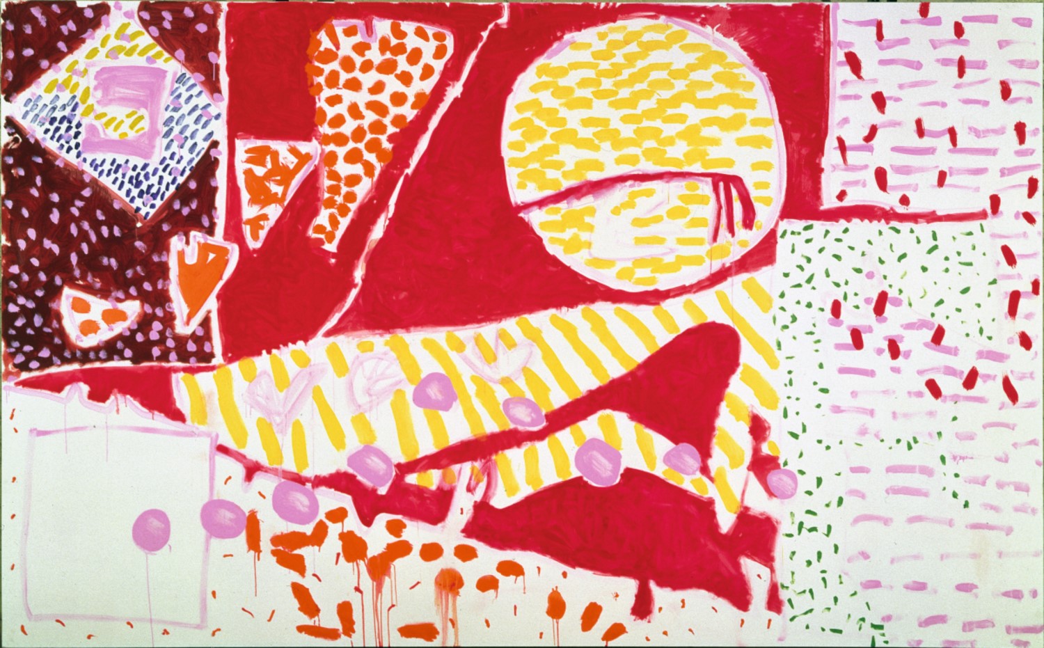
In this situation I was immediately thrown into a third form of viewing behaviour that was alien to me. The experience was not so much mind-blowing (social media loves hyperbole) as invigorating. For a moment I was a child in a sweet shop wanting everything, such was the temptation to taste, and visually touch, it all. ‘Square Green with Orange, Violet and Lemon: 1969’, selected from Heron’s wobbly-hard edge period, has the colour-flavour of Jelly Babies and a surface excitement and frisson that transforms the senses of texture as indivisible from the visual.
Heron’s work is often distinguished by its example of colour-shape dexterity and glorious visuality and a chronological display may not have accommodated or extended the potential impact of his achievements. The visual dynamism of the paintings, from all phases of Heron’s career, contextualised the display. All was equal, big or small, early, mid or late career. But it is mixed in a carefully curated way, as none of the sequencing looked arbitrary, but evincing a sense of purpose – if only to revitalise the viewing experience. There was a sense of freedom in allowing oneself to travel in any direction, including from one end of a wall to examine a row of works, or to diagonally cross a space under the magnetic pull of another canvas.

“Five Discs”, 1963, oil paint on canvas, private collection, © Estate of Patrick Heron. All Rights Reserved, DACS 2018
The one huge room, which is the new extension to Tate St. Ives, was sub-divided into four spaces entitled Unity of the Work; Explicit Scale; Edges and Asymmetry and Recomplication. But the wall texts within these sections could have been placed randomly. For example, ‘Five Discs: 1963’ has unified formality; the quantities and intensities of colour create a rhythm for the eye; the edges define the compositional unity as much as the placement of colour-shapes; and asymmetry is a hallmark of this and most of his work. These served to show that Heron’s practice was consistently founded on clear, analytical thinking and a delight in realising theory based on the visual history of painting and his own perceptions.
“Red Garden Painting”, June 3 – June 5 1985, oil paint on canvas, © Estate of Patrick Heron. All Rights Reserved, DACS 2018
“Sydney Garden Painting”, December 1989, oil paint on canvas, private collection, © Estate of Patrick Heron. All Rights Reserved, DACS 2018
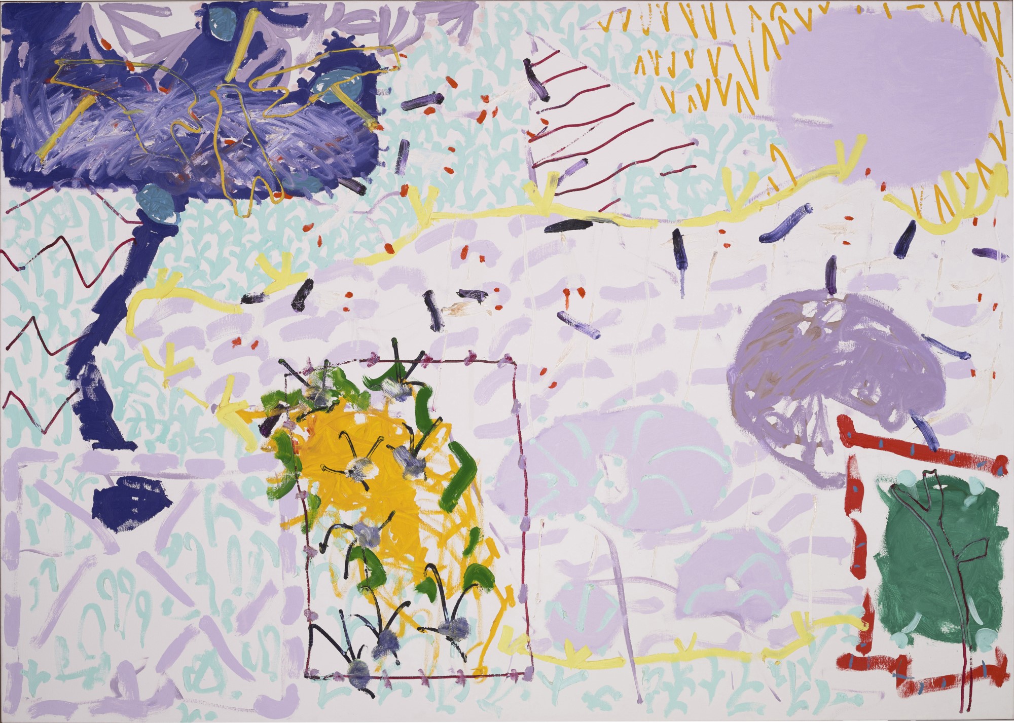
But an abstraction related to living and being-in-the-world was never overshadowed by theory or a purely art-for-art’s-sake formalism. ‘Red Garden Painting: June 3 – June 5 1985’ and ‘Sydney Garden painting: December 1989 II’ come from the final stages of Heron’s career. The confidence in distributing line, shape and colour (all inseparable elements for Heron) might look a little like child’s play. But no element looks out of place and the compositional balance enables the eye to move in, out, across and around. In the paintings from his Australian residency plant-like shapes, organic textures – even birds in a tree – have set up a conversation with colour, line and proximity of space inducing configurations.
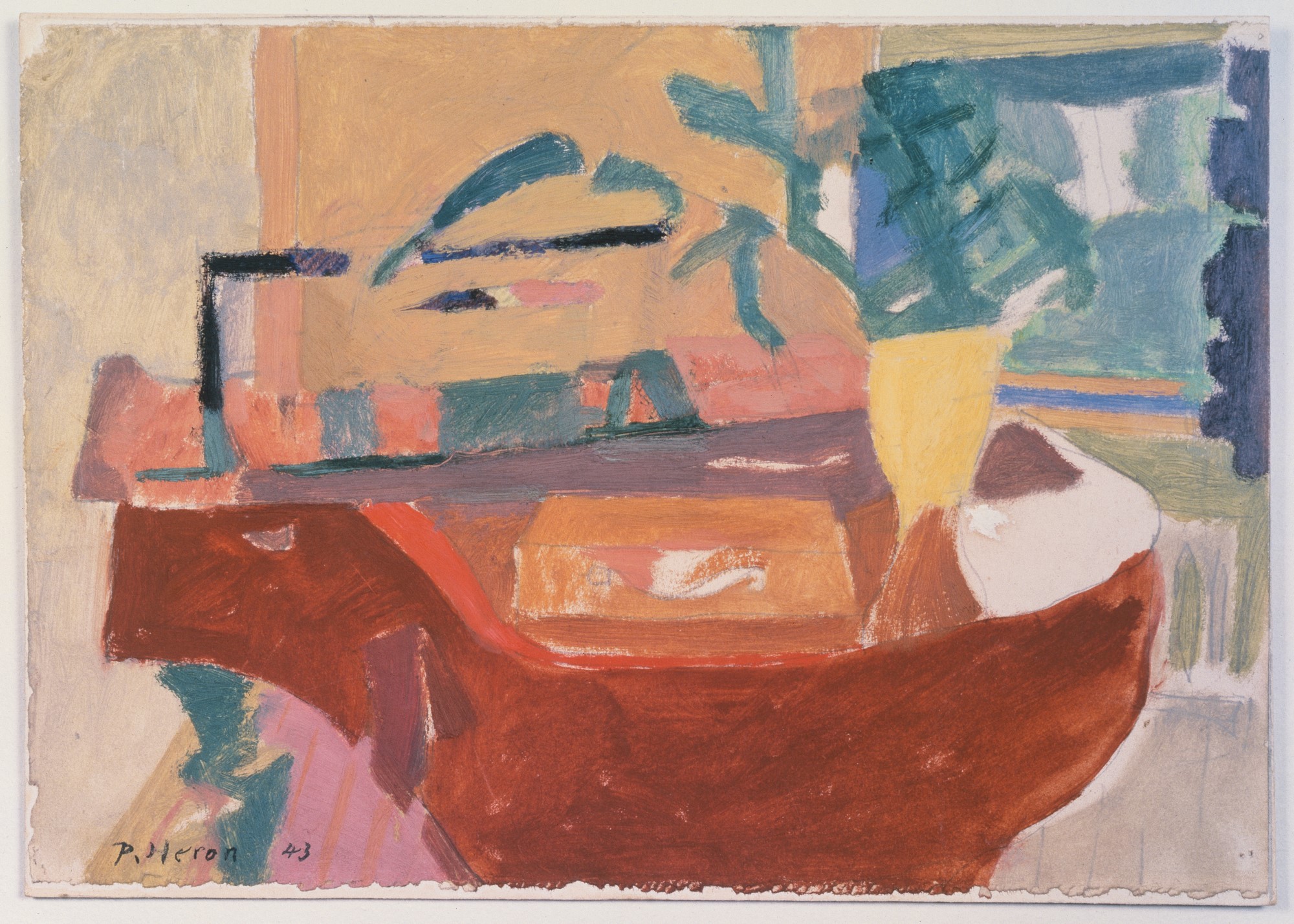
“The Piano”, 1943, oil paint on paper © Estate of Patrick Heron. All Rights Reserved, DACS 2018
“Big Complex Diagonal with Emerald and Reds”, March 1972 – September 1974, oil paint on canvas, © Estate of Patrick Heron. All Rights Reserved, DACS 2018
Yet for all the many acres of colour/paint on display ‘The Piano’ (1943), a diminutive 19 x 27.3cm oil on paper, holds court despite being placed opposite ‘Orange and Lemon with Small Violet: April – July 1977’ (198.1 x 274.3cm). The orange ocean of colour in the latter work could burn your brain to a cinder, but is controlled by the violet island that is embedded in the orange but borders the yellow that flowers below. ‘The Piano’ is a domestic painting in size and subject matter and is a precursor to Heron’s truly abstract paintings that were to develop from the 1950s onwards. Because of its size viewers were stepping up close to take it in. Interestingly, this close-quarters examination was just as likely for ‘Big Complex Diagonal with Emerald and Reds: March 1972-September 1974’ (208.3 x 335.3 cm) that also drew the viewer up close. Has a diagonal ever been so interesting? The twists and turns are as challenging and as surprising as the topographically defined network of roads at the far end of West Cornwall where Heron resided near Zennor.
‘The Piano’ is casual and relaxed. The painting appears to be a study in loosely applied interlocking areas of muted colours. It is harmonious and dreamy – but can you imagine this image 3 metres wide? I suspect it would hold up just fine.
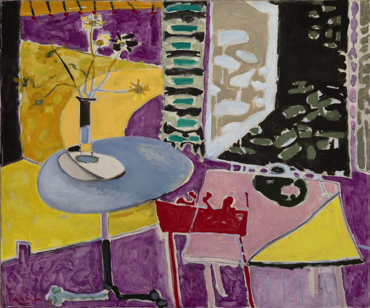
“Interior with Garden Window”, 1955, oil paint on canvas, 1219.2 x 1524 mm, Private collection, © Estate of Patrick Heron. All Rights Reserved, DACS 2018
‘Interior with Garden Window’ (1955) could thematically accompany ‘The Piano’ and bridges the journey from Heron’s healthy obsession with Braque, Bonnard and Matisse to his unique, abstract purifications for the eye that he makes in the next two decades. Here we see an open window motif in the top right hand quarter of the composition that seems to bring the outside world into (or onto) the picture surface, rather than taking the observer’s eye away into perspectival recession. Hanging down from the top centre there appears to be a wall hanging. By the end of the decade, ‘Green and Mauve Horizontals: January 1958’ shows us that the transference to pure abstraction has been achieved. Might we call this a proto-Speculative painting? The systematic process of applying varying strokes of paint are on an equal footing with the final result. An intuitive exploration of paint/colour application is in tune with making a visual statement that looks complete and fully realised – one more stripe might have destroyed its compositional harmony.
“Green and Mauve Horizontals”, January 1958, oil paint on canvas, © Estate of Patrick Heron. All Rights Reserved, DACS 2018
‘The Piano’ would conventionally have been placed at the start of the exhibition. It was not too far from the entrance, but was placed on the blind side of the first dividing screen. This possibly irrelevant fact is mentioned as the media has taken up an inferred sub-plot to the whole show. If you had read the press coverage beforehand, you could be feeling both a little wary but very excited by the prospect of seeing the exhibition. The media attention confirms Heron’s status as a major British painter as, without dissention, everyone loves the work.
But the curation is definitely not “bland” as claimed by Rachel Campbell-Johnston (The Times), or “so infuriating” as Rachel Cooke from The Guardian finds. Alastair Smart in the Mail Online claims that, “Against the odds, this Heron show just doesn’t take off.” Mark Hudson (The Telegraph), always a very thoughtful, perceptive and engaging commentator, strikes a balance of sorts when he says: “Don’t let me put you off seeing this original, if somewhat maddening exhibition. It takes guts to stage a show with no beginning, middle or end, which relies entirely on the visual curiosity of the viewer.”
Heron would surely have loved this last point as he applied orderliness in diversity, and asymmetry to the potential chaos of the inattentive fusion of eye and mind. He purified the experience of the eye by celebrating the peculiar but fundamental power of sight by making paintings for anyone to look at. The curators at Tate St. Ives, Andrew Wilson and Sara Matson (with some advice I would imagine from Heron’s daughters, Katherine and Susanna), have more than ”guts” – for their collective audacity is totally in tune with the spirit of the work.
Thankfully, Jackie Wullschlager from the Financial Times must have actually viewed the show with an open mind, as she wrote:
“Tate, wisely eschewing a chronological hang, has placed these generous, enveloping garden landscapes of dynamic rhythm and repetition, patterns of foliage and flower, in every gallery. Chaotic and expressive within their intermingled linear structures, they constitute a late style of mastery and experiment, exquisite design and broken space: the most sumptuous, vital works in a pleasurable, absorbing show.”
But do not take the implied, hedonistic, visual pleasure too much for granted, for on reflection I realise that I should have given ‘Vermilion and Ultramarine: June 11: 1985’ more time and attention. It feels too radical to take in at once, despite its minimalism. So we shall leave a photograph of this small canvas out of this article on purpose. If Cornwall is too far for you to travel, head for the Turner Contemporary in Margate between 19 October 2018 and 6 January 2019.
Reviews
Rachel Cooke (The Guardian)
Mark Hudson (The Telegraph)
https://www.telegraph.co.uk/art/reviews/patrick-heron-tate-st-ives-review-bold-often-maddening/
Rachel Campbell-Johnston (The Times)
Jackie Wullschlager (FT)
https://www.ft.com/content/94863ffc-590b-11e8-b8b2-d6ceb45fa9d0
Alastair Smart (Mail Online)
Video of the exhibition on Youtube from artcornwall
https://www.youtube.com/watch?v=kF6Vq7_zOxI
Installation shots from artcornwall
http://artcornwall.org/exhibitions/Tate_StIves/Patrick_Heron_Tate_St_Ives.htm

Another review, on the Studio International website takes a positive view of the curation and a rather figurative interpretation of the paintings:
http://www.studiointernational.com/index.php/patrick-heron-review-tate-st-ives
‘Heron admitted that, although he hadn’t consciously painted a representational landscape for years, he was sure that, living where he did, “a third of a mile and over 600 feet above one of the world’s most ferociously rocky coasts […] I don’t doubt for a moment that the enormously powerful rhythmic energies of the granite outcrops beneath my feet transmit certain rhythms straight up through the soles of my shoes every minute of the day.”’
Another Heron quote, writing in 1953: “In painting, space and form are not actual, as they are in sculpture, but illusory. Painting, indeed, is essentially an art of illusion; and ‘pictorial science’ is simply that accumulated knowledge which enables the painter to control this illusion, the illusion of forms in space. But the secret of good painting – of whatever age or school, I am tempted to say – lies in its adjustment of an inescapable dualism: on the one hand there is the illusion, indeed the sensation, of depth; and on the other there is the physical reality of the flat picture surface. Good painting creates an experience which contains both.”
LikeLiked by 1 person
And there you have it in a nutshell; or should I say heron’s egg ?
LikeLike
I thought the hanging was excellent. As Geoff has already suggested, this was the kind of optimal presentation of works in an available space that one might expect of a (huge) private collection – respectful primarily to the paintings rather than to any curatorial narrative.
What struck me immediately upon entering the exhibition was the clarity and lack of sentimentality that the works conveyed. I put this down to the rigour and honesty of Heron´s approach, paired with a growing realisation that he was very much more a draughtsman than a painter.
Analytical line dominates over probing paint in nearly all the works exhibited. The only exceptions are from the late fifties and early sixties, a period that seems poorly represented, with paintings such as “Scarlet Verticals” 1957, “Tall Purple” 1962 and “Orange (with Five) September 18” (1962) whose unintegrated surfaces fail to convince.
“Five Discs” 1963 on the other hand is one of the highlights of the show – a calm, resolved and forceful presence with subtle harmonies of colour and composition.
The pitfalls for drawing-based work (when seen and presented as painting) would seem to be those of design and graphic detachment. The “wobbly hard-edge” paintings come very close to design in most of the examples displayed here. Much is made of the supposed spatiality of Heron´s brushwork, but at the distance required to take in a painting such as “Big Complex Diagonal with Emerald and Red” 1972-74 the effect is at most tactile, preventing whatever colour is taking its turn as background from receding too drastically. Most of the reds and oranges in these paintings form a closed and textured surface – it is only the cooler colours that could be said to exhibit spatial brushwork, most effectively for me in “Square Green with Orange, Violet and Lemon” 1969.
If the wobbly hard edge paintings flirt with design, the later garden paintings flirt with the detachment of the lines from their ground. This can be seen in “10-11 July” 1992, which is a (very beautiful) graphic image that fails to integrate with the bare canvas ground or to build a coherent sense of space.
“5-6 September” 1996 and “Pale Garden Painting” 1984 on the other hand, with their wealth of variety in mark and form, succeed entirely as painting – two of the most impressive works in the show.
I agree with Geoff that this is an invigorating and thought-provoking exhibition, though I suspect that it contains rather few of Heron´s very best works. I would especially like to have seen more of the late garden paintings and the more painterly “kitchen hob” paintings as it seems to me that this is where Heron was at his hugely impressive best.
LikeLiked by 1 person
In continuation of our comments on Emyr’s essay, and in anticipation of seeing the show in Margate later this year (though this won’t resolve the issue, by the sound of it), I’ve been looking at the books again – notably the Mel Gooding – and reaching the provisional conclusion that a great many of the later paintings, particularly those made after the “Red…”, “White…”, and “Pale Garden Paintings” of ’85 and the “Sidney Garden Paintings” of ’89, are conflicted by drawing and figuration to varying degrees, and often to the point of compromise of their abstract qualities. And so I would agree with your second-to-last paragraph, except in the case of “5-6 September 1996”, which I would include in the general fall in quality after 1989, prior to which the work retained a greater measure of physical relatedness between parts or areas.
That said, Heron, like Ben Nicolson, was throughout his career a really good draughtsman. And like Nicholson, this particular talent, though often wonderful, seems insufficient to hold form and colour in place in a more than arbitrary fashion over a large canvas. The drawing starts by trying to signify things external to the work before it begins to develop a reality of their own. This, in a nutshell, is the problem with semi-figuration in abstract painting. The resolving of the real world of three-dimensions into two, a paradox that Heron understood perhaps better than most, is in the later paintings let go rather too easily.
LikeLiked by 1 person
And so I wonder, to quote your comment on Emyr’s essay, what is the greater “restriction on the freedom to paint purely with colour and form, which to me is what abstract painting is all about.” Is it the avoidance of inadvertent figuration, where possible, or the admission of figurative references that at least in Heron’s case seem to compromise the reality of his late work?
LikeLike
It is perhaps worth saying too that as Heron’s late work progresses and he appears to feel a greater freedom to allow figurative and semi-figurative references to introduce themselves, the invention of the work itself decreases accordingly. “Freedom”, then, for the artist to do as he pleases, unrestricted by any notion of separation between abstract and figurative? Or “freedom” for the work to do as “it” pleases, so to speak, free of the known restrictions of conventions of “representation” and, indeed, composition? This seems to me both a difference and a choice. Perhaps it is more in focus in my mind because of being a sculptor…?
LikeLike
The second of those, in my mind too.
But if the painting turns out to have wanted something that is additionally somewhat figurative, what do you do then?
LikeLike
Start again?
But seriously, you would have to give me an example of an abstract painting improved by such a late addition. I can’t imagine it.
It occurs to me we may agree that all painting might be said to have a composition of sorts, just as any sculpture might be said to have a configuration of sorts (if, say, a ‘cluster’ is a ‘configuration’). That may be true, but not of much value, and it’s very different from an artist setting out to make a “composition” or a “configuration” of a specific and limiting character from the start of the work, which seems to me at odds with abstract art and the spirit of open-minded discovery.
LikeLike
And to be honest, it’s probably at odds with good figurative painting too. Surely it’s a sign of academic thinking to have ideas about the right kinds of composition? And surely it’s demeaning to describe a great Constable as a “landscape composition”, even if in some pedantic sense it is true.
LikeLike
The new discussion on Brancaster Chronicles of Harry Hay’s paintings gets into these issues quite deeply:
LikeLike
OK, lets take Hofmann’s “In the Wake of the Hurricane” 1960
I’m pretty sure this would have been painted without any attention to the “conventions of figuration”.
Yet the space discovered in the course of Hofmann’s organisation of colour and form is (for me anyway) a landscape space. It’s not an arbitrary addition or a lazy solution – it’s the space that the painting required in order to succeed as a painting.
The literal content all looks very abstract to me but the landscape spatiality creates figurative associations: the large orange and white area on the lower right becomes a kind of arid plain, while the tongue of green on the lower left becomes a tree-covered hill. Two thirds up is a kind of horizon and above this the dramatic storm clouds are pulling away. Hofmann presumably saw this too and gave the work a corresponding title. But there’s no way he set out with this as his “subject”.
And in spite of all these figurative associations, it is still possible to enjoy the work as a purely abstract and spatially coherent arrangement of painted marks on canvas.
This is what I mean by “transparent” figuration.
Hofmann’s “The Prey” 1956 on the other hand is irremediably figurative, as it seems (to me) that the whole import of the painting is contained in its figurative associations.
Particularly in complex, spatial, abstract painting, the question is not whether there are figurative elements (there are), but whether they impose themselves on the viewer and interfere with the reception of the work as an abstract painting. I don’t think it helps to ignore these figurative elements or pretend they are not there. At some stage of familiarity with the work, all these things will emerge and then it is very much a question of whether they disappear again or are so insistent that the work is to all intents and purposes destroyed, as the eye is long longer at liberty to roam freely around it.
LikeLike
Worth going back to Alan Gouk’s Part 2 and looking at Anne’s comment on …”Hurricane” in comparison with Alan’s “Witchita…”:
‘the best thing here for me is the image of Alan’s painting “Wichita Lineman”.2017
If you have a few minutes click on it and get the full monty and try not to think of where it has been squashed into.
It has been painted only last year,
I don’t know but its probably acrylic paint.
It does not matter to me nor how big it is.
In his “A word from the artist” from the HSOA catalogue of his “Mandalay” series last year he says he hopes for a “cavalier boldness of attack”.
This painting has that no doubt. It has a stand up for itself attitude which has no need for add on explanation. To say the paint flows is an understatement . The colour and the fluidity merge together and describe that ineffable quality that paint can have when it is both relaxed and controlled.
It is something to look and learn from if you are an Abstract painter today.
I found it a it disconcerting that Alan puts his painting in direct comparison to Hofmann’s “In the Wake of the Hurricane” 1960…….For what its worth I think “Wichita ..” is better…The greens and oranges are more heavy handed in “…..Hurricane” and the whole thing is more laboured…..I don’t need to see that comparison …maybe Alan’s painting is only a reality because Hofmann painted his first but in isolation I am not bothered about Hofmann .I love the Gouk for what I have said already and for its subtle strength.
The Hofmann relies on a strong format. Whether I call it format or configuration I think “Wichita….” falls down a little because all of its great qualities do “hang ” on a bit to a hidden structure which I keep discovering…and maybe that is not quite Abstract?
But brilliant….’
And Alan Gouk in reply to a comment by me about the exclusion of Hoyland from the Part 2 survey: February 23, 2018 at 1:49 pm
“That clunking bipartite Composition is precisely why I wasn’t able to include Hoyland in the survey. I’m afraid that in Hoyland’s case the desire to emulate Hofmann’s strongly saturated colour had a negative effect on his painting overall, though this one is better than most. He gets stuck with a rigid design early on , repeated in painting after painting, and resorts to working it up. There is no give and take, no flexibility, no flow of imagination, and in your words, no “discovery”. Form in painting should be discovered anew with each painting, not clunkingly imposed on it from the start, or near start.”
I agree with most of this, except to say Hoyland was by no means the worst culprit when it comes to rigid format, and neither Gouk nor Heron were (or are) wholly exempt.
As for Hofmann, he is undoubtedly semi-figurative at times. There is lots to learn from him, and he remains a favourite artist for me, I love some of his painting, but he’s also in the past, you can’t do what he did again, and art has to go forward.
And I agree wholeheartedly with this from Anne: “Wichita….” falls down a little because all of its great qualities do “hang ” on a bit to a hidden structure which I keep discovering…and maybe that is not quite Abstract?”
Well, maybe Richard you think that the bit of ‘hidden structure’ is a good thing, but I think the onward of painting is better served by trying to get past that, because even in this seemingly impulsive and expressive abstract painting there is the hint of landscape structure, a figure/ground thing, holding back the content. That’s my opinion.
LikeLike
I’m not sure that that “hidden structure” is a good thing in itself, but it may be the price to pay for spatiality in painting. Remember that the space is a projection from the viewer and that the projection has to be triggered somehow.
By the way, “In the Wake of the Hurricane ” is an absolute monster in the flesh, with an enormously forceful presence. I’ve never seen a reproduction that even begins to do it justice. From that point of view I think the comparison with Alan Gouk’s painting (or at least with that seen at the recent Hampstead show) is about right.
LikeLike
“… the price to pay for spatiality…” ? Maybe, but I think that might limit how we think about space in abstract painting by insisting it has to rely on figurative prompts or devices. Whereas I would rather think that the “spatiality” of abstract painting is something a bit looser and has different kinds of potential according to each artist (I’m thinking of how Anne talks about space in (or “of”) her painting as an example of what I mean).
I can only repeat my usual mantra, that the quest for “more abstract” is about opening new doors, not narrowing the possibilities. I deliberately started using the word “spatiality” a while back to separate it from quotidian, literal space in sculpture – and I guess too its “depiction” in painting.
LikeLike
Here’s a weird thought.
If art, and in this case painting, is a way of giving form to the chaos of subjective phenomena, making “what is” amenable to consciousness, it is possible to speculate that the third, illusory dimension of painting (and particularly abstract painting) might serve as a path to consciousness of a dimension of existence not included in the four “known” dimensions of space and time.
Without understanding a single one of them, I believe that all versions of string theory postulate multiple extra dimensions in order to unify physics. One could imagine abstract painting slowly giving form to a dimension that has so far eluded consciousness.
That would be one way of justifying the pursuit of an absolute abstraction that is “spatial” but independent of conventional, “known” space.
LikeLike
Sign me up as your first cult member.
LikeLiked by 1 person
On a more prosaic note, I think the capacity of a painting or sculpture to allow the viewer (and the artist/viewer) to freely move around in its visual structures – or rather, as a virtue of its structures – is an important aspect of abstract art’s spatiality. And just as one might be said to look beyond the picture plane into the spatial “window” of past figurative painting, or comparably, look “at” the frontal address of much abstraction, so one might be invited to imaginatively feel one’s way around and about in a looser kind of way the inside structures of new abstract art (perhaps the picture plane thus becomes a little less insistent?).
But we have been talking for some time now about looking “into” rather than “at” abstract sculpture as an aspect of its newly-transparent three-dimensionality, and this can surely apply to painting too. This brings to abstract painting a very different – but nevertheless potent – kind of physicality from the upfront, burgeoning, literal front-loaded-ness often experienced with Hofmann. The attainment of a less confrontational spatiality perhaps requires a little more precision and intentionality over and above the spontaneity familiar to the methodologies of past abstraction.
LikeLike
Yes, absolutely. I think the freedom of movement thing is probably more basic than the composition/structure thing or even the figuration thing. The eye hangs itself up on structures that are too obtrusive and on isolated figurative elements (faces, animals etc.) which don´t fit. The wholeness of a painting depends, in part, on this freedom.
And without space for the eye to roam in, a “flat” painting has to be terribly simple to ensure that its parts are all related to one another to form a whole.
I don´t think there´s anything wrong with a pronounced surface physicality as long as it doesn´t block the way through to the pictorial space beyond (Cézanne´s problem with the Impressionists?). That said, there are probably more subtle ways (with form and colour) of achieving a surface/space duality.
LikeLike
“The eye hangs itself up on structures that are too obtrusive and on isolated figurative elements (faces, animals etc.) which don´t fit.”
Yes, exactly, which is why compositional devices or formats such as grids are a possible problem. As far as Cezanne is concerned, “…it is all a matter of establishing the utmost possible relationship.” What exactly that might mean in abstract art, without the “motif”, is our exciting project, but devices and conceits of various kinds are no substitute for a discovered unity that deals with the duality you mention. Which brings us back to late Heron, and the unnatural isolation of his line…
LikeLike
Abcrit is on a bit of a break at the moment, but for some enlightening discussion on abstract painting and sculpture right now visit https://branchron.com/
LikeLiked by 1 person