
“Die Einen Sind im Licht”, 2017
Clyde Hopkins: A path through dark and light.
You would expect a body of work, created over a span more than forty years, to display a pattern of development from early attempts, to the mature output where an artist’s ‘signature style’ has fully evolved and is then consolidated. But the paintings of Clyde Hopkins seem to resist this schematic interpretation. Those from the late seventies and early eighties are stylistically different to those produced in the late eighties. Another change occurs in the nineties and from 2008 or thereabouts the paintings seem to take on characteristics almost the opposite of those to be found in work from earlier in his career. So, instead of one signature style, there are several.
Each of these signature styles is fully resolved and sufficient, rather than marking an evolutionary stage in an ongoing narrative. Each deploys an established set of procedures and material properties. The pattern that emerges is more a series of brackets rather than a smooth gradient, each bracket containing a group of works with similar visual qualities. As in algebra the contents of the bracket have to be dealt with separately but there is a further move that can be made with the device: The paintings can be bracketed with works by other painters to widen the context in which they may be appreciated.
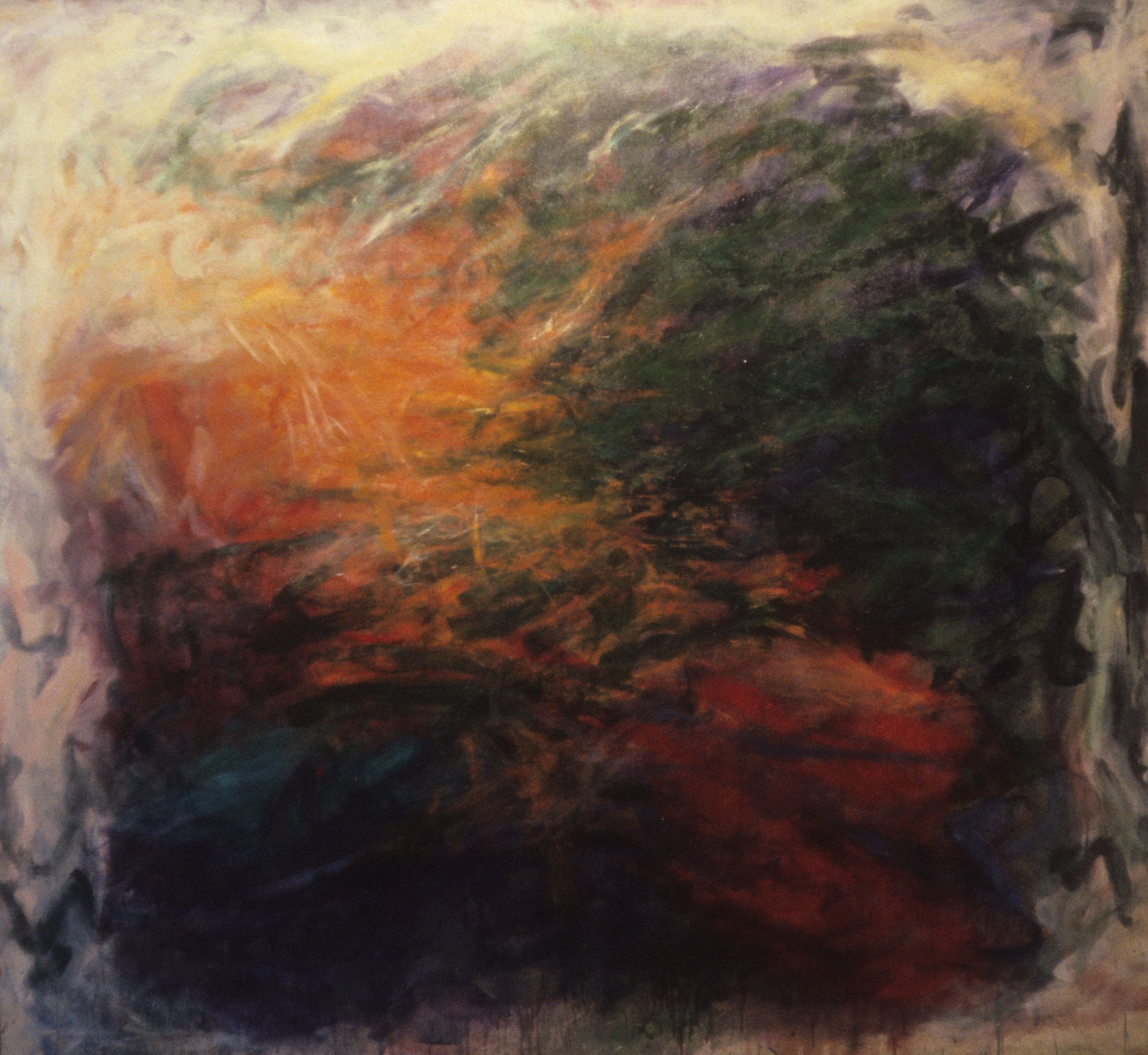
“All Sources”, 1980
The first recognisable style bracket, represented by works like All Sources, Untitled (AF), and Untitled (Driving) and Europa, dates from the late seventies and early eighties. The forms in these paintings are atmospheric and vaporous. They loom and gather but look like they are made from material too soft to be shaped inside defined contours. There seems to be something ‘there’, a pictorial phenomenon, but the elements are non-tactile. They don’t interact in a kinetic or percussive manner. If they were to collide they would simply pass through one another. Because they appear impalpable they don’t have formal relationships in the standard sense. Instead they exert influence in a space they permeate rather than occupy.

untitled (AF), 1980
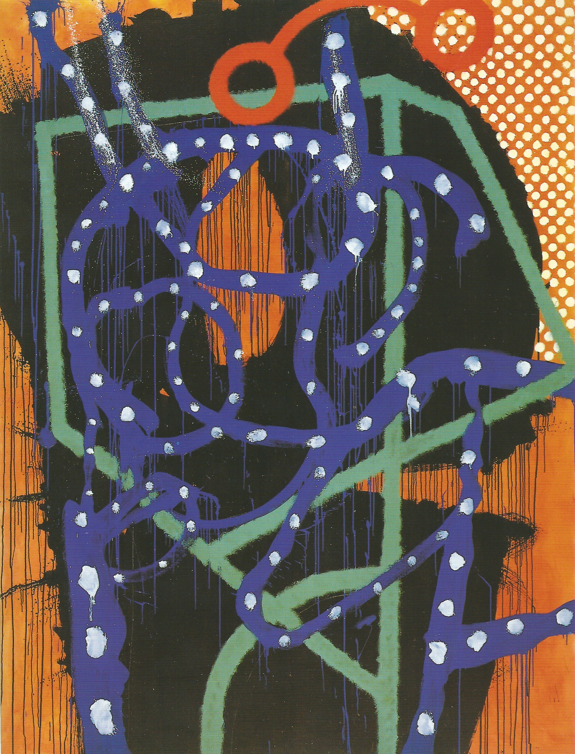
The non-tactile forms were replaced by much more aggressive and interactive elements in the next signature style. The change took place around late 1983 and the results were displayed in an exhibition of new paintings that toured nationally between late 1985 and the spring of the following year. A notable innovation was heavy black drawing creating a structure that spread throughout the painting like a burnt root system, particularly visible in Kent to Yorkshire (via the D.T.) (1984). That the structure resembles a chain of letters, albeit consisting of a limited alphabet, suggests that the works may contain hidden messages, once legible, but scattered and garbled when subjected to a highly active painting process.
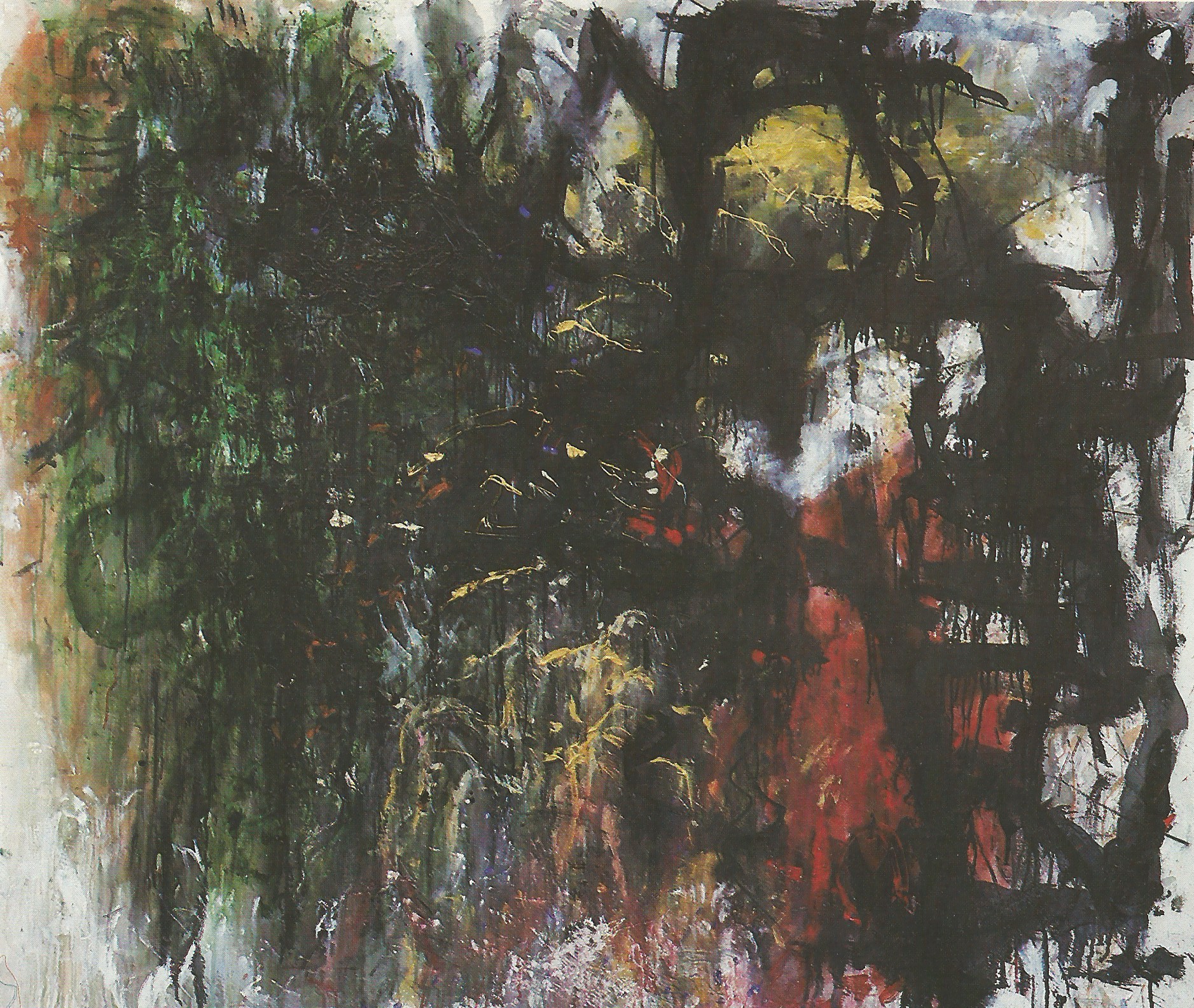
“Kent to Yorkshire (via the DT)”, 1983 – 84
In !Box Box! (1984), the black drawing is more wristy and dynamic, and supports another layer of gestures all tangled together. The fibrous combined structures are anchored to the canvas ground by a filamentous system of vertical drips hanging down from the tracks of liquid pigment. A Working River, (1985), also consists of drawing on drawing, though the lower part of the lattice has been washed away dramatising the section of light toned cryptic writing that has survived and would be clear enough to be deciphered, if its meaning had not been irrevocably lost.
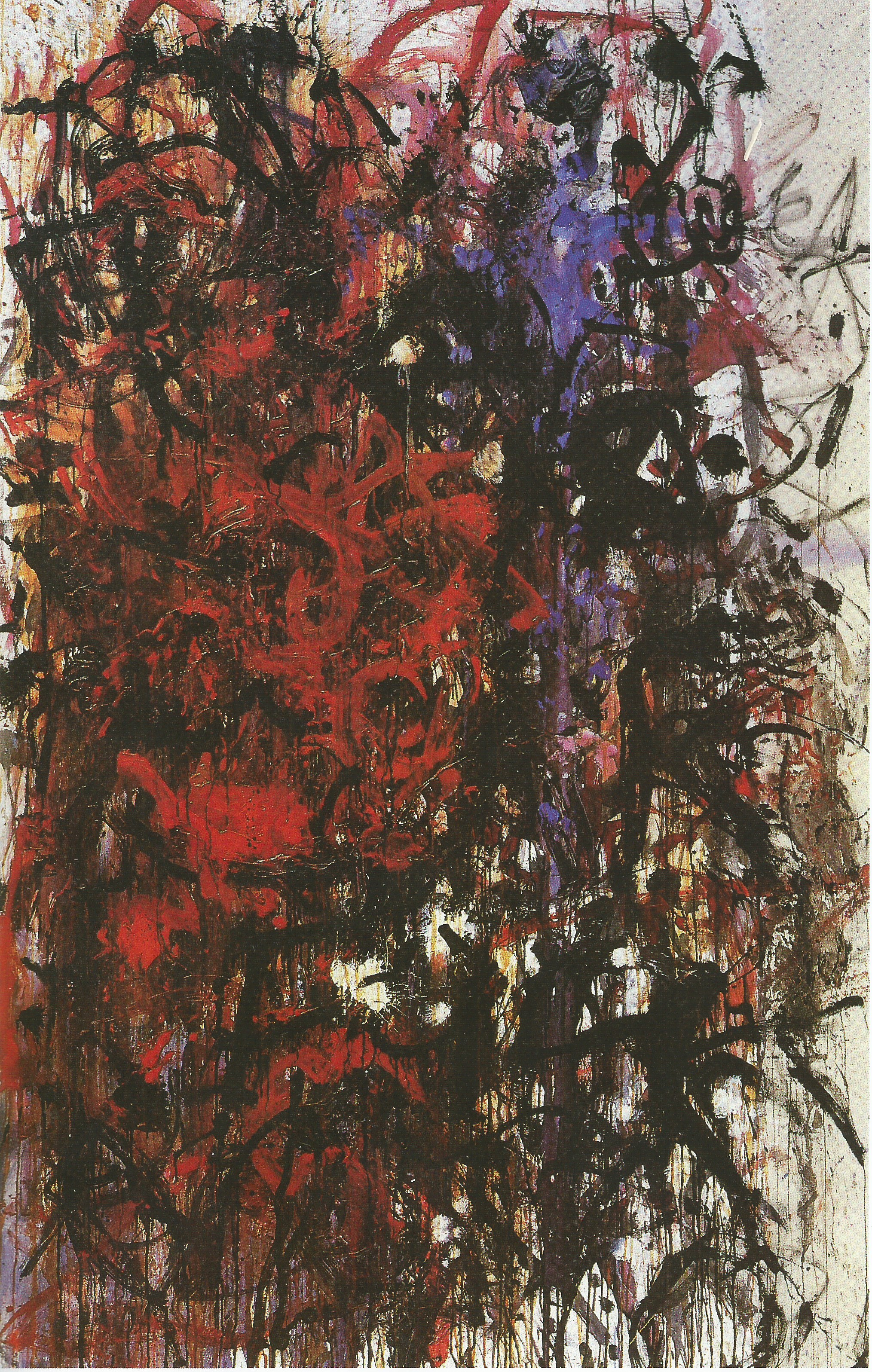
“!Box Box!”, 1984
The angry, rhizoid drawing defines the second signature style. But I want to bracket this set of works with other paintings to add what I think might be a productive dimension. When looking at ¡Box Box! recently I was struck by how good it was, and not just good in a general way. It was as good specifically as a good Abstract Expressionist picture is. Then I thought of the paintings in that category that I’d seen, and concluded it was better than a lot of them. ¡Box Box! also shared some procedural and interpretive overlaps with Abstract Expressionism, especially around the theory that its gestures are intelligible in reference to the artist’s emotional states. The difference is that instead of revealing the private contents of the Unconscious the painting performance channels an anger precipitated by real world public events.
“The Collar (George Herbert)”, 1989-90
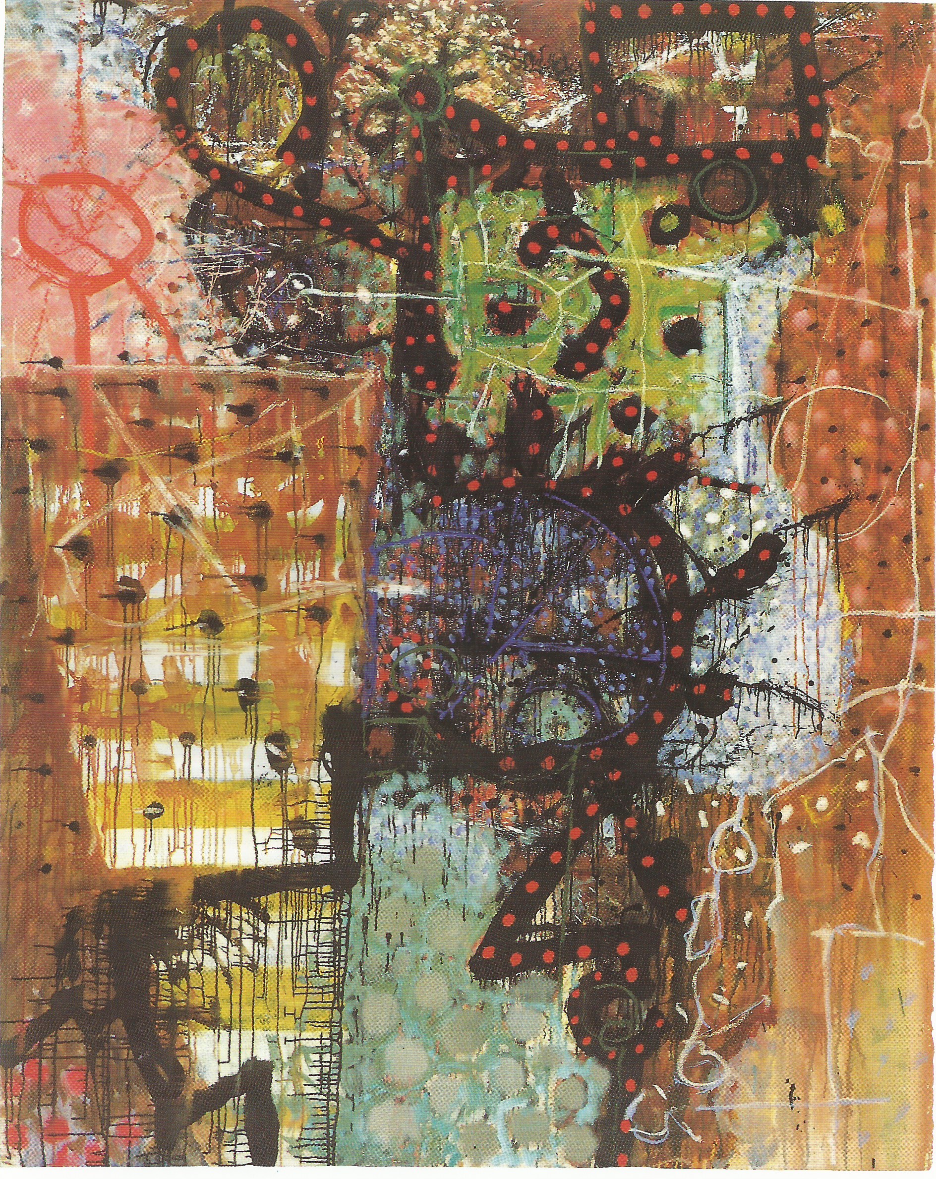
In the late eighties Clyde’s work went through a transitional phase. An exhibition of paintings at Francis Graham Dixon’s gallery in 1990 looks both forward and back, incorporating the black drawing and the spongier elements found in his earlier work, but also containing more defined areas and interlocking shapes. The pulses of dabs and spots make an appearance, animating and activating the surface in some places when applied in a painterly manner, but slowing down movement when more deliberately ‘printed’ in a regular pattern. The drawing becomes self-consciously iconographic, enclosing then linking symbolic entities to form a track through miscellaneous pictorial phenomena, most notably in The Collar (George Herbert) (1990). These paintings might lie between the signature styles that I’m arguing for, but I think Cap D’Ennis (1990) clearly marks the opening of the next bracket.
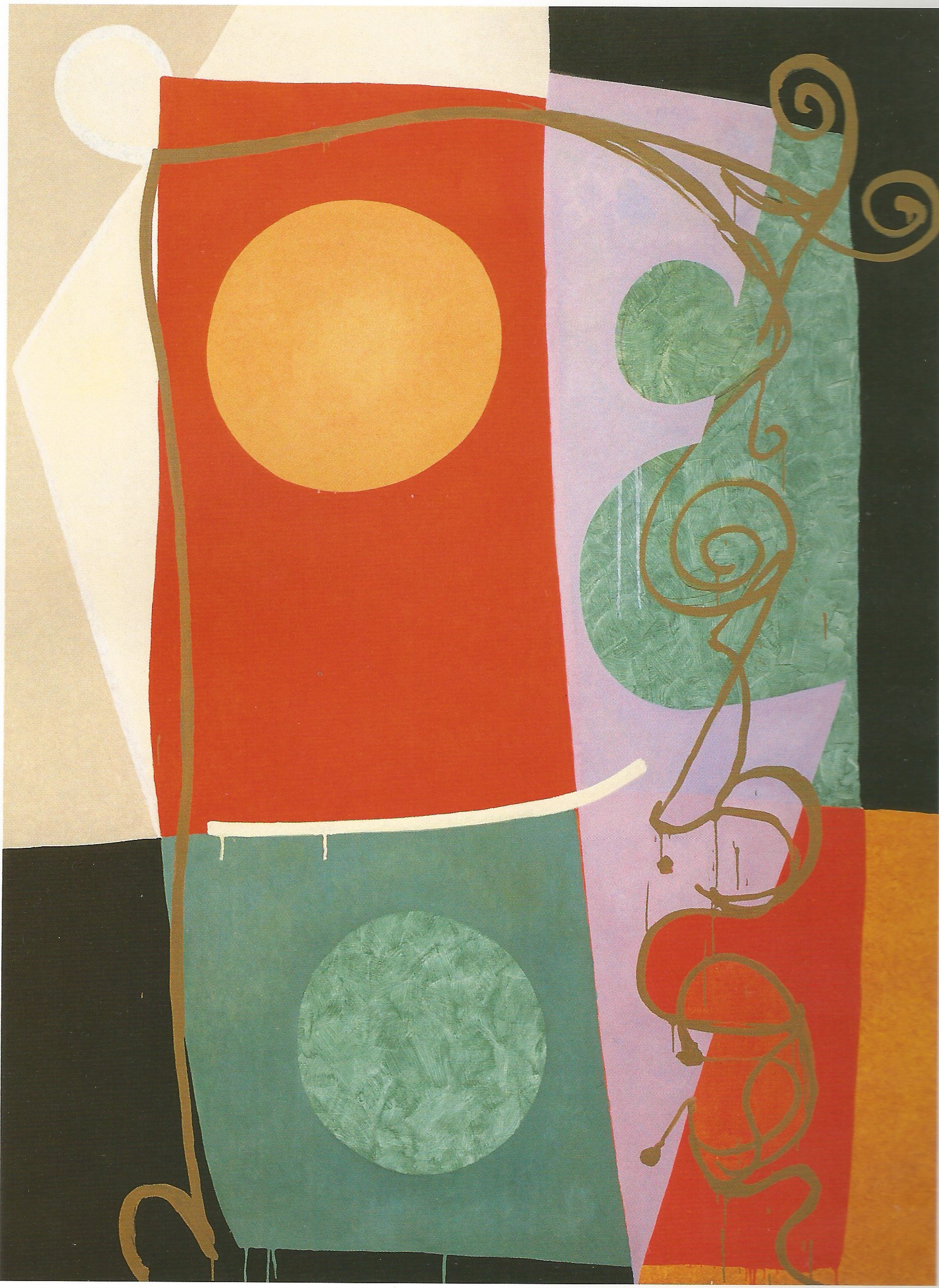
“Cap D’Ennis”, 1990
Unlike the countless constituents of The Collar, Cap D’Ennis comprises four superimposed major elements and few subsidiary elaborations. Corporal Trim, painted the following year, has a similar economy, a dark shape on an orange ground and three areas bounded by a swooping linear element. Though comparatively simplified and flattened, many works of the period were dominated by black and orange; colours that do not create much chromatic resonance. But by 1994 the palette had been expanded and the flat, planar areas had become the basic architecture of the paintings on which the colour could be displayed to fuller effect. Gould and Fleming (1994) inherit the black and orange but the stark binary is mediated by abutting yellows, mauve, beige and green. Planes also dominate Capstan Full Strength (1994) providing opportunities to flood the geometric sub-frame with colour over which other shapes can be stencilled to make local chromatic contrasts, all clamped by two L-shaped corner elements.
“Capstan Full Strength”, 1994
The linear feature, less emphasised in Capstan Full Strength, is more prominent in Night Crossing (1996), but it still has the fibrous, tendril-like quality found in some eighties work. It also contains two areas fabricated from small dots of pigment through which the ground colour can show. This way of dealing with an area became a feature of Clyde’s later work for reasons that are not immediately obvious. Like pointillism, it addresses the retina and enlivens visual appeal by providing optical stimulus that parallels the sensations caused by colour. But it also may be a way of introducing a sharply graphic element into traditional painting procedures. The graphic and the painterly are seen usually as belonging to different sensibilities, one precise, one less precise. In Night Crossing the triangular, dotted shape on the left mirrors the adjacent diagrammatic ‘V’ formed where the orange line passé s through the margin of the central area. The mechanical quality of the dots reveals the relative painterliness of the rest of the surfaces. And it also has the feel of collage, introduced and developed of course in Cubism.
“Night Crossing”, 1996
As ¡Box Box! may best be seen as a successful Abstract Expressionist painting I think Night Crossing is good in the way late cubist paintings are good, The signature style which links it back to Cap D’Ennis and onward to works made in the first few years of the twenty first century, falls within the same cubist bracket: The abutting planes and geometric architecture, the formal decisions, the flattening; are all typical of the style. But what also seems relevant about cubism, especially exemplified by Picasso’s work of the 1920s and 30s, is the way it combines the assets of abstraction and figuration in almost equal measure.
“Bread in Pocket”, 1990
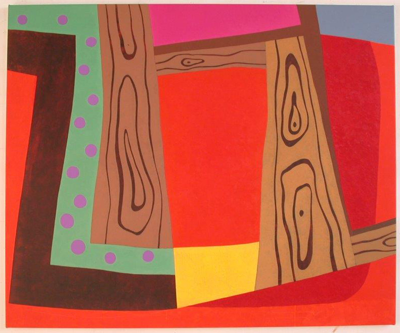
It deals with a built rather than liquid space. The juicy elements still to be found in Bread in Pocket, (1990) have to be dried out so they can prosper in a more arid pictorial environment. All the material needs to adapt to a new legibility and this throws extra emphasis on surface, edge, area, colour and relationships. Formal organisation takes on a greater importance, as does the practice of composition, all features associated with ‘abstraction’. But with cubism there is always space for figuration. Night Crossing has its tendril curls, a ‘moon’ and maybe even moonlight, while other paintings in this bracket contain musical notes, ‘winning posts’ and wood grain.
“Thoindigo”, 1996
Its Picasso’s rather than Braque‘s cubism that these paintings recall, and that inevitably includes the thread of surrealism particularly visible in the treatment of figurative material. Perhaps unrealism is a better description, implying a departure from the rules of natural appearance and a move in the direction of the monstrous or droll, as demonstrated by Gorky and Miro. The planar interaction and the structural stability of works like Thoindigo (1996) gradually gives way to a different more reckless pictorial anatomy, where shapes seem to have more personality than they need as in Prosaic Gulch Painting (2004) and Plankhead. (2005).
“Plankhead”, 2005
But these works still observe the relative geometric discipline of straights and curves derived from cubism, though the palette intensifies and, because the black lines are less prominent, adjacent colour areas generate chromatic relationships which create what might be seen as a colour world detached from the sense of the ‘natural’ that, however stretched, informed earlier paintings.
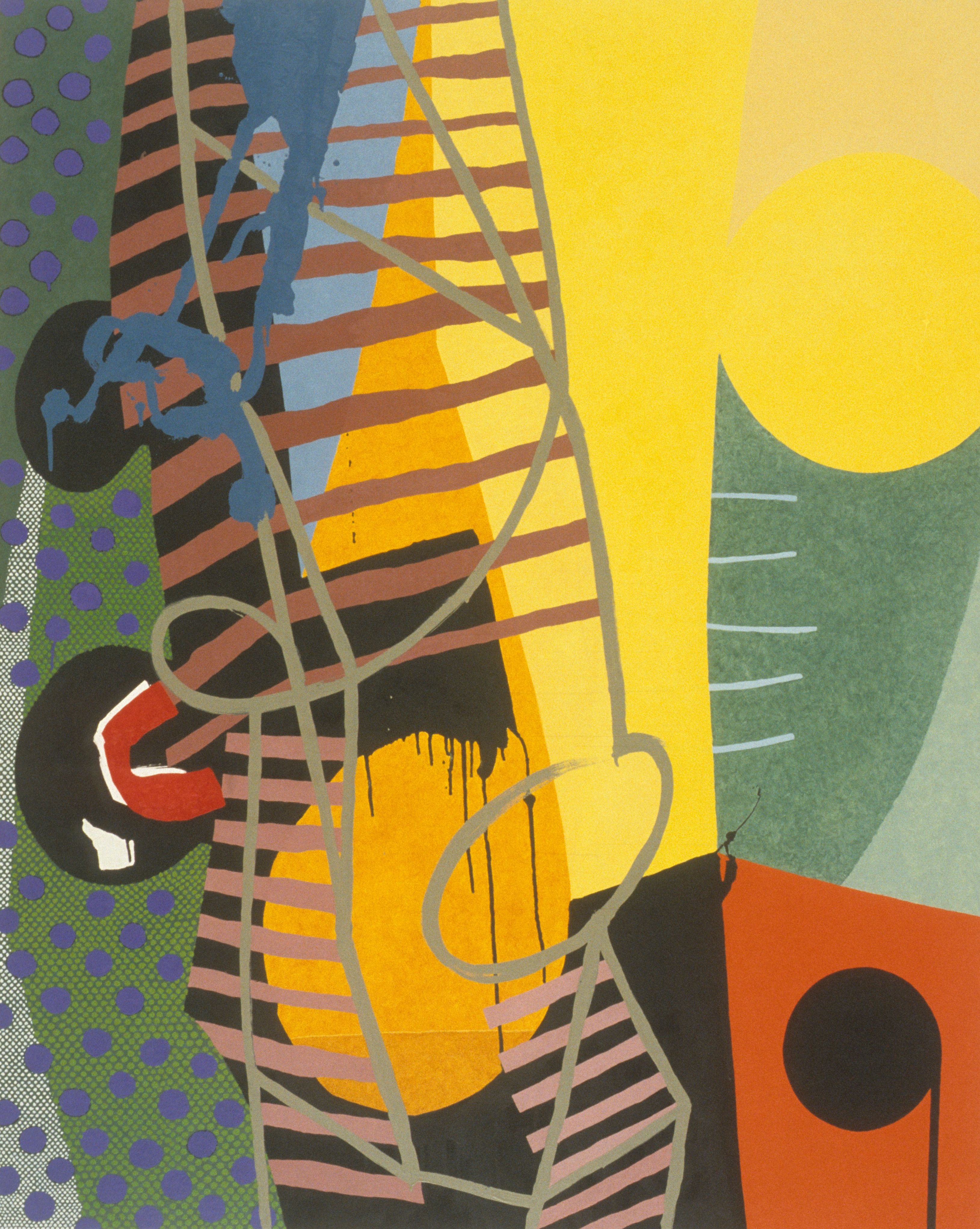
The last signature style emerges around 2007/08 and employs a similar palette but quite a different pictorial vocabulary. The darks return, often functioning as a ground glimpsed between highly coloured joined up shapes, free of hints of the geometric, which host a wide variety of smaller shapes, many produced by a technique using evenly spaced, tiny points of pigment, Stippled areas appeared as far back as Night Crossing, but in the last ten years their presence came to dominate the painted surface alongside other nervy, abraded and distressed textures puncturing the faces of the planes.
“Waltswood”, 2010
In this stylistic bracket there is also a shift in pictorial orientation from the assumption that we are looking at planes that are basically upright, that we see in elevation, to the view of the painting’s events seen as a plan, or map, spread out before us. In Waltswood (2010) this impression is reinforced by the loose chequer board (middle top), like a field system seen from above, and to the right something resembling the cartographer’s contour line denoting a hill. There are also leaf shapes. The dark fissures or tracks that run through the painting are typical of this style in that they invite a figurative interpretation but clearly belong to the topography of an artificial, slightly alien terrain.
The paintings offer a non-decorative, locked pattern, where each component is separately imagined, and separately painted in a procedure that requires infinite patience and concentration on individual forms, operating on a level of maximum legibility. Because of their map-like quality, they don’t participate in a shared space so the many colours they contain don’t advance or recede on the warm/cool principle but stay where they are, like jewels in a treasury.
Faced with this final style it’s hard not to think there must be a key to open the complex pictorial structures, as there must be another that unlocks the thinking behind all those titles. The titles sound like terms of endearment, nicknames, rather than official identifiers, suggesting that the works have personalities, recognised by the painter in what he decides to call them. The titles are provocatively imaginative, rather than soberly accurate, acting like a framing device around the process of seeing the paintings.
“About the Orinoco”, 2013
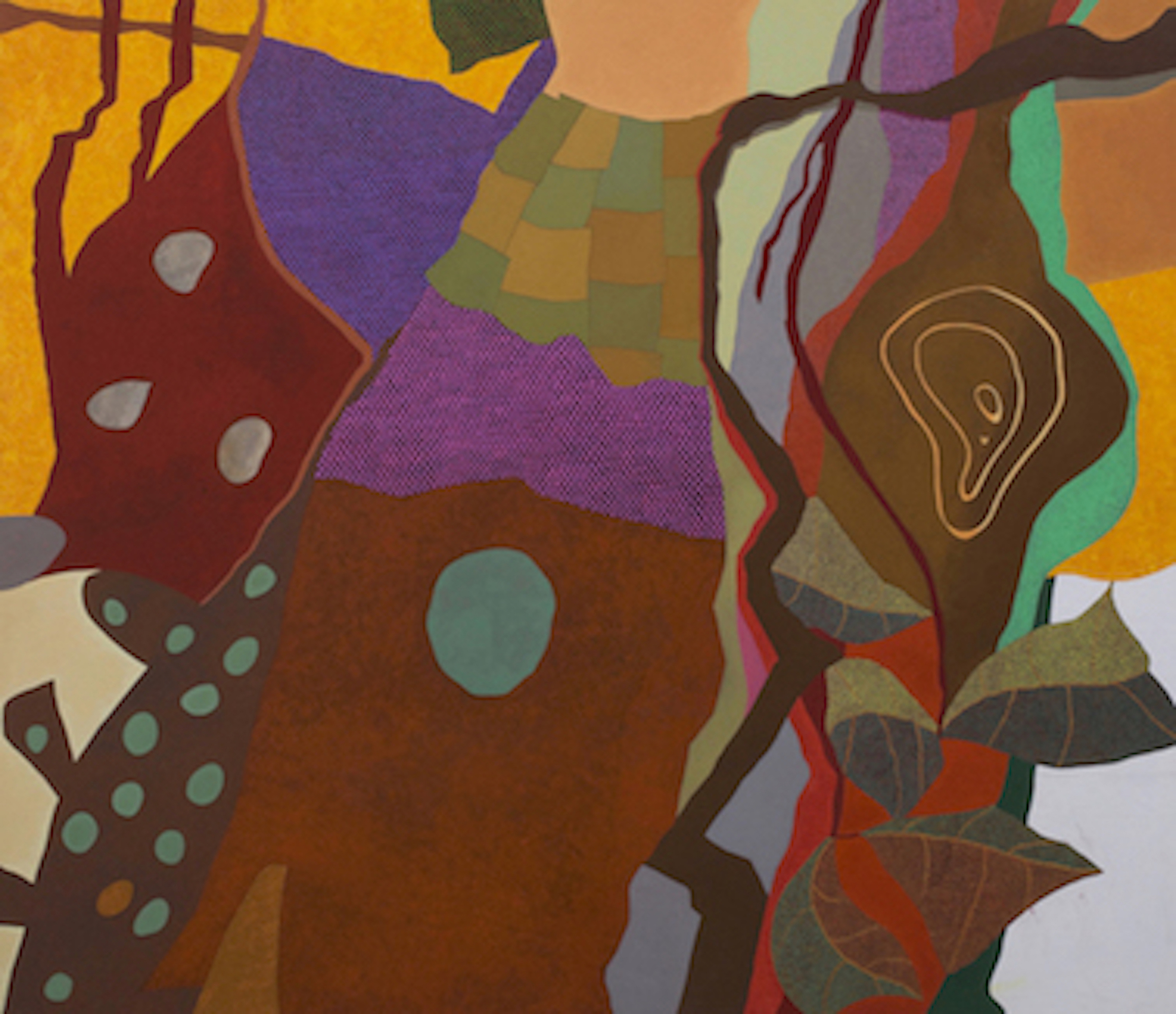
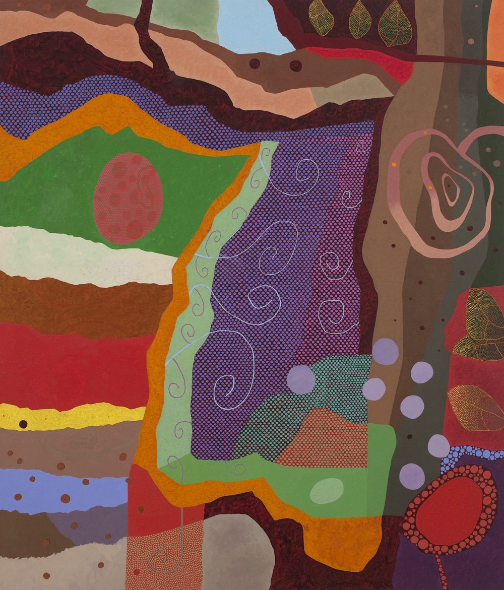
Clyde’s titles have always been elaborate, but in the last signature style their imaginative stimulus suggests that the painting territory he maps should also be seen as an imagined world, as in About the Orinoco (2013). Its contents include fables and memories of the past slowly and laboriously brought to light in the present, in their original, un-faded colour, devoid of the patina that usually coats the objects of recollection.
This seems to be leading in a far too literary direction, towards Marcel Proust and his bit of cake. But maybe it will do no great damage to our appreciation of Clyde’s work to try to discover his equivalent to the French writer’s madeleine, the key to the world that the later paintings construct. It’s tempting to leave the matter undecided, but this is a commentary on a retrospective, on a completed body of work. For what it’s worth, I think the key can probably to be found in experiences lived through in the aftermath of the Second World War.
Clyde himself has freely acknowledged his ‘obsession’ with WW2, though he was born a year after it ended. There are specific wartime references in some of the paintings but I think his interest in the event lies deeper. For him the War was over, but anyone living in the South East of England in the late forties and early fifties would have been fully aware of the strategic importance of that area, and would have experienced its cultural consequence in cinematic form of a narrative about events that were still fresh in adult memories. The exploits of English heroes, depicted by Jack Hawkins or Kenneth More, prolonged the film war well into the Fifties and beyond, strongly influencing the imagination of the post-war generation.
But I think that the key to the last signature style is not the war so much as boyhood.
It may seem too easy to claim that Clyde’s madeleine was his early life in East Sussex, and there may be little iconographic evidence to back it up. But the paintings I’m concentrating on do have a sense of locale, a territorial outline, and vividness in line with Proust’s concept of involuntary memories. The colour has a lustre, an internal iridescence, whose illumination comes not from perception but introspection, a mental process which perhaps can be conducted at the same time as patiently applying dab after dab of pigment across the painting’s surface, listening to the radio.
To press the claim further it might help if this last of Clyde’s styles, perhaps the trickiest to categorise, could be bracketed with a type of work that comes from a different tradition. I think these late works can be productively treated as ‘metaphysical’ paintings.
I’m not saying there is any direct influence, which may make this seem like an outlandish proposal, but I would cite the early scoula metafisica paintings of Giorgio de Chirico as a comparison. I’m thinking of well-known and fairly successful examples of the genre such as his The Enigma of a Day (1914), Piazza d’Italia (1913), and Nostalgia of the Infinite, (1912). They have a distinct sense of place; they are ‘somewhere’, an imagined but vivid world, awkwardly constructed, strongly but questionably lit, riven by dark shadows, with lustrous colours and, though ‘strange’ or ‘enigmatic’, it’s a world more informed by memory than the dream-like states favoured by the Surrealists.
The shifts that occurred in Clyde’s practice from the late seventies to 2018, which I have only briefly outlined, partly account for his prodigious studio output of those years. He drew out the full potential of each signature style. Each one suited him brilliantly, providing distinct aesthetic and technical challenges rich enough to stimulate and support high levels of productivity and creativity. He got inside those styles, committed to their continuing vitality and artistic relevance, for over forty years, during which the fine arts changed out of all recognition. I hope that this exhibition will give an idea of the scope and wealth of his legacy and its place in the history of European visual culture, as well as celebrating his remarkable achievement and his unique contribution to the art of painting.
© David Sweet.
Clyde Hopkins 1946 – 2018.
There is a current show of work by Clyde Hopkins and Friends at Linden Hall Studio, Deal:

Some great things here, mostly the early 80s works. Very strong. Later works less interesting, look compiter designed, or developed. Lack the complex, intertwined, cohesive fluidity of the earlier pieces.
LikeLiked by 1 person
Really enjoyed David Sweets evaluation.Like Pete Hoidas show at APT,its often other artists who can say something of value.People who should know better write some terrible rubbish about Art in the newspapers.
LikeLike
Would love to see photos of the rest of the work in the show
LikeLike