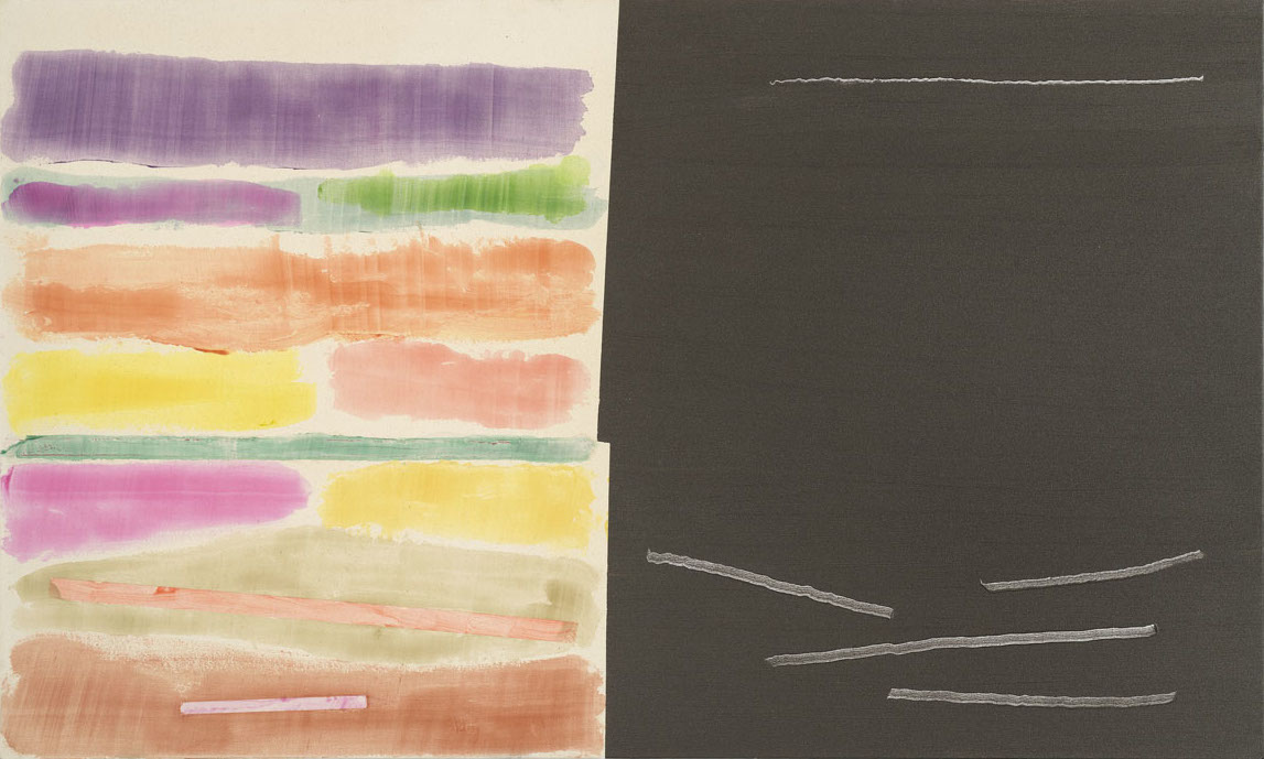
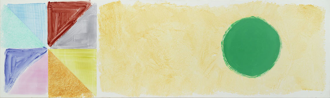
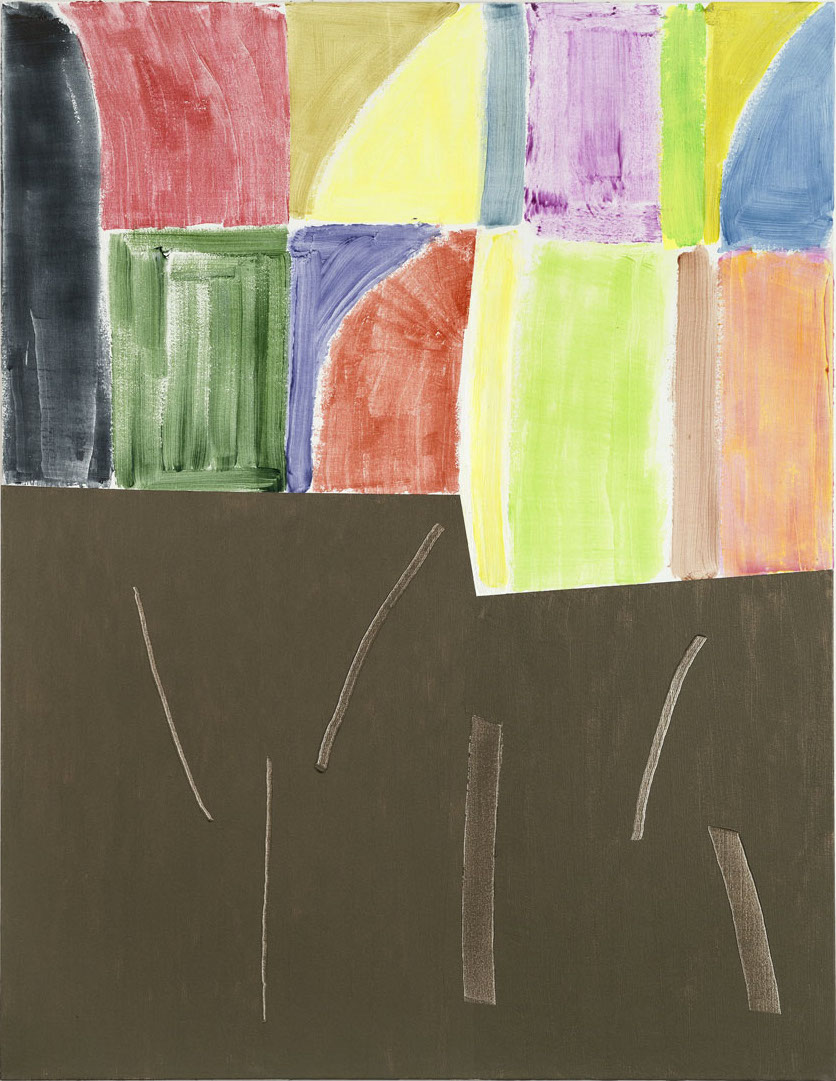
John McLean’s last completed work. Untitled, 2019, acrylic on canvas, 90 x 151 cm. Courtesy of Art Space Gallery
Below are a series of tributes to the painter John McLean, who died earlier this year. The contributors all knew McLean personally. Nevertheless, they were asked to write primarily about his art. Sam Cornish
A memorial retrospective is being held at Art Space Gallery, Islington, 29 November 2019 – 24 January 2020.
East Coast, 1998, acrylic on canvas, 168 x 51 cm. Courtesy of Art Space Gallery
Duncan Macmillian
John was not always an abstract artist. He was a wonderful draughtsman and in his early years he made sombre, but still vivid paintings and drawings in an almost social realist mode. It was when he moved to London that he turned to abstraction, but his first abstract work, shown I think in 1964, was hard-edged. Nevertheless, he was already a colourist. For him, the hard-edge was a way of making colour sing and indeed it did, but composing with masking tape was never going to suit his temperament for long. Around 1965, just before his breakthrough into free, painterly abstraction, I remember him showing me a very strange work. It was essentially a heavy blob of paint in the middle of a piece of wire mesh. I was baffled at first but then I saw what he was driving at. It was as though he had devised an equation to express his idea of figure and ground where, although they each have their own character, they are not separate, but in dynamic tension, at once both distinct and indivisible. He had been looking at Korean pots and saw how they worked that way. After that his painting took off and never looked back. Pouring paint and using a squeegee, there was a terrific liberation in the works that followed, often on a really big scale. Later, after meeting Clement Greenberg and the New York painters he supported, for a while John’s painting got a bit more formal, but he had captured the poetry of colour and freedom and never let it go.
He was generous in his appreciation of the art of others, whether historical or contemporary, and was always willing to learn from them. His great windows in Norwich Cathedral are quite his own but also a homage to Matisse. Perhaps this alertness to new inspiration helped keep his own creativity alive, for, through all the terrible adversity of his illness, right to the very end his spirit never for a moment flagged. He held a show of wonderful new paintings only weeks before he died.
In his art he created a unique dynamic out of the interplay of colours with variations of hue and saturation and subtle changes of depth, density, texture and ground in the application of paint. He gradually evolved an iconography of coloured shapes like enlarged dabs of the brush, circles, blobs and spirals, shuffling rectangles and other, loosely formed geometric shapes, but these elements were never still. That was why he talked about dance as a metaphor for what he was doing. For him painting was as alive and as autonomous as music. As a composer he could be symphonic when given the chance, as he was in the Norwich windows, but he was more often, like Schubert, the master of chamber music and song, of music made visible.
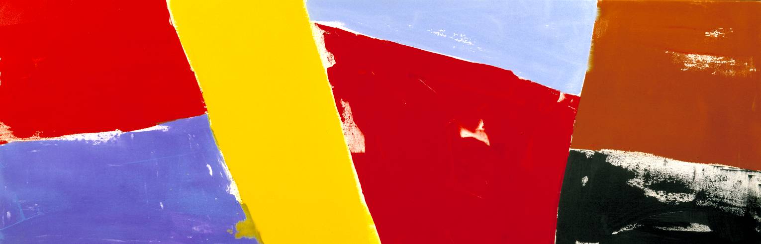
Opening, 1987, acrylic on canvas, 75 x 229 cm. Tate Gallery
Mali Morris
It’s difficult to disentangle the memories of a long friendship when thinking about the importance of John’s paintings. He was an early influence, along with Geoff Rigden, who introduced us. We visited each other’s homes and studios, showed at the same galleries and knew about each other’s lives. His last studio was directly below mine at APT, in Deptford.
He had a great eye, a beautiful touch, soaring colour-chords, and wit. Alfred Brendel, in an essay on humour in classical music, explains how formal aberrations (in Haydn and Beethoven) are funnier than set-up musical jokes, and I think of John’s games with figure/ground, echo and rhyme, shapes and edges, as connected with that. He was direct and bold with format and motif, so that nuances of colour and surface had a safe place to play around in, to misbehave, or harmonise, or both. He was scholarly and learned, as well as daft and scatological when he wanted to lower the tone; he knew how to mix things up in painting too.
The paintings of John’s I was most startled by were at Kapil Jarawala’s in 1987 – works like Opening, now in the Tate. For a short while he had done away with an atmospheric ground: just a few slabs of intense colour butted up against each other in a procession, put flat on the canvas surface, but with traces of touch and just enough breath in them. I thought it was a terrific show, something new to be challenged by. Some time after that we moved in different painting directions, but we still discussed the paintings we loved – we had many favourites in common; a chat with John, about art or architecture, or music, was always an education, of the easy-going kind.
Some years after John joined us at APT he was diagnosed with a particularly cruel form of Parkinson’s, known as MSA. The paintings he made as his condition progressed I found moving rather than startling, unbelievably tender and luminous. He was able to make them with the empathetic help of Hideatsu Shiba, a painter at APT who became John’s part-time assistant. Seated at a horizontal waist-high canvas, as if at a table, set there by Shiba, he gently painted a series of airy rectangles of pale light, with his new touch. Chatting was difficult by now, but his eyes sparkled, the occasional words were as witty as ever, and the completed works would turn out to be as complex and rich as anything he had made before.
That commitment, painting because one’s life depended on it, was always there in John. Seeing the determination of his final few years has been a new lesson, witnessing what might have been be considered a disability turned into ‘a kind of gift’, as he put it, the gift of having to find new ways of doing things. John always wanted – and achieved – light and space through colour; he was always figuring out ways to make that happen, on a flat canvas. It’s a beautiful legacy, to have shown us how he kept on finding new ways, in spite of, or maybe because of everything that was thrown at him – and for him to have left us these radiant late works, which pitch light against dark and hold them both in balance.
Architect Peter Inskip’s flat, Barbican, London with Peasiehil, 1971
Patrick Jones
John McLean stood out for me from the moment I met him. He wasn’t a natural painter, but had to work hard at it. He was from an academic background, studying with John Golding at the Courtauld. He was obviously a thinking man’s artist, despite trying to look like us all, with big hair, beards and check donkey jackets. I have no idea how he felt about his competitors, the larger than life threesome of Scottish painters at Stockwell Depot, Alan Gouk, Fred Pollock and Douglas Abercrombie.
I’d have to say his first efforts I saw were tentative, nicely painted but unremarkable. There are two very important points about his development. Firstly and mainly, it was the fact he obviously didn’t feel comfortable in America, although he knew Clem. He seemed to have met his soul mates artistically with the Canadians Bill Perehudoff and Dorothy Knowles. Bill worked extensively with collage, that is with cut and painted paper. The collaged Matisse-like tests would then be resolved on the canvas with fluid paint. That became McLean’s method, which in retrospect was very clever. Despite the detritus of the studio, there were always at least a couple of sweet little collages on the wall.
The other really important lesson had to do with Golding’s understanding of early modernism. Golding thought Braque’s In Full Flight (1956-61) the greatest painting in the world, a huge grey canvas with loads of thick paint on a negative bird image. McLean absorbed this understanding of early modernism. I have a photo of him from Exeter art school – he is pointing to a taped line, showing the very crucial relationship of the painting’s design with the way it was painted. That and Jack Bush’s retrospective at the Serpentine, and I’ve nothing much else to add. McLean was ambitious and keen to be counted. I missed his later life, and have kept off the personal anecdotes, of which there were many. A true friend and incredibly persistent and clever artist.
Untitled 2018 Acrylic on canvas 50.5 x 170.5 cm. Courtesy of Art Space Gallery
David Evison
Anyone who is involved with contemporary art and knows the mantra that abstract art cannot express feeling as well as figurative art, should get to know John McLean’s last series of paintings. They put that mantra to the test.
I was introduced to him by Alan Gouk in 1972. We became friends, a friendship that lasted almost fifty years. He had a passion for the Old Masters, had visited the major European museums and that knowledge was backed up by a sharp artist’s eye. He taught me a lot. In 1973, myself, Jennifer Durrant, Alan Gouk and the Mclean’s visited New York. Clement Greenberg gave generously of his time and made it possible for us to visit his circle of modernist artists in their studios. But it was the Toronto-based painter, Jack Bush who struck a cord with John, as well as the Manhattanite Dan Christensen, whose painting was influenced by Bush. Awareness of Canadian abstract painting, led McLean to Saskatoon and William Perehudoff. Twenty years older, Perehudoff was generous with his time and advice. John had found a magician with colour, a great artist to guide him for the rest of his life.
Recently the PIFO Gallery in Beijing have been buying McLean paintings and showing them at CAFA Museum Beijing and Guangzhou Museum of Fine Arts. This success could not have come at a more opportune time. His debilitating illness required funds to enable him to work in his Deptford studio with a painting assistant. Thus McLean leaves us with a considerable body of new paintings. All are dominated by a block of black or near blacks, scoured by a few lines and connecting subtle and gently painted bands of colour. By the force of their rightness these bands of colour make the black no longer dominant but another colour. It is telling that the abyss is tempered by light and the delicate beauty of shimmering colour. The eye tells you everything, you only have to look and feeling takes over.
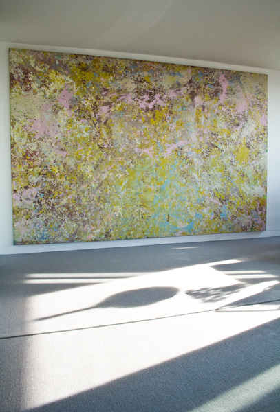
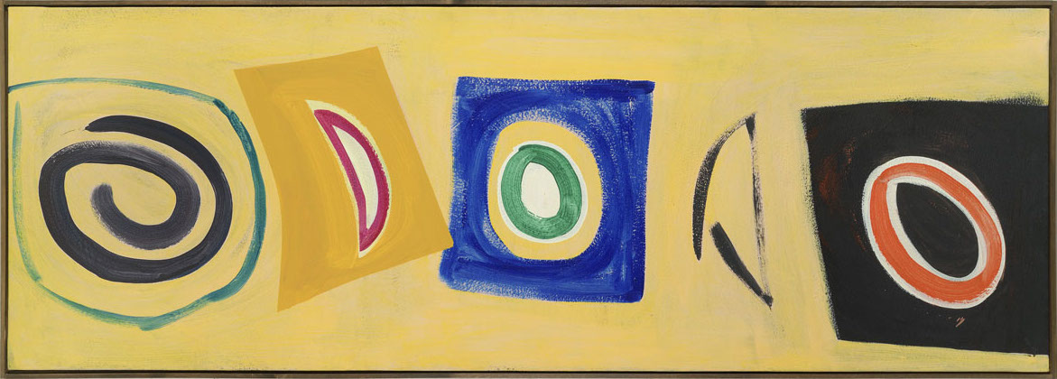
Tournesol, 2011, acrylic on canvas, 92 x 152 cm
Gina Medcalf
Blue
John let me choose a work on paper in the late 80s. On the right is a large boot form in phthalo blue; on the left are smaller pointed, more knowing triangular forms in orange, yellow, magenta. The phthalo blue is one bold stroke, the viscosity judged to partially bleed, partially sit proud of the thick porous, white paper. This blue figure dominates and demands, blazing away on the very edge, but not tipping the balance of the whole. All painted alla prima with no trace of preliminary drawing or pentimenti. Made, not in the paint encrusted Stockwell Depot studio, but at home. John used the similes of a farmer ploughing a furrow, and singing and dancing. But, in his working methods, there is risk, danger, the potential for disappointment and excitement.
Yellow
appears frequently in McLean’s paintings, as figure or as ground, as window, or container. Yellow is difficult to use, it takes over, rays over, and easily lays everything else to waste by being strident. McLean uses yellow full on or with white, cadmium yellows light, medium and dark, all there fully functioning within the paintings’ whole, utterly keyed in.
Last paintings
I love the close tonality and the “atmospheric unity” of the wet into wet brushed streaks in Solomon’s Seal and The Sower’s Song, both 1978; and Speedwell, 1977. John speaks of this work and his subsequent reaction to it and change, “But happy as I was with this new work of mine it began to dissatisfy me because if its all-overness and limited colour. It was at that juncture I saw Jack Bush’s show at Emmerich’s in New York. I loved seeing his chunks of colour floating.” In 1981 John made his first visit to the Emma Lake workshop in Saskatchewan, Canada. From there in a letter to his wife Jan, he wrote of having his work “satisfactorily bright and bold”. And “As the l980s went on I began leaving close tonality further behind.”
In John’s last paintings, some of that late seventies close tonality returns. It is of course different, the paintings are different but they contain in them the flowering of the seeds planted in ‘Solomon’s Seal’ and ‘Speedwell’. Some of these last paintings have been shown this year at the Fine Art Society in Edinburgh and in the Royal Academy’s Summer Exhibition. In the upcoming John McLean Memorial exhibition at Michael Richardson’s Art Space Gallery it is hoped we shall see both, earlier paintings alongside the last works.
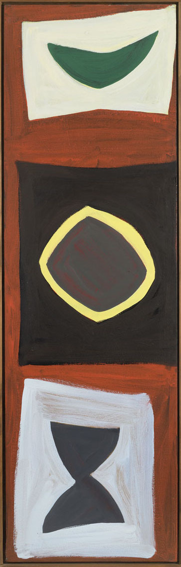
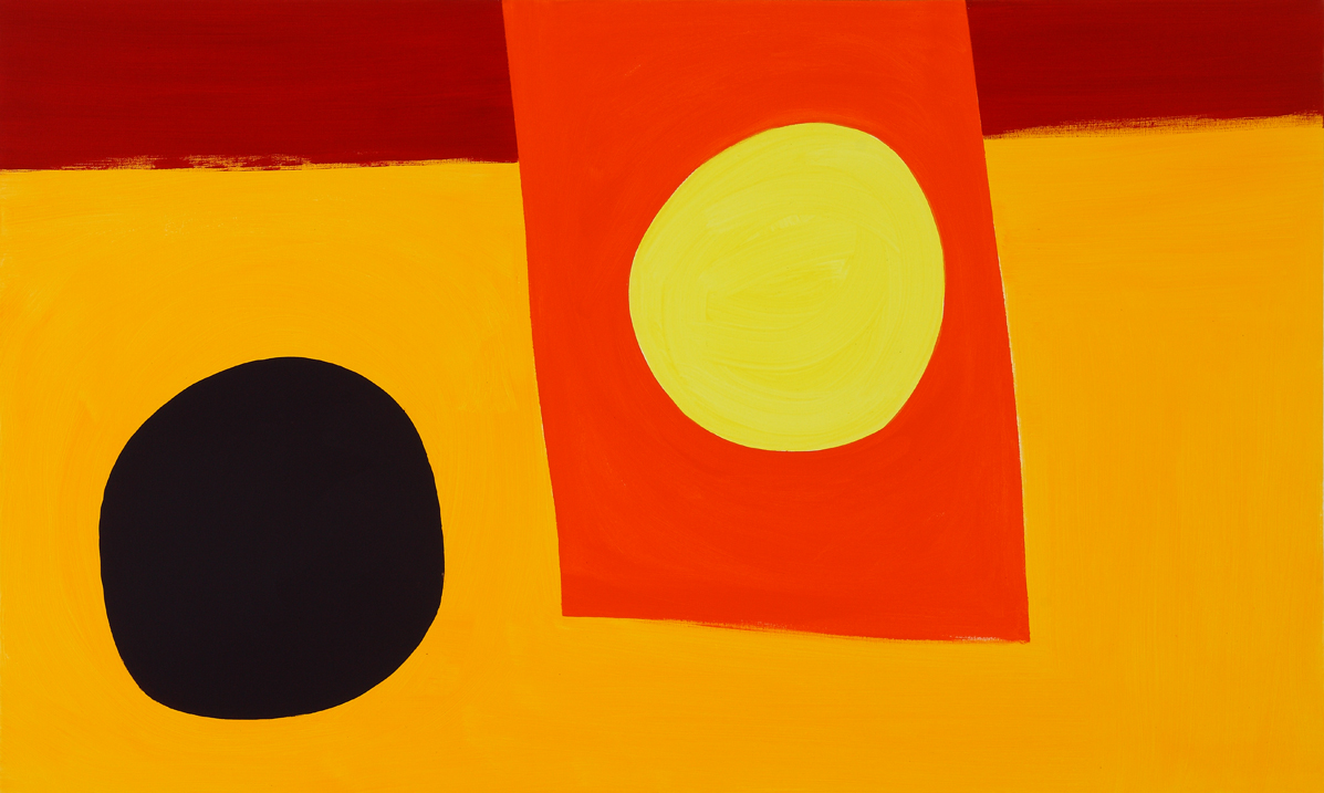
Pitcundrum, 2003 acrylic on canvas, 43 x 109 cm
Karen Wilkin
During the many years that I followed John McLean’s work, in his studio and his exhibitions, beginning, I think, in the early 1980s, I watched his approach evolve from what we might call lyrical abstraction into idiosyncratic drama. The first canvases I saw were memorable for broad sweeps of subtle hues, jostling one another as if they were drifting in a stream, but remaining more or less parallel. Over time, these delicate paintings became increasingly forthright and forceful. Colour intensified and structure became more complex. Grounds broke into quadrants of contrasting hues, with wonky, imperfect ovals, discs, and rectangles hovering against them. After about 2000, these were joined by eloquently deployed lively shapes further divorced from conventional geometry, along with spirals and zigzags, loops, crescents, and swirls – a cast of unruly characters like actors in a repertory company, recognizable for their strong, individual personalities, but different in each role. This multiplicity of unanchored forms allowed McLean to orchestrate colour in unexpected ways, playing brights against darks, warms against cools, and, often, forcing hues with no apparent justification for proximity not only to coexist, but also to enhance one another. The paintings from the early 2000s on are notably exuberant, and energetic, even those McLean made during his long illness. If we search for words to describe them, we fall back on “spontaneous,” “improvisational,” “unfettered,” and “joyous” – among many others evoking the same mood.
McLean believed that the artist’s role was not to comment on the visible but to reveal the unseen. He was faithful to abstraction (except in his hilarious special occasion drawings), and to a conception of abstract paintings as wordless, richly associative carriers of emotion, implicitly loaded with the accumulated baggage – visual and otherwise – of their makers. Rather than yielding to verbal explication, McLean’s work depends upon pure, direct visual experience that acknowledges the power of colour to provoke deep responses. He shared these principles with the artists he admired, among them, Henri Matisse, Joan Miró, Adolph Gottlieb, and the Canadian virtuosos of colour-based abstraction Jack Bush and William Perehudoff. But while it is easy to categorize McLean in relation to modernist abstraction based on the primacy of colour, on both sides of the Atlantic, and while he was deeply knowledgeable about the art of his predecessors and drew sustenance from it, the individuality and personality of his paintings, the sheer eccentricity and animation of his shapes, especially in his last decade and a half, sets them apart. John McLean clearly belonged to a distinguished modernist tradition, but he was also an irrepressible original.
Carousel, 1987, acrylic on canvas, 103 x 65 cm. Courtesy of Art Space Gallery
Robert Christie
I first met and worked with John at the 1981 Emma Lake Artists’ Workshop in northern Saskatchewan, Canada. I had the opportunity to work with him again for short periods in both Saskatoon (mid 80s) and then Vancouver (early 1990s). In the early 2000’s, my wife, Susanne, and I had several opportunities to travel throughout much of Europe with John and his wife Jan.
I don’t think I know any other artist whose work is so reflective of his character and personality, consequently I find it difficult to write about John’s paintings without referencing him. His pictures share John’s paradoxical nature; both were casually astute. His general demeanour underplayed his knowledge and sophistication and it allowed for his ever-present humour and occasional boisterous behaviour to emerge. It is the equivalent to these characteristics that are juxtaposed and emerge in his paintings. The sophistication of John’s colour has always been at the fore but for me it was his slightly awkward handling of the paint in combination with an inherent (and very witty) playfulness that gives substance to the colour. With a beer in one hand and a cigar in the other, John could put anyone at ease and his paintings do the same for me. He was a painter’s painter and he stuck to his Modernist roots, with an ever expanding repertoire of personalized shapes, colours, processes and clustered layouts. John was a great friend and he was as colourful as his paintings and always fun to be with.
Untitled, 2017, 130 x 100 cm, acrylic on canvas. Courtesy of Art Space Gallery
Cuillin Bantock
He began by stapling pieces of cotton duck to the floor.
The Emma Lake Artists’ Workshops, where the forests and prairies of Saskatchewan meet, had been regular events since the 1960s. In 2000 McLean and I were participants at one of these. Being the only two from the UK, we were assigned adjacent work-spaces. We had already known each other for several years.
These workshops allowed total freedom from the usual constraints; one could start work before breakfast and continue till after midnight. McLean spent most of the fortnight kneeling on the floor. His pieces of cotton duck, all rectangular, varied in size from about A4 to a metre or more in either direction. He worked on six or seven of them at any one time. Mostly in silence. There were a few grunts, some muttered curses, and just once, the wonderful noise of a piece of fabric being suddenly torn across before being jettisoned. Masking tape was very much in evidence. Every piece was saved, pinned to the wall, and sometimes reused. At the end of the fortnight McLean had about a dozen finished acrylic paintings.
They paintings varied. One was an unforgettable stunner, quite small, and surprisingly dark. McLean had earlier commented on the glorious clarity of the light of the Canadian prairies and this was an almost inevitable component of his paintings – not in any obvious mimetic sense, but in the way their vitality depended on the use of colour to generate a sense of light. It is probably this which makes McLean’s work instantly identifiable, and it is this which will undoubtedly confer lasting interest in it.
McLean was never one to talk about the ‘meaning’ of a painting. He was primarily a bravura practitioner, and his ability to work intensely on several paintings at the same time implied an impressive objectivity of mind. He painted from a distance. Nevertheless, he was happy enough to comment, always usefully, on the work of others. In a discussion on acrylic paint he once passed on a comment of Kenneth Noland’s: ‘Wherever there is a change in colour, it helps to change the facture. It keeps it alive’. He held that a painting should be figurative or absolutely non-figurative: ‘All that in-between stuff has been done.’ As one of the chief and persistent advocates of the non-representational, when this is sometimes regarded as no longer interesting, his stance was brave, committed and unequivocal. He said quite often that he found neo-realism regressive.
Abstract art is here to stay; its practitioners claim that as an art form unshackled from the yoke of appearances, it has hardly begun. The public eye is slowly catching up, but in the long term it is hardly profitable to speculate how abstraction and McLean’s work in particular, will come to be regarded. Mozart was almost completely neglected for 130 years after his death. McLean’s work, likewise decorative in the best sense, not in the least bit confectionary, will persist as an exemplar of the optimistic and the rational, and an often breath-taking one.
The Workshop wasn’t, of course, all heads down. McLean’s presence was wonderfully inspiriting. He had a huge capacity for enjoying himself. As well as the masking tape stuck to the wall, he one day pinned up the peel of a tangerine, in such a way that the peel, in one piece, made the perfect figure of a man, with the pith core making an impressive personal endowment. He became known as the Prince of Orange. Very McLean.
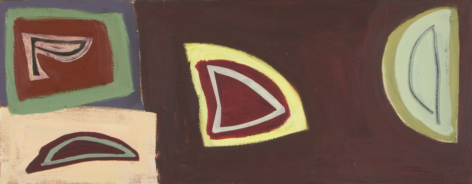
Koto, 1997-2004, acrylic on canvas, 76 x 220 cm
Emyr Williams
John was a fearless colourist; and a great legacy of his was his forthright use of colour without any obvious suggestions or allusions of place – I know he was relaxed if anyone perceived any such inference and sometimes his ordinance survey titling of a painting could send you north of the border in reverie. His paintings, though, are really about pictorial relationships: mini plays with responsive ‘actors’ playing out a pictorial drama – there’s never a lazy line or an incomplete character portrayal; they are very poised and deft – that’s why people wax lyrical on their humanity, as they are so relatable and generous in spirit.
The work gradually looked less lyrical after he returned from his time in America, with areas of flatter colour, inflected through their handling, which pivoted against one another, rather than the previous “signature works” with seductive brushstrokes in colour chords, floating on washy, atmospheric grounds. His great friend, the Canadian painter, Bill Perehudoff was working similarly at the time in this sequential and slightly formulaic way and it comes out of Jack Bush – the “figure-ground” sensibility, which I presume John had fully assimilated through his frequent visits to western Canada. He told me at one point he thought Bill the best painter alive. I think he found his true voice though when he got past this influence.
His work developed into more emphatic coloured areas and smaller eccentric shapes, quasi-geometries with sectioned spaces and brushy glyphs. At first, I thought some of them were too decorative – especially if there was a spiral in them; they seemed to be too obviously looking for the finish line. The best of them though, use a dark/light contrast as a spine for the colour, and the black never drops off; it’s always energised, which is a litmus test for a colourist.
I used to do a lot of framing for him when I was starting out, and he’d be making subtle edging decisions. He’d look at how shapes spoke to the sides and particularly the corners to restate the tautness of the surface. He used shape as the main vehicle for colour; facture became more important over the years too. The final ones he was making (truly astounding in light of his physical incapacity) revisited his earlier more lyrical palette: vibrato handling in medium-suspended transparencies but now allied with harder, abrupt edges and scrapes into flat, metallic pigment-infused areas, which contrast with jostling strokes — the use of line as a structuring device possibly came out of his printmaking. He had a cunning sense of space and used line and stroke in nuanced ways to set up junctions, dialogues or suggest more discrete pockets of space within the whole.
I’ve read lots of analogies to music and dance circulating about his paintings; but if you really want to get John’s work, I think something he used to say about his aspiration for a painting is the most revealing: ‘Painting is like drumming’. Look again at his paintings, and see that shock of the colour, how it maximises the surface tension: ‘We break the waters’, he used to say. He was very reluctant to go on the record about this; I hope he doesn’t mind me quoting him now.
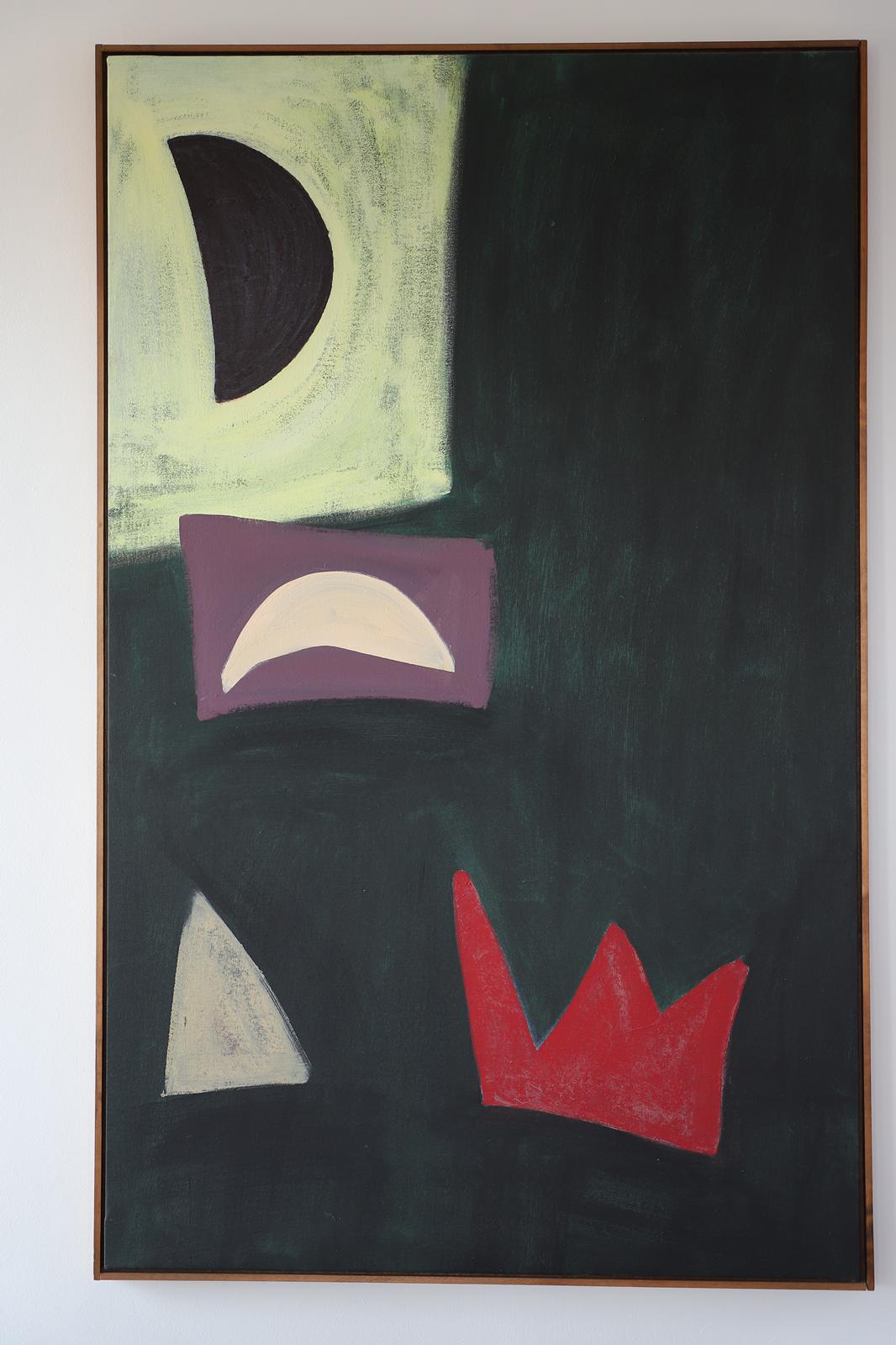
Black Bear, 2003, acrylic on canvas, 164.5 x 101 cm. Photo Peter Inskip
Peter Inskip
John and Jan McLean were already living at the Barbican when I came here, and an aquatint of spheres floating in space arrived on my doorstep as the most wonderful house-warming present. Over the years, I have sought out other McLeans in galleries, sale rooms, and from open weekends at the studios at Deptford Creek where John worked; sometimes, it was direct from the artist himself, by far the most enjoyable way to acquire a painting. Peasiehill, 1971, came from Kasmin’s sale at Sotheby’s, and because of its size, the artist helped get it into the flat: John totally dismantled it in the car park below the building, rolled the canvas in reverse on a carpet tube with lots of padding; rebuilt the stretcher once it was in the flat, and restrecthed the canvas. It took four hours; I had never before realised how hard artists worked.
Like the aquatint, my other McLeans all have a spontaneity and vitality that give them a life of their own. They are calm, gentle and reassuring; thus, Threshold, 2001, is marvellous as it is the first thing I see when waking in the morning. The shapes John drew are figures in space that float, often unrestrained by the boundaries of the canvas. In several, movement rises through a series of forms from bottom left corner to turn around the canvas and return down to the bottom right: Threshold and Yellow Journey, 2003, are examples. This is repeated in Black Bear, 2003, but it is diverted half way up the canvas by a small, pale yellow crescent set on a purple ground which does so much work intervening in the dialogue and short circuits to return to a red crown-shape quietly sitting on a large area of black/green ground. John Elderfield called this crown motif, that is a constant in many of John’s pictures, Madame Matisse’s hat, sometimes to John’s chagrin.
I also had the joy of commissioning a picture from John when I still lived in the country. He and Jan came down to see its proposed position in the sitting room. A few weeks later, he suggested that it was time to visit the studio and see progress. Something much more exciting was hanging on his wall: a tall, narrow canvas with batons of colour sparkling down the centre across a window of unpainted natural canvas set in a glossy, gritty, black ground. Instead of the sitting room, John had decided he wanted to paint something for the radiused wall of the 1780s staircase; an impossible location because of its height and curvature. Torre, 2006, was magic and revealed John’s deep understanding of architecture as well as painting. The long, thin incision of the picture in the space, joining two floors told one so much about the house; the matt batons of colour brought light coruscating into the heart of the building, and the whole house was constantly transformed with the ever-changing daylight.
Untitled, 2019, acrylic on canvas, 40.2 x 50.7 cm. Courtesy of Art Space Gallery
David Webb
I knew John for seventeen years and was his studio neighbour for eleven. We often visited each other’s studio. I almost always downed tools, whereas John invariably kept working. There was no playful performance in these situations; just work, sometimes a drink, and lots of conversation. He welcomed opinions about what he was working on and I liked the way the conversation went easily from the current painting – the here and now – to something bigger; in art, or anything else. He was always thrilled to hear good news; shows, sales, travels, weddings, births. He connected with the joy of others and was himself an enthusiastic joke and story teller. This is important, because while John is a classical non-representational painter (one of the best) I think his work is really about the world. He was too much in the world for it not to be.
John’s work is tough and action-packed, but also beautiful and nuanced; often within the same painting. He could shift tempo across short distances and fill large expanses with joyous colour. This gives his work tension. He worked quickly. He didn’t always have a water bucket in his studio so used to mix and apply some paint, then disappear down the corridor to the communal sink to wash that one single brush. This gave him regular time and space away from the painting and I think working in these short burst kept things fresh. He would use taped edges, scumbling, glazes, tonking, gloss medium, metallics, micaceous iron oxide, pumice, collage; and always seemed to find the right moves. He was both confident and constantly questioning – he wore his extensive theoretical and technical knowledge lightly. John was also a brilliant draughtsman – drawing underpins much of his work.
In the last few years John lived with the debilitating symptoms of multiple system atrophy. He still painted regularly in his studio and I’d still visit, sometimes bringing my young daughter whose company he loved (often making her giggle with just a raise of an eyebrow). She in turn was mesmerised by watching him apply paint. Again, he didn’t stop painting in our company. Laterally he worked flat in almost complete silence with his assistant, Shiba. His work changed during this time and still moved at pace. He found different and exciting ways for colours to meet, with drawing again central. These last works don’t have the same feel as his earlier remarkable and consistent signature pieces. They’re a bit more difficult; they hum subtleties in large thinly painted passages but these are then closed off with an uncompromising edge, heavy toughness and texture. I think they’re fantastic; open and new. Perhaps the link to his earlier works is that they still feel experiential – perhaps not of the outside world, but of memory and a lifetime of making paintings.
Compiled by Sam Cornish

Thank you, really enjoyed this , love the paintings, are there any in NYC museums or galleries?
LikeLike
Hi Janet,The person who would know is Johns great friend in New York,Kikuo Saito ,the painter.We would stay there a lot,I think he shows with Berry Campbell.Otherwise the best person would be Johns wife ,Jan,who could be contacted via Art Space in Islington London,Best Patrick Jones
LikeLike
Hi Patrick. Sad to say that Kikuo passed away in 2016.
Hi Janet. Glad you enjoyed the tributes. Others will know more about this, but I possibly the nearest public collection holding John’s work is the Yale Centre for British art.
LikeLike
It was lovely and inspiring reading all these pieces
LikeLike
I visited the exhibition in Art Space Gallery, wonderful to see the paintings and also to speak to Jan. I also read the articles in the catalogue some of which appear here but inspiring to read some more. Thank you for compiling this.
LikeLike
I don’t think there is a day that passes when I don’t think of John Mclean.Looking at his work now several years after his leaving,I am struck by his visual intelligence.That combined with his humour ,is what makes him so special.He once referred to one of my paintings as looking like it was painted with “The rotten end of the Rag mans Bugle” and it was a complement! As a Painter there was always a degree of competition .There was also a degree of esteem that is a form of love.
LikeLike