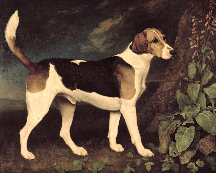
George Stubbs, ‘Ringwood’, 1792
I wanted to try to say something about space in abstract painting. Not the sort of abstract painting that is crowded with marks and visual events, so numerous they almost force the retina to see ‘depth’ as a coping strategy, but rather paintings that employ relatively few, relatively simple elements: Paintings that look flat.
Generating pictorial depth is fairly easy. It can be controlled and directed towards a descriptive goal, as in figurative painting, or it can spontaneously emerge from random movements of worked pigment. However, on its own, depth makes little difference to an individual painting’s ‘quality’.
When pictorial depth is generated it usually has to be anchored to a two-dimensional construct, the surface and/or the picture plane. Giving enough emphasis to this two dimensional feature in the total experience of the work is more tricky. If successfully negotiated, unlike the production of space on its own, it does add value.
The Impressionists were the most successful in negotiating the surface/depth tension. Each dab of the brush was tethered to the surface and linked to the next mark in the passage, but the whole integument was able to convey an account of the natural world, glimpsed but not forensically examined, with its legible spatial cues, its phenomenology addressed to perception.
The Impressionists influence on the practice of painting is hard to overestimate. Michael Fried’s comment sounds reasonable when he writes that ‘the basic formalist-modernist view – enshrined in Greenberg’s “Modernist Painting” – that paintings consist essentially in flat surfaces conjoined with a sheerly visual or optical mode of spatiality amounts to nothing more nor less than a theoretical rationale for the Impressionist picture’.[i] Add to that the practical demonstration of the value of the Impressionist picture taken as far as it would go in the late Monet ‘Water Lilies’ acquired by the Museum of Modern Art from 1955, means that the identification of painting itself and the modernist enterprise is hard to deny.
The Impressionist balance between depth and surface is a model for a certain familiar style of abstraction, the sort highly dependent on gesture and movement. It replaces the spatiality of the observed world that Monet respected with one derived from pigment activity. One of the style’s attractions is that this ‘kinetic’ space is fully compatible with, even rooted in, the exercise of painterly technique. This allows the practitioner opportunity to display mastery of the sensual materiality of the medium, aligning a contemporary non-figurative work with an admirable malerisch tradition represented by Titian or Rubens.
The problem with kinetic space is that its instability, or perhaps complexity, has to be sustained, and this creates an environment hostile to the construction of what can only be called ‘shapes’. Shape can be defined as ‘the total effect produced by the outline of a thing’ and becomes the first casualty in a system based on movement and fragmentation. What might survive are remnants of things, visibly broken down to show the force acting within the painting, which are then held together inside a dominant gestural network. Under these circumstances the integrity, or the ‘total effect’ of shape is lost, and with it the power to function, interacting with other shapes, as a compositional element.
The ‘spatiality’ in flat paintings that feature shape, is often taken care of by the colour, the visual quantity and the chromatic relationships that occur when areas different colours abut. This creates optical vibrancy, the well-known ‘push-pull’ effect, the advancing and retreating of warm and cool, variations of optical pressure and resistance, a space accessible to eyesight alone. Colour, like shape, works best in a stable, non-kinetic environment. The plane has to hold the colour still and evenly for it to be fully ‘seen’. But this standard, and serviceable notion of a depth compatible with abstraction and modernism’s stress on the medium, may need a further adjustment. I wanted to suggest another way of thinking about some implied dimension that can be added to the two that define painting without flirting with an illusion, optical or tactile, of the third dimension. I want to start by considering three letters – ‘O’, ‘G’ and ‘D’.
These three letters can be arranged in six possible combinations;
1 OGD
2 ODG
3 DGO
4 GDO
5 DOG
6 GOD
The first four examples can be readily perceived as arrangements of the three letters. 5 and 6 contain exactly the same letters but, to the English speaker, they stand out because they are words. Moreover they occupy important cultural territory, and have an automatic significance.
The six combinations are all two-dimensional, and are equally visible, so they can all be seen. But 5 and 6 could be said to have another dimension; they can be read.
Once read of course the two words open up immediately onto a universe of meaning which is almost bottomless. Both terms are heavy with content and reference, serious and playful, emotional and spiritual. They have a different reach and relevance, as one seems obviously more elevated than the other. But the attachment felt by their audiences is probably the reverse, with dogs more favoured than the Deity, at the moment in the West at least.
They are both lodged in the imagination, with their associated imagery. Again, dogs have the bigger presence in visual culture.[ii] The concept of the Holy Trinity, the Father, Son and Holy Spirit, makes representation of God difficult. Christ appears widely in art, but the other two Persons are less visible. The third Person takes the uninspiring form of a dove or flame, while God the Father is only rarely depicted. At primary school we were encouraged to represent GOD as a triangle. Michelangelo, in the Sistine Chapel, thinks GOD probably looks like Christ’s dad, though more dashing. Hubert and Jan van Eyck treat the Deity as a bearded high-ranking official in priestly robes and place him in glory at the centre of the Ghent altarpiece.[iii]

Hubert and Jan van Eyck, ‘The Ghent Altarpiece’, 1432
The simple act of reading those two words dumps all this cultural subject matter into our laps almost whether we like it or not. But I want to argue that what is important for this current thought experiment is not what the words mean, but just that they are words. This introduces the possibility of word-blindness, the condition where sufferers can see the letters but not the terms they spell out when arranged in a certain order.
I want to apply the distinction between letters and words, between ‘seeing’ and ‘reading’ planes, to a category of abstraction that manifests a specific pictorial economy which I have mentioned before. The foundational work in, but not of, this category is Henri Matisse’s ‘French Window at Collioure’ 1914, first exhibited in 1966, and includes people like Mondrian, Newman, Still, Rothko, Louis, Noland, and Stella. In broad terms the type of work might be described as geometric abstraction, loose or tight.[iv]
The examples of this genre are characterised by arrangements of planar, bounded elements, which divide up the picture area. As well as being flat, these paintings often look flat, like decorative art, but without the ornamental or frivolous flourishes. They can easily be regarded, and even be admired, as a branch of surface design, or slightly exalted soft furnishings, comparable to printed fabrics or quilts, because they lack the obvious spatiality of most pictorial art.
Shallowness, and the possibility of simple abstract work offering a relatively trivial aesthetic experience, represents a real obstacle to intellectual approval. When a painting consists of a few colourful stripes, how do you know it can be taken seriously? Michael Fried’s anxieties on this point led him to the idea of ‘conviction’. The work, however meagre in terms of its production, should compel conviction in the viewer as to its quality as art. But this conviction is always against a background of uncertainty, and has to be reiterated on every existential occasion.
I wouldn’t want to minimise the importance of critical judgement in our encounters with art. However I would make a different point around the same issue. Faced with a flat painting, the shapes can be seen literally as pictorial phenomena, and they can be read. Their constituent elements, the shapes, can be classed as letters, but they can also be viewed as words, providing an additional dimension to the two so crucial to the medium. This does not involve creating a kinetic spatiality in tension with flatness but a non-spatial dimension that spins shape into form.
The distinction may require an exercise of connoisseurship by the viewer, but it stops short of the level set by ‘conviction’. It is perfectly possible to be aware of what the work spells out without thinking that it is great art. At the same time it may also account for the prevalent failure to appreciate the genre of abstraction I’m trying to talk about. Maybe everyone can see the letters but, for one reason or another, many are not able, or refuse to recognise that letters produce the words, and that words consist only of letters arranged in certain ways. Quite a lot of art professionals, curators, critics and teachers, seem to suffer from this condition.
The passage from ‘seeing’ to ‘reading’, the reclassification of shape as form, matters in terms of pictorial resource especially in the context of abstract painting because it opens up the possibilities of composition. Many years ago I defined pictorial composition as the ‘organisation of forms in space’.[v] That was to separate it from the work of ‘design’, producing ‘a scheme of lines or shapes forming a pattern or decoration’, often associated with the two-dimensions of the drawing board or layout pad. That definition could be adjusted so composition becomes the ‘organisation of forms’ given that ‘forms’ implies the dimension of ‘reading’ as described above. It also gives rise to the potential of formal relationships, as opposed to shape-to-shape interactions, which come into the domain of design.
The reading/seeing or letters/words differentiation is of course an analogy, meant to contrast with the familiar surface/depth polarity, which seems less relevant to the category of flat, ‘playing card’ paintings. Now I want to discuss a few examples of where this interpretation might be fruitful. First a painting by Morris Louis exhibited in London in 2013.[vi]
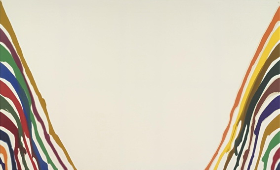
Morris Louis, ‘Gamma Tau’, 1960
There’s not much going on in Gamma Tau 1960. A lattice of paint trails run together down the right and left edges, widening at the base, leaving a plain, slightly distorted trapezium in the painting’s centre, and that’s about it. The key to understanding and therefore appreciating the work turns on what the central area is taken to be. Some may regard the area as a yawning gap, an absence, an empty zone subtracting from the pictorial experience. But other viewers may approach it more positively. Then they will face the issue of whether it is seen as a shape only or one read as a form. Either way I don’t think the unpainted canvas works as depth, even depth accessible to eyesight alone. It’s flat. However, the viewer who gets this far has a choice of how to interpret the trapezium on the above analogy concerning letters and words.
If the central plane is granted the privilege of being treated as a form, the work makes more sense. The trapezium shape acquires status and so can enter into a compositional rather than ‘design’ relationship with other elements, enriching the viewer’s encounter. Implicit in this status is that the viewer takes Gamma Tau seriously as a bona fide painting, accepting its contents and operation, however frugal, as necessary and sufficient to qualify it as belonging to a valid genre of pictorial art.
This may seem like too radical a shift in the present argument. It asks the viewer to proceed on the basis that Gamma Tau is a painting in the traditional sense, one that successfully meets the expectations of those interested in the medium in its many styles and phases, even though it lacks a number of features usually associated such works in the past. In taking on the challenge of Louis’ painting the viewer has to recognise that it represents an advance or innovation and they may be reluctant to extend their interest in the art form to include what the work offers.

4. Henri Matisse, ‘French Window at Collioure’ 1914
This reluctance must have been a factor in the fate of Matisse’s French Window at Collioure, an exemplary flat painting. He didn’t exhibit it in his lifetime and it wasn’t seen in public until 1966, fifty-two years after it was painted. As with the Louis there is a central shape flanked by structures to the right and left. In the Matisse the shape is black and uneventful, apart from indications of wrought ironwork embossed, black on black and virtually invisible. It would be a weaker painting if the black was spatial. It relies on the impenetrable rectangle not receding or inviting optical forays into the void or ‘interior’ beyond the surface, by setting the black unequivocally in the foreground.

Piet Mondrian, ‘Composition B (no 11) with Red’, 1935
In Mondrian’s Composition B (No 11) with Red, 1935 the white is brought to the front. In the painting, but not in reproduction, the black lines and the red area do not force the white areas to recede in order to function collectively as a continuous pale backcloth. Rather than being an all-pervading ‘sky’ against which the pictorial architecture is outlined, the white panes share a foreground position, operating and relating as 9 rectangles of varying sizes and proportions. This formal activity warrants including ‘composition’ in the work’s title. For this to happen however the viewer must choose to ‘read’ the white as well as see it.

Batman logo
A few years back, as part of the publicity for a movie, a new Batman symbol appeared. It was in the shape of an oval inscribed with a stylised silhouette of a bat with outstretched wings. To begin with I couldn’t figure out what it was. I could see the logo but misinterpreted the central element. Obviously I must have been able to see everything, so I would have seen the shapes, but for a while I didn’t read the shape right in the middle. As soon as I realised the movie connection I was able to read the shape as the form of a bat. Looking at it now I can both see the letters and the word some of them spell. At first I could only see the letters.
The Batman logo and the six different arrangements of ‘O’, ‘G’, and ‘D’ itemised earlier, suggest a model for a dimension equivalent to ‘space’ attuned with the experience of geometric abstraction, or ‘flat’ painting. What the two examples have in common is that they contain both types of phenomena, shapes + forms in the first case, and letters + words in the second. In the logo the bat is a form inscribed within a shape, an ellipse. The ellipse isn’t a form and nothing is gained by treating it as a form. In the six versions of the three letters, the first four on the list are not words and there’s no virtue in imagining they are.
This hybrid model can be transferred to the paintings of Matisse, Louis and Mondrian considered earlier. In these examples some components function as shape and others as form. In French Window the structures on the right and left are shapes while the central dark is form. In Gamma Tau, the twin buttresses of colour that lean against the painting’s sides are shapes, while the white trapezium is form. In Composition the red area and the black lines are shapes; the white rectangles are form. In amalgamating shape and form they combine the attributes of both ‘design’, which takes care of shape, and ‘composition’, which manages form. Seeing them only as about shape, and therefore to do with ‘design’, reduces what they have to offer. But equally, to read them only as form also does them a disservice.
This essay may be interpreted as a rather rambling footnote to Michael Fried’s ‘Shape as Form: Frank Stella’s New Paintings’ of 1966: There’s some truth in that. Fried distinguishes between ‘literal’ shape, the silhouette of the support, and ‘depicted’ shape, the elements which appear on the canvas, often strongly correlated with the configuration of the support.[vii] He thought this was how painting defeated ‘objecthood’, and countered the threat posed by minimalism. Following the argument outlined above, the literal/depicted distinction can be replaced by the letter/word, seeing/reading contrast.

Ken Noland, ‘Approach’ 1966.
Given this hybrid model, the narrow diamond silhouette of the stretcher of Ken Noland’s Approach, 1966 can be seen as a shape while the internal bands can be read as forms. The literal shape can be regarded as an issue of design but the bands come under the issue of composition. They have a formal relationship. This underpins the chromatic composition, the way the colour is organised and interacts with the structure, which contributes to the painting’s visual coherence.
The ‘shaped canvas’ has a poor reputation as a gimmick, and works of the sixties by Noland and Stella are often described as banal. And maybe in terms of design they are. But, paradoxically, in the context of the history of composition, the organisation of forms, they are radically innovative. They also, like the three other works cited, demonstrate the power of flatness un-compromised by the paraphernalia of illusion. They maximise the impact of two-dimensionality.
Unfortunately the impact of two-dimensionality has perhaps become fatally associated with the essentialist definition of modernist painting, namely flatness and its delimitation. That formulation is arrived at through a process of theorisation but it leaves out the positive experience to be had when confronted by the immediacy of surfaces whose flatness is candidly exposed. The historical precedent for such experiences can be found in Manet rather than Monet.
Two-dimensionality, however powerful, may never compensate for the loss of ‘depth’ in painting. But the emphasis on shape, seen and read, might lead to a new interest in composition that may offer some creative possibilities not discoverable through painting methods based on fragmentation and pigment hyperactivity. Yet mobile paint and kinetic space have their appeal in our contemporary cultural situation. They reinstate an experience of tactility in a world dominated by slippery pixels and frictionless borders, as does the current craze for slime, especially amongst young girls. Slime is interesting. A great deal goes into mixing the various ingredients and additives to create the substance but you can’t make anything out of it. It’s post-structural. You can manipulate it, kneading and stretching, poking it with your fingers, then it goes back into its container. Apart from that last bit, does it remind you of anything?
[i] Michael Fried. ‘An Introduction to my Art Criticism’, in Art and Objecthood, 1998, p. 53
[ii] I don’t know if George Stubbs established the genre of dog portraiture but he certainly excelled in giving honest and unsentimental accounts of the animals.
[iii] There is some dispute as to what the central figure represents. It suits my case to interpret it as GOD, rather than God the Father.
[iv] This should be consistent with views I’ve expressed in earlier articles on this website.
[v] David Sweet, ‘The Decline of Composition’ Artscribe 28, 1981.
[vi] Exhibited in the Onnasch Collection at Hauser and Wirth, 2013
[vii] Michael Fried, ‘Shape as Form: Frank Stella’s Irregular Polygons’, in Art and Objecthood, 1998, pp. 77-99.

I´m not sure what the distinction between form and shape is meant to be here. Is it something to do with expressivity? I would agree that distinct forms are a powerful ingredient for expression in a painting, and that busy, gestural, small-piece painting with its lack of clear forms is possibly limited in the range of its expressivity.
On the other hand, the examples given from Louis, Mondrian and Matisse all seem to be cases where a potentially negative “left-over” space has been activated by colour relations, shape or touch to give it a positive, intentional character up at the picture plane together with (not instead of) its visual depth. This is not a “new dimension” but the same old duality of pictorial space anchored to the picture plane, described at the beginning of the essay. I´ve not got the reference here, but it´s allied to Patrick Heron´s “every part of the painting must be equally important”. It´s not new at all.
And no, none of these paintings combine shapes with forms. They are whole things, there is nothing left over as a dissociated or inarticulate backdrop.
The batman logo is interesting as it can be interpreted as black on yellow or as yellow on black (facilitated by the concavities in the more concentrated black shape). The difference to the paintings is that neither of these interpretations are really spatial – it is an ambiguous graphic image rather than a painting.
LikeLike
david – I found your analysis made very interesting reading,
For what it is worth (coming from a sculptor) I would say that the emotional reactions evoked by the letters, as subject matter for painting, are inevitably going to be descriptive, whereas emotional reactions to the visual are NOT. There is a difference between describing a cloud for example, and seeing it. I assume a painter would be more interested in conveying what he SAW than what is SUGGESTED by words ?.
LikeLike
Hello David,We have not met but I am a great fan of the work ,you wish to discuss,particularly the morris louis .[I altho think that is one of the best Noland’s ever].However I can’t get past your assertion that quality and depth aren’t linked ,in your first paragraph.The reason I enjoy the Louis,if thats the right word,altho it doesn’t sound sublime enough ,is due to the ambiguity of the central space of bare canvas,which is both field of great depth and a sort of nothingness blankness of bare canvas,which is still optical when flat.Indeed its the real sense of a duality there which is central to my profound enjoyment of this work.I was lucky enough to see John Elderfields Morris Louis show at MOMA New York ,that was the height of post-modernism .It was ignored ,or panned,but was undoubtedly the best exhibition I have ever seen .It was riveting to watch as he [louis] tried successive formats to achieve the relationship between depth ,flatness,colour and sublimity .[There is a hugely romantic backdrop to these pictures in Casper Freidrich ,gentleman looking at the moon] .Depth and quality are inextricably linked in my mind.The article is an interesting one ,particularly when you see what happened to Frank Stella ,once he relinquished the tension between an object and a picture.His quote about what happened if he removed the half inch of bare canvas between the colours ,is pivotal to this.Many Thanks Patrick Jones
LikeLike
Ill go a bit further and say depth is the most important pictorial element to get right in a picture.Its about the only thing Robin and I agree on.I drove across America to see the Rothko Houston chapel,a long way from New York.When I arrived the large monotone slabs of colour remained inert and I sat there ,thinking about my life ,on my own ,miles from anywhere.I pretty much decided the visit was a waste of time ,I was wasting my life being an artist.WHEN,the light changed and all of a sudden ,for a split second, the panels became spatial.It was momentary and quite a feeling of did I see it ,or didn’t I. When all of a sudden it happened again ,the seemingly impenetrable slabs of monochrome colour became great vistas .This carried on,again and again , until I was in tears ,believe it or not ,something thats never happened since.I got the Rothkos all right,the most essential form of aesthetic experience ,from gently modulated colour ,without strong value contrasts,with no primary internal form but the picture itself.I haven’t seen the Heron show in St Ives ,but read about how much time he spent looking at colour closely in his own canvasses.This is so much more exciting than the flailing about which Ab Crit thinks is Painting ,a dreadful hangover from expressionism ,heaping mark upon mark ,creating depth by rote ,looking exciting but in fact terribly monotonous and ultimately futile.Each to his own .
LikeLike
This article is especially for you, Patrick. Cheers.
http://www.wbur.org/artery/2017/09/22/rothko-seeking-stillness-mfa
LikeLike
Perhaps the worst thing I think about all this is using a van Eyck to make some point about GODS or DOGS.
With a painting like this you really can look at it for a long time and ACTUALLY see more and more – and it’s not about you!
LikeLiked by 1 person
Im attempting to post a film about Morris Louis Ive found on You -tube.It shows ,despite dreadful music and too many interviews ,his commitment to Painting as an isolated singular act of complete conviction .I wonder how many young painters today will put up with the lack of attention ,critical and financial,which both he and I endure ,in order to carry on making work that is necessary,fruitfull and moving forward,away from the hype of the great Art World .PS I get by in exactly the same way,teaching enthusiasts and all comers
LikeLike
Try this youth.be/-6Q-wsjCho via you tube
LikeLike
No, try this:
LikeLike
Dear Robin Thanks a lot ,I appreciate your help .Its overlong with dreadful music but suck the bones and its the business.I dare you to show me how to post images on abcrit,which is such a valuable resource.Very Best Patrick Jones
LikeLike