Ten Great Figurative Paintings…
Most of these can be enlarged on your browser by clicking.

Jan van Eyck, “The Crucifixion”, 1440-41
Ten Great Figurative Paintings…
Most of these can be enlarged on your browser by clicking.
Jan van Eyck, “The Crucifixion”, 1440-41

Henri Matisse, “Two Girls in a Coral Interior, Blue Garden”, 1947
In my earlier article on Space in Painting and Sculpture, I wrote about a studio reflection on what I was trying to get out of colour, and I proposed that the space that can be achieved in a painting is related to the size of the work, but is not in any way compromised by it. A small painting which is good is as valid as a big painting which is good – the experience would be the ‘same’. In short, don’t go looking for pictorial illusions, but deal with the space you have available to you and maximise that. Let the space develop accordingly – illusions will occur with colour and do not need the added choreography behind them. I felt that the remark about the size of the painting could have been misconstrued as relating to a “quantifiable’ sort of space, when what I was trying to get at was the principle of bearing down on every moment in a work, making every bit of the painting equally significant. The problem painters have is that paint colour when united with its support will often lend itself to suggestions of landscape, buildings, objects or figures in ways that can often be beyond our control. This kind of suggestion was something discussed in a Brancaster forum on my own work – people commenting could see a torso in one of my paintings. To this day I cannot myself but I took the point that the colour was doing this and whether I intended it or not was irrelevant. It is a human trait to seek a logic in a pattern or configuration and many artists will play on this with evocative effects and an ambiguity of forms. My painting was probably not good enough and it “leaked” into suggestion or rather allowed itself to leak by not doing enough in itself, which is the same end. My conclusion was the same: I hadn’t worked the colour enough, which was quite frustrating with hindsight, as I worked for months on that damn thing.
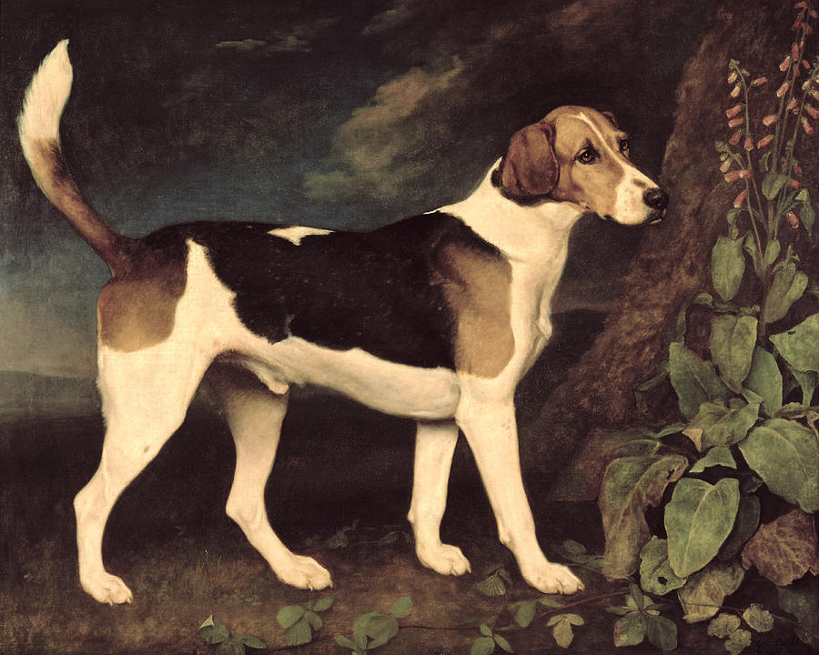
George Stubbs, ‘Ringwood’, 1792
I wanted to try to say something about space in abstract painting. Not the sort of abstract painting that is crowded with marks and visual events, so numerous they almost force the retina to see ‘depth’ as a coping strategy, but rather paintings that employ relatively few, relatively simple elements: Paintings that look flat.
Generating pictorial depth is fairly easy. It can be controlled and directed towards a descriptive goal, as in figurative painting, or it can spontaneously emerge from random movements of worked pigment. However, on its own, depth makes little difference to an individual painting’s ‘quality’.
When pictorial depth is generated it usually has to be anchored to a two-dimensional construct, the surface and/or the picture plane. Giving enough emphasis to this two dimensional feature in the total experience of the work is more tricky. If successfully negotiated, unlike the production of space on its own, it does add value.
The Impressionists were the most successful in negotiating the surface/depth tension. Each dab of the brush was tethered to the surface and linked to the next mark in the passage, but the whole integument was able to convey an account of the natural world, glimpsed but not forensically examined, with its legible spatial cues, its phenomenology addressed to perception.
The Impressionists influence on the practice of painting is hard to overestimate. Michael Fried’s comment sounds reasonable when he writes that ‘the basic formalist-modernist view – enshrined in Greenberg’s “Modernist Painting” – that paintings consist essentially in flat surfaces conjoined with a sheerly visual or optical mode of spatiality amounts to nothing more nor less than a theoretical rationale for the Impressionist picture’.[i] Add to that the practical demonstration of the value of the Impressionist picture taken as far as it would go in the late Monet ‘Water Lilies’ acquired by the Museum of Modern Art from 1955, means that the identification of painting itself and the modernist enterprise is hard to deny.

Joan Miro, “Painting”, 1953, Guggenheim NY, © 2018 Successió Miró Artists Rights Society (ARS), New York ADAGP, Paris
“First the Giants, then the pygmies.” Elie Faure
PART 2
Notes Synthetiques ca. 1888 by Paul Gauguin: “Art is an abstraction; derive this abstraction from nature whilst dreaming before it, and think more of the creation which will result than of nature”.
To Schuffeneker Aug. 1888: “Like music it acts on the soul through the intermediary of the senses. Harmonious colours respond to the harmonies of sounds”.
And in Diverse Choses 1898: “ The impressionists… heed only the eye and neglect the mysterious centres of thought”.
The sources of these ideas, which were to prove so fertile for the development of abstract painting, lay in the literature of early German Romanticism, Jean Paul, E T A Hoffmann, the synaesthesic imagery taken up by Baudelaire, Schopenhauer’s views on music as reinterpreted by Wagner, and the cult of Richard Wagner in France, which influenced even the young Cézanne, and the symbolist poets gathered around Mallarme (though some of these pronouncements of Gauguin antecede his friendship with the latter).
Wagner’s music, especially in The Ring, could be described as the triumph of bad literature over music, or the subjugation of music to the literary imagination. The idea that colour, like music, can express the “mysterious centres of thought” appeals to the literary minded, so it is not surprising to find it echoed in Baudelaire and Mallarme. (See the poem Les Phares by Baudelaire). It is for the most part foreign to the French line in painting stemming from Delacroix and finding its culmination in Matisse. Although Matisse echoes the Mallarmean aesthetic “to paint not the thing but the emotion that it arouses in the artist”, in practice his art remains wedded to the full lustre of the sensory world. The transpositions of colour, red for blue, black for azure, are less emotionally driven as arising from his discoveries in Luxe, Calme et Volupte, 1904/05, that degrees of saturation of hue can form the tonal structure, rather than oppositions of dark and light, just as simultaneous contrasts of colour create light rather than oppositions or gradations of warm and cool.
George Seurat and the theorist Charles Henry voiced similar ideas about the expressive role of line and colour in conveying emotion, on the analogy with music, independently of their function in representation. Chromoluminisme as practiced by Seurat and Divisionism as practiced by Paul Signac, endeavour to combine this emotive theory with the science of colour, a hyper-realism, the two sitting uneasily together, and with mixed results, Pissarro being one of the first to express disillusionment with both the pictorial outcome and the intellectual distancing inherent in the approach.
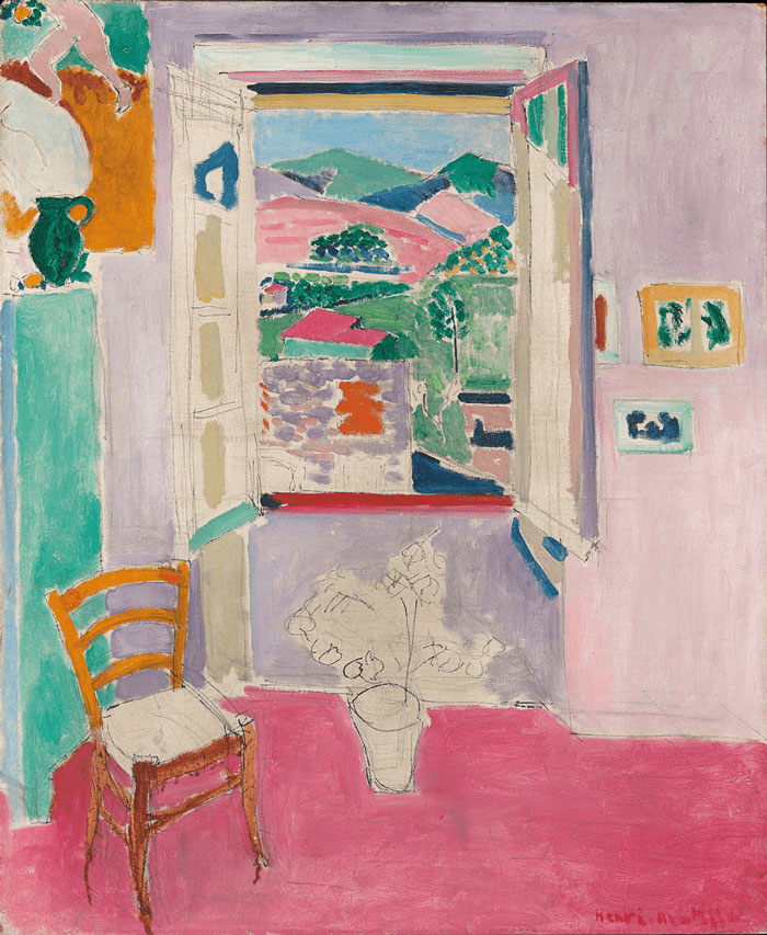
Henri Matisse, “Open Window at Coullioure”, 1911
Matisse-Bonnard : Long Live Painting, is at the Staedal Museum Frankfurt until14th January 2018
http://www.staedelmuseum.de/en/matisse-bonnard
This exhibition consists of about seventy paintings, including major works of both artists, together with drawings, sketchbooks and some of the Jazz cut-outs. The hanging is organised according to subject matter – interior, still-life, landscape, nude etc. No portraits are included. In contrast to the celebrated Matisse/Picasso exhibition of 2002, this is no confrontation. Paintings of both artists are hung in the same room but seldom on the same wall or directly alongside each other – an arrangement that aptly reflects a friendship of forty years, composed of letters and visits, practical and moral support, mutual admiration and an apparent lack of rivalry.
This lack of rivalry was made possible, I think, by the very different approaches of these two men to their art, a factor that can already be seen in their sketches and drawings.
Matisse´s fluid, confident line forms and divides up space. It is a direct act of creation on the empty page. I think it is worth taking his own statement (repeated at the end of his life) about providing “a good armchair” seriously. His lifelong project was the creation of oases of luxe, calme et volupté – good objects (in Adrian Stoke´s sense), able to promote inner harmony, quiet, and well-being through their contemplation and internalisation. His artistic development can be seen as a continuous refinement of the technical means to achieving this aim.
By contrast, Bonnard’s hesitant, repeated, searching lines are a form of exploration. His avowed intention was to go further than the Impressionists by adding the distortions and modifications of subjectivity and emotion to their project of recording light. This approach is more radically non-objective than Impressionism, addressing sensation itself rather than a rationally organised reality filled with objects and the light reflected from them. His is an existential search for clarity of introspection (these days one might call it mindfulness) and its expression in a visual form.

Paul Cézanne, “The Artist’s Father, Reading ‘L’Événement'”, 1866
https://www.npg.org.uk/whatson/cezanne-portraits/exhibition/
Alan Gouk: Some Notes on Three Exhibitions in London. Cezanne, Matisse, Soutine.
The show of Cézanne portraits at the NPG is so overwhelming that I’m obliged to confine my response to just three or four pictures. As with the Rembrandt exhibition at the National Gallery in 2015 one feels that everything that could possibly be said has already been said, and yet nothing has been said that comes near to conveying the qualities of original vision and formal power of these masters, and the formidable (in the French pronunciation) humanity of their affirmation of painting’s capacity to “take the impress of spirit” in the words of Roger Fry. Painting will never be “dead” as long as one can take sustenance from pictures like these.
The resounding “bass vibrato” of the young Cézanne’s temperamental brutalism is struck by the first painting one sees on entry, the large vertical The Artist’s Father 1866. The volumetric relief of this seated man is astonishing, his legs and feet jutting forcefully into the foreground space, swollen like an elephant’s, rendered clumsily in a smoothly succulent and absolute grey, with emphatic shadows that are consistently maintained throughout on the heavy throne-like chair which is modelled with the same fluent clumsiness as the figure of the father, who looks more like a labourer than a banker, his podgy hands clutching L’Événement newspaper, hewn with much scrapings in white/grey/black like a Mosaic tablet. Whether this brutalism was intended as a rebuke to, or an assault on the seamless trompe-l’oeil finesses of Salon favourites, or whether it was the best that Cézanne could manage at this juncture, is no matter, and what it says about his relationship with his father must remain forever prurient speculation. To me if anything it seems to heroicise him. After all it was his father’s largesse that enabled Cézanne to dedicate his life to a sustained concentration on painting that was denied to most of his companions.
The buttery fat palette knifing sculpting the father’s face and hands is echoed in many portraits to follow, of Uncle Dominique and others, which in spite of this limited means, manage an extraordinary salience of volumetric form reduced to the extremes of light and dark (black hat and white gloves placed near the painting to serve as the outer limits of the pendular swing of their tonal language.) The solidity and succulence of paint application in this painting would be subject to transmutation with a thousand nuances over the years, near glazes replacing impasto, in which the watercolours are a crucial accompaniment, re-emerging in the very late portraits with a renewed if symphonic solidity.
But The Artist’s Father has further indices of the inherent tendency of Cézanne’s art, in the dense chocolate brown plane and the sienna wall plane that backs up the chair, with a still-life painting in a style influenced by Monticelli, who was also a palette knifer, hanging behind the head, parallel to the picture plane; in all of which Cezanne seems to want to outdo Manet in “bold impasto” and the emphatic assertion of the planarity of the picture design.
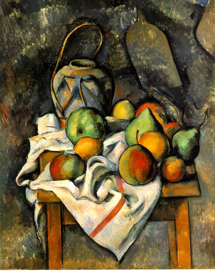
Paul Cézanne, “Ginger Jar and Fruit”, c. 1895
“First the Giants, then the pygmies.” Elie Faure
I could have begun with a painting by Rubens, one of Cézanne‘s favourite painters, his Susannah and the Elders in Munich, or the Three Graces in the Prado, but that would have set us off on the wrong foot by confirming Cézanne‘s own estimate of himself – “how feeble I am in life “, said in relation to Manet’s “bold impasto”. However, when the National Gallery placed Cézanne‘s Grand Bathers beside Titian’s Diana and Actaeon and Rubens’ Judgement of Paris, he did not look feeble, and it was the Rubens that fell away first. What the confrontation confirmed was that it is not the succulent rendering of flesh, the atmospheric rendering of spatial illusion, nor the sumptuous handling of fabrics and the texture of appearances that counts, but the architectural strengths of the composition, the disposition of the major masses and the demands of their accommodation to the entire presented image, and the shape of the canvas , and that this can be created with a new economy of means, new and old, and an especial emphasis on “form”, form over the sensuous, form over everything. Cézanne goes on to build a monument to his feebleness.
And here is a contradiction, for how can it be that someone who said this of himself could prove to be the most powerful temperament in a century of powerful temperaments?
Emile Zola, a vocal champion of the movement in French painting he designated as “naturalism”, coined the expression — “nature seen through a temperament”. No one had a temperament more powerful and idiosyncratic than Paul Cézanne, of an intensity bordering the pathological, in his adolescent ferment, at least. (Perhaps it was just adolescent rebelliousness.) And he did not quite shed the phantasising of erotic torment that assailed him in youth, fuelled by his readings in classical literature, common to every well-educated schoolboy in France in the 19th century.
Underneath and parallel to the discipline instilled into him during his apprenticeship with Pissarro, there remained an erotic imaginative life which found expression in the many Bathers paintings, La Lutte D’Amour, a baroque turbulence in marked contrast to the strictness of his study after nature.
We are not all gifted with as strong a temperament, not all blessed with “equal temperament”. Some of us are in C major, some of us in B flat minor. Some are predominantly extravert sensation types, others are introverted feeling. Find out who you are. Be who you are, and not who you wish you were.
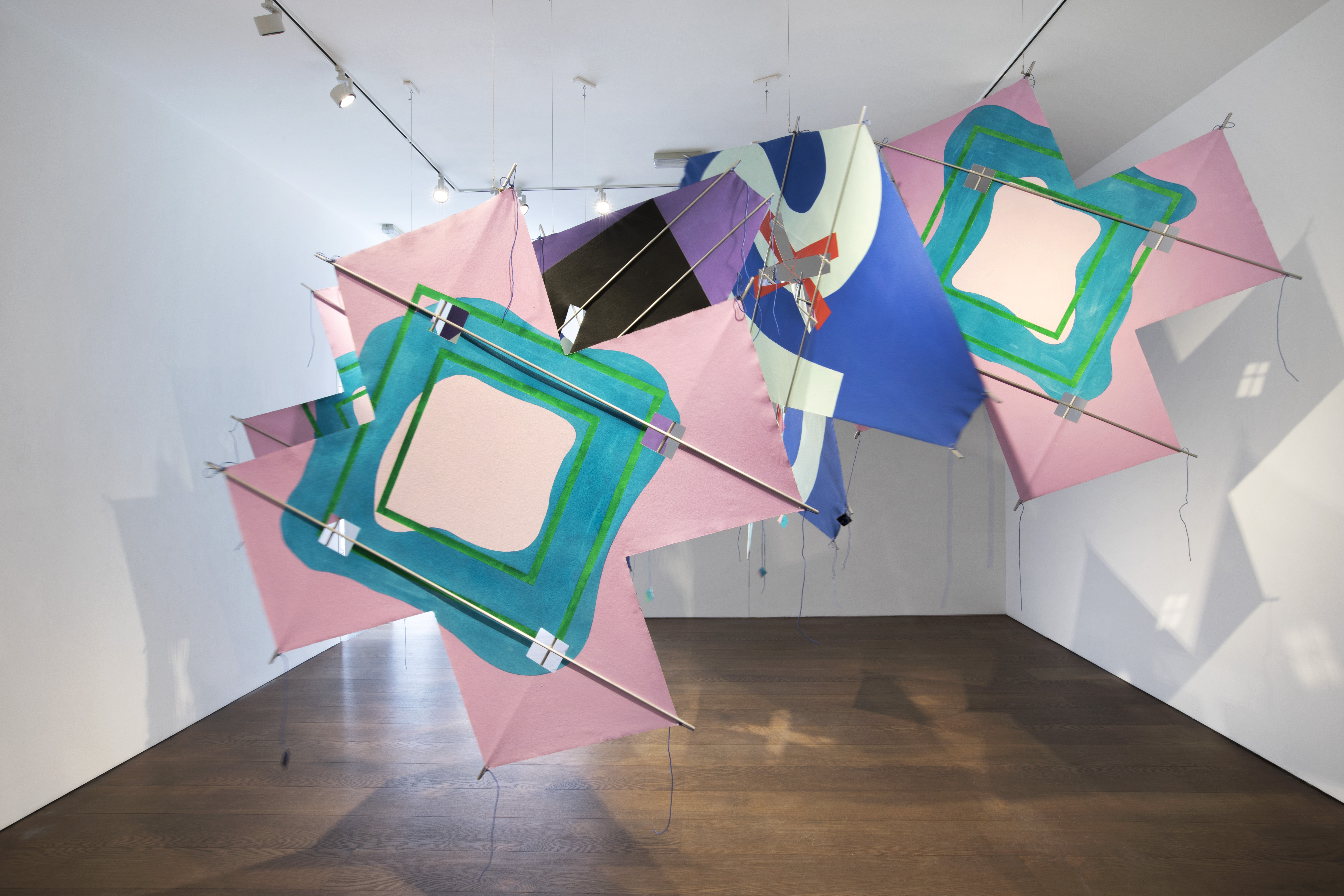
Installation View, upper gallery, Richard Smith – Work of Five Decades, Flowers Gallery, © Richard Smith Foundation, courtesy Flowers Gallery London and New York
Richard Smith – Work of Five Decades is at Flowers Gallery, Cork Street, London until 15th July 2017
https://www.flowersgallery.com/exhibitions/view/richard-smith-5
Richard Smith – Work of Five Decades is as rich and tantalising a show as it is modest and partial. Well chosen combinations of work signal original and singular twists and turns across Smith’s career. It was a chance to get up close to some of the later more delicate and intricate works loosely coming under the rubric of the “Kite” paintings. But there were also the more robust deliberately awkward painterly works that play explicitly with the grid and illusions heightened by intense colour-play. These contrasts and continuities in approaches did not disappoint – but in ways totally unexpected.
The biggest surprise came on encountering Smith’s Snakes and Windows filling the whole of the ground floor (upper) gallery space. I was taken aback by my initial reactions to what is essentially an installation piece because I was instantly reminded of my first encounter with Matisse’s Memory of Oceania and The Snail brought together in Tate Modern’s Cut-Outs blockbuster in 2014. In a note I’d made at that time about them both I said:
“…and finally found myself perplexed but totally engaged by the slow-motion collapsing architecture of Memory of Oceania. The Snail, according to the received wisdom of art historical myth-making, takes us to the cusp of a new kind of visual drama, one of colour and shape devoid of subject-matter adhering only to the shape of the canvas itself. Was this the future that Matisse had in mind for his Cut-Outs?”

Gallery of Matisses at the Shchukin Collection; photo John Pollard
The Shchukin Collection at Fondation Louis Vuitton, Paris has been extended to 5th March 2017.
http://www.fondationlouisvuitton.fr/en.html
This unmissable show is likely to be the highlight of this year and possibly of the decade. The flamboyant kite-like superstructure in Frank Gehry’s signature style apart, the main galleries display beautifully the visionary taste and judgement of this extraordinary Russian collector. What monstrosities may we expect when this show closes? Gerhard Richter? Cy Twombly? Bill Viola? Ai Wei Wei? God help us! So let us rejoice while we can that there once was a man of superlative judgement to take the true temperature of his times, a time before the psychopathology of art globalisation. This is an exhibition that normally would have gone to the Met. or the National Gallery. How many handbag sales have gone into this colossally expensive enterprise on the fringes of the Bois De Boulogne?

Henri Matisse, Interior, Flowers and Parakeets, 1924, Baltimore Museum of Art: The Cone Collection. Succession H. Matisse / Artists Rights Society (ARS)
On Art News Phyllis Tuchman reviews The Matisse/Diebenkorn show in Baltimore:
Striking Up a Conversation: The Baltimore Museum of Art Unites Matisse and Diebenkorn in a Glorious Exhibition.
Tuchman writes:
“Astonishingly, Diebenkorn’s paintings in Baltimore are never overshadowed, as you might expect, by Matisse’s masterpieces. The American who twice lived outside San Francisco—in Berkeley (1953–66) and Healdsburg, California (1988–93)—as well as on the western outskirts of Los Angeles (1966–88) doesn’t just hold his own: he actually upstages Matisse.”
That indeed is astonishing…
