Installation View, upper gallery, Richard Smith – Work of Five Decades, Flowers Gallery, © Richard Smith Foundation, courtesy Flowers Gallery London and New York
Richard Smith – Work of Five Decades is at Flowers Gallery, Cork Street, London until 15th July 2017
https://www.flowersgallery.com/exhibitions/view/richard-smith-5
Richard Smith – Work of Five Decades is as rich and tantalising a show as it is modest and partial. Well chosen combinations of work signal original and singular twists and turns across Smith’s career. It was a chance to get up close to some of the later more delicate and intricate works loosely coming under the rubric of the “Kite” paintings. But there were also the more robust deliberately awkward painterly works that play explicitly with the grid and illusions heightened by intense colour-play. These contrasts and continuities in approaches did not disappoint – but in ways totally unexpected.
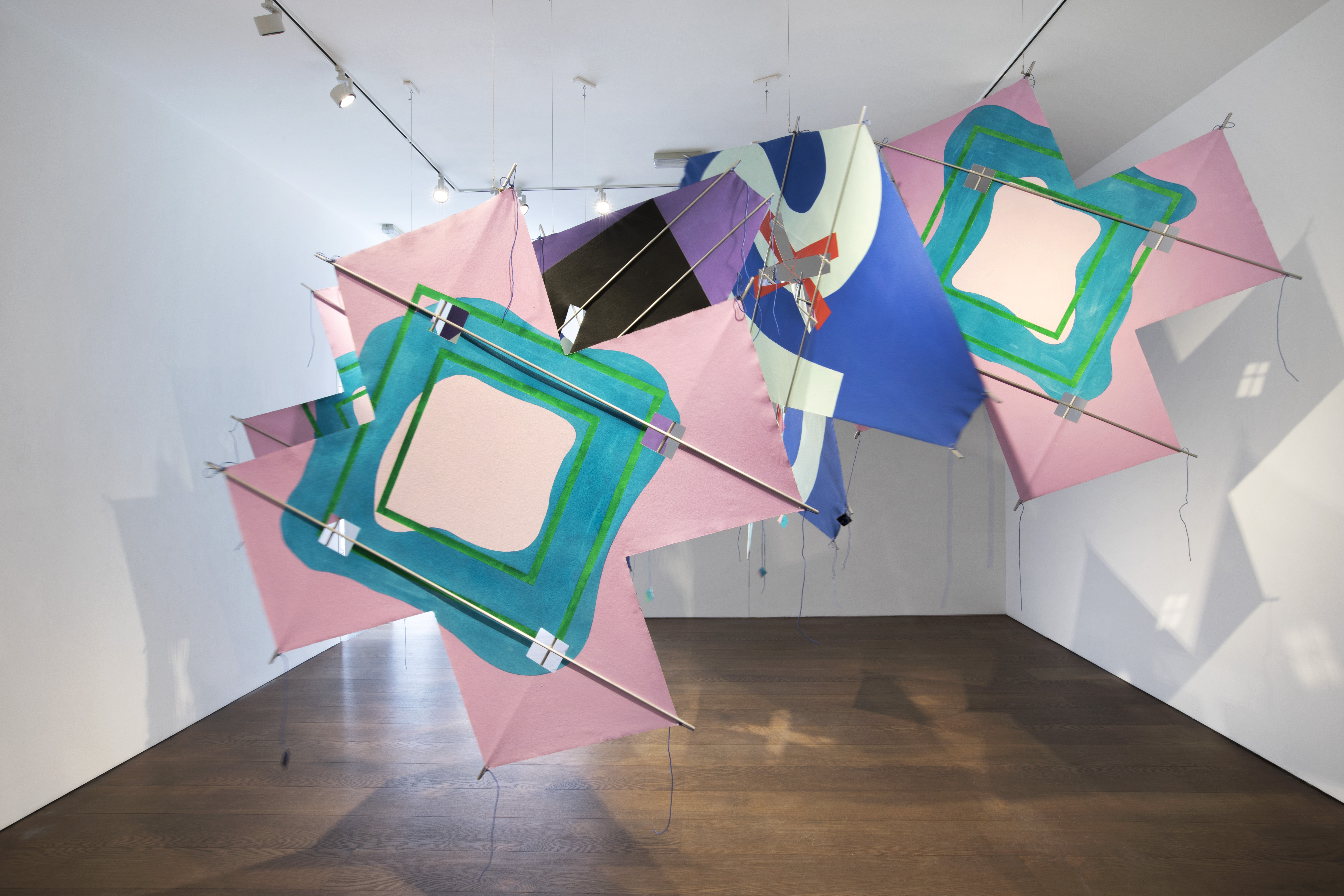
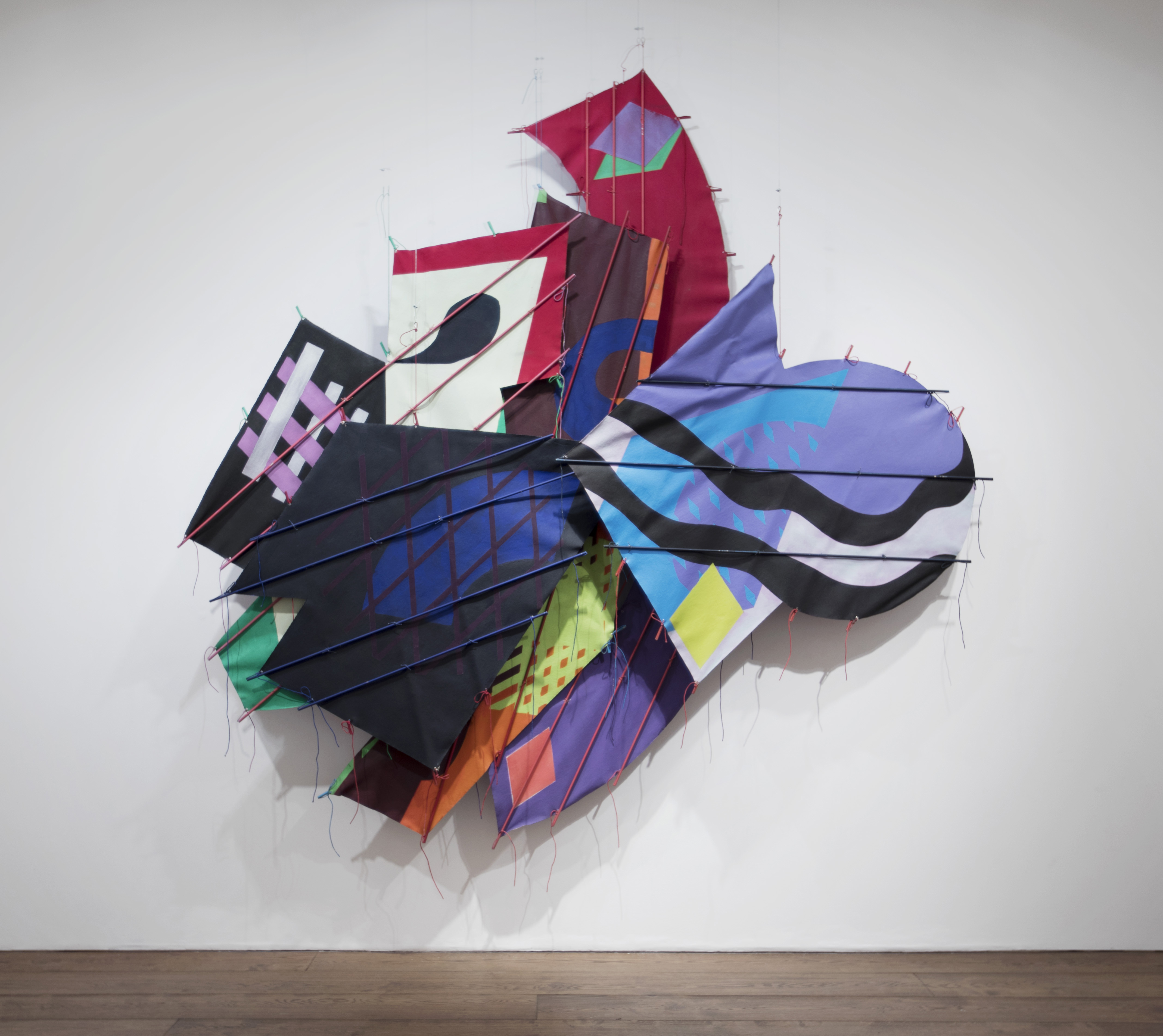
The biggest surprise came on encountering Smith’s Snakes and Windows filling the whole of the ground floor (upper) gallery space. I was taken aback by my initial reactions to what is essentially an installation piece because I was instantly reminded of my first encounter with Matisse’s Memory of Oceania and The Snail brought together in Tate Modern’s Cut-Outs blockbuster in 2014. In a note I’d made at that time about them both I said:
“…and finally found myself perplexed but totally engaged by the slow-motion collapsing architecture of Memory of Oceania. The Snail, according to the received wisdom of art historical myth-making, takes us to the cusp of a new kind of visual drama, one of colour and shape devoid of subject-matter adhering only to the shape of the canvas itself. Was this the future that Matisse had in mind for his Cut-Outs?”
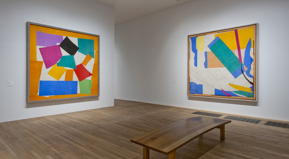
Henri Matisse, “The Snail” and “Memory of Oceania” at Tate Modern, 2014
These initial recollections about Matisse’s late phase were puzzling in relation to Smith because I had primed myself for a more straightforward reworking of Smith’s oeuvre, simply re-emphasising his place in a well-rehearsed formalist and Americanised 60’s art narrative. Instead, I found myself reconsidering Matisse’s development of the “Cut Out” as a potential site for the germination of the idea of working outside the rectangle – but through the power of shaped or incised colour. It seemed specifically in these freewheeling hanging works that Smith touches on some of the implications bursting forth from Memory of Oceania. But just as Matisse always took his cues from nature, it seems that Smith would take his from the man-made world.
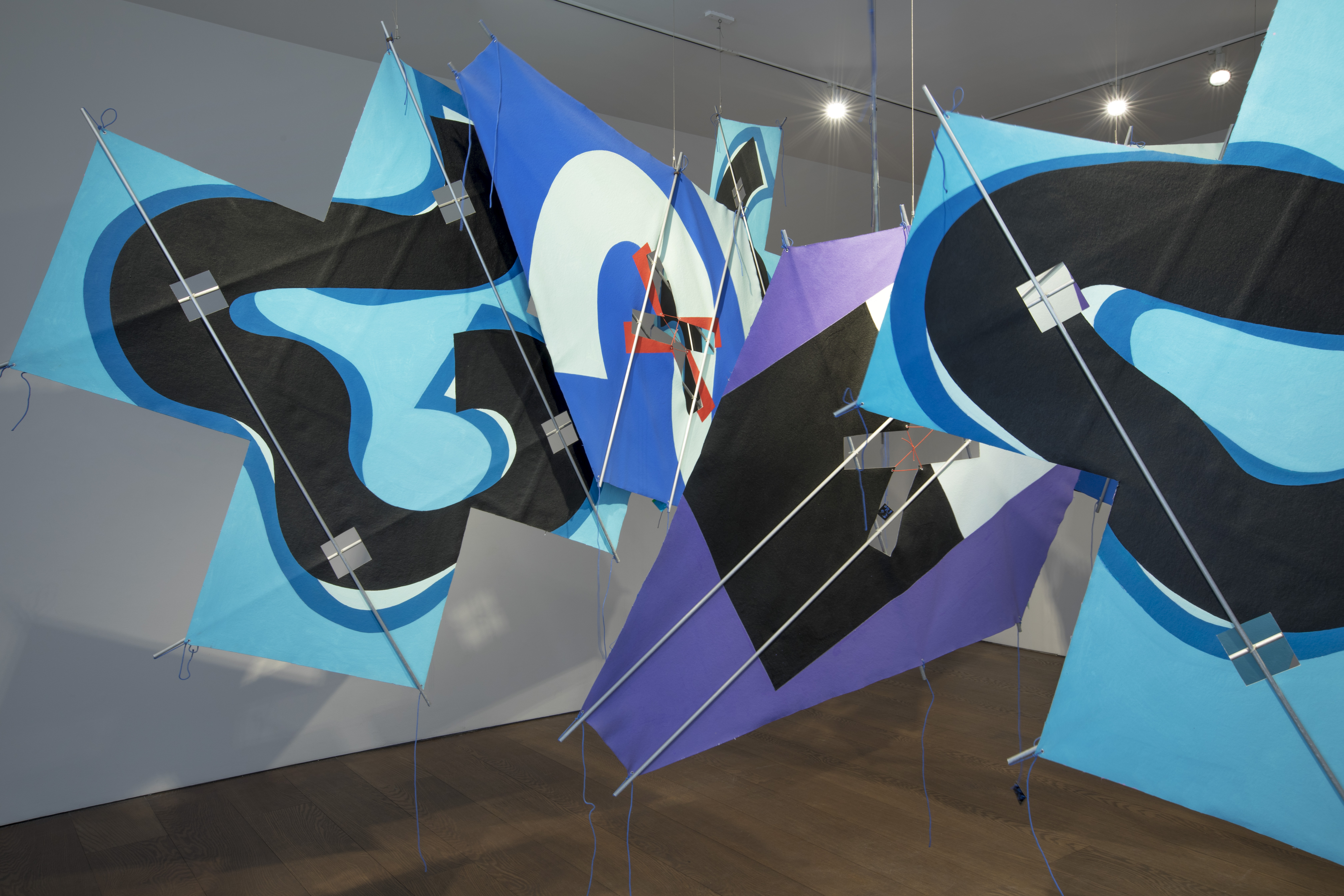
Installation View, upper gallery, Richard Smith -Work of Five Decades, Flowers Gallery, © Richard Smith Foundation, courtesy Flowers Gallery London and New York
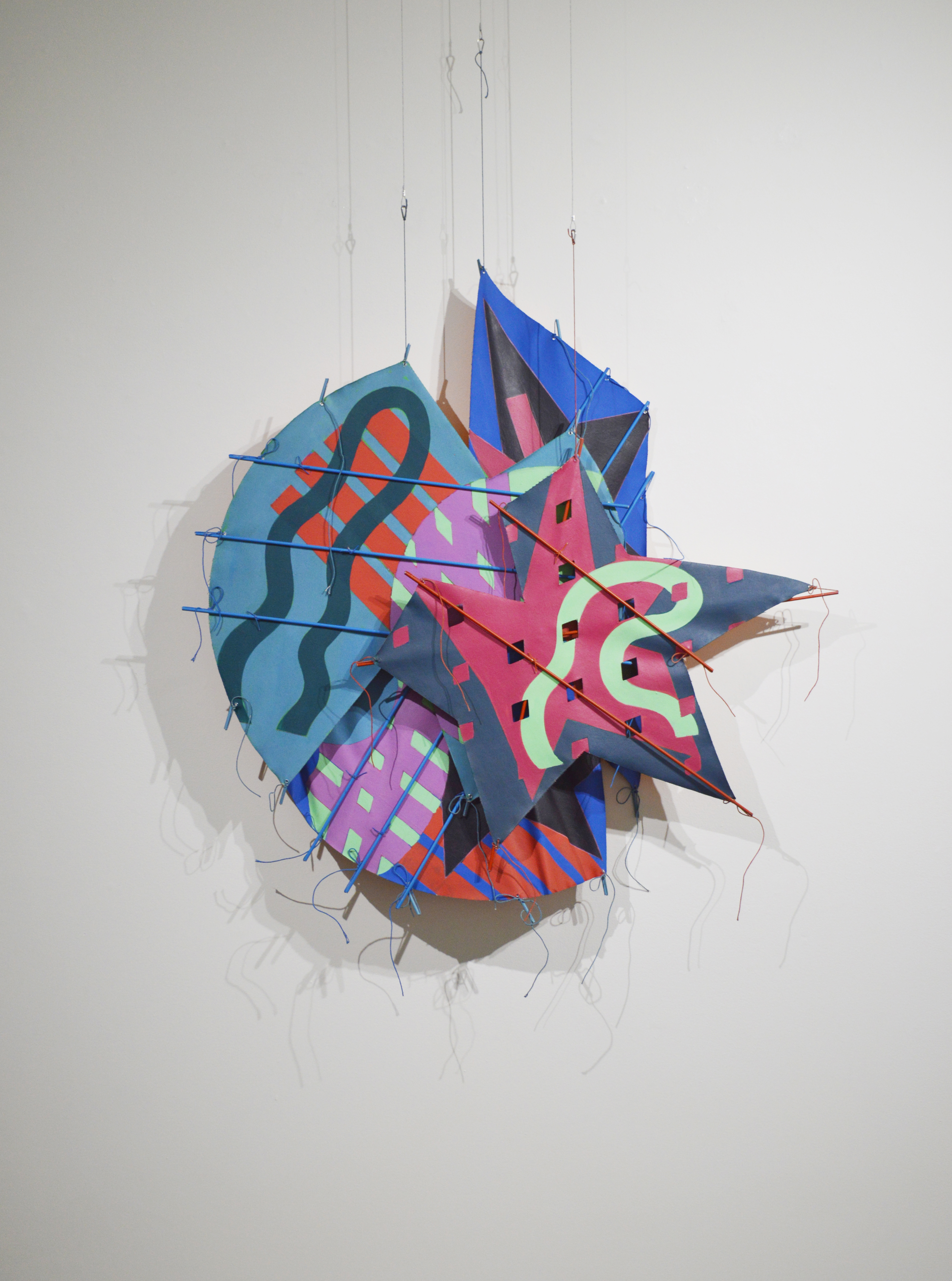
Snakes and Windows is composed of discreet canvases hanging from the ceiling of the gallery. They are suspended at varying heights and gently sway and turn colonising the central vicinity of the gallery space. The individual canvases of various trapezoid and cross shapes are delicately stretched using a deceptively simple combination of electrician’s ties, strings and metal rods. There is rigidity in each of the component parts creating tautness but this also allows the projections into space of softer canvas edges and contours that give the canvases a very delicate and sophisticated sensuousness. In all, this is an ingenious way to let colour breath and work its magic, free of the rules of engagement engendered by the rectangle. But there is a different kind of magic at work here too. It has something to do with the interactions of colour with shape that Smith achieves in various ways throughout this show.
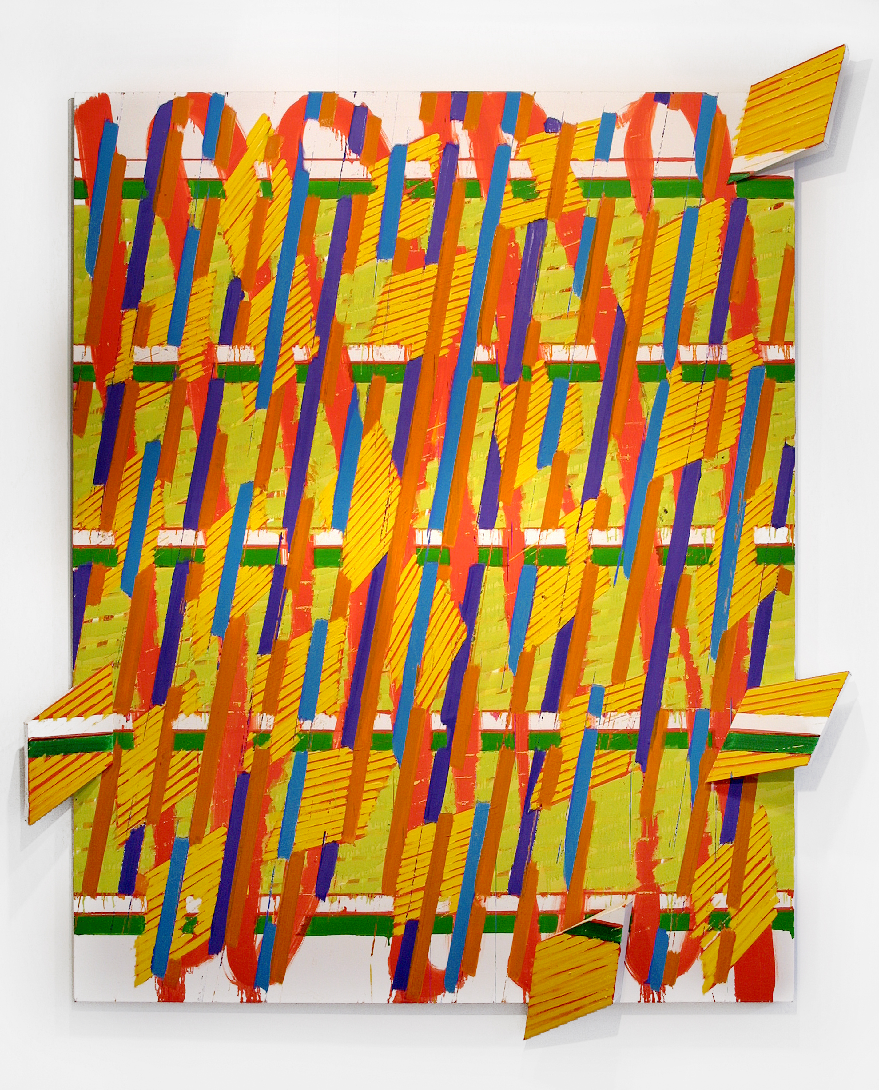
untitled, 2002, oil on canvas, ©Richard Smith Foundation, Courtesy of Flowers Gallery, London and New York
To point to and paraphrase Matisse once more – he said the first line that an artist makes as she/he begins a drawing is in fact the 5th as there are already the four lines defined by the four sides of the paper on which she/he works. This simple truth is pretty much echoed throughout the rise and fall of abstract colour painting. But what happens when a painting that is full of echoes ‘of the edge’ suddenly loses one of those edges, then two, then all of them? All notions of “building up” a painting from the bottom or in from the sides dissolve. So if we can’t hopscotch our way across a conventional canvas and find no reassuring rebounds from its edges, then where next? The very restrictions of the rectangle are a structural comfort, liberation can be found in this age old confinement. Much of Smith’s work seems to scratch at this particular itch concerning the structure of a painting and then the painting of a structure. The gallery window piece untitled 2002 is full to the brim with striking yellow, green, blue, red and diagonal striations fizzing up through and over an ordered white and light blue grid-like system. The reassuring visual equivalent to the ping-like sound of sonar echoing through a stack of high-octane colour calibrations and rebounding off the painting’s edges could easily start to become dissonant. Here, they could become tangled up into frenetic freewheeling diagonal fragments. But all this potential chaos is channelled via wedge-like boxed canvases attached to the original canvas edges. They cleverly, all at once, bend, break up and refract the edges of the painting back into itself. In so doing, they intensify the shimmering all-over colour-texture, but also turn the eye back into the vibrating grid of sizzling high key colour. And there is something like pure delight to be had here.
“Red Valise”, 1995, acrylic on canvas, ©Richard Smith Foundation, Courtesy of Flowers Gallery, London and New York
“Maryland”, 1972, acrylic on canvas, ©Richard Smith Foundation, Courtesy of Flowers Gallery, London and New York
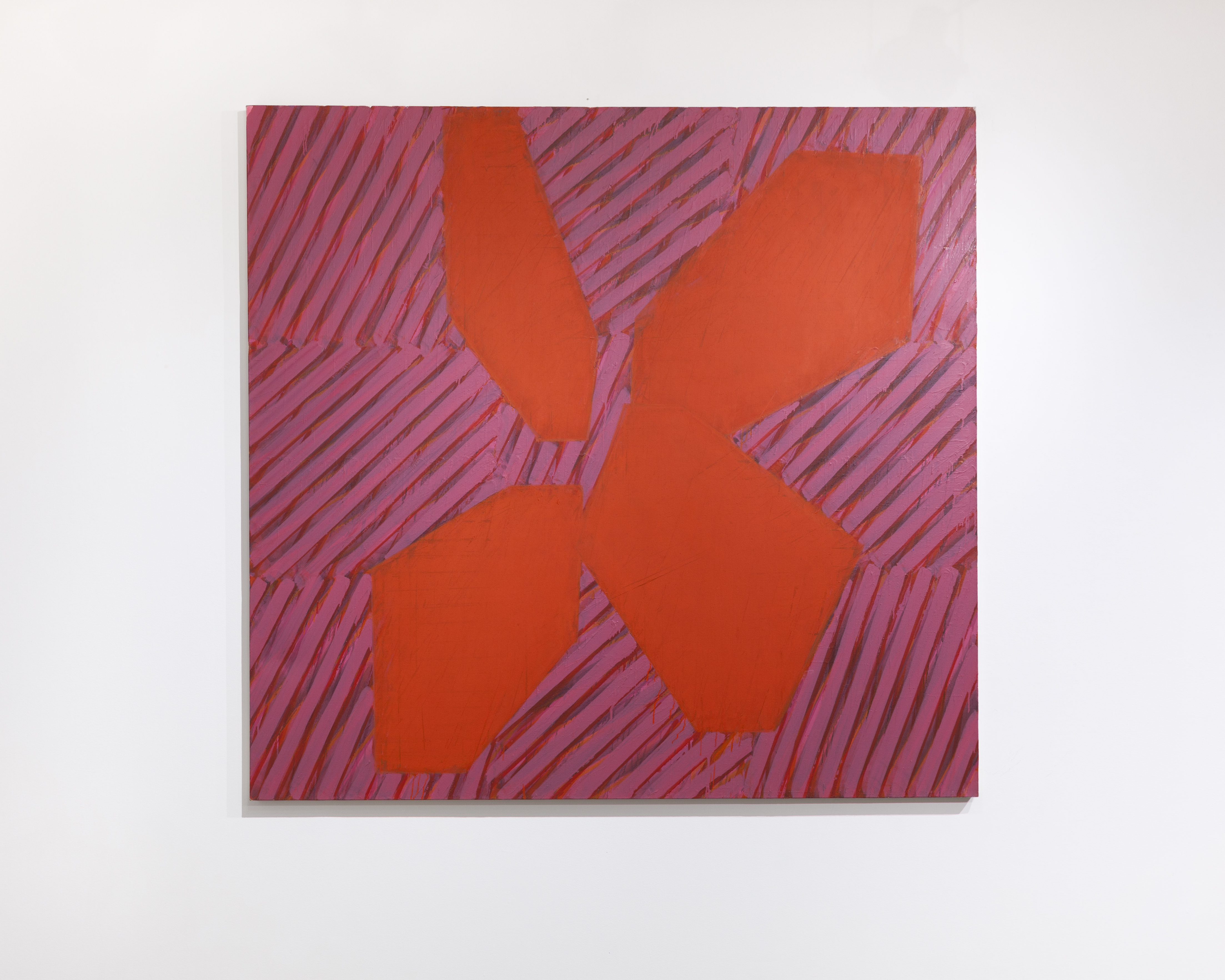
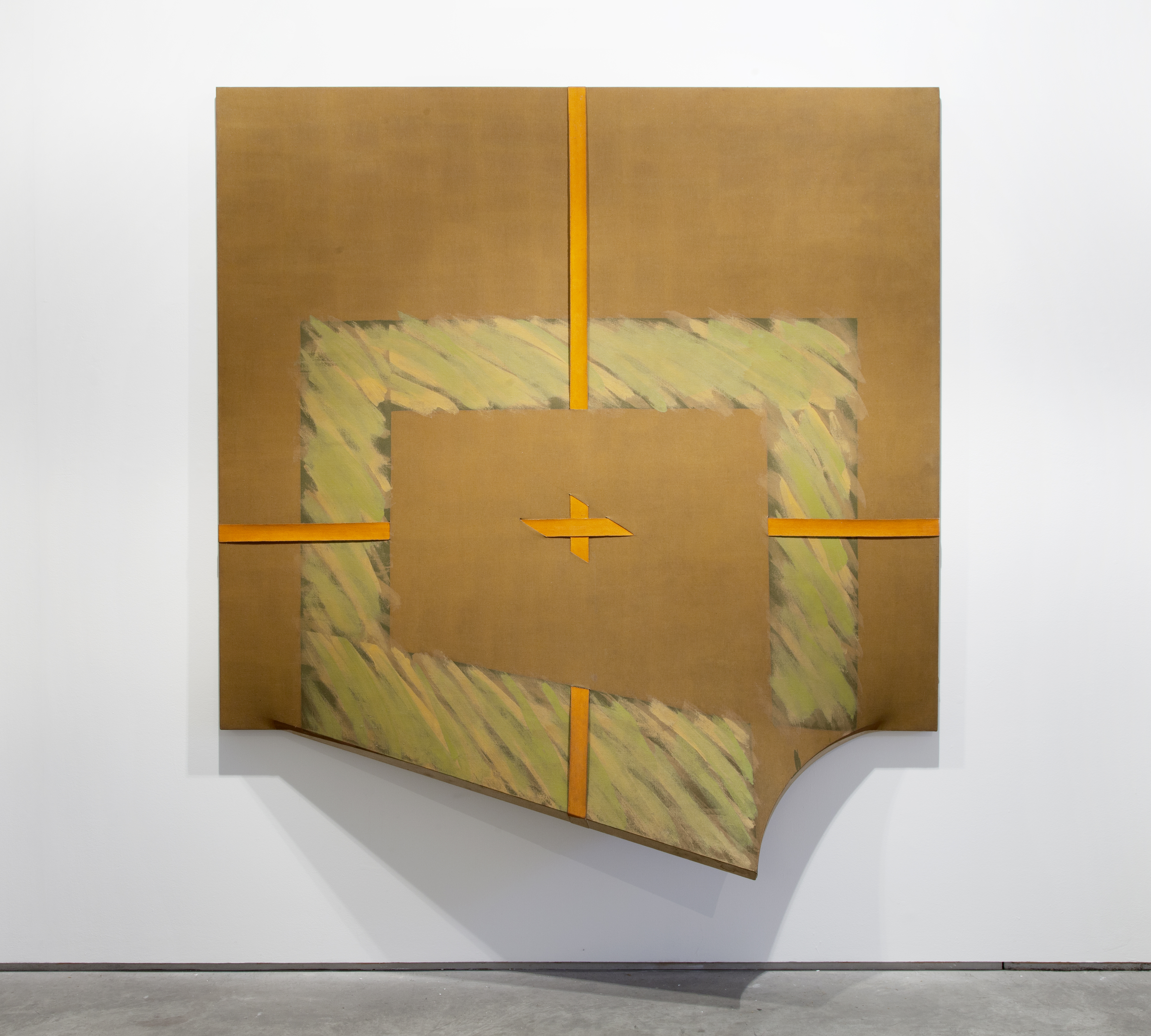
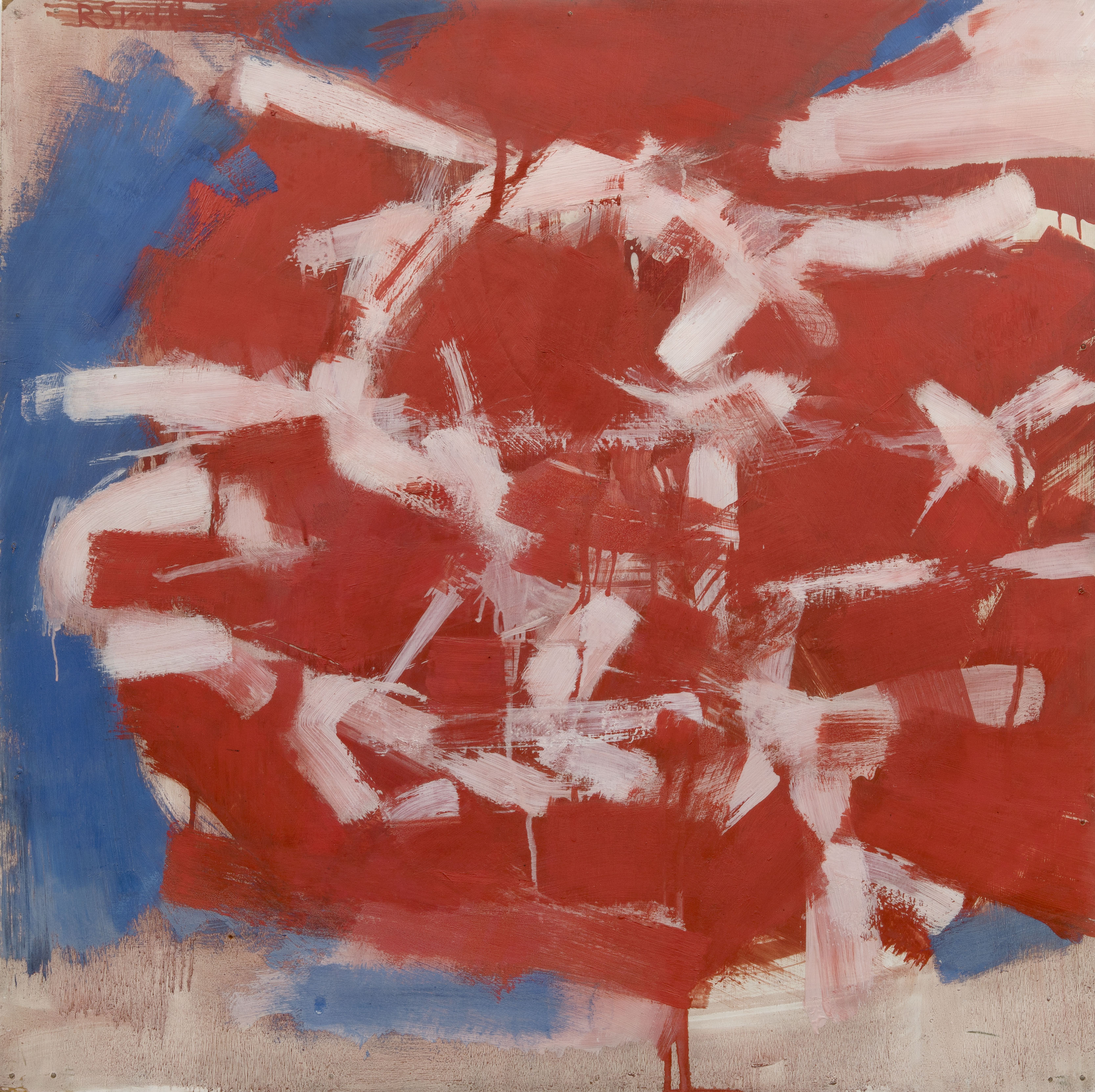
How would the likes of Denny and Smith, railing as they were against the very English neo-romantic figuration of the 50’s, move on from the solemn flatness of a different kind of romanticism harboured in the colour-field wing of AbEx? There seems to me to be a fruitful tryst between a dramatic art of absolutes and tabulae rasae, à la Rothko and Newman, with the cool new vistas opening out from blown up imagery fresh from cinema screens and giant advertising hoardings. The 60’s and 70’s were awash with new colour concoctions chemically formulated to stimulate, seduce, shock and affect the mind and body of the hapless fickle children of the first world in the late 20th century. The tension between angst ridden restraint and the urgent desire to experiment in visual excess in all directions is palpable in this show – a frisson taken to even greater extremes by Smith’s good friend Frank Stella. But whereas Stella, in the 80’s, would famously become ever more frenetic in his mixed-media approach, Smith stays with cooler and quite distinctively peculiar new colour combinations set off against each other with an altogether subtler energy and lightness of touch. In Red Valise, 1995, we see something of Frank Stella’s early edge-echoing striations building up and undulating across its surface. But Smith’s sense for colour and shape break open its centre with large clunky forms articulated in a heavy red painterliness. This sits in great contrast to the taut and muted Maryland, 1972 with its orange strapped front and subtly-curling bottom edge. It exudes the uncertain mysterious charm and menace of an oversized unopened parcel. This kind of visual wit allows Smith to indulge a quite original colour sense that feels linked directly to the real utilitarian world but also one heightened by colours and forms wrested from mass media imagery. Lee, 1961 takes its name from the famous brand of jeans. Look how Smith uses the structure of the creamy beading of jean pockets against saturated blues. What looks like the singing of a simple song in praise to the beauty of blue denim is, at the same time, full of formal clarity and precision.
“Lee” I, 1961, oil on canvas, ©Richard Smith Foundation, Courtesy of Flowers Gallery, London and New York
“Madama”, c. 1980, acrylic on canvas, ©Richard Smith Foundation, Courtesy of Flowers Gallery, London and New York
“Round Flight”, c.1985, ©Richard Smith Foundation, Courtesy of Flowers Gallery, London and New York
For me though it was ‘Madama’ 1980 and ‘Round Flight’ 1985 that stole the show. Their success lies in both work’s abilities in containing a cogent amalgam of spine-like support and free flowing image – all parts individually active, yet singing in unison. The individual shaped canvases, liberated from hefty supports, are able to float above and below each other, interacting in space and with the wall, without reference to a guiding principle of the rectangle. The layering of the taut canvases hung from the ceiling in close proximity to the wall are always interrelated, but not to make some po-faced modernist point about illusions and hidden supports. Instead, the snake-like shapes and hugely compelling dramatic play of orchestrated colour create an interweaving of parts that form a new coherent whole. Ultimately, this made them more satisfying than the more atomised ‘Windows and Snakes’. In ‘Round Flight’ particularly, these innovations seem to move beyond mere visual novelty. It gives real freedom to the potential of a fully abstract kind of image making, liberated, as it is, from the ‘window on the world’ baggage handed down to modern painting. Maybe this freedom from the boxed surface liberates line too? Line, shape and colour are allowed to suggest new and compelling permutations. Is this the kind of potential to be sensed in the Matisse of the “Cut-Outs”? Smith explored the objecthood of painting, but rather than merely reiterating a deadening literalism or an empty formalism symptomatic of the 70’s, he found a peculiar new kind of lyricism that still might have ramifications for the future of abstract painting.
“Red Label”, 1958, oil on board, ©Richard Smith Foundation, Courtesy of Flowers Gallery, London and New York

“Double Box”, 2010, Acrylic on canvas, ©Richard Smith Foundation, Courtesy of Flowers Gallery, London and New York

another take here…. http://www.studiointernational.com/index.php/richard-smith-work-of-five-decades-review-flowers-gallery-london
LikeLike
Perhaps you’d like to reciprocate and mention John’s Abcrit article at the end of your Studio International essay? I’d do it myself, only I’m a Facebook refusenik.
LikeLike
Not seen this yet, but the image that interests me most is “Red Label”, the earliest painting in the show (1958). The thing I like about it is that it sets up, but then – crucially – resists, the “spiralling structure” and “mobility” that Sam suggests (in his S.I. essay) runs through this work and much else in the show. In other words, it has lots of movement, but also has the checks and balances that stop it from becoming just an “illustration” or demonstration of simple spiralling or rolling; or, indeed, actually moving.
Nor do I think, like Sam, that “Red Label” is a flat image; I think it has, along with quite a bit of Smith’s very early, freely-brushed but clearly structured work of the late fifties, more spatial “life” in it than much of the stuff that came later, work that attempted to wed painting to literal three-dimensionality. We are back in the territory of the last discussion on Picasso’s “Mandoline et Clarinette”, back in the abstract painter’s dilemma of how to paint abstract space, and whether that dilemma might be circumvented by dabbling in three-dimensions. In Smith’s case, he thought he could steer round the problem by shaping and projecting out from his canvases in the very elegant and original work he did in the early sixties. It had never occurred to me that he had hooked up later on with Stella, but having had it pointed out, the influence is obvious – and so, for me, are the problems.
Maybe I’ll see the light when I see the show, but all the “kites” look very arbitrary and unconvincing in reproduction and I just cannot connect them with the very carefully weighted and balanced spatial articulations of colour and delicate physicality that Matisse brought to bear on “Memory of Oceania”.
LikeLike
For those painters amongst Abcrit readers who think the debate about three-dimensionality is some arcane and unnecessary bollocks (i.e. all of you!), there is an interesting set of comments now on Brancaster: https://branchron.com/2017/06/24/brancaster-chronicle-no-46-robin-greenwood-sculpture/comment-page-1/#comment-628
Three-dimensionality in sculpture in the way we are now thinking about it and attempting to achieve it is new, unexplored territory in the history of art; and I repeat the point that it has no connection with the appropriation of literal three-dimensions by painters, collagers and assemblers, or indeed the frontal pictorialism of Picasso, Smith or Caro, or the objecthood of Minimalism..
LikeLike
Right, well, seen the Smith show and it didn’t change the thoughts I had had from looking at the pics. I like the little red painting and a couple of others were OK, but the ‘kite’ works that John likes I cannot get on with. They seem to me to suffer from the Stella-ism of far too much intrusive “gubbins” (all those struts and strings) for very little pictorial content or result. In fact, I had no idea what they were trying to do, or how they were trying to get themselves together. They looked arbitrary, the arrangement of overlapping patterned shapes just another version of something that could be endlessly rearranged. So too the large installation upstairs, which has no fixed orientation, it just wafts about, so what you see is always some kind of accidental conjunction. That is NOT three-dimensionality!
(But then I came out of the Smith show and went into the Royal Academy Summer Exhibition; and then I went into the Royal Academy Schools Show; at the end of which Richard Smith was looking like a paragon of painting.)
LikeLike