Patrick Heron

#112. Emyr Williams writes on Patrick Heron at Margate

Patrick Heron, “Cadmium with Violet, Scarlet, Emerald Lemon and Venetian: 1969”. Tate, London 2018 and estate of Patrick Heron. DACS 2018

Patrick Heron at Turner Contemporary, Margate.

The hanging of this exhibition has had a lot of column inches devoted to it. The paintings looked really good in these spaces and in spite of the missing traditional chronological reasoning did not compete or confuse. The spaces are not huge, so it is easy to move back and forth, cross-checking things if so desired. I failed to see what the fuss was all about. I understood there were themes but to be brutally honest I didn’t pay attention to them and proceeded to wander around and take each work on face value. The signature Herons (the “wobbly hard edged”) such as the huge “Cadmium With Violet, Scarlet, Emerald, Lemon and Venetian: 1969” looked immediately familiar and impressive. These works are characterised by their fully saturated higher-keyed primaries and secondaries straight from the tube, activated more by a literalness in the brushstroke rather than a painterliness per se. The brush being a markedly smaller than thought Japanese watercolour brush. Sitting uniformly on a white ground gives each hue the same reflective force. Complementary colours buzz optically against one another as their shapes flip-flop between positive and negative areas, à la Matisse’s cut outs. Heron’s optimism in an almost hedonistic colour, is supported by his wilfulness to drive each colour shape through to its conclusion in the same way as it was started – the brush scribble, more often than not. They have an insistency which, with hindsight, is possibly their undoing at times; in these works he seems to have put himself ahead of his own curve. By this I mean he understood fully what he was doing, not quite moving himself into the more profound areas of discovery – the speed of acknowledgment of each work’s merits is condensed into a shorter space of time. Colour will always surprise but they teeter ever so slightly into the realms of design (this is not to consider design in any pejorative way but to define its nature in terms of more predictive outcomes, for design has to have a preconditioned purpose at its heart).

(more…)

#110. Robin Greenwood writes about “The Art of the Real”, Then and Now

1968 MOMA installation of “The Art of the Real”

“Take a giant step…” as the great Taj Mahal once sang… or was it the Monkees: “Take a giant step outside you mind”?

In April 1969, as a young art student at Wimbledon School of Art in London, I went to see a big show of abstract art at Tate Gallery: “The Art of the Real; An Aspect of American Painting and Sculpture 1948 -1968”. This was very new and exciting to me back then, and in its way, as I will explain, it still is.

The show originated and was shown in 1968 in MOMA, New York, where it was devised and directed by E. C. Goossen, and subsequently presented with the help of the Arts Council of Great Britain to the Tate Gallery, London. Here is the opening to Goossen’s introduction:

“To propose that some art is more “real” than other art may be foolhardy. Yet many American artists over the last few years have made this proposal by the nature of their work. They have taken a stance that leaves little doubt about their desire to confront the experiences and objects we encounter every day with an exact equivalence in art. That they are shaping this equivalence by modifying forms inherited from the history of modern abstraction may or may not be an accident. Certainly there seems to be a growing distrust of idealism and its unfulfilled promises. The “real” of today as it is posited by this new art has nothing to do with metaphor, or symbolism, or any kind of metaphysics. It is not the ideal Hegelian essence that Hans Hofmann was invoking several decades ago in his essay, “The Search for the Real”. It does not wish to convey the notion that reality is somewhere else. Neither is it related to the symbolic reality Malevich thought he had discovered when, in 1913, he first isolated his black square on a white field. Malevich indeed had produced a real square, but he employed it as an element in the construction of a precariously balanced, ideal order with which he proposed to bring forth a “new world of feeling”. Today’s “real”, on the contrary, makes no direct appeal to the emotions, nor is it involved in uplift. Indeed, it seems to have no desire at all to justify itself, but instead offers itself for whatever its uniqueness is worth – in the form of the simple, irreducible, irrefutable object.”

The essay concludes five pages later, thus:

“The gradual divorce of the physical means of art from expressionistic associations has been accompanied by a distinct change in attitude towards what art should attempt. Expressionism, even at its most abstract, continued many aspects of representational art, and constructivism, despite its purist look, was basically nostalgic in its search for meaning through traditional methods of composition. The new attitude has been turning art inside out: instead of perceptual experience being accepted as the means to an end, it has become the end in itself. The Renaissance artist laboured over perspective in order to create an illusion of space within which he could make believable the religious and philosophical ideals of his time; the contemporary artist labours to make art itself believable. Consequently the very means of art have been isolated and exposed, forcing the spectator to perceive himself in the process of perception. The spectator is not given symbols, but facts, to make of them what he can. They do not direct his mind nor call up trusted cores of experience, but lead him to the point where he must evaluate his own peculiar responses. Thus, what was once concealed within art – the technical devices employed by the artist – is now overtly revealed; and what was once the outside – the meaning of its forms – has been turned inside. The new work of art is very much like a chunk of nature, a rock, a tree, a cloud, and possesses much the same hermetic “otherness”. Whether this kind of confrontation with the actual can be sustained, whether it can remain vital and satisfying, it is not yet possible to tell.”

E.C.G.

This, I think even in retrospect, was pretty good, and was the start of something important for me about how to make “abstract” art, and how to make it “real”. I had by then already abandoned any connections with figurative painting and sculpture of any kind.

(more…)

#105. Geoff Hands writes on Patrick Heron at Tate St. Ives

Tweet by Geoff Hands

Patrick Heron is at Tate St Ives, 19 May – 30 September 2018

If you owned a few Herons how would you display them in your house? If you had over forty in your dream collection, and a mansion sized amount of wall space, you might mix things up a bit. In a retrospective at a major, award winning, art gallery the conventional approach would lead to a chronological hang. Not so for Patrick Heron at Tate St. Ives.

I was both enthralled and fascinated with the display and tweeted that the show was “mind blowing”. Intuitively, I attached ‘1-3 September: 1996’. The Tate exhibition guide who had showed a group of us around told me later that she had initially found the display “disorientating”, but her enthusiasm for the work was unaffected nonetheless. She was completely relaxed about it now. My own habit for exhibition viewing is to follow the order from start to finish and then to return to somewhere near the beginning and pick out the works that commanded my attention the most. On the return leg there is a certain degree of arbitrary stopping and starting as individual works that I initially passed too quickly make their presence known.

In this situation I was immediately thrown into a third form of viewing behaviour that was alien to me. The experience was not so much mind-blowing (social media loves hyperbole) as invigorating. For a moment I was a child in a sweet shop wanting everything, such was the temptation to taste, and visually touch, it all. ‘Square Green with Orange, Violet and Lemon: 1969’, selected from Heron’s wobbly-hard edge period, has the colour-flavour of Jelly Babies and a surface excitement and frisson that transforms the senses of texture as indivisible from the visual.

Heron’s work is often distinguished by its example of colour-shape dexterity and glorious visuality and a chronological display may not have accommodated or extended the potential impact of his achievements. The visual dynamism of the paintings, from all phases of Heron’s career, contextualised the display. All was equal, big or small, early, mid or late career. But it is mixed in a carefully curated way, as none of the sequencing looked arbitrary, but evincing a sense of purpose – if only to revitalise the viewing experience. There was a sense of freedom in allowing oneself to travel in any direction, including from one end of a wall to examine a row of works, or to diagonally cross a space under the magnetic pull of another canvas.

(more…)

#96. Alan Gouk writes on Key Paintings of the 20th Century; a Musée Imaginaire, Part 2

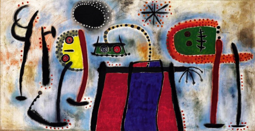
Joan Miro, “Painting”, 1953, Guggenheim NY, © 2018 Successió Miró Artists Rights Society (ARS), New York ADAGP, Paris

“First the Giants, then the pygmies.”   Elie Faure

PART 2  

Notes Synthetiques ca. 1888  by Paul Gauguin: “Art is an abstraction; derive this abstraction from nature whilst dreaming before it, and think more of the creation which will result than of nature”.

To Schuffeneker Aug. 1888: “Like music it acts on the soul through the intermediary of the senses. Harmonious colours respond to the harmonies of sounds”.

And in Diverse Choses 1898: “ The impressionists… heed only the eye and neglect the mysterious centres of thought”.

The sources of these ideas, which were to prove so fertile for the development of abstract painting, lay in the literature of early German Romanticism, Jean Paul, E T A Hoffmann, the synaesthesic imagery taken up by Baudelaire, Schopenhauer’s views on music as reinterpreted by Wagner, and the cult of Richard Wagner in France, which influenced even the  young Cézanne, and the symbolist poets gathered around Mallarme (though some of these pronouncements of Gauguin antecede his friendship with the latter).

Wagner’s music, especially in The Ring, could be described as the triumph of bad literature over music, or the subjugation of music to the literary imagination. The idea that colour, like music, can express the “mysterious centres of thought” appeals to the literary minded, so it is not surprising to find it echoed in Baudelaire and Mallarme. (See the poem Les Phares by Baudelaire). It is for the most part foreign to the French line in painting stemming from Delacroix and finding its culmination in Matisse. Although Matisse echoes the Mallarmean aesthetic “to paint not the thing but the emotion that it arouses in the artist”, in practice his art remains wedded to the full lustre of the sensory world. The transpositions of colour, red for blue, black for azure, are less emotionally driven as arising from his discoveries in Luxe, Calme et Volupte, 1904/05, that degrees of saturation of hue can form the tonal structure, rather than oppositions of dark and light, just as simultaneous contrasts of colour create light rather than oppositions or gradations of warm and cool.

George Seurat and the theorist Charles Henry voiced similar ideas about the expressive role of line and colour in conveying emotion, on the analogy with music, independently of their function in representation. Chromoluminisme as practiced by Seurat and Divisionism as practiced by Paul Signac, endeavour to combine this emotive theory with the science of colour, a hyper-realism, the two sitting uneasily together, and with mixed results, Pissarro being one of the first to express disillusionment with both the pictorial outcome and the intellectual distancing inherent in the approach.

(more…)