
View of the sixth-floor Whitney terrace: Tony Smith, ‘Die’, 1962, steel, Whitney Museum of American Art, New York; purchased with funds from the Louis and Bessie Adler Foundation, Inc., James Block, The Sondra and Charles Gilman Jr. Foundation, Inc., Penny and Mike Winton, and the Painting and Sculpture Committee; and Robert Morris, untitled (3 Ls), 1965, (refabricated 1970), stainless steel, Whitney Museum of American Art, New York; Gift of Howard and Jean Lipman). Photo by Ken Carpenter.
The New York art scene was marked by a number of remarkable events this spring, and some important, worrisome issues came to the fore.
First, the auctions. There were four major previews on one day, Sunday May 10, with Sotheby’s and Christies offering brunches to their preferred customers: Pol Roget champagne, smoked salmon, quail-egg canapés and so on. Armed guards in special rooms with limited access to the big-ticket items underlined their importance. Heightened sales promotion does pay off. The $179m for what I take to be a rather undistinguished Picasso, Les femmes d’Algier, Version O (1955), was the largest sum ever paid at auction for a work of art, and a good, life-size Giacometti, L’Homme au Doigt (1947), set a record for a sculpture sold at auction, going for $141m. Rothko’s No. 10 (1958) went for $82.9m, just short of the record for that artist. Warhol seems to have retained his high-end status. Christopher Wool’s Untitled (Riot) (1990) went for an improbable $29.9m, a record for that artist, and what I take to be an undistinguished work by Robert Ryman, Bridge (1980), set an equally surprising record for him too at $20.6m. The auctions were a striking reminder that we are in a new and disturbing age of income inequality. If the buyer of the Picasso wanted to limit his cost to just one per cent of his wealth, his net worth would be $17.9 billion, However, according to Bloomberg, one underbidder did offer 3.7% of his wealth, so perhaps $17.9 billion is too high an estimate. Whatever the case, the implications are enormous. French economist Thomas Piketty has suggested new taxes on financial transactions and on wealth, but none are in sight. In the mean time, the new super rich class has found an attractive alternative store of value for their assets, although one has to wonder how stable it is. Will Warhol turn out to be the Meisonnier of our time, suffering an equally precipitous decline in favour? More importantly, to what extent has branding come to determine market value for art, and how much has artistic quality lost out as a value in and of itself? How much have the priorities of the advertising giants infected not only collectors but also the museums? Enthusiasts for Damien Hirst, Jeff Koons and the like will not be concerned, but others will be.
On the first of May the Whitney Museum of American Art opened its spacious new building designed by Renzo Piano and located close to the Hudson River at the south end of High Line Park. It has many strong features, one being the numerous good-sized outdoor terraces with engaging views of the River and Park, as well as comfortable seating and extensive space for such iconic sculptures as Tony Smith’s Die (1962) and David Smith’s Cubi XX1 (1964).
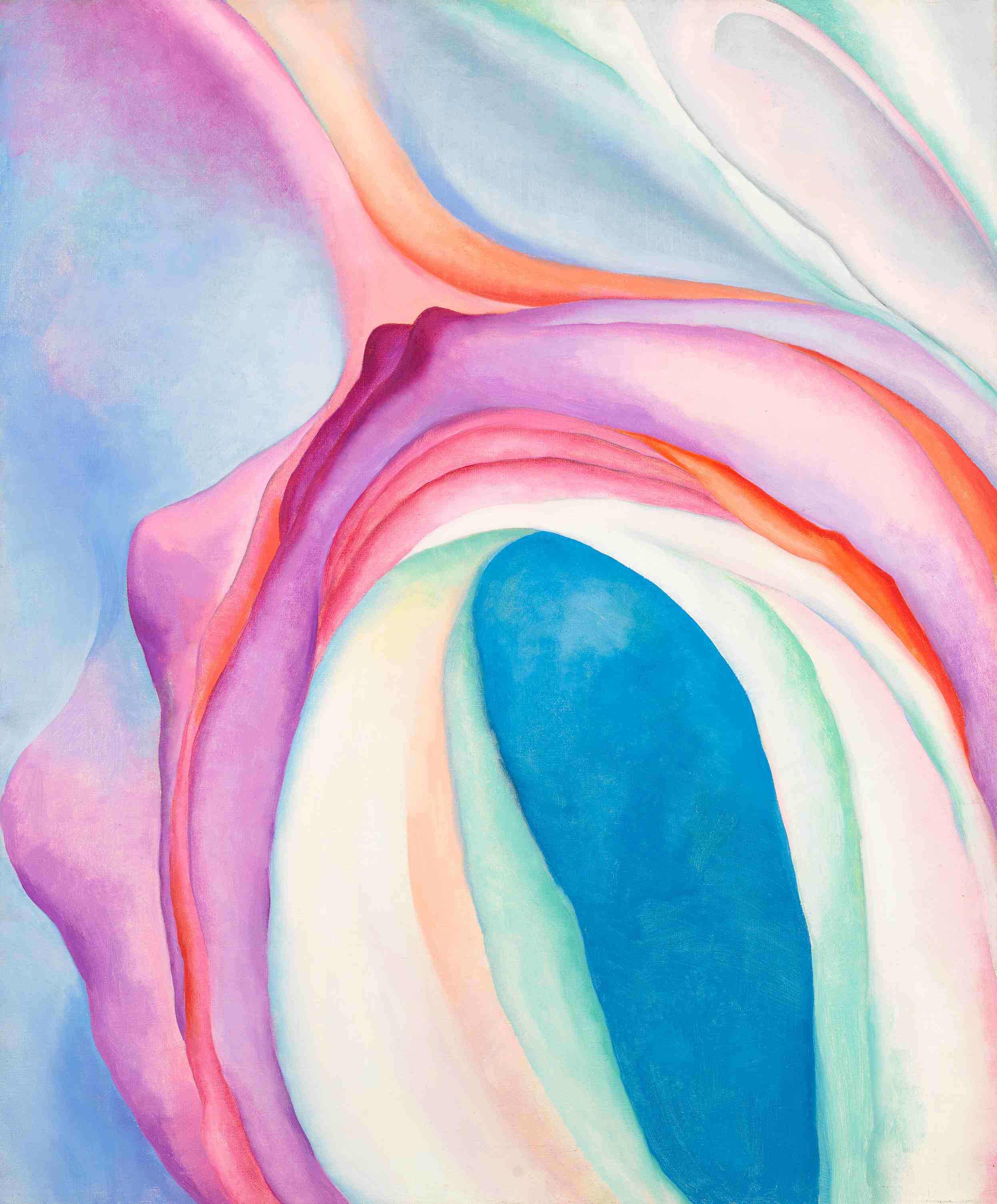
Georgia O’Keeffe, ‘Music, Pink and Blue, No. 2’, 1918, oil on canvas, 35 x 29 15/16in, Whitney Museum of American Art, New York, gift of Emily Fisher Landau, in honor of Tom Armstrong 91.90, ©2014 Georgia O’Keeffe Museum/Artists Rights Society (ARS), New York
The Whitney’s opening show, America Is Hard to See (May 1-Sept. 27), is a massive display of 650 works from their permanent collection. It is arranged in 23 thematic modules spread over five floors. The selection of early American abstractionists such as Georgia O’Keeffe is strong. Nonetheless, the exhibition unintentionally highlighted the weaknesses of both the collection and the curatorial staff. The museum still does not own a Hans Hofmann of note, and so he was absent from the show. (The Metropolitan Museum is doing better, with a whole room currently devoted to Hofmann.) The Whitney does own several good Frankenthalers, such as Arden (1961), but it was inexplicably not present, nor was their outstanding Morris Louis Veil painting, Tet (1958). Sam Francis, Kenneth Noland and Jules Olitski were likewise excluded. The neglect of these important abstract painters extended also to Milton Avery, whose superb Dunes and Sea II (1960) was likewise absent from the exhibition. Artists “engaging their political and social contexts” were apparently the top priority of the curators, although Minimalism and post-Minimalism do get their share of attention with a themed section called “Rational Irrationalism.” What was really hard to see was the full range of abstraction, which to my mind still stands as one of the greatest accomplishments of twentieth-century art.
Certainly one can question the judgment of the Whitney Museum’s curators, who have not always been held in the highest regard, but perhaps there are further factors lying behind these lacunae. One may be the impact of the technological shift towards digitalization. The more recent art at the Whitney is often strikingly less visual than the great Rothko, Four Darks in Red (1958), which dominated the Robert Wilson Galleries on floor seven. Information and paraphrasable ideas have become ubiquitous in contemporary art, bringing painting and sculpture closer than ever to the computer screen. Ours is apparently the age of information addicts. In the galleries, mere information, often naked of any genuine artistic transformation, abounds, such as the installations featuring bookshelves lined with the artist’s preferred titles that appeared in both the Whitney and the Guggenheim. We live in an atmosphere of “anything goes.” As Marshall McLuhan, and subsequently Andy Warhol, once observed, in our time “art is anything you can get away with.”
Nowadays curators have typically been trained in art departments that neglect – if not disdain – connoisseurship and syntactical analysis. This is not just a return to the literary concerns that preoccupied much of official art in the 1860s. I worry that the disinterested, undistracted contemplation required for the experience of art as such is discouraged by our technological climate in this information age. I am reminded of how Roman art was inferior to Greek art at its height, although Roman technology was more advanced. It produced great aqueducts, road beds that could last a millennium, and the military technology that made the Roman Empire possible, but nothing to match the artistic production of fifth-century B.C. Greece. One does not have to adopt the technological determinism that Marshall McLuhan has been accused of to be concerned that electronic technology favours uncontemplative information gathering at the expense of art.
Several commercial-gallery exhibitions did impress me, however, and there would have been more if I had had more time. Epic Abstraction: Friedel Dzubas in the 1970s at the Loretta Howard Gallery was a useful reminder of how good a supposedly second-rank colour-field painter can be. Dzubas was born in Berlin and studied with Paul Klee in Dusseldorf. As a mischlinge (person with mixed Jewish blood), he ran into difficulties with the Nazis and fled to the United States in 1939. Dzubas is remembered for his position on the issue raised in ARTnews in 1959 about late Abstract Expressionism: “Is There a New Academy?” Dzubas agreed there was, complaining about a “seemingly endless repetition of safe sameness” on Tenth St. Nonetheless, his Abstract Expressionist paintings were criticized by Clement Greenberg as lacking the “indeterminate spaciousness” that the critic was hoping for, and – although he was roughly the same age as Jackson Pollock – Dzubas did not move beyond them to develop his signature style until the late 1960s when he began working with Magna acrylic, and the early 1970s.
Friedel Dzubas,’ Nebel’, magna on canvas, 1971, 78.5 x 195″
The two painters standing next to it are Ben Woolfitt and Sandy Van Iderstine. Photo Ken Carpenter.
Dzubas could work in any scale from small to the most ambitiously extensive. Nebel (1971), with its grand expanse of delicately stained, pearly grays and browns, is a magnificent 78.5 x 195 inches. There was also a study for Crossing, a fifty-seven-foot-wide painting acquired years ago by the Shawmut Bank in Boston. Kenworth Moffett and Karen Wilkin were both correct to observe in Dzubas “overtones of the grand manner.”
As appealing as they may appear, his paintings are by no means mere pleasant arrangements of sumptuous colour. Dzubas was at pains to fuel his inspiration. He once wrapped himself in a bedsheet and lay in a coffin before painting. The resultant work, In Case I Die (1949, not in the exhibition), could be interpreted as Dzubas’ personal memento mori. In the later works Dzubas breaks up the shapes – and the background too – by feathering out the dominant colour areas in a manner that, as Patricia Lewy Gidwitz observes, Dzubas referred to as “fading off” or “fading out.” For me they sometimes have an unrecognized kinship with In Case I Die and stand as deeply felt works.
Those signature Cy Twombly “blackboard” paintings that fuse Abstract Expressionist handling and writing never seemed quite strong enough to me. Although they have some of Pollock’s alloverness, I find their line to be too predictable, and their emotional valence a bit limited compared to the conflation of crudity in application and the “almost Rococo fragility and grace” that William Rubin found in Jackson Pollock. But Twombly’s work at Gagosian on Madison (Apr. 23-July 2) was another matter. It highlighted Twombly’s impressive range of materials, style and emotional valence.
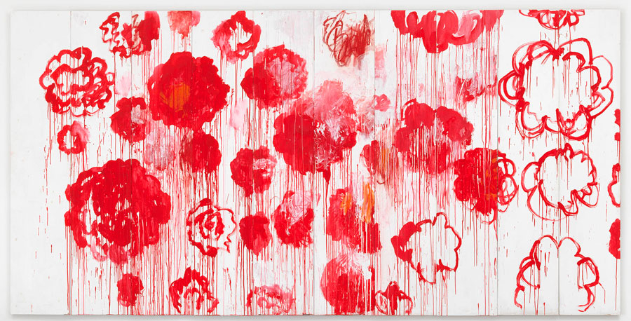
Cy Twombly, ‘Blooming’, 2001-2008, acrylic, wax crayon on ten wooden panels
98 3/8 x 196 7/8 inches, © Cy Twombly Foundation. Private Collection. Photography by Mike Bruce. Courtesy Gagosian Gallery.
Perhaps Twombly is at his best when the work is just on the edge of abstraction. The bronze sculpture Untitled (2004-2009) consists of a broom inside a funnel that sits on a cylinder, and yet it reads as a non-objective work. Blooming (2001-2008), one of a series of ambitiously scaled works, is ostensibly about peonies, which have a special place in Japanese culture. But where are the stems, or even the petals? What distinguishes these objects from clumps of thread, idle scribbles or even — in some instances — spilled paint? Their playful freedom from any precision of representation is central to the strength of these grand paintings.

Cy Twombly, untitled, 2004-2009, bronze, 49 1/8 x 12 1/8 x 11 5/8 inches, © Cy Twombly Foundation. Collection Cy Twombly Foundation. Photography by Mike Bruce. Courtesy Gagosian Gallery.
It is difficult today to imagine a time, half a century ago, when Alexander Calder was not yet solidly in the pantheon and an argument had to be made in Artforum for his importance. His show at Dominique Levy (Apr. 22-June 13), Multum in Parvo (much in little), brought more than forty miniature sculptures — as small as one inch high — to a pristine space designed by the architect Santiago Calatrava and his son Gabriel. Apparently the miniature scale of the work owes in part to a suggestion from Marcel Duchamp that Calder produce sculptures small enough to be mailed to Paris for a show there.
For The New York Times Multum in Parvo was a reminder of Calder’s greatness. It was also a striking reminder of the value in doing genuinely sculptural sculpture. There could be some debate over the essence of sculpture. Is it the tension between real and perceived mass, as nineteenth-century British critic Walter Pater argued? The relation between occupied and negative space? The tension between stability and movement? Calder has it all. Regrettably, so much of contemporary sculpture, so-called, lacks any of these attributes. I think back to those books on a shelf (by Agnieszka Kurant).

Alexander Calder, untitled, c. 1952, sheet metal, brass, wire, and paint, 13 3/8 x 11 x 6 1/4 inches; © 2015 Calder Foundation, New York/Artists Rights Society (ARS), New York; Photo: Tom Powel Imaging, Inc. Courtesy: Dominique Lévy Gallery, New York and London
Calder’s Untitled (ca. 1952) combines both his stabile and mobile types of sculpture and is a signature instance of the tensions between balance and imbalance, stability and flux, that are uniquely Calder’s. Perhaps Calder’s affection for the circus and other of his subjects will prevent some observers from seeing him as a full-fledged modernist, but his respect for the medium shines through all the work in this exhibition.
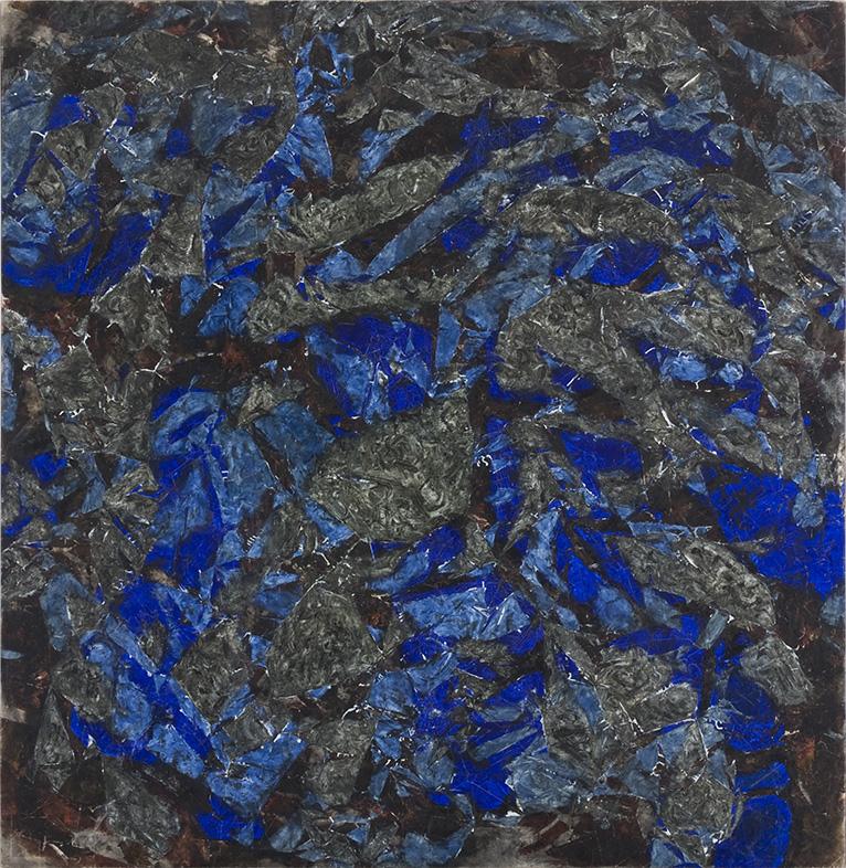
Simon Hantaï, ‘Meun’, 1968, oil on canvas, 100 3/8 x 88 5/8 inches, © Archives Simon Hantaï, photo: Laurent Lecat
Simon Hantaï’s show, Pliage: The First Decade at the Mnuchin Gallery (Apr. 28-June 26) brought some needed attention to the Hungarian-born French artist who remains better known in Europe than in the United States. I have long admired his Peinture (Ecriture rose) (1958-59) at the Pompidou, but regrettably I did not see his posthumous retrospective there in 2013. Hantaï’s pliage (folding) method dates back to 1960, when he began to place an unstretched canvas on the floor, and then fold and crumple it before applying colour. When the canvas was unfolded, the colour areas were broken up and large blank areas remained. These paintings of the 1960s are usually considered his first mature work. At times I find Hantaï’s all-overness verges on the excessive, perhaps even claustrophobic, as in Mariale m.n. 2 (1960-61). But the advantage of his method is substantial, providing a vocabulary with a rich array of forms, many of which came as a surprise to him as the canvases were unfolded. Hantaï embraced chance to a degree that American painters like Pollock were not willing to do. Paintings like Peinture (ca. 1964) and Meun (1968) owe their strikingly varied vocabulary of shapes to his innovative method.
Simon Hantaï, ‘Peinture’, c. 1964, oil on canvas, 88 x 85 inches, private collection, © Archives Simon Hantaï
The Wounded Canvas at the Helly Nahamad Gallery (May 4-June 1) provided a pertinent reminder that the greatest art is rooted in human experience at a deep level of feeling. Matériel painting, with its wretched, damaged, and discarded materials, never caught on in the United States, but then Americans never experienced first-hand the devastation undergone by Europeans during World War Two, nor the poverty they endured in the aftermath, and so, not surprisingly, it was a major force primarily in post-war European art.
There were some outstanding works, especially Burri’s Nero plastica (1965), Fontana’s Concetto spaziale, La Fine de Dio (1963) and Tapies’ Cross on Brown (1960).
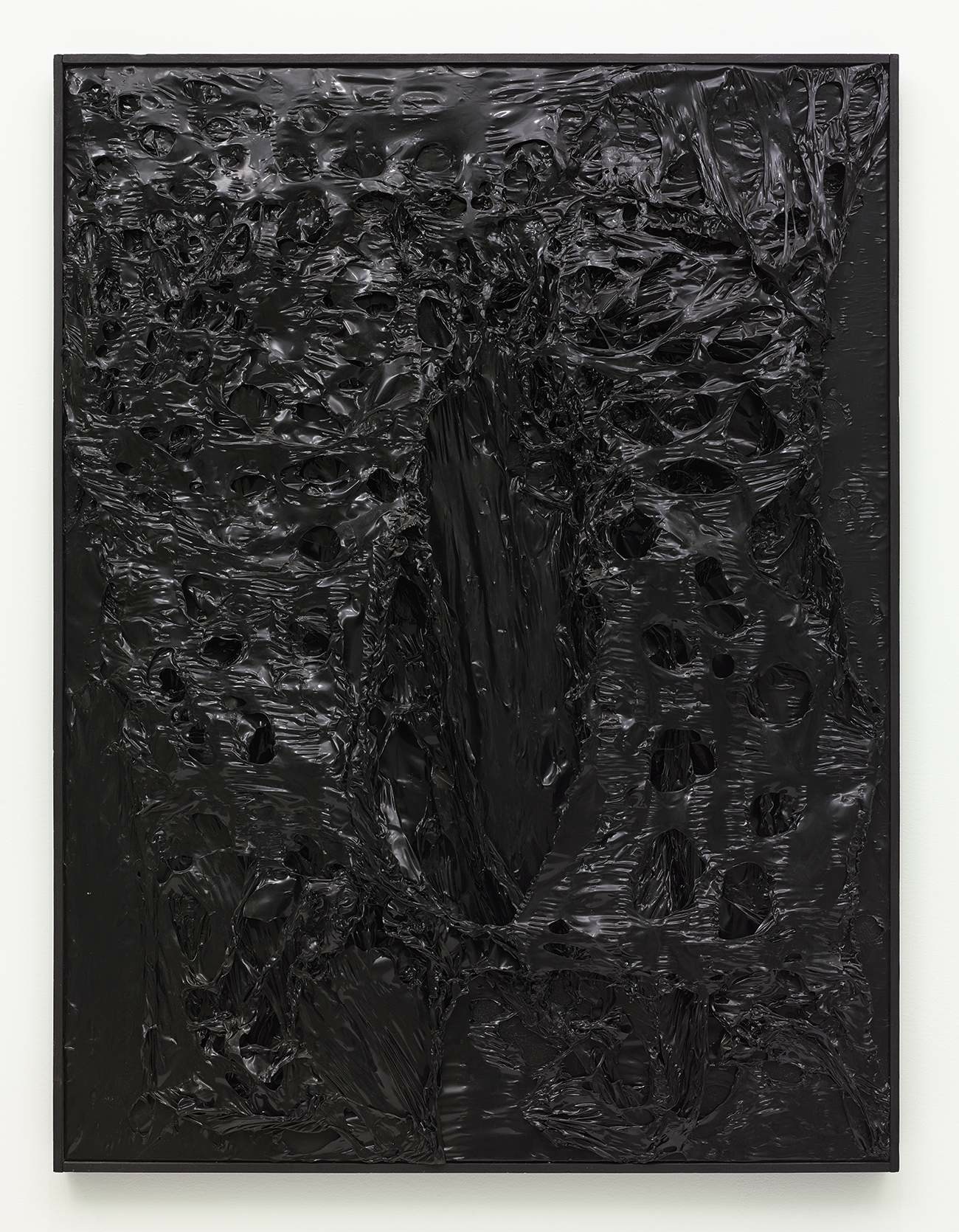
Alberto Burri, ‘Nero Plastica’, 1965, burned plastic on canvas 41 x 31 inches
I think of Fontana as one of the most fecund European artists of the post-war period. He is said to have anticipated shaped canvases, minimalism, conceptual art (“it’s the idea that matters”), installation art, earth art, and maybe even arte povera. And there’s his literalness: the picture doesn’t represent space but rather becomes space. Concetto spaziale, La Fine de Dio is a signature example of the Buchi (punctured paintings): perhaps not quite an exact oval and with Fontana’s preferred admixture of violence and the pristine.

Lucio Fontana, ‘Concetto Spaziale, La fine di Dio’, 1963, oil on canvas 69.3 x 48 in. 176 x 121.9 cm.
Burri has used non-fine-art materials from the start of his career when he was a doctor in the Italian army, imprisoned in Texas in 1944. Not being allowed any paints, he used sackloth, bandaging, toothpaste even.
The distinguished curator and museum director, James Johnson Sweeney is one of many commentators who have found meaning in Burri’s abstract work done with sackcloth: “Burri transmutes rubbish into a metaphor for human, bleeding flesh. He vitalizes the dead materials in which he works, makes them live and bleed; then sews up the wounds evocatively and as sensuously as he made them.” He compared these works to Rembrandt’s flayed beef or Géricault’s corpses. That may be too literal an interpretation, and Burri generally refused to comment on content, but a fully-lived life does inform an impressive work like Nero plastica, which is surely not the case with much of the recent art at the Whitney.
The travails that fueled Tàpies’ inspiration are well known: typhus at the age of ten, and then brucellosis, tuberculosis, and heart trouble (tachycardia) leading to almost two years bedridden in “almost total forced immobility” at sanitaria. And the brutality of the Spanish civil war and Franco’s despotism is never far below the surface.
Antoni Tàpies, ‘Cross on Brown’, 1960, mixed media on canvas, 76 1/2 x 67 inches.
I will not dare to attempt Sweeney’s effort at decoding meaning for Tapies’ Cross on Brown. Not that I agree with Pollock’s refusal to “attempt an explanation of the inexplicable.” But Erwin Panofsky’s iconolgy is so demanding and so speculative an enterprise that it should be reserved for much longer, more focused articles. I simply report that I was profoundly moved by Cross on Brown. It remains on view until Oct. 8 in the exhibition Highlights from the Collection: Summer 2015.
Jackson Pollock was clearly one of the chosen artistic parents of Twombly, with his restricted palette, his drips, his all-overness. And for Hantaï, with his urge towards a highly physical, seemingly chancey way of working, and his occasional all-overness too. I left New York more convinced than ever that Pollock was the seminal figure of his age.
