
Alberto Burri, “Rosso plastica (Red plastic)”, 1962, plastic (PVC), acrylic and burns on black cloth, 65 x 100 cm, private collection, © Fondazione PalazzoAlbizzini Collezione Burri, Città di Castello / VG Bild-Kunst, Bonn 2016 / SIAE, Rome. Photo: © Kunstsammlung NRW
Alberto Burri: The Trauma of Painting was at the Solomon R. Guggenheim Museum in New York from Oct. 9, 2015, to Jan. 6, 2016, and is at the Kunstsammlung Nordrhein-Westfalen in Düsseldorf from March 5 to July 3, 2016.
Jackson Pollock: A Collection Survey, 1935-1954 is on at the Museum of Modern Art through May 1, 2016.
Frank Stella, A Retrospective was at the Whitney Museum of American Art in New York from Oct. 30, 2015, to March 7, 2016. It will be at the Modern Art Museum of Fort Worth in Texas from Apr. 17 to Sept. 4 and the De Young Museum in San Francisco from Nov. 5 to Feb. 26, 201
NEW YORK: BURRI, POLLOCK, STELLA.
Alberto Burri was one of the giants of European matériel painting. The enormous exhibition, Alberti Burri, The Trauma of Painting, which at first occupied almost all of the Solomon R. Guggenheim Museum and is now at the Kunstsammlung Nordrhein-Westfalen in Düsseldorf, presented numerous works from not quite a dozen series in the artist’s richly varied career. The exhibition was accompanied by a thoroughly researched catalogue of 279 pages. It argues persuasively that Burri’s artistic vocabulary emerged directly from his life experience.
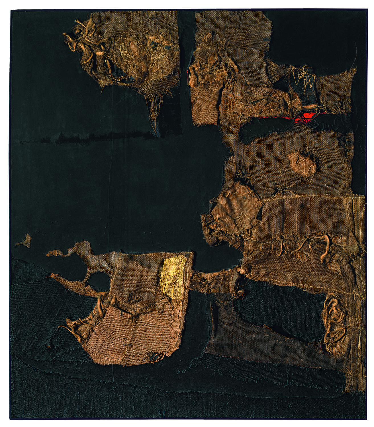
Take for instance the “laborious sewing… stitching” and folding of Burri’s Sacchi (sackcloth paintings). Burri lived in Città di Castello, a mere half-hour’s bike ride away from Piero della Francesca’s Madonna del Parto in Monterchi, with, as Burri’s friend Sandra Blow recalls, its “mobile folds” of drapery “scrunched and tucked by laces.” The artist’s extensive military experience in Ethiopia, Yugoslavia and Tunisia, much of it as a doctor in the medical corps, required him not only to suture battle wounds but also to sew repairs in his own uniform. The exhibition curator Emily Braun writes, “Burri undoubtedly had images of combat wounds seared into his mind, not to mention the muscle memory of suturing actions.”
Alberto Burri, “Sacco e oro (Sack and Gold)”, 1953, Burlap, thread, acrylic, gold leaf, and PVA on black fabric, 102.9 x 89.4 cm. Private collection, courtesy Galleria dello Scudo, Verona. © Fondazione Palazzo Albizzini, Collezione Burri, Città di Castello/2015. Artist Rights Society (ARS), New York/SIAE, Rome
After being captured by the British in 1943, the artist was incarcerated along with around 5,000 other prisoners of war at Hereford, Texas, in a bleak and spare facility where the latrines might be just a few buckets separated by curtains of burlap, which was also used for tents, supply sacks and sandbags. It was one of the few materials on which Burri could paint so as to have a “way of not having to think about the war and everything around me.” For Braun, Burri’s continued use of sackcloth after the war is not only a reprise of his war-time experience but also exemplary of “the reality of contemporary [post-war] Italy as a mendicant state” and is reminiscent of “the abject poverty of St. Francis of Assisi.”
The Cretti (craquelure or crazing paintings) were, Burri argued, “specifically inspired by visits to the arid landscape of Death Valley in California.” The lifeless aridity of that place must have been compelling, as was the sight of the town of Gibellina in Sicily after it was destroyed by an earthquake in 1968, killing more than 500 people and leaving 90,000 homeless. Burri’s tribute to Gibellina was to construct over some 16 acres his Grande cretto (Large Cretto, 1985-89), which now covers the ruined city. That work is the subject of a compelling movie shown at the retrospective.

Alberto Burri, “ Grande Cretto Nero (Large Black Cretto)”, 1977, Acrylic and PVA on Celotex, 149.5 x 249.5 cm Centre Pompidou, Paris, Musée national d’art moderne/Centre de création industrielle, Gift of the artist, 1978 © Fondazione Palazzo Albizzini Collezione Burri, Città di Castello/2015 Artists Rights Society (ARS), New York/SIAE, Rome Photo: © CNAC/MNAM/Dist. RMN-Grand Palais/Art Resource, New York
Such art-historical questions have their interest and might lay the foundation for critical concerns, but issues of aesthetic essence and quality are approached only sporadically in this text. One would want to know more about why these paintings move us (if they do), that is, how they function aesthetically, and what their level of artistic quality might be.
Burri consistently declined to assist historians and critics who hoped to unearth the content of his art, preferring to emphasize instead “a whole chain of pulls and tension,” “architectonic structure,” “unbalanced equilibrium,” and other such purely formal concerns.
Braun’s analysis prioritizes a presumed “redemptive” quality of the work, which she locates in “degradation and attempted restoration,” in “[c]onflicting perceptions… of organic disintegration and pictorial integrity,” and impoverished materials [that] create something whole and rich out of nothing.“ In this she takes off after the celebrated argument of James Johnson Sweeney:
“Burri transmutes rubbish into a metaphor for human, bleeding flesh. He vitalizes the dead materials in which he works, makes them live and bleed; then sews up the wounds evocatively and as sensuously as he made them.”
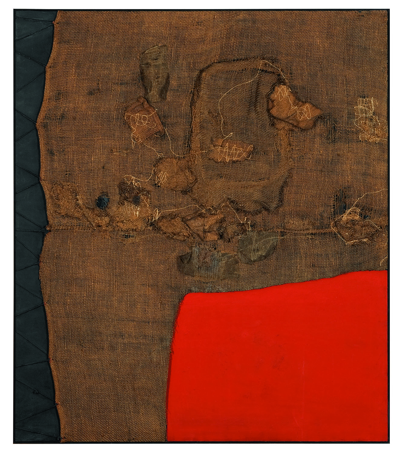
Alberto Burri, “Sacco e rosso (Sack and Red)”, ca. 1959, Burlap, thread, acrylic, and PVA on black fabric, 150 x 130 cm, Private collection, London. © Fondazione Palazzo Albizzini Collezione Burri, Città di Castello/2015. Artist Rights Society (ARS), New York/SIAE, Rome. Photo: Lucy Dawkins, London
Thus, to Marcia Brennan, Burri’s artistic process was “one of quasi-miraculous healing.” But Braun goes beyond this idea of reparation. While she might plausibly have invoked the Melanie Klein/Hanna Segal concept of reparation[i] and stopped there, she instead unconvincingly expands the argument to make Burri’s enterprise into an attempt at “representing consciousness to and within the beholder,” whatever such “representing” might mean. And at times she is even less persuasive, as when she writes that “Burri made medium, not form, the content of his pictures,” a statement betraying an unprofessional understanding of the term “content.”[ii] And one wonders what concept of art could possibly underlie her assertions that “Burri “illuminates our perception of white in myriad ways, and some Cellotex paintings “investigate the properties of black.” Why and how would such an investigation be of meaningful significance?
Braun would have done better to take into account Burri’s own words. He wanted a “way of not having to think about the war and everything around me.” The relevant concept is surely that of “psychical distance,” as expounded by not only Edward Bullough in his widely cited yet controversial article,[iii] but also Georg Hegel, Walter Pater, and Benedetto Croce, among others.
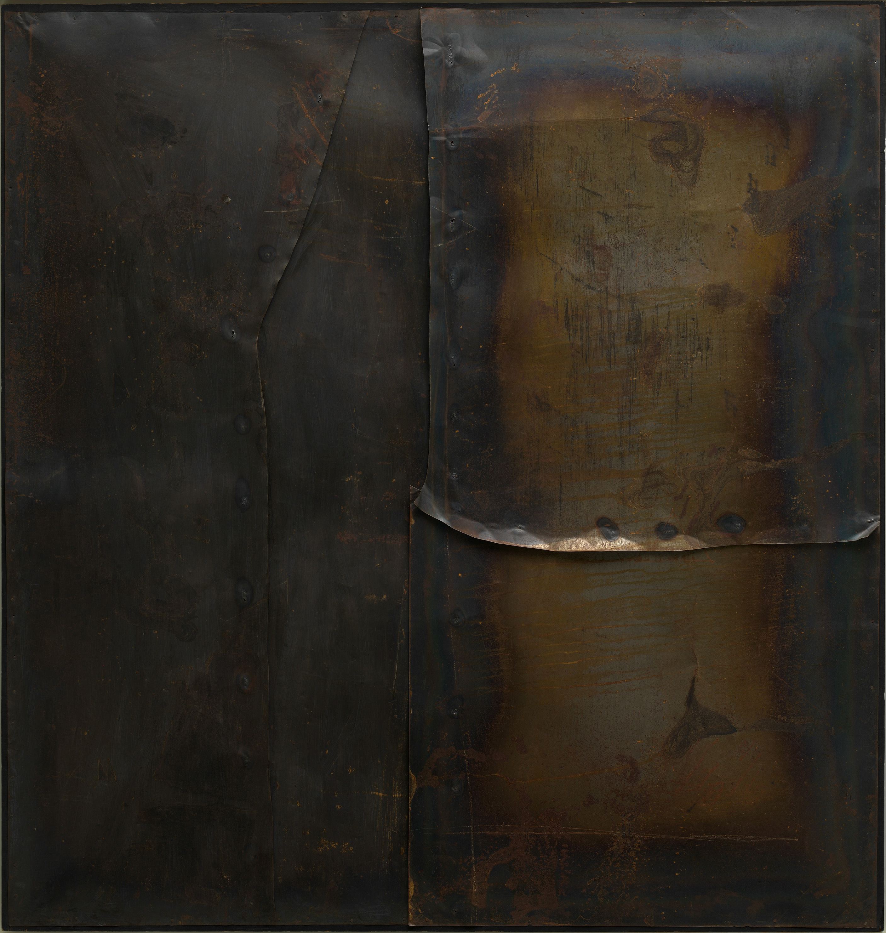
Alberto Burri, “Grande ferro M 4 (Large iron M 4)”, 1959, welded iron plate on wood frame, 199.8 x 189.9 cm, Solomon R. Guggenheim Museum, New York 60.1572, © Fondazione Palazzo Albizzini Collezione Burri, Città di Castello / VG Bild-Kunst, Bonn 2016 / SIAE, Rome. Photo: Photo: Kristopher McKay © Solomon R. Guggenheim Foundation, New York. © Kunstsammlung NRW
So where is the greatest quality in Burri’s oeuvre? Not, I would say, in the Catrami (tar paintings), which obviously came before Burri’s maturity. As interesting as the concept of protruding surfaces may be, the Gobbi (hunchback paintings) strike me as not-yet-fully-realized exemplars of Burri’s notion that “all of my paintings are based on the idea of invasive space.” The Legni (wood veneer works) are too often vitiated by excessive regularity in the rhyming shapes of their laminate elements. With the exception of Grande ferro M 3 (Large Iron M3, 1959), I find the Ferri to be compositionally weak, as if the laborious task of managing weighty steel plates impinged on decisions about layout, and indeed, Emily Braun and her co-author Carol Stringari acknowledge that “reduced compositions characterize the bulk of the series.” The Cretti likewise are too often compositionally trite. The supposed link of their occasional “lunette shape” to “Renaissance altarpieces and chapel walls” does not convince me of their aesthetic force. And the late Cellotex paintings (fiberboard panel works) mostly seem embarrassingly weak, with their surface variation being too minimal to be effective. Was Burri’s inspiration tailing off at the end of his career? I believe it was.

Alberto Burri, “Grande bianco Cretto (Large White Cretto)”, 1974 Acrylic znd PVA on Celotex, 126 x 201 cm, private collection, © Fondazione Palazzo Albizzini Collezione Burri, Città di Castello / VG Bild-Kunst, Bonn 2016, Photo: © Kunstsammlung NRW
The Muffe (molds, that is, works with a ground-pumice surface) initiated what I take to be Burri’s greatest strength: a rich array of varied surface patterns that call to mind Matisse’s so-called pattern paintings, such as The Dessert: Harmony in Red (1908). I particularly admire Muffa (1952). Of the Bianchi (white paintings), the one I admire the most, Bianco (ca. 1949), is in all but name a Muffa.
The Sacchi (sackcloth paintings) were the works that first established Burri’s reputation. To Braun, they can be richly referential, “unmistakably” suggesting “genitalia, pubic hair, and dried bodily fluids.” A “viscous texture… mimics a scab in formation.” Burri’s “stitching… replicates the techniques of skin grafting.” To Braun some of the holes in the Sacchi are “akin to Christian reliquaries.” Perhaps. Perhaps not. In any case, none of this explains why and when the Sacchi are at their best as visual objects of contemplation.

Alberto Burri, “Combustione legno”, 1957, wood veneer, paper, incineration, acrylic and Vinavil on canvas, 149.5 x 99 cm, Private Collection, Courtesy Galleria dello Scudo, Verona, © Fondazione Palazzo Albizzini Collezione Burri, Città di Castello / VG Bild-Kunst, Bonn 2016. Photo: © Kunstsammlung NRW
Burri’s colour vocabulary is distinctively limited, almost entirely confined to red, white, black and brown. Often he uses not much more than one of the four, demonstrating a considerable gift for monochrome. I find the best Sacchi to be those that play off the unity of a narrow range of hues – within one or at most two colour scales – against a near dizzying array of different though shallow surface depths and a plethora of different textural patterns. Composition (1953) and Nero con punti rossi (Black with Red Stitches, 1956), for example, are much superior to the multi-coloured Sacco e bianco (Sackcloth and White, 1953).

Alberto Burri, “Bianco (White)”, 1952, oil, paint, metal paint, fabric, PVA, tar, paper, thread and gold leaf on black cloth, 56.5 x 84.8 cm The Art Institute of Chicago, Gift of Dr. And Mrs. Harry O. Maryan 1955 © Fondazione Palazzo, Albizzini Collezione Burri, Città di Castello / VG Bild-Kunst, Bonn 2016. Photo: © Kunstsammlung NRW
Among the innovative Combustioni plastiche (burned plastic works), I was moved only by the monochromatic black paintings. The rather haphazard Rosso plastica-R (Red Plastic-R, 1962) cannot stand up to the stuffed and fulsome Nero plastica (Black Plastic) (1965).
In the end, I was disappointed to find that only a small number of works in the exhibition moved me deeply. The success ratio was not what I had anticipated. Perhaps better combustioni plastiche have been exhibited in commercial galleries recently. Perhaps the exhibition would have benefited from some editing. Burri is an important artist, but I have no doubt that he is not on the level of Jackson Pollock.

Alberto Burri, “Grande sacco BS (Large burlap BS)”, 1956, sacking, fabric, thread, acrylic and PVA on canvas, 150 x 250 cm, Kunstsammlung Nordrhein-Westfalen, Dusseldorf, © Fondazione Palazzo Albizzini Collezione Burri, Città di Castello / VG bild-Kunst, Bonn 2016 / SIAE, Rome. Photo: Walter Klein, Dusseldorf, © Kunstsammlung NRW
……………………………………………

Jackson Pollock, “The Flame”, c. 1934-38 Oil on canvas mounted on fiberboard 20 1/2 x 30″ (51.1 x 76.2 cm) Enid A. Haupt Fund, MOMA
Jackson Pollock, who has already been given two impressive retrospectives at the Museum of Modern Art (1967 and 1998-99), is represented by 56 works from the museum’s permanent collection in Jackson Pollock: A Collection Survey, 1935-1954. There is no catalogue for the exhibition, but it does bring attention to some lesser known aspects of Pollock’s oeuvre, especially the artist’s print making. It’s illuminating to see how Pollock moved from state to state in making his etchings, with several variants presented side by side. Pollock’s interest in innovative techniques – well known in his paintings – is revealed to extend also to his works on paper. To make Untitled (ca. 1951), we are informed, Pollock “stacked several sheets of absorbent Japanese paper, applied ink to the top sheet, and then allowed it to seep through, forming the same but less distinct composition on each successive sheet” and thus invented a kind of staining.

Jackson Pollock, “untitled”, c. 1951. Ink and colored ink on Japanese paper, 24 3/8″ x 34 3/8″ (62.1 x 87.3 cm). The Museum of Modern Art, New York. The Joan and Lester Avnet Collection, 1978.  © 2016. Pollock-Krasner Foundation / Artists Rights Society (ARS), New York
Pollock’s intense involvement with art history is well known. Clement Greenberg once remarked to one of my colleagues that of the very many artists he had met, Pollock and Morris Louis were the two most knowledgeable about art. William Rubin persuasively traced out many of Pollock’s art-historical interests in a series of 1967 essays in Artforum, and the exhibition Jackson Pollock: Early Sketchbooks and Drawings at the Metropolitan Museum in 1997-1998 documented Pollock’s intense involvement with Renaissance art and the Mexican muralists, in particular.
The Flame (ca. 1934-1938) abounds with suggestions of Jose Clemente Orozco, the great Mexican muralist whose Prometheus (1930) at Pomona College was cited by a youthful Pollock as “the greatest contemporary painting in North America.” The central image is the blazing flames into which Prometheus thrust his hands, and the skeleton at the bottom is reminiscent of Orozco’s mural, Gods of the Western World at Dartmouth College, which Pollock had seen in 1936. The Flame is not yet a mature work. Nonetheless, the vigorous, rhythmical brushstrokes carrying the eye in various directions trump any borrowings and make clear how well influenced Pollock was, able to assimilate his sources into a thoroughly personal transmutation of their iconography and style.
![Jackson Pollock, “Landscape with Steer”, c. 1936-37 Lithograph with airbrushed lacquer additions Publisher: unpublished Printer: unknown composition: 13 13/16 x 18 9/16" (35.1 x 47.1 cm); sheet: 16 1/8 x 23 3/8" (41 x 59.3 cm) Edition: approx. 2-3 (one with airbrushed enamel additions [this ex.]). Gift of Lee Krasner Pollock](https://abcrit.org/wp-content/uploads/2016/04/pollock-1936-37ca-landscapewithsteer-r.jpg)
Jackson Pollock, “Landscape with Steer”, c. 1936-37. Lithograph with airbrushed lacquer additions. Publisher: unpublished. Printer: unknown. composition: 13 13/16 x 18 9/16″ (35.1 x 47.1 cm); sheet: 16 1/8 x 23 3/8″ (41 x 59.3 cm). Edition: approx. 2-3 (one with airbrushed enamel additions [this ex.]). Gift of Lee Krasner Pollock, MOMA.
The Mexicans are only one of the many modern influences that Pollock assimilated. There’s shimmering late Monet, Picasso’s fragmentation of the image, Matisse’s colour, the angst of German Expressionism, Kandinsky’s freedom of handling, Surrealist automatism, the materiality of American Indian sand painting, and a great deal more. Clearly, Pollock is exemplary of Michael Fried’s concept of the “all-together” painter, an omnivorous artist who assimilates a great range of art history, such as Fried argued Manet had done. No wonder that Alfonso Ossorio said that Pollock “had pulled together… all the traditions of the past.”
The exhibition helps to clarify the path of Pollock’s evolution towards his poured-and-spattered all-over masterpieces of 1947-1950. His engravings, with their inherent heightened linearity, seem to have played a significant role. Untitled (ca. 1944-45), Pollock’s most finished engraving, is a convincing example. It already has the all-overness and the heightened, inter-weaving linearity of works like One: Number 31, 1950.
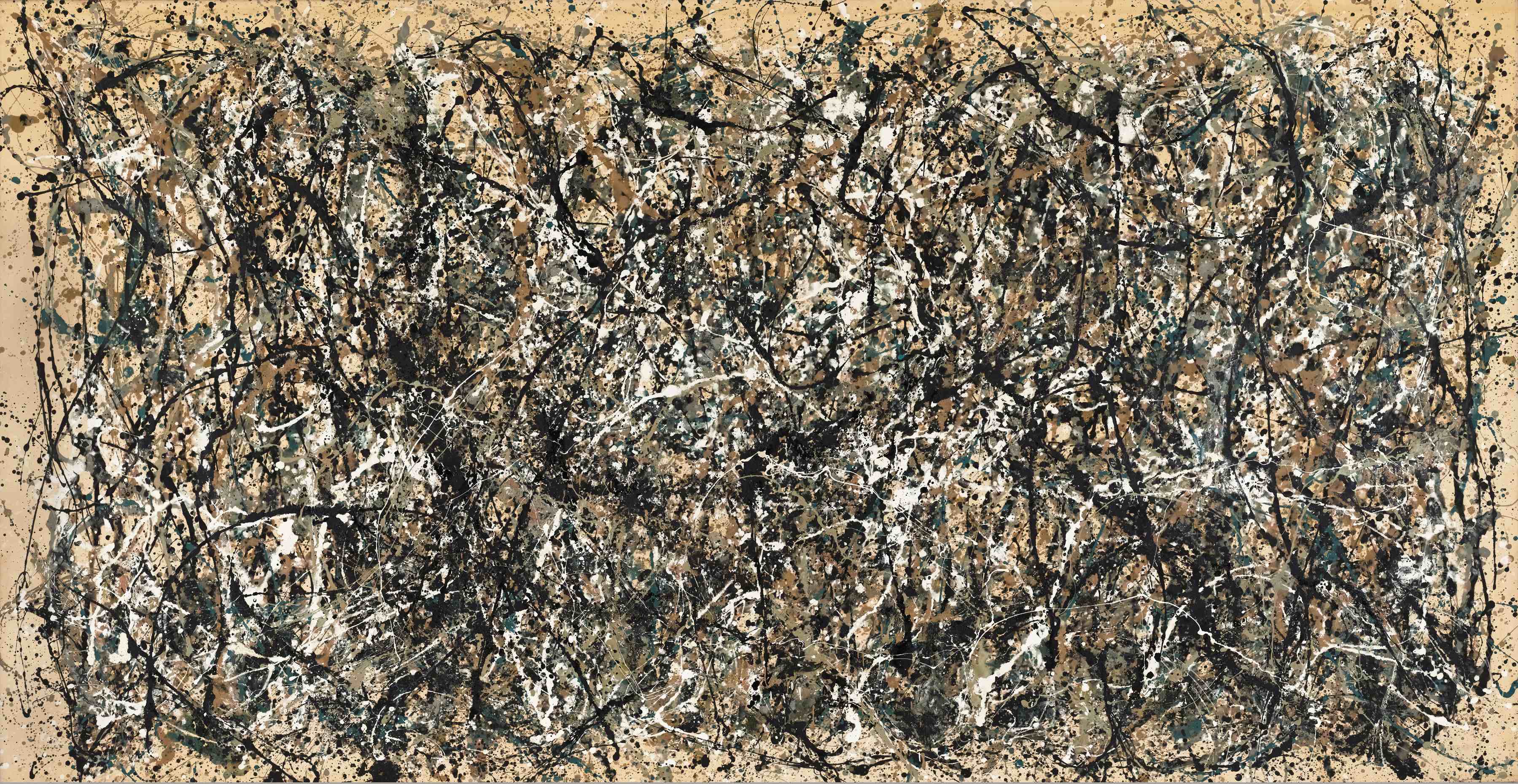
Jackson Pollock, “One: Number 31, 1950”, Oil and enamel paint on canvas, 8′ 10″ x 17′ 5 5/8″ (269.5 x 530.8 cm), Sidney and Harriet Janis Collection Fund (by exchange), MOMA
It has been said that nineteenth-century artists would sometimes aim to “establish the oppositions” and work from the resultant tension. Elizabeth Langhorne found in Pollock a desire for a “union of opposites.” Her idea is consistent with Pollock’s comment that the fusion of two musketballs that had collided in mid-air – a Unionist and a Confederate one that he had seen in the Gettysburg National Military Park – was art. Pollock’s work is replete with tension: troubling ambiguity in the distinction between male and female (especially in the painting of that name); abstraction versus the image, which he often said he “veiled;” innovation versus immersion in tradition; alloverness in tension with rhythm or inflection; crudity of application versus decorative elegance, resulting in what William Rubin described as not just tranquility but an “almost Rococo fragility and grace;” tenderness versus aggression, and in Alfonso Ossorio’s words, “human action” versus “inertia.” As B.H Friedman argued in his biography of Pollock, we can see “the images of father and mother, male and female, the whole dichotomy of active and passive principles being resolved in art.”

Jackson Pollock, Untitled (4), state II of III c.1944-45, Engraving and drypoint plate: 14 15/16 x 17 5/8″ (38 x 44.8 cm); sheet: 18 3/4 x 24 13/16″ (47.7 x 63 cm) Edition: unique trial proof of state II before the 1967 posthumous edition of 50. Publisher: unpublished. Printer: the artist at Atelier 17, New York, Workshop Printer: Stanley William Hayter, British, 1901-1988 Gift of Lee Krasner Pollock, MOMA
This exhibition did not address Pollock’s sources of inspiration, but they can be illuminating and should be considered more often. Stanley William Hayter has said that Pollock “could talk intelligently about the source of inspiration and the limits of working from the unconscious,” but art historians are frequently loath to consider how “human needs and motives” (Pollock’s words) infuse art. Tate Modern posts an illuminating audio commentary, not by an art historian but by a doctor, beside Pollock’s Summertime: Number 9A (1948). It suggests that Pollock’s choice of his signature poured-and-spattered method was not simply his critical assessment of an opening left unexploited by Hans Hofmann, nor the influence of Siqueiros’ dripping as a preparatory technique, nor his response to Stanley William Hayter’s method of dripping paint at Atelier 17. Rather, it was an unconscious attempt to positivize a painful experience – the accidental severing in his youth (age eleven) of one third of his right index finger in a woodchopping accident, with its frightening and painful spurt of blood. He needed to turn uncontrollably flowing fluids into something pleasurable and controlled in art and so transcend the embarrassing mutilation he had suffered. Perhaps this is the deepest reason why Pollock asserted, “I don’t use the accident ’cause I deny the accident.”
As is well known by now, after three biographical studies of the artist, Pollock’s life was full of unresolved tensions and ambiguities: doubts about his sexual orientation, uncertain relations with women in general and his mother in particular, a troubled relationship with a frequently absent father. There were more than enough reasons for Pollock to want to set up and resolve tensions in his art, not just as transference, a removal from his life as he lived it, but also as reparatory respite from the tribulations of that tumultuous life.
Regrettably, we will never know where he could have taken the staining techniques he invented, nor see the junk-iron sculpture he hoped to make. I remain convinced that in 1950 Jackson Pollock was as great as any painter in the world. Perhaps the greatest.
……………………………………………

Frank Stella, “Redjang”, 2009. Fiberglass with stainless steel tubing. 155 x 212 x 64 in. (393.7 x 538.5 x 162.6 cm). Private collection. (c) 2015 Frank Stella/Artists Rights Society (ARS), New York. Photo Ken Carpenter
Frank Stella is one of the most widely exhibited of all American artists. The catalogue for the Whitney’s retrospective suggests some of the qualities rendering his art so popular with museum curators. Adam D. Weinberg, Director of the Whitney, emphasizes Stella’s “attitude and method: his impulsiveness, willingness to take risks…his commitment to using the tools at hand; and his persistence in solving a problem.” Stella was a serious thinker, tackling the question of “how to be original and subvert tradition.”
Michael Auping, Chief Curator at the Modern Art Museum of Fort Worth, argues, “For Stella… logic trumped emotion” and quotes Stella in support: “Paint and canvas are not spiritual.” Stella “absorbed the American pragmatist philosophy of John Dewey, who envisioned art as an everyday activity in which problems are identified and worked through in a series of logical steps.” Such a view of the artist is re-inforced by his famous statement, “What you see is what you see.” The advantage of this unemotional pragmatism, as the artist John Baldessari observed, was that:
“Stella’s Protractors were at the time the essence of the clean, well-made, and broadly understood abstract painting. It was the perfect example of popular abstraction.”
Frank Stella, “Harran II”, 1967, Polymer and fluorescent polymer paint on canvas, 120 x 240 in. (304.8 x 609.6 cm). Solomon R. Guggenheim Museum, New York; gift, Mr. Irving Blum, 1982. (c) 2015 Frank Stella/Artists Rights Society (ARS), NewYork.
But that advantage came at a cost. In 1964 Brian O’Doherty wrote that Stella’s paintings “announce… a new response to living life—one that is anti-emotion, anti-human, anti-art.”
Much of the argumentation in favour of Stella has been in accord with this “pragmatic” view of him. Michael Fried, Stella’s classmate at Harvard, set the tone in his influential Artforum essay, “Shape as Form,” in 1966: “Frank Stella’s new paintings investigate the viability of shape as such.” Today such an “investigation” seems less convincing that it once did, with a questionable aesthetic foundation, and it seems to me a secondary, unconvincing basis for claims of aesthetic merit. I find it hard to credit that such a logical, problem-based art practice is so laudable. Sometimes I find Stella to be emotionally limited, maybe even emotionally impoverished. But perhaps this focused practicality is the other side of a more manic self.
Another supposed strength cited by Auping is that Stella resisted “Clement Greenberg’s dictum that an abstract painting should read as a flat, material image, a visually inert plane, lacking depth or atmosphere.” No reference is given, and the trouble is that Greenberg did not say that. Greenberg often complained that his position was purely descriptive – simply an explanation of what had happened in painting from Manet on – but it was too often misinterpreted as prescriptive. He may have admired the indeterminate space of Jackson Pollock and Jules Olitski, but to him flatness was not a desideratum but merely a fact of painting – it mostly occurs on flat surfaces that become the locus of whatever tensions the artist chooses to establish, and the artist must necessarily take that fact into account.
Frank Stella, “Marrakech”, 1964. Fluorescent alkyd on canvas. 77 x 77 x 2 7/8 in.
(195.6 x 195.6 x 7.6 cm). The Metropolitan Museum of Art, New York; gift of Mr.
and Mrs. Robert C. Scull, 1971 (1971.5). (c) 2015 Frank Stella/Artists Rights
Society (ARS), New York.
Auping is more persuasive when he cites William Rubin’s account of Stella’s question, “How much could he subsume from the neighboring plastic arts of sculpture and architecture and still be making painting?” In the Charles Eliot Norton Lectures of 1983-4 at Harvard University Stella argued that contemporary abstract art was in a predicament, trapped in ambiguous space, “spatially impoverished,” and “no longer available to feeling.” He concluded it needed instead “a real sense of space.” While he admired Caravaggio, he did not think he could go back to traditional space. Rather, in an impressive show of self-criticism, he would turn to “real space” because “painting has always wanted to be real.” Hence the Moby Dick series, the later sculptures, and so much else.
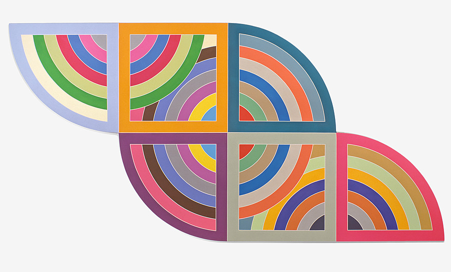
Given the vast range of Stella’s work over almost sixty years, some debate over where he is at his best is inevitable. Peter Schjeldahl in The New Yorker seems to prefer the irregular polygons and the Protractors. Robert Linsley in abstractcritical writes, “For me, the high point of Stella’s late career is the Moby Dick series.” For Robin Greenwood in abstractcritical, the high point is the multiple Protractor series, with works like Harran II (1967). Pac Pobric, in a scathing review in The Art Newspaper, plumps for the work before1966. There doesn’t seem to be as much support for the later, “maximalist” works as there is for the more influential and minimal work of the late 1950s and the 1960s.

Fran Stella, “Catal Hüyük (Level VI B) Shrine VI B.10”, 2001, cast aluminum and aluminum pipe. Photo: Ken Carpenter
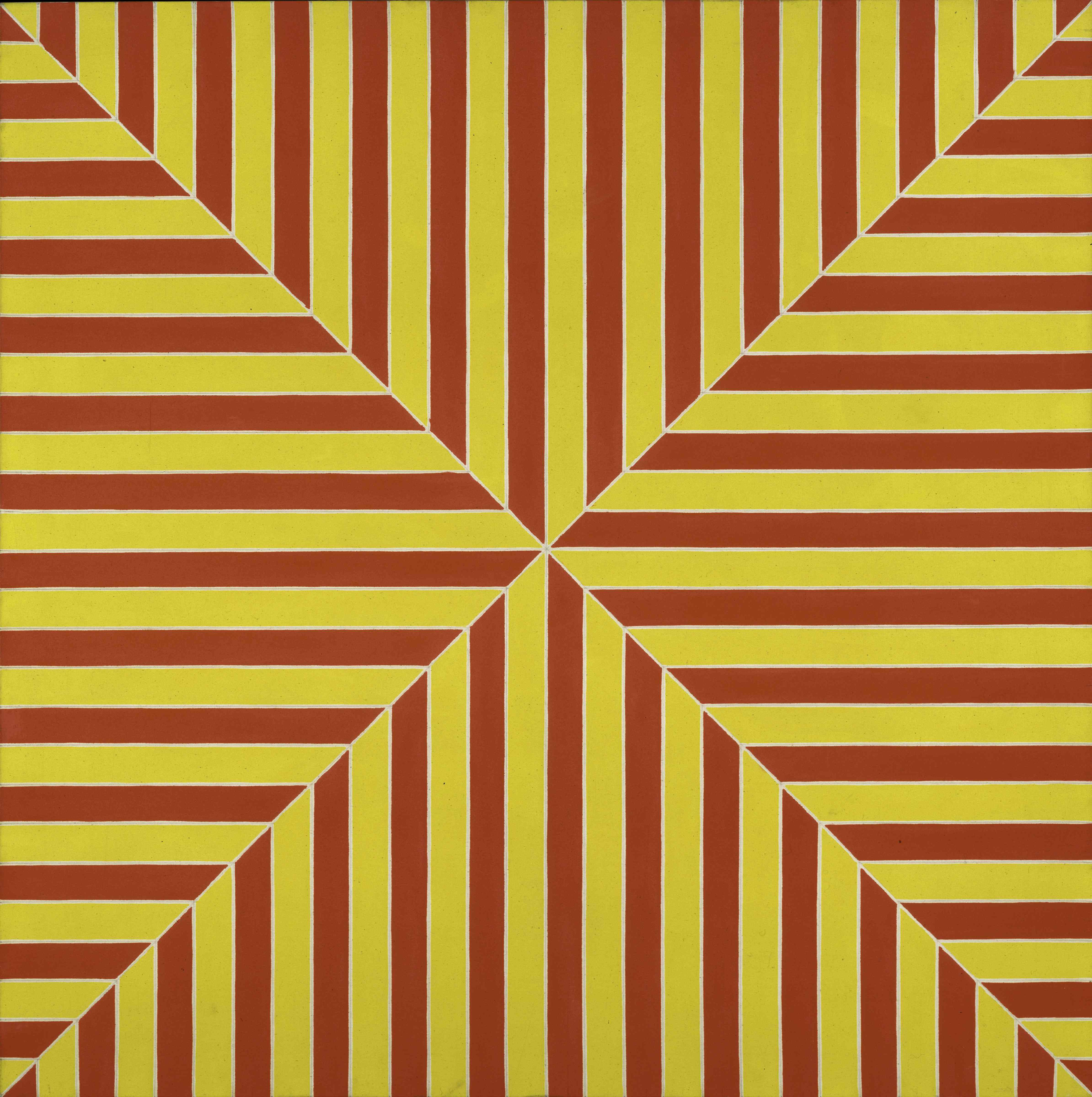
But at times the unity of these earlier Stellas is too pat, not at all the hard-won unity that is so moving in Cézanne, Picasso or Pollock. Perhaps Fried’s concept of “deductive structure,” which under pressure he later changed to “acknowledgement,” was not sufficiently dialectical to persuade, although I and many others did find it persuasive at the time. In any case, I am not convinced by the deadpan regularity of Ophir (1960-61), Palmito Ranch (1961) and Gran Cairo (1962). Even the Protractor series can too often be overly predictable and excessively orderly, despite its spatial interweaving.
At other times there is a burdensome jumble of disparate elements. I would not call this horror vacui but rather a sign that Stella can be so carried away in the sheer, exhilarating pleasure of making that he can’t bring himself to stop creating more and more unlikely juxtapositions, of working with yet more and different materials, so that he doesn’t even ask the question as to when he should stop this relentless accumulation. How else to explain the unfortunate, incoherent jumble of works like Organdie (1998), the excessively busy sculpture kandampat (2002), or the bloated hodgepodge, Das Erbeben in Chili [N#3] (1999)? Surely it was a curatorial lapse to include such works in the retrospective.

Frank Stella, “Empress of India”, 1965, Metallic powder in polymer emulsion on canvas. 77 x 224 in. (195.6 x 569 cm). The Museum of Modern Art, New York; gift of S. I. Newhouse, Jr. © 2015 Frank Stella/Artists Rights Society (ARS), New York. Digital Image © The Museum of Modern Art/Licensed by SCALA / Art Resource, NY.
But in the end, Stella’s ability to critique his own practice, to reinvent himself, to take the risk of both extremely minimal and utterly “maximal” work, is impressive. I find faults with much of his oeuvre, and I wish he would edit more strenuously than he does, but there is much to admire in his richly varied career. Works like the Black painting, Arundel Castle (1959), Empress of India (1965), the irregular polygon Moutonville II (1966), some of the Moby Dick series, and even a few of the late, excoriated sculptures, especially the monochromatic ones, have staying power. Stella may lack the profundity of Pollock, but his position in art history is, I should think, despite all his faults, secure.

Installation view of Frank Stella: A Retrospective. From left to right: Frank Stella, “Black Star”, 2014, (E.2015.0042) and “Wooden Star I”, 2014,(E.2015.0043); © 2015 Frank Stella / Artists Rights Society (ARS), New York. Photo: Ken Carpenter
[i] Hanna Segal, “A Psycho-analytical Approach to Aesthetics,” International Journal of Psycho-analysis, 23 (1952), pp. 196-207.
[ii] Erwin Panofsky’s articulation of three levels of meaning, with content occurring only at the third level, is particularly helpful. See his distinction between iconography and iconology in Studies in Iconology: Humanistic Themes in the Art of the Renaissance (New York: Oxford University Press, 1939).
[iii] Edward Bullough, “‘Psychical Distance’ as a Factor in Art and as an Aesthetic Principle,” British Journal of Psychology, 5 (1912), pp. 87-117.

Thank you Ken for your insights and for a good look at these three.
Burri and Pollock I can take seriously, to varying degrees – Burri much less so than Pollock. But my strong feeling is that we really need to get over Stella, who has now joined the ranks of artist-superstars who think they are untouchable, and that anything they do is marked out by their special genius.
I liked the question Stella asked in his Harvard lectures: how can contemporary art have more of a real sense of space? He addressed some of the shortcomings of abstract art that he himself helped to establish – the set of modernist tropes that still persist: the stripe, the rectangle, the flat, repetitive geometry.
But I don’t like his answer. The modest unity that he achieved in the early works, which was mainly down to its easy minimalist organisation, is pretty much lost just as soon as he tackles anything a little more complex. He threw out the baby with the bathwater, when the thing was to nurture the baby – that little seed of intelligent content that was in a lot of sixties abstract art.
The spatial (and other) problems of abstract painting are not solved by making things literally three-dimensional; ‘literal’ is not equatable with ‘real’, even and especially in sculpture. But after all these years Stella still hasn’t twigged. He carries on banging out more and more stuff that never transcends being just stuff.
I stand by what I wrote here: http://abstractcritical.com/article/%E2%80%98what-you-see-is-a-mess-frank%E2%80%99/index.html
“…the mess of Stella’s art is now seemingly endless. His attempt to side-step pictorial decision-making … by commencing a dalliance and then an outright engagement with three-dimensions has led him into the super-difficult world of abstract sculpture. Here he has even less chance than in painting, collage or relief of ever sorting things out.”
And…
“’What you see’ is already a lost cause, a resolve no longer acted upon.”
…because Stella does NOT act upon what he sees. He does not let forms influence one another. He seems incapable of the unification of his overwhelming and overblown subject matter and its transformation into coherent form. What it is remains resolutely what it is. Dumb.
And so, to cut a long criticism short, we get to a place where Stella, for all his undermining of the pompous artistic ego through a deadpan and disinterested repetition of simplistic shapes back in the sixties, is now making faux-sculpture of such monumental boorishness – “Black Star” and yet another series of big garbage – that it equals for arrogance and banality the worst of Gormley and Kapoor.
I’ve changed my mind; I don’t think Stella was ever any good, or made a real contribution to abstract art. I hope it all ends up in a freeport: http://www.e-flux.com/journal/freeportism-as-style-and-ideology-part-i-post-internet-and-speculative-realism/
LikeLike
Robin, what does that article in e-flux (which I tried but failed to read) have to do with Stella never being any good?
LikeLike
The article is about the storage in crates in bonded warehouses around the world of blue-chip art that no-one ever sees, but is kept for investment purposes only, bought and sold without being viewed. The link still seems to work OK to me; it’s an interesting article about the shocking present state of the artworld. My comment was sarcastic, hoping that some of Stella’s vast and gross output would disappear.
LikeLike
Thanks.
LikeLike
I think Kens discussion of Pollock,while not saying anything new,is terrific because of his insistence on the importance of resolving opposites.Ive posted this is an important point in relation to Basil Beattie,as well as Hoyland,Pollocks struggle is applicable to all Painters of stature .
LikeLike