
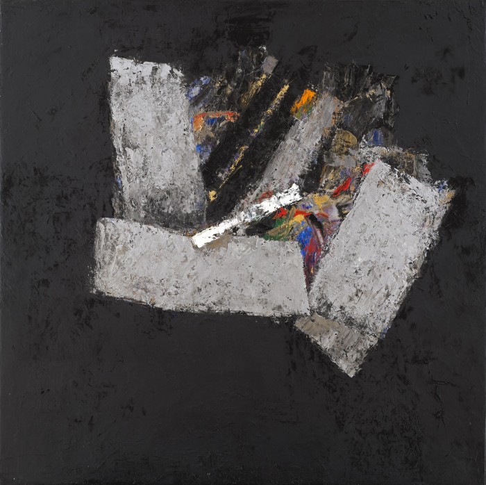
“Black Space 21”, 2014, oil on canvas, 73.7×73.7cm
Klaus Friedeberger – Paintings & Works on Paper 1992-2015 is at Delahunty Fine Art, 21 Bruton Street, London W1, 17th May – 11 June 2016. http://www.delahuntyfineart.com/exhibition/klaus-friedeberger-paintings-works-on-paper-1992-2015/
Friedeberger’s Black Space.
How many artists today would willingly embark on a path so seemingly solitary as that followed by Klaus Friedeberger? Now in his ninth decade he continues to paint with little regard for the usual support network – the periodic exhibitions and moments of critical attention – often seen as vital to sustaining an artist’s career.
That it should have taken so long for this work to become even partially visible (with a selection of paintings from the last two decades currently on display at Delahunty Gallery) is due both to personal choice and life history. After arriving in the UK from Berlin in 1939, his life became that of a peripatetic exile, first interned in this country and then transported as an alien to Australia, where his art education continued erratically, initially under the guidance of fellow European refugees and then through exposure to the work of Nolan, Boyd and the ‘Angry Penguins’.
But by the mid 1960s, when he was again settled in London, he had not only turned away from prevailing currents in British and American art – Pop art, colour field, minimalism – but decided to pursue a patient and decades-long private enquiry into the structural dynamics of abstract form rendered in black and white paint. It was the act of an outsider more philosophically attuned to existentialist practice, as well as to Tachist painting and the writing of Samuel Beckett.
Yet such self-sufficiency can bring its own reward, a kind of freedom to explore and experiment without external distraction or any weight of expectation. And what finally emerges in the best late flowering examples of his work, as he wrestles thickly painted forms from the void in his black spaces, is a visually arresting mixture of tensile strength and compacted energy. While the work harks back to the paint handling of some of the European Tachists – in particular to de Stael and Soulages (a near contemporary of Friedeberger’s) – it nevertheless finds its own way between rawness and rigour, a balance he similarly identifies in the work of Sean Scully.

“Clump”, 1997, oil on canvas, 127x127cm
Modulated in warm and cool greys, the earlier pieces shown here – ‘Light Spatial 1992’ and the untitled sequence from 1997 – lack the drama of the most recent paintings with their intense black fields and shots of brilliant metallic paint. With a narrow tonal range, his gestural forms can seem inert – their movement is slowed down somewhat by the dense application and constant reworking, and the residual shapes tend to sink into rather than float free of the surface.
Only in ‘Clump 1997’ does the hovering form succeed in fully breaking free, mutely suspended in an empty expanse of pale grey. Illuminated from the top left and casting a soft shadow below, this nervous cluster of brush marks, suggestive of a meteorite or a crushed ball of paper (and rendered as though the paint had collapsed in on itself) exercises a powerfully ambiguous presence. Although his abstract language is resistant to ‘reading’, this existential still life is perhaps the closest his work comes to metaphor: are we witness to an unfolding or an aftermath? To something or nothing?

“Dark Still Life with Copper”, 2007-8, oil on canvas, 127x127cm
Friedeberger has often been drawn back to Italian and Spanish painters – to Giotto, Caravaggio and Goya – and uses reproductions of their work hung upside down in the studio so as to empty them of subject matter and to better understand the complex interplay of light and shadow in a dark, often black, field. He has also – since visiting the Prado in 2002 – found renewed inspiration by looking at Spanish still life painting and in particular at Cotan’s work. It is evidently there in the hard light and austere arrangement (as though one of Cotan’s cardoons were forged in steel and copper) of ‘Dark Still Life with Copper’ 2007-8, and also in the tight placement of abutting forms within a square format of the new ‘Black Space’ paintings, where the best of them have the energy of a coiled spring.
Finally, in ‘Black space 21’, 2014, the swiftly articulated diagonally curved strokes brushed in thinner metallic hues of silver and gold generate a pulse of energy that leaps across the void, lighting up the dark firmament. Friedeberger’s approach to painting can be viewed as a sustained act of endurance, a struggle against futility that recalls Beckett’s famous words in ‘The Unnamable’: ‘… you must go on, I can’t go on, I’ll go on’. But as he continues to progress, the work of resistance takes on an increasingly affirmative quality.
“Black Space 24”, 2015, oil on canvas, 50x50cm

untitled, stripped paper collage, 1997, 35.6x38cm
untitled, 1984, paper drawing collage, 21x21cm

untitled, stripped paper collage, 1992, 45x45cm

I think that “Clump” is interesting for the issues it raises around (presumably) discovered figuration.
From the photo its space and light seem as well defined and convincing as those in Robin’s Elinga painting.
So far so good, but the consequence seems to be that it is impossible not to see it as a “thing” (scrunched up paper or whatever) against a background.
The shadow looks very much like a retrospective decision, but even without this (presumably) figurative embellishment the problem (?) remains.
Do discovered objects always turn abstract paintings into figurative, maybe surrealist paintings? Is abstract painting limited to playing around with flat, coloured planes? Or is the abstract/figurative distinction more important as a description of working methods rather than as a property of finished pictures?
For me “untitled 1992” is abstract but “Clump” is figurative, and I think this is mainly because of that shadow.
LikeLike
Indeed, “Clump” is very figurative. Having seen the painting, I would say that this has been arrived at inadvertently (presumably what you mean by “discovered figuration”), since on close inspection the “Clump” is broken brushwork and the shadow is underpainting picked up in the off-white background, perhaps initially accidentally, which I think masks other stuff painted out around and about the clump. But the artist must have intended it, in the end, to be figurative, it’s so blatant. The drawings/collages, by contrast, look a much more natural and abstract set of work than the paintings. I liked some of these smaller works – you can see more on the gallery website. The paintings remind me of Sandra Blow from a few decades back.
As for the question “Is abstract painting limited to playing around with flat, coloured planes?”, let’s hope not. As I’ve said before (to the annoyance of painters who work with coloured planes – mentioning no names), what would be the point? Abstract painting needs to move beyond such limitations, and in some cases has already.
And by the way, figurative or abstract, “Clump” is a mere shadow of a painting compared to the Elinga, is it not?
LikeLike
OK, but doesn’t the presence of complex, specific space in a painting almost inevitably lead to “Clump”-like objects appearing?
That’s why I think that “abstract painting” is maybe better applied to the method (starting from nothing, decision making based purely on colour, form etc.) rather than to the result. If the various figurative possibilities that emerge in the course of a painting are ignored rather than actively encouraged or destroyed, won’t the resulting work communicate through its abstract decisions, whether it can be interpreted figuratively or not?
I rather fear that if one is too concerned with the abstract look of the final work then this can compromise the painting process, leading to timid and uninspiring results.
LikeLiked by 1 person
I think this starts to touch upon a very crucial and exciting debate, one that we’ve sort of been down, but perhaps could be approached again more productively and more above the belt. I would like to hear a detailed account, perhaps from Alan Gouk, as to what the advantage of planes or planarity have over the “diffuse handling” he has previously referred to. Would I be right in thinking that the criticism of it is mostly levelled at any misconception held that the scattered mark making can somehow circumvent and escape the reality of the picture plane, and so therefore why bother? Because lots of little marks not seeking to render volumetric form, remain in isolation, lots of flat little marks, and so the painting is still dealing with a sort of parallel, raised space. Better then to confront the issue of the flat canvas head on and use it to your advantage?
This seems likely enough to be the case, but maybe just in theory. Maybe lots of little flat marks are in theory still flat, but can we really predict just how they will work together in reality? Are they always in every case going to just add up to a more crowded and ultimately planar space, or could there be something slightly different happening, something neither planar nor figurative.
In the video of the Brancaster group discussion, I thought one very interesting moment was listening to Fred Pollock talk about Anne Smart’s painting. For those who haven’t seen it, he was quite critical of it, partly because he wanted his colour in larger clearer areas and not so broken up. I think he said he didn’t like the way his eye couldn’t settle on anything. This could well be a fair enough criticism, but it brings up the question of whether you can demand something from a work that it is simply not trying to do. It would seem that Anne Smart’s work was doing something on that day that a very experienced painter such as Fred Pollock was not used to looking at. I’m not saying that this painting I haven’t seen must therefore be doing something new and radically different. The point I wanted to make was that a work not dealing in planes of saturated colour, seemed to be eliciting a different kind of response. Did that have something to do with the space? Was it still planar in the end?
LikeLiked by 1 person
A propos of the above and of previous rather heated arguments on Abcrit, I want to quote (again, but a different bit) from Patrick Heron’s essay on Constable’s drawings, which I’ve just re-read (thanks, Steven Walker!), and which I think is one of the greatest pieces of writing by one artist on another that I know of.
Heron starts by quoting himself, in a letter to the Times:
“…one is more aware than ever of the colossal influence Constable’s incredibly varied and totally undisguised brush-movements exerted on virtually every major French master… – Delacroix (who famously acknowledged it), Courbet, Corot, Manet, early Pissarro, Monet Sisley, Cezanne (look at the “Cezanne-esque” foliage in Constable’s poplars and elms), even Matisse and Derain.”
He continues:
“The discovery, in Constable, which proved so spectacularly potent and lastingly revolutionary was, very simply, the broken surface. Briefly, the major part of the picture surface in all Constable’s greatest forerunners, consisted of continuous and virtually unbroken skins or veils of pigment which were welded together on the canvas by means of brushwork which was itself almost invisible.
…with Constable, suddenly there is the discovery that the evocation of a form or a plane in the subject can be totally definite without the pictorial definition, there on the picture plane, being continuous. In other words, separate strokes, quite unconnected to each other, like islands in an archipelago, can evoke and define the continuous surfaces in the subject with a power even greater than that achieved by those continuous skins of pigment…”
I know this is about figurative painting, but even so… Heron goes on to discuss how Constable’s “roving eye” continually re-invented its focus, and so opened up the centre of his compositions, spatially, in contrast to, say, Turner, “whose classically ovoid and ‘complete’ compositional organisations tend to repeat themselves.”
At the moment, I would hazard a guess that it is going to be far more productive to dispense with thinking simplistically, in unbroken and obvious planes, and see where that goes. The more things are mixed up and opened up, the better… I certainly don’t think it will come back to bite you. And yes, Fred’s response to Anne’s painting was very interesting, and I really wish we could have gone a little bit further and deeper at that point in the discussion. Unfortunately, good manners got the better of us.
LikeLiked by 1 person
What you are saying is interesting Harry, I feel one needs to look at paintings with different eyes depending on the way they have been produced and the intentions behind them, as you point out.
Anne Smart’s work reveals more of itself the longer one looks at it, there isn’t an immediately obvious planarity. It’s just a completely different experience from looking at a Fred Pollock painting.
LikeLike
And of course you could simply fill up a canvas with loads of little marks that are all parallel with the picture plane, and the painting can end up feeling sort of flat and underwhelming, unable to reach out and make space through big expansive bursts of colour.
But I think this busier visual approach can still use great colour and be about colour, but in a different way to lots of really great past and present abstract painting. I might be wrong and I don’t think I understand colour nearly as much as other contributors on this site, but I don’t really see why it must be any less about colour than say Rothko or Heron. I love it when on close inspection of dark patches in a painting, abstract or figurative, I find that what looked more or less like a black from a distance, is made up of little flecks of blues, greens, violets and crimsons that might scumble and drag across and through each other, making up a richer, more involved dark space.
As painters, the colour is the thing we all share, surely? How it’s treated probably comes down to each painter’s personal preference, tendencies and inclinations. Whether they want it big and clearly demarcated, or broken and interspersed. Some would probably want both.
LikeLike