Sophia Starling, “Stack (Marble)”, marble dust and acrylic on linen. 190x170x15cm.
Painting & Structure was at the Kennington Residency, London from 9th to 24th February 2017
Have you watched Larry Poons on YouTube where he considers the luxurious drapery in a Velasquez and says ‘that’s what you want’? Did you hear the one about Kenneth Koch asking Willem de Kooning whether he had read Frank OHara’s poem called ‘Radio’ in which it is said…
Well, I have my beautiful de Kooning
to aspire to. I think it has an orange
bed in it.
Willem de Kooning is reported to have mentioned how he was interested in mattresses because they were pulled in at certain points and puffed out at others ‘like the earth’…
Or to put the histrionics on hold for the moment, let’s think about how our notions of ‘a future’ affect the present tense- or even ‘the past’. Maybe consider one of those old fashioned sci-fi stories where one exquisitely machined pill (a white and slightly over sized lozenge) takes the place of a hearty 3 course meal. All that messy business of yearning, gratification, ingestion and excretion done away with. Replace all that with a glass of water and a hard swallow followed by a swollen stomach and a tiny flurry of gas expelled on the march down those long dark corridors. The ones that connect the living quarters to the mines being dug under Mars’ new exploratory colony.
Hold those images in the mind for a moment… Close your eyes… Then open them again and find yourself at the Painting and Structure exhibition at the Kennington Residency on Kennington Lane in south London… This show brings together an interesting mix of painters who tend to ‘play’ with the tension between crafted excess and severe reduction. Excess can take different guises though. One might immediately think of impasto with gusto for instance. But what dominates here, is extremely fine tuned attention to details, to surfaces, to materials, to the history of the medium, to the throbbing gristle called culture in which it all stews… But what is finally distilled after all this excessive boiling down and fastidious reduction? Well, that is the question.
Whether it be an orange mattress or a white pill or a Pope’s skirt there are so many structures on which the painter can hang an idea, a starting point, a way in to something new. But I think it is the art historical notion of ‘the grid’ as ‘structure’ that is the ghost at the dinner party to a greater or lesser degree in the work of nearly all of the artists gathered here in Kennington.
Donald Judd was obsessed with ridding art of its connection to its decadent Old World European past. The Minimalists turned on the old concept of what happens in one part of the painting directly effecting what happens in another part and replaced it with the pragmatism of the grid. Marks, actions or colours are quietly and equally placed across the surface of the painting, er, or should I say ‘object’? This New World Puritanism was soon to be undermined though. Since the late 70s various artists have taken their turn to humiliate and ridicule the grid. Judd’s and many other’s minimalist works were referenced in the shelving units, vitrines and display cabinets (think Koons’ basketballs, Hirst’s ‘specimens’, Bickerton’s logo clad wall boxes) in the art of the 90s. In terms of abstract painting Peter Halley has suggested since the 80s that his work is based on a ‘strong mis-reading’ of Minimalism. Mark Bradford has said that he is attempting to inject subject matter back into Minimalism.
So from this historical perspective the grid never went away so much as periodically being on the receiving end of a good kicking like every piece of well-worn visual rhetoric should. But it is the unstable correlation between this stoic, if macho, rationality of the grid and the skewing by ‘painterly’ or sculptural means going on in this show that creates interesting historical tensions and connections. But are these works strong enough visual experiences in their own right to go beyond their anchorage in the shifting sands of art history?
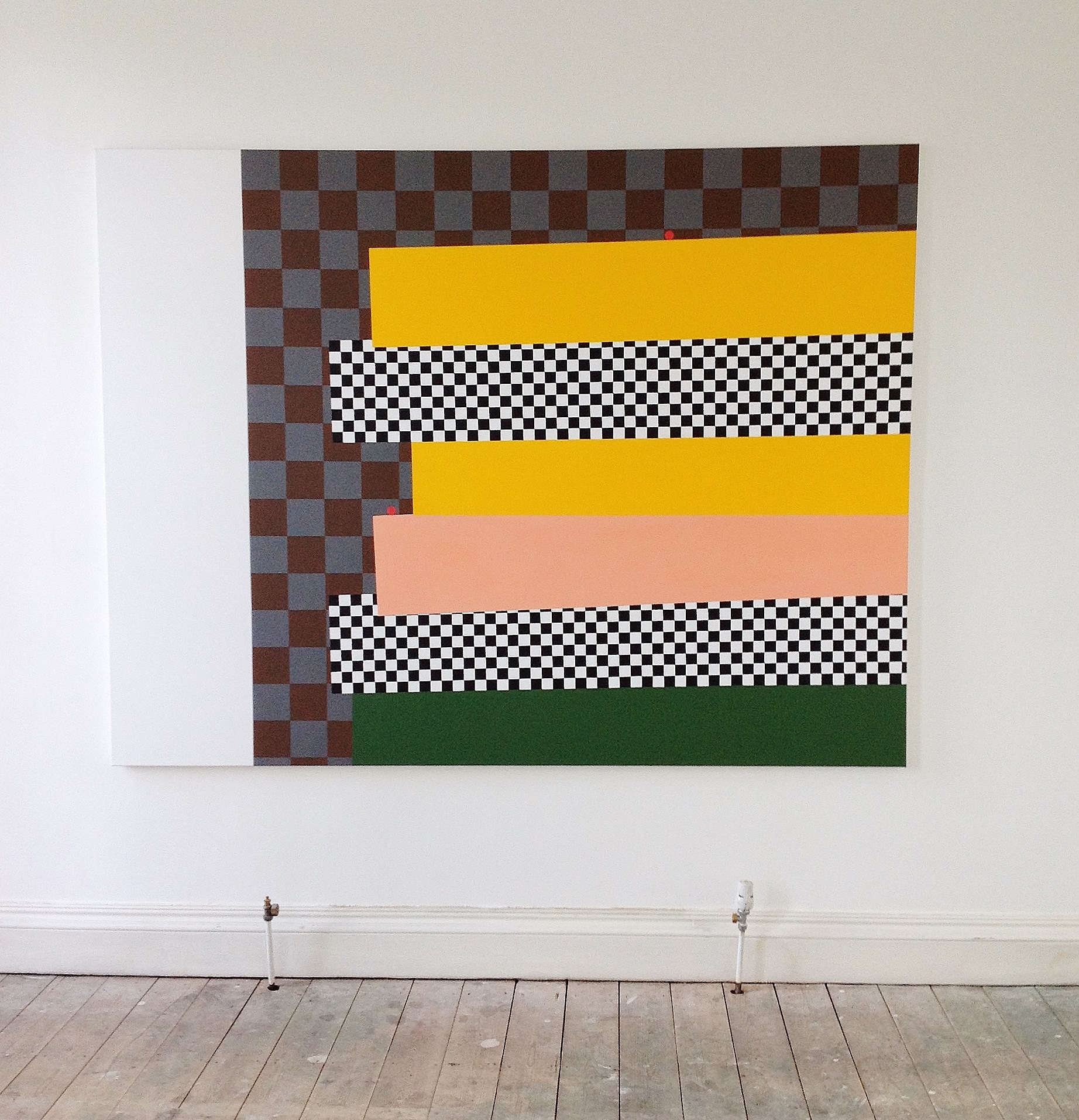
Daniel Sturgis “Passion and Distance”. 2008, acrylic oncanvas. 163x214cm.
Daniel Sturgis’ paintings seem to play directly on the optical buzz of Minimalism’s thrill seeking cousin Op Art. Op received a serious mangling by the likes of Ross Bleckner in the 80s. He filled Bridget Riley’s stripes with failure and death via nostalgia and Gothy kitsch in his appropriations of Op. Sturgis seems to set up skewed chess board- like and playful (if not at times wistful) visual paradoxical games with it. One can’t help for example of seeing the 2 red dots in ‘Passion and Distance’ 2008 as balls or marble like characters poised almost melodramatically on slopes of off-kilter pinky orange and murky green or yellow cliffs. A thrust and parry of camp flourishes, dead spaces and arch references haunt this work.
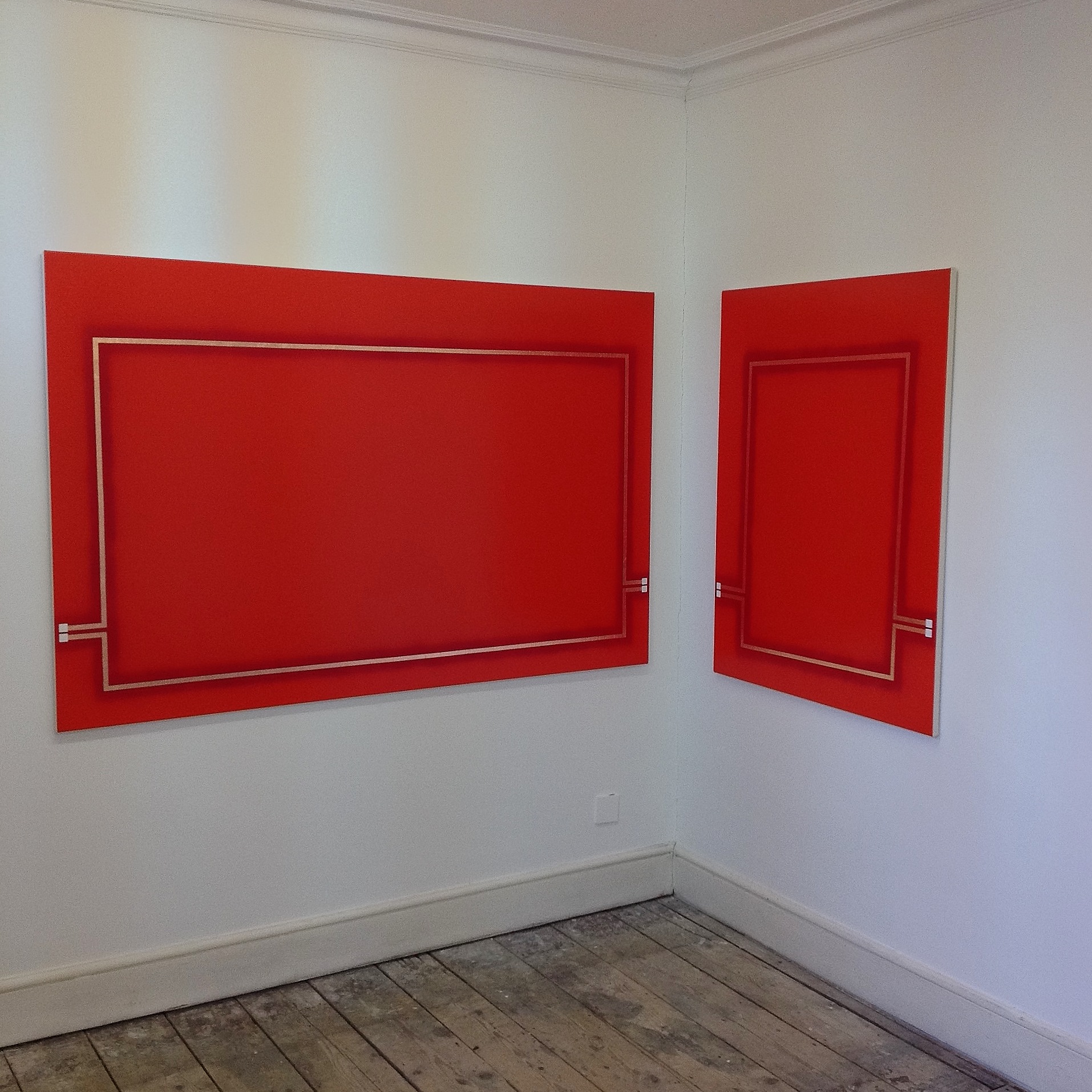
James Campion. “Window Eleven”, 2017, oil and copper leaf on canvas. 119X184cm; and “Window Twelve”, 2017, oil and copper leaf on canvas, 119X92cm.
James Campion’s work seems to look more directly to Halley or maybe to Robyn Denny? And this difference could be important. Denny translates the languages of hard edge and field painting in a late modernist surge of optimism for the future. Halley uses a very similar vocabulary to question why that future never really arrived. Rather than ‘conduits and cells’ though, Campion gives us fine lines of copper leaf that act like hot wires on circuit boards taking our eyes around the paintings’ edges. These red monochromes lean in on each other, set as they are on the two walls of a corner; they echo and amplify each other’s electrical fizz. All heated up by beautifully crafted and worked surfaces they throb and intensify at their stretcher’s edges. One could almost warm one’s hands by them.
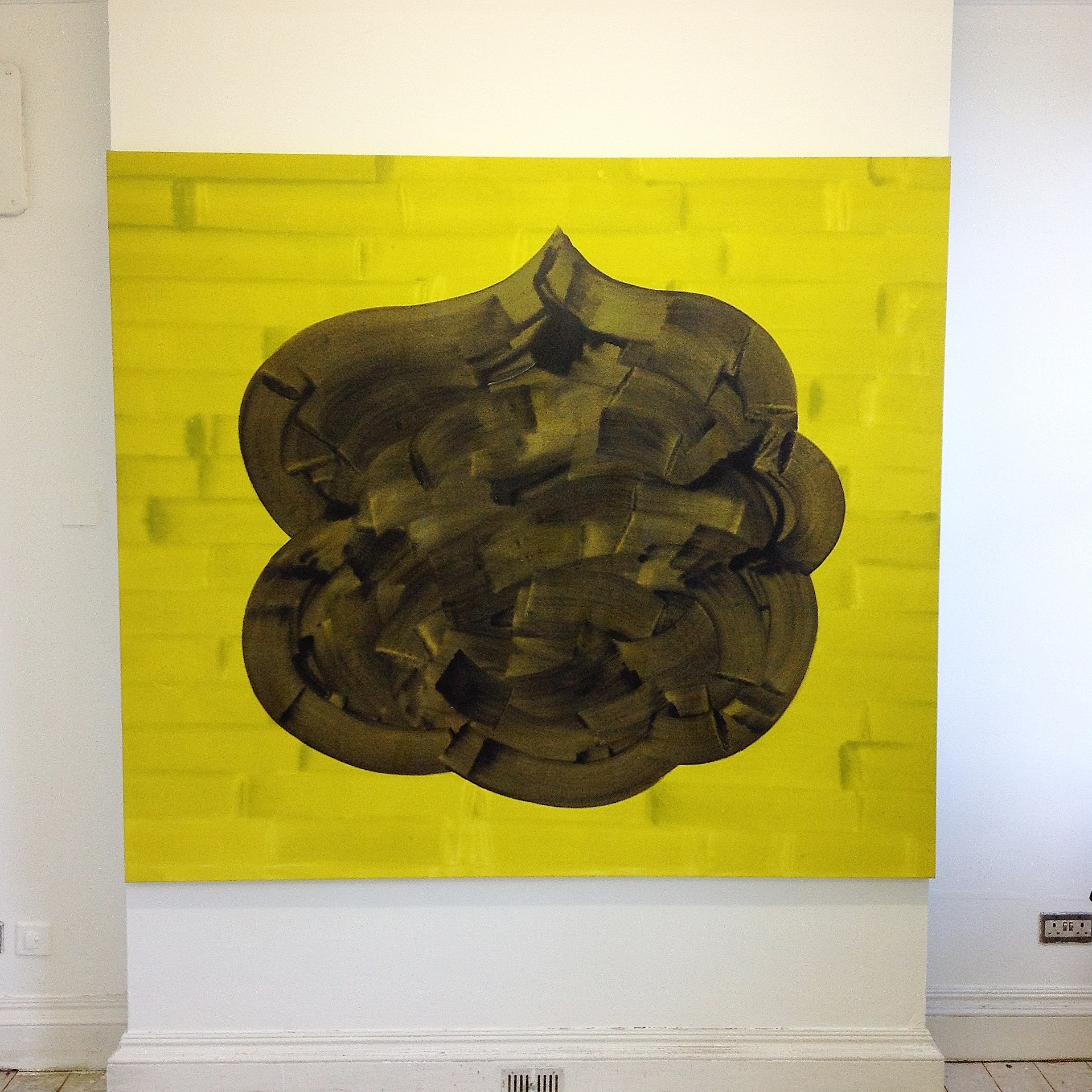
Mali Morris, “Among Days.”,1997, acrylic on canvas, 171x197cm.

Mali Morris, “Dark Ashbery”, 2013, acrylic on board, 24X28cm.
Mali Morris intimates the grid but in an altogether different way. ‘Among Days’ 1997 is a knotted pulsating black central form built up of translucent washed out brush marks that squirm unsettlingly before the eyes. But this riveting central image with its disturbing upper central dark spot opens up against quietly orchestrated lime brushmarks that are set at near regular intervals. They suggest both a pulsing grid but at the same time, with an uncanny incongruity, a ghostly lime green brick wall. And they are strokes in the true sense of the word, delicate but precise, notional but persistent. Morris calls up the grid once more in the small painting ‘Dark Ashbery’ 2013. But here she has melted right angles into translucent and glowing criss-crosses of vibrantly coloured brush strokes. They are punctuated by cleverly orchestrated circles or dots that phrase her colour rhythms in intervals of blood reds, luminous limes, sunny yellows and cooler glassy blues.
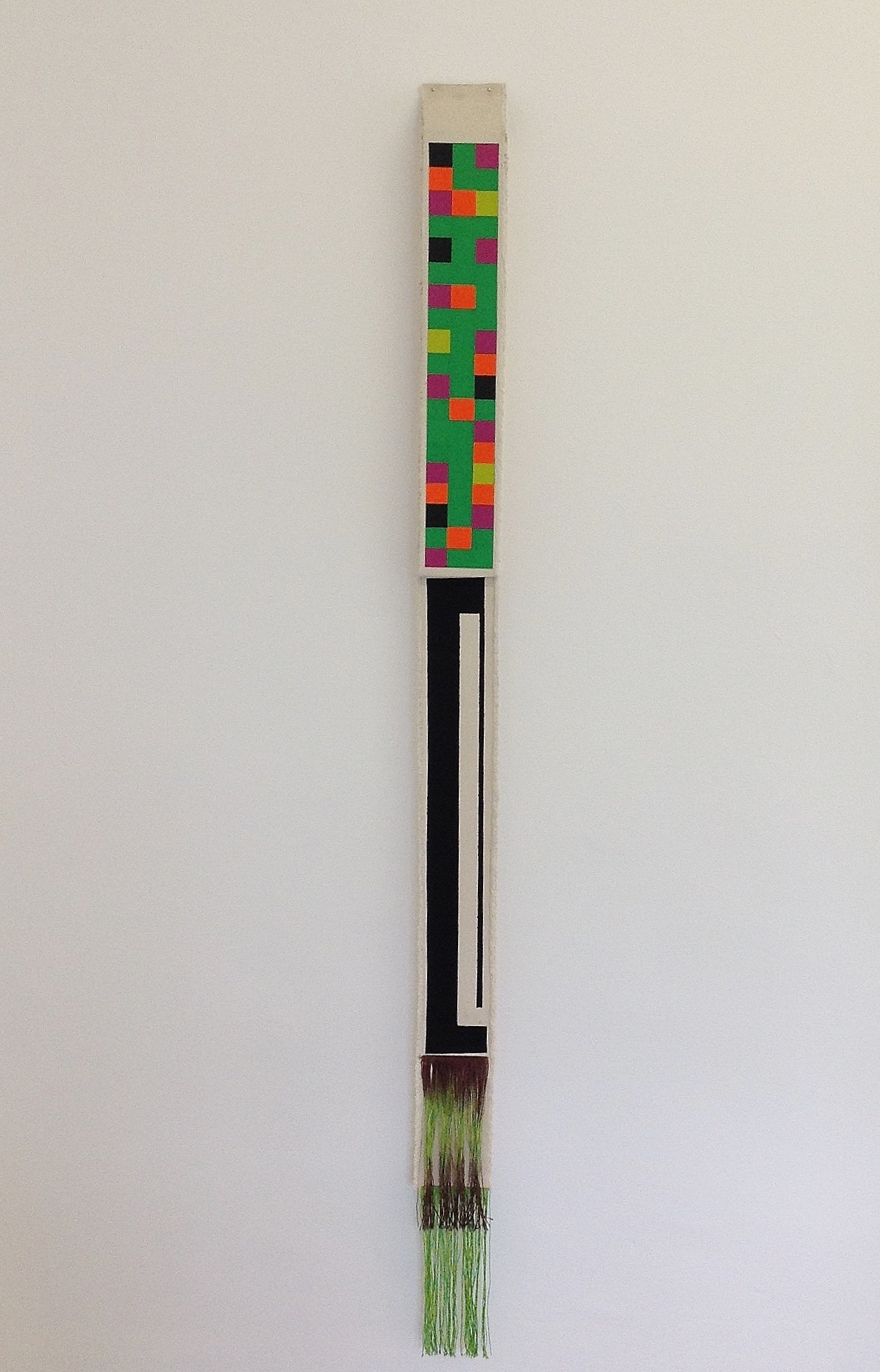
Andrea Medjesi-Jones, “Dispenser” 2016, oak support, canvas strip, fringing, acrylic and pigment.
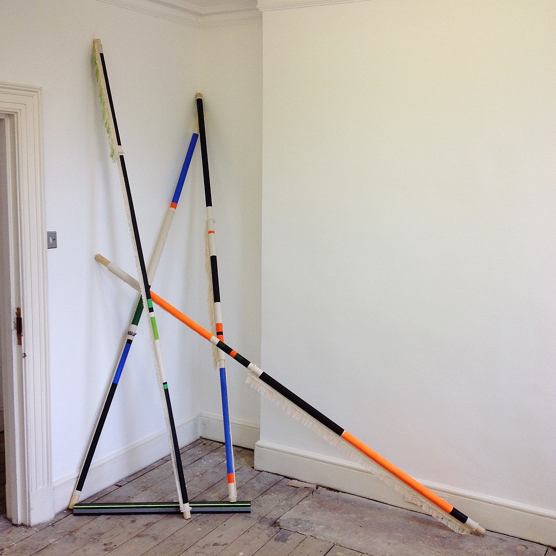
Andrea Medjesi-Jones, “Please Stand Up”, 2016, wooden poles, canvas strips, acrylic and canvas tape.
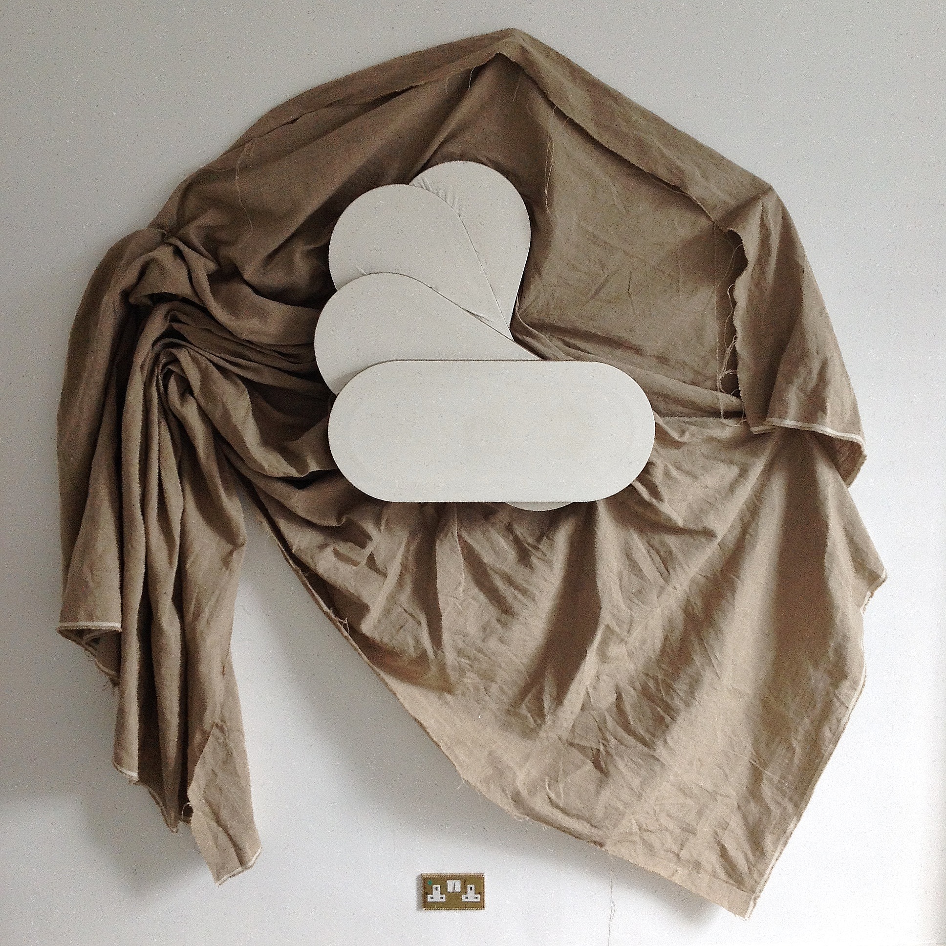
Another less well known influence that can be felt in the work of Andrea Medjesi-Jones and Sophia Starling is the mostly French ‘Supports and Surfaces’ movement from the late sixties. This approach focused on processes in painting essentially involved in the materiality and objecthood of the painting surface itself. They prioritised the importance of site and the reduction of painting to bare essentials, foregrounding the structural support of the stretcher for instance or leaving canvases bare or unstretched, folded or suspended, tied off or draped. Medjesi-Jones utilises oak poles that suggest the idea of the rolled up canvas, only revealing tiny fragments of larger wholes that are bound up or wrapped round a strong supporting rod. Oddly delicate and almost decorative, fringes and frills unhinge the other snippets of what look like hard edge luminous lines and grid like structures painted on the rolled up canvases or long thin box stretcher bars. For all the hard edge rhetoric these works feel fragile and eccentric- batons containing some kind of indecipherable gridded code. They naturally seem to colonise the domestic layouts of the townhouse come gallery rooms, lingering uneasily beside doorways or breaking out of hidden corners.
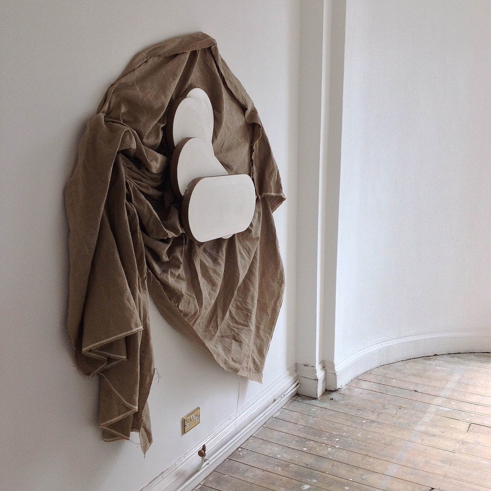
Sophia Starling, “Stack (Marble)”, marble dust and acrylic on linen.
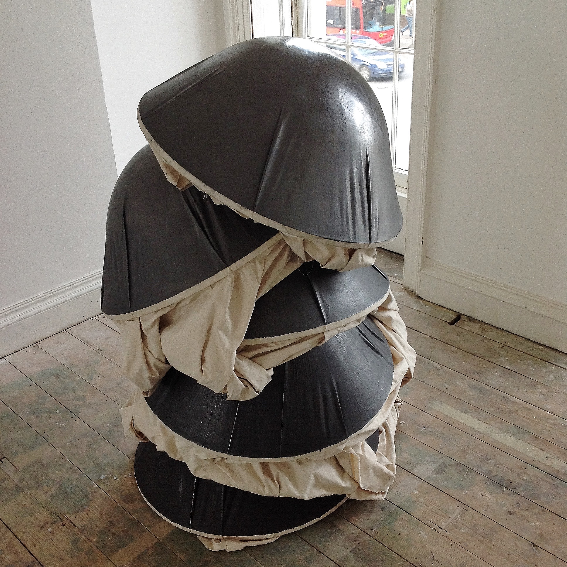
Sophia Starling, “Cluster (Silver-Black) Vertical”, 2016, graphite and acrylic on canvas, 137X 85X85cm.
Where Sophia Starling is concerned, I think you have to consider the now historical figure of that post minimalist Eva Hesse and an artist who came to prominence in the naughties Angela de la Cruz. As Hess debased the Minimalist aesthetic, de la Cruz’s work is about the vulnerable body politic. She has pulled the ‘high art’ ‘monochrome’ down a peg or two. She has made it homeless and wholly uncomfortable with itself- with all its shambolic ‘underbelly’ and bodily failings exposed. Starling’s free standing piece ‘Cluster’ (Silver-Black) Vertical’ 2016 feels much tighter and more crafted than an earlier de la Cruz. It hinges on the twisting of the canvases against the concave circular gun metal burnished helmet-like forms. They are stacked on top of one another like those pre-historic Horse Shoe Crabs- all caught in a frenzied layer cake of primeval spawning. The image hums with the tension between a squeezing sense of claustrophobia and a strange kind of self satisfied containment and protection. The wall piece feels forlorn and vulnerable in comparison, relying solely on the tension between tightly stretched and neatly rounded white and stacked shaped canvases. They push out from the wall, twisting up against an abject and tussled sheet of canvas (think Poons and Velasquez, de Kooning and his mattress and that lozenge-shaped pill again- but with none of the glamour…)
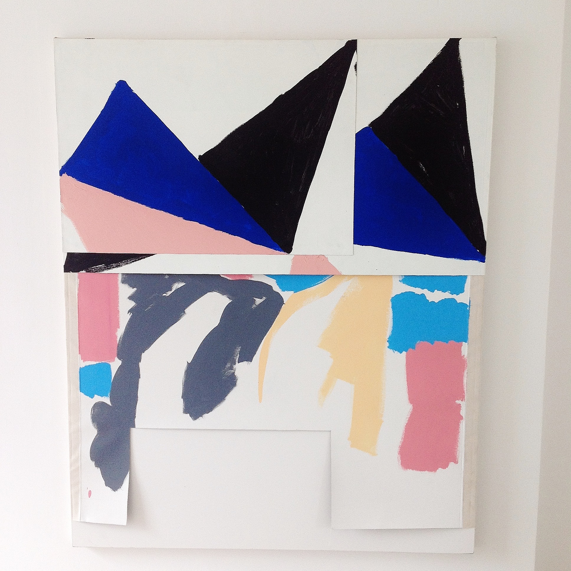
Kes Richardson, untitle, 2017, acrylic on canvas, 160X130cm.
Kes Richardson brings the most provisional qualities of picture making to this gathering. He also foregrounds the objecthood of the surfaces he works on but very little of the obvious crafting of form remains. His process seems to pivot on subtractions and additions in his removing of layers of canvas. He cuts away sections of the work, leaving gestural marks and faux naive hand drawn triangles. Painted in colours reminiscent of children’s poster paints, they are set adrift in voided spaces that echo the hacked out shapes and cut away scraps. These scraps then seem to return to the surface as collaged elements, reconfigured in uncomfortable relationships with an unstable set of layers. They are like half hearted templates from oversized and violated flip charts or pads used for note making in management meetings for some bigger but forgotten plan.
The best works here do not purely function as ciphers that belong to a hermetically sealed art historical continuum or an academicism of ever more subtle refinement. They function because their facture, their material qualities encourage powerful ‘strong misreadings’ that encroach upon, and throw into question, the distinct boundary lines drawn up between disciplines and the straight forward art historical narratives that protect them. These issues of tradition vs. innovation always seems especially intense in the highly contentious realm called ‘painting’. What is the difference between simply forcing a novel kind of nihilism into one’s work and attempting, by means of visual art, to extend physical and mental realms of human thought and feeling? A pill, anyone?

“The image hums with the tension between a squeezing sense of claustrophobia and a strange kind of self satisfied containment and protection.” No it doesn’t is the inevitable retort that springs to mind. Colourful phraseology though, as per usual. Why do I keep thinking of condoms or Dutch caps. You see you can free associate anything you like, but is it accurate, is it true?
LikeLike
Is it abstract?
LikeLike
Seems to be poetry month on abcrit, so here we go:
Daniel Sturgis promotes the abstract
But his painting, all content they lacked
They’re mere illustrations
Flat graphic creations
Of modernist tropes that he’s sacked
This strange Mali Morris that’s yellow
And inflated just like a marshmallow
That’s stuck on a wall
Make it quite close to call
If it’s abstract at all, or just mellow
Tim Campion’s work looks like Denny
But complexity, it hasn’t any
And so, in the end
Although they’re on trend
They’re generic’ly just like the many
Sophie Starling is now in my territory
Of sculpture, although it’s defamatory
To call it as such
When it reads double-dutch
And…
Oh, fuck it, I can’t be arsed,
To write any more that is parsed…
Here’s one I wrote earlier:
Alan Gouk, he refused to take part in
The Brancaster forums with art in
He sat in Montrose
And looked down his nose
At the artists who’d put all their heart in
Then Robin, who thought he knew better
Sat down and wrote Alan a letter
It came back the next day
“Modernism must stay!”
Fourteen pages without a spell-checker
LikeLiked by 1 person
Can’t handle poetry? Try music:
http://hyperallergic.com/363526/when-experimental-music-resonated-with-abstract-art/?utm_medium=email&utm_campaign=When%20Experimental%20Music%20Resonated%20with%20Abstract%20Art&utm_content=When%20Experimental%20Music%20Resonated%20with%20Abstract%20Art+CID_aa18ac7eba309946f4fd5a724e4566cd&utm_source=HyperallergicNewsletter&utm_term=Read%20More
LikeLike
There is/was even less of an audience for this kind of music than there was/is for modernist painting. The juxtaposition drives home the question: how is it possible to make art when there is essentially no audience at all (other than other artists, a handful of professional critics and collectors and some wealthy mostly corporate buyers)?
LikeLiked by 1 person
When I studied Creative Writing at Sussex we were told that the only people who bought poetry books were other poets.
LikeLike
Poetry and Abstract art? Just read this on Katrin Mäurich’s website:
“Perhaps we could define poetry by contrasting it with prose; except in cases like Joyce, poetry is always what cannot be sold, or what does not sell. It doesn’t narrate anything; it has no usefulness or it is merely useful in its uselessness, through the ethical and aesthetic awareness that results from it. Poetry and experimental poetry in particular, which sustains this awareness most radically, is what remains of a genre that has almost disappeared from the human race. It holds out in a world where people are tending to lose all the spiritual values in favour of practical predatory goals.”
(Augusto de Campos)
http://www.maeurich.co.uk/about.html
LikeLike
Re: “What is the difference between simply forcing a novel kind of nihilism into one’s work and attempting, by means of visual art, to extend physical and mental realms of human thought and feeling?”
There’s something positively affirmative abut forcing something – even a process or habit. The apparent nihilism is undermined by making the work in the first place, and by presenting the subsequent results in public.
If some of this work is baffling or disappointing to some, it is most likely the opposite to others. I could certainly live with Mali Morris’ ‘Dark Ashbury’ on my wall. But I might otherwise choose a Kes Richardson or a Sophia Starling to unsettle me – to challenge my habitual ease with non-figurative art/imagery.
Is an ‘abstract’ definition/categorisation so important? Yes and no.
Today we hear that Howard Hodgkin has died. Was he an abstract artist? He discouraged the definition for his work. He was a humanist. The positive aspect of nihilism – if Nietzsche was right about notions of God.
LikeLike
Or maybe you just couldn’t find a rhyme for defamatory? The Match hates are out again this year.
LikeLike
March Hares. The internet has a mind of its own.
LikeLike
How about — it looks a bit mammatory. I’m sure Pete Hoida could find a better rhyme than that. Or is it cos I’m a Tory, (not).
LikeLike
This is Paul Moorhouse, erstwhile interpreter of Caro, Hofmann and much other abstract art, now director of the NPG, where Hodgkin has a forthcoming show of “portraits”:
“Howard Hodgkin is arguably one of the late 20th century’s greatest portraitists.
I make this claim aware that some observers do not consider his paintings of people to be portraits at all. Some wonder how a painting composed of expressive marks and shapes, but lacking literal description, can even have a subject. But this is a profound misunderstanding, for it fails to take account of metaphor. The capacity of the mind to read one thing as embodying or expressing another – by association rather than resemblance – means that abstract form is uniquely eloquent.”
Profound misunderstandings abound. To give him his due, Hodgkin never did claim to be abstract, though how one can interpret a few uncoordinated daubs as a non-representational portrait (or anything else) without reading the label first, I don’t know. Hodgkin’s paintings are to me almost unfailingly and indulgently simplistic, and judged as abstract art (i.e. ignoring metaphors!) are nigh-on meaningless. In my language, they lack abstract content to any significant degree.
If a painting or sculpture is reliant on metaphor for its meaning, it’s not abstract. That does not in any way preclude abstract form from being “uniquely eloquent”. But Moorhouse wants it both ways, as is the case with so many commentators (and indeed, detractors of Brancaster); if the marks and shapes in Hodgkin are in themselves “expressive”, as Moorhouse suggests, then are they not already meaningful? If not, they are surely just literal. And with yet more of such expressive abstract content – if such it is – why can that not suffice to get us, in its own right, to a state of synthesis and sublime human content? And indeed, why can such truly abstract art not then go on to surpass the crudities of cheap and easy and completely unverifiable visual metaphor, and become ever more expressive? (Literary metaphor being a different kettle of fish altogether. And by the way, writers just LOVE Hodgkin. They think they “get it”.)
Moorhouse goes on: “Hodgkin’s paintings have always had a compelling message to share about people, the relationship between individuals, our place in the world, and the capacity of paint to represent a wealth of experience.”
Eyewash. Like so much of modernism, you can read into Hodgkin’s simplistic works anything you care to, because they are so ambiguous. They would need to be both more complex and more specific, and of a higher order of synthesis altogether, to ACTUALLY embody to any degree the real human content Moorhouse implies.
So too most of the work in the Kennington exhibition. With the probable exception of Morris’ “Dark Ashbery”, they are not abstract, not really visual; they might be non-figurative, but they adopt their slight and crude meanings from allusion and metaphor.
LikeLike
Because I “liked” the review, I now feel obliged to say that it was the images that I really liked! I wish I had seen the show.
LikeLike