
“Mandalaysian Orchid”, 2016, 66″x100″, acrylic on canvas
Alan Gouk: New Abstract Colour Paintings 28 March – 12 May 2017, Hampstead School of Art, Penrose Gardens, London NW3 7BP www.hampstead-school-of-art.org
Elephints a-pilin’ teak
In the sludgy, squdgy creek,
Where the silence ‘ung that ‘eavy you was ‘arf afraid to speak!
On the road to Mandalay…
Rudyard Kipling: A Road to Mandalay (from his Barrack-Room Ballads and Other Verses, 1892)
Alan Gouk last exhibited at Hampstead School of Art in 2014: a series of gouache and acrylic on paper paintings marked by an overt fluidity of handling. Soups of primary and secondary colours were brushed, pushed and dragged into some of Gouk’s signature configurations: vertical gestures often animated with curves and leaning diagonals, set against supportive or disruptive horizontals. Working with this sort of liquidity and with this palette forces a painter to deal with brown; primaries end up there when all mixed – sometimes fatally, other times splendidly. This is the risk run and painting in this way is akin to driving on a cliff road – add speed into the equation and it can be quite a ride.
Hampstead School of Art has since moved into a stylish new bespoke building designed by architects Allies and Morrison and celebrates its 70th year. The modest café space providing the gallery walls. As a patron of this establishment, Gouk has reciprocated by moving his painting on too. After the recce of those gouaches, we can see the evidence of a more flowing “in the moment” attack. There were a couple of smaller works on show, but the main protagonists were five large, quite sumptuous paintings in newly adopted acrylics instead of the usual oil paint. Gouk coyly suggested the economy of acrylic was a deciding factor. (Having just purchased a post-Brexit order of acrylics at pre-Brexit prices before they go up 15% this month and finding myself eyeing up more and more lonely post offices in secluded locations, I am not entirely persuaded by that reasoning.) Acrylic flows over larger areas and there are a lot more surface variations that can be employed when compared to oil, especially with the addition of an ever-bewildering variety of facture-determining mediums.
“Mandalay Reprised No. 8″, 2015, 53″x95”, acrylic on canvas
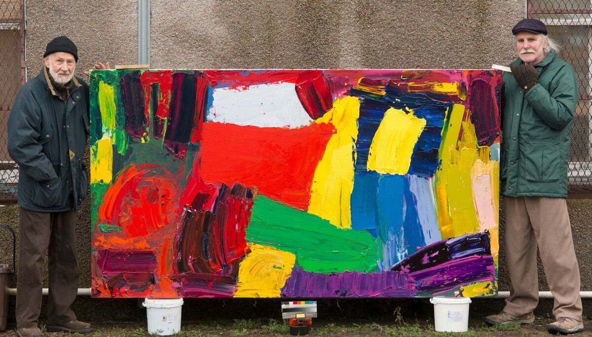
These paintings have a real fizz, bang, wallop quality about them that at first sight stops you in your tracks. Painters paint and trek about visiting exhibitions of others – sometimes out of interest, at other times… courtesy (come on, you’ve all done it!). Gouk is one of only a handful of contemporary painters whose work I would go out of my way to see. Thankfully on this occasion it was an easy drive. You have to see these paintings in the flesh though to really feel their colour in relation to their size and indeed to your own body’s proportions. Screens nullify both facture and scale and I would urge the editor to post an image or two with a figure in the scene and perhaps even a close up to address this, even in a cursory way. [Ed’s note – here’s one…]
It is worth exploring how the paintings are made, as the tools of the job are brushes and cardboard (apparently in this instance the actual boxes that the brushes came packaged in – that’s a new twist on the recycling logo!). We can trace the use of each of these two applicators: the brush daubs and sweeps colour into rough bands in a very forthright and accumulative way; spreading the colour and working it into ordered areas until an amount of colour arrived at “feels right.” The box is used to drag colour through other colour – wet into wet. Indeed the paintings retain an alla-prima freshness of execution. You can see that there have been several or numerous “sessions”, but the evidence of one colour sitting on top of another from a different session is not as strongly felt as the amount of “in one hit” painting. It looks like a lot of the painting has been put down, then a whole new painting or at least a significant part of one is laid over the top (such is the bravery of “Gouka Din”).

“Baltimore Oriole (Mandalay No. 17)”, 2016, 66″x100″, acrylic on canvas
When a wet colour is dragged into another wet colour, the stakes are high – unforeseen outcomes are a gainsaid (of all ambitious painting for that matter). In this regard Gouk’s hands are a little tied. Use a complement and the cliff’s edge awaits, so a gamut of analogous colours are used instead. Greens drag through yellows and vice-versa, creating limes, reds through purples and purples through magentas. Blue is often bonded with white, and white is used to kick areas into a bristling effervescence. The paintings are stacked with these heady effects. Reds smolder with an insouciant menace in shadowy plums or rusts. We are staring at colour used in molten ways. The gestures are deliberately confrontational, addressing us front on, like a troop of soldiers on leave; some stand cheek by jowl, others sprawl or lean as if drunk on sun and alcohol – burned by the heat of an exotic climate and bewildered by its alien treasures.
Actor Fred Proud can be seen on You Tube giving a remarkable reading of Kipling’s Road to Mandalay. This rendition re-awakened lines which had popped into Gouk’s head as he was working on a painting way back in 1986, which in turn sparked an interest to revisit some paintings, in his view, which were unresolved. This information conjuring up a thematic aroma to the proceedings, with titles referencing the poem throughout. Make no mistake though, there is no illustrative or figurative link with poem or place evident. Yet the qualities of these works, their other worldliness and their pictorial ambition for an intense, pressing hedonistic colour space, positively revels with such an association. Nostalgia can swagger every bit as much as nihilism, so it is therefore important not to drift into the reveries of distant places like an off duty squaddie. Stand up straight laddie, there are paintings to be made! Thankfully Gouk doesn’t yield to the temptations of allusion – temptations so evidently given in to by so many high(er) profile painters.
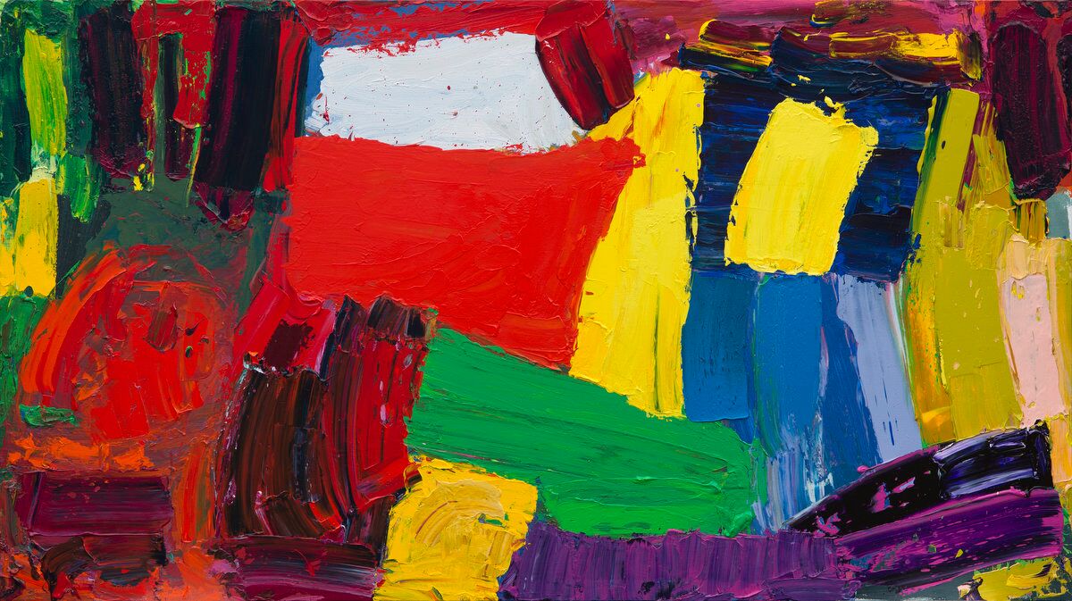
Mandalaysian Orchid, 2016, 66″x100″, acrylic on canvas
The unforgettable example on show is “Mandalaysian Orchid” – by general consensus the belle of the ball – “Supi-yaw-lat”. Like the others on show there is a sweaty, tropical temperature evident in the colour juxtapositions. The whole thing would burn out such is the acidity of the dark to light tonal shifts, if it wasn’t for the welcome cooling of a buttery lilac centre stage and a backhand flicked blue cuffed off to swim upwards and shunt into the welcoming corner of anthraquinone and dioxazine. A wonderfully applied pink at the top leaves a glimpse of an ice-cream roughneck ancestor to complete the dousing job. Like all the paintings on show, the regularity of vertical and horizontal holds sway, but, as in all of them, there is a simmering disquiet in the relationship of these forces, which adds a frisson to the work. To the left, we see a curmudgeonly cadmium lurch into the scene, propped up by a spindly streaky green that doesn’t quite stop the red from laying a finger on a friendly orange – a nudging plea to be allowed into the party.
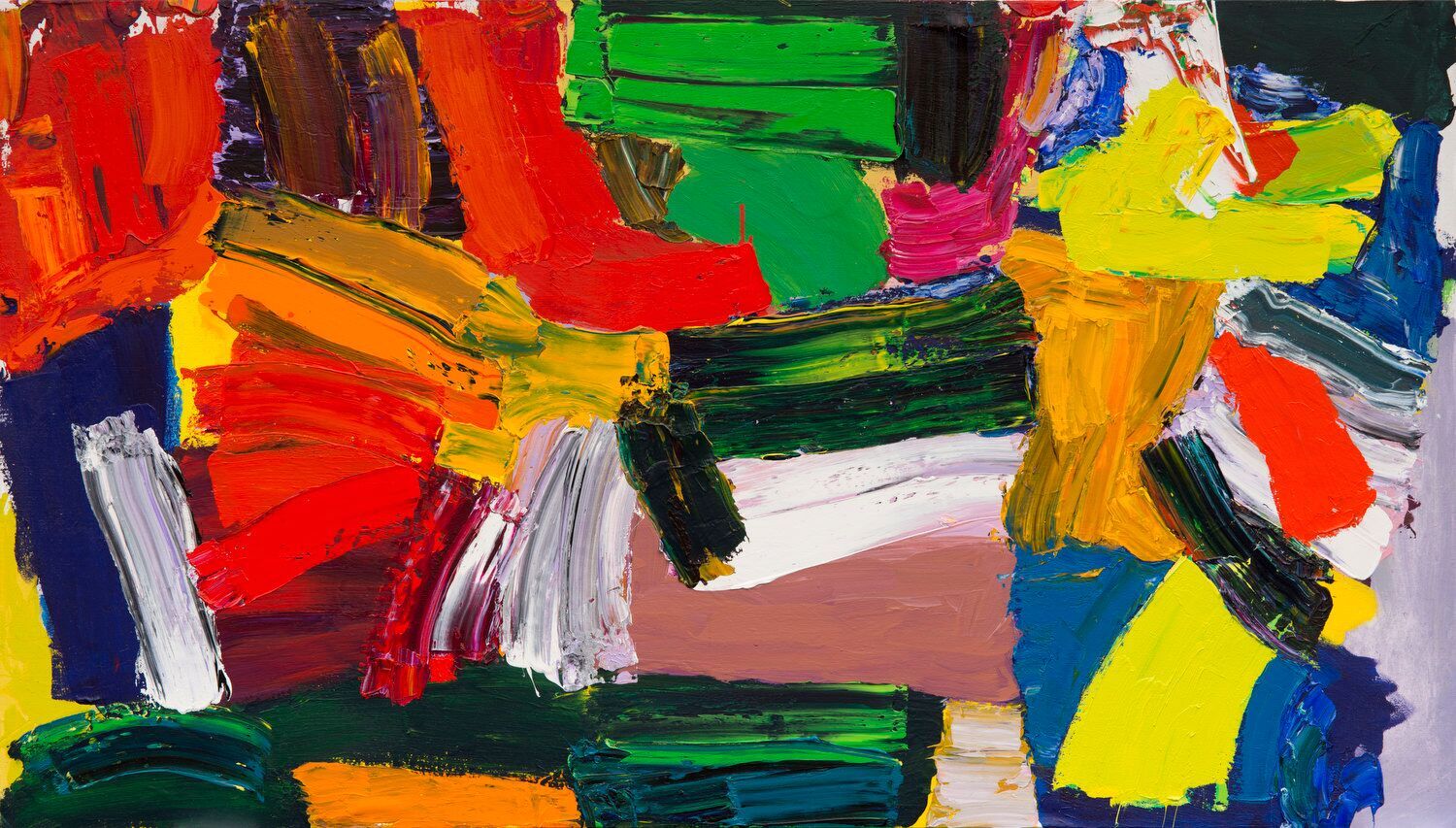
“Mephistopheles (Mandalay No. 15)”, 2016, 67″x118″, acrylic on canvas
Although this is the stand out painting, I want to make a play for something that is going on in another. “Mephistopheles (Mandalay No15)” has a lot more awkwardness about it. Indeed it doesn’t quite hang together. There is an uneasy cappuccino brown which hooks into a deep phthalo green and streaky grey creating a sort of hole in the gut of the painting. Although this coffee looks out of place amidst the bacchanalian antics of the other colours, it does attempt a sobering moment. Also the whole right hand side has a fluttery invention in the way that the colour sits on or under a neighbour and cascades up to the top. I couldn’t take my eyes of the deep vat orange which straddles a dragged whitened purple and grey, especially as the edge is the original stained lilac showing its canvas weave in an airy release of space at the corner. There is something telling happening in these colours and I would like to see more of it. Would it perhaps be prudent to bring these softer earths and muted hues into the spotlight more to give the big guns more room to breathe – perhaps even by throttling back on the dragging box technique? The whole painting has an unpredictability that suggests it will repay on repeated visits with its secrets remaining intact for some time yet.
“Theebaw’s Queen”, 2015, 36″x84″, acrylic on canvas
The paintings are worked on the stretcher from all sides and at some point an orientation presents itself. The ensuing gravity is then honed to an equilibrium. They sometimes have a “base level” of colour and sit up off that, getting to the top, which frequently has darker colours lurking about, either overtly or covertly enclosing and compressing the spaces. Coloured gestures and patches spread, squeeze or accelerate and often bump into one another in uneasy and at times claustrophobic ways. It is the saturation of colour that often rebuts any ungainliness, though not always; one or two passages had a dry stone wall build-ness which could have been lifted with more subtle transitions of hue, and some passages did lapse into tenebrous depths. The essentially frontal configurations shut down on any illusory devices. Illusions happen with colour, so why force them? Gouk prefers to maintain his focus on the primacy of immediate colour responses; put it on and see where it goes, what happens next will be something to deal with in due course, rather than worry about beforehand. I was trying to figure out a lineage here and although Hofmann and Heron, Motherwell even, could be cited, I am not convinced that any of them is a true ancestor. I’m sure that certain vernacular qualities raise their head from time to time which do connect Gouk with these three, but I would prefer to go back to Matisse’s “Moroccans” – a right bugger of a painting with a hard-wrought resolution that Matisse won his spurs on. It does no twisting and turning to present its mordant logic to us, rather it hits us head on – directly, unrelentingly; large – at first glance – cumbersome passages of paint gather their momentum and end up reaching an uneasy victory of pictorial unity. Each area of the painting is architecturally different to another. This is something that I see in Gouk’s painting – a declarative and specific construction of part to part relationships that neither exist as a process nor as a compositional device, though “Theebaw’s Queen” flirted with one. I think it boils down to an ‘honesty’ in the approach.
Gouk eschews any understated handling in favour of the power hit and there is no “knowing” device used to corral any reading of a fictive illusory space. This is a strength of the work; however, sometimes a little more sensitive variety of handling in the facture with some concessions to earths and more nuanced tertiaries in the palette would enhance their emotional reach even further. Then again I could equally well see him go the other way and make those high key chromatics career off each other in ever more explosively abrupt ways. The prize of such choices has to be earned by the hard yards in the studio. Which brings me to my final point: the directness and forthrightness of colour could appear to some as an obvious, even matter of fact thing to do; just get the big colours out of the tub, wing them around and hey presto another blockbuster abstract painting is born. It sounds simple doesn’t it? It’s not! Painting such as this takes a massive amount of dedication to one’s art. Not enough is made of this fact. Abstract painting with this ambition and clarity of purpose does not come easily.
“An there ain’t no ‘busses runnin’ from the Bank to Mandalay”… (though the 113 runs from Edgware Road and stops round the corner – go see.)

I am really looking forward to seeing this exhibition later in the month. I had the great pleasure of seeing Alan Gouk’s powerful works on paper in the 2014 show at HSOA, but these look as if they might positively ROAR at you off the walls.
LikeLike
Just about to board the plane over. Though it’ll take a bit longer than Emyr’s 113 from Edgware road.
LikeLiked by 1 person
This is a magnificent show, even within the confines of the limited space at HSoA (one could wish for more square metres).
I came to the Private View via the Wallace Collection, having viewed Poussin’s ‘Dance to the Music of Time’ and Titian’s ‘Perseus and Andromeda’. It would be churlish to make comparisons where none are appropriate. I do not think abstract painting can achieve what it is not suited or able to achieve. Perhaps now abstraction can vie with the greatest of Japanese ceramics, but regarded on its own terms, quite separate from the achievements and concerns dealt with in the great traditions of representational (figurative) art.
I concur largely with almost everything that is so eloquently stated by Emyr in his review, Robin in the catalogue essay, not forgetting Ellis Woodman (five spoons of sugar for The Builder).
Here is the however; I do not find a problem where I take it Robin and Emyr do. Whether or not “Mephistopheles (Mandalay No. 15)” is quite as successful as the other canvases, I have no difficulty with the (well) buff almost central block. In fact I find it activates the whole, working as a positive disruption, and can be read as a background. It also acts against what can be taken as Alan’s conventions that verge on becoming tropes. Further, the light blue left corner in “Baltimore Oriole (Mandalay No. 17)” performs a similar but slightly different function; it is as if the remaining painted surface could be lifted back as though it were a “skin” thus reminding us that this is a painting, a constructed thing. To my mind this resolves a problem that is manifested in what is generally agreed to be the most successful of these works, “Mandalaysian Orchid”, that the paint presents a solid wall. Both of the incidents I refer to start to allow the paintings to “breathe”.
As to touch, variety of pace, procedure or mark, are we asking Alan Gouk to be someone else? The temptation is always to think that the other painter should be painting like “me”.
LikeLike
Lovely writing here.
LikeLike
Without having seen the originals, it seems to me that the strength of these paintings in terms of color has to do with the fact that what we see is not the result of mixing paint of different colors before it is applied to the canvas (which would be to apply a new color, produced by the mixture) but rather of applying distinct colors in ways that mix them in the application itself. In this way, the individual colors retain (and insist on) their logical and special identity (one color cannot logically occupy the same space as another color) while at the same time being part of the same stroke or smear or wipe or other painterly gesture. This produces an extraordinarily dynamic surface due to the tension between logical facts (one color cannot occupy the same space as another color) and empirical facts (which force individual colors into what is seen as one division of space by virtue of the action that delimits the space).
LikeLike
On occasion you come across such a formidable intellect that you throw up your arms in horror. As Blaise Cendrars says: “ This year or the next/ Art criticism is as stupid as esperanto…” ( Blaise Cendrars Selected Poems, trans Peter Hoida, Penguin Modern European Poets).
One longs for just such a something to disrupt the scheme, like the sight of a girl with her blouse off glimpsed through a door ajar as you search for the address of a dentist you have been recommended.
LikeLike
Nice one. But do you really think a visit to Abcrit is like a trip to the dentist? How reassuring. You know you have to do it every six months. I’m just putting together a program of root canal work for Alan.
LikeLike
These look good from the jpegs. Hope to see in next couple of weeks. Emyr: is the anthropomorphising of the marks in the passages below intentional? Whether it is or not, do you think it meaningful? Are they in some way like personages / figures?
”
The gestures are deliberately confrontational, addressing us front on, like a troop of soldiers on leave; some stand cheek by jowl, others sprawl or lean as if drunk on sun and alcohol – burned by the heat of an exotic climate and bewildered by its alien treasures.
To the left, we see a curmudgeonly cadmium lurch into the scene, propped up by a spindly streaky green that doesn’t quite stop the red from laying a finger on a friendly orange – a nudging plea to be allowed into the party.
cumbersome passages of paint gather their momentum and end up reaching an uneasy victory of pictorial unity.
“
LikeLiked by 1 person
Good questions! It undoubtedly makes for lively writing, and I enjoy Emyr’s way with words a great deal; and it also makes you look again, which is good. It’s also really hard to avoid. But I think the question for me is whether or not it skews your looking. I don’t think I would naturally see things like Emyr describes in this work, but as I read the article, I went looking for the “incidents”. I’m not entirely comfortable with that.
LikeLike
Ekphrastic – I’m part Greek.
LikeLike
For me, this way of writing is perfectly OK because it dramatizes the paint AS PAINT. It would be different if Emyr were looking for fanciful images in the paintings, but I don´t think he is.
And how important that “finger” is!
LikeLike
From my catalogue notes:
“…they warp and bend spatially, make powerful movements in many directions…
They are only and wholly the fully articulated colour-spaces that they are, and yet this content is so far beyond the scope of what is customary in abstract painting that its sensual impact leaves one slightly breathless at the last. And it leaves the quotidian pursuit of aesthetics and good taste for absolute dead. “Mandalaysian Orchid” is a brooding, rocking vision that resonates more deeply with the artist’s own temperament than perhaps even he would care to admit – certainly deeper than the lighter moods of “Mephistopheles” or “Road to Mandalay No.8”,…”
I think there are perhaps two ways of looking at “Mephistopheles” (I’m sure there are more, but I have two at the moment). You can see it as a breakdown or breakout of the horizontal format we have recently discussed on Abcrit, wherein the strength of the content of the work depends to a large degree on the warping out of the orthogonal (particularly the sloping off to the right hand side).
Or you can see it as a kind of ‘motif’ or configuration that runs from right to left, horizontally across the centre of the painting, starting at the right-hand slope, running across the strong green horizontal bands, and ending in the mid-left hand-shaped fanning-out. All of this is the main action; what surrounds this action then blocks it in with reference to and repetition of the confining rectangle; a kind of ‘holding down’ activity. (I think this relates too to Ellis Woodman’s catalogue essay discussion of the bottom-edge, gravitational ‘grounding’ effect in some of the work, mentioned too by Emyr, which has been around in abstract painting a long time – see Hoyland in the sixties – and which I increasingly find a disturbingly figurative idea.)
When I thought of this second way of ‘reading’ “Mephistopheles”, I was reminded of a Fred Pollock that we talked about in Brancaster a few years back – “Sunspots” from ‘87-‘98. Fred actually talked about the ‘locking-down’ of the painting with the stuff that goes on around the edges, in this case with a more circular, but similar, containment of some central action.
Something similar might be said of “Mandalaysian Orchid”, because it too has a centralised main activity, maybe even a ‘figure’ of a kind, surrounded by a clatter of more orthogonal marks, but it seems to me that the worked-up energy of these, particularly on the lower right-hand side, in those dark and moody colours intermingling, but also across most of the painting, break clear of the orthogonal formatting, and mitigate the centralising tendency enough for the painting to work much more as a whole. To quote Alan himself, the “cavalier boldness of attack”, where the whole thing feels in the balance, for me wins the day.
LikeLike
Stressing or emphasising or taking possession of the bottom edge of the painting as a launch-pad for floating the superstructure above, has been a consistent feature of my work in whatever mode since 1981-82, when I first found my own way. It is one of the contributants to the architectural strengths of the pictures and I see no reason to abandon it, even if I could, in order to appeal to someone else’s sense of form.
LikeLike
Lots of interesting writing about Alan’s work here, but it’s Alan’s “word” in the catalog that’s most interesting to me. This sentence especially: “But they do attempt to convey a richer, a more abundant world of sensation than we normally experience, the after-shock which occurs when we experience something more than the senses can readily take in, and the perturbation of spirit which follows.”
I happen to have this sentence of Jacques Riviere’s lying around: “There are works that overflow with accusations, hopes, encouragements. You suffer, regret, take confidence with them; they contain all the beautiful perturbations of the spirit; you give yourself to them as to the counsel of a friend; they have a moral quality and always partake of pity.”
And this sentence of Merce Cunningham’s (the late great American choreographer) came up on Twitter the other day: “Dance is a spiritual exercise in physical form.” It provoked an interesting response from Robin. He Tweeted something about modern dance often being embarrassing.
I wish I could say something interesting about The Spirit. Maybe I’m embarrassed. Maybe I’m just not smart enough.
Not long ago I saw an evening of dance and music put on by the Mark Morris Dance Group. MMDG offered “a richer, a more abundant world of sensation than we normally experience.” There were two short operas: Britten’s Curlew River, Purcell’s Dido and Aeneas. TWO, not one: and they weren’t that short. There was live music. There more/less always is with MMDG. The thing is all this “richness”/this “abundance” came through clearly/directly: there was nothing “extra”/excessively “rich.” All the performers in Curlew River were dressed in white. Everybody in Dido was dressed in black. There was plenty of “simplicity.” Still it was way more than my senses could take in.
I’d listened to the woman I went with, a dedicated dancer, talk about Fred Astaire before the MMDG performance. After Curlew River she turned to me and said, “That was NOT entertainment.” She “loved” the performance. Had her spirit been “perturbed”? What would that mean?
I don’t really know, but I think it’s important. Maybe it’s embarrassing. It’s easier to talk about how “good” Alan’s paintings are, how “good” the Mark Morris dancers are—but Alan’s paintings and Mark’s dances are about much more than how “good” they are.
I guess there’s some sense in which Mark’s dances “explain” (to some extent) Alan’s paintings (at least for me)—some sense Alan’s paintings “explain” Mark’s dances. Mark loves Indian music and dance. He loves India period. It’s fun to think about Alan’s connections to India—through Kipling, through Tim Scott—in this “light.” Howard Hodgkin did design work for a number Mark’s dances. Another guy with “connections” to India, a guy whose work I think at least Robin might find “embarrassing”/not “good”—but what is that “embarrassment” about?
Anyway, guess what! You all will have a chance to see a brand new Mark Morris dance in May: Pepperland is coming to the City of Liverpool: Sgt. Pepper at 50 Festival, May 25-27. Here’s a link to a brief interview with Mark about Pepperland: https://goo.gl/10ts9e. Skip ahead to the 1:46:48 mark for the interview. Robin, I bet you’ll like Pepperland.
LikeLike
Luscious work boldly executed, Picasso said paint directly, which you have done admirably. Brilliant color.
LikeLike
Thank you Emyr for letting me know about this show of Alans ,which I will publicise to my students and go and see this weekend .This will be after taking in Robins sculpture,and Gary Wraggs paintings in Deal.Great that there are two shows of British Abstract Painting and Sculpture on at the moment.With Bill Tucker at Pangolin and Sams cracking show of 60s colour in Liverpool,Abstraction is far from a dead issue.Indeed there is a symposium by Matthew Macauley at a northern university[to be confirmed] coming up,with requests for papers.Two very good painters rang me to say go and see the Picasso show at Tate Modern,which I did.It was stunning and there were probably eight or so masterpieces in one room from one year!Tony and Sheila Caros show in Peterborough and Graham Boyd at the Cut,Frank Bowling in Dublin and Scully in Newcastle,Mali Morris at Women can’t Paint at Turps Banana ,loads to see,enjoy ,think about and stimulate new work.I hope there are all those hungry [artistically]young Abstract Painters and Sculptors out there keen to extend the genre.!
LikeLike