
Françoise Sullivan, “De une (Of One)”, 1968-69, plexiglass, 72.5 x 278 x 74 cm; Musée national des beaux-arts du Québec, photo: Ken Carpenter
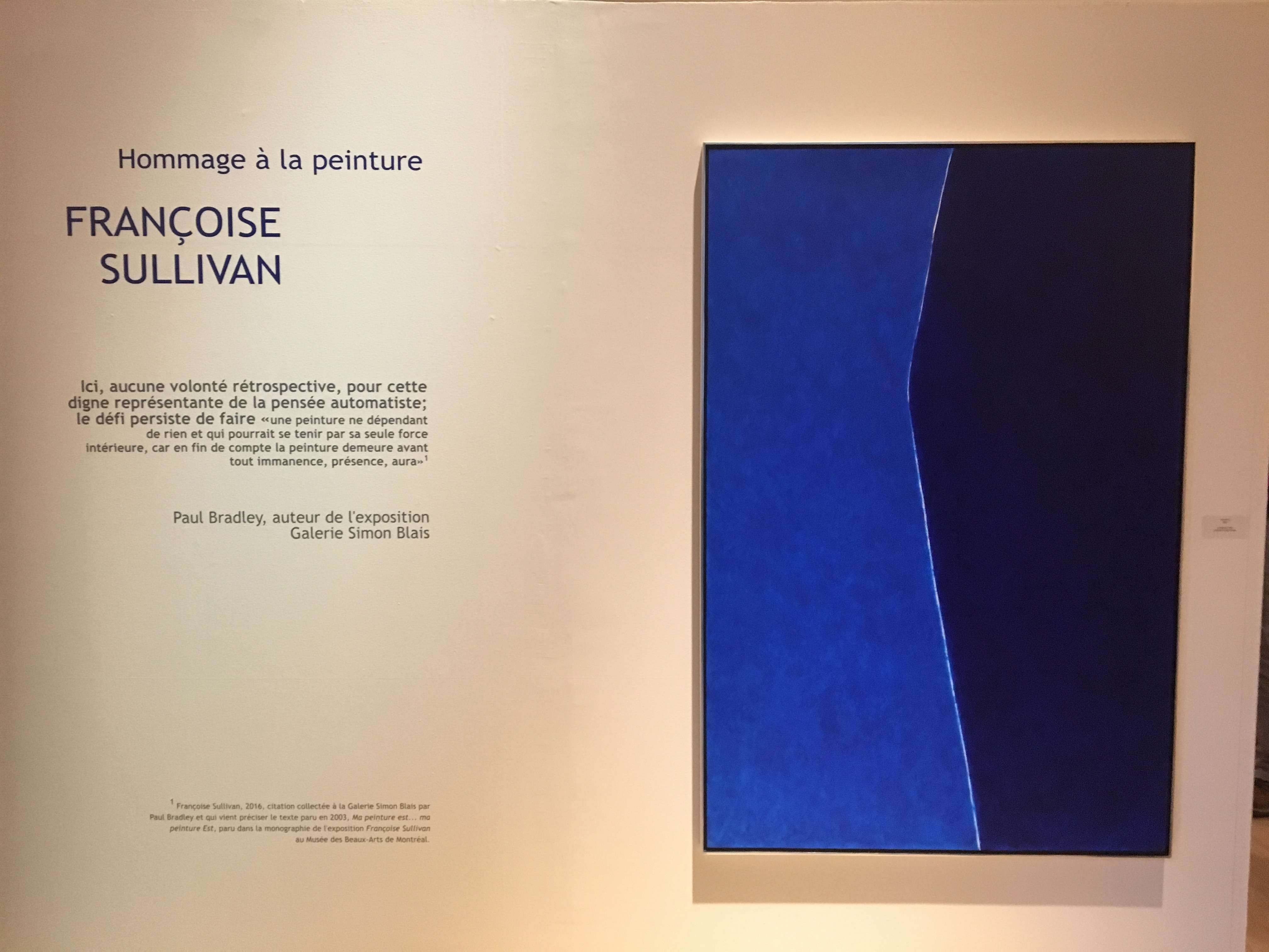
In the 1940s and early 1950s, Montreal was the pre-eminent centre for advanced art in Canada. The most important group there, Les Automatistes, emerged parallel to the Abstract Expressionists, although they were more inter-disciplinary and more political than their New York contemporaries. Think of their provocative and influential manifesto, Refus global (1948), which is often credited with furthering Quebec’s advance into the more modern era of the “Quiet Revolution.” While their leading figure, Paul-Emile Borduas, exiled himself to New York in 1953 and then Paris in 1955, where he died prematurely in 1960, several titans of Les Automatistes continued to re-invent themselves for a surprisingly long time, most notably Pierre Gauvreau (1922-2011), Marcel Barbeau (1925-2016) and Francoise Sullivan (1925- ). The vitality of Sullivan’s current work is a striking reminder of the importance of this still underappreciated movement.
If Françoise Sullivan were Japanese rather than Canadian, she would almost certainly have been designated by now as a living national treasure. She contributed a seminal essay (“Dance and Hope”) to that most important cultural document in the history of Canada, Refus global, and is widely credited with making a vital contribution to the development of modern dance in Canada. Moreover, she created some early modernist sculpture in Canada, was a leader in performance art here, and for the last few decades has been one of this country’s most prominent abstract painters. I think of her as the doyenne of Canadian art.
Françoise Sullivan , “Proportio-2”, 2015, acrylic on canvas, 152.5 x 101.5 cm,
collection of the artist, photo Ken Carpenter
The last twelve months have been a banner time for Sullivan, with three quite different exhibitions. Most recently, Françoise Sullivan: Resplendent Trajectories, curated by Louise Déry at the gallery of the University of Quebec at Montreal, focused on her conceptual and performance art. The enormous exhibition Françoise Sullivan, A Tribute to Painting, organized by Paul Bradley for the Museum of Contemporary Art in Baie St. Paul, re-affirmed her status as a venerable artist deserving attention far beyond Quebec. And her solo show at Galerie Simon Blais a year ago presented a significant renewal of her art. A radio programme by Michael Enright about her remarkable career was broadcast on national CBC radio on Feb. 12 and can be heard at the CBC website.[i]
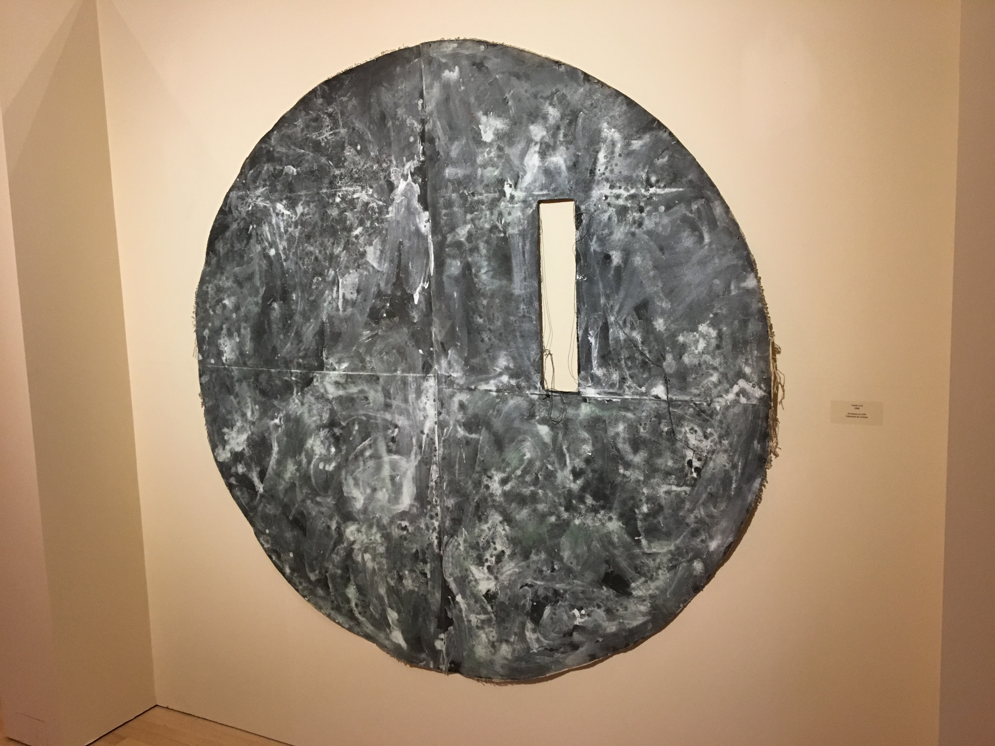
Françoise Sullivan, “Tondo no. 6”, 1980, acrylic on canvas, 169 x 178 cm, collection of the
artist, photo: Ken Carpenter
Sullivan has most often worked in series, and her more important ones were well represented at Baie St. Paul. From her celebrated tondos there was Tondo no. 6 (1980). For all its apparent unity, this understated but compelling work is a painting of rich yet subtle contrasts: both present and absent, joined and yet separate, emphatic at times in its drawing (that not-quite-perfect circumference! that excision!) but nonetheless understated in touch. A large circle comprised of two vertical semi-circles. The one on the right firmly folded down at its left edge and attached to the other. Each creased by a now-lost horizontal fold, but at different heights – two lines going in the same direction, on the same plane, but never to meet. A vertical rectangle cut out to reveal the wall behind – a touching conflation of absence and presence. Loose threads left by this excision reaching towards more lose threads at the perimeter, but never to join them. A rich range of blacks, whites and greys, with just a hint of red at the top right and even less of blue here and there, but enough to remind that black, white and grey are colours too. For me this is one of the most moving works in the exhibition, and yet Sullivan was not thinking of “establishing the oppositions,” as nineteenth-century painters sometimes did, nor of the “hard-won unity” that Clement Greenberg regarded so highly. Although she reads extensively, taught for years at Concordia University and has a lively intellect, Sullivan’s creative process is sufficiently intuitive that such criteria are never in her mind. She works without preconceptions and continues working until she senses the painting “is exactly how it has to be.”
From 1983 to 1986 Sullivan owned a house in Greece, where she would spend the winter each year. That experience inspired her Cretan Cycle, for which she would abstract shapes from the landscape, cut them up and glue them together. The result was figurative works, often in eccentric shapes, that in my mind — good as they sometimes are — are an excursus from the main thrust of her development. Some of them seem to be a more conservative version of the tondos, with an overlay of traditional subject matter and conventional drawing. But since Sullivan thinks of abstraction as the single most important development in twentieth-century art, she soon returned to it with an enduring passion.
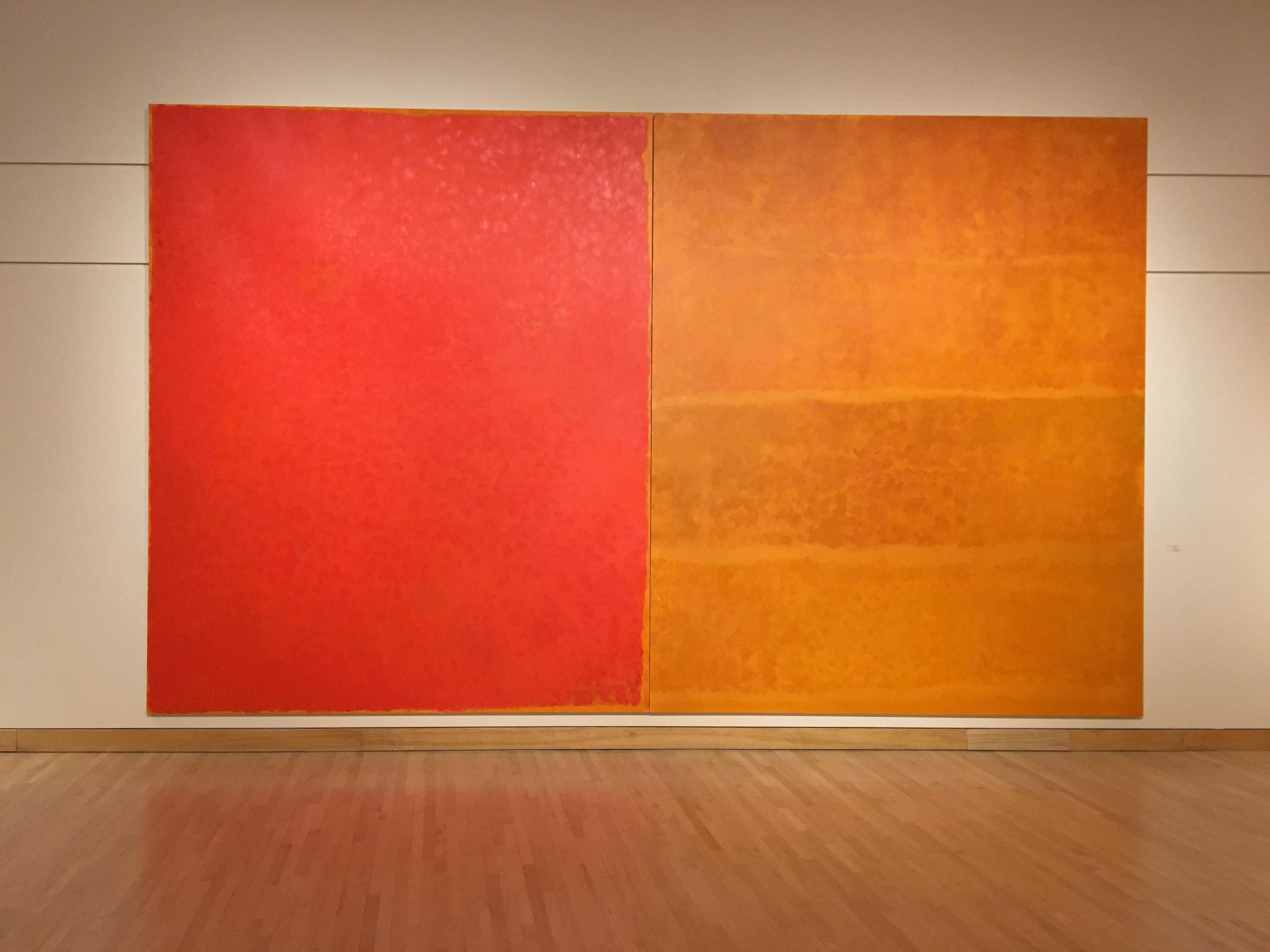
Françoise Sullivan, “Homage to Paterson”, 2003, acrylic on canvas, 348 x 574
cm, photo: Ken Carpenter
The Homage series has been acclaimed by the Canadian painter David Urban as “one of the most remarkable and affecting series of paintings in recent memory.” Homage to Paterson (2003) has a grand scale in keeping with the largess of the tribute Sullivan wanted to make to her former husband, the distinguished painter Paterson Ewen. As she observed, “Paterson got the biggest [Homage] painting. He was the most important man in my life.” At 348 x 574 cm, this diptych is indeed on a grand scale. Spare as it might seem, having only three colours and – perhaps – five shapes, all aligned more or less with the perimeter, Homage to Paterson is rich in visual relationships. A relatively assertive, monochromatic, unitary and impenetrable left side sets off the more permeable, irregular, and fluid forms on the right, infused as they are by a glowing luminescence. Areas on the right (now I hesitate to call them shapes) fuse with one another and then separate. The almost rigid rectangularity of the red side is subtly infused by the more organic elements from the right. And all this with the commanding presence of a painting that far surpasses mere human scale.
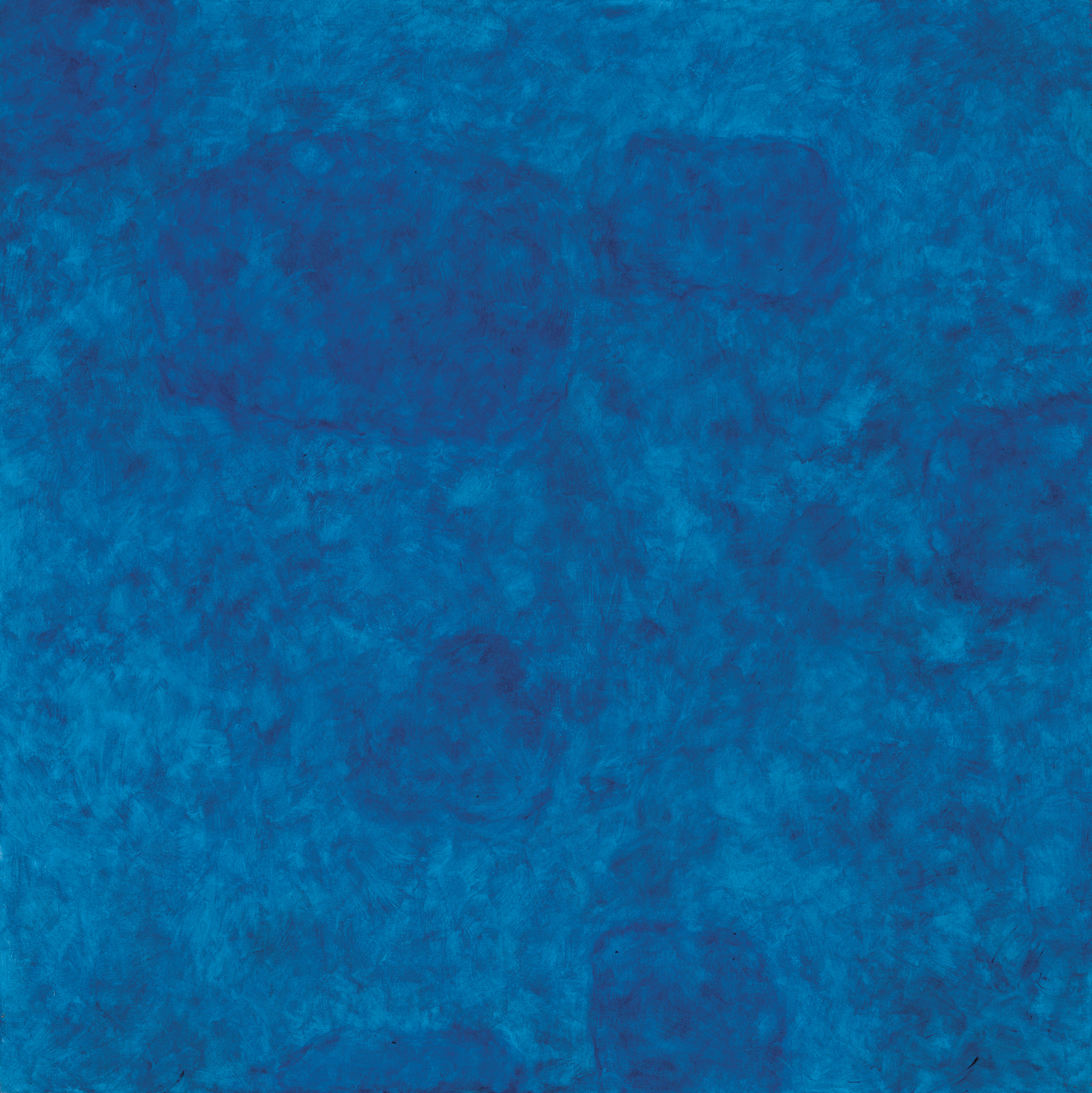
Françoise Sullivan, “Ocean no. 2”, 2005, acrylic on canvas, 122 x 122 cm,
collection of the artist, photo: Guy L’Heureux
Ocean no. 2, (2005, from a series done in 2005-06) is typical Sullivan. It’s the product of numerous delicate yet resolute touches, strikingly monochromatic, and with a quiet serenity despite all the fluidity it suggests. In Francoise Sullivan, A Tribute to Painting, artist Benjamin Klein cites Kenneth Clark’s essay “The Artist Grows Old”:
Nearly all the painters who have grown greater in old age have retained an astonishing vitality of touch. As their handling has grown freer, so have the strokes of the brush developed an independent life.
Here touch never asserts itself, never becomes, as Kenneth Noland once put it, “thingy.” Yet it’s central to the success of this sublime painting: it caresses; it has rhythm; it establishes cadence.
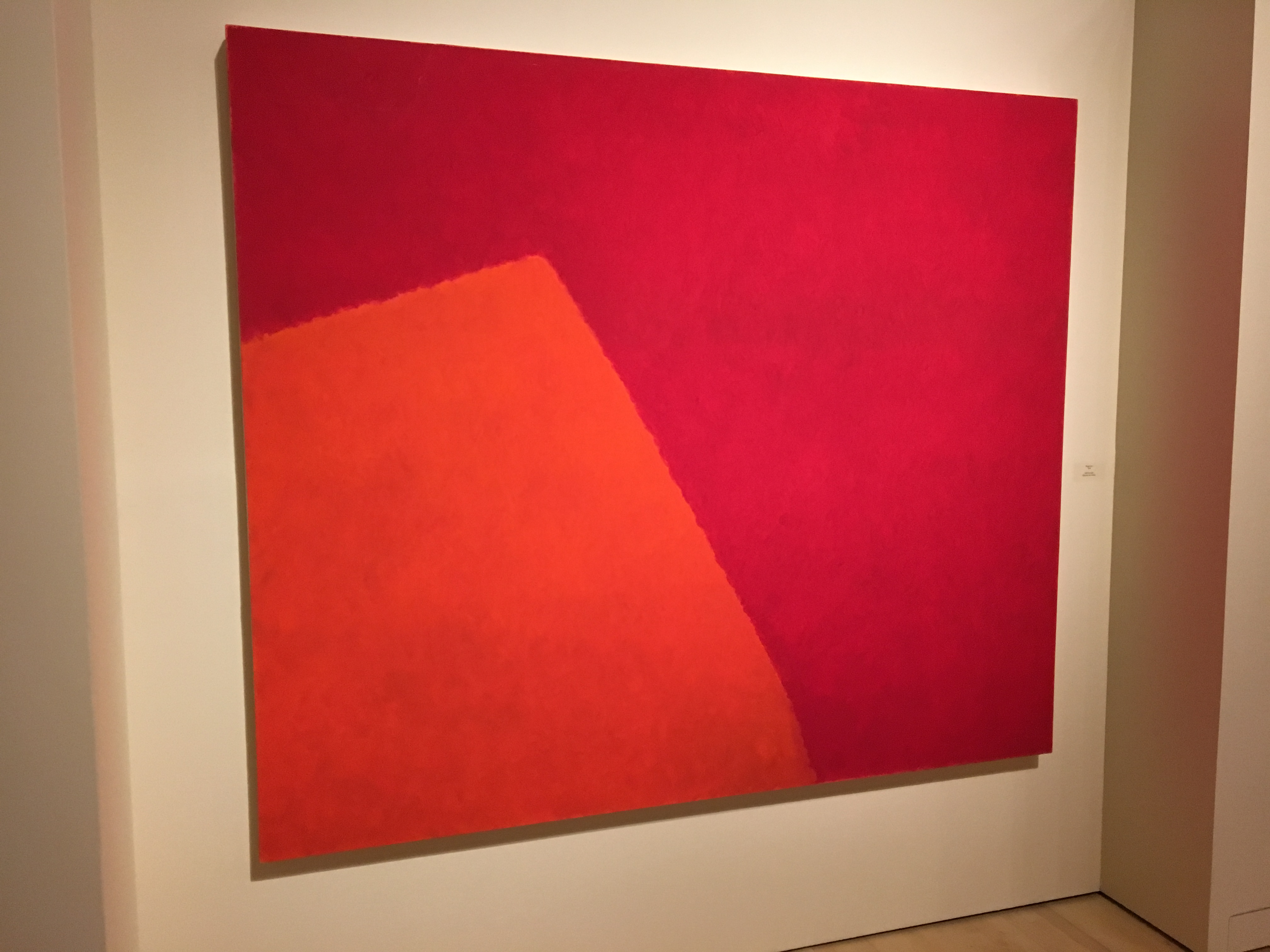
Françoise Sullivan, “Rouges no. 3 (Reds No. 3)”, 2010, oil on canvas, 167.5 x
198 cm, collection of the artist: photo Ken Carpenter
The Rouges series was well represented also. One might not expect a painting of such limited means as Rouge no. 3 (2010) to be as affective as it is. Two simple shapes. A mere two colours. A generally uniform écriture so understated as to be scarcely noticeable. Perhaps two emotional tones, that of the bottom left more ebullient than that at the top . Yet it has tensions, pressure. One gets a sense of envelopment, perhaps even of insertion.
Françoise Sullivan, “Red Bloom”, 2016, acrylic on canvas, 152.5 x 305 cm,
collection of the artist, photo: Ken Carpenter
Occasionally Sullivan has lapses. I’m not fond of the Arundel (2013) series. Nor of the Jeux series (2013-15), which can have too many shapes of excessively irregular proportions, too many colours (even when there aren’t that many), too much variation in handling. The catalogue suggests that in these works “effort gets mixed with play,” but I find in them a certain degree of inattention to the overall result. Sullivan has said, “I let the movements come…. I let rhythms flow,” but so much awkward angularity hinders that. Red Bloom (2016), from a series of the same name, strikes me as a much more successful painting. It does achieve that necessity art has when it is “exactly how it has to be.”

Françoise Sullivan, “Proportio-3″, 2015, acrylic on canvas, 152.4 x 304.8 cm (60”
x 120″), collection of the artist: photo Guy L’Heureux
In presenting yet another of her many striking moves into new territory, Sullivan’s exhibition Proportio at Galerie Simon Blais (March 2-April 9, 2016) made it clear that she remains at the height of her powers. The idea for this body of work came to her when she saw an exhibition of the same title at the Palazzo Fortuny in Venice in 2015, where the curators hoped to initiate a dialogue around “the lost knowledge of proportions and sacred geometry.” But more than that, she seems to have found new possibilities for complexity in her rather spare Rouges paintings of 2010.
The Proportio paintings are expansive, often grandly scaled works (several are 152.5 x 305 cm), that reveal themselves slowly. The triptych Proportio-3 (2015) has a few main shapes, all in the same family, but should we count six, or should we count four? They abut, enfold, and gently jostle one another, but these are mere suggestions of motion, a stately movement that has been not quite crystallized and stabilized. There’s also a sense of incompleteness to these irregular shapes; they have soft, imprecise edges and could readily be envisioned as extending beyond the limits of the canvas, and yet they nonetheless provide an equally powerful impression of monumental palpability, of sheer presentness.
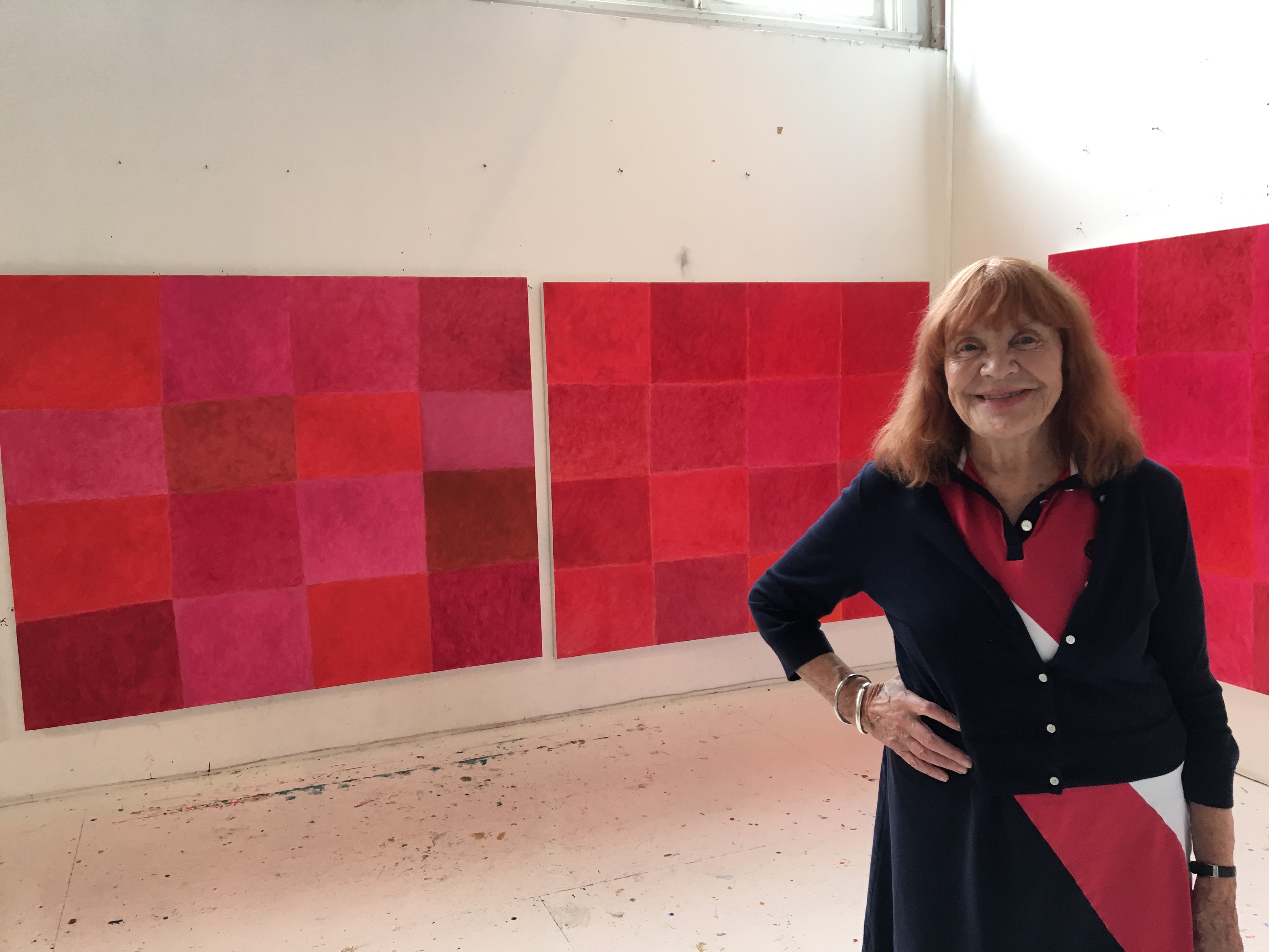
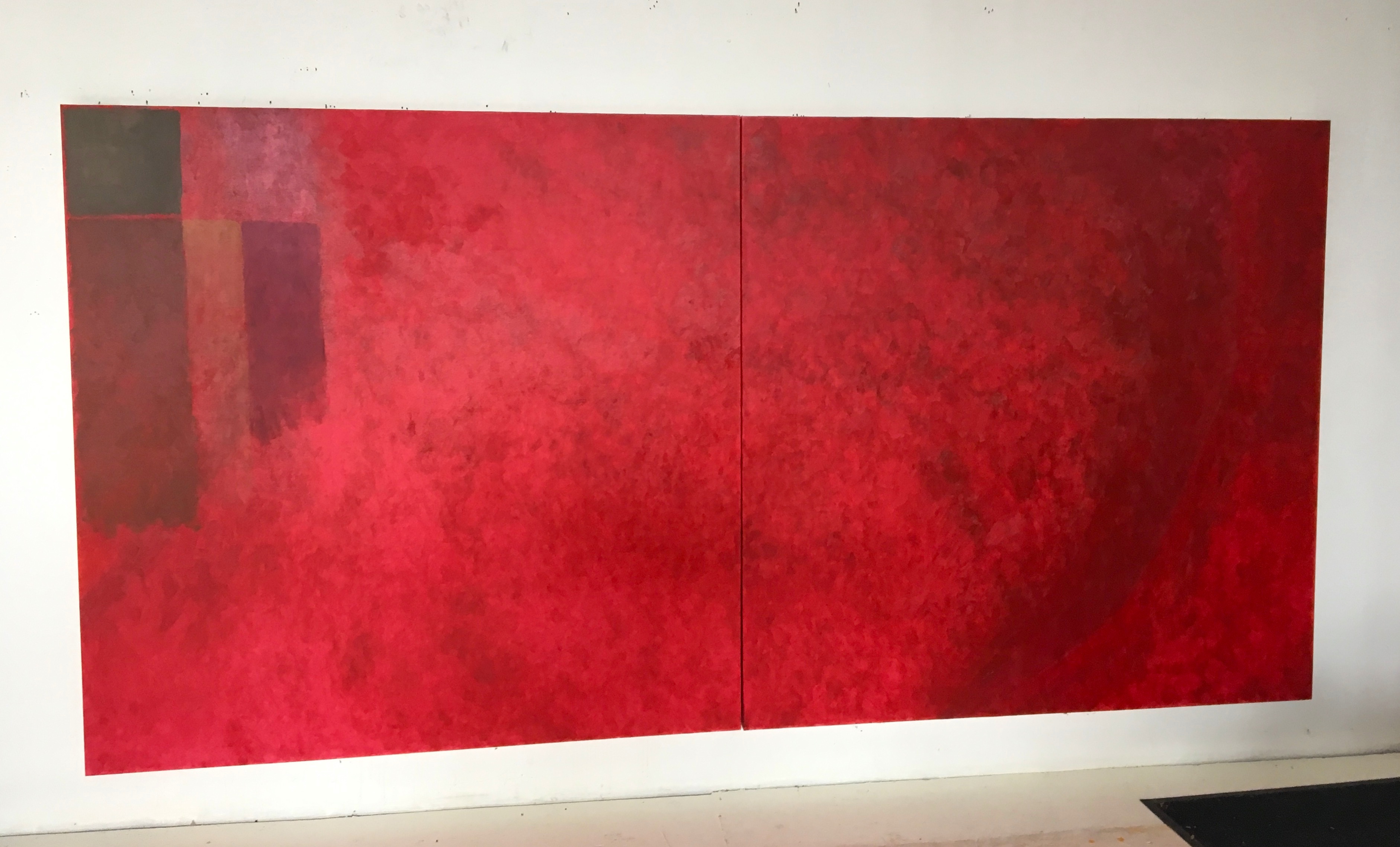
Sullivan in her Montreal studio with some of her “Only Red” paintings, Aug. 28, 2016; photo: Ken Carpenter
As I see it then, these paintings are also an art of yes-and-no, of continual ambiguity, of striking tensions, no matter how spare the composition and how limited the palette. We are reminded that Sullivan has always had a particular strength with monochrome or, if not that, then the next thing to it. The strongest works at Simon Blais were Proportio-3 and Proportio-4, spare yet monumental, reserved yet rich in feeling. But rather than press further with this inspired project, Sullivan restlessly moved forward with three new series in 2016: the Bloom series, the Cartesian series and the Only Red series. Her resolve to continually move forward is truly remarkable. Unlike so many other artists who have tailed off in quality as they got older – Vuillard, Picasso even, her Automatiste colleague Riopelle – Francoise Sullivan seems ageless.
………………………………………………………………
Paul Bureau, “New Cut (B)”, 2008, oil on canvas, 273 x 183 cm, private
collection, photo: Guy L’Heureux
Shortly after completing his BFA in 1983 and MFA in 1985 at Concordia University in Montreal, Paul Bureau moved to Paris, where he lived from 1985 to 1995. At the time he was painting with acrylic, but as he saw it, the results tended to be “too flat, too immediate,” and ultimately not satisfying, and so he switched to oils. This was but the first of many self-critical moves by Bureau.
Bureau thinks of the Efflorescences (1996) as his “breakthrough paintings, which he made by pressing one canvas against another,” and he discarded most of the work he had done before. Then for two years he made stripe paintings, the richly coloured Turbulences, but came to think of them as too limiting.
In 2006 he began his Passages series in which he divided his paintings into three sections. His first move would be to establish the division that would become the “concrete basis” for the composition, which is “right away made.” (Bureau’s English is perfect, but infused with some Gallicisms in word order.) The real work came with the layering and texturing within the confines of that basic ordering. Layer after layer of different colours were applied with folded exhibition invitations used as a trowel. To Bureau this process was “aléatoire” – that is, a kind of blind experiment with a hit-or-miss quality.
Bureau relishes “the exhilarating power of colour” and thinks of colour and colour relations as his forte. Nonetheless, in 2008 he began a series of resolutely monochromatic paintings with heightened materiality, the New Cut paintings. As such they could be considered the heir of and creative response to Borduas’ late monochromatic paintings. Bureau asserts that his interest is in abstraction where “the physical and material aspects of painting are paramount.” While the stripes that he thought had been banished from his work still linger somewhat, they now read more as meandering line. His habit of dividing the paintings into sections is more compelling than before: less assertive and less predictable. There are some fine works, such as New Cut (R) (2008 and New Cut ( B) (both 2008)).
As Bureau observes in a statement on his website, each of his series derives from the previous one. In 2010 Bureau began adding tiny rectangles within his highly textured, monochromatic fields, creating the One on One series. Whatever dissatisfaction he may have felt with the monochromatic works that preceded them, I’m not convinced by the solution. I regret that the added rectangles take up no more than about two per cent of the painting’s total area. Darby Bannard has written that the typical floating rectangle in Hans Hofmann’s late masterpieces took up five to ten percent of the picture’s total area and hence it was “big enough to assert itself” and could achieve a balance between isolation and complexity. In the One on One series I find rather too much unalloyed isolation. The Thrusts of 2012, which add a stripe as a second element interrupting the monochromatic field, are somewhat stronger, but not as strong in my view as the work that was still to come.
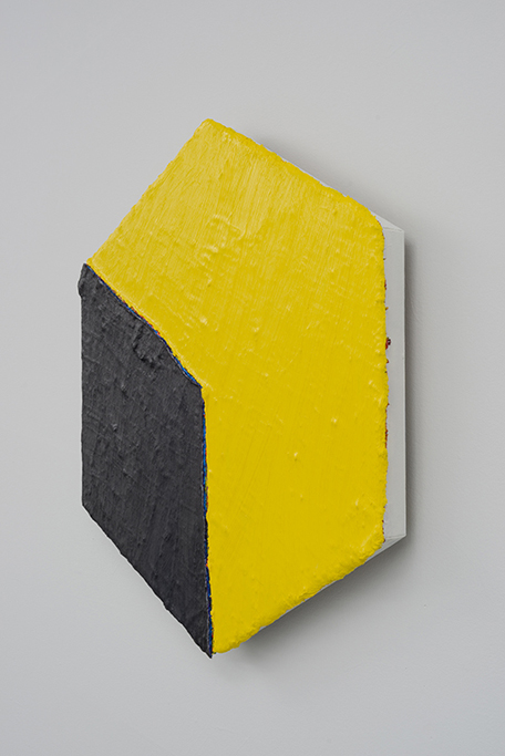
Paul Bureau, “Out of Shape (yellow/black)”, 2014, 76 x 66 cm, collection of
the artist, photo: Guy L’Heureux
I believe a more decisive breakthrough for Bureau occurred in 2014 when he requested that his supplier provide canvases in eight different shapes. The stripes that had continually infused his work, even when he thought he was free of them, were now truly gone, as was the multi-hued palette of the Turbulences. In part the idea came to him from his free-form shapes in ceramic of 2008, works that bear a striking resemblance to the paintings of Dutch/Belgian artist Bram Bogart. Perhaps his admiration for the spare vocabulary of Agnes Martin was also at play.
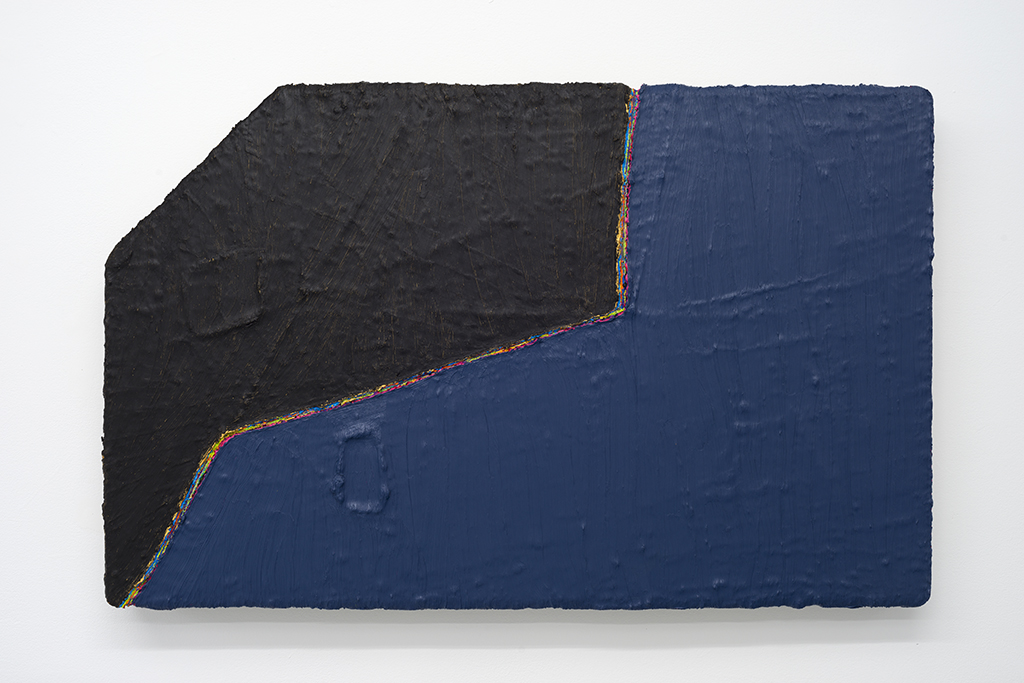
Paul Bureau, “Out of Shape (black/blue)”, 2014, 66 x 104cm, collection of the artist: photo Guy L’Heureux
Shaped canvases do have a history. Bureau’s most immediate predecessors would be Frank Stella, Kenneth Noland, Ron Davis and Ellsworth Kelly. In its illusionism Bureau’s Out of Shape (yellow/black) (2014) bears some resemblance to Davis’s Cube series of 1971, and both are hexagons. But otherwise Bureau’s Out of Shape paintings are very much his own. Michael Fried argued in Three American Painters (1965) for the importance of “deductive structure,” where elements inside the painting are echoes of the framing edge and so create an intensified unity. He was thinking of Noland’s concentric circles and Stella’s black paintings. But that repetitive echoing does not occur in Out of Shape (black/blue) (2014.) Moreover that painting is quite the opposite of Stella’s Protractor series or Noland’s “needle diamonds.” It has none of Stella’s interweaving, and little of Noland’s vaunted pressure of the inside on the outside, as Kenworth Moffett put it. It’s quintessential Bureau. There is still Bureau’s division of the canvas into differently coloured parts, as there was in the Passages series, but it feels more inevitable now. There is still a small isolated block, as there was in the One on One series, but it seems more purposeful here, serving to slow down the several propulsive diagonals above and to its left, and yet declaring itself less. What Out of Shape (black/blue) does do is to establish a kind of pressure zone where two irregularly shaped colour areas are at the same time both conjoint and isolated from one another. This duality is dependent on the thin multi-coloured line that serves to both unite and separate the two areas, much as Barnett Newman’s zips have been thought to do.
Bureau is an artist whose career had developed logically and organically, and he works with the heightened self-criticism that has distinguished much of the best in the now rather lengthy history of modernism. He would seem to be going from strength to strength. I look forward to his forthcoming exhibition, Interior Element, at the Patrick Mikhail Gallery in Montreal.
………………………………………………………………
Deborah Carruthers, “Mortsaf for My Father: Balcony Rock”, 2014, 50″ x 80″, acrylic on birch panels, photo Guy L’Heureux, collection of the artist
Like Sullivan, Deborah Carruthers is a wide-ranging artist with an interest in several disciplines: painting, photography, and installation works. Her wide-ranging intellect has resulted in photographic and installation projects on the unfortunate results of the War on Sparrows in Mao’s China and on a neglected Indian burial ground in northern Ontario. Her exhibition at Maison de la Culture de Notre-Dame-de-Grâce, Souvenir/Souvenir, included examples of all the media that she works in. There were also little assemblages that she put in vitrines and various objects that she hung on the wall. To be sure, she thinks of these vitrines and such as simply an indication of the sources for her inspiration rather than actual art works, perhaps even as aids to meditation on the transitory nature of all we value in life, but they can be distracting to the audience, which is left wondering what to make of all these things: moth wings, bird nests, chunks of bark, and so on.
As much as I admired her large-format photograph of the derelict Indian graveyard, with its shift in focus (the fence around the graveyard is in lower resolution than the trees in the background), I felt the abstract paintings were by far the strongest works in the exhibition. The source for her inspiration in these two grand diptychs was the complex of emotions aroused by the death of her father in November of 2012, and the exhibition was conceived as an homage to him. The title of the exhibition resonates with the two meanings of “souvenir”: “to remember” in French and a token of some past experience in English.
The diptych Mortsaf for My Father: Balcony Rock (2014) was painted with dozens of tiny number-ten-size brushes on birch panels that had been primed with transparent gesso, and it took a year to complete. Mortsaf for My Father: Resting Rock (2014-16) took two years. They’re both based on her memory of treasured times at her family’s summer home on Lake Ranbow in the Laurentian Mountains of Quebec, where she and her father would swim and playfully bestow names on the various rocks. Even now it pains Carruthers to see photographs of her father, but at last she can contemplate the lake, which – also troublingly – has long since been sold.
Deborah Carruthers, “Mortsaf for My Father: Resting Rock”, 2014-16, 60″ x 96″, acrylic on birch panels, photo Guy L’Heureux, collection of the artist
Carruther’s palette is spare: a few neutrals and earth tones, a pair of complementaries, and not much else. But the heightened intensity that one might expect from simultaneous contrast is not the issue here. Rather, colour flows, shifts, fades away and never quite seems to come to rest. I am reminded of Adrian Stokes’ comment that Monet “was attracted … by scenes of near dissolution … from which he distilled an instant yet solid loveliness.” Carruther’s vision has a diffuse or scattered quality that resists focus. It seems she intuitively appreciates the value of what Anton Ehrenzweig in The Hidden order of Art (1967) called “synchretistic” or unfocused vision (a term he borrowed from Swiss psychologist Jean Piaget).
The diptychs owe nothing to Jules Olitski’s spray paintings, but they do have a kinship with them. Like the Olitskis, Carruthers’ paintings hover between the insistent presence of their surface and their utterly evanescent colour and touch, which is compounded by their complete removal from the realm of identifiable shapes. Olitski recounted how he and his grandmother, exiled from their native Russia to the United States, and deprived of the presence of Olitski’s father who had been killed before Olitski was even born, would watch the smoke rise from a pile of burning leaves and recall what had been lost. He exclaimed: “I am almost overcome by a feeling of great joy, as if something loved and long gone had returned.” As I see it, Olitski’s spray paintings convey simultaneously a sense of both presence and absence, as do Carruthers’ diptychs. I admire the way both artists have created deeply moving meditations on loss, working from a universal experience that is, in the words of Newman, Gottlieb and Rothko’s 1943 letter to the New York Times, both “timeless and tragic.”
The abstract proportion of Carruthers’ work has fallen in the last year or so, and she faces some key questions now: where does she see her greatest strength, and in what direction will she now take her work? And perhaps even more crucial, what are the most fecund sources for her inspiration? Her answer to these questions could set her path for decades to come.
[i] http://www.cbc.ca/radio/thesundayedition/at-93-pioneering-avant-garde-artist-françoise-sullivan-paints-every-day-and-lives-in-the-present-1.3976835
Françoise Sullivan: Resplendent Trajectories, curated by Louise Déry, was at the gallery of the University of Quebec at Montreal from Jan. 11 to Feb. 18, 2017.
Françoise Sullivan, A Tribute to Painting, organized by Paul Bradley, is at the Museum of Contemporary Art in Baie St. Paul from Nov. 25, 2016, to June 4, 2017.
Françoise Sullivan’s exhibition, Proportio, was at Galerie Simon Blais in Montreal from March 2 to April 9, 2016.
Paul Bureau’s exhibition, Interior Element, is at the Patrick Mikhail Gallery in Montreal from April 1 to May 20, 2017.
Deborah Carruthers’ exhibition, Souvenir/Souvenir, was at Maison de la Culture de Notre-Dame-de-Grâce in Montreal from Nov. 24, 2016, to Jan. 29, 2017.

This is a really nice essay, and in some curious way Ken’s waxing lyrical on the charms of Sullivan etc. is quite refreshing, because it’s so genuine and felt.
But really, though I have enjoyed the read, I find at the last it’s hard to take some of it. On “Tondo No.6”, for example: “A vertical rectangle cut out to reveal the wall behind – a touching conflation of absence and presence. Loose threads left by this excision reaching towards more lose threads at the perimeter, but never to join them.” Ah, the pathos of those poor severed threads; and the sense of loss because a hole has been cut out of the canvas. Are we to take meaning from this? I just can’t do it.
Then there is the minimalist ambiguity of it all. You (Ken) seem to see so much in such fine nuances. Perhaps you have a much more refined sensibility than I do. True, it’s unlikely I will get to see this work, as it’s improbable it will get to the UK galleries, but it looks in any case very familiar. I’ll never know for sure, but I think I can imagine how it feels to confront Sullivan’s big paintings. This kind of work generally demands that you make an interpretation of it because of the paradoxical fact that it is so undemanding; it insists that you find in it analogies to the human condition, both mental and physical, because there is nothing much else to do with it, because there is nothing much in it. But if you are not prepared to do that, and I’m not sure that I am, the work has very little to offer.
I think abstract art has moved on since the time when this kind of nurturing of the “barely there” meant something to the cognoscenti of abstract art just from the sheer novelty of its pared-back minimalism. There is a need now, I think, to be less presumptuous about what will be worthy of attention, and thus a need to put in much more content (abstract content, I mean) for the viewer to look at, and to allow a far greater freedom for the viewer to make choices about how they discover meaning – a kind of multi-tasking by the work itself, if you like, that allows different ways of looking – which is a long way away from the celebration of ambiguity that is elaborated here. Abstract art needs to evolve – and already has – beyond such a simple state, beyond minimalism and familiar tropes, in order to survive and be in the present both engaging and relevant.
LikeLike
Hi Ken, I’ve been meaning to write this a long time ago, but….you know how it is !
Good to have your occasional writing on Abcrit; how about raking in some of the other Canadians – Bentham, Fauteux, Sutton, the Edmonton mob et al ??? It would make for some more alternative viewpoints.
LikeLiked by 1 person