
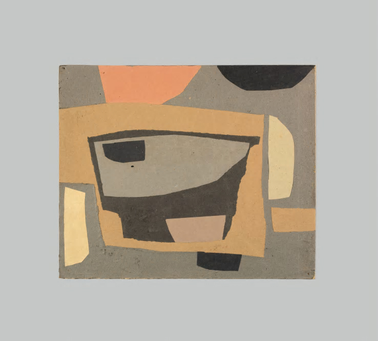
Francis Davison, Redfern Gallery installation, ‘No Number 2’ and ‘D-277’
Francis Davidson was at the Redfern Gallery, London, 14 November – 21 December 2017
https://www.redfern-gallery.com/exhibitions/33
‘The sensation of physically operating on the world is very strong in the medium of the paper colle or collage, in which various kind of paper are pasted to the canvas. One cuts and chooses and shifts and pastes, and sometimes tears off and begins again. In any case shaping and arranging such a relational structure obliterates the need, and often the awareness of representation. Without reference to likenesses, it possesses feeling because all the decisions in regard to it are ultimately made on the grounds of feeling.’ Robert Motherwell
It is rare to see an exhibition of completely abstract collage; by this I mean work without reference to cut up body parts or fragments of recognisable objects, ranging from Picasso/Braque, (who both used printed patterned paper and also painted into the work as well as using plain coloured papers) through Dada and the Surrealists
(who used photographic and printed imagery, rearranged in incongruous juxtapositions) through Pop, to now, where the genre is soaked in the legacy of all the aforementioned. Exceptions to all this are Arp, Tauber-Arp and Schwitters and even earlier, in the 20s, Paul Joostens who remains perhaps as unknown as Davison.*
In contemporary terms there is of course the work of John Bunker or John Eaves, who use both painted and unpainted paper and a constructive rather than destructive take on the material; they are part of a small bubble amongst the post-modernist torrent of deconstructed, reconstructed cut-up archival photographic and modern advertising imagery (not to mention the application of untold technology). However, Davison was unusual in the ‘purity’ of his approach in that he solely used unpainted coloured paper; the only patterning in evidence is in the grain of some of the brown paper and envelopes, and that is intrinsic to the material.
‘A-42’, 1952-3, 50x59cm
This is a substantial show of Davison’s work, ranging across his whole career, with pieces from 1953 to 1983 and ranging from an intimate 14x15cm to the largest at 145x148cm. There is one early work, A-42 from 1953/4, which is significantly different from the rest, in that the torn paper elements are arranged within a delineated rectangular ground, a practice he used until 1963 when he then allowed the fragments of paper to form the edges of the piece. This resulted in a more informal and expressive medium, though it was only in the 70s that the predominantly regular rectangular format started to be disrupted. Unlike some collage practitioners, Davison relied solely on found coloured paper, and did not paint it and then tear or cut it before applying it to the piece. A lot of it is crinkled, crumpled and creased and this adds to the aliveness of the material; he didn’t iron it flat. This use of the jagged edge and the distressed surface distances him from Matisse with his dextrous practice of cutting clean, painted paper. Davison has more affinity with Arp’s ‘chance’ collages of the 30s. However, his are not ‘chance’ pieces; they were worked and reworked, deliberated upon and worked again in an open process until they felt right. Often he would take parts of existing collages and recycle bits from them, thus destroying what had previously been thought of as finished. Like painting, this was an ongoing cycle of creation and destruction, with each fragment of paper stuck down obliterating and transforming what was there before; one colour butting up against another forming a new relationship which would change the timbre of the whole. A lot of the works are dated between two to five years, showing the interval of time he worked on them or revised them after some time had lapsed, often cannibalising previous works.

‘C-58’, 1965-71, 69x100cm
The wealth of colours and the different torn shapes, some recurring, such as the square or circle, the long thin rectangle and the curved segments, could all be combined and repeated ad infinitum with many variations but form disjointed symmetry and syncopated rhythms. For example, there are a number of pieces that have a chequerboard effect where regular sized squares of one colour are dominant, such as C-58, which is the most striking example in its limited palette of yellow, black and brown. Its stacked uneven rows of yellow and black squares set against yellow and black triangular grounds are offset by two simple diagonals, one a single strip of yellow running in from the top right corner, the other a broken line of yellow squares set along the diagonal border where a black triangle meets the brown ground in the lower right corner. These two diagonals are matched by the edge of the yellow triangle on which black squares jump about, in the top left area. The dynamic energy of the interior is sustained at the edge with black and brown strips and some yellow and a few black squares. Torn squares are used to similar effect in C-55, also with a limited palette, very different to the previous one, with green, yellow and black.
‘C-163’, 1965-71, 111x108cm
Some squares of the same colour are used to very linear effect such as in C-155 and C-163, producing a similar energetic feeling to a couple of late Mondrian paintings, Broadway Boogie Woogie and Victory Boogie Woogie; the first with a sedate, sparse, vertical-horizontal rhythm, the second with a more intense, dense, syncopated pulse.
Some of the works have gaps or spaces in them, such as the small rectangular one in D-300, set slightly off centre; or the larger vertical slit in D-185, which breaks the horizontals, and is set off-centre to the right. More dramatic is that of C-182 where the centre is almost hollowed out, but is pierced by a black horizontal. The central punctuation in D-211 is complimented by gaps in the unequal edges of the piece, one vertical at the top, and a horizontal on the left side, breaking up the mass and adding to the spin effect caused by the stacking of different coloured strips and the yellow L shape.

‘D-211’, 1972, 112x125cm
Few of the collages completely break out of the rectangular format; even when they have ‘outriders’ these are usually contained within the limits, as the ‘empty’ space still reads as if it is part of the whole; often a gestalt is formed with the edge of a near block of colour, thus completing the mostly rectangular form. ‘Horizontal Navy’ and ‘No Number 2’ are the only ones that break out, with diagonals on the left hand edges. However, this sense of restraint is reinforced by the black frames, and one has to imagine these pieces without that boundary. Those mentioned above, and D-230, that have irregular ‘outriders’, even though they don’t explode off the main mass, would have a greater sense of space without the frames.

Installation shot, ‘D-36’, 1970 and ‘D-230’, 1971
Some of the small ‘envelope’ pieces are more successful in breaking the mould. This more intimate series are made out of torn brown envelopes and white paper and with the latter there is sometimes some typed text on what was possibly a letter. There are subtle colour variations in the brown paper where different envelopes have been used and they have more breathing space in their frames, which are a more sympathetic colour than the black ones of the larger pieces. In fact, spatially, these small ones are much more adventurous overall. Perhaps small is beautiful, large is more tricky; however these are from the last years so there will be an accumulation of experience from the previous bodies of work.

‘HL-29’, 1983, 18x21cm,
Noteworthy that the largest piece, ‘No Number 2’ (top image) is also from this time and feels like the loosest, most informal one, even though it is based on two concentric rectangles, one black, one white, with a hole in the middle. It is unfortunately imprisoned in a very tight frame, which at least is not black.

‘D-185’, 1971, 84x94cm
Some of the larger pieces contain ‘painterly’ effects, where one colour paper has been stuck down and later removed leaving traces of either the upper or lower layer, or streaked remnants of both. This is mostly in evidence in the later pieces such as ‘Horizontal Navy’, ‘Many Colours’ and ‘No Number 2’, all dated 1978-83; they are the largest and latest in the exhibition and have a much less ordered application of paper than most previous ones. It is possible that here we are seeing the results of much more recycling of earlier pieces, their elements torn apart after being stuck down, hence the textural, more ragged appearance.

‘G-609, Horizontal Navy’, 1978-83, 117x110cm
In C-98 we can see clear evidence of where a black paper square has been peeled away leaving traces of the edge and the remaining area has triangles of different blues added to give the area a more complex feel.

‘C-98’, 1965-71, 82x57cm
Some pieces have a clear, simple structure such as C-145, C-187, C-148, C-149 and D-36. The limited blocks of colours work together with the punctuation of different coloured ‘holes’ made from the roughly torn squares, placed as accents, so that what appears to be behind the strip of colour is actually stuck on top. There are many instances of this but for me the most effective is in C- 182 where there are only two of these coloured ‘holes’ and they are of different sizes; they work in conjunction with the central gap to add a different dynamic. In a lot of the others they are too regularly placed and of the same size to surprise us. However, in D-36 there are actual holes as wells as plugs and this makes for more interest.
Time spent in the exhibition reveals a surprising and satisfying variety of form and colour using the very simple material that is coloured paper.
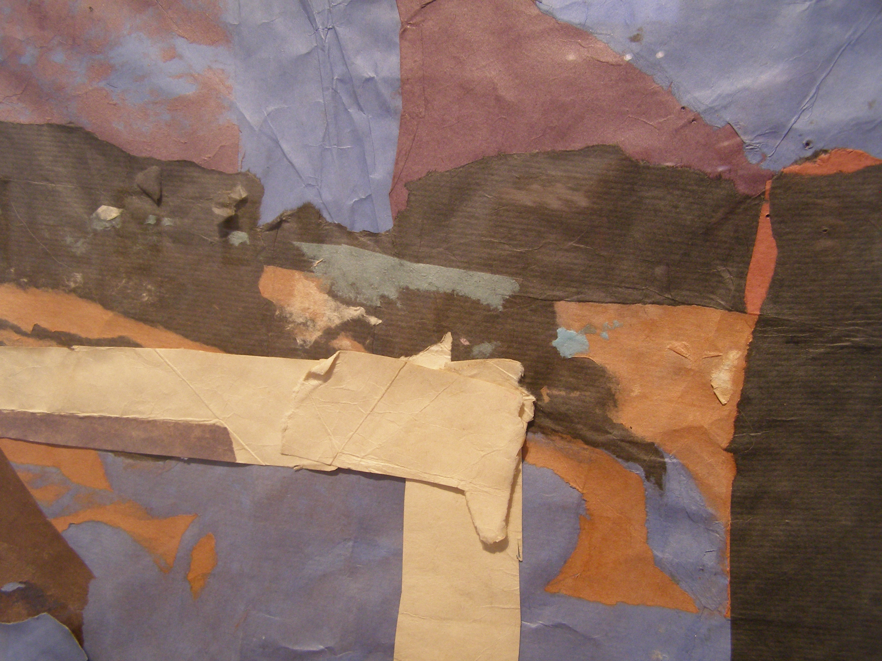
Detail, ‘H-23’
* of course I have missed out Miro’s ‘anti-paintings, Rotella, Villegle, Burri, Marca-Relli, Motherwell, Blow et all, and the combines of Rauschenberg and the mixed media paintings of Bowling, and when is a collage a collage and not a painting… but that’s another essay…
