
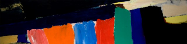
‘Poet and Peasant’, 178 x 335 cm., November 1991
Origins and Diversions: Pete Hoida paintings 1991-2017, in association with SITselect at The Malthouse, 9 January – 25 February 2018
http://www.petehoida.co.uk/exhibition/malthouse.html
“What use painting is to woman or man is unknown, yet it is surely necessary, as attested to by the caveman and the dandy. I have long pursued a path that avoided the health-plans and dogmas of the high-priests and the moneylenders, and yet have overthrown nothing but painterly cliches and visual platitudes.
Over a career of fifty years I have disregarded the demand to produce series of signature works and failed to subjugate myself to mere talent. I am not looking to produce patterns; each period of painting has created, or found, its own identity. Sometimes the characteristics of the work, or foundations, carry over from one year into the next period. Or subside for a time before reappearing transformed, made new yet again. Paintings from the 2010’s can present aspects of the 70’s. The colour say, or the motif, or motive force, the brush-stroke, the time-line, the structure, its translucency or opacity, its serenity or punch. I have eschewed drawing, images, narrative and subject; I have defied the camera that always lies. I have told only the story of the brush that lies. I have quarrelled with the canvas and lost. I have found the surface and ignited it.” Pete Hoida, 2017
The Malthouse, formerly part of Stroud Brewery, is a formidable venue for an art exhibition. The bare rustic brick walls and vast height are no problem, however, for Pete Hoida’s central piece, ‘Poet and Peasant’, measuring a magnificent 178 x 335cm. The painting completely holds its own and commands the space with its sublime passages of pastel shades in pistachio, turquoise, eau de nil, yellow and pink, offset by blocks of rich sumptuous carmine overpainted by muddy purple, smeared yellow into umber, earthy green and flashes of orange and red. Hoida allows the underpainting to show through, creating a rich surface generating space and light.
‘Cork’, 64 x 269 cm., 1992/93
The two works with exaggerated horizontality are hung very high but still maintain a potent presence. ‘Cork’ has a bold diagonal drive with strong pure colour blocks wedged between midnight blue and black fields to the top and side, with a bite of light yellow and a bar of pale ochre to hold the composition in place. ‘Cobalt Patch’ has a steady rhythm of dry colour patches moving from one side of the canvas to the other with accents of red uniting the visual field. There are margins at either end, holding bands of colour, a narrower blue on the left and a large area of mixed reds through to orange on the right. The eye is guided to the central area of cream, red and black by sloping diagonal strokes within the blue and red margins.
‘Cobalt Patch’, 91 x 328 cm., October 1993
These two works read from side to side allowing the eye to pause at each new block of colour as if reading a scroll.

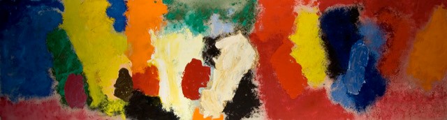
‘Sleeping Bee’, 145 x 336 cm., February 1992
’Sleeping Bee’ overcomes the constraint of an alcove with light fittings, and shines out with a substantial field of buttery yellow to the left travelling and narrowing across the canvas into a belt of lighter yellow merging into lilac grey with a sliver of green in between. The loosely painted blocks in a myriad of colours from peachy red to sandy umber act as ballast to offset the yellow mass and create a disrupted structure.

‘Mrs Joyce’, 35 x 45 cm., November 2006
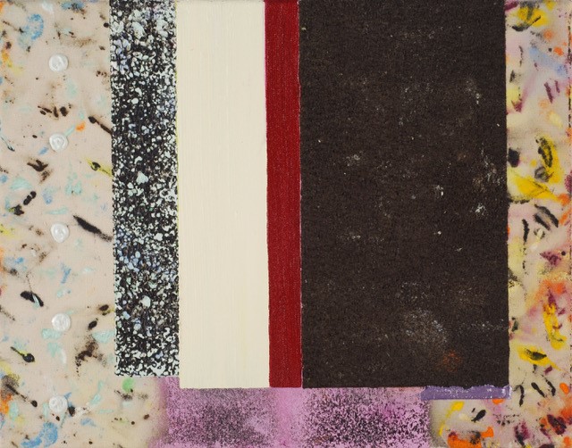
The three smaller paintings, ‘Mrs. Joyce’, ‘Kittiwake’ and ‘Vanilla’, have hard edged and deliberate textural elements to them. They are sweet-toothed brutalist confections punctuated by iced gem motifs, flowing bronze squiggles, volcanic liquorice sheets and gritty rectangles hovering in front of a delicately painted backdrop of small mineral explosions in gaseous space. The colour married to the texture is especially compelling.

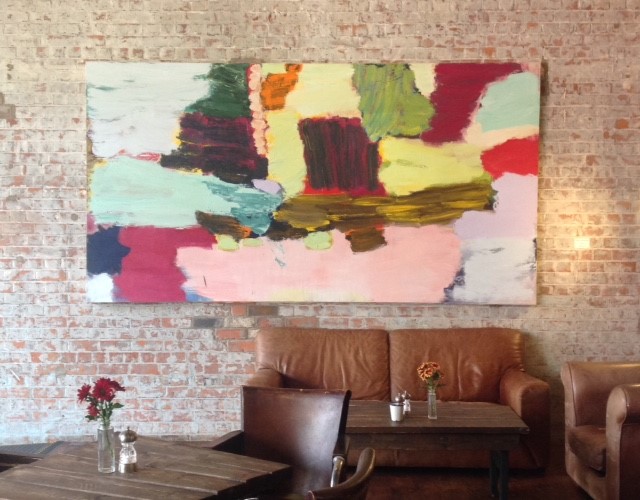
‘High Voltage’, 139 x 124 cm., November 2015 – October 2017
The most recent painting is ‘High Voltage’, an audacious composition with an ovoid floating in front of a black rectangular gash, centrally placed for maximum effect, challenging the viewer with its full-frontal stance. The white ground behind holds ghostly images of the underpainting whilst being flanked half way up either side by panels of black, sienna, cerulean, umber and mint green. The delicate blue and green blocks on opposite sides are perfectly placed to hold the space and light within the painting. Incidental drips, drags and flicks offset the pristine dark magenta oval banded by earthy green.
‘Kittiwake’, 35 x 40 cm., October 2007
What I admire and like about Pete Hoida’s work is; his exquisite use of a pastel palette in contrast to blended earthy mixes as well as potent primary colour; his thoughtfully-created, poetic compositions with considered placing of shapes and constructed textures; his deceptively casual and seductive brushwork which, while gestural, feels completely managed yet free and fluid; and the way he can create space, structure and light with the choices he makes.

installation of ‘Poet and Peasant’, 178 x 335 cm., November 1991
The Malthouse (GL6 6NU) exhibitions are organised by Lizzi Walton director of SITselect, and ‘Origins and Diversions’ Pete Hoida paintings 1991-2017 runs until 25th February.

I visited today, when I sat in an alcove next to Mrs Joyce and had fish and chips with a cup of tea. Firstly, it was far better seeing the originals, rather than poor computer images. The venue, I have mixed feelings about. Its brutalist appearance worked well with the paintings, though taking abstract painting to ‘the public’, it will receive a mainly negative reaction. I noticed one youngish couple commenting negatively to the woman waiting tables, who was equally dismissive of them in response. Congratulations Pete, in showing your paintings at that venue; and more needs to happen.
I liked the range of sizes. Abstract painting does not have to be huge, though some of these paintings are, to create images full of interest. The small paintings; ‘Mrs. Joyce’, ‘Kittiwake’ and ‘Vanilla’, showed me something different, something very much from Pete Hoida’s heart rather than head. There is a subtlety of design with small hits of colour for those who are prepared to look and each canvas was full of textures. Although I enjoyed seeing the large paintings, they were large, abstract acrylic paintings that say just that. Like many paintings of that type, arranging othagonal shapes in an oblong canvas. But for me, their depth through layering offered so much, I could have sat there all day looking deeper and deeper into them. ‘High Voltage’ broke away from the format. I thought it looked great, even from across the room, it had a real presence.
In leaving the exhibition, my thoughts keep returning to the three small paintings and how abstract painting has uniquely developed through the guidance of creator.
LikeLike
Further Diversions. Despite some brickbats noted above by Keith Williams, there have been a number of bouquets, especially Noela’s lucid essay.
The paintings were due to come down on 26th February, however SITselect have extended the exhibition which now runs until 26th March (2018).
The Malthouse is open 7 days a week, 10 am to 4 pm
LikeLike
It turns out that when repetition becomes copy, it is a scaffold, a costume, and that what really creates the work of art is the aberrations to repetition, the imperfections of repetition, the individuality of a work of art. When we watch the waves come in, hour after hour, on a shallow and sandy shore, we see thousands of repetitions but not one copy.
Pete Hoida judges repetition with expertise. His brushwork can vary significantly within one work, though it is always his. These are generically abstract paintings without programmation or palpable design. No-one is offered a parachute-shaped set of artist’s notes, and the titles, which are witty and curiously evocative, bear little visual relationship to the clues on the canvas. Hoida has families of works – perhaps more obvious in exhibitions which preceded his current show at the Malthouse, Stroud ¬– and some repeated motifs, such as the Esso-style ellipse which appears with some mystery here and there. A series of smaller works with rectangles of pattern laid upon one another and anointed with impasto gems displays similar structures and tones and use repetition to gain strength and conviction. They are triumphs.
There is an extrinsic repetition between the tones and the deceptively arbitrary shapes in the paintings and the textures and tones on the gorgeously distressed walls of the old brewery where they hang. Skerricks of old paint on the walls, remnants of redundant fittings and so on, seem somehow to heighten the finish and polish of Hoida’s pieces, the biggest of which belong perfectly in such a space, although they could be here and there a little better lit.
These are important paintings displayed elegantly. It is a shame to think that they will be taken down in a few weeks’ time. Somehow they seem to belong here.
LikeLike