
“Portrait of the Artist”, 1984-87
Howard Hodgkin: Absent Friends at the National Portrait Gallery 23 March – 18 June 2017
http://www.npg.org.uk/whatson/howard-hodgkin-absent-friends/home/
The first thing to say about this retrospective is that it can be enjoyed quite simply as a thought-provoking exhibition of mostly abstract or semi-abstract colour paintings, even though the catalogue texts, titles and Hodgkin´s own remarks insist that they are portraits.
Hodgkin always maintained that the inspiration for each of his paintings was a very specific set of feelings concerning a particular person or situation. Accepting this, and also that he succeeded for himself in capturing these feelings in his art, does not however imply that we should have the same feelings on viewing it. The pressing of a visual button A to produce the specific emotion B is the modus operandi of kitsch, and these paintings are better than that. A painting has to work for itself, so whatever the specific situations that may have inspired Hodgkin, they are irrelevant to us here, and since it is hardly anywhere necessary to see figures in the paintings it is an unhelpful conceit for the viewer to regard them as portraits.

“Interior of a Museum”, 1956-59
The show has a warm, generous, optimistic feel to it, in stark contrast to the rather mean and shabby atmosphere pervading the recent Picasso show at the same venue. The reason for this, I think, is colour. Hodgkin is good at colour. Harmony is present from beginning to end. Nowhere is the eye forced to stray outside a painting in search of missing elements. Hodgkin works here most frequently with straight complementaries, green with red and orange with blue. The greens are predominantly cold, the reds and pinks warm, the oranges and blues often bright and sometimes electric. Pure yellows are scarce as are purple, violet and lilac. From the colour point of view, every painting is well resolved – some unadventurously (“The Tilsons”), others more daringly (“Robyn Denny and Katherine Reid”). He is not afraid of saturated colour and strong contrasts, and at a graphic level, he makes them work.
If glorious colour is the constant throughout Hodgkin´s work, space is the variable that seems to have caused much more in the way of experimentation and changes of course. It is space, therefore that I want to talk about here. The consistently good colour is simply there to enjoy, and doesn´t need agonizing about.
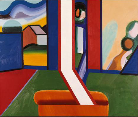
“Mr. & Mrs. Patrick Caulfield”, 1967-70
The show is arranged chronologically, which seems sensible, and a couple of his earliest works (“Gramophone”, “Interior of a Museum”) are among the more successful in combining an intact and tangible surface with an modest but coherent sense of space. As the work becomes more abstract in the 1960s and early 1970s, colours and forms free themselves progressively from figuration, but the space remains obstinately figurative. There are coloured areas unequivocally in front of other coloured areas (“Mr. and Mrs. Stephen Buckley”), there are highlights (“Mr. and Mrs. P. Stringer”) and modeling (“Talking about Art”) and there is perspective (“Mr. and Mrs. E.J.P.”) – all of these combined uneasily with abstract flat planes of uninflected or regularly patterned colour. During this period, Hodgkin appears to be looking for a more abstract spatiality. He sometimes experiments with conflicting combinations of “one-way”, figurative devices, but the resulting spatiality is merely confusing, creating a lifeless spatial nonsense rather than the pulsating, animated spatial ambiguity of Hofmann´s push and pull. A painting such as “Mr. and Mrs. Patrick Caulfield”, with its spatial non sequiturs now seems manipulative and irritating, irrespective of any other qualities it might have.
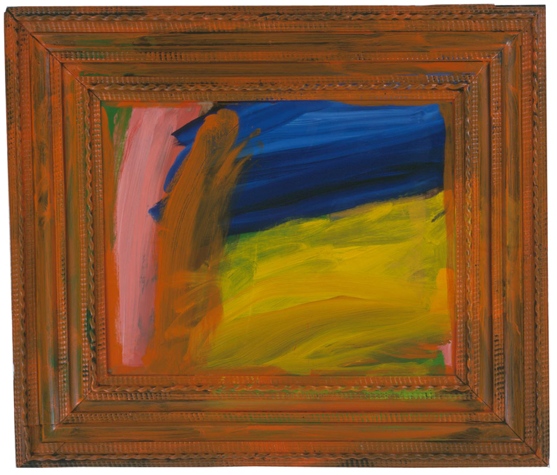
Maybe it was his own dissatisfaction with these experiments that led Hodgkin to his trademark frames. There is a window-like “proto-frame” in the admirable “Widcome Crescent” from 1966, but the typical framing around the outside seems to have become habitual from the early 1970s onwards. Hodgkin explains these frames psychologically, as a kind of protective shield for the emotions within. As a visual device it seems to me that the frame does two things: firstly it pushes the pre-existing painting into deep or deepish space, giving the viewer a space to “get into” without actually having to engage with the space in the original painting. And secondly, it obliterates the edges, eliminating many of the difficulties that arise for a painter in connection with “getting to the edge”. The eye is consistently (if abruptly) hauled up to the surface before it slips off the painting, and the new, inner edge of the frame is much more forgiving than the actual edge of the canvas, because the painting beneath can easily be imagined carrying on beyond the “window frame” of paint. In both cases, the framing provides a simple though somewhat evasive solution to basic questions that lie at the very heart of the western painting tradition. Functionally, it is somewhat reminiscent of Kenneth Noland´s concentric circles – freeing up the artist to concentrate more intensely on other things, such as colour, or in Hodgkin´s case simply to paint more spontaneously. With the pressure on his treatment of space deflected by the frames, Hodgkin proceeds to dispense with figurative spatial devices (still present, for instance, in “Robyn Denny and Katherine Reid”) and adopts a freer, more gestural style that often produces a much more satisfying and abstract, painterly space (“Portrait of the Artist” 1984-7, “Double Portrait”) than can be found in his earlier works. With drawing, perspective and modeling gone, colours are let loose to move against each other and the paintings come alive.
“Going for a Walk with Andrew”, 1995-98
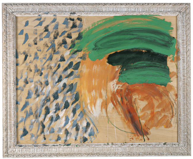
Hodgkin´s ever more Dionysian approach in his later years stretches the “framing” solution to its limits. “Going for a Walk with Andrew” needs an immensely wide and physical, bright orange frame to compensate the spatial imbalance that it would otherwise contain. Scale also poses problems. In a large work, the power of the frame is weakened and the internal spatiality becomes critical again. In “Artist and Model”, for instance, gestural freedom has been bought at the cost of surface integration. But skeins of gestural paint floating in front of an un-integrated background create the same kind of one-way, figurative space that perspective does. The skeins become literal “things” and here, even the framing cannot force them to congeal into an image.
“Artist and Model”, 2005-07
In the impressive “Chez Stamos” and the rather beautiful “Souvenirs” Hodgkin finds a solution to this scale problem by extending the “frame” idea as an animated grid of blots over the entire painting. The original painting becomes background and falls far behind, but there are no holes for the eye to fall into as it is evenly distributed and broken up into tiny areas. That said, there is still an additional visual thrill to be had whenever the background is allowed to surface after all, as it does thanks to a vivid orange on the left hand side of “Chez Stamos”.
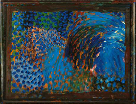
“Chez Stamos”, 19
All in all, this is an enjoyable and interesting exhibition, well worth the time and expense of a visit. Apart from anything else, it is a somewhat rare opportunity to see original, eminently visual, non-formulaic and un-ironic works of art; a celebration of colour, of life and (should one read the catalogue texts after-all) of friendship too.
