Paul Cézanne, “Ginger Jar and Fruit”, c. 1895
“First the Giants, then the pygmies.” Elie Faure
I could have begun with a painting by Rubens, one of Cézanne‘s favourite painters, his Susannah and the Elders in Munich, or the Three Graces in the Prado, but that would have set us off on the wrong foot by confirming Cézanne‘s own estimate of himself – “how feeble I am in life “, said in relation to Manet’s “bold impasto”. However, when the National Gallery placed Cézanne‘s Grand Bathers beside Titian’s Diana and Actaeon and Rubens’ Judgement of Paris, he did not look feeble, and it was the Rubens that fell away first. What the confrontation confirmed was that it is not the succulent rendering of flesh, the atmospheric rendering of spatial illusion, nor the sumptuous handling of fabrics and the texture of appearances that counts, but the architectural strengths of the composition, the disposition of the major masses and the demands of their accommodation to the entire presented image, and the shape of the canvas , and that this can be created with a new economy of means, new and old, and an especial emphasis on “form”, form over the sensuous, form over everything. Cézanne goes on to build a monument to his feebleness.
And here is a contradiction, for how can it be that someone who said this of himself could prove to be the most powerful temperament in a century of powerful temperaments?
Emile Zola, a vocal champion of the movement in French painting he designated as “naturalism”, coined the expression — “nature seen through a temperament”. No one had a temperament more powerful and idiosyncratic than Paul Cézanne, of an intensity bordering the pathological, in his adolescent ferment, at least. (Perhaps it was just adolescent rebelliousness.) And he did not quite shed the phantasising of erotic torment that assailed him in youth, fuelled by his readings in classical literature, common to every well-educated schoolboy in France in the 19th century.
Underneath and parallel to the discipline instilled into him during his apprenticeship with Pissarro, there remained an erotic imaginative life which found expression in the many Bathers paintings, La Lutte D’Amour, a baroque turbulence in marked contrast to the strictness of his study after nature.
We are not all gifted with as strong a temperament, not all blessed with “equal temperament”. Some of us are in C major, some of us in B flat minor. Some are predominantly extravert sensation types, others are introverted feeling. Find out who you are. Be who you are, and not who you wish you were.
A fair portion of the story of the modernist masterpieces can be traced without leaving the walls of the Barnes Foundation in Philadelphia, except in the case of the analytical cubism of Braque and Picasso, which Mr Barnes does not seem to have been over fond of. This lacuna apart, which can be repaired elsewhere, the link between the father of modern art, Cézanne, and his influence on Matisse at least, can be vividly delineated in Mr Barnes’ sterling selection.
To the painter the world consists of a sequence of convex and concave surfaces inflected towards or away from the eye, and illuminated in light. The task is to claim these surfaces, to render them tangible to the eye, (if that’s not a contradiction), to make them real through the artist’s unique individual touch. In Cézanne there are no smooth undifferentiated surfaces. And he abhors tightly bound forms. Although everything is stated with economy in terms of the most direct use of the elements of pictorial means, each plane surface is made up of a myriad of inflections, richly detailed, and it pulses with an expansive movement out to its loosely and tentatively inscribed contours. His forms are open to the adjacent surrounding spaces.

Paul Cézanne, watercolour, Metropolitan Museum of Art
Paul Cézanne, “Apples, Bottle and Chairback”, watercolour, Courtauld
Here the separation of drawn shadow paths and contours from the colour modelling of volumes is not so marked as it can be in later pictures, such as the side view of The Gardner Vallier, though it would be the implications of this separation and fusion, particularly evident in the watercolours, which would be taken up by Picasso (and on different terms by Matisse). The fruit retain their local colours which are gradated from light to dark with emphatic shadows tending to black, like billiard balls cannoning into one another. The centralised composition with its monumentally disposed table and emphatically undulating tablecloth is surrounded by a magnificently shaded sward of blue-blacks, greys and warm ochres, the feathery strokes of which would be incorporated directly into Braque’s and Picasso’s analytical cubist masterpieces of 1910-11, though seldom with a comparable lustre. It is a symphony of shadows, not a conscious creation, but flowing from the synthesising power of the will to harmonise volumetric form with its enveloping surrounds, (as in Rubens’ Susannah and the Elders, Alte Pinakotek Munich). Impulse and echo, the movement into depth being answered by a corresponding echo out of the depth. One could say that that which is intuitive and subconscious in Cézanne becomes fully conscious and intellectualised in cubism. That is the inevitability of the “anxiety of influence”. Whenever someone has shown you the way, you are going to be conscious of the influence, and perhaps to deny it, or as Harold Bloom says, to “misprision” it, to misunderstand it, deliberately. And that is the problem with so much of contemporary art. It’s all too conscious, too knowing. “These terribly conscious birds want to turn it all into talk, into knowing, and so life, which will not be known, leaves them”.(D.H.Lawrence).
Cézanne‘s favourite painters, Rubens and Tintoretto were painters of the Baroque, which is to say that they project an illusion of volumetric fullness, or three-dimensionality into the depth of the picture, which is then echoed by an enveloping swathe, a counter-movement out of the depths, (pace Heinrich Wolfflin and Hans Hofmann). This is a special case scenario, not the property of pre-Renaissance or Renaissance painting, for example. Almost in spite of himself, against himself, Cézanne found his way back to an earlier mode of painting, one which asserted the plane of the picture and the clarity of circum-ambient space more clearly, less ambiguously than in the painters he had first loved. Or one should say, some of the time, amongst other qualities. Therein lies the great conflict at the heart of his work. Perhaps this is the “anxiety” that Picasso sensed, or imagined in him. And this pre-Renaissance simplicity and limpid clarity of space, is a “more truly plastic space”, as Matisse would call it, in which space can be represented by a serene, flat, clear blue, the plane of the wall surface itself. This is what Matisse sought and found on his visits to Italy in the early 1900s. The shock to his system administered by sight of Les Demoiselles led Matisse to define himself in opposition, and he did so by way of Padua and Arezzo, and Florence.
The early commentators on Cézanne, Roger Fry, for instance, spoke of a return to Giotto. A little far-fetched perhaps, but what they meant was a return to the most elementary modes of representation, of the delineation of three dimensional form on a flat surface, one that respected that flatness, a kind of primitivism if you like. Matisse and Picasso sensed this by instinct, a kind of monkish asceticism, not timeless, but evocative of clearer, simpler and less sophisticated times, and which sieved out the more contingent sensuousness of the world in favour of unadorned “form”, and in their very different ways, found their own way of responding. It was a movement against the Baroque, against Venetian painting, in favour of the early Italians of the 13th and 14th centuries. Not to be confused with Pre-Raphaelitism, although if one could disentangle the writings of John Ruskin from the support he gave to the painters of that name, there would be many points of sharing, with his aesthetic demands for a purer, clearer light in which figures are bathed.

Paul Cézanne, “Still Life with Plaster Bust of Cupid”, 1895. National Museum, Stockholm
This painting looks so spontaneous and fluid in its handling that it as if it was painted in a single session. It almost certainly wasn’t, but it is so masterful in its lyricism that it appears that way. As Cézanne himself is reputed to have said: “if I interpret too much, if I come back to a painting with thoughts that are foreign to it, then everything is lost,” (paraphrasing) and Matthew Smith, echoing him, said, “the greatest immorality in painting is to try to finish something that is badly begun. Whereas something that is well begun can be left off at any point. Look at Cézanne’s watercolours.”
It’s a kind of delirium, not a delirium of the mind, but a delirium in the paint. Everything is in motion. Everything pulsates, quivers, and is fluid. “Brushwork is spatial.” It is an eroticism more elementary than the pleasure principle. It is not a sublimation of sex. It is the libidinous flow of the life energy itself. Psychic energy, as Jung named it. Laughter, the babbling of infants are primary, anterior to the pleasure principle. It is rather that erotic pleasure feeds into this more primary pleasure and becomes mixed up with it. So when I talk of the libidinous flow of feeling, I am referring to this elementary psychic energy, libidinous without sexual connotation.
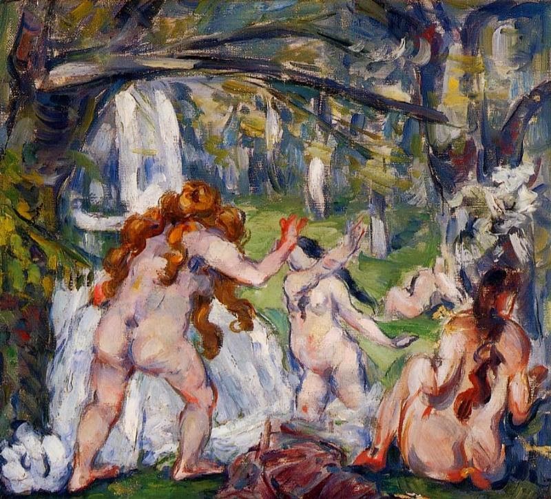
Paul Cézanne, “Three Bathers”, 1875-77
Whatever one says about Cézanne, he will contradict it. You may say he is systematic, that he has a method for delineating volumes, and then he will present you with extraordinary spontaneity. (Three Bathers 1875-77, once owned by Henry Moore). The volumetric three-dimensionality in painting is optical, scopophilic, addressed to the eye. To want to put your hands round one of these figures, as Moore did is to misunderstand the nature of painting.

Paul Cézanne, “Still Life with Soup Tureen”, 1877, Musee D’Orsay
Paul Cézanne, “Basket of Apples”, Glasgow
You may say, as it has been, that Cézanne is not concerned with the materiality of objects, but only in the relationship between them, their influence on one another, and then there is a painting like Still Life with Soup Tureen, 1877 (Musee D’Orsay), and then there is the little Basket of Apples in Glasgow, which does not present the tactility or matiere of objects, but the lustre of paint itself, the texture of paint, nacreous paint, like gold coins. With a great painter a kind of delirium sets in, when they are so enraptured, in thrall to the manipulation of the paint and colour that they take off on it in an extended flow of feeling. And only brushwork can do this. To my mind this is one of the most abstract paintings we are going to see in this Part 1 survey. The manipulation of form and colour has transcended any obvious representational origins to become the subject and content of the picture. And it is what seems to have entered my subconscious somewhere as an ideal of painting. Or if it hasn’t, it will do now.
Paul Cézanne, “Compotier and Plate of Biscuits”, 1877. p.c. Japan.
The truth is his style is infinitely varied, his handling of paint responding to a myriad of momentary intuitions. You may say that he is not interested in depicting the fall of light on objects. And he himself said that sunlight cannot be depicted, but has to be created by something else, by the action of colour on colour, opposition creating light. And then there is Madame Cézanne in Blue, 1885-87, (Houston Museum of Fine Art), or Lady in Blue, 1900-04 (Hermitage Museum) where there is a clear fall of light in a central shaft on the figures, created by leaving areas of the canvas unpainted.

Paul Cézanne, “Madame Cézanne Leaning on a Table”, 1873

Paul Cézanne, “Madame Cézanne in Blue”, 1885-7
Cézanne described his mentor Pissarro as “the humble and colossal”, and called himself “pupil of Pissarro” when entering a work to the Salon. Cézanne himself may not have been so humble, but he certainly was colossal. He is one of the greatest of all painters, and as this began to dawn on a few of the next generation’s aspirants, the “anxiety of influence” demanded either to build on aspects of his art, or to find a way around him, or both at once. A train of influence was set in motion which did not really hit the buffers until the late 1950s in America, with the “ironized” posture of Jasper Johns, his so-called “final literalisation of the canvas surface”, and the “cosmetically disingenuous” mannerisms of Cy Twombly. (Pace Michael Fried 1969).

Paul Cézanne, “Peasant”, 1891

Pablo Picasso, “Head of a Woman (Fernande) with Still Life of Pears”, 1909
This is one of Picasso’s greatest works. Picasso foregrounds the chest and shoulders of Fernande right up to the picture plane in a pyramidal composition of great monumentality and volumetric forcefulness, restricting his colour to ochres, greys, black and white, for the head and shoulders at least. The faceting and folding of forehead, cheek bones, nose and lips, with foreshortened neck and chin is too complex to describe, but its overall result is of great volumetric power, capped off by a magnificently sculpted head-piece which completes the illusion of a near sculptural presence, with its background of counterpointed diagonals helping to project it forward, an effect only enhanced by the putative distance created by the diminution in scale of the still life of pears and peaches, and the diagonal thrust of the arrow headed table corner “behind” her right shoulder.
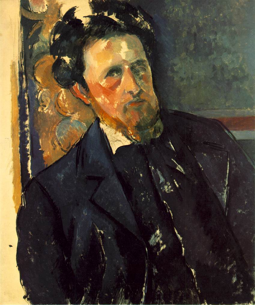
Paul Cézanne, “Joachim Gasquet”, 1896
The suggested light source which percolates through all facets of the composition is subtle and logically sustained, adding to the power of the illusion, and its “realism”. The years 1906-1908, the proto-cubist years, revealed Picasso’s creative genius at its most imperious.
However, if such a powerfully realised volume is placed centrally as here, it gives rise to difficulties for the surrounding spaces which back it up. And it was to answer such a dilemma that the phase known as analytical cubism in which he collaborated with Braque, sought to integrate, or interpenetrate a centralised “figure” with its surrounding spaces, or to dissolve the one into the other. “Architecture and Vertigo” is the way Prof. Christopher Green describes the stability-instability created by such Picassos as The Aficionado. But it is also an aspect, or should be attributed equally to many more paintings – Cézanne ‘s Madame Cézanne in a Red Dress, Metropolitan Museum NY, for instance, a supreme example.
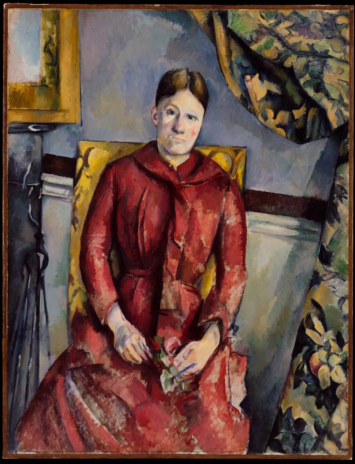
Paul Cézanne, “Madame Cézanne in Red Dress” 1888, oil on canvas 116 89 cm The Metropolitan Museum of Art, New York

Pablo Picasso, “Loaves and Bowl of Fruit on a Table”, 1908, Kunstmuseum, Basel.
An uncanny echo of the Cézanne Ginger Jar still life, with its flattened “loaves” reminiscent of the mysterious palette shape in the background of the Cézanne , and it’s symmetrically foregrounded table legs and folded down drop leaf table. But it is also somewhat brittle, like panel beating, the relief pressed through from behind. One cannot imagine Cézanne ever making sculpture, for instance. He is all painting, and nothing but.

Pablo Picasso, “The Aficionado”, 1912, Kunstmuseum, Basel
Both Picasso and Matisse are conservative in that they draw back from the implications of an all-out abstraction. Picasso, despite his ” convulsions ” of form, does not violate the norms of Western European plastic art, i.e. the representation of volumetric illusion on a flat surface, descending from Masaccio and Fra Filippo Lippi, as much as Matisse does with his “oriental”, “truly plastic space”, (the lessons he learned from Persian and Islamic decorative art, in paintings such as The Pink Studio 1911 Pushkin Museum.) And when Picasso does pursue a decorative “flatness” it is usually under Matisse’s influence. Man leaning on a Table 1917 was painted in direct competition with Matisse’s Piano Lesson 1, 1916 which he saw while at work on his own picture.

Henri Matisse,
“Blue Still Life with Jug”, Barnes Foundation, 1907
So, returning to the Barnes Foundation, let’s look at Matisse’s Blue Still Life with Jug, 1907, and to Cézanne’s remark that sunlight cannot be depicted or reproduced, but that it must be represented by something else, by oppositions of colour. This is an aspiration, but the situation is more complicated than that. We have seen that in some pictures there is a clear falling of light onto objects or sitters from a source outside the picture, often by leaving unpainted areas of the canvas to suggest highlights. And in Matisse too there are pictures in which this happens. It is often pointed out how much Matisse owes, how much he assimilated from Cézanne, but in this still life we can see that Matisse does not follow any of Cézanne’s methods directly. In fact he is further away from him than Picasso or Braque. He worshipped Cézanne, but was not intimidated by him. He sees for himself and simplifies the rendering of the fruit for instance with simple strong single colours, local colours, more akin in fact to the way Monet does in his marvellous Dejeuner sur L’Herbe, painted partly out of doors. Look at the way the fruit is depicted on the picnic tablecloth in the foreground. It is remarkably direct and naive compared to Cézanne’s complex enrichments. Matisse sees for himself and his colour is his own. He surrounds each fruit shape with a bold black shadow, and adds a blue-violet shadow behind the table top in violation of the logical light source implied by other sections of the still life, and curtails it when it threatens to obscure important areas of the colour sequences in the “background”.

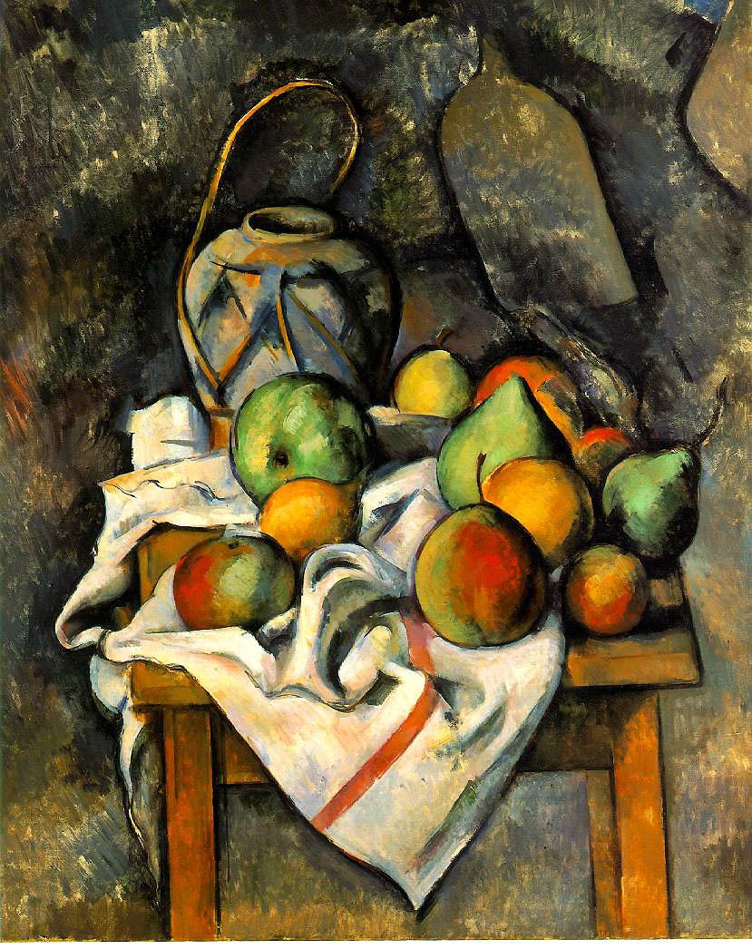
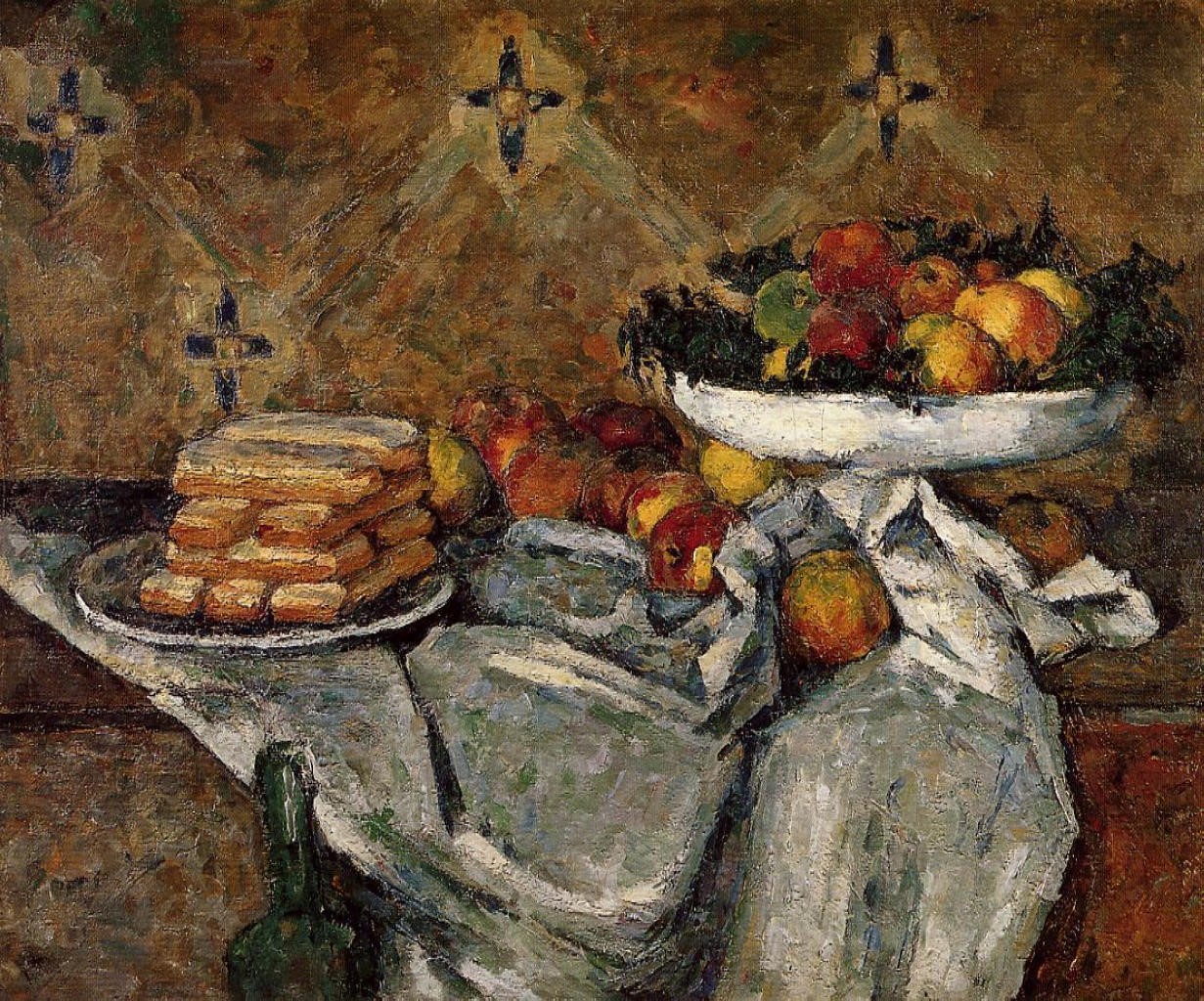
Paul Cézanne, “Table, Napkin and Fruit”, 1895-90. Barnes Foundation

Henri Matisse, “Young Sailor I”, 1906

Henri Matisse, “Young Sailor II”, 1906 Metropolitan Museum N.Y.

Michelangelo, Decorative Figure, Sistine Chapel
It has gradually become apparent to art historians over the past thirty years or so that it has been the intense rivalry between Matisse and Picasso that has led to some of the greatest paintings of the 20th century, and that this rivalry did not quieten after the well-known episodes of the first decade of the century. Attention has concentrated on the genesis of the Demoiselles D’Avignon, 1907, and the aftershock of seeing it in progress that led to Matisse’s reply to it, the Bathers with a Turtle, 1908. However Matisse had already painted at Collioure the previous year, 1906, two pictures that reveal remarkable powers of simplification and directness of drawing, Young Sailor I and Young Sailor II, the latter picture so embarrassing its creator that he was reluctant to exhibit it for fear of the ridicule he had been receiving, and from Picasso’s circle no less. The second picture is a drastic, childlike simplification of the first. Matisse had already told Picasso that he was fascinated by the naivety of his children’s art. It was bought by Leo Stein, and so Picasso may have seen it. The facial features are mask-like, with large almond eyes, heavily underlined. And there is also Matisse’s Blue Nude, Souvenir of Biskra 1907, in which there is similar mask like simplification of the facial features, as well as the arm raised behind the head, deriving from Michelangelo’s Dying Slave, which would find its way into the Demoiselles D’Avignon.

Michelangelo, Dying Slave

Pablo Picasso, “Les Demoiselles d’Avignon”, 1907
1906 was the year of Cézanne’s death, and there were large retrospective exhibitions of his work in Paris in that year. So there is a further dimension to the rivalry of two such seriously competitive artists as Matisse and Picasso. “First the Giants, then the pygmies” – Elie Faure. Modernism is founded on the realisation that the old masters cannot be rivalled on their own terms. Another way has to be found.
No amount of formal analysis or iconographic tracing will ever unravel the mystery of the Demoiselles. John Richardson has done as good a job as any in showing the synthesis of influences that gave rise to it, but there is a mystery and it remains. Early viewers saw barbarism, where in fact there is extreme sophistication and subtlety in modelling, colour and drawing. But it seems to tap into some ancient ritual, dredged up from collective memory. Just as Stravinsky’s Rite of Spring introduced an element of barbarism into the infinitely refined world of Ravel and Debussy’s Impressionism through its percussive rhythms, it was the angularity of the Demoiselles that disturbed Matisse. If Matisse had been the only person to be privy to the private viewing, it would have been enough to shape the high road of modernism for the next ten years or more.
Stravinsky spent the rest of his life trying to atone for the violence in The Rite. Picasso had no such qualms. But we mustn’t forget that Gauguin had been there first. (He had died in 1903, and there were major retrospectives of his work as well as Cézanne in Paris in 1906. This is another of the paradoxes of modernism, (and of Romanticism), a nostalgia for the primitive, for a time when the world is experienced with an elemental clarity that has been clouded over, occluded by the complexities of the modern industrialised world, whilst simultaneously that modernity is being embraced. The raised arms behind the heads of the women facing straight at us, staring us down, somewhat above our eye level, as we look up at them, seem to signify a flagrant abandon to the fact of being seen, not a voyeuristic seeing, but the scopophilic delectation afforded by women who are well aware that they are offering this pleasure to a male observer, the observer seated in front, aggressively turned to confront us. (See also Cézanne’s A Modern Olympia.) The Dying Slave of Michelangelo is passive, the head lolling back, the gaze turned in on itself. But these brazen hussies are not passive. They are indeed confrontational of us as observers in a more extreme way than Manet’s Olympia had been forty years earlier.

Paul Cézanne, detail from “The Large Bathers”, 1898, Philadelphia Museum
Perhaps no-one in the world but Picasso had the confidence and the daring to throw so much of the impetus onto line drawing in trying to rival the architectural strength of Cézanne ‘s late Bathers paintings, following the linear scaffold that is so exposed in a detail such as this one of the Philadelphia version of the Large Bathers, and without falling into crude parody. But his way of doing so led him far from Cézanne’s world, though perhaps not so far, when one recalls that Cézanne’s bathers were imaginative fantasy pictures in which he let loose all the repressed sensuality that the discipline of concentrated focus on the “motif” had buried, and which had always been there from the turbulence of his youth. Picasso’s drawing in the Demoiselles is quite unlike Cézanne’s, but it is the scaffold on which the painting is built, and is equally decisive for its character.
Henri Matisse, “Bathers with a Turtle”, 1908
Cézanne did not work from live models, male or female, for his Bathers compositions, or hardly ever. He has a kit of parts conceived in his head, owing much to his drawings after sculpture and plaster casts, with which he assembles his figures, much in the same way Rodin was to do with the little terra cottas shown recently at the Courtauld Gallery. His volumes are therefore conceptual, perceptual, optical, and conjoined as a sculptor would. It is this that the cubists sensed, together with his practice of combining different perspective viewpoints in the one painting. But this makes it sound like an intellectual method that he was fully conscious of, as it would become for the cubists. On the contrary it was intuitive and multi-various in the extent to which it arose in different situations.
The extent to which Matisse was disturbed by the angularity and the relief-like choppy sea of planes in the Demoiselles is revealed in the Bathers with a Turtle. It is virtually the only painting in his entire oeuvre in which there is an expressionistic treatment of the human visage, as here in the right hand figure, which looks as if it comes from Goya’s Black paintings, and some suggestion of literary symbolism with the feeding of the turtle, the sorts of thing Picasso had being doing in his Blue Period sentimental illustration.

Henri Matisse,” Interior with Violin”, 1917-1918

Henri Matisse,”Still Life with Aubergines”, 1911
Matisse was 43 yars old when he painted this picture, Still Life with Aubergines. He had been something of a late developer, twelve years older than Picasso, and did not reach any sign of maturity till his early thirties.
In this picture there is no hierarchical sequence of planes receding into depth, but a simultaneity of presentation, the simultaneous presence and pressure of all sections of the picture surface, of equal intensity in terms of colour. But this equality is modulated by a number of subtle devices, such as the repeat “stencilling” of the cinquefoil pattern which overlaps incongruously different areas of the space, walls, floor, mirror reflection, illogically from a rationalist’s point of view, but situating the painting in a unique place between Western norms of plasticity and Eastern decorativeness (a lesson learned from Gauguin in his Tahitian phase).
Here we see the influence of Persian painting at its maximum. The picture space is composed of decorative cells which appear to be at different distances from the plane of the picture due to the differing scale of the patterns within them. Notice the minute sculpture and the dish with two pears beside the eggplants, which seem to float rather than to rest, and the vase of flowers and sculpture sitting on the mantelpiece shelf with what looks like a second mirror above it, complicating the space. But along with this predominant frontality there are subtle diagonal recessions in that fireplace shelf, and the diagonal entry into the fireplace, the folder leaning against a mirror, and a further illusionistic complication of the space in the reflections, illogical, in that mirror. Then there is the strongly accented arabesque rhythm of curves on the screen, which then leave the screen and overlap bizarrely within the image in the mirror. And the window does not open out into spatial depth, but presents more pattern indicating “garden”.
It was on this picture that Matisse first began to pin cut out paper shapes to clarify the design before painting, covertly, because he didn’t want people to be aware of this method, but on a visit to his studio in the Midi, Braque saw this experiment, which led to his own “invention” of papier-colle soon afterwards, and thence to Picasso’s own experiments back in Paris.

Henri Matisse,” Interior with Goldfish and Sculpture”, 1912 Barnes Foundation
The following year Matisse painted another momentous picture, momentous for us, that is – Interior with Goldfish and Sculpture.
Here the perspectival recession which acts against the “flatness” of the enveloping black surround is even more pronounced, most noticeably with the heavily underlined drawing of the table and it’s sculpture. It is not a single uniform black, but several closely related blacks, which, combined with the more hidden aspects of the perspective, have the paradoxical effect of rendering palpable the space of the room to an almost measurable degree. As Patrick Heron said, this is “the central mystery of Matisse’s art,” but it is not “abstraction”. There is also a clear buffeting of light around the room from the obscured deep blue window to the reflected light in the mirror, which also reflects an invisible garden, to the luminous water of the goldfish bowl. This light is diffused throughout the picture and heralds the equal intensity of projection, as if back-lit, that will characterise the later Matisse, and will be taken on into abstraction by others. The “arbitrary” character of Matisse’s colour, and its presumed anti-naturalism has been greatly exaggerated in order to claim him as a precursor of abstraction. In fact, with only a few rare exceptions, it his devotion to observing the light in his rooms, studio interiors, and hotel bedrooms that makes his paintings a constant surprise, and makes them last, in a way that Picasso does not. Even though his reverie at times, in the Nice years, led him to delight in a near phantasy world of heightened artifice, and his use of black as a colour and space creator would appear to be anti-naturalistic, the palpable three-dimensionality of the rooms of the Quai St. Michel period, the so-called “Radical Years”, 1913-17, inspired as it may have been by the struggle with “the methods of modern construction” i.e. Cubism, none-the-less are a long way from anything that one could term “abstraction”.
Interior with Violin, 1917, Copenhagen, is the most extreme statement of this style, and it’s summation is The Moroccans, 1915-16, MOMA, New York.
But first we must consider Matisse’s Piano Lesson 1, 1916, in MOMA.
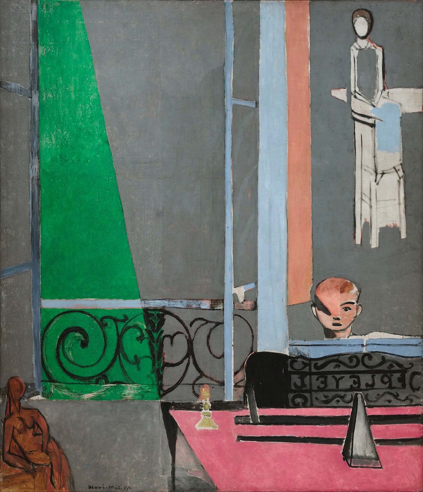
Henri Matisse, “Piano Lesson 1”, 1916. MOMA NY.
Notice how the two little scratched shadow strokes where the frame of the partially opened and perspectivally receding window meets the pale blue vertical window jamb, indicating its “going behind”, and the similar scratched shading of the horizontal balcony rail indicating that the frame goes ” in front of” the balcony’s decorative handrail scrolling. These subtle diagonal window frames suggest a space “within the room” (in which we as observers are situated) – a space that is continuous and opens out onto the space of the garden beyond.
But it is all spatially and normatively ambiguous. Why is there a diagonal left to right division, splitting the surface in two, separating the green of the “garden” from the grey space? – because if the whole area framed by the window were “green”, the spatial result would be more pedestrian, more literal, in short, less spatial, and would separate that area of the picture from the totality of the spatial impact of the picture as a whole. That is a guess, because it remains something of a mystery still, as does that strange scything arm shape that divides the Moroccans, out of scale and seemingly unidentifiable within the language of the picture.
Similar devices can be found in other of the “radical years” pictures of 1913-17. They set the paradigm which recurs right up to Memories of Oceania. Though these collages might suggest a loss of definition with the approach of abstraction, this is not the case in the late paintings of 1947-48, such as Still Life with Egyptian Curtain, where the equal intensity back projection of uniform light is at its ultimate, as in a stained-glass window.

Henri Matisse, “Interior with Egyptian Curtain”, 1948
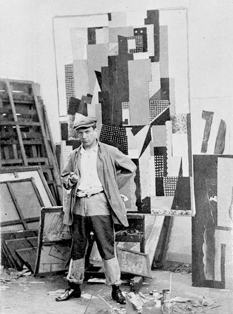
Pablo Picasso in front of “Seated Man”

Pablo Picasso,”Seated Man”, 1917
As far as I can recall I have only seen this painting once, at the Hayward Gallery. It is in a private collection and too fragile to travel often. But it immediately struck me as being one of Picasso’s major achievements. John Richardson says that as Demoiselles D’Avignon stands as the masterwork at the beginning of Cubism, Seated Man stands as the masterwork at it’s end. It is the largest canvas Picasso attempted since the Demoiselles, a conscious chef-d’oeuvre. And there is no doubt that it was painted in direct rivalry with and as a result of seeing Matisse’s Piano Lesson. The extensive overpainting and cracking does not harm the overall effect of the picture, in fact it seems to enhance it. Successive stages of the work can be seen in photographs in 1915 and 1916, with Picasso posing in front of it. The reworking of the picture, which right from the start had a monumental character, seems to have been to introduce a symphonic ordering of various greens, a deepening and darkening of those planes which created relief shadows, and bringing the dotted areas into some kind of logical sequence across the picture surface in emphasis of the tension between shallow relief and surface unity. The crazing of the “background” therefore helps to make those areas more “tactile” than they would otherwise have been. But in the absence of a recent sighting of the picture it is not possible to say more.
Henri Matisse, “The Moroccans”, 1915-16
The Moroccans, 1916-17 is not an abstract picture for at least seven reasons.
- the balcony which “floats” above the turbaned kneeling figures, or field of melons, (it is very ambiguous, apparently Matisse identified them as watermelons) is depicted as having diagonally cast shadows from a source outside the picture, slightly falling right to left, the handrail ” in front ” of it also casts a shadow. But the light implied is a soft light, almost like moonlight.
- The flying carpet of white grid lines or tiled floor, projects perspectivally into the void of “space” created by the surrounding black, and the discs representing heads or melons nestle amongst shaded and modelled green foliage subtly modelled to suggest three dimensions.
- The scything arm shape out of scale with everything else in the picture is also slightly modelled to indicate “sleeve” or some such, dividing the picture into two separate spatial worlds.
- The seated Muslim with back to us gives numerous clues to a three-dimensional existence, by contour drawing, scratched lines etc, as in the Piano Lesson 1.
- The inward slanting “window shutter” cuts into and out of depth, and increases the sense that the black surround on the left of the picture is a cavernous deep space, and yet it simultaneously holds to the surface. A further ambiguity is provided by what looks like a semi-abstract painting hanging on the wall at the top right of the picture.
- Furthermore, perspectivally there are several unrelated viewpoints. We are looking straight at the balcony, slightly down on the “melons”, and down on a mysterious circular object like a dome, or the turbaned head, seen from directly above, just to the left of the seated Muslim.
- Striped blue and white circles represent a cactus plant (?) perched on the end of the balcony, rhyming with the other circular forms in the picture.
Despite the defining features of this scaffold, the subtleties in the picture come from these violet or pinkish grey areas, the right hand third of the painting almost a dirtied grey-pink-violet, which have been extensively worked and reworked to unify across the whole picture, creating light against the spatial propensity of the blacks, since, as with the Interior with Goldfish and Sculpture, there is not just one uniform black. In paintings like these Matisse discovered that black had the propensity to create space more powerfully than any colour, at least in the context of an indoor setting of representational art. And he would go on to discover that grey, or greys had the same property for an open daylight space. It is these subtleties of adjustment and the “plumb line” architectural strengths of the picture that raised it above the level of Picasso’s Three Musicians when seen side by side at the Tate in 2002. All this complexity grew with the painting “organically”. It was not forced onto the painting, which began as a more naturalistic and lyrical evocation of sketches Matisse had made in situ. It arose as a summation of all that Matisse had learned from his conflicted engagement with cubist practices which he had adopted as a necessary irritant. This austere and absolute declaration of space and surface, space through surface, of the Piano Lesson and Moroccans was to become an ideal for abstract artists henceforth.
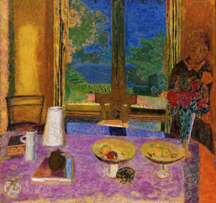
Pierre Bonnard, “Dining Room in the Garden”, 1934-35, Guggenheim.

Pierre Bonnard, “The Terrace at Grasse”, 1912
“As one paints one draws” Cézanne said. Of no-one is this more true than Bonnard, whose drawing is the most painterly in conception since Watteau. This is the antithesis of Raphaelesque drawing by pure line delineation. His pencil, or crayon, consists of overlapping zones of shading which model and distend the body’s perimeter so that it dovetails with its surrounding spaces in an unbroken continuum. His technique extends all the way from interlocking near flat pattern to fully volumetrically modelled figures, without disrupting an overall unity of design. The planes of the head are laid side by side rather than in a convex/concave recession. And he can be the sexiest of painters in modern times, an eroticism that is entirely his own.
Rendering everything into the one element, the paint-teasing drawing of Bonnard-world, Bonnard texture; fuzzy silhouettes which dovetail in the loosest possible way to create large irregular zones, dappled and mottled. Bonnard has the sensuosity gene in full measure, sensuous and sensual. Picasso hated Bonnard’s art and said so -because he is accepting of the external world of the senses as given, and fills in a pre-existing mode of organising space derived from the impressionists and to a lesser extent from Matisse. But this is only seeming, unfair and inaccurate. There are distortions of the visual world, discoveries of perception that are Bonnard’s and Bonnard’s alone.
Picasso is voracious in pursuit of a radical re-ordering of experience, but he never looked at the sensory world as closely or as patiently as Bonnard. The colour may be heightened, but it registers something real about the light-filled interiors of Bonnard’s reverie, and achieves a savoured and contemplated sensuality that Picasso’s impetuosity could never match.
Bonnard is an artist you can become obsessed by, sucked into, the whole world of the senses experienced as a dream, like a drug, as some find with the appalling Richard Wagner. A dream projected onto reality, or in Wagner’s case, a nightmare.
Hofmann said that Renoir mastered the depth problem (which is a colour problem) to a high degree by instinct. How much more true is this of Bonnard?

Pierre Bonnard, “The Terrace”, 1918. Phillips Coll. Washington
The spaciousness of this picture is amazing, yet the bank of coloured bands to the right hand side maintains its surface-hugging character despite the horizon line and aerial perspective of the sky. Notice the tablecloth with its pink diagonals and amazing floating table and balustrade, out of scale with its highlighted white balustrade, the sudden plunge in scale into the sunken garden creating space subliminally, almost miraculously. The foreground planes shelve away into a passage of detail reduced in scale, from which the banks of trees and bushes rear up, as if illuminated as in a son et lumiere display by strong spotlights shining directly onto them from outside the picture. Heron used the phrase “inspired timidity” in characterising Bonnard’s art, and it is a timidity capable of upsetting the applecart of the cerebral compulsiveness that drives so much of “modern” art. “Architecture and Vertigo”? Architecture through vertigo. This timidity of involuntary touch or sensibility would prove to be an encouragement to Rothko when he embarked on his Multiforms in 1947, but that is to anticipate.
Bonnard’s favoured way of working was to tack the canvas to the wall, and to scrub the paint into the surface with spidery touches and delicate dabs, dappling the whole surface. He is the last of the great sensualists of paint.

Picasso, Matisse, Bonnard in the Musée Imaginaire

Paul Gauguin, “Te aa no areois (The Seed of the Areosis)”, 1892

Paul Gauguin, “Via Rumati, 1897, Musee D’Orsay

Paul Gauguin, “What? Are you Jealous”, 1892, Pushkin Museum

Paul Gauguin, “Two Tahitian Women”, The Metropolitan Museum
But before we become lost in Bonnard world, a tonic corrective from another sensualist – the scoundrel and sometime charlatan, Paul Gauguin’s Te aa no Areois (The Seed of the Areois) in MOMA N.Y. The longing for the instinctual life as a restorative, and an escape from the positivist/materialist nightmare and the enervating listlessness of the modern urban prison, so vividly heralded by Baudelaire and Mallarme – ” then shall I wake to that first fervour, upright and alone, with one of you both for ingenuousness” …though it may have proved in reality to fall short of the imagined ideal, and to have been somewhat sordid, nevertheless continued to fire the imaginations of artists as different from one another as Gauguin, Matisse, Bonnard, and in a different guise, Jackson Pollock. Purity of sensation, returning to the source, the primitivistic urge, “utter directness”… “The humble transcription, in terms of paint, of sensation itself”… all of these have their parentage in Gauguin’s Tahitian and Marquesan escapades. In the end, Gauguin is the biggest influence of all on the later Matisse. Not just decoration, but the impulse behind the decoration. John Golding, writing about Matisse, said: “It was Matisse more than any other artist who saw through to its ultimate conclusion the greatest lesson that Gauguin had to teach, that it was possible to be a decorative artist and still remain within the avant-garde, or more strongly and more appositely, that it was possible to be a decorative painter, and simultaneously to be a high artist, even a revolutionary one”. (New York Review of Books, January 1985.)

Paul Gauguin, “The king’s Wife”, 1896, Pushkin Museum
When Matisse went to Tahiti in the early 1940s he said that the women and men of Tahiti were even more beautiful than Gauguin had made them. Looking at this latter painting, one cannot help but conclude that whatever else may be dubious about Gauguin’s accounts of his sojourn in Tahiti, the vision he projects of these women is sincere.

Claude Monet, “Water Lilies, Albertina, Vienna
What painting is about is claiming the surface – making it real to you, palpable, physically present, and tangible almost. At its best it is the expression of one’s involuntary response to surface, but without resorting to literalism. Every painter’s response will be different. The task is to find your own way, by trusting your impulses and going with them. You are always more original than you think you are. A painting is first and foremost a stretched membrane, like the skin of a drum. Whether it is hit hard or softly tickled into life is a matter of basic temperament, or of psychological type, extravert, introvert, thinking, feeling, intuition, sensation, and all points on that spectrum.
Meanwhile, from left field there came the seemingly superseded and bypassed figure of the later Claude Monet. Divisionism, Fauvism, Cubism, had followed the party line set down by Serusier and Signac that maligned Impressionism as “work without intelligence”, and yet Monet had ploughed his own furrow regardless, and with the later Nympheas pictures had turned out a stream of colourist masterpieces that have yet to be equalled in their rich orchestration of colour and decorative and spatial complexity, while achieving what Matisse would later say of his own ambitions: ” the role of painting I think, the role of all decorative painting, is to enlarge surfaces, to work so that one no longer feels the dimensions of the wall”.

Claude Monet
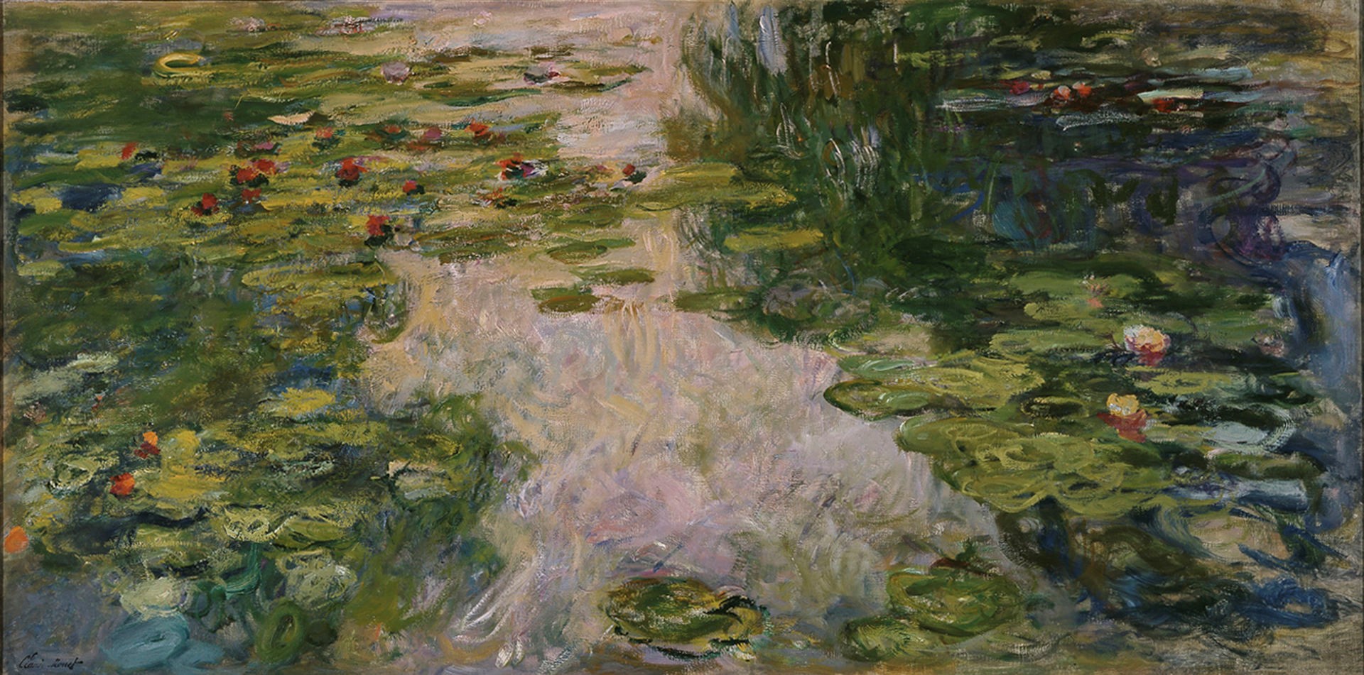
Claude Monet, “Water Lilies”, 1917-19, Honolulu Academy of Art
There is a clear demonstration of the mechanics of how the spatial illusionism/cum rich surface tapestry of Monet’s Nympheas is created, in a ridiculously heightened detail of the central portion of one of the Orangerie pictures, at the same time showing its kinship with the perspective in his early Boulevard Des Capuchines 1873 (Pushkin Museum) and Pissarro’s late recapitulation on that theme in his own late Boulevard Des Italiens – Afternoon, 1897.
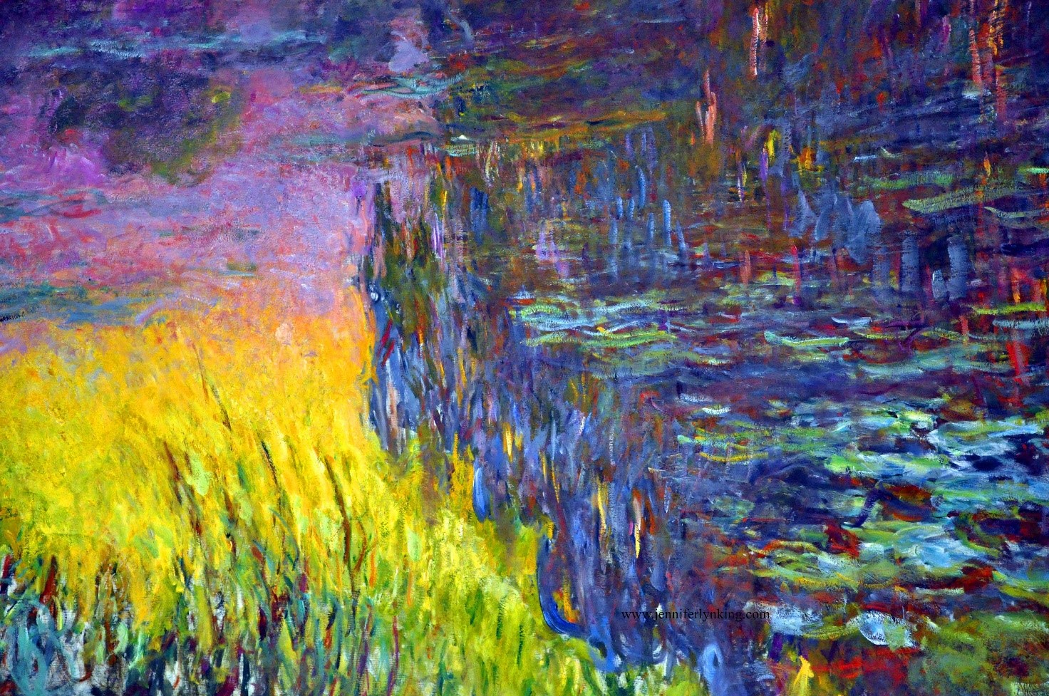
Claude Monet, “Water Lilies”, detail, Orangerie, Paris
The whole right hand zone of this detail has a subtly disguised perspectival recession accentuated by the gradual enlarging of the wonderfully animated brush strokes from its inward projection to its “nearer” areas. Then the left hand zones pull away and out from this recession in broad swathes of atmospheric colour in aerial perspective without breaking the rich surface tapestry. The surface is thus claimed as physically real, present, palpable and stamped with the unique touch of the artist.

Georges Braque, “Still Life with Music Scrolls”, 1937
Georges Braque, “Interior Still Life with Black Vase”, 1938, Phillips Coll. Washington.

Georges Braque, “Atelier No. IV”

Geoges Braque, “Atelier No. IX”
It is true that in the real world you cannot look at the ceiling of a room and the floor at the same time, but in the painted world you can and do. Hence the extraordinary difficulty of describing, let alone characterising the essence of Braque’s multifaceted inventiveness and the sheer quantity of variations he was able to draw from a few pertinacious themes over a lifespan. Complexity upon complexity, yet lucidity. You can’t replicate it, you can’t fake it, and you can’t force it. It is a million miles from those who load their canvases with complicated “moves” or bits and pieces of bric-a-brac (like Rauschenberg for instance). It is intensely visual. It is a continuation of the plastic and spatial concerns of the great still life painters of the past, (Chardin for example: The Ray) i.e., it is concerned with the perception of objects in space and in organising all the confused perceptions that arise in vision when the normative impositions of a rationalised and intellectualised perspective are withheld. If you look at your own immediate surroundings at home when in a quietist relaxed frame of mind, you may notice that things obscure one another, loom up in front of one another, and do not align themselves in any coherent and mono-visual, uni-directional fashion, (as in photography, for instance). Our human lenses do not and cannot align the world the way the monocular camera lens does. We know from an account that Patrick Heron has given of a visit to Braque’s studio in the 1940’s that he began by drawing in roughly the whole composition with a “honey-washed wandering line”, including his signature, sometimes including a counterpoint of chalk or pastel lines overlaid, before going on to complicate and layer his patterns which overlap and link together irrationally different surface planes of the image.
Hans Hofmann, with Germanic thoroughness, included mirrors (à la Matisse), tinfoil, and reflective surfaces in order to complicate things for his students when setting up a still life. Braque didn’t need to do this. He watched and observed what actually happens if, say, one looks through a glass half full of wine at a lamp situated behind it, or observes the evening light from a window as it passes through a potted plant with fretted leaves on the window sill, and is refracted and reflected by other objects placed between us and them. He watched, and found a graphic pattern to convey all this superimposed echoing and counter echoing of light on surfaces. Available to all if you attend to it, but Braque’s vision was unrepeatable, and his way of overlapping and inter-penetrating linear pattern in the service of spatial organisation is unique. No-one except for Patrick Heron, a devotee, in the 1950s, has tried to follow in his footsteps, because no-one can. However, what Braque did do was to suspend a giant stainless steel or chromium plated hinge from the ceiling of his studio, to reflect light, and which by some alchemy became the large birds in his late Atelier paintings of the 1950s. These bird forms were made to rhyme with the shape of a curved, ovoid palette shape to join the birds in a meditation on the theme of the still life interior, a staple of the French tradition. How far away from contemporary priorities is this master of painting?
This essay appears by kind permission of Hampstead School of Art, where it was first given as a lecture.

The most brilliant article. Thank you
LikeLiked by 1 person
Not only great critical writing, but wonderful, illuminating selection of pictures. I’m going to take some time to digest all of this.
LikeLiked by 1 person
It was Prof.Christopher Green ex. Courtauld who coined the phrase Architecture and Vertigo to account for Picasso’s tendency to sabotage his own architectural rectitude in his analytical cubist phase and beyond. But perhaps he had forgotten that Cezanne does this more emphatically and powerfully in the likes of Madame Cezanne in Red Dress. Metropolitan Museum, and others. He sometimes takes an oblique view of his sitters, and then tilts them off the vertical, a double Vertigo, a bit like what happens when amateur photographers tilt the camera off the horizontal/ vertical axis. Unlike the Plumbline obsessed Matisse.
For all Picasso’s “convulsions”, he doesn’t disrupt the biases of binocular vision to the extent that Cezanne does, seemingly without even intending to?
But my contention is that Architecture and Vertigo applies to virtually all great paintings in some respect or another. Or else they wouldn’t be great?
LikeLike
Thank you so much for this, excellent in so many ways !
LikeLike
Another example is the Shchukin Collection’s Man Smoking a Pipe (and leaning on a table). Curious that in Picasso’s Seated Man (or Man Leaning on aTable) there is no indication of leaning at all.
LikeLike
A great essay – by turns partisan, well-informed, idiosyncratic, erudite, anachronistic, objective and opinionated; I wonder will anyone ever write like this in the future? More of all that, please.
And how can Part 2 ever be as good as Part 1 without Cézanne in it? Cézanne could have his very own “Key Paintings from All Time, Ever”. What about the still lives from around 1879-82; or the mid-80’s series of the Gulf of Marseille from L’Estaque; or the late still lives from 1900-5 (which are actually 20th Century paintings, unlike a lot of Alan’s Cézannes! But never mind), such as “Still Life with Teapot” (worth a trip to Cardiff for on its own, and never mind the Poussin). Those three periods alone are unequalled by any other painter for their relentless focus on opening painting outwards and rebuilding it from scratch, moving from doubt to certainty.
Then there is Matisse, and that sequence of pics in the middle of this essay: ”Interior with Violin”; ”Still Life with Aubergines”; ” Interior with Goldfish and Sculpture”; “Piano Lesson 1”; “Interior with Egyptian Curtain”; they all look so fantastic in reproduction.
At the highest level, Picasso, Braque, Bonnard, Gauguin don’t seem to me to match up to Cézanne and Matisse. Nor, for my money (or Monet) does late Monet (though early and mid Monet go head-to-head at times with Pissarro and Cézanne).
So when you say, Alan…
“What painting is about is claiming the surface – making it real to you, palpable, physically present, and tangible almost. At its best it is the expression of one’s involuntary response to surface, but without resorting to literalism”,
…that seems a very narrow claim for painting, and so it’s just as well you have already said…
“…it is not the succulent rendering of flesh, the atmospheric rendering of spatial illusion, nor the sumptuous handling of fabrics and the texture of appearances that counts, but the architectural strengths of the composition, the disposition of the major masses and the demands of their accommodation to the entire presented image, and the shape of the canvas , and that this can be created with a new economy of means, new and old, and an especial emphasis on “form”, form over the sensuous, form over everything.”
…because therein lies the contradiction/tension of all the very, very best figurative painting; you get all of that, but via the surface. I’ve only just begun to realise that Cézanne can have both things – the opened out possibilities of freedom of action and movement delivered to the viewer through how the painting is palpably built AND the absolute certainty of commanding architectural form. Pissarro had it too, in spades. But didn’t late Monet lose the architecture? The Monet detail is very unconvincing. Maybe he overdid the vertigo?
Therefore, looking forward to Part 2, in which you will no doubt explain how abstract painting continues that amazing duality and its resolution! Good luck with that.
LikeLiked by 1 person
Yes, Part 2 , already written, may prove to be more contentious, and raise some hackles. But it has to be given as a talk at Hampstead School of Art first.
LikeLike
Alan, you’ve made a thoughtful argument rooted in a cogent visual analysis on behalf of your selections -art writers take note.
I do, however, question the received wisdom regarding Matisse. Though he has been deified in the halls of AbCrit and beyond, I’m not convinced that his paintings from 1913-17 rate so highly. Like much of the work from the so called “radical” years, “The Morrocans” is unnecessarily bloated, clocking in at just over 9 feet long. I say unnecessarily because like the contemporaneous “Bathers by a River” (which is three feet longer) or the hallowed “Piano Lesson” there’s remarkably little surface incident to justify this scale beyond the obvious and to my mind mannered, pentimenti that litter the surface of these works. It’s as if Matisse is trying to compensate for his lack of faith in the cubist idiom by just pumping up the scale, rather like a musician turning up the volume when the melody he’s crafted for the guitar solo isn’t quite up to snuff. The areas that Matisse has painted out and over -which contribute to his much vaunted spatial complexity- are always just a little too circumspect and tasteful to my eye. Matisse’s facture is all too frequently thin, watery and brittle; which is why his works always look great in reproduction, and often shockingly gutless in real life. I do suppose, however, that “key” paintings are not always or necessarily synonymous with good ones. Looking forward to part two!
LikeLiked by 1 person
I’m afraid there is no answer to that, AP. Just so wrong, so blind, so wilfully cantankerous. There’s none so blind as those who cannot see. But no one can prove you wrong, mores the pity.
LikeLiked by 1 person
I’m sympathetic to Alan P’s view on this. I don’t think it is wilfully cantankerous to say so, and it might just be wishful thinking on yours, Alan G.
To repeat what I said on the Shchukin comments: “…close up and personal, these works [the big Matisses from the “Radical Years”] are rather dull…. All these works look really great when concentrated and disembodied in reproduction, and it’s easy to allow them to become quite compelling in one’s mind’s-eye, without even seeing and examining them; but in the flesh, they dazzle not so much. I’m beginning to realise I like Matisse most when he’s still under the early influence of Cezanne,”
So they could indeed be “key” in the minds of painters without actually being all that good in the flesh.
LikeLike
Indeed. While I happily admit to a contrarian streak buried somewhere within my psyche, in this case, it is the antithesis of blindness or willful cantankerousness that has led me to my conclusions. I’m simply trusting my eyes and my expierence. For some time now, I have had the great fortune of viewing “Bathers by a River” a few times a month; “The Moroccans” and “The Piano Lesson” about once a year. “In the flesh” as Robin says, these paintings all too often disappoint.
LikeLike
What, you too! I am not judging these Matisses or any other of the paintings discussed on the basis of reproductions on the screen (except for the heightened Monet detail). It was seeing the Moroccans next to Picasso’s Three Musicians at Tate Modern in 2002 and again in New York in 2011? that has led me to estimate it, and others of the so-called Radical Years pictures, amongst the greatest pictures of the century. They’re Key because they are so good, not for historicist or any other reason you might like to foist onto them.
“Dull” — certainly not. “Thin, watery and brittle” – you must be joking.
A more accurate take on these paintings is by Kirk Varnedoe in the Tate catalogue……
“That latter comparison ( of The Moroccans with Three Musicians) though, confirms what is already clear when we juxtapose Goldfish and Palette to Harlequin : that such pairings, while revealing, have disparities that make them arguably unfair. The curious truth…… is that Picasso’s planar synthetic phase of cubism, while it provoked a weighty, bold rhetoric of scale in several key Matisse’s, was in Picasso’s hands more frequently alloyed with delicate detail and quiescent refinement……… put the two paintings side by side, and the Picasso can be made to seem thinner, even spindly, with its slow-burn Halloween magic put at a disadvantage by the ruggedness of the Matisse. In these moments of comparable ambition and gravity, Matisse plays the bigger bass vibrato, while Picasso’s flute-and -woodwind threnody, laced with a lonesome, distant calliope, demands a different kind of listening.”
And Golding, Elderfield and Cowling all understandably echo these sentiments in different ways. And it is not only Picasso that suffers in the comparison.
This was also my perception at the Shchukin Collection at Louis Vuitton earlier this year, yet another occasion when Matisse stood out amongst an array of great paintings.
No one rates Cezanne higher than I do, but apparently disarming still are the convictions of taste(and there is no other word for it) that led Matisse to challenge and reverse so many of the hallowed verities of consensus ,around the Baroque and Venetian masters for one instance, in favour of an absolute declaration of space through surface with his greys and blacks, as I described them above. It was Braque, Gris and Picasso who had forced him there, but what he made of it calls for a “radical” rethink of what architecture in painting can be.
“Dazzle not so much” ? Cast out the mote in thine eye, and look again.
LikeLiked by 1 person
Well, we know all roads lead to Rome and all painting leads to where you are now (and Golding and others are not exactly disinterested observers either), but maybe those verities should never have been reversed. I’m not by any means saying Picasso is better, I don’t think he is, but I’ve no idea really what a “declaration of space through surface” means in this particular and special respect. Does Constable NOT make a “declaration of space through surface”?
Maybe it’s your rose-tinted spectacles…?
LikeLike
I have the utmost respect for the late Varnedoe, but this lengthy quote is precisely the type of “received wisdom” I’m referring to. It may be that in comparison to “The Three Musicians” “The Moroccans” plays a “bigger bass vibrato” but comparisons like these aren’t especially edifying. Taken on their own terms, and within the context of Matisse’s wider oeuvre, his “radical” works are not particularly great paintings.
LikeLike
And ” when Matisse is still under the early influence of Cezanne” — ? When would that be? I thought I had done enough to show that though Cezanne’s influence is pervasive and general, as late as for instance the Portrait of Auguste Pelierin II 1917, it is difficult to point to any overt stylistic or technical borrowing. Matisse is assimilating influences from Corot, Manet decisively, Gauguin increasingly, the Neo impressionists extensively, and so on.
It is the example of Cezanne’s formal and architectural grasp that he admired, but the trajectory of Matisse’s development takes him a world away. Latterly there is also Courbet’s intimate portraiture, and the sensuous delicacy of Renoir’s odalisques to factor in, to the disdain of puritans.
The great still lifes, such as Oriental Rugs, 1906, Grenoble, and the Blue Still Life with jug, (illustrated) only resemble Cezanne in their strength of colour and artless directness, (less artful than Cezanne in fact ). But they employ none of Cezanne’s methodical shading.
LikeLike
“the early influence of Cezanne” would be early (!), “as in the ‘Bois de Boulogne’, say up to 1904-ish”, to continue the quote. I stand by the view that ‘Bois de Boulogne’ was the best Matisse in the Shchukin. It’s solidity and organisation owing a huge amount to Cezanne – in particular perhaps his views of the garden at Jas du Bouffan, and the manner in which strong perspectival recession is managed on a flat surface. You are right to say that influence pervades much of Matisse’s later work too. That influence is never detrimental, in my opinion.
Whilst I know very well that Matisse had a high regard of Renoir, I’m curious to hear which paintings of his you think benefitted from the latter’s odalisques. (Not just influence, but benefit.)
LikeLike
Varnedoe, Golding, Elderfield and Cowling may not be entirely disinterested, but they do not have an axe to grind either. If I found by experience of the paintings that I disagreed with them, having been looking at them at least as long as they have, and as a painter, not an historian, I would say so. This “received wisdom” is as well founded as you could hope to find, although it has taken a long time to arrive if you look at the record. And it has the great advantage of being entirely free of the obfuscating verbiage of the post-structuralist miasma.
I’ll get back to you on the Odalisque question.
LikeLike
Back to the Barnes Foundation. Of the pervasive background influence of Renoir on Matisse, see Renoir’s Sailor Boy (portrait of Robert Nunes) 1883, Barnes Foundation, and its companion, Girl with a Parasol 1883 ,p.c. and compare with Matisse’s Boy with a Butterfly Net. But specifically, the influence throughout the Nice years and the Delectorskaya years is evident (amongst other influences and originality) in the Barnes Foundation’s Reclining Nude (nu couche) 1924, Seated Odalisque 1922, Barnes, Odalisque in Red Trousers 1922/24 Orangerie, Odalisque with Grey Culottes 1926/27 Orangerie, Odalisque its Red Trousers 1921 Pompidou Centre, Paris, Odalisque with Magnolias p.c. and Manteau de Fourrure 1936 p.c., page 162 in the Delectorskaya book, Adrienne Maeght 1988 Paris.
The Grey Culottes picture is a masterpiece in itself. These pictures take their place in the ongoing French tradition of intimiste portrayal of the feminine. See the comments at the end of my article on The Baroness Gourgaud, and the article by Jed Perl in Forever Paris, quoted in an exchange with Jock Ireland.
LikeLike
That’s an art historian’s answer. I know they are called “Odalisque”, but I’ve just never seen the Renoir in Matisse, and still can’t, other than in subject matter and the intimacy of the “oriental” set-up. The simplification of form, and the monumentality of the models often recalls Cezanne, and never Renoir. What about “Odalisque with a Turkish Armchair”, 1928 (National Musem of Modern Art, Paris), where the culottes are formed and shaded as grandly as a Cezanne apple and the background is straight out of Cezanne’s “Tannhauser Overture”?
LikeLike
As Robin suggests, this merely a congruence of subject matter. Renior connects to a tradition of painterly painting that goes straight back to the Venetians. In Renoir’s late works especially, the artist has effectively abolished line as an element delineating form, much like late Titian. Matisse’s line on the other hand, in virtually any period under examination, is a dominant feature of his work. It is almost always concise and authoritative. So powerfully does line enclose Matisse’s form, one could imagine Cezanne referring to him as he once did Gauguin: “a painter of Chinese images.” I can’t see much Renior in Matisse, but the Gauguin is there in spades.
LikeLike
Correction. It’s not in the Baroness comments, and I can’t find it. Maybe Jock can remember? Where are you, Jock?
LikeLike
you’re quite correct about that Robin, that’s why I said amongst other influences and originality. Matisse owned a Courbet portrait of a woman , head and shoulders, so,there’s an influence there as well. But the “touch” in these periods is much more delicate and feathery, and the modelling is in flesh tones, where Cezanne’s is less sensual, i.e. realistically sensual, given that he is not working with nude or even semi nude models .
LikeLike
To see how unrealistic Cezanne is and how discomfited with the presence of nudity ,, relying instead on a fertile imagination, see Afternoon in Naples , which by the way, I’ve just been doing a homage to in some small pictures.
LikeLike
Why, it’s in my as yet unpublished essay on The Gypsy of Matisse. The book of Jed Perl’s is Paris Without End. Here is what he says …… “He (Matisse) is quite conscious of living in the age of the flapper, of the free-spirited gal, and the fitfulness with which he sustains the old pictorial fictions of Muse, or Odalisque, or Visitor to the Studio, keeps reminding us that he knows time is running out on the model’s complicity, or her willingness to be immobilised before the artist’s gaze. Still by some sort of imaginative leap he joins his models to the women of Delacroix, Ingres, Courbet, Corot and Renoir. He may not tell us anything about his young women as human beings, but he manages to gain them a place in — what would one call it?– the Myth of Woman in French Art. And this has, for Matisse, as much reality as Venus had for Titian.”
But unless some of the Odalisques I listed are put up as images, the Barnes Foundation duo, for example, the Renoir connection may not be evident to readers. One of Matisse’s pictures is titled Girl with Parasol and Shawl with Rose in Ear. I haven’t found it yet on google.
If Woman with a Parasol is typed into google, a whole flood of images ranging from Salon fashion to out and out kitsch appear, and Matisse’s Odalisques amongst them. Matisse was prepared to risk this exposure in pursuit of what Perl has aptly described above.
Which is why , especially now, it is important to stay away from exhibiting in contexts which will tar one’s work with sleaze.
LikeLike
Perl adds —“Matisse understands Orientalism as a ‘painting problem’ …. In every inch of the Femmes D’Alger, Delacroix had transformed the touristic, the voyeuristic , the Oriental, into something experienced firsthand ….. Matisse is piqued by Delacroix’s being able to turn Romantic sleaze into French poetry; for Matisse the same operation is even more of a challenge, because the sleazy bric-a-brac is now retro-sleaze, not just pop nostalgia, but 19th century pop nostalgia”.
LikeLiked by 1 person
And by the way, the late style of Renoir that Alan Pocaro describes came just after a phase where he had swung to the opposite pole, known as his thin or meagre, (maigre) style, where he essayed a Raphaelesque drawing of volumetric delineation of his figures, sometimes known as the crisis of Impressionism.
LikeLike
He visited Cezanne and worked alongside him, envious of the volumetric strength of his art. Renoir is one of the most naturally gifted , versatile and subtle painters of his time, so don’t underestimate the linear element in his work.
LikeLiked by 1 person
Interesting to compare Renoir’s Bathers in the Forest c. 1897 , Barnes Foundation, with Matisse’s Bonheur de Vivre on the obtuse links to be found between seemingly incompatible styles. Draw a line around the figures and trees and you’re half way to the Matisse. Far fetched? The round of dancers in the pond in Matisse is related to drawings for the Gates of Hell by Rodin also.
See also Cezanne’s Leda and the Swan in the Barnes Foundation, where he is almost certainly working from a popular print or a photograph. The modelling of the figure is markedly Cezannian, i.e. chiselled, robustly rhythmic, “sculptural”, warm and cool conceptual, quite unlike the sensuous delicacy of Matisse’s Reclining nudes.
Perhaps AP should spend more time in Philadelphia, since he seems to be tired by Chicago.?
LikeLike
The Barnes book says this about Renoir’s Sailor Boy. “In the early 1880s, following his first journey to Italy and its revelation of Reaissance painting, and Antiquity, Renoir was experimenting with ways to give the principal human figures a monumental presence in his paintings, to detach them from and display them against their environments. ……. (he) now sought to endow his subjects with an almost sculptural presence, not only by painting them more smoothly but also by accentuating the inconsistency between foreground and background painting styles.” And in this Matisse would follow him two decades later.
LikeLike
Well, I’m in no way underestimating Renior’s line, Alan. I’m simply pointing out that in a Renior, particularly his later work, line is so fully integrated with the rest of his compostion, with color, light, and space that it effectively ceases to function as a discrete element. -it cannot be separated in any way from the totality of his form. Where as Matisse is a painter of interlocking planes of color that are circumscribed by a very palpable sense of decorative line. Matisse’s line and color are often interdependent, but can always be distinguished from one another. As to light, well Matisse isn’t much concerned with it, and his shadows are as flat and decorative as any of his other planes. Despite what Perl might suggest about the sociology of the artist model relationship, I still maintain that Matisse and Renoir are fundamentally different types of painters and see little visible evidence of a technical influence flowing from Renior to Matisse.
As to my alleged fatigue with the Art Institute of Chicago, I would think that a place I visit as often as most religious people attend their houses of worship should rather suggest the opposite.
LikeLike
“As to light, well Matisse isn’t much concerned with it” …….you cannot be serious!! Paraphrasing — Matisse said –” there are two ways of creating light in painting, one depicting it by warm and cool gradations, as the impressionists had done, the other creating light by the opposition of colours, as in my paintings”. That’s one of the ways in which he echoes Cezanne His concern with generating light in this way is absolute; it is observed light, and accounts for the way his pictures dominate all those around them when hung together, and another reason why his pictures continue to surprise when all around them pall, the artificiality of the cubists rendition of light most of all.
The rest of your comment I agree with.
LikeLiked by 2 people
Though not the remark — ” his shadows are as flat and decorative as the rest of his planes”. No wonder you can’t see The Moroccans.
LikeLike
I’d not very tactfully suggest that you start at the top and read the article all over again with more care and attention.
LikeLike
Fair enough, Alan. As I said in my initial comment, it’s a great essay and I’m happy to read it again. Of course, it’s true that Matisse is interested in light in the absolute sense -in the scientifically measurable saturation and reflectivity of the pigments he deploys and the perceptual vibrations caused by the collision of complementing hues, but as a malleable design element, I stand by my observation: Matisse virtually ignores light. In none of the reproductions you’ve presented does Matisse demonstrate any serious interest in a functional light source and transitions of value as means of describing volume and unifying composition. Even when a light source is implied by the presence of cast shadows, the shadows (such as the one under the fruit bowl in “Interior with Egyptian Curtain”) register as decorative planes, flat color shapes. Maybe it’s my use of the term “light” as opposed to “value”, but that seems like an uncontroversial observation and I think one Matisse would agree with.
LikeLike
Update on Jock: I’m trying to move from one studio to another. NOT succeeding very well. I have been able to read Alan’s essay though. Delighted Alan has been able to muster some enthusiasm for Picasso, great to see Renoir make an appearance in the comments, etc. I keep thinking how great it would be to have Alan speak at the Studio School—with Robin and AP in the audience. Geography makes that a bit difficult. Technology makes Abcrit and Brancaster possible though. It makes me very grateful. . .
LikeLiked by 1 person
Thank you for this tremendous and inspiring article Alan Gouk! It is one which I will reread and read again.
One question: you seem to be familiar with Patrick Heron’s profound writing on Cezanne (as well as Matisse). What is your opinion about the idea that much of Cezanne’s originality comes from his endeavour to paint and represent a binocular vision of the world, as opposed to the monocular tradition of perspective that originated in the Renaissance? To my mind it is this (widely unrecognised) proposition that makes his work truly revolutionary.
Thanks again.
LikeLike
Only just noticed your comment, Anselm. Glad you liked the article. I don’t know what a monocular vision of the world would look like. If you close one eye, all you see is a very fuzzy partial picture. I suppose the camera produces a monocular vision, but we see the result with two eyes, and make imaginative adjustments accordingly. The camera always lies.
I don’t know enough about perspective in the Renaissance, but obviously paintings of that period are not monocular. On the contrary the space represented is a very complex one, which calls for a mental adjustment for us to take it in. Experts like Earle Loran and Kurt Baxter have spent a lifetime studying the complexities of Cezanne’s still life’s, for instance, but binocular vision isn’t adequate to account for their richness. But I don’t want to open up a whole new chain of comments, so, let’s leave it at that.
LikeLike
Sorry, Google has a life of its own. It’s Erle, and Badt.
LikeLike
I can not match the prose of the other comments. Here is my take as a painter I was taken by your characterization of Bonnard “he can be the sexiest of painters in modern times, an eroticism that is entirely his own” I cringe when I see his work. God that I could paint with such studied delicacy. He is so underrated among his peers.
The Matisse radical period works stand up very well today. They still feel radical. His later Odalisques border on kitsch.
I prefer the late Picasso’s they sort of look like cartoon parodies of his early work, but that is what I find appealing.
LikeLike
I would like to comment on your observation of Matisse’s creative process.
“It was on this picture that Matisse first began to pin cut out paper shapes to clarify the design before painting, covertly, because he didn’t want people to be aware of this method, but on a visit to his studio in the Midi, Braque saw this experiment, which led to his own “invention” of papier-colle soon afterwards, and thence to Picasso’s own experiments back in Paris.”
I am a digital painter I am quite sure if Matisse was alive today he would have loved Photoshop layers. The ability to reveal, conceal overlay etc.
In his old age he used a primitive Photoshop like solution. He would have assistants paint huge swatches of paint which Matisse would cut into shapes with a pair of scissors. He would then arrange the colored shapes on a colored ground.
LikeLike