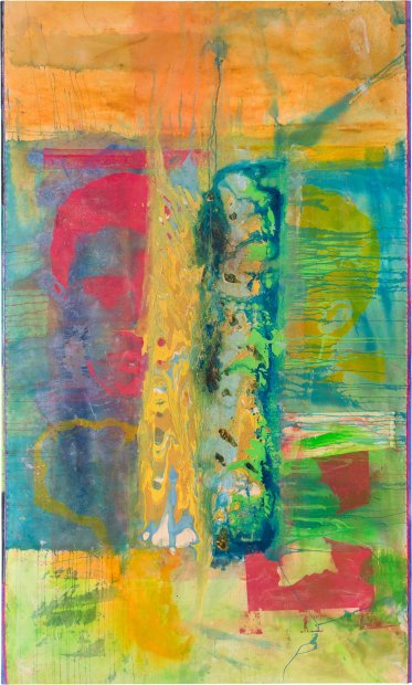
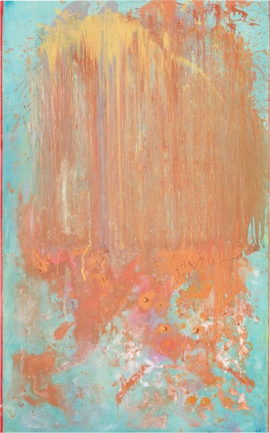
“Pouring over Two Morrison Boys and Two Maps II” 2016, acrylic on canvas, 306x184cm
Frank Bowling, ‘Fishes, Wishes in Summertime Blue’ was at Hales Gallery, London, 8th September to 28th October 2017
Walking into this exhibition one is greeted by a large vertical painting, ‘Pouring over two Morrison Boys and Two Maps II’, on the wall at the far end of the gallery – deliberately placed I would say to draw us into the space. It is eye-catching, arresting and dazzling with its rich array of saturated colour; red, greens, yellows and oranges, yet there is much subtlety to be found alongside these more dominant colours and we are kept interested because there are more revelations each time we look. A web of colour would be a good metaphor – we are fixed and caught, mesmerised, in front of this pulsing canvas as it gradually eats into our senses and swallows us, engulfs us; but it also feeds us. It is made from six canvases glued, stitched and layered. From the two central vertical elements, the left a marbled complexity of yellow, ochre and red with swirls of blue, the right more heavily weighted with various greens drowning the yellows; from all four sides, runs percolate over rich, complex, saturated backdrops, all of which contain combinations of the same colours, but each ‘quarter’ has a different emphasis. The left has red runoffs over mauve and blue underneath the red screenprinted areas; the right has green runs over ochre and red screenprints; at the top, green runs both ways, up from the centre and down from a stained green area that sits horizontally on top of the ochre and orange ground; the lower area, a thin green ground with strong yellow and red patches has runs down only the left hand side. On first viewing, this painting seems to be balanced and symmetrical, but of course the more we look the more the symmetry is destroyed; in the top right by the diagonal green run; the red screenprint on the lower right; the yellow disturbance on the lower left. Bowling is not afraid to set up geometry and then destroy it. Indeed geometry underscores most of the paintings in this exhibition; in some it is more overt than others.
‘Pouring over two Morrison Boys and Two Maps II’ is the centrepiece of the show and I was so drawn by it that I found it difficult to then set about the room in a systematic way, starting at the door and working my way round, and I found myself constantly referring back to this thing of beauty.
As Bowling says in the catalogue, ‘I am on the side of beauty, and beauty doesn’t stop still’… how apposite this is; this exhibition celebrates the way in which Bowling ever presses on, no matter what obstacles are in his way. He keeps reinventing, revisiting and reprocessing what some see as the tired medium of paint on canvas in fresh ways, mining his life, his experiences and the different approaches he has experienced to the work; it all comes together on the walls here. The show includes three of his ‘white paintings’, which are not white at all but a much more subtle use of layered colour; in ‘Ashton’s Swirl I’ and ‘Horsing Around’ visual rhythms are set up by the gel marks and engulfed objects that are rooted in it. The latter is a study in subtlety with its submerged colours and objects drawing us in to explore the scrubbed and stained whitened surface.
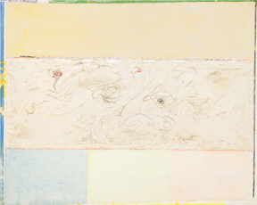
“Ashton’s Swirl I”, 2016, 147.4 x185.7 cm
The literal stitching and gluing of canvases together and layering them is a rich metaphor for the work, the bringing together of disparate techniques and materials; printmaking, stencils, poured and dripped paint, gobs of material, gel, and incorporated objects along with a range of colour used both subtly and explosively. Stained areas are overpainted, layered and bespattered….. Bowling has ever been interested in the physicality and sensuous nature of paint. The eye skims over areas of pearlised paint only to be brought to a halt bumping into islands of gel and mutilated plastic (insects), then lead along drips that defy gravity into rivers and lakes of pooled, thinned colour. The confident, delicate, line of a drawn circle takes us off on a trip as it metamorphoses into a serrated strip of canvas, carefully cut out with pinking shears, that buckles and totters into a gloop of gel. Indeed, at the fringes of many of the attached canvases, there it is, the signature toothed edge, contrasting with other thready, wobbly, ripped seams. All the paintings are framed with colour, hinting at the submerged under-canvases, for this is what they are, like an under-painting, some more prominent than others, some deliberately wide to offset the main canvases and negate symmetry, others a thin line to emphasise edges.

“Little Bird Overhead”, 2016, acrylic on canvas, 153x183cm
‘Little Bird Overhead’ is not as complex as the larger ‘Pouring over two…’ but held my interest in a similar way (as did ‘Iona Miriam’s Christmas…’ more of that later) again made out of multiple canvases, this time with a melted kaleidoscope of colour forming a horizontal band through the centre but this is offset as the colours are stretched down to make the whole oval shape sit lower. The central band has a dense application of gel and objects and in the blue area above are screenprints, originally from the early seventies, in red and yellow, not densely painted but scratchy to get away from the solid shape that the original print would have had. In the top left corner is a row of three patches of canvas, again upsetting the balance of the painting; without them the whole piece would be too settled.
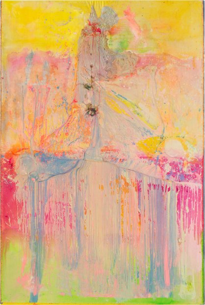
“Iona Miriam’s Christmas Visit To & From Brighton”, 2017, acrylic on canvas, 189 x 122.5 cm
In ‘Iona Miriam’s Christmas Visit To and From Brighton’ the vertical painting is halved by a horizontal band of different colours, the striped ‘gap’ is also not a consistent width as the bottom line of the upper canvas is not straight. And this strip is printed, hence the smoothness and regularity of the blocks of colour, contrasting with the loser working of the rest of the work. The two separated areas of canvas have the appearance of originally having been part of the same painting that has then torn apart, reworked separately, and stuck onto the ‘base’ canvas. The stained background in the two canvas parts is common to both areas along with red and violet, but then two different attacks have been made, top and bottom, both with circular shapes but of very different feel. In the top half, a blaze of colour – red, yellow mauve – are rooted in encrusted paint and objects (dismembered plastic insects); a quadrant of drawn red paint is drawn from the top right corner to the lower left and this continues down the lower canvas from top left to bottom right; thus the two halves are reconnected by the drawn semicircle which in the lower half morphs into a serrated canvas zip that staggers along its arc and is mired in gel.
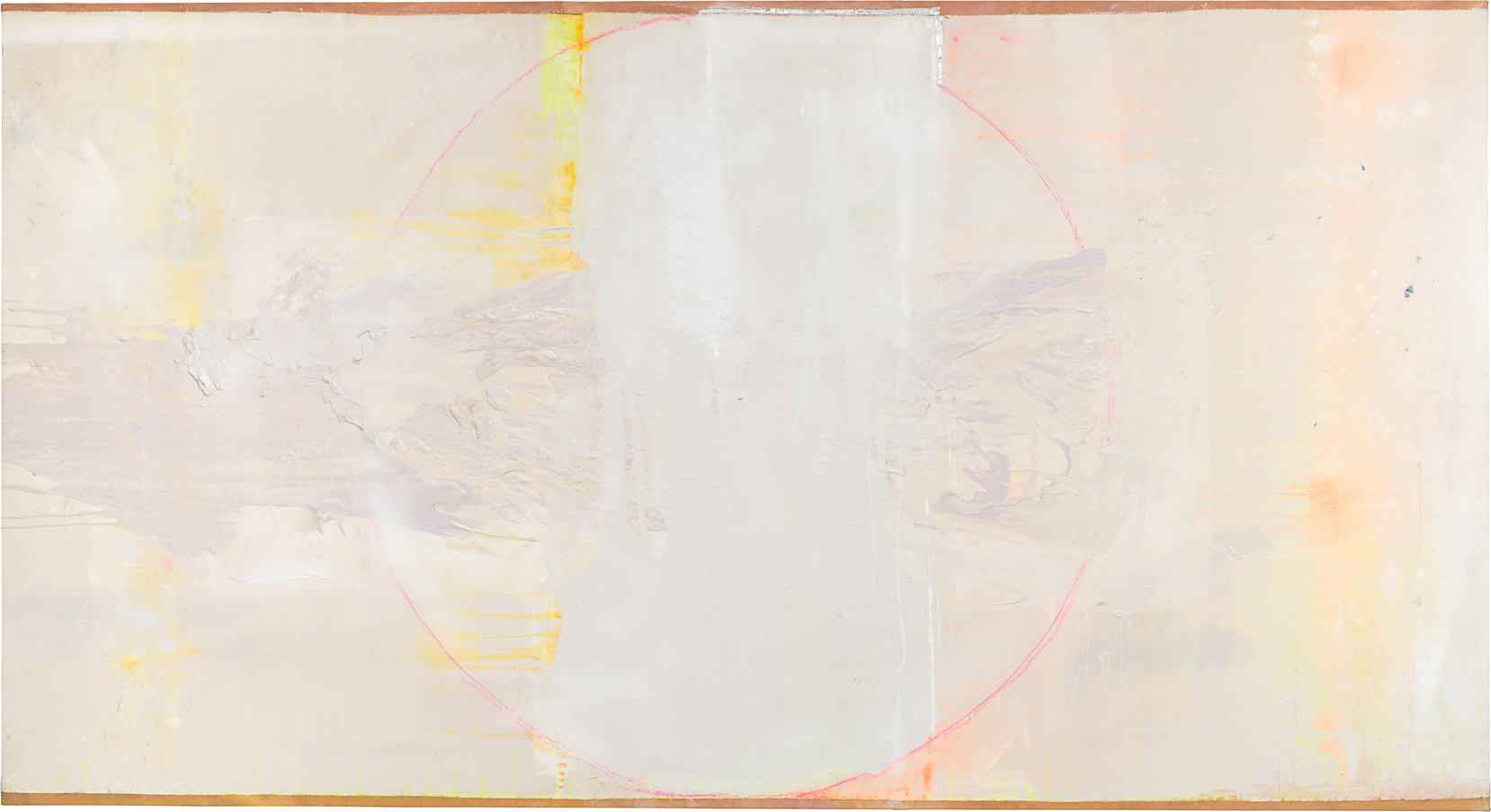
“Stuart’s Predictions”, 2016, acrylic on canvas, 147.5 x 271.5 cm
The largest of the ‘white’ paintings, ‘Stuarts Prediction’ is a horizontal canvas that has originally been a poured vertical one. The central area is defined by two things, a drawn red circle and in this a vertical rectangle of white paint; these both sit on a ground of subtly modulated vertical ‘stripes’ of pink and yellow. The central pour, with added gel impasto runs three quarters of the way across the painting and contains traces of a subtle violet. The run is broken by the unequal vertical rectangle of white mentioned previously, its top right corner emphasised by a right angle of metal zip. Vivid yellow runs spread away from the white on the top and mid left hand side. The potency of the painting is then emphasised by the white canvas being mounted on another that shows as strips top and bottom, their ochre colour holding the painting from expanding, thus emphasising its length.
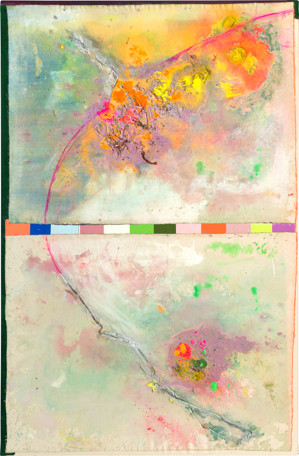
The exhibition title painting, ‘Fishes, Wishes and Summertime Blue’, another of the ‘white’ series, is strangely missing from the show. Perhaps the most straightforward embodiment of geometry in any of the paintings (as seen in the catalogue) it is a horizontal rectangle of subtly modulated pouring of light blue, mauve, pink and yellow with scrapings of white…and there is the thin red circle that appears in ‘Iona Miriam’s Christmas Visit..’ and ‘Stuarts Prediction’ but here it is singular and whole, but again with the top and bottom edges of the canvas lined with a thin strip of underlying canvas of a different colour emphasising the horizontal. I am reminded of an earlier, larger painting, from 2010, ‘Red, Yellow and Blue’ which has the same formal arrangement of a central circle in a horizontal rectangle but this is like the difference between a full moon and a new moon. It gives an idea of the range within which Bowling works. The full red circle of ‘Red, Yellow and Blue’ is collaged onto the yellow and blue ‘background’ and it reveals all the subtlety of paint application that the ‘white’ one does but with its variety of applications of red paint.
Collaboration with Ms Dammidge”, 2016, acrylic on canvas, 295x184cm
Over the last few years especially, Bowling has relied more and more on painting as a collaborative process. This includes not only his long time companion and accomplice Rachel Scott and regular visitor Spencer Richards who travels regularly from New York, but also other friends and family members. This is witnessed in the show by the painting ‘ Collaboration with MS and Dammidge’ but more covertly in some of the material that is embedded in the surface of the paintings. An example of this is the plastic insects which were given to him, some of which he then broke up and put in the mix of the paintings, (though sometimes they survive whole, as in the scorpion in ‘Ashton’s Swirl I’). Another example of his collaborative process is that some of the striped and brightly coloured canvas used in the framing, edging and ‘backgrounds’ of the paintings are cut from canvases sent to him by Arlington Weithers, a Guyanese painter, as pointed out in the catalogue by Gabrielle Schwarz.
“Shadowbalding”, 2014, acrylic on canvas, 277x186cm
‘Shadowbalding’ has a typical Bowling what the ?…title; the painting is the most anarchic one in the show, with its triple tiers of multiple attacks on the canvas. The three horizontal bands are structured in a logical way, with the deepest at the bottom, almost half way up the canvas, then the next layer is about twice the width of the top strip; but within this is complete licentiousness though there is evidence in the facture to show that there was a fairly straightforward method in the making. As seen in the three bands, there are three distinct ways the painting has been made. The clues are in the impressed circles made by the paint pots used to weigh down the canvas when it is laid over the table to stop it slipping off. One appears in the top left quadrant of yellow, two others are on the left and right sides about half way up the painting. The right hand one is almost a white ghost amongst the swirl of yellow that has flowed past; it is a lighter blue with a white outline amidst the blue and red pours that have bypassed it. Below or to the side of these pot marks are deltas of paint amongst the multicoloured cascades that have been let lose over the side of the table, pooling at the end of the canvas which s presumably flat on the floor. The middle section is the most unruly with paint going in all directions and the divide between the two top sections is marked by a C shape of gel dotted with plastic objects. Again any vertical symmetry is broken by the difference in the left and right halves of the top section; the left is a consistent yellow whereas the right is swirling with green and pink incursions.
Throughout this body of work edges, borders, thresholds and portals are evident and potent; colours, material, things, appear and disappear, melt into each other, slip, slide, drip and run…symmetry is subverted and geometry set up to be broken…. ‘something happens with the material through the process, and these amazing and beautiful things appear and one tries to, well sort of sustain them..’ And this engagement in a particular process that is unparalleled in reason and goes against our desire for making sense of things in a logical way, is what underpins Bowling’s approach to painting and gives it its complexity and richness.
I find that the more I look, the more I have to delete what I have written, or cut and paste areas again, add more, then change it again…and it is an ongoing process that may never end….except I am going to stop now and let you make more discoveries yourselves.
“Horsing Around”, 2016, 152.6 x 94cm
And yes, if anyone walked into Bowling’s studio and said ‘what are you doing??’ he might reply ‘I’m horsing around, what else?’
All images courtesy The Artist and Hales Gallery. Copyright The Artist.
