Robin Greenwood

#32. Robin Greenwood writes on Content and Continuity

Pieter Janssens Elinga, "La Balayeuse", 1668-1672

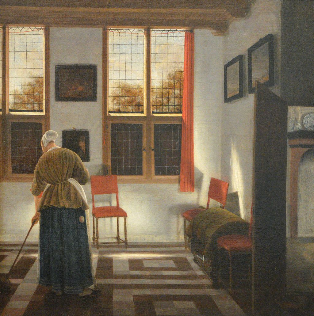
Pieter Janssens Elinga, “La Balayeuse”, 1668-1672

“Shakespeare’s pre-eminence is of course due to his extraordinary originality; but to begin to understand his originality, we have to interpret the word correctly. It does not mean that he invented a kind of drama that was quite different from that to which his age was accustomed, or that he invented new ideas for his dramatic subjects. It means that as part of his poetic talent and his imaginative intensity he possessed an unusual critical power. This, too, must be properly defined. He left no assessments of his own or of anybody else’s work, but a great imaginative writer must use criticism to test the vitality of the literary forms of his age. He tests them, rather than invents new ones… [in order to be] continuous with the imaginative expression that nourished him…”

 “In all these plays Shakespeare is not rejecting the accepted forms of theatrical tradition; he is revitalizing them by bringing them into relationship with the actualities of real experience.”

C.Gillie, Longman Companion to English Literature; The Great Age: 1590-1620; Longman.

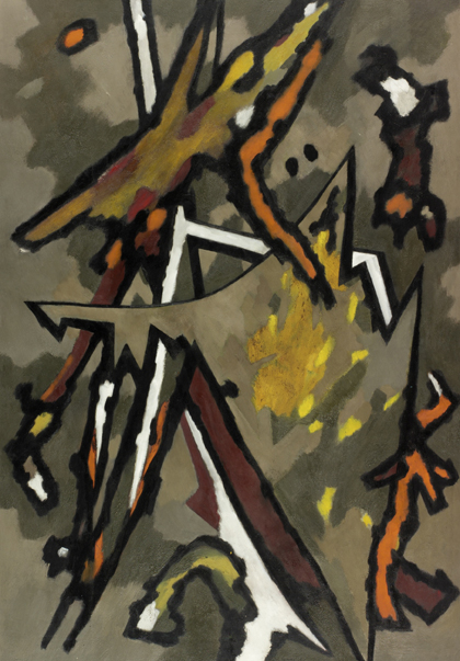
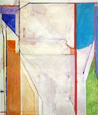
Lucky Shakespeare, to have lived at such a time, when forms and precedents and high, ambitious, competitive achievement were strong, and the artform in question could thus properly express the deepest feelings of the age. I’m not sure in visual art we are in the midst of anything like such interesting times, but nor do I believe that we are in an age of shallow feeling that must be mirrored in the contemporary art we make. But it strikes me as something of a dilemma; we might need on the one hand to overturn all precedent in abstract art so far; yet we can’t presume to make painting or sculpture without thought or structure, about any old thing and from garbage; and so, on the other hand, sympathising with all the achievements of abstract art to date, even if we consider them only minor, we might wish to continue to attempt to make something of their precedent – but yet more real, more intense… better.

(more…)

#23. Robin Greenwood writes on Flatness at Pace and Plastic Space

Installation shot at Pace London, works by Caro and Noland.

Installation shot at Pace London, works by Caro (Stainless Piece C, 1974/5) and Noland.

Hoyland, Caro, Noland at Pace Gallery, London.

In the mid-20th Century shared unreality that was ‘Caroland’ it was somehow viable, with intentions that were quite probably on the right side of honest, to make a sculpture – in this case, Stainless Piece C, 1974/5 – that sat flat on the floor and rose up no more than a couple of inches, so you looked down upon it like a relief laid horizontally (I made a few like this myself); and to make it out of a few scattered (or were they artfully composed?) pieces of stainless steel plate and other bits and pieces (David Smith’s steel?) that had been scoured with an angle-grinder to give an optical illusion of depth to its surface when it had none at all to its structure (again, like Smith?). In the Pace Gallery, London, this work is shown on a plinth that is a good three inches taller than the sculpture itself (didn’t Caro do away with plinths? Did the gallery decide the work’s lack of status required one?), making a combined height, sculpture and plinth, of oh… all of eight inches or so. And because it’s by Caro, and because he’s now dead (R.I.P.), and because it’s a piece of art history merchandising already, and because it’s the prestigious Pace Gallery; because of all this and more, and for no reason due to its inherent value, since it transparently has none, unless you view it through a thick haze of sentimental regret for simpler and more certain times in abstract art; this pathetic little piece of twaddle has become a luxury commodity, imbued with all the myths of modernism, reflecting back at us our own ‘good-housekeeping-modern-but-weren’t-we-ever-so-radical-back-in-the-sixties’ taste.

(more…)

#14. Robin Greenwood writes on: Contemporaneity – William Gear/Stockwell Depot/Hans Hofmann.

William Gear, 'Autumn Landscape', 1950. Copyright the Artist's Estate. Image courtesy of Tyne & Wear Archives & Museums, Laing Art Gallery

William Gear, ‘Autumn Landscape’, 1950. Copyright the Artist’s Estate. Image courtesy of Tyne & Wear Archives & Museums, Laing Art Gallery

William Gear: the Painter that Time Forgot is at the Towner Gallery Eastbourne, 17 July – 27 September 2015; at City Art Centre, Edinburgh, 24 October 2015 – 14 February 2016.

A Radical View: William Gear as Curator 1958 -1964 is also at the Towner, 9 May – 31 August 2015.

William Gear: A Centenary Exhibition is at the Redfern Gallery, London, 16 July -5 September.

Stockwell Depot 1967 – 1979 is at the University of Greenwich Galleries, 24 July – 12 September 2015.

Hans Hofmann Catalogue Raisonné is recently published in the UK by Lund Humphries.


At the Same Time as Now.

The Towner and the Redfern are both presenting the work of ‘forgotten’ artist William Gear, an associate of CoBrA in the 1940s and a controversial painter in his heyday of the 1950s. Also showing is an exhibition of the works acquired by Gear during his tenure as the Towner’s curator (1958-64), including paintings by Sandra Blow, Alan Davie, Roger Hilton and Ceri Richards. Gear fought battles with Eastbourne Town Council to get modern art, and in particular, new abstract painting, into the Towner collection, the outcome of which was to make it one of the leading contemporary collections in municipal gallery/museums at that time.

Gear’s very own version of a public outcry over contemporary art had happened a decade earlier in 1951, when his painting Autumn Landscape was awarded the Festival of Britain Purchase Prize, paid for out of the public purse, and attracting the ridicule and faux-outrage of the press. It’s hard to see why, since it looks now to be the most good-mannered of abstractions, and by our experiences of contemporaneity, unconfrontational. A lot has changed in the last 65 years of art; the position of always equating ‘now-ness’ with newness is well established (they are, to be fair, often difficult to differentiate), as one novelty project succeeds and eclipses another. If there is any value left in contemporaneity, it has to be more than just the next new thing, and certainly more than a rehash of what has gone before but is now forgotten.

(more…)

#6. Robin Greenwood writes on Richard Diebenkorn and the Hollowing-out of Painting.

Ocean Park #43, 1971

‘Ocean Park #43’, 1971

Richard Diebenkorn at the Royal Academy, London, 14 March – 7 June, 2015

If I’ve read one 5-star review of the RA’s Diebenkorn show by now, I’ve read at least ten, most of them little more than P.R. exercises repeating the same blandishments to the gallery-going public, to recognise and acknowledge a masterly evocation of the lambent light and open spaces of his native Californian west coast. Spoiler alert: this will not be another piece of positive flannel. OK, Diebenkorn was by all accounts a fine fellow and a much-respected artist, and his reputation has grown considerably over the past two decades as he has entered the collective art-school consciousness of recent generations as the straight-up kind of painter’s painter in an age of conceptual art. More and more young abstract and semi-abstract painters have become familiar with the three phases of his work, and it now chimes in with something that has recently happened in abstract painting, whereby it has become the acceptable, non-scary version of modern art in general; safe to feature in sofa catalogues, a safe occupation for the younger amateur painter, decidedly unthreatening; in fact, not too radically abstract. And Diebenkorn is a kind of flagship painter for the confident employment and enjoyment of these ubiquitous modern aesthetic tropes. He now, reputedly, has clout and charisma, where he once seemed a peripheral and minor contributor. He undoubtedly had a degree of talent, and his paintings have the sniff of sincerity and ‘authenticity’; they look superficially like the ‘real deal’. But, as some clever wag pointed out recently, authenticity is a content-free zone. If you think Diebenkorn’s art has anything to do with, say, a continuation of Matisse’s lifelong core project, you’re wrong; if you think Diebenkorn is anything of a colourist, you’re wrong; and if you think Diebenkorn is exciting, you are living a very sheltered life. He raises the mediocre to fantastic levels of significance. More on all this later.

(more…)