#17. Carl Kandutsch writes on Caro, Fried and “Deep Body Blue”

Anthony Caro, Deep Body Blue, 1966. Steel painted dark blue, 48 ½ x 101 x 124 inches. Private collection, Harpswell. Courtesy Annely Juda Fine Arts. Photo: John Goldblatt.

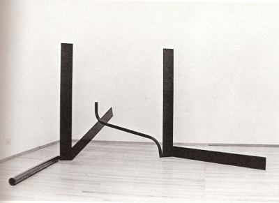
Anthony Caro, “Deep Body Blue”, 1966. Steel painted dark blue, 48 ½ x 101 x 124 inches. Private collection, Harpswell. Courtesy Annely Juda Fine Arts. Photo: John Goldblatt.

Deep Body Blue

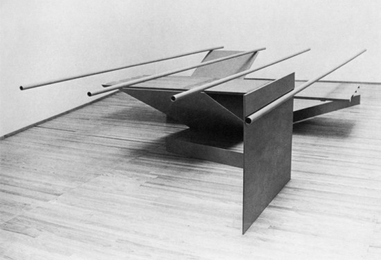
Michael Fried is today one of the most interesting and perceptive art historians in the world. In the 1960s however, Fried was, along with his mentor Clement Greenberg, perhaps the most insightful critic of contemporary art in the United States, and certainly the strongest advocate for what was then known as “modernist” painting and sculpture, as epitomized in the work of Morris Louis, Kenneth Noland, Jules Olitski, Frank Stella and English sculptor Anthony Caro among others.

Fried’s best art-critical writing was done between 1965 and about 1972 as short reviews of exhibits published in Art International and ArtForum[i]. These short descriptive pieces are for the most part limited to careful descriptions of specific works of art, but at the same time seem to achieve the quality of philosophical prose, although Fried did not set out to write philosophy[ii]. I think that this perception has to do both with Fried’s formidable talents as a viewer of art and with the nature of the objects being described. In this article I will try to convey a sense of what it is about those objects that allows or indeed compels an accurate description of them to be read as philosophical prose.

Before we get there however, I want to take notice of the fact that the kind of evaluative art criticism that Fried practiced during 1966-67 (and before him, Clement Greenberg) no longer exists. The world has changed, the art world has changed, and art itself has changed in such a way that the concepts of aesthetic quality and value (and therefore the evaluative judgments that are based on these concepts) are no longer central or even relevant to the kind of art that had replaced the high modernism of the 1960s. It often seems as if the concepts of quality and value no longer matter in our society. I do not purport to explain why that is the case, but simply to register the fact that something has been lost, and its loss represents a significant turn in our cultural history, for better or (far more likely) for worse.[iii]

(more…)

#16. Carl Kandutsch writes on Caro, Fried, and “Prairie”

Anthony Caro, "Prairie", painted steel, 1967, Copyright Barford Sculptures

Anthony Caro, “Prairie”, painted steel, 1967, Copyright Barford Sculptures

Prairie

In § 111 of the Philosophical Investigations, Wittgenstein wrote: “the problems arising through a misinterpretation of our forms of language have the character of depth. They are deep disquietudes; their roots are as deep in us as the forms of our language, and their significance is as great as the importance of our language. –Let us ask ourselves: why do we feel a grammatical joke to be deep? (And that is what the depth of philosophy is.)”[i]

And in § 109: “The problems are solved, not by giving new information, but by arranging what we have always known.”

Why do we feel that the meaning of a work of art is something deep – something lying somewhere underneath the surface when after all a painting or a sculpture is really nothing more than surface and shape? Why do we feel as though we need to see beyond and beneath appearances in order to understand a thing that according to its essential nature is appearance? These questions are related to although not identical with the question raised in Wittgenstein’s later philosophy, namely, why do we feel as though our ordinary language, hence our ordinary lives, is somehow inadequate, so that we must locate and pursue its “true” meaning elsewhere, for example in a region either below (in the case of language, its underlying logical structure) or above (in the case of ordinary mortal existence, its redemption in heaven) the place where we actually spend the days of our lives?

These remarks reflect the fact that we human beings tend to orient ourselves around a vertical (as opposed to horizontal) axis, literally (as in the fact that we stand) and figuratively (we aspire, reach for the stars, and when we fail, we fall down, are leveled, degraded, and so on). One manifestation of our vertical orientation is the traditional placement of sculptures on pedestals – as if placing them above rather than on the ground helps to secure the meta-physically elevated status of artworks as distinguished from ordinary objects in the world. (The device of the pedestal does for sculpture what the frame does for pre-modernist painting.)

(more…)

#15. Ken Carpenter writes a Letter from New York

View of the sixth-floor Whitney terrace with Die by Tony Smith, 1962, steel, Whitney Museum of American Art, New York; Purchased with funds from the Louis and Bessie Adler Foundation, Inc., James Block, The Sondra and Charles Gilman, Jr. Foundation, Inc., Penny and Mike Winton, and the Painting and Sculpture Committee); and Robert Morris, untitled (4 Ls), 1965, (refabricated 1970), stainless steel, Whitney Museum of American Art, New York; Gift of Howard and Jean Lipman). Photo by Ken Carpenter.

View of the sixth-floor Whitney terrace: Tony Smith, ‘Die’, 1962, steel, Whitney Museum of American Art, New York; purchased with funds from the Louis and Bessie Adler Foundation, Inc., James Block, The Sondra and Charles Gilman Jr. Foundation, Inc., Penny and Mike Winton, and the Painting and Sculpture Committee; and Robert Morris, untitled (3 Ls), 1965, (refabricated 1970), stainless steel, Whitney Museum of American Art, New York; Gift of Howard and Jean Lipman). Photo by Ken Carpenter.

The New York art scene was marked by a number of remarkable events this spring, and some important, worrisome issues came to the fore.

First, the auctions. There were four major previews on one day, Sunday May 10, with Sotheby’s and Christies offering brunches to their preferred customers: Pol Roget champagne, smoked salmon, quail-egg canapés and so on. Armed guards in special rooms with limited access to the big-ticket items underlined their importance. Heightened sales promotion does pay off. The $179m for what I take to be a rather undistinguished Picasso, Les femmes d’Algier, Version O (1955), was the largest sum ever paid at auction for a work of art, and a good, life-size Giacometti, L’Homme au Doigt (1947), set a record for a sculpture sold at auction, going for $141m. Rothko’s No. 10 (1958) went for $82.9m, just short of the record for that artist. Warhol seems to have retained his high-end status. Christopher Wool’s Untitled (Riot) (1990) went for an improbable $29.9m, a record for that artist, and what I take to be an undistinguished work by Robert Ryman, Bridge (1980), set an equally surprising record for him too at $20.6m. The auctions were a striking reminder that we are in a new and disturbing age of income inequality. If the buyer of the Picasso wanted to limit his cost to just one per cent of his wealth, his net worth would be $17.9 billion, However, according to Bloomberg, one underbidder did offer 3.7% of his wealth, so perhaps $17.9 billion is too high an estimate. Whatever the case, the implications are enormous. French economist Thomas Piketty has suggested new taxes on financial transactions and on wealth, but none are in sight. In the mean time, the new super rich class has found an attractive alternative store of value for their assets, although one has to wonder how stable it is. Will Warhol turn out to be the Meisonnier of our time, suffering an equally precipitous decline in favour? More importantly, to what extent has branding come to determine market value for art, and how much has artistic quality lost out as a value in and of itself? How much have the priorities of the advertising giants infected not only collectors but also the museums? Enthusiasts for Damien Hirst, Jeff Koons and the like will not be concerned, but others will be.

On the first of May the Whitney Museum of American Art opened its spacious new building designed by Renzo Piano and located close to the Hudson River at the south end of High Line Park. It has many strong features, one being the numerous good-sized outdoor terraces with engaging views of the River and Park, as well as comfortable seating and extensive space for such iconic sculptures as Tony Smith’s Die (1962) and David Smith’s Cubi XX1 (1964).

(more…)

#14. Robin Greenwood writes on: Contemporaneity – William Gear/Stockwell Depot/Hans Hofmann.

William Gear, 'Autumn Landscape', 1950. Copyright the Artist's Estate. Image courtesy of Tyne & Wear Archives & Museums, Laing Art Gallery

William Gear, ‘Autumn Landscape’, 1950. Copyright the Artist’s Estate. Image courtesy of Tyne & Wear Archives & Museums, Laing Art Gallery

William Gear: the Painter that Time Forgot is at the Towner Gallery Eastbourne, 17 July – 27 September 2015; at City Art Centre, Edinburgh, 24 October 2015 – 14 February 2016.

A Radical View: William Gear as Curator 1958 -1964 is also at the Towner, 9 May – 31 August 2015.

William Gear: A Centenary Exhibition is at the Redfern Gallery, London, 16 July -5 September.

Stockwell Depot 1967 – 1979 is at the University of Greenwich Galleries, 24 July – 12 September 2015.

Hans Hofmann Catalogue Raisonné is recently published in the UK by Lund Humphries.


At the Same Time as Now.

The Towner and the Redfern are both presenting the work of ‘forgotten’ artist William Gear, an associate of CoBrA in the 1940s and a controversial painter in his heyday of the 1950s. Also showing is an exhibition of the works acquired by Gear during his tenure as the Towner’s curator (1958-64), including paintings by Sandra Blow, Alan Davie, Roger Hilton and Ceri Richards. Gear fought battles with Eastbourne Town Council to get modern art, and in particular, new abstract painting, into the Towner collection, the outcome of which was to make it one of the leading contemporary collections in municipal gallery/museums at that time.

Gear’s very own version of a public outcry over contemporary art had happened a decade earlier in 1951, when his painting Autumn Landscape was awarded the Festival of Britain Purchase Prize, paid for out of the public purse, and attracting the ridicule and faux-outrage of the press. It’s hard to see why, since it looks now to be the most good-mannered of abstractions, and by our experiences of contemporaneity, unconfrontational. A lot has changed in the last 65 years of art; the position of always equating ‘now-ness’ with newness is well established (they are, to be fair, often difficult to differentiate), as one novelty project succeeds and eclipses another. If there is any value left in contemporaneity, it has to be more than just the next new thing, and certainly more than a rehash of what has gone before but is now forgotten.

(more…)

#13. John Bunker writes on Jackson Pollock at Tate Liverpool

'Jackson Pollock: Blind Spots', on display at Tate Liverpool, © Tate Liverpool, Roger Sinek

‘Jackson Pollock: Blind Spots’, on display at Tate Liverpool, © Tate Liverpool, Roger Sinek

Jackson Pollock: Blind Spots at Tate Liverpool, 30 June – 18 October 2015

‘I don’t paint nature, I am nature’ is only a couple of stops up the art historical track from ‘It’s art because I say it is’ and only a few more stops down from ‘Pollock blew the picture to hell’1. But what if we get off this particularly well ridden bandwagon of art-speak clichés? We are used to those grindingly repetitive narratives of courageous innovation leading to a numbing bubble of celebrity, crippling self doubt and full-blown self destruction. I was hoping this show might help in beating a new path toward fresh and original ways to apprehend Pollock’s later art.

Jackson Pollock: Blind Spots at Tate Liverpool did not start with a painting but with a small photograph. We are told it’s an image of a mother and child. Areas of the two entwined bodies are blotted out by the artist with black ink. Other areas of the grainy creases of skin, limbs, hands and eyes are left exposed. The image has at once been destroyed and remade, obscured and revealed. And it is interesting that our ideas of Pollock, the person and the artist, are so utterly entwined with photographs and film. These famous images have indeed created peculiar ‘Blind Spots’ of their own. They introduced a wider public and fellow painters to a new and emphasised exploration of an artist’s processes and materials. They de-mystified the way the artist worked while at the same time re-enforcing the myth of ‘Jack the Dripper’. Pollock and his art were transformed into a series of consumable images and a lifestyle package (‘flawed genius’ having its own particularly enduring history).

(more…)

#12. Geoff Hands writes on Bridget Riley at DLWP

Bridget Riley, The Curve Paintings 1961-2014 installation at DLWP. © Bridget Riley 2015. All rights reserved, courtesy Karsten Schubert, London

Bridget Riley, The Curve Paintings 1961-2014 installation at DLWP. © Bridget Riley 2015. All rights reserved, courtesy Karsten Schubert, London

Bridget Riley, The Curve Paintings 1961 – 2014 is at the De La Warr Pavilion, Bexhill on Sea, until 6th September 2015

Serial Thriller

Even an English flâneur may have imagined being on the Côte d’Azur in this heat, pausing on the Promenade des Anglais, to admire the view. On an outstandingly bright summer morning, if you looked south from the De La Warr Pavilion in Bexhill on Sea towards France, the sea and brilliantly dazzling sky dissolved the field of vision, eschewing aerial perspective. Space had flattened; somehow, confirming the shifting nature of perception as optically realised and, therefore (or thereafter), re-conceptualised, re-seen, rather than diminished without the culturally acquired safety net of perspective.

Bridget Riley might be categorised as a ‘classic’ abstract/geometric painter, whose practice engages with image making that, autobiographically, encapsulates her perfectionist tendencies. Her methodological practice is invariably characterised by tightly controlled, sensuously schematic, repetitive and minimalist, optically demanding imagery. She’s a serial, visual, thriller – of the highest order.

(more…)

#11. Craig Staff writes on ‘Real Painting’

Angela de la Cruz, "Compressed 1", 2010

Angela de la Cruz, “Compressed 1”, 2010

With thanks to the Castlefield Gallery, Manchester, who commissioned this essay to coincide with their exhibition: Real Painting,12 June 2015 — 2 August 2015 with work by Simon Callery, Adriano Costa, Deb Covell, Angela de la Cruz, Lydia Gifford, David Goerk, Alexis Harding, Jo McGonigal, DJ Simpson, Finbar Ward

Painting qua painting (as noun and verb)

Tell him of things. He will stand astonished.1

Writing in Hapticity and Time: Notes on Fragile Architecture, Juhani Pallasmaa speaks of the need, at least in relation to the experiential basis of the discipline the paper was originally directed towards, to reinstate “opacity and depth, sensory invitation and discovery, mystery and shadow.”2 As a way of highlighting this apparent sensory gap or caesura, Pallasmaa seeks recourse to, inter alia, the writings of Maurice Merleau-Ponty (philosopher and author of Phenomenology of Perception, 1945):

“My perception is [therefore] not a sum of visual, tactile, and audible givens: I perceive in a total way with my whole being: I grasp a unique structure of the thing, a unique way of being, which speaks to all my senses at once.” 3

On one level, Pallasmaa’s foregrounding of embodied experience, an emphasis he sought to inscribe as the means whereby the perceived “loss of materiality and temporal experience” could be countered, rehearses a particular set of debates that marked the project of late modernism and more specifically, Minimalism.4 Whilst the latter’s adoption of Merleau-Ponty’s ideas have been well rehearsed, the conditions of possibility for the continuation of this approach after Minimalism remains a compelling question.

(more…)

#10. Charley Peters writes on Agnes Martin

Happy Holiday, 1999, Tate/National Galleries of Scotland

Happy Holiday, 1999, Tate/National Galleries of Scotland

Agnes Martin at Tate Modern until 11 October 2015

Agnes Martin said that inspiration found her and that she could take no credit for it, she just emptied her head – especially of thoughts of herself – and inspiration would come into her ‘vacant mind’. She maintained that her personality and experiences were irrelevant to her work, a belief that has commonly been reinforced by the few people allowed to witness her sitting for hours, waiting for inspiration to appear in the guise of a minute but fully formed mental image. Martin’s gallerist (and eventual friend) Arne Glimcher wrote, “…she was extremely self-effacing and separated her persona from her art. She believed that she was the locus where her art happened, rather than its creator.” Yet critics and curators seem less easily satisfied: who was the reclusive Agnes Martin, and from where did her ‘inspired’ paintings develop? Her lifestyle is often referenced as informing her aesthetic; a persistent endeavour to order and silence a fragile, troubled mind by producing immaculate, rational, quiet works. Tate Modern mercifully restrains from introducing Martin’s paintings as ‘products of personal and spiritual struggle’ caused by her schizophrenia until Room 5 of its current major retrospective, but nevertheless the exhibition at times develops into a distracting mashup of what we are told of the artist’s biography and what we can see for ourselves in her work, providing comfort and explanation in personal anecdote, and portraying Martin’s work as a logical story of cause and effect. Despite any of the vulnerability implied by the narratives surrounding her paintings, Agnes Martin at Tate Modern is a vast, comprehensive survey of her robust and relentless vision, best viewed by spending time with her paintings and not by dwelling for too long on the explanations of why they may have been made.

(more…)

#9. Andy Parkinson writes on Sonia Delaunay

Sonia Delaunay, "Yellow Nude", 1908, Musée des Beaux-Arts de Nantes, Nantes, © Pracusa 2014083

Sonia Delaunay, “Yellow Nude”, 1908, Musée des Beaux-Arts de Nantes, Nantes. © Pracusa 2014083

Viewing the Sonia Delaunay exhibition at Tate Modern (on show until 9 August) I could almost believe that I had been transported to a time and space where decorative or applied art and serious fine art actually co-existed, having equal importance, rather than the gendered separation that was more the reality then and continues, perhaps subliminally into the present. Whilst it may no longer be that we consciously think of one as more important and therefore the domain of men, and the other as less important, being the domain of women, I could suggest that our contemporary suspicion of the decorative is an unconscious carry-over from that sexist separation of domains. It appears that the worst thing that can be said of an artist today is that s/he is “a decorator”, or that a work is “merely decorative”, which may indeed be a repressed form of misogyny. Sonia Delaunay’s designs and paintings, her fabrics and her fashion, were all part of the same project of modernity that promised to overcome traditional hierarchies like male/female and high/applied art. So, whilst what strikes me first about the exhibition is that the work is highly decorative, I see no reason to use that word in a pejorative sense.

Born in Odessa in 1885 to Jewish parents and being adopted by her wealthy uncle when she was five years old, she grew up amongst the St. Petersburg bourgeoisie, learning Russian, French, German and English. Travelling throughout Europe and regularly visiting museums and galleries, she became interested in art from an early age. She studied at the Art Academy in Karlsruhe, Germany and then at the Académie de la Palette, after moving to Paris in 1906. She had visited the third Salone d’Automne in the previous year seeing paintings by the Fauves whose influence along with that of Gauguin can clearly be seen in the gallery of her early work, with her use of bold colours and dark contours around her figures, as seen in the numerous portraits and in her impressive Nu Jaune (Yellow Nude).

(more…)

#8. David Sweet writes on 1966 and the New Pictorial Economy

Richard Diebenkorn, Woman in Profile, 1958, Oil on canvas, 68” X 59”. Image, with artist’s signature, from Dunn International catalogue, 1963.

Richard Diebenkorn, “Woman in Profile”, 1958, Oil on canvas, 68” X 59”. Image, with artist’s signature, from Dunn International catalogue, 1963.

Richard Diebenkorn’s Ocean Park series seems to have been initiated as a response to two paintings by Henri Matisse; View of Notre Dame and French Window at Collioure. Both date from 1914 but had never been exhibited before being included in a Matisse retrospective in 1966, organised by the University of California and shown in Los Angeles, Chicago and Boston, but not New York.[i] I want to argue that Diebenkorn recognised something important about these paintings. He saw that they introduced and valorised a particular pictorial economy, characterised by simple means and finite quantities.

Despite the difference in age, the works were similar to a kind of painting then being made in America. The same year Frank Stella’s Irregular Polygons and Barnett Newman’s Stations of the Cross series were also shown. Anyone who saw the three exhibitions would have faced an interesting triangulation; the Matisses, like the light from a new star arriving fifty years after the event, an ambitious late career statement from a major Abstract Expressionist and a set of unconventionally configured canvases from a 30 year old star of the New York art scene.

These coinciding exhibitions arguably constitute an important cultural moment, and one can imagine the impact on a sample viewer of the combined experience. It would be clear that the terms of a new pictorial economy had been constructed, validated and even historically provisioned, by obviously successful, high net worth examples. It would also have offered evidence for the possibilities of abstraction made under the auspices of this economy. What I want to suggest is that it is impossible to fully understand abstraction’s contemporary potential, and past achievements, without recovering this moment and absorbing an appreciation of the associated pictorial economy into our critical apparatus: So there.

(more…)